The Driver Suit Blog-Birds and Sports

Quick, what do Randy Johnson, Dave Winfield, and Dale Earnhardt Sr. all have in common? Well for starters, all were very talented, and all are Hall of Famers, but that isn’t all. The unique thing about these three players is that each one of them has accidentally killed a bird while playing sports. Dave Winfield was playing in Toronto in 1983, and was playing catch with a bat boy, when a seagull flew into the path of the ball, and was hit and killed as a result. This was a total accident, but the fans were so upset that Winfield was arrested for animal cruelty. Police later dropped the charges, and Winfield was released. In 2001, Randy Johnson was pitching a spring training game, when he hit a dove with a pitch in a freak accident. A number of animal rights groups were upset, but no charges were filed.

Dale Earnhardt Sr.’s story is by far the strangest. At the 1991 Daytona 500, Earnhardt was a heavy favorite to win the race. Davey Allison won the pole, Hut Stricklin was 2nd, and Earnhardt was 3rd. Allison led the first lap, and Earnhardt took the lead during the 2nd lap. During that same lap, Earnhardt’s Chevy Lumina struck a seagull on the back stretch. Although this might not seem that bad, it seriously damaged the car, affecting the air intake, and raising the temperature of the engine. Emergency repairs took place, and while Earnhardt finished 5th, he wasn’t in contention for the lead after the seagull incident.

The really weird thing is that for many years, the seagull incident was a metaphor for Dale Sr.’s record at the Daytona 500. No discussion on his 19 futile attempts to win the Daytona 500 would be complete without mentioning the seagull incident. While other attempts to win the 500 ended with flat tires, or running out of gas, or just plain wrecks, the seagull incident stands out, along with the 1997 flip.

The 1997 Daytona 500 had the other unique incident at Daytona. During the 1997 event, Earnhardt was, again, a heavy favorite to win the event, and on lap 188, he was in a four-way battle for the lead, and he got into a wreck with the 28 car of Ernie Irvan, and rolled his car on the back-stretch. Irvan’s hood flies into the crowd and causes a number of injuries to fans. Earnhardt’s car lands on its wheels and Dale gets out of the car and heads to the ambulance. As he does so, he notices that his car has all four tires on it, so being Dale Earnhardt, he gets out of the ambulance and walks over to the car, and asks the guy attaching the car to the wrecker to see if the engine will fire, and it fired. He climbs back into his car and drives back to pit road, where is car is patched up as best could be done, and he finished the race 5 laps down. This is the only incident where a die-cast was made of a wrecked car. Speaking to reporters after the race, Earnhardt said “Well I just wanted to get back in the race and try to make laps, and we runnin’ for a championship…I got in the ambulance and I looked back at the car and said “man the wheels is still on that thing.” I got out of the ambulance and and asked the guy inside the car and he was hooking it up, I said “see if it would crank,” and he cranked it up, I said “get out, give me the car back” so I drove it back around and we taped it up.” It is a moment that still brings chills to my spine and this is 15 years later.

Image

I am proud to say that I own a piece of each car from the two above stories. From the 1991 Daytona 500, I own a small piece of the passenger-side fender, which still has race damage present. As seen below:

Image

From the 1997 Daytona 500 I have this piece of what remained of the car after the event. Interestingly, the car was repaired, and raced at Talladega later that season. The race damage is clearly visible on it:

Image

Moving on to paint schemes…

Kyle Busch #18 M&Ms Toyota Camry Very solid scheme here. Not only is the color scheme great, it looks even better than last year, with a clean front. The cleaner lines of the new car just make this scheme so much better as well. Final Grade A+

Jeff Burton #31 Caterpillar Hybrid Excavator Chevy SS Another great scheme, though the tailpipe decals are really ugly, and the yellow roof number is really ugly. Final Grade B+

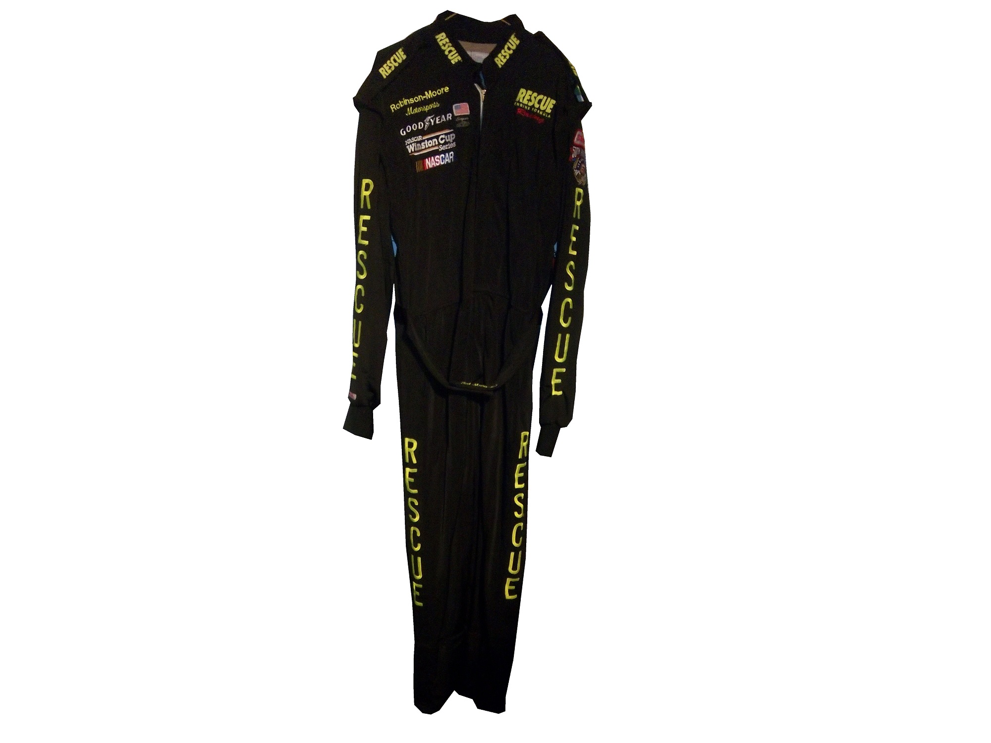
And we also have some driver suit photos and videos

Joey Logano #22 Shell/Pennzoil Ford Fusion This was posted on Logano’s Facebook page, and all I can say is… Hey look kids! It’s Ronald McDonald! Joking aside, this seriously looks like a McDonald’s suit, but with Shell and Pennzoil logos. That being said, it’s not a bad suit, the television logos are good, and it gets a final grade of an A

Jimmie Johnson #48 Lowes Chevy SS This video, from Hendrick Motorsports YouTube page shows Johnson’s new suit.  Very solid, with a great color scheme and basic design. I could to without the white collar, but that is only a minor complaint for a great suit, and it gets an A!

The Driver Suit Blog-Televison Logos

By David Firestone

I recently did a post focusing on Christian Fittipaldi, and the unusual way his suit displayed the so-called television logos.  But these logos have a unique history all their own.  One of the first examples on an in-car camera being used was the 1979 Daytona 500.  At that time driver suits mostly looked like this: That is Buddy Baker after winning the pole at Bristol that same year.  As can be clearly seen, no logos of any kind on the legs, or sleeves.  For much of the early and late 1980′s that was mostly the case.  Even though by 1989 there were opportunities to add logos in good places, in many instances this did not occur.  There are instances where there were logos on the legs and sleeves, and the position in many of them is consistent with today.

In the late 1990′s, TV logos were still, for the most part off the radar screen.  But around 1997, sponsors started taking the hint, and adding these logos.  Although it was not popular across the board,  it steadily gained momentum, and by 2004 these logos began to be the rule rather than the exception.    Granted in-car cameras were somewhat more nomadic then they are now, but even still it is kind of amazing that these logos took as long as they did to catch on.  Here is an example of a televison logo.  This logo comes from a Mike Skinner suit from 1997:31-skinner-rsleeve2 - Copy

This is how it appears when the driver’s arms are at their sides.  When the driver has his arms at the wheel, or crossed, the logo appears like this:31-skinner-rsleeve2

It seems so simple, and it is surprising that it took that long to figure this out.  In fact, in a number of instances, logos on sleeves looked like this, The Ted Musgrave suit from a previous post:15-musgrave-rsleeve1

While that looks good outside the car, inside the driver compartment, it looks like this to an in-car:15-musgrave-rsleeve1 - Copy

Not good for an in-car, the logo is next to impossible to read.  The legs have gotten the same treatment, in some cases the logo looks like this Ricky Craven model from 1996:41-craven - Copy

But to an in-car camera, the logos look like this:41-craven-legs - Copy

Again, the logo is impossible to read.  The proper alignment looks like this:31-skinner-legs

This is the proper alignment, when the driver is in the car, and the camera is to the side, the logo appears as such:31-skinner-legs - Copy

The whole point of sponsorship in racing is brand exposure, and these logos are a perfect example of this.  I still love the fact that even the drivers who almost never have an in-car camera have these logos.

Moving on to more 2013 paint schemes….

Ryan Newman #39 Wix Filters Chevy SS  “Black with lime green and silver shark fins is a really great design” said no one ever.  Final Grade: F

Moving on to the Nationwide Series…

Austin Dillon #3 Advocare Chevy Camaro  I’m not a fan of power blue in most cases, but here it just works.  The RCR 3 always looks good, the logos are good, and the whole car looks sold.  Final Grade: A

Regan Smith #5 Tax Slayer/Hellmans Chevy Camaro  Could someone please explain to me why Dale Jr. and Regan Smith are running identical paint schemes in the Nationwide Series this year?  The only differences between the two cars are the numbers and name rail.  The Hellmans scheme stays at a B-, but the Tax Slayer scheme looks better from the layout shown here, and it has earned the A rating.

Brad Keselowski #22 Discount Tires Ford Mustang This would be an A grade, if not for the Discount Tire logo…why does it look like it was designed by a 5 year old in art class?  The letters are so horribly aligned, it takes the scheme from classic to comical.  I’m shocked that it isn’t written in Comic Sans with the D backwards.  It is really sad, because it takes away from an otherwise great scheme, and takes the final grade from A to B-

Ty Dillon #33 Ritz/Wesco/Armour Chevy SS Three schemes to discuss.  The Wesco scheme is good but if the door numbers were a different color than the stripes, it would get a better grade than B-.  The Ritz scheme is completely solid, with great colors, great design, and great logos, and gets an A.  The Armour scheme is decent, but the numbers could use a more visible outline.  There is also a logo just behind the door number that is next to invisible.  Final Grade B+

The Driver Suit Blog-New Paint Schemes and Some IndyCar News…

We start off today with a unique story from IndyCar.  Ryan Hunter-Reay won the Izod IndyCar Series Championship last season, and as such has the right to use the number 1 on his car.  He normally used 28 as his car number, because 28 million people worldwide are affected by cancer, and his mother passed away from cancer in 2009.  So he is using a number 1 with a rather unique twist.  Also mentioned that Marco Andretti will switch to number 25 from 26 next year.

Moving on to NASCAR paint schemes, let’s look at the Nationwide Series first.  Two Chevy schemes and one Ford scheme have been released so far

Sam Hornish-#12 Alliance Ford Mustang  Could someone explain to me why in the world it has door handle decals?  And why does it have a blue line on the door that looks like race damage?  I really want to defend this scheme, but no, just no.  Final Grade: C

Kevin Harvick-#33 Hunt Brothers Pizza Chevy Camaro    First off, the Camaro looks really good on its own, and this paint scheme works quite well.  The door-handle decal is visible, but not as bold as the Hornish car.  The green/white contrast works well, and the decal package on the front looks really good.  The stripes on the sides work very well, and are not as haphazard of some schemes I have seen for this season.  Final Grade: A

Dale Earnhardt Jr./Cole Whitt-#88 Tax Slayer Chevy Camaro  Decent color scheme at work here, but what is with the pink roll cage?  The red black and white scheme has a similar color in the front stripe at the nose.  It’s visually distracting, and pointless.  The powder blue/pink stripe takes away from a great scheme and takes the final grade from an A to a B-.  Get rid of the blue, and it would be an A

Now we look at the Sprint Cup Schemes

Kasey Kahne-#5 Time Warner Cable Chevy SS  Awful color scheme, check.  Door and panel design that is supposed to be edgy but is really a cliche, check.  The most unoriginal sponsor logo in NASCAR, check.  Ok, I think we’re all done here, Final Grade: D

Ryan Newman-#39 Quicken Loans Chevy SS  Want to have some fun, open the Kahne link, and this link in two different tabs, and switch back and forth to see how “original” this scheme is.   Clearly both were designed by the same person, they look almost identical, except the fronts are a little different, and the color scheme on the Newman car is much better.  Final Grade: C-

Jeff Gordon-#24 Drive to End Hunger Chevy SS Yuck! They took one of the best color schemes ever and ruined it!  But these shots do feature a new design that will be used in NASCAR in 2013, and that is a sponsor decal on the roof.  The close-up of the rear-end shows the decent taillight decals, and the unnecessary tailpipe decals, as well as the updated Chevy logo.  Final Grade: D-

Been a long day, will be back tomorrow.

The Driver Suit Blog-Phantom Sponsorships.

By David Firestone

12-stremme - Copy

At first glace, this driver suit looks like it has no primary sponsorship at all, but dig deeper and you find the real story behind it.

From 2000 to 2008, car #12 in the Sprint Cup was driven by Ryan Newman and sponsored by Alltel Wireless. In 2002, Ryan Newman’s first full season the series was sponsored by Winston cigarettes and called the Winston Cup Series. In 2004, Winston left the series and Nextell took over as the series sponsor. At that time, there were a number of wireless companies sponsoring cars in the Cup series, including Cingular and Alltel. As they were under contract with teams before the Nextell sponsorship took effect, they were allowed to stay as car sponsors in the Cup series under a grandfather clause.

The first phantom sponsorship happened in 2007, when Cingular merged with AT&T. That set into motion a chain of events that began early in the season, when AT&T tried to re-brand the 31 car driven by Jeff Burton, and Sprint said that it was a violation of the grandfather clause. After a number of injunctions and legal wrangling, came the 2007 Sharpie 500 at Bristol in August, when NASCAR, under pressure from Sprint told the 31 team that they could not have any AT&T logos on the car, hauler, pit shirts, driver or crew uniforms, or helmets. The result was this unique scheme.

800px-JeffBurton2007BristolAugustRacehttp://www.flickr.com/photos/98572459@N00

Eventually a settlement was reached where the Cup team could keep AT&T decals on the car for the rest of the season, but would have to find a new sponsorship for the next season. This deal was met, and the next year, Jeff Burton drove a Caterpillar sponsored car.

In 2009, the Alltel sponsorship changed because Verizon purchased most of Alltell’s assets. Instead of a long court battle, Verizon, who was also sponsoring Roger Penske’s IndyCar teams basically sponsored the team but focused on their Nationwide Series with car logos, as the restrictions on Verizon were not in effect in the Nationwide Series, and allowed car #12 driven by David Stremme to run a Penske Racing scheme for the car they were paying for. That resulted in this very stylish David Stremme driver suit, currently in my personal collection.

12-stremme - Copy

The thing I find interesting is the fact that even though the car was running Penske decals, no mention of Penske is visible on the collars or shoulders, and no television logos are present.

12-stremme-collar

I also think it is interesting that the red stripes across the chest look like Verizon logos, but are just different enough to throw Sprint off the scent.

12-stremme-flogo

Unless the primary sponsor of the series changes again, with seems unlikely in the foreseeable future, I can’t imagine this happening again. It also should be noted that both AT&T and Sprint took flak for their actions during the controversy. I really hope this doesn’t happen again in racing, ever.

Before I go, here is my latest video episode..

The Driver Suit Blog-When Using Yellow, Keep It Mellow

When Jimmie Johnson’s team unveiled the car that would race in the Shootout this year, I felt compelled to write a blog on the issue of yellow cars.  Yellow is the same as any other color, it can work very well when used properly.  The problem is that many teams won’t use it properly.  Some colors work well bold and bright, and some don’t.  So let me make the case both for and against yellow as the main paint scheme in racing…

The Case For Yellow…

Yellow in racing seems to work well if the shade used isn’t overly bright.  A perfect example is Ricky Stenhouse Jr.’s Schoolbus scheme from last year. Dr. Frank W. Cyr picked school bus yellow in 1939 for its visibility, and the fact that black lettering on the shade of yellow is very visible in semi-darkness.  It also works very well on race cars.  Another example of yellow being chosen for easy visibility is the Yellow Cab Company in Chicago when president John D. Hertz chose yellow for his taxi cabs, a fact that Aric Almirola demonstrated in 2012 at New Hampshire.

One example of a longtime shade of yellow is Penzoil.  They have used the same shade of yellow for decades, and no matter what, it always looks good.  As long as the shade of yellow is not overpowering it will look good…which brings me to…

The Argument Against Yellow.

Apparently highlighter yellow is the top shade for any team that uses yellow, and it always looks bad.  Unlike red or silver when it comes to yellow, the brighter it is, the worse it looks.  If you don’t believe me look at the following examples…do I have to say anything more? I think not.  I’m shocked that more teams are not figuring this out, but it seems that every year the shades of yellow get worse.

Neon yellow is a terrible color, and it is used way to liberally in racing in this day in age.

In related news two other paint schemes were released..

Kasey Kahne #5 Quaker State Chevy SS Meh…Not bad, the door looks like a Carolina Hurricanes logo, but other than that it’s a mediocre scheme with decent color.  Final Grade: C

Carl Edwards #99 Aflac Ford Fusion I didn’t think it was possible, but we actually have a color scheme worse than the Seattle SeahawksThat shade of green is even worse than some of the shades of yellow I mentioned!  If it was silver, or for that matter any other color it would work, but this scheme gets a bad grade for a bad color…Final Grade: F!

The Driver Suit Blog-The Curious Case of The Bugle of Christian Fittipaldi

By David Firestone

Christian Fittipaldi is a Brazilian race driver who raced in F1, Champ Car and eventually NASCAR. Although he had two wins in Champ Car, his F1 and NASCAR careers were fruitless. His NASCAR career lasted from 2002-2003, and during that time he raced in a total of 16 races, with 2 DNQ’s. With the exception of the 2003 Daytona 500, all of his races were for Petty Enterprises, and he raced in all 3 of their teams at the time, cars #43, 44, and 45. His final two races were for car #44, which at the time was sponsored by Bugles.44-fittipaldi

In 2011, I bought the Bugles driver suit Fittipaldi wore for those final two races. When I got the suit, I saw it had some…irregularities to it. The most prominent feature are the television logos on the sleeves.44-Fittipaldi-rsleeve244-Fittipaldi-lsleeve2

Notice anything odd? The TV logos on the sleeves are incorrectly positioned…for NASCAR. I found this to be a bit odd, as there seems to be no logical reason for the logos to be set the way that they are. These logos, introduced in the 1990′s as a way for the primary sponsor of the car to advertise to the in-car cameras, should be positioned so that the logo appears clearly. These logos are designed for a camera mounted in the area where the passenger seat would be, as seen at 3:48 in the video below:

The logos are upside down. I was trying to understand why this was done, and then I watched the Indianapolis 500, and watching the in-car views, and suddenly, it all made sense, as seem below:

It became clear rather quickly that the TV logos are correct for F1 and IndyCar in-car cameras, but not correct for NASCAR ones. It seems that this car was designed for an open-wheel car, but not a stock car. The evidence on the shoulders is further proof…

ImageImageI’ve never seen any shoulder design like that of this suit before. The V pattern with the Goodyear logos on both sides. This is not unique to this suit, the shoulder designs of an earlier Christian Fittipaldi suit are the same as this one, though the logos are not visible on the back.

45-fittipaldi-rshoulder

45-fittipaldi-lshoulderSo we have two anomalies to this suit, but why did this happen? This suit was worn in 2003, and these logos were developed an implemented in the mid 1990′s. My theory to the answer can be found in two things, who wore the suit, and who made the suit. Fittipaldi was an open-wheel driver, and frequently wore suits made by an Italian company named Momo. Although Momo makes NASCAR equipment now, back in 2003, they were new to the NASCAR game, and as such were not as used to designing for NASCAR in-car cameras. As such, they designed the suit for an open-wheel car.

Granted Momo wasn’t as familiar with the design of stock cars, and their in car camera placement, but even so, wasn’t there somebody examining the suit? Wasn’t a team representative present at any point in the process? How does a mistake like that happen? The thing that really gets me is this…that was from the same season, and was made by the same company, but clearly the logos are correct in this shot…if they get it right once, why can’t they get it right again? How did that mistake happen? Well it did, and although there was no harm done, it does look pretty goofy…

Moving on to new paint schemes, let’s look at some…

First in the Nationwide Series

Regan Smith #5 Hellman’s Chevy Camaro The yellow is ok, a bit too bright for my taste, but I have seen much worse. The stripes look good, great colors and they are easy to figure out unlike some others. Final Grade: B+ Tone down the yellow a bit and it would be an ANow onto the Sprint Cup:

Matt Kenseth #20 Husky Toyota Camry Not much really to say, mediocre color scheme, no real design to comment on, the logos are plain Jane enough, it’s a bland scheme that earns a C grade. A mediocre grade for a mediocre scheme.

Aric Almirola #43 Smithfield Foods Ford Fusion Basically the scheme is unchanged from last year, and that is a good thing. I love this scheme, great color, great design, looks good, the logos are easy to see, and I give it an A. Extra credit was given for the use of Petty Blue.

Bobby Labonte #47 House Autry House Foods Toyota Camry The design is simple, but good. The color scheme need some work. The red used is too bright, as is the blue. The logo group on the quarter-panel is awful. The really odd thing is that this is the first scheme of Labonte’s that has been released, and it is the scheme slated for the All-Star Race. Why in the world would the All-Star Race scheme be released before any of the regular season races? I just don’t understand the logic here. But that being said, the final grade is a B-. If the color wasn’t so bright, I could grade it higher.

The Driver Suit Blog-A Trip Down Memory Lane…

One of my favorite drivers growing up was Ted Musgrave.  When I was watching NASCAR back in middle and high school, Musgrave drove the #16 Family Channel Ford for Roush Racing.  He was born in Waukegan, Illinois, which is close to my hometown of Evanston, and grew up racing in Wisconsin.  He is a Camping World Truck Series Champion.

hoganWe had family friends who lived in Elkhorn Wisconsin for many years Penny and Tom Hogan, and their two kids, Chris and Patrice.  We used to go up to their farm to visit them during the summer and over the holidays.  We always had fun with them.  I still look back on those days and it always brings a smile to my face.  Aunt Penny was one of the few people in my life who understood my love for NASCAR, and one night she was at a party where Ted Musgrave was attending.  She got me an autographed photo that is still near and dear to my heart:

musgrave1I still have this photo to this day, and I look at it often.  That is still one of my favorite paint schemes of all time.  Aunt Penny was able to get me a second, personalized photo, which is still in my possession today:musgrave2As the years went by, and the NASCAR race-used collectors market began to grow, I began buying driver suits, and I came across this one, worn by Musgrave in 1998:

15-musgraveI love the fact that the logos on the sleeves are not only in the wrong position, but also the fact that they are the wrong typeface as well.  The logos at the end of the sleeves and on the sides of the legs are supposed to be sideways so that the in-car cameras can see them easily.  But I still missed that Family Channel Scheme, then in May of this year, I came across an ebay listing that I just couldn’t say no to, and I got this:

musgrave1

That is a Ted Musgrave helmet that he wore in qualifying in 1996.  I love everything about this helmet, and it is even signed on the top

musgrave6Shortly thereafter, I came across this on ebay…

16-musgrave-replica4That is a 1/4 scale version of the full size helmet I currently own.  I had to have a little fun with it, so I did this video:

That helmet is one of my favorite items and everytime I see it, I think back to the 90’s, and all the fun we had at the Hogans, and it always brings a smile to my face.

The Driver Suit Blog-Some Thoughts on 2013 Paint Schemes So Far

Yesterday, I discussed the basic design changes for the 2013 redesigned schemes.  Today, I thought I would look at some of the schemes that have been released, and give my thoughts on them.

Let’s look at the Chevy schemes first.

Jamie McMurray  The basic scheme is solid here.  The Bass Pro Shop “lightning bolt” used in last year’s scheme is gone, and a single Golden Arch has taken its place.  The car has a cleaner look as a result.  I like the design of the car number here as well, and the goldenrod yellow works rather well.  Final Grade: A-

Kasey Kahne  I really hope this is a prototype design,,,the color scheme is all wrong, there are too many light colors, and the door design is just brutal.  The tailpipe decals which are already bad have a silver border around them, which just makes them stand out even more. Of the Chevy schemes released, this is the worst.  Final Grade: D+

Danica Patrick  Last year Danica’s car was painful to look at.  However if this is the final design for Danica, I like it.  The yellow is much more subdued, giving it an overall better appearance.  Also the orange and black stripes at the bottom give it a bolder look as well.  The numbers need work though, as the generic racing font doesn’t do the car any favors.  Final Grade: B+

Tony Stewart  Both of Tony Stewart’s paint schemes leave something to be desired.  The Bass Pro Shop scheme is the better of the two.  The total lack of white on the Bass Pro Shop scheme give the car a good look, and the stripes give a cleaner line.  The orange on the bottom needs to be a little darker, but it;s a great scheme.  Mobil 1 on the other hand has too much white, an awful set of stripes that seem to be non-sequitur with each other.  The overall color scheme is all over the place and is very confusing to look at.  In addition, the white on the back doesn’t help.  Final Grade: C+

Jeff Gordon Are you kidding?  Black flames on a car that is totally black outline in blue?  Pepsi has a great shade of blue and a great logo and yet they manage to screw it up by trying the Pepsi Max design to be edgy.  I’m a fan of black cars, but this just falls flat. Final Grade: C-

Kevin Harvick  Ok, let’s make this clear:  This is what a Budweiser scheme should look like, this is not.  This is one of my favorite schemes so far, it looks like a Budweiser car should look like, so my Final Grade: A

Jeff Burton From what I’ve seen the Cat car looks about the same as it did last year which is actually a good thing, because the scheme is solid, has good colors, great number designs and a good pattern used.  Final Grade: A

Juan Pablo Montoya Great color, great number design, and the pattern used is a lot more sublte than last year’s scheme.  The quarter-panels have too many associate sponsors and looks too cluttered, keeping the Final Grade at a B.

Jimmie Johnson  Less is more and this paint scheme proves that.  The Z-28 stripes, good color scheme, and clean design gives the Lowes car a simple yet elegant design that just works.  The Jimmie Johnson Foundation scheme is a little cluttered, but it still works.  Final Grade: A

Dale Earnhardt Jr.  The Diet Dew scheme isn’t great, the design is pointlessly complex, and the red on green number design is just brutal.  If you look at this picture of the National Guard scheme you will see that one of the major changes to Chevy’s driver suits is the full Chevy logo, as opposed to just a red bow tie like last year.  This design was used in IndyCar last year and looks better than the old design.

Moving on to Ford…

Brad Keselowski  The scheme is decent, but the dark red lettering on the dark blue background is very hard to see.  Miller needs to rethink that part of the design, but other than that it’s a good scheme…though I still miss the beer-colored wheels from last year!  Final Grade is a C

Marcos Ambrose  Is it normal to get seasick while looking at a paint scheme?  The Petty Blue just does not work here, and the oval around the letters is pointless.  The car looks awful even though it has a great color scheme and great sponsor logos.  Final Grade: D

Greg Biffle  There’s nothing really wrong here, but nothing really right here either.  The side design looks forced, the black roof is idiotic, the color scheme is good, but the number design looks too cliche.  It makes no sense, but 3M schemes never do, so I’ll give it a C

Ricky Stenhouse Jr.  The Best Buy scheme looks good.  The number design, color scheme, and simplistic design give the car a good look.  The Zest scheme on the other hand has an awful scheme, and like Kasey Kahne’s scheme, has too many light colors and not enough dark to make the scheme work.  The Final grade is a C overall, an A for Best Buy and a D for Zest.

Trevor Bayne Timeless, plain and simple.  This scheme works well, and if it’s not broken, don’t fix it.  Final Grade: A

Joey Logano This scheme could very easily be mistaken for McDonald’s.  The red wheels don’t do it any favors, and the Penzoil scheme is too simplistic.  Sometimes less is more when it comes to car design.  Final grade: D-

Carl Edwards  The stripes work well here, and the color scheme is good.  Unlike the Zest scheme, this scheme uses enough dark blue to make it work.  The UPS scheme however is a disaster.  The dark brown really works, but the various shades of gold, orange and red make the design look like a sad rainbow.  The white numbers don’t help that much either.  Final Grade is a C, A for Fastenal, D for UPS

And finally a look at Toyota’s schemes thusfar

Matt Kensith  This Dollar General scheme could be good if some of the black stripes go, and what is up with the DG design on the bottom of the quarter-panels?  The yellow-to-orange fade on the back doesn’t work either.  Final Grade: D

Clint Bowyer  The dual blue and white scheme is popular this year, and this scheme is one example.  The basic design would work better without some of the stripes on the front.  Otherwise it’s a solid scheme with a B grade.

and last but not least, Martin Truex Jr.  Simple, elegant with a great color scheme, great logos and great number design.  Final Grade: A

I will add more input when more schemes are released.