I don’t normally do a midweek column, but a brand new event in NASCAR is taking place tonight. Eldora Speedway in New Weston, Ohio is the site of a new experiment in the NASCAR world. For the first time since 1970, one of NASCAR’s top series, the Camping World Truck Series will race on a dirt oval. Tonight at 8PM EST, 30 of NASCAR’s top drivers including Ryan Newman, Ken Schrader, Kenny Wallace and others will race 150 laps, in 3 different segments on a ½ mile clay track.
Some things have surprised me about this event. The first thing is that two drivers who I would have expected to try and make the field aren’t attending the race. The first is Kyle Busch. Busch is what I like to call a “pure driver” and what that means is that he is truly happy when he is behind the wheel of a race car. The dirt style of racing I think would suit Kyle very well. The other absent driver that really shocks me is Tony Stewart. Stewart, like Busch is a pure driver, but what makes Tony’s absence from this race perplexing is that HE OWNS ELDORA SPEEDWAY! Why Tony Stewart isn’t in this race at a track that he owns is kind of odd.
Now even though this is the first dirt-track race featuring on of NASCAR’s top 3 series, I doubt it will be the last. This event is a concept that is a long time coming, and I think it will in the very near future extend to the Nationwide and Sprint Cup series. I would honestly love to see a second all-star race on Eldora or another dirt track added to both of NASCAR’s top series, in addition to the truck series.
The Driver Suit Blog and DGF2099 Productions team up to stop something that has been going on for too long, sports memorabilia being destroyed for “swatch cards”
When it comes to driver suits, I normally focus on race-worn items, but this week I’m going to shift gears, and focus on another kind of suit…and yes, pun intended. This example is a suit used by the Richard Petty Driving Experience. What the RPDE does is give die hard fans the ability to get in a stock car and either be driven around a track for a few laps, or drive the car around the track after some instruction. The cars are almost identical to Gen 4 cars, but have two seats and are scaled down to 600 horsepower from the over 800 currently run in NASCAR.
It looks similar in design to suits that Richard Petty wore during his racing days. Interestingly, there is no Petty blue, but a darker blue similar to the blue used in STP logos. There are no logos of any kind present, not even of the suit manufacturer, a company called Westex. I find it odd that at that time, the Richard Petty Driving Experience logo wasn’t used. There is no indication it was ever present on the suit to begin with. The legs are cuffed, as opposed to the boot cut that most NASCAR drivers like to use. Arm gussets, which give drivers better freedom of movement, are not here either. Later suits have some of these features.
Now even though the cars are either driven by professionals, or by drivers who have had lessons, the risk of crash and fire is present. As such, the fans are issued driver suits. This is an early version of the suit issued to them. What strikes me about this suit is that it is a single-layer suit with no epaulets. The epaulet is critical here because they are specifically designed for pulling an unconscious driver from a burning car in the event of a wreck. The fact that is is a single-layer suit is an issue here because in racing, redundancy is safety. NASCAR drivers wear double or triple-layer suits as well as fireproof long johns that give them 30 seconds of fire protection. I would be shocked if this suit would give 10 seconds.
I should also mention at this point that the suit does not have any SFI or FIA certification. When you are driving fans around a track with the ever present risk of fire, having a suit that can withstand the worst case scenario is a plus. SFI certification is designed to do just that, insure that the person wearing the suit will be able to be protected in the worst case scenario, so I do not get the logic of having uncertified suit for use.
All that said, now let’s discuss the basics.
The collar is a Velcro-shut design.
The tag is custom for the RPDE and has some things written and crossed out in Sharpie.
The sleeves are plain.
There is an unadorned belt.
The front torso shows some stains.
It should be noted that these suits are no longer used, and now Simpson SFI certified suits are currently in use. And while the suit has its short comings it is still a very attractive item. I plan on doing the RPDE in the very near future.
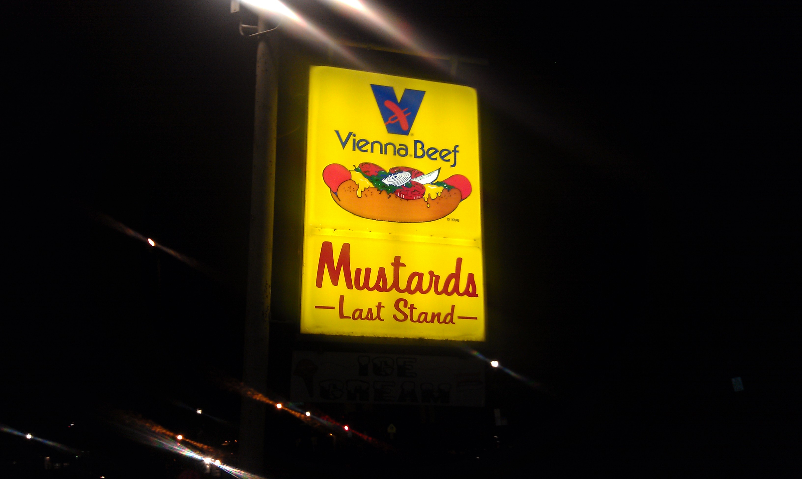
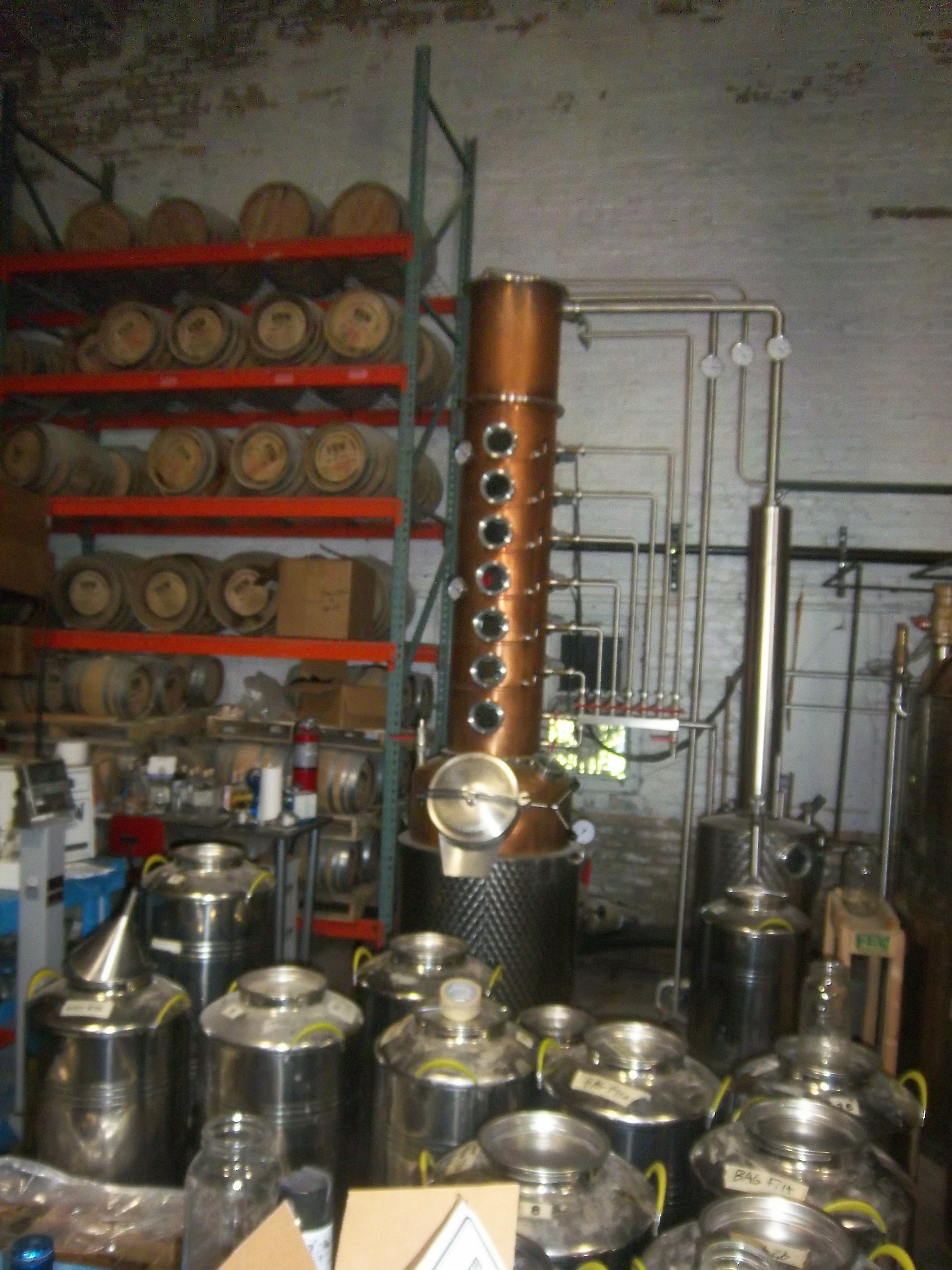
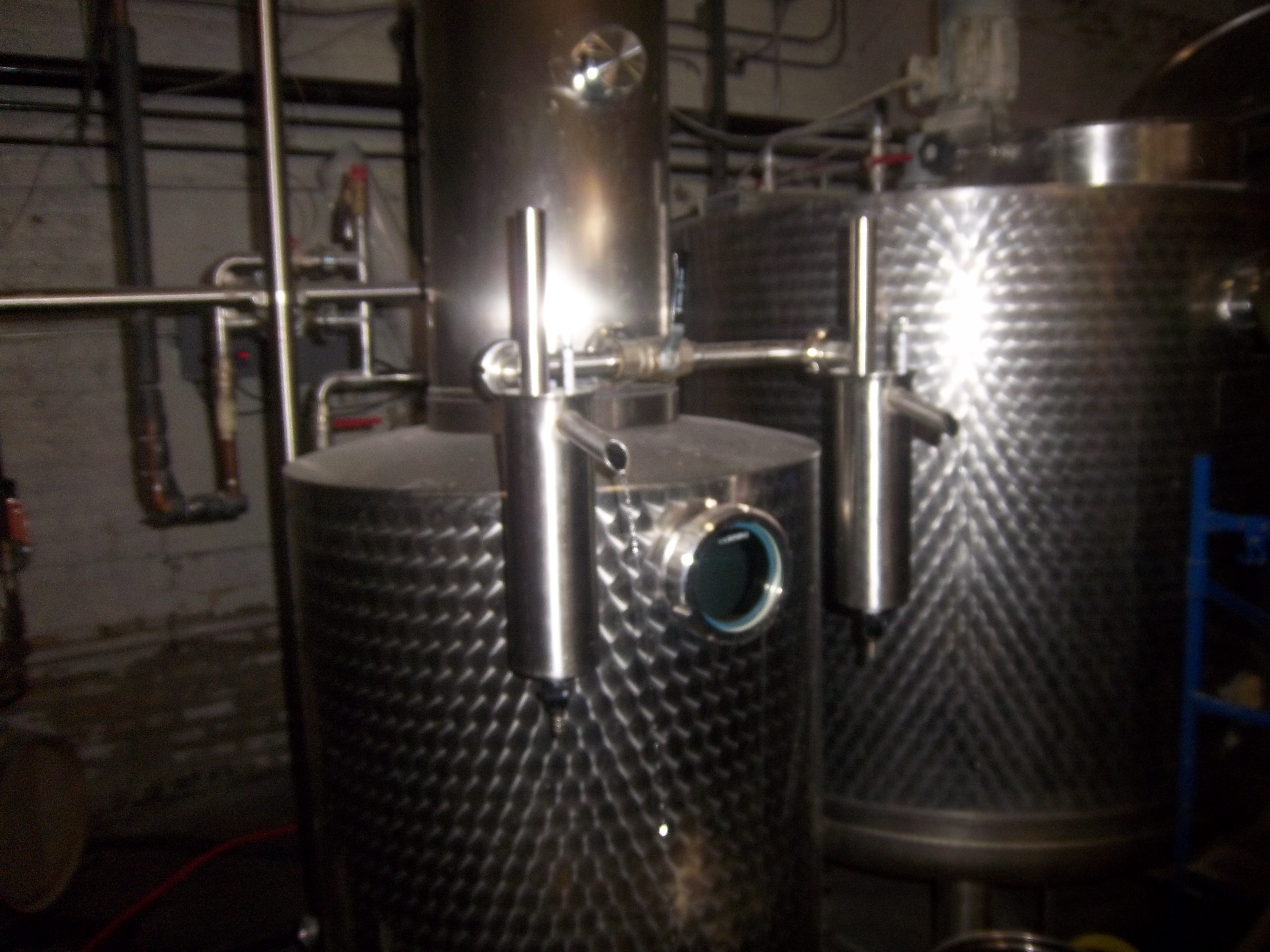
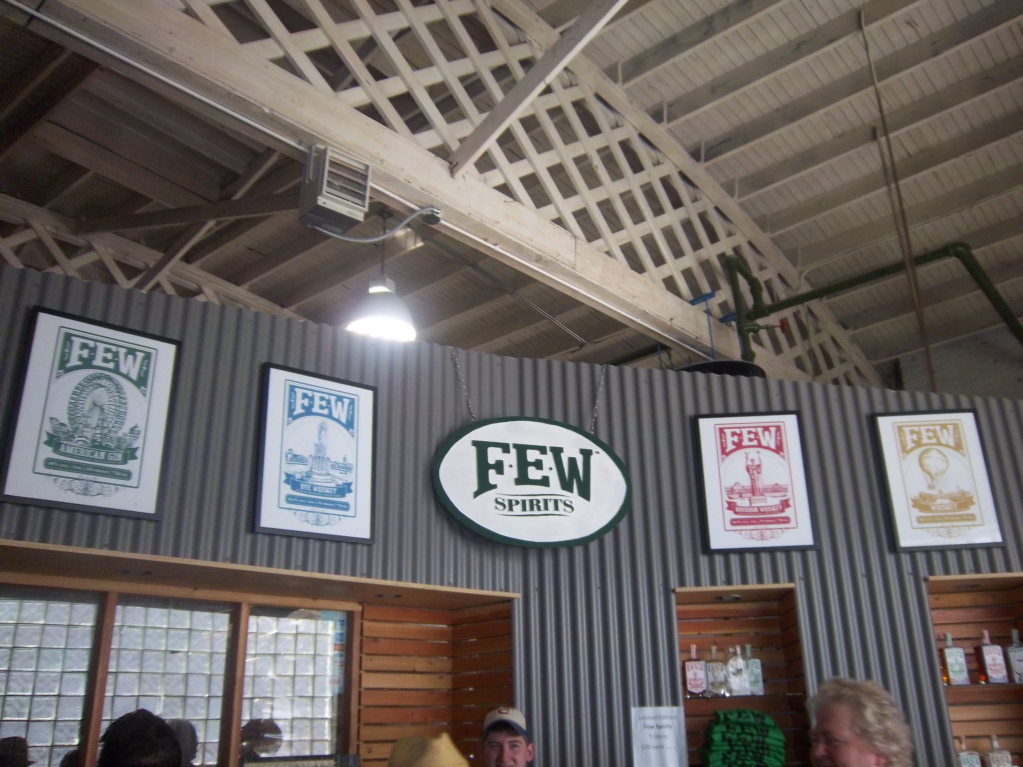
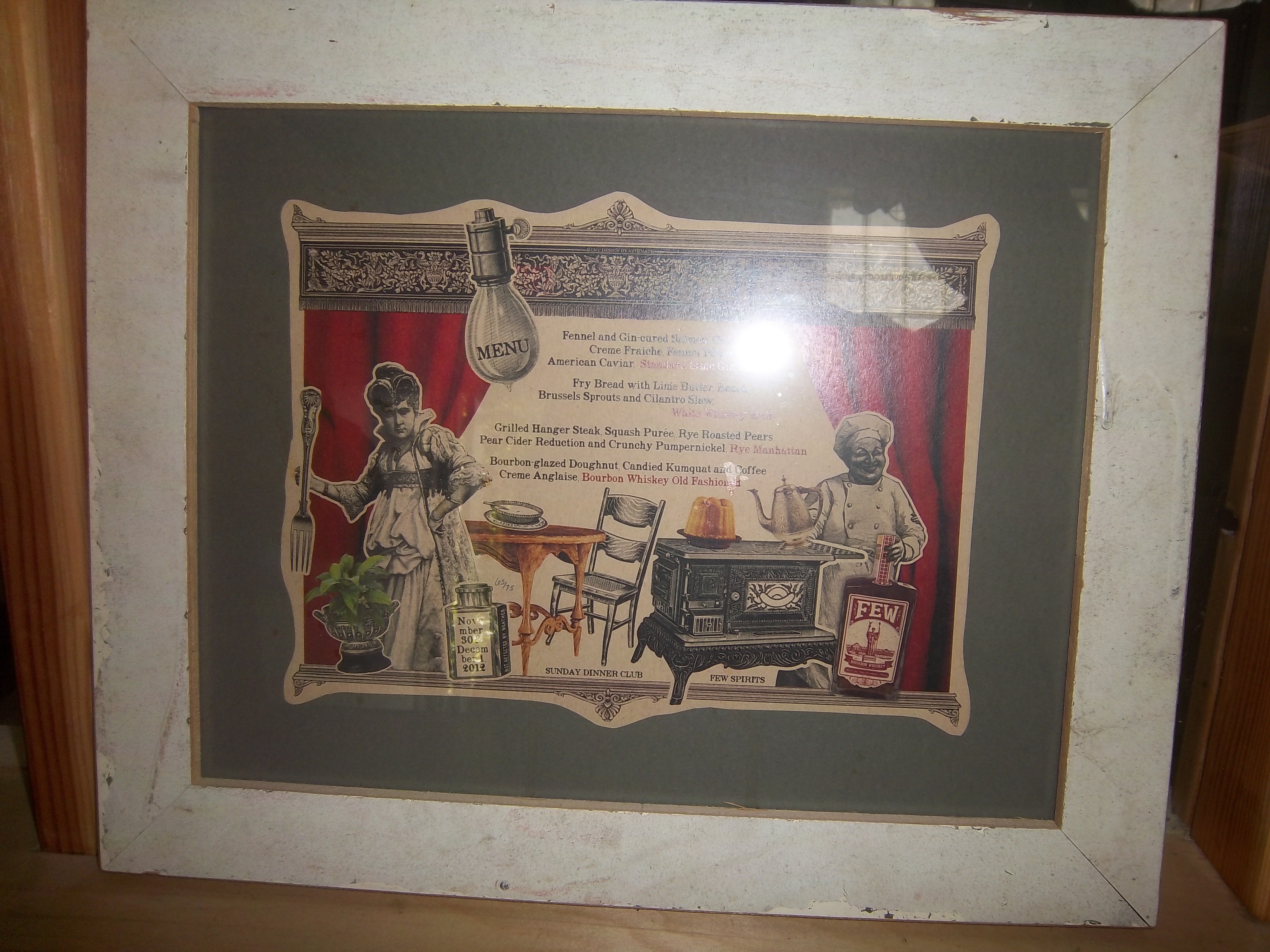
Growing up in Evanston Illinois, I spent most of my life in this area. I’ve had the chance to take opportunities outside of the Chicago-area, but this is home. I LOVE Evanston! I love everything about Evanston, especially the food. Heaven for me is a Mutt Special from Hecky’s,Chicago-style hot dogs, and Italian beef from Mustard’s Last Stand,and Chicago-style pizza from Carmen’s.Evanston has been a home for me, and it has been a home for the temperance movement. Francis Willard and the Woman’s Christian Temperance Union have been headquartered in Evanston for many years, and up until 1984, Evanston was dry, something amazing for a college town. So it surprised me to learn that recently, a distillery opened in Evanston.FEW Spirits was founded in 2011 at 918 Chicago Avenue, in what was, according to the owner, a chop-house. They are a craft distillery, that actually distillers their own spirits. This sets them apart from many craft distillers, who buy alcohol from industrial alcohol producers, and add their own ingredients. Everything that FEW makes is made in a series of steps in their small building. I had the opportunity to take a tour of their facility, and it was enlightening and fun.First, we went into the production facility, and saw the stills and equipment used to distill their line of spirits. While they produce only produce whiskey and gin, they various ways that they can adjust their ingredients and production methods can produce a number of variations. I wish I had a way of transmitting the scent of the production facility over the internet, because it was a unique and amazing scent that I will never forget.
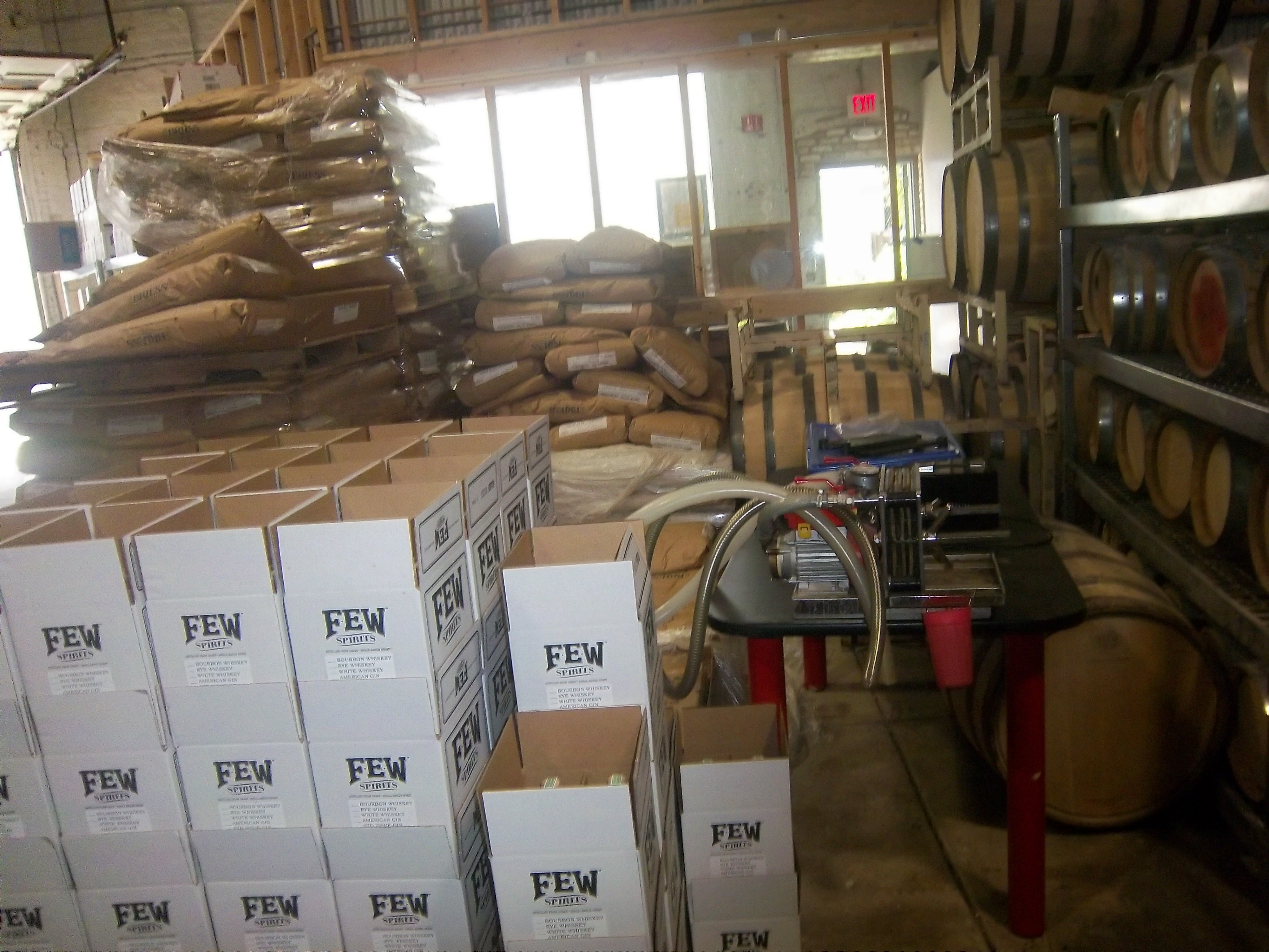
Also there was a small bottling facility,and some barrel storage. There is a second facility, again in Evanston, where long-term barrel storage is held. The facility is not large, but it does have a lot of character. This character is reflected in the tasting area, where we headed next. During the tasting, we tasted a number of gin variations, including American Gin-a white 93 proof gin, Barrel-Aged Gin which has a brownish color, and Standard Issue Gin-which has 114 proof, and is similar to the type issued to the British Navy. The whiskey variations we tried were White Whiskey-which is bottled before it is put in a barrel and maintains a clear appearance, and Bourbon and Rye Whiskeys. Each of these variations was very good, and the small glasses used for the tastings look really good.One thing you will notice about FEW is that it has a vintage character to the spirits they brew. This is evident in their shop, and their labels. The labels pay homage to the 1893 World’s Fair in Chicago, and the shop is lined with vintage items with the FEW logo on it. This is an extension of the FEW character.Tours take place on Saturdays at 2 and 3 PM. Sign up at fewspirits.com, it only costs $10 and is an interesting, enlightening and fun way to spend your Saturday.
The driver suit is almost always customized for the driver, and as such, the driver has the option of adding customizations to the suit. This may come in the form of size,
and belt design,but the back of the neck is a unique place for customizations. The designs that are placed on the back of the neck are as unique as the driver themselves.I’ve gone at length to discuss the FIA certification which is frequently sewn into the back of the neck. This is a prominent feature in Formula 1 and IndyCar. That is standard issue, so no real need to comment on it any more.In NASCAR, the back of the neck can be used for a myriad of different customizations. One of the most common is a car number, such as this Christian Fittipaldi suit, and another common feature can be sponsor logos, such as this Randy LaJoie Bob Evans suit from 1999-2000,and this Joey Miller Craftsman Truck Series suit from 2005.This Kasey Kahne suit has the Evernham Motorsports logo sewn into the back of the neck.And Roger Penske likes to have the American Flag on the back of the neck of his suits, as evidenced by this David Stremme suit from 2009.Older Simpson driver suits have been known to have an inventory number sewn here, as exampled by this Mike Skinner suit from 1997,and this Stevie Reeves example, again from 1997.But for my money, the personal customizations are more fun when they are as unique as the driver is. In this Terry Labonte suit, Terry has added a Texas logo.My favorite customization is from a Boris Said suit from 2005. Said has added a Boris Badenov design to the back of his neck.It’s the little things that make a suit personal, and these are some of those little things. Who says a driver suit can’t be fun.
And of course, it goes without saying that the neck is frequently left blank, as exampled by this Nort Northam suit from 1988.
Jamie McMurray #1 Cessna Patriotic Chevy SS Pretty good scheme here, red white and blue is always a solid scheme, but the one gripe I have is the pointless circle around the door number. While it gives the car a vintage look, it is just out of place here. Even still, this scheme is a solid A-
Kasey Kahne #5 Hendrick Cars Chevy SS Red white and black is a very solid color scheme, and the design, while a bit convoluted looks really good. It has a hurricane-esquire design that looks really good. A-
Danica Patrick #10 Go Daddy .US Chevy SS The simple design of this scheme looks really good…but what is going on with the colors? Why is the car painted in Russian dressing green? Russian dressing is good, but not as a color scheme. The red white and blue designs clash, and it just looks awful. D-
Kyle Busch #18 Interstate Batteries All Battery Center Toyota Camry Now THIS is what an Interstate Batteries scheme should be! The classic dark green, gold and white color scheme is amazing, and the design is simple yet very attractive. Giving this scheme an A+ is not saying enough about how great this scheme is!
Jeff Gordon #24 Axalta Standox Chevy SS White flames on a blue background? Seriously? I could forgive it if it was blue flames on a white background, blue flames look really good. But white flames? This design ruins a great color scheme AND a great design scheme TOGETHER! Now that is impressive! F-
Jeff Burton #31 Quikset Chevy SS Decent color scheme but the design needs a little work. If the red was on the hood, roof and deck-lid and the black was on the sides, I would give it an A, but the shark-fin design is brutal on the eyes, and serves no real purpose. As such, I can only give it a C-
AJ Allmendinger #51 Neil Bonnett Throwback Chevy SS While I like most throwback schemes, this one, while accurate, has the worst color scheme I have ever seen. It just screams 1980’s. Hot pink and neon yellow really stands out, and not in a good way. Still, I do miss Neil, and they were pretty accurate, so I will give this scheme a B
I had a post ready to go concerning collar designs, but I’ve decided to save that for next week. I’m still on vacation, and last Saturday I went to see the 16th annual O’Reilly Auto Parts Route 66 NHRA Nationals presented by Super Start Batteries, in Joliet. I had the chance to get VIP tickets, so I went with Argie, a friend from work, and some of her friends, and took the chance to mix business with pleasure.
It was a mixture of Mello Yello Drag Racing Series regulars, and some minor league drivers, but it was fun. The first thing I learned was how loud these cars really are. I’ve been to NASCAR races, and I’ve heard the engines running, but NHRA engines are so much louder than I had thought. For a while, I was standing in the spectator area on track level, and as they warmed up, you felt the vibrations of the engine. I’m standing about 75 feet away from the starting line, and when they went by, you felt it in every part of your body, a split second after they passed you. Needless to say, it was AWESOME!
One thing I did enjoy was checking out the different kinds of cars, from top fuel dragsters, to super stocks,to funny cars, The scoreboard tells the fans who won, and what their times and speeds were, each side having its own scoreboard with lights around the sponsor logo to tell you who won.I also checked out the tires on these cars, and man, they are huge! They look like they are twice the size of NASCAR tires.Speaking of which, I got a chance to check out the new Gen 6 Sprint Cup car, as Clint Bowyer’s Toyota Camry show car made an appearance…it looks amazing!They even had a jet dragster, but I didn’t get to see it on the track…oh well.One of the fun things about these events is that you can check out the pit area, so I did, checked out all sorts of cars, and the various equipment and stages of preparation and equipment used in them. Impact Racing had a booth there, and they had the various designs of helmets sold for race use. Aside from NASCAR, IndyCar and motocross designs, they had drag racing helmets. Drag racing helmets feature a visor design similar to wrap-around sunglasses. Top fuel and funny cars have their own designs, with funny car having an air filer, since the nitro-methane engine sits in front of the driver, instead of behind, like in a top fuel dragster. Many of the teams sell off equipment from the cars after the various events are done, and I took full advantage, acquiring a timing belt from Bob Tasca’s Motorcraft Funny car, this one used in his first qualifying session at the Ford Thunder Valley Nationals in Bristol Tennessee. This run he had a 4.15 second, 306 MPH run. This thing is HUGE, measuring over 64 inches in circumference and 3 inches across. As well as an ignition coil and a spark plug from Morgan Lucas Racing. Ignition coils are used to turn on cars in general, but this MSD 8142 is designed to fire up these 8000 horsepower engines, which need a lot of electricity to start and operate. I was fortunate enough to have Tony Schumacher and Ron Capps autograph it in person. My VIP ticket got me into the Don Schumacher Racing hospitality area. That was a lot of fun. We got to watch his car get prepared. Since the U.S. Army is his primary sponsor, DSR had some Army recruiters and soldiers speak. Though speaking to a crowd is not always easy when you have 2 8000 horsepower cars racing nearby. Then Tony Schumacher got up and gave a speech, and discussed his helmet, which prompted this question from me:
Afterwards, I was able to get a photo with him,and got to watch the engine test. This video looks tame, but unless you see it in person, you don’t have any idea how loud it really is, and I was 15 feet away when I shot that video!
Then I had dinner,and called it a day. I had a great time, and I will go back any chance I get!
In other news, I went back to the Museum of Science and Industry, and I went to the Jeff Gordon suit exhibit, and was shocked to see this:THE ENTIRE DISPLAY had been emptied out of the display case. At first I didn’t know what had happened, so I asked at the information desk. They, in turn, told me that pipes located above the display had been leaking, and that the items had been removed. I hope that when the display is fixed, the issues I discussed in a previous blog will have been fixed, I will keep you posted.
And since I’m here, Let’s talk paint schemes…shall we?
Jamie McMurray #1 Hellmann’s 100th Anniversary Chevy SS The yellow or green on the contingency decals is pointless, and it takes away from what is a very solid scheme, with simple design and great color. I give it a B+, almost an A, just not enough.
Tony Stewart #14 Ducks Unlimited Chevy SS Although it is just his normal scheme with DUCKS UNLIMITED instead of MOBIL 1 on the quarter panel, I hate his new look. The black scheme from before Kansas was really good, but this is just horrible. Too much orange, not enough black or camo. F
Clint Bowyer #15 Toyota Camry 30th Anniversary Toyota Camry Ok, so is this a red car, a black car, or a silver car…I’m really lost here. The nose and front panels look red, but the hood and back quarter panels look black, and the roof is silver. They took one of the best color schemes in racing, and made it horrible! The only thing giving this scheme a passing grade is the color scheme, but even that can’t keep it above a D-
Aric Almirola #43 Go Bowling Ford Fusion I love what they did here. The bowling ball nose and pin design give a great impression, and the color scheme works very well here. A+
AJ Allmendinger #47 Scotts Toyota Camry Simple and attractive, with a very nice simple color scheme…But could someone explain to me why in this rendering the windshield decal reads AJ ALLMENDINGER instead of just ALLMENDINGER? The only time a first name is on the windshield is in the case of Kurt and Kyle Busch. There is no other Allmendinger racing in the Sprint Cup. That said, this scheme earns an A
Brian Vickers #55 Aaron’s/Louisville Cardinals Toyota Camry The color scheme is amazing, and the basic simple design of the car works well. The hood has some needless design, which does affect the grade, but even so, it still earns an A-
Martin Truex Jr. #56 NAPA Batteries/Get Back and Give Back Toyota Camry Another example of why most teams only USE ONE COLOR AND DESIGN SCHEME! The nose features BDU digital camouflage in light and dark green, which works well. The doors feature Truex’s normal scheme, again good color and design, and the back features a blue/black digital camouflage, again which would work well by itself. The problem is that the combination of the three make for an awful look. This scheme is one of the worst so far this year, and it earns the F- grade it deserves. I fully support our Armed Forces, but this scheme is horrible!
Carl Edwards #99 UPS Ford Fusion I know I covered this scheme in a previous post, but this photo illustrates why I hate UPS as a car sponsor. No matter what, UPS cars have one thing in common, and that is that the driver suit can look really good, whereas the car will look awful. In this case, the car has pointless designs and needlessly added colors, whereas the driver suit is simple and attractive. So my previous grade of D- still applies.
And finally, while I don’t normally do Nationwide paint schemes anymore, I had to do this one. Kurt Busch has had a throwback at Talladega reminiscent of Neil Bonnett’s Country Time scheme from the 1980’s, and last night, he had had an amazing scheme taken from Days of Thunder…I love that scheme because I love the movie. The boxy design of the Camaro works well with the scheme, as it is much similar to the design of the Lumina. Keep it up Kurt!


