
Kenny Wallace is in the spotlight this week, as we look at a race-worn driver suit circa 1999-2000, which he has boldly autographed across the front.
Month: November 2013
The Driver Suit Blog-Paint Scheme Leaderboard Part 2- Chevy
By David G. Firestone
Last week, I ranked the Ford teams based on their paint schemes, and this week I will do the Chevy teams and next week I’ll rank the Toyota teams, so without further ado all the Chevy teams ranked from best to worst:
#1 Hendrick Motorsports #48 Jimmie Johnson went with a very classic look, with a day scheme and a night scheme, which worked very well. Johnson did not have a bad look all year.
#2 Furniture Row Racing #78 When it came down to picking a number 1 for Chevy, for both the Paint Schemie and the Leaderboard, I had to flip a coin to pick a number 1, and Johnson won. Kurt Busch ran a series of very solid schemes, not a lot to comment on and it always looks good.
#3 Richard Childress Racing #29 The Bad Boy Buggies scheme is bad, and the Rheem/Budweiser combo scheme is awful, but aside from those, Kevin Harvick has had a very good season, paint scheme wise
#4 Earnhardt Ganassi Racing #42 Get rid of the Axe Apollo scheme and the Camouflage scheme, and Juan Pablo Montoya would have the top spot.
#5 Phoenix Racing/Turner Scott #51 Guy Roofing and Hendrick Cars are hideous, but apart from that, they have run a great set of paint schemes. Bonus points given for the Neil Bonnett throwback scheme.
#6 Richard Childress Racing #27 The yellow is too bright, but other than that, the schemes are really good.
#7 Stewart Haas Racing #14 Some of these schemes are good, others not so much.
#8 Hendrick Motorsports #88 Dale Jr. runs good schemes most of the time, but Soldiers of Steel, Orange Amp Energy, and Camouflage are just brutal. Additional points lost for a pinkwashing scheme.
#9 Earnhardt Ganassi Racing #1 Bad Boy Buggies is even worse here, and the Bass Pro Shop schemes are awful. A number of good schemes here as well.
#10 Tommy Baldwin Racing #36 This team looks better without a primary sponsor than they do with one.
#11 Max Q Motorsports #37 Simple, yet attractive. Would be higher if they ran more races.
#12 Circle Team Sport #40 Interstate Moving is really good. Moon Shine Attitude Attire is really awful, and their pinkwashing scheme is even worse.
#13 Richard Childress Racing #31 A few good schemes but most of them are mediocre at best.
#14-Hendrick Motorsports #24 See Above
#14 Stewart Haas Racing #10 Worst shades of yellow in NASCAR, and the pinkwashing scheme is so much worse.
#15 Stewart Haas Racing #39 I have to give them credit, their schemes are mostly awful, but at least they are creative.
#16 Tommy Baldwin Racing #7 Worst. Door. Number. Ever. The rest of the car isn’t good either, and a pinkwashing scheme doesn’t help.
#17 Hendrick Motorsports #5 Innovation can be a bad thing. This, for example is what happens when you let Karl Benjamin design your cars.
#19 Circle Sport/RCR #33 It amazes me how two different teams can use the same car number, and both can put awful designs on their cars. Special credit for the Honey Nut Cheerios scheme, which is just horrific.
DGF2099 Productions-Introduction to Sports Memorabilia-Scott Vieira Chicago Cubs Jersey
Scott Vieira wore this jersey during Chicago Cubs spring training from 1999 to 2000. It has been signed by a number of former MLB players after the fact, and we will examine it in detail this week.
The Driver Suit Blog-Paint Scheme Leaderboard Part 1-Ford
By David G. Firestone
I started ranking all the teams last week, with the Paint Schemie Awards, and I figured I would continue this week with the Paint Scheme Leaderboard. The concept is that over the next 4 weeks, I will rank all the drivers by team. The rules are the same as the Paint Schemies, and I will rank the teams, first by Manufacturer, and then by all the teams running the Sprint Cup Series. A random drawing has Ford going first, followed by Chevy next week, and then Toyota the following week. The last week, will be all 50 teams that ran in the Sprint Cup Series this year.
So, without further ado, let’s look at how Ford’s NASCAR teams fared in the paint scheme world this year:
#1-Wood Brothers #21-A classic design scheme that just seems to get better with age. The Henry Ford design combines classic and modern elements for an amazing look.
#2-Richard Petty Motorsports #43 This team combines classic and modern looks, and uses Petty Blue very effectively. The Transportation Impact scheme was not good at all, and kept the 43 team out of the top spot. Extra Credit for the Maurice Petty Tribute Scheme.
#3 Penske Racing #12-Though only raced for one race, the SKF design worked very well. A great color and great design scheme. If this had been raced for multiple races, I would have ranked it higher, but it is still a solid scheme.
#4 Richard Petty Motorsports #9 This set earned a place in the top 5 because it improved by a lot over the course of the season. It has a great color scheme, but the early schemes were not great, but since Stanley redesigned their logo, and made some changes to the car, it is a very nice set.
#5 Roush Fenway Racing #17 A pinkwashing scheme as well as the Valvoline NexGen scheme kick Ricky Stenhouse Jr. out of the top spot. Sad thing too, as Ricky had a very solid year when it comes to paint schemes.
#6 Penske Racing #2 While I miss the beer colored wheels from last year, Keselowski has had a decent year, the color scheme is great, though there is too much white on the car. The Redd’s Apple Ale scheme was great, but the Fan Mosaic, pinkwashing, and Patriotic schemes need some work.
#7 Roush Fenway Racing #16 Greg Biffle had a lot of great schemes, but he had a number of awful ones as well. Get rid of the pinkwashing scheme, the Scotchguard, give blood, and Megulars schemes, and he would be in the top 5.
#8 FAS Lane Racing #32 The Oxy Water scheme, and the gray scale C&J Energy Services schemes do not work, but the rest of the schemes they ran do.
#9 Front Row Motorsports #38 The template they run works very well when the color scheme matches that of the sponsor. When it doesn’t match, it looks awful.
#10 Front Row Motorsports #35, See above
#11 Front Row Motorsports #34, See above, aside from the CSX scheme, which looks great, and the Peanut Patch scheme which looks awful.
#12 Roush Fenway Racing #99 Geek Squad and Fastenal work well, the rest…not so much.
#13 Germain Racing #13 Nothing really wrong, but nothing really right with these schemes.
#14 Penske Racing #22 Red and yellow is a really great color scheme, but the design is all wrong. This design gets even worse with the AAA scheme, which has an even better color scheme. The Pennzoil scheme is good, but not good enough to save the set.
#15 Phil Parsons Racing# 98 The schemes come in one of two food groups, bland or awful. Great colors, but the designs are horrid.
#16 Levine Family Racing #95 Worst template in NASCAR.
#17 Xxxtreme Motorsports #44 Yuck.
Next Week, the Chevy Leaderboard!
Vintage Item Spotlight-Richard Nixon Bill Signer Pen
By David G. Firestone
 We have discussed so called “bill signer” pens a couple of times, and for this article, we will shift gears. Richard Nixon’s entire Presidency can be summed up with the word Watergate. Prior to that, he was a popular president, who did a lot for the country.
On October 20, 1972, while the scandal was beginning to heat up, and with the elections in sight, President Nixon was in Philadelphia Pennsylvania, and while at Independence Hall, signed “H.R. 14370 To provide fiscal assistance to State and local governments, to authorize Federal collection o£ State individual income taxes, and for other purposes.” He did so using this custom Parker 45 pen.
The pen is blue in color, and has Richard Nixon’s signature on the side of the blue plastic. 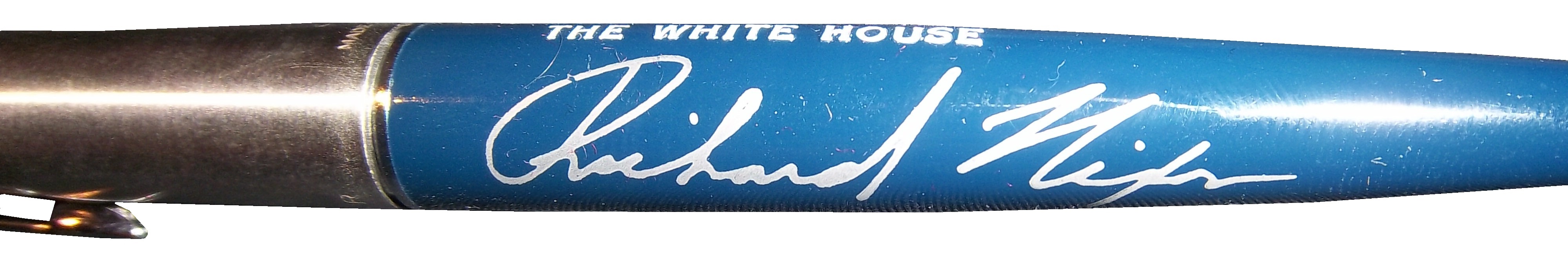
The pen shows heavy use, with cracks on the blue plastic. The tip is also destroyed. Given what was going on in Washington at the time, that makes sense. Just 10 days earlier, the FBI had announced that the Nixon re-election committee had been involved in a huge ring of illegal spying and surveillance. Nixon had to be on edge, and it is very likely he very aggressively signed his name on the document. 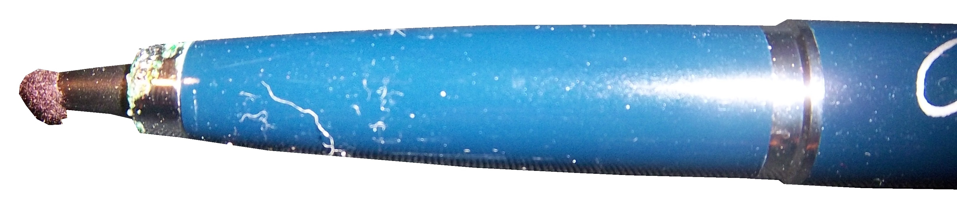
The pen still has the original pen box, customized with the Presidential Seal and Nixon’s signature emblazoned in gold on a white background. The inside has red felt, and holds the pen very snugly.

Accompanying the pen is a card the length of the pen box with a description of the signing in blue script on a tan background.  It was one of the last moments of pride for a presidency that would see its end in scandal less than two years later. It did change our society, but the man who used the pen would also change our society.
DGF2099 Productions-Introduction to Sports Memorabilia-Vintage Game Used Cubs-Style Baseball Jersey
This week, we will analyze another vintage baseball jersey, this one is a Chicago Cubs style jersey from the 1970’s.
The Driver Suit Blog-Ladies and Gentlemen: The Paint Schemie Awards!
By David G. Firestone
For the end of the 2013 Season, I will reveal the best and worst paint schemes and driver suits of 2013. This was done using a focus group of one, namely myself, and uses the following standards:
Color Scheme:How the colors look, and how they work with each other.
Overall Design:How good the design itself looks, is there too much, or not enough.
Primary Sponsor Logos: How the primary sponsor logos look on the car
Originality: How original is the scheme. Note that originality can work both for and against a scheme in award voting.
Let’s get the bad paint scheme awards out of the way.
First, the Paint Schemie Award for Worst Single Paint Scheme.
The nominees are:
Dave Blaney #7 Sany Ford Fusion
Clint Bowyer #15 Duck Dynasty Toyota Camry
Greg Biffle #16 Red Cross Give Blood Ford Fusion
Austin Dillon #33 Honey Nut Cheerios Chevy SS
Brian Keselowski #52 Star Coach Motor Tours Toyota Camry
And the Paint Schemie Award for worst single paint scheme goes to…
BRIAN KESELOWSKI #52 STAR COACH TOYOTA CAMRY
The next Paint Schemie Award is for Exhibition Race Paint Schemes. This category is a little different, as the Schemies will go to the best and worst special scheme that was run in either the Sprint Unlimited, the Sprint Showdown or the Sprint All-Star Race.
The Paint Schemie Award for Worst Exhibition Race Paint Scheme Goes To:
BRIAN KESELOWSKI’S SPRINT SHOWDOWN SCHEME
The Paint Schemie Worst Dressed Driver Award goes to
Joey Logano
Our next category is the Award For Worst Scheme Set of 2013, which is given to the team that consistently runs bad paint schemes throughout the season.
The Nominees Are:
David Stremme #30 Toyota Camry
The Winner for Worst Scheme Set of 2013 goes to:
DAVID STREMME #30 TOYOTA CAMRY
The Paint Schemie Award for Most Degraded Paint Scheme goes to Kasey Kahne, who’s scheme from 2013 is much worse than that of 2012.
Now the nominees for Best Single Paint Scheme are:
Kyle Busch #18 Doublemint Gum Toyota Camry
Trevor Bayne #21 Motorcraft/Quick Lane Ford Fusion
David Ragan #34 CSX Play it Safe Ford Fusion
Juan Pablo Montoya #42 Target Chevy SS
Jimmie Johnson #48 Lowes Chevy SS
David Reutimann #83 Burger King/Dr. Pepper Toyota Camry
The Paint Schemie Award for Best Single Paint Scheme Goes to
KYLE BUSCH #18 DOUBLEMINT GUM TOYOTA CAMRY
The next two Paint Schemie Awards are for Best Exhibition Race Paint Scheme, and Worst Exhibition . These are a little different, as they will go to the best and worst special scheme that was run in either the Sprint Unlimited, the Sprint Showdown or the Sprint All-Star Race.
And taking these schemes into consideration, the Paint Scheme Goes To:
JIMMIE JOHNSON’S SPRINT UNLIMTED SCHEME!
The Paint Schemie Award for Most Improved Paint Scheme goes to:
Kevin Harvick
who improved his schemes from 2012 to 2013
The Paint Schemie Best Dressed Award goes to:
Jimmie Johnson
Now, our final Paint Schemie Award, The Best Scheme Set of 2013:
Now for this, I will take a look at the best Chevy Schemes, followed by Ford, and then Toyota, and then finally I will reveal the winners of the Paint Schemie Awards.
And now, the 5 best Chevy teams that have consistently run great schemes:
#1 Jimmie Johnson The classic design that is paired with different color schemes every once in a while works very well. The design gives the car a very clean look, and is a very timeless look.
#2 Kurt Busch Furniture Row Racing’s “less is more” approach works very well here, with a matte black, white lettering and red letters. They always look good, thought I wish their results on the track were as good as they look.
#3 Kevin Harvick Kevin has had, for the most part, done quite well. All of the schemes have great color schemes, and most have great sponsor logos, and are decently original. Originality works well here, but some of the overall designs, namely the Bad Boy Buggies and Rheem/Budweiser combination schemes need a lot of work, but otherwise Kevin Harvick has had a great season paint scheme wise.
#4 Juan Pablo Montoya The Target scheme is very solid, with great colors, great overall design, and great sponsor logos. Not original, but solid. The most original scheme is the Axe Apollo scheme, but that was just brutal. It had a decent color scheme, and a decent sponsor logo, but the whole outer-space motif just did not work. If Axe Apollo was not on the car this year, Juan would be at the top of the standings.
#5 Phoenix Racing/Turner Scott Motorsports A team that has a very consistent track record when it comes to good color schemes, originality, as well as primary sponsor logos, the team can sometimes have serious issues with overall design. The Hendrick Cars scheme, and the Guy Roofing scheme are just brutal in that category.
Moving on to Ford.
#1 Trevor Bayne The Wood Brothers haven’t run a full schedule this year, but when they have shown up, they have always looked good. The schemes are original, since the Wood Brothers used these schemes for many years, and the colors, overall design, and sponsor schemes are always great.
#2 Aric Almirola The Transportation Impact scheme is keeping Almirola from the top spot, because it does not fit the team at all, and it just looks brutal. Other than that scheme, which while original, has awful colors, and overall design, every scheme they ran is solid, with the STP/Farmland scheme almost making up for Transportation Impact.
#3 Sam Hornish Jr. His one and only appearance in the Sprint Cup came at Kansas this year, and this one scheme, with great colors, great overall design, and great sponsor logos worked very well. I gave him 3rd, since everyone else on the list ran full schedules, and he only ran one race.
#4 Marcos Ambrose The Mac Tools scheme looks odd, with a great color scheme, but iffy overall design. The Stanley logo redesign could have worked well, but the black covering the front and headlights does not enhance the look at all. I was not a fan of this scheme at the beginning of the year, but some slight adjustments to the color scheme worked well.
#5 Ricky Stenhouse Jr. A “pinkwashing” scheme makes an appearance, which takes away from the overall grade. That said, this team has great color schemes all year, but some of the overall designs have a bit too much noise. Sponsor logos work well, and Ricky has had a great year.
Last, but certainly not least is Toyota.
#1 Michael Waltrip/Mark Martin/Brian Vickers Every scheme they have run has been a hit, with great color scheme, great overall design, great sponsor logos, and decent originality. No bad schemes here!
#2 Kyle Busch Overall great design, color schemes, and primary sponsor logos, Kyle also has the most original schemes of the top contenders for the Paint Schemie awards. That said, the Mprove America needs a different shade of blue, while the white Interstate Batteries scheme could use a different color besides white.
#3BK Racing Great color schemes, sponsor logos, and overall design. These designs work well, except for the Old Dominion scheme, which is just awful. Everything that the other schemes are, Old Dominion is not, and it is keeping BK Racing out of the top spot.
#4 Martin Truex Jr. Overall, this team works well when it comes to colors, overall design, originality, and primary sponsor logos, except for the camouflage scheme. The camouflage scheme was awful, and it knocked Martin out of the top spot.
#5 JTG Daugherty Racing Most of what they ran this year was great, but the Bushes Baked Beans car has an odd overall design, and a weird color scheme. The Clorox scheme has a bad color scheme, as does the Charter scheme. If these schemes were fixed, there is no reason why JTG Daugherty could be in the top spot.
Now I will take these top contenders, and rank them in order from worst to best. These top contenders should feel very proud that they have earned a spot on the countdown.
#13 Martin Truex Jr.
#12 Phoenix Racing/Turner Scott Motorsports
#11 Marcos Ambrose
#5 Kyle Busch
#4 Kurt Busch
#3 Michael Waltrip/Mark Martin/Brian Vickers
And Finally The Paint Scheme Award for Best Paint Scheme Set of 2013 goes to:
#1 Trevor Bayne
Congratulations to everyone who won a First award, and to everyone who won a Worst award…paint your cars better!
To conclude the Paint Schemie Awards, I will finish with a top 10 list I have been wanting to do for quite a while. These are the
TOP 10 SPONSORS I MISS IN NASCAR
10 Skoal Bandit The shade of green they used was one of the best, and the car has a classic look that always looks good.
9 Kodiak A simple look, with my all-time favorite shade of green ever used on a race car. I have a lot of Kodiak race-used items, and they all look good.
8 Miller Genuine Draft Rusty’s MGD scheme had a much simpler design than the Miller Lite scheme, and it had a much better color scheme. I really hope they throwback to this scheme at some point.
7 Tide Are there any orange schemes that could ever live up to Tide? No, this is the best orange scheme in the history of auto racing.
6 Smokin’ Joe’s It had a great color scheme, and it had a very 1990’s design, that oddly enough still looks attractive.
5 Western Auto/Parts America The chrome numbers, the layered fading, the color scheme, it just comes together very well.
4 The Family Channel The logo is awesome, the colors can’t be any better, the lettering is great, and it just comes together very well.
3 Kodak If there is or was a better shade of yellow in NASCAR, I haven’t seen it yet!
2 Texaco/Havoline Great simple design, with an amazing hood logo, and great color scheme.
1 GM Goodwrench This scheme is, in a word, perfect. It doesn’t evolve, it doesn’t have to. It is simply perfect.
There is one last piece of business that I need to address. I like to keep it light on the Driver Suit Blog, but sometimes I have to address a news story that is heavy, like this story that was released on Thursday. Dario Franchiti, who has won 3 Indy 500’s, 4 Indycar Championships, and 21 races announced on Thursday, that due to injuries sustained at the Shell and Pennzoil Grand Prix of Houston on October 6. During that race, he was involved in a scary wreck, and suffered spinal and knee injuries that doctors have told him are too serious to resume his career. 13 fans, who were in the wrong place at the wrong time were injured in the wreck as well. I’m saddened that a talented driver had his career end like that, and I really wish it didn’t have to. But what I really hope is that IndyCar learns what lessons need to be learned, and make changes to safety so that the chances of this scenario repeating are lowered. I know that there will always be the risk of injury or death in auto racing, that adds to the mystique of the race car driver, but every wreck has a story to tell. These stories should be looked over, and changes made so that another talented in the prime of his career does not have to go through what Dario had to this week. Fans should also be able to go to a race, and not have to worry about getting hurt during a wreck. If the investigation in this incident results in changes that keep fans and drivers from serious injury in the future, than the lessons have been learned. My thoughts and prayers are with Dario and his Family right now.
Vintage Item Spotlight-Lyndon Baines Johnson Bill Pen…Part 2
 By David G. Firestone
As you may remember, a few weeks ago, we discussed a Lyndon Baines Johnson Esterbrook pen, used to sign S. 510 in 1965, well we will take a look at another pen used by LBJ to sign legislation, but this pen is completely different.
On August 1, 1944, The Warsaw Uprising took place. The Polish Resistance Home Army launched Operation Tempest to combat the Nazi occupation, and to establish sovereignty before the Soviet Red Army arrived in Poland. For 63 days, the Home Army fought against the Nazis. Tragically, due to a lack of outside support, and lack of supplies, the Warsaw Uprising failed.
20 Years later, on July 31, 1964, President Lyndon Baines Johnson signed Proclamation 3603, which states:
By the President of the United States of America
A Proclamation
Whereas August 1, 1964, marks the twentieth anniversary of the historic uprising of Polish patriots to liberate their capital, the City of Warsaw from the Nazi occupation; and
Whereas the bravery of the Polish people demonstrated their determination to achieve liberty and independence; and
Whereas the American people regard the action of the Polish patriots in the Warsaw uprising as a great manifestation of bravery and devotion to home and country; and
Whereas this historic effort should serve to inspire people everywhere to rededicate themselves to the cause of freedom and justice:
Now, Therefore, I, Lyndon B. Johnson, President of the United States of America, do hereby designate August 1, 1961, as Warsaw Uprising Day.
I invite the people of the United States to observe this day with appropriate ceremonies and activities, and I urge them to mark this event as an exceptional demonstration of man’s courage and devotion in the long and continuing struggle for human freedom.
In Witness Whereof, I have hereunto set my hand and caused the Seal of the United States of America to be affixed.
DONE at the City of Washington this thirty-first day of July in the year of our Lord nineteen hundred and sixty-four, and of the Independence of the United States of America the one hundred and eighty-ninth.
LYNDON B. JOHNSON
By the President:
DEAN RUSK,
Secretary of State.
For that event, Lyndon Johnson used this pen to sign the proclamation. It is an Eversharp 45, which was the predecease to the Parker 45, which became a staple for most political bill signer pens, presidential and governor alike. It has been mounted in a shadowbox with the pen box, a picture of Johnson signing the proclamation, a portrait of Johnson,
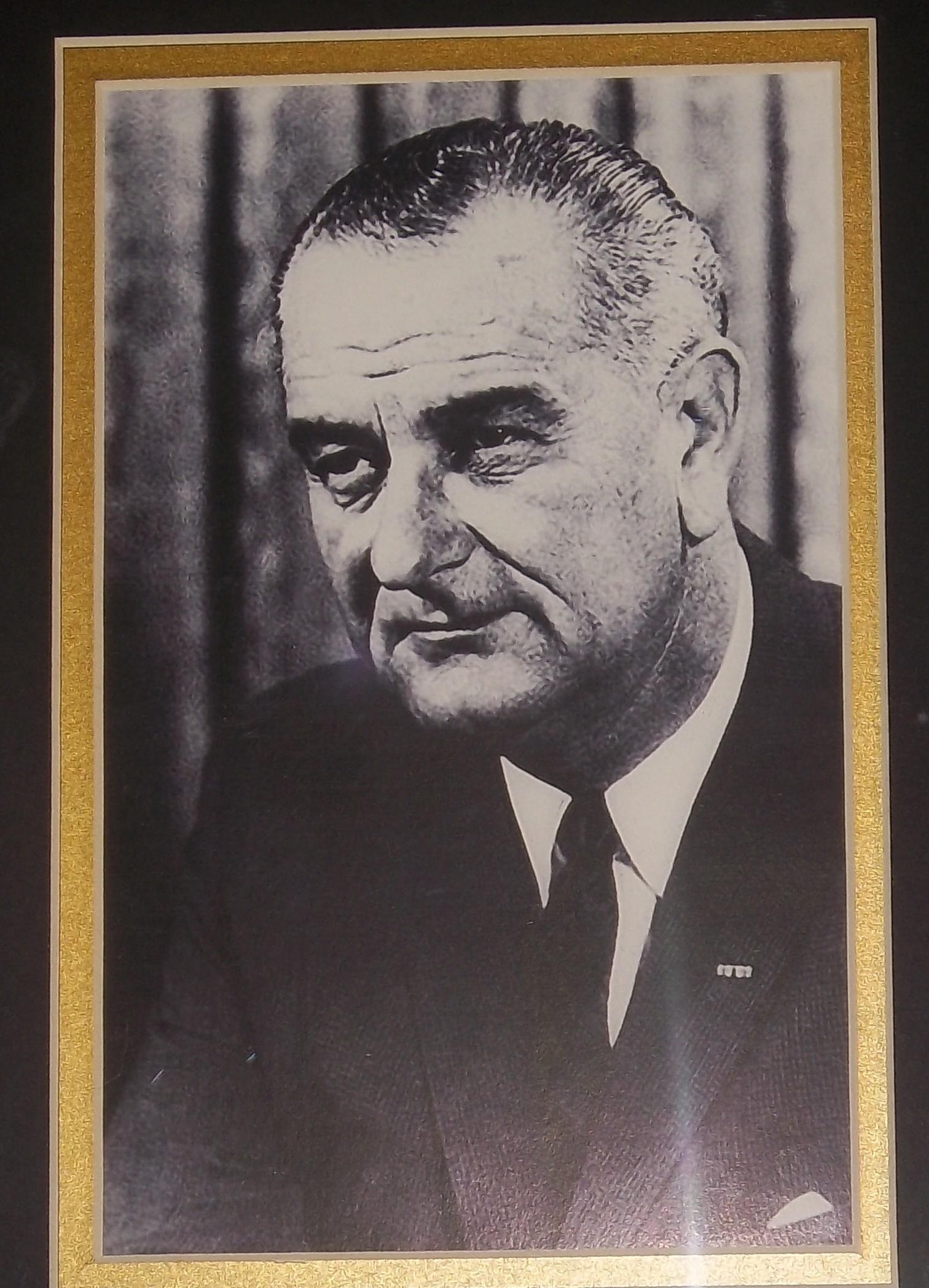 and a plaque stating when the pen was used.
 This is an example of an item that has changed the United States. This pen, which is made of plastic, metal, and felt was used by a President to sign a proclamation that did in fact change our world forever. While the Warsaw Uprising was in the end, a failure, it has a legacy left that tells the story of those who stood and fought for what they believed in.
DGF2099 Productions-Introduction to Sports Memorabilia-Vintage Game Used Baseball Jersey #14
This week, we will analyze another vintage baseball jersey, this one from the 1950’s-60’s.
The Driver Suit Blog-The First Question…Where Do You Buy This Stuff?
By David G. Firestone
I discuss the various aspects of race-worn and race used collectibles on this blog, and in researching something, I had received a suggestion that sounded like a great idea. The idea that was posed was “You may want to mention where people can actually buy these suits as well.” So I think I will.
The most obvious place to purchase race-worn and race-used items is eBay. Now this is not as simple as it might sound. In the Sports Memorabilia, Cards and Fan Shop section, entering the term “Suit”is a good place to start. Entering the term “driver” can be a mixed bag, and the term “firesuit” as well as “driver suit” work well. If that is not to your liking, search “driver suit” firesuit” “driver firesuit” “NASCAR uniform” “racing uniform” or “driver uniform” in the Any Categories setting.
Another, less likely place on eBay is the Safety Equipment section on eBay motors. Reason being that not all race-worn driver suits end up in collections, many of them are recycled and sold to racers who need a quality firesuit but do not have the resources to spend the thousands needed for a customized one. In fact, many auctions that are geared towards collectors also mention the size in case the suit is bought by a racer.
I have a couple of sellers that I buy from on a regular basis. One of my favorites is Just For Fun Collectibles. They have an amazing selection, and some of the best prices for stuff I have ever seen. I have bought a lot from them, and I always enjoy buying from them. The other seller I buy from regularly is Race Image. Both are based in North Carolina, and Race Image buys regularly from race teams, and resells the items both on their site and on eBay. Like Just For Fun, I have bought a lot from them, and I always enjoy buying from them. Raceusedrescued is another great seller, who has a whole lot of NASCAR stuff.
Using legitimate auction sites can be iffy, not as many people are into race-worn and race-used memorabilia, as are into baseball, or football. But one place that regularly sells race-worn material is Paragon Auctions. They have had a lot of race-worn driver suits for sale in their auctions. Other groups, such as Heritage Auctions and American Memorabilia both have had a lot of suits sell through their auctions.
But with all the places to buy items, doing the research before you buy is critical. That is why I started The Driver Suit Blog, to give collectors the resources and information that they need to do the hobby, and do it right. I’m not someone who just buys these because they look nice, throw them in a closet, and never think about them. I look at them, admire them, and I understand how much work went into designing them. I love this hobby, and I fully support it, and I want to help collectors advance in this hobby in any way I can. That is why I put the time and effort I do into this blog.
Next week, I will announce the 2013 Driver Suit Blog Paint Schemie Awards. The Schemies are a series of awards given out for paint schemes in the Sprint Cup series. For every category, there are two awards given, First and Worst. First awards are given to the best schemes of the year, and worst…well that is pretty self-explanatory, isn’t it?
Tailgating Time!
I took my chili recipe I previously mentioned, and changed the recipe slightly.
You will need:
2 pounds beef chorizo sausage
1 onions, chopped
1 (7 ounce) can diced tomatoes-drained
1 (7 ounce) cans smoked chipotle salsa
1 (12 ounce) can kidney beans-drained
1 cup water
Chili powder and garlic powder to taste
In a large saucepan over medium heat, combine the chorizo and onion and saute until meat is browned and onion is tender. Add the diced tomatoes, smoked chipotle salsa,beans and water.
Season with the chili powder, and garlic powder to taste. Bring to a boil, reduce heat to low, cover and let simmer for 15 minutes.
Paint Scheme Reviews
First we start with 2014 schemes…
Brad Keselowski #2 Miller Lite Retro Ford Fusion This scheme is perfect. There is nothing that can be done to improve it. A+
Marcos Ambrose #9 Twisted Tea Ford Fusion A good color scheme is in play here. I like the shades of yellow, green and blue used here. The overall design works well with the color scheme, and I will give it an A.
Now on to 2013 schemes…
Jamie McMurray #1 Lexar Chevy SS Decent color scheme, and if you get rid of the flash drives at the bottom, it would be an A scheme. This scheme is good, and earns a B+
Dave Blaney #7 Ultra Wheels Chevy SS This is the first time that this car actually looks good…provided you get rid of that door number. B+
Clint Bowyer #15 5-Hour Energy Sour Apple Toyota Camry Another example of why camouflage does NOT work on race cars. What does camouflage have to do with sour apples? This scheme does not work, and it gets an F
Greg Biffle #16 Scotch Ford Fusion Eww…the green design clashes with the red, and the plaid design is atrocious. F
Ricky Stenhouse Jr. #17 RFR Driven Chevy SS Ricky has run a lot of great schemes this year, and this scheme is not an exception. Great color and simple design earns this scheme an A.
Ryan Newman #39 Quicken Loans-Salute to Veterans Day Chevy SS This scheme is a bit more complex in the grade that I gave it, and requires some explanation. This scheme features pictures of United States Military Veterans on the side as a tribute to them. They have earned a place on the car, and have earned the respect as a nation, and an A+++ grade.
Landon Cassill #40 Pirate Oilfield Chevy SS Looks good, great color scheme, simple design, A+
Juan Pablo Montoya #42 Target Camouflage Chevy SS Camo just doesn’t work for race cars, an this is no exception. While they did try to keep the red, it just looks awful, and I’ll give it an F
Bobby Labonte #47 Wounded Warrior Project Toyota Camry Camo doesn’t ever look good on a race car, and this is another example. It looks better than this though…
Kyle Larson #51 Visit Dallas Chevy SS I love color scheme, and I love the skyline on the hood. I’m disappointed that the skyline isn’t on the side of the car, it would look good on the door, but it is still a solid A scheme.
Dale Earnhardt Jr. National Guard Breast Cancer Awareness Chevy SS Pinkwashing is an automatic F grade.
Dale Earnhardt Jr. Amp Gold Chevy SS Not a bad color scheme, though the dot design does not look good at all. I’ll be generous and give it a B-
