
Brad Noffsinger wore this classic helmet during the 1988 NASCAR Winston Cup Series, and today we will analyze it.
Category: auto racing
The Driver Suit Blog-Richard Lasater and His Helmet
By David G. Firestone
Spent the last week just being insanely busy, with Passover and the Chicago Sun Times Collectables Convention, but now back to work. I’ve discussed the safety aspects of race gear, but today, I’m going in a bit of a different direction. Even in today’s safety-conscious racing environment, injuries are always a possibility. Denny Hamlin suffered a fractured vertebrae, and Dale Earnhardt Jr. has suffered a concussion in the last few years. Wrecks can be hell on drivers, but what about the uniform protecting them? What would a helmet from a wreck like this look like?
Well the helmet looks like this:


For a helmet that went through a scary-looking wreck, it is in good shape…and that is not by accident. It was worn by Richard Lasater throughout the 1993 season. At the 1993 Fram Filter 500K, Lasater was involved in that scary wreck, and wasn’t seriously hurt. As for overall damage, it is mainly scratches, scrapes and dings, no cracks or serious damage.
The helmet kept Lasater safe and suffered minor damage because that is what it was designed to do. After the race, he autographed the helmet and it wound up in my collection. This helmet shows better than any other helmet I have the reasons why proper equipment is needed in racing.
On to Paint Schemes…
Jamie McMurray #1 Bass Pro Shops Chevy SS White? Seriously? Did the designers not realize that the white looks awful? The black and orange color scheme works, but white? I don’t get this scheme at all, and it gets an F grade
Marcos Ambrose #9 MAC Tools Ford Fusion Good color choices here. The basic design is solid. I can do without the quarter panel design, but it is still a good scheme with a B grade-
Danica Patrick #10 Go Daddy St. Patrick’s Day Chevy SS I would like to thank the 1978 Cincinnati Reds for being one of the first teams to wear green on St. Patrick’s Day for encouraging this awful F grade scheme.-
Denny Hamlin #11 Fedex March of Dimes Toyota Camry There are two schemes that fans voted for. With Hamlin on the shelf for a while, Mark Martin and Brian Vickers will share the 11 ride. That said, scheme #1 I don’t hate, but it has something odd going on with the hood and nose design…I swear it looks like the two parts were designed by different people who never interacted with each other, and that earns it a C grade Scheme #2, the better of the two schemes, not only looks more like a FedEx scheme, it is simpler and much cleaner as well, and earns an A grade.
Tony Stewart #14 Rush Truck Centers Chevy SS Good color and design schemes here. A Grade
Kyle Bush #18 Snickers Bites Toyota Camry A paint scheme that has a great color scheme, and illustrates the theory that less is more. Nothing bad about this Scheme-A+
Jeff Gordon #24 Imron Elite Real Truck Paint Chevy SS Based off the classic Jeff Gordon Scheme, it looks really good, and it works as a paint scheme. Great color scheme used here…A+
Jeff Gordon Cromax Pro Chevy SS Another good DuPont inspired scheme with a great color scheme and great design-A+
Ken Schrader #32 Federated Auto Parts Ford Fusion Federated Auto Parts always has great looking cars, and they do not disappoint here. Great color scheme and great design earn a great grade of A+
Timmy Hill #32 U.S. Chrome Ford Fusion NASCAR rules prevent using chrome in most NASCAR paint scheme aspects, which is kind of disappointing since this scheme should have a bit of chrome in it. Even so, it is still a solid A scheme, with great colors and simple, yet elegant design
Josh Wise #35 MDS Ford Fusion The color scheme of the car, and the color scheme of the logos match! As a direct result, the car looks so much better! This scheme earns a B grade because the deisgn on the quarter panel needs some work.
Ryan Newman #39 HAAS Automation Chevy SS Great color scheme, good basic design, I love the diagonal hood logo, A+ Scheme
Brian Vickers #55 RK Motors Toyota Camry Basic design with an uninspired color scheme. The car is just blah. I can’t give this scheme anything except a C-
Brian Vickers #55 Jet Edge Toyota Camry A better color scheme takes the grade from C to B
Joe Nemecheck #87 Maddies Place Rocks Toyota Camry Simple design, decent color scheme, good hood logo, Final grade B
Dale Earnhardt Jr. #88 Amp Energy Chevy SS Orange? Amp’s main can color is green. It’s not a bad design, but using a color that isn’t really used on the packaging earns this scheme a C-
The Driver Suit Blog-To Boot or Not to Boot…That is the Question
By David G. Firestone I love exploring and discussing the lesser-known aspects of driver suits, and one thing that most fans don’t get to see are the cuffs are the end of the legs. In NASCAR, that is because there is a design feature in suits called the “boot cut.”
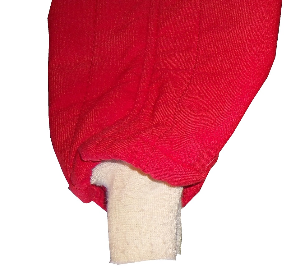
 As seen above, the boot cut features a cuff within a cuff. In NASCAR this is not just for aesthetic reasons. NASCAR, and other stock car classes feature the engine in front of the driver. In the very likely event of an engine catching fire the cuff helps keep the driver’s legs protected, as demonstrated below…
The other style of cuff is just called “cuff.” It is a predominant feature seen in F1 and IndyCar suits. Since the engine and fuel tanks are located behind the driver, and because of the restricted space within the driver compartment, the cuff style is a popular choice. On occasion, cuff cuts can be seen on NASCAR suits as well. Early NASCAR suits feature cuff cuts, but in the 1980’s, the boot cut became the standard choice. On to the paint scheme reviews…
Clint Bowyer #15 Napa Filers Toyota Camry It looks to me like this scheme was created by taking 2 previous schemes and combining them into one horrific scheme. The color is good, but the design is so awful it earns an F- and I’m being very generous with my grade here.
Terry Labonte #32 Oxy Water Ford Fusion I don’t know why, but I like this scheme. Normally I wouldn’t like the color scheme and basic design but for whatever reason, I like this. A-
David Ragan #34 Dockside Logistics Ford Fusion I can’t be the only one who thinks that Dockside Logistics is ripping off the basic logo design and color scheme from Game Stop…right? That aside, this is a really good scheme, good color scheme, and a great design. A+
David Gilliland #38 Long John Silvers Ford Fusion I’m really reviewing a lot of Fords today, and many of them, including this one are good. Long John Silvers has a good color scheme, and the basic design used with that scheme on this car just makes it stand out. I’m not a fan of yellow on race cars in most cases, but I’ll overlook it this time because it is just so good. A+
David Ragan #38 A&W Ford Fusion The same design as the Long John Silvers car, but with a somewhat more difficult color scheme. But they pulled it off. It looks really good. A+
Austin Dillon #51 Tag Heuer Eye-wear Chevy SS Finally a Chevy to review, and it is a good one! Black, red and white is almost always a good bet for a race car, and the classic racing stripe design really works with this car. A+
Kurt Busch #78 Denver Mattress/Serta Chevy SS The simplest design in NASCAR but with a Serta logo on the side, instead of a Denver Mattress logo. It works and works well enough to earn a solid A grade.
Malcom McDowell #98 Ambient Edge Air Conditioning Ford Fusion It has a classic look to it, with a good color scheme. Gets a Solid A
That’s it for this week. Next week, I will be working on another project, so I won’t be adding another article for two weeks.
DGF2099 Productions-Introduction to Sports Memorabilia-Boris Said 2005 Race-Worn and Signed Driver Suit
Paste a Video URL
A very large Boris Said driver suit from 2005, which Boris has signed on the front will be examined here.
DGF2099 Productions-Introduction to Sports Memorabilia-Alex Barron 1998 Race-Worn Driver Suit
Another of my favorite items, this Alex Barron 1998 Champ Car suit. This suit was worn in his famous wreck with Bryan Herta
The Driver Suit Blog-Warranty Labels…Unseen by Many
 By David G. Firestone
This week, we take a look at a suit feature that is unseen by most race fans. Every suit has one, the so called “Liability Tag. ”-Every piece of racing equipment has some form of “liability tag” which basically states that anything that happens to the wearer of the item is the wearer’s fault and not the company’s fault. The Simpson tag, which has remained virtually unchanged since the 1980’s reads as follows:
“Warning-Auto Racing is Hazardous-this Article is sold without warranty expressed or implied. No warranty or representation is made as to this product’s ability to protect the user from any injury or death. This garment is made of Nomex and other flame retardant materials. Even with the high quality of this garment there could be fires or circumstances where this garment will give only minimal protection. Nomex underwear should be worn under this garment. This garment is manufactured to comply with the rules as set forth by S.C.C.A., N.A.S.C.A.R. , S.F.I., F.I.A., and other regulatory bodies.”Cleaning Instructions” Dry clean only. Dry clean alone. Specify using perchloroethylene only.” Sparco’s tags are located behind the zipper andhave two different statements. Older suits have this tag:
“Although this product is manufactured from special materials that satisfy certain safety standards and may carry the approval of various authorities for its use in specific circumstances the manufacturer or supplier can not be held liable for its protective qualities under all activities, circumstances, and conditions.” Newer Sparco tags have this warning in both English and Italian:
“It is important to carefully read the user’s handbook concerning the care of the garment. This suit will offer protection from fire and the transmission of heat for a limited time, but it does not offer total protection against any kind of hear or fire. The fabric used to make this suit is subject to aging. It is recommended that the suit is inspected frequently for any signs of wear or damage that may result in a loss of protection to the wearer. If the suit has been worn extensively and shows signs of war or damage it is recommended to wear another suit. Sparco is not responsible for any damages the suit incurs from improper use of the suit bu the user, or any third party. Through improper care of the suit, misuse of the suit, or discoloration of the suit from perspiration, or any use of the product after the expiration date, as described in the instruction manual. Do not leave this garment under sunlight, or any artificial light. This suit is not intended for use in go-karts.” Impact! Suits use this simple warning:
“Motorsports are dangerous. the user of this product assumes the risk of injury or death. No warranty or representation is made that this product will protect the user from injury or death”
This is by no means unique. Almost all sports equipment to a certain extent has this type of warning. This example is from an XFL helmet. 

 On to Paint Schemes…from here on out, I will only review Sprint Cup paint schemes.
Paul Menard #27 Rheem Chevy SS/Serta Chevy SS Basically the same scheme as his regular scheme, but with two different hood logos…nothing really to say here…C-
Kevin Harvick #29 Jimmy Johns Chevy SS Great color and design, but I still don’t understand why Jimmy Johns sponsors Harvick instead of Jimmie Johnson…still a solid A scheme
Jeff Burton #31 Qwik-Set Chevy SS Grey…so much grey…so bland…so boring…C-
Josh Wise #35 Blockbuster Ford Fusion Didn’t Blockbuster go bankrupt? Apparently they have enough money for a one race deal…though the color scheme of the logos, and the car are different…C-
Scott Riggs No Label Watches Ford Fusion A great color scheme ruined by awful number design and medicore car design. C-
Michael Waltrip Aarons/Alabama Crimsion Tide Toyota Camry Decent color scheme and a simple, yet elegant design that works for both the car, and Alabama. It earns a solid B+
DGF2099 Productions-Introduction to Sports Memorabilia-Hut Stricklin 2000 Race-Worn Driver Suit
One of my favorite suits, a Hut Stricklin suit from 2000 is examined in this episode
DGF2099 Productions-Introduction to Sports Memorabilia-Lake Speed 1997 Race-Worn Driver Suit
Now, we will take a look at a driver suit worn by Lake Speed in 1997 during the NASCAR Winston Cup season
DGF2099 Productions-Introduction to Sports Memorabilia-Bill Sedgwick 1996 Race-Worn Driver Suit
This week, we look at a Bill Sedgwick Die Hard race-worn driver suit from the 1996 Craftsman Truck Series season. This is the first driver suit I ever purchased.
DGF2099 Productions-Introduction to Sports Memorabilia-Ted Musgrave 1998 Race-Worn Driver Suit
For part 2 of our Ted Musgrave double feature, we look at a race suit from 1998
