The Driver Suit Blog-The Two Most Iconic Logos in Auto Racing Part 2

stpBy David G. Firestone

If you were into grunge in the 1990’s, the name Stone Temple Pilots is very familiar to you. Dean DeLeo, Robert DeLeo, Eric Kretz, Scott Weiland met in San Diego and in 1986, began using the name Mighty Joe Young, after a 1949 movie. When informed that Mighty Joe Young had been claimed by Chicago Blues singer Joseph Young, the band needed a new name. As children of the 1970’s, they had seen STP stickers on motorcycles, and other various places, so they took that abbreviation and started calling themselves the Stone Temple Pilots.

Indeed those stickers were iconic, but I doubt if The DeLeos, Kretz and Weiland understood the meaning behind that STP logo they liked so much. Indeed, many people know the logo, but many don’t know the meaning behind it. STP stands for Scientifically Treated Petroleum. It was invented in 1953 by three businessmen, who started selling it out of the trunk of their car. It was so effective, that auto racing teams came calling for it. STP grew from there, not only designing products to help drivers, both in racing and on the road, but sponsoring teams in racing.

The STP logo was part of the first can design, and has remained unchanged. That logo, which was seen on the sides of race cars, was turned into decals. Those decals sold in droves. The red oval with blue and white STP on it, with THE RACER’S EDGE simply looked cool, and the decals turned up on cars, motorcycles, locker doors, and dozens of other places. Many people bought the decal, some, I’m convinced, didn’t know anything about the product.

While many drivers ran the STP red oval, it’s become attached to one particular car. It was a partnership that transcended the barriers of time, and is just as iconic as the logo. It began at rhe 1971 Winston Golden State 400 at Riverside, on June 20, 1971, when STP started sponsoring the #43 car of Richard Petty. Driving a blue 1971 Plymouth Road Runner, Petty started second, but due to engine issues only ran 110 of the 153 laps, finishing 13th. Though it seemed insignificant at the time, this would be the beginning of a long partnership between Petty and STP, which would result in 4 Sprint Cup Championships and 60 of Petty’s 200 victories.

With STP, the brand identity is more important than the brand itself, it seems. Many different racing equipment and additive companies are in business today, some longer than STP, but very few still use their original logo, and fewer still have had that logo prove so, not only iconic, but influential as well. The STP logo will NEVER change, and it shouldn’t change.
The Driver Suit Blog-The Two Most Iconic Logos in Auto Racing Part 1

Mopar_logo.svgBy David G. Firestone

Anyone who says that auto racing “doesn’t really matter” has obviously never driven a car, or ridden in one. Technology developed for auto racing is so ingrained in car design in this day in age, that it is impossible to find a car company that doesn’t have a motorsports program. Companies will use racing as an extended R&D, testing part designs that will be implemented in real cars, albeit under much more strenuous conditions. Each car company will make parts in house, trying to keep prying eyes away from their designs, trying to get an edge on the competition.

Chrysler started their in-house brand in 1933. Their logo was D, C, P and D, for Dodge Chrysler, Plymouth, and Desoto. That didn’t exactly look and sound too good, didn’t really roll off the tongue, so in 1937, Nelson L Farley was in charge of a marketing group, trying to come up with a better name. They were working on motor parts, so they took MO from motor, and PAR from parts, and combined them into MOPAR. This would begin not only the name for Chrysler’s in-house program, but the beginning of an auto racing identity.

Between 1937, and 1963, the MOPAR logos varried, changing with the times, as many logos tend to do. In 1964, MOPAR started using the Omega M logo. It seemed like just another logo change, trying to keep up with the time. Little did anyone know that the Omega M would become not only iconic, but a part of Chrysler’s racing identity for 51 years. That same year, another Chrysler icon was released, the 426 Elephant Hemispherical engine, which would come to be known as the Hemi.

Suddenly and seemingly inexplicably, the Omega M became MOPAR’s identity. The logo was simple, distinctive, and worked. As Chrysler, Plymouth, and Dodge became more heavily involved with motorsports, the MOPAR logo became their banner. It became cool. Many car logos became cool, but the MOPAR logo was in a class by itself. Very few logos have remained unchanged for 51 years. But MOPAR has stood the test of time.

One of the other iconic logos inspired one of the most well-known bands of the 1990’s, and I will discuss that next time..

In Defense of Vintage Chicago Traffic Signs

princeton-1By David G. Firestone

I’ve lived in Chicago my whole life, and all my life, I have been fascinated with signs of all kinds. It doesn’t matter if we are talking advertising, store, or street signs, they have always fascinated me. Living in Chicago for as long as I have, and traveling with my family around the city, I have occasionally seen street signs like this one.princeton-1 princeton-2

This is a vintage street sign for Princeton Avenue. These yellow and black signs were used in Chicago until the 1970’s. Not all of the yellow signs went away, some were missed, albeit unintentionally. Many of them wound up in the hands of collectors. As they were being discarded anyway, it is perfectly legal to own then. The font is slightly reflective, whereas the background isn’t.

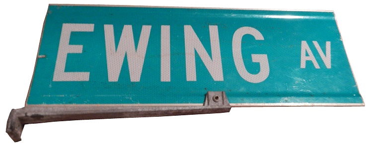
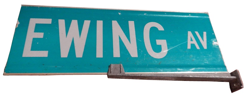
This Ewing Avenue sign follows the rules set by the 1971 version of the The Manual on Uniform Traffic Control Devices (MUTCD). ewing-1 ewing-2That particular version stated several significant standards; it required all center lines on two-way roads to be painted in yellow (instead of white, which was to indicate traffic moving in the same direction), and required that all highway guide signs (not just those on Interstate Highways) contain white text on a green background. Most of the repainting to the 1971 standard was done between 1971 and 1974, with a deadline of 1978 for the changeover of both the markings and signage. It should also be noted that the Ewing sign uses the standard font for street signs, commonly known as “Highway Gothic.

Interestingly, while the MUTCD is the standard for the United States, other countries, namely Canada, New Zealand, Australia, and Ireland use MUTCD. The other standard for road signs is The Vienna Convention on Road Signs and Signals, which was signed in 1968, and came into force in 1978. 63 countries uses the VCRS.

Anyway, taking these two designs into question, if given the choice, I would take the yellow/black over green/white. I would do this because the reflective nature of the green sign can make if difficult to read in dark conditions. The yellow sign isn’t as reflective, and the dark on light setup works much better than light on kinda dark. I’m not alone on this, I’ve talked to several antique dealers, some old, some young, and many of them agree with me.ewing-1 princeton-1The color scheme resembles that of school buses, and that is not by accident. The reason school buses are yellow is because Dr. Frank W. Cyr realized that the color scheme would be easily seen by children in the semi-darkness of the early morning. I’ve seen yellow fire trucks, and ambulances, designed for the same reason. Using that setup makes the signs much more visible in dark conditions. The green and white scheme came into use because of highway signs. Originally, the highway signs were supposed to be blue with white lettering, but they were much more difficult to see.

While I disagree with the standards, they are the standards, and I have to accept it. I think the color scheme and over-reflectivity is an issue, but there isn’t anything I can do about it.

The Driver Suit Blog-Lottery Ticket Design Was Awesome Back In The Day!

1858-full-1 1858-half-1 1858-quarter-1By David G. Firestone

I’m gonna go off topic today. When I wrote about the Lottery Ball back in July, I mentioned that “The history of the lottery in the United States dates back to the 1600’s, while Europe was colonizing North America. Many colonies saw gambling as harmless fun, but as English investors waned to profit from the New World, this changed quickly. As time went on, each of the 13 original colonies had a lottery system in place to help fund the colonies. It became a civic duty to play the lottery. Recessions, scandals, and corruption had almost eliminated the lottery in the United States by 1868.”

How these lotteries worked was much the same way as today. Tickets were sold with official stamps and endorsements and the proceeds would go to a certain charity, or group that needed funding. These tickets could be very lucrative, as the prizes, when adjusted for inflation, were quite good. A perfect example are these three lottery tickets from the Maryland Consolidated Lotteries for the benefit of the Patapsco Female Institute which was in Ellicott City, Howard County, Maryland. All three tickets are from December 6, 1858.

One ticket is for one quarter, another for one half and the third for a full ticket. If one of these tickets was a winner and the winning amount was $10,000($269,586.38), the full ticket would bring the whole amount. For the half ticket, the winner would get $5,000($134,793.19). The quarter ticket would bring $2,500($67396.60). Each ticket has a Maryland State revenue stamp on it (not an actual paper stamp, but ink stamped). The half ticket has a little dent on the right. All three are in excellent condition. Real treasures of Maryland history. Like most of the early lottery tickets from Maryland, they shows Baltimore on them.

Looking at the designs, you can’t help but be impressed with the design. These are from 1858, the designs look impressive, and are even more impressive considering how much work had to go into something that seems so mundane. Even the rubber stamp designs look good, considering the era. I can’t help but be awed by the amount of work that went into them.

This is the full ticket:1858-full-1 1858-full-1 - Copy (1) 1858-full-1 - Copy (2) 1858-full-1 - Copy (3) 1858-full-2This is the half ticket:1858-half-1 1858-half-1 - Copy (2) 1858-half-1 - Copy (3) 1858-half-1 - Copy 1858-half-2This is the quarter ticket:1858-quarter-1 1858-quarter-1 - Copy (2) 1858-quarter-1 - Copy (3) 1858-quarter-1 - Copy 1858-quarter-2

I love vintage design, not just in race cars, but in a lot of things. Money, baseball cards, sports tickets, book and magazine covers, and sports programs just don’t look as good as they did back in the day. That’s why I love good throwback scheme.