
A collection of NASCAR, and NHRA Starting Lineup figures from the late 1990’s.
The Driver Suit Blog-Die Casts Examined

 By David G. Firestone
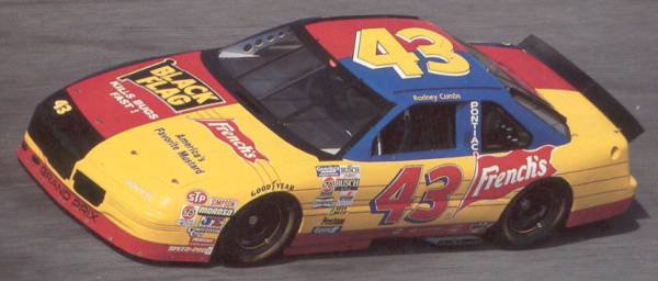
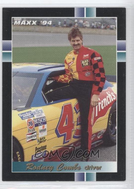
Recently, I came across a design quirk I had never seen on a car before. Take a look at these two cars above. These two design schemes were used by Rodney Combs in 1994. He raced in the Busch Grand National Series. He had 3 top 10’s, and led 11 laps. Now while these two paint schemes look completely different, they are a lot more connected than you might think…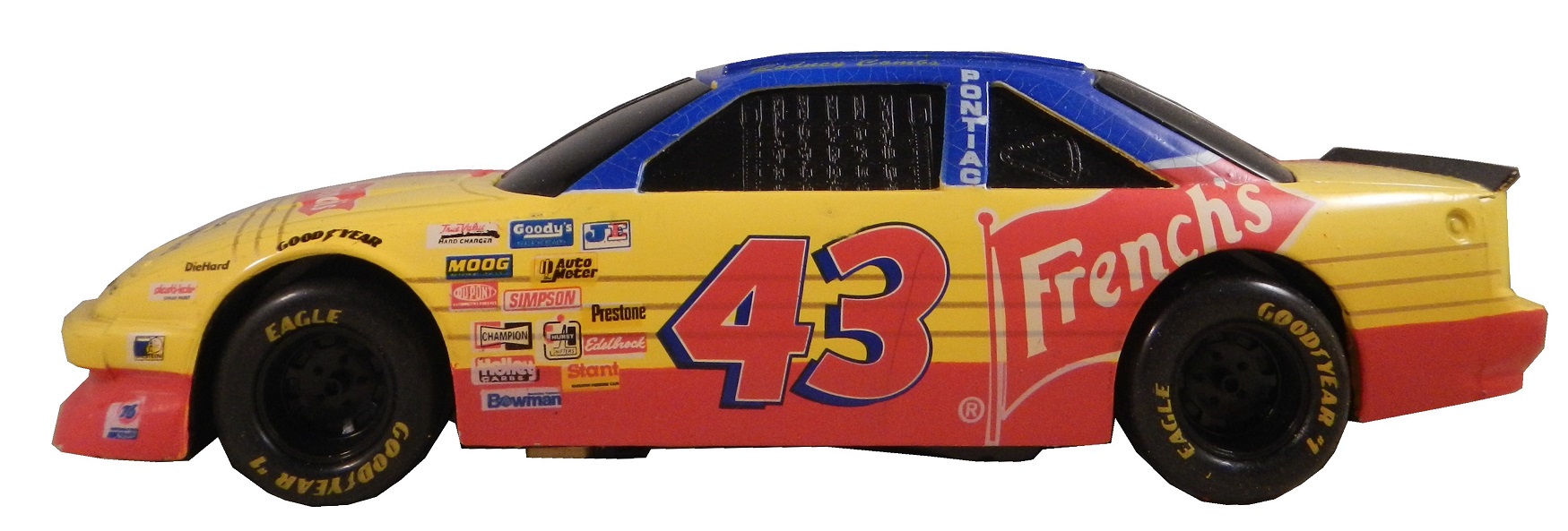
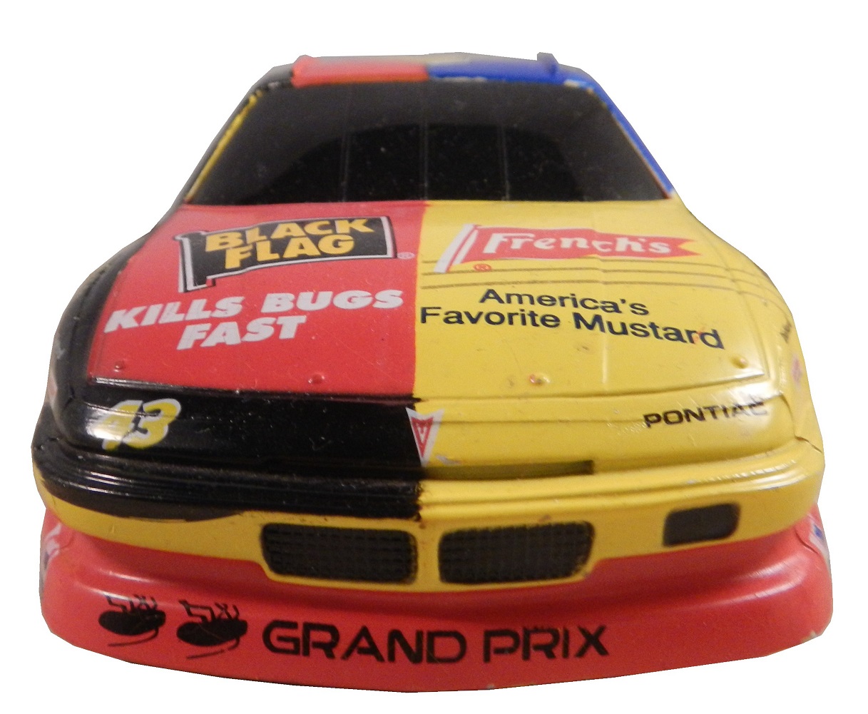


 Yes this was an actual paint scheme used on a real race car. I had never seen a design scheme like this before or since. It is one of the oddest paint schemes I have ever seen. Normally if two different companies sponsor a car, one runs their scheme for a number of races, and the other runs their scheme for a number of races. The driver suit is no less unusual. But I bought this for another reason besides just the paint scheme. This is an example of a NASCAR bank. These were marketed for a number of years to kids as collectibles. They were marketed to kids in the late 1980’s through the mid 1990’s. They are 1:24 scale, and are the same design as their die-cast toy counterparts. They faded out after a while. After trying to use one, I now understand why they faded from use. Let’s look at the bottom.
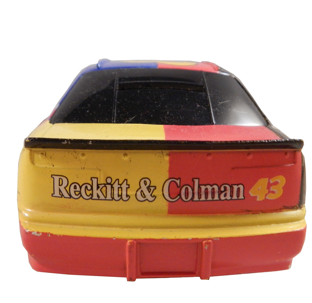
The bank opens with a key and the door that the coins are supposed to come out of is much too small for a standard American coin to fall out of. I tried to remove some coins and it took me 45 minutes to remove all of them. While they were a good idea on paper, their practicalities made them next to useless and needlessly annoying.
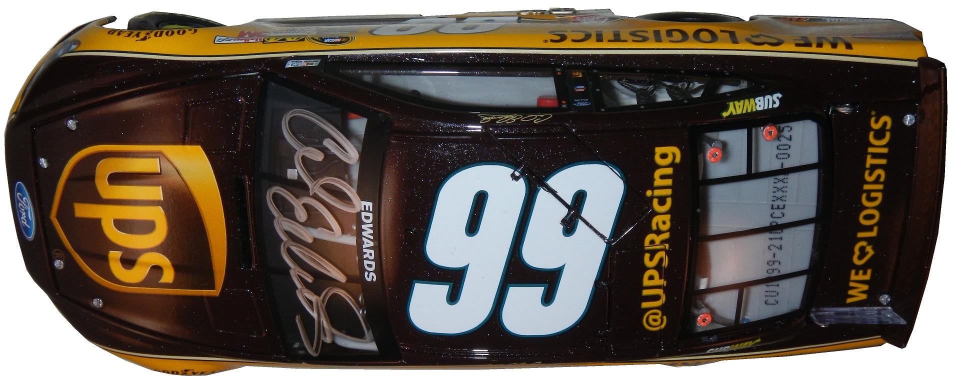
We move from the old to the new, with this Carl Edwards design from 2013. This is my first die-cast scheme of the Gen 6 car, and I have to say, I’m amazed at the detail. Check it out.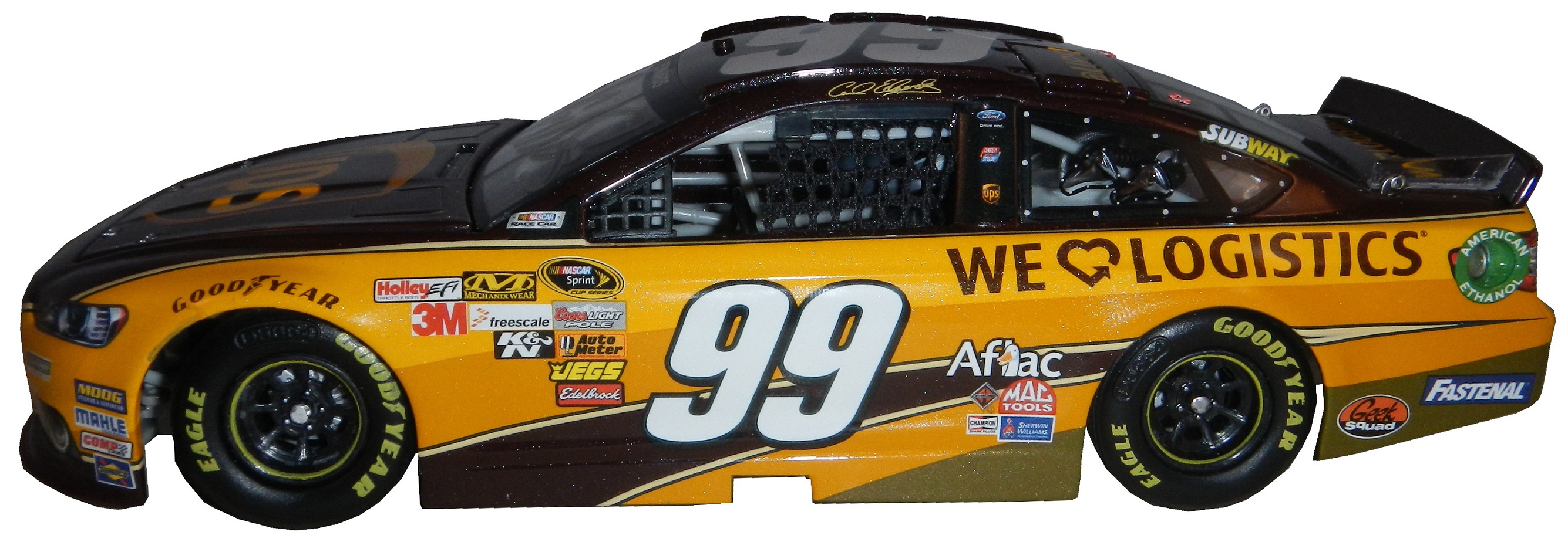 Carl ran the UPS scheme for one race in 2013, at the Quaker State 400, where he started 2nd, led 35 laps, but finished 21st. This is an autographed version, of which only 900 were sold by Lionel. Unlike the bank, this is a very accurate design. It’s made of a more lightweight metal, the window net is cloth,
 the grill is accurate,
 so are the door decals.
 The hood opens,
the deck lid opens,
the roof flaps work,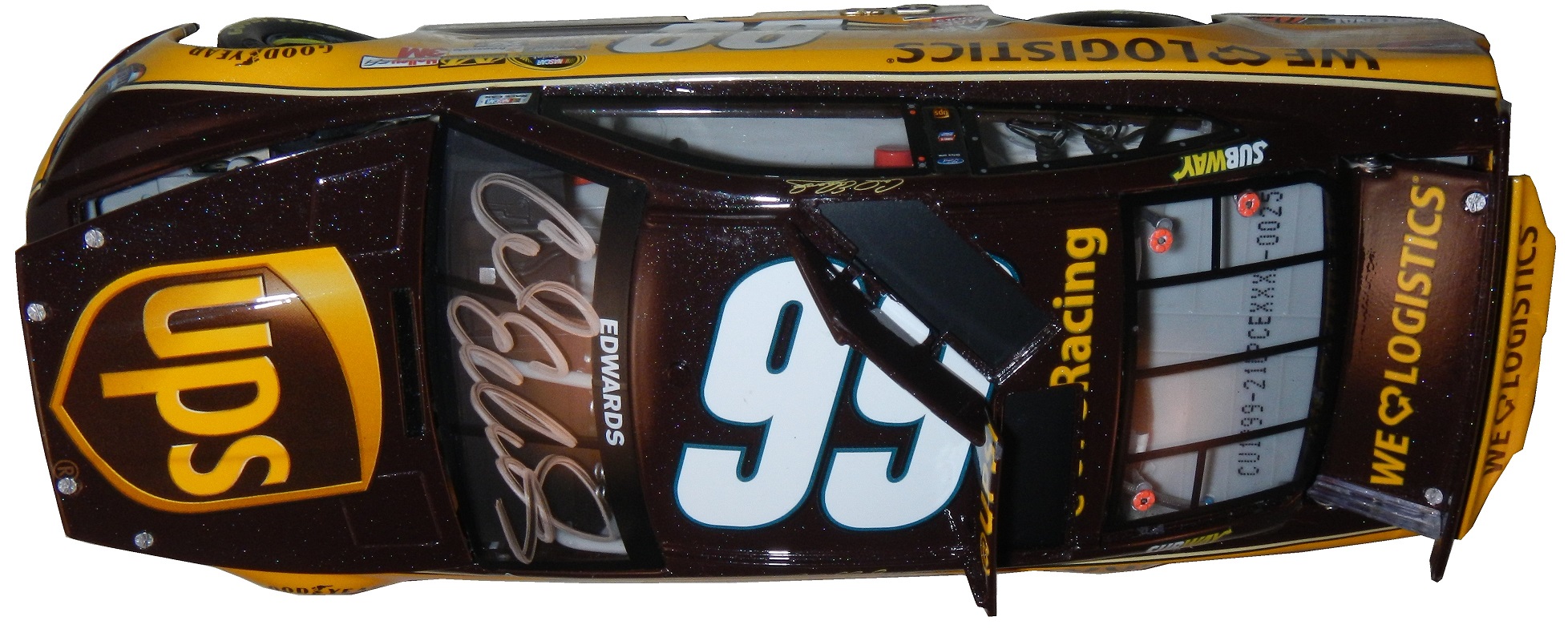
the details are really accurate, and the paint scheme is amazingly accurate. It has all the details of it’s on track counterparts at a 1:24 scale, with a nice Carl Edwards signature on the windshield. My biggest complaint is that the hood is difficult to open, and does not open very far. It takes away from the appearance.


 Now we move on to the real thing with…
PAINT SCHEME REVIEWS!
Michael Annett #7 Pilot /Allstate Peterbuilt/St Jude’s Chevy SS Great color scheme, great simple design, A+
Clint Bowyer #15 Speed Digital Toyota Camry Clint keeps up a streak of bad schemes with his RK Motors scheme but with a different logo. D-
Greg Biffle #16 Ortho Fire Ant Killer Ford Fusion Great color scheme, good design, I give it an A-, the number still looks horrible.
Ty Dillion #33 Rheem Comfort Products Chevy SS From this moment onward, anytime I see camo on the side of a race car it will be an automatic 1 letter grade deduction. In this case it takes a great scheme, and ruins it. It would have been an A scheme, but with the contrasting designs, it earns a C-
Landon Cassill #40 CRC 1 Tank Renew Chevy SS Decent color scheme, but the design is a bit overdone. If it didn’t have the yellow stripes on the back I would like it more, but this is a decent scheme, worth a B-
Justin Allgaier #51 Auto Owners Insurance Chevy SS Can’t say anything bad about this scheme, A+
Michael McDowell #95 Teenage Mutant Ninja Turtles Ford Fusion Let me get this straight, The Turtles are in a Michael Bay directed movie that to date has made over $242 million and this scheme seems to go out of its way not to use the movie? I’m trying to make sense of that…OK, now the color scheme is good, but the back of the car is very cluttered. Even still it’s a B+ scheme.
DGF2099 Productions-Introduction to Sports Memorabilia-Racing Mini Helmets
A collection of NASCAR,IndyCar and NHRA mini helmets from across the years
The Driver Suit Blog-The Silly Season…and Why It Isn’t Silly For Me…
By David G. Firestone
It’s August, the summer is winding down, you are seeing back to school ads on TV, Halloween stuff is popping up in stores, and the Silly Season is officially underway. For me, this begins the most hectic part of the year for The Driver Suit Blog. Within the next few months, driver changes, sponsor changes and team changes will be announced. There is always a shakeup of some kind, and this year will be no different.
Carl Edwards, for example, will be leaving Roush Fenway Racing after the season. It was announced on Tuesday that Edwards would be moving to Joe Gibbs Racing and driving the #19 Toyota Camry. He has sponsors, one of which is Arris, which is a communications company for 17 races. The remaining 19 races he has a sponsor for the other races, but that hasn’t been addressed yet.
Where a driver is in the points helps with these kinds of decisions. As it stands right now, there are 1- drivers in the Chase because of a victory, and X driver who are in the Chase because of points. Will that change before Chicagoland? I have no reason to believe it won’t. I will be watching the Federated Auto Parts 400 this year, in light of what happened last year. I would have to believe that something like last year can happen. As of today, there are 12 drivers, AJ Allmendinger, Aric Almorla, Kurt Busch, Kyle Busch, Dale Earnhardt Jr., Carl Edwards, Jeff Gordon, Denny Hamlin, Kevin Harvick, Jimmy Johnson, Brad Keselowski, and Joey Logano have a spot in the Chase due to wins. That leaves 4 spots open, and with 3 races to go it is highly unlikely that there will be 3 new winners, so some drama can and will happen.
The part where it gets really bad is that from here to Daytona in February, there will be 2015 paint schemes released on a regular basis. The problem is that every 2015 scheme I grade will have to be taken with a grain of salt. For example,in mid-August last year, Brian Vickers was announced to drive the #55 Aaron’s Dream Machine. The announcement included photos of the car. However, later on, a new design was released, and became the current standard. I didn’t complain too much because both designs are good. But this is a constant issue for me, do I grade them as-is, or do I back off and wait? This will get more and more frustrating between now and Homestead. An example of this is that Ricky Stenhouse Jr.and Greg Biffle just announced one of their new car designs for 2015. I will take it with a grain of salt, but I will grade it below as I normally would.
Something I also have to take into consideration is that something late in the season will cause a major change to the playing field. A perfect example is the unpleasantness last year at the Federated Auto Parts 400. After that scandal, Napa announced that it would be leaving Michael Waltrip Racing, and that left Martin Truex Jr. without a ride. He moved to Furniture Row Racing, and the full-time #56 became the part time #66.
One other major story I am following and I’m sure you are as well is who will sponsor the Nationwide Series next season? It was announced in 2013 that after 2014, Nationwide Insurance would be leaving as the series sponsor. Nothing definitive has been announced as of today, but I would have to believe there will be an announcement before the season ends. I’m curious just as the rest of us as to who that would be. Comcast is negotiatinng a deal for the series, and I would think a deal would be announced quite soon.
There will be driver changes, sponsor changes, team changes, and schedule changes. A rumor is going around that The Southern 500 will move back to Labor Day, Atlanta will follow the Daytona 500, and that the first Bristol race is moving from early March to mid-April. Again, when the schedule is announced we will know for sure. There are little changes every year, and after a while these little changes add up to big changes.
One other bit of news I need to address is that on Monday, a number of teams stayed at Michigan to test some 2015 rule changes. All totaled, 6 different car configurations were tested for a total of 160 laps. Again, equipment changes are a common event between seasons and this is nothing new. Information will be taken, adjustments will be made, and there will be more testing during the off season. Once that happens, the rules package will be created and distributed to the teams for the upcoming season.
Now before I get into paint schemes, I’d like to discuss something that has been happening in F1 for a while and I think needs to be stopped. Between the Hungarian Grand Prix on July 27, and the Belgian Grand Prix on August 29, F1 is on it’s “summer break.” This is due to the high travel restrictions and the limit on active crew members an F1 team can have. Teams don’t show up to the track on the Friday before the race, they show up on the Monday before the race. While I am not unsympathetic to the demands on crew members, I am a racing fan. F1 is one of the most watched sports in the world, with telecasts that can get as many as 54 million viewers worldwide. Fans love the sport, and the summer break is a headache. So here is my solution. First, we double the number of active personnel that the team can have, so fresh guys that can be rotated. Second, we extend the season by 4 weeks, so that there can be time for drivers and crew to relax between events.
Now we have a lot of ground to cover when it comes to…
PAINT SCHEME REVIEWS!
First, we have our first 2015 paint scheme,
Greg Biffle #16 Ortho Fire Ant Killer Ford Fusion Great color scheme, good design, I give it an A-, the number still looks horrible.
Ricky Stenhouse Jr. #17 Fastenal Ford Fusion Decent design, great color scheme, I hope this scheme stays on…A
Now on to 2014 Schemes…
Brad Keselowski #2 Miller Lite/Careers for Veterans Ford Fusion This is a rare case where the quarterpanel logo needs to be bigger. The lettering is hard to see in this photo, and was harder to see on the telecast. It takes an A scheme down to a B+
Michael Annett #7 Pilot /Allstate Peterbuilt Chevy SS Great color scheme, great simple design, A+
Greg Biffle #16 Roush Perfomance Ford Fusion Red and black is a great color combination, and I like the dot fade effect. This is the best Biffle scheme all year and it earns an A
Greg Biffle #16 Hire our Heroes Ford Fusion Another prime example of why came and race cars don’t mix. This is just an awful mess. The American flag motif just looks horrible with the camo, but I think it might look good by itself. I’ll give it a D
Kyle Busch #18 Doublemint Gum Toyota Camry Great color scheme, great design, A+
Alex Bowman #23 Dustless Blasting Toyota Camry I don’t like green on race cars, but at least here it is used tastefully. It works very well and earns an A+
Cole Whitt #26 Bully Hill Vineyards Toyota Camry Good color scheme, odd design for the sponsor. A vineyard using a spilled wine design to sell wine…not a good look. C-
Cole Whitt #26 Speed Stick/Iowa City Chop House Toyota Camry I find it amazing that the same team that brought the terrible scheme above could come up with an A+ scheme for the race one week later.
Travis Kvapil #32 Keen Parts/Try Androzone Ford Fusion Great simple design and a great color scheme earns an A+
Travis Kvapil #32 Skuttle Tight Ford Fusion Great simple design and a great color scheme earns an A+
Alex Kennedy #33 Circle Sport Chevy SS Good color scheme, bad design, it’s giving me a headache, D+
David Stremme #33 ThunderCoal Chevy SS Good color scheme bad design, C-
Aric Almirola #43 Eckrich Ford Fusion Ok, I thought we had this said, but I’ll say it again…CAMO DOES NOT WORK ON RACE CARS! It takes an A scheme down to a C-
Jimmie Johnson #48 Jimmie Johnson Foundation Chevy SS Another classic Jimmie Johnson A+ scheme!
Jimmie Johnson #48 Lowes Chevy SS Reportedly, Jimmie was unhappy with the color scheme change from blue to white and asked Lowes to swtich back to blue after a series of sub-par finishes. Lowes agreed, and the car is another classic Jimmie Johnson A+ scheme!
Joe Nemechek #66 Landcastle Title Toyota Camry Great simple design and a great color scheme earns an A+
Nelson Piquet Jr. #77 Worx Ford Fusion Another tasteful use of green, another A+ scheme!
Josh Wise #98 Provident Metals Ford Fusion The word horrible is not enough to describe this car! Too overdesigned and with a bad color scheme, I can only give it an F
Carl Edwards #99 Ford Eco-Boost Ford Fusion The word of the day is overdesigned. Good color scheme, but overdesgined and a C- grade Before I go I wanted to tell you about a project. I recently bought a Mr. Beer home brewing kit. It is a kit for beginers like me who have no experience brewing beer. It is a realativly simple process. The kit comes with a 2 gallon fermenter, some booster sugar, brewer’s yeast, a pale ale hopped malt extract, and some no rinse cleanser.
 You need a non wooden spoon, a glass bowl a can opener and a measuring cup.
  You use the no rinse cleanser to sanitize everything you use to make the beer, then you place the hopped malt extract and booster containers in hot water while you boil 4 cups of water.
 While the water is boiling, you fill the fermenter with 4 quarts of cold water. Once the water is boiled, you add the hopped malt extract, and booster sugar, and mix well.
 Then you pour the mix into the fermenter, add more water, and then add the yeast.

 Now comes the hard part, we have to wait two weeks for it to ferment. I’ll keep you posted.
DGF2099 Productions-Introduction to Sports Memorabilia-NASCAR Die Cast Episode 2
For the 12 season premier, we will look at my collection of Nationwide, Camping World Truck, IndyCar and NHRA die casts
The Driver Suit Blog-My Thoughts on the Tony Stewart Situation
By David G. Firestone
I try to keep it light as I can on The Driver Suit Blog. I try not to get into very serious issues, but the events on Saturday night have forced my hand in this respect. As you all know by now, last Saturday, Tony Stewart was involved in a tragic incident at a sprint car race where fellow driver Kevin Ward Jr. was sadly killed. I as well as many people were shocked that it had happened. My thoughts and prayers are with the family of Kevin Ward Jr.
A couple days after the incident happened, I got into a discussion with a friend of mine who is a long time boxing fan. He recounted watching the Ray Mancini/Kim Duk-koo fight in 1982. Like many fans he thought that it was a great fight, and was shocked at the aftermath. Mancini blamed himself for what happened, and had to have friends and family support to get back in the ring.
There is an interesting parallel to these incidents. Both Tony Stewart and Ray Mancini are competitors and they did not mean to end another life in competition. Nobody wanted this to happen, and they feel horrible that it did. At the same time, they do bear the responsibility of what happened because they were directly involved. Tony is considered one of the best race car drivers in America and he knew how to handle these cars. He raced these cars his whole life. Again, he didn’t want this to happen but his actions helped lead to this accident.
Do the other competitors have some culpability in these incidents? Yes. In the Ray Mancini/Kim Duk-koo fight, Duk-koo was a willing participant and stayed in the fight longer than he should have. Kevin Ward Jr. was a willing participant. He got out of the car and tried to confront Tony Stewart. Every racing sanctioning body has rules governing getting out of a car on track. What I’m about to say might seem insensitive but it needs to be said. If Kevin had never got out of the car and tried to confront Tony, then the incident would never have happened. Again that might seem insensitive, but the truth often is. I understand he is a race car driver, I understand he loved what he did, and he was passionate about it. That can be understood, if not respected. However in the heat of the moment he made a bad choice, and paid the price for it.
One thing that I have to think will change is that NASCAR will make a rule change concerning Sprint Cup, Nationwide, and Camping World Truck Series drivers racing these “extracurricular” races. I’ve been wondering if and when a decision like this would be made, and I think that now NASCAR has no other choice. People wonder why Tony would race in these kinds of races that often pay less than $3000 when he is a 3 time Sprint Cup Champion. The answer is simple, Tony is the kind of guy who is truly happy when he is in a race car. The man loves to race. You or I can make judgments, but racing isn’t just a job, its a love of his.
This is not without precedent, since the accident, two dirt tracks in New York have made changes to the rules, and there are hints that NASCAR would do the same in the very foreseeable future.. The rule would be that a driver must stay in their car after a wreck until the safety crew arrives, unless the car is on fire, or the driver’s safety is in jeopardy.
One of the other rules I was wondering about was changed on Friday, when NASCAR announced that effective immediate, a rule is now in place banning drivers from exiting cars unless the car is on fire, there is smoke in the driver compartment, or any other situation where the driver’s safety is in danger, or may be in danger. This is a welcome change from the past, and I hope other tracks and sanctioning bodies follow up.
I’m as shocked as anyone when it comes to Saturday night, but what happened has happened. I’ve had an article concerning Tony Stewart ready for a while, but I’m gonna hold off for the time being. I will also not grade any of his paint schemes in respect to the accident this last week. I ask all of my readers not to judge until all the facts are in, as I will when it comes to this situation.
DGF2099 Productions-Introduction to Sports Memorabilia-NASCAR Die Cast Episode 1
For the 12 season premier, we will look at my NASCAR Sprint Cup Die Cast collection.
The Driver Suit-Just Because it Fits Does NOT Mean It Looks Good!
 By David G. Firestone
I love the design aspects of driver suits, I really do. From older suits where aesthetics wasn’t one of the main focuses, to modern suits where everything is precisely where it should be, I love suit design. There is an organization and a subtlety to design that deserves to be appreciated. I thought I had seen most designs, until I saw this one.

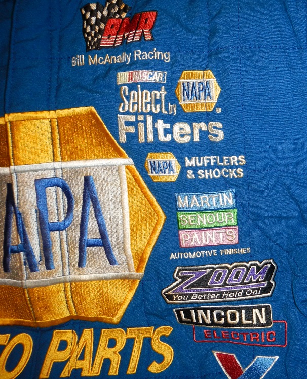 This is a Bill McAnally Racing pit crew suit. I have no idea what year exactly when this suit is from. It looks as cluttered as I have ever seen a driver suit. Whereas most driver suit may have 12 to 15 logos visible on the front, this suit has, in total, 24 logos. It looks really cluttered and awkward. I love NAPA and I think they have great cars and a great color scheme, but this looks like it was thrown together at the last minute.Interestingly, the suit is made by MotoWear, which is one of the more low-rent driver suit manufacturers. It shows in the suits because the large NAPA logos look very odd. It doesn’t look as smooth as other logos on suits, and it has a low rent look. The logos on the collars,
 back torso,
 sleeves,
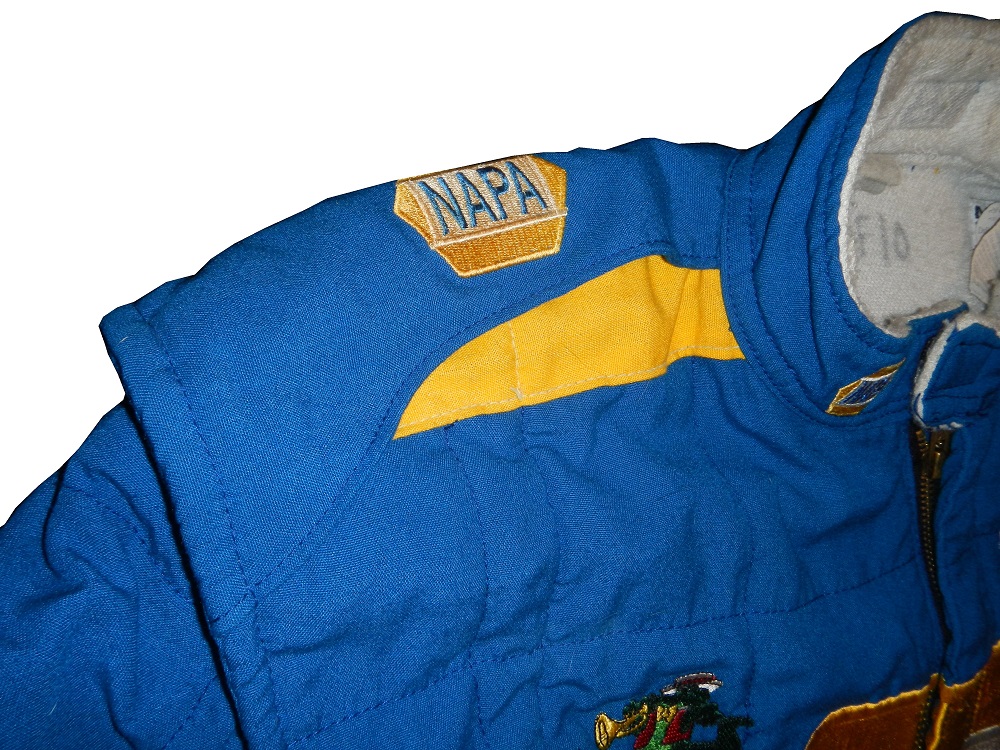


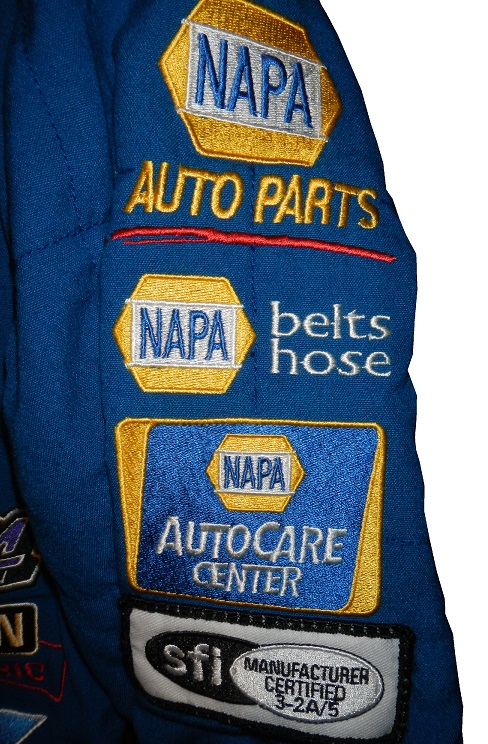 and legs
 all share a similar look. I also find it interesting that there is no series logo on the suit at all. Bill McAnally Racing is in the Wheelin All American Series, and the K&N Pro Series
The other reason the suit is featured this week is that it is an example of something that, prior to this, I had only seen on racing official suits. The SFI logo, normally found on the left wrist, is visible on the left sleeve. While I was not able to find a picture, many pit road officials wear firesuits with the SFI patch on the left sleeve. Other NASCAR officials wear the SFI logo on the back of their necks, but on the back of the neck of this suit is the MotoWear logo. The placement of the logo just adds to an already cluttered look to the suit.
As for a MotoWear suit, it has a warranty tag, a wash tag,
 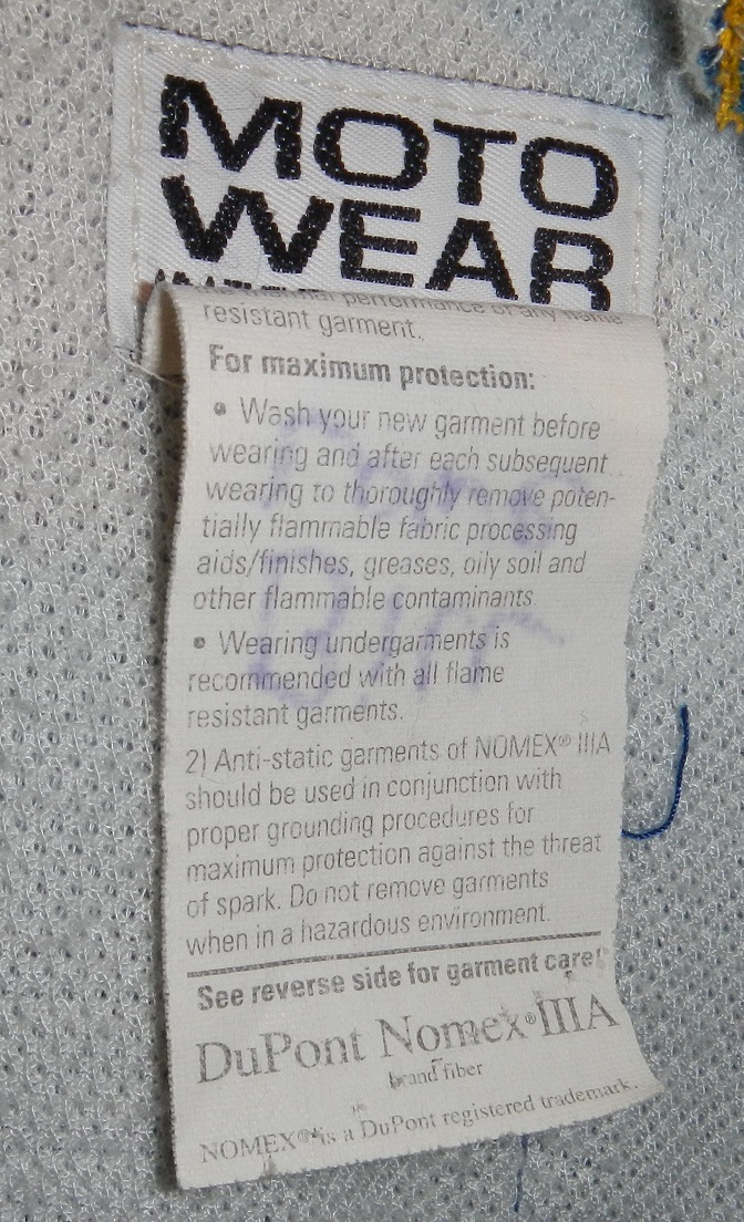 and it is really well made. For a pit crew suit it is really well made. I say it is a pit crew suit because on the tag is written Bill Lowe. After many hours of searching, I was unable to find a Bill Lowe as a driver. It is likely that Bill Lowe was a pit crew member. It looks really good, and I also like the quilt pattern, you just don’t see that anymore.
Another item of news this week is that BidAMI Auctions, which is based in Las Vegas is auctioning off a Dale Earnhardt Jr. Driver Suit. Starting this week, I will look at major auction houses, and if a driver suit, or other piece of NASCAR memorabilia I think should be promoted, I will link to it here.
The Driver Suit Blog-Motor City Masters-NASCAR Review
By David G. Firestone
I don’t usually watch Motor City Masters, but I tuned in on Tuesday, since the theme this week was NASCAR. For those who don’t know, Motor City Masters is a reality show on TruTv featuring designers competing for a design job at Chevy as well as $100,000. Each designer designs something in the beginning and the two design managers and the managers will pick the design team from the rest of the competors. The two teams will, in turn, take a Chevy model picked for the episode and turn it into a concept car. It’s a basic reality show. I watched it, took notes, and took my notes and made it into a cohesive article.
Jameson, who comes across as kind of a jerk, actually said the perfect thing about race cars… “Function first, appearance second.” I really had high hopes for the episode, but it was a let down. First off, the show has a direct endorsement with Chevy, and AJ Allmendinger made a cameo appearance in the episode. The design challenge was to take a Chevy SS race car and design it a futuristic manner. The car they provided for the design challenge looked NOTHING like a Sprint Cup Chevy SS! It looked like they took an old Monte Carlo from a low ranking team and re-decaled in into an SS! It looked awful! As if that wasn’t bad enough, there was an NHRA-style Christmas tree in the background! Why? When did NASCAR start using the tree? Did anyone involved with the set design do any research?
Moving on from that, Camillo and Darby won the design challenge, and Darby had the better of the two. She actually created a futuristic design with NASCAR design elements. The smartest discussion I heard in the episode was from Edward T Welburn, Vice President of Global Design for GM. He discussed that Louis Chevy was a race car driver, and discusses how sponsors like the car to be distinctive and to stand out. He then said that the Chevy SS is “a strong link to what Chevy races in NASCAR” which is kind of true, since the NASCAR SS and the street SS are alike in name only.
I got excited when I heard the basic theory of the competition, but got really nervous when it became clear that a huge part of the challenge would be to have a back story based on a color scheme…oh no! I can’t imagine this end well. The teams were selected, the challenge started, and the teams went to the back to work on the design. As much as I complain about color schemes in the Paint Scheme Reveiws, I can’t imagine that they would pick what I consider a good color scheme.
As is the case with these kinds of shows, there was a lot of pissing and moaning about various design aspects and eventually, the cars are started upon on the second day, when the cars are in the pre painting stage, that is when the colors start to work. Carmillo takes photos of himself and a team member in a racing suit, and begin to work with that as a part of the template. They are using #74.
Darby’s team is still arguing over the design of the car. There are a number of schemes, but all of them are awful. They choose the most hideous shade of yellow, which the paint team messes up. The design lookd like something a kid would have on the side of a Honda Civic. Darby’s team applies decals to the car, and so does Carmillo’s team. At least Carmillo’s team have the decency to factor sponsor logos into the cars, and hand make the decals themselves. Carmillo uses a shark and a rabbit on the car, to imply speed and aggression. The decals applied, the build is over.
Every episode has a guest judge and this week’s guest judge is introduced as “NASCAR racing pro Robby Gordon.” Very nice, considering that he hasn’t raced in NASCAR since 2012. Carmillo’s car comes out first, and it is named the Solar Blast. It has a red silver and black color scheme and a traditional look. Darby’s team has the Pink Dynamite, and has a pink and yellow scheme. It spits in the face of traditional design. Carmillo describes the design as having a NASCAR look and that the car number is visible anywhere on the track. Darby describes the car as being as loud as the car sounds. The judges seem to like Carmillo’s design, and they comment that Darby’s design is a little too off-putting for a sponsor.
The judges send the teams away, and look over the designs. They comment that Darby’s car is off-putting for sponsors once again. They comment. orange black and silver scheme looks good, aside from some decals. Carmillo’s team is rightfully declared the winner. One of the three team members is going to be sent home. Each of the three team members, Darby, Jameson, and Shane explain why they should stay. Shane is kept, and now Darby and Jameson are in the hot seat. Jameson is sent home. As much as a jerk as he is, he is still a great design talent.
All in all the show is mediocre. I’m so glad that Darby’s design isn’t a real design, because it would sweep the single scheme Paint Schemie Awards. It looked horrible. Carmillo’s car looked like an actual race car, and the color scheme worked very well. If either of Carmillo’s team goes home, I would recommend that a NASCAR team hire them as a designer. It was a decent show, but this was not enough to keep me as a viewer.
DGF2099 Productions-Introduction to Press Kits-1995 Bill Sedgewick Press Kit
Bill Sedgewick raced for one season in the Die Hard Chevy 1500 CKfor the 1996 Craftsman Truck Series for Darrell Waltrip Motorsports, and this press kit was issued for that season.
