Last Week, Chevy teams were ranked. This week, the Paint Scheme Ranking Executive Committee, made up of myself, and Alejandro my black cat have determined how Ford’s teams will be ranked. Alejandro was slightly more useful this week, keeping my leg warm while he slept. As with last week, teams that did not exist or did not run Fords last year will be marked with NR for Not Ranked.
1-Wood Brothers #21 Rank Last Year:1st of 17-The Wood Brothers always design great cars, and the Quick Lane scheme uses the blue very well. It all looks good!
2-Team Penske #2 Rank Last Year:6th of 17-The Wurth and Redd’s Apple Ale schemes are a bit over designed, but the white Miller Lite schemes, Alliance Truck Parts, and Detroit Genuine Parts schemes make up for it.
3-Roush Fenway Racing #6 Rank Last Year:NR-This would be ranked higher, as it has a somewhat vintage look, but the candy cane on the nose looks odd. It’s still a good scheme.
4-Richard Petty Motorsports #43 Rank Last Year:2nd of 17-The Ekcrich camouflage scheme doesn’t work, camouflage schemes rarely do. The Charter green is horrible, but the rest of the schemes look really good.
5-Levine Family Racing #95 Rank Last Year:16th of 17-The TWD schemes look medicore, but could be worse. The template Levine Family Racing switched too this year looks great and the cars look very good too.
6-Front Row Motorsports #34 Rank Last Year:11th of 17-The majority of the schemes look great, but the upside down lettering on the hood of the CSX scheme looks odd. The Wendell Scott scheme is amazing!
7-Humphery Racing #77 Rank Last Year:NR-Plinker Arms doesn’t look great but it could be worse. That applies to Essex Homes as well. The rest of the schemes look good.
8-Front Row Motorsports #35 Rank Last Year:10th of 17-The Hefty scheme is a little unorthodox, silver and orange isn’t a great combo, but the design looks good. MDS looks good.
9-Team Penske #12 Rank Last Year:3rd of 17-The SKF scheme works very well. The Penske Truck Rental scheme uses a horrible shade of orange, and just looks hideous.
10-Phil Parsons Racing #98 Rank Last Year: 15th of 17-While I like the Dogecoin,Trench Shoring,iRacing, black Curb Records, and unsponsored black schemes, anything else looks horrendous.
11-Front Row Motorsports #38 Rank Last Year:9th of 17-Most of the schemes are good, but the Love’s Truck Stops, and Love’s Truck Stops Camo schemes are horrific.
12-Roush Fenway Racing #17 Rank Last Year:5th of 17-Eco-Power has awful shades of green. Pit for a pair is awful even for a pink-washing scheme. Zest has a good color scheme, but awful design scheme,as does Fifth-Third Bank. Their all-star scheme was terrible. Ford Eco-Boost, NOS, and Nationwide work very well.
13-Richard Petty Motorsports #9 Rank Last Year:4th of 17-Can all be summed up with Great color schemes but mediocre design schemes. The camo scheme looks bad, but the upside is that the camo is subtle.
14-Team Penske #22 Rank Last Year:14th of 17-The Shell/Pennzoil scheme has a decent color scheme but a bad design scheme. Anything Pennzoil Platnum is awful, as is Auto Trader. The Auto Club scheme has a great color scheme but a bad design scheme.
15-Roush Fenway Racing #99 Rank Last Year:12th of 17-Fastenal looks good, but anything else looks terrible.
16-Go FAS Racing #32 Rank Last Year:8th of 17-The Terry Labonte throwback scheme was amazing, but most of their other schemes are over-designed messes.
For the end of the 2014 NASCAR Sprint Cup Season, the Paint Schemies have returned! The Schemies will reveal the best and worst paint schemes and driver suits of 2014. This was done using the Driver Suit Blog executive committee for paint scheme analysis and consists of me and me alone, and uses the following standards:
Color Scheme:How the colors look, and how they work with each other.
Overall Design:How good the design itself looks, is there too much, or not enough.
Primary Sponsor Logos: How the primary sponsor logos look on the car
Originality: How original is the scheme.
All of the above can work for or against a scheme, and all will be taken into consideration.
Let’s get the bad paint scheme awards out of the way.
First, the Paint Schemie Award for Worst Regular Season Single Paint Scheme .
The next Paint Schemie Award is for Exhibition Race Paint Schemes. This category is a little different, as the Schemies will go to the best and worst special scheme that was run in either the Sprint Unlimited, the Sprint Showdown or the Sprint All-Star Race.
The Paint Schemie Award for Worst Exhibition Race Paint Scheme Goes To:
That’s all for the best and worst, now I wanted to do something in the way of a top 10 list, but I wanted to do something differnet. I wanted to do the top to logos that have never been the primary sponsor of a Sprint Cup Car, so here they are:
Ty Dillon #33 Charter Chevy SS-Charter has the worst shade of green in NASCAR, and with the over designing, it earns an F.
Kyle Larson #42 Target Camo Chevy SS-Good color scheme, awful design scheme, add a one letter grade deduction for use of camo and you have a D- grade.
Aric Almirola #43 Farmland Pork Ford Fusion-I get what they are trying to do, but the light green and blue color scheme does not work. I can’t give this any higher than a C, so I won’t.
Aric Almirola #43 Farmland/Folds of Honor Ford Fusion-Works very well, color and design scheme is great, and while there is camo in the design scheme, I’ll forgive it because it looks good. It’s subtle, and it works. A+
Joey Gase #32 Donate Life Ford Fusion Decent paint scheme, but the design scheme needs work. There is some needless over design on the door just under the second number, and it distracts from the rest of the scheme.
Joey Gase #32 24-7 E-Cigs Ford Fusion I’m fascinated by the rules concerning e-cigs. NASCAR and many other racing series have strict rules that state tobacco companies cannot sponsor cars. I live in Evanston, Illinois and over here, they are regulated as tobacco cigarettes. That said, the design looks good, the color scheme is good, there aren’t too many good shades of green used in NASCAR, and it earns an A+
NEW LOGO ALERT! On Thursday, NASCAR released the logo for the Xfinity Series which is what the Nationwide Series will become on January 1, 2015. I will have much more to say about it on Saturday, as well as some upcoming changes to the site.
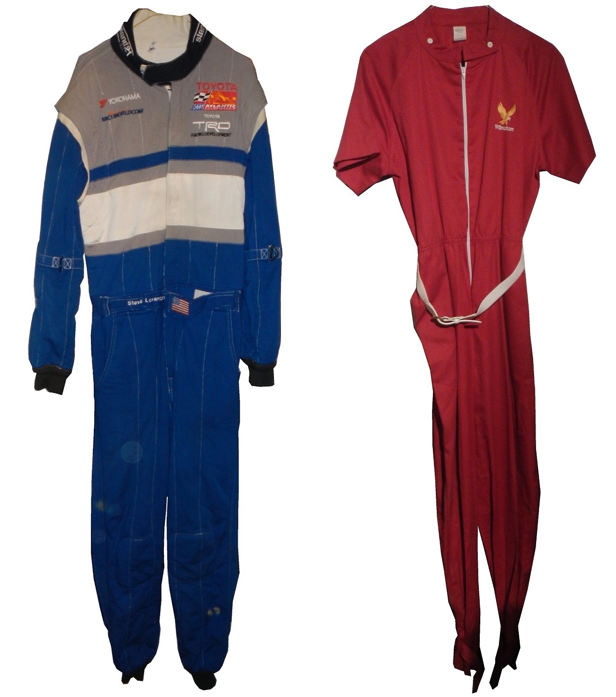
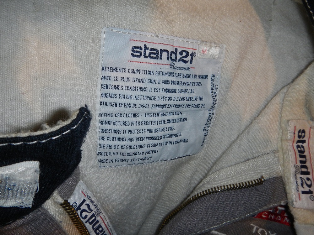
Gonna do a two for one this week. Two suits this week, in a good mood, gonna spread the love. Our first week is my first Stand 21 suit, a 2000-2001 Toyota Atlantic series suit worn by Steve Lorenzen. The Toyota Atlantic Championship was a racing series in Champ Car that ran from 1977 to 1988 as the Formula Atlantic Championship. It then became part of Champ Car from 1989 to 2005, then it became Champ Car Atlantic from 2006-2007. After than from 2008-2009 it was unaffiliated with any major racing series, and is currently on hiatus.
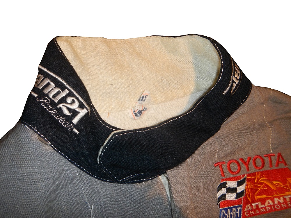
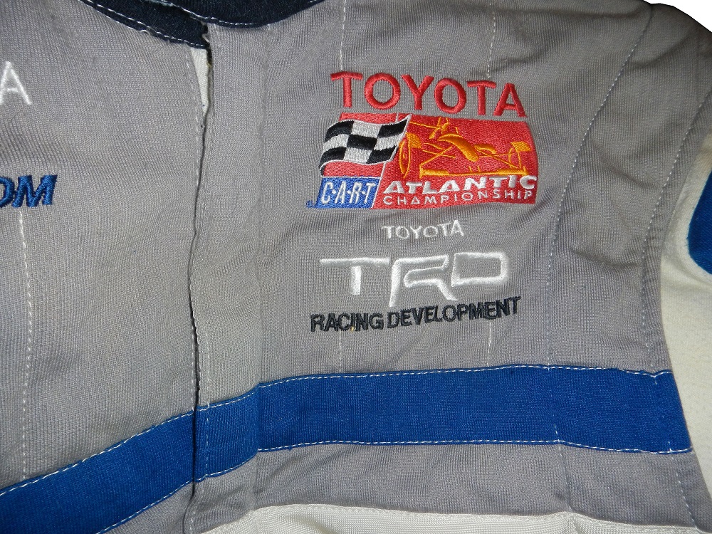
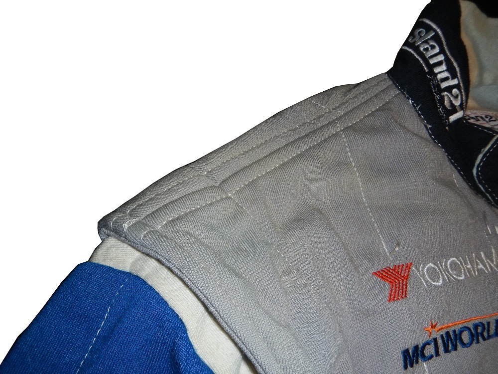
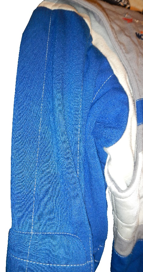
This particular suit was worn by driver Steve Lorenzen. Lorenzen raced in the Toyota Atlantic Championship from 2000-2001 for 6 races in total. He did not have any success, and left the series after 2001.The suit shows light use, having been raced for only 6 races, and is FIA certified. The collar has a Stand 21 logo on either side. A warranty label is present on the inside of the collar in French and English. The front of the suit has a YOKOHAMA and MCI WORLD COM logo on the right side, and on the left is a TOYOTA ATLANTIC CHAMPIONSHIP logo, and nothing except stripes on the torso. The shoulders have no epaulets, no logos on the top of the sleeves and STAND 21 logos on the ends, just below an arm restraint on each sleeve.
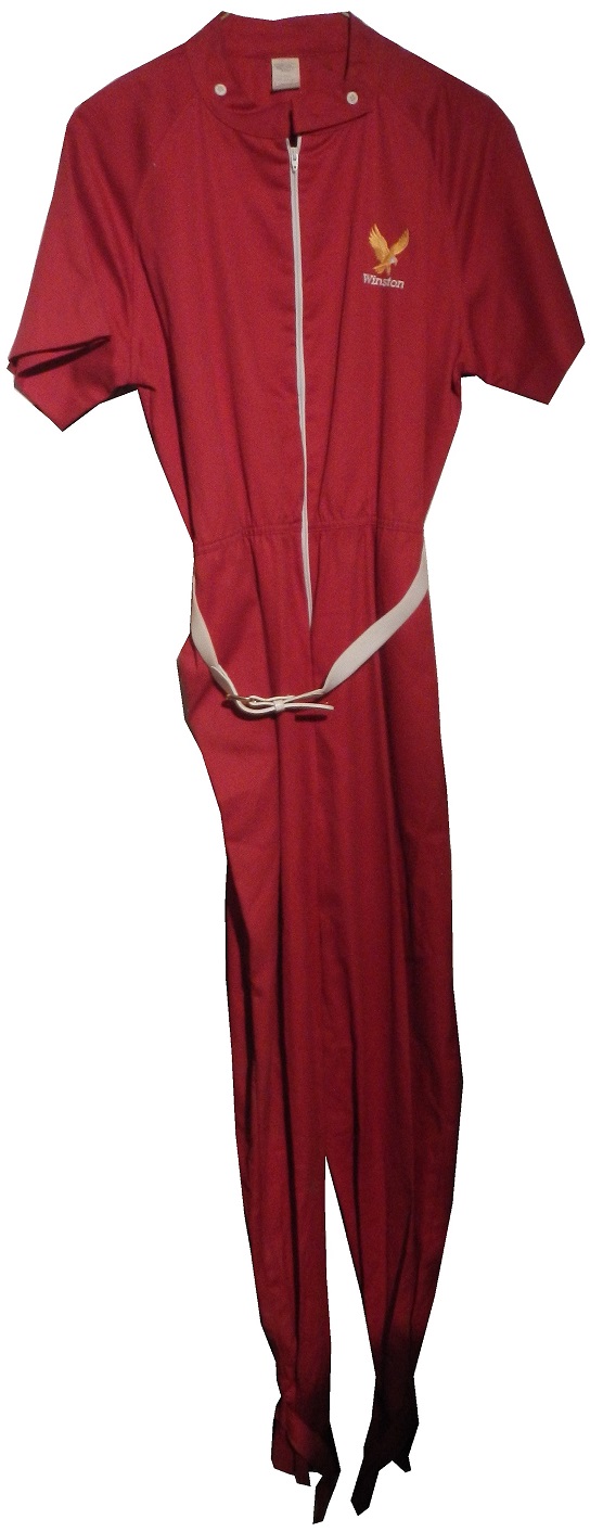
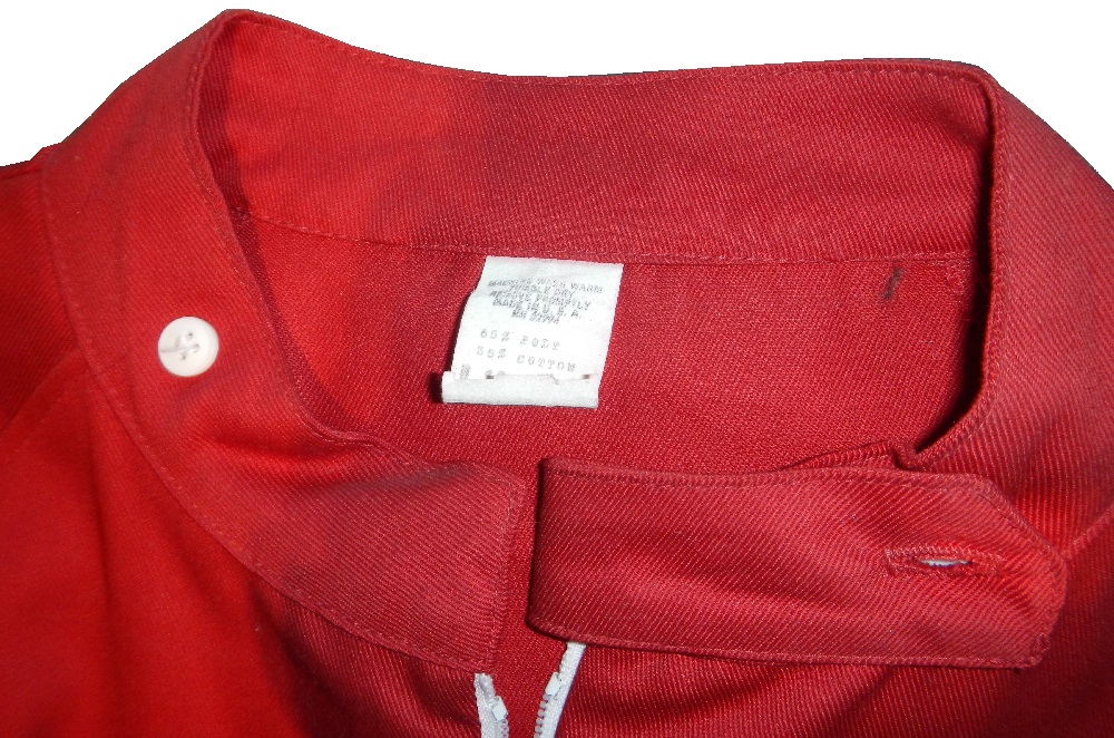
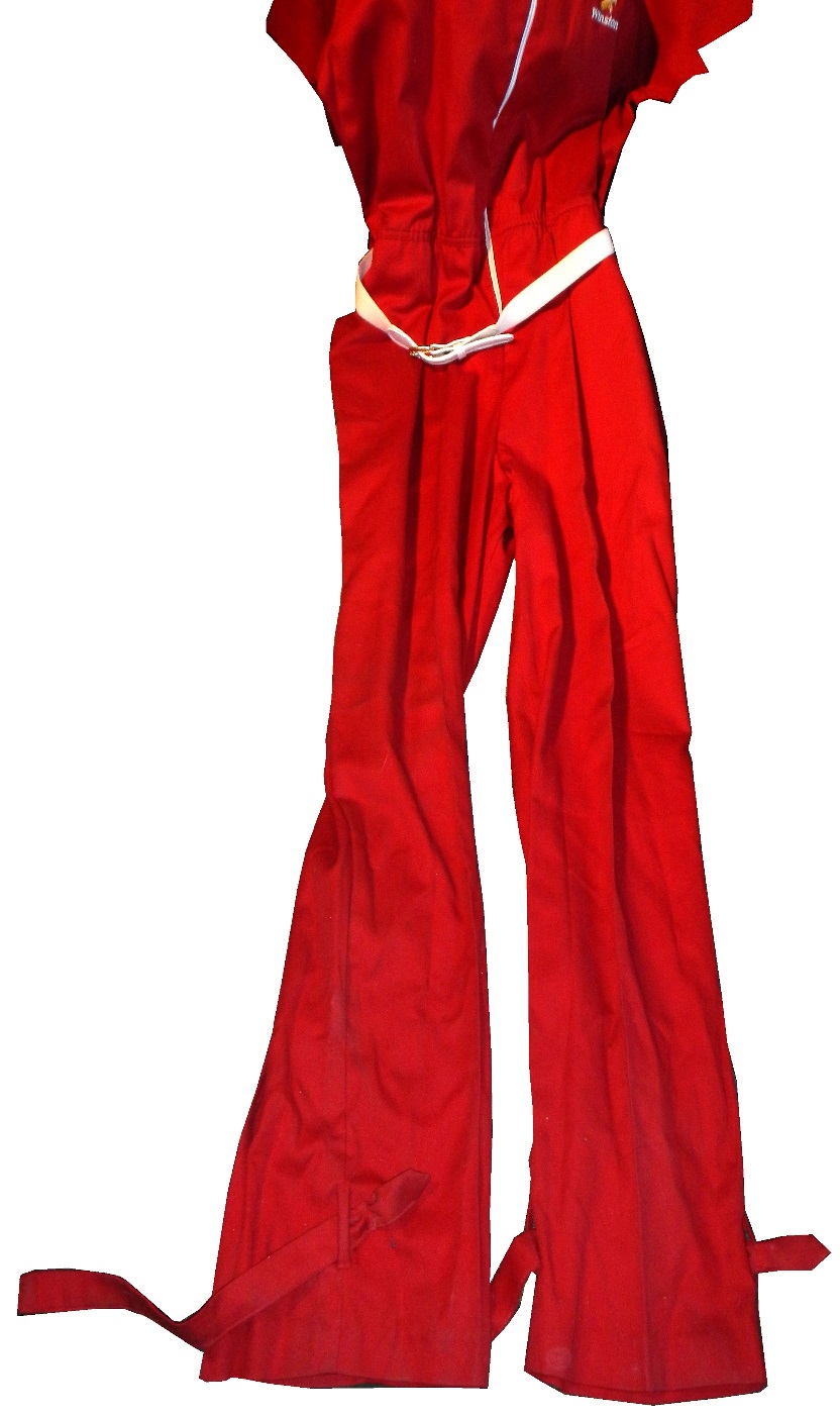
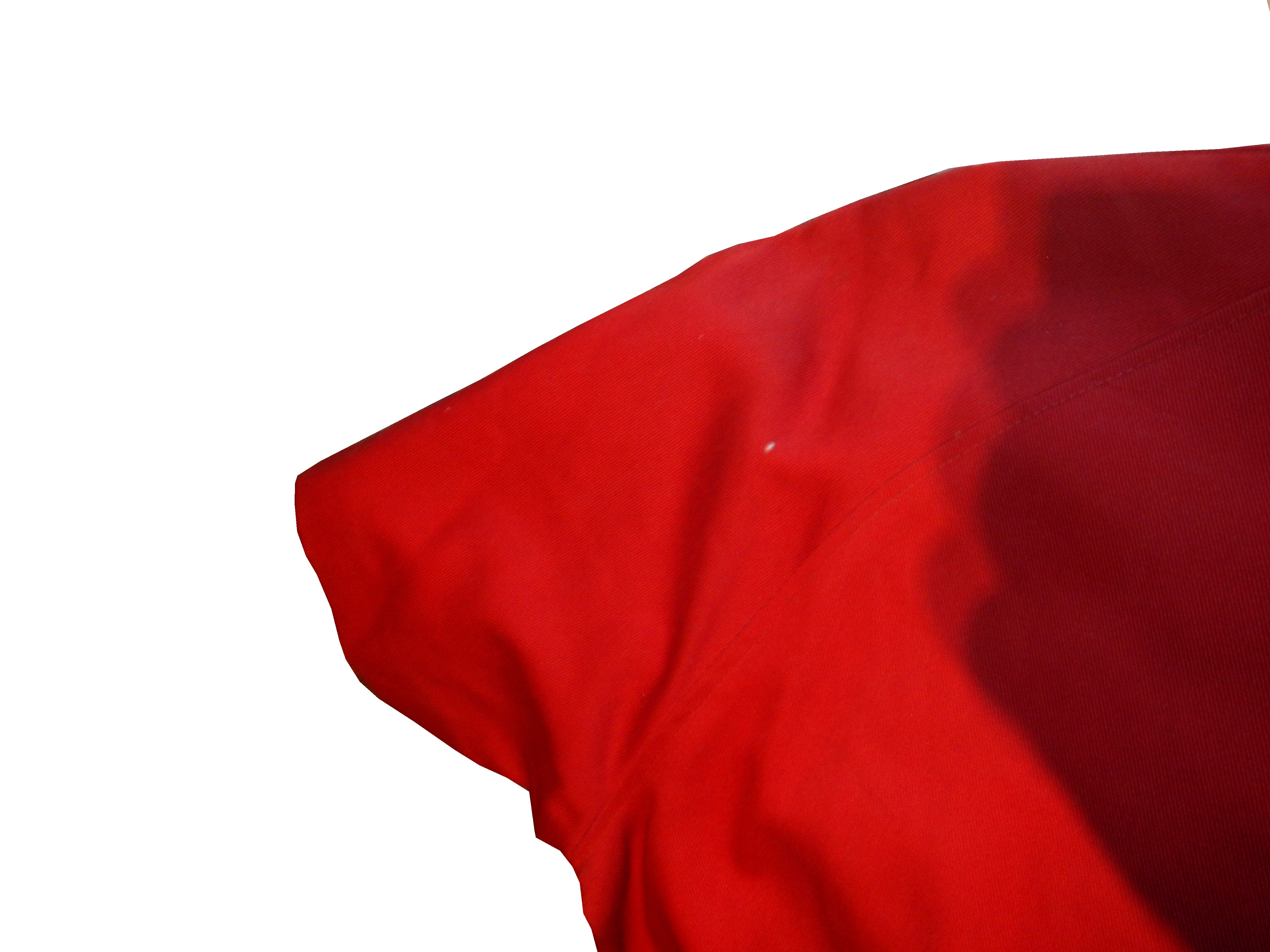
The second item is a jump suit worn by Miss Winston in the late 1970’s or early 1980’s. Miss Winston was an idea thought up in the 1970’s. The idea was to have a beauty queen with the drivers in Victory Lane after races. The idea died after the Winston Cup turned to the Nextel Cup, but when Sprint took over in 2009, the idea was revived. It is a simple red polyester jumpsuit with a Winston logo on the chest, a white belt, straps on the legs, and short short sleeves. Miss Winston was an idea thought up in the 1970’s. The idea was to have a beauty queen with the drivers in Victory Lane after races. The idea died after the Winston Cup turned to the Nextel Cup, but when Sprint took over in 2009, the idea was revived.
Now we move on to…
PAINT SCHEME REVIEWS!
Kasey Kahne #5 Design the 5 Chevy SS This is an awful scheme, even by Kasey Kahne standards. I can’t say anything good about it, so I will just give it an F
Kurt Busch #41 Haas CNC 500th Start Chevy SS Kurt is starting his 500th race this week at Dover, and to celebrate, he is running a special paint scheme. The color scheme is decent, it has a gray scale look, but it is somewhat overdesigned. I wish Kurt would have a scheme for his 500th start that is better than a C, but that is how the cookie crumbles.
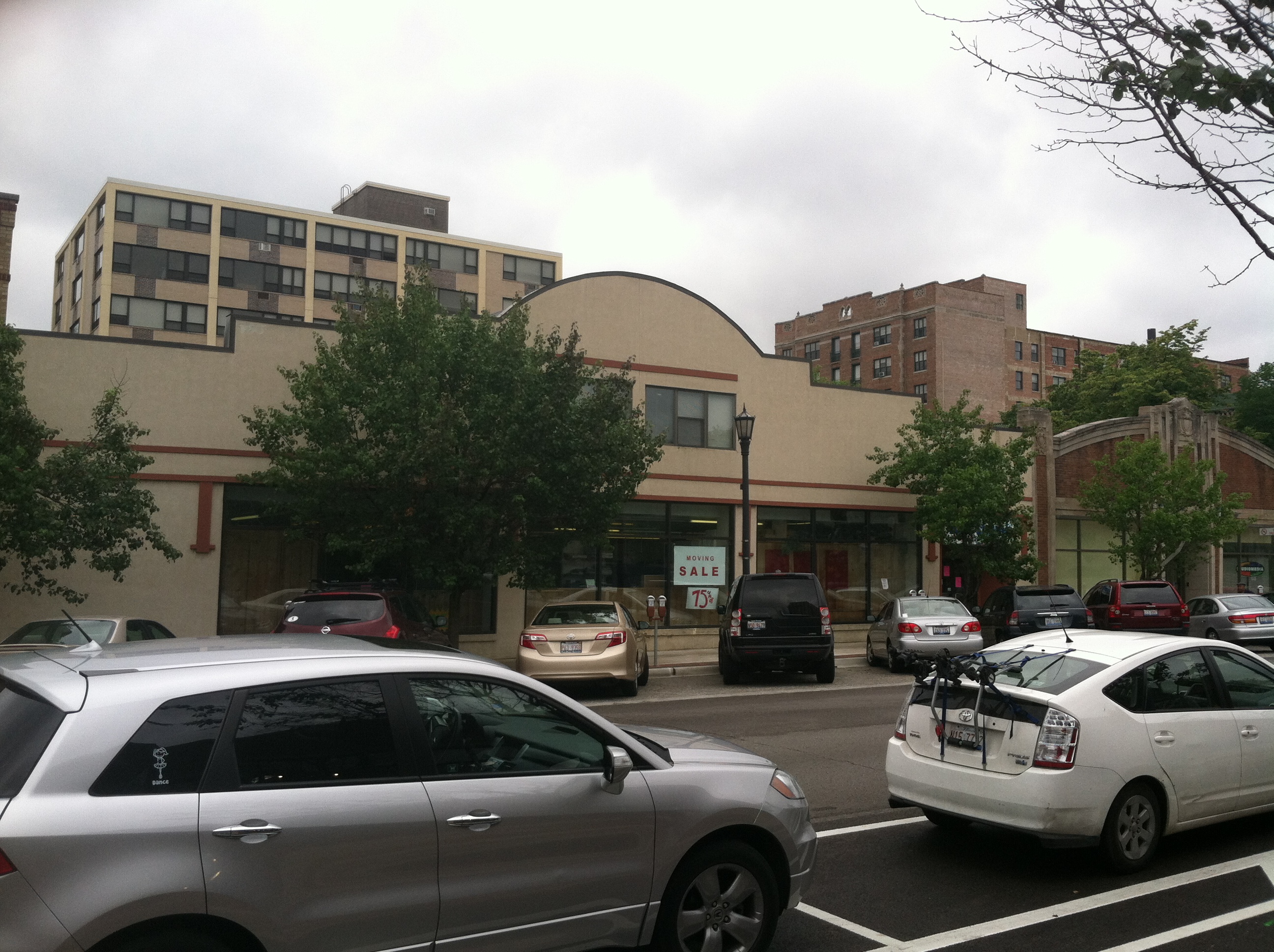
We all have at least one place that we always remember fondly from our childhood. It could be a restaurant, a park, the home of a close friend, or family member, or a park. We all have at least one, probably many. It is always sad when one of these places goes away. Well this happened to me this last week, when an Evanston institution began the process of moving.
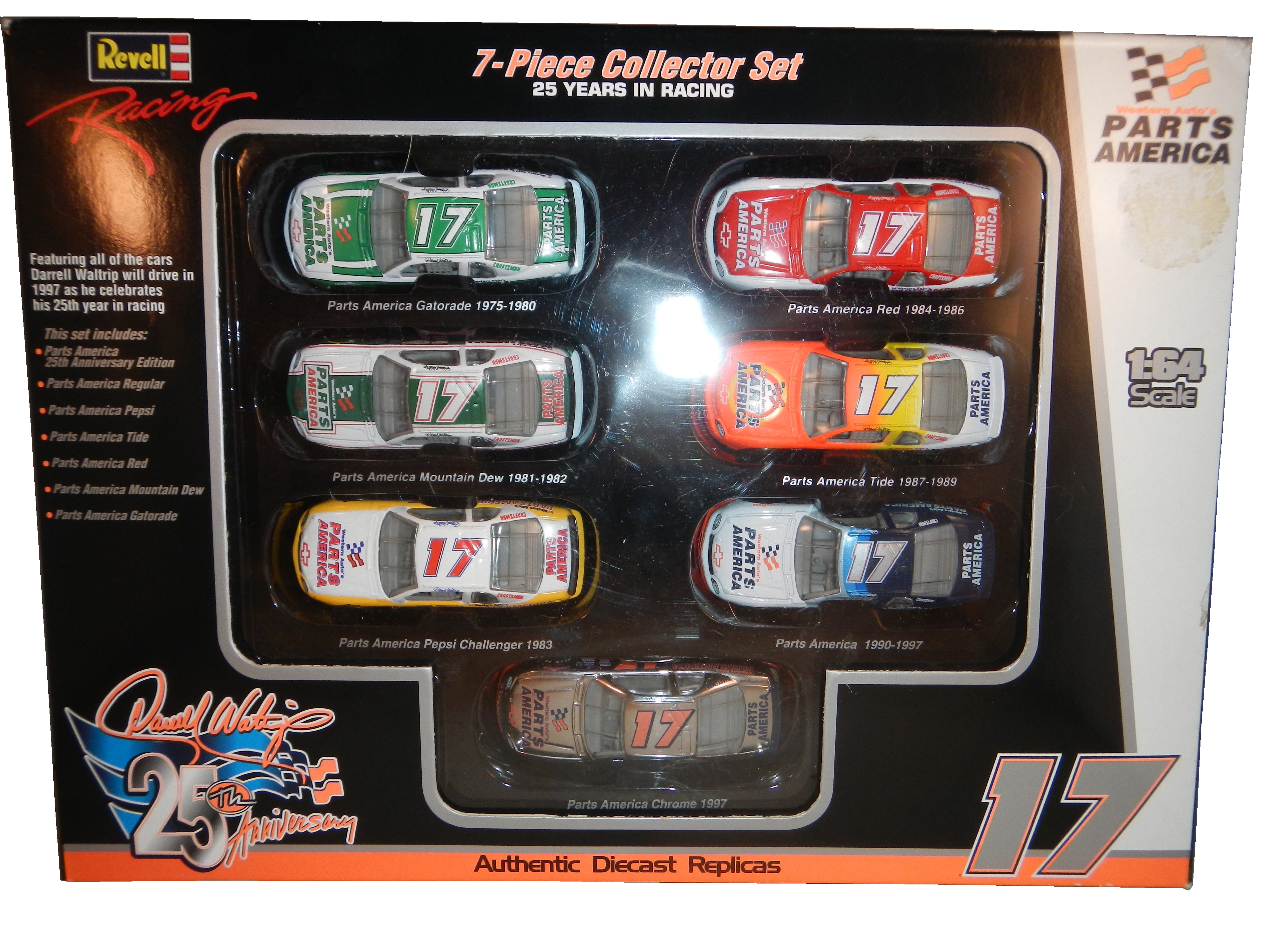
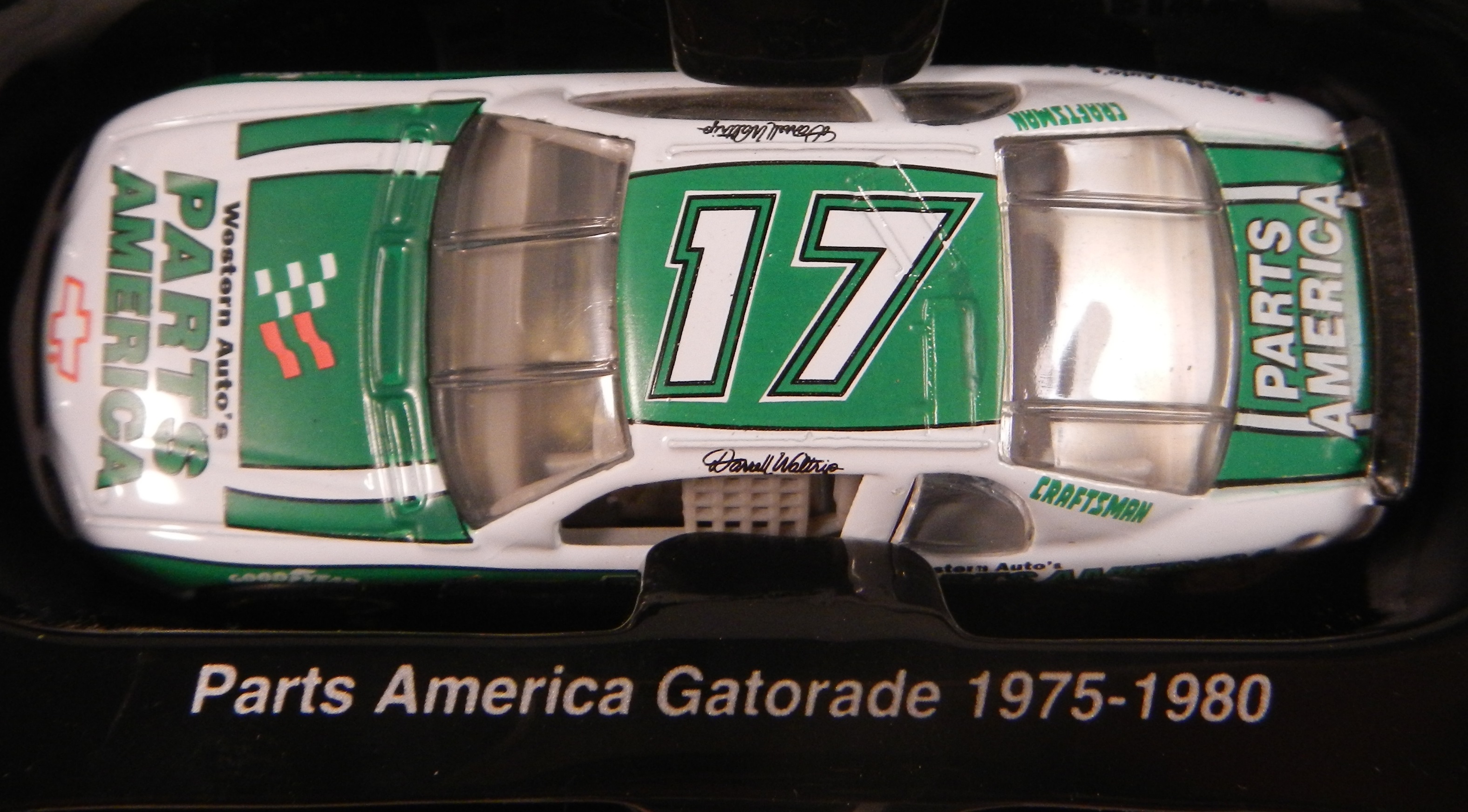
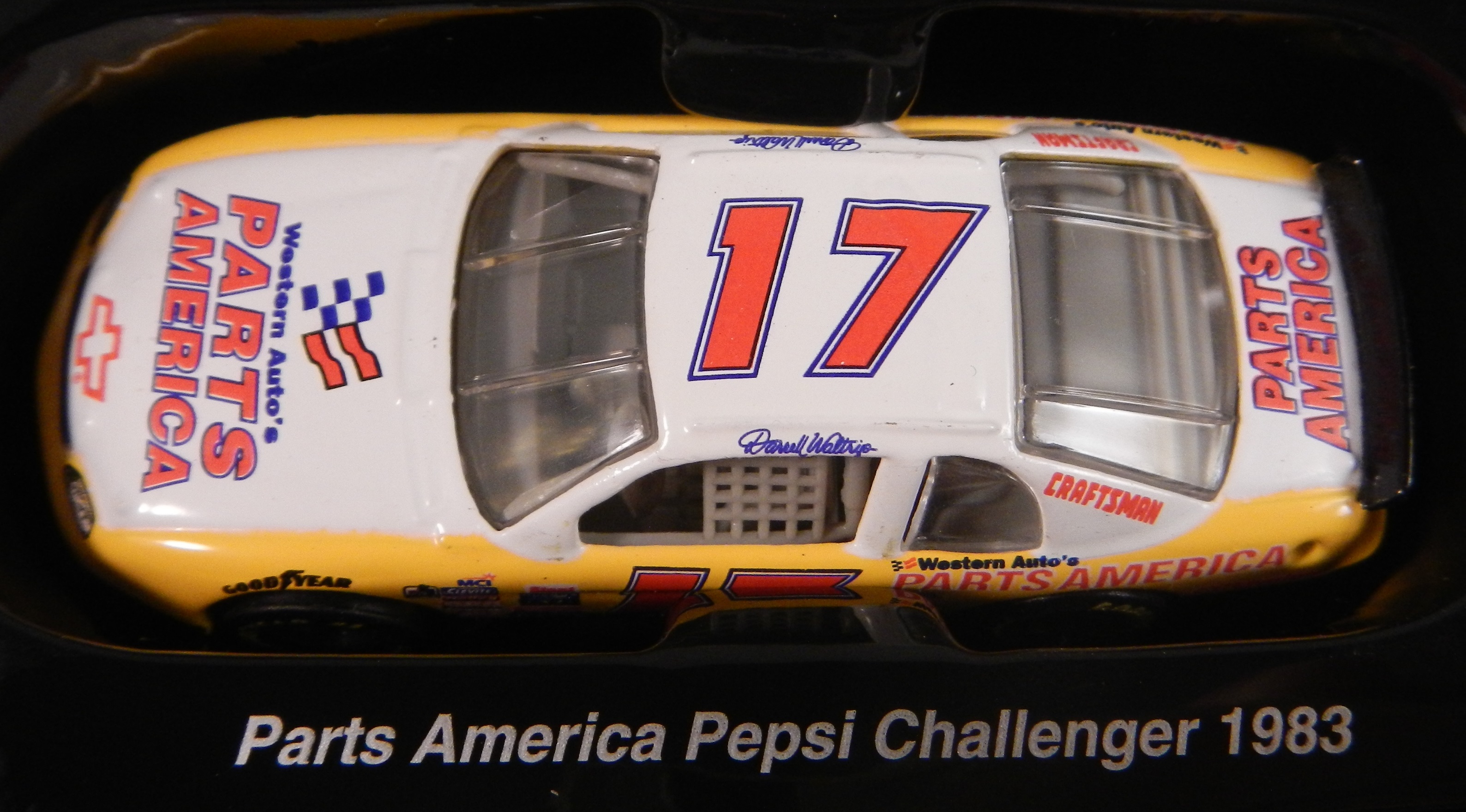
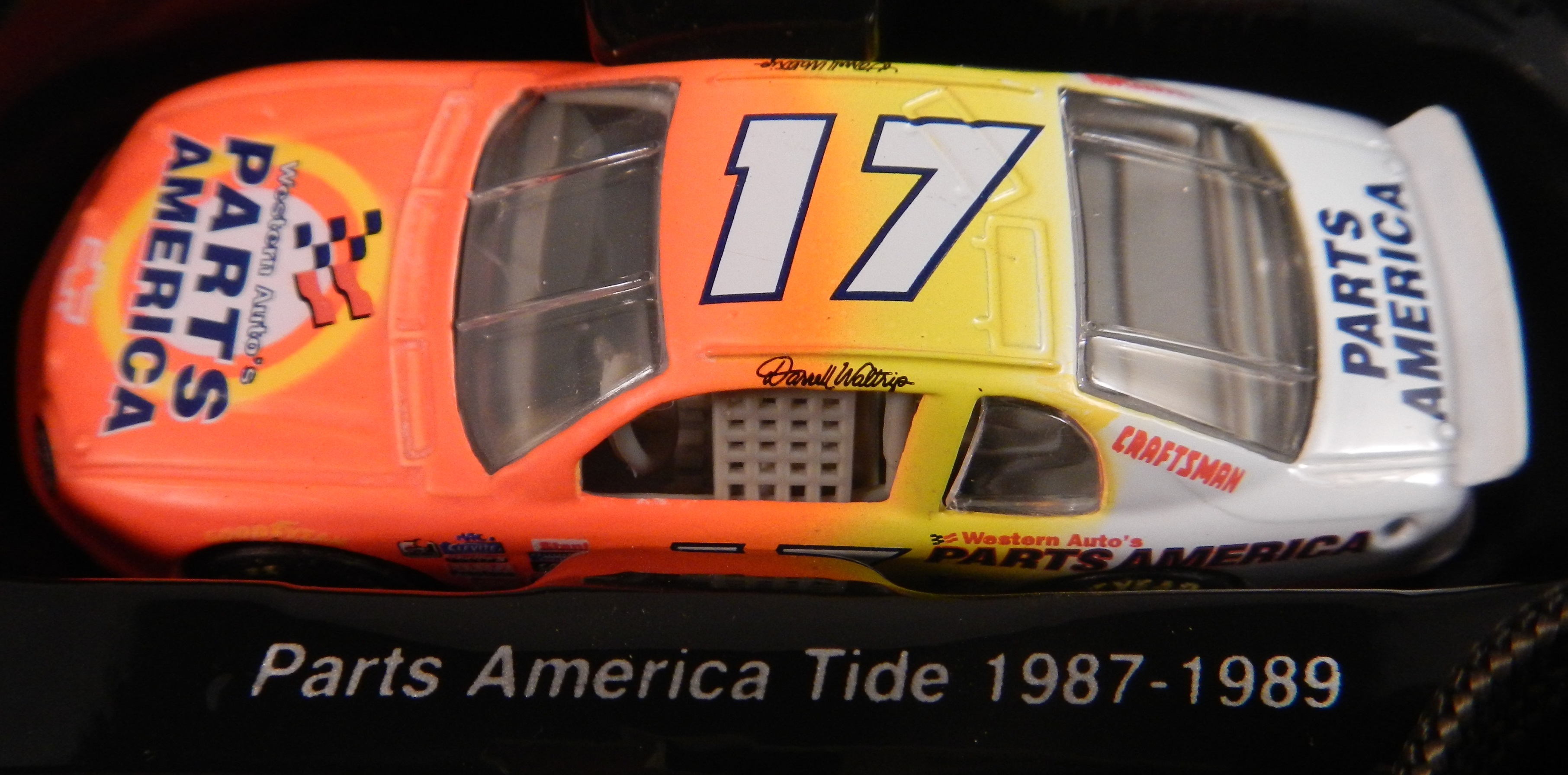
Tom Thumb in Downtown Evanston was a place that I and a number of my friends spent a great deal of our childhood. Some of us were skateboarders, some of us were RC car fanatics, some of us, like me were model builders and die cast collectors. It had been in the same place for 49 years, but they announced that they were going to move after a zoning decision was made to replace the current building with a two-story building for two restaurants. So, on July 12, after 49 years as an Evanston institution, it closed. I went there on the 12, and made, with a heavy heart, my last purchase.This was a sad day because I am a huge NASCAR fan, and for many years, Tom Thumb was the only store in Evanston that sold NASCAR stuff. It was also one of, if not the oldest skate shop in the midwest. I went there, looked around the store where I spend my childhood, took it all in, and bought my last purchase, this 1997 Darrell Waltrip 25th Anniversary set.I bought this for two reasons. The first is that I love this set, I remember many of these schemes from races I watched in 1997. They all look really good, and they bring back memories. The second reason, and I didn’t even think about this until I started doing some work for next week. During my research, I was grumbling about how many different paint schemes each car runs every week, and it dawned on me that this might be the first example of that in the Sprint Cup Series.
You never had this much variety in paint schemes before 1997. Each team ran one scheme for the majority of the season, maybe 2 or 3 different schemes and special schemes for the All-Star race, and possibly the Busch Clash. But Darrell Waltrip ran, in total, 7 different schemes, each based on a specific era in his career. Each had Western Auto Parts America as the primary sponsor, but were based for past sponsors. He started with Gatorade, which he ran for DiGard Motorsports, from 1975-1980. He won two Coca Cola 600’s(1978, 1979) a Winston 500(1977) the Southern 500(1978,1979)as well as 22 other races during that time.In 1981, he left DiGard for Junior Johnson Motorsports, and was sponsored by Mountain Dew, where he won 24 races including the 1982 Winston 500, the 1981 Busch Clash, and two of his three Sprint Cup ChampionshipsPepsi replaced Mountain Dew and created The Pepsi Challenger which he ran in 1983 for Junior Johnson. He won 6 races for PepsiAfter Pepsi left, Budweiser took over the sponsorship, and from 1984-1986, he won 13 races, the 1985 Winston Cup Championship, the Inagural All-Star Race in 1985, the 1985 Southern 500, and the Winston 500. I find love how they call it “Red” instead of Budweiser since this was marketed to kids at the time.In 1987, he made the move to Hendrick Motorsports, and picked up Tide as a sponsor. He won the 1989 Daytona 500, The 1988 and 1989 Coca Cola 600’s and 6 other races. I loved that it was identical to the scheme used by Ricky Ruddthat same season.From 1990-1997, he raced the #17 for Hendrick Motorsports in 1990, and then founded Darrell Waltrip Motorsports, which raced this scheme from 1990 to 1997. He won 5 races, but was never to get his former glory back. Western Auto left the team after 1997, and Darrell Waltrip Motorsports shut down shortly after the start of the 1998 season.The last scheme is one of the most innovative schemes in the history of NASCAR. His legendary Chrome scheme. Darrell loved chrome, using chrome numbers, and a chrome helmet. This was supposed to be used for just a single race, but it was raced a number of times that season. Nothing like this had ever been done in NASCAR before. There had been chrome numbers, but never a chrome car. This car was so far ahead of it’s time. Darrell even had a Chrome driver suit that he wore with this car!1997 would be the beginning of the end for Darrell Waltrip. He shut down his Winston Cup team in 1998, and joined Dale Earnhardt Inc. midway through the season. He would race for just two more seasons before fully retiring in 2000.
The idea of 7 different schemes seems like standard opperating procedure today, but back in 1997, this was revolutionary. This was unheard of. These schemes were all good, and they worked well, but this surprised some fans. 17 years later, this is the norm rather than the exception. If I did the paint scheme reveiws back in 1997, I would write one article at the beginning of the season, one before the all-star race, and maybe one midway through the season. There were no changes to paint scheme, or if there were, they were very rare.
Tom Thumb will reopen eventually. But whavever the new location, it will never have the same feel as the decades old building were it was once housed. I will miss it. I really will. But I find a bit of irony in that I bought the beginning of an era at the end of another era. I will visit Tom Thumb when they reopen, and I wish them the best of luck. From the residents of Evanston to Tom Thumb, we will miss you, and we wish you the best of luck in your new location!
We also have a paint scheme related news item to discuss. This last week, NASCAR announced that the Chase for the NASCAR Sprint Cup would have some new features on their cars. Specifically, all Chase contenders will have a yellow splitter cover, a yellow window stripe with black letters, yellow roof numbers, and a special Chase for the NASCAR Sprint Cup decal. I’ve been speculalting that this might come to be, and now I have proof. I am not going to discuss how I think it will look, until I have a good idea as to who is in the Chase, and how it will look on their cars. Here is an illustration of how it looks.
With that out of the way, we move on to…
PAINT SCHEME REVIEWS
Kasey Kahne #5 Great Clips/Shark Week Chevy SS Another case where it looks like two different designers created the car without speaking to each other. It looks awful. The color scheme is good, so it passes, though just bearly with a D-
Greg Biffle #16 3M Throwback Ford Fusions Greg Biffle is holding a contest to pick a throwback sheme for his race at Pocono in August. I would normally grade all four of these seperatley, however they all have the same traits, so I will grade them at once. All four have really good color schemes, and really nice logos, but they are all plagues with modern car numbers as well as modern designs. They simply look awful. I will vote for none of these schemes and give them all an F-
Morgan Shepherd #33 ThunderCoal Chevy SS I liked the other ThunderCoal scheme, but this is just awful. Too many neon colors, and it is needlessly overdesigned. I give it an F
Michael McDowell #95 JPO Absorbents Ford Fusion Another great Levine Family Racing scheme. It is hard to believe how bad they were last year. Great color and design scheme equals an A+ scheme.
I have a lot of paint schemes to discuss and we will get to that shortly. I wanted to discuss something that took place before the Coke Zero 400 last week. It is a bit murky, but here is what took place.
Charlie Crist is a former governor of Florida, and a former Republican. After a brief hiatus from politics, he has annoucned his intentions to run for the Governor of Florida as a democrat. He had plans to run the #98 Phil Parsons Racing Ford driven by Josh Wise. After this was announced however, the Republican Party of Florida filed a lawsuit stating that it was a campaign contribution worth more than $3,000. Remember, this was the same team that was crowd funded by Reddit and Dogecoin at Talladega, and that sponsorship cost about $55,000. It was later reported that the Charlie Crist decals had been removed from the car. Phil Parsons Racing stated the deal was in response to a series of negative ads toward Crist, and that the Crist decals were part of a deal with recording artist Lee Brice. They also stated that they didn’t pull the sponsorship due to the lawsuit, and that the $25,000 sponsorship would be returned.
I frankly don’t buy any of that for a second. I think that it was because of the lawsuit, and that Phil Parsons Racing did not want to get thrown under the bus because of it. They tried to handle it as diplomatic as possible, but it still sounds sketchy. The other reason I have a huge problem with this is because the simple fact that politics and racing don’t mix. Look at what’s happened with F1 and IndyCar. Politics are a constant issue in the sport, and I for one am tired of it. Look at the Ayrton Senna/Alan Prost battle in the 1990’s! Look at The Split! Politics ruins racing!
This is not the first time a politician with deep pockets has sponsored a race car, but I hope that this is the last time. I’m not against politics, I’m against forcing it into something it has no place being in! If tobacco, cel phone carriers, and hard liqour have or had been banned from sponsoring cars, then so should politicians.
Austin Dillon #3 Great Stuff Chevy SS Color scheme is good, the design looks very odd. The gold numbers and chain design does not suit the car at all, and if they were left off, I would give it an A, but this scheme earns a B-
Kasey Kahne #5 Team Stream Chevy SS Good color scheme, but Kasey loves to drive overdesigned cars, and this is no exception. I’m giving it a C which is a very fair grade here.
Danica Patrick #10 GoDaddy/Florida Lottery Chevy SS It looks like two people designed this car, and they didn’t talk to each other while designing it. Both sets of color schemes are awful, and both design schemes are awful. F-
Josh Wise #98 Phil Parsons Racing Ford Fusion Since this design is what was raced, I will grade it as such. The color scheme is decent, but it is a tad too overdesigned. It is a D+ look.
The 2014 Sprint All Star race is behind us, and as usual, there were a myriad of different paint schemes. Some were good, others not so much, but I have to say there were a lot of great schemes in this year’s race. Let’s start with the Sprint Showdown. Unlike in previous years, The Showdown took place on Friday, and the All-Star Race was on Saturday. The Showdown was a great event, which saw Clint Bowyer winning, AJ Allmendinger finishing second, and in the upset of the year, Josh Wise winning the Sprint Fan vote, and advancing to the All Star Race. Let’s get to the grades:
#10 Cole Whitt #26 Speed Stick Gear Toyota Camry This is one of the few schemes that has both a classic and modern look at the same time, and paired with a great color scheme, it earns an A
#13 Austin Dillon #3 Dow Chevy SS While I like the color scheme and number and logo designs, the white stripe up the side kills the look. It takes an A scheme to a B+ scheme.
#14 Kyle Larson #42 Target Chevy SS The scheme looks decent, I like the red on the back, though I do not like the Target logos at the bottom. That takes a scheme that was an A grade to a B-
#16 Michael Annett #7 Pilot/Flying J Chevy SS Good color scheme, but the awful template is back for Tommy Baldwin. It is really sad, because this could be a great scheme, but the template takes it from an A to a C-
#19 JJ Yeley #44 Phoenix Warehouse Chevy SS My first thought when I saw this scheme was it looked like the color scheme from the 1994-1995 NBA All-Star Game jerseys which is a decent color scheme. But to say the car is overdesigned is an understatement. This scheme is awful. Not even a great color scheme can help this car pass. F
Now we move on to the All-Star Race, which saw Jamie McMurray pull an upset and take the win, thus guaranteeing him entry into the event for the next 10 years. Overall there were a lot of great schemes, though I wish more teams would run special schemes.
#5 David Ragan #34 Taco Bell Ford Fusion Overall design and color schemes are good, and the only complaint is that the Taco Bell logo should be in color as opposed to black and white. A+
#11 Jeff Gordon #24 Drive to End Hunger Chevy SS Great overall design, great color scheme, though the D on the hood reversed to miror the curves of the hood looks odd. Still it’s a good scheme and Ill give it an A
#12 Dale Earnhardt Jr. #88 National Guard Chevy SS The new metallic numbers work, and the overall design is decent, since it incorporates the design used on the numbers. I’ll give it an B+
#13 Denny Hamlin #11 FedEx Express Toyota Camry The front nose design and stripes are awful. The color schemes are great, as are the logos and numbers, but the stripes kill it. The best grade I can give is a C+
#15 Kasey Kahne #5 Time Warner Cable Chevy SS It is a good color scheme, but the design on the side needs a little tweaking. Get rid of the needless zig-zag pattern and it works a whole lot better. It is still a decent scheme, so I will give it a C
#17 Matt Kenseth #20 Home Depot/Huskey Toyota Camry I would give this scheme an A grade, but the yellow back bumper ruins it. The clash between the two just works awkward, and it takes an A scheme down to a C
#19 Ryan Newman #31 Cat/Quicken Loans Chevy SS What in the blue hell is going on here? I’ve liked Ryan’s schemes this year but this is an F scheme, even though I like the color scheme.
#22 Greg Biffle#16 3M Ford Fusion-The sides and roof have gotten worse from last year. I have to give it an F in that respect.
Also, check this video out concerning how different pit stops in open wheel racing were between 1950 and today:
The video shows how far we have come in pit stops, but we also have come a long way in driver uniforms.
By David G. Firestone
50 years ago this week, events over the course of 6 days in May of 1964 changed the culture, cars, and uniforms of auto racing forever. Three deaths in two races over those six days demonstrated that current safety methods were ineffective at best, and 3 talented drivers lost their lives. The 1964 World 600 and the 1964 Indianapolis 500 helped introduce reenforced fuel tanks and Nomex driver suits, among other things. 50 years later, those events are still being felt
The World 600 began in the early afternoon on May 24, 1964. For the first six laps, it was business as usual, but on lap 7, on the backstretch, Junior Johnson and Ned Jarrett wrecked, and Glenn “Fireball” Roberts swerved to avoid them, and wrecked. He was trapped in the car by the pedals, and his car caught fire. Ned Jarrett ran and pulled Roberts from the car, and paramedics took him to the hospital. 39 days after the wreck, while still in the hospital from his injuries, he died from pneumonia.
NASCAR had rules concerning “fire retardant” uniforms but these were inadequate at best. These uniforms were cotton coveralls traditionally used by workmen that had been dipped in a number of fire retardant materials including Borax. These were not only ineffective, but were extremely uncomfortable to wear. They were known for inflaming the skin, and aggravating asthma. Fireball was not wearing these coveralls during that race, because he had a doctor’s note stating he should not wear them. There is some debate over what the doctor’s note was for, either for asthma or skin hives. It llustrates why these uniforms were not popular, they were so uncomfortable to wear that drivers did not want to wear them.
6 days later, on May 30, the 48th Indianapolis 500 was held. Dave MacDonald started 14th, and Eddie Sachs started 17th when the green flag dropped. MacDonald was racing a car built by racing innovator Mickey Thompson, which by all accounts was badly built and difficult to drive. The first lap led into the second, which saw Dave MacDonald lose control of his car and smash into the inside wall. The fuel tank instantly ignited and the car went across the track, and collected a number of other cars, including Eddie Sachs car, which also exploded on impact. Sachs was killed by the impact, but MacDonald was seriously burned, and his lungs were scorched, the lung damage proved to be fatal.
Inspired by these events, the Nomex firesuit was introduced in 1967 as a replacement for the cotton coveralls dipped in chemicals. It was a lot more comfortable and safer than chemical-dipped cotton, so drivers were more willing to wear them. Like most new safety equipment in sports, it took a while to catch on. Nomex was created in 1967, for NASA. Its main use at the time was for the Apollo Command Module parachutes. NASA needed a material that could stand up to the heat of reentering the earth’s atmosphere, and still remain fully functional.
Bill Simpson is credited with introducing Nomex to driver suits. The story goes that Simpson started making Nomex suits after learning about the material from astronaut Pete Conrad while Simpson was working as a consultant for NASA. One of the pivital moments in the history of the suit was when Simpson had heard that a competitor had been badmouthing his products, and so, in something he said later was “the dumbest thing I have ever done,” challenged the competitor to a “burn off.” Simpson put on his suit and lit himself on fire. He later recreated this for a Mazda commercial.
Why did it take so long to make critical changes to driver uniforms? The events that took place in 1964 were tragic, and it clearly illustrated why the old system didn’t work. The only change made immediately after the events was the rule that fire retardant suits were now mandatory, regardless of how it made the driver feel. In today’s sports safety culture, there would be focus groups, meetings within the sanctioning body, and changes within a few months after the event. But by 1964 standards, just rigidly enforcing the rule was the best course of action. Remember that in 1964 race car drivers were seen as somewhat expendable. Driver deaths in racing were stunningly common back then. As such, while there was a need for improvement, it was not a priority for sanctioning bodies. The sad fact is that back then, driver deaths were part of the allure of racing. People would go to these events and hope to see a fatal crash, as crass as that sounds. As for the suits themselves, the only other options besides chemical dipped cotton was aluminized cotton or aluminized kevlar, which was not more comfortable, as it was like wearing aluminum foil.
So what did these pre-Nomex driver suits look like? They looked like this. This is a driver suit made by Hinchman in Indianapolis. It is basically a polyester suit that is customizedto thedriver’spreference. It is not all that different than a jumpsuit that one would wear to work. It is a very flimsy material, has no cuffson the arms or legs, and, most amazingly, the tag states that the suit is “Untreated, will burn, must be dipped.” This suit was worn circa 1972, which is indicated by the “Archie Bunker for President” patch sewn into the chest. Like any new safety technology in sports, it takes time for it to become the standard, and for Nomex, this is no exception.
This race, along with the 1955 24 Hours of Le Mans and the 2001 Daytona 500 have their legacies written in death, but unlike other similar events, the lessons they had to teach were learned, and the racing world as a whole is better for them. The deaths in these events were not in vain, and others are alive because of them. 50 years later, those 6 days in May 1964 are still having an impact on racing.
I have been neglecting the Paint Scheme grades for the last few weeks, so after this brief post, we will focus on those this week. I want to clarify a term that I use regularly. I use the word “overdesigned” and what it basically means is that the paint scheme has design for design sake. The scheme has design that serves no real purpose, and was just added needlessly. Most things we own are, to a certain extent, over designed, mainly to prevent damage from regular use. But when a car uses needless design in a paint scheme, more often than not, it looks awful.
The other news items I wanted to get to are from Formula 1. I’m not an F1 fan per se, but I felt that these deserved some time on the DSB. First there was a major shift in how cars are numbered in F1. It used to be that were ever the driver finished in the previous season is what his car number was. Now the change has been made and instead it is that the drivers pick a number and then use that for their entire careers. Sky Sports covered the driver’s number choices in full, and I’m now a Daniel Ricardo fan! The 2014 F1 helmet designs have been released and the designs speak for themselves. This last item is about the man who is in charge of painting Lewis Hamilton’s Silver Arrow for the German-based Mercedes GP Petronas Formula One Team, my favorite team appearance wise in F1. Now we move on to…
Paint Scheme Reviews
Austin Dillon #3 American Ethanol Chevy SS For many years, green was considered an unlucky color in auto racing. That said, this is a decent scheme. The green used is very good, and the overall design is good. The green around the vent on the side is needless, but this scheme still works. A-
Austin Dillon #3 Bad Boy Buggies/Realtree Chevy SS I’m seriously considering giving any camo paint scheme an automatic F because not one that I have seen in the last 5 years looks good at all. This scheme is just awful. The white/camo scheme is hideous and I’m embarrassed to have to grade it. F
Jeff Gordon #24 Texas A&M Engineering Chevy SS Decent color scheme, but the side design is odd. It has a little too much design. The crooked Texas A&M logo looks odd here too. Still it is a decent design and earns a C+
Paul Menard #27 Menards/Quaker State Chevy SS Quaker State has a great shade of green, and it should be the dominant color of the car. The yellow base with green accents looks awkward. I’ll give it a C
Travis Kvapil #32 Ask More Get More Ford Fusion Two different schemes in two weeks is unusual and for whatever reason, the new car was a bit over designed. It still has a decent look and earns a B+
David Ragan #34 Taco Bell Ford Fusion Overall design and color schemes are good, and the only complaint is that the Taco Bell logo should be in color as opposed to black and white. A+
JJ Yeley #44 Phoenix Warehouse Chevy SS My first thought when I saw this scheme was it looked like the color scheme from the 1994-1995 NBA All-Star Game jerseys which is a decent color scheme. But to say the car is overdesigned is an understatement. This scheme is awful. Not even a great color scheme can help this car pass. F
Jeff Burton #66 Toyota Toyota Camry The stripe down the side is much too big, and the hood design looks odd. The color scheme is good, but the overall design is a D+
Dale Earnhardt Jr. #88 Mountain Dew Kickstart Chevy SS The black and green color scheme is good, and the side is a bit overdeisgned. If the green stripes were scaled back, it would work better. It is work a B- grade.
The focus group of one has had its meetings, and has made its decisions. Here are all 50 teams that ran the Sprint Cup this year ranked first to last on their paint schemes:
#1-Wood Brothers #21-A classic design scheme that just seems to get better with age. The Henry Ford design combines classic and modern elements for an amazing look.
#3-Michael Waltrip Racing #55 Simple traditional designs. That is the secret to their success on the leaderboard. Color schemes are great as well. Nothing wrong with these schemes.
#4-Furniture Row Racing #78 When it came down to picking a number 1 for Chevy, for both the Paint Schemie and the Leaderboard, I had to flip a coin to pick a number 1, and Johnson won. Kurt Busch ran a series of very solid schemes, not a lot to comment on and it always looks good.
#5-Joe Gibbs Racing #18 Like Jimmie Johnson and Kurt Busch on the Chevy side, the Toyota winner for both the Paint Schemie and Leaderboard was decided by a coin flip. More modern than the 55, all these schemes are good, with amazing paint schemes and really good design.
#9-Penske Racing #12-Though only raced for one race, the SKF design worked very well. A great color and great design scheme. If this had been raced for multiple races, I would have ranked it higher, but it is still a solid scheme.
#12-Richard Petty Motorsports #9 This set earned a place in the top 5 because it improved by a lot over the course of the season. It has a great color scheme, but the early schemes were not great, but since Stanley redesigned their logo, and made some changes to the car, it is a very nice set.
#26-Front Row Motorsports #38 The template they run works very well when the color scheme matches that of the sponsor. When it doesn’t match, it looks awful.
#40-Germain Racing #13 Nothing really wrong, but nothing really right with these schemes.
#41-Penske Racing #22 Red and yellow is a really great color scheme, but the design is all wrong. This design gets even worse with the AAA scheme, which has an even better color scheme. The Pennzoil scheme is good, but not good enough to save the set.
#42-Stewart Haas Racing #39 I have to give them credit, their schemes are mostly awful, but at least they are creative.
#47-Circle Sport/RCR #33 It amazes me how two different teams can use the same car number, and both can put awful designs on their cars. Special credit for the Honey Nut Cheerios scheme, which is just horrific.
#50-Swan Racing #30/26 Please tell me this is an experiment on how to make the worst paint scheme in history? Is Swan Racing competing with Travis Pastrana for the most obnoxious paint scheme in NASCAR?


