A lot of schemes released this week, so let’s get started.
Jamie McMurray #1 McDonalds Chevy SS-A new scheme for 2015, this one has a little more side design than last year’s design. I think that it is a decent look, but not as smooth as last year’s design, so I’ll give it a B+
Kasey Kahne #5 Pepsi Chevy SS-I like the blue scheme, the current shade of blue Pepsi is using works very well, and the cutting edge design is good. I’ll give it a B+
Danica Patrick #10 TaxACT Chevy SS-Red, green, white and black is not the best scheme, and the side design is overdone. I’ll give it a C-
Denny Hamlin #11 SportClips Toyota Camry-Denny’s cars are sporting new designs, but this one, like its predicessor is overdone. Good color scheme, so I’ll give it a C-
Carl Edwards #19 Subway Toyota Camry-I was wondering if Subway would follow Carl Edwards to Joe Gibbs, and they did. The scheme works well, it’s smooth, and has a great color scheme. An A+ scheme for sure.
It’s August, the summer is winding down, you are seeing back to school ads on TV, Halloween stuff is popping up in stores, and the Silly Season is officially underway. For me, this begins the most hectic part of the year for The Driver Suit Blog. Within the next few months, driver changes, sponsor changes and team changes will be announced. There is always a shakeup of some kind, and this year will be no different.
Carl Edwards, for example, will be leaving Roush Fenway Racing after the season. It was announced on Tuesday that Edwards would be moving to Joe Gibbs Racing and driving the #19 Toyota Camry. He has sponsors, one of which is Arris, which is a communications company for 17 races. The remaining 19 races he has a sponsor for the other races, but that hasn’t been addressed yet.
Where a driver is in the points helps with these kinds of decisions. As it stands right now, there are 1- drivers in the Chase because of a victory, and X driver who are in the Chase because of points. Will that change before Chicagoland? I have no reason to believe it won’t. I will be watching the Federated Auto Parts 400 this year, in light of what happened last year. I would have to believe that something like last year can happen. As of today, there are 12 drivers, AJ Allmendinger, Aric Almorla, Kurt Busch, Kyle Busch, Dale Earnhardt Jr., Carl Edwards, Jeff Gordon, Denny Hamlin, Kevin Harvick, Jimmy Johnson, Brad Keselowski, and Joey Logano have a spot in the Chase due to wins. That leaves 4 spots open, and with 3 races to go it is highly unlikely that there will be 3 new winners, so some drama can and will happen.
The part where it gets really bad is that from here to Daytona in February, there will be 2015 paint schemes released on a regular basis. The problem is that every 2015 scheme I grade will have to be taken with a grain of salt. For example,in mid-August last year, Brian Vickers was announced to drive the #55 Aaron’s Dream Machine. The announcement included photosof thecar. However, later on, a new design was released, and became the current standard. I didn’t complain too much because both designs are good. But this is a constant issue for me, do I grade them as-is, or do I back off and wait? This will get more and more frustrating between now and Homestead. An example of this is that Ricky Stenhouse Jr.and Greg Biffle just announced one of their new car designs for 2015. I will take it with a grain of salt, but I will grade it below as I normally would.
Something I also have to take into consideration is that something late in the season will cause a major change to the playing field. A perfect example is the unpleasantness last year at the Federated Auto Parts 400. After that scandal, Napa announced that it would be leaving Michael Waltrip Racing, and that left Martin Truex Jr. without a ride. He moved to Furniture Row Racing, and the full-time #56 became the part time #66.
One other major story I am following and I’m sure you are as well is who will sponsor the Nationwide Series next season? It was announced in 2013 that after 2014, Nationwide Insurance would be leaving as the series sponsor. Nothing definitive has been announced as of today, but I would have to believe there will be an announcement before the season ends. I’m curious just as the rest of us as to who that would be. Comcast is negotiatinng a deal for the series, and I would think a deal would be announced quite soon.
There will be driver changes, sponsor changes, team changes, and schedule changes. A rumor is going around that The Southern 500 will move back to Labor Day, Atlanta will follow the Daytona 500, and that the first Bristol race is moving from early March to mid-April. Again, when the schedule is announced we will know for sure. There are little changes every year, and after a while these little changes add up to big changes.
One other bit of news I need to address is that on Monday, a number of teams stayed at Michigan to test some 2015 rule changes. All totaled, 6 different car configurations were tested for a total of 160 laps. Again, equipment changes are a common event between seasons and this is nothing new. Information will be taken, adjustments will be made, and there will be more testing during the off season. Once that happens, the rules package will be created and distributed to the teams for the upcoming season.
Now before I get into paint schemes, I’d like to discuss something that has been happening in F1 for a while and I think needs to be stopped. Between the Hungarian Grand Prix on July 27, and the Belgian Grand Prix on August 29, F1 is on it’s “summer break.” This is due to the high travel restrictions and the limit on active crew members an F1 team can have. Teams don’t show up to the track on the Friday before the race, they show up on the Monday before the race. While I am not unsympathetic to the demands on crew members, I am a racing fan. F1 is one of the most watched sports in the world, with telecasts that can get as many as 54 million viewers worldwide. Fans love the sport, and the summer break is a headache. So here is my solution. First, we double the number of active personnel that the team can have, so fresh guys that can be rotated. Second, we extend the season by 4 weeks, so that there can be time for drivers and crew to relax between events.
Now we have a lot of ground to cover when it comes to…
Greg Biffle #16 Roush Perfomance Ford Fusion Red and black is a great color combination, and I like the dot fade effect. This is the best Biffle scheme all year and it earns an A
Greg Biffle #16 Hire our Heroes Ford Fusion Another prime example of why came and race cars don’t mix. This is just an awful mess. The American flag motif just looks horrible with the camo, but I think it might look good by itself. I’ll give it a D
Aric Almirola #43 Eckrich Ford Fusion Ok, I thought we had this said, but I’ll say it again…CAMO DOES NOT WORK ON RACE CARS! It takes an A scheme down to a C-
Jimmie Johnson #48 Lowes Chevy SS Reportedly, Jimmie was unhappy with the color scheme change from blue to white and asked Lowes to swtich back to blue after a series of sub-par finishes. Lowes agreed, and the car is another classic Jimmie Johnson A+ scheme!
Carl Edwards #99 Ford Eco-Boost Ford Fusion The word of the day is overdesigned. Good color scheme, but overdesgined and a C- gradeBefore I go I wanted to tell you about a project. I recently bought a Mr. Beer home brewing kit. It is a kit for beginers like me who have no experience brewing beer. It is a realativly simple process. The kit comes with a 2 gallon fermenter, some booster sugar, brewer’s yeast, a pale ale hopped malt extract, and some no rinse cleanser. You need a non wooden spoon, a glass bowl a can opener and a measuring cup. You use the no rinse cleanser to sanitize everything you use to make the beer, then you place the hopped malt extract and booster containers in hot water while you boil 4 cups of water.While the water is boiling, you fill the fermenter with 4 quarts of cold water. Once the water is boiled, you add the hopped malt extract, and booster sugar, and mix well. Then you pour the mix into the fermenter, add more water, and then add the yeast. Now comes the hard part, we have to wait two weeks for it to ferment. I’ll keep you posted.
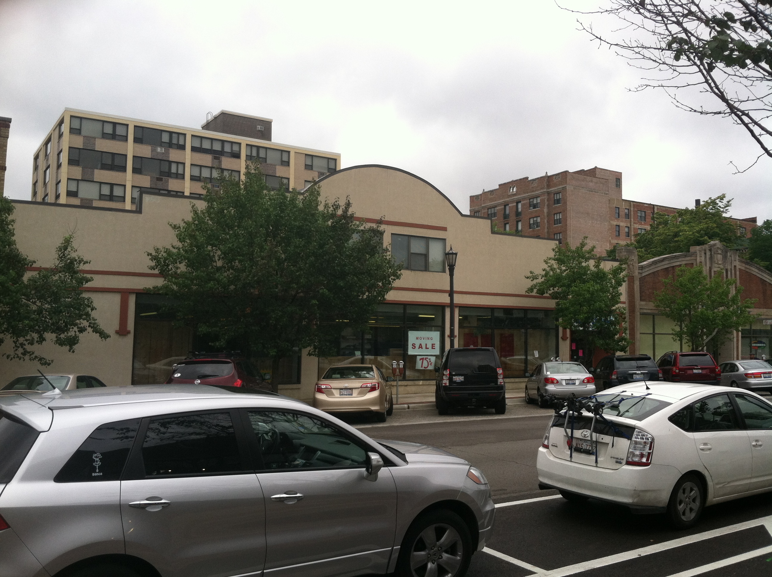
We all have at least one place that we always remember fondly from our childhood. It could be a restaurant, a park, the home of a close friend, or family member, or a park. We all have at least one, probably many. It is always sad when one of these places goes away. Well this happened to me this last week, when an Evanston institution began the process of moving.
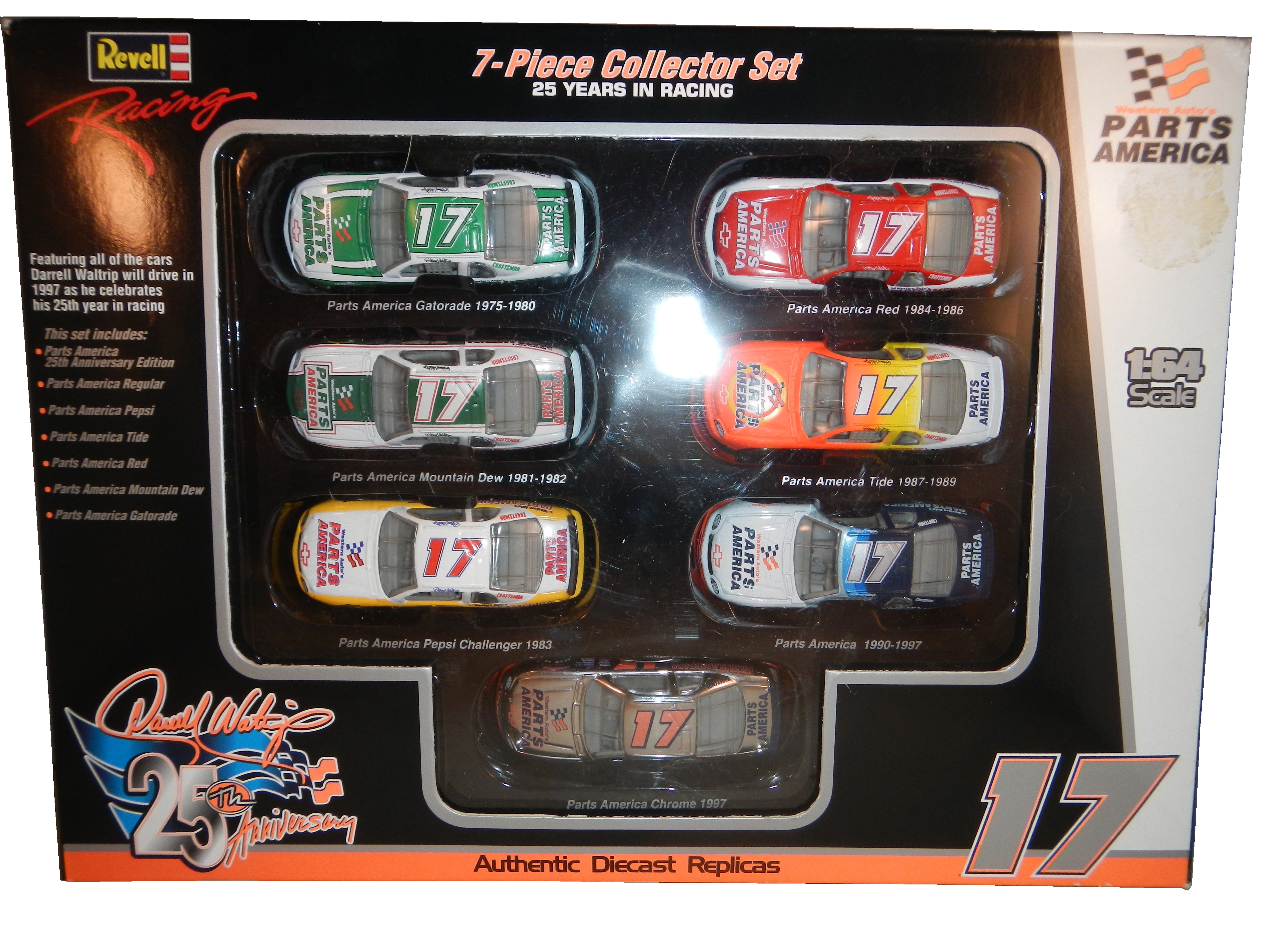
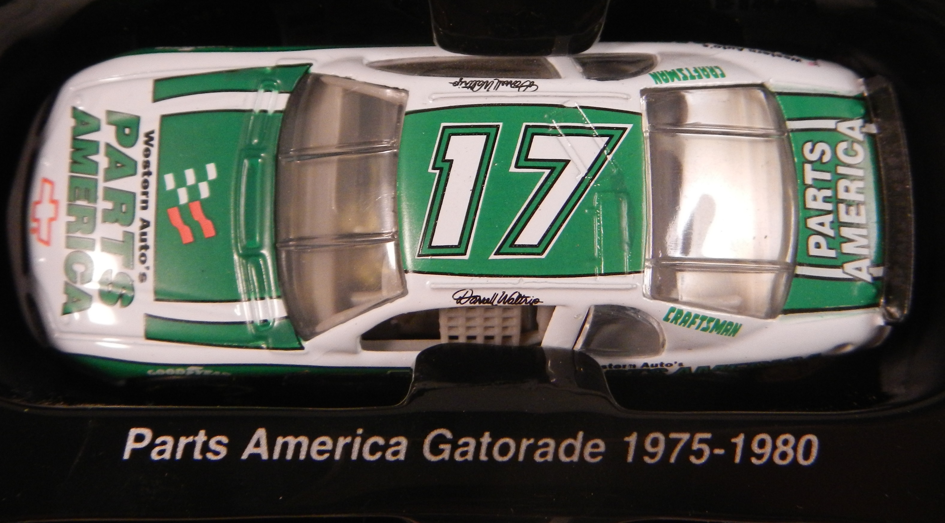
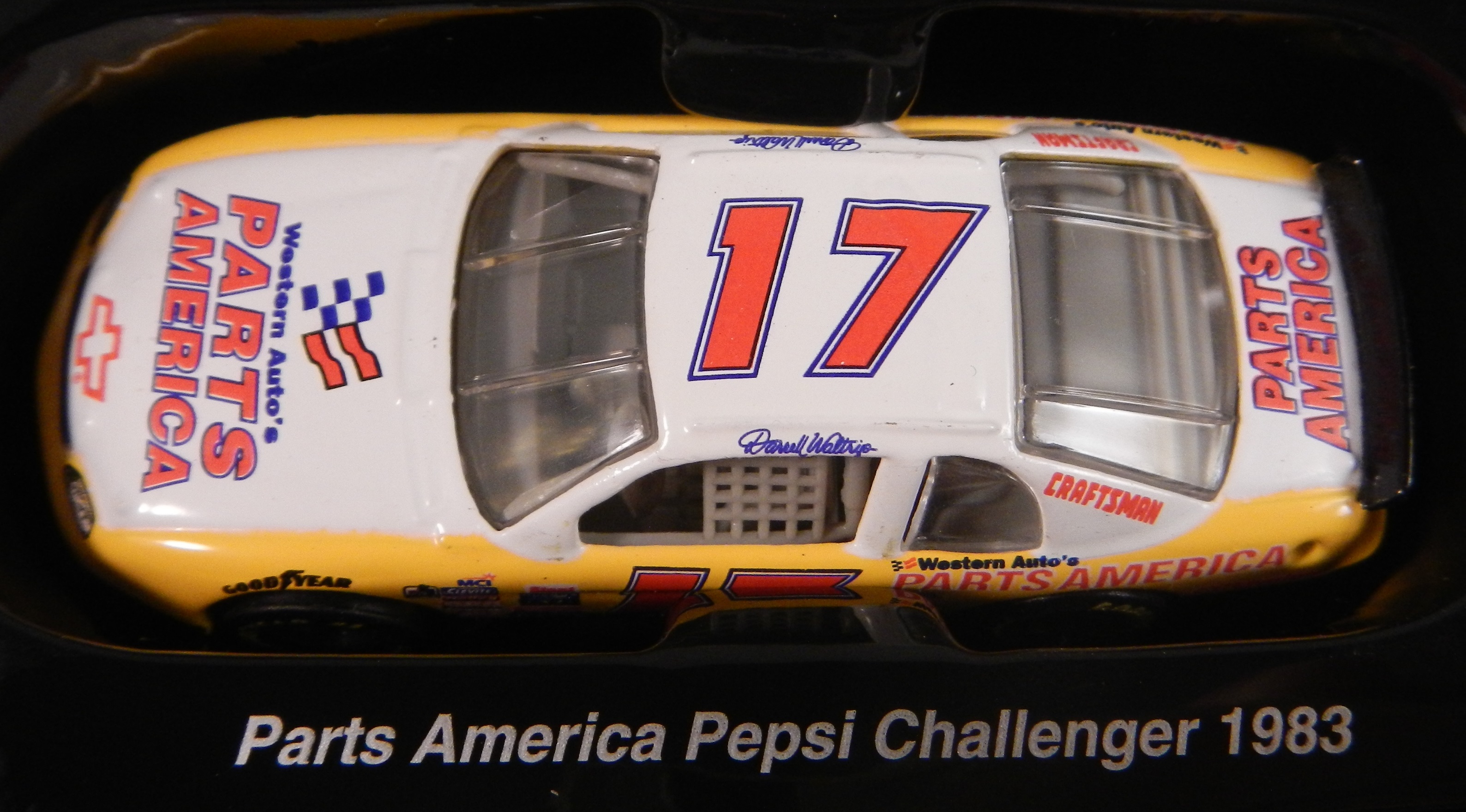
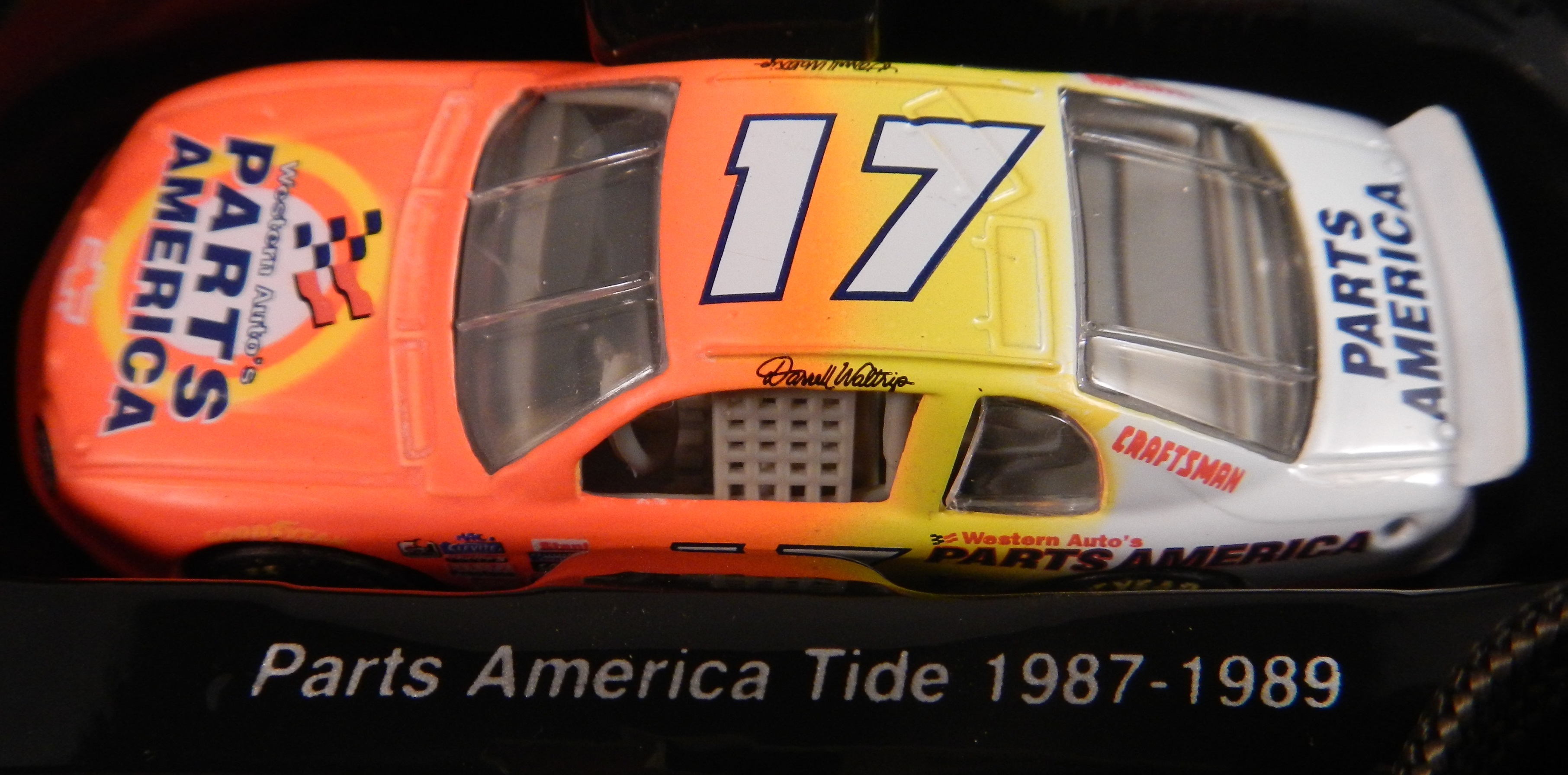
Tom Thumb in Downtown Evanston was a place that I and a number of my friends spent a great deal of our childhood. Some of us were skateboarders, some of us were RC car fanatics, some of us, like me were model builders and die cast collectors. It had been in the same place for 49 years, but they announced that they were going to move after a zoning decision was made to replace the current building with a two-story building for two restaurants. So, on July 12, after 49 years as an Evanston institution, it closed. I went there on the 12, and made, with a heavy heart, my last purchase.This was a sad day because I am a huge NASCAR fan, and for many years, Tom Thumb was the only store in Evanston that sold NASCAR stuff. It was also one of, if not the oldest skate shop in the midwest. I went there, looked around the store where I spend my childhood, took it all in, and bought my last purchase, this 1997 Darrell Waltrip 25th Anniversary set.I bought this for two reasons. The first is that I love this set, I remember many of these schemes from races I watched in 1997. They all look really good, and they bring back memories. The second reason, and I didn’t even think about this until I started doing some work for next week. During my research, I was grumbling about how many different paint schemes each car runs every week, and it dawned on me that this might be the first example of that in the Sprint Cup Series.
You never had this much variety in paint schemes before 1997. Each team ran one scheme for the majority of the season, maybe 2 or 3 different schemes and special schemes for the All-Star race, and possibly the Busch Clash. But Darrell Waltrip ran, in total, 7 different schemes, each based on a specific era in his career. Each had Western Auto Parts America as the primary sponsor, but were based for past sponsors. He started with Gatorade, which he ran for DiGard Motorsports, from 1975-1980. He won two Coca Cola 600’s(1978, 1979) a Winston 500(1977) the Southern 500(1978,1979)as well as 22 other races during that time.In 1981, he left DiGard for Junior Johnson Motorsports, and was sponsored by Mountain Dew, where he won 24 races including the 1982 Winston 500, the 1981 Busch Clash, and two of his three Sprint Cup ChampionshipsPepsi replaced Mountain Dew and created The Pepsi Challenger which he ran in 1983 for Junior Johnson. He won 6 races for PepsiAfter Pepsi left, Budweiser took over the sponsorship, and from 1984-1986, he won 13 races, the 1985 Winston Cup Championship, the Inagural All-Star Race in 1985, the 1985 Southern 500, and the Winston 500. I find love how they call it “Red” instead of Budweiser since this was marketed to kids at the time.In 1987, he made the move to Hendrick Motorsports, and picked up Tide as a sponsor. He won the 1989 Daytona 500, The 1988 and 1989 Coca Cola 600’s and 6 other races. I loved that it was identical to the scheme used by Ricky Ruddthat same season.From 1990-1997, he raced the #17 for Hendrick Motorsports in 1990, and then founded Darrell Waltrip Motorsports, which raced this scheme from 1990 to 1997. He won 5 races, but was never to get his former glory back. Western Auto left the team after 1997, and Darrell Waltrip Motorsports shut down shortly after the start of the 1998 season.The last scheme is one of the most innovative schemes in the history of NASCAR. His legendary Chrome scheme. Darrell loved chrome, using chrome numbers, and a chrome helmet. This was supposed to be used for just a single race, but it was raced a number of times that season. Nothing like this had ever been done in NASCAR before. There had been chrome numbers, but never a chrome car. This car was so far ahead of it’s time. Darrell even had a Chrome driver suit that he wore with this car!1997 would be the beginning of the end for Darrell Waltrip. He shut down his Winston Cup team in 1998, and joined Dale Earnhardt Inc. midway through the season. He would race for just two more seasons before fully retiring in 2000.
The idea of 7 different schemes seems like standard opperating procedure today, but back in 1997, this was revolutionary. This was unheard of. These schemes were all good, and they worked well, but this surprised some fans. 17 years later, this is the norm rather than the exception. If I did the paint scheme reveiws back in 1997, I would write one article at the beginning of the season, one before the all-star race, and maybe one midway through the season. There were no changes to paint scheme, or if there were, they were very rare.
Tom Thumb will reopen eventually. But whavever the new location, it will never have the same feel as the decades old building were it was once housed. I will miss it. I really will. But I find a bit of irony in that I bought the beginning of an era at the end of another era. I will visit Tom Thumb when they reopen, and I wish them the best of luck. From the residents of Evanston to Tom Thumb, we will miss you, and we wish you the best of luck in your new location!
We also have a paint scheme related news item to discuss. This last week, NASCAR announced that the Chase for the NASCAR Sprint Cup would have some new features on their cars. Specifically, all Chase contenders will have a yellow splitter cover, a yellow window stripe with black letters, yellow roof numbers, and a special Chase for the NASCAR Sprint Cup decal. I’ve been speculalting that this might come to be, and now I have proof. I am not going to discuss how I think it will look, until I have a good idea as to who is in the Chase, and how it will look on their cars. Here is an illustration of how it looks.
With that out of the way, we move on to…
PAINT SCHEME REVIEWS
Kasey Kahne #5 Great Clips/Shark Week Chevy SS Another case where it looks like two different designers created the car without speaking to each other. It looks awful. The color scheme is good, so it passes, though just bearly with a D-
Greg Biffle #16 3M Throwback Ford Fusions Greg Biffle is holding a contest to pick a throwback sheme for his race at Pocono in August. I would normally grade all four of these seperatley, however they all have the same traits, so I will grade them at once. All four have really good color schemes, and really nice logos, but they are all plagues with modern car numbers as well as modern designs. They simply look awful. I will vote for none of these schemes and give them all an F-
Morgan Shepherd #33 ThunderCoal Chevy SS I liked the other ThunderCoal scheme, but this is just awful. Too many neon colors, and it is needlessly overdesigned. I give it an F
Michael McDowell #95 JPO Absorbents Ford Fusion Another great Levine Family Racing scheme. It is hard to believe how bad they were last year. Great color and design scheme equals an A+ scheme.
I have a lot of paint schemes to discuss and we will get to that shortly. I wanted to discuss something that took place before the Coke Zero 400 last week. It is a bit murky, but here is what took place.
Charlie Crist is a former governor of Florida, and a former Republican. After a brief hiatus from politics, he has annoucned his intentions to run for the Governor of Florida as a democrat. He had plans to run the #98 Phil Parsons Racing Ford driven by Josh Wise. After this was announced however, the Republican Party of Florida filed a lawsuit stating that it was a campaign contribution worth more than $3,000. Remember, this was the same team that was crowd funded by Reddit and Dogecoin at Talladega, and that sponsorship cost about $55,000. It was later reported that the Charlie Crist decals had been removed from the car. Phil Parsons Racing stated the deal was in response to a series of negative ads toward Crist, and that the Crist decals were part of a deal with recording artist Lee Brice. They also stated that they didn’t pull the sponsorship due to the lawsuit, and that the $25,000 sponsorship would be returned.
I frankly don’t buy any of that for a second. I think that it was because of the lawsuit, and that Phil Parsons Racing did not want to get thrown under the bus because of it. They tried to handle it as diplomatic as possible, but it still sounds sketchy. The other reason I have a huge problem with this is because the simple fact that politics and racing don’t mix. Look at what’s happened with F1 and IndyCar. Politics are a constant issue in the sport, and I for one am tired of it. Look at the Ayrton Senna/Alan Prost battle in the 1990’s! Look at The Split! Politics ruins racing!
This is not the first time a politician with deep pockets has sponsored a race car, but I hope that this is the last time. I’m not against politics, I’m against forcing it into something it has no place being in! If tobacco, cel phone carriers, and hard liqour have or had been banned from sponsoring cars, then so should politicians.
Austin Dillon #3 Great Stuff Chevy SS Color scheme is good, the design looks very odd. The gold numbers and chain design does not suit the car at all, and if they were left off, I would give it an A, but this scheme earns a B-
Kasey Kahne #5 Team Stream Chevy SS Good color scheme, but Kasey loves to drive overdesigned cars, and this is no exception. I’m giving it a C which is a very fair grade here.
Danica Patrick #10 GoDaddy/Florida Lottery Chevy SS It looks like two people designed this car, and they didn’t talk to each other while designing it. Both sets of color schemes are awful, and both design schemes are awful. F-
Josh Wise #98 Phil Parsons Racing Ford Fusion Since this design is what was raced, I will grade it as such. The color scheme is decent, but it is a tad too overdesigned. It is a D+ look.
The 2014 Sprint All Star race is behind us, and as usual, there were a myriad of different paint schemes. Some were good, others not so much, but I have to say there were a lot of great schemes in this year’s race. Let’s start with the Sprint Showdown. Unlike in previous years, The Showdown took place on Friday, and the All-Star Race was on Saturday. The Showdown was a great event, which saw Clint Bowyer winning, AJ Allmendinger finishing second, and in the upset of the year, Josh Wise winning the Sprint Fan vote, and advancing to the All Star Race. Let’s get to the grades:
#10 Cole Whitt #26 Speed Stick Gear Toyota Camry This is one of the few schemes that has both a classic and modern look at the same time, and paired with a great color scheme, it earns an A
#13 Austin Dillon #3 Dow Chevy SS While I like the color scheme and number and logo designs, the white stripe up the side kills the look. It takes an A scheme to a B+ scheme.
#14 Kyle Larson #42 Target Chevy SS The scheme looks decent, I like the red on the back, though I do not like the Target logos at the bottom. That takes a scheme that was an A grade to a B-
#16 Michael Annett #7 Pilot/Flying J Chevy SS Good color scheme, but the awful template is back for Tommy Baldwin. It is really sad, because this could be a great scheme, but the template takes it from an A to a C-
#19 JJ Yeley #44 Phoenix Warehouse Chevy SS My first thought when I saw this scheme was it looked like the color scheme from the 1994-1995 NBA All-Star Game jerseys which is a decent color scheme. But to say the car is overdesigned is an understatement. This scheme is awful. Not even a great color scheme can help this car pass. F
Now we move on to the All-Star Race, which saw Jamie McMurray pull an upset and take the win, thus guaranteeing him entry into the event for the next 10 years. Overall there were a lot of great schemes, though I wish more teams would run special schemes.
#5 David Ragan #34 Taco Bell Ford Fusion Overall design and color schemes are good, and the only complaint is that the Taco Bell logo should be in color as opposed to black and white. A+
#11 Jeff Gordon #24 Drive to End Hunger Chevy SS Great overall design, great color scheme, though the D on the hood reversed to miror the curves of the hood looks odd. Still it’s a good scheme and Ill give it an A
#12 Dale Earnhardt Jr. #88 National Guard Chevy SS The new metallic numbers work, and the overall design is decent, since it incorporates the design used on the numbers. I’ll give it an B+
#13 Denny Hamlin #11 FedEx Express Toyota Camry The front nose design and stripes are awful. The color schemes are great, as are the logos and numbers, but the stripes kill it. The best grade I can give is a C+
#15 Kasey Kahne #5 Time Warner Cable Chevy SS It is a good color scheme, but the design on the side needs a little tweaking. Get rid of the needless zig-zag pattern and it works a whole lot better. It is still a decent scheme, so I will give it a C
#17 Matt Kenseth #20 Home Depot/Huskey Toyota Camry I would give this scheme an A grade, but the yellow back bumper ruins it. The clash between the two just works awkward, and it takes an A scheme down to a C
#19 Ryan Newman #31 Cat/Quicken Loans Chevy SS What in the blue hell is going on here? I’ve liked Ryan’s schemes this year but this is an F scheme, even though I like the color scheme.
#22 Greg Biffle#16 3M Ford Fusion-The sides and roof have gotten worse from last year. I have to give it an F in that respect.
Also, check this video out concerning how different pit stops in open wheel racing were between 1950 and today:
The video shows how far we have come in pit stops, but we also have come a long way in driver uniforms.
By David G. Firestone
50 years ago this week, events over the course of 6 days in May of 1964 changed the culture, cars, and uniforms of auto racing forever. Three deaths in two races over those six days demonstrated that current safety methods were ineffective at best, and 3 talented drivers lost their lives. The 1964 World 600 and the 1964 Indianapolis 500 helped introduce reenforced fuel tanks and Nomex driver suits, among other things. 50 years later, those events are still being felt
The World 600 began in the early afternoon on May 24, 1964. For the first six laps, it was business as usual, but on lap 7, on the backstretch, Junior Johnson and Ned Jarrett wrecked, and Glenn “Fireball” Roberts swerved to avoid them, and wrecked. He was trapped in the car by the pedals, and his car caught fire. Ned Jarrett ran and pulled Roberts from the car, and paramedics took him to the hospital. 39 days after the wreck, while still in the hospital from his injuries, he died from pneumonia.
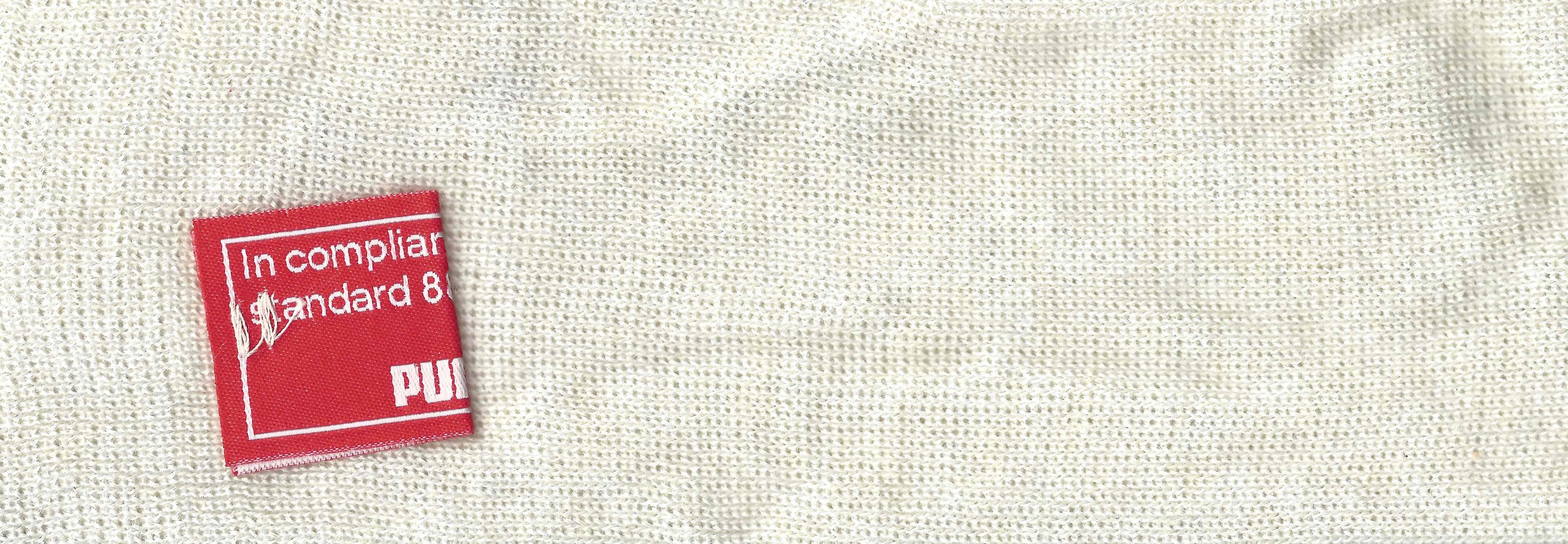
NASCAR had rules concerning “fire retardant” uniforms but these were inadequate at best. These uniforms were cotton coveralls traditionally used by workmen that had been dipped in a number of fire retardant materials including Borax. These were not only ineffective, but were extremely uncomfortable to wear. They were known for inflaming the skin, and aggravating asthma. Fireball was not wearing these coveralls during that race, because he had a doctor’s note stating he should not wear them. There is some debate over what the doctor’s note was for, either for asthma or skin hives. It llustrates why these uniforms were not popular, they were so uncomfortable to wear that drivers did not want to wear them.
6 days later, on May 30, the 48th Indianapolis 500 was held. Dave MacDonald started 14th, and Eddie Sachs started 17th when the green flag dropped. MacDonald was racing a car built by racing innovator Mickey Thompson, which by all accounts was badly built and difficult to drive. The first lap led into the second, which saw Dave MacDonald lose control of his car and smash into the inside wall. The fuel tank instantly ignited and the car went across the track, and collected a number of other cars, including Eddie Sachs car, which also exploded on impact. Sachs was killed by the impact, but MacDonald was seriously burned, and his lungs were scorched, the lung damage proved to be fatal.
Inspired by these events, the Nomex firesuit was introduced in 1967 as a replacement for the cotton coveralls dipped in chemicals. It was a lot more comfortable and safer than chemical-dipped cotton, so drivers were more willing to wear them. Like most new safety equipment in sports, it took a while to catch on. Nomex was created in 1967, for NASA. Its main use at the time was for the Apollo Command Module parachutes. NASA needed a material that could stand up to the heat of reentering the earth’s atmosphere, and still remain fully functional.
Bill Simpson is credited with introducing Nomex to driver suits. The story goes that Simpson started making Nomex suits after learning about the material from astronaut Pete Conrad while Simpson was working as a consultant for NASA. One of the pivital moments in the history of the suit was when Simpson had heard that a competitor had been badmouthing his products, and so, in something he said later was “the dumbest thing I have ever done,” challenged the competitor to a “burn off.” Simpson put on his suit and lit himself on fire. He later recreated this for a Mazda commercial.
Why did it take so long to make critical changes to driver uniforms? The events that took place in 1964 were tragic, and it clearly illustrated why the old system didn’t work. The only change made immediately after the events was the rule that fire retardant suits were now mandatory, regardless of how it made the driver feel. In today’s sports safety culture, there would be focus groups, meetings within the sanctioning body, and changes within a few months after the event. But by 1964 standards, just rigidly enforcing the rule was the best course of action. Remember that in 1964 race car drivers were seen as somewhat expendable. Driver deaths in racing were stunningly common back then. As such, while there was a need for improvement, it was not a priority for sanctioning bodies. The sad fact is that back then, driver deaths were part of the allure of racing. People would go to these events and hope to see a fatal crash, as crass as that sounds. As for the suits themselves, the only other options besides chemical dipped cotton was aluminized cotton or aluminized kevlar, which was not more comfortable, as it was like wearing aluminum foil.
So what did these pre-Nomex driver suits look like? They looked like this. This is a driver suit made by Hinchman in Indianapolis. It is basically a polyester suit that is customizedto thedriver’spreference. It is not all that different than a jumpsuit that one would wear to work. It is a very flimsy material, has no cuffson the arms or legs, and, most amazingly, the tag states that the suit is “Untreated, will burn, must be dipped.” This suit was worn circa 1972, which is indicated by the “Archie Bunker for President” patch sewn into the chest. Like any new safety technology in sports, it takes time for it to become the standard, and for Nomex, this is no exception.
This race, along with the 1955 24 Hours of Le Mans and the 2001 Daytona 500 have their legacies written in death, but unlike other similar events, the lessons they had to teach were learned, and the racing world as a whole is better for them. The deaths in these events were not in vain, and others are alive because of them. 50 years later, those 6 days in May 1964 are still having an impact on racing.
The Driver Suit Blog is my favorite project I have ever undertaken. I’ve gotten a few people who ask about the origins of The Driver Suit Blog, and so this week, we will start with how it came to be. The origins are rooted in my game-used memorabilia collection. I started in hockey, and looked at the various game wear patterns on jerseys. I then would get into other forms of memorabilia, and would analyze them for an old website. In 2008, I went to the National Sports Collector’s Convention in Rosemont, and came away with a late 1960’s Oakland A’s jersey. As fate would have it, when I got home, I was looking for something on my computer and found Windows Movie Maker on my XP based hard drive. I decided on a whim to make a video about it, and with that Introduction to Sports Memorabilia was born.
I started into driver suits in 2010, and researched the suits the same way I research every other game-used item. I had a lot of trouble finding information for a collector about the various aspects of driver suits and race-worn memorabilia. So I just did what I could, research wise. In 2012, I asked Paul Lukas if I could guest write a column for Uni-Watch. Now the blog was never a thought prior to this article, but as work progressed, it dawned on me that I could start a blog for driver suit and racing memorabilia collectors. So in January 2013, The Driver Suit Blog was born.
The paint scheme grading was born out of frustration. I had been working on a Christian Fittipaldi article, and it wasn’t long enough, so I started grading paint schemes to fill some extra space. I kept doing it, and it has become a part of the blog. The same can be said for Tailgating Time, which was also based on a Uni-Watch feature known as Cuilinary Corner. Tailgating Time was designed for tailgaters, to give them recipies that can be cooked on a grill or hot plate at a track, but are something more than just burgers and hot dogs.
Where will the blog go from here? I will continue my work for driver suit collectors, giving them tips on how to analyze driver suits. Tailgating Time will return, but I can’t say for sure when this will happen. I have a lot of stuff planned so stay tuned.
I also want to take a moment to thank my readers. Without you guys, this would have never taken off, and I just want to say thanks. I also owe a huge debt to Paul Lukas. Without him, the Driver Suit Blog would have never been created. Paul, next time you are in Evanston, hit me up, we’ll go out for a beer!
Next week, we will go behind the scenes and examine how a Driver Suit Blog article comes to be. One other thing that I will start in a couple of weeks is I will do more Wheel Reviews for The Driver Suit Blog, but for now, we conclude with
PAINT SCHEME REVIEWS!
Ryan Blaney #12 SKF Ford Fusion I gave this exact same scheme an A last year, and it earned 9th place on the Paint Scheme Leaderboard as well. This scheme still earns an A+
Cole Whitt #26 Iowa Chop House Toyota Camry When it comes to great paint schemes for the #26, BK Racing picked up where Swan Racing left off. Great color and design schemes, A+
AJ Allmedinger #47 Hungry Jack Toyota Camry What is this new deal with diagonal curved stripes across the side? It just looks awkward. It has a great color scheme, but the design just looks bad. C-
Jimmie Johnson #48 Lowes/Valspar Chevy SS Jimmy’s same great classic design with a very nice red rear end. I love a great shade of red on a race car, and this is a great shade of red. A+
By David G. Firestone
While I typically watched NASCAR growing up, I did also watch IndyCar. That was before “the split” which diluted the value the sport so much that to this day it is still suffering, 6 years after the unification of Champ Car and the Indy Racing League. I got tired of politics and wanted to watch racing, I didn’t care who was sanctioning it. I still watch IndyCar racing and I collect race-used stuff.
I mentioned this a few months ago, when I discussed video matching. My first open wheel driver suit is this Alex Barron suit from 1998.
Not only is this my first open wheel suit, it was also my first suit that featured an FIA safety certification on the back of the neck. Having dealt in NASCAR suits, I didn’t know what to make of it, and through some research, I eventually learned what it was and what it meant.The chest features a FedEx Championship Series patch, probably my favorite sanctioning body patch ever,
and logos for Toyota and Denso.This being my first Sparco driver suit, The cowl tags, and location of the warranty tags were out of place, as compared to a NASCAR driver suit.One thing I do find interesting is that there are no television logos on the sleeves and legs, but as the video at the end shows, that was not uncommon, but more on that later.
The collar has an unusual design. Most collar designs feature either logos on the side, or logos across the front, or sometimes both. This one is unique in that it features a DEGREE logo on the front, as well as a CASTROL logo on the right side, but nothing on the left side…I’ve never seen that before or since, and I can’t understand the need for that particular design…it just looks odd.Alex’s name is embroidered into the belt, and something I love about open wheel suits is that because it is an international sport, much more so than NASCAR, the driver usually has their home country flag embroidered next to their name on their suit, as this suit shows.I also have a 1/18 die cast of Barron’s very sharp looking car from 1998. It is the only die cast I have that has a driver in it. I love the fact that he is wearing a very accurate version of his driver suit.Now as I mentioned, this was the suit Barron wore during his most infamous moment, his crash at Road America, where he wound up on top of Bryan Herta. Someone recently uploaded the whole race to YouTube, and when watching it, notice that nobody has logos for the in-car camera. I find that rather interesting, since it would be very easy to place logos on the sleeves, and it was commonplace in other forms of racing. But it is an interesting race.
Now we have another piece of news to discuss. In the realm of NCAA sports, the two major factions in uniforms are Nike and Under Armour. Nike has a deal with Denny Hamlin for driver suits, and I was wondering when Under Armour would jump on the band wagon, and this week, we got our answer. Under Armour, who has signed deals with Michael Waltrip Racing and Henrdick Motorsports to outfit teams with apparel. This deal does not include the drivers themselves but the car numbers are fair play. I find it a bit unusual that the deal provides apparel for all members of the team, pit crew members, front office personel, and everyone EXCEPT the faces of the franchises. Now that might change in the near future, but for now that is how the deal works. You can read more about the deal here.
Greg Biffle #16 Give Kids A Smile Ford Fusion Man! Greg Biffle really wants the Paint Schemie Awards for Most Degraded Paint Schemes, and Worst Paint Scheme Set with another F scheme. Horrible design, and an ugly paint scheme.
Ricky Stenhouse Jr. #17 Ford EcoBoot Ford Fusion I like the color scheme, I like the overall scheme, and my only complaint is that the orange numbers on the roof should be on the door. Still it is an A scheme
Parker Kligerman #30 Swan Energy Toyota Camry Just when I thought Swan had learned the error of their ways, and were improving their paint schemes, along comes this one. Now we are back to square one, and this scheme earns a D+
Travis Kvapil #32 Keen Parts Ford Fusion Decent design, good color scheme, but the logo on the hood is very difficult to see. That is a major issue. When a sponsor pays for a car, the hood design should be easy to see, but this isn’t easy, and I give it a C-
Aric Almirola #43 Ekrich Ford Fusion The red on the roof is pointless, and it takes away from a great scheme. If the roof were Petty Blue, and the red was just a stripe on the bottom, I would give this scheme an A+ but with the red roof, it goes down to a B-
The 36th Sprint Unlimited starts tonight at 8:15 ET on Fox. This marks the beginning of the Daytona 500 and the beginning of the NASCAR season. I will be looking forward to it, and I will enjoy it as always.
The event will feature a number of segments which were voted on by NASCAR fans including myself, and many of you. The first segment will feature laps followed by a second segment of laps, and then a third segment of laps. Many special paint schemes will be run for this race, as is traditional. My personal favorite is the Miller Lite Throwback scheme being run by Brad Keselowski.
Now some factoids about the race.
*There are, in total, Chevy drivers, Ford drivers and Toyota drivers.
*Chevy has 20 wins, Ford has 7 wins, and Toyota has 1 win.
*Mark Martin has competed in 20 consecutive events from 1989-2008.
*Dale Earnhardt Sr. has won 6 events, more than anyone else in 1980, 1986, 1988, 1991, 1993, and 1995 and went on to win the Sprint Cup Championship 4 times in 1980, 1986, 1991, and 1993, he is one of 7 drives to do so.
*From 1979-2011 the event was sponsored by Anheuser-Busch, first called the Busch Clash which was the brainchild of Monty Roberts, brand manager of Busch Beer, who sponsored the Pole Award. It remained the Busch Clash until 1998, when Budweiser took over the Pole Award, and it was renamed the Budweiser Shootout. In 2012, Sprint, the series sponsor took over the sponsorship after Budweiser announced they would drop the sponsorship in favor of sponsoring the Duel Races that determine the starting order of the Daytona 500.
*Petty Enterprises was not eligible to run the Shootout because of a rule stating that only drivers that ran the Busch/Budweiser pole award decal were eligible to enter the shootout. Richard Petty and his family did not support alcohol sponsorship or decals on race cars. So John Andretti, Bobby Hamilton, Jeff Green, and Aric Almirola who all had a number of poles with Petty Enterprises were not eligible to participate. I find it interesting that Petty has reversed course on the alcohol sponsorship rule, since Kasey Kahne was sponsored by Budweiser, and Marcos Ambrose will run at least one race sponsored by Twisted Tea.
*Buddy Baker won the inaugural Sprint Unlimited in 1979, which was a 20 lap sprint.
*Since many top drivers were excluded from the race due to not winning a pole award, they moved to the TV booth as color commentators. These included Dale Earnhardt Sr. in 1981, Richard Petty and AJ Foyt in 1982 and 1983, Neil Bonnett in 1993, Darrell Waltrip in 1994, 1995, 1997, and 1999, and Kenny Wallace in 1998.
*There has never been a driver who has won the Sprint Unlimited, Budweiser Duel and Daytona 500 in the same year. Drivers have won 2 of 3 in a season, but never scored the hat trick.
*One of the first instances of a special paint scheme being used specifically for the Sprint Unlimited was the Chroma Premier scheme run by Jeff Gordon in 1997. He followed it up the next year with the legendary Chroma-lusion scheme, which feature a paint that changed color. Since then, special schemes have become commonplace.
*Richard Childress Racing has 8 Sprint Unlimited wins, most of any team. Hendrick Motorsports has 6 wins, and Joe Gibbs Racing has 5 wins.
The Unlimited starts tonight at 8 PM ET on Fox Sports 1, and I look forward to watching the event as I hope the rest of you do too.
Though I have had a VERY busy week, I still have time for…
Paint Scheme Reviews!
Kasey Kahne #5 Time Warner Cable Chevy SS It is a good color scheme, but the design on the side needs a little tweaking. Get rid of the needless zig-zag pattern and it works a whole lot better. It is still a decent scheme, so I will give it a C
Michael Annett #7 Pilot/Flying J Chevy SS Good color scheme, but the awful template is back for Tommy Baldwin. It is really sad, because this could be a great scheme, but the template takes it from an A to a C-
Kyle Busch #18 M&M’s Peanut Toyota Camry I like this, it has a great shade of yellow, hard to find in NASCAR these days, and the peanut motif works very well. It is an original design, and I’ll give it an A
Joey Logano #22 Autotrader.com Ford Fusion Sometimes orange works, sometimes it doesn’t. This is an example of an orange scheme that just doesn’t work. If the white was taken out completely it might work, but this is just horrid, and I give it an F
Cole Whitt #26 Speed Stick Gear Toyota Camry This is one of the few schemes that has both a classic and modern look at the same time, and paired with a great color scheme, it earns an A
David Ragan #34 CSX Ford Fusion What in the hell is going on here? Why is the hood decal upside down? Why in the world would they do that? Were they drunk when they decaled the car? The only thing that I can guess is that it is designed for an in-car camera…but that makes no sense either! F-
Dale Earnhardt Jr. #88 Kelley Blue Book Chevy SS During my Daytona Preseason Thunder article, I said I wanted to see the #88 they used on a real car. I got my wish, and I like this design overall. The metallic gold is a bold choice, it doesn’t always work well. I give it an A+
BUT WAIT, THERE’S MORE!
As many of you know, I don’t just research and collect driver suits and racing items, I collect and research many other things. I recently had a column run in Uni-Watch concerning some lettering from the 1958 Washington Senators, and you can read my column here.
By David G. FirestoneI must have said the word Nomex a thousand times on this blog, but what exactly is Nomex? In short, it is a flame-resistant meta-aramid cloth material. It is an aramid material, which is the same thing as Kevlar, but it is not as strong as a bulletproof vest, but it has great thermal, as well as chemical resistance, which makes it great for racing firesuits.
The development of the Nomex firesuit has been a long road. This road has seen its share of driver deaths and injuries. Before the Coca Cola 600, I discussed the deaths of Fireball Roberts, Eddie Sachs, and Dave McDonald in fire-related crashes over the course of 6 days in 1964. What took place from there would cross the paths of racing and a young drag racer.
Bill Simpson was born in Hermosa Beach, California in 1940. He took up drag racing at a young age, and at age 18, broke both arms in a drag racing crash. As he recuperated, he thought of safety in racing for the first time. He developed the idea of an X shaped parachute, and using materials from his uncle’s army surplus shop, developed a functional drag racing parachute. Don Garlits noticed the new parachutes, and took an interest, which helped the Simpson Drag Chute company to form. As time went on, he started making other racing equipment, which caught the attention of drivers, and, oddly enough, NASA. During a project, he met Pete Conrad, who introduced the now 27 year old Simpson to Nomex in 1967.
Nomex was created in 1967, for NASA. Far from the uses it has today, its main use at the time was for the Apollo Command Module parachutes. NASA needed a material that could stand up to the heat of reentering the earth’s atmosphere, and still remain fully functional. Simpson saw what the material could do, and decided it would work well to make driver suits, and other uniform items.Contrary to what most people think, Nomex is not fire PROOF, rather it is fire RETARDENT. It does burn, but burns at a much slower rate, and that protects the driver in the event of a fire. Bill Simpson decided to show how much better this material was by having a “burn off.” He put on one of his Simpson racing suits, doused himself in gasoline, and lit himself on fire. Though he was fully engulfed in flames, he was not hurt. Though he admits that is was a bad idea, it sold drivers on Nomex. Even today, 46 years later, Nomex is still the go-to material for driver suits.Nomex is used for many other things. Nomex sheet is used in power cords for insulation. Fire-fighters use Nomex for protection in saving lives. Fighter pilots wear Nomex suits in case of cockpit fires. Nomex was developed for NASA and NASA still uses a lot of Nomex. It is used in what NASA refers to as the “Thermal Micrometeoroid Garment of the Extravehicular Mobility Unit”, or in regular English, the “outer layer of a spacesuit.” The spacesuits that space shuttle astronauts wore on liftoff and touchdown were primarily made of Nomex. Almost every project that NASA has done in the last 40 years involves Nomex in one form or another, so it is a very versatile material.
Interestingly, as safety concerns increased, and safety equipment changes for the better, you begin to see that Nomex is beginning to have competition in the driver suit market in terms of fire protection. While I’m typically a traditionalist when it comes to sports uniforms, for driver suits that is a great thing. Developing a new material that serves the same purpose as Nomex, but can do it better and longer is a great thing. Eventually, Nomex will go the way of typewriters, film cameras, the printing press, and the floppy disk as an invention that is obsolete but changed the world.
Paint Scheme Reviews!
Some new 2014 schemes released this week:
Danica Patrick #10 Apsen Dental Chevy SS Even though this scheme is better than the *ahem* current Aspen Dental scheme, it still does not look good. But it is still an improvement, and I’ll give it a C
Ryan Newman #31 Quicken Loans Chevy SS Great color scheme-Check, Awesome use of Northwestern stripes-Check, classic design-Check, A+ Grade, Double-Check!
Dale Earnhardt Jr. #88 National Guard Chevy SS The numbers kill what is otherwise a great scheme. I like everything else, but the color of the numbers looks really odd, and I can’t really say it adds to the car at all. Still it is a decent scheme, so I’ll give it a B
Greg Biffle #16 Pink 3M Ford Fusion Pinkwashing is an automatic F. I hate it when companies use causes like this to move products, so I show no mercy in this sence.
Ricky Stenhouse Jr. #17 My Best Buy Ford Fusion The blue used on this scheme is a tad too light, but it is still a decent scheme, though the lighter blue takes it from the A grade Best Buy had to an A-
Joey Logano #22 Shell/Pennzoil/Hertz Ford Fusion I’ll be honest, I want to give this scheme a better grade, but the Hertz logo just looks out of place here, and it is awkward on an already iffy scheme. Best I can give it is a D-
Cole Whitt #30 Black Clover Toyota Camry Swan Racing seems to go out of its way to design bad paint schemes this year, and this scheme is no exception. It has no redeeming features at all, and earns an F-
Aric Almirola #41 Maurice Petty Tribute Ford Fusion Tribute schemes have worked very well across the board, and this is no exception. Simple, timeless, yet attractive, a great tribute to a great engine builder. Extra points for using Maurice’s #41 for the weekend. Interestingly, Maurice raced in a total of 26 Sprint Cup races, and had 7 top 5’s and 16 top 10’s during the 1960’s.
We start off today with a unique story from IndyCar. Ryan Hunter-Reay won the Izod IndyCar Series Championship last season, and as such has the right to use the number 1 on his car. He normally used 28 as his car number, because 28 million people worldwide are affected by cancer, and his mother passed away from cancer in 2009. So he is using a number 1 with a rather unique twist. Also mentioned that Marco Andretti will switch to number 25 from 26 next year.
Moving on to NASCAR paint schemes, let’s look at the Nationwide Series first. Two Chevy schemes and one Ford scheme have been released so far
Sam Hornish-#12 Alliance Ford Mustang Could someone explain to me why in the world it has door handle decals? And why does it have a blue line on the door that looks like race damage? I really want to defend this scheme, but no, just no. Final Grade: C
Kevin Harvick-#33 Hunt Brothers Pizza Chevy Camaro First off, the Camaro looks really good on its own, and this paint scheme works quite well. The door-handle decal is visible, but not as bold as the Hornish car. The green/white contrast works well, and the decal package on the front looks really good. The stripes on the sides work very well, and are not as haphazard of some schemes I have seen for this season. Final Grade: A
Dale Earnhardt Jr./Cole Whitt-#88 Tax Slayer Chevy Camaro Decent color scheme at work here, but what is with the pink roll cage? The red black and white scheme has a similar color in the front stripe at the nose. It’s visually distracting, and pointless. The powder blue/pink stripe takes away from a great scheme and takes the final grade from an A to a B-. Get rid of the blue, and it would be an A
Now we look at the Sprint Cup Schemes
Kasey Kahne-#5 Time Warner Cable Chevy SS Awful color scheme, check. Door and panel design that is supposed to be edgy but is really a cliche, check. The most unoriginal sponsor logo in NASCAR, check. Ok, I think we’re all done here, Final Grade: D
Ryan Newman-#39 Quicken Loans Chevy SS Want to have some fun, open the Kahne link, and this link in two different tabs, and switch back and forth to see how “original” this scheme is. Clearly both were designed by the same person, they look almost identical, except the fronts are a little different, and the color scheme on the Newman car is much better. Final Grade: C-


