From here on out, I will publish a complete list of 2015 paint schemes that have been announced, on Wednesdays. I will grade them as normal on Saturdays. Again these should be taken with a grain of salt as they can and often are changed between now and the next season. So without further ado, the first 2015 trackers!
The 2014 Sprint All Star race is behind us, and as usual, there were a myriad of different paint schemes. Some were good, others not so much, but I have to say there were a lot of great schemes in this year’s race. Let’s start with the Sprint Showdown. Unlike in previous years, The Showdown took place on Friday, and the All-Star Race was on Saturday. The Showdown was a great event, which saw Clint Bowyer winning, AJ Allmendinger finishing second, and in the upset of the year, Josh Wise winning the Sprint Fan vote, and advancing to the All Star Race. Let’s get to the grades:
#10 Cole Whitt #26 Speed Stick Gear Toyota Camry This is one of the few schemes that has both a classic and modern look at the same time, and paired with a great color scheme, it earns an A
#13 Austin Dillon #3 Dow Chevy SS While I like the color scheme and number and logo designs, the white stripe up the side kills the look. It takes an A scheme to a B+ scheme.
#14 Kyle Larson #42 Target Chevy SS The scheme looks decent, I like the red on the back, though I do not like the Target logos at the bottom. That takes a scheme that was an A grade to a B-
#16 Michael Annett #7 Pilot/Flying J Chevy SS Good color scheme, but the awful template is back for Tommy Baldwin. It is really sad, because this could be a great scheme, but the template takes it from an A to a C-
#19 JJ Yeley #44 Phoenix Warehouse Chevy SS My first thought when I saw this scheme was it looked like the color scheme from the 1994-1995 NBA All-Star Game jerseys which is a decent color scheme. But to say the car is overdesigned is an understatement. This scheme is awful. Not even a great color scheme can help this car pass. F
Now we move on to the All-Star Race, which saw Jamie McMurray pull an upset and take the win, thus guaranteeing him entry into the event for the next 10 years. Overall there were a lot of great schemes, though I wish more teams would run special schemes.
#5 David Ragan #34 Taco Bell Ford Fusion Overall design and color schemes are good, and the only complaint is that the Taco Bell logo should be in color as opposed to black and white. A+
#11 Jeff Gordon #24 Drive to End Hunger Chevy SS Great overall design, great color scheme, though the D on the hood reversed to miror the curves of the hood looks odd. Still it’s a good scheme and Ill give it an A
#12 Dale Earnhardt Jr. #88 National Guard Chevy SS The new metallic numbers work, and the overall design is decent, since it incorporates the design used on the numbers. I’ll give it an B+
#13 Denny Hamlin #11 FedEx Express Toyota Camry The front nose design and stripes are awful. The color schemes are great, as are the logos and numbers, but the stripes kill it. The best grade I can give is a C+
#15 Kasey Kahne #5 Time Warner Cable Chevy SS It is a good color scheme, but the design on the side needs a little tweaking. Get rid of the needless zig-zag pattern and it works a whole lot better. It is still a decent scheme, so I will give it a C
#17 Matt Kenseth #20 Home Depot/Huskey Toyota Camry I would give this scheme an A grade, but the yellow back bumper ruins it. The clash between the two just works awkward, and it takes an A scheme down to a C
#19 Ryan Newman #31 Cat/Quicken Loans Chevy SS What in the blue hell is going on here? I’ve liked Ryan’s schemes this year but this is an F scheme, even though I like the color scheme.
#22 Greg Biffle#16 3M Ford Fusion-The sides and roof have gotten worse from last year. I have to give it an F in that respect.
Also, check this video out concerning how different pit stops in open wheel racing were between 1950 and today:
The video shows how far we have come in pit stops, but we also have come a long way in driver uniforms.
By David G. Firestone
50 years ago this week, events over the course of 6 days in May of 1964 changed the culture, cars, and uniforms of auto racing forever. Three deaths in two races over those six days demonstrated that current safety methods were ineffective at best, and 3 talented drivers lost their lives. The 1964 World 600 and the 1964 Indianapolis 500 helped introduce reenforced fuel tanks and Nomex driver suits, among other things. 50 years later, those events are still being felt
The World 600 began in the early afternoon on May 24, 1964. For the first six laps, it was business as usual, but on lap 7, on the backstretch, Junior Johnson and Ned Jarrett wrecked, and Glenn “Fireball” Roberts swerved to avoid them, and wrecked. He was trapped in the car by the pedals, and his car caught fire. Ned Jarrett ran and pulled Roberts from the car, and paramedics took him to the hospital. 39 days after the wreck, while still in the hospital from his injuries, he died from pneumonia.
NASCAR had rules concerning “fire retardant” uniforms but these were inadequate at best. These uniforms were cotton coveralls traditionally used by workmen that had been dipped in a number of fire retardant materials including Borax. These were not only ineffective, but were extremely uncomfortable to wear. They were known for inflaming the skin, and aggravating asthma. Fireball was not wearing these coveralls during that race, because he had a doctor’s note stating he should not wear them. There is some debate over what the doctor’s note was for, either for asthma or skin hives. It llustrates why these uniforms were not popular, they were so uncomfortable to wear that drivers did not want to wear them.
6 days later, on May 30, the 48th Indianapolis 500 was held. Dave MacDonald started 14th, and Eddie Sachs started 17th when the green flag dropped. MacDonald was racing a car built by racing innovator Mickey Thompson, which by all accounts was badly built and difficult to drive. The first lap led into the second, which saw Dave MacDonald lose control of his car and smash into the inside wall. The fuel tank instantly ignited and the car went across the track, and collected a number of other cars, including Eddie Sachs car, which also exploded on impact. Sachs was killed by the impact, but MacDonald was seriously burned, and his lungs were scorched, the lung damage proved to be fatal.
Inspired by these events, the Nomex firesuit was introduced in 1967 as a replacement for the cotton coveralls dipped in chemicals. It was a lot more comfortable and safer than chemical-dipped cotton, so drivers were more willing to wear them. Like most new safety equipment in sports, it took a while to catch on. Nomex was created in 1967, for NASA. Its main use at the time was for the Apollo Command Module parachutes. NASA needed a material that could stand up to the heat of reentering the earth’s atmosphere, and still remain fully functional.
Bill Simpson is credited with introducing Nomex to driver suits. The story goes that Simpson started making Nomex suits after learning about the material from astronaut Pete Conrad while Simpson was working as a consultant for NASA. One of the pivital moments in the history of the suit was when Simpson had heard that a competitor had been badmouthing his products, and so, in something he said later was “the dumbest thing I have ever done,” challenged the competitor to a “burn off.” Simpson put on his suit and lit himself on fire. He later recreated this for a Mazda commercial.
Why did it take so long to make critical changes to driver uniforms? The events that took place in 1964 were tragic, and it clearly illustrated why the old system didn’t work. The only change made immediately after the events was the rule that fire retardant suits were now mandatory, regardless of how it made the driver feel. In today’s sports safety culture, there would be focus groups, meetings within the sanctioning body, and changes within a few months after the event. But by 1964 standards, just rigidly enforcing the rule was the best course of action. Remember that in 1964 race car drivers were seen as somewhat expendable. Driver deaths in racing were stunningly common back then. As such, while there was a need for improvement, it was not a priority for sanctioning bodies. The sad fact is that back then, driver deaths were part of the allure of racing. People would go to these events and hope to see a fatal crash, as crass as that sounds. As for the suits themselves, the only other options besides chemical dipped cotton was aluminized cotton or aluminized kevlar, which was not more comfortable, as it was like wearing aluminum foil.
So what did these pre-Nomex driver suits look like? They looked like this. This is a driver suit made by Hinchman in Indianapolis. It is basically a polyester suit that is customizedto thedriver’spreference. It is not all that different than a jumpsuit that one would wear to work. It is a very flimsy material, has no cuffson the arms or legs, and, most amazingly, the tag states that the suit is “Untreated, will burn, must be dipped.” This suit was worn circa 1972, which is indicated by the “Archie Bunker for President” patch sewn into the chest. Like any new safety technology in sports, it takes time for it to become the standard, and for Nomex, this is no exception.
This race, along with the 1955 24 Hours of Le Mans and the 2001 Daytona 500 have their legacies written in death, but unlike other similar events, the lessons they had to teach were learned, and the racing world as a whole is better for them. The deaths in these events were not in vain, and others are alive because of them. 50 years later, those 6 days in May 1964 are still having an impact on racing.
By David G. Firestone
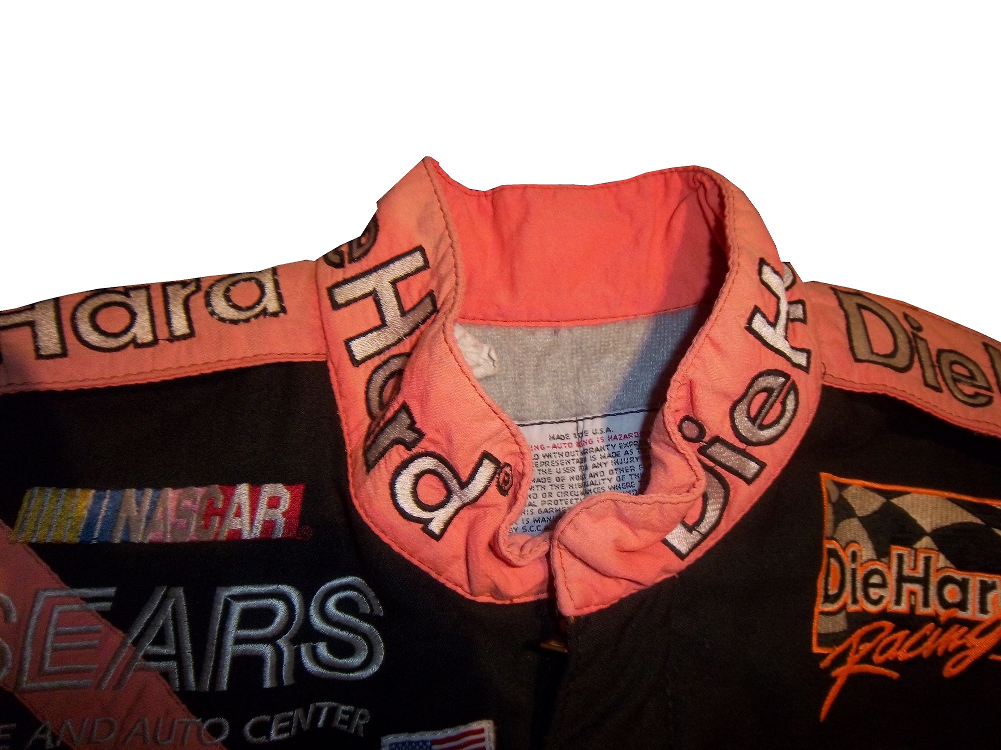
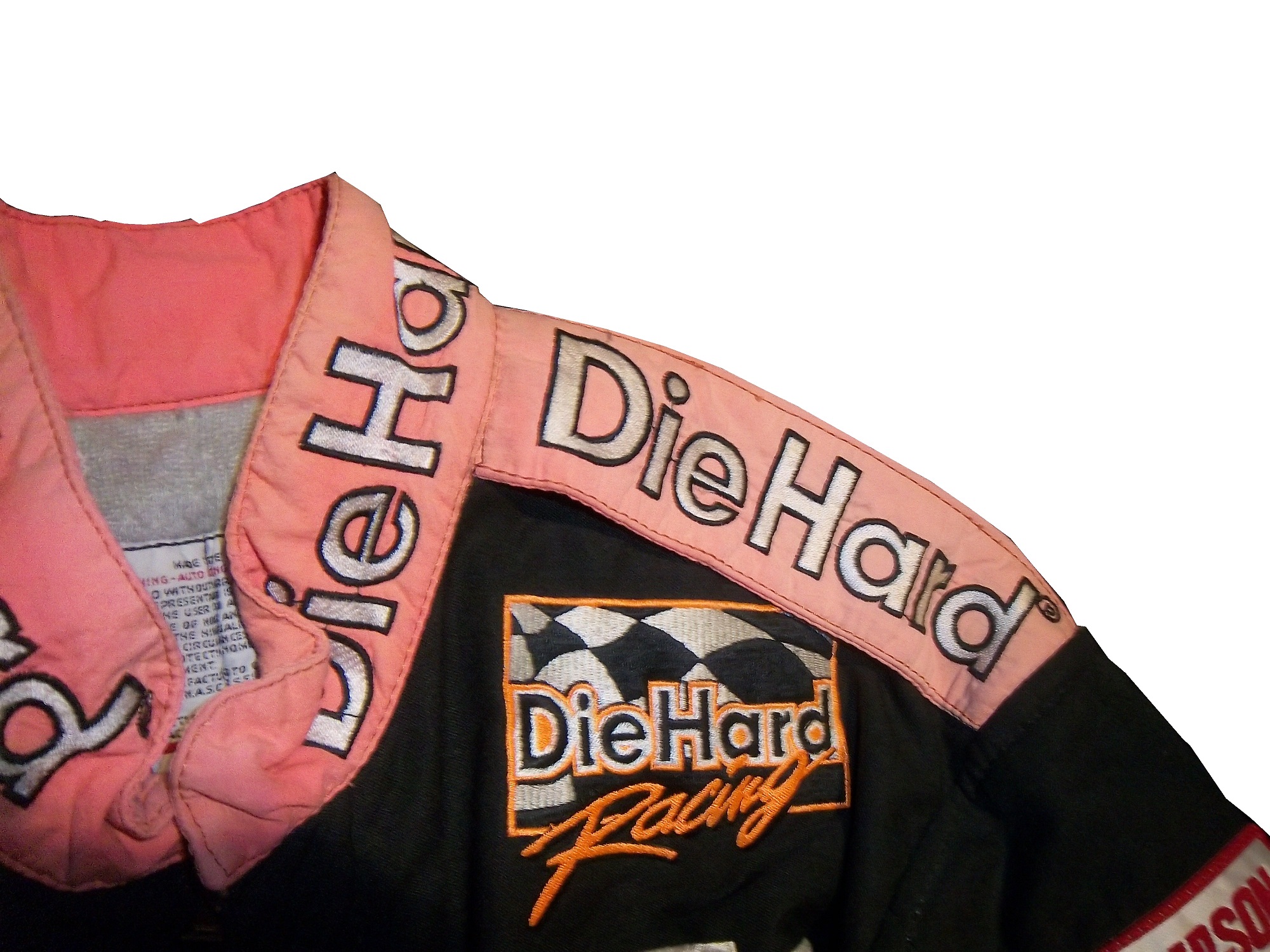
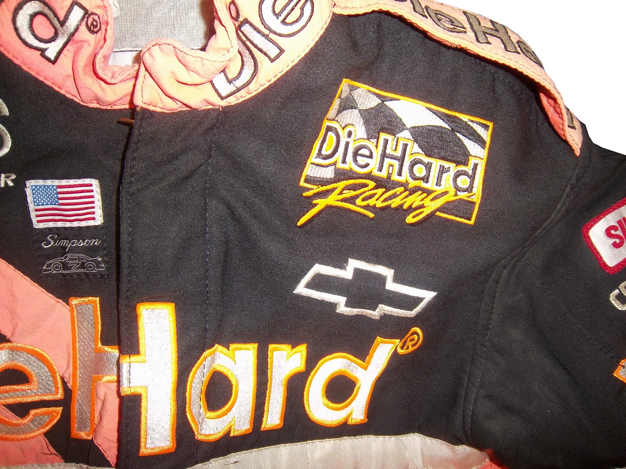
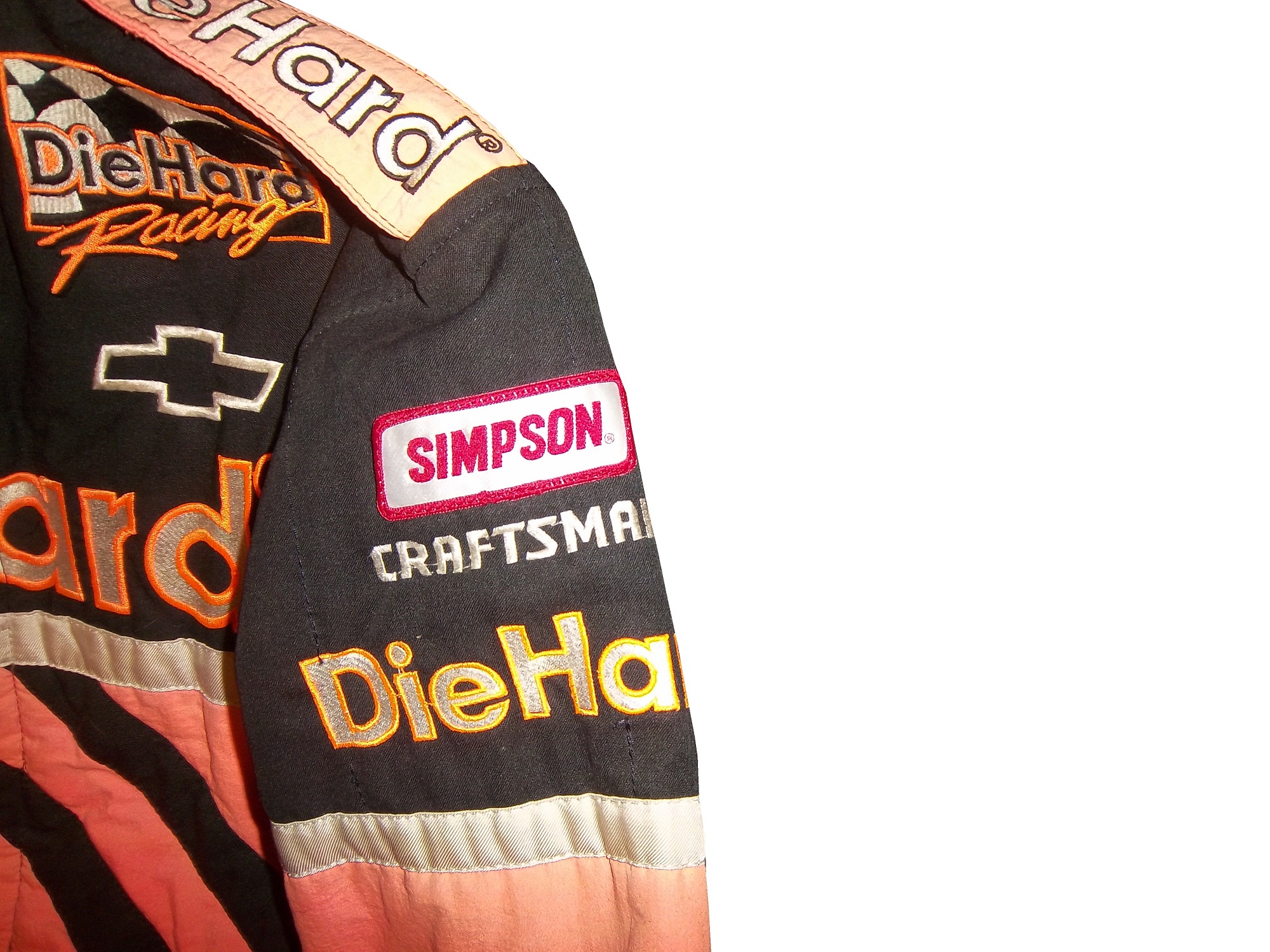
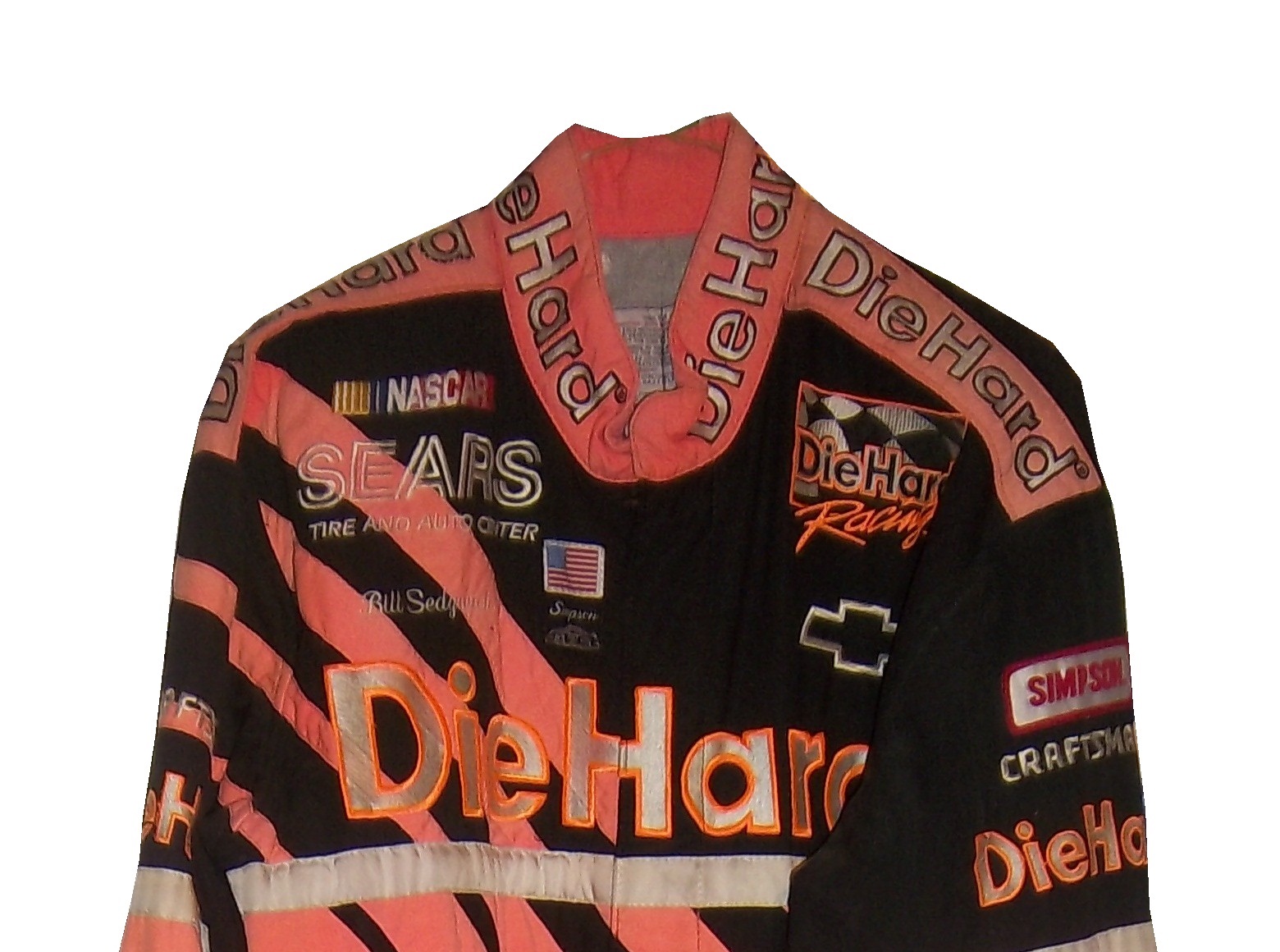
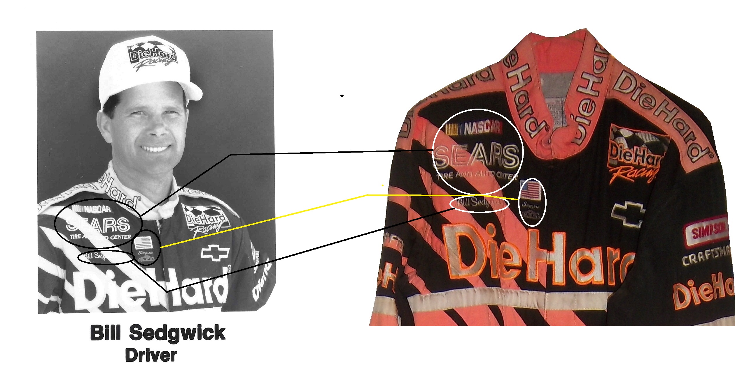
On the first anniversary of the founding of The Driver Suit Blog I felt it appropriate to analyze the first two NASCAR driver suits I ever bought. I started in the driver suit hobby in March of 2010, with a Bill Sedgwick Die Hard driver suit from the Craftsman Truck Series in 1996. I purchased this specific item for a number of reasons, first, it was well within my price range, and second, I wanted a low-end example that I can look at and get a general feel for aspects that I will see in other driver suits.
Some of the stuff I learned from this particular suit helped me understand the very basics of design aspects on race-worn driver suits. Some of the aspects I discovered from that were completely different and it was through subsequent research that I began to understand driver suits more. I have kept it for as long as I have is because I love the suit, and I even though I have had it for almost 4 years, I still find aspects about it that interest me.
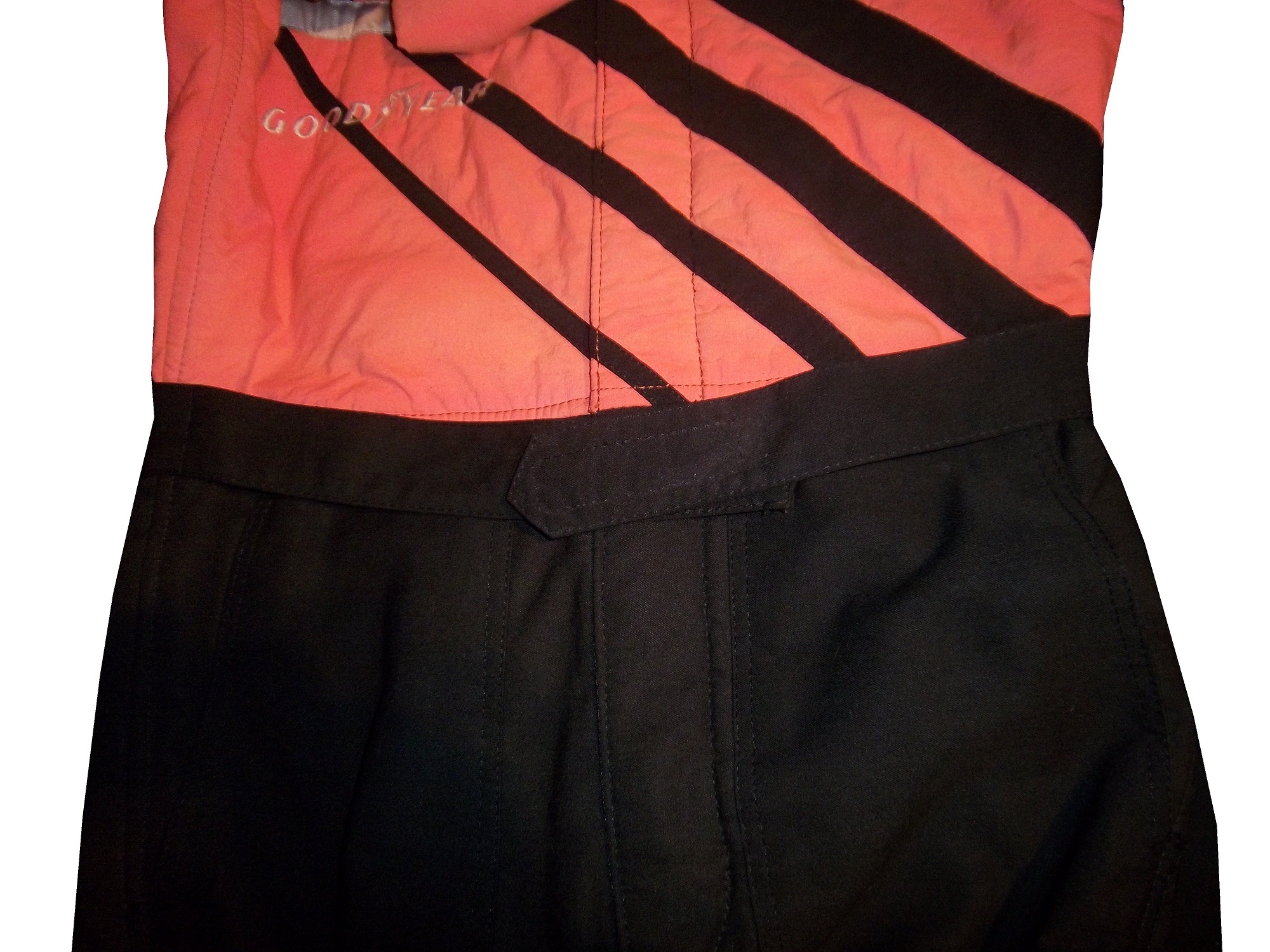
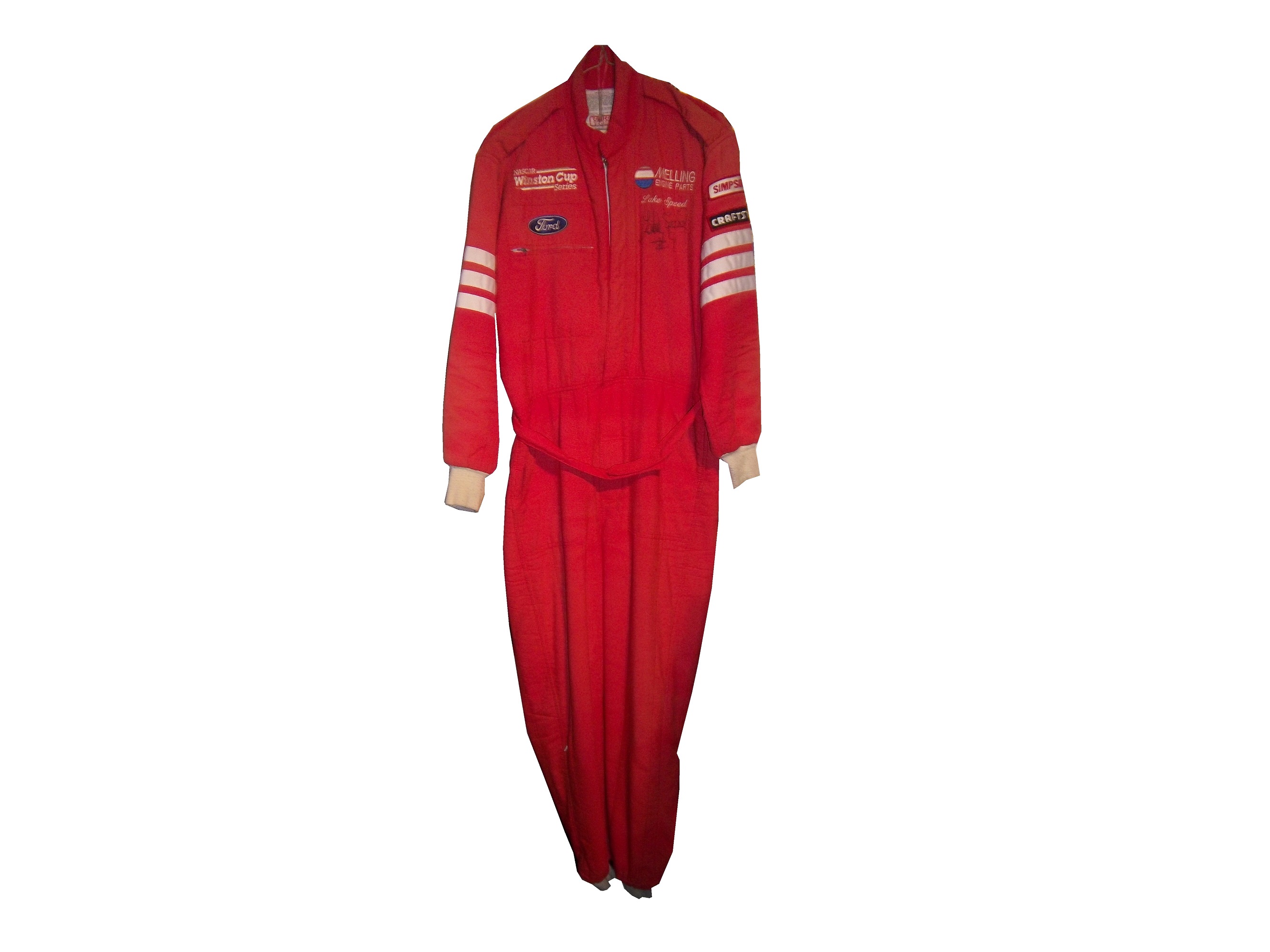
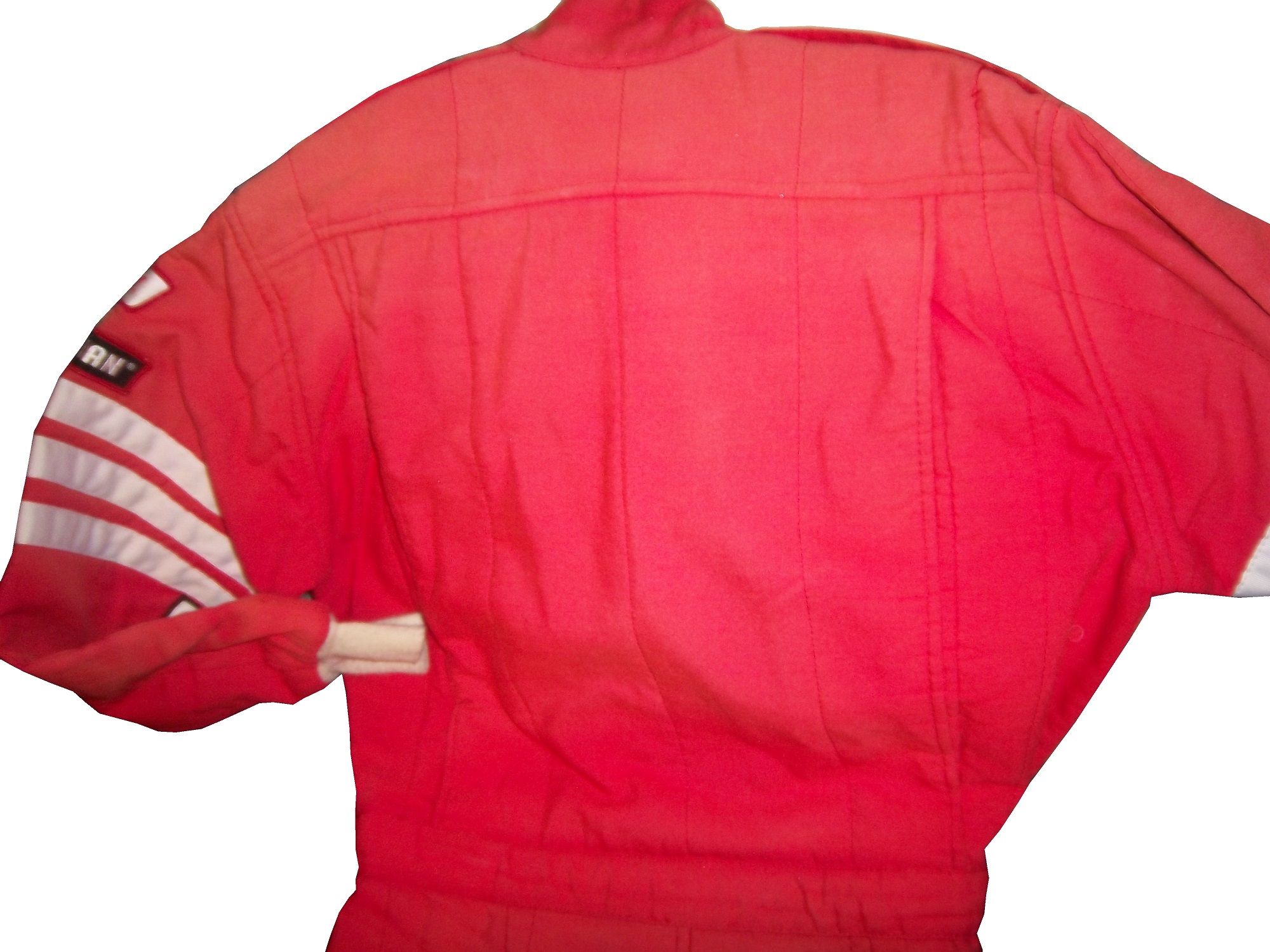
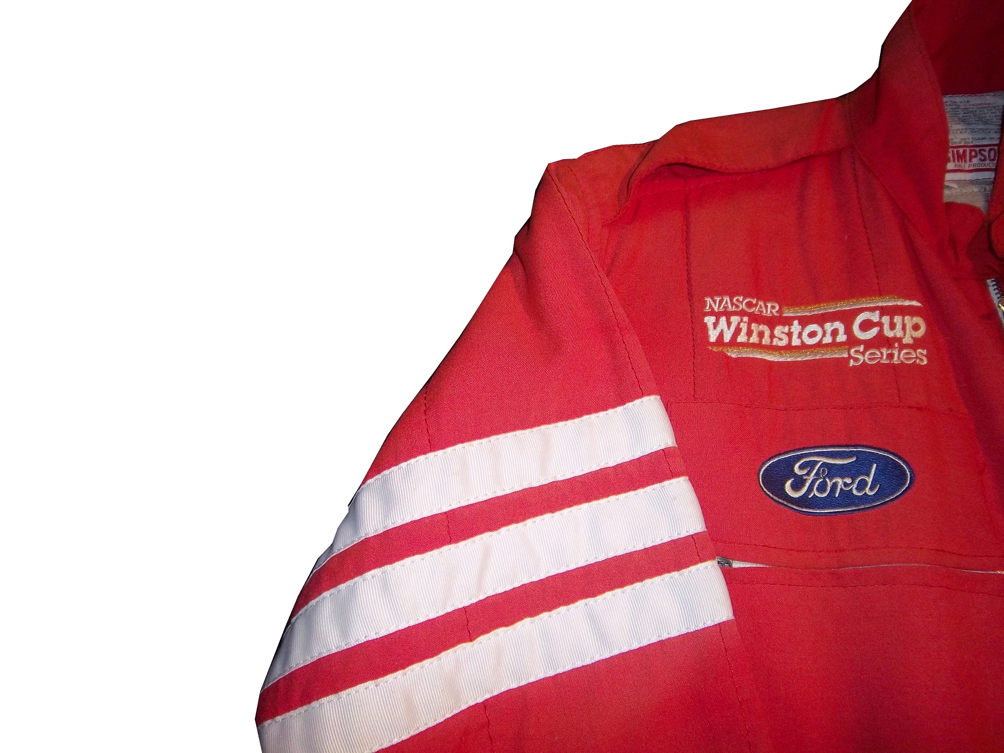
The suit is custom designed for Darrell Waltrip’s Craftsman Truck Series team. Sedgwick drove the #17 Chevy C-1500 for the entire 1996 season, whereas Waltrip drove the #5 truck for a very limited schedule. Sedgwick had 3 top 5’s and 8 top 10’s in the 23 of the 24 races that year, and led a total of 8 laps. Sedgwick was released at the end of the season.The triple-layer suit is custom designed for Sedgwick, with the Sears Die Hard logos on the collar and shoulder epaulets,Sears Die Hard logos across the front and Sedgwick’s name on the right chest,no arm gussets,no adornment on the belt,TV logos and safety stripes on the legs,TV logos on the sleeves, and a huge logo across the back.I purchased a press kit for this suit, which I covered in December, concerning this suit, and I realized that the suit Sedgwick is wearing in the promotional photo is the same suit that is in my collection. I keep the press kit in my authentication binder with the rest of my COA’s and LOA’sThe other suit I bought, my first Winston Cup suit was a Lake Speed suit from 1997, this one is a bit different. In 1997, Speed was racing for Melling Racing, which in 1997 was a shell of its former self. Melling had 34 victories and the 1988 Winston Cup Championship, but by 1997, they had no real sponsorship, and had not won a race since 1991. During that season Lake Speed didn’t score a top 5, top 10, or victory, and only led 3 laps in the 25 races he raced in that year.Due to the lack of sponsorship, Speed didn’t have the luxury of having a custom-made suit that season so he wore what appears to be a store bought suit. It looks like the suit was purchased either from a store or a catalog, and customized for Lake’s use. There are no large sponsor logos on the collar,shoulder epaulets,torso,sleeves,or legs.The legs have a cuff cut, as opposed to a boot cut like the Bill Sedgwick suit has.
Everyone who has a hobby or an interest started somewhere. With me, it was with these two driver suits. No matter what you do in your hobby, or how high you fly in your hobby, you were a rookie, and you started from somewhere. Never forget where you came from. These two suits are a reminder of what I was, and I love these two.
Before we get to paint schemes, I need to say something to my readers. When I started this project one year ago, I never thought it would take off as much as it did. I have a group of really awesome readers and followers. I also owe a special thanks to Paul Lukas of Uni-Watch, because if I had never written my two articles for Uni-Watch in 2013, I would never have done the research I did for them, and I would never have had the frustration of not finding research from the collector’s perspective, and The Driver Suit would never have been born. To all my readers, from the bottom of my heart, I say thank you! Stay Tuned because 2014 will be even better than 2013!
Paint Scheme Reveiws
Jamie McMurray #1 Cessna Chevy SS Black with silver numbers and white trim looks simple and really good. I can’t say anything bad about this scheme, and bonus points for improving the door number design. A+
Austin Dillon #3 Dow Chevy SS Take the white stripe down the side off, and it will be a solid A scheme. The white does not look good at all. The red/white/black color scheme works very well, and it is decently designed, so I will give it a B+
Danica Patrick #10 Go Daddy Chevy SS Not only does Go Daddy continue to use the worst shade of yellow in NASCAR, they also have given the worst shade of orange a more prominent role in the car. Givng this car an F is a very fair grade.
Ricky Stenhouse Jr. #17 NOS Ford Fusion I love this color scheme, however, I don’t love the side design. It has too many different different designs, all of which would work on their own but combined they look like a jumbled mess. I really want to like this scheme, but I just can’t, so I’ll give it a C-
Kurt Busch #41 Haas CNC Chevy SS Great color scheme and a very simple desgin look very good here. I also like the matte black used, and the door numbers look really solid. Can’t give this scheme anything less than an A
Kyle Larson #42 Target Chevy SS The scheme looks decent, I like the white on the back, though I do not like the Target logos at the bottom. That takes a scheme that was an A grade to a B-
Dale Earnhardt Jr. #88 Diet Mountain Dew Chevy SS Same scheme as last year, but I never gave it a grade. So here is my analysis Not a great scheme, too much needless design on the side of the car, and the silver background is just brutal. The red lettering on a green background is unattractive at best, and all in all, this is a D- grade.
Carl Edwards #99 Aflac Ford Fusion This has a terrible color scheme, with lime green, neon blue, black and white. The wing design is not only ugly but would work better starting at the door and working behind.
You know me for driver suits, but i also collect other things besides suits. Aside from helmets and other uniform items, i also collect other race-used items from the cars. Racing is half man half machine, and items from the machine make unique collectibles as well.
One of the most obvious things is sheet metal. Stock cars consist of a roll cage which contains the engine, suspension, and driver compartment. Covering that is what is called “sheet metal” which is a thin metal that has the shape of the car and where the paint scheme is added. The cars are “skinned” after each race. The sheet metal from cars has become a huge collectors market. Pieces can be as small as 1 inch squared, such as this Carl Edwards piece, or huge, such as this Sterling Marlin door.
Tires are also popular to collect as well. Tires can be purchased whole, but since they can weigh as much as 90 pounds, they are often cut up and the pieces are sold, like sheet metal. This example, used by Kevin Harvick in the 2002 Daytona 500 is an example. it gives a good example of the thickness of the tire, and the cords are visible as well. This Kyle Petty/John Andretti card has two small pieces of tire, each used by the respective driver in the card. These are popular, and everything from suits to caps, to sheet metal wind up in cards.
Race-used lug nuts go hand in hand with tires. Lug nuts are used once, and then sold after the race, such as these Tony Stewart examples. Lug nuts are Super glued to the rim, and one of these still has superglue residue on it.
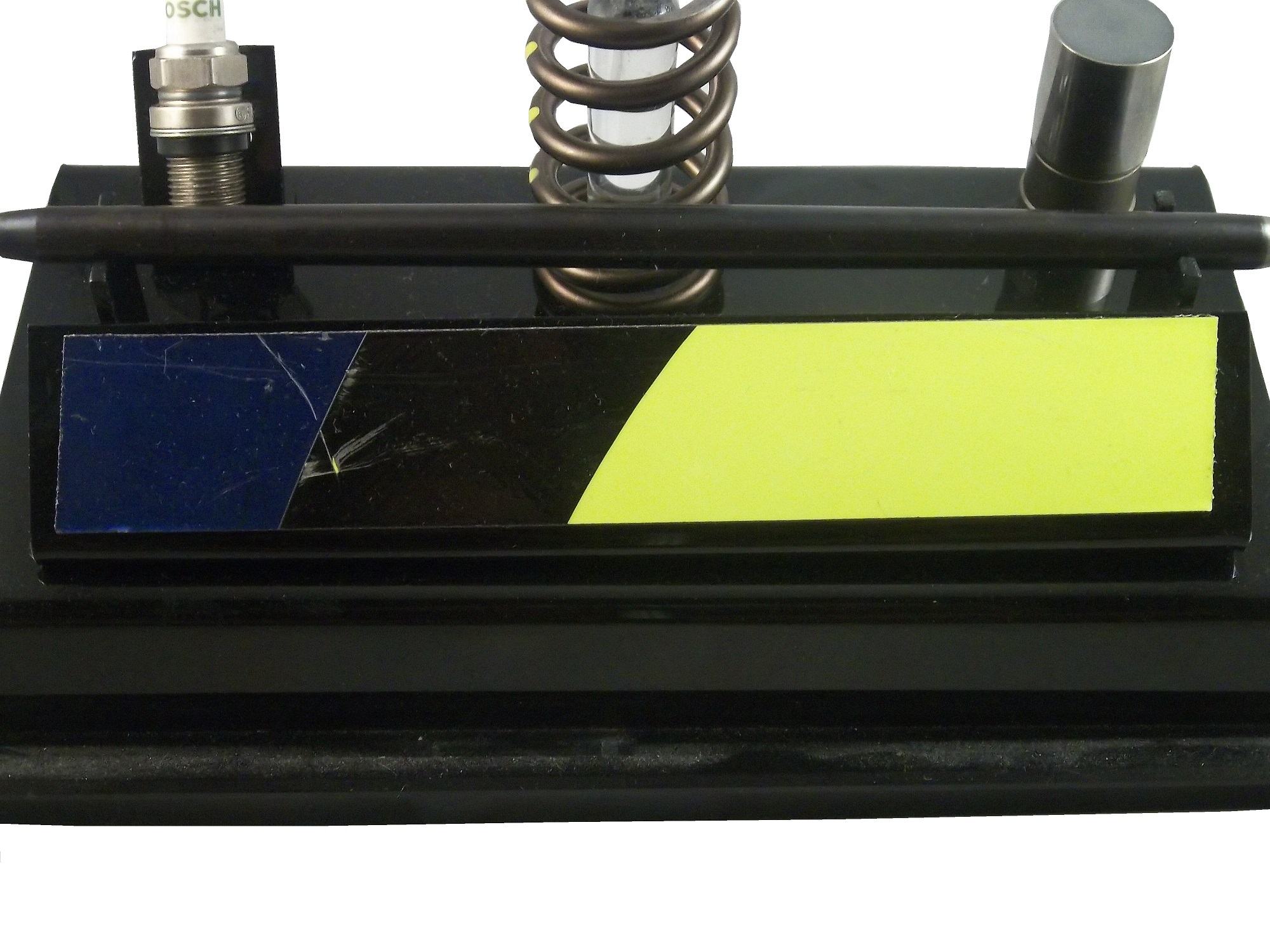
Mechanical components, especially engine components are interesting to collect, as there is no better representation of man and machine than a part of the heart of the machine. For example, I have a brake rotor used by John Andretti in the 1998 Bank of America 500 at Charlotte, which has been signed by Richard Petty. This is a set released after Jimmie Johnson won his first sprint cup title back in 2006. It contains a series of pieces used by Johnson, including a piece of sheet metal from his door,
a spark plug,
a valve spring,
a piece of the track bar,
and a lifter.
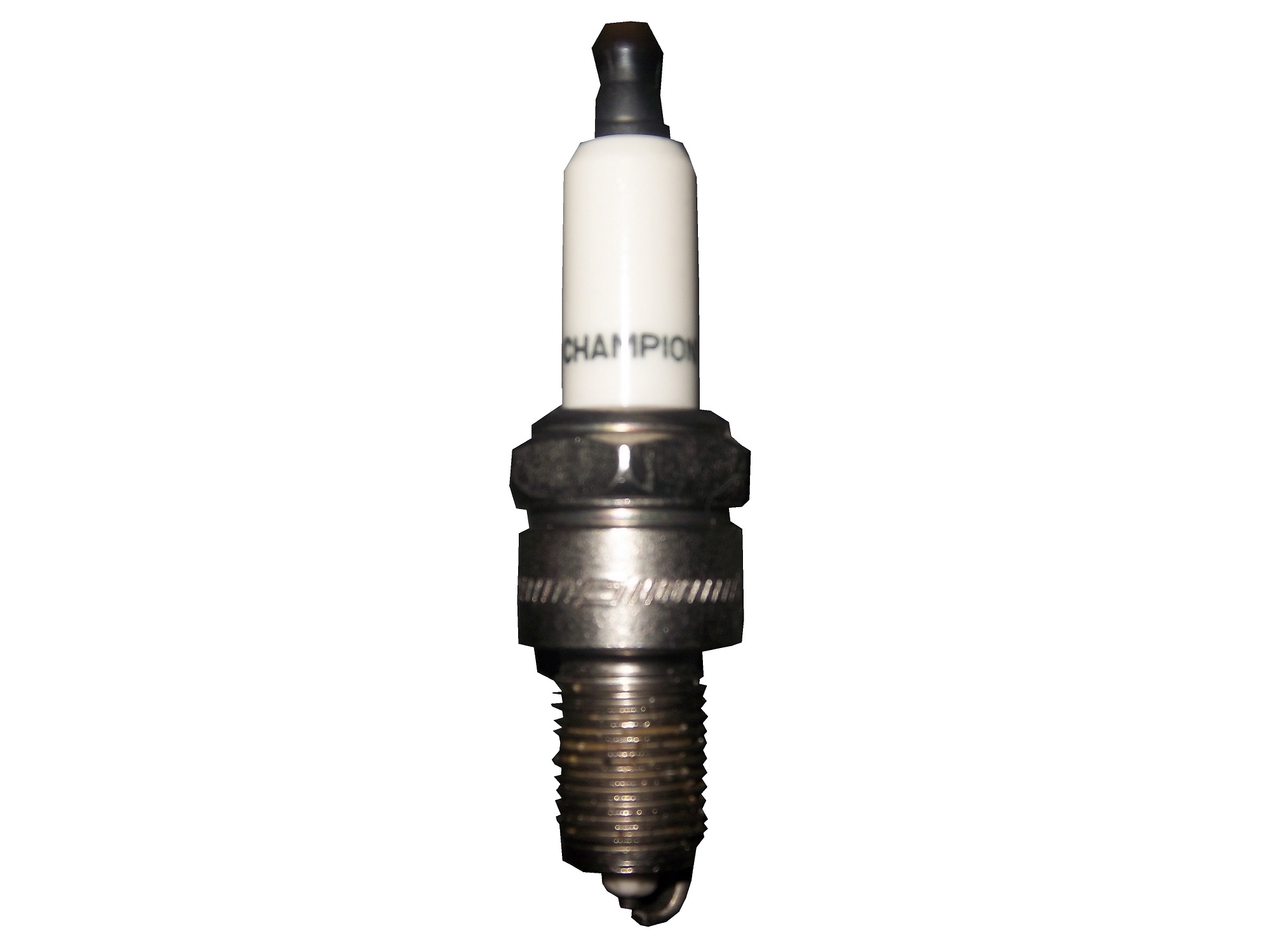
i also have a spark plug from Morgan Lucas Racing in the NHRA
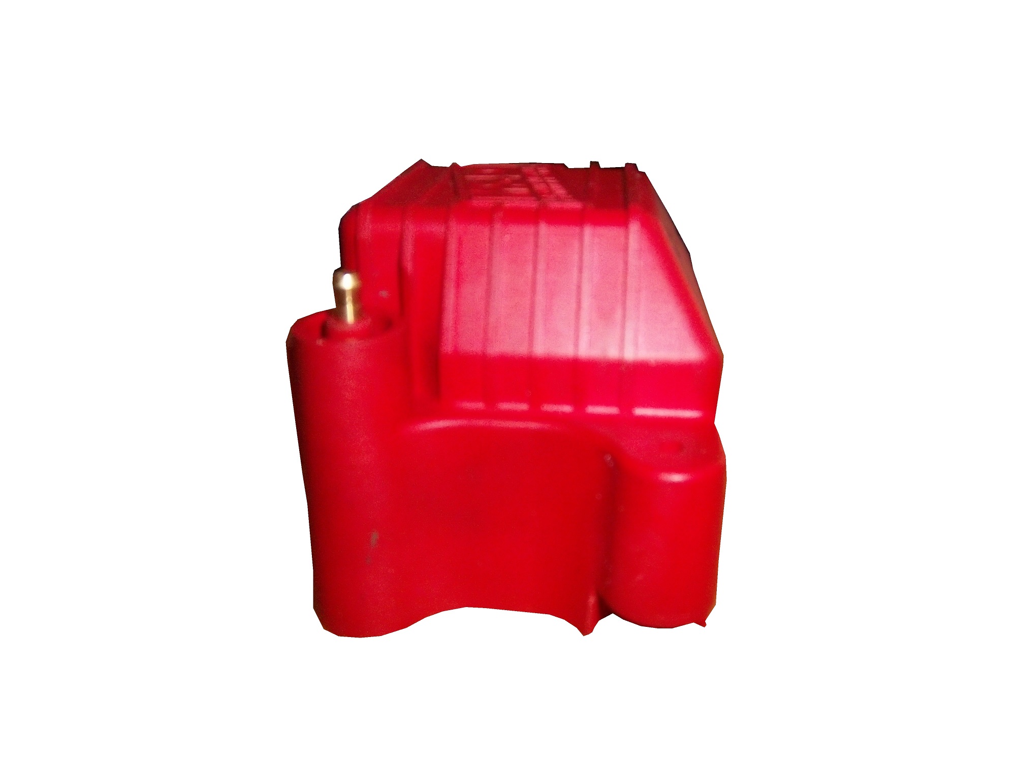
an ignition coil from Morgan Lucas Racing, which has been signed by Tony Schumacher and Ron Capps
one last item from the equipment collection is this piece of Daytona International Speedway
Jamie McMurray #1 Cessna Chevy SS Black with silver numbers and white trim looks simple and really good. I can’t say anything bad about this scheme, and bonus points for improving the door number design. A+
Austin Dillon #3 Dow Chevy SS Take the white stripe down the side off, and it will be a solid A scheme. The white does not look good at all. The red/white/black color scheme works very well, and it is decently designed, so I will give it a B+
Danica Patrick #10 Go Daddy Chevy SS Not only does Go Daddy continue to use the worst shade of yellow in NASCAR, they also have given the worst shade of orange a more prominent role in the car. Givng this car an F is a very fair grade.
Casey Mears #13 Geico Ford Fusion The yellow they use is awful, and the side design is just too lowd, Ricky Stenhouse Jr. NOS Ford Fusion I love this color scheme, however, I don’t love the side design. It has too many different different designs, all of which would work on their own but combined they look like a jumbled mess. I really want to like this scheme, but I just can’t, so I’ll give it a C-
Kurt Busch #41 Haas CNC Chevy SS Great color scheme and a very simple desgin look very good here. I also like the matte black used, and the door numbers look really solid. Can’t give this scheme anything less than an A
Dale Earnhardt Jr. #88 Diet Mountain Dew Chevy SS Same scheme as last year, but I never gave it a grade. So here is my analysis Not a great scheme, too much needless design on the side of the car, and the silver background is just brutal. The red lettering on a green background is unattractive at best, and all in all, this is a D- grade.
Carl Edwards #99 Aflac Ford Fusion This has a terrible color scheme, with lime green, neon blue, black and white. The wing design is not only ugly but would work better starting at the door and working behind.


