
By David G. Firestone
RICK WARE RACING #01
Corey LaJoie #01 DuraMax/Take 5 Oil Change Chevy Camaro-New scheme for 2025, black with red stripes. B
Corey LaJoie #01 AirMedCare Network Ford Mustang-New sponsor for 2025, blue and white with stripes. A
TRACKHOUSE RACING #1
Ross Chastain #1 Busch Light Chevy Camaro–No change. A
Ross Chastain #1 Kubota Chevy Camaro–New scheme for 2025, red stripe fade to black stripe fade to red. B
Ross Chastain #1 Trackhouse Chevy Camaro-New scheme for 2025, gray and yellow with a series of designs. F
Ross Chastain #1 Moose Fraternity Chevy Camaro–No change. A
Ross Chastain #1 Busch Light For the Love of Texas Chevy Camaro-New scheme for 2025, white with blue mountains and star. B
Ross Chastain #1 Kubota Orange Days Sales Event Chevy Camaro-New scheme for 2025, black rear extended. C+
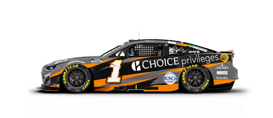
Ross Chastain #1 Choice Privileges Chevy Camaro–New scheme for 2025, design changes, more black and gray added. F
Ross Chastain #1 Busch Light Fishing Chevy Camaro-New scheme for 2025, blue with fishing motif across whole car. A
TEAM PENSKE #2
Austin Cindric #2 Discount Tire Ford Mustang–No change. A
Austin Cindric #2 Menards/Maytag Ford Mustang–No change. A
Austin Cindric #2 Autotrader Ford Mustang–No change. A
Austin Cindric #2 Freightliner/eCascadia Ford Mustang–New scheme for 2025, dark blue with a series of designs. D
Austin Cindric #2 Menards/Delta Ford Mustang-New sponsor for 2025, Menard’s template with black. A
Austin Cindric #2 Menards/Monster Ford Mustang–No change. A
Austin Cindric #2 Menard’s/Duracel Ford Mustang–No change. A
Austin Cindric #2 Menard’s/Jack Links Beef Jerky Ford Mustang–No change. A
Austin Cindric #2 Freightliner Throwback Ford Mustang–New scheme for 2025, based on Dale Earnhart’s 1979 Daytona 500 Rod Osterlund Racing #2 Buick. A
RICHARD CHILDRESS RACING #3
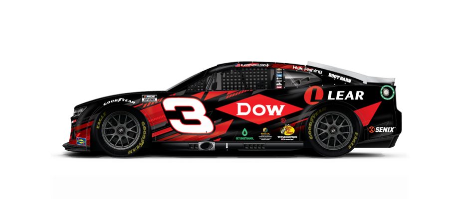
Austin Dillon #3 Dow Mobility Science Chevy Camaro–No change. B+
Austin Dillon #3 Titan Risk Solutions Chevy Camaro-New sponsor for 2025, white with red sides. A
Austin Dillon #3 Bass Pro Shops/Winchester Chevy Camaro–New scheme for 2025, camo and black. F
Austin Dillon #3 Get Bioethanol Chevy Camaro–No change. A
Austin Dillon #3 BREZTRI Chevy Camaro–No change. A
Austin Dillon #3 Dow Mobility Science Chevy Camaro–No change. B+
FRONT ROW MOTORSPORTS #4
Noah Gragson #4 MillerTech Ford Mustang–New scheme for 2025, white, black, blue and yellow with lightning motif. C
Noah Gragson #4 Zep Ford Mustang–No change. A
Noah Gragson #4 Rush Truck Centers Ford Mustang–New scheme for 2025, some changes to the stripes. A
Noah Gragson #4 TrueTimber Chevy Camaro-New sponsor for 2025, black with camo and stripes. F
Noah Gragson #4 TitleMax Ford Mustang-New sponsor for 2025, blue with red and white designs, B
Noah Gragson #4 Long John Silver’s Ford Mustang-New scheme for 2025, same as #34. C
Noah Gragson #4 Beef A Roo Ford Mustang–New scheme for 2025, white, and yellow, with some designs. A
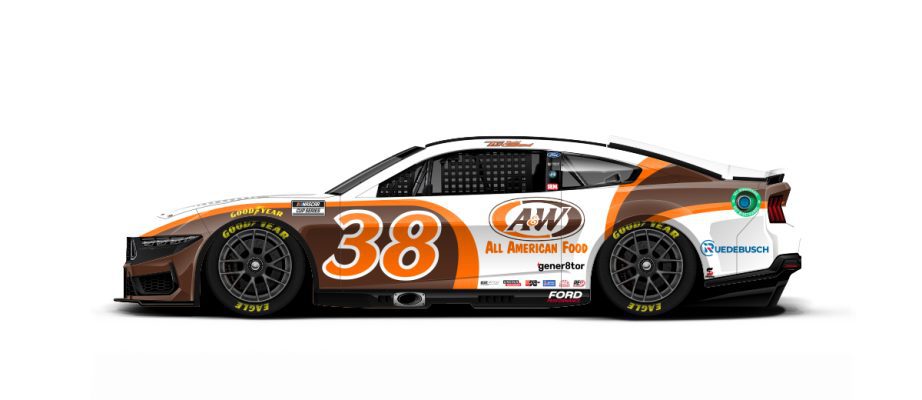
Noah Gragson #4 A&W Root Beer Ford Mustang–New scheme for 2025, some design changes. B
Noah Gragson #4 Beef-a-Roo Throwback Ford Mustang–New scheme for 2025, Based on Dale Earnhardt Jr.’s 1996 #31 Mom ‘n’ Pops Chevy. A
HENDRICK MOTORSPORTS #5
Kyle Larson #5 Hendrickcars.com Chevy Camaro–No change. A
Kyle Larson #5 Valvoline Chevy Camaro–New scheme for 2025, some slight changes. B
Kyle Larson #5 HendrickCars.com Throwback Chevy Camaro–New scheme for 2025, based on Terry Labonte’s 2001 #5 Kellogg’s Chevy. A
ROUSH-FENWAY RACING #6
Brad Keselowski #6 BuildSubmarines.com Ford Mustang–No change. A
Brad Keselowski #6 Castrol Ford Mustang–New scheme for 2025, green and white with red stripes and designs. A
Brad Keselowski #6 Kroger Ford Mustang-New scheme for 2025, white with blue rear. A
Brad Keselowski #6 Consumer Cellular Ford Mustang–No change. A-
Brad Keselowski #6 Esperion Therapeutics Ford Mustang–No change. A
Brad Keselowski #6 Fastenal Body Guard Ford Mustang–No change. A
Brad Keselowski #6 Kroger/Cottonelle Ford Mustang–New scheme for 2025, blue and white with stripes. A
Brad Keselowski #6 Solomon Plumbing Ford Mustang–No change. A
Brad Keselowski #6 Castrol Seven Critical Areas Ford Mustang-New sponsor for 2025, black with oil motif. B
SPIRE MOTORSPORTS #7
Justin Haley #7 Fraternal Order of Eagles Chevy Camaro–No change. A-
Justin Haley #7 Gainbridge Chevy Camaro–New scheme for 2025, sides changed. C
Justin Haley #7 Chili’s Ride the ‘Dente Chevy Camaro–New scheme for 2025, white with blue and red stripe. A
RICHARD CHILDRESS RACING #8
Kyle Busch #8 Lucas Oil Chevy Camaro–No change. A
Kyle Busch #8 Rebel Bourbon Chevy Camaro–New scheme for 2025, black with barrel motif. A
Kyle Busch #8 Bank OKZ Chevy Camaro-New sponsor for 2025, white front, red and blue stripe, black rear. A-
Kyle Busch #8 Cheddar’s Scratch Kitchen Chevy Camaro–No change. A-
Kyle Busch #8 zone Premium Nicotine Patches/QuikTrip Chevy Camaro–No change. A-
Kyle Busch #8 BetMGM Chevy Camaro–No change. A
Kyle Busch #8 Bank OZK Chevy Camaro-New sponsor for 2025, white, red, gray and black with stripes. A-
HENDRICK MOTORSPORTS #9
Chase Elliott #9 UniFirst Chevy Camaro–New scheme for 2025, green with yellow and red stripe on bottom. A
Chase Elliott #9 NAPA Chevy Camaro–New scheme for 2025, gold replaces white. A
Chase Elliott #9 LLumar Window Film Chevy Camaro–New scheme for 2025, red with designs. A-
Chase Elliott #9 Amazon Prime Chevy Camaro-New sponsor for 2025, blue with white designs. A
Chase Elliott #9 Kelly Blue Book Chevy Camaro–No change. A
Chase Elliott #9 NAPA Chevy Camaro–No change. A
Chase Elliott #9 UniFirst Chevy Throwback Camaro–New scheme for 2025, based on Ken Schrader’s 1994 #25 Kodiak Chevy. C
KAULIG RACING #10
Ty Dillon #10 Grizzly Nicotine Pouches Chevy Camaro-New sponsor for 2025, black with red trim and sublimated designs. B
Ty Dillon #10 Sea Best Seafood Chevy Camaro–New scheme for 2025, red and black with red and white stripes. B
Ty Dillon #10 Hybrid Light Chevy Camaro-New sponsor for 2025, black with diagonal yellow stripe. A
Ty Dillon #10 Sea Best Seafood Chevy Camaro-New scheme for 2025, red and black with red and white stripes. A
Ty Dillon #10 Sea Best Seafood Chevy Camaro-New scheme for 2025, red and yellow with rough designs. B
Ty Dillon #10 Mark III Employee Benefits Chevy Camaro–New scheme for 2025, darker blue, and white stripe in center. A
Ty Dillon #10 Beaver Street Fisheries Throwback Chevy Camaro–New sponsor for 2025, based on Patty Moise’s 1989 Daytona #45 Beaver Street Foods Buick. A
JOE GIBBS RACING #11
Denny Hamlin #11 Sport Clips Haircuts Toyota Camry–No change. B+
Denny Hamlin #11 National Debt Relief Toyota Camry-New sponsor for 2025, JGR 11 template with patriotic elements. C
Denny Hamlin #11 Yahoo! Toyota Camry–New scheme for 2025, dark blue, and light blue, with white designs. C
Denny Hamlin #11 Progressive Insurance Toyota Camry-New sponsor for 2025, blue with a white section. A
Denny Hamlin #11 Sport Clips Haircuts Throwback Toyota Camry–New scheme for 2025, based on Carl Edwards’ #99 Office Depot Ford. A
TEAM PENSKE #12
Ryan Blaney #12 Advance Auto Parts Ford Mustang–No change. A
Ryan Blaney #12 Discount Tire Ford Mustang–No change. A
Ryan Blaney #12 Wabash Ford Mustang–No change. A-
Ryan Blaney #12 Menard’s/Cardell Cabinetry Ford Mustang–No change. A
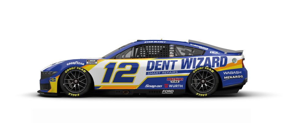
Ryan Blaney #12 Dent Wizard Ford Mustang–No change. B
Ryan Blaney #12 Menard’s/Great Lakes Flooring Ford Mustang–No change. A
Ryan Blaney #12 Menard’s/Peak Ford Mustang–No change. B+
Ryan Blaney #12 BodyArmor Zero Sugar Ford Mustang–New scheme for 2025, gray fade to black with red stripe. A
Ryan Blaney #12 Menard’s/Duracel Ford Mustang–No change. A
Ryan Blaney #12 Wurth Ford Mustang–No change. A
Ryan Blaney #12 Menard’s/Pennzoil Ford Mustang–No change. A
Ryan Blaney #12 Dent Wizard Ford Mustang-New scheme for 2025, yellow and green stripes added. C
Ryan Blaney #12 Menards/Dutch Boy Throwback Ford Mustang–New scheme for 2025, based on Dave Blaney’s 2006 Dollar General 300 winning #32 Haas Avocados Chevy. B
RICK WARE RACING #15
Tim Brown #15 Dairi-O/Jerry Hunt/Hayes Ford Mustang-New sponsor for 2025, red with blue and white stripe. A
KAULIG RACING #16
AJ Allmendinger #16 Campers Inn RV Chevy Camaro–No change. B
AJ Allmendinger #16 Celsius Chevy Camaro–No change. B
AJ Allmendinger #16 Action Industries Chevy Camaro–No change. B+
AJ Allmendinger #16 Black’s Tire Chevy Camaro–New scheme for 2025, white front, blue fade to black with tire tread pattern. B
ROUSH-FENWAY RACING #17
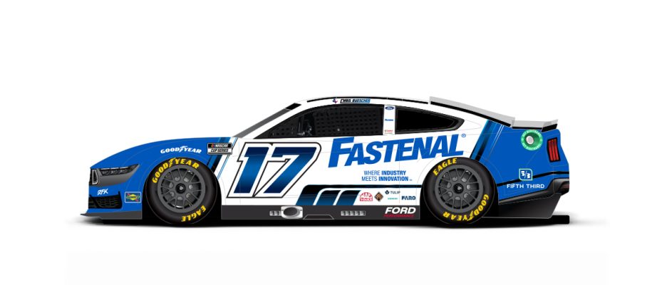
Chris Buescher #17 Fastenal Ford Mustang–New scheme for 2025, some designs and blue roof added. A
Chris Buescher #17 BuildSubmarines.com Ford Mustang-No change. A
Chris Buescher #17 Travel Centers of America Ford Mustang–No change. B+
Chris Buescher #17 Kroger Ford Mustang-New scheme for 2025, blue front half, white rear half. A
Chris Buescher #17 Esperion Therapeutics Ford Mustang–No change. A
Chris Buescher #17 Kroger/Tree Top Ford Mustang–New scheme for 2025, red top green bottom, white hood. A
Chris Buescher #17 Fry’s/Thomas’/Philadelphia Ford Mustang–New scheme for 2025, new orange, more blue added, curved stripe replaced with straight stripe. A
Chris Buescher #17 Smith’s/Dasani Ford Mustang-New sponsor for 2025, teal. A
Chris Buescher #17 Kroger/Farm Rich Ford Mustang-New sponsor for 2025, green fade to white. A
Chris Buescher #17 Kroger/Old El Paso Ford Mustang-New sponsor for 2025, yellow with red roof and sublimated designs. A
JOE GIBBS RACING #19
Chase Briscoe #19 Bass Pro Shops Toyota Camry–New scheme for 2025, some slight changes. C
Chase Briscoe #19 Bass Pro Shops Spring Fishing Classic Toyota Camry-New scheme for 2025, fish scale motif across whole car. A
JOE GIBBS RACING #20
Christopher Bell #20 Rheem Toyota Camry–No change. A-
Christopher Bell #20 DeWalt Toyota Camry–New scheme for 2025, sides cleaned up. A
Christopher Bell #20 Mobil 1 Toyota Camry–New scheme for 2025, white and black reversed. D
Christopher Bell #20 Reser’s Fine Foods Toyota Camry–New scheme for 2025, black with red wave design. A
Christopher Bell #20 Interstate Batteries Toyota Camry–No change. F
Christopher Bell #20 DEWALT/Interstate Batteries Toyota Camry–No change. F
Christopher Bell #20 DeWalt Outdoors Toyota Camry-New sponsor for 2025, yellow with black roof, and grass motif. C
Christopher Bell #20 DeWalt Outdoors Throwback Ford Mustang–New scheme for 2025, based on Rick Ferkel’s #0 sprint car. B
WOOD BROTHERS RACING #21
Josh Berry #21 Motorcraft/Quick Lane Ford Mustang-New scheme for 2025, red. A
Josh Berry #21 Motorcraft/Quick Lane Ford Mustang–New scheme for 2025, red and blue stripe added on bottom. A
Josh Berry #21 eero Ford Mustang–New scheme for 2025, blue. A
Josh Berry #21 Freightliner Ford Mustang–New scheme for 2025, same as #2. D
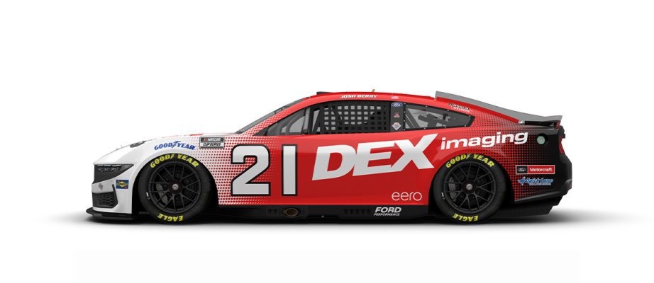
Josh Berry #21 DEX Imaging Ford Mustang-New scheme for 2025, white dot fade to red, dot fade to black. A
Josh Berry #21 Motorcraft/Quick Lane Throwback Ford Mustang–New scheme for 2025, based on Jim Clark’s 1965 Indianapolis 500 winning #82 Lotus powered by Ford. A
TEAM PENSKE #22
Joey Logano #22 Hunt Brothers Ford Mustang–New scheme for 2025, more stripes added. D
Joey Logano #22 Auto Trader Ford Mustang–No change. A
Joey Logano #22 Shell/Pennzoil Ford Mustang–New scheme for 2025, red added to sides. A
Joey Logano #22 Shell/Pennzoil Ford Mustang-New scheme for 2025, red fade to yellow, fade to red. A
Joey Logano #22 Pennzoil Ultra Premium Ford Mustang-New sponsor for 2025, yellow with white designs. A
Joey Logano #22 Shell Pennzoil Throwback Ford Mustang–New scheme for 2025, based on Cale Yarborough’s #11 Holly Farms Poultry Oldsmobile. A
23XI RACING #23
Bubba Wallace #23 Leidos Toyota Camry–New scheme for 2025, white with blue rear and sublimated designs. A
Bubba Wallace #23 McDonald’s Toyota Camry-New scheme for 2025, fries changed to a different pattern. B+
Bubba Wallace #23 Columbia Sportswear Toyota Camry–New scheme for 2025, blue with gray splatter front, gray with blue splatter on rear. C
Bubba Wallace #23 Mobil 1 Toyota Camry–New scheme for 2025, white and red with black and gray designs. C
Bubba Wallace #23 U.S. Air Force Toyota Camry–New scheme for 2025, gray and black B-2 design. A
Bubba Wallace #23 Columbia Sportswear Toyota Camry–New scheme for 2025, rainbow tarpon motif. A
HENDRICK MOTORSPORTS #24
William Byron #24 RAPTOR Chevy Camaro–New scheme for 2025, green, black, and silver, with a series of designs. F
William Byron #24 Axalta Chevy Camaro–New scheme for 2025, blue replaces white. A
William Byron #24 HP Chevy Camaro–No change. A-
William Byron #24 Valvoline Chevy Camaro–New scheme for 2025, same as #5, but blue replaces teal. A
William Byron #24 Axalta Throwback Chevy Camaro–New scheme for 2025, based on Jeff Gordon’s final race #24 Chevy. A
RICHARD CHILDRESS RACING #33
Austin Hill #33 United Rentals Chevy Camaro–New scheme for 2025, Some slight changes. F
FRONT ROW MOTORSPORTS #34
Todd Gilliland #34 Love’s Truck Stops Ford Mustang–No change. A-
Todd Gilliland #34 Grillo’s Pickles Ford Mustang–No change. A
Todd Gilliland #34 Ruedbusch Development and Construction Ford Mustang–New scheme for 2025, sides cleaned up. A
Todd Gilliland #34 Gener8tor Skills Accelerator Ford Mustang–No change. A
Todd Gilliland #34 Long John Silver’s Ford Mustang–No change. C
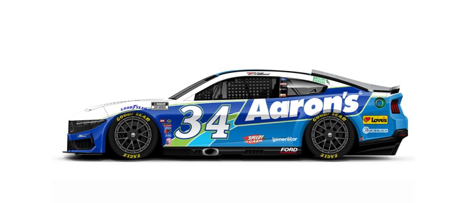
Todd Gilliland #34 Aaron’s Ford Mustang-New sponsor for 2025, blue with white, green, and light blue curves. C
Todd Gilliland #34 Frontline Enterprises Inc. Ford Mustang–New scheme for 2025, white and gray designs. F
Todd Gilliland #34 Colortech Ford Mustang–New sponsor for 2025, wave replaces many of the spots. C
Todd Gilliland #34 Ruedebusch Throwback Ford Mustang–New scheme for 2025, based on Based on Ray Fox’s #3 Royal Dodge Dodge Charger. A
23XI RACING #35
Riley Herbst #35 Monster Energy Toyota Camry–New scheme for 2025, black with yellow stripe. A
Riley Herbst #35 Chumba Casino Toyota Camry-New sponsor for 2025, black with green, yellow, orange and blue designs. F
Riley Herbst #35 SunnyD Toyota Camry-New scheme for 2025, same as #47. F
Riley Herbst #35 Lucy Breakers Toyota Camry-New sponsor for 2025, white with designs and black on rear. C
FRONT ROW MOTORSPORTS #38
Zane Smith #38 Speedy Cash Ford Mustang–New scheme for 2025, black with green flame designs. C
Zane Smith #38 Benebone Ford Mustang–No change. A
Zane Smith #38 City of Refuge Ford Mustang–New scheme for 2025, blue, purple and green with designs. F
Zane Smith #38 TitleMax Ford Mustang-New scheme for 2025, same as #4. B
Zane Smith #38 Aaron’s Ford Mustang-New scheme for 2025, same as #34. C
Zane Smith #38 Long John Silver’s Ford Mustang–No change. C
Zane Smith #38 Long John Silver’s Throwback Ford Mustang–No change. A
JR MOTORSPORTS #40
Justin Allgaier #40 Traveller Whiskey Chevy Camaro-New sponsor for 2025, white with orange and red stripe across bottom. A
HAAS FACTORY TEAM #41
Cole Custer #41 HaasTooling.com Ford Mustang–New scheme for 2025, red with a series of designs. F
Cole Custer #41 3D Systems Ford Mustang-New sponsor for 2025, dark blue with lighter blue curves. A
Cole Custer #41 Bonanza Cabernet Ford Mustang–No change. A
Cole Custer #41 Haas/Andy’s Frozen Custard Ford Mustang-New sponsor for 2025, blue with yellow and red designs on sides. B
Cole Custer #41 Autodesk/HaasTooling Ford Mustang-New sponsor for 2025, white front, black rear. A
Cole Custer will drive the No. 41 Haas Automation Throwback Ford Mustang–New scheme for 2025, based on Jimmy Spencer’s 2001 #41 Target Dodge. B
LEGACY MOTOR CLUB #42
John Hunter Nemechek #42 Dollar Tree Toyota Camry–No change. A
John Hunter Nemechek #42 Pye Barker Fire & Safety Chevy Camaro–New scheme for 2025, white with green wave, and green and purple flames. B
John Hunter Nemechek #42 Backstreet Boys Toyota Camry-New sponsor for 2025,various shades of blue and white with sublimated designs. F
John Hunter Nemechek #42 Dollar Tree Throwback Toyota Camry–New scheme for 2025, based on Joe Nemechek’s 1997-1998 #42 Bell South Mobility Chevy. A
LEGACY MOTOR CLUB #43
Erik Jones #43 Family Dollar Toyota Camry–New scheme for 2025, red with red vertical stripes. A
Erik Jones #43 Advent Health Toyota Camry–New scheme for 2025, blue and white with multi-colored stripes. B+
Erik Jones #43 Dollar Tree Toyota Camry–No change. A
Erik Jones #43 Advent Health Throwback Toyota Camry–New scheme for 2025, based on John Andretti’s 1998 STP scheme. A
NY RACING #44
JJ Yeley #44 Green River Whiskey Chevy Camaro-New sponsor for 2025, green with red roof and stripe. A
JJ Yeley #44 PCNY Chevy Camaro-New sponsor for 2025, pink, black, and white with a series of designs. F
23XI RACING #45
Tyler Reddick #45 Jordan Brand Toyota Camry–New scheme for 2025 white with black rear. A
Tyler Reddick #45 Nasty Beast Toyota Camry–No change. C
Tyler Reddick #45 Xfinity Mobile Toyota Camry–New scheme for 2025, blue and white with vertical diagonal divisions. A
Tyler Reddick #45 Mobil 1 Toyota Camry–New scheme for 2025, same as #23. C
Tyler Reddick #45 Jordan Brand Toyota Camry-New scheme for 2025, white fade to blue with black curve. A
Tyler Reddick #45 McDonald’s Toyota Camry–New scheme for 2025, similar to #23, but with bun motif. A
HYAK MOTORSPORTS #47
Ricky Stenhouse Jr. #47 SunnyD Ford Mustang–No change. F
Ricky Stenhouse Jr. #47 Martin’s Famous Potato Rolls-New sponsor for 2025, yellow with red, silver, and white with numerous cutting edge designs. F
Ricky Stenhouse Jr. #47 Rate Chevy Camaro-New sponsor for 2025, red roof and bottom, white middle with red and gray stripes. C
Ricky Stenhouse Jr. #47 Ram Self Storage Chevy Camaro-New sponsor for 2025, red, and gold with a series of stripes. D-
Ricky Stenhouse Jr. #47 Real American Beer Camaro-New sponsor for 2025, red, white, and blue with paint designs. A
Ricky Stenhouse Jr. #47 betr March Madness Chevy Camaro-New sponsor for 2025, black with blue and basketballs, A-
HENDRICK MOTORSPORTS #48
Alex Bowman #48 Ally Financial Chevy Camaro–New scheme for 2025, blue, pink, and purple, with designs. F
Alex Bowman #48 Ally/Best Friends Chevy Camaro–New scheme for 2025, blue and orange with a series of designs, and dogs. D
Alex Bowman #48 Ally Unrivaled League Chevy Camaro-New sponsor for 2025, blue with drawings. A
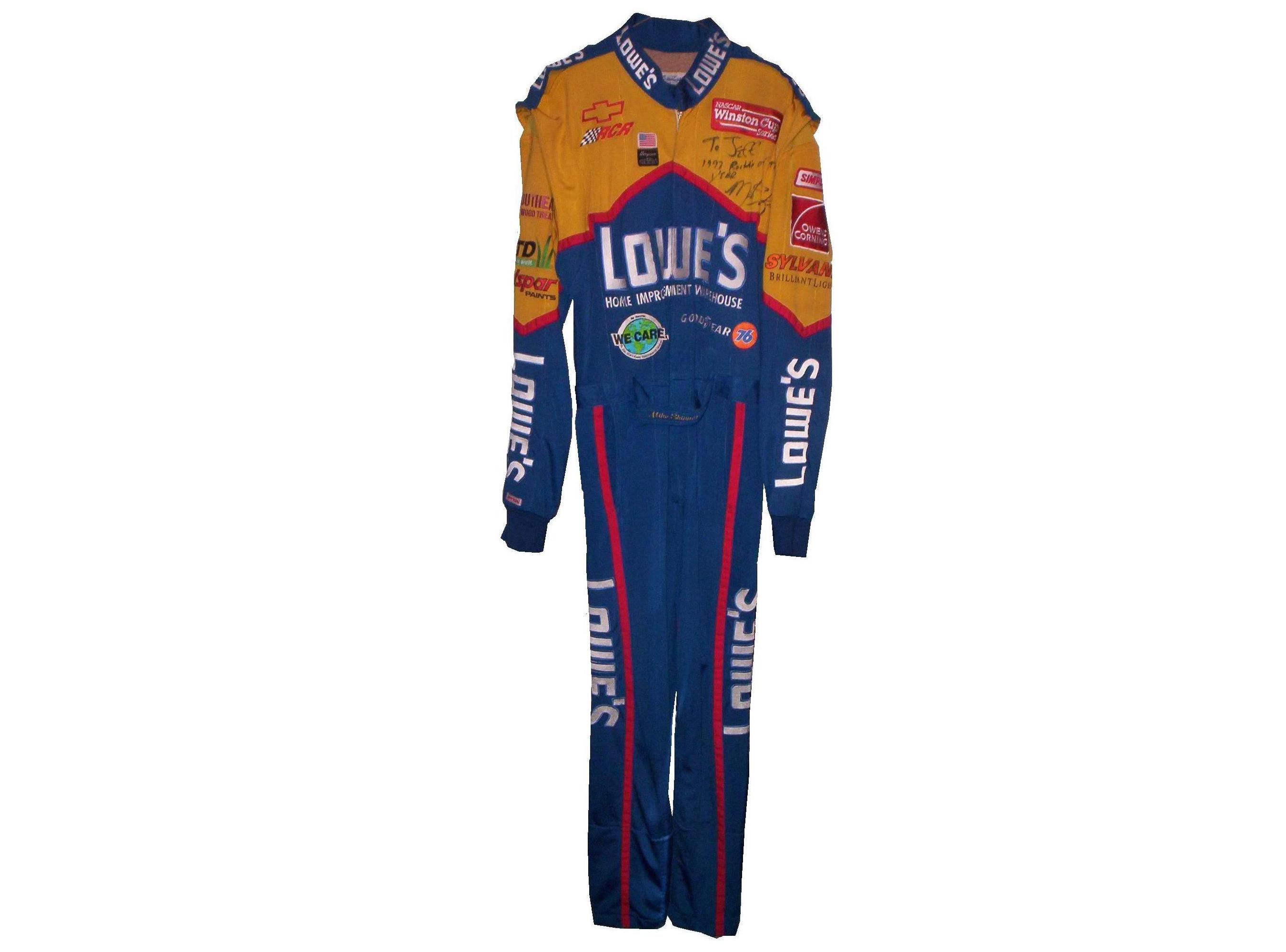
Alex Bowman #48 Ally Throwback Chevy Camaro–New scheme for 2025, based on Jimmie Johnson’s 2012 Southern 500 winning #48 Lowe’s Chevy. A
TEAM AMERIVET #50
Burt Myers #50 Citrusafe Cleaners/Pinnacle Financial Partners Chevy Camaro-New sponsor for 2025, black with white sides. A
Burt Myers #50 C3 Chevy Camaro-New sponsor for 2025, red with white and black with sublimated designs. C
RICK WARE RACING #51
Cody Ware #51 American Red Cross Ford Mustang-New sponsor for 2025, white front, red stripes, blue rear. A
Cody Ware #51 Parts Plus/Jacob Construction Ford Mustang-New scheme for 2025, white front, white rear, some stripes under number. A
Cody Ware #51 Arby’s Ford Mustang–No change. A-
Cody Ware #51 Mighty Fire Breaker Ford Mustang–New scheme for 2025, vertical stripes replace flames and trees. A-
Cody Ware #51 Evel Knievel-Parts Plus Ford Mustang–No change. A
Cody Ware #51 Jacob Construction Throwback Ford Mustang–New scheme for 2025, based on Ward Burton’s 1999-2003 Caterpillar schemes. A
JOE GIBBS RACING #54
Ty Gibbs #54 Saia Toyota Camry-New sponsor for 2025, white and red with stripes. A
TRICON GARAGE #56
Martin Truex Jr. #56 Bass Pro Shops Toyota Camry-New scheme for 2025, same as #19, black replaces camo, and color changes. C
ROUSH-FENWAY RACING #60
Ryan Preece #60 BuildSubmarines.com Ford Mustang–No change. A
Ryan Preece #60 Castrol Ford Mustang-New scheme for 2025, same as #6. A
Ryan Preece #60 Kroger Ford Mustang-New scheme for 2025, blue with white rear. A
Ryan Preece #60 Consumer Cellular Ford Mustang-New scheme for 2025, same as #6. A-
Ryan Preece #60 Esperion Therapeutics Ford Mustang-New scheme for 2025, same as #6. A
Ryan Preece #60 Mohawk Northeast Ford Mustang–New scheme for 2025, sides cleaned up. A
Ryan Preece #60 Fastenal Ford Mustang–No change. A
Ryan Preece #60 Castrol/Travel Centers of America Ford Mustang-New scheme for 2025, Castrol front with blue rear roof. C
Ryan Preece #60 Solomon Plumbing Ford Mustang-New scheme for 2025, same as #6. A
Ryan Preece #60 Kroger/Gevalia/Entenmann’s Ford Mustang-New sponsor for 2025, yellow with blue roof. A
Ryan Preece #60 Kroger/Country Crock Ford Mustang–New scheme for 2025, wood motif with white roof. A
BEARD MOTORSPORTS #62
Anthony Alfredo #62 Fortify Building Solutions Chevy Camaro-New sponsor for 2025, white, gray, and yellow with designs. B
GARAGE 66 #66
Chandler Smith #66 QuickTie Ford Mustang-New sponsor for 2025, white with teal and red cutting edge designs. B
Garrett Smithley #66 Veterans Ranch Ford Mustang-New sponsor for 2025, patriotic motif across car. C
Casey Mears #66 Coble Enterprises Ford Mustang–New scheme for 2025, black with orange and white stripes. A
Casey Mears #66 HitchGo Ford Mustang-New sponsor for 2025, same as Coble Enterprises. A
SPIRE MOTORSPORTS #71
Michael McDowell #71 B’laster Chevy Camaro–No change. D-
Michael McDowell #71 Workforce Chevy Camaro-New sponsor for 2025, dark blue with light blue and white stripes. C
Michael McDowell #71 Go Bowling Chevy Camaro–New scheme for 2025, similar to last year, more designs added. B
Michael McDowell #71 Group 1001 Chevy Camaro–New scheme for 2025, gray, teal and green with designs. F
Michael McDowell #71 Gainbridge Chevy Camaro-New scheme for 2025, same as #7. C
Michael McDowell #71 Rockingham Speedway Chevy Camaro-New sponsor for 2025, black with white mountain designs, A-
Michael McDowell #71 Delaware Life Chevy Camaro-New scheme for 2025, similar to #77, but with some changes. C-
SPIRE MOTORSPORTS #77
Carson Hocevar #77 MINER Chevy Camaro–No change. C
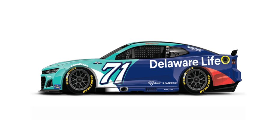
Carson Hocevar #77 Delaware Life Chevy Camaro–New scheme for 2025, some slight changes and a red stripe added. C-
Carson Hocevar #77 Zeigler Auto Group Chevy Camaro–No change. C
LIVE FAST MOTORSPORTS #78
BJ McLeod #78 HitchGo Chevy Camaro-New sponsor for 2025, black. A
BJ McLeod #78 Chevy Camaro–No change. A
Katherine Legge #78 Droplight Chevy Camaro-New sponsor for 2025, green and black with cutting edge designs. B
LEGACY MOTOR CLUB #84
Jimmie Johnson #84 Carvana Toyota Camry–New scheme for 2025, black with stripes. B
TRACKHOUSE RACING #87
Connor Zilisch #87 Red Bull Chevy Camaro-New sponsor for 2025, dark blue with white rear. A
TRACKHOUSE RACING #88
Shane van Gisbergen #88 WeatherTech Chevy Camaro–New scheme for 2025, solid stripes replace dual stripes on sides. A
Shane van Gisbergen #88 Red Bull Chevy Camaro-New scheme for 2025, same as #87, but with red rear. A
Shane van Gisbergen #88 Trackhouse Chevy Camaro-New scheme for 2025, blue and yellow with a series of designs. D-
Shane van Gisbergen #88 Jockey Chevy Camaro–New scheme for 2025, red and white stripes. A
TRACKHOUSE RACING #91
Hélio Castroneves #91 Wendy’s Chevy Camaro–New scheme for 2025, blue with designs. B
TRACKHOUSE RACING #99
Daniel Suarez #99 Freeway Insurance Chevy Camaro–New scheme for 2025, blue with green and white. A
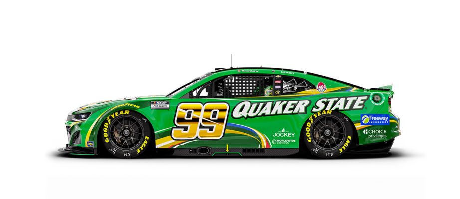
Daniel Suarez #99 Quaker State Chevy Camaro–New scheme for 2024, green stripes changed. C


