The Driver Suit Blog-A Prototype Pit Crew Suit…Say That Three Times Fast Part 1

By David G. Firestone.johansen

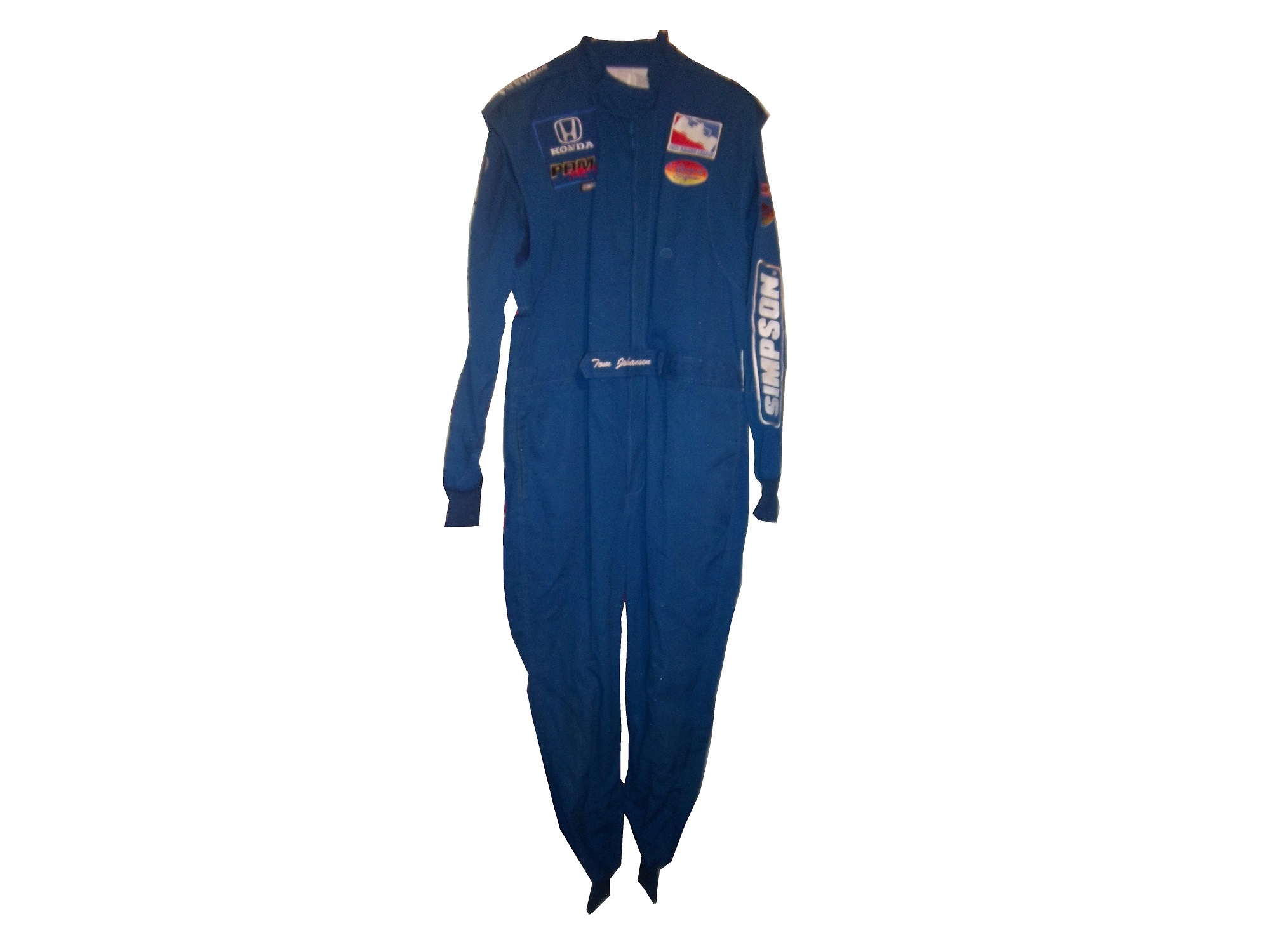
Ok, for the next two weeks, I am going to focus on one single suit. This is a “prototype crew suit.” In other words, it is a prototype suit for a pit crew member. In that light, I will do two articles, one focusing on the “prototype” part and the other will focus on the “pit crew” part.

This is a prototype suit. What that means is that this suit was made up to see how various design aspects work. The designers will attach various aspects, stripes, sponsor patches, to a full-size mockup of a suit, usually a single-layer suit, to see how the suit will look like when finished. Since driver and pit crew suits can cost as much as $1500 each to make, this is a simpler and cheaper way to design a suit in full-size. A full size mockup looks very impressive. The designs can be changed as needed.

Prototype suits are made from a single-layer suit. Single-layer suits are cheaper to use, but provide little protection in case of fire, so they are not often used in race condition. Suit design has, in the last 20+ years gone from not an issue to very critical. Because suits are used for promotion for the primary sponsor, the design aspect is very important. Every aspect, from the colors, to the primary and associate sponsor patches, to the decorative design is taken into consideration.johansen

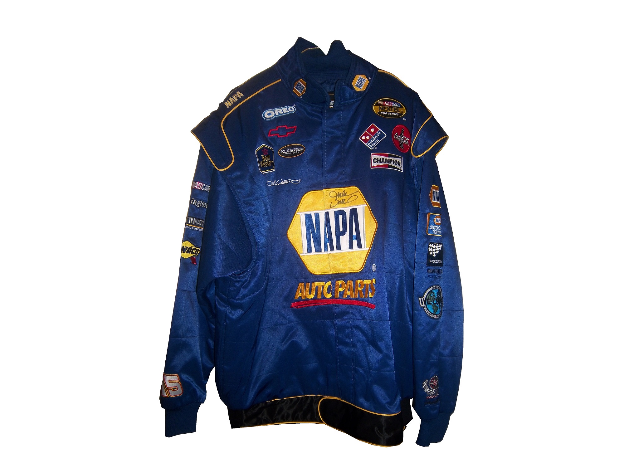
This particular suit was made for PDM racing, for use in the IndyCar Racing League in 2006. It was made for an individual by the name of Tom Johansen. It appears that Johansen is a crew member, and this suit was designed for his use. The logos are sewn on patches, the patches are placed on pieces of fabric, and then attached to the suit. From there, the suit starts to take shape, and the name is attached to the belt, and the logos are attached to the shoulder epaulets. In this example:

The right chest has a HONDA and a PDM RACING logo.johansen-rchest
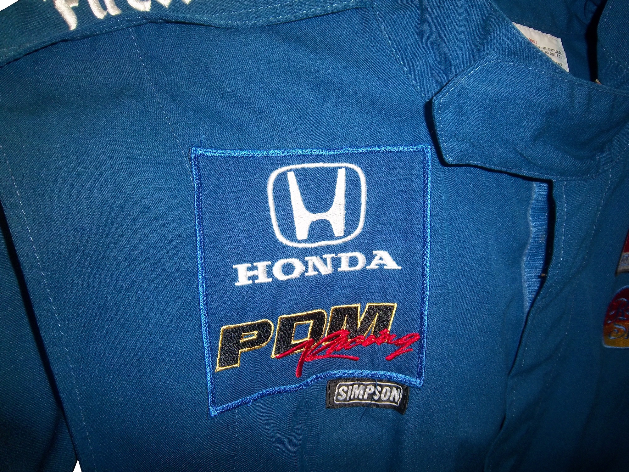
The left chest has an INDY RACING LEAGUE logo and a ROYAL SPA logo.johansen-lchest
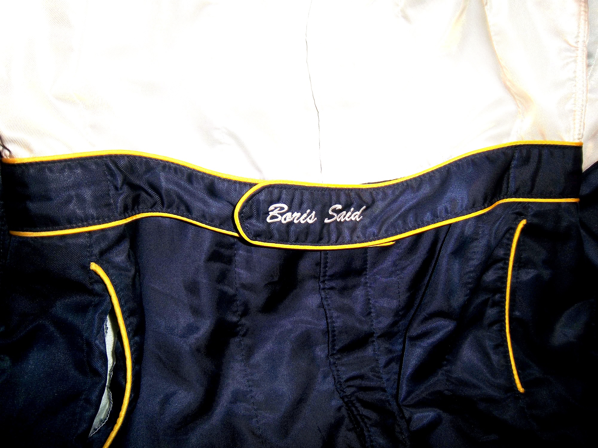
The belt has TOM JOHANSEN directly embroidered into it.johansen-belt
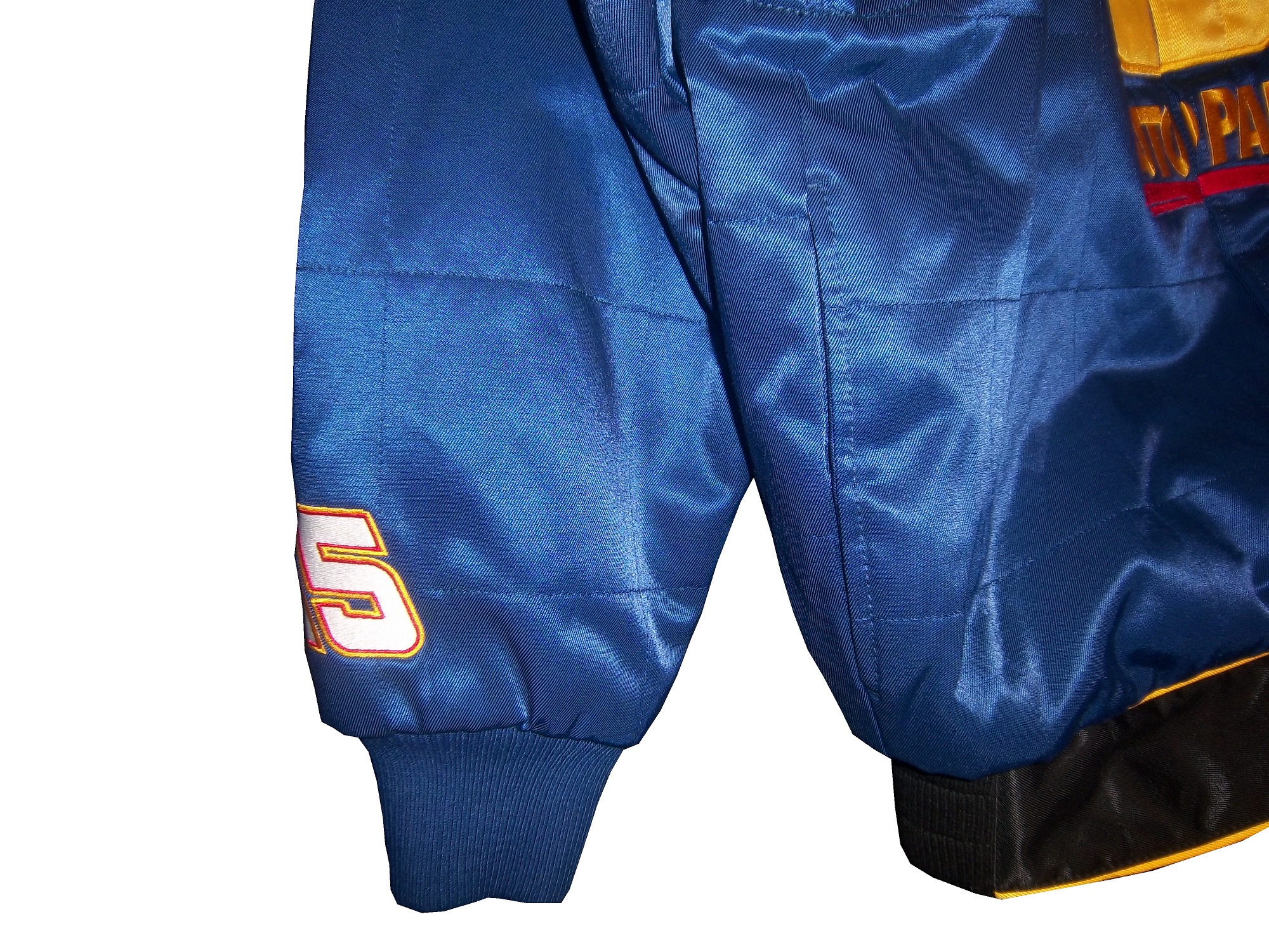
The legs are cuffed.johansen-legsThe sleeves have small logos on the top, and large SIMPSON logos present the bottom.johansen-rsleeve1 johansen-rsleeve2 johansen-lsleeve1 johansen-lsleeve2
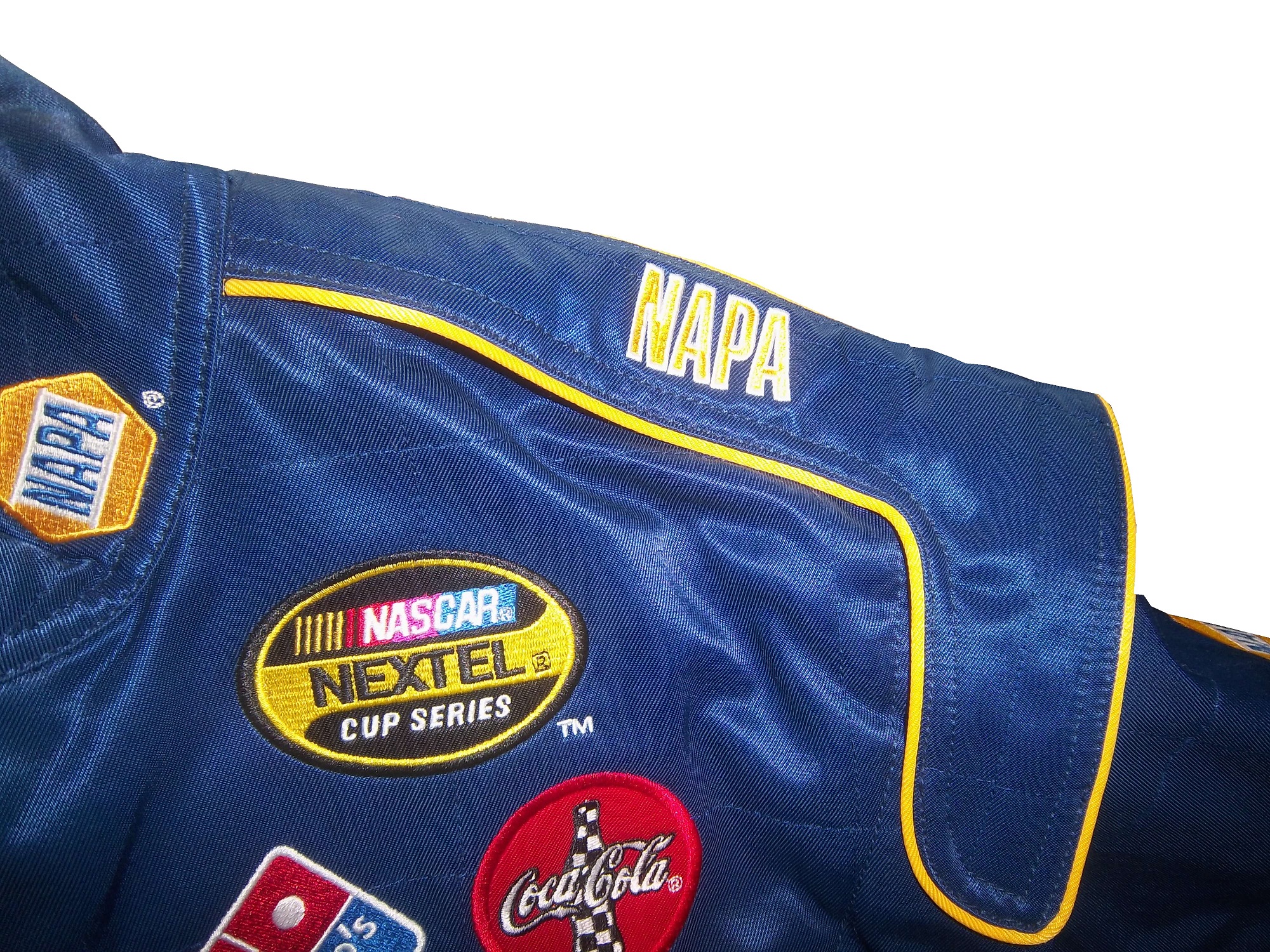
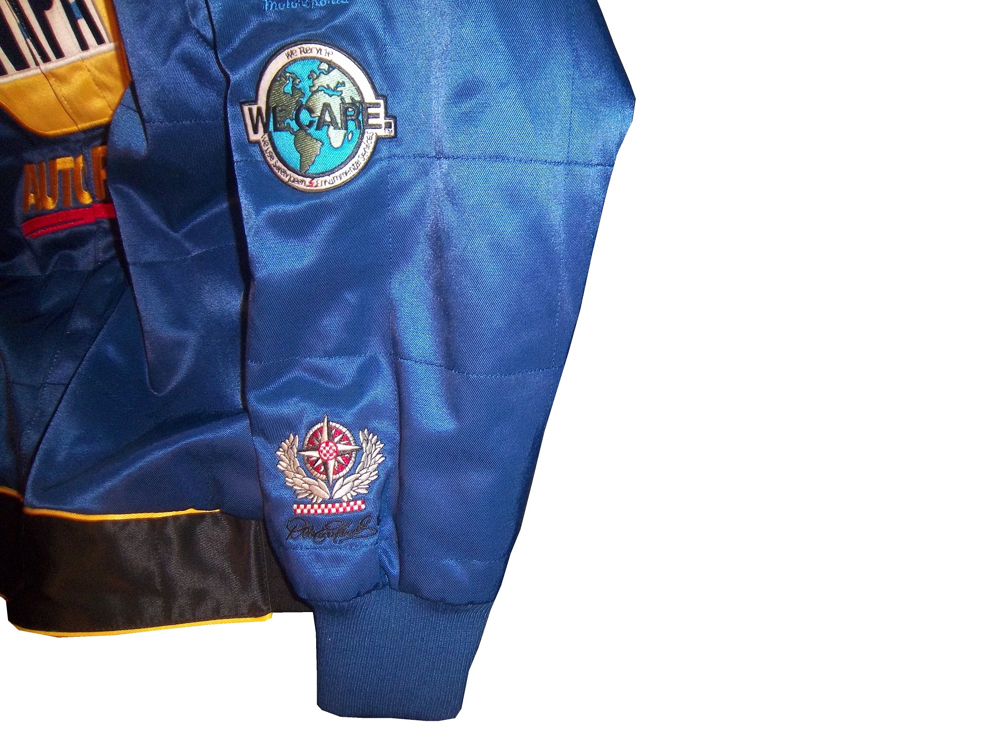
The shoulder epaulet have FIRESTONE logos present.johansen-rshoulder johansen-lshoulder
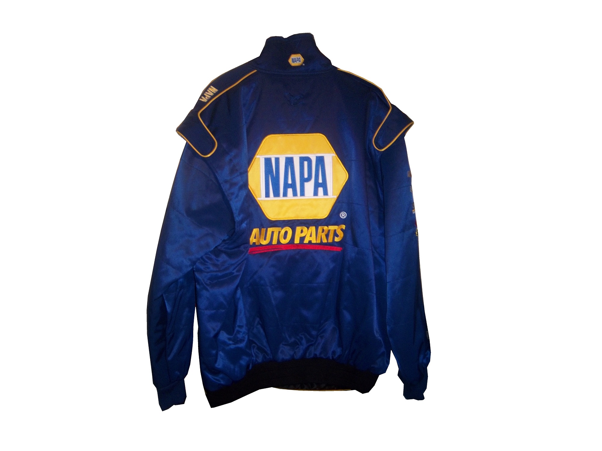
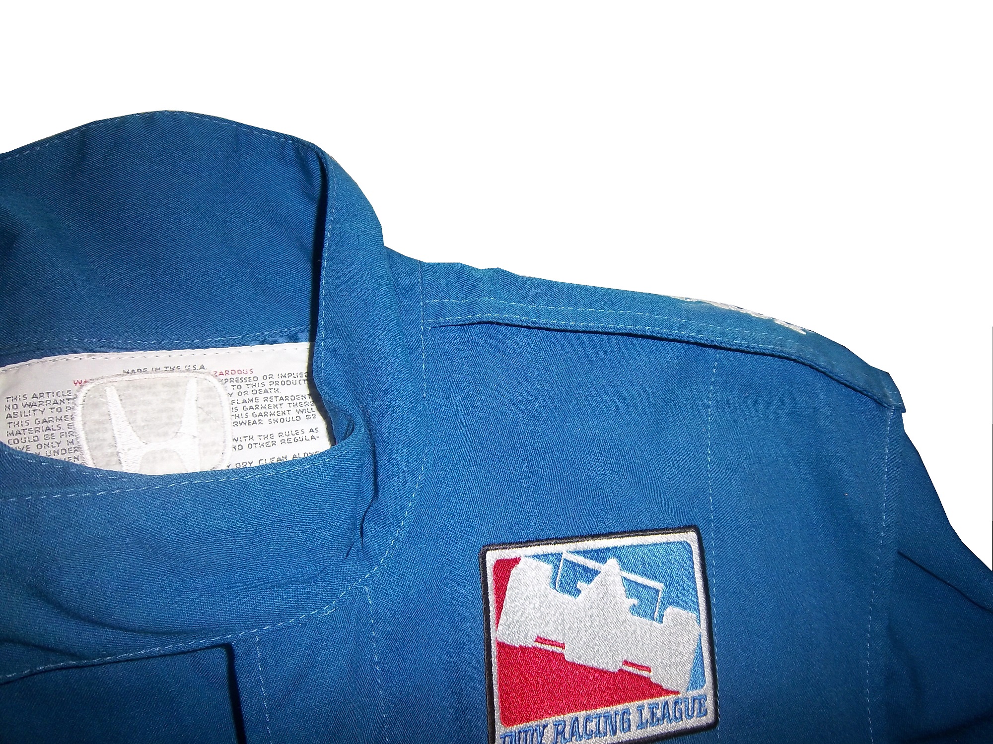
The back cowl has a HONDA logo that covers part of the tag.johansen-blogo johansen-rchestThe back Torso has a large ROYAL SPA logo, Royal Spa being the primary sponsor at the time.johansen-blogoThe suit shows no wear to speak of, nor does it have any safety certification.

The question is asked, did this suit see race-use?  While the suit itself shows no wear, it seems likely that it did in some form see race use.  PDM Racing was always a sub-par team, and they were always a low-budget team.  An inside joke was that PDM stood for “Poor Dumb Mechanics.”  So the fact that this suit was made would indicate that it was used by Johansen.  However what part Tom Johansen served on the crew is unknown.   On the other hand, a single-layer suit such as this would not provide much protection for the wearer in the very real threat of a fire.  The suit material feels very light, and the wearer would have been seriously injured if a fire had taken place.  The deciding factor for me is that the suit shows no wear.  I have suits in my collection that have been worn for only a few races, but have a lot of visible wear, and for a pit crew suit, that is pretty telling.

Prototype suits provide little protection in case of fire, unlike pit crew suits which are designed to give the wearer as much protection as possible, which we will examine further next week.

Paint Scheme Time!

Jamie McMurray #1 Advil Chevy SS While I’m not a fan of the grid on the front, the car as a whole has a simple, yet attractive design, as well as a good color scheme. So I’ll overlook the grid and give this an A+

Brad Keselowski #2 Miller Lite/Luke Brian Ford Fusion I gave this basic scheme a C+ at the beginning of the year, and this new design doesn’t add or take away from the scheme, so I will leave it at a C

Alex Kennedy #19 Media Master Toyota Camry Nothing really remarkable here, just a simple white scheme with black numbers and green logos. Very simple, and very plain, C+

David Stremme #30 Genny Light Toyota Camry Too much needless decoration. A good color scheme, but there is way too much going on design wise on the side of the car. It just looks awful, and I give it a D-

David Ragain #34 Taco Bell Ford Fusion I have yet to cover Taco Bell this year, but this scheme has a great color scheme, great side design, and a very pronounced design on the hood, which really makes the car stand out, and gives it a better look. A+

Ryan Newman #39 Haas 30th Anniversary Chevy SS Haas has a great scheme already, and the all-black look really works well here. To give this scheme anything less than an A+ is unfair.

Ryan Newman #39 Quicken Loans/PTA Chevy SS The nicest thing I can say about this is that it looks like a unicorn threw up all over the car. F-

Brian Keselowski #52 Star Coach Race Tours Toyota Camry Are you f***ing kidding me? I have to give them credit, they took the worst scheme in NASCAR this year, and found a way to make it even worse. The color and design are horrific, and bonus points for putting blue lettering in the green camo, thus making it nearly invisible. Giving this scheme an F– does not go far enough! WORST SCHEME THIS YEAR!

Brian Vickers #55 Toyota Cares Toyota Camry Good color scheme, and decent design. It is pretty simple, and it works. A

And speaking of Brian Vickers, we got a look at the design for his 2014 Aarons Dream Machine Toyota Camry. The scheme has a more modern look, both in the overall design and door numbers. It is a great scheme, with a great color scheme. A+

The Driver Suit Blog-NASCAR at the National Sports Collectors Convention

By David G. Firestone

While I’m primarily a driver uniform guy, I collect other stuff as well. I like game-worn and game-used memorabilia, space-flown stuff, and Presidential bill pens, amongst other things. Last Saturday, I spent the day at the National Sports Collectors Convention in Rosemont Illinois. The NSCC, or “The National” is the biggest sports memorabilia show in the United States, and features hundreds and hundreds of sports memorabilia dealers from all over the country.

I go to these conventions on a regular basis, and something that I noticed in recent years is that racing memorabilia is present at these shows more and more, as the racing memorabilia market expands. I go to these shows with an open mind. What I don’t want to do is to go there wanting something specific, and pass up the chance to get an item that I really want. I find myself making offers and deals on items I would never would have dreamed I would buy. I went to a show in March, and came away with this Don Kessinger 1968 MLB All-Star Game trophy/coffee pot.kessenger-trophy-2

While racing memorabilia has a bigger part in these shows, what I DON’T see are driver suits. These shows, especially the National, features dealer and stores from all over the country, and they can only bring so much of their inventory to these shows. Transporting a driver suit from one state to another for a sports memorabilia convention, can be problematic at best. I have however seen driver shoes, gloves, helmets, sheet metal, and pit crew clothes at these shows, and you never know, I may see a driver suit at a show in the near future. Die casts, especially autographed ones are abundant at conventions, and I usually pick up one or two of them.

I picked up this very spiffy Michael Waltrip autographed jacket base on his 2004 driver suit. This jacket is notable in that it is very accurate when compared to his suitwaltripcoat waltripcoatbIt has arm gussets, which I have never seen on a jacket before.waltripcoat-rsleeve1The material feels like the material that the real suit is made from, and is as heavy as an on track suit. It has a belt, though the belt is black, whereas the suit belt is blue, and Waltrip’s signature is embriodered into the side of the jacket, where a Goodyear logo is embroidered.waltripcoat-rchest waltripcoat-lchestWaltrip’s name would normally be sewn into the belt in yellow lettering on a blue background.waltripcoat-belt

The arm logos are very accurate, and just like the suit, there are no television logos on the ends of the sleeves.waltripcoat-rshoulder waltripcoat-rsleeve1 waltripcoat-rsleeve2 waltripcoat-lshoulder waltripcoat-lsleeve1 waltripcoat-lsleeve2Michael signed the jacket on the front NAPA logo.waltripcoat-flogoAn identical NAPA logo is on the back.waltripcoat-blogo

And instead of a safety certification, there is a NAPA logo on the back.waltripcoat-neck

I also bought a coin and die set from the U.S. Mint. The large round object is a die used to press coins.coinddie2

Tailgating Time!

A classic tailgating recipie is chili. It works well in the late summer and fall, and is very easy. This is a recipie that I personally use, and it is unique and has a kick to it.

You will need:

2 pounds chorizo sausage

2 onions, chopped

2 (7 ounce) cans stewed tomatoes

2 (7 ounce) cans smoked chipotle peppers

2 (15 ounce) cans tomato sauce

2 (15 ounce) cans kidney beans

3 cups water

2 pinches chili powder

2 pinch garlic powder

salt and pepper to taste

In two large saucepans over medium heat, using one pan for half the ingredients each, combine the chorizo and onion and saute until meat is browned and onion is tender. Add the stewed tomatoes with juice, smoked chipotle peppers with juice, tomato sauce, beans and water.

Season with the chili powder, garlic powder, salt and ground black pepper to taste. Bring to a boil, reduce heat to low, cover and let simmer for 15 minutes.

Paint Scheme Reviews:

Jeff Burton #31 GutterClear 365 Chevy SS Um…Who did the decals on the quarter panel? Why is the logo bent over the top of the deck lid? It looks odd, and it doesn’t do the car any favors. The CAT logo on the light blue background looks forced and awkward. The bad part is that if those two flaws were fixed, this would be a very solid scheme. I love the colors, and the overall design looks amazing, but the rear sponsor is just awful. I will give this scheme a C+ It is good but it need some work.


Tomy Drissi #87 The Counselor Toyota Camry Good color scheme, great simple classic design. A+

The Driver Suit Blog-Getting the Belt…Not Always a Bad Thing

By David G. Firestone

One aspect of driver suits that has become a target for new customizations in the last 15-17 years is the belt. For many years, the belt was unadorned, or had a very small logo. Belts are a comfort feature, and typically made of the same material that the suit itself is made out of, with the same amount of layers and has a Velcro closure on it. Belts may incorporate a border made with an alternate color, to help it stand out.

Belts had no design or decoration on them for many years, as examined by this Ted Musgrave example from 1995,16-musgrave-beltthis Ricky Craven example from 1996,41-craven-beltand many more.barber-belt nunn-belt petty-belt 17-sedgwick-belt 9-speed-belt But it was around that time, that something began to happen. Looking at the Ted Musgrave suit from 1995, his name is embroidered into the left-chest area.16-musgrave-lshoulderIn 1998, this had changed so that his name is embroidered into the belt.15-musgrave-beltThis was popular in F1 and IndyCar for many years, and is still the way that names are presented on the driver suit.25-wallace-belt 23-wimmer-belt 12-stremme-belt 10-labonte-belt 15-sprague-belt 31-skinner-belt 36-said-belt1 90-stricklin-belt 96-reeves-belt Other examples, such as this Randy Lajoie example circa 1999-2000 will have a sponsor logo embroidered into the belt.1-lajoie-BELTKasey Kahne wore this suit in 2005 at an event, and it has a GOODYEAR logo on the front, and when the belt is opened, on the inside, the FIA certification is present here. 9-kahne-belt 9-kahne-fiaFormula 1 and IndyCar have a unique quirk to the design. Since the drivers come from all over the world, the flag from the driver’s home country is sewn into the belt, such as this Alex Barron example from 1998:36-barron-beltNot all belts are created equal. Christian Fittipaldi didn’t wear belts on two of his NASCAR suits. The first one, comes from 2002, while he was sponsored by Georgia Pacific, and instead of the belt, he just has his name sewn into the suit.45-fittipaldi-beltThis Christian Fittipaldi example from 2003 features no belt, and no name.44-fittipaldi-beltThis Nort Northam example from the 1988 Sunbank 24 at Daytona, now the Rolex 24 at Daytona, features a belt that is specifically designed to be removed.56-Northam-beltMany NASCAR action figures will feature the belt designs on them, and many of these figures are pretty accurate, but I think I’ll save that for another blog.

Tailgating Time!

Just for fun, I’ve decided to add a recipe that can easily be made while tailgating at the track. This is my recipe for beer-broiled brats. This works well in the fall, during the Chase, on a cooler day.

You will need:

1 6-pack of beer

1 16oz jar of sauerkraut

½ sliced onion

garlic salt and butter to taste

12 plain, uncooked bratwurst

Take the 6 pack, and pour it into a large pan. Place the pan on the grill or stove, and add 1/4 the jar of sauerkraut, the onions, salt and butter, and finally the brats. Bring to a boil and boil for 8 minutes.

Tip-Do NOT cut or puncture the brats in any way, the casing keeps the juice, and taste in the brats. For more flavor, let soak after cooking. DO NOT OVERBOIL THE BRATS, that is the best way to ruin them.

While the brats are boiling, prepare a grill. Gas or charcoal works either way. After boiling is done, remove from the liquid, and place on the hot grill, and cook 5 minutes per side. Brats are made from pork, and under-cooking them can be hazardous, You want to watch the race from the stands, not a hospital room.  Here is a video visualizing the process…

After grilling the brats, toast the buns on the grill for 20 seconds, place the brats in the buns, and serve. For sides, I would recommend some mustard potato salad, some potato or tortilla chips, and, of course, plenty of ice-cold beer!

This recipe will rock your tailgating party at the next race, and I will post more simple recipes for tailgating in the near future.

Paint Scheme Reviews

Jamie McMurray #1 McDonald’s/Monopoly Chevy SS The simple design is good, but the color scheme needs a lot of work. Beige does NOT work on race cars, and this is a perfect example. The Rich Uncle Pennybags(or Mr Monopoly) wearing sunglasses is not very attractive either, so I can give this scheme a C at best.

Kasey Kahne #5 Pepsi Max Chevy SS Are you kidding me? Is it too much to ask to pick a design scheme? You can have a cutting edge purple design which works, OR a matte black design that works, BUT YOU CAN’T HAVE BOTH! The purple, red and black design is good, but the design scheme is just horrible. Even with a good color scheme, this earns an F

Tony Stewart #14 Mobil1 Chevy SS Ok, now THIS is a great scheme! Simple design, great color scheme, great design all over, A+

Tony Stewart #14 Go Daddy Chevy SS This is, without a doubt, the best Go Daddy scheme EVER! Great simple design, amazing color scheme, and black works much better than yellow or green. A+

Clint Boyer #15 Peak/Duck Dynasty Toyota Camry Oh man, where do I start here? The color scheme would work without the baby blue stripe, the hunting camo roof is just awful, and the overall design just looks forced. This car looks like a bad photoshop job…F

Greg Biffle #16 3MSafety Ford Fusion The contrast between the white and black parts of the car would normally not work, but because it is a safety themed car, and safety coveralls are typically white or black with an orange and silver stripe on them to increase visibility, this scheme makes sense. The colors are good, and I give this scheme an A

Kyle Busch #18 M&M’s Peanut Butter Toyota Camry I ranked Kyles regular M&M’s scheme as an A+, and this scheme somehow improves on it. The orange background works even better than the regular scheme. I have to give this scheme an A+

Trevor Bayne #21 Motorcraft/Henry Ford Ford Fusion This is a solid scheme, I like the Henry Ford design. The black, white and gold scheme works very well, and it is an A scheme

Austin Dillon #33 Mycogen Seeds Chevy SS Meh. I like the color scheme, but the front to back arch is overdone, and the is unoriginal at best. I will give it a C

Ron Fellows #33 Canadian Tire Chevy SS Grey red and black can be tough to work with sometimes, but this scheme works very well. The red flames work well, and the otherwise basic design is very attractive. A

Victor Gonzalez Jr. #36 Mobil 1/IMCA Chevy SS This was a late entry into the race in Sonoma, Gonzalez is a “road course ringer” so there was not much time to design and decal a car, but that said, this is a great simple scheme, no pointless design, and a great color scheme. A+

Ryan Newman #39 Quicken Loans/Smurfs 2 Chevy SS Again, as with Kasey Kahne above, PICK A DESIGN SCHEME! You can either have a red and black scheme, or a red and white scheme, BUT NOT BOTH! It looks like someone designed a Smurf scheme, quickly realized that it needed to carry a Quicken Loans design as well, and tried to make a hybrid of the two, which is just awful, and earns an F

Landon Cassill #40 Interstate Moving Company Chevy SS Good color scheme, kinda reminds me of United Airlines back in the day, and a really simple smooth design. Good scheme and earns an A

Juan Pablo Montoya #42 Depends Chevy SS Is this a good look? Depends! Joking aside, this is not a very good scheme, the green logo works, but the black and grey scheme is awful.

Juan Pablo Montoya #42 Axe Apollo Chevy SS The Apollo Astronaut design is unique. It works very well, and although the design is convulted, it is very attractive. The color scheme works well and this scheme earns an A

Juan Pablo Montoya #42 Energizer Chevy SS From the wheel well forward it is a great scheme. From the driver door backward it is awful. Whatever look they were going for, they missed. It just looks horrible. Great colors, but awful design, D

Aric Almirola #43 Smithfield Helping Hungry Homes Ford Fusion A patriotic scheme, mixed with Petty Blue, that is not overdesigned. Giving this scheme an A is not going far enough to describe how good it is.

Jimmie Johnson #48 Lowes/Disney’s Planes Chevy SS While I like the color scheme and basic design, the hood logo is awful. The door number has a black outline, and it is very visible, but the hood logo which does not have a black outline is next to invisible, which defeats the purpose of having a logo on the car in the first place. That said, it is still a good design, and I will be generous and give it a B.

Paulie Harraka #52 HASA Pool Products Ford Fusion I like matte black, and the hood logo and basic color scheme are good. The smaller logos on the quarter panel are hard to see, but it gives the car a smaller, short track look. A

David Reutimann #83 Dr. Pepper Toyota Camry Dr Pepper has a great color scheme and great designs on their packaging, and this is reflected in this paint scheme. It works very well, and is a great complement to a bottle of Dr. Pepper. A

Tomi Drissi #87 The Wolverine Toyota Camry Many movie paint schemes don’t work, but this is not most movie paint schemes. It is simple, has a great color scheme, and has a great design, and earns an A

Travis Kvapil #93 Dr. Pepper Toyota Camry A design based on Diet Dr. Pepper, again a design faithful to the packaging, that works very well. Everything that I said about the Reutimann scheme above applies here, and this scheme earns an A

Travis Kvapil #83 Burger King Rib Sandwich Toyota Camry BK Racing has a lot of great schemes this year, and this is another one. Great color scheme, great overall design, and I like what they did with the rib sandwich. I’m not a “Rib-wich”guy, but I like this, and give it an A.

The Driver Suit Blog-Neck Backs…A Hotbed for Unique Customizations.

36-saidThe driver suit is almost always customized for the driver, and as such, the driver has the option of adding customizations to the suit. This may come in the form of size,

and belt design,36-barron-beltbut the back of the neck is a unique place for customizations. The designs that are placed on the back of the neck are as unique as the driver themselves.36-barron-neckI’ve gone at length to discuss the FIA certification which is frequently sewn into the back of the neck. This is a prominent feature in Formula 1 and IndyCar. That is standard issue, so no real need to comment on it any more.barber-neckIn NASCAR, the back of the neck can be used for a myriad of different customizations. One of the most common is a car number, such as this Christian Fittipaldi suit, 45-fittipaldi-bneckand another common feature can be sponsor logos, such as this Randy LaJoie Bob Evans suit from 1999-2000,1-lajoie-neckand this Joey Miller Craftsman Truck Series suit from 2005.12-miller-blogoThis Kasey Kahne suit has the Evernham Motorsports logo sewn into the back of the neck.9-kahne-neckAnd Roger Penske likes to have the American Flag on the back of the neck of his suits, as evidenced by this David Stremme suit from 2009.12-stremme-neckOlder Simpson driver suits have been known to have an inventory number sewn here, as exampled by this Mike Skinner suit from 1997,31-skinner-futureand this Stevie Reeves example, again from 1997.96-reeves-neckBut for my money, the personal customizations are more fun when they are as unique as the driver is. In this Terry Labonte suit, Terry has added a Texas logo.10-labonte-neckMy favorite customization is from a Boris Said suit from 2005. Said has added a Boris Badenov design to the back of his neck.36-said-neckIt’s the little things that make a suit personal, and these are some of those little things. Who says a driver suit can’t be fun.

And of course, it goes without saying that the neck is frequently left blank, as exampled by this Nort Northam suit from 1988.56-Northam-neck

Jamie McMurray #1 Cessna Patriotic Chevy SS Pretty good scheme here, red white and blue is always a solid scheme, but the one gripe I have is the pointless circle around the door number. While it gives the car a vintage look, it is just out of place here. Even still, this scheme is a solid A-

Brad Keselowski #2 Miller Lite Patriotic Ford Fusion Solid scheme, nothing to complain about, A+

Kasey Kahne #5 Hendrick Cars Chevy SS Red white and black is a very solid color scheme, and the design, while a bit convoluted looks really good. It has a hurricane-esquire design that looks really good. A-

Danica Patrick #10 Go Daddy .US Chevy SS The simple design of this scheme looks really good…but what is going on with the colors? Why is the car painted in Russian dressing green? Russian dressing is good, but not as a color scheme. The red white and blue designs clash, and it just looks awful. D-

Clint Bowyer #15 Peak Blue DEF Toyota Camry I gave this scheme a B grade, and the logo change on the hood does nothing to either add or subtract for this grade. B

Greg Biffle #16 3M Statue Of Liberty Ford Fusion Amazing how a better color scheme, as well as the Statue of Liberty design take a C grade and bring it up to a B

Kyle Busch #18 Interstate Batteries All Battery Center Toyota Camry Now THIS is what an Interstate Batteries scheme should be! The classic dark green, gold and white color scheme is amazing, and the design is simple yet very attractive. Giving this scheme an A+ is not saying enough about how great this scheme is!

Jeff Gordon #24 Axalta Standox Chevy SS White flames on a blue background? Seriously? I could forgive it if it was blue flames on a white background, blue flames look really good. But white flames? This design ruins a great color scheme AND a great design scheme TOGETHER! Now that is impressive! F-

Kevin Harvick #29 Budweiser Folds of Honor Chevy SS The Patriotic schemes worked quite well this year, and this is another example of that. A-

Jeff Burton #31 Quikset Chevy SS Decent color scheme but the design needs a little work. If the red was on the hood, roof and deck-lid and the black was on the sides, I would give it an A, but the shark-fin design is brutal on the eyes, and serves no real purpose. As such, I can only give it a C-

JJ Yeley #36 Golden Coral Patriotic Chevy SS Another A grade Patriotic scheme.

AJ Allmendinger #51 Neil Bonnett Throwback Chevy SS While I like most throwback schemes, this one, while accurate, has the worst color scheme I have ever seen. It just screams 1980’s. Hot pink and neon yellow really stands out, and not in a good way. Still, I do miss Neil, and they were pretty accurate, so I will give this scheme a B

Carl Edwards #99 Subway Ahhvocado Ford Fusion Good color scheme and a simple design. I’m not a fan of avocados on sandwiches, but this is a good solid A scheme.

The Driver Suit Blog-My Day at the NHRA in Joliet

100_3559I had a post ready to go concerning collar designs, but I’ve decided to save that for next week. I’m still on vacation, and last Saturday I went to see the 16th annual O’Reilly Auto Parts Route 66 NHRA Nationals presented by Super Start Batteries, in Joliet. I had the chance to get VIP tickets, so I went with Argie, a friend from work, and some of her friends, and took the chance to mix business with pleasure.

It was a mixture of Mello Yello Drag Racing Series regulars, and some minor league drivers, but it was fun. The first thing I learned was how loud these cars really are. I’ve been to NASCAR races, and I’ve heard the engines running, but NHRA engines are so much louder than I had thought. For a while, I was standing in the spectator area on track level, and as they warmed up, you felt the vibrations of the engine. I’m standing about 75 feet away from the starting line, and when they went by, you felt it in every part of your body, a split second after they passed you. Needless to say, it was AWESOME!

One thing I did enjoy was checking out the different kinds of cars, from top fuel dragsters, 100_3531 100_3532to super stocks,100_3543to funny cars, 100_3545 100_3546 100_3547 100_3552The scoreboard tells the fans who won, and what their times and speeds were, each side having its own scoreboard with lights around the sponsor logo to tell you who won.100_3544I also checked out the tires on these cars, and man, they are huge! They look like they are twice the size of NASCAR tires.100_3550Speaking of which, I got a chance to check out the new Gen 6 Sprint Cup car, as Clint Bowyer’s Toyota Camry show car made an appearance…it looks amazing!100_3535 100_3534 100_3533 100_3537 100_3536 100_3538 100_3539They even had a jet dragster, but I didn’t get to see it on the track…oh well.100_3560One of the fun things about these events is that you can check out the pit area, so I did, checked out all sorts of cars, and the various equipment and stages of preparation and equipment used in them.   100_3540 100_3541 100_3553 100_3554 100_3555 100_3557Impact Racing had a booth there, and they had the various designs of helmets sold for race use. Aside from NASCAR, IndyCar and motocross designs, they had drag racing helmets. Drag racing helmets feature a visor design similar to wrap-around sunglasses. Top fuel and funny cars have their own designs, with funny car having an air filer, since the nitro-methane engine sits in front of the driver, instead of behind, like in a top fuel dragster. 100_3548 100_3549Many of the teams sell off equipment from the cars after the various events are done, and I took full advantage, acquiring a timing belt from Bob Tasca’s Motorcraft Funny car, this one used in his first qualifying session at the Ford Thunder Valley Nationals in Bristol Tennessee. This run he had a 4.15 second, 306 MPH run. This thing is HUGE, measuring over 64 inches in circumference and 3 inches across. tasca-belt1 tasca-belt2As well as an ignition coil and a spark plug from Morgan Lucas Racing. Ignition coils are used to turn on cars in general, but this MSD 8142 is designed to fire up these 8000 horsepower engines, which need a lot of electricity to start and operate. I was fortunate enough to have Tony Schumacher and Ron Capps autograph it in person. mlr-coil1 mlr-coil2 mlr-coil3 mlr-coil4 mlr-coil5 mlr-coil6 mlr-coil7My VIP ticket got me into the Don Schumacher Racing hospitality area. That was a lot of fun. We got to watch his car get prepared. Since the U.S. Army is his primary sponsor, DSR had some Army recruiters and soldiers speak. Though speaking to a crowd is not always easy when you have 2 8000 horsepower cars racing nearby. Then Tony Schumacher got up and gave a speech, and discussed his helmet, which prompted this question from me:

Afterwards, I was able to get a photo with him,100_3556and got to watch the engine test. This video looks tame, but unless you see it in person, you don’t have any idea how loud it really is, and I was 15 feet away when I shot that video!

Then I had dinner,100_3558and called it a day. I had a great time, and I will go back any chance I get!

In other news, I went back to the Museum of Science and Industry, and I went to the Jeff Gordon suit exhibit, and was shocked to see this:100_3811THE ENTIRE DISPLAY had been emptied out of the display case.  At first I didn’t know what had happened, so I asked at the information desk.  They, in turn, told me that pipes located above the display had been leaking, and that the items had been removed.  I hope that when the display is fixed, the issues I discussed in a previous blog will have been fixed, I will keep you posted.

And since I’m here, Let’s talk paint schemes…shall we?

Jamie McMurray #1 Hellmann’s 100th Anniversary Chevy SS The yellow or green on the contingency decals is pointless, and it takes away from what is a very solid scheme, with simple design and great color. I give it a B+, almost an A, just not enough.

Casey Mears #13 Valvoline Next Gen Ford Fusion Not bad, not bad at all. I like the color scheme, which has both earth and motor oil tones in it, and the overall design is great. A+

Tony Stewart #14 Ducks Unlimited Chevy SS Although it is just his normal scheme with DUCKS UNLIMITED instead of MOBIL 1 on the quarter panel, I hate his new look. The black scheme from before Kansas was really good, but this is just horrible. Too much orange, not enough black or camo. F

Clint Bowyer #15 Toyota Camry 30th Anniversary Toyota Camry Ok, so is this a red car, a black car, or a silver car…I’m really lost here. The nose and front panels look red, but the hood and back quarter panels look black, and the roof is silver. They took one of the best color schemes in racing, and made it horrible! The only thing giving this scheme a passing grade is the color scheme, but even that can’t keep it above a D-

Aric Almirola #43 Go Bowling Ford Fusion I love what they did here. The bowling ball nose and pin design give a great impression, and the color scheme works very well here. A+

AJ Allmendinger #47 Scotts Toyota Camry Simple and attractive, with a very nice simple color scheme…But could someone explain to me why in this rendering the windshield decal reads AJ ALLMENDINGER instead of just ALLMENDINGER? The only time a first name is on the windshield is in the case of Kurt and Kyle Busch. There is no other Allmendinger racing in the Sprint Cup. That said, this scheme earns an A

Brian Vickers #55 Aaron’s/Louisville Cardinals Toyota Camry The color scheme is amazing, and the basic simple design of the car works well. The hood has some needless design, which does affect the grade, but even so, it still earns an A-

Martin Truex Jr. #56 NAPA Batteries/Get Back and Give Back Toyota Camry  Another example of why most teams only USE ONE COLOR AND DESIGN SCHEME!  The nose features BDU digital camouflage in light and dark green, which works well.  The doors feature Truex’s normal scheme, again good color and design, and the back features a blue/black digital camouflage, again which would work well by itself.  The problem is that the combination of the three make for an awful look.   This scheme is one of the worst so far this year, and it earns the F- grade it deserves.  I fully support our Armed Forces, but this scheme is horrible!

Carl Edwards #99 UPS Ford Fusion I know I covered this scheme in a previous post, but this photo illustrates why I hate UPS as a car sponsor. No matter what, UPS cars have one thing in common, and that is that the driver suit can look really good, whereas the car will look awful. In this case, the car has pointless designs and needlessly added colors, whereas the driver suit is simple and attractive. So my previous grade of D- still applies.

And finally, while I don’t normally do Nationwide paint schemes anymore, I had to do this one. Kurt Busch has had a throwback at Talladega reminiscent of Neil Bonnett’s Country Time scheme from the 1980’s, and last night, he had had an amazing scheme taken from Days of Thunder…I love that scheme because I love the movie. The boxy design of the Camaro works well with the scheme, as it is much similar to the design of the Lumina. Keep it up Kurt!

The Driver Suit Blog-Collar Guard…Not a Product, but a Safety Feature.

1-lajoie-collarBy David G. Firestone

Like shoulder epaulets, the collar of a driver suit has made a transition. It has gone from safety accessory to fashion piece, but unlike the epaulet, it is not only ornamental. Because the collar is still a piece of safety equipment. It goes without saying that fire is an ever present danger in auto racing. The collar protects the neck from burns. This may seem minor, but many people who die from burns die from infection. When the skin is compromised, it can’t stop germs from getting inside the body, and as such makes infection a serious risk during burn injuries.

But the fashion aspect of collars is interesting as well. With the standard alignment of sponsors on the top of the suit, the Series logo, tire manufacturer logo, car manufacturer logo, and other sponsor logos are on the top, and the primary sponsor logos are present on the collar and epaulets. This Randy Lajoie example shows how the suit appears during an televised interview:1-lajoie-fNote a couple of things: First, the fabric on the collar overlaps just a bit here, but when the driver wears it, it meets perfectly at the center of the neck. Second, it allows the driver to breathe easily. Comfort Vs. Safety is a constant debate. This is one kind of collar, the other kind of collar is what I call the Velcro collar, as shown in this Alex Barron suit from 1998:36-barron-collarThe Velcro collar is exactly what it sounds like, a collar with a strap which Velcros shut. This provides a little more protection in case of fire. It also has another use, as sponsor ads are popular to put on the front of the Velcro strap. This has been used quite often over the years…41-craven-collarbarber-collar This is due to the fact that for quite some time the open face helmet was used, and the collar provided extra fire protection where the helmet failed. In this day in age, helmets come standard with Nomex socks on the bottom, so the collar, while still a key safety feature, is not as critical. But for sponsor logo placement, it really can’t be beat.

If the collar does not have a Velcro closure, then the primary sponsor logo is sewn into either side of the collar. Like the Lajoie example above, or this Mike Skinner example below, this can be used very effectively as a place for sponsor logos.31-skinner-collarLike most other aspects of the driver suit, the choice of Velcro or not comes down to driver preference. Kyle Bush, as well as older brother Kurt favor the Velcro style, whereas Tony Stewart and Carl Edwards prefer the non-Velcro variety. Many pit crew shirts have a similar design to the driver design as well.

Editor’s note: For the next two weeks I will be on a very badly needed vacation. I will still have articles ready to go, but I won’t be commenting on up do date issues until I get back. I will still check in from time to time.

Moving on to paint schemes…

Denny Hamlin #11 FedEx Express 2005 Toyota Camry Done as a memorial to Jason Leffler, this is a replica of the scheme that Leffler ran in 2005 during FedEx’s first season as a full-time NASCAR sponsor. It is very faithfull to the original scheme. It also has a great design and color scheme, and earns an A

Greg Biffle #16 3M/Give Kids a Smile Ford Fusion The same bland paint scheme that I described as “There’s nothing really wrong here, but nothing really right here either.  The side design looks forced, the black roof is idiotic, the color scheme is good, but the number design looks too cliche.  It makes no sense, but 3M schemes never do.” It has a small Give Kids a Smile logo on the hood, that is all but invisible. I gave it a C and it will stay at a C.

David Stremme #30 Window Wax Toyota Camry Ugh! This is bad, I can live with the color scheme, but the design is bad. It gets a D

Austin Dillon #33 American Ethanol Chevy SS While I hate the shade of green used here, this scheme looks pretty decent. The designs around the front brake vent are unnessicary, but I still like them. If the green were a bit darker, I could give it a better grade than a C+.

AJ Allmendinger #47 Charter Toytoa Camry The hood design is interesting here. It is designed in the same light as television logos on driver suits. It is a unique idea that works and I hope will catch on. The color scheme is great, and I love the overall design. A

Brian Vickers #55 Aaron’s/Louisville Cardinals Toyota Camry The color scheme is good, but the Fruit Stripe Gum design seen on the Louisville Cardinals shorts is ugly. The whole Zubaz design scheme is horrible on sports uniforms, and even worse on this car. I have nothing against the Louisville Cardinals, but this is horrible. F

Dale Earnhardt Jr #88 National Guard Solider of Steel Chevy SS Solid simple scheme with good colors, but the Superman Logo on the hood is next to invisible.

The Driver Suit Blog-Arm Gussets…Comfortable AND Safe!

By David G. Firestone

We’ve all seen them in telecasts and photos, but what many of us do not realize is what they are and what they do. I am talking about the arm gusset. Arm gussets are seen at the top of the sleeve on a driver suit, under the shoulder. They are a flexible piece of Nomex specifically designed to do two things. One is protect the driver, the other is give the driver some freedom of movement.10-labonte-rshoulder 10-labonte-lshoulderArm Gussets are almost always present on race-worn driver suits. Anyone who has worn a one-piece full body jumpsuit can attest to the fact that it restricts freedom of body movement. The gusset takes some of that restriction away. This is important when it comes to driving, because it gives the driver one less thing to concentrate on, and in the worst case scenario, can help a driver escape a burning vehicle much quicker.36-said-rshoulder 36-said-lshoulderGussets have very little variation, though I have seen one unusual one. In this Ricky Craven suit from 1996, the front of the sleeves look like they are attached to the body, whereas the back has a gusset in it. This would be done for driver preference of course, bur I have never seen a half gusset before or since.100_3458 100_3457 100_3456This Lake Speed suit from 1997 is store bought, as opposed to custom designed, and it has no gussets. This suit would have some restriction of movement. Again this can come down to driver choice.9-speed-rshoulder 9-speed-lshoulderThe need for protection vs. the need for driver comfort is a major conflict in the world of racing safety. The gusset is a major meeting point between the two sides involved, and the drivers love them.

RIP Jason Leffler…you will be missed.

Now on to paint schemes.

Jame McMurray #1 Parade Magazine Chevy SS-Great color scheme, great design, nothing wrong at all, A+

Jame McMurray #1 Banana Boat Chevy SS-A scheme that could be a B+ is ruined by an awful color scheme. That orange is the worst I have ever seen on a race car. It takes this scheme and takes to a D-

Jamie McMurray #1 Bad Boy Buggies Chevy SS-An attempt to be innovative with design fails horribly here. The color scheme is decent, but the design is awful.

Brad Keselowski #2 Miller Lite Patriotic Ford Fusion-Taking the stars and stripes and slapping them on a race car can work…just not here. If it was just plain blue with red and white lettering, it would work better, but this just falls flat. C-

Marcos Ambrose #9 Stanley/DeWalt Racing for a Miracle Ford Fusion-This is a major improvement over what they currently run. This just works! A+

Denny Hamlin #11 Sport Clips Toyota Camry-Seriously? Why does it look like a sperm is painted in red on the side of the car? The red/white/black color scheme works, but the door design is just awful! D-

Denny Hamlin #11 Fedex/Autism Speaks Toyota Camry-Much better! The puzzle design, and solid color scheme look really good here. The red 11 is amazing too! Can’t give this anything but an A+

Tony Stewart #14 Code 3 Chevy SS-Love the scheme, love the simple design and great color scheme.  Works very well and earns an A+

Clint Bowyer #15 5-Hour Energy Patriotic Toyota Camry-How is this patriotic? Oh….I get it…the stars….just one problem…THE COLOR SCHEME IS WRONG! If it was red white and blue I would like this, but this is just awful! You want to honor America, but can’t get the color scheme right? F-

Greg Biffle #16 Fastenal Ford Fusion-Since minor variations of this scheme were run by Biffle, Ricky Stenhouse, and Carl Edwards with minor variations between them, I will grade them all here. Solid scheme, good color scheme, A+ for all 3.

Greg Biffle #16 3M/Ace/Rite Aid Ford Fusion-The color scheme is good, but the door design is too busy. If it was one single color, it would work quite well, but being a mix of black, blue, red, and white it just looks confusing. It works, but not as well as it could, and earns a C+

Jeff Gordon #24 Axalta Chevy SS-Another DuPont scheme with different logos that works very well. Good color scheme and design. A+

Paul Menard #27 Menard’s/Libman Chevy SS-The Libman green hood design just looks horrible on the yellow background of the car. The green is too light, and if it were darker it might work, but this scheme earns a D

Kevin Harvick #29 Budweiser Patriotic Chevy SS-This is another patriotic scheme that works very well with a good design. A+

J.J. Yeley #36 Click it or Ticket Chevy SS-Good design, but awful color scheme. The green and blue is just horrible. If one or the other was used it might work, but this is horrific. F

Ryan Newman #39 Quicken Loans Patriotic Chevy SS-Meh.  The design needs work.  Too much going on with the front of the car to earn anything above a C

Aric Almirola #43 Air Force Ford Fusion-Great design, simple design with a great color scheme. A+

Bobby Labonte #47 Bush’s Grilling Beans Toyota Camry-The overall design and color scheme is good, but the major flaw here is that the quarter panel has 5 different logos, most of which clash with the Bush’s scheme. It takes an A scheme and drags it down to a C

Jimmie Johnson #48 Lowes Patriotic Chevy SS-The only bad thing I can say about this is that the red should be a little darker. Other than that, this scheme earns an A

Jimmie Johnson #48 Monsters University Chevy SS-If the blue was darker, I would like it more, but the blue is too light. Other than that, this is a solid scheme. B+

Martin Truex Jr. #56 Napa Patriotic Toyota Camry-Perfect…that is all I can say. A+

The Driver Suit Blog-Grading the 2013 All-Star Race

By David G. Firestone

Last week was the All-Star Showdown and the All-Star Race.  These two events are magnets for special paint schemes.  The top two finishers from the Showdown move to the All-Star Race.  I have graded both events, starting with the Showdown.  It is ranked from best to worst.

The Good:

1 David Reutimann #83 Burger King/Dr. Pepper Toyota Camry. Great classic design with a great color scheme that gets an A+

2 Travis Kvapil #93 Burger King/ Dr. Pepper Toyota Camry See Above, A+

3 David Gilliland #38 Long John Silvers Ford Fusion Good color scheme, and the basic design used with that scheme on this car just makes it stand out. I’m not a fan of yellow on race cars in most cases, but I’ll overlook it this time because it is just so good. A+

4 Jeff Burton #31 Cat Chevy SS The scheme is solid, has good colors, great number designs and a good pattern used. Final Grade: A

5 Martin Truex Jr. #56 NAPA Toyota Camry Simple, elegant with a great color scheme, great logos and great number design.  Final Grade: A

Aric Almirola #43 Smithfield Ford Fusion Lose the design on the doors and it would be perfect. Other than that this scheme is perfect and earns a solid A

7 Mike Bliss #19 Gentry Plastics Inc. Toyota Camry-Good color scheme and simple design work well here, A

8 Terry Labonte #32 Oxy Water Ford Fusion I don’t know why, but I like this scheme. Normally I wouldn’t like the color scheme and basic design but for whatever reason, I like this. A-

Juan Pablo Montoya #42 Target Chevy SS Great color, great number design, and the pattern used is a lot more subtle than last year’s scheme. The quarter-panels have too many associate sponsors and looks too cluttered, keeping the Final Grade at a B.

10 Bobby Labonte #47 House Autry House Foods Toyota Camry The design is simple, but good. The color scheme need some work. The red used is too bright, as is the blue. The logo group on the quarter-panel is awful. B-. If the color wasn’t so bright, I could grade it higher.

The So-So

11 Joe Nemechek #87 Royal Teak Toyota Camry Good color scheme, simplistic design, not much to say here, C

12 Landon Cassill #33 Bicycle NASCAR Playing Cards Chevy SS-Decent color scheme, but the design is all over the place, way too chaotic, C-

13 Paul Menard #27 Serta Chevy SS Basically the same scheme as his regular scheme, but different hood logo…nothing really to say here…C-

14 JJ Yeley #36 World TradeX Chevy SS– Not much to say here…other than make the logo bigger. D-

15 Dave Blaney #7 Sany Chevy SS Great color scheme ruined by bad door design and generic racing number design. The design is just disgusting to look at, and it gets a D-

16 Casey Mears #13 Geico Ford Fusion Eww…just eww. The color scheme is dreadful, and the designs on the side are painful to look at. It passed because of the logo and number design. Final Grade: D-

17 David Stremme #30 Lean 1 Toyota Camry The best way I can describe this scheme is that there is nothing good about it. Anything they could have messed up with this scheme, they did. It gets an F

18 Scott Riggs #44 No Label Watches Ford Fusion An awful scheme made much worse by a horrible color scheme that earns an F- grade.

19 Michael McDowell #95 Levine Family Racing Ford Fusion There is nothing right about this scheme. F-

20 Brian Keselowski #52 Supportmillitary.org Toyoa Camry-Eww…Too much going on, with the oversized camo in too many different colors, and the door design which is awful. F-

Now on to the All-Star Race.  Jamie McMurray, and Ricky Stenhouse Jr. transferred in from their performances in the Showdown, and Danica Patrick was voted in.  As such, their grades will be mentioned here.

The Good

1 Brad Keselwoski #2 Miller Lite Fan Mosiac Ford Fusion.  It looks really good, and the pictures of the fans give it a condensation on the can effect that is really cool.  A+

2 David Ragan #34 CSX Play It Safe Ford Fusion This is a very solid scheme, with great colors, great design and an overall great look. CSX did this scheme very well and it gets an A+

3 Kyle Bush #18 Snickers Bites Toyota Camry A paint scheme that has a great color scheme, and illustrates the theory that less is more. Nothing bad about this Scheme-A+

4 Joey Logano #22 Pennzoil Ford Fusion Pennzoil has an amazing shade of yellow, and they really put it on display in this A+ scheme

5 Jeff Gordon Cromax Pro Chevy SS Another good DuPont inspired scheme with a great color scheme and great design-A+

6 Dale Earnhardt Jr. #88 National Guard Chevy SS Great scheme, nothing wrong, A+

7 Danica Patrick #10 Go Daddy Cares Chevy SS-The racing stripe makes the scheme look better, and the hood logo is good as well  A

8 Carl Edwards #99 Fastenal Ford Fusion The stripes work well here, and the color scheme is good. A

9 Ricky Stenhouse Jr. #17 Best Buy Ford Fusion  The number design, color scheme, and simplistic design give the car a good look. A

10 Kevin Harvick #29 Budweiser/Rheem Chevy SS-Good color scheme, and I like the two different designs on the side.  A-

11 Clint Bowyer #15 5 Hour Energy Toyota Camry Good color scheme, decent design, could use some work on the front. B+

12 Tony Stewart #14 National Wild Turkey Federation Chevy SS Good color scheme and overall design, but the major issue I have is with the NATIONAL WILD TURKEY being on a curve and not as visible It gets a B-

The So-So

13 Jamie McMurray #1 Bass Pro Shops/NWTF Chevy SS-Great Color Scheme, Awful design, C+

14 Denny Hamlin #11 FedEx Express Toyota Camry The front nose design and stripes are awful. The color scheme is great, but the stripes kill it. The best grade I can give is a C+

15 Greg Biffle #16 3M Filtrete Ford Fusion-Could you please pick a color scheme and stick with it?  Two different color schemes on the same car is just awful. But they are two good color schemes. C-

16 Ryan Newman #39 Aspen Dental Chevy SS-Good colors, but awful design…what does this have to do with teeth?  C-

17 Jimmie Johnson #48 Lowes Patriotic Chevy SS-Not the best scheme he has run all year, but I would love to see the car in that shade of red on the bottom C-

18 Matt Kenseth #20 Husky Toyota Camry Not much really to say, mediocre color scheme, no real design to comment on, the logos are plain Jane enough, it’s a bland scheme that earns a C grade. A mediocre grade for a mediocre scheme.

The Awful

19 Marcos Ambrose #9 Stanley/DeWalt Ford Fusion  Is it normal to get seasick while looking at a paint scheme?  The Petty Blue just does not work here, and the oval around the letters is pointless.  The car looks awful even though it has a great color scheme and great sponsor logos. D

20 Kurt Busch #78 Furniture Row Military Appreciation Night Chevy SS I love the matte black that Furniture Row usually uses, so this is kind of disappointing. That said, the color are good, but the hood design needs work. The MILITARY APPRECIATION banner is much to small and it is hard to see at speed. A good scheme that has been ruined and earns a D-

Before I leave, I have two more pieces of business.  First off, I would also like to extend congratulations to Tim Flock, Jack Ingram, Dale Jarrett, Maurice Petty, and Glen “Fireball” Roberts for being elected to the 2014 class of the NASCAR Hall of Fame.

Second off, RIP Dick Trickle.  You will be missed.

The Driver Suit Blog-All-Star Race Weekend Events and Fun

By David G. Firestone

With the sad passing of Dick Trickle, as well as the All-Star Race, and the Memorial Day trifecta next week, I decided today I needed a change of pace, and I wouldn’t think about racing or driver suits today. So with my uncle in town, we went to the Museum of Science and Industry in Chicago. It’s an amazing museum with a lot of fun things to see and do, and we had a great time.

They have an exhibit that I saw concerning vintage cars, and a number of race cars. They have the winning car from the 1993 Sunrace USA100_3196100_3197A 1924 Marmon race car 100_3194 100_3195Wally Dallenbach’s car from the 1972 Indy 500 100_3192100_3193 and Al Unser’s 1978 Lola race car that won the triple crown 100_3190 100_3191The Spirit Of America, which held the land speed record from August 1963 to October 1964, and still holds the record for world’s longest skid mark is also on display as well.100_3185There is a new exhibit as well, Science Storms, an impressive state of the art exhibit detailing the science of natural phenomena, and how modern society has to interact with it. It is on two floors in the main gallery. On the second floor, there are displays for physics, magnetism, electricity, and fire among other things. At the end of the balcony, there is a large Tesla coil mounted in the ceiling. Nearby, I was shocked to see this display:IMAG0047That is a Jeff Gordon driver suit, with a similar helmet. 100_3176 100_3175 100_3177 100_3171A helmet that has been bi-sected to display the fire protection that the helmet100_3180A helmet used for fire testing, and a Nomex hood.100_3181A racing helmet and matching goggles from the 1950,s and a 1975 drag racing helmet worn by Dennis Baca100_3182and some Nomex undergarments and a Sparco bag. 100_3178 100_3179Now first off, why is the picture of Jeff Gordon from 2011 when the suit is from 2002? I think that it would be better if the picture of Gordon featured him wearing the suit on display. But that’s a minor complaint compared to some of the other issues the display has. The bag in the display clearly states “Jeff Gordon 2003.” So that might lead one to believe that the suit was from 2003. However after doing some research, the suit is from 2002. Looking at a 2003 suit, The Quaker State logo is different, the Lowes logo is gone, and the GMAC and Goodyear logos are in different places. So kudos to the museum for catching that.

The biggest issue is with the helmet cut in half. The sign clearly states “Jeff Gordon’s Helmet, Circa 2002.” Just taking a look at it, and I can clearly tell it’s not race-worn. I can tell for a number of reasons. Let’s start with the obvious fact that the color schemes on the helmet and driver suit are completely different. Second off, there are no ventilation ports or microphone equipment present. Since Gordon was wearing the vent on the left side of his helmet, the fact it is not there is very telling. Considering that DuPont Automotive Finishes paid nearly $12 million total to sponsor Gordon in 2002, his sponsor logos are conspicuously absent, and for a helmet that was supposedly worn for an entire racing season, it seems to be in very VERY good condition, almost new. It should also be noted that there are no HANS anchors present. At first I thought it was because the helmet was not meant to have them, but it turns out they were either supposed to be there, or have been removed. Why this occurred is not clear, but it clearly was NOT worn by Jeff Gordon. In fact, I would be shocked if he ever held this helmet. 100_3180 100_3180 - Copy 100_3180 - Copy - CopyBut there is one other issue with this display. The whole display is geared around fire protection, but there is no mention of safety certification. This is not a minor complaint, as the suit has a FIA certification on the back of the neck, but in the display is almost invisible.100_3184That picture, as bad as it is, is the best I can do, because the side of the display is inaccessible to viewers. If a display discussing fire safety, at least mention that the suit is certified to do just that!

Outside of that display, I had a great time at the Museum of Science and Industry, and I can look past those complaints to say that it is a really nice display that tells viewers a lot about racing safety. So if you are ever in Chicago, stop on over. I promise it is worth the time!

Now on to NASCAR All-Star Showdown Special Schemes…

First the All-Star Showdown Schemes…

Jamie McMurray #1 Bass Pro Shops/NWTF Chevy SS-Great Color Scheme, Awful design, C+

Danica Patrick #10 Go Daddy Cares Chevy SS-The racing stripe makes the scheme look better, and the hood logo is good as well  A

Mike Bliss #19 Gentry Plastics Inc. Toyota Camry-Good color scheme and simple design work well here, A

Landon Cassill #33 Bicycle NASCAR Playing Cards Chevy SS-Decent color scheme, but the design is all over the place, way too chaotic, C-

JJ Yeley #36 World TradeX Chevy SS– Not much to say here…other than make the logo bigger.  D-

Brian Keselowski #52 Supportmillitary.org Toyoa Camry-Eww…Too much going on, with the oversized camo in too many different colors, and the door design which is awful.  F-

Now On to All-Star Race Schemes.

Brad Keselwoski #2 Miller Lite Fan Mosiac Ford Fusion.  It looks really good, and the pictures of the fans give it a condensation on the can effect that is really cool.  A+

Greg Biffle #16 3M Filtrete Ford Fusion-Could you please pick a color scheme and stick with it?  Two different color schemes on the same car is just awful. But they are two good color schemes. C-

Kevin Harvick #29 Budweiser/Rheem Chevy SS-Good color scheme, and I like the two different designs on the side.  A-

Ryan Newman #39 Aspen Dental Chevy SS-Good colors, but awful design…what does this have to do with teeth?  C-

Jimmie Johnson #48 Lowes Patriotic Chevy SS-Not the best scheme he has run all year, but I would love to see the car in that shade of red on the bottom C-

The Driver Suit Blog-Pit Boards…Unique and Under-Appreciated.

By David Firestone

Today, I thought we should discuss an item that everyone sees, but not everyone understands…the mighty pit board. Pit Boards are an item that most average collector wouldn’t think that would come up for sale, but they do. I am a proud owner of one myself:mccumbee-pit-1

This beauty of an item is from MRD Motorsports, and was used between 2007 and 2009 for Chad McCumbee and Blake Bjorklund, amongst others. Made from a thick plastic inside, with the color design made with a plastic similar to many campaign signs, it shows very nice use, with scratches and scuff marks. There are two types of pit boards. One type hangs above the pit lane, to help indicate to the driver where his pit is. This board almost always has the car number and holes cut into it to cut down on wind resistance. This is an example of one used by MRD.

The other type, like the one shown above, is to indicate to the car where to stop in the pit. In years past, a crew member would stand behind the board and the car would drive up to him, as shown at 6:49 at the video here…

http://youtu.be/w4v_ya596eg?t=6m46s

Since this was as dangerous as one thinks it is, in the 1990’s, pit crews switched to the “lollipop” form still used today.  The board is held on a long pole and held where the driver can see and hit it to stop at their stall, as seen below:

http://youtu.be/ilJ5qxhBbaI

Boards are often customized to driver preference.  Kevin Harvick is known for his “Happy Face” pit board.  Some drivers use sponsor names, other use car numbers.  It all looks confusing on pit road sometimes.  In this example, the MRD Motorsports board has the car number design on it.  This board shows where the pole was attached to the board.mccumbee-pit-2 mccumbee-pit-3And it also shows numerous scratches and scuff marks from race use.mccumbee-pit-3 mccumbee-pit-4The back of this board is plain black.  That is due to MRD being a low budget team, with limited resources.mccumbee-pit-5A quick search on ebay and other sites shows that these items frequently sold as collectors items after a race.  These are unique items, and for NASCAR fans are conversation pieces.

And now on to Paint Schemes…

Brian Vickers #11 FedEx Delivery Manager Toyota Camry  Good simple scheme with great colors and design, gets an A

Sam Hornish Jr. #12 SKF Ford Fusion  Good color scheme, but it looks like a cross between Joey Logano’s scheme and Aric Almirola’s schemes.  I give it a B+

Tony Stewart #14 Mobil 1/Bass Pro Shop Chevy SS The color scheme is good, but the overall design isn’t as good as the regular scheme. Too much going on. The best grade it can earn is a C

Clint Bowyer #15 Toyota Toyota Camry Not much to complain about here, good color scheme and simple design and an A grade

Clint Bowyer #15 KFC I Ate The Bones Toyota Camry KFC has great lettering and a great shade of red, and both are not represented here very well.  That said, I don’t hate this scheme, colors are good, but what is with the hood design?  The KFC logo is too small, and the hood has some creepy guy with a bowl cut as the most promising feature.  All things considered, it earns a C-

Kyle Busch #18 M&M’s M’ Prove America Toyota Camry Good scheme with a great color scheme and good design. Nothing wrong with this solid A scheme.

Kyle Busch #18 Doublemint Gum Toyota Camry Just like Kyle’s scheme on the 18, I love the color scheme, love the simple design, love the fact that the 81 is the 18 backwards, love this scheme, A+

David Ragan #34 Detail Doctor Ford Fusion  Decent color scheme and decent design.  C-

Juan Pablo Montoya #42 Clorox 100th Anniversary Chevy SS  Surprise!  Happy Birthday!  The blue and white is good but the rest looks too goofy to be good.  It looks like a birthday party for a 4 year old.  Lose the confetti and streamers and I would like it much more, this scheme earns a D+

Aric Almirola #43 Enrich/Smithfield/Farmland Ford Fusion Lose the design on the doors and it would be perfect. Other than that these three schemes, different only by the hood and quarter panel sponsors are perfect and earn solid A schemes

Aric Almirola #43 Transportation Impact Ford Fusion Black white and lime green? Seriously? And the black front makes it look like the car was in a wreck and had the nose replaced. Not a good look at all. The door design is awful and the quarter panel is even worse! I can’t give this scheme a passing grade and it gets an F!

Aric Almirola #43 Jani-King/STP Gas Booster Ford Fusion This scheme makes up for the Transportation Impact scheme with simple perfection, and an A grade

Aric Almirola #43 STP/Farmland Ford Fusion OK, last Almirola scheme…I promise! A good throwback scheme is ruined with the door number design. Get rid of the oval design and it would get an A, whereas this scheme earns a B-

Scott Riggs #44 No Label Watches Ford Fusion An awful scheme made much worse by a horrible color scheme that earns an F- grade.

Scott Riggs #44 JPO Absorbents Ford Fusion Why do many racing teams have wave designs?  It is not a good design, and in this case it takes a good color scheme and ruins it earning a D grade.

Bobby Labonte #47 Clorox 100th Anniversary Toyota Camry Did anyone look at the main color of the car before it was painted?  This looks awful!  Montoya’s version looks better, but not by much.  D-

Jimmie Johnson #48 Lowes “Reverse” Chevy SS  Looks really good, and really stands out in nighttime racing.  Color scheme is good, as Lowe’s often is.  A+

Jimmie Johnson #48 Lowe’s “Emerald” Chevy SS  Decent color scheme, though if if were reversed it would look even better.  Even still it is good enough to earn an A-

Martin Truex Jr. #56 NAPA Brakes Toyota Camry Simple design, good color scheme, but the Twitter handle on the back of the roof is distracting and it looks awful.  It takes an A scheme to a B-

Kurt Busch #78 Furniture Row Military Appreciation Night Chevy SS I love the matte black that Furniture Row usually uses, so this is kind of disappointing. That said, the color are good, but the hood design needs work. The MILITARY APPRECIATION banner is much to small and it is hard to see at speed. A good scheme that has been ruined and earns a D-

Elliot Sadler #81 Double-Mint Gum Toyota Camry Just like Kyle’s scheme on the 18, I love the color scheme, love the simple design, love the fact that the 81 is the 18 backwards, love this scheme, A+

Dale Earnhardt Jr. #88 National Guard Chevy SS What the hell?  The blue and white scheme works well with this design, but camo and black?  It just looks awful.  I love Dale Jr. but I can’t defend this scheme at all. F-

Scott Speed #95 Tracking Point/JTS Truck Sales Ford Fusion Good color scheme, but awful design. The diamond plate decals does nothing to help, and it earns a D-

Michael McDowell #98 Curb Record/ The Bobby Bones Show Ford Fusion Love the color schemes and design. Bonus points for the diagonal hood logo. Not many people can make the diagonal logo work, but it works here, A+

Carl Edwards #99 Geek Squad Ford Fusion.  Not much to say here, really simple design and it looks alright…C+

Carl Edwards #99 Cheez Its/Frosted Flakes Ford Fusion.  These two schemes are awful.  Too much going on, too many colors, no consistency, not a good pair of schemes at all, F