Austin Dillon #3 Dow Chevy Camaro-Get rid of the silver, and this would be a solid A scheme, but with the silver, this scheme gets a B+.
Austin Dillon #3 Dow Gold Chevy Camaro-Metallic gold and black is a great color scheme, and the overall design is great. I can’t say anything bad about this scheme, so I won’t. A
Kevin Harvick #4 Jimmy Johns Ford Mustang-The new stripes are visually distracting, but aren’t as bad as they could be. It’s not a bad scheme, just a step down from last year’s scheme. A-
Daniel Hemric #8 Liberty National Chevy Camaro-This new toned down scheme is so much better than the overly cluttered design used last year. This is a great design. Add in a good shade of yellow to boot, and you have a great scheme all around. A
Daniel Hemric #8 Caterpillar Chevy Camaro-This scheme is an improvement on the Mini Excavators scheme used last year, and I like this scheme a lot. It has a great design, and a great color scheme, and that will always earn an A.
Ricky Stenhouse Jr. #17 Fastenal Ford Mustang-When used with the right color scheme, hourglass designs can work well, this isn’t the right color scheme. It’s not horrible, but this isn’t great. I’ll give it a B-.
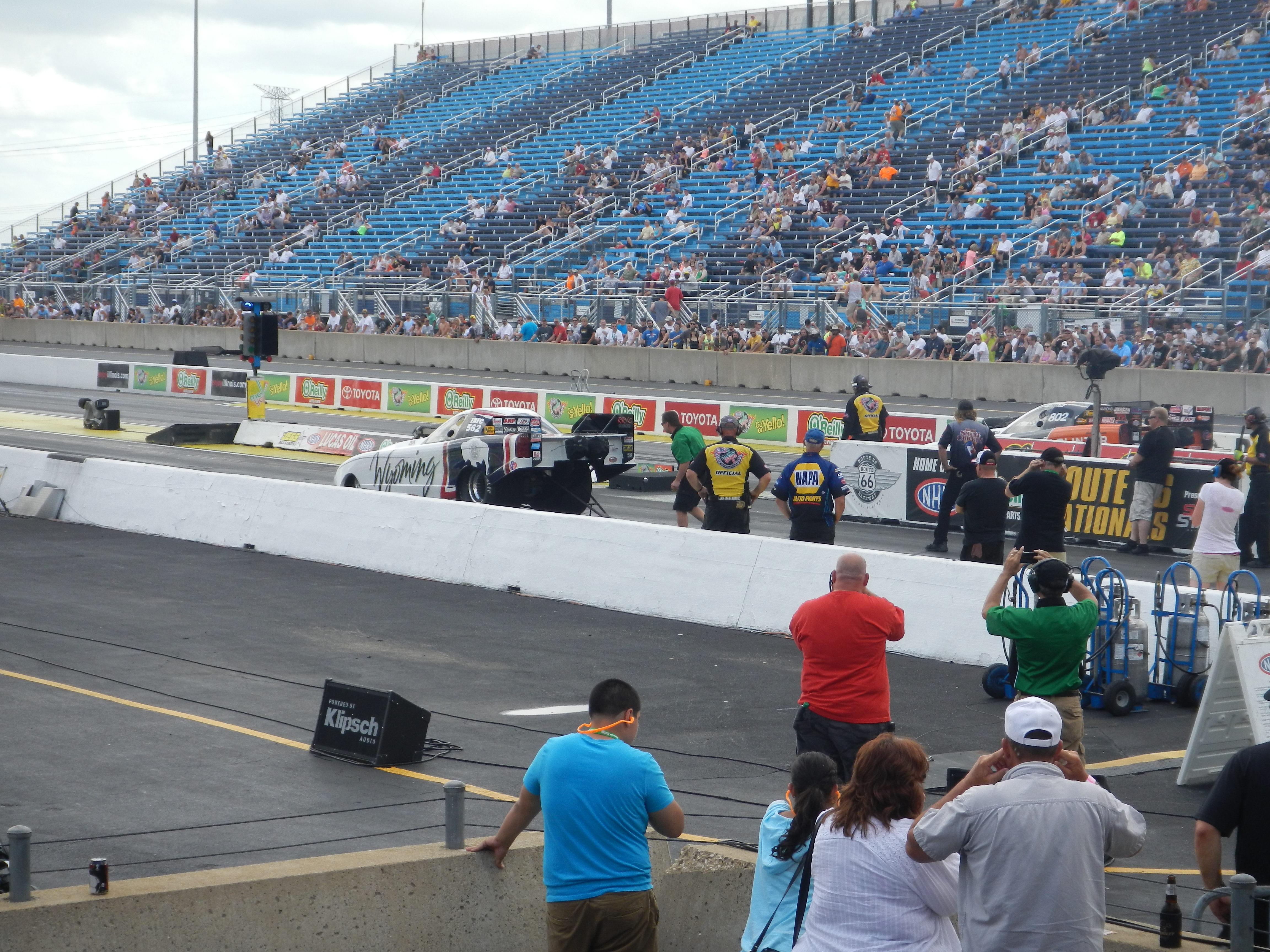
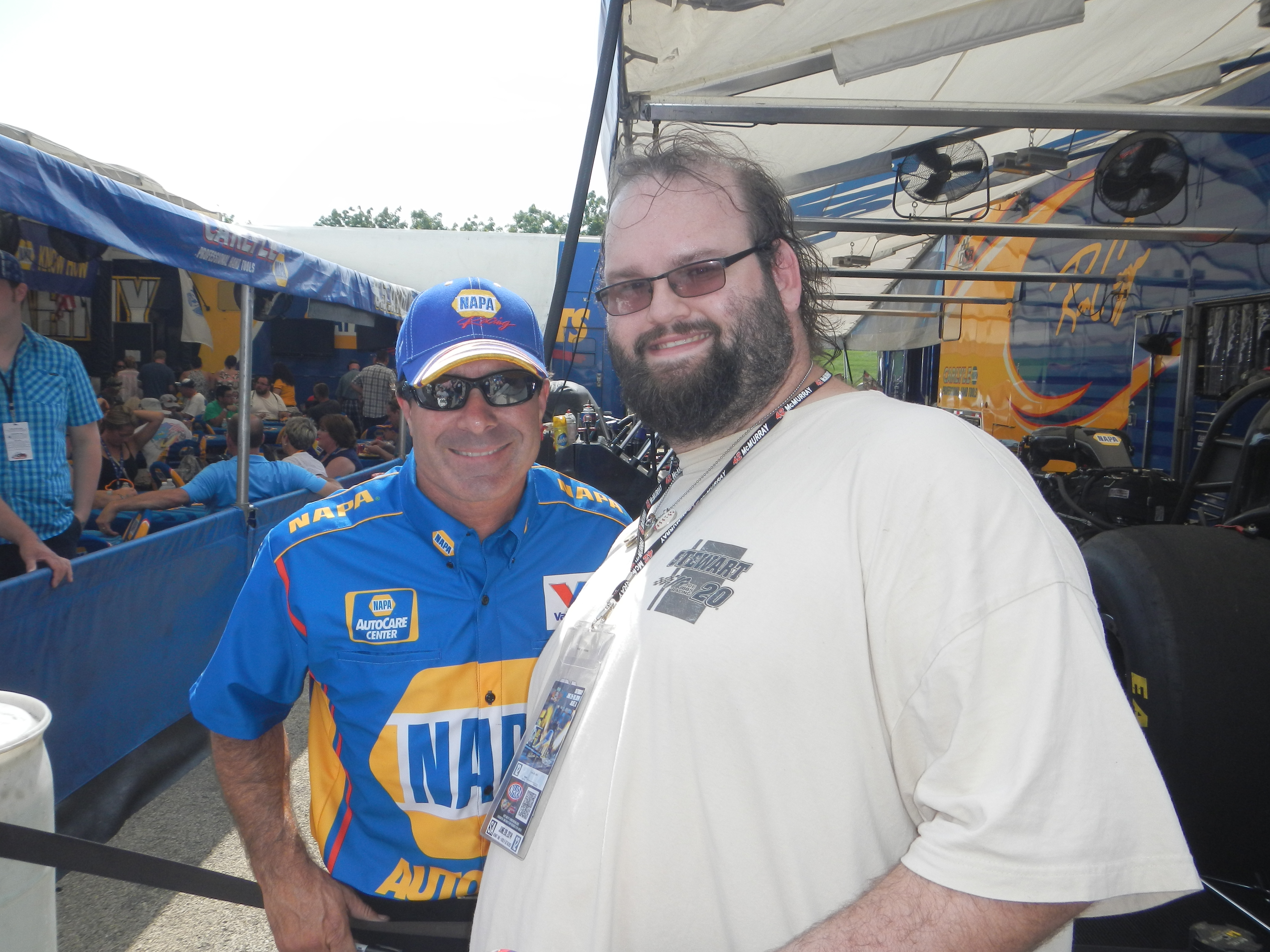
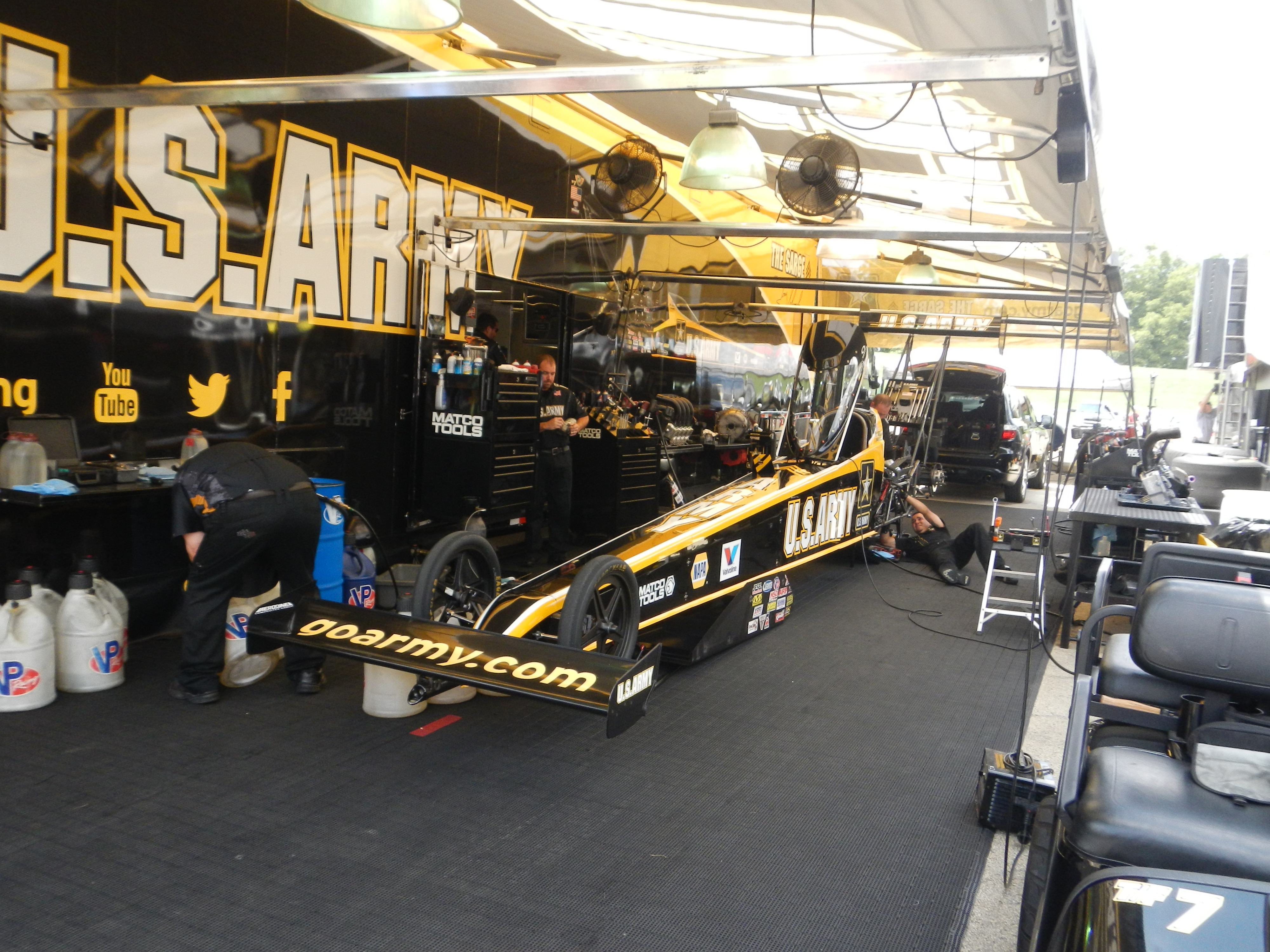
Every summer, I make a pilgrimage to two places, Jim’s Original and The O’Reilly Auto Parts Route 66 Nationals at Route 66 Raceway in Joliet. This last week, I did both. Jim’s Original is still good, and the Route 66 Nationals are always fun.This year, I went on Saturday and Sunday. Normally I would only go on Saturday, but this year I decided to double the fun. I went with Argie, a friend from work, and I spent Saturday watching racing and wandering through the pits. NHRA tickets promise that “every ticket is a pit pass” and trust me, they more than live up to that claim. You can walk around the pits and watch as the teams setup cars before races and fix cars after races. The wear and tear on nitro cars is such that the entire engine has to be disassembled, repaired, and reassembled between races, sometimes in as little as 45 minutes. Needless to say, speed is paramount.I had been fortunate enough to get a pass to the Don Schumacher Racing hospitality tent. This not only got me the tickets, but also a chance to meet Tony Schumacher, and Ron Capps. I came into the tent a little later than normal, and I got to listen Tony talk to the crowd, and take questions. I got a chance to ask him something that I have always wanted to ask a driver… “What is the weirdest thing you have ever autographed?” Having done autograph signings since I was 5, I’ve seen a lot of odd stuff get autographed over the years, and I was interested in the answer. He responded that he has signed a lot of body parts, arms, legs, etc, and that his wife hates that.
A few minutes later, he mentioned that he wears a 5-layer firesuit, as well as two additional layers of fire protection. That adds up to a total of 7 layers. Most NASCAR suits make up 3 layers, with an additional layer underneath. Nomex is not a lightweight material, and on days like Saturday, when it was 88 degrees outside, that can get very uncomfortable. He is also credited with the aforementioned canopy to Top Fuel dragsters.
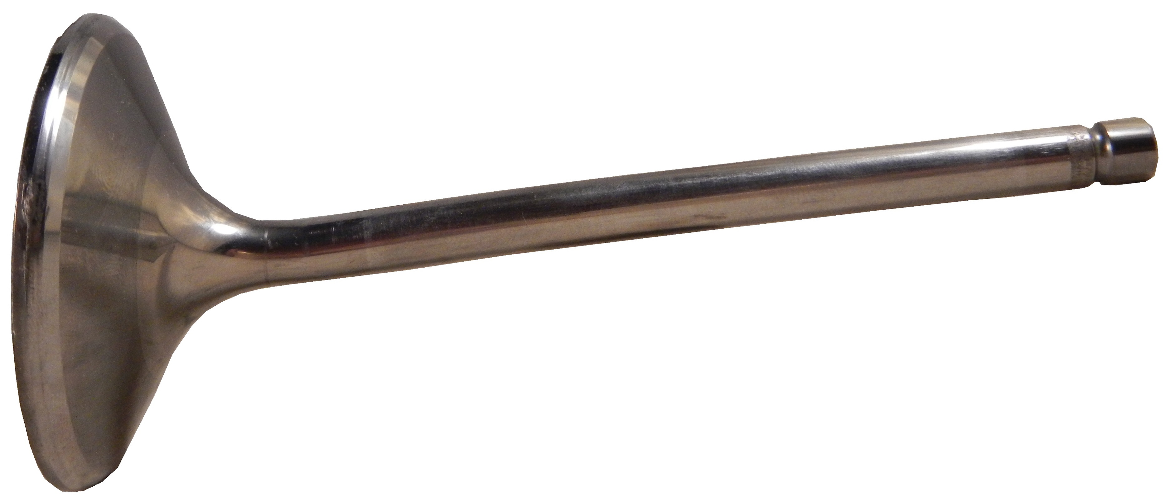
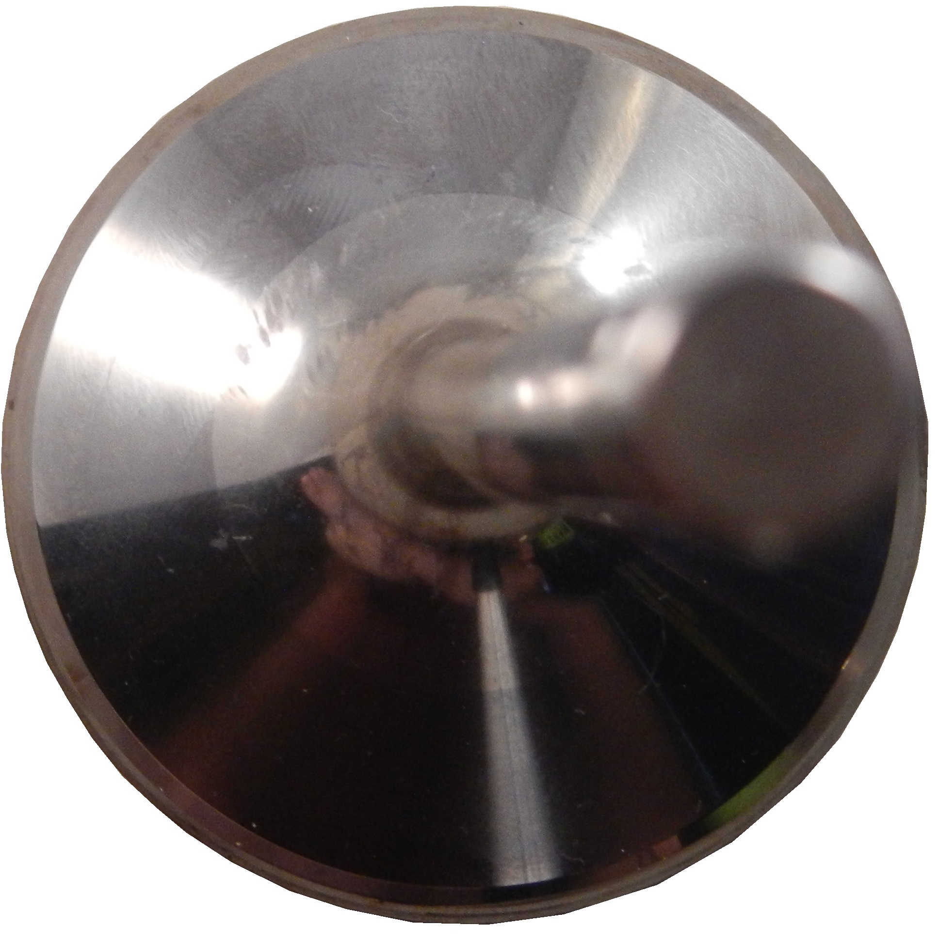
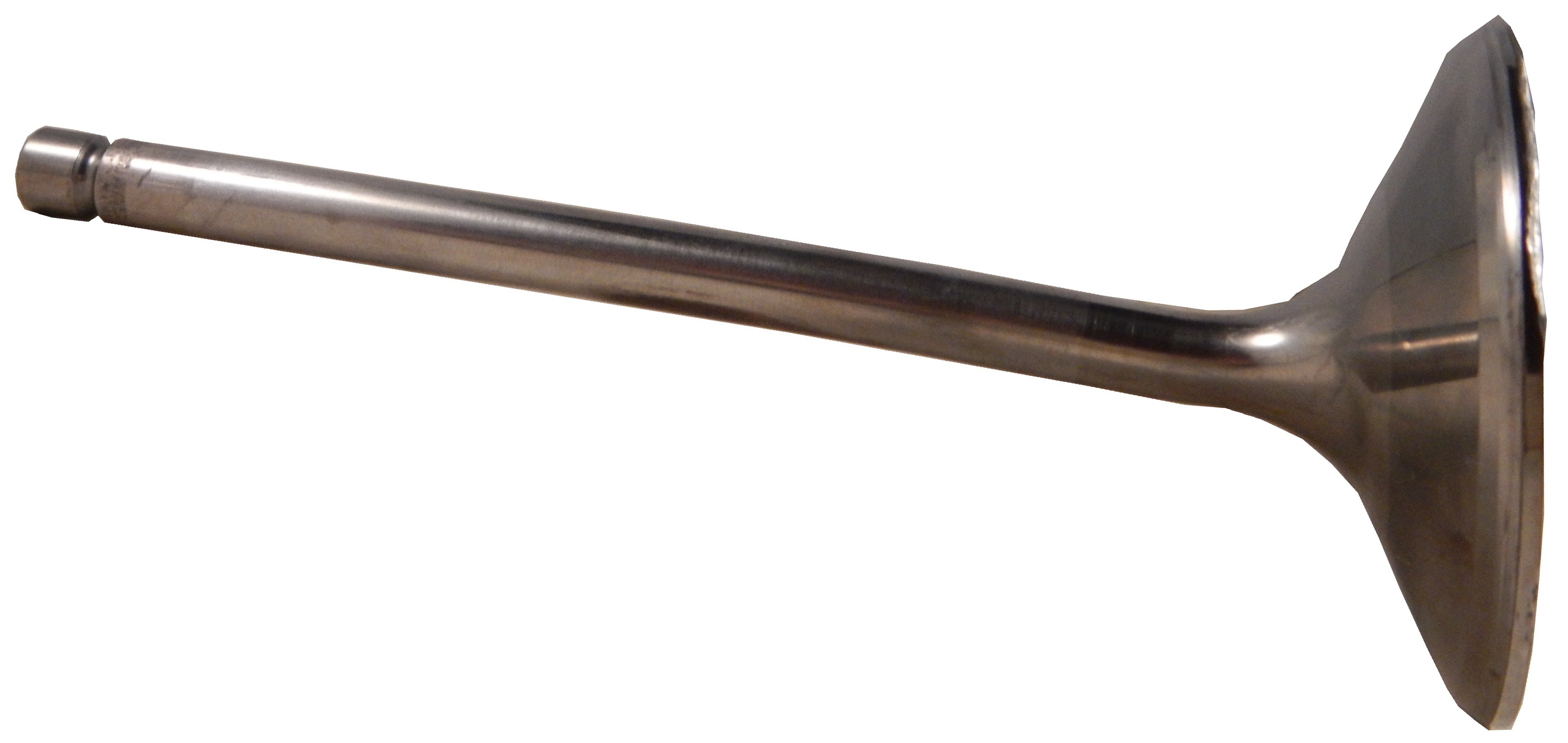
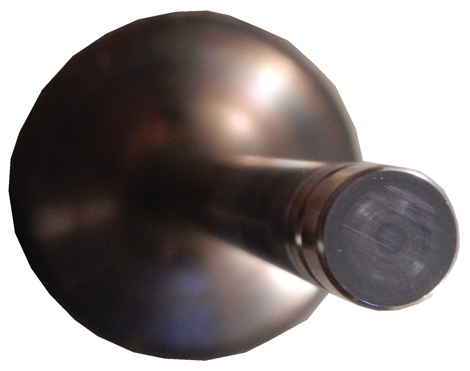
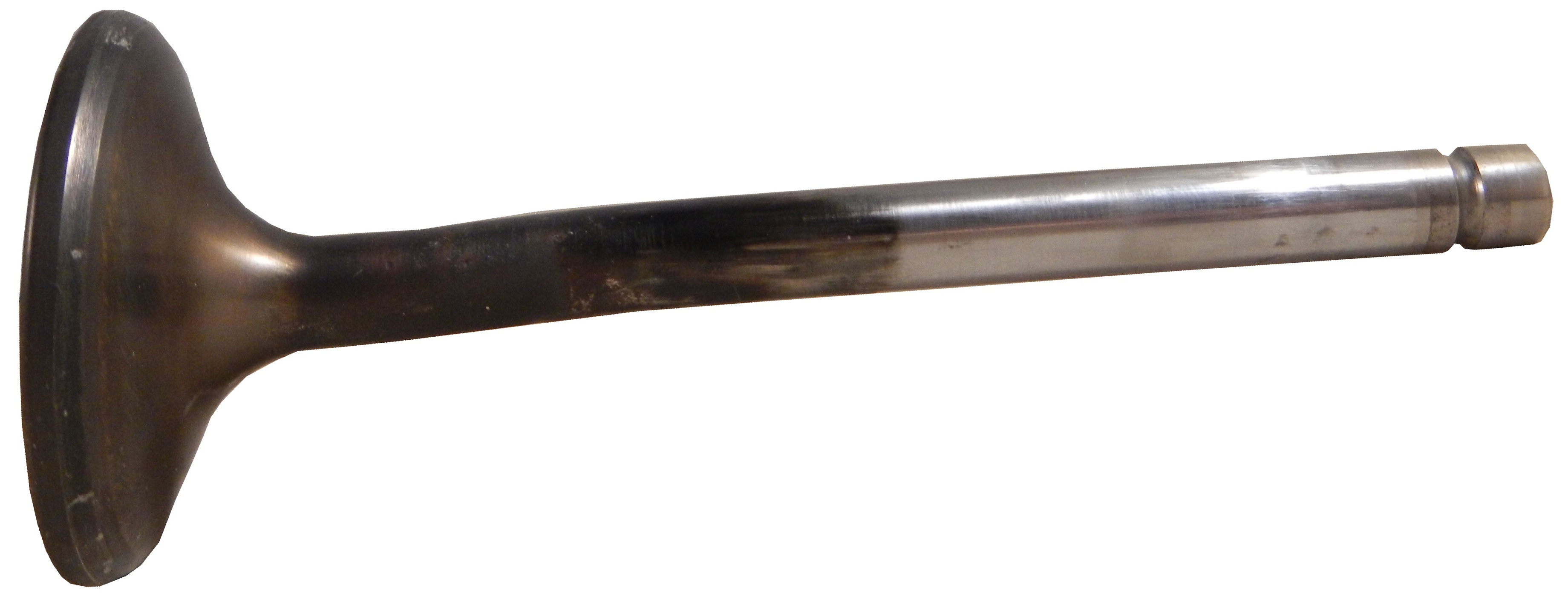
One thing I love to do is to buy race-used equipment from dragsters, and I did so this year as well. I bought a couple of valves from Tasca Racing, one large,and one small,Both show tremendous use, and have chips missing from them. Valves like these are used for one race and then replaced. The wear they go through for one run is very evident.
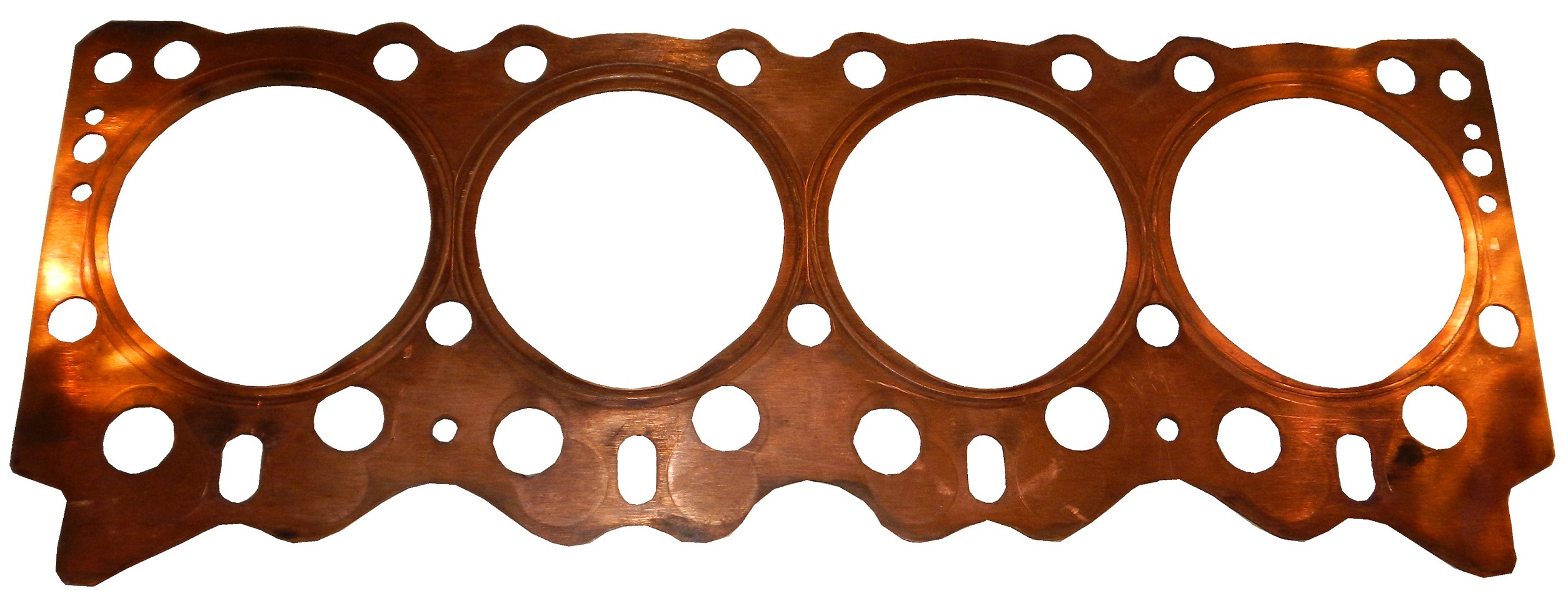
The other race used piece of equipment is a gasket from Morgan-Lucas Racing. It shows a huge amount of wear, and is a very heavy, thick and durable gasket.
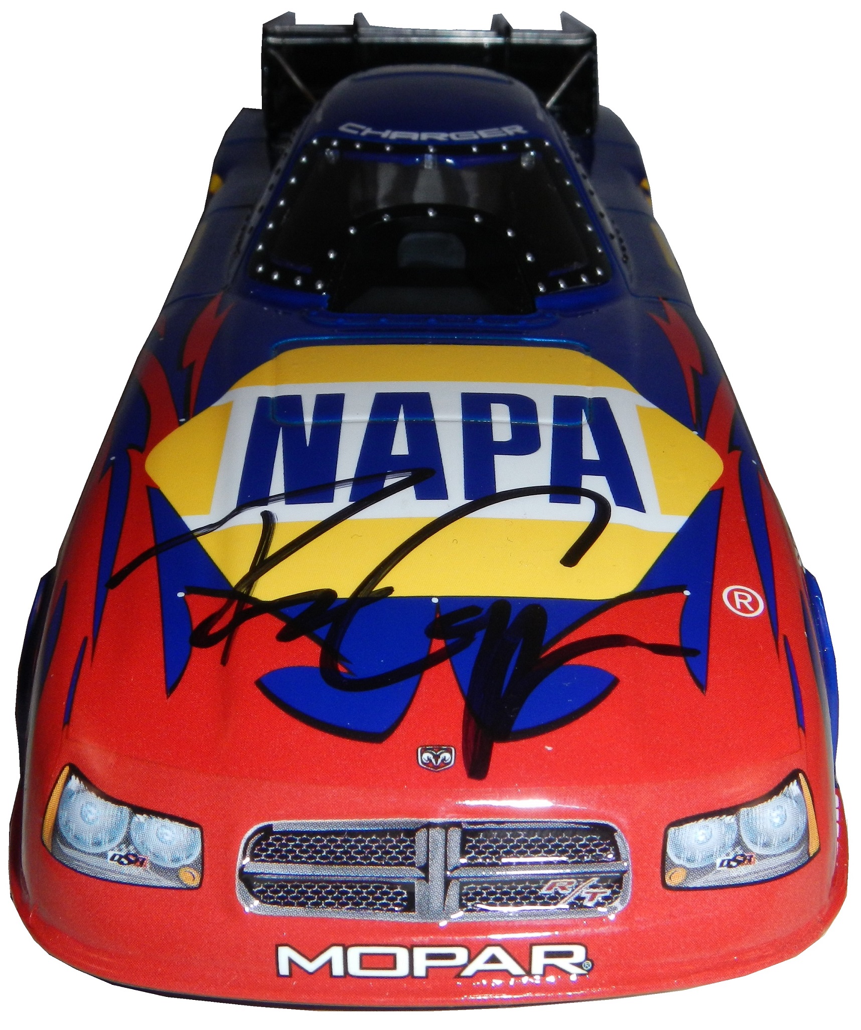
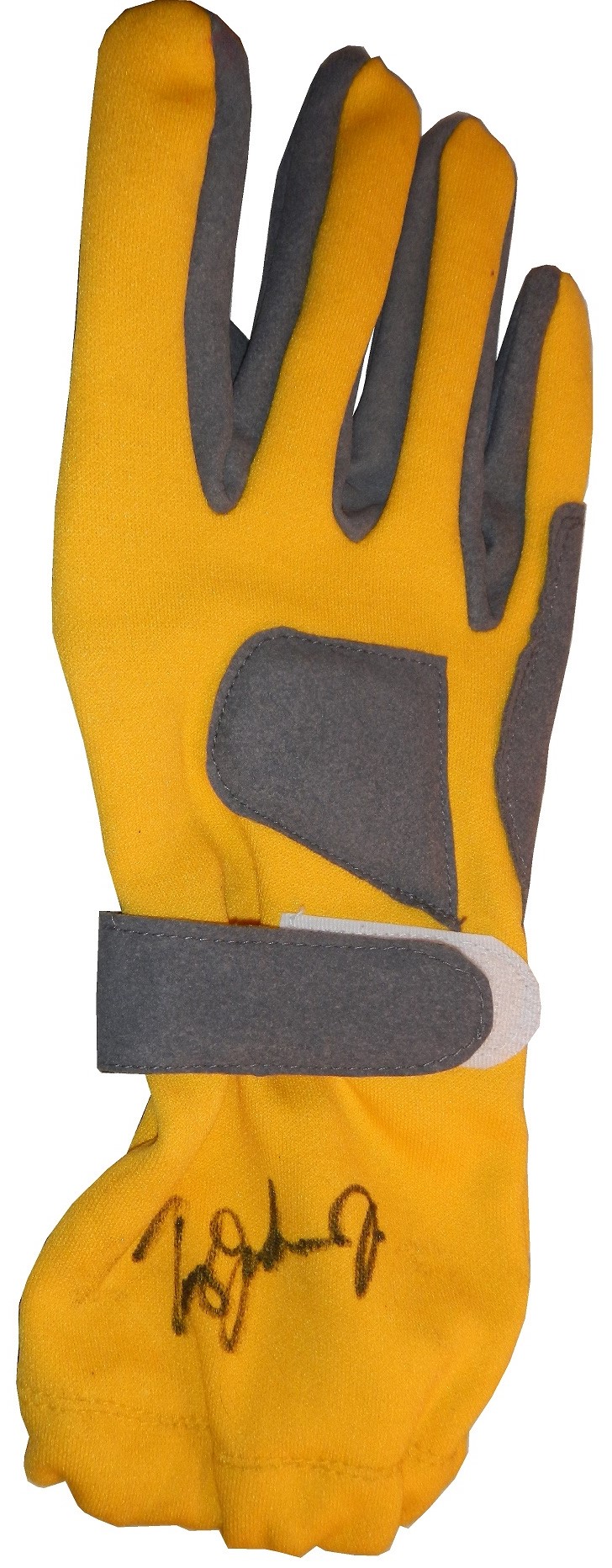
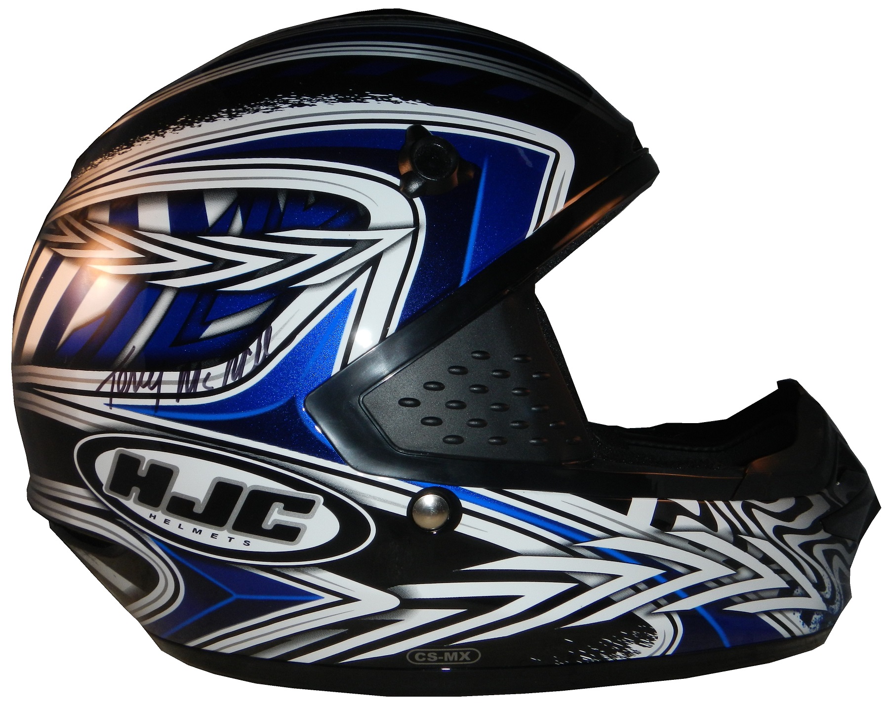
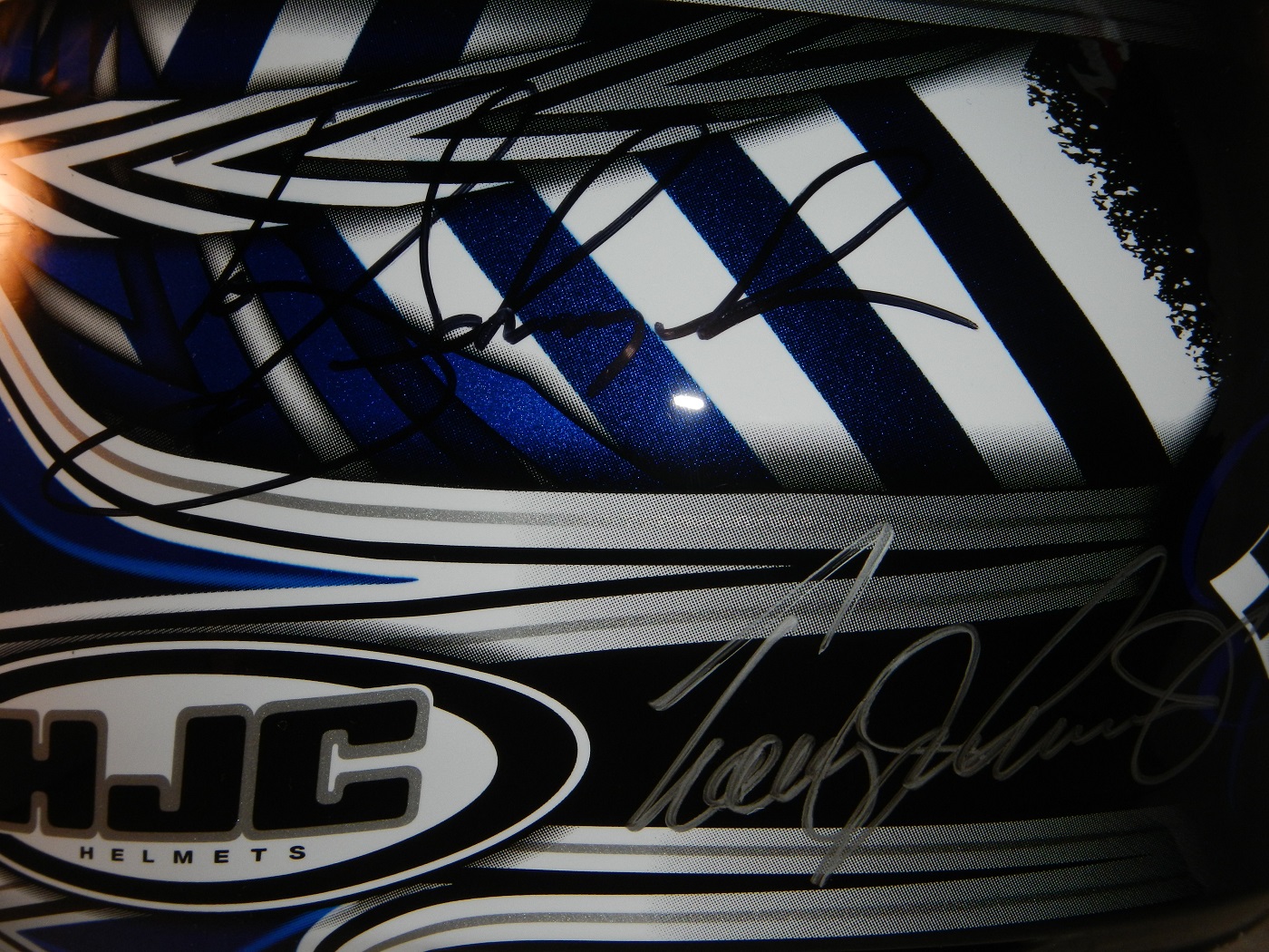
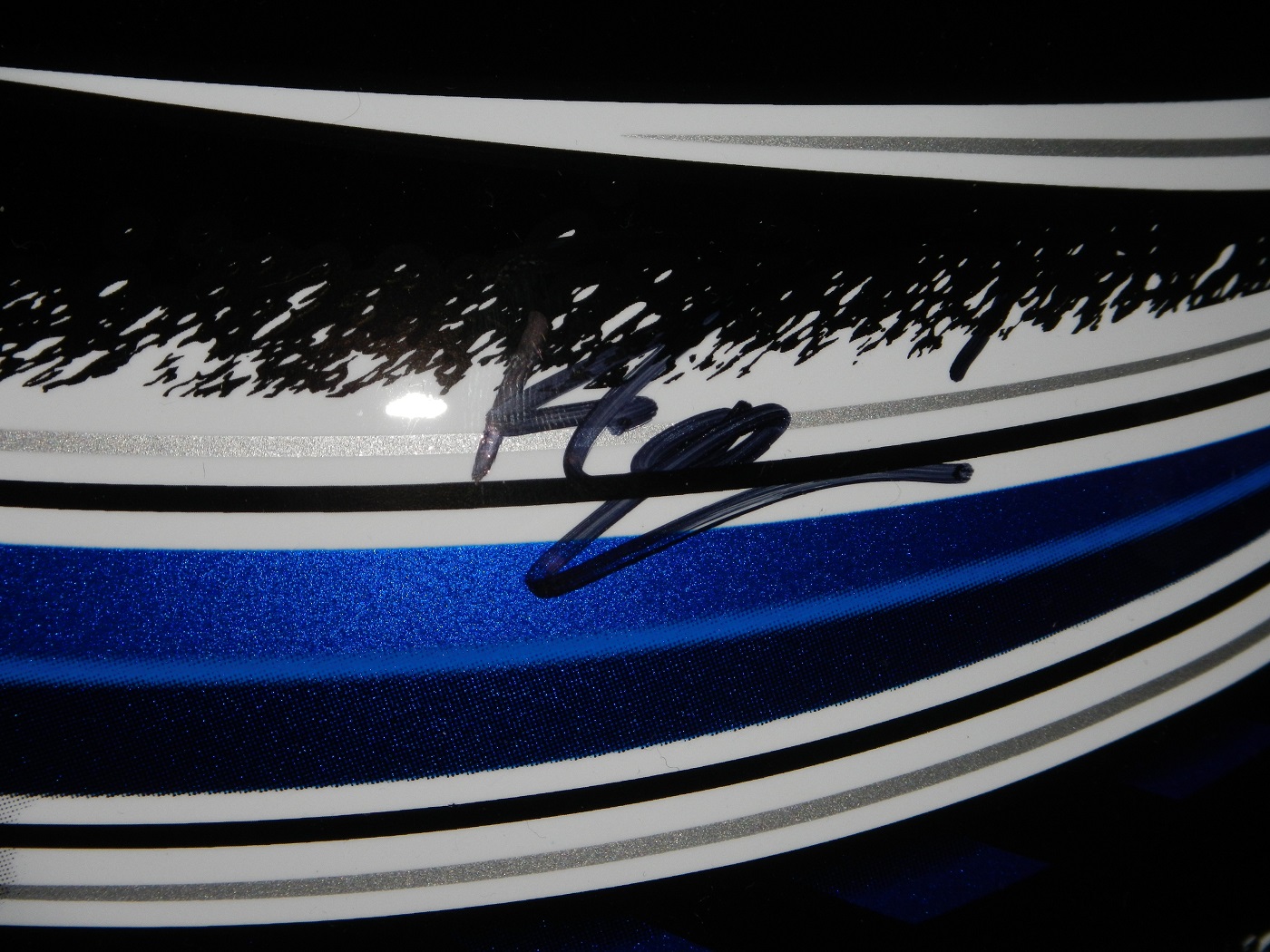
It just wouldn’t be a race for me without getting some autographs. I bought a Ron Capps funny car die cast, and had his sign it in person, and it looks really good.I had a pair of gloves I wanted to get signed, and I did, by Tommy Johnson Jr.My favorite item it this brightly painted helmet. It was signed by Robby Gordon when I bought it, and I got it signed by Clay Millian, Terry McMillen, Tony Schmacher, Tommy Johnson Jr.,Ron Capps, and the legendary Shirley Muldowney.
One thing I didn’t do as much this year was take pictures. I did take some, but not as many as last year. I did make a number of videos, as shown below.
That’s all for this week, I’ll return next week with a set of paint scheme reviews, and believe me, there are a lot of them! Hope you are all having a fun summer! Happy Belated Canada Day for our friends up North, Happy Fourth of July to my readers in the USA, and to everyone else, See you soon!
I had a post ready to go concerning collar designs, but I’ve decided to save that for next week. I’m still on vacation, and last Saturday I went to see the 16th annual O’Reilly Auto Parts Route 66 NHRA Nationals presented by Super Start Batteries, in Joliet. I had the chance to get VIP tickets, so I went with Argie, a friend from work, and some of her friends, and took the chance to mix business with pleasure.
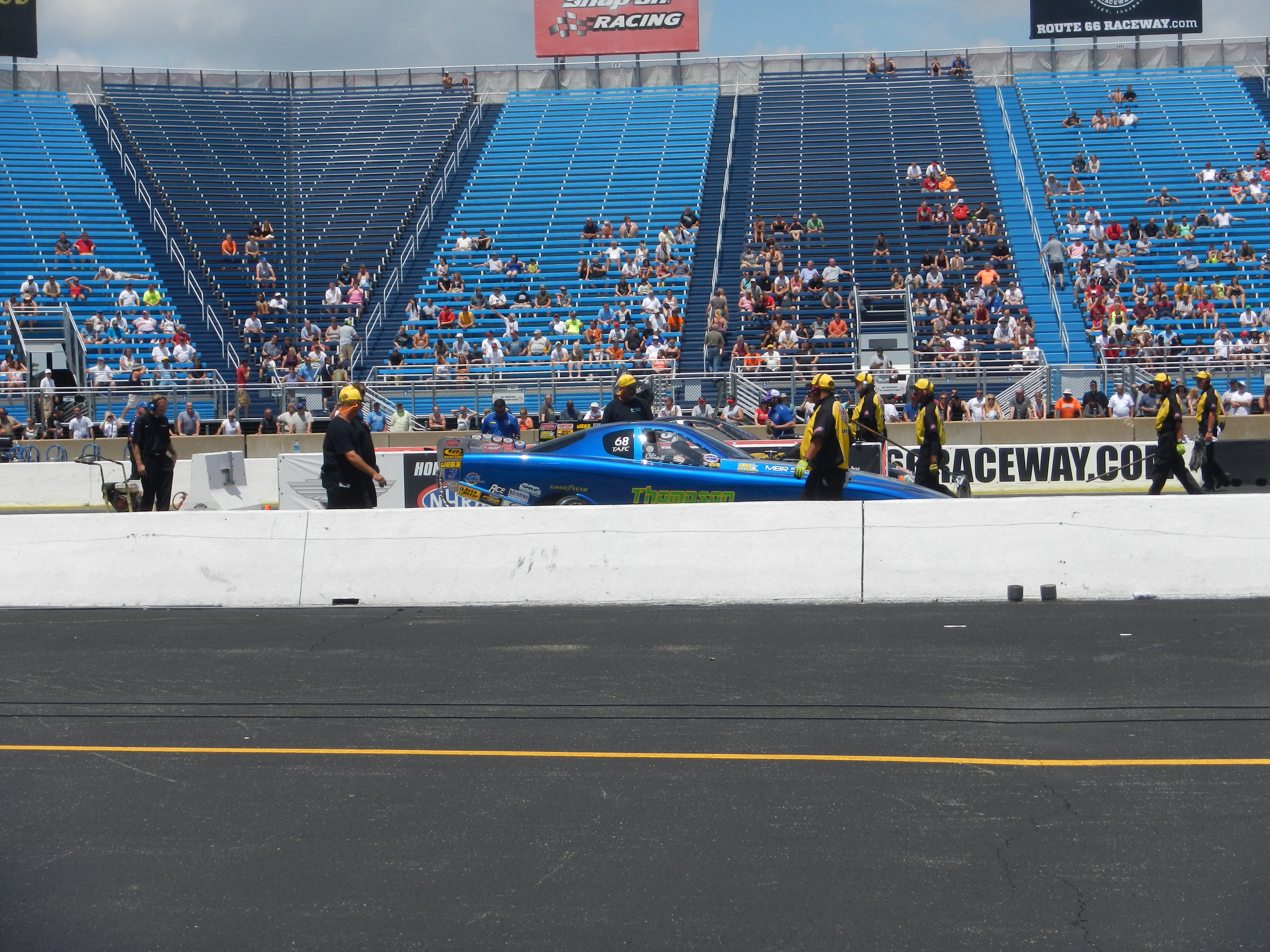
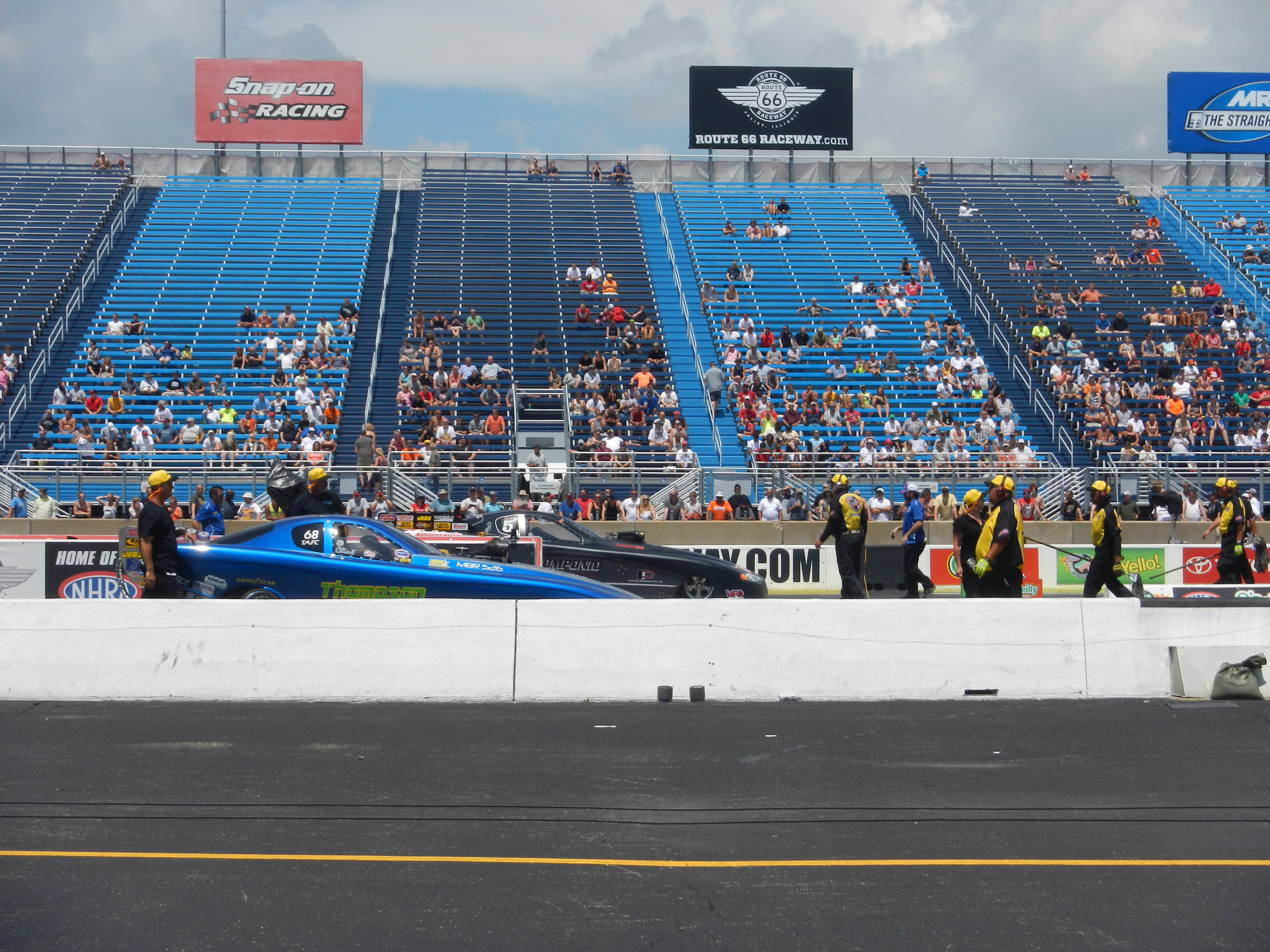
It was a mixture of Mello Yello Drag Racing Series regulars, and some minor league drivers, but it was fun. The first thing I learned was how loud these cars really are. I’ve been to NASCAR races, and I’ve heard the engines running, but NHRA engines are so much louder than I had thought. For a while, I was standing in the spectator area on track level, and as they warmed up, you felt the vibrations of the engine. I’m standing about 75 feet away from the starting line, and when they went by, you felt it in every part of your body, a split second after they passed you. Needless to say, it was AWESOME!
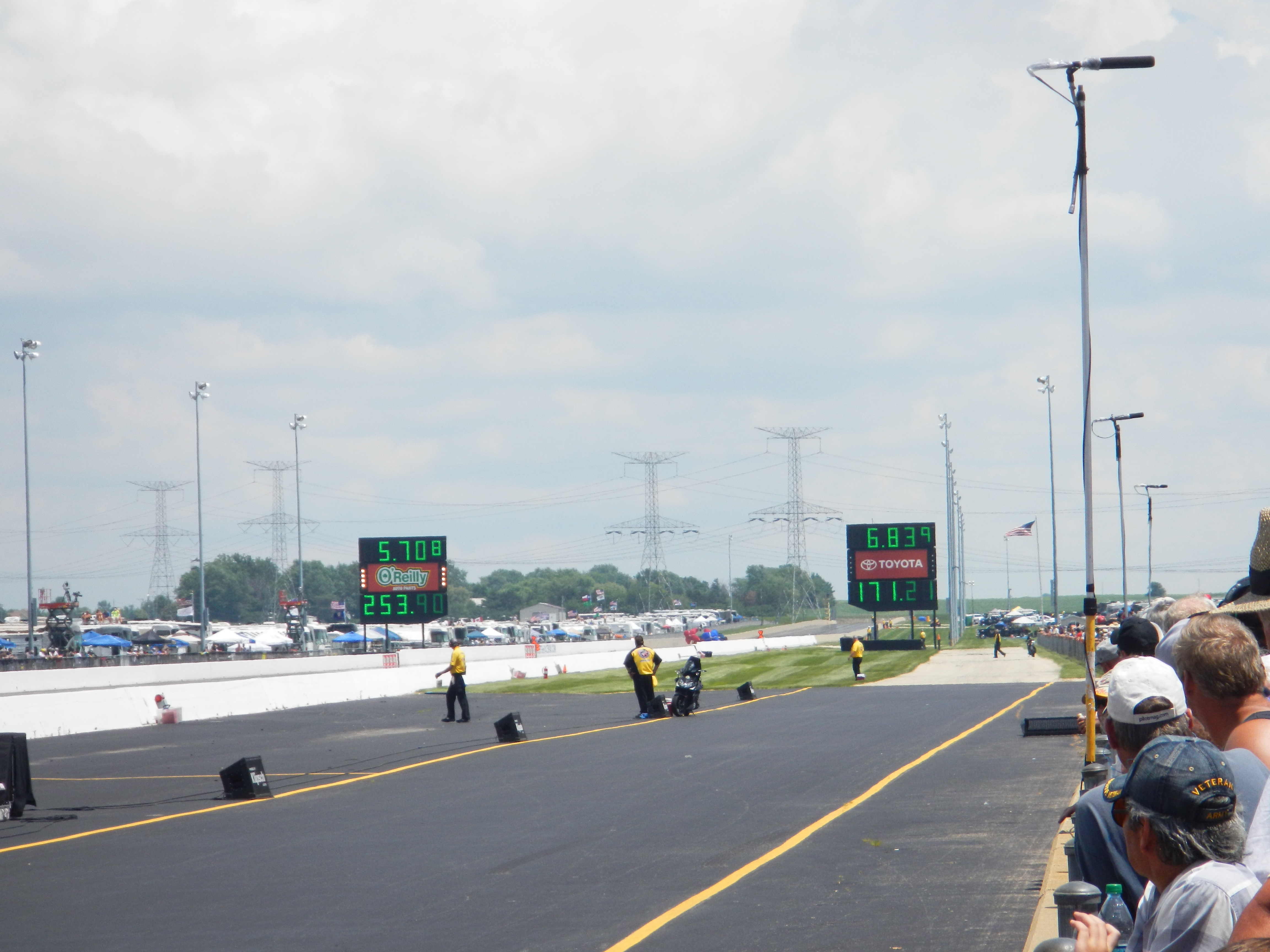
One thing I did enjoy was checking out the different kinds of cars, from top fuel dragsters, to super stocks,to funny cars, The scoreboard tells the fans who won, and what their times and speeds were, each side having its own scoreboard with lights around the sponsor logo to tell you who won.I also checked out the tires on these cars, and man, they are huge! They look like they are twice the size of NASCAR tires.Speaking of which, I got a chance to check out the new Gen 6 Sprint Cup car, as Clint Bowyer’s Toyota Camry show car made an appearance…it looks amazing!They even had a jet dragster, but I didn’t get to see it on the track…oh well.One of the fun things about these events is that you can check out the pit area, so I did, checked out all sorts of cars, and the various equipment and stages of preparation and equipment used in them. Impact Racing had a booth there, and they had the various designs of helmets sold for race use. Aside from NASCAR, IndyCar and motocross designs, they had drag racing helmets. Drag racing helmets feature a visor design similar to wrap-around sunglasses. Top fuel and funny cars have their own designs, with funny car having an air filer, since the nitro-methane engine sits in front of the driver, instead of behind, like in a top fuel dragster. Many of the teams sell off equipment from the cars after the various events are done, and I took full advantage, acquiring a timing belt from Bob Tasca’s Motorcraft Funny car, this one used in his first qualifying session at the Ford Thunder Valley Nationals in Bristol Tennessee. This run he had a 4.15 second, 306 MPH run. This thing is HUGE, measuring over 64 inches in circumference and 3 inches across. As well as an ignition coil and a spark plug from Morgan Lucas Racing. Ignition coils are used to turn on cars in general, but this MSD 8142 is designed to fire up these 8000 horsepower engines, which need a lot of electricity to start and operate. I was fortunate enough to have Tony Schumacher and Ron Capps autograph it in person. My VIP ticket got me into the Don Schumacher Racing hospitality area. That was a lot of fun. We got to watch his car get prepared. Since the U.S. Army is his primary sponsor, DSR had some Army recruiters and soldiers speak. Though speaking to a crowd is not always easy when you have 2 8000 horsepower cars racing nearby. Then Tony Schumacher got up and gave a speech, and discussed his helmet, which prompted this question from me:
Afterwards, I was able to get a photo with him,and got to watch the engine test. This video looks tame, but unless you see it in person, you don’t have any idea how loud it really is, and I was 15 feet away when I shot that video!
Then I had dinner,and called it a day. I had a great time, and I will go back any chance I get!
In other news, I went back to the Museum of Science and Industry, and I went to the Jeff Gordon suit exhibit, and was shocked to see this:THE ENTIRE DISPLAY had been emptied out of the display case. At first I didn’t know what had happened, so I asked at the information desk. They, in turn, told me that pipes located above the display had been leaking, and that the items had been removed. I hope that when the display is fixed, the issues I discussed in a previous blog will have been fixed, I will keep you posted.
And since I’m here, Let’s talk paint schemes…shall we?
Jamie McMurray #1 Hellmann’s 100th Anniversary Chevy SS The yellow or green on the contingency decals is pointless, and it takes away from what is a very solid scheme, with simple design and great color. I give it a B+, almost an A, just not enough.
Tony Stewart #14 Ducks Unlimited Chevy SS Although it is just his normal scheme with DUCKS UNLIMITED instead of MOBIL 1 on the quarter panel, I hate his new look. The black scheme from before Kansas was really good, but this is just horrible. Too much orange, not enough black or camo. F
Clint Bowyer #15 Toyota Camry 30th Anniversary Toyota Camry Ok, so is this a red car, a black car, or a silver car…I’m really lost here. The nose and front panels look red, but the hood and back quarter panels look black, and the roof is silver. They took one of the best color schemes in racing, and made it horrible! The only thing giving this scheme a passing grade is the color scheme, but even that can’t keep it above a D-
Aric Almirola #43 Go Bowling Ford Fusion I love what they did here. The bowling ball nose and pin design give a great impression, and the color scheme works very well here. A+
AJ Allmendinger #47 Scotts Toyota Camry Simple and attractive, with a very nice simple color scheme…But could someone explain to me why in this rendering the windshield decal reads AJ ALLMENDINGER instead of just ALLMENDINGER? The only time a first name is on the windshield is in the case of Kurt and Kyle Busch. There is no other Allmendinger racing in the Sprint Cup. That said, this scheme earns an A
Brian Vickers #55 Aaron’s/Louisville Cardinals Toyota Camry The color scheme is amazing, and the basic simple design of the car works well. The hood has some needless design, which does affect the grade, but even so, it still earns an A-
Martin Truex Jr. #56 NAPA Batteries/Get Back and Give Back Toyota Camry Another example of why most teams only USE ONE COLOR AND DESIGN SCHEME! The nose features BDU digital camouflage in light and dark green, which works well. The doors feature Truex’s normal scheme, again good color and design, and the back features a blue/black digital camouflage, again which would work well by itself. The problem is that the combination of the three make for an awful look. This scheme is one of the worst so far this year, and it earns the F- grade it deserves. I fully support our Armed Forces, but this scheme is horrible!
Carl Edwards #99 UPS Ford Fusion I know I covered this scheme in a previous post, but this photo illustrates why I hate UPS as a car sponsor. No matter what, UPS cars have one thing in common, and that is that the driver suit can look really good, whereas the car will look awful. In this case, the car has pointless designs and needlessly added colors, whereas the driver suit is simple and attractive. So my previous grade of D- still applies.
And finally, while I don’t normally do Nationwide paint schemes anymore, I had to do this one. Kurt Busch has had a throwback at Talladega reminiscent of Neil Bonnett’s Country Time scheme from the 1980’s, and last night, he had had an amazing scheme taken from Days of Thunder…I love that scheme because I love the movie. The boxy design of the Camaro works well with the scheme, as it is much similar to the design of the Lumina. Keep it up Kurt!
Many race fans have seen these small patches on driver suits, and may have wondered what they are. What many do not realize is that these small patches have a very critical role in driver safety. These small patches are the safety certification patches. These small patches state that this uniform part has been examined by one of the two groups, and determined to meet the standards set by the group. For North American made equipment that group is SFI.
According to their website, SFI was founded in 1963 as part of Speed Equipment Manufacturers Association or SEMA, as a safety group. Back then, the safety culture wasn’t as rigorous as it is today, and there were not many standards in place. SEMA started the safety certification with SFI or SEMA Foundation, Inc certification. If the equipment didn’t meet SFI standards, the participant could be denied entrance to the event. Eventually, SFI left SEMA and became its own independent group.
Since then, SFI has certified safety equipment, and their certification is the standard in North America. This small patch is usually sewn into the inside wrist area on the left sleeve. This example, from a Terry Labonte suit from 2008, indicates that the suit meets “3.2A/5” standards. According to their site, this certification is standard for driver suits, and this suit would need re-certification in the next 5 years, or 2013. This certification is standard for many NASCAR suits, as shown below.
For suits made internationally, the certification comes from a different group, the FIA Institute. Like SFI, the FIA Institute has the exact same goal, to make sure auto racing is safe, and that the equipment that drivers wear is as safe as possible. Unlike SFI however, FIA certification ends up in one of two places, either on the back of the neck,or inside the belt,
Both certifications serve the same purpose and both are mandated in racing today. These certifications also appear on driver gloves,and even helmets, usually on the HANS anchorMoving on to more 2013 paint schemes…
Trevor Bayne #6 Valvoline Ford Mustang Love this scheme! This brings back some fond memories of Mark Martin behind the wheel back in the 1990’s. The color and design scheme are amazing, so it gets an A
Brad Keselowski #22 Hertz Ford Mustang Only Penske can ruin one of the best color schemes with an awful design. Seriously what is the design on the front? It kills this scheme. Final Grade: D
Travis Pastrana #60 Ford Mustang What the Hell? Did Lisa Frank design this car? I’d love to comment on the color scheme, but just looking at the picture is enough! I didn’t think it was possible to make a scheme worse than the Kyle Bush Sponsafier car, but here we are! Final Grade: F’
By the way, I never thought I would reference Lisa Frank in this blog…
Casey Mears #13 Geico Ford Fusion Eww…just eww. The color scheme is dreadfull, and the designs on the side are painful to look at. It passed because of the logo and number design. Final Grade: D-
Kyle Busch #18 Interstate Batteries Toyota Camry Great color scheme, and good basic design, but there is something with this car I find annoying. The driver’s name is on the windshield and above the door, so why is it on the top of the hood? Not just on the top of the hood, but UPSIDE DOWN as well? Seriously? It makes no sense, and takes the final grade down to a B
By David G. FirestoneThe evolution of the racing helmet in NASCAR for the most part was slow, in the beginning. NASCAR was officially founded in 1947, two years after World War II ended. Many of the helmets worn during the 1940’s and 1950’s were little more than repainted army and air force helmets. These helmets were basic at best, and as protection for the dangers of racing, these helmets were inadequate at best. During the 1950’s, many drivers switched from military headgear to motorcycle helmets. In the 1960’s, motorcycle-style helmets became the norm.The above helmet was worn by Jim McConnell, who raced and promoted races in Maine, and went on to found Beech Ridge Motor Speedway in Scarborough, Maine. This is a racing helmet, but it looks more like Wyatt’s Captain America helmet from Easy Rider, in its basic design. It has an open face, no microphone equipment, and is rather thin. Although there would be advancements in helmet technology, the open-face design would remain popular until the 1980’s.This helmet was worn by Brad Noffsinger in 1988, it is the same general design, though it is much thicker, has some advancements in visor technology, and had some microphone technology in it as well. Although these helmets have since been banned, they remained legal for as long as they did for one simple reason: Advanced visibility. NASCAR did not want to have a crash caused by decreased visibility due to a rule mandating full-face helmets.The Ted Musgrave helmet mentioned in a previous post is a perfect example. The bottom part covering the chin does to a certain extent reduce visibility for a driver. The logic makes sense, in that if there was a crash caused by reduced visibility, so for the 1990’s and 2000, the open-face was legal…then came the 2001 Daytona 500. That race saw the death of Dale Earnhardt Sr. from a Basilar skull fracture, which as tragic as it was, wasn’t the first death due to sub-par safety equipment. John Nemechek, Adam Petty, Kenny Irwin Jr., and Tony Roper had all been killed in similar accidents. Only after Earnhardt’s death, did the HANS device come to light, and eventually became mandatory in NASCAR, and eventually, across the board in racing. Now the helmets used in NASCAR look like this:This is a helmet worn between 2004 and 2005 by either Regan Smith or Jason Keller. As you can see, it has a number of advancements, including the visor, and air intakes, but the biggest advancement is these small bolts towards the back.These are where the HANS device connects to the helmet. The HANS device was mandated after the death of Dale Earnhardt Sr. to prevent Basilar skull fracture deaths. This device has worked very well. The HANS device works by attaching the device to the helmet, and then being secured by the shoulder straps.
As advanced as this helmet is, there is always room for improvement. What new form will the racing helmet of tomorrow take? Only time will tell.
On to Paint Schemes, we have a lot of ground to cover today…
Sam Hornish Jr. #12 Wurth Tools Ford Mustang The doors look like they have race damage on them already, which is not a good sign. The color scheme is decent, but the Pennzoil stripes just kill it. The logos are easy to see, but the stripes are just awful. Final grade C+
Matt Kenseth #18 Reser’s Foods Toyota Camry. Numbers are great, color scheme is good, logos are easy to see, and the background design is visible, but not overpowering. The only thing keeping this scheme from a higher grade is the picture of the package on the side of the car. That drags the grade down to a B+ from an A
Now moving on to the Sprint Cup Series
Denny Hamlin #11 FedEx Toyota Camry There are a total of 4 variations of the FedEx scheme, Express, Freight, Ground and Office. Right off the bat, the front nose design and stripes are awful. The color schemes are great, as are the logos and numbers, but the stripes kill it. The best grade I can give is a C+ across the board.
Paul Menard #27 Menard’s Chevy SS Not the worst I have ever seen, but the yellow is way too bright, and the massive collection of sponsor stickers on the quarter panel is just ugly. Final Grade C-
I recently did a post focusing on Christian Fittipaldi, and the unusual way his suit displayed the so-called television logos. But these logos have a unique history all their own. One of the first examples on an in-car camera being used was the 1979 Daytona 500. At that time driver suits mostly looked like this: That is Buddy Baker after winning the pole at Bristol that same year. As can be clearly seen, no logos of any kind on the legs, or sleeves. For much of the early and late 1980′s that was mostly the case. Even though by 1989 there were opportunities to add logos in good places, in many instances this did not occur. There are instances where there were logos on the legs and sleeves, and the position in many of them is consistent with today.
In the late 1990′s, TV logos were still, for the most part off the radar screen. But around 1997, sponsors started taking the hint, and adding these logos. Although it was not popular across the board, it steadily gained momentum, and by 2004 these logos began to be the rule rather than the exception. Granted in-car cameras were somewhat more nomadic then they are now, but even still it is kind of amazing that these logos took as long as they did to catch on. Here is an example of a televison logo. This logo comes from a Mike Skinner suit from 1997:
This is how it appears when the driver’s arms are at their sides. When the driver has his arms at the wheel, or crossed, the logo appears like this:
It seems so simple, and it is surprising that it took that long to figure this out. In fact, in a number of instances, logos on sleeves looked like this, The Ted Musgrave suit from a previous post:
While that looks good outside the car, inside the driver compartment, it looks like this to an in-car:
Not good for an in-car, the logo is next to impossible to read. The legs have gotten the same treatment, in some cases the logo looks like this Ricky Craven model from 1996:
But to an in-car camera, the logos look like this:
Again, the logo is impossible to read. The proper alignment looks like this:
This is the proper alignment, when the driver is in the car, and the camera is to the side, the logo appears as such:
The whole point of sponsorship in racing is brand exposure, and these logos are a perfect example of this. I still love the fact that even the drivers who almost never have an in-car camera have these logos.
Austin Dillon #3 Advocare Chevy Camaro I’m not a fan of power blue in most cases, but here it just works. The RCR 3 always looks good, the logos are good, and the whole car looks sold. Final Grade: A
Regan Smith #5 Tax Slayer/Hellmans Chevy Camaro Could someone please explain to me why Dale Jr. and Regan Smith are running identical paint schemes in the Nationwide Series this year? The only differences between the two cars are the numbers and name rail. The Hellmans scheme stays at a B-, but the Tax Slayer scheme looks better from the layout shown here, and it has earned the A rating.
Brad Keselowski #22 Discount Tires Ford Mustang This would be an A grade, if not for the Discount Tire logo…why does it look like it was designed by a 5 year old in art class? The letters are so horribly aligned, it takes the scheme from classic to comical. I’m shocked that it isn’t written in Comic Sans with the D backwards. It is really sad, because it takes away from an otherwise great scheme, and takes the final grade from A to B-
Ty Dillon #33 Ritz/Wesco/Armour Chevy SS Three schemes to discuss. The Wesco scheme is good but if the door numbers were a different color than the stripes, it would get a better grade than B-. The Ritz scheme is completely solid, with great colors, great design, and great logos, and gets an A. The Armour scheme is decent, but the numbers could use a more visible outline. There is also a logo just behind the door number that is next to invisible. Final Grade B+
We start off today with a unique story from IndyCar. Ryan Hunter-Reay won the Izod IndyCar Series Championship last season, and as such has the right to use the number 1 on his car. He normally used 28 as his car number, because 28 million people worldwide are affected by cancer, and his mother passed away from cancer in 2009. So he is using a number 1 with a rather unique twist. Also mentioned that Marco Andretti will switch to number 25 from 26 next year.
Moving on to NASCAR paint schemes, let’s look at the Nationwide Series first. Two Chevy schemes and one Ford scheme have been released so far
Sam Hornish-#12 Alliance Ford Mustang Could someone explain to me why in the world it has door handle decals? And why does it have a blue line on the door that looks like race damage? I really want to defend this scheme, but no, just no. Final Grade: C
Kevin Harvick-#33 Hunt Brothers Pizza Chevy Camaro First off, the Camaro looks really good on its own, and this paint scheme works quite well. The door-handle decal is visible, but not as bold as the Hornish car. The green/white contrast works well, and the decal package on the front looks really good. The stripes on the sides work very well, and are not as haphazard of some schemes I have seen for this season. Final Grade: A
Dale Earnhardt Jr./Cole Whitt-#88 Tax Slayer Chevy Camaro Decent color scheme at work here, but what is with the pink roll cage? The red black and white scheme has a similar color in the front stripe at the nose. It’s visually distracting, and pointless. The powder blue/pink stripe takes away from a great scheme and takes the final grade from an A to a B-. Get rid of the blue, and it would be an A
Now we look at the Sprint Cup Schemes
Kasey Kahne-#5 Time Warner Cable Chevy SS Awful color scheme, check. Door and panel design that is supposed to be edgy but is really a cliche, check. The most unoriginal sponsor logo in NASCAR, check. Ok, I think we’re all done here, Final Grade: D
Ryan Newman-#39 Quicken Loans Chevy SS Want to have some fun, open the Kahne link, and this link in two different tabs, and switch back and forth to see how “original” this scheme is. Clearly both were designed by the same person, they look almost identical, except the fronts are a little different, and the color scheme on the Newman car is much better. Final Grade: C-


