The Driver Suit Blog-2015 Paint Scheme Tracker

By David G. Firestone

From here on out, I will publish a complete list of 2015 paint schemes that have been announced, on Wednesdays.  I will grade them as normal on Saturdays.  Again these should be taken with a grain of salt as they can and often are changed between now and the next season.  So without further ado, the first 2015 trackers!

Brad Keselowski #2 Miller Lite Ford FusionSame basic design as 2014, but with no gold stripe, vintage Miller Crest, or hop designs on the side.

Austin Dillon #3 Cheerios Chevy SSNo change

Austin Dillon #3 Dow Chevy SSNo change

Kevin Harvick #4 Budweiser Chevy SSNo change

Kevin Harvick #4 Jimmie Johns Chevy SSNo change

Kevin Harvick #4 Outback SteakhouseNo Change

Kevin Harvick #4 Ditech Chevy SS-New sponsor for 2015, blue, and white is the primary color scheme

Kasey Kahne #5 Great Clips Chevy SSNo Change

Kasey Kahne #5 Time Warner Cable Chevy SSNo Change

Kasey Kahne #5 Farmers Insurance Chevy SSComplete redesign from last year, black, and dark blue replaces light blue and silver, and the design has been completely revamped.

Trevor Bayne #6 Advocare Ford Fusion-New team, new sponsor, red, white and blue is the color scheme.

Danica Patrick #10 Aspen Dental Chevy SSSame basic design as last year, but the blue ovals on the white are more pronounced.

Tony Stewart #14 Bass Pro Shops/Mobil 1 Chevy SSSame color scheme as last year, but with a new design on the side.

Tony Stewart #14 Mobil 1/Bass Pro Shops Chevy SSSame color scheme as last year, but with a new design on the side.

Tony Stewart #14 Code 3 Associates/Mobil1 Chevy SSNo Change

Greg Biffle #16 Ortho Fire Ant Killer Ford FusionNo change

Greg Biffle #16 Ortho Bug-B-Gon Ford Fusion-New sponsor, new design, red, black, and white is the primary color scheme.

Ricky Stenhouse Jr. #17 Fastenal Ford Fusion-New primary sponsor, blue, and white is the color scheme.

Carl Edwards #19 Stanley Toyota Camry-New team and new sponsor, yellow, black, and white is the color scheme.

Matt Kenseth #20 DeWalt Toyota Camry-New sponsor, black, green, yellow, and white is the color scheme.

Joey Logano #22 Shell/Pennzoil Ford FusionNo change

Paul Menard #27 Pittsburgh Paints/Menard’s Chevy SSNo change

Ryan Newman #31 Cat Chevy SSSame color scheme, but the car as a whole has been redesigned

Ryan Newman #31 Quicken Loans Chevy SSNo change

Ty Dillion #33 Yuengling Brewery Chevy SS-New sponsor, red, white, and blue is the primary color scheme.

Kurt Busch #41Haas CNC Chevy SSSame color scheme, but the car has been completely redesigned.

Kurt Busch #41 Slate Water Heaters Chevy SSNo change

Aric Almirola #43 Smithfield Ford FusionNo change

Dale Earnhardt Jr. #88 Nationwide Chevy SS-No Change

The Driver Suit Blog-The End of An Era in Evanston

DSCN0972By David G. Firestone

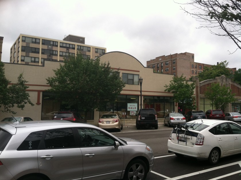
We all have at least one place that we always remember fondly from our childhood. It could be a restaurant, a park, the home of a close friend, or family member, or a park. We all have at least one, probably many. It is always sad when one of these places goes away. Well this happened to me this last week, when an Evanston institution began the process of moving.

Tom Thumb in Downtown Evanston was a place that I and a number of my friends spent a great deal of our childhood. Some of us were skateboarders, some of us were RC car fanatics, some of us, like me were model builders and die cast collectors. It had been in the same place for 49 years, but they announced that they were going to move after a zoning decision was made to replace the current building with a two-story building for two restaurants. So, on July 12, after 49 years as an Evanston institution, it closed. I went there on the 12, and made, with a heavy heart, my last purchase.photo 2 photo 1This was a sad day because I am a huge NASCAR fan, and for many years, Tom Thumb was the only store in Evanston that sold NASCAR stuff. It was also one of, if not the oldest skate shop in the midwest. I went there, looked around the store where I spend my childhood, took it all in, and bought my last purchase, this 1997 Darrell Waltrip 25th Anniversary set.DSCN0972I bought this for two reasons. The first is that I love this set, I remember many of these schemes from races I watched in 1997. They all look really good, and they bring back memories. The second reason, and I didn’t even think about this until I started doing some work for next week. During my research, I was grumbling about how many different paint schemes each car runs every week, and it dawned on me that this might be the first example of that in the Sprint Cup Series.

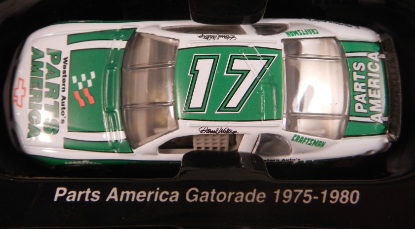
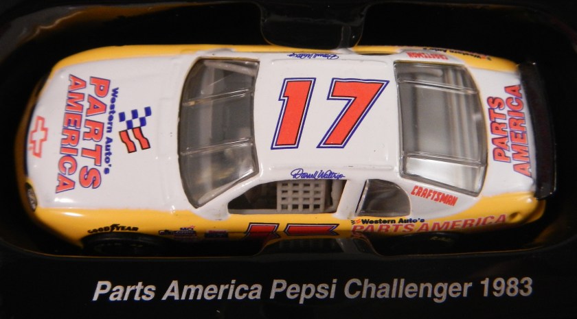
You never had this much variety in paint schemes before 1997. Each team ran one scheme for the majority of the season, maybe 2 or 3 different schemes and special schemes for the All-Star race, and possibly the Busch Clash. But Darrell Waltrip ran, in total, 7 different schemes, each based on a specific era in his career. Each had Western Auto Parts America as the primary sponsor, but were based for past sponsors. He started with Gatorade, which he ran for DiGard Motorsports, from 1975-1980. He won two Coca Cola 600’s(1978, 1979) a Winston 500(1977) the Southern 500(1978,1979)as well as 22 other races during that time.DSCN0990In 1981, he left DiGard for Junior Johnson Motorsports, and was sponsored by Mountain Dew, where he won 24 races including the 1982 Winston 500, the 1981 Busch Clash, and two of his three Sprint Cup ChampionshipsDSCN0991Pepsi replaced Mountain Dew and created The Pepsi Challenger which he ran in 1983 for Junior Johnson. He won 6 races for PepsiDSCN0992After Pepsi left, Budweiser took over the sponsorship, and from 1984-1986, he won 13 races, the 1985 Winston Cup Championship, the Inagural All-Star Race in 1985, the 1985 Southern 500, and the Winston 500. I find love how they call it “Red” instead of Budweiser since this was marketed to kids at the time.DSCN0993In 1987, he made the move to Hendrick Motorsports, and picked up Tide as a sponsor. He won the 1989 Daytona 500, The 1988 and 1989 Coca Cola 600’s and 6 other races. I loved that it was identical to the scheme used by Ricky Rudd that same season.DSCN0994From 1990-1997, he raced the #17 for Hendrick Motorsports in 1990, and then founded Darrell Waltrip Motorsports, which raced this scheme from 1990 to 1997. He won 5 races, but was never to get his former glory back. Western Auto left the team after 1997, and Darrell Waltrip Motorsports shut down shortly after the start of the 1998 season.DSCN0995The last scheme is one of the most innovative schemes in the history of NASCAR. His legendary Chrome scheme.  Darrell loved chrome, using chrome numbers, and a chrome helmet.  This was supposed to be used for just a single race, but it was raced a number of times that season. Nothing like this had ever been done in NASCAR before. There had been chrome numbers, but never a chrome car. This car was so far ahead of it’s time.  Darrell even had a Chrome driver suit that he wore with this car!DSCN09961997 would be the beginning of the end for Darrell Waltrip. He shut down his Winston Cup team in 1998, and joined Dale Earnhardt Inc. midway through the season. He would race for just two more seasons before fully retiring in 2000.
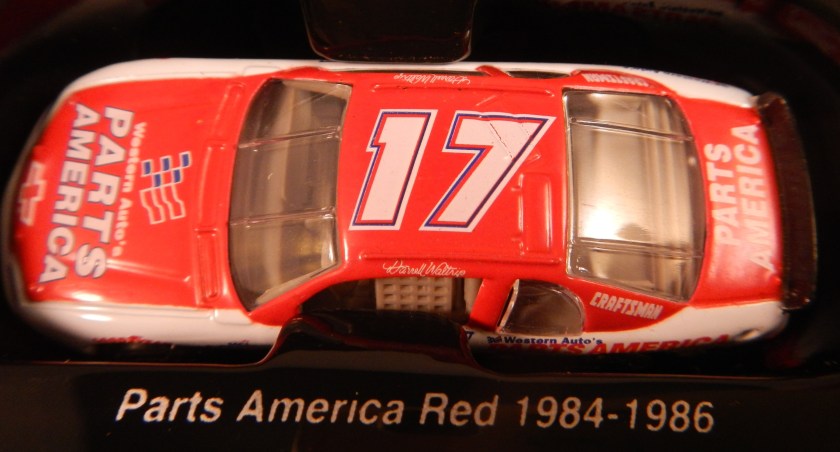
The idea of 7 different schemes seems like standard opperating procedure today, but back in 1997, this was revolutionary. This was unheard of. These schemes were all good, and they worked well, but this surprised some fans. 17 years later, this is the norm rather than the exception. If I did the paint scheme reveiws back in 1997, I would write one article at the beginning of the season, one before the all-star race, and maybe one midway through the season. There were no changes to paint scheme, or if there were, they were very rare.

Tom Thumb will reopen eventually. But whavever the new location, it will never have the same feel as the decades old building were it was once housed. I will miss it. I really will. But I find a bit of irony in that I bought the beginning of an era at the end of another era. I will visit Tom Thumb when they reopen, and I wish them the best of luck. From the residents of Evanston to Tom Thumb, we will miss you, and we wish you the best of luck in your new location!

We also have a paint scheme related news item to discuss.  This last week, NASCAR announced that the Chase for the NASCAR Sprint Cup would have some new features on their cars.  Specifically,  all Chase contenders will have a yellow splitter cover, a yellow window stripe with black letters, yellow roof numbers, and a special Chase for the NASCAR Sprint Cup decal.  I’ve been speculalting that this might come to be, and now I have proof.  I am not going to discuss how I think it will look, until I have a good idea as to who is in the Chase, and how it will look on their cars.  Here is an illustration of how it looks.

With that out of the way, we move on to…

PAINT SCHEME REVIEWS

Kasey Kahne #5 Great Clips/Shark Week Chevy SS Another case where it looks like two different designers created the car without speaking to each other. It looks awful. The color scheme is good, so it passes, though just bearly with a D-

Tony Stewart #14 Bass Pro Shops/Ducks Unlimited Chevy SS For a Bass Pro Shops scheme it looks really good. It isn’t over designed, has a nice patriotic touch, and has a good color scheme. A+

Clint Bowyer #15 RK Motors Charlotte Toyota Camry Clint’s C scheme but with an even worse color scheme ends in a D-

Greg Biffle #16 3M Throwback Ford Fusions Greg Biffle is holding a contest to pick a throwback sheme for his race at Pocono in August. I would normally grade all four of these seperatley, however they all have the same traits, so I will grade them at once. All four have really good color schemes, and really nice logos, but they are all plagues with modern car numbers as well as modern designs. They simply look awful. I will vote for none of these schemes and give them all an F-

Trevor Bayne #21 QuickLane Ford Fusion A really good design with a really good color scheme. It works very well, A+

Cole Whitt #26 Scorpion Window Film Toyota Camry Good color scheme, good design, though the silver stripe on the bottom is a bit much. A-

Paul Menard #27 Menards/Splash Chevy SS The Splash logo looks really good, and I’ll give it a B+

Joe Nemechek #29 Toyota Cares Toyota Camry Great color scheme, awful design, they average out to a C-

Morgan Shepherd #33 ThunderCoal Chevy SS I liked the other ThunderCoal scheme, but this is just awful. Too many neon colors, and it is needlessly overdesigned. I give it an F

Alex Kennedy #33 MediaCAST Chevy SS Awful color scheme and way too over designed. F

Landon Cassill #40 Gallery Furniture Chevy SS Great color scheme, great simple design, though the 40 could be brighter. A

Kyle Larson #42 Cottonelle Chevy SS Great color scheme, great design A+

Michael Waltrip #66 Royal Teak Toyota Camry Good color scheme, great simple design, A+

Martin Truex Jr. #78 Worldvision Chevy SS Great color scheme, great design, I love that fade, looks great. A+

Ryan Truex #83 Voodoo/Armed Forces Motorsports Toyota Camry A D+ scheme with a new hood logo is still a D+ scheme.

Michael McDowell #95 JPO Absorbents Ford Fusion Another great Levine Family Racing scheme. It is hard to believe how bad they were last year. Great color and design scheme equals an A+ scheme.

Carl Edwards #99 UPS Ford Fusion They took a D- scheme, and made it worse. Awful color scheme, awful design, F-
The Driver Suit Blog-Paint Scheme Leaderboard Part 4-The Grand Finale

By David G. Firestone

The focus group of one has had its meetings, and has made its decisions.  Here are all 50 teams that ran the Sprint Cup this year ranked first to last on their paint schemes:

#1-Wood Brothers #21-A classic design scheme that just seems to get better with age. The Henry Ford design combines classic and modern elements for an amazing look.

#2-Hendrick Motorsports #48 Jimmie Johnson went with a very classic look, with a day scheme and a night scheme, which worked very well. Johnson did not have a bad look all year.

#3-Michael Waltrip Racing #55 Simple traditional designs. That is the secret to their success on the leaderboard. Color schemes are great as well. Nothing wrong with these schemes.

#4-Furniture Row Racing #78 When it came down to picking a number 1 for Chevy, for both the Paint Schemie and the Leaderboard, I had to flip a coin to pick a number 1, and Johnson won. Kurt Busch ran a series of very solid schemes, not a lot to comment on and it always looks good.

#5-Joe Gibbs Racing #18 Like Jimmie Johnson and Kurt Busch on the Chevy side, the Toyota winner for both the Paint Schemie and Leaderboard was decided by a coin flip. More modern than the 55, all these schemes are good, with amazing paint schemes and really good design.

#6-Richard Petty Motorsports #43 This team combines classic and modern looks, and uses Petty Blue very effectively. The Transportation Impact scheme was not good at all, and kept the 43 team out of the top spot.  Extra Credit for the Maurice Petty Tribute Scheme.

#7-BK Racing #83 Great designs all around, but the hood needs work. Why is it black when the rest of the car is red?

#8-BK Racing #93 See Above, but the Old Dominion scheme drags it down.

#9-Penske Racing #12-Though only raced for one race, the SKF design worked very well. A great color and great design scheme. If this had been raced for multiple races, I would have ranked it higher, but it is still a solid scheme.

#10-Richard Childress Racing #29 The Bad Boy Buggies scheme is bad, and the Rheem/Budweiser combo scheme is awful, but aside from those, Kevin Harvick has had a very good season, paint scheme wise

#11-Earnhardt Ganassi Racing #42 Get rid of the Axe Apollo scheme and the Camouflage scheme, and Juan Pablo Montoya would have the top spot.

#12-Richard Petty Motorsports #9 This set earned a place in the top 5 because it improved by a lot over the course of the season. It has a great color scheme, but the early schemes were not great, but since Stanley redesigned their logo, and made some changes to the car, it is a very nice set.

#13-Phoenix Racing/Turner Scott #51 Guy Roofing and Hendrick Cars are hideous, but apart from that, they have run a great set of paint schemes. Bonus points given for the Neil Bonnett throwback scheme.

#14-Michael Waltrip Racing #56 The Get Back and Give Back scheme is horrid, but the rest of the schemes are really good.

#15-JTG Daugherty Racing #47 Most of what they ran this year was great, but the Bushes Baked Beans car has an odd overall design, and a weird color scheme. The Clorox scheme has a bad color scheme, as does the Charter scheme, as does the Wounded Warrior Project scheme.

#16-Roush Fenway Racing #17 A pinkwashing scheme as well as the Valvoline NexGen scheme kick Ricky Stenhouse Jr. out of the top spot. Sad thing too, as Ricky had a very solid year when it comes to paint schemes

#17-Joe Gibbs Racing #81 Alert Energy is awful. Double Mint is awesome.

#18-Penske Racing #2 While I miss the beer colored wheels from last year, Keselowski has had a decent year, the color scheme is great, though there is too much white on the car. The Redd’s Apple Ale scheme was great, but the Fan Mosaic and Patriotic schemes need some work.

#19-Roush Fenway Racing #16 Greg Biffle had a lot of great schemes, but he had a number of awful ones , including a pinkwashing scheme as well. Get rid of the pinkwashing scheme, the Scotchguard, give blood, and Megulars schemes, and he would be in the top 5.

#20-Richard Childress Racing #27 The yellow is too bright, but other than that, the schemes are really good.

#21-Stewart Haas Racing #14 Some of these schemes are good, others not so much.

#22Hendrick Motorsports #88 Dale Jr. runs good schemes most of the time, but Soldiers of Steel, Orange Amp Energy, and Camouflage are just brutal. Additional points lost for a pinkwashing scheme.

#23-Joe Gibbs Racing #20 If the Dollar General was more plain, and did not have the orange back, I would love to give Matt Kenseth a higher spot, and a pinkwashing scheme does not help.

#24-Earnhardt Ganassi Racing #1 Bad Boy Buggies is even worse here, and the Bass Pro Shop schemes are awful. A number of good schemes here as well.

#25-FAS Lane Racing #32 The Oxy Water scheme, and the gray scale C&J Energy Services schemes do not work, but the rest of the schemes they ran do

#26-Front Row Motorsports #38 The template they run works very well when the color scheme matches that of the sponsor. When it doesn’t match, it looks awful.

#27-Front Row Motorsports #35, See above

#28-Front Row Motorsports #34, See above, aside from the CSX scheme, which looks great, and the Peanut Patch scheme which looks awful.

#29-Tommy Baldwin Racing #36 This team looks better without a primary sponsor than they do with one.

#30-Max Q Motorsports #37 Simple, yet attractive. Would be higher if they ran more races.

#31-Joe Gibbs Racing #11 The Jason Leffler tribute scheme and the FedEx delivery manager schemes are great, but the rest are just awful. I miss the Gen 5 schemes

#32-Nemco Racing #87 The word that can best describe this set is dull. Not bad, but not spectacular.

#33-Circle Team Sport #40 Interstate Moving is really good. Moon Shine Attitude Attire is really awful, and their pinkwashing scheme is even worse.

#34-Roush Fenway Racing #99 Geek Squad and Fastenal work well, the rest…not so much.

#35-Richard Childress Racing #31 A few good schemes but most of them are mediocre at best.

#36-Hendrick Motorsports #24 See Above

#37-Stewart Haas Racing #10 Worst shades of yellow in NASCAR, and the pinkwashing scheme is so much worse.

#38-Michael Waltrip Racing #15 Clint has consistently run cars with great color schemes, but awful designs. Except for Duck Dynasty, and pinkwashing, which are just hideous.

#39-Humphrey Smith Racing #19 Another car that just looks better without a primary sponsor.

#40-Germain Racing #13 Nothing really wrong, but nothing really right with these schemes.

#41-Penske Racing #22 Red and yellow is a really great color scheme, but the design is all wrong. This design gets even worse with the AAA scheme, which has an even better color scheme. The Pennzoil scheme is good, but not good enough to save the set.

#42-Stewart Haas Racing #39 I have to give them credit, their schemes are mostly awful, but at least they are creative.

#43-Tommy Baldwin Racing #7 Worst. Door. Number. Ever. The rest of the car isn’t good either, and a pinkwashing scheme doesn’t help.

#44-Phil Parsons Racing# 98 The schemes come in one of two food groups, bland or awful. Great colors, but the designs are horrid.

#45-Levine Family Racing #95 Worst template in NASCAR.

#46-Hendrick Motorsports #5 Innovation can be a bad thing. This, for example is what happens when you let Karl Benjamin design your cars.

#47-Circle Sport/RCR #33 It amazes me how two different teams can use the same car number, and both can put awful designs on their cars. Special credit for the Honey Nut Cheerios scheme, which is just horrific.

#48-Xxxtreme Motorsports #44 Yuck.

#49-Hamilton-Means Racing #52 Paulie Harraka had a great scheme, but Brian Keselowski…not so much.

#50-Swan Racing #30/26 Please tell me this is an experiment on how to make the worst paint scheme in history? Is Swan Racing competing with Travis Pastrana for the most obnoxious paint scheme in NASCAR?

The Driver Suit Blog-Paint Scheme Leaderboard Part 2- Chevy

By David G. Firestone

Last week, I ranked the Ford teams based on their paint schemes, and this week I will do the Chevy teams and next week I’ll rank the Toyota teams, so without further ado all the Chevy teams ranked from best to worst:

#1 Hendrick Motorsports #48 Jimmie Johnson went with a very classic look, with a day scheme and a night scheme, which worked very well. Johnson did not have a bad look all year.

#2 Furniture Row Racing #78 When it came down to picking a number 1 for Chevy, for both the Paint Schemie and the Leaderboard, I had to flip a coin to pick a number 1, and Johnson won. Kurt Busch ran a series of very solid schemes, not a lot to comment on and it always looks good.

#3 Richard Childress Racing #29 The Bad Boy Buggies scheme is bad, and the Rheem/Budweiser combo scheme is awful, but aside from those, Kevin Harvick has had a very good season, paint scheme wise

#4 Earnhardt Ganassi Racing #42 Get rid of the Axe Apollo scheme and the Camouflage scheme, and Juan Pablo Montoya would have the top spot.

#5 Phoenix Racing/Turner Scott #51 Guy Roofing and Hendrick Cars are hideous, but apart from that, they have run a great set of paint schemes. Bonus points given for the Neil Bonnett throwback scheme.

#6 Richard Childress Racing #27 The yellow is too bright, but other than that, the schemes are really good.

#7 Stewart Haas Racing #14 Some of these schemes are good, others not so much.

#8 Hendrick Motorsports #88 Dale Jr. runs good schemes most of the time, but Soldiers of Steel, Orange Amp Energy, and Camouflage are just brutal. Additional points lost for a pinkwashing scheme.

#9 Earnhardt Ganassi Racing #1 Bad Boy Buggies is even worse here, and the Bass Pro Shop schemes are awful. A number of good schemes here as well.

#10 Tommy Baldwin Racing #36 This team looks better without a primary sponsor than they do with one.

#11 Max Q Motorsports #37 Simple, yet attractive. Would be higher if they ran more races.

#12 Circle Team Sport #40 Interstate Moving is really good. Moon Shine Attitude Attire is really awful, and their pinkwashing scheme is even worse.

#13 Richard Childress Racing #31 A few good schemes but most of them are mediocre at best.

#14-Hendrick Motorsports #24 See Above

#14 Stewart Haas Racing #10 Worst shades of yellow in NASCAR, and the pinkwashing scheme is so much worse.

#15 Stewart Haas Racing #39 I have to give them credit, their schemes are mostly awful, but at least they are creative.

#16 Tommy Baldwin Racing #7 Worst. Door. Number. Ever. The rest of the car isn’t good either, and a pinkwashing scheme doesn’t help.

#17 Hendrick Motorsports #5 Innovation can be a bad thing. This, for example is what happens when you let Karl Benjamin design your cars.

#19 Circle Sport/RCR #33 It amazes me how two different teams can use the same car number, and both can put awful designs on their cars. Special credit for the Honey Nut Cheerios scheme, which is just horrific.

The Driver Suit Blog-The Helmet Stripe-An Unusual Place For Sponsorship

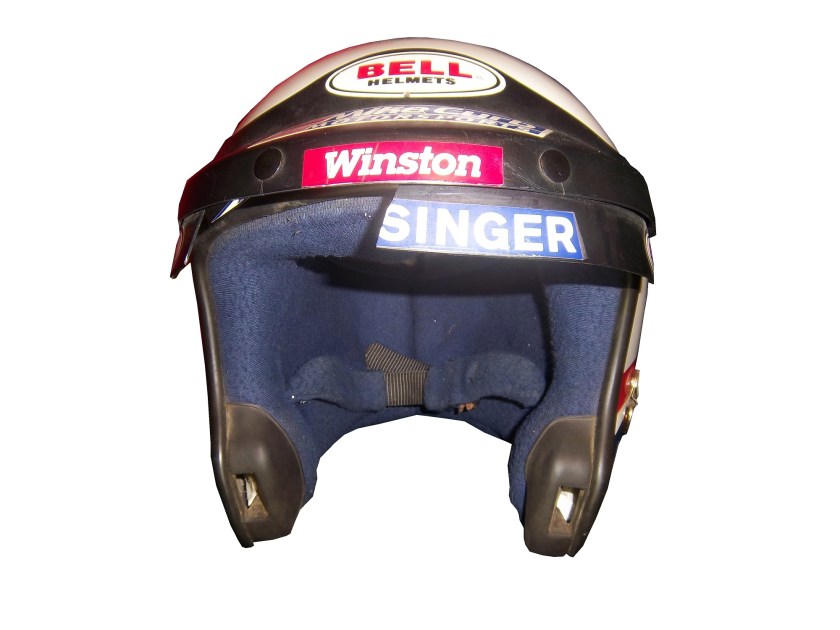
By David G. Firestone14ALast week, I had a column run on Uni-Watch, and I delayed this article until this week.  Two weeks ago, we discussed visors, this week, we will discuss what has become known as the “helmet stripe.” Helmet stripes came from IndyCar and Formula 1 cars, which are open cockpit cars. Helmets are clearly visible to television cameras and fans. As a direct result, helmet design in Formula 1 has become its own unique art form. Helmet designs become a part of the driver identity. The other thing that these open cockpits allow is for sponsorship opportunity. As such, a small opaque stripe is used on helmet visors.lepage-4In NASCAR, the visor was slow to arrive. This is due to two reasons, first, many drivers up until the mid 1990’s chose to wear open-faced helmets. While these helmets had a shade to help keep the sun out of a driver’s eyes. While sponsor logos do show up, they were used for the driver’s name. This Brad Noffsinger example from 1988 is an example of that.Noffsinger-4The second reason that helmet stripes were slow to come to NASCAR is that in-car cameras, while used, were for many years positioned in such a way that the visor would not be seen. Even if helmets were painted, the visor had no stripe. When the in-car cameras were positioned to film the driver from the side and even from the front, the helmet stripe became the standard. The stripe is designed to fit over the part of the visor that overlaps the opaque part of the helmet, as this example shows.musgrave2 musgrave3Helmet stripes have become standard. To show how it affects the overall look of the helmet, I took this Kevin Lepage helmet from 1999, and edited the pictures to show how it looks. lepage-2  lepage-4  lepage-6Not bad, but let’s compare it side by side to the original helmet…lepage-7 lepage-8 lepage-9Helmet stripes have become a unique way for a driver to customize a helmet, as this video shows:

Facebook pages and Twitter helmets are becoming standard on these. All visors that a driver would wear on a helmet have these stripes, which is standard, as visors are changed on a regular basis, and sponsors want the advertising space that they pay for.

Paint Scheme Reviews!

Because of the Uni-Watch article last week, I didn’t get to review paint schemes.  Within the last couple of weeks there were a large number of 2014 paint schemes released. Now I know that many of these will change before the start of the 2014 season, but I will grade them anyways.

Brad Keselowski #2 Miller Lite Ford Fusion  Same scheme as this year, same grade, C

Kevin Harvick #4 Budweiser Chevy SS Same Scheme as last year, same grade, A

Kevin Harvick #4 Jimmy John’s Chevy SS  They improved one of the best schemes in NASCAR and went from an A to A+

Kevin Harvick #4 Outback Steakhouse Chevy SS The color scheme remains the same but red takes over from beige as the primary color, which gives the car a great look, and an A grade

Kasey Kahne #5 Great Clips Chevy SS Same scheme as this year, same D+ grade

Kasey Kahne #5 Pepsi Max Cheyv SS Same scheme as last year, same F grade

Marcos Ambrose #9 Stanley/DeWalt Ford Fusion Great color scheme, though the nose, and quarter panel design are over done. Even still, I give it a B-

Marcos Ambrose #9 DeWalt/Stanley Ford Fusion See Above

Tony Stewart #14 Bass Pro Shop/Mobil 1 Chevy SS I get that two companies with different desgin schemes are sharing the car, but this is just brutal to look at. The orange and camo contrast is hideous, and the overall design is overdone. C-

Tony Stewart #14 Mobil 1/Bass Pro Shop Chevy SS The white and black contrast just looks awful! I really hope this changes before the season starts, because this is a scheme that is painful to look at. I have to give it an F

Tony Stewart #14 Code 3 Associates/Mobil 1 Chevy SS As bad of a color scheme as this is, it is certainly better than the other two Tony Stewart schemes are. That said, the color scheme warrants an F while the design warrants an A, so I’ll split the difference and give it a C

Greg Biffle #16 3M Ford Fusion This scheme is a MAJOR improvement over this year’s design! All of the pointless noise on the door is gone, and the car has a very smooth look because of it, and I have to give this design an A

Ricky Stenhouse Jr. #17 Nationwide Insurance Ford Fusion Great color and design schemes, though the white on light blue lettering and logos are hard to see. Even still, I have to give it an A-

Joey Logano #22 Shell/Pennzoil Ford Fusion Same scheme as last year, same grade, D

Joey Logano #22 AAA Insurance Ford Fusion  See Above

Jeff Gordon #24 Pepsi Max Chevy SS I gave this scheme a C-, but given the *ahem* other Pepsi Max scheme, I’ve reconsidered, and I will give this scheme a B

Ryan Newman #31 Caterpillar Chevy SS  An improvement on an already good scheme, A+

Aric Almirola #43 Smithfield Foods Ford Fusion If the hood and front were done in the stars design, and the rest of the car was red and white striped, it would look better, and I would be able to give it more than a C+

Jimmie Johnson #48 Lowes Chevy SS Supposidly, this will be the main scheme for the whole season, and I have to say it looks amazing, and is an A+ grade

Jimmie Johnson #48 Lowes/Kobalt Chevy SS This will be run for a few races, and it is an A+ scheme.

Carl Edwards #99 Fastenal Ford Fusion Same scheme as last year, same A grade

Carl Edwards #99 UPS Ford Fusion No redeeming features whatsoever, F-`

Now on to new 2013 paint schemes…

Jamie McMurray #1 Cessna/Auburn University Chevy SS The white hood and roof just look aukward, compared to the black covering the rest of the car.  That said, it is still a decent scheme, and I’ll give it a B

Dave Blaney #7 Breast Cancer Awareness Chevy SS Pinkwashing is an automatic F

Marcos Ambrose #9 Bostitch Ford Fusion The 2014 scheme is previewed here, and I’ll give it the same B- grade I gave the 2014 scheme.

Landon Cassill #33 T-Mone Chevy SS This is a perfect example as to why only one person should design a car.  It looks like it took at least 3 people to design the car, each with a different idea as to what the car should look like.  And in the end it is just a mess, and not even a good color scheme can give this scheme a passing grade.  F

David Ragan #34 Safercar.gov Ford Fusion  See Above. F

JJ Yeley #36 United Mining Equipment Chevy SS Even if I didn’t give pinkwashing schemes an automatic F, this scheme would get an F anyway, it just looks awful

Kyle Larson #51 Target Chevy SS Simple, yet attractive, and it earns an A

Kurt Busch #78 Wonder Bread Chevy SS  To celebrate the return of Wonder Bread, Kurt is going to channel Ricky Bobby, except for one difference…this scheme is a lot better than the Ricky Bobby Scheme.    No flames and the baloons coming from the brake duct are a great look for this car, and it earns an A

Dale Earnhardt Jr. #88 Mountain Dew/Xbox 1 Chevy SS  It has a great color scheme, and that is the nicest thing I can say about it.  The design is just awful, and it looks like it will give people seizures as it drives around the track.  I give it an F

Blake Koch #95 Supportmillitary.org Ford Fusion Eww…Too much going on, with the over-sized camo in too many different colors, and the door design which is awful. F-