
By David G. Firestone
2015 Toyota Camry–The first Gen 6 redesign comes to the Camry for 2015. The front is sleeker, with a more aggressive nose, and grill area, the tail has been redesigned as well.
CHIP GANASSI RACING TEAM #1
Jamie McMurray #1 Cessna/Beechcraft Chevy SS–No Change
Jamie McMurray #1 McDonald’s Chevy SS–Same basic scheme, but with a new door design.
Jamie McMurray #1 Cessna/McDonald’s Chevy SS-Special dual scheme for the Daytona 500, black Cessna on the front, fade to red McDonald’s on the back.
Jamie McMurray #1 Sherwin Williams Chevy SS-New sponsor for 2015, Red, white and blue with a red line down the center, with the top fades blue to white on top, and white to blue on the bottom.
TEAM PENSKE #2
Brad Keselowski #2 Miller Lite Ford Fusion–Same basic design as 2014, but with no gold stripe, vintage Miller Crest, or hop designs on the side.
Brad Keselowski #2 Alliance Truck Parts Ford Fusion–New redesign, similar in design to Joey Logano’s Shell/Pennzoil Ford, black replaces yellow as the primary color.
Brad Keselowski #2 Wurth Ford Fusion–Redesign from last season, follows the Shell/Pennzoil template.
Brad Keselowski #2 Detroit Genuine Parts Ford Fusion–New scheme for 2015, blue Penske template on a black background
RICHARD CHILDRESS RACING #3
Austin Dillon #3 Cheerios Chevy SS–No change
Austin Dillon #3 Dow Chevy SS–No change
Austin Dillon #3 Bass Pro Shops Chevy SS–No Change
Austin Dillon #3 American Ethanol Chevy SS–No Change
STEWART-HAAS RACING #4
Kevin Harvick #4 Budweiser Chevy SS–No change
Kevin Harvick #4 Jimmie Johns Chevy SS–No change
Kevin Harvick #4 Outback Steakhouse–No Change
Kevin Harvick #4 Ditech Chevy SS-New sponsor for 2015, blue, and white is the primary color scheme
HENDRICK MOTORSPORTS #5
Kasey Kahne #5 Great Clips Chevy SS–No Change
Kasey Kahne #5 Time Warner Cable Chevy SS–No Change
Kasey Kahne #5 Farmers Insurance Chevy SS–Complete redesign from last year, black, and dark blue replaces light blue and silver, and the design has been completely revamped.
Kasey Kahne #5 Liftmaster Chevy SS-New sponsor for 2015, red and white redesign of the Time Warner scheme.
Kasey Kahne #5 Pepsi Chevy SS–No change
ROUSH-FENWAY RACING #6
Trevor Bayne #6 Advocare Ford Fusion-New team, new sponsor, red, white and blue is the color scheme.
TOMMY BALDWIN RACING #7
Alex Bowman #7 Nikko/Toy State Chevy SS-New sponsor for 2015, Red borders a blue design on the sides and hood.
RICHARD PETTY MOTORSPORTS #9
Sam Hornish Jr. #9 Twisted Tea Ford Fusion–No Change
Sam Hornish Jr. #9 Camping World/Medallion Bank Ford Fusion-New sponsor set for 2015, a redesign of the Fresh From Florida #43 scheme.
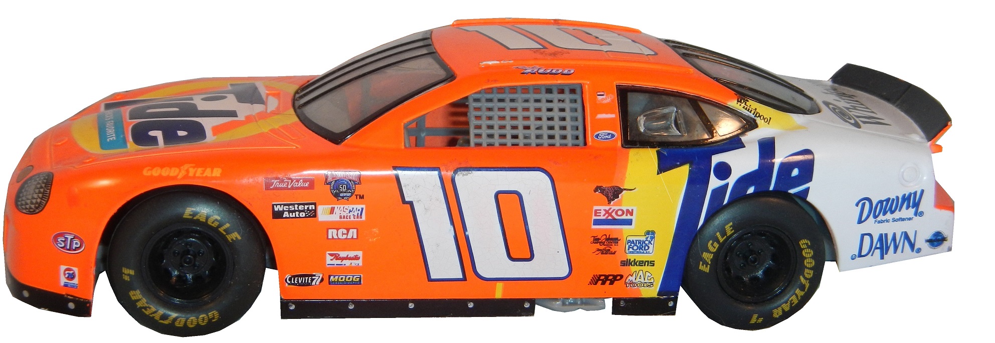
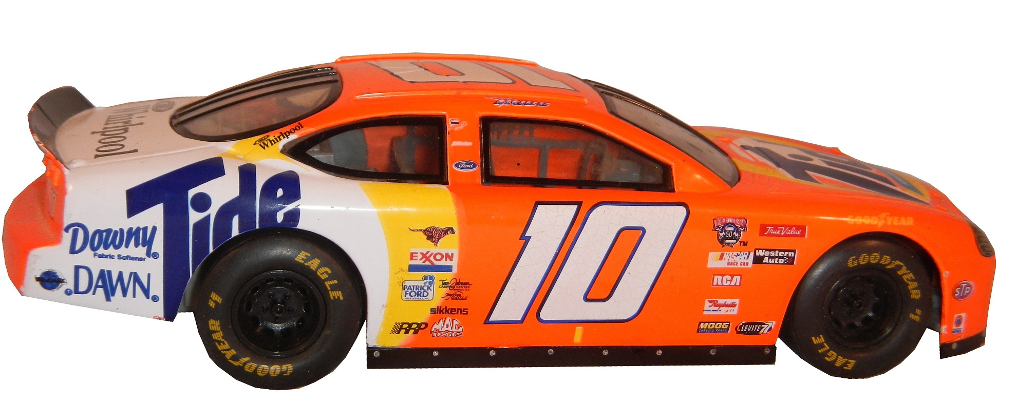
STEWART-HAAS RACING #10
Danica Patrick #10 Aspen Dental Chevy SS–Same basic design as last year, but the blue ovals on the white are more pronounced.
Danica Patrick #10 GoDaddy Chevy SS–New redesign with more black and less orange.
Danica Patrick #10 GoDaddy/TaxAct Chevy SS-New sponsor combo for the Sprint Unlimited, front of the car retains traditional GoDaddy design, whereas back quarter panel is TaxAct
Danica Patrick #10 TaxAct Chevy SS-One race sponsor, will run at Martinsville in March, red, white and black scheme, with diagonal design up the doors.
JOE GIBBS RACING #11
Denny Hamlin #11 FedEx Express Toyota Camry–New redesign with a much simpler front and more design on the sides.
Denny Hamln #11 FedEx Office Toyota Camry–Same redesign as FedEx Express
Denny Hamlin #11 FedEx Freight Toyota Camry–Same redesign as FedEx Express
Denny Hamlin #11 FedEx Ground Toyota Camry–Same redesign as FedEx Express
Denny Hamlin #11 SportClips Toyota Camry–New redesign with a new door design
GERMAIN RACING #13
Casey Mears #13 Geico Chevy SS–No Change.
STEWART-HAAS RACING #14
Tony Stewart #14 Bass Pro Shops/Mobil 1 Chevy SS–Same color scheme as last year, but with a new design on the side.
Tony Stewart #14 Mobil 1/Bass Pro Shops Chevy SS–Same color scheme as last year, but with a new design on the side.
Tony Stewart #14 Code 3 Associates/Mobil1 Chevy SS–No Change
MICHAEL WALTRIP RACING #15
Clint Bowyer #15 5 Hour Energy Toyota Camry–No Change
Clint Bowyer #15 Peak Toyota Camry–No Change
ROUSH-FENWAY RACING #16
Greg Biffle #16 Cheez Its Ford Fusion-New sponsor for 2015, red with a cheese colored stripe and crackers on the side.
Greg Biffle #16 Clean Harbors Ford Fusion-New sponsor for 2015, red white and black design
Greg Biffle #16 Ortho Fire Ant Killer Ford Fusion–No change
Greg Biffle #16 Ortho Home Defense Ford Fusion-New sponsor, white design with a red and yellow stripe on the bottom, with a net design on the side.
Greg Biffle #16 Ortho Bug-B-Gon Ford Fusion-New sponsor, new design, red, black, and white is the primary color scheme.
ROUSH-FENWAY RACING #17
Ricky Stenhouse Jr. #17 Fastenal Ford Fusion-New primary sponsor, blue, and white is the color scheme.
Ricky Stenhouse Jr. #17 Fifth-Third Bank Ford Fusion–Same color scheme as 2014, but with a new, simpler side design.
JOE GIBBS RACING #18
Kyle Busch #18 Interstate Batteries Toyota Camry–No Change
Kyle Busch #18 M&M’s Crispy Toyota Camry-New design for 2015, with a green background and more emphasis on M&M’s Crispy, as well as a new hood logo.
JOE GIBBS RACING #19
Carl Edwards #19 Stanley Toyota Camry-New team and new sponsor, yellow, black, and white is the color scheme.
Carl Edwards #19 Aaris Toyota Camry-New team and new sponsor, reddish orange with the Aaris logo used as part of the side stripe.
Carl Edwards #19 Comcast Business Toyota Camry-New sponsor for 2015, blue, silver and white, with a stripe that starts on the bottom, covers the car number, and takes over the top at the back.
Carl Edwards #19 SportClips Toyota Camry-New sponsor, same design as Denny Hamlin.
Carl Edwards #19 Subway Toyota Camry–New sponsor for Joe Gibbs, much simpler design.
JOE GIBBS RACING #20
Matt Kenseth #20 DeWalt Toyota Camry-New sponsor, black, green, yellow, and white is the color scheme.
Matt Kenseth #20 Dollar General Toyota Camry–Much simpler than the 2014 scheme, with fewer side designs.
WOOD BROTHERS RACING #21
Ryan Blaney #21 Motorcraft/Quicklane Ford Fusion–No Change
TEAM PENSKE #22
Joey Logano #22 Shell/Pennzoil Ford Fusion–No change
Joey Logano #22 AAA Ford Fusion–The AAA logo has been straightened up in 2015.
Joey Logano #22 Pennzoil Platnum Ford Fusion–No Change
BK RACING #23
J.J. Yeley #23 Dr. Pepper/Maxim Fantasy Sports Toyota Camry-New sponsor for the Daytona 500. Black on top, white on the bottom, red stripe in between, Dr Pepper style logo on the door number.
JJ Yeley #23 Dr Pepper Toyota Camry–Slight redesign for 2015, car keeps the red on top, new number design, and white on bottom.
HENDRICK MOTORSPORTS #24
Jeff Gordon #24 3M Chevy SS-New design for 2015, silver, with red accents and numbers, with a white hood design that extends over the roof and deck-lid.
Jeff Gordon #24 Axalta Chevy SS–No Change
Jeff Gordon #24 Drive to End Hunger Chevy SS–Much simpler redesign, with new hood logo and same color scheme–
Jeff Gordon #24 Panasonic Toughbook Chevy SS–No Change
HENDRICK MOTORSPORTS #25
Chase Elliott #25 NAPA Chevy SS-New sponsor and car number for 2015, blue is the primary sponsor, with a yellow design on the side.
BK RACING #26
Jeb Burton #26 Live Deals Ford Fusion-New sponsor for the Daytona 500, will have similar design as JJ Yeley, but with orange, black, and white.
Jeb Burton #26 Maxim Toyota Camry-New sponsor for 2015, white with black lettering.
RICHARD CHILDRESS RACING #27
Paul Menard #27 Pittsburgh Paints/Menard’s Chevy SS–No change
Paul Menard #27 Menard’s/Serta Chevy SS–Same basic scheme as 2014, but with more blue on the sides than last year.
Paul Menard #27 Menard’s/Peak Chevy SS–Some slight changes to the stripes, and roof
Paul Menard #27 Menard’s/Duracel Chevy SS–New scheme for 2015, using a black, yellow, and gold version of the Menard’s template.
RAB RACING #29
Justin Marks #29 American Born Moonshine Toyota Camry-New sponsor for the Daytona 500, has a wood finished look, with white lettering.
TMG RACING #30
Ron Horniday #30 Smokey Mountain Herbal Snuff Chevy SS-New team and sponsor for 2015. Two-tone green design with white lettering and yellow accents.
RICHARD CHILDRESS RACING #31
Ryan Newman #31 Cat Chevy SS–Same color scheme, but the car as a whole has been redesigned
Ryan Newman #31 Quicken Loans Chevy SS–No change
Ryan Newman #31 Granger Chevy SS-New sponsor for 2015, green, red and white, with some designs on the side.
GO FAS RACING #32
Go FAS Racing #32 Keen Parts Ford Fusion–Simpler redesign and a much simpler color scheme.
Go FAS Racing #32 C&J Energy Services Ford Fusion–Same color scheme, but with a different and much more complex side design
RICHARD CHILDRESS RACING #33
Ty Dillon #33 Yuengling Brewery Chevy SS-New sponsor, red, white, and blue is the primary color scheme.
Ty Dillon #33 Cheerios Chevy SS-New sponsor for the Daytona 500, based on Austin Dillon’s Cheerios scheme, but with a Kroger’s logo on the hood.
FRONT ROW MOTORSPORTS #34
David Ragan #34 KFC Ford Fusion–Redesign for 2015, all white front, KFC style stripes on the back.
David Ragan #34 CSX Ford Fusion–Same basic scheme, though the word bubble on the hood has been replaced with a CSX logo.
FRONT ROW MOTORSPORTS #35
Cole Whitt #35 Speed Stick Gear Ford Fusion–No Change
Cole Whitt #35 Rinnai Filters Ford Fusion–Same scheme as 2014, different team.
FRONT ROW MOTORSPORTS #38
David Gilliland #38 Love’s Travel Stops Ford Fusion–No change
HILLMAN-SMITH MOTORSPORTS #40
Landon Cassill #40 Snap 24-7 Fitness Chevy SS–Slight redesign from last year, with the black quarter panel replaced with red.
Landon Cassill #40 Cars For Sale Chevy SS–No Change
STEWART-HAAS RACING #41
Stewart-Haas Racing #41 Haas CNC Chevy SS–Same color scheme, but the car has been completely redesigned.
Stewart-Haas Racing #41 Slate Water Heaters Chevy SS–No change
CHIP GANASSI RACING TEAM #42
Kyle Larson #42 Target Chevy SS– Same basic design as 2014, but with some sponsor changes on the quarter panel.
Kyle Larson #42 White Target Chevy SS–Same basic design as 2014, but with some sponsor changes on the quarter panel.
Kyle Larson #42 Energizer Eco Advanced Chevy SS–New scheme for 2015, different stripe color, fewer logos on the side.
RICHARD PETTY MOTORSPORTS #43
Aric Almoriola #43 Eckrich Ford Fusion–Same basic design, but with a Nathans logo on the rear.
Aric Almirola #43 Smithfield Ford Fusion–No change
Aric Almirola #43 Fresh From Florida Ford Fusion–No Change.
Aric Almirola #43 STP Ford Fusion–No Change.
TEAM XTREME RACING #44
Reed Sorenson #44 Golden Corral Chevy SS-New sponsor for 2015, same design as 2015 #36.
HSCOTT MOTORSPORTS #46
Michael Annett #46 Pilot/Flying J Chevy SS-New car number and design. White is the primary color, with red and yellow accents on the sides and front.
JTG DAUGHTERY RACING #47
AJ Allmendinger #47 Better Than Bullion Chevy SS-New Sponsor for 2015, all black with a gold stripe running down the side.
AJ Allmendinger #47 Bush’s Best Chevy SS–Same basic scheme, some logos have changed on the side.
AJ Allmendinger #47 Clorox Chevy SS–Same basic scheme, some logos have changed on the side.
AJ Allmendinger #47 House Autry Chevy SS-New primary sponsor for 2015, Red sides, with blue roof and posts.
AJ Allmendinger #47 Bush’s Chilli Beans Chevy SS-New sponsor, yellow to orange to yellow fade across whole car.
AJ Allmendinger #47 Hungry Jack Chevy SS–Same basic scheme, some logos have changed on the side.
AJ Allmendinger #47 Kingsford Chevy SS–Same basic scheme, some logos have changed on the side.
AJ Allmendinger #47 Scott Chevy SS–Same basic scheme, some logos have changed on the side.
AJ Allmendinger #47 Bush’s Grilling Beans Chevy SS–Same basic scheme, some logos have changed on the side.
AJ Allmendinger #47 Kroger Chevy SS–No change
HENDRICK MOTORSPORTS #48
Jimmie Johnson #48 Lowe’s Chevy SS–New design, bears a resemblance to the old Kobalt tools scheme from 2009.
Jimmie Johnson #48 Kobalt Chevy SS–New design, redesigned version of the current Lowe’s scheme.
HSCOTT MOTORSPORTS #51
Justin Allgaier #51 Brandt Chevy SS–Same primary design, but the door number has reversed colors.
MICHAEL WALTRIP RACING #55
Brian Vickers #55 Aaron’s Toyota Camry–Same basic design as last year, the nose has been changed, the main blue is slightly darker, and the gold has been replaced with light blue
Brett Moffitt #55 Aaron’s 60th Anniversary Toyota Camry-New scheme for 2015, colors are reversed, new logo on the hood.
PREMIUM MOTORSPORTS #62
Brian Scott #62 Shore Lodge Chevy SS-New sponsor for the Daytona 500, Black with white lettering and silver designs.
PREMIUM MOTORSPORTS #66
Mike Wallace #66 Crazy Vapors/X8 Energy Gum Toyota Camry-New sponsor for 2015, Hood has Crazy Vapors green stripe design, side has X8 abstract design.
FURNITURE ROW RACING #78
Martin Truex Jr. #78 Furniture Row Chevy SS–No Change
BK RACING #83
Johnny Sauter #83 Dustless Blasting Toyota Camry-New sponsor for 2015, green stripes up the hood and roof, white design with Dr Pepper style door numbers.
Matt Dibenedetto #83 Burger King Toyota Camry–Slight redesign for 2015, black takes over as primary color, Dr. Pepper design around door numbers.
HENDRICK MOTORSPORTS #88
Dale Earnhardt Jr. #88 Nationwide Chevy SS–No Change
Dale Earnhardt Jr. #88 Diet Mountain Dew Chevy SS–No major changes,except a Nationwide logo replaces the National Guard logo.
Dale Earnhardt Jr. #88 Kelly Blue Book Chevy SS–Same basic design but blue has replaced white as the primary color.
LEVINE FAMILY RACING #95
Michael McDowell #95 Thrivent Financial Ford Fusion–Redesign of last year’s scheme, another example of logo as a stripe pattern.
Michael McDowell #95 K-Love Ford Fusion–Template has been redesigned, and the city outline on the rear quarterpanel has been removed.
PHIL PARSONS RACING #98
Josh Wise #98 Phoenix Construction Ford Fusion-New sponsor for 2015, all white with red lettering, and red and black numbers


