The Driver Suit Blog-Paint Scheme Leaderboard-Week 4, The Grand Finale

By David G. Firestone

The Paint Scheme Ranking Executive Committee meetings have been long, but not too contentious, I can’t stay mad at Alejandro when he shows me his belly, so now we present all 55 NASCAR Sprint Cup teams ranked from first to last on how their paint schemes looked. NR has a different meaning this week. NR now specifically referrs to teams that didn’t exist in 2013. Teams that ran different manufacturers in 2013 will be ranked when it came to last year. So, without further ado,

1-Wood Brothers #21 Rank Last Year:1st of 50 -The Wood Brothers always design great cars, and the Quick Lane scheme uses the blue very well. It all looks good!

2-Hendrick Motorsports #48 Rank Last Year:2nd of 50-Classic, smooth looks with no needless clutter. Jimmie always runs great schemes

3-Michael Waltrip Racing #55 Rank Last Year:3rd of 50-The color schemes are good, and the design schemes work very well.

4-Joe Gibbs Racing #18 Rank Last Year:5th of 50-The zebra stripe Interstate Battery scheme wrecks a perfect score for Kyle this year

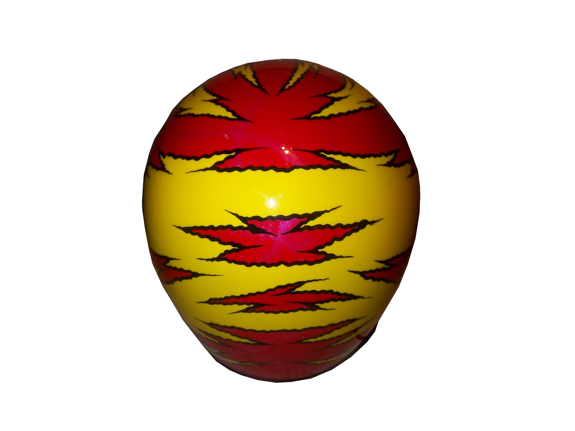
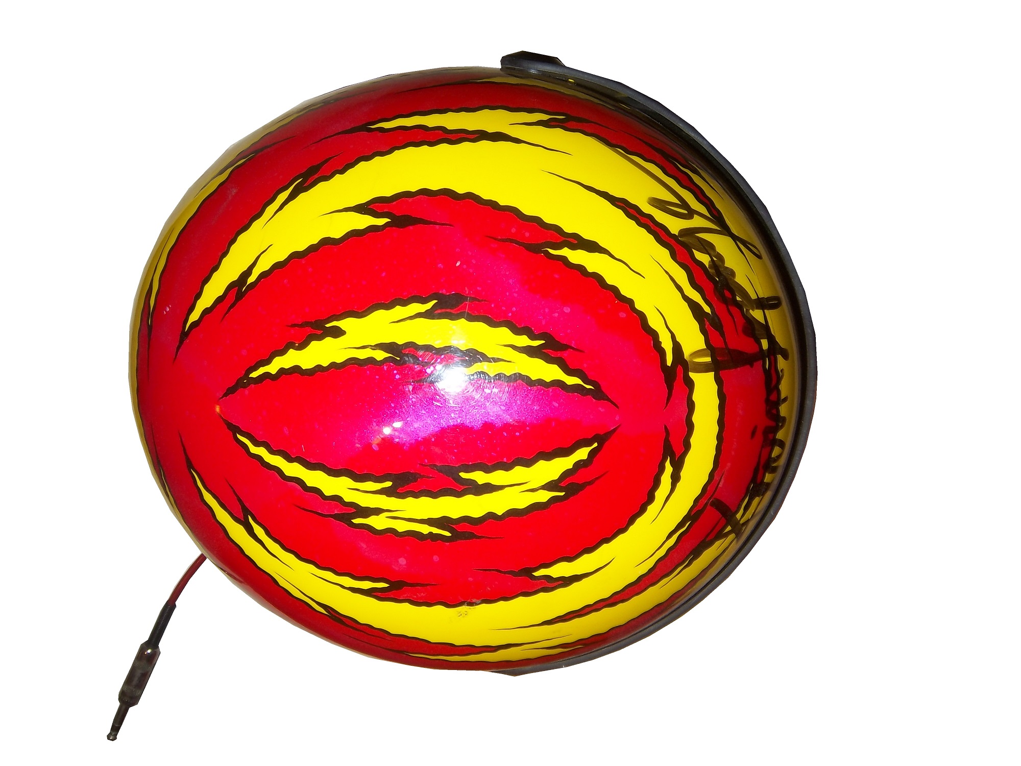
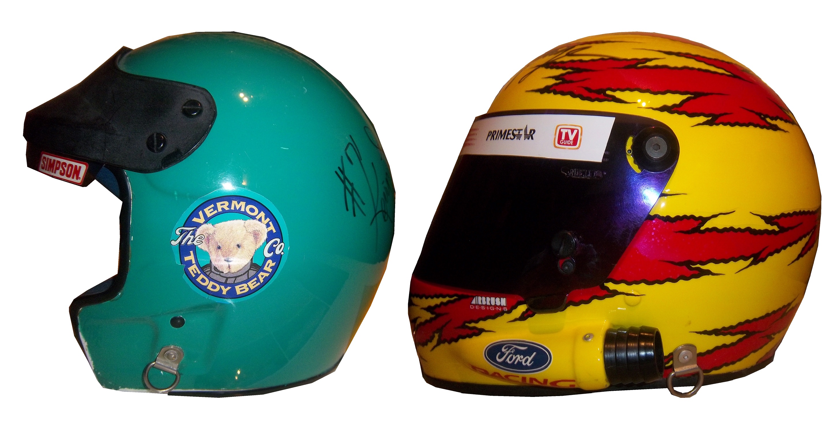
5-Stewart Haas Racing #4 Rank Last Year:NR-With the exception of Hunt Brothers Pizza, which uses an awful shade of green, Kevin has consistently run a series of great schemes.

6-Team Penske #2 Rank Last Year:18th of 50-The Wurth and Redd’s Apple Ale schemes are a bit over designed, but the white Miller Lite schemes, Alliance Truck Parts, and Detroit Genuine Parts schemes make up for it.

7-Richard Childress Racing #31 Rank Last Year:35th of 50-A lot of great schemes this year, but Wix is overdone, and the Cat/Quicken Loans hybrid looks awful

8-BK Racing #23 Rank Last Year:NR-The Dip Your Car scheme is awful, but the rest of the schemes are very good, and are very attractive.

9-Stewart Haas Racing #41 Rank Last Year: NR-The Slate scheme does not work, but all the other schemes work very well.

10-Roush Fenway Racing #6 Rank Last Year:NR-This would be ranked higher, as it has a somewhat vintage look, but the candy cane on the nose looks odd. It’s still a good scheme.

11-Richard Petty Motorsports #43 Rank Last Year:6th of 50-The Ekcrich camouflage scheme doesn’t work, camouflage schemes rarely do. The Charter green is horrible, but the rest of the schemes look really good.

12-Chip Ganassi Racing #1 Rank Last Year:24th of 50-A pink-washing scheme and a terrible shade of green on the WEMO scheme cost this team the 2nd place spot,knocking them down to 5th. They have run a lot of great schemes this season

13-Levine Family Racing #95 Rank Last Year:45th of 50-The TWD schemes look medicore, but could be worse. The template Levine Family Racing switched too this year looks great and the cars look very good too.

14-Furniture Row Racing #78 Rank Last Year:4th of 50-The World Vision scheme needs work, as the color does not support a fade, but the Furniture Row, and Colorado Freedom Memorial work very well.

15-BK Racing #26 Rank Last Year:50th of 50-Bully Hill Vinyards is an over-designed joke with an awful color scheme. The yellow numbers on the Burger King scheme are awful, but the rest of the schemes are good, and defendable.

16-RAB Racing #29 Rank Last Year:NR-Good color scheme, mediocre design scheme.

17-Hendrick Motorsports #88 Rank Last Year:22nd of 50-National Guard, Mountain Dew, Kickstart, and Superman look good, and work well with the new number design, but Michael Baker, Kelly Blue Book, and Nationwide don’t at all.

18-Chip Ganassi Racing #42 Rank Last Year:11th of 50-While Cottonelle, the Silver Scheme, and Energizer work very well, but the rest of their schemes are mediocre at best. The white on the back doesn’t work.

19-Beard Oil Racing #75 Rank Last Year:NR-If the sides had a sponsor, and the stripe at the bottom was eliminated, it would work a lot better.

20-Front Row Motorsports #34 Rank Last Year:28th of 50-The majority of the schemes look great, but the upside down lettering on the hood of the CSX scheme looks odd. The Wendell Scott scheme is amazing!

21-JTG Daugherty Racing #47 Rank Last Year:15th of 50-While Bush’s, Clorox, Scott’s, Sullivan/Palatek, Kingsford, and Bush’s Grilling Beans work well,Kroger/USO is overdone, Charter Communications uses a horrid shade of green, and Hungry Jack just looks terrible.

22-Hendrick Motorsports #24 Rank Last Year: 36th of 50-Drive to end Hunger is too overdone, and the upside down D on the hood looks terrible. Their orange scheme is even worse. Panasonic is mediocre at best. Pepsi looks good, and all of the Axalta schemes are really good.

23-Humphery Racing #77 Rank Last Year:NR-Plinker Arms doesn’t look great but it could be worse. That applies to Essex Homes as well. The rest of the schemes look good.

24-Joe Gibbs Racing #11 Rank Last Year:31st of 50-The Autisim Speaks scheme works well. The zipper scheme is decent, but odd. Sport Clips is over-designed, but with a good color scheme. The FedEx schemes have decent color schemes, but are over-designed on the front.

25-BK Racing #83 Rank Last Year:7th of 50-Voo Doo Barbecue is an over-designed mess. Dip your car is terrible, as is Zak. Burger King and Borla work well though.

26-Team Penske #12 Rank Last Year:9th of 50-The SKF scheme works very well. The Penske Truck Rental scheme uses a horrible shade of orange, and just looks hideous.

27-Hillman Racing #40 Rank Last Year: NR-When the car doesn’t have a scheme, it looks very good. When it has a sponsor it looks awful.

28-Front Row Motorsports #35 Rank Last Year:27th of 50-The Hefty scheme is a little unorthodox, silver and orange isn’t a great combo, but the design looks good. MDS looks good

29-HScott Motorsports #52 Rank Last Year: NR-The black scheme is good, but the orange Florida Lottery scheme is a trainwreck. Less is more on a paint scheme.

30-HScott Motorsports #51 Rank Last Year:13th of 50-If the car is running a Brandt scheme it looks good, anything else looks terrible.

31-Phil Parsons Racing #98 Rank Last Year: 44th of 50-While I like the Dogecoin,Trench Shoring,iRacing, black Curb Records, and unsponsored black schemes, anything else looks horrendous.

32-Front Row Motorsports #38 Rank Last Year:26th of 50-Most of the schemes are good, but the Love’s Truck Stops, and Love’s Truck Stops Camo schemes are horrific.

33-Joe Gibbs Racing #20 Rank Last Year:23rd of 50-Can all be summed up with medicore color schemes and mediocre design schemes

34-Swan Racing #30 Rank Last Year:50th of 50-The only time the car looked good was when it was unsponsored, but compared to last year’s design it looks amazing!

35-Roush Fenway Racing #17 Rank Last Year:16th of 50-Eco-Power has awful shades of green. Pit for a pair is awful even for a pink-washing scheme. Zest has a good color scheme, but awful design scheme,as does Fifth-Third Bank. Their all-star scheme was terrible. Ford Eco-Boost, NOS, and Nationwide work very well.

36-Richard Childress Racing #27 Rank Last Year: 20th of 50-Neon yellow looks terrible, when they use the stripes on the sides it looks even worse. The Pittsburgh Paints scheme looks really good though.

37-BK Racing #93 Rank Last Year:8th of 50-The Support Millitary scheme is the worst, and although Burger King, Dr. Pepper, and Iowa City Chop House do make up for it, it just isn’t enough.

38-CircleSport/Richard Childress Racing #33 Rank Last Year: 47th of 50-

39-Tommy Baldwin Racing #37 Rank Last Year: NR-Accell Construction has a great color scheme, but the design scheme ruins it.

40-Tommy Baldwin Racing #36 Rank Last Year:29th of 50-Another example of a team where when the car is unsponsored, it looks better.

41-Richard Petty Motorsports #9 Rank Last Year:12th of 50-Can all be summed up with Great color schemes but mediocre design schemes. The camo scheme looks bad, but the upside is that the camo is subtle.

42-Team Penske #22 Rank Last Year:41st of 50-The Shell/Pennzoil scheme has a decent color scheme but a bad design scheme. Anything Pennzoil Platnum is awful, as is Auto Trader. The Auto Club scheme has a great color scheme but a bad design scheme.

43-Identity Ventures Racing #87 Rank Last Year:NR-300 is a mess, and Morris,Hardick and Schinder/SmartBen looks too dull.

44-Michael Waltrip Racing #15 Rank Last Year:38th of 50-The Peak scheme is defendable, the color scheme is good, but the rest of the schemes are just awful.

45-Roush Fenway Racing #99 Rank Last Year:34th of 50-Fastenal looks good, but anything else looks terrible.

46-Go FAS Racing #32 Rank Last Year:25th of 50-The Terry Labonte throwback scheme was amazing, but most of their other schemes are over-designed messes.

47-Stewart Haas Racing #14 Rank Last Year:21st of 50-The over designing of the Bass Pro Shops schemes, as well as the use of orange and camo just look horrible. Mobil 1, Rush Truck Centers, and Code 3 look decent, but to some extent have issues. Mobil 1 is over designed, Rush uses too dark a yellow, Code 3 uses too bright a yellow.

48-Tommy Baldwin Racing #7 Rank Last Year:43rd of 50-Allstate Peterbuilt, and Pilot-St Jude Children’s Network work well, as both have good color schemes and design schemes. Anything else just looks awful.

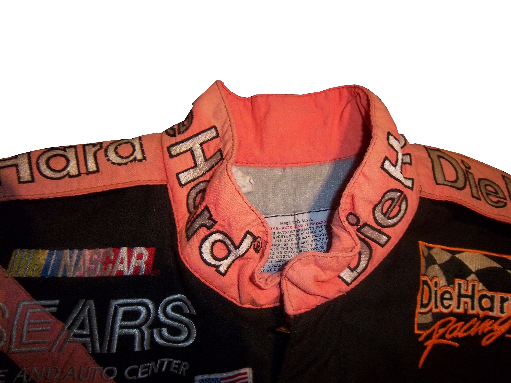
49-Richard Childress Racing #3 Rank Last Year:NR-Cheerios is very good, and has a classic look. Dow schemes have a great color scheme, but have mediocre design. Anything else looks terrible on this car.

50-Germain Racing #13 Rank Last Year:40th of 50-The blue is too bright, as is the yellow. The car is overdesigned, and the whole car looks like a mess. The camo scheme is much worse.

51-Hendrick Motorsports #5 Rank Last Year:46th of 50-The only half decent scheme is Pepsi. Everything else is an over designed mess.

52-Stewart Haas Racing #10 Rank Last Year:37th of 50-The only scheme that doesn’t make my eyes hurt here is Aspen Dental. Terrible shades of orange and green, with ugly design. The pink-washing scheme is terrible.

53-Xxxtreme Motorsports #44 Rank Last Year: 49th of 50-Every single one of their cars is an ugly, over-designed mess that doesn’t look good at all.

54-Roush Fenway Racing #16 Rank Last Year:19th of 50-Every scheme is terrible.

55-Michael Waltrip Racing #66 Rank Last Year:NR-Nothing about any of these schemes is good.

The Driver Suit Blog-Commemorative Patches…and Why I HATE Them!

301650thanniversarylogoBy David G. Firestone

Derek Jeter has had his  number retired. Several teams this year have various anniversaries they are celebrating.  All of them are wearing commemorative patches on their uniforms.  Why is this important to The Driver Suit Blog? Because too much salt will ruin the soup.  What does that mean, well, I saw that Jeter was wearing a patch to commemorate his upcoming retirement, and, well it got me thinking, and I’d like to talk about this issue, which has been getting on my nerves for a while. Sports uniforms in 2014 are designed to move merchandise, and this is the case in racing. I can’t begin to put the blame for this on NASCAR, so I won’t. But I do think that what happened in 1998 is a perfect example of why it doesn’t really work.

In 1998, NASCAR turned 50. In 1948, Bill France Sr. saw the potential for a unified stock car racing series, so at the Streamline Hotel in Daytona Beach, a series of meetings took place. France was in charge of the National Championship Stock Car Circuit or NCSSC, which was founded in 1947, but when the AAA refused to fund the series, France had to make do. Fonty Flock would win the 1947 NCSSC Championship. In December, the meetings took place at the Streamline, and the Series was supposed to be renamed the National Stock Car Racing Association, or NSCRA, but that name was used by a rival organization, so on December 14, 1947, the name NASCAR or National Association of Stock Car Racing Association. NASCAR itself was founded on February 21, 1948.

On February 15, 1998, almost 50 years to that day, the 1998 racing season began in great style with Dale Earnhardt Sr. winning the Daytona 500. NASCAR as a whole celebrated the anniversary in grand style, with NASCAR’s 50 Greatest Drivers being named, and the sports history was celebrated. For an event like this, you need a good logo for it, so this design was utilized to commemorate the 1998 season.301650thanniversarylogoDerek Jeter has had his  number retired. Several teams this year have various anniversaries they are celebrating.  All of them are wearing commemorative patches on their uniforms.  Why is this important to The Driver Suit Blog? Because too much salt will ruin the soup.  I saw that Jeter was wearing a patch to commemorate his upcoming retirement, and, well it got me thinking, and I’d like to talk about this issue, which has been getting on my nerves for a while. Sports uniforms in 2014 are designed to move merchandise, and this is the case in racing. I can’t begin to put the blame for this on NASCAR, so I won’t. But I do think that what happened in 1998 is a perfect example of why it doesn’t really work.

Every driver suit had this patch somewhere, as this Ted Musgrave example from that season shows.15-musgrave-lsleeve1 Decals would up on helmets as well. grissom-1NASCAR used this to move merchandise, but it was so overused in telecasts and car designs, that I intentionally didn’t buy that much NASCAR stuff during that time. I could not wait for the season to end, and I didn’t have to look at that logo again.  Sports uniforms as a whole are using more of these patches to sell merchandise, and frankly it’s now completely out of control.  Sports jerseys retail about $100 on the low end, and these patches are used to sell more of them.   Is a logo like that really worth shelling out $100 for a new jersey, or shirt, or jacket?  I’m gonna say no.

After the 1998 season, the logo did go away, but not before another major issue with these types of logos come up. When these logos are being used, merchandise sells. When the season ends, and a new season begins, the logos aren’t selling as much, and the retailers who sell merchandise have a lot of this stuff that they have to put on sale to move it. This is not a small issue for retailers, as many of them are mom and pop stores whose profit margins are razor thin enough. In many instances, these items will be sold at a loss to make room for new merchandise.  People will say that these are “collector’s items” but prices on eBay would lead me to believe that this is not the case.  They make money for a short time, and lose money in the long term.  This has become the case in general with commemorative logos on merchandise.

If this logo had been used on merchandise, but hadn’t been used in the telecasts as much as it was, I would be willing to work with it a bit more, but even in 2014, 16 years after the fact, my hatred for this logo is still with me. Words can’t say how much I hate seeing this logo again.  What I’m about to say next might seem odd, but it is the truth…I don’t think it’s a bad logo. In fact, I think it’s a good logo, but I was so sick of seeing it, that I hate it.  When you as a fan would watch a 3 hour long race, and had to see this logo in the corner while the race was on, and at every commercial break, it got really old, really fast.

It’s a problem with sports uniforms that’s endemic. It started with anniversaries, and moved on to number retirements, old stadiums closing, new stadiums opening, announcers retiring, players about to retire, and even anniversaries of tragic events. It has gotten out of hand. It moves merchandise in the short term, which is good, but too much salt will ruin the soup every time. Commemorative patches need to be toned down…way down.

Editor’s Note, we are now in October, and now starts the Pinktober, Pinkwashing, call it whatever you want, but for the next month, sports teams across the country will be using pink on uniforms and equipment to raise money for in support of breast cancer. Much of this does not go to serious research, but to more “feel good” charities that don’t really help. Toward that end, all pinkwashing schemes will earn an automatic F. If someone is bold enough to try pinkwashing and camo, it will earn them a one rank loss on the Paint Scheme Leaderboard, and automatic disqualification for the best paint scheme set in the Schemies.

First, we have some 2015 Schemes…

Kasey Kahne #5 Farmers Insurance Chevy SS It has a good color scheme, and while it’s overdesigned, it still looks better than the current scheme. I’ll give it a C+

Ty Dillon #33 Yuengling Brewery Chevy SS I love the faded glory design, I think it works well, and I’ll give it an A+

Now onto the 2014 schemes…

Jamie McMurray #1 McDonald’s Monopoly Chevy SS Overall design is good, I like the color scheme, and it is a great looking car, A+

Michael Annett #7 Cypress Chevy SS Overdesigned and has a goofy color scheme earns an F every time.

Clint Bowyer #15 Five Hour Energy Pink Lemonade Toyota Camry Pinkwashing earns an automatic F.

Ricky Stenhouse Jr. #17 Cargill Beef Ford Fusion I like the black flames on the blue background, but the orange and white stripes take away from it. It kills a great look with a great color scheme, and takes it from an A to a B-

Timmy Hill #32 US Chrome Ford Fusion Great simple design with a great color scheme earns an A+

Josh Wise #98 Vapor Station Ford Fusion Good design, good color scheme, A+

The Driver Suit Blog-Two Birthdays in January…

100_4380By David G. Firestone
On the first anniversary of the founding of The Driver Suit Blog I felt it appropriate to analyze the first two NASCAR driver suits I ever bought. I started in the driver suit hobby in March of 2010, with a Bill Sedgwick Die Hard driver suit from the Craftsman Truck Series in 1996. 17-sedgwickI purchased this specific item for a number of reasons, first, it was well within my price range, and second, I wanted a low-end example that I can look at and get a general feel for aspects that I will see in other driver suits.
Some of the stuff I learned from this particular suit helped me understand the very basics of design aspects on race-worn driver suits. Some of the aspects I discovered from that were completely different and it was through subsequent research that I began to understand driver suits more. I have kept it for as long as I have is because I love the suit, and I even though I have had it for almost 4 years, I still find aspects about it that interest me.
The suit is custom designed for Darrell Waltrip’s Craftsman Truck Series team. Sedgwick drove the #17 Chevy C-1500 for the entire 1996 season, whereas Waltrip drove the #5 truck for a very limited schedule. Sedgwick had 3 top 5’s and 8 top 10’s in the 23 of the 24 races that year, and led a total of 8 laps. Sedgwick was released at the end of the season.17-sedgwickThe triple-layer suit is custom designed for Sedgwick, with the Sears Die Hard logos on the collar and shoulder epaulets,17-sedgwick-collar 17-sedgwick-rshoulder 17-sedgwick-lshoulderSears Die Hard logos across the front and Sedgwick’s name on the right chest,17-sedgwick-rchest17-sedgwick-lchestno arm gussets,17-sedgwick-rsleeve1 17-sedgwick-lsleeve1no adornment on the belt,17-sedgwick-beltTV logos and safety stripes on the legs,17-sedgwick-legsTV logos on the sleeves,17-sedgwick-rsleeve2 17-sedgwick-lsleeve2 and a huge logo across the back.17-sedgwickb 17-sedgwickb-logoI purchased a press kit for this suit, which I covered in December, concerning this suit, and I realized that the suit Sedgwick is wearing in the promotional photo is the same suit that is in my collection. I keep the press kit in my authentication binder with the rest of my COA’s and LOA’s17-sedgwick-presskit1 17-sedgwick-presskit3 17-sedgwick-presskit2 17-sedgwick 17-sedgwick-presskit2The other suit I bought, my first Winston Cup suit was a Lake Speed suit from 1997, this one is a bit different. In 1997, Speed was racing for Melling Racing, which in 1997 was a shell of its former self. Melling had 34 victories and the 1988 Winston Cup Championship, but by 1997, they had no real sponsorship, and had not won a race since 1991. During that season Lake Speed didn’t score a top 5, top 10, or victory, and only led 3 laps in the 25 races he raced in that year.9-speedDue to the lack of sponsorship, Speed didn’t have the luxury of having a custom-made suit that season so he wore what appears to be a store bought suit. It looks like the suit was purchased either from a store or a catalog, and customized for Lake’s use. There are no large sponsor logos on the collar,9-speed-collarshoulder epaulets,9-speed-chest 9-speed-lshouldertorso,9-speed-bsleeves,9-speed-rsleeve1 9-speed-rsleeve2 9-speed-lsleeve1 9-speed-lsleeve2or legs.9-speed-legsThe legs have a cuff cut, as opposed to a boot cut like the Bill Sedgwick suit has.
Everyone who has a hobby or an interest started somewhere. With me, it was with these two driver suits. No matter what you do in your hobby, or how high you fly in your hobby, you were a rookie, and you started from somewhere. Never forget where you came from. These two suits are a reminder of what I was, and I love these two.
Before we get to paint schemes, I need to say something to my readers. When I started this project one year ago, I never thought it would take off as much as it did. I have a group of really awesome readers and followers. I also owe a special thanks to Paul Lukas of Uni-Watch, because if I had never written my two articles for Uni-Watch in 2013, I would never have done the research I did for them, and I would never have had the frustration of not finding research from the collector’s perspective, and The Driver Suit would never have been born. To all my readers, from the bottom of my heart, I say thank you! Stay Tuned because 2014 will be even better than 2013!

Paint Scheme Reveiws

Jamie McMurray #1 Cessna Chevy SS Black with silver numbers and white trim looks simple and really good. I can’t say anything bad about this scheme, and bonus points for improving the door number design. A+

Jamie McMurray #1 McDonald’s Chevy SS Same great design as last year, same A grade.

Austin Dillon #3 Dow Chevy SS Take the white stripe down the side off, and it will be a solid A scheme. The white does not look good at all. The red/white/black color scheme works very well, and it is decently designed, so I will give it a B+

Danica Patrick #10 Go Daddy Chevy SS Not only does Go Daddy continue to use the worst shade of yellow in NASCAR, they also have given the worst shade of orange a more prominent role in the car. Givng this car an F is a very fair grade.

Denny Hamlin #11 FedEx Ground Toyota Camry Same scheme as last year, same C+ grade

Denny Hamlin #11 FedEx Freight Toyota Camry Same scheme as last year, same C+ grade

Denny Hamlin #11 FedEx Office Toyota Camry Same scheme as last year, same C+ grade

Denny Hamlin #11 FedEx Express Toyota Camry Same scheme as last year, same C+ grade

Casey Mears #13 Geico Ford Fusion The yellow they use is awful, and the side design is just too loud,  I’ll give it a D

Ricky Stenhouse Jr. #17 NOS Ford Fusion I love this color scheme, however, I don’t love the side design. It has too many different different designs, all of which would work on their own but combined they look like a jumbled mess. I really want to like this scheme, but I just can’t, so I’ll give it a C-

Ricky Stenhouse Jr. #17 Fifth-Third Bank Ford Fusion Everything I just said about NOS applies here. C-

Clint Bowyer #15 5 Hour Energy Toyota Camry Same scheme as last year, same B+ grade.

Kyle Busch #18 M&M’s Toyota Camry Same scheme as last year, same A+ grade.

Ryan Newman #31 Cat Chevy SS New season, new driver, new scheme that looks great and earns an A

Kurt Busch #41 Haas CNC Chevy SS Great color scheme and a very simple desgin look very good here. I also like the matte black used, and the door numbers look really solid. Can’t give this scheme anything less than an A

Kyle Larson #42 Target Chevy SS The scheme looks decent, I like the white on the back, though I do not like the Target logos at the bottom. That takes a scheme that was an A grade to a B-

Brian Vickers #55 Aaron’s Toyota Camry A good scheme, and the 55 lettering looks really good here, and the gold is a nice touch. A

Martin Truex Jr. #78 Furniture Row Chevy SS Simple, and perfect. A+

Dale Earnhardt Jr. #88 Diet Mountain Dew Chevy SS Same scheme as last year, but I never gave it a grade. So here is my analysis Not a great scheme, too much needless design on the side of the car, and the silver background is just brutal. The red lettering on a green background is unattractive at best, and all in all, this is a D- grade.

Michael McDowell #95 Levine Family Racing Ford Fusion This scheme is so much better than last year’s scheme, and just for that I’ll give it a B

Carl Edwards #99 Aflac Ford Fusion This has a terrible color scheme, with lime green, neon blue, black and white. The wing design is not only ugly but would work better starting at the door and working behind.

The Driver Suit Blog-Parts and Recreation

By David G. Firestonepettyrotor1

You know me for driver suits, but i also collect other things besides suits. Aside from helmets and other uniform items, i also collect other race-used items from the cars. Racing is half man half machine, and items from the machine make unique collectibles as well.

One of the most obvious things is sheet metal. Stock cars consist of a roll cage which contains the engine, suspension, and driver compartment. Covering that is what is called “sheet metal” which is a thin metal that has the shape of the car and where the paint scheme is added. The cars are “skinned” after each race. The sheet metal from cars has become a huge collectors market. Pieces can be as small as 1 inch squared, such as this Carl Edwards pieceedwards6, or huge, such as this Sterling Marlin door.marlin

Tires are also popular to collect as well. Tires can be purchased whole, but since they can weigh as much as 90 pounds, they are often cut up and the pieces are sold, like sheet metal. This example, used by Kevin Harvick in the 2002 Daytona 500 is an example. it gives a good example of the thickness of the tire, and the cords are visible as well.harvick-tire1 harvick-tire2  100_4233   This Kyle Petty/John Andretti card has two small pieces of tire, each used by the respective driver in the card. These are popular, and everything from suits to caps, to sheet metal wind up in cards. petty-card1 petty-card2

Race-used lug nuts go hand in hand with tires. Lug nuts are used once, and then sold after the race, such as these Tony Stewart examples. Lug nuts are Super glued to the rim, and one of these still has superglue residue on it.stewartlugnut-1 stewartlugnut-2 stewartlugnut-9

Mechanical components, especially engine components are interesting to collect, as there is no better representation of man and machine than a part of the heart of the machine. For example, I have a brake rotor used by John Andretti in the 1998 Bank of America 500 at Charlotte, which has been signed by Richard Petty. pettyrotor1 pettyrotor2 pettyrotor3 pettyrotor4   This is a set released after Jimmie Johnson won his first sprint cup title back in 2006. johnsongroupIt contains a series of pieces used by Johnson, including a piece of sheet metal from his door,johnsonsheet

a spark plug,johnsonplug

a valve spring,johnsonspring

a piece of the track bar,johnsonrod

and a lifter.johnsonlifter

i also have a spark plug from Morgan Lucas Racing in the NHRAmlr-plug

an ignition coil from Morgan Lucas Racing, which has been signed by Tony Schumacher and Ron Cappsmlr-coil3 mlr-coil2 mlr-coil4 mlr-coil5 mlr-coil6 mlr-coil1 mlr-coil7

and a timing belt from Bob Tasca,tasca-belt1 tasca-belt2

I discussed this pit board from Chad McCumbee earlier in the yearmccumbee-pit-1 mccumbee-pit-2 mccumbee-pit-3 mccumbee-pit-4 mccumbee-pit-5

one last item from the equipment collection is this piece of Daytona International Speedwaydaytona1 daytona2 daytona3 daytona4

Jamie McMurray #1 Cessna Chevy SS Black with silver numbers and white trim looks simple and really good. I can’t say anything bad about this scheme, and bonus points for improving the door number design. A+

Jamie McMurray #1 McDonald’s Chevy SS Same great design as last year, same A grade.

Austin Dillon #3 Dow Chevy SS Take the white stripe down the side off, and it will be a solid A scheme. The white does not look good at all. The red/white/black color scheme works very well, and it is decently designed, so I will give it a B+

Danica Patrick #10 Go Daddy Chevy SS Not only does Go Daddy continue to use the worst shade of yellow in NASCAR, they also have given the worst shade of orange a more prominent role in the car. Givng this car an F is a very fair grade.

Denny Hamlin #11 FedEx Ground Toyota Camry Same scheme as last year, same C+ grade

Denny Hamlin #11 FedEx Freight Toyota Camry Same scheme as last year, same C+ grade

Denny Hamlin #11 FedEx Office Toyota Camry Same scheme as last year, same C+ grade

Denny Hamlin #11 FedEx Express Toyota Camry Same scheme as last year, same C+ grade

Casey Mears #13 Geico Ford Fusion The yellow they use is awful, and the side design is just too lowd, Ricky Stenhouse Jr. NOS Ford Fusion I love this color scheme, however, I don’t love the side design. It has too many different different designs, all of which would work on their own but combined they look like a jumbled mess. I really want to like this scheme, but I just can’t, so I’ll give it a C-

Clint Bowyer #15 5 Hour Energy Toyota Camry Same scheme as last year, same B+ grade.

Kyle Busch #18 M&M’s Toyota Camry Same scheme as last year, same A+ grade.

Kurt Busch #41 Haas CNC Chevy SS Great color scheme and a very simple desgin look very good here. I also like the matte black used, and the door numbers look really solid. Can’t give this scheme anything less than an A

Dale Earnhardt Jr. #88 Diet Mountain Dew Chevy SS Same scheme as last year, but I never gave it a grade. So here is my analysis Not a great scheme, too much needless design on the side of the car, and the silver background is just brutal. The red lettering on a green background is unattractive at best, and all in all, this is a D- grade.

Carl Edwards #99 Aflac Ford Fusion This has a terrible color scheme, with lime green, neon blue, black and white. The wing design is not only ugly but would work better starting at the door and working behind.

The Driver Suit Blog-Paint Scheme Leaderboard Part 4-The Grand Finale

By David G. Firestone

The focus group of one has had its meetings, and has made its decisions.  Here are all 50 teams that ran the Sprint Cup this year ranked first to last on their paint schemes:

#1-Wood Brothers #21-A classic design scheme that just seems to get better with age. The Henry Ford design combines classic and modern elements for an amazing look.

#2-Hendrick Motorsports #48 Jimmie Johnson went with a very classic look, with a day scheme and a night scheme, which worked very well. Johnson did not have a bad look all year.

#3-Michael Waltrip Racing #55 Simple traditional designs. That is the secret to their success on the leaderboard. Color schemes are great as well. Nothing wrong with these schemes.

#4-Furniture Row Racing #78 When it came down to picking a number 1 for Chevy, for both the Paint Schemie and the Leaderboard, I had to flip a coin to pick a number 1, and Johnson won. Kurt Busch ran a series of very solid schemes, not a lot to comment on and it always looks good.

#5-Joe Gibbs Racing #18 Like Jimmie Johnson and Kurt Busch on the Chevy side, the Toyota winner for both the Paint Schemie and Leaderboard was decided by a coin flip. More modern than the 55, all these schemes are good, with amazing paint schemes and really good design.

#6-Richard Petty Motorsports #43 This team combines classic and modern looks, and uses Petty Blue very effectively. The Transportation Impact scheme was not good at all, and kept the 43 team out of the top spot.  Extra Credit for the Maurice Petty Tribute Scheme.

#7-BK Racing #83 Great designs all around, but the hood needs work. Why is it black when the rest of the car is red?

#8-BK Racing #93 See Above, but the Old Dominion scheme drags it down.

#9-Penske Racing #12-Though only raced for one race, the SKF design worked very well. A great color and great design scheme. If this had been raced for multiple races, I would have ranked it higher, but it is still a solid scheme.

#10-Richard Childress Racing #29 The Bad Boy Buggies scheme is bad, and the Rheem/Budweiser combo scheme is awful, but aside from those, Kevin Harvick has had a very good season, paint scheme wise

#11-Earnhardt Ganassi Racing #42 Get rid of the Axe Apollo scheme and the Camouflage scheme, and Juan Pablo Montoya would have the top spot.

#12-Richard Petty Motorsports #9 This set earned a place in the top 5 because it improved by a lot over the course of the season. It has a great color scheme, but the early schemes were not great, but since Stanley redesigned their logo, and made some changes to the car, it is a very nice set.

#13-Phoenix Racing/Turner Scott #51 Guy Roofing and Hendrick Cars are hideous, but apart from that, they have run a great set of paint schemes. Bonus points given for the Neil Bonnett throwback scheme.

#14-Michael Waltrip Racing #56 The Get Back and Give Back scheme is horrid, but the rest of the schemes are really good.

#15-JTG Daugherty Racing #47 Most of what they ran this year was great, but the Bushes Baked Beans car has an odd overall design, and a weird color scheme. The Clorox scheme has a bad color scheme, as does the Charter scheme, as does the Wounded Warrior Project scheme.

#16-Roush Fenway Racing #17 A pinkwashing scheme as well as the Valvoline NexGen scheme kick Ricky Stenhouse Jr. out of the top spot. Sad thing too, as Ricky had a very solid year when it comes to paint schemes

#17-Joe Gibbs Racing #81 Alert Energy is awful. Double Mint is awesome.

#18-Penske Racing #2 While I miss the beer colored wheels from last year, Keselowski has had a decent year, the color scheme is great, though there is too much white on the car. The Redd’s Apple Ale scheme was great, but the Fan Mosaic and Patriotic schemes need some work.

#19-Roush Fenway Racing #16 Greg Biffle had a lot of great schemes, but he had a number of awful ones , including a pinkwashing scheme as well. Get rid of the pinkwashing scheme, the Scotchguard, give blood, and Megulars schemes, and he would be in the top 5.

#20-Richard Childress Racing #27 The yellow is too bright, but other than that, the schemes are really good.

#21-Stewart Haas Racing #14 Some of these schemes are good, others not so much.

#22Hendrick Motorsports #88 Dale Jr. runs good schemes most of the time, but Soldiers of Steel, Orange Amp Energy, and Camouflage are just brutal. Additional points lost for a pinkwashing scheme.

#23-Joe Gibbs Racing #20 If the Dollar General was more plain, and did not have the orange back, I would love to give Matt Kenseth a higher spot, and a pinkwashing scheme does not help.

#24-Earnhardt Ganassi Racing #1 Bad Boy Buggies is even worse here, and the Bass Pro Shop schemes are awful. A number of good schemes here as well.

#25-FAS Lane Racing #32 The Oxy Water scheme, and the gray scale C&J Energy Services schemes do not work, but the rest of the schemes they ran do

#26-Front Row Motorsports #38 The template they run works very well when the color scheme matches that of the sponsor. When it doesn’t match, it looks awful.

#27-Front Row Motorsports #35, See above

#28-Front Row Motorsports #34, See above, aside from the CSX scheme, which looks great, and the Peanut Patch scheme which looks awful.

#29-Tommy Baldwin Racing #36 This team looks better without a primary sponsor than they do with one.

#30-Max Q Motorsports #37 Simple, yet attractive. Would be higher if they ran more races.

#31-Joe Gibbs Racing #11 The Jason Leffler tribute scheme and the FedEx delivery manager schemes are great, but the rest are just awful. I miss the Gen 5 schemes

#32-Nemco Racing #87 The word that can best describe this set is dull. Not bad, but not spectacular.

#33-Circle Team Sport #40 Interstate Moving is really good. Moon Shine Attitude Attire is really awful, and their pinkwashing scheme is even worse.

#34-Roush Fenway Racing #99 Geek Squad and Fastenal work well, the rest…not so much.

#35-Richard Childress Racing #31 A few good schemes but most of them are mediocre at best.

#36-Hendrick Motorsports #24 See Above

#37-Stewart Haas Racing #10 Worst shades of yellow in NASCAR, and the pinkwashing scheme is so much worse.

#38-Michael Waltrip Racing #15 Clint has consistently run cars with great color schemes, but awful designs. Except for Duck Dynasty, and pinkwashing, which are just hideous.

#39-Humphrey Smith Racing #19 Another car that just looks better without a primary sponsor.

#40-Germain Racing #13 Nothing really wrong, but nothing really right with these schemes.

#41-Penske Racing #22 Red and yellow is a really great color scheme, but the design is all wrong. This design gets even worse with the AAA scheme, which has an even better color scheme. The Pennzoil scheme is good, but not good enough to save the set.

#42-Stewart Haas Racing #39 I have to give them credit, their schemes are mostly awful, but at least they are creative.

#43-Tommy Baldwin Racing #7 Worst. Door. Number. Ever. The rest of the car isn’t good either, and a pinkwashing scheme doesn’t help.

#44-Phil Parsons Racing# 98 The schemes come in one of two food groups, bland or awful. Great colors, but the designs are horrid.

#45-Levine Family Racing #95 Worst template in NASCAR.

#46-Hendrick Motorsports #5 Innovation can be a bad thing. This, for example is what happens when you let Karl Benjamin design your cars.

#47-Circle Sport/RCR #33 It amazes me how two different teams can use the same car number, and both can put awful designs on their cars. Special credit for the Honey Nut Cheerios scheme, which is just horrific.

#48-Xxxtreme Motorsports #44 Yuck.

#49-Hamilton-Means Racing #52 Paulie Harraka had a great scheme, but Brian Keselowski…not so much.

#50-Swan Racing #30/26 Please tell me this is an experiment on how to make the worst paint scheme in history? Is Swan Racing competing with Travis Pastrana for the most obnoxious paint scheme in NASCAR?

The Driver Suit Blog-Paint Scheme Leaderboard Part 2- Chevy

By David G. Firestone

Last week, I ranked the Ford teams based on their paint schemes, and this week I will do the Chevy teams and next week I’ll rank the Toyota teams, so without further ado all the Chevy teams ranked from best to worst:

#1 Hendrick Motorsports #48 Jimmie Johnson went with a very classic look, with a day scheme and a night scheme, which worked very well. Johnson did not have a bad look all year.

#2 Furniture Row Racing #78 When it came down to picking a number 1 for Chevy, for both the Paint Schemie and the Leaderboard, I had to flip a coin to pick a number 1, and Johnson won. Kurt Busch ran a series of very solid schemes, not a lot to comment on and it always looks good.

#3 Richard Childress Racing #29 The Bad Boy Buggies scheme is bad, and the Rheem/Budweiser combo scheme is awful, but aside from those, Kevin Harvick has had a very good season, paint scheme wise

#4 Earnhardt Ganassi Racing #42 Get rid of the Axe Apollo scheme and the Camouflage scheme, and Juan Pablo Montoya would have the top spot.

#5 Phoenix Racing/Turner Scott #51 Guy Roofing and Hendrick Cars are hideous, but apart from that, they have run a great set of paint schemes. Bonus points given for the Neil Bonnett throwback scheme.

#6 Richard Childress Racing #27 The yellow is too bright, but other than that, the schemes are really good.

#7 Stewart Haas Racing #14 Some of these schemes are good, others not so much.

#8 Hendrick Motorsports #88 Dale Jr. runs good schemes most of the time, but Soldiers of Steel, Orange Amp Energy, and Camouflage are just brutal. Additional points lost for a pinkwashing scheme.

#9 Earnhardt Ganassi Racing #1 Bad Boy Buggies is even worse here, and the Bass Pro Shop schemes are awful. A number of good schemes here as well.

#10 Tommy Baldwin Racing #36 This team looks better without a primary sponsor than they do with one.

#11 Max Q Motorsports #37 Simple, yet attractive. Would be higher if they ran more races.

#12 Circle Team Sport #40 Interstate Moving is really good. Moon Shine Attitude Attire is really awful, and their pinkwashing scheme is even worse.

#13 Richard Childress Racing #31 A few good schemes but most of them are mediocre at best.

#14-Hendrick Motorsports #24 See Above

#14 Stewart Haas Racing #10 Worst shades of yellow in NASCAR, and the pinkwashing scheme is so much worse.

#15 Stewart Haas Racing #39 I have to give them credit, their schemes are mostly awful, but at least they are creative.

#16 Tommy Baldwin Racing #7 Worst. Door. Number. Ever. The rest of the car isn’t good either, and a pinkwashing scheme doesn’t help.

#17 Hendrick Motorsports #5 Innovation can be a bad thing. This, for example is what happens when you let Karl Benjamin design your cars.

#19 Circle Sport/RCR #33 It amazes me how two different teams can use the same car number, and both can put awful designs on their cars. Special credit for the Honey Nut Cheerios scheme, which is just horrific.

The Driver Suit Blog-The Helmet Stripe-An Unusual Place For Sponsorship

By David G. Firestone14ALast week, I had a column run on Uni-Watch, and I delayed this article until this week.  Two weeks ago, we discussed visors, this week, we will discuss what has become known as the “helmet stripe.” Helmet stripes came from IndyCar and Formula 1 cars, which are open cockpit cars. Helmets are clearly visible to television cameras and fans. As a direct result, helmet design in Formula 1 has become its own unique art form. Helmet designs become a part of the driver identity. The other thing that these open cockpits allow is for sponsorship opportunity. As such, a small opaque stripe is used on helmet visors.lepage-4In NASCAR, the visor was slow to arrive. This is due to two reasons, first, many drivers up until the mid 1990’s chose to wear open-faced helmets. While these helmets had a shade to help keep the sun out of a driver’s eyes. While sponsor logos do show up, they were used for the driver’s name. This Brad Noffsinger example from 1988 is an example of that.Noffsinger-4The second reason that helmet stripes were slow to come to NASCAR is that in-car cameras, while used, were for many years positioned in such a way that the visor would not be seen. Even if helmets were painted, the visor had no stripe. When the in-car cameras were positioned to film the driver from the side and even from the front, the helmet stripe became the standard. The stripe is designed to fit over the part of the visor that overlaps the opaque part of the helmet, as this example shows.musgrave2 musgrave3Helmet stripes have become standard. To show how it affects the overall look of the helmet, I took this Kevin Lepage helmet from 1999, and edited the pictures to show how it looks. lepage-2  lepage-4  lepage-6Not bad, but let’s compare it side by side to the original helmet…lepage-7 lepage-8 lepage-9Helmet stripes have become a unique way for a driver to customize a helmet, as this video shows:

Facebook pages and Twitter helmets are becoming standard on these. All visors that a driver would wear on a helmet have these stripes, which is standard, as visors are changed on a regular basis, and sponsors want the advertising space that they pay for.

Paint Scheme Reviews!

Because of the Uni-Watch article last week, I didn’t get to review paint schemes.  Within the last couple of weeks there were a large number of 2014 paint schemes released. Now I know that many of these will change before the start of the 2014 season, but I will grade them anyways.

Brad Keselowski #2 Miller Lite Ford Fusion  Same scheme as this year, same grade, C

Kevin Harvick #4 Budweiser Chevy SS Same Scheme as last year, same grade, A

Kevin Harvick #4 Jimmy John’s Chevy SS  They improved one of the best schemes in NASCAR and went from an A to A+

Kevin Harvick #4 Outback Steakhouse Chevy SS The color scheme remains the same but red takes over from beige as the primary color, which gives the car a great look, and an A grade

Kasey Kahne #5 Great Clips Chevy SS Same scheme as this year, same D+ grade

Kasey Kahne #5 Pepsi Max Cheyv SS Same scheme as last year, same F grade

Marcos Ambrose #9 Stanley/DeWalt Ford Fusion Great color scheme, though the nose, and quarter panel design are over done. Even still, I give it a B-

Marcos Ambrose #9 DeWalt/Stanley Ford Fusion See Above

Tony Stewart #14 Bass Pro Shop/Mobil 1 Chevy SS I get that two companies with different desgin schemes are sharing the car, but this is just brutal to look at. The orange and camo contrast is hideous, and the overall design is overdone. C-

Tony Stewart #14 Mobil 1/Bass Pro Shop Chevy SS The white and black contrast just looks awful! I really hope this changes before the season starts, because this is a scheme that is painful to look at. I have to give it an F

Tony Stewart #14 Code 3 Associates/Mobil 1 Chevy SS As bad of a color scheme as this is, it is certainly better than the other two Tony Stewart schemes are. That said, the color scheme warrants an F while the design warrants an A, so I’ll split the difference and give it a C

Greg Biffle #16 3M Ford Fusion This scheme is a MAJOR improvement over this year’s design! All of the pointless noise on the door is gone, and the car has a very smooth look because of it, and I have to give this design an A

Ricky Stenhouse Jr. #17 Nationwide Insurance Ford Fusion Great color and design schemes, though the white on light blue lettering and logos are hard to see. Even still, I have to give it an A-

Joey Logano #22 Shell/Pennzoil Ford Fusion Same scheme as last year, same grade, D

Joey Logano #22 AAA Insurance Ford Fusion  See Above

Jeff Gordon #24 Pepsi Max Chevy SS I gave this scheme a C-, but given the *ahem* other Pepsi Max scheme, I’ve reconsidered, and I will give this scheme a B

Ryan Newman #31 Caterpillar Chevy SS  An improvement on an already good scheme, A+

Aric Almirola #43 Smithfield Foods Ford Fusion If the hood and front were done in the stars design, and the rest of the car was red and white striped, it would look better, and I would be able to give it more than a C+

Jimmie Johnson #48 Lowes Chevy SS Supposidly, this will be the main scheme for the whole season, and I have to say it looks amazing, and is an A+ grade

Jimmie Johnson #48 Lowes/Kobalt Chevy SS This will be run for a few races, and it is an A+ scheme.

Carl Edwards #99 Fastenal Ford Fusion Same scheme as last year, same A grade

Carl Edwards #99 UPS Ford Fusion No redeeming features whatsoever, F-`

Now on to new 2013 paint schemes…

Jamie McMurray #1 Cessna/Auburn University Chevy SS The white hood and roof just look aukward, compared to the black covering the rest of the car.  That said, it is still a decent scheme, and I’ll give it a B

Dave Blaney #7 Breast Cancer Awareness Chevy SS Pinkwashing is an automatic F

Marcos Ambrose #9 Bostitch Ford Fusion The 2014 scheme is previewed here, and I’ll give it the same B- grade I gave the 2014 scheme.

Landon Cassill #33 T-Mone Chevy SS This is a perfect example as to why only one person should design a car.  It looks like it took at least 3 people to design the car, each with a different idea as to what the car should look like.  And in the end it is just a mess, and not even a good color scheme can give this scheme a passing grade.  F

David Ragan #34 Safercar.gov Ford Fusion  See Above. F

JJ Yeley #36 United Mining Equipment Chevy SS Even if I didn’t give pinkwashing schemes an automatic F, this scheme would get an F anyway, it just looks awful

Kyle Larson #51 Target Chevy SS Simple, yet attractive, and it earns an A

Kurt Busch #78 Wonder Bread Chevy SS  To celebrate the return of Wonder Bread, Kurt is going to channel Ricky Bobby, except for one difference…this scheme is a lot better than the Ricky Bobby Scheme.    No flames and the baloons coming from the brake duct are a great look for this car, and it earns an A

Dale Earnhardt Jr. #88 Mountain Dew/Xbox 1 Chevy SS  It has a great color scheme, and that is the nicest thing I can say about it.  The design is just awful, and it looks like it will give people seizures as it drives around the track.  I give it an F

Blake Koch #95 Supportmillitary.org Ford Fusion Eww…Too much going on, with the over-sized camo in too many different colors, and the door design which is awful. F-


The Driver Suit Blog-The ONLY Time A Visor Looks Good!

By David G. Firestone100_4068Some time ago, I did two posts focusing on one item, and for the next two weeks, I’ll do something similar. A part of the driver uniform that is seen by virtually everyone but not really discussed is the visor in the helmet. We see them on in-car cameras and on television, but we don’t think about them by itself that much. It seems like a minor part, but it has an interesting history.

From the 1920’s through the late 1980’s, helmets were primarily open-faced. This example is from the 1960’s, and was worn by Maine short track driver Jim McConnell.mcconnell-5 mcconnell-3 mcconnell-1 mcconnell-9 mcconnell-8These helmets are very simple in design, they just cover the whole head, except for the face. The downside to this is that when the sun shines in the driver’s eyes, or if the car is an open-cockpit the wind can and will force the drivers eyes closed, or fumes from the car can get in a driver’s eyes. As such, these helmets were worn with goggles.100_3182As full-faced helmets took over, the visor came attached to the helmet. The early ones were basically plexi-glass but as safety certification got more advanced, the visors were and still are fire tested. They also have to stand impact testing as well. As the helmets became more advanced over the years, so did the visors. Let’s take a look at one:100_4068This visor is from the McDonald’s helmet I covered earlier in the year. It is made of a very tough, but very light clear plastic. The visor is attached to the helmet by 3 screws, two that hold the visor to the helmet and a third that guides the visor and keep it in the proper place. There was a 4th one, but it was removed at the driver’s request. The visor has some unique features. At the bottom-left side there is a small flap, which is used by the driver to open the visor. Next to the small flap is a hole for a small peg. The peg goes in the hole, and holds the visors shut, but is small enough so that if a driver wants to open the helmet, they can do so with no trouble. Drivers frequently leave the visor open slightly, so two small knobs, one on each side so the driver can open or close the visor.100_4069Notice that it has a yellow-ish tint. This is one of 3 options for drivers, dark tint, light tint, and clear. The visor is designed to be easily changed at the drivers request. Clear visors are used for night races, and tinted ones are used for sunny races. In the event a race goes from day to night, a driver can use a tinted tear off, so that when it gets dark, they can remove the tint and have a clear visor.100_4070 100_4071Like eyeglasses, visors get scratched over time. As such, they are changed often. Like most other items racing teams and drivers use, when they are no longed needed, they are sold to the general public. They are frequently autographed by drivers, and are a popular item to get signed by drivers. They are interesting to look at, and interesting to examine up-close. All helmet visors in this day in age have a sponsor stripe across the top, and we’ll cover that next week.

Paint Scheme Reviews

Danica Patrick #10 Go Daddy Chevy SS Pinkwashing is an automatic F

Greg Biffle #16 Sherwin Williams Ford Fusion See Above

Tony Raines #40 Moon Shine Attitude Attire Chevy SS See Above

and we have a new 2014 scheme

Kasey Kahne #5 Farmers Insurance Chevy SS It’s amazing what a different shade of paint can do to a paint scheme. This years Farmer’s scheme earned a D+ because of the primary color, this scheme earns a B+ because of the color. The design needs some work, but the whole scheme is a major improvement.

The Driver Suit Blog-Open or Closed…Which Helmet Would You Have Chosen?

By David G. Firestone

[Editor’s Note: Originally, this week was a post dedicated to primary sponsor logos. However, I had this column on the shelf for a while, but given recent events in the NFL, which fellow uniform blogger Paul Lukas has covered in depth, I felt that this article concerning helmet safety in NASCAR would be appropriate to run this week, with the primary sponsor logo column running next week. DF]lepagePrior to the tragic events of the 2001 Daytona 500, drivers had to make a choice that in this day in age seems absolutely absurd. From the beginning of NASCAR to that tragic day drivers had their choice of helmets, and they were open-faced,lepage94-2or full-face.lepage99-2To examine the merits and demerits of both helmets let’s take a look at one example of each, both worn by the same driver, Kevin Lepage. First, the open-faced helmetlepage94-1 lepage94-2 lepage94-4 lepage94-3 lepage94-6 lepage94-5Worn in the Nationwide Series in 1994 and 1995 during his rookie and sophomore seasons, this helmet bears a decal from high-end plush toy company Vermont Teddy Bears. It shows very heavy use, with scratches and scuff marks, has had the microphone equipment removed, and Lepage has signed the back of the helmet in black Sharpie.

Now let’s look at the full-face helmet,lepage99-1 lepage99-2 lepage99-3 lepage99-5 lepage99-6 lepage99-7 lepage99-8Worn by Lepage in the 1999 Winston Cup season, this helmet was painted for the combination Primestar/TV Guide #16 Ford. Like the open-faced helmet, it shows scratches and scuff marks, and Lepage has signed the top of the helmet above the visor. Unlike the open-faced helmet, this helmet still has the microphone equipment.

Now on to the comparison…

Looking at the helmets from the inside, there was no real difference between the two. Both are the same basic design, with the same inner liner and filler.lepage7The left sides of the helmets differ greatly. Notice that there is a hose attachment near the Ford logo on the full-faced helmet. This is to accommodate the “hotbox” attachment. Hotboxes are designed to force air into the driver’s face to help keep them cool. This is not a luxury, as driver compartments can reach as high as 160 degrees Fahrenheit, and drivers typically wear 3-4 layers of Nomex during a race. Keep in mind that in-car drinking systems are not standard as of 2000, and the hotbox is a great tool for driver comfort.lepage5Microphone equipment is added to the helmet on the right side. The only difference between these two helmets is that the microphone has been removed on the open-faced helmet.lepage1The back of the helmets are virtually identical except for the paint schemes and the liability tag present.lepage6The front of the helmet is the key to making the decision. Everything else thus far is a minor issue. The question was asked then, and is asked now, why were these helmets legal for as long as they were? These pictures should answer that question:lepage3 lepage4The bottom of the helmet underneath the visor gives an extra bit of safety in case of fire, BUT takes away about 2-3 inches of visibility. That 3 inches might not seem like that much, but in a race car, trying to keep situational awareness of what the car is doing, those 3 inches are as critical as you can imagine. NASCAR at the time had the opinion that if they had the restriction in place, that the obstruction could cause a driver to lose that situational awareness, and lead to a wreck. NASCAR felt that any rule that could cause a wreck is a bad idea, and rightfully so. How often in the wake and investigation of accidents does it reveal that a rule, regulation, or guideline cause an accident? It happens quite often. NASCAR at the time felt that imposing a rule that all helmets should be full-faced that is could very easily lead to an accident, and as such, allowed open-faced helmets to avoid that from happening.

It was a rule that was easy to understand, but would lead to tragedy. It led to this design, which itself is now becoming obsolete:mcdonalds-1 mcdonalds-6 mcdonalds-7 mcdonalds-4 mcdonalds-3 mcdonalds-9 mcdonalds-10 mcdonalds-12Now, even the best full-faced helmet designs from the 1990’s are now a distant memory and the current helmet design has taken over. It might seem like unfair, but if these rules were in place at the 2001 Daytona 500, we would have never lost a true legend.

Paint Scheme Reviews!

Jamie McMurray #1 Linksys Chevy SS Clean lines and a great color scheme make for an A+ scheme!

Matt Kenseth #20 Husky/500th Start Toyota Camry The gray-scale design does not work here at all. The rest of the car looks very good, but the black and dark gray color scheme needs work. If the Husky red is where the gray is, it would work better, but the best grade I can give is a C-

Michael McDowell #51 SEM Chevy SS Classic design with a great color scheme, A+

And we have a 2014 leak…

Austin Dillon #3 Cheerios Chevy SS This is the best Cheerios scheme I have ever seen! The goofy bagel design is gone, and has been replaced with a couple of racing stripes. I also love the black around the #3. If this is the final design, it will be a great car, and I give it an A+!

The Driver Suit Blog-Getting the Belt…Not Always a Bad Thing

By David G. Firestone

One aspect of driver suits that has become a target for new customizations in the last 15-17 years is the belt. For many years, the belt was unadorned, or had a very small logo. Belts are a comfort feature, and typically made of the same material that the suit itself is made out of, with the same amount of layers and has a Velcro closure on it. Belts may incorporate a border made with an alternate color, to help it stand out.

Belts had no design or decoration on them for many years, as examined by this Ted Musgrave example from 1995,16-musgrave-beltthis Ricky Craven example from 1996,41-craven-beltand many more.barber-belt nunn-belt petty-belt 17-sedgwick-belt 9-speed-belt But it was around that time, that something began to happen. Looking at the Ted Musgrave suit from 1995, his name is embroidered into the left-chest area.16-musgrave-lshoulderIn 1998, this had changed so that his name is embroidered into the belt.15-musgrave-beltThis was popular in F1 and IndyCar for many years, and is still the way that names are presented on the driver suit.25-wallace-belt 23-wimmer-belt 12-stremme-belt 10-labonte-belt 15-sprague-belt 31-skinner-belt 36-said-belt1 90-stricklin-belt 96-reeves-belt Other examples, such as this Randy Lajoie example circa 1999-2000 will have a sponsor logo embroidered into the belt.1-lajoie-BELTKasey Kahne wore this suit in 2005 at an event, and it has a GOODYEAR logo on the front, and when the belt is opened, on the inside, the FIA certification is present here. 9-kahne-belt 9-kahne-fiaFormula 1 and IndyCar have a unique quirk to the design. Since the drivers come from all over the world, the flag from the driver’s home country is sewn into the belt, such as this Alex Barron example from 1998:36-barron-beltNot all belts are created equal. Christian Fittipaldi didn’t wear belts on two of his NASCAR suits. The first one, comes from 2002, while he was sponsored by Georgia Pacific, and instead of the belt, he just has his name sewn into the suit.45-fittipaldi-beltThis Christian Fittipaldi example from 2003 features no belt, and no name.44-fittipaldi-beltThis Nort Northam example from the 1988 Sunbank 24 at Daytona, now the Rolex 24 at Daytona, features a belt that is specifically designed to be removed.56-Northam-beltMany NASCAR action figures will feature the belt designs on them, and many of these figures are pretty accurate, but I think I’ll save that for another blog.

Tailgating Time!

Just for fun, I’ve decided to add a recipe that can easily be made while tailgating at the track. This is my recipe for beer-broiled brats. This works well in the fall, during the Chase, on a cooler day.

You will need:

1 6-pack of beer

1 16oz jar of sauerkraut

½ sliced onion

garlic salt and butter to taste

12 plain, uncooked bratwurst

Take the 6 pack, and pour it into a large pan. Place the pan on the grill or stove, and add 1/4 the jar of sauerkraut, the onions, salt and butter, and finally the brats. Bring to a boil and boil for 8 minutes.

Tip-Do NOT cut or puncture the brats in any way, the casing keeps the juice, and taste in the brats. For more flavor, let soak after cooking. DO NOT OVERBOIL THE BRATS, that is the best way to ruin them.

While the brats are boiling, prepare a grill. Gas or charcoal works either way. After boiling is done, remove from the liquid, and place on the hot grill, and cook 5 minutes per side. Brats are made from pork, and under-cooking them can be hazardous, You want to watch the race from the stands, not a hospital room.  Here is a video visualizing the process…

After grilling the brats, toast the buns on the grill for 20 seconds, place the brats in the buns, and serve. For sides, I would recommend some mustard potato salad, some potato or tortilla chips, and, of course, plenty of ice-cold beer!

This recipe will rock your tailgating party at the next race, and I will post more simple recipes for tailgating in the near future.

Paint Scheme Reviews

Jamie McMurray #1 McDonald’s/Monopoly Chevy SS The simple design is good, but the color scheme needs a lot of work. Beige does NOT work on race cars, and this is a perfect example. The Rich Uncle Pennybags(or Mr Monopoly) wearing sunglasses is not very attractive either, so I can give this scheme a C at best.

Kasey Kahne #5 Pepsi Max Chevy SS Are you kidding me? Is it too much to ask to pick a design scheme? You can have a cutting edge purple design which works, OR a matte black design that works, BUT YOU CAN’T HAVE BOTH! The purple, red and black design is good, but the design scheme is just horrible. Even with a good color scheme, this earns an F

Tony Stewart #14 Mobil1 Chevy SS Ok, now THIS is a great scheme! Simple design, great color scheme, great design all over, A+

Tony Stewart #14 Go Daddy Chevy SS This is, without a doubt, the best Go Daddy scheme EVER! Great simple design, amazing color scheme, and black works much better than yellow or green. A+

Clint Boyer #15 Peak/Duck Dynasty Toyota Camry Oh man, where do I start here? The color scheme would work without the baby blue stripe, the hunting camo roof is just awful, and the overall design just looks forced. This car looks like a bad photoshop job…F

Greg Biffle #16 3MSafety Ford Fusion The contrast between the white and black parts of the car would normally not work, but because it is a safety themed car, and safety coveralls are typically white or black with an orange and silver stripe on them to increase visibility, this scheme makes sense. The colors are good, and I give this scheme an A

Kyle Busch #18 M&M’s Peanut Butter Toyota Camry I ranked Kyles regular M&M’s scheme as an A+, and this scheme somehow improves on it. The orange background works even better than the regular scheme. I have to give this scheme an A+

Trevor Bayne #21 Motorcraft/Henry Ford Ford Fusion This is a solid scheme, I like the Henry Ford design. The black, white and gold scheme works very well, and it is an A scheme

Austin Dillon #33 Mycogen Seeds Chevy SS Meh. I like the color scheme, but the front to back arch is overdone, and the is unoriginal at best. I will give it a C

Ron Fellows #33 Canadian Tire Chevy SS Grey red and black can be tough to work with sometimes, but this scheme works very well. The red flames work well, and the otherwise basic design is very attractive. A

Victor Gonzalez Jr. #36 Mobil 1/IMCA Chevy SS This was a late entry into the race in Sonoma, Gonzalez is a “road course ringer” so there was not much time to design and decal a car, but that said, this is a great simple scheme, no pointless design, and a great color scheme. A+

Ryan Newman #39 Quicken Loans/Smurfs 2 Chevy SS Again, as with Kasey Kahne above, PICK A DESIGN SCHEME! You can either have a red and black scheme, or a red and white scheme, BUT NOT BOTH! It looks like someone designed a Smurf scheme, quickly realized that it needed to carry a Quicken Loans design as well, and tried to make a hybrid of the two, which is just awful, and earns an F

Landon Cassill #40 Interstate Moving Company Chevy SS Good color scheme, kinda reminds me of United Airlines back in the day, and a really simple smooth design. Good scheme and earns an A

Juan Pablo Montoya #42 Depends Chevy SS Is this a good look? Depends! Joking aside, this is not a very good scheme, the green logo works, but the black and grey scheme is awful.

Juan Pablo Montoya #42 Axe Apollo Chevy SS The Apollo Astronaut design is unique. It works very well, and although the design is convulted, it is very attractive. The color scheme works well and this scheme earns an A

Juan Pablo Montoya #42 Energizer Chevy SS From the wheel well forward it is a great scheme. From the driver door backward it is awful. Whatever look they were going for, they missed. It just looks horrible. Great colors, but awful design, D

Aric Almirola #43 Smithfield Helping Hungry Homes Ford Fusion A patriotic scheme, mixed with Petty Blue, that is not overdesigned. Giving this scheme an A is not going far enough to describe how good it is.

Jimmie Johnson #48 Lowes/Disney’s Planes Chevy SS While I like the color scheme and basic design, the hood logo is awful. The door number has a black outline, and it is very visible, but the hood logo which does not have a black outline is next to invisible, which defeats the purpose of having a logo on the car in the first place. That said, it is still a good design, and I will be generous and give it a B.

Paulie Harraka #52 HASA Pool Products Ford Fusion I like matte black, and the hood logo and basic color scheme are good. The smaller logos on the quarter panel are hard to see, but it gives the car a smaller, short track look. A

David Reutimann #83 Dr. Pepper Toyota Camry Dr Pepper has a great color scheme and great designs on their packaging, and this is reflected in this paint scheme. It works very well, and is a great complement to a bottle of Dr. Pepper. A

Tomi Drissi #87 The Wolverine Toyota Camry Many movie paint schemes don’t work, but this is not most movie paint schemes. It is simple, has a great color scheme, and has a great design, and earns an A

Travis Kvapil #93 Dr. Pepper Toyota Camry A design based on Diet Dr. Pepper, again a design faithful to the packaging, that works very well. Everything that I said about the Reutimann scheme above applies here, and this scheme earns an A

Travis Kvapil #83 Burger King Rib Sandwich Toyota Camry BK Racing has a lot of great schemes this year, and this is another one. Great color scheme, great overall design, and I like what they did with the rib sandwich. I’m not a “Rib-wich”guy, but I like this, and give it an A.