Paint Scheme Tracker, December 24, 2014

By David G. Firestone

Let’s just get this out of the way, Merry Christmas, Happy Chanukah, Happy Kwanza, and Happy Festivus.  Lots of new schemes this week, including Austin Dillon, Greg Biffle, Sam Hornish Jr., Ty Dillon, Aric Almirola, Jimmie Johnson and Brian Vickers.

2015 Toyota CamryThe first Gen 6 redesign comes to the Camry for 2015. The front is sleeker, with a more aggressive nose, and grill area, the tail has been redesigned as well.

Jamie McMurray #1 Cessna/Beechcraft Chevy SSNo Change

Brad Keselowski #2 Miller Lite Ford FusionSame basic design as 2014, but with no gold stripe, vintage Miller Crest, or hop designs on the side.

Austin Dillon #3 Cheerios Chevy SSNo change

Austin Dillon #3 Dow Chevy SSNo change

Austin Dillon #3 Bass Pro Shops Chevy SSNo Change

Austin Dillon #3 American Ethanol Chevy SSNo Change

Kevin Harvick #4 Budweiser Chevy SSNo change

Kevin Harvick #4 Jimmie Johns Chevy SSNo change

Kevin Harvick #4 Outback SteakhouseNo Change

Kevin Harvick #4 Ditech Chevy SS-New sponsor for 2015, blue, and white is the primary color scheme

Kasey Kahne #5 Great Clips Chevy SSNo Change

Kasey Kahne #5 Time Warner Cable Chevy SSNo Change

Kasey Kahne #5 Farmers Insurance Chevy SSComplete redesign from last year, black, and dark blue replaces light blue and silver, and the design has been completely revamped.

Kasey Kahne #5 Liftmaster Chevy SS-New sponsor for 2015, red and white redesign of the Time Warner scheme.

Trevor Bayne #6 Advocare Ford Fusion-New team, new sponsor, red, white and blue is the color scheme.

Sam Hornish Jr. #9 Twisted Tea Ford FusionNo Change

Danica Patrick #10 Aspen Dental Chevy SSSame basic design as last year, but the blue ovals on the white are more pronounced.

Danica Patrick #10 GoDaddy Chevy SSNew redesign with more black and less orange.

Denny Hamlin #11 FedEx Express Toyota CamryNew redesign with a much simpler front and more design on the sides.

Tony Stewart #14 Bass Pro Shops/Mobil 1 Chevy SSSame color scheme as last year, but with a new design on the side.

Tony Stewart #14 Mobil 1/Bass Pro Shops Chevy SSSame color scheme as last year, but with a new design on the side.

Tony Stewart #14 Code 3 Associates/Mobil1 Chevy SSNo Change

Clint Bowyer #15 5 Hour Energy Toyota CamryNo Change

Greg Biffle #16 Cheez Its Ford Fusion-New sponsor for 2015, red with a cheese colored stripe and crackers on the side.

Greg Biffle #16 Clean Harbors Ford Fusion-New sponsor for 2015, red white and black design

Greg Biffle #16 Ortho Fire Ant Killer Ford FusionNo change

Greg Biffle #16 Ortho Home Defense Ford Fusion-New sponsor, white design with a red and yellow stripe on the bottom, with a net design on the side.

Greg Biffle #16 Ortho Bug-B-Gon Ford Fusion-New sponsor, new design, red, black, and white is the primary color scheme.

Ricky Stenhouse Jr. #17 Fastenal Ford Fusion-New primary sponsor, blue, and white is the color scheme.

Kyle Busch #18 M&M’s Toyota CamryNo change

Kyle Busch #18 M&M’s Crispy Toyota Camry-New design for 2015, with a green background and more emphasis on M&M’s Crispy, as well as a new hood logo.

Carl Edwards #19 Stanley Toyota Camry-New team and new sponsor, yellow, black, and white is the color scheme.

Carl Edwards #19 Aaris Toyota Camry-New team and new sponsor, reddish orange with the Aaris logo used as part of the side stripe.

Matt Kenseth #20 DeWalt Toyota Camry-New sponsor, black, green, yellow, and white is the color scheme.

Matt Kenseth #20 Dollar General Toyota CamryMuch simpler than the 2014 scheme, with fewer side designs.

Ryan Blaney #21 Motorcraft/Quicklane Ford FusionNo Change

Joey Logano #22 Shell/Pennzoil Ford FusionNo change

Joey Logano #22 AAA Ford FusionThe AAA logo has been straightened up in 2015.

Joey Logano #22 Pennzoil Platnum Ford FusionNo Change.

Jeff Gordon #24 Axalta Chevy SSNo Change

Jeff Gordon #24 Panasonic Toughbook Chevy SSNo Change

Paul Menard #27 Pittsburgh Paints/Menard’s Chevy SSNo change

Ryan Newman #31 Cat Chevy SSSame color scheme, but the car as a whole has been redesigned

Ryan Newman #31 Quicken Loans Chevy SSNo change

Ty Dillon #33 Yuengling Brewery Chevy SS-New sponsor, red, white, and blue is the primary color scheme.

Ty Dillon #33 Cheerios Chevy SS-New sponsor for the Daytona 500, based on Austin Dillon’s Cheerios scheme, but with a Kroger’s logo on the hood.

Kurt Busch #41Haas CNC Chevy SSSame color scheme, but the car has been completely redesigned.

Kurt Busch #41 Slate Water Heaters Chevy SSNo change

Aric Almoriola #43 Eckrich Ford FusionSame basic design, but with a Nathans logo on the rear.

Aric Almirola #43 Smithfield Ford FusionNo change

Jimmie Johnson #48 Lowe’s Chevy SSNew design, bears a resemblance to the old Kobalt tools scheme from 2009.

Jimmie Johnson #48 Kobalt Chevy SSNew design, redesigned version of the current Lowe’s scheme.

Brian Vickers #55 Aaron’s Toyota CamrySame basic design as last year, the nose has been changed, the main blue is slightly darker, and the gold has been replaced with light blue

Dale Earnhardt Jr. #88 Nationwide Chevy SSNo Change

Dale Earnhardt Jr. #88 Diet Mountain Dew Chevy SSNo major changes,except a Nationwide logo replaces the National Guard logo.

Dale Earnhardt Jr. #88 Kelly Blue Book Chevy SSSame basic design but blue has replaced white as the primary color.

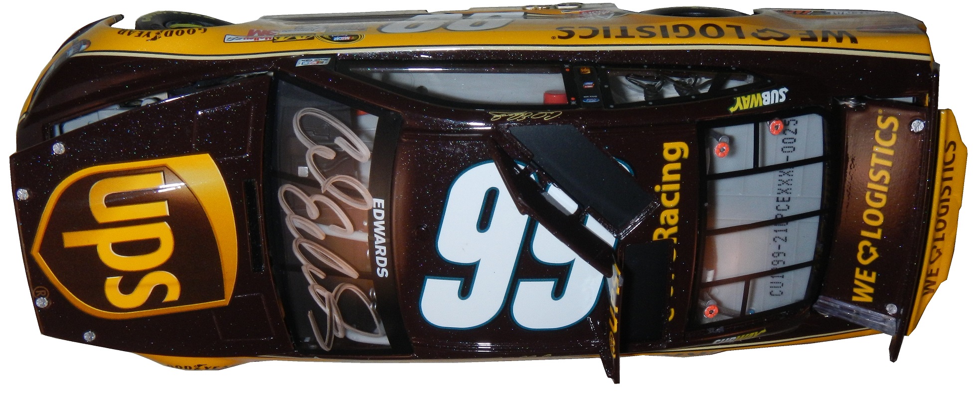
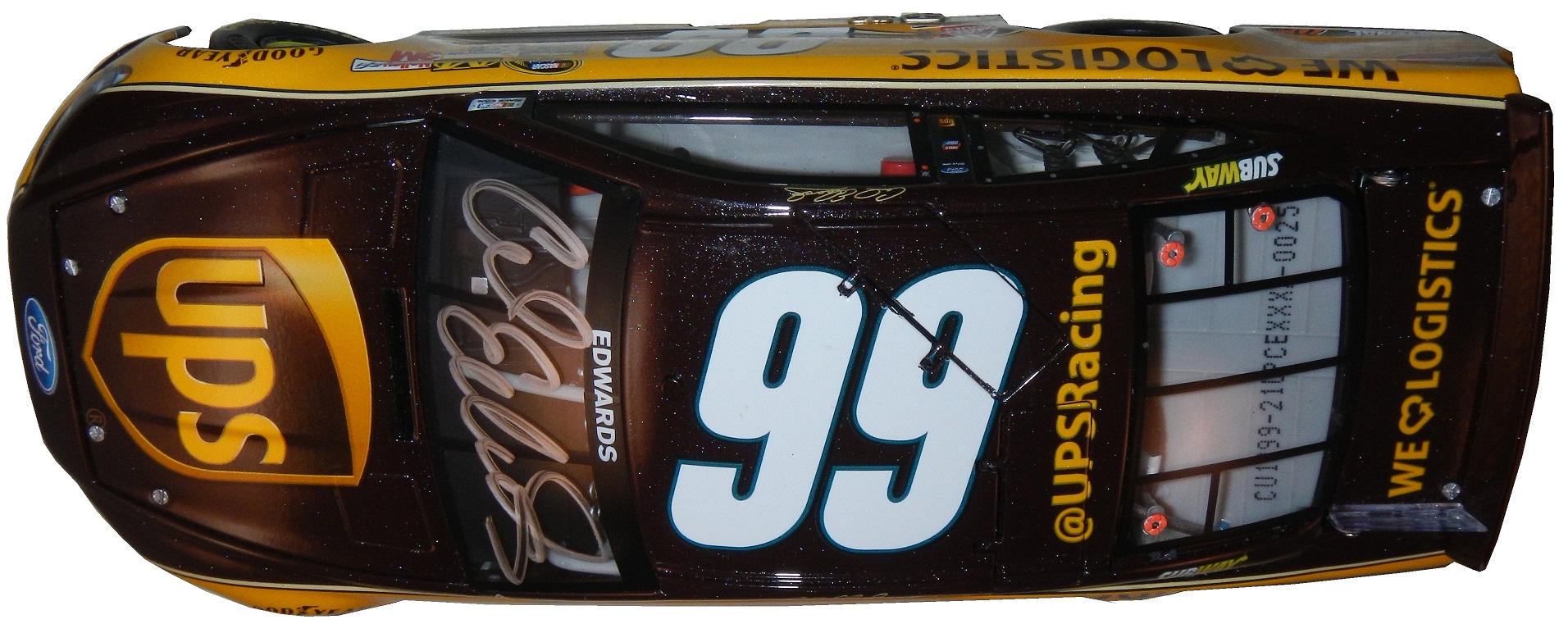
Michael McDowell #95 Thrivent Financial Ford FusionRedesign of last year’s scheme, another example of logo as a stripe pattern.

The Driver Suit Blog-Paint Scheme Leaderboard-Week 4, The Grand Finale

By David G. Firestone

The Paint Scheme Ranking Executive Committee meetings have been long, but not too contentious, I can’t stay mad at Alejandro when he shows me his belly, so now we present all 55 NASCAR Sprint Cup teams ranked from first to last on how their paint schemes looked. NR has a different meaning this week. NR now specifically referrs to teams that didn’t exist in 2013. Teams that ran different manufacturers in 2013 will be ranked when it came to last year. So, without further ado,

1-Wood Brothers #21 Rank Last Year:1st of 50 -The Wood Brothers always design great cars, and the Quick Lane scheme uses the blue very well. It all looks good!

2-Hendrick Motorsports #48 Rank Last Year:2nd of 50-Classic, smooth looks with no needless clutter. Jimmie always runs great schemes

3-Michael Waltrip Racing #55 Rank Last Year:3rd of 50-The color schemes are good, and the design schemes work very well.

4-Joe Gibbs Racing #18 Rank Last Year:5th of 50-The zebra stripe Interstate Battery scheme wrecks a perfect score for Kyle this year

5-Stewart Haas Racing #4 Rank Last Year:NR-With the exception of Hunt Brothers Pizza, which uses an awful shade of green, Kevin has consistently run a series of great schemes.

6-Team Penske #2 Rank Last Year:18th of 50-The Wurth and Redd’s Apple Ale schemes are a bit over designed, but the white Miller Lite schemes, Alliance Truck Parts, and Detroit Genuine Parts schemes make up for it.

7-Richard Childress Racing #31 Rank Last Year:35th of 50-A lot of great schemes this year, but Wix is overdone, and the Cat/Quicken Loans hybrid looks awful

8-BK Racing #23 Rank Last Year:NR-The Dip Your Car scheme is awful, but the rest of the schemes are very good, and are very attractive.

9-Stewart Haas Racing #41 Rank Last Year: NR-The Slate scheme does not work, but all the other schemes work very well.

10-Roush Fenway Racing #6 Rank Last Year:NR-This would be ranked higher, as it has a somewhat vintage look, but the candy cane on the nose looks odd. It’s still a good scheme.

11-Richard Petty Motorsports #43 Rank Last Year:6th of 50-The Ekcrich camouflage scheme doesn’t work, camouflage schemes rarely do. The Charter green is horrible, but the rest of the schemes look really good.

12-Chip Ganassi Racing #1 Rank Last Year:24th of 50-A pink-washing scheme and a terrible shade of green on the WEMO scheme cost this team the 2nd place spot,knocking them down to 5th. They have run a lot of great schemes this season

13-Levine Family Racing #95 Rank Last Year:45th of 50-The TWD schemes look medicore, but could be worse. The template Levine Family Racing switched too this year looks great and the cars look very good too.

14-Furniture Row Racing #78 Rank Last Year:4th of 50-The World Vision scheme needs work, as the color does not support a fade, but the Furniture Row, and Colorado Freedom Memorial work very well.

15-BK Racing #26 Rank Last Year:50th of 50-Bully Hill Vinyards is an over-designed joke with an awful color scheme. The yellow numbers on the Burger King scheme are awful, but the rest of the schemes are good, and defendable.

16-RAB Racing #29 Rank Last Year:NR-Good color scheme, mediocre design scheme.

17-Hendrick Motorsports #88 Rank Last Year:22nd of 50-National Guard, Mountain Dew, Kickstart, and Superman look good, and work well with the new number design, but Michael Baker, Kelly Blue Book, and Nationwide don’t at all.

18-Chip Ganassi Racing #42 Rank Last Year:11th of 50-While Cottonelle, the Silver Scheme, and Energizer work very well, but the rest of their schemes are mediocre at best. The white on the back doesn’t work.

19-Beard Oil Racing #75 Rank Last Year:NR-If the sides had a sponsor, and the stripe at the bottom was eliminated, it would work a lot better.

20-Front Row Motorsports #34 Rank Last Year:28th of 50-The majority of the schemes look great, but the upside down lettering on the hood of the CSX scheme looks odd. The Wendell Scott scheme is amazing!

21-JTG Daugherty Racing #47 Rank Last Year:15th of 50-While Bush’s, Clorox, Scott’s, Sullivan/Palatek, Kingsford, and Bush’s Grilling Beans work well,Kroger/USO is overdone, Charter Communications uses a horrid shade of green, and Hungry Jack just looks terrible.

22-Hendrick Motorsports #24 Rank Last Year: 36th of 50-Drive to end Hunger is too overdone, and the upside down D on the hood looks terrible. Their orange scheme is even worse. Panasonic is mediocre at best. Pepsi looks good, and all of the Axalta schemes are really good.

23-Humphery Racing #77 Rank Last Year:NR-Plinker Arms doesn’t look great but it could be worse. That applies to Essex Homes as well. The rest of the schemes look good.

24-Joe Gibbs Racing #11 Rank Last Year:31st of 50-The Autisim Speaks scheme works well. The zipper scheme is decent, but odd. Sport Clips is over-designed, but with a good color scheme. The FedEx schemes have decent color schemes, but are over-designed on the front.

25-BK Racing #83 Rank Last Year:7th of 50-Voo Doo Barbecue is an over-designed mess. Dip your car is terrible, as is Zak. Burger King and Borla work well though.

26-Team Penske #12 Rank Last Year:9th of 50-The SKF scheme works very well. The Penske Truck Rental scheme uses a horrible shade of orange, and just looks hideous.

27-Hillman Racing #40 Rank Last Year: NR-When the car doesn’t have a scheme, it looks very good. When it has a sponsor it looks awful.

28-Front Row Motorsports #35 Rank Last Year:27th of 50-The Hefty scheme is a little unorthodox, silver and orange isn’t a great combo, but the design looks good. MDS looks good

29-HScott Motorsports #52 Rank Last Year: NR-The black scheme is good, but the orange Florida Lottery scheme is a trainwreck. Less is more on a paint scheme.

30-HScott Motorsports #51 Rank Last Year:13th of 50-If the car is running a Brandt scheme it looks good, anything else looks terrible.

31-Phil Parsons Racing #98 Rank Last Year: 44th of 50-While I like the Dogecoin,Trench Shoring,iRacing, black Curb Records, and unsponsored black schemes, anything else looks horrendous.

32-Front Row Motorsports #38 Rank Last Year:26th of 50-Most of the schemes are good, but the Love’s Truck Stops, and Love’s Truck Stops Camo schemes are horrific.

33-Joe Gibbs Racing #20 Rank Last Year:23rd of 50-Can all be summed up with medicore color schemes and mediocre design schemes

34-Swan Racing #30 Rank Last Year:50th of 50-The only time the car looked good was when it was unsponsored, but compared to last year’s design it looks amazing!

35-Roush Fenway Racing #17 Rank Last Year:16th of 50-Eco-Power has awful shades of green. Pit for a pair is awful even for a pink-washing scheme. Zest has a good color scheme, but awful design scheme,as does Fifth-Third Bank. Their all-star scheme was terrible. Ford Eco-Boost, NOS, and Nationwide work very well.

36-Richard Childress Racing #27 Rank Last Year: 20th of 50-Neon yellow looks terrible, when they use the stripes on the sides it looks even worse. The Pittsburgh Paints scheme looks really good though.

37-BK Racing #93 Rank Last Year:8th of 50-The Support Millitary scheme is the worst, and although Burger King, Dr. Pepper, and Iowa City Chop House do make up for it, it just isn’t enough.

38-CircleSport/Richard Childress Racing #33 Rank Last Year: 47th of 50-

39-Tommy Baldwin Racing #37 Rank Last Year: NR-Accell Construction has a great color scheme, but the design scheme ruins it.

40-Tommy Baldwin Racing #36 Rank Last Year:29th of 50-Another example of a team where when the car is unsponsored, it looks better.

41-Richard Petty Motorsports #9 Rank Last Year:12th of 50-Can all be summed up with Great color schemes but mediocre design schemes. The camo scheme looks bad, but the upside is that the camo is subtle.

42-Team Penske #22 Rank Last Year:41st of 50-The Shell/Pennzoil scheme has a decent color scheme but a bad design scheme. Anything Pennzoil Platnum is awful, as is Auto Trader. The Auto Club scheme has a great color scheme but a bad design scheme.

43-Identity Ventures Racing #87 Rank Last Year:NR-300 is a mess, and Morris,Hardick and Schinder/SmartBen looks too dull.

44-Michael Waltrip Racing #15 Rank Last Year:38th of 50-The Peak scheme is defendable, the color scheme is good, but the rest of the schemes are just awful.

45-Roush Fenway Racing #99 Rank Last Year:34th of 50-Fastenal looks good, but anything else looks terrible.

46-Go FAS Racing #32 Rank Last Year:25th of 50-The Terry Labonte throwback scheme was amazing, but most of their other schemes are over-designed messes.

47-Stewart Haas Racing #14 Rank Last Year:21st of 50-The over designing of the Bass Pro Shops schemes, as well as the use of orange and camo just look horrible. Mobil 1, Rush Truck Centers, and Code 3 look decent, but to some extent have issues. Mobil 1 is over designed, Rush uses too dark a yellow, Code 3 uses too bright a yellow.

48-Tommy Baldwin Racing #7 Rank Last Year:43rd of 50-Allstate Peterbuilt, and Pilot-St Jude Children’s Network work well, as both have good color schemes and design schemes. Anything else just looks awful.

49-Richard Childress Racing #3 Rank Last Year:NR-Cheerios is very good, and has a classic look. Dow schemes have a great color scheme, but have mediocre design. Anything else looks terrible on this car.

50-Germain Racing #13 Rank Last Year:40th of 50-The blue is too bright, as is the yellow. The car is overdesigned, and the whole car looks like a mess. The camo scheme is much worse.

51-Hendrick Motorsports #5 Rank Last Year:46th of 50-The only half decent scheme is Pepsi. Everything else is an over designed mess.

52-Stewart Haas Racing #10 Rank Last Year:37th of 50-The only scheme that doesn’t make my eyes hurt here is Aspen Dental. Terrible shades of orange and green, with ugly design. The pink-washing scheme is terrible.

53-Xxxtreme Motorsports #44 Rank Last Year: 49th of 50-Every single one of their cars is an ugly, over-designed mess that doesn’t look good at all.

54-Roush Fenway Racing #16 Rank Last Year:19th of 50-Every scheme is terrible.

55-Michael Waltrip Racing #66 Rank Last Year:NR-Nothing about any of these schemes is good.

The Driver Suit Blog-Paint Scheme Leaderboard-Week #2-Ford

Ford

By David G. Firestone

Last Week, Chevy teams were ranked. This week, the Paint Scheme Ranking Executive Committee, made up of myself, and Alejandro my black cat have determined how Ford’s teams will be ranked. Alejandro was slightly more useful this week, keeping my leg warm while he slept. As with last week, teams that did not exist or did not run Fords last year will be marked with NR for Not Ranked.

1-Wood Brothers #21 Rank Last Year:1st of 17-The Wood Brothers always design great cars, and the Quick Lane scheme uses the blue very well. It all looks good!

2-Team Penske #2 Rank Last Year:6th of 17-The Wurth and Redd’s Apple Ale schemes are a bit over designed, but the white Miller Lite schemes, Alliance Truck Parts, and Detroit Genuine Parts schemes make up for it.

3-Roush Fenway Racing #6 Rank Last Year:NR-This would be ranked higher, as it has a somewhat vintage look, but the candy cane on the nose looks odd. It’s still a good scheme.

4-Richard Petty Motorsports #43 Rank Last Year:2nd of 17-The Ekcrich camouflage scheme doesn’t work, camouflage schemes rarely do. The Charter green is horrible, but the rest of the schemes look really good.

5-Levine Family Racing #95 Rank Last Year:16th of 17-The TWD schemes look medicore, but could be worse. The template Levine Family Racing switched too this year looks great and the cars look very good too.

6-Front Row Motorsports #34 Rank Last Year:11th of 17-The majority of the schemes look great, but the upside down lettering on the hood of the CSX scheme looks odd. The Wendell Scott scheme is amazing!

7-Humphery Racing #77 Rank Last Year:NR-Plinker Arms doesn’t look great but it could be worse. That applies to Essex Homes as well. The rest of the schemes look good.

8-Front Row Motorsports #35 Rank Last Year:10th of 17-The Hefty scheme is a little unorthodox, silver and orange isn’t a great combo, but the design looks good. MDS looks good.

9-Team Penske #12 Rank Last Year:3rd of 17-The SKF scheme works very well. The Penske Truck Rental scheme uses a horrible shade of orange, and just looks hideous.

10-Phil Parsons Racing #98 Rank Last Year: 15th of 17-While I like the Dogecoin,Trench Shoring,iRacing, black Curb Records, and unsponsored black schemes, anything else looks horrendous.

11-Front Row Motorsports #38 Rank Last Year:9th of 17-Most of the schemes are good, but the Love’s Truck Stops, and Love’s Truck Stops Camo schemes are horrific.

12-Roush Fenway Racing #17 Rank Last Year:5th of 17-Eco-Power has awful shades of green. Pit for a pair is awful even for a pink-washing scheme. Zest has a good color scheme, but awful design scheme,as does Fifth-Third Bank. Their all-star scheme was terrible. Ford Eco-Boost, NOS, and Nationwide work very well.

13-Richard Petty Motorsports #9 Rank Last Year:4th of 17-Can all be summed up with Great color schemes but mediocre design schemes. The camo scheme looks bad, but the upside is that the camo is subtle.

14-Team Penske #22 Rank Last Year:14th of 17-The Shell/Pennzoil scheme has a decent color scheme but a bad design scheme. Anything Pennzoil Platnum is awful, as is Auto Trader. The Auto Club scheme has a great color scheme but a bad design scheme.

15-Roush Fenway Racing #99 Rank Last Year:12th of 17-Fastenal looks good, but anything else looks terrible.

16-Go FAS Racing #32 Rank Last Year:8th of 17-The Terry Labonte throwback scheme was amazing, but most of their other schemes are over-designed messes.

17-Roush Fenway Racing #16 Rank Last Year:7th of 17-Every scheme is terrible.

Ford is in the rearview mirror, but next week we move on to Toyota!

The Driver Suit Blog-Ladies and Gentlemen…THE 2014 PAINT SCHEMIE AWARDS

CIMG1131By David G. Firestone

For the end of the 2014 NASCAR Sprint Cup Season, the Paint Schemies have returned! The Schemies will reveal the best  and worst paint schemes and driver suits of 2014. This was done using the Driver Suit Blog executive committee for paint scheme analysis and consists of me and me alone, and uses the following standards:

Color Scheme:How the colors look, and how they work with each other.

Overall Design:How good the design itself looks, is there too much, or not enough.

Primary Sponsor Logos: How the primary sponsor logos look on the car

Originality: How original is the scheme.

All of the above can work for or against a scheme, and all will be taken into consideration.

Let’s get the bad paint scheme awards out of the way.CIMG1131 - Copy

First, the Paint Schemie Award for Worst Regular Season Single Paint Scheme .

The nominees are:

Austin Dillon #3 Bass Pro Shops Chevy SS

Danica Patrick #10 Go Daddy Breast Cancer Awareness Chevy SS

Casey Mears #13 Geico Military Chevy SS

Clint Bowyer #15 Duck Commander Toyota Camry

Greg Biffle #16 Hire Our Heroes Ford Fusion

Joey Logano #22 Pennzoil Platnum Ford Fusion

Parker Kligerman #30 Phoenix Warehouse Toyota Camry

Morgan Shepherd #93 SupportMillitary.org Toyota Camry

Josh Wise #98 Provident Metals Ford Fusion

And the winner of the Paint Schemie Award for Worst Regular Season Single Paint Scheme is…

MORGAN SHEPHERD!

The next Paint Schemie Award is for Exhibition Race Paint Schemes. This category is a little different, as the Schemies will go to the best and worst special scheme that was run in either the Sprint Unlimited, the Sprint Showdown or the Sprint All-Star Race.

The Paint Schemie Award for Worst Exhibition Race Paint Scheme Goes To:

Blake Koch #32 Support Military Ford Fusion!

The paint scheme for worst driver suit goes to…

Joey Logano Auto Trader Ford Fusion

The Schemie for Least Improved Scheme Set from 2013 goes to

Greg Biffle’s #16 Ford Fusion

The next award is for Worst Paint Scheme Set, meaning the team that is running consistently bad schemes all year. The nominees are:

#16 Roush Fenway Racing Ford Fusion

#44 Xxxtreme Motorsports Chevy SS

#66 Michael Waltrip Racing Toyota Camry

The winner of the Award For Worst Scheme Set of 2014 goes to…

Michael Waltrip Racing #66 Toyota Camry!

CIMG1131Now after talking about the bad, we discuss the good. Here are the winners in the best category…

First, the Paint Schemie Award for Best Regular Season Single Paint Scheme.

Jamie McMurray #1 Cessna/Hawker Chevy SS

Brad Keselowski #2 Miller Lite Ford Fusion

Kyle Busch #18 M&M’s Toyota Camry

Trevor Bayne #21 Motorcraft Ford Fusion

Jimmie Johnson #48 Lowe’s Chevy SS

Brian Vickers #55 Aaron’s Toyota Camry

And the winner of the Paint Schemie Award for Best Regular Season Single Paint Scheme is…

JIMMIE JOHNSON!

The next Paint Schemie Award is for Best Exhibition Race Paint Scheme that was run in either the Sprint Unlimited, the Sprint Showdown or the Sprint All-Star Race.

And taking these schemes into consideration, the Paint Scheme Goes To:

Dave Blaney #77 Folcher Law Ford Fusion

The Paint Schemie for Best Driver Suit of 2014 goes to…

JIMMIE JOHNSON!

The Paint Schemie for Most Improved Scheme Set goes to

We have a tie between Swan Racing/BK Racing, and Levine Family Racing, so both win the Schemie!

I will be adding a new category for this year, and it is best throwback scheme. It can be full time or special. The nominees are:

Brad Keselowski #2 Miller Lite Ford Fusion

Trevor Bayne #21 Motorcraft Ford Fusion

Terry Labonte #32 C&J Energy Services Ford Fusion

David Ragan #34 Wendell Scott Tribute Ford Fusion

Aric Almirola #43 STP Ford Fusion

David Stremme #90 Junie Donlavey Ford Fusion

The winner of the Paint Schemie for Best Throwback Scheme is…

TERRY LABONTE

The final award of 2014 is the Paint Schemie for Best Paint Scheme Set of 2014. The nominees are:

Trevor Bayne #21 Motorcraft Ford Fusion

Jimmie Johnson #48 Lowe’s Chevy SS

Brian Vickers #55 Aaron’s Toyota Camry

The winner of the Paint Schemie is…

TREVOR BAYNE!

That’s all for the best and worst, now I wanted to do something in the way of a top 10 list, but I wanted to do something differnet. I wanted to do the top to logos that have never been the primary sponsor of a Sprint Cup Car, so here they are:

10: Apple

9: American Airlines

8: United Airlines

7: Lockheed

6: Microsoft

5: Bose

4: Boeing

3: Sprite

2: Fanta

1: Wendy’s

Now that’s all for this week, but stay tuned next week as the Paint Scheme Leaderboard Starts, this time with Chevy! See you soon!

The Driver Suit Blog-Paint Scheme Grades October 9-16

By David G. Firestone

I want to clarify something that I stated last week. My rule for pinkwashing is an automatic F. After a few people pointed out to me that almost everyone is wearing a pink ribbon, I’ve made the decision not to factor a pink ribbon into the grades. That said, pink lettering, numbers, or background will still earn an automatic F. Let’s get to the reviews.

Jamie McMurray #1 Cessna/Beechcraft Chevy SS Pinkwashing is an automatic F

Brad Keselowski #2 Redd’s Wicked Ale Ford Fusion My only complaint is that this isn’t a Miller Genuine Draft scheme. The color scheme is really good, and the design scheme is really good, A+

Denny Hamlin #11 FedEx One Rate Toyota Camry Um…huh? Someone explain to me what black leather and zippers have to do with FedEx? It’s not a bad design, though I could have done without the green at the bottom, so I’ll give it an A-, but I don’t get why they used that design at all.

Kyle Busch #18 M&M’s Halloween Toyota Camry M&M’s always have great Halloween schemes, and this is no different. Orange and black are always a good scheme, and the design fits both M&M’s and Halloween very well. I’ll give it an A+

Terry Labonte #32 C&J Energy Services Ford Fusion Terry is making his 890th start at Talladega, and this scheme is in honor of that. This is now, officially, my all-time favorite throwback scheme. The driver side is designed to look like his Kellogg’s scheme when he won the 1996 Sprint Cup Championship, and the passenger side is designed to look like his 1984 Championship winning Piedmont Airlines scheme. I couldn’t say anything bad about this if my life depended on is, A+

David Ragan #34 Dockside Logistics Ford Fusion The all white look works well, as does the red curved stripe down the sides. The color scheme is really good, and I give it an A+

Landon Cassill #40 Thunder Coal Chevy SS Between the paint scheme grades for last week, and the race at Charlotte, Cassill picked up Thunder Coal as a sponsor. The logo works well on a white background, and the car has a clean, smooth look that earns an A+

Kyle Larson #42 Energizer Chevy SS Same scheme as last year, same D grade

Michael Waltrip #66 My AFib Story Toyota Camry Ok, this one needs some explaining. Michael Waltrip suffers from Atrial fibrillation or AFib, an abnormal heart rhythm. He is working with The American Heart Association to inform people about AFib, and this scheme features pictures of those who have shared their stories about dealing with the disease, and I have to give this an A+ for that. It also doesn’t hurt that the color and design schemes are really good too!

Michael McDowell #95 Jordan Truck Sales Ford Fusion Pinkwashing earns an automatic F. It should be noted that this is the first time a team has put a Twitter handle on the side of their car.

Josh Wise #98 Provident Metals Ford Fusion A much more scaled down version of the paint scheme, which is much smoother and better looking. It has a great color scheme, so I’ll give it a B+.

The Driver Suit Blog-Die Casts Examined

43-combs1 - CopyBy David G. Firestone

Recently, I came across a design quirk I had never seen on a car before.  Take a look at these two cars above.  These two design schemes were used by Rodney Combs in 1994. He raced in the Busch Grand National Series. He had 3 top 10’s, and led 11 laps. Now while these two paint schemes look completely different, they are a lot more connected than you might think…43-combs1 43-combs2 43-combs3 43-combs4 43-combs5 43-combs6 43-combs1 - Copy (2)Yes this was an actual paint scheme used on a real race car. I had never seen a design scheme like this before or since.  It is one of the oddest paint schemes I have ever seen. Normally if two different companies sponsor a car, one runs their scheme for a number of races, and the other runs their scheme for a number of races. The driver suit is no less unusual. But I bought this for another reason besides just the paint scheme.  This is an example of a NASCAR bank. These were marketed for a number of years to kids as collectibles.  They were marketed to kids in the late 1980’s through the mid 1990’s.   They are 1:24 scale, and are the same design as their die-cast toy counterparts. They faded out after a while. After trying to use one, I now understand why they faded from use. Let’s look at the bottom.43-combs6

The bank opens with a key and the door that the coins are supposed to come out of is much too small for a standard American coin to fall out of. I tried to remove some coins and it took me 45 minutes to remove all of them. While they were a good idea on paper, their practicalities made them next to useless and needlessly annoying.

We move from the old to the new, with this Carl Edwards design from 2013.   This is my first die-cast scheme of the Gen 6 car, and I have to say, I’m amazed at the detail.  Check it out.99-edwards1Carl ran the UPS scheme for one race in 2013, at the Quaker State 400, where he started 2nd, led 35 laps, but finished 21st. This is an autographed version, of which only 900 were sold by Lionel. Unlike the bank, this is a very accurate design. It’s made of a more lightweight metal, the window net is cloth,99-edwards1 - Copy (2)the grill is accurate,99-edwards3 - Copyso are the door decals.99-edwards1 - CopyThe hood opens,99-edwards4

the deck lid opens,99-edwards9

the roof flaps work,99-edwards12

the details are really accurate, and the paint scheme is amazingly accurate.99-edwards1 - CopyIt has all the details of it’s on track counterparts at a 1:24 scale, with a nice Carl Edwards signature on the windshield.   My biggest complaint is that the hood is difficult to open, and does not open very far.  It takes away from the appearance.  99-edwards2 99-edwards1 99-edwards3 99-edwards4 99-edwards6 99-edwards7 99-edwards8 99-edwards9 99-edwards11 99-edwards1299-edwards5Now we move on to the real thing with…

PAINT SCHEME REVIEWS!

Michael Annett #7 Pilot /Allstate Peterbuilt/St Jude’s Chevy SS Great color scheme, great simple design, A+

Clint Bowyer #15 Speed Digital Toyota Camry Clint keeps up a streak of bad schemes with his RK Motors scheme but with a different logo. D-

Greg Biffle #16 Ortho Fire Ant Killer Ford Fusion Great color scheme, good design, I give it an A-, the number still looks horrible.

Ty Dillion #33 Rheem Comfort Products Chevy SS From this moment onward, anytime I see camo on the side of a race car it will be an automatic 1 letter grade deduction. In this case it takes a great scheme, and ruins it. It would have been an A scheme, but with the contrasting designs, it earns a C-

Landon Cassill #40 CRC 1 Tank Renew Chevy SS Decent color scheme, but the design is a bit overdone. If it didn’t have the yellow stripes on the back I would like it more, but this is a decent scheme, worth a B-

Justin Allgaier #51 Auto Owners Insurance Chevy SS Can’t say anything bad about this scheme, A+

Michael McDowell #95 Teenage Mutant Ninja Turtles Ford Fusion Let me get this straight, The Turtles are in a Michael Bay directed movie that to date has made over $242 million and this scheme seems to go out of its way not to use the movie? I’m trying to make sense of that…OK, now the color scheme is good, but the back of the car is very cluttered. Even still it’s a B+ scheme.

The Driver Suit Blog-The End of An Era in Evanston

DSCN0972By David G. Firestone

We all have at least one place that we always remember fondly from our childhood. It could be a restaurant, a park, the home of a close friend, or family member, or a park. We all have at least one, probably many. It is always sad when one of these places goes away. Well this happened to me this last week, when an Evanston institution began the process of moving.

Tom Thumb in Downtown Evanston was a place that I and a number of my friends spent a great deal of our childhood. Some of us were skateboarders, some of us were RC car fanatics, some of us, like me were model builders and die cast collectors. It had been in the same place for 49 years, but they announced that they were going to move after a zoning decision was made to replace the current building with a two-story building for two restaurants. So, on July 12, after 49 years as an Evanston institution, it closed. I went there on the 12, and made, with a heavy heart, my last purchase.photo 2 photo 1This was a sad day because I am a huge NASCAR fan, and for many years, Tom Thumb was the only store in Evanston that sold NASCAR stuff. It was also one of, if not the oldest skate shop in the midwest. I went there, looked around the store where I spend my childhood, took it all in, and bought my last purchase, this 1997 Darrell Waltrip 25th Anniversary set.DSCN0972I bought this for two reasons. The first is that I love this set, I remember many of these schemes from races I watched in 1997. They all look really good, and they bring back memories. The second reason, and I didn’t even think about this until I started doing some work for next week. During my research, I was grumbling about how many different paint schemes each car runs every week, and it dawned on me that this might be the first example of that in the Sprint Cup Series.

You never had this much variety in paint schemes before 1997. Each team ran one scheme for the majority of the season, maybe 2 or 3 different schemes and special schemes for the All-Star race, and possibly the Busch Clash. But Darrell Waltrip ran, in total, 7 different schemes, each based on a specific era in his career. Each had Western Auto Parts America as the primary sponsor, but were based for past sponsors. He started with Gatorade, which he ran for DiGard Motorsports, from 1975-1980. He won two Coca Cola 600’s(1978, 1979) a Winston 500(1977) the Southern 500(1978,1979)as well as 22 other races during that time.DSCN0990In 1981, he left DiGard for Junior Johnson Motorsports, and was sponsored by Mountain Dew, where he won 24 races including the 1982 Winston 500, the 1981 Busch Clash, and two of his three Sprint Cup ChampionshipsDSCN0991Pepsi replaced Mountain Dew and created The Pepsi Challenger which he ran in 1983 for Junior Johnson. He won 6 races for PepsiDSCN0992After Pepsi left, Budweiser took over the sponsorship, and from 1984-1986, he won 13 races, the 1985 Winston Cup Championship, the Inagural All-Star Race in 1985, the 1985 Southern 500, and the Winston 500. I find love how they call it “Red” instead of Budweiser since this was marketed to kids at the time.DSCN0993In 1987, he made the move to Hendrick Motorsports, and picked up Tide as a sponsor. He won the 1989 Daytona 500, The 1988 and 1989 Coca Cola 600’s and 6 other races. I loved that it was identical to the scheme used by Ricky Rudd that same season.DSCN0994From 1990-1997, he raced the #17 for Hendrick Motorsports in 1990, and then founded Darrell Waltrip Motorsports, which raced this scheme from 1990 to 1997. He won 5 races, but was never to get his former glory back. Western Auto left the team after 1997, and Darrell Waltrip Motorsports shut down shortly after the start of the 1998 season.DSCN0995The last scheme is one of the most innovative schemes in the history of NASCAR. His legendary Chrome scheme.  Darrell loved chrome, using chrome numbers, and a chrome helmet.  This was supposed to be used for just a single race, but it was raced a number of times that season. Nothing like this had ever been done in NASCAR before. There had been chrome numbers, but never a chrome car. This car was so far ahead of it’s time.  Darrell even had a Chrome driver suit that he wore with this car!DSCN09961997 would be the beginning of the end for Darrell Waltrip. He shut down his Winston Cup team in 1998, and joined Dale Earnhardt Inc. midway through the season. He would race for just two more seasons before fully retiring in 2000.

The idea of 7 different schemes seems like standard opperating procedure today, but back in 1997, this was revolutionary. This was unheard of. These schemes were all good, and they worked well, but this surprised some fans. 17 years later, this is the norm rather than the exception. If I did the paint scheme reveiws back in 1997, I would write one article at the beginning of the season, one before the all-star race, and maybe one midway through the season. There were no changes to paint scheme, or if there were, they were very rare.

Tom Thumb will reopen eventually. But whavever the new location, it will never have the same feel as the decades old building were it was once housed. I will miss it. I really will. But I find a bit of irony in that I bought the beginning of an era at the end of another era. I will visit Tom Thumb when they reopen, and I wish them the best of luck. From the residents of Evanston to Tom Thumb, we will miss you, and we wish you the best of luck in your new location!

We also have a paint scheme related news item to discuss.  This last week, NASCAR announced that the Chase for the NASCAR Sprint Cup would have some new features on their cars.  Specifically,  all Chase contenders will have a yellow splitter cover, a yellow window stripe with black letters, yellow roof numbers, and a special Chase for the NASCAR Sprint Cup decal.  I’ve been speculalting that this might come to be, and now I have proof.  I am not going to discuss how I think it will look, until I have a good idea as to who is in the Chase, and how it will look on their cars.  Here is an illustration of how it looks.

With that out of the way, we move on to…

PAINT SCHEME REVIEWS

Kasey Kahne #5 Great Clips/Shark Week Chevy SS Another case where it looks like two different designers created the car without speaking to each other. It looks awful. The color scheme is good, so it passes, though just bearly with a D-

Tony Stewart #14 Bass Pro Shops/Ducks Unlimited Chevy SS For a Bass Pro Shops scheme it looks really good. It isn’t over designed, has a nice patriotic touch, and has a good color scheme. A+

Clint Bowyer #15 RK Motors Charlotte Toyota Camry Clint’s C scheme but with an even worse color scheme ends in a D-

Greg Biffle #16 3M Throwback Ford Fusions Greg Biffle is holding a contest to pick a throwback sheme for his race at Pocono in August. I would normally grade all four of these seperatley, however they all have the same traits, so I will grade them at once. All four have really good color schemes, and really nice logos, but they are all plagues with modern car numbers as well as modern designs. They simply look awful. I will vote for none of these schemes and give them all an F-

Trevor Bayne #21 QuickLane Ford Fusion A really good design with a really good color scheme. It works very well, A+

Cole Whitt #26 Scorpion Window Film Toyota Camry Good color scheme, good design, though the silver stripe on the bottom is a bit much. A-

Paul Menard #27 Menards/Splash Chevy SS The Splash logo looks really good, and I’ll give it a B+

Joe Nemechek #29 Toyota Cares Toyota Camry Great color scheme, awful design, they average out to a C-

Morgan Shepherd #33 ThunderCoal Chevy SS I liked the other ThunderCoal scheme, but this is just awful. Too many neon colors, and it is needlessly overdesigned. I give it an F

Alex Kennedy #33 MediaCAST Chevy SS Awful color scheme and way too over designed. F

Landon Cassill #40 Gallery Furniture Chevy SS Great color scheme, great simple design, though the 40 could be brighter. A

Kyle Larson #42 Cottonelle Chevy SS Great color scheme, great design A+

Michael Waltrip #66 Royal Teak Toyota Camry Good color scheme, great simple design, A+

Martin Truex Jr. #78 Worldvision Chevy SS Great color scheme, great design, I love that fade, looks great. A+

Ryan Truex #83 Voodoo/Armed Forces Motorsports Toyota Camry A D+ scheme with a new hood logo is still a D+ scheme.

Michael McDowell #95 JPO Absorbents Ford Fusion Another great Levine Family Racing scheme. It is hard to believe how bad they were last year. Great color and design scheme equals an A+ scheme.

Carl Edwards #99 UPS Ford Fusion They took a D- scheme, and made it worse. Awful color scheme, awful design, F-

The Driver Suit Blog-Why I Hate Politics and Paint Scheme Update

By David G. Firestone

I have a lot of paint schemes to discuss and we will get to that shortly. I wanted to discuss something that took place before the Coke Zero 400 last week. It is a bit murky, but here is what took place.

Charlie Crist is a former governor of Florida, and a former Republican. After a brief hiatus from politics, he has annoucned his intentions to run for the Governor of Florida as a democrat. He had plans to run the #98 Phil Parsons Racing Ford driven by Josh Wise. After this was announced however, the Republican Party of Florida filed a lawsuit stating that it was a campaign contribution worth more than $3,000. Remember, this was the same team that was crowd funded by Reddit and Dogecoin at Talladega, and that sponsorship cost about $55,000. It was later reported that the Charlie Crist decals had been removed from the car. Phil Parsons Racing stated the deal was in response to a series of negative ads toward Crist, and that the Crist decals were part of a deal with recording artist Lee Brice. They also stated that they didn’t pull the sponsorship due to the lawsuit, and that the $25,000 sponsorship would be returned.

I frankly don’t buy any of that for a second. I think that it was because of the lawsuit, and that Phil Parsons Racing did not want to get thrown under the bus because of it. They tried to handle it as diplomatic as possible, but it still sounds sketchy. The other reason I have a huge problem with this is because the simple fact that politics and racing don’t mix. Look at what’s happened with F1 and IndyCar. Politics are a constant issue in the sport, and I for one am tired of it. Look at the Ayrton Senna/Alan Prost battle in the 1990’s! Look at The Split! Politics ruins racing!

This is not the first time a politician with deep pockets has sponsored a race car, but I hope that this is the last time. I’m not against politics, I’m against forcing it into something it has no place being in! If tobacco, cel phone carriers, and hard liqour have or had been banned from sponsoring cars, then so should politicians.

Ok enough serious stuff, on to…

PAINT SCHEME REVIEWS!

Jamie McMurray #1 Cessna/Hawker Chevy SS Nothing bad to say here…A+

Jamie McMurray #1 Lexar Chevy SS Great Color Scheme, great design, A+

Austin Dillon #3 Great Stuff Chevy SS Color scheme is good, the design looks very odd. The gold numbers and chain design does not suit the car at all, and if they were left off, I would give it an A, but this scheme earns a B-

Austin Dillon #3 NRA Museum Chevy SS Good color scheme, decent design, B+

Austin Dillon #3 Cheerios Protien Chevy SS Much too overdeisgned, decent color scheme, C-

Kasey Kahne #5 Team Stream Chevy SS Good color scheme, but Kasey loves to drive overdesigned cars, and this is no exception. I’m giving it a C which is a very fair grade here.

Kasey Kahne #5 Farmers Chevy SS Good color scheme, decent design, B+

Marcos Ambrose #9 Black and Decker Ford Fusion Good color scheme, Good design, A

Danica Patrick #10 GoDaddy/Florida Lottery Chevy SS It looks like two people designed this car, and they didn’t talk to each other while designing it. Both sets of color schemes are awful, and both design schemes are awful. F-

Greg Biffle #16 3M/DAV Ford Fusion Green usually doesn’t look good, camo never looks good, so this scheme earns an F

Greg Biffle #16 3M Aerospace Ford Fusion See Above F

Greg Biffle #16 NESN 30th Anniversary Ford Fusion A bit less overdesigned, at least by Greg Biffle’s standards, and I do like the Red Sox and Bruins logos as well, so I will give it a C

Greg Biffle #16 3M Ford Fusion Good color scheme, decent design, B+. Nice change for Greg Biffle.

Kyle Busch #18 Interstate Battery Center Toyota Camry No. Redeeming. Features. Whatsoever. F-

Ricky Stenhouse Jr. #17 Cargil Ford Fusion Much MUCH TOO OVER DESIGNED! F

Jeff Gordon Panasonic Toughbook Chevy SS Blue and white work very well, and while it is a bit over designed, it works, and I’ll give it an A

Jeff Gordon #24 Pepsi Chevy SS Great color scheme, great design scheme, A+

Cole Whitt #26 Rinnai Toyota Camry The color scheme is good, and the design is great, so it gets an A+

Cole Whitt #26 Tapout Muscle Recovery Toyota Camry Simple design, great color scheme, A+

Boris Said #32 7-Eleven Ford Fusion I normally hate green on race cars, but this works well. I like the design scheme too, and I give it an A

Bobby Labonte #33 Thunder Coal Chevy SS Great simple design and a great color scheme, A+

Alex Kennedy #33 MediaCast Chevy SS The color scheme is awful, and the design is worse. F

Reed Sorenson #36 Theme Park Connection Chevy SS Ugly design, good color scheme, C-

David Gilliland #38 Long John Silvers Free Fish and Fries Ford Fusion Great design, great color scheme, great look, A+

David Gilliland #38 Love’s Truck Stops Ford Fusions CAMO DOES NOT WORK ON RACE CARS! F

Landon Cassill #40 Snap Fitness Chevy SS So So design, good color scheme C+

Kyle Larson #42 Target Chevy SS Whadaya Know? An A+ Patriotic scheme!

Aric Almirola #43 Waffle House/Smithfield Ford Fusion The understated patriotic design scheme works well, and the color scheme works well too. B-

Justin Algaier #51 CSSUSA Chevy SS Looks good, overall design is good, color scheme is good, and I’ll give it an A

Brian Vickers #55 Aarons/Florida State Toyota Camry Good design with a good design color scheme, A

Brett Moffit #66 Toyota Toyota Camry Good color scheme, simple design, looks very good, A

Tommy Drissi #66 Hercules Toyota Camry I don’t even know where to begin…it just looks awful. F

Martin Truex Jr. #78 World Vision Chevy SS Good color scheme decent design, B-

Dale Earnhardt Jr. #88 Kelly Blue Book Chevy SS A decent scheme, but a bit overdeisgned. Color scheme looks good. B

Dale Earnhardt Jr. #88 National Guard Chevy SS See David Gilliland Love’s above. F

Michael McDowell #95 K-Love Ford Fusion I like the color scheme, and the overall design is another good Levine Family Racing scheme that earns an A

Josh Wise #98 Dogecoin Ford Fusion Good simple design with a good color scheme equals an A grade

Josh Wise #98 Phil Parsons Racing Ford Fusion Since this design is what was raced, I will grade it as such. The color scheme is decent, but it is a tad too overdesigned. It is a D+ look.

The Driver Suit Blog-Bill Brach Vintage Suit

headerBy David G. Firestone

A couple of weeks ago, I discussed the events in 1964 that led to the invention of the Nomex driver suit. I also briefly discussed what one of these pre-Nomex suits looked like. Well that was meant as a Uni-Watch article, and was written differently than I would normally write it. It didn’t run on Uni-Watch for a myriad of reasons not worth getting in to. So for this week, I will analyze the suit in Driver Suit Blog style

Before Nomex became the standard for driver suits, racing was living in the dark ages. Drivers would race in whatever they were wearing when they came to the track. Little if any consideration was given to fire safety. As such, many drivers perished in on-track fires. Even when the fire retardant suits began to spring up, they were of little value. Prior to 1967, and for some time after, your standard driver suit was little more than a cotton or polyester suit dipped in borax and other chemicals. This made them fire retardant, but very uncomfortable to wear. Nomex made the driver suit safe and comfortable to wear.

But what did these suits look like? Well this is an example of a polyester suit. It was worn by an Indianapolis based driver named Bill Brach. He was a member of the Murat Shrine in Indianapolis, and he raced in this suit.brach brachbThe suit itself dates to 1972 at least, because of an Archie Bunker For President patch.brach-rchestIt has a tag that says “Untreated, will burn,should be dipped.”brach-collar brach-tagThe polyester material is very flimsy, and is ripped in one part.brach-wearIt has a classic racing stripe up the side, similar to what Paul Newman wore in LeMans.brach-lchestThe belt has a metal-clasp to close it, unlike most suits, which use Velcrobrach-beltThe sleeves can be unzipped for comfort, which compromises the fire protection.brach-lsleeve2 brach-lsleeve3The back has MURAT 500 SHRINE CLUB in chain stitching on the back.brach-blogo

This is an example of a suit from yesteryear. One that has been made obsolete. It is delicate, thin, and in a fire was of limited value. Nomex has become the standard, and suits like this are now simply relics.

Paint Scheme Reviews

Jamie McMurray #1 Keurig Chevy SS Great color scheme, simple design, A+

Brad Keselowski #2 Miller Lite Ford Fusion Too overdesiged. Not a good look. Good color scheme. B-

Brad Keselowski #2 Redd’s Apple Ale Ford Fusion Black and Red is always a good scheme, and the overall design is good. The sticking point for me with this scheme is that APPLE ALE is almost invisible on the quarter panel. So for a final grade, it gets a B-

Kevin Harvick #4 Budweiser Folds of Honor Chevy SS A good patriotic scheme. A

Denny Hamln #11 FedEx/Autism Speaks Toyota Camry This is, by far, the best design Denny has run all year! I can’t say anything bad about it! A+

Clint Bowyer #15 RK Motors Charlotte Toyota Camry Same bad 5 Hour Energy scheme, but with an even worse color scheme. F

Greg Biffle #16 Fastenal Ford Fusion What’s worse than camo? Blue camo! F

Ricky Stenhouse Jr. #17 Fastenal Ford Fusion A mediocre scheme, that is much too overdesigned. D-

Ricky Stenhouse Jr. #17 Cargill/Winn Dixie Ford Fusion Great color scheme, and I love the flame design on the side. A+

Kyle Busch #18 M&M’s Toyota Camry Good color scheme, good design, A+

Ryan Newman #31 Quicken Loans Chevy SS Good design, great color scheme, A

Ryan Newman #31 Wix Filters Chevy SS Awful design, and awful color scheme, F

Alex Kennedy #33 Dream Factory Chevy SS Yeah it is a tad overdesigned, but it is for a charity to help children with life-threatening illnesses. So I’ll give it a B

Reed Sorenson #36 Click it or Ticket Chevy SS Another potentially good design with a great color scheme ruined by an overly complex design. B-

David Ragan #38 The Pete Store Ford Fusion Good color scheme, great design, A+

Landon Cassill #40 CRC Brakeleen Chevy SS Good design, good color scheme, Solid A.

Landon Cassill #40 NBS Chevy SS Great design, and a good shade of green…something not seen in NASCAR much. A+

Kurt Busch #41 Haas Chevy SS If the black were blue, and the red and white stripes were kept, I would like it more, but this scheme earns a C.

Kyle Larson #42 Cottonelle Chevy SS The blue looks decent, but the target logos on blue look awkward. The 42 would look better in white than dark blue as well. C+

Aric Almirola #43 Nathans Hot Dogs Ford Fusion As much as I like Nathans Hot Dogs, this is awful! The clash between the green and blue is horrific, and I can’t give this a passing grade.

Justin Allgaier #51 Hendrickcars.com Chevy SS I like the color scheme, but the car is a bit too overdesigned. Still it earns a C

Dave Blaney #77 Fochler Veterans Law / Valor 4 Vets Ford Fusion Really good patriotic scheme here, nothing wrong, A+

Dale Earnhardt Jr. #88 National Guard/Superman Chevy SS I love the red and yellow numbers, and the overall color scheme is great. The design is a bit overdesigned though, and it brings it down to a B.

Michael McDowell #95 JPO Absorbents Ford Fusion Levine Family Racing keeps cranking out good schemes, and this A scheme is no exception. Good color and design schemes.

Michael McDowell #95 JTS/Black Dragon Ford Fusion See Above…A

Michael McDowell #95 K-Love Ford Fusion Good design, but the sky blue is awful. It just looks awful. B-

Josh Wise #98 Reddit/iRacing Ford Fusion Good design, great color scheme, A

Carl Edwards #99 Fastenal Ford Fusion See Ricky Stenhouse Above…D-

The Driver Suit Blog-Item Spotlight-Alex Barron 1998 Champ Car Driver Suit

By David G. Firestone
While I typically watched NASCAR growing up, I did also watch IndyCar. That was before “the split” which diluted the value the sport so much that to this day it is still suffering, 6 years after the unification of Champ Car and the Indy Racing League. I got tired of politics and wanted to watch racing, I didn’t care who was sanctioning it. I still watch IndyCar racing and I collect race-used stuff.

I mentioned this a few months ago, when I discussed video matching. My first open wheel driver suit is this Alex Barron suit from 1998.36-barron

Not only is this my first open wheel suit, it was also my first suit that featured an FIA safety certification on the back of the neck. Having dealt in NASCAR suits, I didn’t know what to make of it, and through some research, I eventually learned what it was and what it meant.36-barron-neck 36-barron-fia2The chest features a FedEx Championship Series patch, probably my favorite sanctioning body patch ever,
and logos for Toyota and Denso.36-barron-lchest 36-barron-rchest 36-barron-flogoThis being my first Sparco driver suit, The cowl tags, and location of the warranty tags were out of place, as compared to a NASCAR driver suit.36-barron-tag 36-barron-tag2One thing I do find interesting is that there are no television logos on the sleeves and legs, but as the video at the end shows, that was not uncommon, but more on that later.36-barron-rsleeve2 36-barron--lsleeve2 36-barron-legs
The collar has an unusual design. Most collar designs feature either logos on the side, or logos across the front, or sometimes both. This one is unique in that it features a DEGREE logo on the front, as well as a CASTROL logo on the right side, but nothing on the left side…I’ve never seen that before or since, and I can’t understand the need for that particular design…it just looks odd.36-barron-collarAlex’s name is embroidered into the belt, and something I love about open wheel suits is that because it is an international sport, much more so than NASCAR, the driver usually has their home country flag embroidered next to their name on their suit, as this suit shows.36-barron-beltI also have a 1/18 die cast of Barron’s very sharp looking car from 1998. It is the only die cast I have that has a driver in it. I love the fact that he is wearing a very accurate version of his driver suit.36i-barron-2 36i-barron-3 36i-barron-1Now as I mentioned, this was the suit Barron wore during his most infamous moment, his crash at Road America, where he wound up on top of Bryan Herta. Someone recently uploaded the whole race to YouTube, and when watching it, notice that nobody has logos for the in-car camera. I find that rather interesting, since it would be very easy to place logos on the sleeves, and it was commonplace in other forms of racing. But it is an interesting race.

Now we have another piece of news to discuss.  In the realm of NCAA sports, the two major factions in uniforms are Nike and Under Armour.  Nike has a deal with Denny Hamlin for driver suits, and I was wondering when Under Armour would jump on the band wagon, and this week, we got our answer.  Under Armour, who has signed deals with Michael Waltrip Racing and Henrdick Motorsports to outfit teams with apparel.  This deal does not include the drivers themselves but the car numbers are fair play.  I find it a bit unusual that the deal provides apparel for all members of the team, pit crew members, front office personel, and everyone EXCEPT the faces of the franchises.  Now that might change in the near future, but for now that is how the deal works.  You can read more about the deal here.

Now we move to…

PAINT SCHEME REVIEWS!

Jamie McMurray #1 Bell Helicopters Chevy SS Great look, great color scheme, A+

Austin Dillon #3 Dow Powerhouse Solar Chevy SS The side is somewhat over designed, but I like the product placement on the roof. The color scheme is great so I will give it a B

Denny Hamlin #11 FedEx Office March Of Dimes Toyota Camry Decent color scheme, but the side is a bit overdesigned, and has a messy look to it. C+

Clint Bowyer #15 Willy’s Duck Diner/Buck Commander Toyota Camry Too much camo. Camo doesn’t work they way designers want it to on a car and I give it a D

Greg Biffle #16 Give Kids A Smile Ford Fusion Man! Greg Biffle really wants the Paint Schemie Awards for Most Degraded Paint Schemes, and Worst Paint Scheme Set with another F scheme. Horrible design, and an ugly paint scheme.

Greg Biffle #16 3M Areospace Ford Fusion Take the worst aspects of Greg Biffle 2014 schemes, and add a liberal amount of camo, and you have an F scheme

Ricky Stenhouse Jr. #17 Ford EcoBoot Ford Fusion I like the color scheme, I like the overall scheme, and my only complaint is that the orange numbers on the roof should be on the door.  Still it is an A scheme

Cole Whitt #26 Swan Energy Toyota Camry Simple design and a great color scheme earns an A+

Cole Whitt #26 Swan Energy Toyota Camry Simple design and a great color scheme earns an A+

Paul Menard #27 Menards/Duracel Chevy SS This is the best Menard scheme I have seen! Duracel works very well on the hood, and I give it an A

Parker Kligerman #30 Swan Energy Toyota Camry Just when I thought Swan had learned the error of their ways, and were improving their paint schemes, along comes this one. Now we are back to square one, and this scheme earns a D+

Parker Kligerman #30 SMS Audio Toyota Camry Well things for Swan are looking up, this is a pretty cool design. It works very well, and has a great color scheme. A+

Ryan Newman #31 Quicken Loans Billion Dollar Bracket Challenge Chevy SS I understand what they tried to do, but the scheme as a whole is just bland, boring, and C+.

Travis Kvapil #32 Keen Parts Ford Fusion  Decent design, good color scheme, but the logo on the hood is very difficult to see.  That is a major issue.  When a sponsor pays for a car, the hood design should be easy to see, but this isn’t easy, and I give it a C-

Aric Almirola #43 Ekrich Ford Fusion The red on the roof is pointless, and it takes away from a great scheme. If the roof were Petty Blue, and the red was just a stripe on the bottom, I would give this scheme an A+ but with the red roof, it goes down to a B-

Michael McDowell #95 Triangle Office Equipment Levine Family Racing keeps up the fight with Swan Racing to win the Most Improved Paint Schemie Award with another beautiful A+ scheme!