By David G. Firestone
STAR COM RACING #00
Landon Cassill #00 StarCom Fiber Chevy Camaro–New scheme for 2019, Yellow, white, black and silver with numerous stripes and designs on sides. D+
Landon Cassill #00 Permatex Chevy Camaro-New sponsor for 2019, orange and blue with white diagonal stripes on sides. A-
Landon Cassill #00 StarCom Fiber Chevy Camaro-New scheme for 2019, Yellow, white, black and silver, design has been toned down D+
Landon Cassill #00 Manscaped Chevy Camaro-New sponsor for 2019, black with white and silver stripes on bottom. A
Landon Cassill #00 Iron Mountain Data Centers Chevy Camaro-New sponsor for 2019, white with blue stripes. A
CHIP GANASSI RACING #1
Kurt Busch #1 Monster Energy Chevy Camaro–No change. A
Kurt Busch #1 ComSurv Chevy Camaro-New sponsor for 2019, black, with green logos across car. A
Kurt Busch #1 Gear Wrench Chevy Camaro–New scheme for 2019, black with orange curve up sides. A
Kurt Busch #1 Star Nursery Throwback Chevy Camaro–New sponsor for 2019, based on Kurt’s 1999 Star Nursery scheme. A-
Kurt Busch #1 Global Poker Chevy Camaro-New scheme for 2019, same as Monster, but with Global Poker on sides and hood. A
TEAM PENSKE #2
Brad Keselowski #2 Miller Lite Ford Mustang–No change. A
Brad Keselowski #2 Discount Tire Ford Mustang–No Change. A
Brad Keselowski #2 Auto Trader Ford Mustang–No change. C
Brad Keselowski #2 Alliance Truck Parts Ford Mustang–No Change. A
Brad Keselowski #2 Wurth Ford Mustang–New scheme for 2019, white front, red center, black rear, with design in middle. A
RICHARD CHILDRESS RACING #3
Austin Dillon #3 Dow Chevy Camaro–New scheme for 2019, black with red, white, and silver wave pattern. B+
Austin Dillon #3 Dow Gold Chevy Camaro-New scheme for 2019, gold with black and red stripe on bottom. A
Austin Dillon #3 AAA Chevy Camaro–No change. A
Austin Dillon #3 American Ethanol Chevy Camaro–New scheme for 2019, black has been removed entierly, white roof, light and dark green waves across sides. A
Austin Dillon #3 Dow Silastic Silicone Elastomers Chevy Camaro–No change. A
Austin Dillon #3 Dow Killz Coatings Chevy Camaro–New scheme for 2019, same as Dow. B+
STEWART-HAAS RACING #4
Kevin Harvick #4 Busch Ford Mustang–No change. A
Kevin Harvick #4 Jimmy Johns Ford Mustang–New scheme for 2018, similar to 2018 scheme, but with added stripes on sides. A-
Kevin Harvick #4 Mobil 1 Ford Mustang–New scheme for 2019, black with gray flames. A
Kevin Harvick #4 Hunt Brothers Pizza Ford Mustang-New sponsor for 2019, green sides, white hood and roof, curve designs on sides. A
Kevin Harvick #4 Busch Light Ford Mustang–No change. A
Kevin Harvick #4 Busch Beer Car 2 Can Ford Mustang-New sponsor for 2019, black carbon fiber motif. A
ROUSH-FENWAY RACING #6
Ryan Newman #6 Oscar Meyer Ford Mustang–New scheme for 2019, orange with hot dog motif across whole car. A
Ryan Newman #6 Wyndham Rewards Ford Mustang–New scheme for 2019, clouds have been removed, stripes have been expanded. B+
Ryan Newman #6 Performance Plus Motor Oil Ford Mustang–No change. B-
Ryan Newman #6 Acorns Ford Mustang-New sponsor for 2019, green with pink door numbers sublimated designs, and white logos. C-
Ryan Newman #6 Oscar Mayer Bacon Ford Mustang-New sponsor for 2019, same as Oscar Meyer, but with bacon instead of hot dogs. A
RICHARD CHILDRESS RACING #8
Daniel Hemric #8 Bass Pro Shops/CAT Gold Chevy Camaro-New sponsor for 2019, same as #3 gold. A
Daniel Hemric #8 Liberty National Chevy Camaro–New scheme for 2019, much more toned down. A
Daniel Hemric #8 Caterpillar Chevy Camaro–New scheme for 2019, yellow front, fades to honeycomb on black rear. A
Daniel Hemric #8 ALSCO Chevy Camaro-New sponsor for 2019, white with light green on sides and hood. B+
Daniel Hemric #8 Red Kap Chevy Camaro-New sponsor for 2019, red, with black and white curved stripes. B+
Daniel Hemric #8 Cessna Chevy Camaro-New sponsor for 2018, white with black and silver cutting edge on sides. B+
Daniel Hemric #8 Okuma Chevy Camaro–No change. D+
Daniel Hemric #8 CAT Next Generation Mini Excavators Chevy Camaro–New scheme for 2019, gold with mini-excavator design on sides. C+
HENDRICK MOTORSPORTS #9
Chase Elliott #9 NAPA Chevy Camaro–No change. B+
Chase Elliott #9 Mountain Dew Chevy Camaro–No change. A
Chase Elliott #9 Hooters Chevy Camaro–New scheme for 2019, sides have been cleaned up a bit. B
Chase Elliott #9 Kelly Blue Book Chevy Camaro–New scheme for 2019, blue and white with designs on sides. B-
Chase Elliott #9 Mountain Dew/Team Rubicon Chevy Camaro-New sponsor for 2019, camo has replaced black in some sports. B+
STEWART-HAAS RACING #10
Aric Almirola #10 Smithfield Foods Ford Mustang–New scheme for 2019, slash patterns have been expanded. A
Aric Almirola #10 Smithfield Prime Fresh Ford Mustang-New sponsor for 2019, white front and top, green and yellow rear. B+
Aric Almirola #10 Farmer John Ford Mustang–New scheme for 2019, same as Smithfield, but blue has replaced black. A
JOE GIBBS RACING #11
Denny Hamlin #11 FedEx Toyota Camry–New scheme for 2019, white with orange and blue designs on sides. B+
TEAM PENSKE #12
Ryan Blaney #12 PPG Ford Mustang–No change. A
Ryan Blaney #12 Menard’s/Knauf Ford Mustang–New scheme for 2019, blue on hood and front, yellow sides. B+
Ryan Blaney #12 Menard’s/Peak Ford Mustang–New scheme for 2019, blue on hood and front, yellow sides. B+
Ryan Blaney #12 Money Lion Ford Mustang-New sponsor for 2019, green and white Penske template. C
Ryan Blaney #12 Body Armor Ford Mustang–No change. B+
Ryan Blaney #12 Menard’s/Pennzoil Ford Mustang–No change. B-
GERMAIN RACING #13
Ty Dillon #13 Twisted Tea Chevy Camaro–No change. A
STEWART-HAAS RACING #14
Clint Bowyer #14 Peak Ford Mustang–New sponsor for 2019, black, and blue with curve elements. C
Clint Bowyer #14 Blue Def Ford Mustang-New sponsor for 2018, same as 2019 Peak, but white replaces black. C
Clint Bowyer #14 Rush’s Truck Stops Ford Mustang–No change. A
Clint Bowyer #14 Mobil 1 Ford Fusion–New scheme for 2019, black with red flames. A
Clint Bowyer #14 DeKalb Ford Mustang Fusion–No change. A
Clint Bowyer #14 Haas CNC Ford Mustang–New scheme for 2019, black with red stripes. A
Clint Bowyer #14 CSU One Cure Ford Mustang–No change. A
Clint Bowyer #14 IT Savvy Ford Mustang–No Change. A
PREMIUM MOTORSPORTS #15
Ross Chastain #15 Chevy Camaro–No change. A
Ross Chastain #15 Rim Ryderz Chevy Camaro-New scheme for 2019, same as #27. A-
Ross Chastain #15 Fit Strong Chevy Chevy Camaro-New scheme for 2019, black with blue stripes on side. A-
Ross Chastain #15 So Cal Chevy Chevy Camaro–No change. A
ROUSH-FENWAY RACING #17
Ricky Stenhouse Jr. #17 Fifth-Third Bank Ford Mustang–No change. B-
Ricky Stenhouse Jr. #17 Fastenal Ford Mustang–New scheme for 2019, black added to sides, along with hourglass design. B-
Ricky Stenhouse Jr. #17 Little Hug Fruit Barrels Ford Mustang–No change. F
Ricky Stenhouse Jr. #17 Sunny D Ford Mustang–New scheme for 2019, side designs changed. F
JOE GIBBS RACING #18
Kyle Busch #18 M&M’s Toyota Camry–No change. A
Kyle Busch #18 Interstate Batteries Toyota Camry–No change. F
Kyle Busch #18 M&M’s Chocolate Bar Toyota Camry-New sponsor for 2019, chocolate bar motif across whole car. B-
Kyle Busch #18 Skittles Patriotic Toyota Camry–No change. A
Kyle Busch #18 Snickers Creamy Toyota Camry-New sponsor for 2019, brown with nougat motif across car. A
JOE GIBBS RACING #19
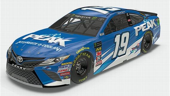
Martin Truex Jr. #19 Bass Pro Shops Toyota Camry–No change. C-
Martin Truex Jr. #19 Auto Owner’s Insurance Toyota Camry–New scheme for 2019, blue front with cutting edge designs fade to black. B+
JOE GIBBS RACING #20
Erik Jones #20 Craftsman Toyota Camry–No change. A
Erik Jones #20 DeWalt Toyota Camry–No change. A
Erik Jones #20 SportClips Toyota Camry–New scheme for 2019, same as 2018, but with smartphone added on side. C
Erik Jones #20 Reser’s Fine Foods Toyota Camry–No Change. A
Erik Jones #20 Craftsman Toyota Camry–No change. A
WOOD BROTHERS RACING #21
Paul Menard #21 Motorcraft Ford Mustang–No change. A
Paul Menard #21 Menard’s/Moen Ford Mustang–New scheme for 2019, new Menard’s template with purple front and stripe. B+
Paul Menard #21 Quaker State Ford Mustang–No Change. B-
TEAM PENSKE #22
Joey Logano #22 Pennzoil Ford Mustang–No change. A
Joey Logano #22 Shell/Pennzoil Ford Mustang–No change. D
HENDRICK MOTORSPORTS #24
William Byron #24 Axalta Chevy Camaro–No change. A
William Byron #24 UniFirst Chevy Camaro–No change. B-.
William Byron #24 Liberty University Chevy Camaro–No change. A
William Byron #24 Hertz Chevy Camaro–No change. A
PREMIUM MOTORSPORTS #27
Casey Mears #27 Rim Ryderz Chevy Camaro-New sponsor for 2019, black with orange and yellow stripes. A-
RICHARD CHILDRESS RACING #31
Tyler Reddick #31 Symbicort Chevy Camaro–New scheme for 2019, more yellow, less blue, new side designs. C-
GO FAS RACING #32
Corey Lajoie #32 Keen Parts/Corvette Parts Ford Mustang–New scheme for 2019, black with red and silver stripes on sides. B-
Corey LaJoie #32 Schluter Systems Ford Mustang–New scheme for 2019, orange with black designs. A
Corey LaJoie #32 Old Spice Ford Mustang-New sponsor for 2019, LaJoie’s face and hair across whole car. F
Corey LaJoie #32 Prospr Parts Ford Mustang-New sponsor for 2019, black, fade to red, with black stripes near door number. A
Corey LaJoie #32 The Hartford Group Ford Mustang–New scheme for 2019, gold with logos. A
FRONT ROW MOTORSPORTS #34
Michael McDowell #34 Love’s Truck Stops Ford Mustang–No change. A
Michael McDowell #34 Fr8 Auctions Ford Mustang–New scheme for 2019, gray front, carbon fiber and red across sides. B+
Michael McDowell #34 Dockside Logistics Ford Mustang–New scheme for 2019, black with red designs on sides. B+
FRONT ROW MOTORSPORTS #36
Matt Tifft #36 Speedco Ford Mustang–No change. A
Matt Tift #36 Surface Sunscreen Ford Mustang-New sponsor for 2019, gray with face designs on bottom. B+
JTG DAUGHERTY RACING #37
Chris Buescher #37 Kleenex Wet Wipes Chevy Camaro–No change. B+
Chris Buescher #37 Scott Comfort Plus Chevy Camaro–No change. C-
Chris Buescher #37 Natural Light Naturdays Chevy Camaro-New sponsor for 2019, beige, fade to yellow to beige. F
Chris Buescher #37 Kroger Flavor Fill Up Chevy Camaro-New sponsor for 2019, black, green, and red with tire mark motif. D-
FRONT ROW MOTORSPORTS #38
David Ragan #38 Select Blinds Ford Mustang-New sponsor for 2019, blue with white and purple designs on sides. B
David Ragan #38 Citgard Ford Mustang–New scheme for 2019, red sides, white front, some stripes across sides. B+
David Ragan #38 Fireade Ford Mustang-New sponsor for 2019, black with yellow and green designs on sides. C-
David Ragan #38 MDS Ford Mustang–New scheme for 2019, white with blue and orange designs. B+
CHIP GANASSI RACING #40
Jamie McMurray #40 McDonald’s/Cessna Chevy Camaro–New scheme for 2019, toned down version of 2018 scheme. A
Jamie McMurray #40 Advent Health Chevy Camaro-New sponsor for 2019, green, blue, pink, and silver with cutting edge design on sides. F
Jamie McMurray #40 McDonald’s/Cessna Chevy Camaro–No change. A
STEWART-HAAS RACING #41
Daniel Suarez #41 Haas Automotion Ford Mustang–New scheme for 2019, red front, black camo rear. F
Daniel Suarrez #41 Aaris Ford Mustang-New scheme for 2019, orange top, black bottom, white stripe between the two. A
Daniel Suarez #41 Arris Ruckus Ford Mustang–New scheme for 2019, black bottom, white top, orange stripe between. A
CHIP GANASSI RACING #42
Kyle Larson #42 Credit One Chevy Camaro–New scheme for 2019, redesign of the 2018 scheme. A
Kyle Larson #42 McDonald’s Team Classic Chevy Camaro-New scheme for 2019, red with over sized McDonald’s logos across car. A
RICHARD PETTY MOTORSPORTS #43
Darrell Wallace Jr. #43 Air Force Chevy Camaro–No change. A
Darrell Wallace Jr. #43 Plan B Sales Chevy Camaro–New scheme for 2019,dark blue, Petty blue, silver, and white with designs on sides. F
Darrell Wallace Jr. #43 Aftershokz Chevy Camaro-New sponsor for 2018, black front, Petty blue rear. A
Darrell Wallace Jr. #43 McDonald’s Team Bacon Chevy Camaro-New sponsor for 2019, white with over sized McDonald’s logos, red hood, and red square over car numbers. B+
Darrell Wallace Jr. #43 Transportation Impact Chevy Camaro–No change. A
JTG DAUGHERTY RACING #47
Ryan Preece #47 Kroger Chevy Camaro–New scheme for 2018, patriotic motif across whole car. A
HENDRICK MOTORSPORTS #48
Jimmie Johnson #48 Ally Financial Chevy Camaro-New sponsor for 2019, black with blue designs on wheel well. A
RICK WARE RACING #51
BJ McCleod #51 Jacob Companies Chevy Camaro–New scheme for 2019, blue with silver and white designs across car. B
RICK WARE RACING #52
Cody Ware #52 Winn-Dixie Chevy Camaro–New sponsor for 2019, red front, black middle, red rear. A
BJ McLeod #52 Trick Shot Chevy Camaro-New sponsor for 2019, green top, black and gold marker design over red. F
BJ McLeod #52 MTEL-ONE Chevy Camaro-New sponsor for 2019, same as Jacob Companies, but with orange added. B
BEARD MOTORSPORTS #62
Brendan Gaughan #62 Beard Oil/South Point Chevy Camaro–No change. A
PREMIUM MOTORSPORTS #66
Joey Gase #66 AgriSupply Toyota Camry-New scheme for 2019, light blue with blue, yellow, white, and black curved stripe on sides. C
Joey Gase #66 www.NVDonor.org Toyota Camry-New sponsor for 2019, black with yellow and blue waves across sides. B-
TOMMY BALDWIN RACING #71
Ryan Truex #71 Accell Construction Chevy Camaro–No change. A
SPIRE MOTORSPORTS #77
Garrett Smithley #77 HeroBox, Harrell’s and Precision Turf Chevy Camaro-New sponsors for 2019, black with red and white curves up sides of car. A
Reed Sorenson #77 Chevy Camaro-New scheme for 2019, plain black. A
Quin Houff #77 Rim Ryderz Chevy Camaro-New sponsor for 2019, same as #15/27. A-
Garrett Smithley #77 CDF Firefighters Benevolent Foundation Chevy Camaro-New sponsor for 2019, black with sponsor logos. A
HENDRICK MOTORSPORTS #88
Alex Bowman #88 LLumar Window Film Chevy Camaro–New scheme for 2019, white front and top, orange and red rear, wave pattern in between. C
Alex Bowman #88 Valvoline Chevy Camaro–No change. A
Alex Bowman #88 Nationwide Chevy Camaro–New scheme for 2019, blue hood and roof, white side, blue stripe across bottom. A
Alex Bowman #88 Nationwide Pet Insurance Chevy Camaro-New sponsor for 2019, white front, blue rear, diagonal separation. A
LEAVINE FAMILY RACING #95
Matt DiBenedetto #95 Procore Chevy Toyota Camry–No change. F
Matt DiBenedetto #95 Dumont Jets Toyota Camry–New scheme for 2019, some slight changes from 2018. B-
Matt DiBenedetto #95 Procore Chevy Toyota Camry-New scheme for 2019, black with orange and white accents, and motherboard motif across car. B+
GAUNT BROS RACING #96
Parker Kligerman #96 Toyota: Proud Sponsor of Team USA Toyota Camry-New sponsor for 2019, white front, red and blue rear, starts added.
Parker Kligerman #96 Gaunt Brothers Racing Toyota Camry–No change. A
OBAIKA RACING #97
Tanner Berryhill #97 II:WAVE Toyota Camry-New sponsor for 2019, black with white logos. A

