
Tag: nascar craftsman truck series
DGF2099 Productions-Introduction to Press Kits-1995 Bill Sedgewick Press Kit
Bill Sedgewick raced for one season in the Die Hard Chevy 1500 CKfor the 1996 Craftsman Truck Series for Darrell Waltrip Motorsports, and this press kit was issued for that season.
The Driver Suit Blog-“Press Kit” Does NOT Mean Ironing a Uniform!
By David G. Firestone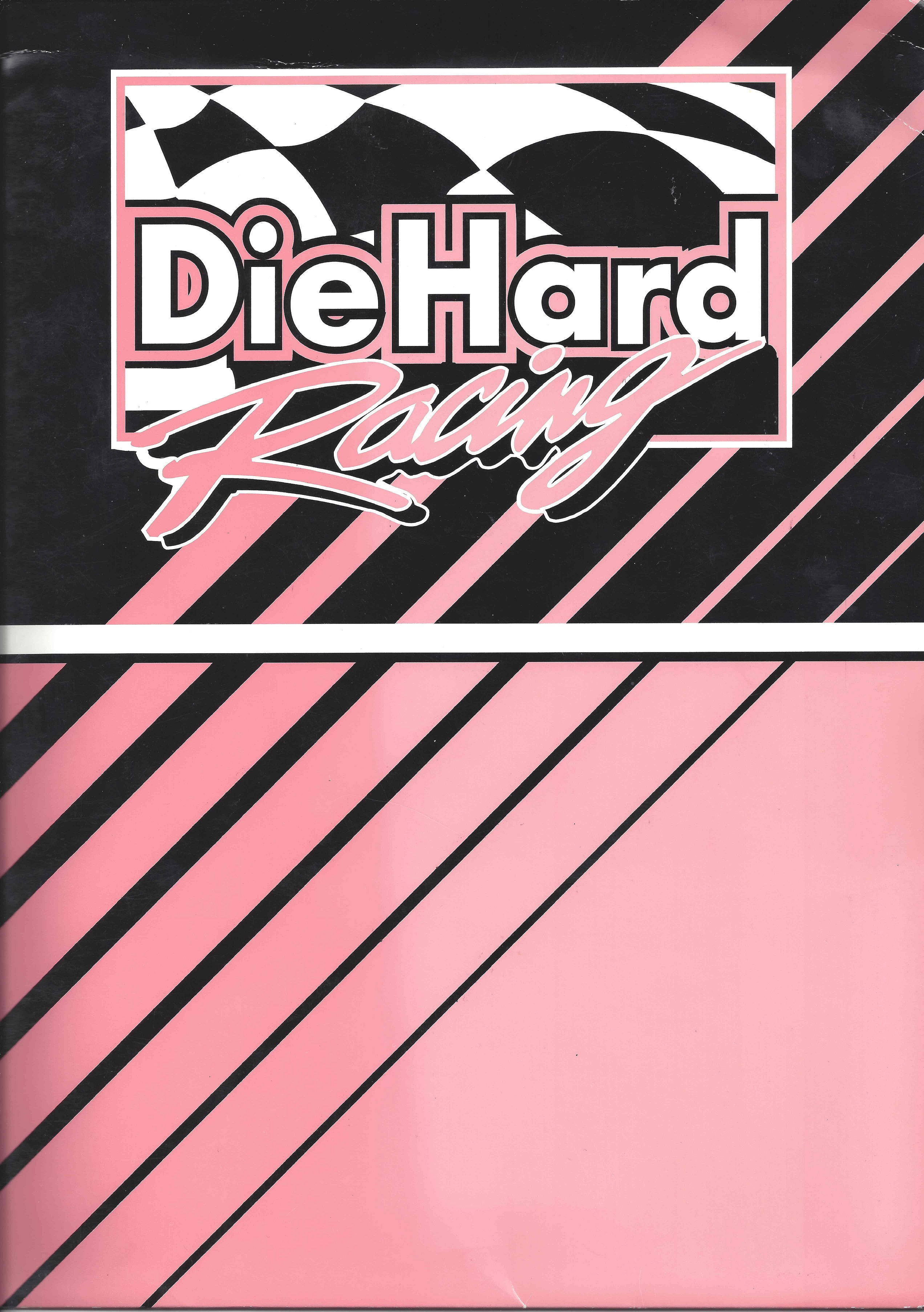 Hope you all had a great holiday season, whatever you celebrate. I turned 32 on Thursday, and am celebrating the first year of the The Driver Suit Blog. Ok, enough sappy stuff, on to this week’s column.We’ve discussed photo-matching before, but here is something regarding photo matching that many people don’t know about, using press kits to photo match a suit. Press Kits are defined on Wikipedia as “a prepackaged set of promotional materials of a person, company, or organization distributed to the media for promotional use.” In sports, these are usually distributed to the media, prior to the start of the season, and usually contain information about players, statistics on players, history of the teams, photos, and the occasional gift.
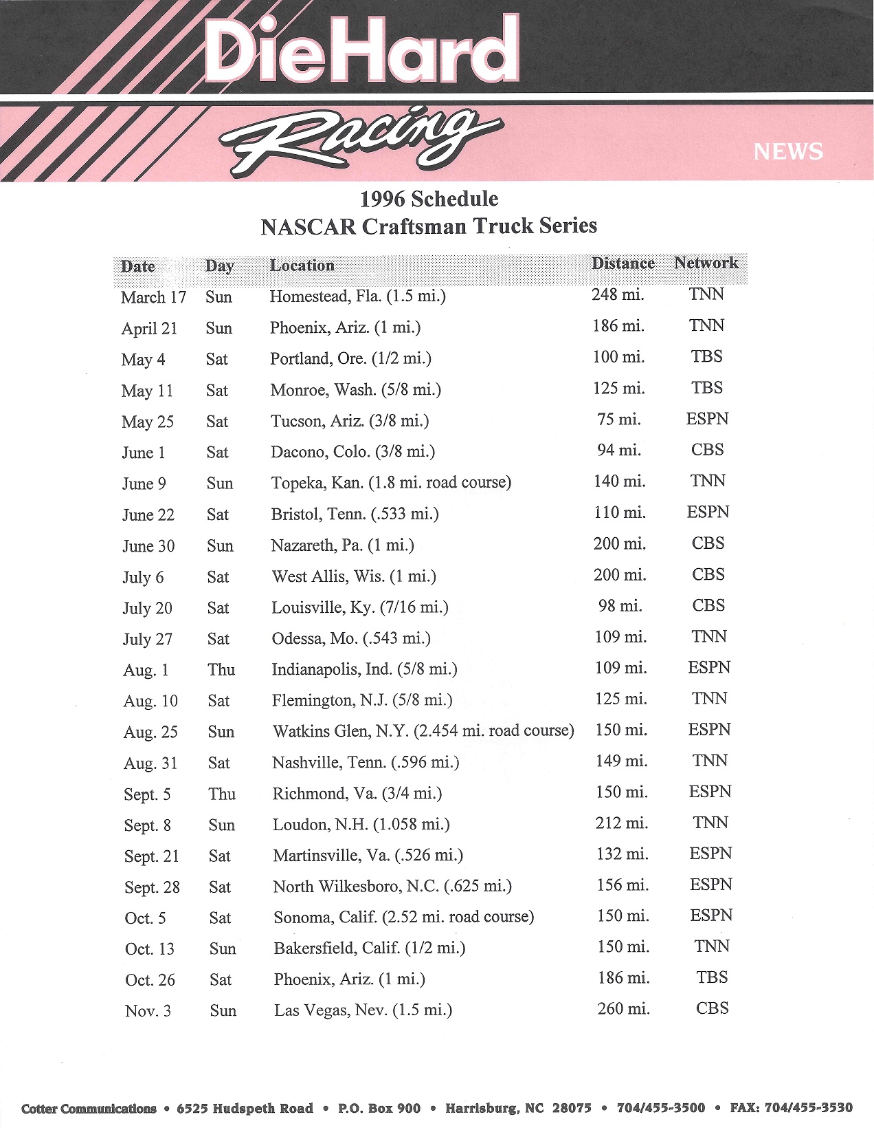
NASCAR teams distribute these to the media before and during the season, and they often find their way into the hands of collectors. These kits are fun to collect, and I enjoy looking at the various driver suits that the drivers are wearing. These have a serious side in the collectors market, as they can easily be used for photo-matching. This is an example of a NASCAR press kit, this one from 1996. Bill Sedgwick was the driver of the #17 Die Hard Chevy C-1500. The team was owned by Darrell Waltrip, who also raced for the team in a number of events. In 1996, he started 23 of the 24 races in the Craftsman Truck Series, and had a decent season, with 3 top 5’s and 8 top 10’s, including a 2nd place finish at Milwaukee. He finished the season in 14th place. During the season, this press kit was distributed to the media. It comes in a custom folder,
  and contains race statistics
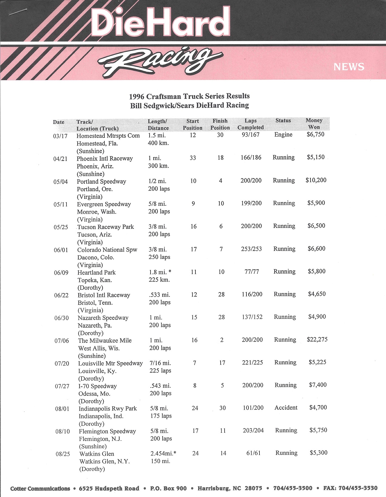


 a driver profile
 ,an owner profile
  ,sponsor information,
 technical information,
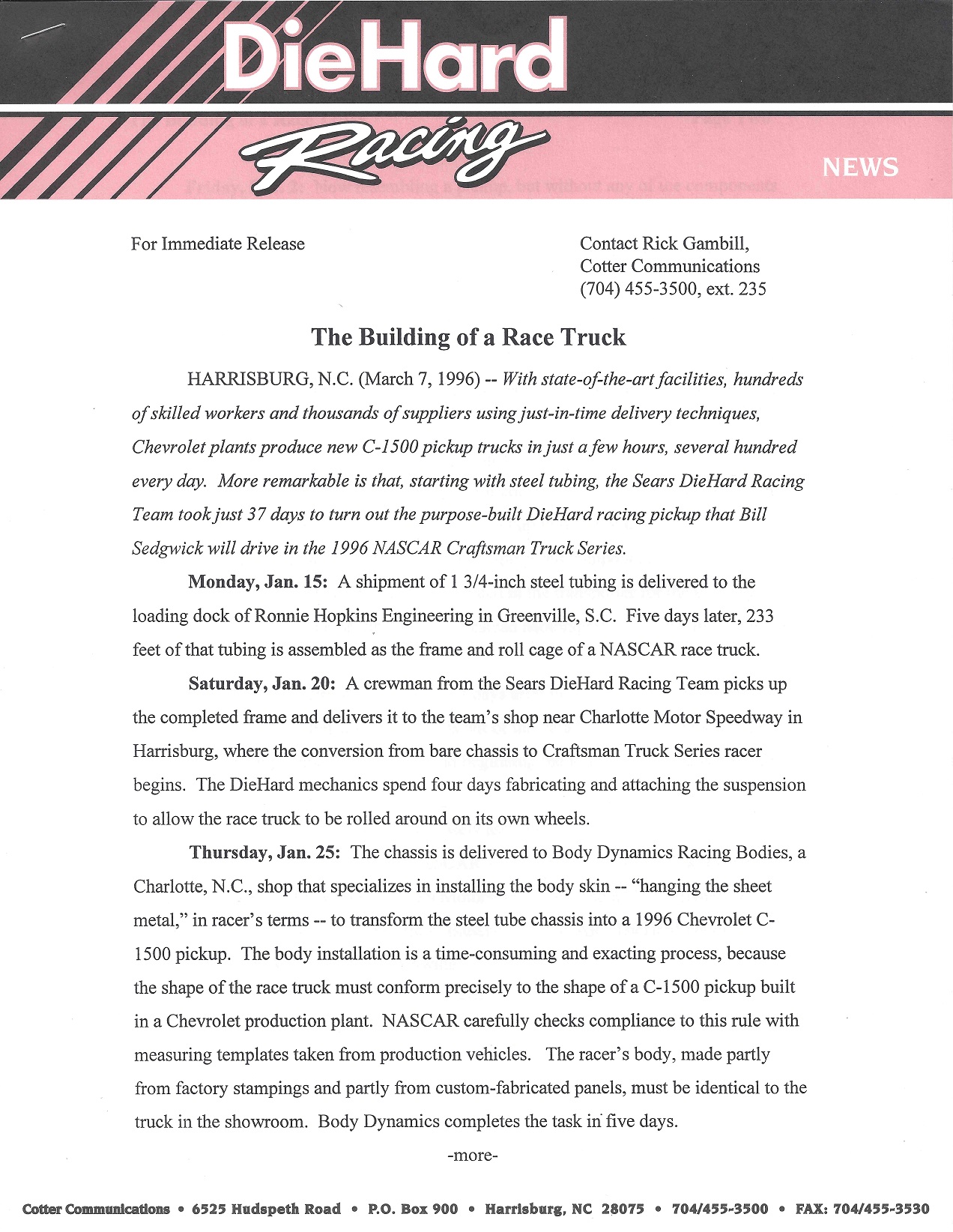

 a bumper sticker,
 and a photo of both Darrell and Bill.
 I own Sedgwick’s suit from that season, it was the first driver suit I ever bought.

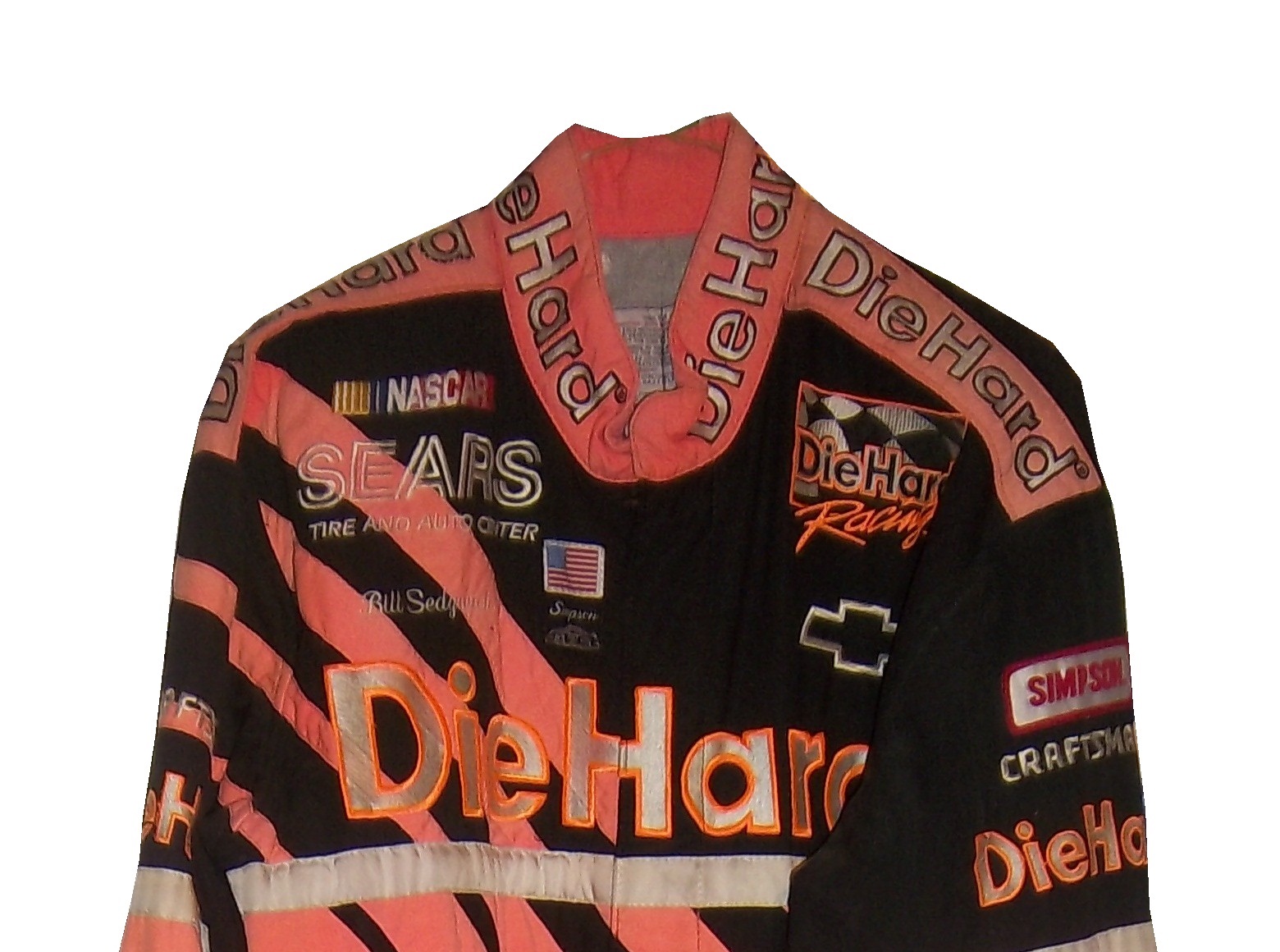
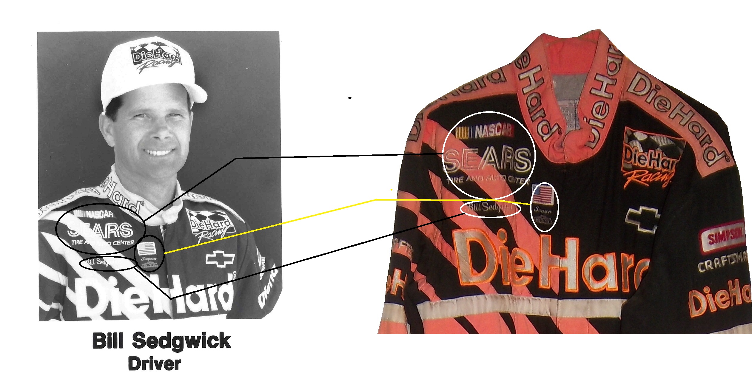 I tried to find a picture of any kind of him wearing the suit, but had no luck, until I found the press kit, and the black and white photo of him wearing the suit. So I bought it and photo matched the suit. Photo-matching, though time-consuming, it is a part of this hobby that is a necessary evil. If you buy a driver suit, helmet, or anything else worn by a driver, finding pictures or video of the driver wearing the suit is crucial to authenticating the suit. Sometimes traditional manners come up empty, and a press kit is the only way. Kits typically run between $5 and $30, so they can be pricy, but the upside to this is that when it works, you have indisputable proof that this suit was worn by the driver in question.
This last year, I took exception with a display at the Museum of Science and Industry concerning an obviously fake helmet that is being passed off as real. I recently went back there after sending my argument that the sign should be changed. Last time I went the display had been emptied: Recently, I went back and went back to the display, and saw this:
 The display has been restored, and it looks really good except…
 THE SIGN HASN’T BEEN CHANGED! I want to love this display, I really do, but I can’t ignore the fact that there is a fake item being represented as real. I have seen items from museum collections go up for sale to the public, and I have to make sure a fake item doesn’t get misrepresented as real.
PAINT SCHEME REVIEWS
Tony Stewart #14 Mobil 1 Chevy SS The color scheme is good, but the design is horrid! The contrast between the black and the white looks awful. As much as I want to defend this scheme, I can’t. F
Tony Stewart #14 Bass Pro Shop Chevy SS Same scheme as last year, same C- grade. Also, it appears that the last name on the windshield has larger lettering than last year.
Tony Stewart #14 Rush Truck Centers Chevy SS Same Scheme as last year, same A grade
Matt Kenseth #20 Home Depot/Huskey Toyota Camry I would give this scheme an A grade, but the yellow back bumper ruins it. The clash between the two just works awkward, and it takes an A scheme down to a C
The Driver Suit Blog-Neck Backs…A Hotbed for Unique Customizations.
 The driver suit is almost always customized for the driver, and as such, the driver has the option of adding customizations to the suit. This may come in the form of size,
and belt design, but the back of the neck is a unique place for customizations. The designs that are placed on the back of the neck are as unique as the driver themselves.
 I’ve gone at length to discuss the FIA certification which is frequently sewn into the back of the neck. This is a prominent feature in Formula 1 and IndyCar. That is standard issue, so no real need to comment on it any more.
 In NASCAR, the back of the neck can be used for a myriad of different customizations. One of the most common is a car number, such as this Christian Fittipaldi suit,
  and another common feature can be sponsor logos, such as this Randy LaJoie Bob Evans suit from 1999-2000,
 and this Joey Miller Craftsman Truck Series suit from 2005.
 This Kasey Kahne suit has the Evernham Motorsports logo sewn into the back of the neck.
 And Roger Penske likes to have the American Flag on the back of the neck of his suits, as evidenced by this David Stremme suit from 2009.
 Older Simpson driver suits have been known to have an inventory number sewn here, as exampled by this Mike Skinner suit from 1997,
 and this Stevie Reeves example, again from 1997.
 But for my money, the personal customizations are more fun when they are as unique as the driver is. In this Terry Labonte suit, Terry has added a Texas logo.
 My favorite customization is from a Boris Said suit from 2005. Said has added a Boris Badenov design to the back of his neck.
 It’s the little things that make a suit personal, and these are some of those little things. Who says a driver suit can’t be fun.
And of course, it goes without saying that the neck is frequently left blank, as exampled by this Nort Northam suit from 1988.
Jamie McMurray #1 Cessna Patriotic Chevy SS Pretty good scheme here, red white and blue is always a solid scheme, but the one gripe I have is the pointless circle around the door number. While it gives the car a vintage look, it is just out of place here. Even still, this scheme is a solid A-
Brad Keselowski #2 Miller Lite Patriotic Ford Fusion Solid scheme, nothing to complain about, A+
Kasey Kahne #5 Hendrick Cars Chevy SS Red white and black is a very solid color scheme, and the design, while a bit convoluted looks really good. It has a hurricane-esquire design that looks really good. A-
Danica Patrick #10 Go Daddy .US Chevy SS The simple design of this scheme looks really good…but what is going on with the colors? Why is the car painted in Russian dressing green? Russian dressing is good, but not as a color scheme. The red white and blue designs clash, and it just looks awful. D-
Clint Bowyer #15 Peak Blue DEF Toyota Camry I gave this scheme a B grade, and the logo change on the hood does nothing to either add or subtract for this grade. B
Greg Biffle #16 3M Statue Of Liberty Ford Fusion Amazing how a better color scheme, as well as the Statue of Liberty design take a C grade and bring it up to a B
Kyle Busch #18 Interstate Batteries All Battery Center Toyota Camry Now THIS is what an Interstate Batteries scheme should be! The classic dark green, gold and white color scheme is amazing, and the design is simple yet very attractive. Giving this scheme an A+ is not saying enough about how great this scheme is!
Jeff Gordon #24 Axalta Standox Chevy SS White flames on a blue background? Seriously? I could forgive it if it was blue flames on a white background, blue flames look really good. But white flames? This design ruins a great color scheme AND a great design scheme TOGETHER! Now that is impressive! F-
Kevin Harvick #29 Budweiser Folds of Honor Chevy SS The Patriotic schemes worked quite well this year, and this is another example of that. A-
Jeff Burton #31 Quikset Chevy SS Decent color scheme but the design needs a little work. If the red was on the hood, roof and deck-lid and the black was on the sides, I would give it an A, but the shark-fin design is brutal on the eyes, and serves no real purpose. As such, I can only give it a C-
JJ Yeley #36 Golden Coral Patriotic Chevy SS Another A grade Patriotic scheme.
AJ Allmendinger #51 Neil Bonnett Throwback Chevy SS While I like most throwback schemes, this one, while accurate, has the worst color scheme I have ever seen. It just screams 1980’s. Hot pink and neon yellow really stands out, and not in a good way. Still, I do miss Neil, and they were pretty accurate, so I will give this scheme a B
Carl Edwards #99 Subway Ahhvocado Ford Fusion Good color scheme and a simple design. I’m not a fan of avocados on sandwiches, but this is a good solid A scheme.
The Driver Suit Blog-The Epaulet…What It Was, and What It Is
 The mighty epaulet, every racing fan has seen them, but few understand what they are for. They are now mostly for fashion and sponsor exposure, but epaulets have a more interesting history than one might think.
 Back in the 1950′s and 60′s, racing suits were supposed to provide fire protection, but early versions of the suit were very unreliable. Many drivers perished in fires, and sometimes, drivers were trapped within the car, unable to escape the raging inferno within their car. The solution? The epaulet. Mounted on both shoulders, epaulets were reinforced strips of fabric specifically designed to help pull an injured or unconscious driver from a burning car. Epaulets quickly became an integral part of the driver suit.
As racing technology became more advanced, the need for epaulets for safety began to decrease, but this was happening at a time when coverage was increasing and sponsorship was rising. It did not take that long for sponsors to realize that they could slap a logo on the epaulet and get the company name more visible on pictures and TV interviews. As such the epaulet made the successful transition from safety feature to fashion accessory.
 As in-car cameras began to become commonplace across racing, epaulets evolved with them. I mentioned in a previous post that Christian Fittipaldi favored epaulet styles used in F1 and IndyCar. When Sparco first came to NASCAR in the early 2000′s, they brought their epaulet style with them, and it quickly became the standard for NASCAR epaulet style. Most driver suits worn in NASCAR today involve some variation of the Sparco epaulet. They have evolved very well over the years, and are a familiar part of the driver suit
Moving on to paint schemes…
First the NASCAR Camping Word Truck Series
Ty Dillon #3 Bass Pro Shops Chevy Silverado Bass Pro Shops has a great scheme this year, both in the Cup series, and this scheme is just good. Nothing wrong, everything right, Final grade: A+
Brendan Gaughn #62 South Point Hotel and Casino Chevy Silverardo This scheme is very simple, and looks really good. The color scheme is solid, and brings back memories of Rusty Wallace driving for Miller Genuine Draft. The lettering is easy to read, and stands out. Final Grade: A
Now on to the Sprint cup Series…
Trevor Bayne #21 Ford Motorcraft/Quick Lane Ford Fusion I think this is a prototype, but that said, this is still a classic scheme. It has a great color scheme, number design, and is just a solid scheme all around. Final Grade A+
Jeff Burton #31 Cheerios Chevy SS This scheme is rather under designed for my taste. The color scheme is decent, but the gray Cheerio design is hard to see, and looks more like soda carbonation rather than breakfast cereal. Final Grade C+ On a related note some more pics from the Caterpillar scheme have been released, and they are still using the same scheme from last year. It is pretty good, so my final grade will not change.
Austin Dillon #33 Honey Honey Nut Cheerios Chevy SS Now this is just awful. The color scheme is bad, and the HONEY NUT CHEERIOS lettering is nearly invisible. The bright blue Kroger logo looks out of place, and the tailpipe decals with rookie stripe just takes more away from an already bad scheme. Final Grade F-
