By David G. FirestoneSome time ago, I did two posts focusing on one item, and for the next two weeks, I’ll do something similar. A part of the driver uniform that is seen by virtually everyone but not really discussed is the visor in the helmet. We see them on in-car cameras and on television, but we don’t think about them by itself that much. It seems like a minor part, but it has an interesting history.
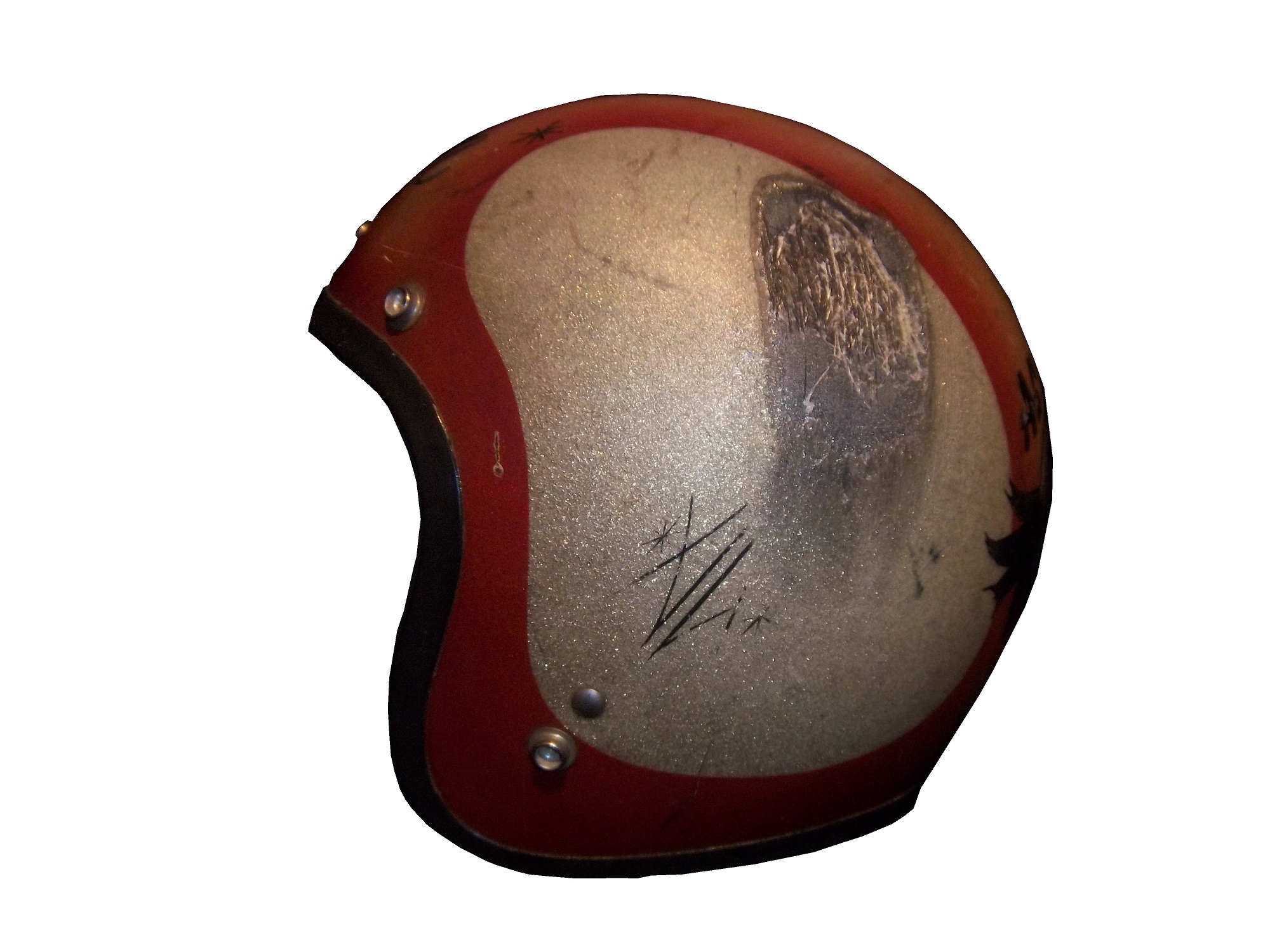
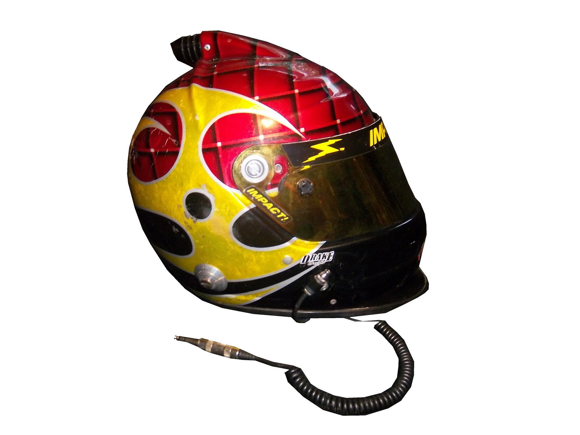
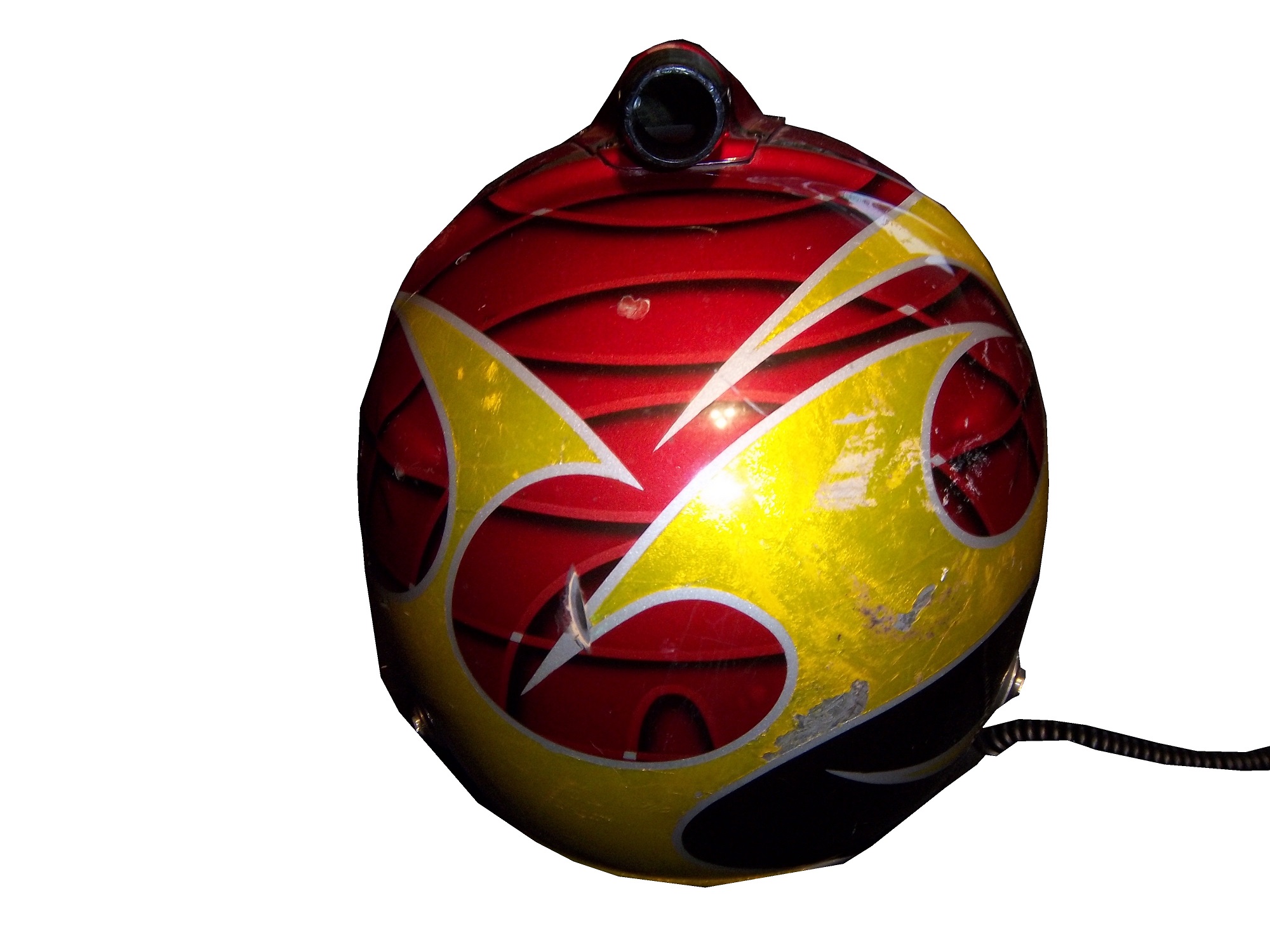
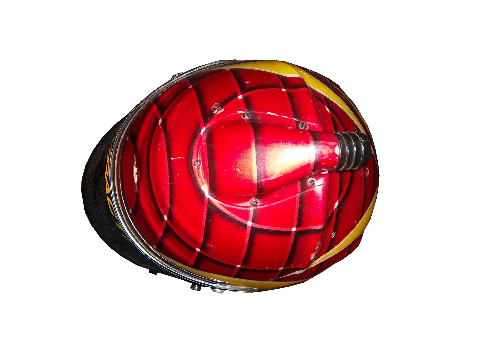
From the 1920’s through the late 1980’s, helmets were primarily open-faced. This example is from the 1960’s, and was worn by Maine short track driver Jim McConnell.These helmets are very simple in design, they just cover the whole head, except for the face. The downside to this is that when the sun shines in the driver’s eyes, or if the car is an open-cockpit the wind can and will force the drivers eyes closed, or fumes from the car can get in a driver’s eyes. As such, these helmets were worn with goggles.As full-faced helmets took over, the visor came attached to the helmet. The early ones were basically plexi-glass but as safety certification got more advanced, the visors were and still are fire tested. They also have to stand impact testing as well. As the helmets became more advanced over the years, so did the visors. Let’s take a look at one:This visor is from the McDonald’s helmet I covered earlier in the year. It is made of a very tough, but very light clear plastic. The visor is attached to the helmet by 3 screws, two that hold the visor to the helmet and a third that guides the visor and keep it in the proper place. There was a 4th one, but it was removed at the driver’s request. The visor has some unique features. At the bottom-left side there is a small flap, which is used by the driver to open the visor. Next to the small flap is a hole for a small peg. The peg goes in the hole, and holds the visors shut, but is small enough so that if a driver wants to open the helmet, they can do so with no trouble. Drivers frequently leave the visor open slightly, so two small knobs, one on each side so the driver can open or close the visor.Notice that it has a yellow-ish tint. This is one of 3 options for drivers, dark tint, light tint, and clear. The visor is designed to be easily changed at the drivers request. Clear visors are used for night races, and tinted ones are used for sunny races. In the event a race goes from day to night, a driver can use a tinted tear off, so that when it gets dark, they can remove the tint and have a clear visor.Like eyeglasses, visors get scratched over time. As such, they are changed often. Like most other items racing teams and drivers use, when they are no longed needed, they are sold to the general public. They are frequently autographed by drivers, and are a popular item to get signed by drivers. They are interesting to look at, and interesting to examine up-close. All helmet visors in this day in age have a sponsor stripe across the top, and we’ll cover that next week.
Kasey Kahne #5 Farmers Insurance Chevy SS It’s amazing what a different shade of paint can do to a paint scheme. This years Farmer’s scheme earned a D+ because of the primary color, this scheme earns a B+ because of the color. The design needs some work, but the whole scheme is a major improvement.
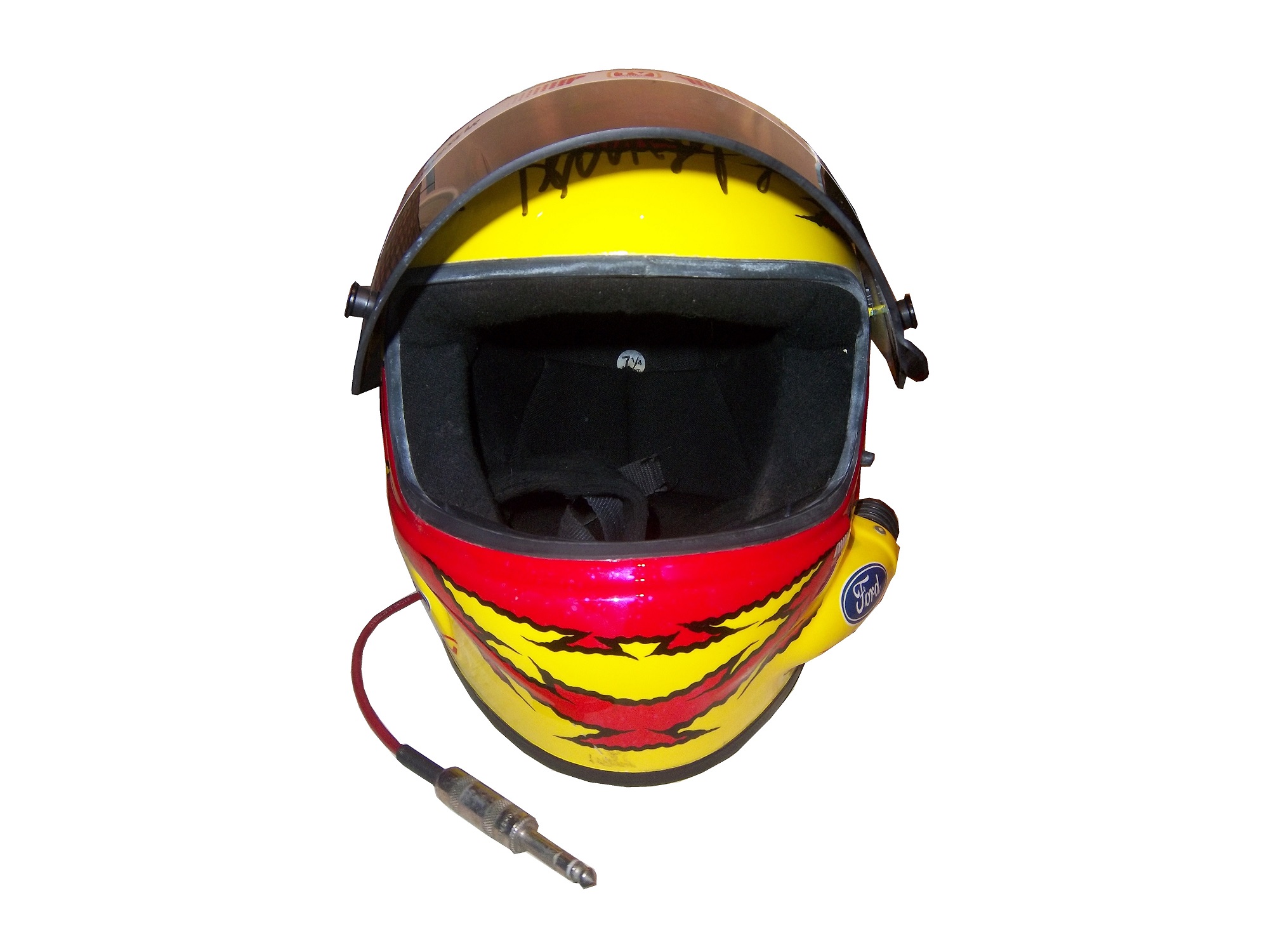
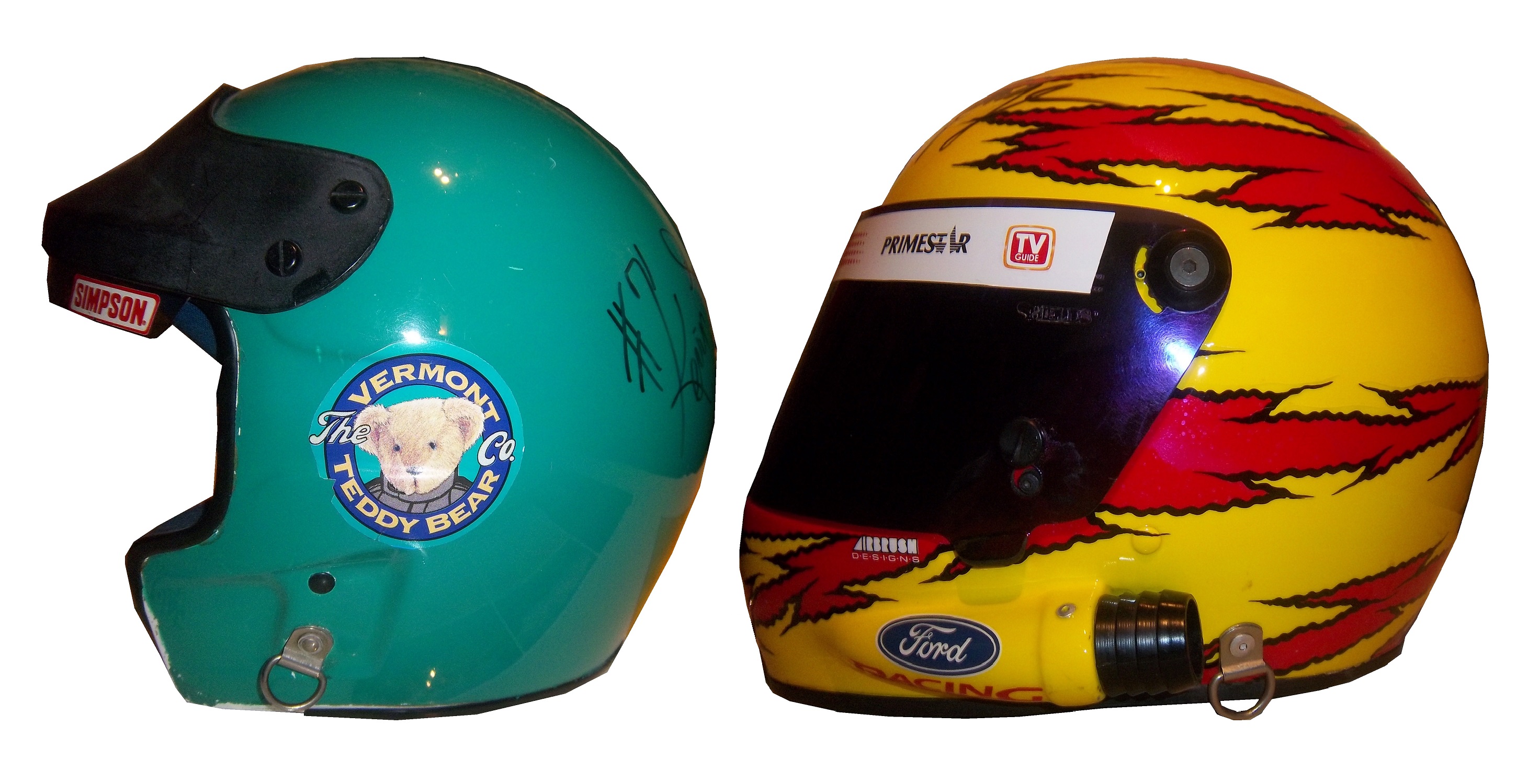
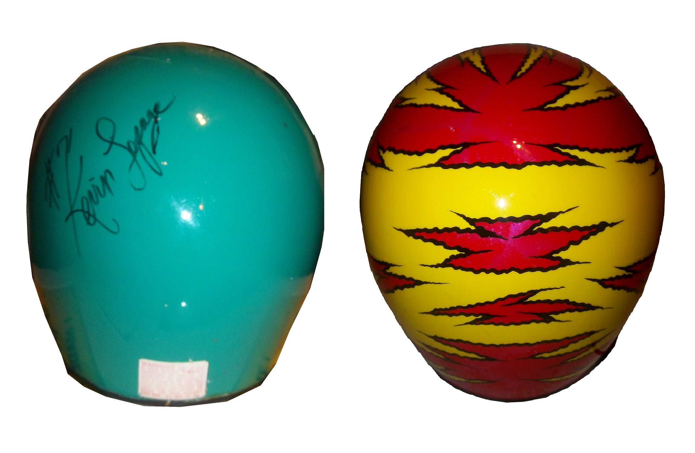
[Editor’s Note: Originally, this week was a post dedicated to primary sponsor logos. However, I had this column on the shelf for a while, but given recent events in the NFL, which fellow uniform blogger Paul Lukashas covered in depth, I felt that this article concerning helmet safety in NASCAR would be appropriate to run this week, with the primary sponsor logo column running next week. DF]Prior to the tragic events of the 2001 Daytona 500, drivers had to make a choice that in this day in age seems absolutely absurd. From the beginning of NASCAR to that tragic day drivers had their choice of helmets, and they were open-faced,or full-face.To examine the merits and demerits of both helmets let’s take a look at one example of each, both worn by the same driver, Kevin Lepage. First, the open-faced helmetWorn in the Nationwide Series in 1994 and 1995 during his rookie and sophomore seasons, this helmet bears a decal from high-end plush toy company Vermont Teddy Bears. It shows very heavy use, with scratches and scuff marks, has had the microphone equipment removed, and Lepage has signed the back of the helmet in black Sharpie.
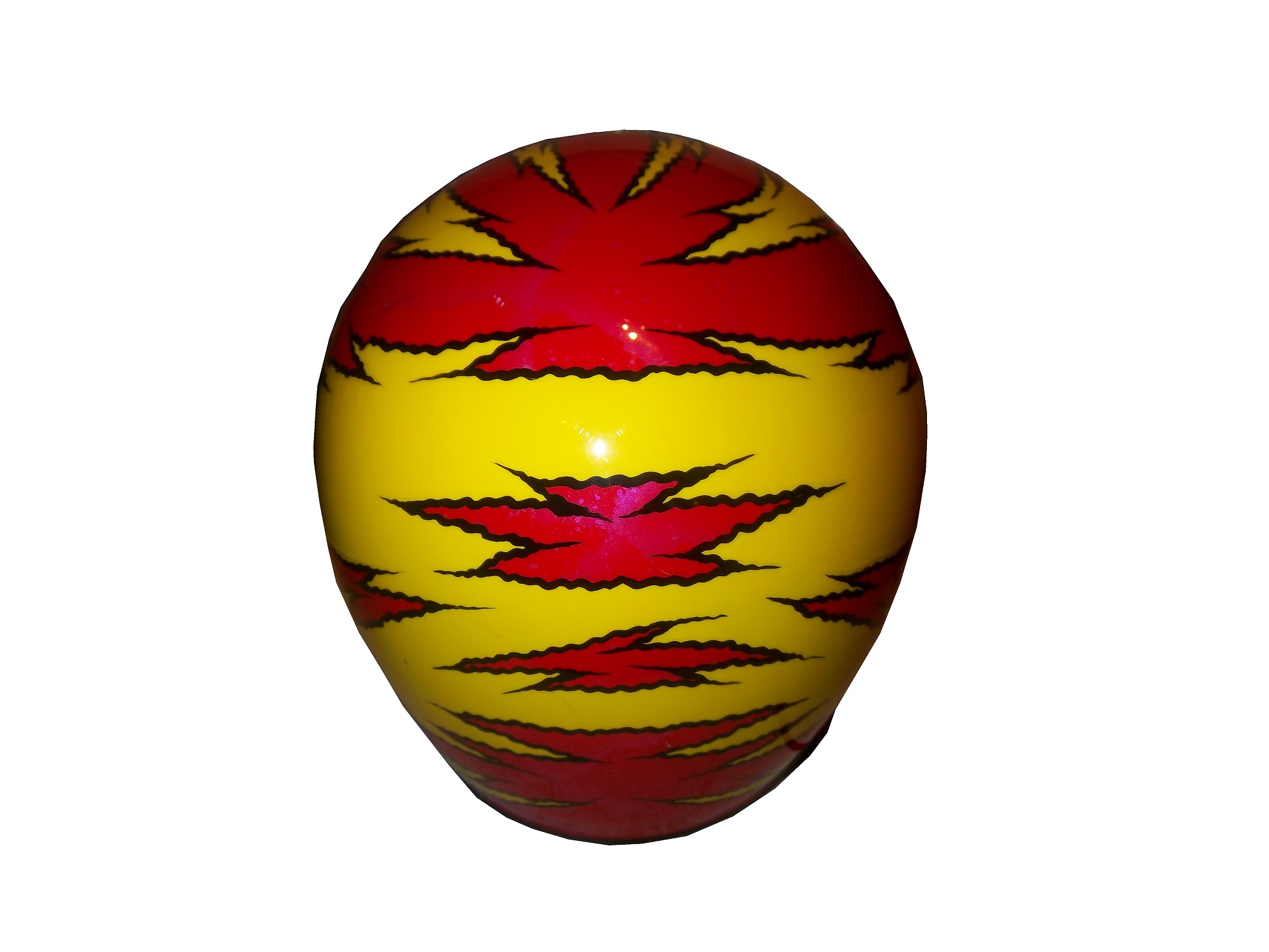
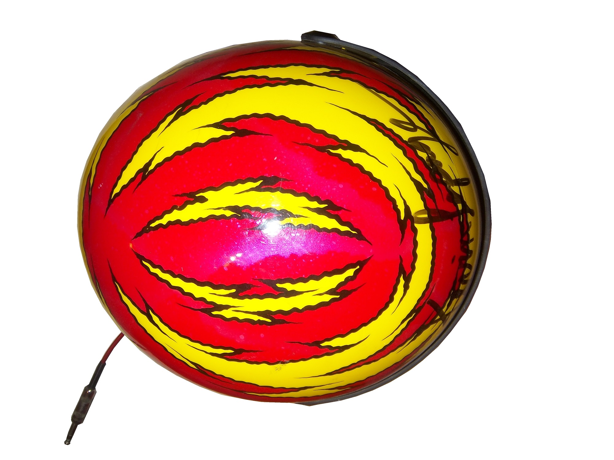
Now let’s look at the full-face helmet,Worn by Lepage in the 1999 Winston Cup season, this helmet was painted for the combination Primestar/TV Guide #16 Ford. Like the open-faced helmet, it shows scratches and scuff marks, and Lepage has signed the top of the helmet above the visor. Unlike the open-faced helmet, this helmet still has the microphone equipment.
Now on to the comparison…
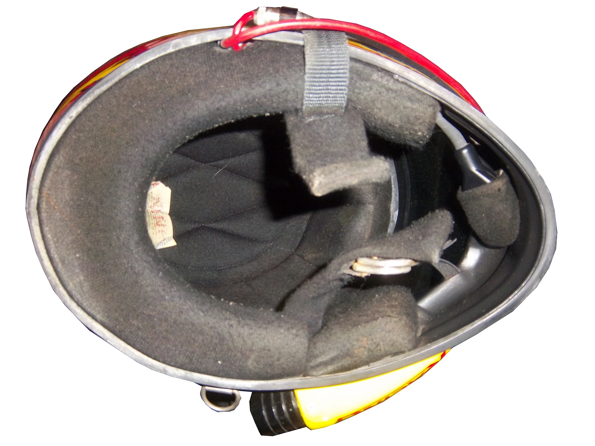
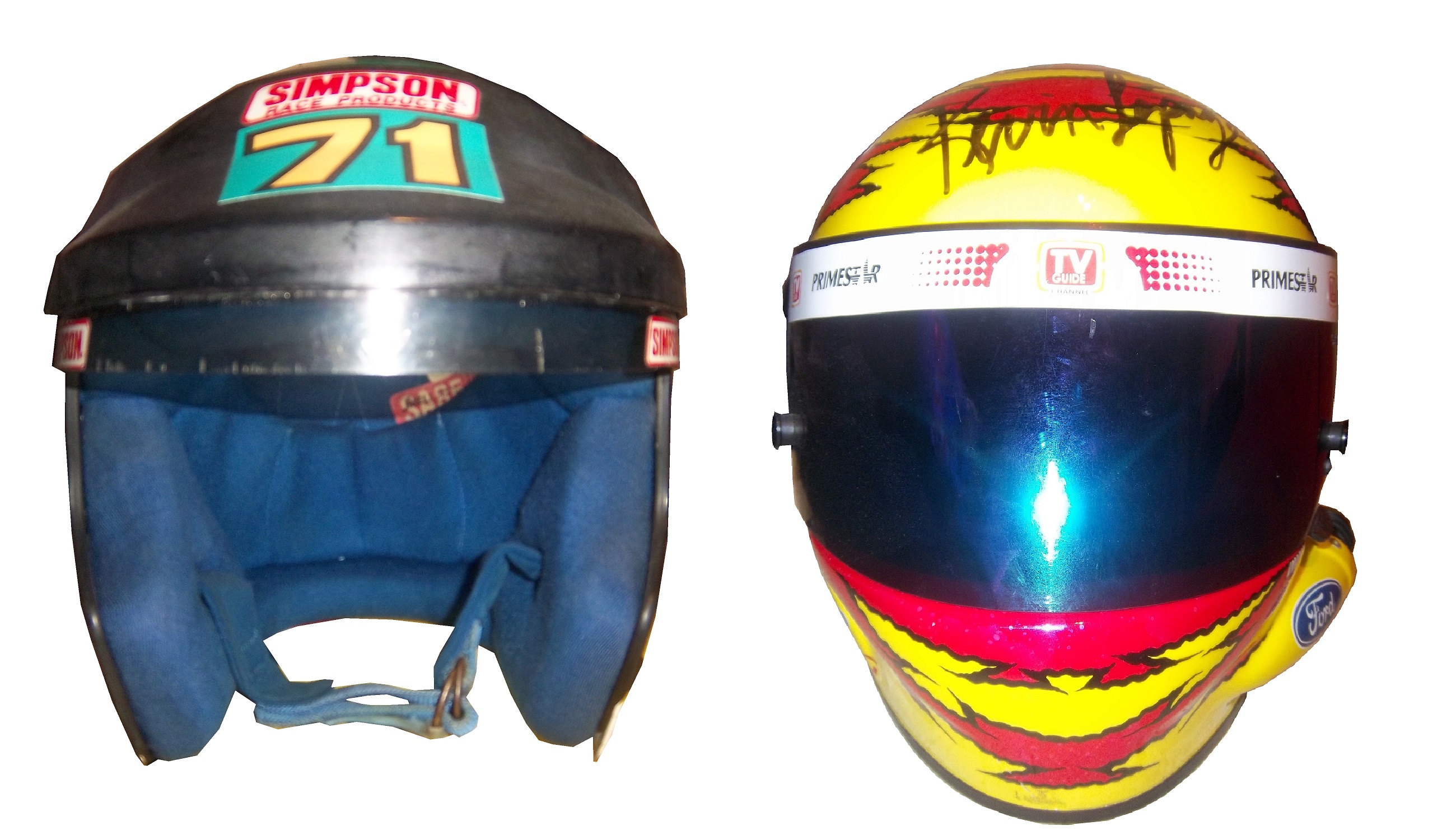
Looking at the helmets from the inside, there was no real difference between the two. Both are the same basic design, with the same inner liner and filler.The left sides of the helmets differ greatly. Notice that there is a hose attachment near the Ford logo on the full-faced helmet. This is to accommodate the “hotbox” attachment. Hotboxes are designed to force air into the driver’s face to help keep them cool. This is not a luxury, as driver compartments can reach as high as 160 degrees Fahrenheit, and drivers typically wear 3-4 layers of Nomex during a race. Keep in mind that in-car drinking systems are not standard as of 2000, and the hotbox is a great tool for driver comfort.Microphone equipment is added to the helmet on the right side. The only difference between these two helmets is that the microphone has been removed on the open-faced helmet.The back of the helmets are virtually identical except for the paint schemes and the liability tag present.The front of the helmet is the key to making the decision. Everything else thus far is a minor issue. The question was asked then, and is asked now, why were these helmets legal for as long as they were? These pictures should answer that question:The bottom of the helmet underneath the visor gives an extra bit of safety in case of fire, BUT takes away about 2-3 inches of visibility. That 3 inches might not seem like that much, but in a race car, trying to keep situational awareness of what the car is doing, those 3 inches are as critical as you can imagine. NASCAR at the time had the opinion that if they had the restriction in place, that the obstruction could cause a driver to lose that situational awareness, and lead to a wreck. NASCAR felt that any rule that could cause a wreck is a bad idea, and rightfully so. How often in the wake and investigation of accidents does it reveal that a rule, regulation, or guideline cause an accident? It happens quite often. NASCAR at the time felt that imposing a rule that all helmets should be full-faced that is could very easily lead to an accident, and as such, allowed open-faced helmets to avoid that from happening.
It was a rule that was easy to understand, but would lead to tragedy. It led to this design, which itself is now becoming obsolete:Now, even the best full-faced helmet designs from the 1990’s are now a distant memory and the current helmet design has taken over. It might seem like unfair, but if these rules were in place at the 2001 Daytona 500, we would have never lost a true legend.
Matt Kenseth #20 Husky/500th Start Toyota Camry The gray-scale design does not work here at all. The rest of the car looks very good, but the black and dark gray color scheme needs work. If the Husky red is where the gray is, it would work better, but the best grade I can give is a C-
Austin Dillon #3 Cheerios Chevy SS This is the best Cheerios scheme I have ever seen! The goofy bagel design is gone, and has been replaced with a couple of racing stripes. I also love the black around the #3. If this is the final design, it will be a great car, and I give it an A+!
One aspect of driver suits that has become a target for new customizations in the last 15-17 years is the belt. For many years, the belt was unadorned, or had a very small logo. Belts are a comfort feature, and typically made of the same material that the suit itself is made out of, with the same amount of layers and has a Velcro closure on it. Belts may incorporate a border made with an alternate color, to help it stand out.
Belts had no design or decoration on them for many years, as examined by this Ted Musgrave example from 1995,this Ricky Craven example from 1996,and many more. But it was around that time, that something began to happen. Looking at the Ted Musgrave suit from 1995, his name is embroidered into the left-chest area.In 1998, this had changed so that his name is embroidered into the belt.This was popular in F1 and IndyCar for many years, and is still the way that names are presented on the driver suit. Other examples, such as this Randy Lajoie example circa 1999-2000 will have a sponsor logo embroidered into the belt.Kasey Kahne wore this suit in 2005 at an event, and it has a GOODYEAR logo on the front, and when the belt is opened, on the inside, the FIA certification is present here. Formula 1 and IndyCar have a unique quirk to the design. Since the drivers come from all over the world, the flag from the driver’s home country is sewn into the belt, such as this Alex Barron example from 1998:Not all belts are created equal. Christian Fittipaldi didn’t wear belts on two of his NASCAR suits. The first one, comes from 2002, while he was sponsored by Georgia Pacific, and instead of the belt, he just has his name sewn into the suit.This Christian Fittipaldi example from 2003 features no belt, and no name.This Nort Northam example from the 1988 Sunbank 24 at Daytona, now the Rolex 24 at Daytona, features a belt that is specifically designed to be removed.Many NASCAR action figures will feature the belt designs on them, and many of these figures are pretty accurate, but I think I’ll save that for another blog.
Tailgating Time!
Just for fun, I’ve decided to add a recipe that can easily be made while tailgating at the track. This is my recipe for beer-broiled brats. This works well in the fall, during the Chase, on a cooler day.
You will need:
1 6-pack of beer
1 16oz jar of sauerkraut
½ sliced onion
garlic salt and butter to taste
12 plain, uncooked bratwurst
Take the 6 pack, and pour it into a large pan. Place the pan on the grill or stove, and add 1/4 the jar of sauerkraut, the onions, salt and butter, and finally the brats. Bring to a boil and boil for 8 minutes.
Tip-Do NOT cut or puncture the brats in any way, the casing keeps the juice, and taste in the brats. For more flavor, let soak after cooking. DO NOT OVERBOIL THE BRATS, that is the best way to ruin them.
While the brats are boiling, prepare a grill. Gas or charcoal works either way. After boiling is done, remove from the liquid, and place on the hot grill, and cook 5 minutes per side. Brats are made from pork, and under-cooking them can be hazardous, You want to watch the race from the stands, not a hospital room. Here is a video visualizing the process…
After grilling the brats, toast the buns on the grill for 20 seconds, place the brats in the buns, and serve. For sides, I would recommend some mustard potato salad, some potato or tortilla chips, and, of course, plenty of ice-cold beer!
This recipe will rock your tailgating party at the next race, and I will post more simple recipes for tailgating in the near future.
Paint Scheme Reviews
Jamie McMurray #1 McDonald’s/Monopoly Chevy SS The simple design is good, but the color scheme needs a lot of work. Beige does NOT work on race cars, and this is a perfect example. The Rich Uncle Pennybags(or Mr Monopoly) wearing sunglasses is not very attractive either, so I can give this scheme a C at best.
Kasey Kahne #5 Pepsi Max Chevy SS Are you kidding me? Is it too much to ask to pick a design scheme? You can have a cutting edge purple design which works, OR a matte black design that works, BUT YOU CAN’T HAVE BOTH! The purple, red and black design is good, but the design scheme is just horrible. Even with a good color scheme, this earns an F
Clint Boyer #15 Peak/Duck Dynasty Toyota Camry Oh man, where do I start here? The color scheme would work without the baby blue stripe, the hunting camo roof is just awful, and the overall design just looks forced. This car looks like a bad photoshop job…F
Greg Biffle #16 3MSafety Ford Fusion The contrast between the white and black parts of the car would normally not work, but because it is a safety themed car, and safety coveralls are typically white or black with an orange and silver stripe on them to increase visibility, this scheme makes sense. The colors are good, and I give this scheme an A
Austin Dillon #33 Mycogen Seeds Chevy SS Meh. I like the color scheme, but the front to back arch is overdone, and the is unoriginal at best. I will give it a C
Ron Fellows #33 Canadian Tire Chevy SS Grey red and black can be tough to work with sometimes, but this scheme works very well. The red flames work well, and the otherwise basic design is very attractive. A
Victor Gonzalez Jr. #36 Mobil 1/IMCA Chevy SS This was a late entry into the race in Sonoma, Gonzalez is a “road course ringer” so there was not much time to design and decal a car, but that said, this is a great simple scheme, no pointless design, and a great color scheme. A+
Ryan Newman #39 Quicken Loans/Smurfs 2 Chevy SS Again, as with Kasey Kahne above, PICK A DESIGN SCHEME! You can either have a red and black scheme, or a red and white scheme, BUT NOT BOTH! It looks like someone designed a Smurf scheme, quickly realized that it needed to carry a Quicken Loans design as well, and tried to make a hybrid of the two, which is just awful, and earns an F
Juan Pablo Montoya #42 Depends Chevy SS Is this a good look? Depends! Joking aside, this is not a very good scheme, the green logo works, but the black and grey scheme is awful.
Juan Pablo Montoya #42 Axe Apollo Chevy SS The Apollo Astronaut design is unique. It works very well, and although the design is convulted, it is very attractive. The color scheme works well and this scheme earns an A
Juan Pablo Montoya #42 Energizer Chevy SS From the wheel well forward it is a great scheme. From the driver door backward it is awful. Whatever look they were going for, they missed. It just looks horrible. Great colors, but awful design, D
Aric Almirola #43 Smithfield Helping Hungry Homes Ford Fusion A patriotic scheme, mixed with Petty Blue, that is not overdesigned. Giving this scheme an A is not going far enough to describe how good it is.
Jimmie Johnson #48 Lowes/Disney’s Planes Chevy SS While I like the color scheme and basic design, the hood logo is awful. The door number has a black outline, and it is very visible, but the hood logo which does not have a black outline is next to invisible, which defeats the purpose of having a logo on the car in the first place. That said, it is still a good design, and I will be generous and give it a B.
David Reutimann #83 Dr. Pepper Toyota Camry Dr Pepper has a great color scheme and great designs on their packaging, and this is reflected in this paint scheme. It works very well, and is a great complement to a bottle of Dr. Pepper. A
Tomi Drissi #87 The Wolverine Toyota Camry Many movie paint schemes don’t work, but this is not most movie paint schemes. It is simple, has a great color scheme, and has a great design, and earns an A
Travis Kvapil #83 Burger King Rib Sandwich Toyota Camry BK Racing has a lot of great schemes this year, and this is another one. Great color scheme, great overall design, and I like what they did with the rib sandwich. I’m not a “Rib-wich”guy, but I like this, and give it an A.
The driver suit is almost always customized for the driver, and as such, the driver has the option of adding customizations to the suit. This may come in the form of size,
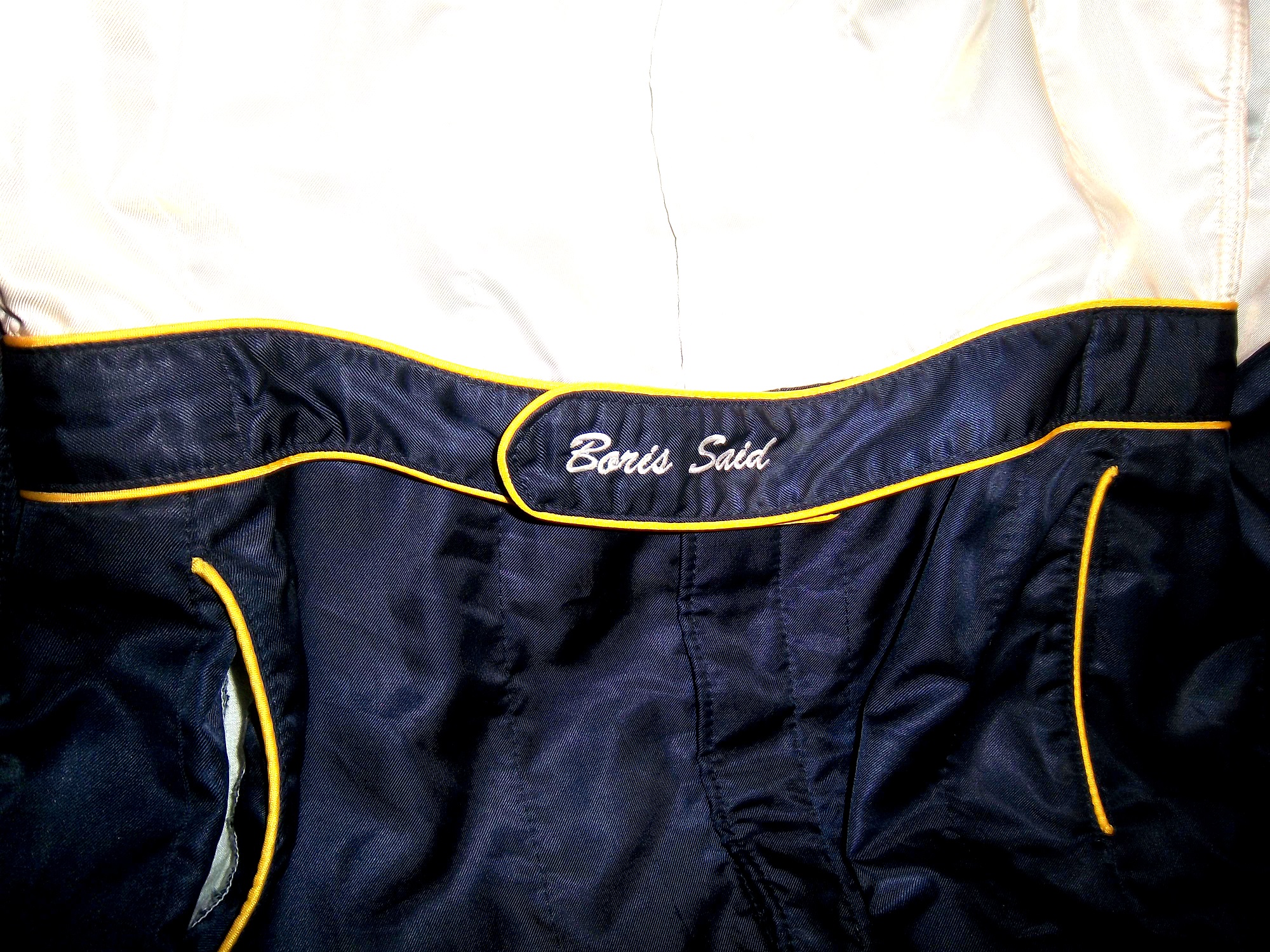
and belt design,but the back of the neck is a unique place for customizations. The designs that are placed on the back of the neck are as unique as the driver themselves.I’ve gone at length to discuss the FIA certification which is frequently sewn into the back of the neck. This is a prominent feature in Formula 1 and IndyCar. That is standard issue, so no real need to comment on it any more.In NASCAR, the back of the neck can be used for a myriad of different customizations. One of the most common is a car number, such as this Christian Fittipaldi suit, and another common feature can be sponsor logos, such as this Randy LaJoie Bob Evans suit from 1999-2000,and this Joey Miller Craftsman Truck Series suit from 2005.This Kasey Kahne suit has the Evernham Motorsports logo sewn into the back of the neck.And Roger Penske likes to have the American Flag on the back of the neck of his suits, as evidenced by this David Stremme suit from 2009.Older Simpson driver suits have been known to have an inventory number sewn here, as exampled by this Mike Skinner suit from 1997,and this Stevie Reeves example, again from 1997.But for my money, the personal customizations are more fun when they are as unique as the driver is. In this Terry Labonte suit, Terry has added a Texas logo.My favorite customization is from a Boris Said suit from 2005. Said has added a Boris Badenov design to the back of his neck.It’s the little things that make a suit personal, and these are some of those little things. Who says a driver suit can’t be fun.
And of course, it goes without saying that the neck is frequently left blank, as exampled by this Nort Northam suit from 1988.
Jamie McMurray #1 Cessna Patriotic Chevy SS Pretty good scheme here, red white and blue is always a solid scheme, but the one gripe I have is the pointless circle around the door number. While it gives the car a vintage look, it is just out of place here. Even still, this scheme is a solid A-
Kasey Kahne #5 Hendrick Cars Chevy SS Red white and black is a very solid color scheme, and the design, while a bit convoluted looks really good. It has a hurricane-esquire design that looks really good. A-
Danica Patrick #10 Go Daddy .US Chevy SS The simple design of this scheme looks really good…but what is going on with the colors? Why is the car painted in Russian dressing green? Russian dressing is good, but not as a color scheme. The red white and blue designs clash, and it just looks awful. D-
Kyle Busch #18 Interstate Batteries All Battery Center Toyota Camry Now THIS is what an Interstate Batteries scheme should be! The classic dark green, gold and white color scheme is amazing, and the design is simple yet very attractive. Giving this scheme an A+ is not saying enough about how great this scheme is!
Jeff Gordon #24 Axalta Standox Chevy SS White flames on a blue background? Seriously? I could forgive it if it was blue flames on a white background, blue flames look really good. But white flames? This design ruins a great color scheme AND a great design scheme TOGETHER! Now that is impressive! F-
Jeff Burton #31 Quikset Chevy SS Decent color scheme but the design needs a little work. If the red was on the hood, roof and deck-lid and the black was on the sides, I would give it an A, but the shark-fin design is brutal on the eyes, and serves no real purpose. As such, I can only give it a C-
AJ Allmendinger #51 Neil Bonnett Throwback Chevy SS While I like most throwback schemes, this one, while accurate, has the worst color scheme I have ever seen. It just screams 1980’s. Hot pink and neon yellow really stands out, and not in a good way. Still, I do miss Neil, and they were pretty accurate, so I will give this scheme a B
We’ve all seen them in telecasts and photos, but what many of us do not realize is what they are and what they do. I am talking about the arm gusset. Arm gussets are seen at the top of the sleeve on a driver suit, under the shoulder. They are a flexible piece of Nomex specifically designed to do two things. One is protect the driver, the other is give the driver some freedom of movement.Arm Gussets are almost always present on race-worn driver suits. Anyone who has worn a one-piece full body jumpsuit can attest to the fact that it restricts freedom of body movement. The gusset takes some of that restriction away. This is important when it comes to driving, because it gives the driver one less thing to concentrate on, and in the worst case scenario, can help a driver escape a burning vehicle much quicker.Gussets have very little variation, though I have seen one unusual one. In this Ricky Craven suit from 1996, the front of the sleeves look like they are attached to the body, whereas the back has a gusset in it. This would be done for driver preference of course, bur I have never seen a half gusset before or since.This Lake Speed suit from 1997 is store bought, as opposed to custom designed, and it has no gussets. This suit would have some restriction of movement. Again this can come down to driver choice.The need for protection vs. the need for driver comfort is a major conflict in the world of racing safety. The gusset is a major meeting point between the two sides involved, and the drivers love them.
Jame McMurray #1 Banana Boat Chevy SS-A scheme that could be a B+ is ruined by an awful color scheme. That orange is the worst I have ever seen on a race car. It takes this scheme and takes to a D-
Brad Keselowski #2 Miller Lite Patriotic Ford Fusion-Taking the stars and stripes and slapping them on a race car can work…just not here. If it was just plain blue with red and white lettering, it would work better, but this just falls flat. C-
Denny Hamlin #11 Sport Clips Toyota Camry-Seriously? Why does it look like a sperm is painted in red on the side of the car? The red/white/black color scheme works, but the door design is just awful! D-
Tony Stewart #14 Code 3 Chevy SS-Love the scheme, love the simple design and great color scheme. Works very well and earns an A+
Clint Bowyer #15 5-Hour Energy Patriotic Toyota Camry-How is this patriotic? Oh….I get it…the stars….just one problem…THE COLOR SCHEME IS WRONG! If it was red white and blue I would like this, but this is just awful! You want to honor America, but can’t get the color scheme right? F-
Greg Biffle #16 3M/Ace/Rite Aid Ford Fusion-The color scheme is good, but the door design is too busy. If it was one single color, it would work quite well, but being a mix of black, blue, red, and white it just looks confusing. It works, but not as well as it could, and earns a C+
Jeff Gordon #24 Axalta Chevy SS-Another DuPont scheme with different logos that works very well. Good color scheme and design. A+
Paul Menard #27 Menard’s/Libman Chevy SS-The Libman green hood design just looks horrible on the yellow background of the car. The green is too light, and if it were darker it might work, but this scheme earns a D
J.J. Yeley #36 Click it or Ticket Chevy SS-Good design, but awful color scheme. The green and blue is just horrible. If one or the other was used it might work, but this is horrific. F
Bobby Labonte #47 Bush’s Grilling Beans Toyota Camry-The overall design and color scheme is good, but the major flaw here is that the quarter panel has 5 different logos, most of which clash with the Bush’s scheme. It takes an A scheme and drags it down to a C
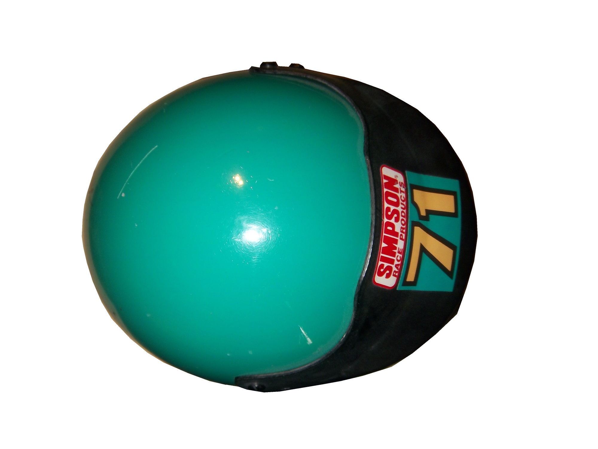
By David G. FirestoneThe evolution of the racing helmet in NASCAR for the most part was slow, in the beginning. NASCAR was officially founded in 1947, two years after World War II ended. Many of the helmets worn during the 1940’s and 1950’s were little more than repainted army and air force helmets. These helmets were basic at best, and as protection for the dangers of racing, these helmets were inadequate at best. During the 1950’s, many drivers switched from military headgear to motorcycle helmets. In the 1960’s, motorcycle-style helmets became the norm.The above helmet was worn by Jim McConnell, who raced and promoted races in Maine, and went on to found Beech Ridge Motor Speedway in Scarborough, Maine. This is a racing helmet, but it looks more like Wyatt’s Captain America helmet from Easy Rider, in its basic design. It has an open face, no microphone equipment, and is rather thin. Although there would be advancements in helmet technology, the open-face design would remain popular until the 1980’s.This helmet was worn by Brad Noffsinger in 1988, it is the same general design, though it is much thicker, has some advancements in visor technology, and had some microphone technology in it as well. Although these helmets have since been banned, they remained legal for as long as they did for one simple reason: Advanced visibility. NASCAR did not want to have a crash caused by decreased visibility due to a rule mandating full-face helmets.The Ted Musgrave helmet mentioned in a previous post is a perfect example. The bottom part covering the chin does to a certain extent reduce visibility for a driver. The logic makes sense, in that if there was a crash caused by reduced visibility, so for the 1990’s and 2000, the open-face was legal…then came the 2001 Daytona 500. That race saw the death of Dale Earnhardt Sr. from a Basilar skull fracture, which as tragic as it was, wasn’t the first death due to sub-par safety equipment. John Nemechek, Adam Petty, Kenny Irwin Jr., and Tony Roper had all been killed in similar accidents. Only after Earnhardt’s death, did the HANS device come to light, and eventually became mandatory in NASCAR, and eventually, across the board in racing. Now the helmets used in NASCAR look like this:This is a helmet worn between 2004 and 2005 by either Regan Smith or Jason Keller. As you can see, it has a number of advancements, including the visor, and air intakes, but the biggest advancement is these small bolts towards the back.These are where the HANS device connects to the helmet. The HANS device was mandated after the death of Dale Earnhardt Sr. to prevent Basilar skull fracture deaths. This device has worked very well. The HANS device works by attaching the device to the helmet, and then being secured by the shoulder straps.
As advanced as this helmet is, there is always room for improvement. What new form will the racing helmet of tomorrow take? Only time will tell.
On to Paint Schemes, we have a lot of ground to cover today…
Sam Hornish Jr. #12 Wurth Tools Ford Mustang The doors look like they have race damage on them already, which is not a good sign. The color scheme is decent, but the Pennzoil stripes just kill it. The logos are easy to see, but the stripes are just awful. Final grade C+
Matt Kenseth #18 Reser’s Foods Toyota Camry. Numbers are great, color scheme is good, logos are easy to see, and the background design is visible, but not overpowering. The only thing keeping this scheme from a higher grade is the picture of the package on the side of the car. That drags the grade down to a B+ from an A
Now moving on to the Sprint Cup Series
Denny Hamlin #11 FedEx Toyota Camry There are a total of 4 variations of the FedEx scheme, Express, Freight, Ground and Office. Right off the bat, the front nose design and stripes are awful. The color schemes are great, as are the logos and numbers, but the stripes kill it. The best grade I can give is a C+ across the board.
Paul Menard #27 Menard’s Chevy SS Not the worst I have ever seen, but the yellow is way too bright, and the massive collection of sponsor stickers on the quarter panel is just ugly. Final Grade C-
The roof ads are next to invisible when viewed from the standard TV cameras. They may look better from in-car cameras, but until I see them, I’ll reserve my judgement…
The radio antennas are much larger than last year, and are much more visible than last year. This may just be the setup for testing, but it looks really ugly.
The names on the windshield need to be in bigger lettering. At speed, these names are very hard to read.
It turns out that Ford is running tailpipe decals, but they are much less predominant that their Chevy counterparts.
The yellow Dollar General scheme with the orange Home Depot rear looks much MUCH worse at speed.
Many of the cars are running a matte black design, with numbers and sponsor decals…and it is amazing how this improves the look of many of the cars.
and finally…Daytona has a very nice checkerboard design in the front infield.
Now let’s discuss paint schemes…we have a lot of ground to cover.
Ryan Newman #39 Outback Steakhouse Chevy SS A decent scheme ruined by a bland color scheme. The mountain stripes look good, but the beige background just makes it bland. Is the Australian Outback dealing with smog? A sky blue would work much better here. Final Grade: C
Bobby Labonte #47 Bushes Baked Beans/Charter/Clorox/Kingsford/Scott Toyota Camry The Final Grades for the Bushes, Clorox, Kingsford and Scott schemes are all A…Nothing wrong with them. The Charter scheme is ruined by a really mediocre color scheme, and earns a C.
Kurt Busch #78 Furniture Row Racing Chevy SS Not much here, but I love the matte black, simple logo and number design and the complete lack of stripes or other designs, and it warrants an A…simple yet elegant.
Moving on to the new schemes in the Nationwide Series
Brian Scott #2 Shore Lodge Chevy Camaro Richard Childress is the only owner who can use the black/white/silver combo effectivey, which is what this scheme does. The stripe pattern needs work, but the logos are very visible, and the lettering is good. Final Grade B+
Eric McClure #14 Hefty Toyota Camry Not a big fan of this color scheme. The stripes on the quarter panels are dreadful. The numbers and logos are good, and boost the scheme to a C grade.
The mighty epaulet, every racing fan has seen them, but few understand what they are for. They are now mostly for fashion and sponsor exposure, but epaulets have a more interesting history than one might think.Back in the 1950′s and 60′s, racing suits were supposed to provide fire protection, but early versions of the suit were very unreliable. Many drivers perished in fires, and sometimes, drivers were trapped within the car, unable to escape the raging inferno within their car. The solution? The epaulet. Mounted on both shoulders, epaulets were reinforced strips of fabric specifically designed to help pull an injured or unconscious driver from a burning car. Epaulets quickly became an integral part of the driver suit.
As racing technology became more advanced, the need for epaulets for safety began to decrease, but this was happening at a time when coverage was increasing and sponsorship was rising. It did not take that long for sponsors to realize that they could slap a logo on the epaulet and get the company name more visible on pictures and TV interviews. As such the epaulet made the successful transition from safety feature to fashion accessory.
As in-car cameras began to become commonplace across racing, epaulets evolved with them. I mentioned in a previous post that Christian Fittipaldi favored epaulet styles used in F1 and IndyCar. When Sparco first came to NASCAR in the early 2000′s, they brought their epaulet style with them, and it quickly became the standard for NASCAR epaulet style. Most driver suits worn in NASCAR today involve some variation of the Sparco epaulet. They have evolved very well over the years, and are a familiar part of the driver suit
Brendan Gaughn #62 South Point Hotel and Casino Chevy Silverardo This scheme is very simple, and looks really good. The color scheme is solid, and brings back memories of Rusty Wallace driving for Miller Genuine Draft. The lettering is easy to read, and stands out. Final Grade: A
Now on to the Sprint cup Series…
Trevor Bayne #21 Ford Motorcraft/Quick Lane Ford Fusion I think this is a prototype, but that said, this is still a classic scheme. It has a great color scheme, number design, and is just a solid scheme all around. Final Grade A+
Jeff Burton #31 Cheerios Chevy SS This scheme is rather under designed for my taste. The color scheme is decent, but the gray Cheerio design is hard to see, and looks more like soda carbonation rather than breakfast cereal. Final Grade C+ On a related note some more pics from the Caterpillar scheme have been released, and they are still using the same scheme from last year. It is pretty good, so my final grade will not change.
Austin Dillon #33 Honey Honey Nut Cheerios Chevy SS Now this is just awful. The color scheme is bad, and the HONEY NUT CHEERIOS lettering is nearly invisible. The bright blue Kroger logo looks out of place, and the tailpipe decals with rookie stripe just takes more away from an already bad scheme. Final Grade F-
I recently did a post focusing on Christian Fittipaldi, and the unusual way his suit displayed the so-called television logos. But these logos have a unique history all their own. One of the first examples on an in-car camera being used was the 1979 Daytona 500. At that time driver suits mostly looked like this: That is Buddy Baker after winning the pole at Bristol that same year. As can be clearly seen, no logos of any kind on the legs, or sleeves. For much of the early and late 1980′s that was mostly the case. Even though by 1989 there were opportunities to add logos in good places, in many instances this did not occur. There are instances where there were logos on the legs and sleeves, and the position in many of them is consistent with today.
In the late 1990′s, TV logos were still, for the most part off the radar screen. But around 1997, sponsors started taking the hint, and adding these logos. Although it was not popular across the board, it steadily gained momentum, and by 2004 these logos began to be the rule rather than the exception. Granted in-car cameras were somewhat more nomadic then they are now, but even still it is kind of amazing that these logos took as long as they did to catch on. Here is an example of a televison logo. This logo comes from a Mike Skinner suit from 1997:
This is how it appears when the driver’s arms are at their sides. When the driver has his arms at the wheel, or crossed, the logo appears like this:
It seems so simple, and it is surprising that it took that long to figure this out. In fact, in a number of instances, logos on sleeves looked like this, The Ted Musgrave suit from a previous post:
While that looks good outside the car, inside the driver compartment, it looks like this to an in-car:
Not good for an in-car, the logo is next to impossible to read. The legs have gotten the same treatment, in some cases the logo looks like this Ricky Craven model from 1996:
But to an in-car camera, the logos look like this:
Again, the logo is impossible to read. The proper alignment looks like this:
This is the proper alignment, when the driver is in the car, and the camera is to the side, the logo appears as such:
The whole point of sponsorship in racing is brand exposure, and these logos are a perfect example of this. I still love the fact that even the drivers who almost never have an in-car camera have these logos.
Austin Dillon #3 Advocare Chevy Camaro I’m not a fan of power blue in most cases, but here it just works. The RCR 3 always looks good, the logos are good, and the whole car looks sold. Final Grade: A
Regan Smith #5 Tax Slayer/Hellmans Chevy Camaro Could someone please explain to me why Dale Jr. and Regan Smith are running identical paint schemes in the Nationwide Series this year? The only differences between the two cars are the numbers and name rail. The Hellmans scheme stays at a B-, but the Tax Slayer scheme looks better from the layout shown here, and it has earned the A rating.
Brad Keselowski #22 Discount Tires Ford Mustang This would be an A grade, if not for the Discount Tire logo…why does it look like it was designed by a 5 year old in art class? The letters are so horribly aligned, it takes the scheme from classic to comical. I’m shocked that it isn’t written in Comic Sans with the D backwards. It is really sad, because it takes away from an otherwise great scheme, and takes the final grade from A to B-
Ty Dillon #33 Ritz/Wesco/Armour Chevy SS Three schemes to discuss. The Wesco scheme is good but if the door numbers were a different color than the stripes, it would get a better grade than B-. The Ritz scheme is completely solid, with great colors, great design, and great logos, and gets an A. The Armour scheme is decent, but the numbers could use a more visible outline. There is also a logo just behind the door number that is next to invisible. Final Grade B+
We start off today with a unique story from IndyCar. Ryan Hunter-Reay won the Izod IndyCar Series Championship last season, and as such has the right to use the number 1 on his car. He normally used 28 as his car number, because 28 million people worldwide are affected by cancer, and his mother passed away from cancer in 2009. So he is using a number 1 with a rather unique twist. Also mentioned that Marco Andretti will switch to number 25 from 26 next year.
Moving on to NASCAR paint schemes, let’s look at the Nationwide Series first. Two Chevy schemes and one Ford scheme have been released so far
Sam Hornish-#12 Alliance Ford Mustang Could someone explain to me why in the world it has door handle decals? And why does it have a blue line on the door that looks like race damage? I really want to defend this scheme, but no, just no. Final Grade: C
Kevin Harvick-#33 Hunt Brothers Pizza Chevy Camaro First off, the Camaro looks really good on its own, and this paint scheme works quite well. The door-handle decal is visible, but not as bold as the Hornish car. The green/white contrast works well, and the decal package on the front looks really good. The stripes on the sides work very well, and are not as haphazard of some schemes I have seen for this season. Final Grade: A
Dale Earnhardt Jr./Cole Whitt-#88 Tax Slayer Chevy Camaro Decent color scheme at work here, but what is with the pink roll cage? The red black and white scheme has a similar color in the front stripe at the nose. It’s visually distracting, and pointless. The powder blue/pink stripe takes away from a great scheme and takes the final grade from an A to a B-. Get rid of the blue, and it would be an A
Now we look at the Sprint Cup Schemes
Kasey Kahne-#5 Time Warner Cable Chevy SS Awful color scheme, check. Door and panel design that is supposed to be edgy but is really a cliche, check. The most unoriginal sponsor logo in NASCAR, check. Ok, I think we’re all done here, Final Grade: D
Ryan Newman-#39 Quicken Loans Chevy SS Want to have some fun, open the Kahne link, and this link in two different tabs, and switch back and forth to see how “original” this scheme is. Clearly both were designed by the same person, they look almost identical, except the fronts are a little different, and the color scheme on the Newman car is much better. Final Grade: C-

 Some time ago, I did two posts focusing on one item, and for the next two weeks, I’ll do something similar. A part of the driver uniform that is seen by virtually everyone but not really discussed is the visor in the helmet. We see them on in-car cameras and on television, but we don’t think about them by itself that much. It seems like a minor part, but it has an interesting history.


 These helmets are very simple in design, they just cover the whole head, except for the face. The downside to this is that when the sun shines in the driver’s eyes, or if the car is an open-cockpit the wind can and will force the drivers eyes closed, or fumes from the car can get in a driver’s eyes. As such, these helmets were worn with goggles.
 As full-faced helmets took over, the visor came attached to the helmet. The early ones were basically plexi-glass but as safety certification got more advanced, the visors were and still are fire tested. They also have to stand impact testing as well. As the helmets became more advanced over the years, so did the visors. Let’s take a look at one:
 Notice that it has a yellow-ish tint. This is one of 3 options for drivers, dark tint, light tint, and clear. The visor is designed to be easily changed at the drivers request. Clear visors are used for night races, and tinted ones are used for sunny races. In the event a race goes from day to night, a driver can use a tinted tear off, so that when it gets dark, they can remove the tint and have a clear visor.
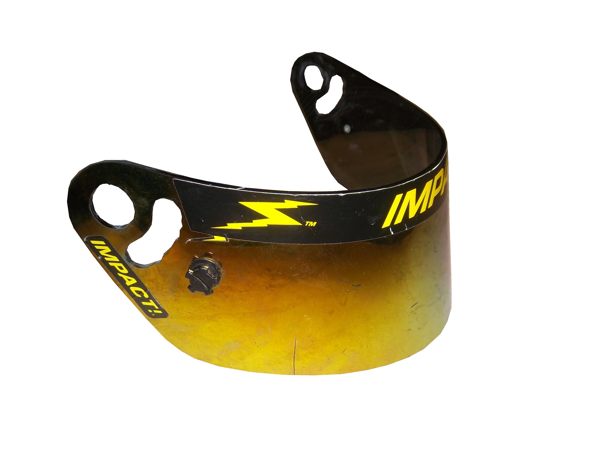
 Like eyeglasses, visors get scratched over time. As such, they are changed often. Like most other items racing teams and drivers use, when they are no longed needed, they are sold to the general public. They are frequently autographed by drivers, and are a popular item to get signed by drivers. They are interesting to look at, and interesting to examine up-close. All helmet visors in this day in age have a sponsor stripe across the top, and we’ll cover that next week.
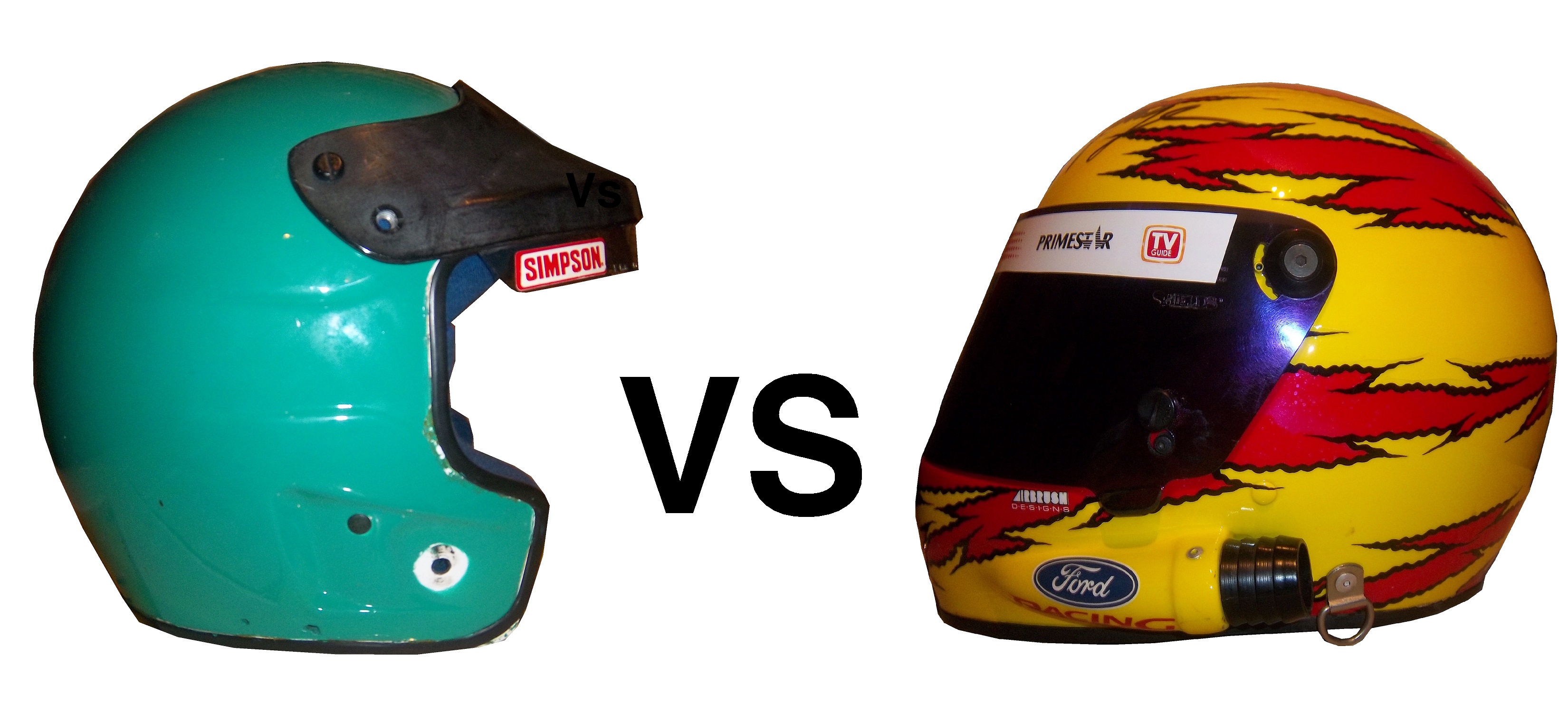


