From here on out, I will publish a complete list of 2015 paint schemes that have been announced, on Wednesdays. I will grade them as normal on Saturdays. Again these should be taken with a grain of salt as they can and often are changed between now and the next season. So without further ado, the first 2015 trackers!
It’s August, the summer is winding down, you are seeing back to school ads on TV, Halloween stuff is popping up in stores, and the Silly Season is officially underway. For me, this begins the most hectic part of the year for The Driver Suit Blog. Within the next few months, driver changes, sponsor changes and team changes will be announced. There is always a shakeup of some kind, and this year will be no different.
Carl Edwards, for example, will be leaving Roush Fenway Racing after the season. It was announced on Tuesday that Edwards would be moving to Joe Gibbs Racing and driving the #19 Toyota Camry. He has sponsors, one of which is Arris, which is a communications company for 17 races. The remaining 19 races he has a sponsor for the other races, but that hasn’t been addressed yet.
Where a driver is in the points helps with these kinds of decisions. As it stands right now, there are 1- drivers in the Chase because of a victory, and X driver who are in the Chase because of points. Will that change before Chicagoland? I have no reason to believe it won’t. I will be watching the Federated Auto Parts 400 this year, in light of what happened last year. I would have to believe that something like last year can happen. As of today, there are 12 drivers, AJ Allmendinger, Aric Almorla, Kurt Busch, Kyle Busch, Dale Earnhardt Jr., Carl Edwards, Jeff Gordon, Denny Hamlin, Kevin Harvick, Jimmy Johnson, Brad Keselowski, and Joey Logano have a spot in the Chase due to wins. That leaves 4 spots open, and with 3 races to go it is highly unlikely that there will be 3 new winners, so some drama can and will happen.
The part where it gets really bad is that from here to Daytona in February, there will be 2015 paint schemes released on a regular basis. The problem is that every 2015 scheme I grade will have to be taken with a grain of salt. For example,in mid-August last year, Brian Vickers was announced to drive the #55 Aaron’s Dream Machine. The announcement included photosof thecar. However, later on, a new design was released, and became the current standard. I didn’t complain too much because both designs are good. But this is a constant issue for me, do I grade them as-is, or do I back off and wait? This will get more and more frustrating between now and Homestead. An example of this is that Ricky Stenhouse Jr.and Greg Biffle just announced one of their new car designs for 2015. I will take it with a grain of salt, but I will grade it below as I normally would.
Something I also have to take into consideration is that something late in the season will cause a major change to the playing field. A perfect example is the unpleasantness last year at the Federated Auto Parts 400. After that scandal, Napa announced that it would be leaving Michael Waltrip Racing, and that left Martin Truex Jr. without a ride. He moved to Furniture Row Racing, and the full-time #56 became the part time #66.
One other major story I am following and I’m sure you are as well is who will sponsor the Nationwide Series next season? It was announced in 2013 that after 2014, Nationwide Insurance would be leaving as the series sponsor. Nothing definitive has been announced as of today, but I would have to believe there will be an announcement before the season ends. I’m curious just as the rest of us as to who that would be. Comcast is negotiatinng a deal for the series, and I would think a deal would be announced quite soon.
There will be driver changes, sponsor changes, team changes, and schedule changes. A rumor is going around that The Southern 500 will move back to Labor Day, Atlanta will follow the Daytona 500, and that the first Bristol race is moving from early March to mid-April. Again, when the schedule is announced we will know for sure. There are little changes every year, and after a while these little changes add up to big changes.
One other bit of news I need to address is that on Monday, a number of teams stayed at Michigan to test some 2015 rule changes. All totaled, 6 different car configurations were tested for a total of 160 laps. Again, equipment changes are a common event between seasons and this is nothing new. Information will be taken, adjustments will be made, and there will be more testing during the off season. Once that happens, the rules package will be created and distributed to the teams for the upcoming season.
Now before I get into paint schemes, I’d like to discuss something that has been happening in F1 for a while and I think needs to be stopped. Between the Hungarian Grand Prix on July 27, and the Belgian Grand Prix on August 29, F1 is on it’s “summer break.” This is due to the high travel restrictions and the limit on active crew members an F1 team can have. Teams don’t show up to the track on the Friday before the race, they show up on the Monday before the race. While I am not unsympathetic to the demands on crew members, I am a racing fan. F1 is one of the most watched sports in the world, with telecasts that can get as many as 54 million viewers worldwide. Fans love the sport, and the summer break is a headache. So here is my solution. First, we double the number of active personnel that the team can have, so fresh guys that can be rotated. Second, we extend the season by 4 weeks, so that there can be time for drivers and crew to relax between events.
Now we have a lot of ground to cover when it comes to…
Greg Biffle #16 Roush Perfomance Ford Fusion Red and black is a great color combination, and I like the dot fade effect. This is the best Biffle scheme all year and it earns an A
Greg Biffle #16 Hire our Heroes Ford Fusion Another prime example of why came and race cars don’t mix. This is just an awful mess. The American flag motif just looks horrible with the camo, but I think it might look good by itself. I’ll give it a D
Aric Almirola #43 Eckrich Ford Fusion Ok, I thought we had this said, but I’ll say it again…CAMO DOES NOT WORK ON RACE CARS! It takes an A scheme down to a C-
Jimmie Johnson #48 Lowes Chevy SS Reportedly, Jimmie was unhappy with the color scheme change from blue to white and asked Lowes to swtich back to blue after a series of sub-par finishes. Lowes agreed, and the car is another classic Jimmie Johnson A+ scheme!
Carl Edwards #99 Ford Eco-Boost Ford Fusion The word of the day is overdesigned. Good color scheme, but overdesgined and a C- gradeBefore I go I wanted to tell you about a project. I recently bought a Mr. Beer home brewing kit. It is a kit for beginers like me who have no experience brewing beer. It is a realativly simple process. The kit comes with a 2 gallon fermenter, some booster sugar, brewer’s yeast, a pale ale hopped malt extract, and some no rinse cleanser. You need a non wooden spoon, a glass bowl a can opener and a measuring cup. You use the no rinse cleanser to sanitize everything you use to make the beer, then you place the hopped malt extract and booster containers in hot water while you boil 4 cups of water.While the water is boiling, you fill the fermenter with 4 quarts of cold water. Once the water is boiled, you add the hopped malt extract, and booster sugar, and mix well. Then you pour the mix into the fermenter, add more water, and then add the yeast. Now comes the hard part, we have to wait two weeks for it to ferment. I’ll keep you posted.
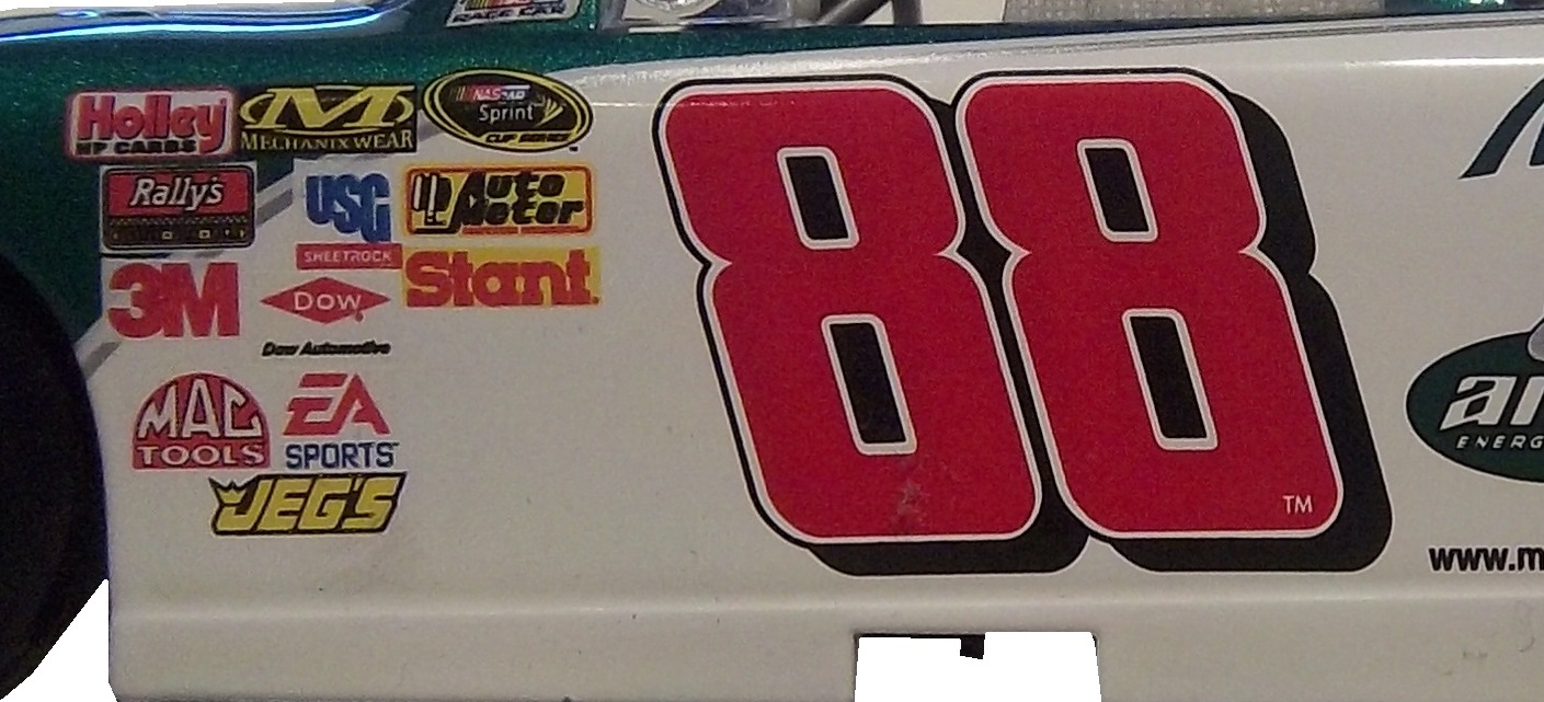
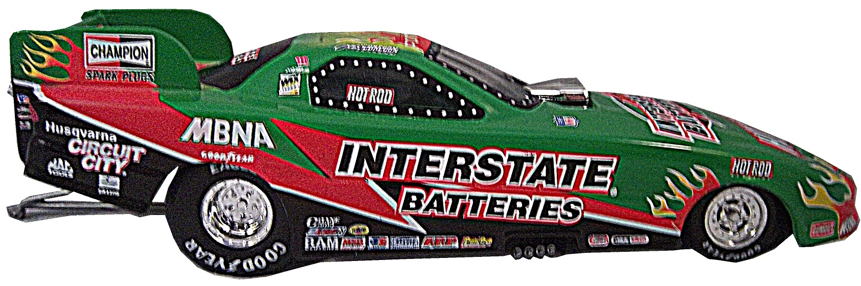
Number designs are an important detail in American auto racing, especially NASCAR, where the number is used on all of the merchandise sold to fans. The number is an identity for the driver and for the fans. While I was watching the Camping World RV Sales 301, for some reason, I noticed that the majorty of the car number are slanted. As the race went on, I noticed that almost all of them were slanted to the right. The Carl Edwards die cast above shows what I mean. Let’s look at the driver’s side car number up close.As you can see, the numbers are slanted with the top slanted to the right of the bottom. This gives the illusion that the numbers are being blown back by the speed of the car. I kept thinking about this and I decieded to see just who uses which slant when designing numbers for race cars. I wound up doing the NASCAR Sprint Cup Series, the Verizon IndyCar Series, and Formula 1. Here is what my research found…
The Sprint Cup car numbers overwhelmingly are designed to lean to the right. In fact, only 6 of the 54 teams don’t use numbers that lean to the right. In IndyCar, it is much more down the middle, with 19 cars with right leaning numbers and 14 straight leaning numbers. Formula 1 is the straightest series, with only 4 of the 22 numbers being slanted. NASCAR is the only group of the series that has left-leaning numbers, all 3 of which 3, 31, and 33, are raced by Richard Childress Racing.
It is one of those odd idiosyncrasies of racing design that a lot of people see but don’t notice. In fact, I didn’t notice until a couple weeks ago that the numbers seem to lean from one side to another. I also am curious as to why so many teams choose to have the car numbers lean to the right. I’m not saying it looks bad, they, for the most part, look really good.
Greg Biffle #16 3M 1942 Throwback Ford Fusion An perfect example of why throwback schemes fail. A classic logo which I have to admit looks really good, on a modern car, with modern design, modern numbers, and modern logos. It just looks out of place. F
Jeff Gordon #24 Axalta/Maaco Chevy SS The red, yellow and black color scheme works, except the blue and white Maaco logo scheme contrasts with it. The Pepsi globe looks odd there too, so I can’t give it any higher than a C-
David Ragan #34 A&W Root Beer Float Day Ford Fusion The color is good, the basic design scheme is good, but the Root Beer Float Day logos are too small. Even in this picture they look too small and are hard to see. If I am looking at a picture and I think it is too small, how do you think it will look on the track? C-
Bobby Labonte #37 Accell Construction Chevy SSGood color scheme, but the awful template is back for Tommy Baldwin. It is really sad, because this could be a great scheme, but the template takes it from an A to a C-
Landon Cassill #40 Cars For Sale Chevy SS The yellow is too bright, and the gray and black numbers look too dark on the side. The design is mediocre and I’ll give it a C-
Kurt Busch #41 Haas Automotion Chevy SS This is a perfect example of why gray-scale color schemes don’t work. By itself it is a good look, but the Monster Energy logo, the Goodyear logo, and the contigency logos ruin the look. If it were all gray-scale, I would give it an A, but because of those flaws, it earns a B-
Aric Almirola #43 Go Bowling Ford FusionI love what they did here. The bowling ball nose and pin design give a great impression, and the color scheme works very well here. A+
Justin Allgaier #51 Collision Cure Chevy SS Yellow black and blue is a bold color scheme choice, but this works. The design is simple, and it has a really good unique look, and I’ll give it an A
A couple of weeks ago, I discussed the events in 1964 that led to the invention of the Nomex driver suit. I also briefly discussed what one of these pre-Nomex suits looked like. Well that was meant as a Uni-Watch article, and was written differently than I would normally write it. It didn’t run on Uni-Watch for a myriad of reasons not worth getting in to. So for this week, I will analyze the suit in Driver Suit Blog style
Before Nomex became the standard for driver suits, racing was living in the dark ages. Drivers would race in whatever they were wearing when they came to the track. Little if any consideration was given to fire safety. As such, many drivers perished in on-track fires. Even when the fire retardant suits began to spring up, they were of little value. Prior to 1967, and for some time after, your standard driver suit was little more than a cotton or polyester suit dipped in borax and other chemicals. This made them fire retardant, but very uncomfortable to wear. Nomex made the driver suit safe and comfortable to wear.
But what did these suits look like? Well this is an example of a polyester suit. It was worn by an Indianapolis based driver named Bill Brach. He was a member of the Murat Shrine in Indianapolis, and he raced in this suit.The suit itself dates to 1972 at least, because of an Archie Bunker For President patch.It has a tag that says “Untreated, will burn,should be dipped.”The polyester material is very flimsy, and is ripped in one part.It has a classic racing stripe up the side, similar to what Paul Newman wore in LeMans.The belt has a metal-clasp to close it, unlike most suits, which use VelcroThe sleeves can be unzipped for comfort, which compromises the fire protection.The back has MURAT 500 SHRINE CLUB in chain stitching on the back.
This is an example of a suit from yesteryear. One that has been made obsolete. It is delicate, thin, and in a fire was of limited value. Nomex has become the standard, and suits like this are now simply relics.
Brad Keselowski #2 Redd’s Apple Ale Ford FusionBlack and Red is always a good scheme, and the overall design is good. The sticking point for me with this scheme is that APPLE ALE is almost invisible on the quarter panel. So for a final grade, it gets a B-
Alex Kennedy #33 Dream Factory Chevy SS Yeah it is a tad overdesigned, but it is for a charity to help children with life-threatening illnesses. So I’ll give it a B
Kurt Busch #41 Haas Chevy SS If the black were blue, and the red and white stripes were kept, I would like it more, but this scheme earns a C.
Kyle Larson #42 Cottonelle Chevy SS The blue looks decent, but the target logos on blue look awkward. The 42 would look better in white than dark blue as well. C+
Aric Almirola #43 Nathans Hot Dogs Ford Fusion As much as I like Nathans Hot Dogs, this is awful! The clash between the green and blue is horrific, and I can’t give this a passing grade.
The 2014 Sprint All Star race is behind us, and as usual, there were a myriad of different paint schemes. Some were good, others not so much, but I have to say there were a lot of great schemes in this year’s race. Let’s start with the Sprint Showdown. Unlike in previous years, The Showdown took place on Friday, and the All-Star Race was on Saturday. The Showdown was a great event, which saw Clint Bowyer winning, AJ Allmendinger finishing second, and in the upset of the year, Josh Wise winning the Sprint Fan vote, and advancing to the All Star Race. Let’s get to the grades:
#10 Cole Whitt #26 Speed Stick Gear Toyota Camry This is one of the few schemes that has both a classic and modern look at the same time, and paired with a great color scheme, it earns an A
#13 Austin Dillon #3 Dow Chevy SS While I like the color scheme and number and logo designs, the white stripe up the side kills the look. It takes an A scheme to a B+ scheme.
#14 Kyle Larson #42 Target Chevy SS The scheme looks decent, I like the red on the back, though I do not like the Target logos at the bottom. That takes a scheme that was an A grade to a B-
#16 Michael Annett #7 Pilot/Flying J Chevy SS Good color scheme, but the awful template is back for Tommy Baldwin. It is really sad, because this could be a great scheme, but the template takes it from an A to a C-
#19 JJ Yeley #44 Phoenix Warehouse Chevy SS My first thought when I saw this scheme was it looked like the color scheme from the 1994-1995 NBA All-Star Game jerseys which is a decent color scheme. But to say the car is overdesigned is an understatement. This scheme is awful. Not even a great color scheme can help this car pass. F
Now we move on to the All-Star Race, which saw Jamie McMurray pull an upset and take the win, thus guaranteeing him entry into the event for the next 10 years. Overall there were a lot of great schemes, though I wish more teams would run special schemes.
#5 David Ragan #34 Taco Bell Ford Fusion Overall design and color schemes are good, and the only complaint is that the Taco Bell logo should be in color as opposed to black and white. A+
#11 Jeff Gordon #24 Drive to End Hunger Chevy SS Great overall design, great color scheme, though the D on the hood reversed to miror the curves of the hood looks odd. Still it’s a good scheme and Ill give it an A
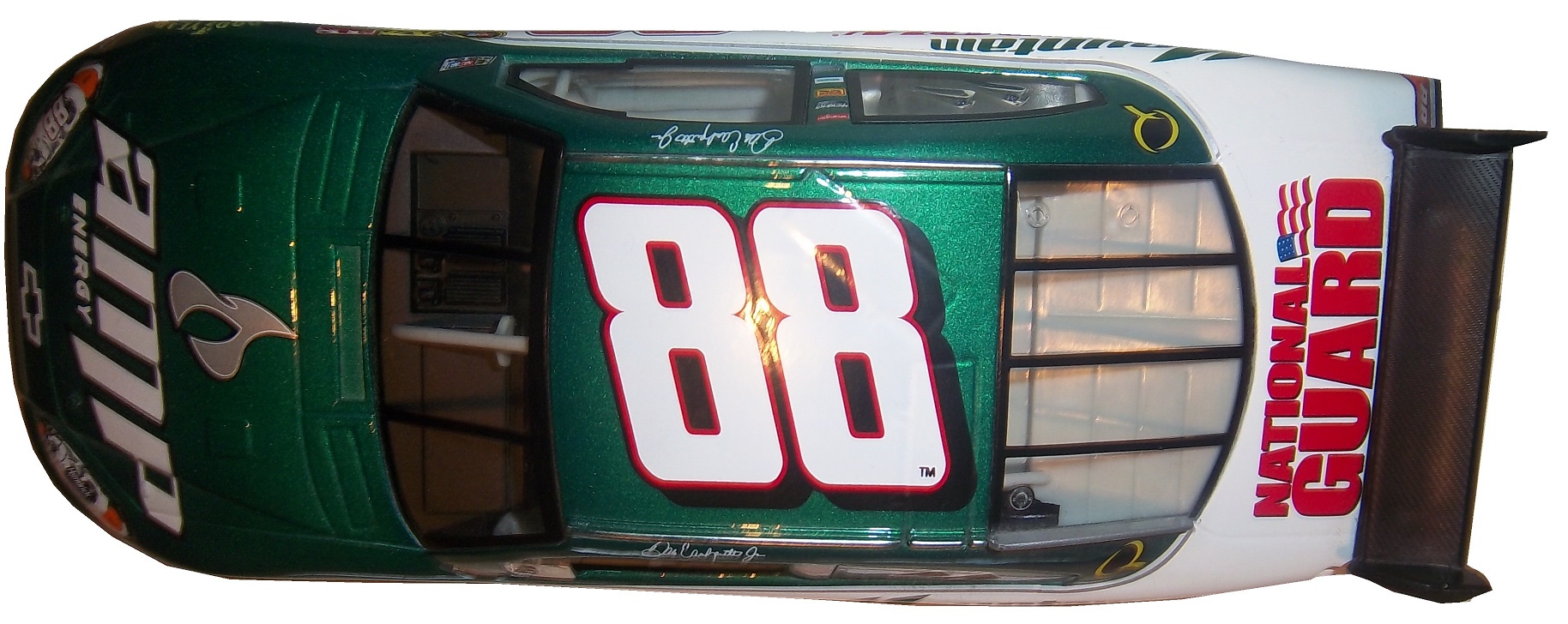
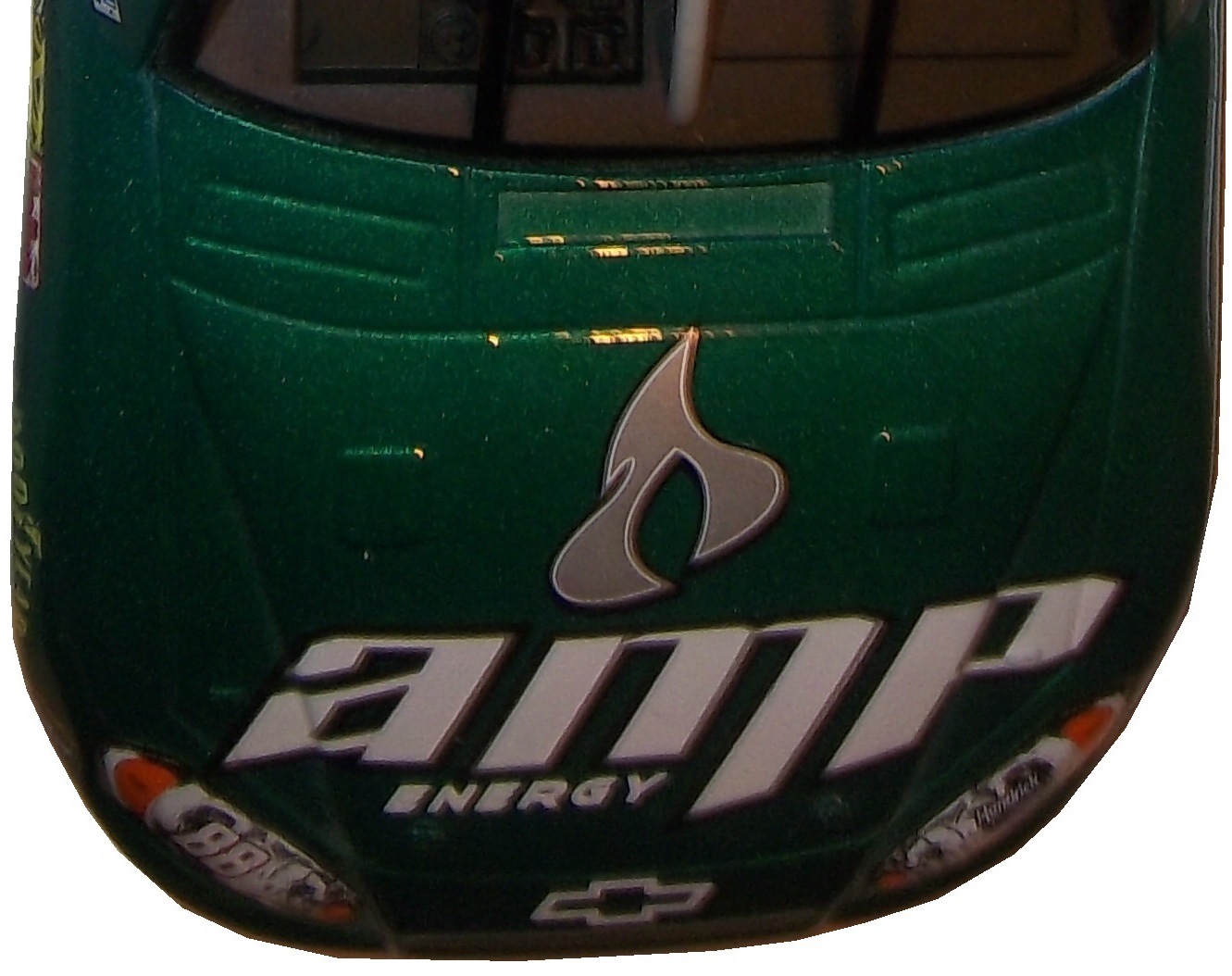
#12 Dale Earnhardt Jr. #88 National Guard Chevy SS The new metallic numbers work, and the overall design is decent, since it incorporates the design used on the numbers. I’ll give it an B+
#13 Denny Hamlin #11 FedEx Express Toyota Camry The front nose design and stripes are awful. The color schemes are great, as are the logos and numbers, but the stripes kill it. The best grade I can give is a C+
#15 Kasey Kahne #5 Time Warner Cable Chevy SS It is a good color scheme, but the design on the side needs a little tweaking. Get rid of the needless zig-zag pattern and it works a whole lot better. It is still a decent scheme, so I will give it a C
#17 Matt Kenseth #20 Home Depot/Huskey Toyota Camry I would give this scheme an A grade, but the yellow back bumper ruins it. The clash between the two just works awkward, and it takes an A scheme down to a C
#19 Ryan Newman #31 Cat/Quicken Loans Chevy SS What in the blue hell is going on here? I’ve liked Ryan’s schemes this year but this is an F scheme, even though I like the color scheme.
#22 Greg Biffle#16 3M Ford Fusion-The sides and roof have gotten worse from last year. I have to give it an F in that respect.
Also, check this video out concerning how different pit stops in open wheel racing were between 1950 and today:
The video shows how far we have come in pit stops, but we also have come a long way in driver uniforms.
By David G. Firestone
50 years ago this week, events over the course of 6 days in May of 1964 changed the culture, cars, and uniforms of auto racing forever. Three deaths in two races over those six days demonstrated that current safety methods were ineffective at best, and 3 talented drivers lost their lives. The 1964 World 600 and the 1964 Indianapolis 500 helped introduce reenforced fuel tanks and Nomex driver suits, among other things. 50 years later, those events are still being felt
The World 600 began in the early afternoon on May 24, 1964. For the first six laps, it was business as usual, but on lap 7, on the backstretch, Junior Johnson and Ned Jarrett wrecked, and Glenn “Fireball” Roberts swerved to avoid them, and wrecked. He was trapped in the car by the pedals, and his car caught fire. Ned Jarrett ran and pulled Roberts from the car, and paramedics took him to the hospital. 39 days after the wreck, while still in the hospital from his injuries, he died from pneumonia.
NASCAR had rules concerning “fire retardant” uniforms but these were inadequate at best. These uniforms were cotton coveralls traditionally used by workmen that had been dipped in a number of fire retardant materials including Borax. These were not only ineffective, but were extremely uncomfortable to wear. They were known for inflaming the skin, and aggravating asthma. Fireball was not wearing these coveralls during that race, because he had a doctor’s note stating he should not wear them. There is some debate over what the doctor’s note was for, either for asthma or skin hives. It llustrates why these uniforms were not popular, they were so uncomfortable to wear that drivers did not want to wear them.
6 days later, on May 30, the 48th Indianapolis 500 was held. Dave MacDonald started 14th, and Eddie Sachs started 17th when the green flag dropped. MacDonald was racing a car built by racing innovator Mickey Thompson, which by all accounts was badly built and difficult to drive. The first lap led into the second, which saw Dave MacDonald lose control of his car and smash into the inside wall. The fuel tank instantly ignited and the car went across the track, and collected a number of other cars, including Eddie Sachs car, which also exploded on impact. Sachs was killed by the impact, but MacDonald was seriously burned, and his lungs were scorched, the lung damage proved to be fatal.
Inspired by these events, the Nomex firesuit was introduced in 1967 as a replacement for the cotton coveralls dipped in chemicals. It was a lot more comfortable and safer than chemical-dipped cotton, so drivers were more willing to wear them. Like most new safety equipment in sports, it took a while to catch on. Nomex was created in 1967, for NASA. Its main use at the time was for the Apollo Command Module parachutes. NASA needed a material that could stand up to the heat of reentering the earth’s atmosphere, and still remain fully functional.
Bill Simpson is credited with introducing Nomex to driver suits. The story goes that Simpson started making Nomex suits after learning about the material from astronaut Pete Conrad while Simpson was working as a consultant for NASA. One of the pivital moments in the history of the suit was when Simpson had heard that a competitor had been badmouthing his products, and so, in something he said later was “the dumbest thing I have ever done,” challenged the competitor to a “burn off.” Simpson put on his suit and lit himself on fire. He later recreated this for a Mazda commercial.
Why did it take so long to make critical changes to driver uniforms? The events that took place in 1964 were tragic, and it clearly illustrated why the old system didn’t work. The only change made immediately after the events was the rule that fire retardant suits were now mandatory, regardless of how it made the driver feel. In today’s sports safety culture, there would be focus groups, meetings within the sanctioning body, and changes within a few months after the event. But by 1964 standards, just rigidly enforcing the rule was the best course of action. Remember that in 1964 race car drivers were seen as somewhat expendable. Driver deaths in racing were stunningly common back then. As such, while there was a need for improvement, it was not a priority for sanctioning bodies. The sad fact is that back then, driver deaths were part of the allure of racing. People would go to these events and hope to see a fatal crash, as crass as that sounds. As for the suits themselves, the only other options besides chemical dipped cotton was aluminized cotton or aluminized kevlar, which was not more comfortable, as it was like wearing aluminum foil.
So what did these pre-Nomex driver suits look like? They looked like this. This is a driver suit made by Hinchman in Indianapolis. It is basically a polyester suit that is customizedto thedriver’spreference. It is not all that different than a jumpsuit that one would wear to work. It is a very flimsy material, has no cuffson the arms or legs, and, most amazingly, the tag states that the suit is “Untreated, will burn, must be dipped.” This suit was worn circa 1972, which is indicated by the “Archie Bunker for President” patch sewn into the chest. Like any new safety technology in sports, it takes time for it to become the standard, and for Nomex, this is no exception.
This race, along with the 1955 24 Hours of Le Mans and the 2001 Daytona 500 have their legacies written in death, but unlike other similar events, the lessons they had to teach were learned, and the racing world as a whole is better for them. The deaths in these events were not in vain, and others are alive because of them. 50 years later, those 6 days in May 1964 are still having an impact on racing.
I was ready to present a behind the scenes video this week, but I’m gonna put that on the back burner until next week. Last Saturday was the inaugural Grand Prix of Indianapolis, an IndyCar race on the road course at Indianapolis Motor Speedway. The race as a whole was fun, but it did have some issues. There was a huge wreck on the standing start, fortunately all were Ok. The same cannot be said for James Hinchcliffe.
The 2011 Rookie of The Year suffered a concussion when he was hit by a piece of flying debris. Watching it live, it looked like after he had gotten hit, he pulled off the track and he was stunned by what had happened. The report was, at the time, that he had hurt his hand. The race went on, no caution flag flew because the safety crew was able to get the car out of harms way quickly. It looked like everything was normal, then suddenly the camera shows Hinchcliffe on a stretcher being led away seemingly in distress. He was loaded onto an ambulance, and was taken to the hospital. He was diagnosed with a concussion and his future status for the season is yet to be determined.
This incident reminded me of something Tony Schumacher said last year. I was in his hospitality tent listening to him make a speech, and he took a number of questions. One of them concerned the canopy he has over his cockpit. He stated that it took some time to convince the NHRA to allow a cockpit canopy. He stated that he is really scared of hitting a bird with his helmet, stating that “I’ve taken a few out with my tail, and if you catch one of those with your helmet, you’re getting coloring books for Christmas for the rest of your life.”
I’m wondering if in the near future canopies will come to IndyCar. With the current safety culture in racing, I’m kind of shocked it hasn’t yet. Racing fans will complain that it breaks tradition, but at the same time, nobody wants another Dan Wheldon. Fans do not want to watch a driver to die. I think that canopies will come to IndyCar, I want them to come to IndyCar, and I think that safety should take precedence over tradition.
The other factor that needs to be discussed is that there is a parallel to the recent concussion lawsuit filed with the NFL. The information that was gained from that suit was that no helmet can definitely prevent all head injuries. As such, a canopy could very well prevent a fatality in that respect. Give the driver an extra layer of protection so that he could walk away. These canopies are not plexiglass, they are the same exact material used to make F-16 bulletproof canopies. It is a very durable material that could have prevented what happened to Hinchcliffe.
Shifting gears now, I want to discuss something else. Starting in a couple of weeks, I will be restarting Wheel Reviews. I started with Rush, an amazing F1 movie by Ron Howard about James Hunt and Niki Lauda in the 1976 F1 season. So what I am going to do is to alternate the paint scheme reviews and Wheel Reviews. I’ve got 13 movies in total to review so far, and I hope to find some more. With that, we move on to…
Ryan Newman #31 Cat/Quicken Loans Chevy SS What in the blue hell is going on here? I’ve liked Ryan’s schemes this year but this is an F scheme, even though I like the color scheme.
Landon Cassill #40 Cars For Sale Chevy SS I like the design, but to be honest, I don’t know where I stand on the color scheme. The red is good, but the when it comes to yellow/green I’m not sure if I like it or hate it. I’ll give it a C
Aric Almirola #43 US Air Force Ford Fusion I’ve been tough on military schemes this year, but this is the best one! The dark blue sky theme, with two small fighters with light clouds works perfectly, and earns an A+. See, military schemes CAN be done well without camo.
The Driver Suit Blog is my favorite project I have ever undertaken. I’ve gotten a few people who ask about the origins of The Driver Suit Blog, and so this week, we will start with how it came to be. The origins are rooted in my game-used memorabilia collection. I started in hockey, and looked at the various game wear patterns on jerseys. I then would get into other forms of memorabilia, and would analyze them for an old website. In 2008, I went to the National Sports Collector’s Convention in Rosemont, and came away with a late 1960’s Oakland A’s jersey. As fate would have it, when I got home, I was looking for something on my computer and found Windows Movie Maker on my XP based hard drive. I decided on a whim to make a video about it, and with that Introduction to Sports Memorabilia was born.
I started into driver suits in 2010, and researched the suits the same way I research every other game-used item. I had a lot of trouble finding information for a collector about the various aspects of driver suits and race-worn memorabilia. So I just did what I could, research wise. In 2012, I asked Paul Lukas if I could guest write a column for Uni-Watch. Now the blog was never a thought prior to this article, but as work progressed, it dawned on me that I could start a blog for driver suit and racing memorabilia collectors. So in January 2013, The Driver Suit Blog was born.
The paint scheme grading was born out of frustration. I had been working on a Christian Fittipaldi article, and it wasn’t long enough, so I started grading paint schemes to fill some extra space. I kept doing it, and it has become a part of the blog. The same can be said for Tailgating Time, which was also based on a Uni-Watch feature known as Cuilinary Corner. Tailgating Time was designed for tailgaters, to give them recipies that can be cooked on a grill or hot plate at a track, but are something more than just burgers and hot dogs.
Where will the blog go from here? I will continue my work for driver suit collectors, giving them tips on how to analyze driver suits. Tailgating Time will return, but I can’t say for sure when this will happen. I have a lot of stuff planned so stay tuned.
I also want to take a moment to thank my readers. Without you guys, this would have never taken off, and I just want to say thanks. I also owe a huge debt to Paul Lukas. Without him, the Driver Suit Blog would have never been created. Paul, next time you are in Evanston, hit me up, we’ll go out for a beer!
Next week, we will go behind the scenes and examine how a Driver Suit Blog article comes to be. One other thing that I will start in a couple of weeks is I will do more Wheel Reviews for The Driver Suit Blog, but for now, we conclude with
PAINT SCHEME REVIEWS!
Ryan Blaney #12 SKF Ford Fusion I gave this exact same scheme an A last year, and it earned 9th place on the Paint Scheme Leaderboard as well. This scheme still earns an A+
Cole Whitt #26 Iowa Chop House Toyota Camry When it comes to great paint schemes for the #26, BK Racing picked up where Swan Racing left off. Great color and design schemes, A+
AJ Allmedinger #47 Hungry Jack Toyota Camry What is this new deal with diagonal curved stripes across the side? It just looks awkward. It has a great color scheme, but the design just looks bad. C-
Jimmie Johnson #48 Lowes/Valspar Chevy SS Jimmy’s same great classic design with a very nice red rear end. I love a great shade of red on a race car, and this is a great shade of red. A+
If I could give a new collector two pieces of advice, they would be 1: In this hobby, when you stop learning, it stops being fun and 2: Research, research, research. Research is critical in any hobby, and that is, for the most part, why The Driver Suit Blog exists. I put a lot of research into this hobby, and I will give some pointers to help my fellow collectors.
First, always get a picture of the item you are going to buy beforehand. This is useful for a number of reasons. First, you can photo match the item. If you are not able to find an exact photo of the suit, helmet or accessory, you can “style match” the item. Style matching is finding evidence that the driver or crew member wore a design similar to the item in question. Drivers wear multiple versions of the same suit for a number of reasons. Nomex is a great material, however, if the suit catches fire, the Nomex will change color, and will not protect the area of the burn after the fire. So if a driver gets into a fiery crash in practice, and the suit gets damaged on the arm. The suit will have to be replaced for the race, because it is very possible that a similar crash could occur during the race, and wearing the damaged suit would wind up burning the driver.
Figuring out WHEN the suit was worn can be tricky, but in addition to photo matching, you can do a driver search on Racing Reference. Racing Reference is a site devoted entirely to racing stats, and for every race they list, they have driver, owner and sponsor information. So for example, let’s take this Stevie Reeves suit:
The primary sponsor is Big A Auto Parts, and is a Busch Series suit. So you go to his driver page:
and clicking the races in his Nationwide Series Statistics section, you can look at each of his sponsors. In this case, he was only sponsored by Big A Auto Parts in 1997. So it can be concluded that the suit was worn in 1997.
In some cases, you will not be able to find a photo of the driver wearing the suit, that is just the law of the land. When searching for a photo, I use Getty Images, Google, YouTube, and eBay. It might seem strange that I use eBay but it works quite well and I have had a lot of success. People sell photos, press kits, hero cards and other such things on eBay, and this is a gold mine. In some cases, I have no luck in searching for photos, and I will take a break, get something to eat, play with the cat, take the dog for a walk, and I will have a moment when I realize I should change a parameter of the search. Sometimes it works, other times it does not.
When it comes to learning, when you stop, the hobby stops being fun. I’ve been collecting sports memorabilia since I was 5, and I’m constantly learning new things about it all the time. Never stop learning, because every hobby is constantly changing, and new information can be very useful.
I also have to cover this story. I gave Swan Racing a lot of bad reviews for paint schemes last year, and I said this year, they stand a good chance of winning the Schemie for most improved paint scheme set. Well, it looks as though they will have to shut down due to a lack of sponsorship. As it stands right now, the team is shutting down and Cole Whitt does not have a ride for Richmond. I will update the story as I learn more information.
Kevin Harvick #4 Budweiser Chevy SS The Coca Cola 600 is held as the July 4th race, and as such, NASCAR teams like to run patriotic schemes. The scheme as a whole is good, and red, white and blue is a great color scheme. I give it an A. Something else to note: Notice that the name on the windshield is in a patriotic design, as opposed to white lettering on a black background. Is this going to be run by all teams? Stay Tuned!
Kasey Kahne #5 Farmers/Thank A Million Teachers Chevy SS I really hate the huge FARMERS lettering on the side of the car, and I’m guessing that the design on the lettering is a photo mosiac. The color scheme is not good, and there are a number of dark designs on the black background which are almost impossible to see. I support the idea of Thank a Million Teachers, but this scheme looks awful, and earns an F
Greg Biffle #16 Scotch Ford Fusion Greg’s paint scheme downward spiral continues, with this horrid scheme! The green and plaid doesn’t work with the Biffle template, and it just looks like a mangled mess that earns an F grade!
David Stremme #33 Newton Building Supplies Chevy SS Red and white is a good color combination, and if the side did not have the small rectangle just behind the front wheel, I would give it an A, but it takes it down to a B+
Kyle Larson #42 Axe Peace Chevy SS Decent color scheme, but much too overdesigned. Too much visual noise, and i just don’t like it. The green number look awful as well. D-
Ryan Truex #83 VooDoo BBQ Toyota Camry color scheme is not great, and the car in general is way too overdesigned. I can’t give this scheme anything less than a D-
The 36th Sprint Unlimited starts tonight at 8:15 ET on Fox. This marks the beginning of the Daytona 500 and the beginning of the NASCAR season. I will be looking forward to it, and I will enjoy it as always.
The event will feature a number of segments which were voted on by NASCAR fans including myself, and many of you. The first segment will feature laps followed by a second segment of laps, and then a third segment of laps. Many special paint schemes will be run for this race, as is traditional. My personal favorite is the Miller Lite Throwback scheme being run by Brad Keselowski.
Now some factoids about the race.
*There are, in total, Chevy drivers, Ford drivers and Toyota drivers.
*Chevy has 20 wins, Ford has 7 wins, and Toyota has 1 win.
*Mark Martin has competed in 20 consecutive events from 1989-2008.
*Dale Earnhardt Sr. has won 6 events, more than anyone else in 1980, 1986, 1988, 1991, 1993, and 1995 and went on to win the Sprint Cup Championship 4 times in 1980, 1986, 1991, and 1993, he is one of 7 drives to do so.
*From 1979-2011 the event was sponsored by Anheuser-Busch, first called the Busch Clash which was the brainchild of Monty Roberts, brand manager of Busch Beer, who sponsored the Pole Award. It remained the Busch Clash until 1998, when Budweiser took over the Pole Award, and it was renamed the Budweiser Shootout. In 2012, Sprint, the series sponsor took over the sponsorship after Budweiser announced they would drop the sponsorship in favor of sponsoring the Duel Races that determine the starting order of the Daytona 500.
*Petty Enterprises was not eligible to run the Shootout because of a rule stating that only drivers that ran the Busch/Budweiser pole award decal were eligible to enter the shootout. Richard Petty and his family did not support alcohol sponsorship or decals on race cars. So John Andretti, Bobby Hamilton, Jeff Green, and Aric Almirola who all had a number of poles with Petty Enterprises were not eligible to participate. I find it interesting that Petty has reversed course on the alcohol sponsorship rule, since Kasey Kahne was sponsored by Budweiser, and Marcos Ambrose will run at least one race sponsored by Twisted Tea.
*Buddy Baker won the inaugural Sprint Unlimited in 1979, which was a 20 lap sprint.
*Since many top drivers were excluded from the race due to not winning a pole award, they moved to the TV booth as color commentators. These included Dale Earnhardt Sr. in 1981, Richard Petty and AJ Foyt in 1982 and 1983, Neil Bonnett in 1993, Darrell Waltrip in 1994, 1995, 1997, and 1999, and Kenny Wallace in 1998.
*There has never been a driver who has won the Sprint Unlimited, Budweiser Duel and Daytona 500 in the same year. Drivers have won 2 of 3 in a season, but never scored the hat trick.
*One of the first instances of a special paint scheme being used specifically for the Sprint Unlimited was the Chroma Premier scheme run by Jeff Gordon in 1997. He followed it up the next year with the legendary Chroma-lusion scheme, which feature a paint that changed color. Since then, special schemes have become commonplace.
*Richard Childress Racing has 8 Sprint Unlimited wins, most of any team. Hendrick Motorsports has 6 wins, and Joe Gibbs Racing has 5 wins.
The Unlimited starts tonight at 8 PM ET on Fox Sports 1, and I look forward to watching the event as I hope the rest of you do too.
Though I have had a VERY busy week, I still have time for…
Paint Scheme Reviews!
Kasey Kahne #5 Time Warner Cable Chevy SS It is a good color scheme, but the design on the side needs a little tweaking. Get rid of the needless zig-zag pattern and it works a whole lot better. It is still a decent scheme, so I will give it a C
Michael Annett #7 Pilot/Flying J Chevy SS Good color scheme, but the awful template is back for Tommy Baldwin. It is really sad, because this could be a great scheme, but the template takes it from an A to a C-
Kyle Busch #18 M&M’s Peanut Toyota Camry I like this, it has a great shade of yellow, hard to find in NASCAR these days, and the peanut motif works very well. It is an original design, and I’ll give it an A
Joey Logano #22 Autotrader.com Ford Fusion Sometimes orange works, sometimes it doesn’t. This is an example of an orange scheme that just doesn’t work. If the white was taken out completely it might work, but this is just horrid, and I give it an F
Cole Whitt #26 Speed Stick Gear Toyota Camry This is one of the few schemes that has both a classic and modern look at the same time, and paired with a great color scheme, it earns an A
David Ragan #34 CSX Ford Fusion What in the hell is going on here? Why is the hood decal upside down? Why in the world would they do that? Were they drunk when they decaled the car? The only thing that I can guess is that it is designed for an in-car camera…but that makes no sense either! F-
Dale Earnhardt Jr. #88 Kelley Blue Book Chevy SS During my Daytona Preseason Thunder article, I said I wanted to see the #88 they used on a real car. I got my wish, and I like this design overall. The metallic gold is a bold choice, it doesn’t always work well. I give it an A+
BUT WAIT, THERE’S MORE!
As many of you know, I don’t just research and collect driver suits and racing items, I collect and research many other things. I recently had a column run in Uni-Watch concerning some lettering from the 1958 Washington Senators, and you can read my column here.
How I have gone as long as I have without delving into the subject of die casts? I really don’t know, but for this week’s column, we are going to discuss it. Racing as a sport is half man, half machine. When it comes to collectibles, they both get virtually equal billing. One of the biggest collectibles in racing is the legendary die cast car.
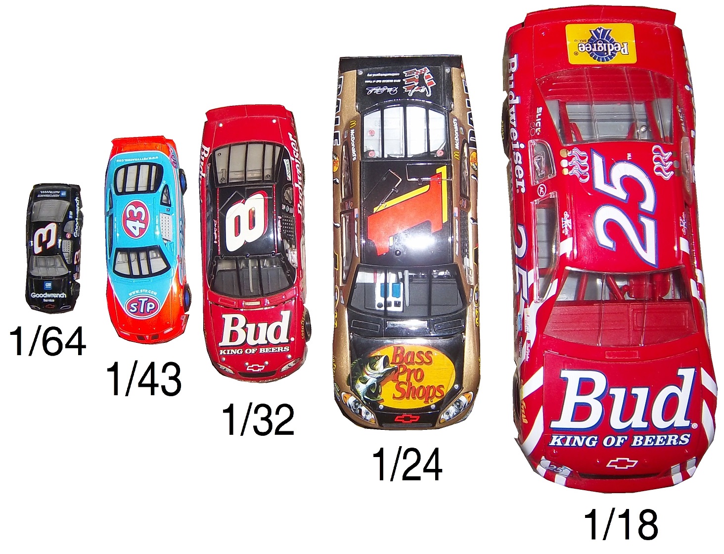
Die cast cars began as an industry in the early 20th Century, but the early cars were very basic, with a simple body design and rolling wheels. They were of very poor quality, lacked detail, and often broke for no apparent reason. An zinc-based alloy named Zamak solved this problem. In 1953 Jack Odell, co-owner of Lesney Products in England had a moment that revolutionized the industry forever. His daughter went to a school that allowed the students to bring toys, provided they were small enough to fit in a matchbox. He created a small die cast steam roller that could easily fit in a matchbox. For the Coronation of Queen Elizabeth II, he created a similarly sized model of her Coronation coach. After selling 1 million of these small coaches, he realized he was on to something, and thus the Matchbox line of die cast cars was born. In 1968 Mattel launched the Hot Wheels brand, which, like Matchbox created cars in 1:64 scale, or S-Scale for railroading. In 1997 after being sold numerous times, Mattel bought Matchbox and has been fostering the brand ever since.
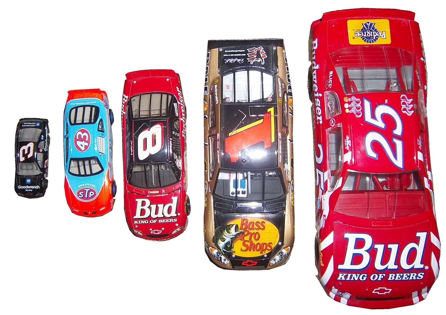
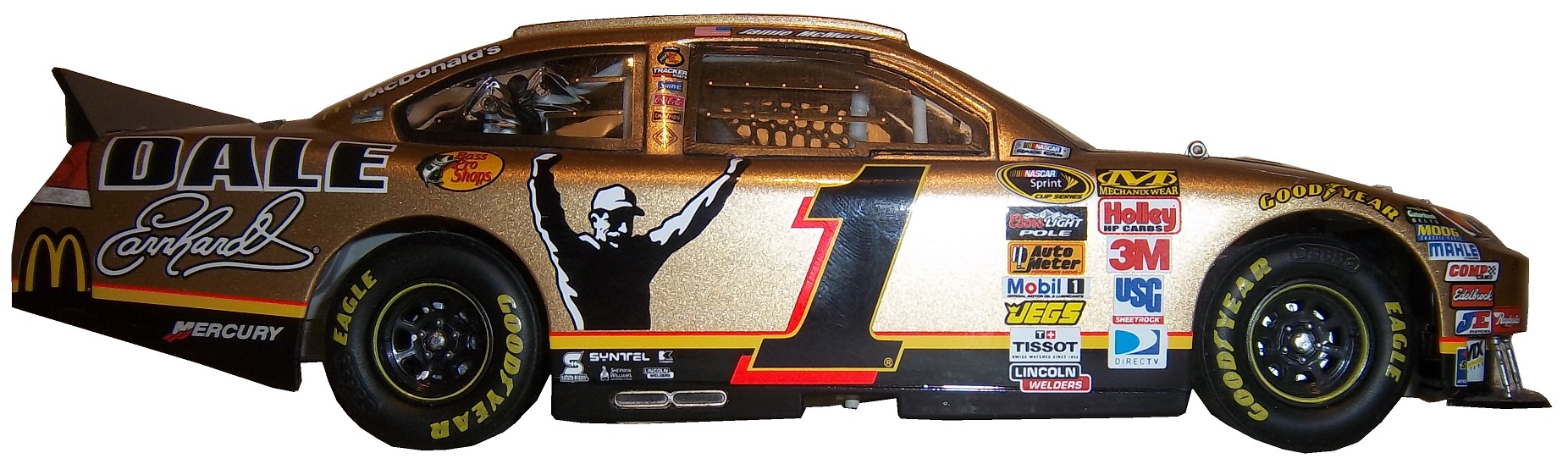
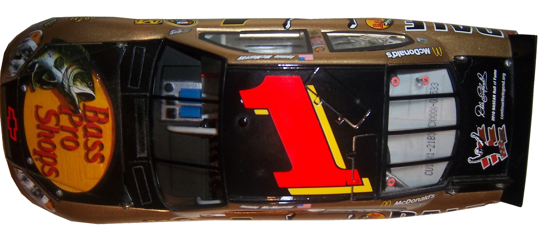
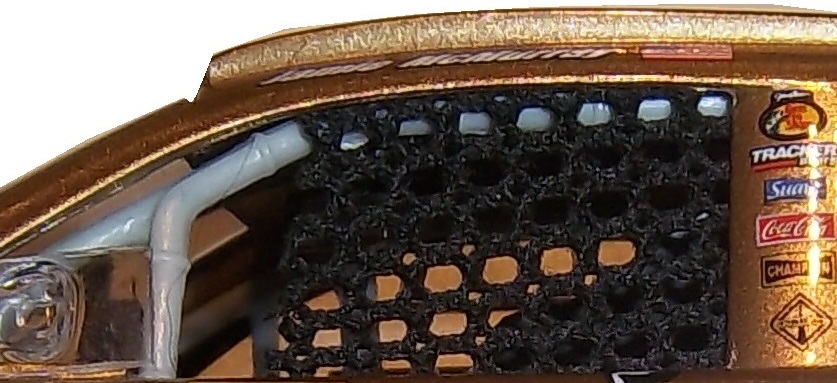
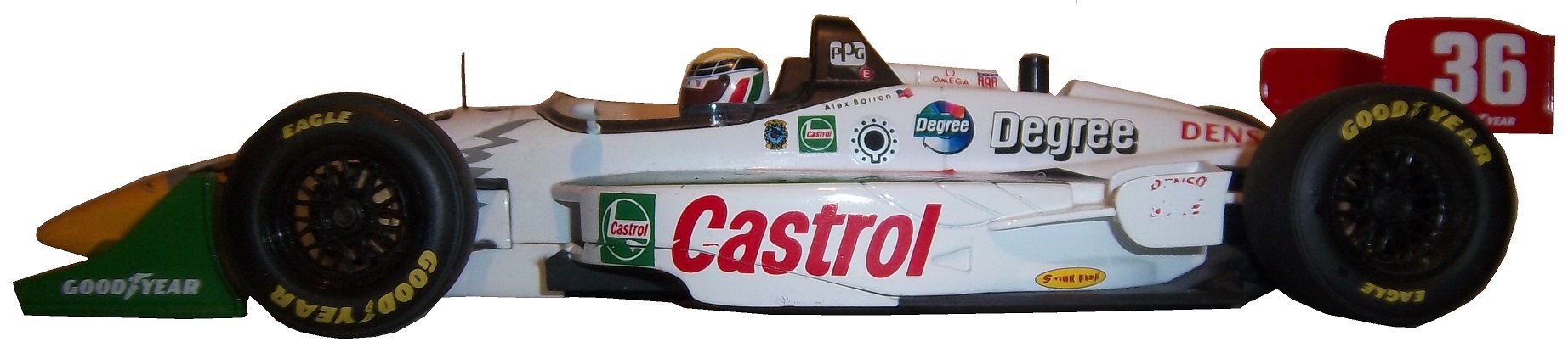
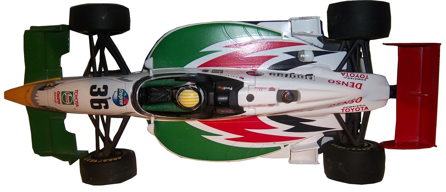
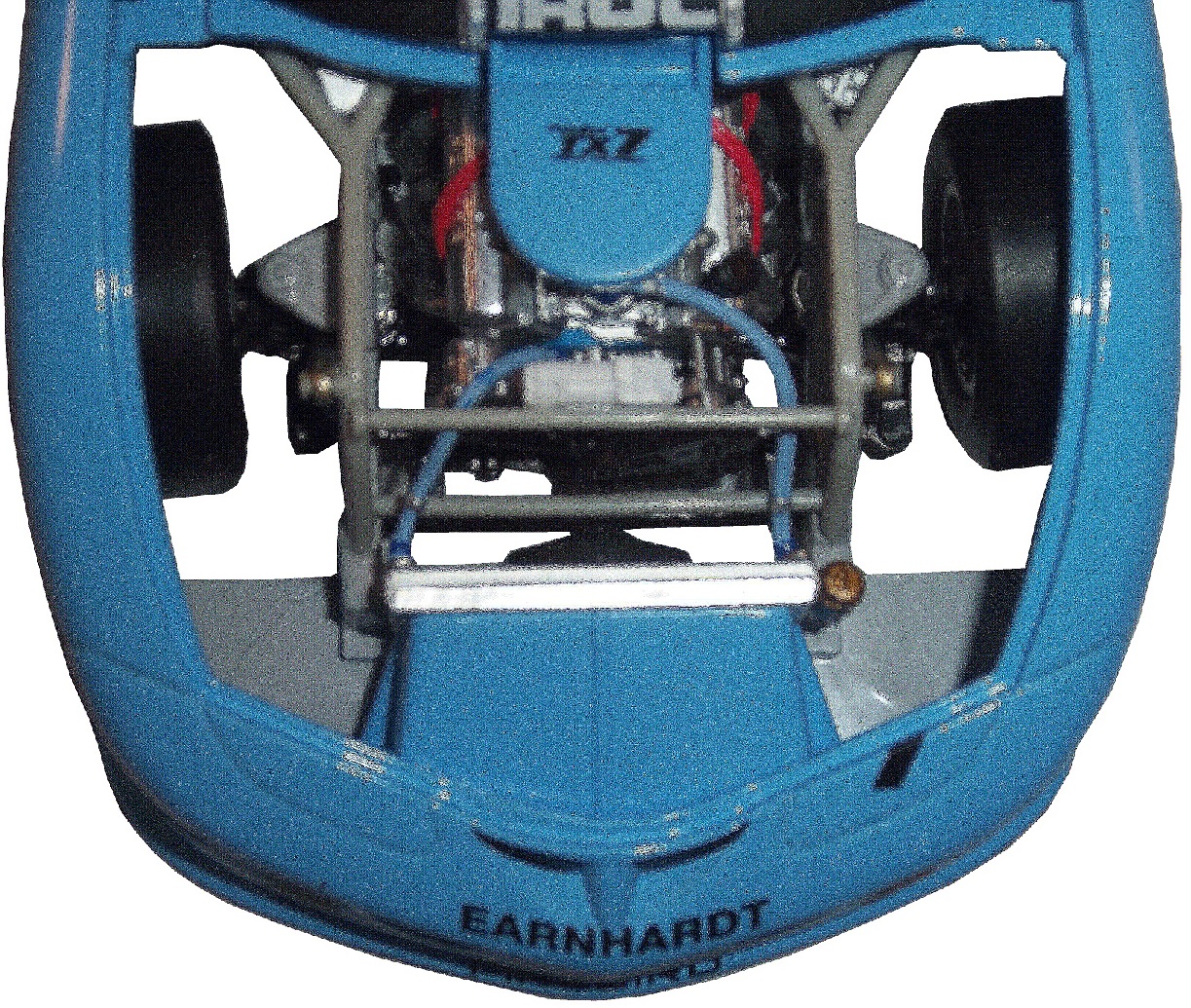
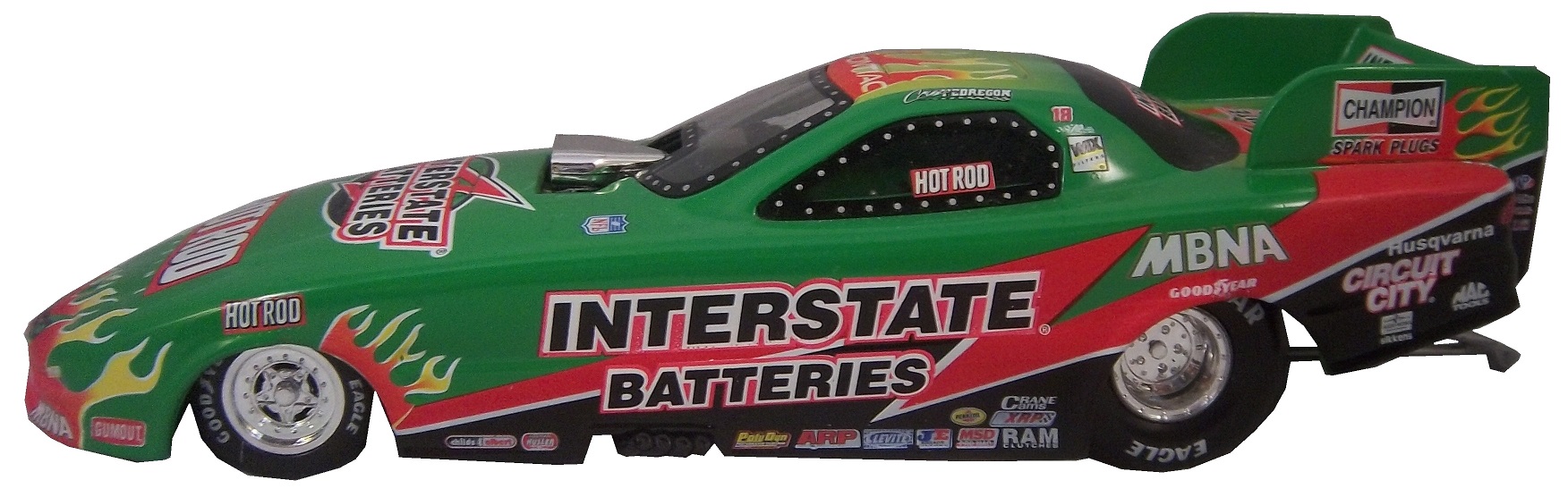
Race cars are a popular version of die casts, as most boys who love racing will buy the die cast of their favorite driver, and play with it as if they are driving the car. I’m guilty of this, as I’m willing to bet the majority of racing fans are, if you don’t believe, check this out. In the beginning, die casts were marketed and sold to kids, but as time went on, it became clear that grown up fans liked these as well. So die cast manufacturers began to create larger “adult collectibles,” typically in either 1:18 scale, or 1:24 scale, or one of the accepted G scales. The adult die casts will feature alcohol and tobacco sponsors, and are much more accurate in design, with cloth window nets, and working hoods, decklids, and roof spoilers. As time progressed, these cars gained a very dedicated following, and have become very profitable for NASCAR, IndyCar and F1. Interesting to note that the standard size for NHRA and NASCAR die casts is 1:24 and 1:64 whereas IndyCar uses 1:18 and 1:64 and F1 use 1:18 and 1:43. NASCAR die casts can also be purchased in 1:43, 1:32, and 1:18, here is how they compare to each other:An adult collectible die cast as mentioned above, is very accurate, such as this Jamie McMurray example from 2010. The amount of accuracy in this design is stunning! The window net is made of cloth,the contingency decals are all accuratethe roof features a place for the in car cameras, as well was a pair of functioning roof spoilers.The hood opens to display a very accurately recreated engine.Whereas this Dale Earnhardt Jr. die cast, this one a children’s toy has a plastic window net,the contingency decals aren’t as accurate,the roof does not feature working roof spoilers, or an in-car camera pod,and the hood doesn’t open.If we look at an IndyCar die cast, we see some different things. This example is an Alex Barron example from 1998, purchased because I have the matching driver suit. This particular die cast is a 1:18 scale, and features a working suspension that when you move the wheels move the steering wheel. Everything else about the car, including the helmet and driver suit are perfect as compared to the real car.Everything that I just said about the Jamie McMurray die cast can also apply to this Dale Earnhardt IROC model. Again the accuracy in this design is amazing!One of my personal favorie die casts is this Cruz Pedregon 1:32 die cast from 1998. The body can be removed from the rest of the car to reveal details of the car. Haulers, which are used to transport cars to and from races, but they aren’t made as much today as they used to, sadly. This example is a Ricky Rudd example from the early 1990’s. Now we move from replica cars to the real ones as we get to…
Dave Blaney #77 Plinker Arms Ford Fusion I would love for the side design to be more simplified. It is a decent scheme, but the door design is too busy, and it is very distracting. I give this scheme a C-, bad design, good color scheme.
Ryan Truex #83 Borla Exhaust Toyota Camry This is actually a great scheme, with the oversized exhaust design that starts on the area where the real exhaust starts, and extends to just under the numbers. The number has been redesigned since last year and they work very well. I give this scheme an A.
In Memorandum 2013 Continued.
Andy Granatelli-Former CEO of STP, partially responsible for STP’s sponsorship of Richard Petty.
Bruce Pepper-Brother of ThorSport Racing GM David Pepper.
Dennis Wood-Former owner of Phoenix International Speedway
Now comes the best news of the new year so far…THE ROLEX 24 AT DAYTONA STARTS LATER TODAY! The TUDOR United SportsCar Championship starts off the racing season later today. Fox will carry the first part of the race starting at 2PM/1PM CST, and Fox Sports 1 and Fox Sports 2 will carry the race as well. You had better believe I will be watching and enjoying it.


