A couple of weeks ago, I discussed the events in 1964 that led to the invention of the Nomex driver suit. I also briefly discussed what one of these pre-Nomex suits looked like. Well that was meant as a Uni-Watch article, and was written differently than I would normally write it. It didn’t run on Uni-Watch for a myriad of reasons not worth getting in to. So for this week, I will analyze the suit in Driver Suit Blog style
Before Nomex became the standard for driver suits, racing was living in the dark ages. Drivers would race in whatever they were wearing when they came to the track. Little if any consideration was given to fire safety. As such, many drivers perished in on-track fires. Even when the fire retardant suits began to spring up, they were of little value. Prior to 1967, and for some time after, your standard driver suit was little more than a cotton or polyester suit dipped in borax and other chemicals. This made them fire retardant, but very uncomfortable to wear. Nomex made the driver suit safe and comfortable to wear.
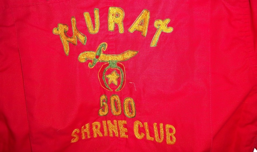
But what did these suits look like? Well this is an example of a polyester suit. It was worn by an Indianapolis based driver named Bill Brach. He was a member of the Murat Shrine in Indianapolis, and he raced in this suit.
 The suit itself dates to 1972 at least, because of an Archie Bunker For President patch.
 It has a tag that says “Untreated, will burn,should be dipped.”
 The polyester material is very flimsy, and is ripped in one part.
 It has a classic racing stripe up the side, similar to what Paul Newman wore in LeMans.
 The belt has a metal-clasp to close it, unlike most suits, which use Velcro
 The sleeves can be unzipped for comfort, which compromises the fire protection.
 The back has MURAT 500 SHRINE CLUB in chain stitching on the back.
This is an example of a suit from yesteryear. One that has been made obsolete. It is delicate, thin, and in a fire was of limited value. Nomex has become the standard, and suits like this are now simply relics.
Paint Scheme Reviews
Jamie McMurray #1 Keurig Chevy SS Great color scheme, simple design, A+
Brad Keselowski #2 Miller Lite Ford Fusion Too overdesiged. Not a good look. Good color scheme. B-
Brad Keselowski #2 Redd’s Apple Ale Ford Fusion Black and Red is always a good scheme, and the overall design is good. The sticking point for me with this scheme is that APPLE ALE is almost invisible on the quarter panel. So for a final grade, it gets a B-
Kevin Harvick #4 Budweiser Folds of Honor Chevy SS A good patriotic scheme. A
Denny Hamln #11 FedEx/Autism Speaks Toyota Camry This is, by far, the best design Denny has run all year! I can’t say anything bad about it! A+
Clint Bowyer #15 RK Motors Charlotte Toyota Camry Same bad 5 Hour Energy scheme, but with an even worse color scheme. F
Greg Biffle #16 Fastenal Ford Fusion What’s worse than camo? Blue camo! F
Ricky Stenhouse Jr. #17 Fastenal Ford Fusion A mediocre scheme, that is much too overdesigned. D-
Ricky Stenhouse Jr. #17 Cargill/Winn Dixie Ford Fusion Great color scheme, and I love the flame design on the side. A+
Kyle Busch #18 M&M’s Toyota Camry Good color scheme, good design, A+
Ryan Newman #31 Quicken Loans Chevy SS Good design, great color scheme, A
Ryan Newman #31 Wix Filters Chevy SS Awful design, and awful color scheme, F
Alex Kennedy #33 Dream Factory Chevy SS Yeah it is a tad overdesigned, but it is for a charity to help children with life-threatening illnesses. So I’ll give it a B
Reed Sorenson #36 Click it or Ticket Chevy SS Another potentially good design with a great color scheme ruined by an overly complex design. B-
David Ragan #38 The Pete Store Ford Fusion Good color scheme, great design, A+
Landon Cassill #40 CRC Brakeleen Chevy SS Good design, good color scheme, Solid A.
Landon Cassill #40 NBS Chevy SS Great design, and a good shade of green…something not seen in NASCAR much. A+
Kurt Busch #41 Haas Chevy SS If the black were blue, and the red and white stripes were kept, I would like it more, but this scheme earns a C.
Kyle Larson #42 Cottonelle Chevy SS The blue looks decent, but the target logos on blue look awkward. The 42 would look better in white than dark blue as well. C+
Aric Almirola #43 Nathans Hot Dogs Ford Fusion As much as I like Nathans Hot Dogs, this is awful! The clash between the green and blue is horrific, and I can’t give this a passing grade.
Justin Allgaier #51 Hendrickcars.com Chevy SS I like the color scheme, but the car is a bit too overdesigned. Still it earns a C
Dave Blaney #77 Fochler Veterans Law / Valor 4 Vets Ford Fusion Really good patriotic scheme here, nothing wrong, A+
Dale Earnhardt Jr. #88 National Guard/Superman Chevy SS I love the red and yellow numbers, and the overall color scheme is great. The design is a bit overdesigned though, and it brings it down to a B.
Michael McDowell #95 JPO Absorbents Ford Fusion Levine Family Racing keeps cranking out good schemes, and this A scheme is no exception. Good color and design schemes.
Michael McDowell #95 JTS/Black Dragon Ford Fusion See Above…A
Michael McDowell #95 K-Love Ford Fusion Good design, but the sky blue is awful. It just looks awful. B-
Josh Wise #98 Reddit/iRacing Ford Fusion Good design, great color scheme, A
Carl Edwards #99 Fastenal Ford Fusion See Ricky Stenhouse Above…D-

