The Driver Suit Blog-Paint Scheme Grades-March 12, 2016

By David G. Firestone

Austin Dillon #3 AAA Chevy SS-Simiar in design to Robert Hight’s funny car, which looks great, but with needless extra designs, and rearranged colors takes a B+ scheme down to a D+.

Regan Smith #7 Chevy SS-A smooth look and a great color scheme, no complaints here! A+

Matt Kenseth #20 DeWalt Toyota Camry-Same scheme as last year, same A+ grade.

Paul Menard #27 Richmond/Menard’s Chevy SS-The new Menard’s template can be temperamental, but this color scheme works very well. Black works well with Menard’s and the scheme earns an A+.

Chris Buescher #34 Dockside Logistics Ford Fusion-A smooth look and a great color scheme, no complaints here! A+

Chris Buescher #34 CSX Play it Safe Ford Fusion-Same scheme as last year, same A+ grade.

Landon Cassill #38 Snap Fitnaess Ford Fusion-Great color scheme with a smooth design will always earn an A+.

Michael Annett #46 Pilot/Flying J Chevy SS-The shade of red works well, and the overall design looks great, and earns an A+.

AJ Allmendinger #47 Fry’s Chevy SS-Same basic scheme as last year same A+ grade.

Matt DiBenedetto #83 Cosmo Motors Toyota Camry-It’s a smooth look with a great color scheme, and a HUGE improvement over last year. A+

Matt DiBenedetto #83 Schluter Systems Toyota Camry-The look is an odd one. The two designs clash a little with each other, and the stripes are dizzying. The color scheme is decent, but that can’t save it from a D-.

Cole Whitt #98 Speed Stick Chevy SS-Same scheme as last year, same A+ grade.

The Driver Suit Blog-Paint Scheme Grades-March 5, 2016

By David G. Firestone

Austin Dillon #3 Dow Intellifresh Chevy SS-Same scheme as Dow Energy and Water, same B- grade.

Regan Smith #7 Nikko Street Bratz Chevy SS-Much too over designed, and with a mediocre paint scheme to boot. F

Ricky Stenhouse Jr. #17 Ford Eco-Boost Ford Fusion-The red on top is an amazing improvement, the car just looks better than it did in 2015. Still, the design is a little overdone, but I’ll give it a B+.

Ricky Stenhouse Jr. #17 Sunny D Ford Fusion-Hmm…let’s see how many different colors and design schemes we can put into car until it will make you motion sick while you are standing still. This car is beyond over designed, and it looks AWFUL! F

Paul Menard #27 Menard’s/Dutch Boy Chevy SS-What better way to promote the quality of your paint than by running a scheme showing it chipping off the side of the car. I’m giving it an F just for that!

Landon Cassill #38 MDS Ford Fusion– It’s a simple, smooth and great scheme with a great color scheme. A+

Aric Almiroa #43 U.S. Air Force Ford Fusion-It’s the same basic scheme from 2015, with lightning added, which is a great look too. A+

Michael McDowell #95 Monte Carlo Casino Chevy SS-Same scheme as WRL Contractors, same A+ grade.

The Driver Suit Blog-Paint Scheme Grades-February 20, 2016

By David G. Firestone

Jamie McMurray #1 Credit One Chevy SS-Too many designs going on at once. It’s just an awful mess. F

Jamie McMurray #1 McDonalds/Cessna Chevy SS– A major downgrade from last year’s amazing fade. The two designs just don’t work that well together, and the car looks like a jumbled mess. Still, the color schemes are really good, so I’ll give it a B-

Regan Smith #7 Golden Corral/Niko Toy State Chevy SS-See above, but without the color scheme bonus. F

David Ragan #23 Dr. Pepper Toyota Camry-Not bad, but the side design is a tad over done for my taste. Still, it’s worth a B+.

Robert Richardson #26 Stalk It Toyota Camry-It’s a bold look with a really good color scheme that isn’t overdone. In my book, that earns an A+.

Josh Wise #30 Toyota Camry-Nothing to complain about here! A+

Bobby Labonte #32 C&J Energy Services Ford Fusion-Same scheme as last year, same F grade.

David Gilliland #35 Ford Fusion-Nothing to complain about here! A+

Landon Cassill #38 Florida Lottery Ford Fusion-Same scheme as last year, same C+ grade.

Michael McDowell #59 Thrivent Financial Chevy SS– Same scheme as #95, same B+ grade.

Martin Truex Jr. #78 Auto Owner’s Insurance Chevy SS-The vertical fade look is great, and the shades of blue look good. The numbers look really good here too. A+

Michael Waltrip #83 Maxwell House Toyota Camry-Same scheme as last year, same A+ grade.

Matt DiBenedetto #93 Dustless Blasting Toyota Camry-Same scheme as last year, same Bgrade.

Cole Whitt #98 Premium Motorsports RTIC Coolers Toyota Camry-A smooth look with a really good color scheme will always earn an A+.

The Driver Suit Blog-The ONLY Time A Visor Looks Good!

By David G. Firestone100_4068Some time ago, I did two posts focusing on one item, and for the next two weeks, I’ll do something similar. A part of the driver uniform that is seen by virtually everyone but not really discussed is the visor in the helmet. We see them on in-car cameras and on television, but we don’t think about them by itself that much. It seems like a minor part, but it has an interesting history.

From the 1920’s through the late 1980’s, helmets were primarily open-faced. This example is from the 1960’s, and was worn by Maine short track driver Jim McConnell.mcconnell-5 mcconnell-3 mcconnell-1 mcconnell-9 mcconnell-8These helmets are very simple in design, they just cover the whole head, except for the face. The downside to this is that when the sun shines in the driver’s eyes, or if the car is an open-cockpit the wind can and will force the drivers eyes closed, or fumes from the car can get in a driver’s eyes. As such, these helmets were worn with goggles.100_3182As full-faced helmets took over, the visor came attached to the helmet. The early ones were basically plexi-glass but as safety certification got more advanced, the visors were and still are fire tested. They also have to stand impact testing as well. As the helmets became more advanced over the years, so did the visors. Let’s take a look at one:100_4068This visor is from the McDonald’s helmet I covered earlier in the year. It is made of a very tough, but very light clear plastic. The visor is attached to the helmet by 3 screws, two that hold the visor to the helmet and a third that guides the visor and keep it in the proper place. There was a 4th one, but it was removed at the driver’s request. The visor has some unique features. At the bottom-left side there is a small flap, which is used by the driver to open the visor. Next to the small flap is a hole for a small peg. The peg goes in the hole, and holds the visors shut, but is small enough so that if a driver wants to open the helmet, they can do so with no trouble. Drivers frequently leave the visor open slightly, so two small knobs, one on each side so the driver can open or close the visor.100_4069Notice that it has a yellow-ish tint. This is one of 3 options for drivers, dark tint, light tint, and clear. The visor is designed to be easily changed at the drivers request. Clear visors are used for night races, and tinted ones are used for sunny races. In the event a race goes from day to night, a driver can use a tinted tear off, so that when it gets dark, they can remove the tint and have a clear visor.100_4070 100_4071Like eyeglasses, visors get scratched over time. As such, they are changed often. Like most other items racing teams and drivers use, when they are no longed needed, they are sold to the general public. They are frequently autographed by drivers, and are a popular item to get signed by drivers. They are interesting to look at, and interesting to examine up-close. All helmet visors in this day in age have a sponsor stripe across the top, and we’ll cover that next week.

Paint Scheme Reviews

Danica Patrick #10 Go Daddy Chevy SS Pinkwashing is an automatic F

Greg Biffle #16 Sherwin Williams Ford Fusion See Above

Tony Raines #40 Moon Shine Attitude Attire Chevy SS See Above

and we have a new 2014 scheme

Kasey Kahne #5 Farmers Insurance Chevy SS It’s amazing what a different shade of paint can do to a paint scheme. This years Farmer’s scheme earned a D+ because of the primary color, this scheme earns a B+ because of the color. The design needs some work, but the whole scheme is a major improvement.

The Driver Suit Blog-Open or Closed…Which Helmet Would You Have Chosen?

By David G. Firestone

[Editor’s Note: Originally, this week was a post dedicated to primary sponsor logos. However, I had this column on the shelf for a while, but given recent events in the NFL, which fellow uniform blogger Paul Lukas has covered in depth, I felt that this article concerning helmet safety in NASCAR would be appropriate to run this week, with the primary sponsor logo column running next week. DF]lepagePrior to the tragic events of the 2001 Daytona 500, drivers had to make a choice that in this day in age seems absolutely absurd. From the beginning of NASCAR to that tragic day drivers had their choice of helmets, and they were open-faced,lepage94-2or full-face.lepage99-2To examine the merits and demerits of both helmets let’s take a look at one example of each, both worn by the same driver, Kevin Lepage. First, the open-faced helmetlepage94-1 lepage94-2 lepage94-4 lepage94-3 lepage94-6 lepage94-5Worn in the Nationwide Series in 1994 and 1995 during his rookie and sophomore seasons, this helmet bears a decal from high-end plush toy company Vermont Teddy Bears. It shows very heavy use, with scratches and scuff marks, has had the microphone equipment removed, and Lepage has signed the back of the helmet in black Sharpie.

Now let’s look at the full-face helmet,lepage99-1 lepage99-2 lepage99-3 lepage99-5 lepage99-6 lepage99-7 lepage99-8Worn by Lepage in the 1999 Winston Cup season, this helmet was painted for the combination Primestar/TV Guide #16 Ford. Like the open-faced helmet, it shows scratches and scuff marks, and Lepage has signed the top of the helmet above the visor. Unlike the open-faced helmet, this helmet still has the microphone equipment.

Now on to the comparison…

Looking at the helmets from the inside, there was no real difference between the two. Both are the same basic design, with the same inner liner and filler.lepage7The left sides of the helmets differ greatly. Notice that there is a hose attachment near the Ford logo on the full-faced helmet. This is to accommodate the “hotbox” attachment. Hotboxes are designed to force air into the driver’s face to help keep them cool. This is not a luxury, as driver compartments can reach as high as 160 degrees Fahrenheit, and drivers typically wear 3-4 layers of Nomex during a race. Keep in mind that in-car drinking systems are not standard as of 2000, and the hotbox is a great tool for driver comfort.lepage5Microphone equipment is added to the helmet on the right side. The only difference between these two helmets is that the microphone has been removed on the open-faced helmet.lepage1The back of the helmets are virtually identical except for the paint schemes and the liability tag present.lepage6The front of the helmet is the key to making the decision. Everything else thus far is a minor issue. The question was asked then, and is asked now, why were these helmets legal for as long as they were? These pictures should answer that question:lepage3 lepage4The bottom of the helmet underneath the visor gives an extra bit of safety in case of fire, BUT takes away about 2-3 inches of visibility. That 3 inches might not seem like that much, but in a race car, trying to keep situational awareness of what the car is doing, those 3 inches are as critical as you can imagine. NASCAR at the time had the opinion that if they had the restriction in place, that the obstruction could cause a driver to lose that situational awareness, and lead to a wreck. NASCAR felt that any rule that could cause a wreck is a bad idea, and rightfully so. How often in the wake and investigation of accidents does it reveal that a rule, regulation, or guideline cause an accident? It happens quite often. NASCAR at the time felt that imposing a rule that all helmets should be full-faced that is could very easily lead to an accident, and as such, allowed open-faced helmets to avoid that from happening.

It was a rule that was easy to understand, but would lead to tragedy. It led to this design, which itself is now becoming obsolete:mcdonalds-1 mcdonalds-6 mcdonalds-7 mcdonalds-4 mcdonalds-3 mcdonalds-9 mcdonalds-10 mcdonalds-12Now, even the best full-faced helmet designs from the 1990’s are now a distant memory and the current helmet design has taken over. It might seem like unfair, but if these rules were in place at the 2001 Daytona 500, we would have never lost a true legend.

Paint Scheme Reviews!

Jamie McMurray #1 Linksys Chevy SS Clean lines and a great color scheme make for an A+ scheme!

Matt Kenseth #20 Husky/500th Start Toyota Camry The gray-scale design does not work here at all. The rest of the car looks very good, but the black and dark gray color scheme needs work. If the Husky red is where the gray is, it would work better, but the best grade I can give is a C-

Michael McDowell #51 SEM Chevy SS Classic design with a great color scheme, A+

And we have a 2014 leak…

Austin Dillon #3 Cheerios Chevy SS This is the best Cheerios scheme I have ever seen! The goofy bagel design is gone, and has been replaced with a couple of racing stripes. I also love the black around the #3. If this is the final design, it will be a great car, and I give it an A+!

The Driver Suit Blog..The SFI and FIA patches…Why they are as critical as they are.

fia 1By David Firestone

Many race fans have seen these small patches on driver suits, and may have wondered what they are. What many do not realize is that these small patches have a very critical role in driver safety. These small patches are the safety certification patches. These small patches state that this uniform part has been examined by one of the two groups, and determined to meet the standards set by the group. For North American made equipment that group is SFI.

sfiAccording to their website, SFI was founded in 1963 as part of Speed Equipment Manufacturers Association or SEMA, as a safety group. Back then, the safety culture wasn’t as rigorous as it is today, and there were not many standards in place. SEMA started the safety certification with SFI or SEMA Foundation, Inc certification. If the equipment didn’t meet SFI standards, the participant could be denied entrance to the event. Eventually, SFI left SEMA and became its own independent group.

Since then, SFI has certified safety equipment, and their certification is the standard in North America. This small patch is usually sewn into the inside wrist area on the left sleeve. This example, from a Terry Labonte suit from 2008, indicates that the suit meets “3.2A/5” standards. According to their site, this certification is standard for driver suits, and this suit would need re-certification in the next 5 years, or 2013. This certification is standard for many NASCAR suits, as shown below.12-stremme-sfi36-said-sfi

10-labonte-sfi 12-miller-sfiFor suits made internationally, the certification comes from a different group, the FIA Institute. Like SFI, the FIA Institute has the exact same goal, to make sure auto racing is safe, and that the equipment that drivers wear is as safe as possible. Unlike SFI however, FIA certification ends up in one of two places, either on the back of the neck,36-barron-neckor inside the belt,

9-kahne-fiaBoth certifications serve the same purpose and both are mandated in racing today. These certifications also appear on driver gloves,90-stricklingloves-ltagand even helmets, usually on the HANS anchormcdonalds-2 - CopyMoving on to more 2013 paint schemes…

Trevor Bayne #6 Valvoline Ford Mustang Love this scheme! This brings back some fond memories of Mark Martin behind the wheel back in the 1990’s. The color and design scheme are amazing, so it gets an A

Regan Smith #7 Tax Slayer/Hellman’s Chevy Camaro Same as the 5 and 88, so nothing really to say here…

Brad Keselowski #22 Hertz Ford Mustang Only Penske can ruin one of the best color schemes with an awful design. Seriously what is the design on the front? It kills this scheme. Final Grade: D

Travis Pastrana #60 Ford Mustang What the Hell? Did Lisa Frank design this car? I’d love to comment on the color scheme, but just looking at the picture is enough! I didn’t think it was possible to make a scheme worse than the Kyle Bush Sponsafier car, but here we are! Final Grade: F’

By the way, I never thought I would reference Lisa Frank in this blog…

Jamie McMurray #1 Cessna Chevy SS Cessna has figured out the way to a good paint scheme, simple colors and simple design. It works very well and earns an A grade.

Casey Mears #13 Geico Ford Fusion Eww…just eww. The color scheme is dreadfull, and the designs on the side are painful to look at. It passed because of the logo and number design. Final Grade: D-

Kyle Busch #18 Interstate Batteries Toyota Camry Great color scheme, and good basic design, but there is something with this car I find annoying. The driver’s name is on the windshield and above the door, so why is it on the top of the hood? Not just on the top of the hood, but UPSIDE DOWN as well? Seriously? It makes no sense, and takes the final grade down to a B

The Driver Suit Blog-NASCAR Helmets Over The Years

By David G. Firestonemcconnell-5The evolution of the racing helmet in NASCAR for the most part was slow, in the beginning. NASCAR was officially founded in 1947, two years after World War II ended. Many of the helmets worn during the 1940’s and 1950’s were little more than repainted army and air force helmets. These helmets were basic at best, and as protection for the dangers of racing, these helmets were inadequate at best. During the 1950’s, many drivers switched from military headgear to motorcycle helmets. In the 1960’s, motorcycle-style helmets became the norm.mcconnell-5The above helmet was worn by Jim McConnell, who raced and promoted races in Maine, and went on to found Beech Ridge Motor Speedway in Scarborough, Maine. This is a racing helmet, but it looks more like Wyatt’s Captain America helmet from Easy Rider, in its basic design. It has an open face, no microphone equipment, and is rather thin. Although there would be advancements in helmet technology, the open-face design would remain popular until the 1980’s.Noffsinger-1This helmet was worn by Brad Noffsinger in 1988, it is the same general design, though it is much thicker, has some advancements in visor technology, and had some microphone technology in it as well. Although these helmets have since been banned, they remained legal for as long as they did for one simple reason: Advanced visibility. NASCAR did not want to have a crash caused by decreased visibility due to a rule mandating full-face helmets.musgrave1The Ted Musgrave helmet mentioned in a previous post is a perfect example. The bottom part covering the chin does to a certain extent reduce visibility for a driver. The logic makes sense, in that if there was a crash caused by reduced visibility, so for the 1990’s and 2000, the open-face was legal…then came the 2001 Daytona 500. That race saw the death of Dale Earnhardt Sr. from a Basilar skull fracture, which as tragic as it was, wasn’t the first death due to sub-par safety equipment. John Nemechek, Adam Petty, Kenny Irwin Jr., and Tony Roper had all been killed in similar accidents. Only after Earnhardt’s death, did the HANS device come to light, and eventually became mandatory in NASCAR, and eventually, across the board in racing. Now the helmets used in NASCAR look like this:mcdonalds-1This is a helmet worn between 2004 and 2005 by either Regan Smith or Jason Keller. As you can see, it has a number of advancements, including the visor, and air intakes, but the biggest advancement is these small bolts towards the back.mcdonalds-2 - CopyThese are where the HANS device connects to the helmet. The HANS device was mandated after the death of Dale Earnhardt Sr. to prevent Basilar skull fracture deaths. This device has worked very well. The HANS device works by attaching the device to the helmet, and then being secured by the shoulder straps.

As advanced as this helmet is, there is always room for improvement. What new form will the racing helmet of tomorrow take? Only time will tell.

On to Paint Schemes, we have a lot of ground to cover today…

First in the Camping World Truck Series

Chris Cockrum #07 Accu-Tech/Homesmart Toyota Tundra Decent color scheme, good stripe pattern, logos are easy to see. Solid A grade.

Sean Coor #82 Warriors in the Workplace Ford F-Series Simple yet bold. Great use of matte black, great number design and color scheme. The logo is easy to see and stands out. No distracting stripes or patterns. Solid A grade.

Next up, the Nationwide Series

Sam Hornish Jr. #12 Wurth Tools Ford Mustang The doors look like they have race damage on them already, which is not a good sign. The color scheme is decent, but the Pennzoil stripes just kill it. The logos are easy to see, but the stripes are just awful. Final grade C+

Matt Kenseth #18 Reser’s Foods Toyota Camry. Numbers are great, color scheme is good, logos are easy to see, and the background design is visible, but not overpowering. The only thing keeping this scheme from a higher grade is the picture of the package on the side of the car. That drags the grade down to a B+ from an A

Now moving on to the Sprint Cup Series

Denny Hamlin #11 FedEx Toyota Camry There are a total of 4 variations of the FedEx scheme, Express, Freight, Ground and Office. Right off the bat, the front nose design and stripes are awful. The color schemes are great, as are the logos and numbers, but the stripes kill it. The best grade I can give is a C+ across the board.

Paul Menard #27 Menard’s Chevy SS Not the worst I have ever seen, but the yellow is way too bright, and the massive collection of sponsor stickers on the quarter panel is just ugly. Final Grade C-

The Driver Suit Blog-Televison Logos

By David Firestone

I recently did a post focusing on Christian Fittipaldi, and the unusual way his suit displayed the so-called television logos.  But these logos have a unique history all their own.  One of the first examples on an in-car camera being used was the 1979 Daytona 500.  At that time driver suits mostly looked like this: That is Buddy Baker after winning the pole at Bristol that same year.  As can be clearly seen, no logos of any kind on the legs, or sleeves.  For much of the early and late 1980′s that was mostly the case.  Even though by 1989 there were opportunities to add logos in good places, in many instances this did not occur.  There are instances where there were logos on the legs and sleeves, and the position in many of them is consistent with today.

In the late 1990′s, TV logos were still, for the most part off the radar screen.  But around 1997, sponsors started taking the hint, and adding these logos.  Although it was not popular across the board,  it steadily gained momentum, and by 2004 these logos began to be the rule rather than the exception.    Granted in-car cameras were somewhat more nomadic then they are now, but even still it is kind of amazing that these logos took as long as they did to catch on.  Here is an example of a televison logo.  This logo comes from a Mike Skinner suit from 1997:31-skinner-rsleeve2 - Copy

This is how it appears when the driver’s arms are at their sides.  When the driver has his arms at the wheel, or crossed, the logo appears like this:31-skinner-rsleeve2

It seems so simple, and it is surprising that it took that long to figure this out.  In fact, in a number of instances, logos on sleeves looked like this, The Ted Musgrave suit from a previous post:15-musgrave-rsleeve1

While that looks good outside the car, inside the driver compartment, it looks like this to an in-car:15-musgrave-rsleeve1 - Copy

Not good for an in-car, the logo is next to impossible to read.  The legs have gotten the same treatment, in some cases the logo looks like this Ricky Craven model from 1996:41-craven - Copy

But to an in-car camera, the logos look like this:41-craven-legs - Copy

Again, the logo is impossible to read.  The proper alignment looks like this:31-skinner-legs

This is the proper alignment, when the driver is in the car, and the camera is to the side, the logo appears as such:31-skinner-legs - Copy

The whole point of sponsorship in racing is brand exposure, and these logos are a perfect example of this.  I still love the fact that even the drivers who almost never have an in-car camera have these logos.

Moving on to more 2013 paint schemes….

Ryan Newman #39 Wix Filters Chevy SS  “Black with lime green and silver shark fins is a really great design” said no one ever.  Final Grade: F

Moving on to the Nationwide Series…

Austin Dillon #3 Advocare Chevy Camaro  I’m not a fan of power blue in most cases, but here it just works.  The RCR 3 always looks good, the logos are good, and the whole car looks sold.  Final Grade: A

Regan Smith #5 Tax Slayer/Hellmans Chevy Camaro  Could someone please explain to me why Dale Jr. and Regan Smith are running identical paint schemes in the Nationwide Series this year?  The only differences between the two cars are the numbers and name rail.  The Hellmans scheme stays at a B-, but the Tax Slayer scheme looks better from the layout shown here, and it has earned the A rating.

Brad Keselowski #22 Discount Tires Ford Mustang This would be an A grade, if not for the Discount Tire logo…why does it look like it was designed by a 5 year old in art class?  The letters are so horribly aligned, it takes the scheme from classic to comical.  I’m shocked that it isn’t written in Comic Sans with the D backwards.  It is really sad, because it takes away from an otherwise great scheme, and takes the final grade from A to B-

Ty Dillon #33 Ritz/Wesco/Armour Chevy SS Three schemes to discuss.  The Wesco scheme is good but if the door numbers were a different color than the stripes, it would get a better grade than B-.  The Ritz scheme is completely solid, with great colors, great design, and great logos, and gets an A.  The Armour scheme is decent, but the numbers could use a more visible outline.  There is also a logo just behind the door number that is next to invisible.  Final Grade B+

The Driver Suit Blog-The Curious Case of The Bugle of Christian Fittipaldi

By David Firestone

Christian Fittipaldi is a Brazilian race driver who raced in F1, Champ Car and eventually NASCAR. Although he had two wins in Champ Car, his F1 and NASCAR careers were fruitless. His NASCAR career lasted from 2002-2003, and during that time he raced in a total of 16 races, with 2 DNQ’s. With the exception of the 2003 Daytona 500, all of his races were for Petty Enterprises, and he raced in all 3 of their teams at the time, cars #43, 44, and 45. His final two races were for car #44, which at the time was sponsored by Bugles.44-fittipaldi

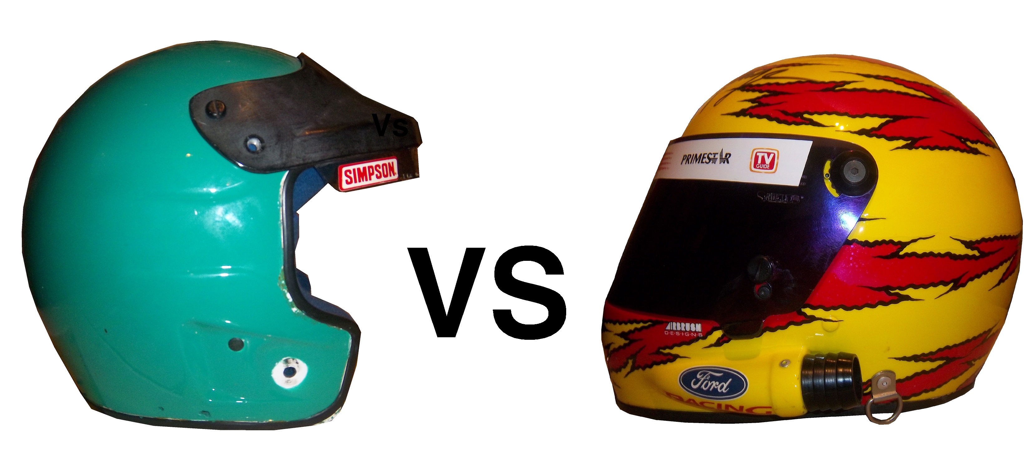
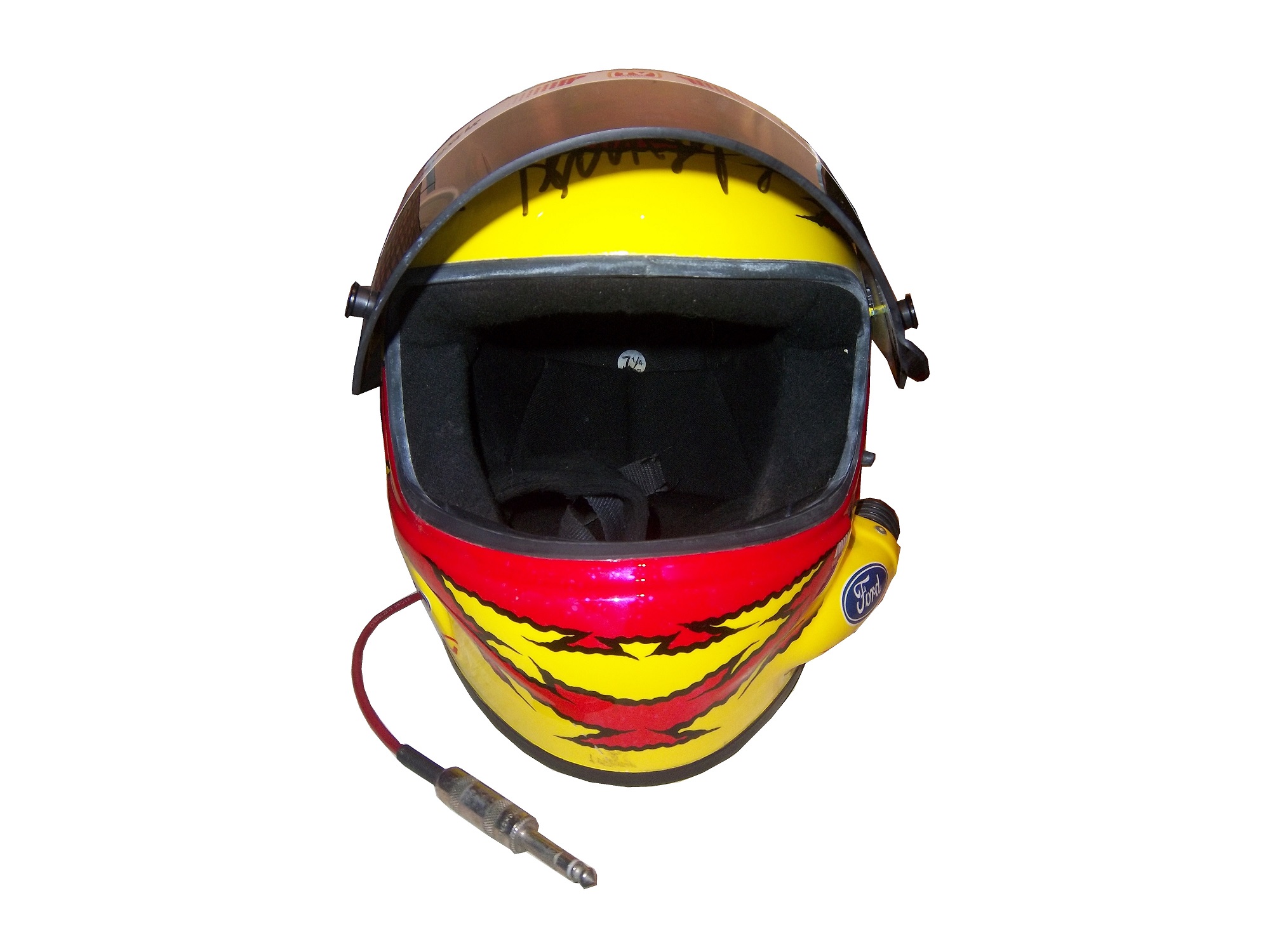
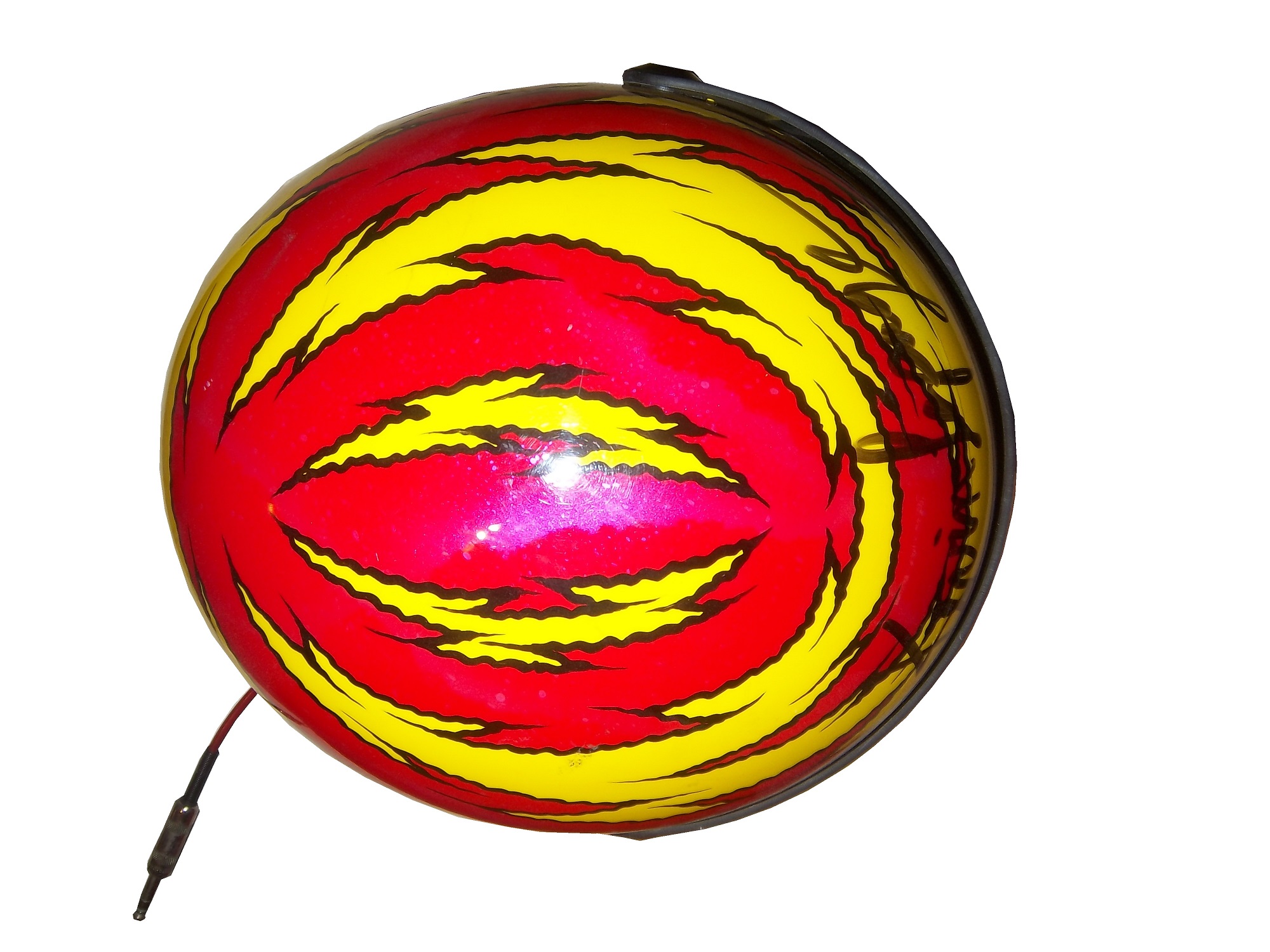
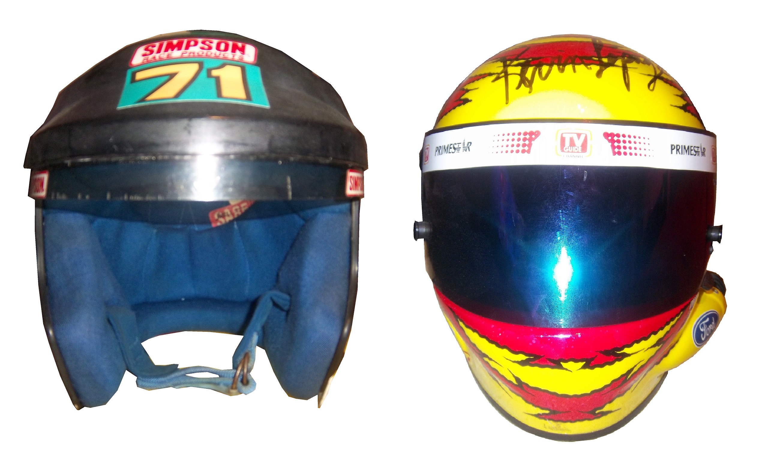
In 2011, I bought the Bugles driver suit Fittipaldi wore for those final two races. When I got the suit, I saw it had some…irregularities to it. The most prominent feature are the television logos on the sleeves.44-Fittipaldi-rsleeve244-Fittipaldi-lsleeve2

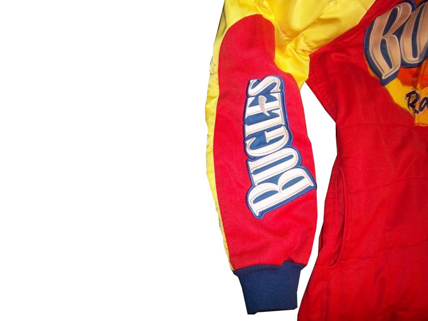
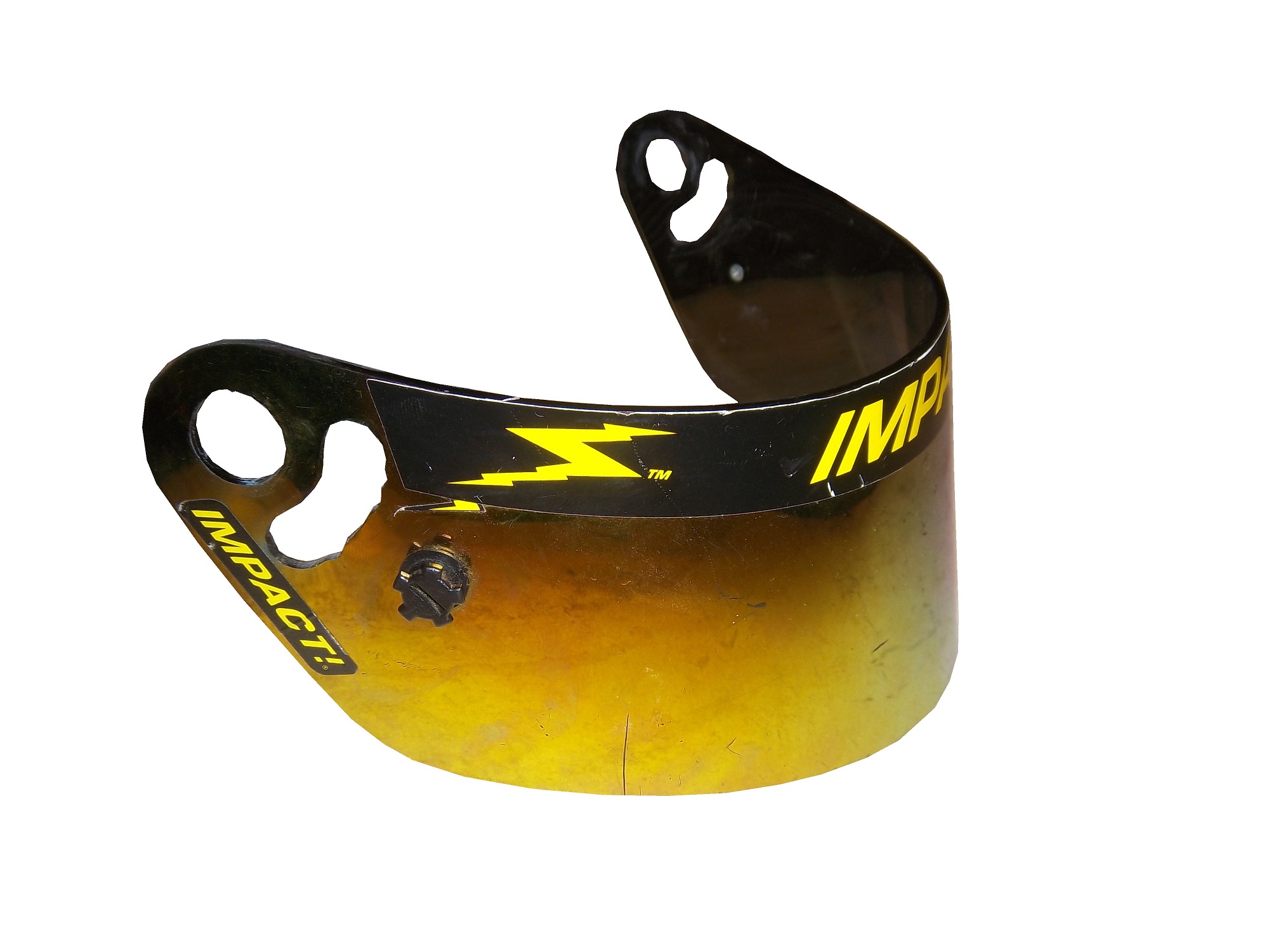
Notice anything odd? The TV logos on the sleeves are incorrectly positioned…for NASCAR. I found this to be a bit odd, as there seems to be no logical reason for the logos to be set the way that they are. These logos, introduced in the 1990′s as a way for the primary sponsor of the car to advertise to the in-car cameras, should be positioned so that the logo appears clearly. These logos are designed for a camera mounted in the area where the passenger seat would be, as seen at 3:48 in the video below:

The logos are upside down. I was trying to understand why this was done, and then I watched the Indianapolis 500, and watching the in-car views, and suddenly, it all made sense, as seem below:

It became clear rather quickly that the TV logos are correct for F1 and IndyCar in-car cameras, but not correct for NASCAR ones. It seems that this car was designed for an open-wheel car, but not a stock car. The evidence on the shoulders is further proof…

ImageImage
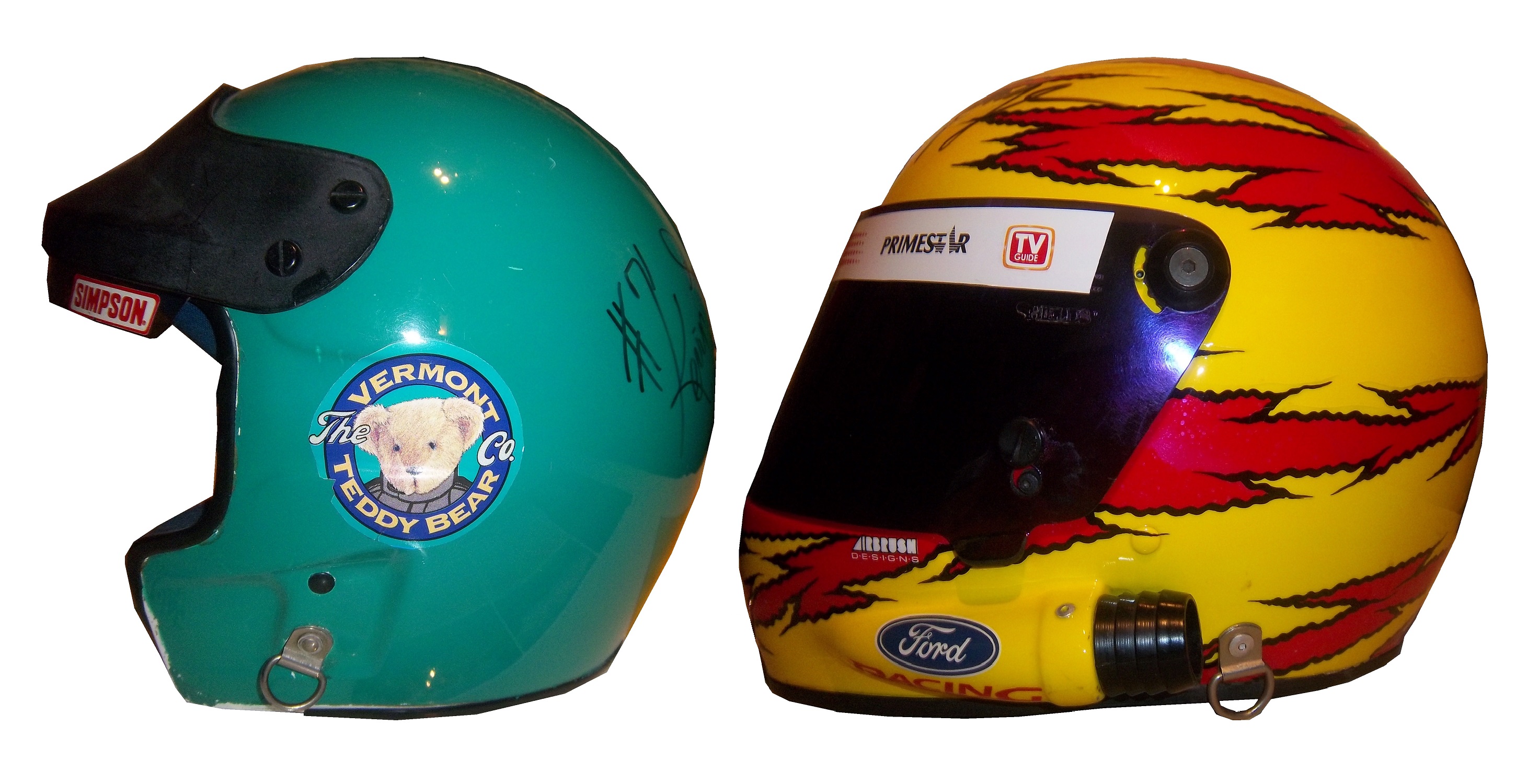
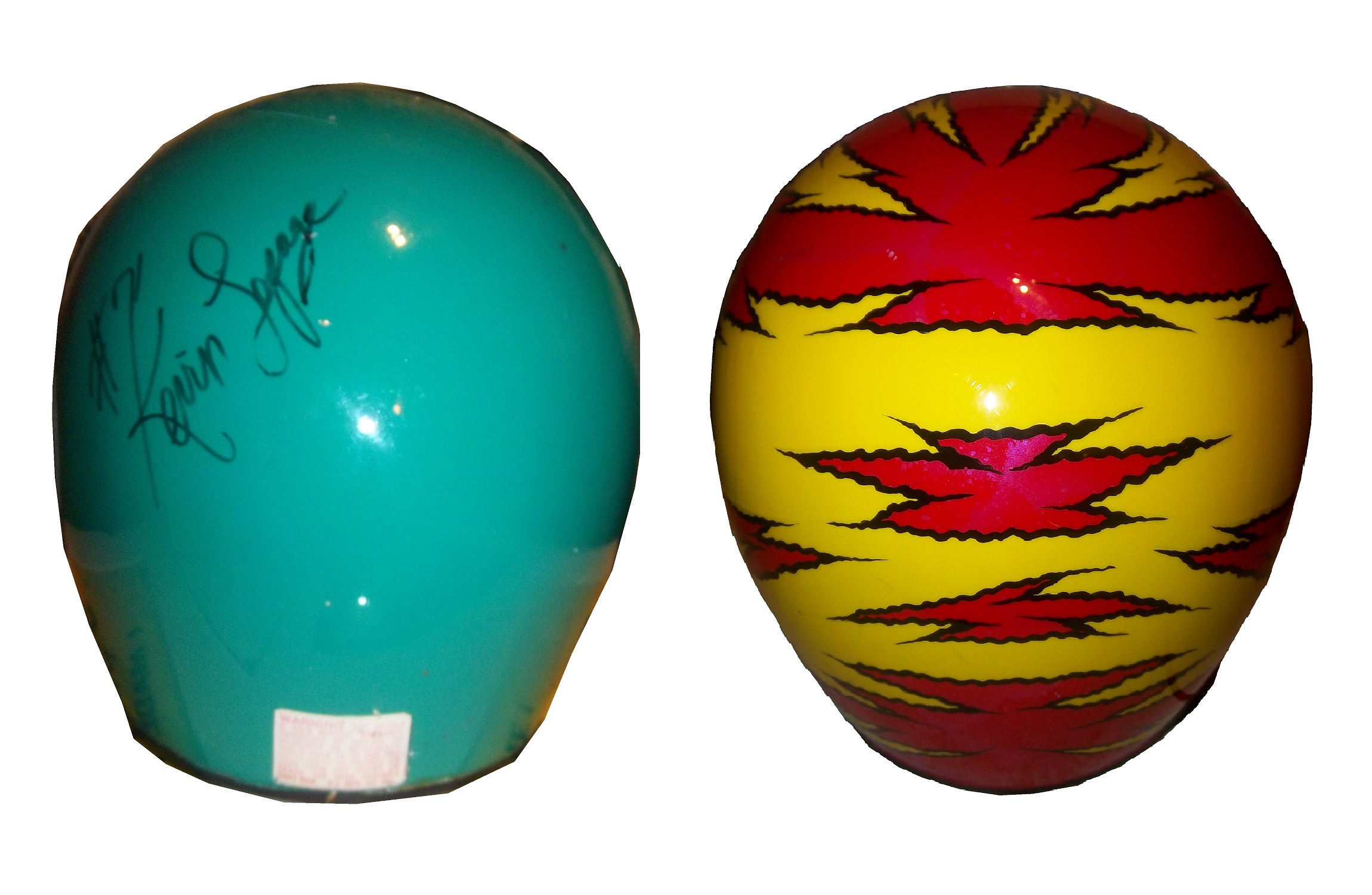
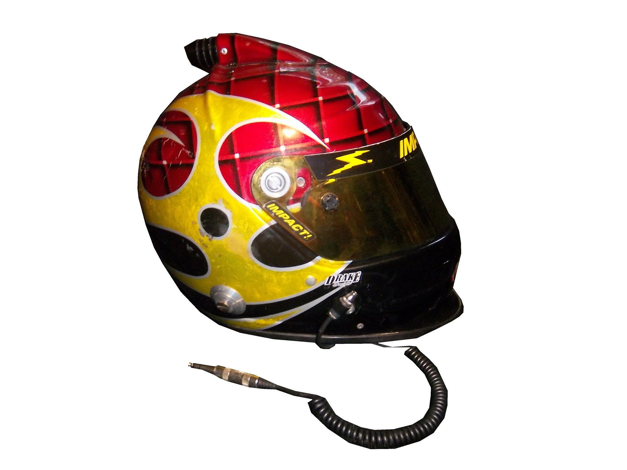
I’ve never seen any shoulder design like that of this suit before. The V pattern with the Goodyear logos on both sides. This is not unique to this suit, the shoulder designs of an earlier Christian Fittipaldi suit are the same as this one, though the logos are not visible on the back.

45-fittipaldi-rshoulder

45-fittipaldi-lshoulderSo we have two anomalies to this suit, but why did this happen? This suit was worn in 2003, and these logos were developed an implemented in the mid 1990′s. My theory to the answer can be found in two things, who wore the suit, and who made the suit. Fittipaldi was an open-wheel driver, and frequently wore suits made by an Italian company named Momo. Although Momo makes NASCAR equipment now, back in 2003, they were new to the NASCAR game, and as such were not as used to designing for NASCAR in-car cameras. As such, they designed the suit for an open-wheel car.

Granted Momo wasn’t as familiar with the design of stock cars, and their in car camera placement, but even so, wasn’t there somebody examining the suit? Wasn’t a team representative present at any point in the process? How does a mistake like that happen? The thing that really gets me is this…that was from the same season, and was made by the same company, but clearly the logos are correct in this shot…if they get it right once, why can’t they get it right again? How did that mistake happen? Well it did, and although there was no harm done, it does look pretty goofy…

Moving on to new paint schemes, let’s look at some…

First in the Nationwide Series

Regan Smith #5 Hellman’s Chevy Camaro The yellow is ok, a bit too bright for my taste, but I have seen much worse. The stripes look good, great colors and they are easy to figure out unlike some others. Final Grade: B+ Tone down the yellow a bit and it would be an ANow onto the Sprint Cup:

Matt Kenseth #20 Husky Toyota Camry Not much really to say, mediocre color scheme, no real design to comment on, the logos are plain Jane enough, it’s a bland scheme that earns a C grade. A mediocre grade for a mediocre scheme.

Aric Almirola #43 Smithfield Foods Ford Fusion Basically the scheme is unchanged from last year, and that is a good thing. I love this scheme, great color, great design, looks good, the logos are easy to see, and I give it an A. Extra credit was given for the use of Petty Blue.

Bobby Labonte #47 House Autry House Foods Toyota Camry The design is simple, but good. The color scheme need some work. The red used is too bright, as is the blue. The logo group on the quarter-panel is awful. The really odd thing is that this is the first scheme of Labonte’s that has been released, and it is the scheme slated for the All-Star Race. Why in the world would the All-Star Race scheme be released before any of the regular season races? I just don’t understand the logic here. But that being said, the final grade is a B-. If the color wasn’t so bright, I could grade it higher.