2015 Paint Scheme Tracker-10-21-2014

By David G. Firestone

Two Jeff Gordon schemes this week, not much else to say, it should pick up in a few weeks.

2015 Toyota CamryThe first Gen 6 redesign comes to the Camry for 2015. The front is sleeker, with a more aggressive nose, and grill area, the tail has been redesigned as well.

Brad Keselowski #2 Miller Lite Ford FusionSame basic design as 2014, but with no gold stripe, vintage Miller Crest, or hop designs on the side.

Austin Dillon #3 Cheerios Chevy SSNo change

Austin Dillon #3 Dow Chevy SSNo change

Kevin Harvick #4 Budweiser Chevy SSNo change

Kevin Harvick #4 Jimmie Johns Chevy SSNo change

Kevin Harvick #4 Outback SteakhouseNo Change

Kevin Harvick #4 Ditech Chevy SS-New sponsor for 2015, blue, and white is the primary color scheme

Kasey Kahne #5 Great Clips Chevy SSNo Change

Kasey Kahne #5 Time Warner Cable Chevy SSNo Change

Kasey Kahne #5 Farmers Insurance Chevy SSComplete redesign from last year, black, and dark blue replaces light blue and silver, and the design has been completely revamped.

Trevor Bayne #6 Advocare Ford Fusion-New team, new sponsor, red, white and blue is the color scheme.

Danica Patrick #10 Aspen Dental Chevy SSSame basic design as last year, but the blue ovals on the white are more pronounced.

Tony Stewart #14 Bass Pro Shops/Mobil 1 Chevy SSSame color scheme as last year, but with a new design on the side.

Tony Stewart #14 Mobil 1/Bass Pro Shops Chevy SSSame color scheme as last year, but with a new design on the side.

Tony Stewart #14 Code 3 Associates/Mobil1 Chevy SSNo Change

Greg Biffle #16 Ortho Fire Ant Killer Ford FusionNo change

Greg Biffle #16 Ortho Bug-B-Gon Ford Fusion-New sponsor, new design, red, black, and white is the primary color scheme.

Ricky Stenhouse Jr. #17 Fastenal Ford Fusion-New primary sponsor, blue, and white is the color scheme.

Carl Edwards #19 Stanley Toyota Camry-New team and new sponsor, yellow, black, and white is the color scheme.

Matt Kenseth #20 DeWalt Toyota Camry-New sponsor, black, green, yellow, and white is the color scheme.

Jeff Gordon #24 Axalta Chevy SSNo Change

Jeff Gordon #24 Panasonic Toughbook Chevy SSNo Change

Joey Logano #22 Shell/Pennzoil Ford FusionNo change

Paul Menard #27 Pittsburgh Paints/Menard’s Chevy SSNo change

Ryan Newman #31 Cat Chevy SSSame color scheme, but the car as a whole has been redesigned

Ryan Newman #31 Quicken Loans Chevy SSNo change

Ty Dillion #33 Yuengling Brewery Chevy SS-New sponsor, red, white, and blue is the primary color scheme.

Kurt Busch #41Haas CNC Chevy SSSame color scheme, but the car has been completely redesigned.

Kurt Busch #41 Slate Water Heaters Chevy SSNo change

Aric Almirola #43 Smithfield Ford FusionNo change

Dale Earnhardt Jr. #88 Nationwide Chevy SSNo Change

By David G. Firestone

This week, Toyota rolled out their new 2015 Toyota Camry, and came out with the new Gen 6 car design, nothing really besides that.

2015 Toyota CamryThe first Gen 6 redesign comes to the Camry for 2015. The front is sleeker, with a more aggressive nose, and grill area, the tail has been redesigned as well.

Brad Keselowski #2 Miller Lite Ford FusionSame basic design as 2014, but with no gold stripe, vintage Miller Crest, or hop designs on the side.

Austin Dillon #3 Cheerios Chevy SSNo change

Austin Dillon #3 Dow Chevy SSNo change

Kevin Harvick #4 Budweiser Chevy SSNo change

Kevin Harvick #4 Jimmie Johns Chevy SSNo change

Kevin Harvick #4 Outback SteakhouseNo Change

Kevin Harvick #4 Ditech Chevy SS-New sponsor for 2015, blue, and white is the primary color scheme

Kasey Kahne #5 Great Clips Chevy SSNo Change

Kasey Kahne #5 Time Warner Cable Chevy SSNo Change

Kasey Kahne #5 Farmers Insurance Chevy SSComplete redesign from last year, black, and dark blue replaces light blue and silver, and the design has been completely revamped.

Trevor Bayne #6 Advocare Ford Fusion-New team, new sponsor, red, white and blue is the color scheme.

Danica Patrick #10 Aspen Dental Chevy SSSame basic design as last year, but the blue ovals on the white are more pronounced.

Tony Stewart #14 Bass Pro Shops/Mobil 1 Chevy SSSame color scheme as last year, but with a new design on the side.

Tony Stewart #14 Mobil 1/Bass Pro Shops Chevy SSSame color scheme as last year, but with a new design on the side.

Tony Stewart #14 Code 3 Associates/Mobil1 Chevy SSNo Change

Greg Biffle #16 Ortho Fire Ant Killer Ford FusionNo change

Greg Biffle #16 Ortho Bug-B-Gon Ford Fusion-New sponsor, new design, red, black, and white is the primary color scheme.

Ricky Stenhouse Jr. #17 Fastenal Ford Fusion-New primary sponsor, blue, and white is the color scheme.

Carl Edwards #19 Stanley Toyota Camry-New team and new sponsor, yellow, black, and white is the color scheme.

Matt Kenseth #20 DeWalt Toyota Camry-New sponsor, black, green, yellow, and white is the color scheme.

Joey Logano #22 Shell/Pennzoil Ford FusionNo change

Paul Menard #27 Pittsburgh Paints/Menard’s Chevy SSNo change

Ryan Newman #31 Cat Chevy SSSame color scheme, but the car as a whole has been redesigned

Ryan Newman #31 Quicken Loans Chevy SSNo change

Ty Dillion #33 Yuengling Brewery Chevy SS-New sponsor, red, white, and blue is the primary color scheme.

Kurt Busch #41Haas CNC Chevy SSSame color scheme, but the car has been completely redesigned.

Kurt Busch #41 Slate Water Heaters Chevy SSNo change

Aric Almirola #43 Smithfield Ford FusionNo change

Dale Earnhardt Jr. #88 Nationwide Chevy SSNo Change

The Driver Suit Blog-2015 Paint Scheme Tracker

By David G. Firestone

From here on out, I will publish a complete list of 2015 paint schemes that have been announced, on Wednesdays.  I will grade them as normal on Saturdays.  Again these should be taken with a grain of salt as they can and often are changed between now and the next season.  So without further ado, the first 2015 trackers!

Brad Keselowski #2 Miller Lite Ford FusionSame basic design as 2014, but with no gold stripe, vintage Miller Crest, or hop designs on the side.

Austin Dillon #3 Cheerios Chevy SSNo change

Austin Dillon #3 Dow Chevy SSNo change

Kevin Harvick #4 Budweiser Chevy SSNo change

Kevin Harvick #4 Jimmie Johns Chevy SSNo change

Kevin Harvick #4 Outback SteakhouseNo Change

Kevin Harvick #4 Ditech Chevy SS-New sponsor for 2015, blue, and white is the primary color scheme

Kasey Kahne #5 Great Clips Chevy SSNo Change

Kasey Kahne #5 Time Warner Cable Chevy SSNo Change

Kasey Kahne #5 Farmers Insurance Chevy SSComplete redesign from last year, black, and dark blue replaces light blue and silver, and the design has been completely revamped.

Trevor Bayne #6 Advocare Ford Fusion-New team, new sponsor, red, white and blue is the color scheme.

Danica Patrick #10 Aspen Dental Chevy SSSame basic design as last year, but the blue ovals on the white are more pronounced.

Tony Stewart #14 Bass Pro Shops/Mobil 1 Chevy SSSame color scheme as last year, but with a new design on the side.

Tony Stewart #14 Mobil 1/Bass Pro Shops Chevy SSSame color scheme as last year, but with a new design on the side.

Tony Stewart #14 Code 3 Associates/Mobil1 Chevy SSNo Change

Greg Biffle #16 Ortho Fire Ant Killer Ford FusionNo change

Greg Biffle #16 Ortho Bug-B-Gon Ford Fusion-New sponsor, new design, red, black, and white is the primary color scheme.

Ricky Stenhouse Jr. #17 Fastenal Ford Fusion-New primary sponsor, blue, and white is the color scheme.

Carl Edwards #19 Stanley Toyota Camry-New team and new sponsor, yellow, black, and white is the color scheme.

Matt Kenseth #20 DeWalt Toyota Camry-New sponsor, black, green, yellow, and white is the color scheme.

Joey Logano #22 Shell/Pennzoil Ford FusionNo change

Paul Menard #27 Pittsburgh Paints/Menard’s Chevy SSNo change

Ryan Newman #31 Cat Chevy SSSame color scheme, but the car as a whole has been redesigned

Ryan Newman #31 Quicken Loans Chevy SSNo change

Ty Dillion #33 Yuengling Brewery Chevy SS-New sponsor, red, white, and blue is the primary color scheme.

Kurt Busch #41Haas CNC Chevy SSSame color scheme, but the car has been completely redesigned.

Kurt Busch #41 Slate Water Heaters Chevy SSNo change

Aric Almirola #43 Smithfield Ford FusionNo change

Dale Earnhardt Jr. #88 Nationwide Chevy SS-No Change

The Driver Suit Blog-Why I Hate Politics and Paint Scheme Update

By David G. Firestone

I have a lot of paint schemes to discuss and we will get to that shortly. I wanted to discuss something that took place before the Coke Zero 400 last week. It is a bit murky, but here is what took place.

Charlie Crist is a former governor of Florida, and a former Republican. After a brief hiatus from politics, he has annoucned his intentions to run for the Governor of Florida as a democrat. He had plans to run the #98 Phil Parsons Racing Ford driven by Josh Wise. After this was announced however, the Republican Party of Florida filed a lawsuit stating that it was a campaign contribution worth more than $3,000. Remember, this was the same team that was crowd funded by Reddit and Dogecoin at Talladega, and that sponsorship cost about $55,000. It was later reported that the Charlie Crist decals had been removed from the car. Phil Parsons Racing stated the deal was in response to a series of negative ads toward Crist, and that the Crist decals were part of a deal with recording artist Lee Brice. They also stated that they didn’t pull the sponsorship due to the lawsuit, and that the $25,000 sponsorship would be returned.

I frankly don’t buy any of that for a second. I think that it was because of the lawsuit, and that Phil Parsons Racing did not want to get thrown under the bus because of it. They tried to handle it as diplomatic as possible, but it still sounds sketchy. The other reason I have a huge problem with this is because the simple fact that politics and racing don’t mix. Look at what’s happened with F1 and IndyCar. Politics are a constant issue in the sport, and I for one am tired of it. Look at the Ayrton Senna/Alan Prost battle in the 1990’s! Look at The Split! Politics ruins racing!

This is not the first time a politician with deep pockets has sponsored a race car, but I hope that this is the last time. I’m not against politics, I’m against forcing it into something it has no place being in! If tobacco, cel phone carriers, and hard liqour have or had been banned from sponsoring cars, then so should politicians.

Ok enough serious stuff, on to…

PAINT SCHEME REVIEWS!

Jamie McMurray #1 Cessna/Hawker Chevy SS Nothing bad to say here…A+

Jamie McMurray #1 Lexar Chevy SS Great Color Scheme, great design, A+

Austin Dillon #3 Great Stuff Chevy SS Color scheme is good, the design looks very odd. The gold numbers and chain design does not suit the car at all, and if they were left off, I would give it an A, but this scheme earns a B-

Austin Dillon #3 NRA Museum Chevy SS Good color scheme, decent design, B+

Austin Dillon #3 Cheerios Protien Chevy SS Much too overdeisgned, decent color scheme, C-

Kasey Kahne #5 Team Stream Chevy SS Good color scheme, but Kasey loves to drive overdesigned cars, and this is no exception. I’m giving it a C which is a very fair grade here.

Kasey Kahne #5 Farmers Chevy SS Good color scheme, decent design, B+

Marcos Ambrose #9 Black and Decker Ford Fusion Good color scheme, Good design, A

Danica Patrick #10 GoDaddy/Florida Lottery Chevy SS It looks like two people designed this car, and they didn’t talk to each other while designing it. Both sets of color schemes are awful, and both design schemes are awful. F-

Greg Biffle #16 3M/DAV Ford Fusion Green usually doesn’t look good, camo never looks good, so this scheme earns an F

Greg Biffle #16 3M Aerospace Ford Fusion See Above F

Greg Biffle #16 NESN 30th Anniversary Ford Fusion A bit less overdesigned, at least by Greg Biffle’s standards, and I do like the Red Sox and Bruins logos as well, so I will give it a C

Greg Biffle #16 3M Ford Fusion Good color scheme, decent design, B+. Nice change for Greg Biffle.

Kyle Busch #18 Interstate Battery Center Toyota Camry No. Redeeming. Features. Whatsoever. F-

Ricky Stenhouse Jr. #17 Cargil Ford Fusion Much MUCH TOO OVER DESIGNED! F

Jeff Gordon Panasonic Toughbook Chevy SS Blue and white work very well, and while it is a bit over designed, it works, and I’ll give it an A

Jeff Gordon #24 Pepsi Chevy SS Great color scheme, great design scheme, A+

Cole Whitt #26 Rinnai Toyota Camry The color scheme is good, and the design is great, so it gets an A+

Cole Whitt #26 Tapout Muscle Recovery Toyota Camry Simple design, great color scheme, A+

Boris Said #32 7-Eleven Ford Fusion I normally hate green on race cars, but this works well. I like the design scheme too, and I give it an A

Bobby Labonte #33 Thunder Coal Chevy SS Great simple design and a great color scheme, A+

Alex Kennedy #33 MediaCast Chevy SS The color scheme is awful, and the design is worse. F

Reed Sorenson #36 Theme Park Connection Chevy SS Ugly design, good color scheme, C-

David Gilliland #38 Long John Silvers Free Fish and Fries Ford Fusion Great design, great color scheme, great look, A+

David Gilliland #38 Love’s Truck Stops Ford Fusions CAMO DOES NOT WORK ON RACE CARS! F

Landon Cassill #40 Snap Fitness Chevy SS So So design, good color scheme C+

Kyle Larson #42 Target Chevy SS Whadaya Know? An A+ Patriotic scheme!

Aric Almirola #43 Waffle House/Smithfield Ford Fusion The understated patriotic design scheme works well, and the color scheme works well too. B-

Justin Algaier #51 CSSUSA Chevy SS Looks good, overall design is good, color scheme is good, and I’ll give it an A

Brian Vickers #55 Aarons/Florida State Toyota Camry Good design with a good design color scheme, A

Brett Moffit #66 Toyota Toyota Camry Good color scheme, simple design, looks very good, A

Tommy Drissi #66 Hercules Toyota Camry I don’t even know where to begin…it just looks awful. F

Martin Truex Jr. #78 World Vision Chevy SS Good color scheme decent design, B-

Dale Earnhardt Jr. #88 Kelly Blue Book Chevy SS A decent scheme, but a bit overdeisgned. Color scheme looks good. B

Dale Earnhardt Jr. #88 National Guard Chevy SS See David Gilliland Love’s above. F

Michael McDowell #95 K-Love Ford Fusion I like the color scheme, and the overall design is another good Levine Family Racing scheme that earns an A

Josh Wise #98 Dogecoin Ford Fusion Good simple design with a good color scheme equals an A grade

Josh Wise #98 Phil Parsons Racing Ford Fusion Since this design is what was raced, I will grade it as such. The color scheme is decent, but it is a tad too overdesigned. It is a D+ look.

The Driver Suit Blog-Paint Scheme Leaderboard Part 4-The Grand Finale

By David G. Firestone

The focus group of one has had its meetings, and has made its decisions.  Here are all 50 teams that ran the Sprint Cup this year ranked first to last on their paint schemes:

#1-Wood Brothers #21-A classic design scheme that just seems to get better with age. The Henry Ford design combines classic and modern elements for an amazing look.

#2-Hendrick Motorsports #48 Jimmie Johnson went with a very classic look, with a day scheme and a night scheme, which worked very well. Johnson did not have a bad look all year.

#3-Michael Waltrip Racing #55 Simple traditional designs. That is the secret to their success on the leaderboard. Color schemes are great as well. Nothing wrong with these schemes.

#4-Furniture Row Racing #78 When it came down to picking a number 1 for Chevy, for both the Paint Schemie and the Leaderboard, I had to flip a coin to pick a number 1, and Johnson won. Kurt Busch ran a series of very solid schemes, not a lot to comment on and it always looks good.

#5-Joe Gibbs Racing #18 Like Jimmie Johnson and Kurt Busch on the Chevy side, the Toyota winner for both the Paint Schemie and Leaderboard was decided by a coin flip. More modern than the 55, all these schemes are good, with amazing paint schemes and really good design.

#6-Richard Petty Motorsports #43 This team combines classic and modern looks, and uses Petty Blue very effectively. The Transportation Impact scheme was not good at all, and kept the 43 team out of the top spot.  Extra Credit for the Maurice Petty Tribute Scheme.

#7-BK Racing #83 Great designs all around, but the hood needs work. Why is it black when the rest of the car is red?

#8-BK Racing #93 See Above, but the Old Dominion scheme drags it down.

#9-Penske Racing #12-Though only raced for one race, the SKF design worked very well. A great color and great design scheme. If this had been raced for multiple races, I would have ranked it higher, but it is still a solid scheme.

#10-Richard Childress Racing #29 The Bad Boy Buggies scheme is bad, and the Rheem/Budweiser combo scheme is awful, but aside from those, Kevin Harvick has had a very good season, paint scheme wise

#11-Earnhardt Ganassi Racing #42 Get rid of the Axe Apollo scheme and the Camouflage scheme, and Juan Pablo Montoya would have the top spot.

#12-Richard Petty Motorsports #9 This set earned a place in the top 5 because it improved by a lot over the course of the season. It has a great color scheme, but the early schemes were not great, but since Stanley redesigned their logo, and made some changes to the car, it is a very nice set.

#13-Phoenix Racing/Turner Scott #51 Guy Roofing and Hendrick Cars are hideous, but apart from that, they have run a great set of paint schemes. Bonus points given for the Neil Bonnett throwback scheme.

#14-Michael Waltrip Racing #56 The Get Back and Give Back scheme is horrid, but the rest of the schemes are really good.

#15-JTG Daugherty Racing #47 Most of what they ran this year was great, but the Bushes Baked Beans car has an odd overall design, and a weird color scheme. The Clorox scheme has a bad color scheme, as does the Charter scheme, as does the Wounded Warrior Project scheme.

#16-Roush Fenway Racing #17 A pinkwashing scheme as well as the Valvoline NexGen scheme kick Ricky Stenhouse Jr. out of the top spot. Sad thing too, as Ricky had a very solid year when it comes to paint schemes

#17-Joe Gibbs Racing #81 Alert Energy is awful. Double Mint is awesome.

#18-Penske Racing #2 While I miss the beer colored wheels from last year, Keselowski has had a decent year, the color scheme is great, though there is too much white on the car. The Redd’s Apple Ale scheme was great, but the Fan Mosaic and Patriotic schemes need some work.

#19-Roush Fenway Racing #16 Greg Biffle had a lot of great schemes, but he had a number of awful ones , including a pinkwashing scheme as well. Get rid of the pinkwashing scheme, the Scotchguard, give blood, and Megulars schemes, and he would be in the top 5.

#20-Richard Childress Racing #27 The yellow is too bright, but other than that, the schemes are really good.

#21-Stewart Haas Racing #14 Some of these schemes are good, others not so much.

#22Hendrick Motorsports #88 Dale Jr. runs good schemes most of the time, but Soldiers of Steel, Orange Amp Energy, and Camouflage are just brutal. Additional points lost for a pinkwashing scheme.

#23-Joe Gibbs Racing #20 If the Dollar General was more plain, and did not have the orange back, I would love to give Matt Kenseth a higher spot, and a pinkwashing scheme does not help.

#24-Earnhardt Ganassi Racing #1 Bad Boy Buggies is even worse here, and the Bass Pro Shop schemes are awful. A number of good schemes here as well.

#25-FAS Lane Racing #32 The Oxy Water scheme, and the gray scale C&J Energy Services schemes do not work, but the rest of the schemes they ran do

#26-Front Row Motorsports #38 The template they run works very well when the color scheme matches that of the sponsor. When it doesn’t match, it looks awful.

#27-Front Row Motorsports #35, See above

#28-Front Row Motorsports #34, See above, aside from the CSX scheme, which looks great, and the Peanut Patch scheme which looks awful.

#29-Tommy Baldwin Racing #36 This team looks better without a primary sponsor than they do with one.

#30-Max Q Motorsports #37 Simple, yet attractive. Would be higher if they ran more races.

#31-Joe Gibbs Racing #11 The Jason Leffler tribute scheme and the FedEx delivery manager schemes are great, but the rest are just awful. I miss the Gen 5 schemes

#32-Nemco Racing #87 The word that can best describe this set is dull. Not bad, but not spectacular.

#33-Circle Team Sport #40 Interstate Moving is really good. Moon Shine Attitude Attire is really awful, and their pinkwashing scheme is even worse.

#34-Roush Fenway Racing #99 Geek Squad and Fastenal work well, the rest…not so much.

#35-Richard Childress Racing #31 A few good schemes but most of them are mediocre at best.

#36-Hendrick Motorsports #24 See Above

#37-Stewart Haas Racing #10 Worst shades of yellow in NASCAR, and the pinkwashing scheme is so much worse.

#38-Michael Waltrip Racing #15 Clint has consistently run cars with great color schemes, but awful designs. Except for Duck Dynasty, and pinkwashing, which are just hideous.

#39-Humphrey Smith Racing #19 Another car that just looks better without a primary sponsor.

#40-Germain Racing #13 Nothing really wrong, but nothing really right with these schemes.

#41-Penske Racing #22 Red and yellow is a really great color scheme, but the design is all wrong. This design gets even worse with the AAA scheme, which has an even better color scheme. The Pennzoil scheme is good, but not good enough to save the set.

#42-Stewart Haas Racing #39 I have to give them credit, their schemes are mostly awful, but at least they are creative.

#43-Tommy Baldwin Racing #7 Worst. Door. Number. Ever. The rest of the car isn’t good either, and a pinkwashing scheme doesn’t help.

#44-Phil Parsons Racing# 98 The schemes come in one of two food groups, bland or awful. Great colors, but the designs are horrid.

#45-Levine Family Racing #95 Worst template in NASCAR.

#46-Hendrick Motorsports #5 Innovation can be a bad thing. This, for example is what happens when you let Karl Benjamin design your cars.

#47-Circle Sport/RCR #33 It amazes me how two different teams can use the same car number, and both can put awful designs on their cars. Special credit for the Honey Nut Cheerios scheme, which is just horrific.

#48-Xxxtreme Motorsports #44 Yuck.

#49-Hamilton-Means Racing #52 Paulie Harraka had a great scheme, but Brian Keselowski…not so much.

#50-Swan Racing #30/26 Please tell me this is an experiment on how to make the worst paint scheme in history? Is Swan Racing competing with Travis Pastrana for the most obnoxious paint scheme in NASCAR?

The Driver Suit Blog-Paint Scheme Leaderboard Part 1-Ford

By David G. Firestone

I started ranking all the teams last week, with the Paint Schemie Awards, and I figured I would continue this week with the Paint Scheme Leaderboard. The concept is that over the next 4 weeks, I will rank all the drivers by team. The rules are the same as the Paint Schemies, and I will rank the teams, first by Manufacturer, and then by all the teams running the Sprint Cup Series. A random drawing has Ford going first, followed by Chevy next week, and then Toyota the following week. The last week, will be all 50 teams that ran in the Sprint Cup Series this year.

So, without further ado, let’s look at how Ford’s NASCAR teams fared in the paint scheme world this year:

#1-Wood Brothers #21-A classic design scheme that just seems to get better with age. The Henry Ford design combines classic and modern elements for an amazing look.

#2-Richard Petty Motorsports #43 This team combines classic and modern looks, and uses Petty Blue very effectively. The Transportation Impact scheme was not good at all, and kept the 43 team out of the top spot.  Extra Credit for the Maurice Petty Tribute Scheme.

#3 Penske Racing #12-Though only raced for one race, the SKF design worked very well. A great color and great design scheme. If this had been raced for multiple races, I would have ranked it higher, but it is still a solid scheme.

#4 Richard Petty Motorsports #9 This set earned a place in the top 5 because it improved by a lot over the course of the season. It has a great color scheme, but the early schemes were not great, but since Stanley redesigned their logo, and made some changes to the car, it is a very nice set.

#5 Roush Fenway Racing #17 A pinkwashing scheme as well as the Valvoline NexGen scheme kick Ricky Stenhouse Jr. out of the top spot. Sad thing too, as Ricky had a very solid year when it comes to paint schemes.

#6 Penske Racing #2 While I miss the beer colored wheels from last year, Keselowski has had a decent year, the color scheme is great, though there is too much white on the car. The Redd’s Apple Ale scheme was great, but the Fan Mosaic, pinkwashing, and Patriotic schemes need some work.

#7 Roush Fenway Racing #16 Greg Biffle had a lot of great schemes, but he had a number of awful ones as well. Get rid of the pinkwashing scheme, the Scotchguard, give blood, and Megulars schemes, and he would be in the top 5.

#8 FAS Lane Racing #32 The Oxy Water scheme, and the gray scale C&J Energy Services schemes do not work, but the rest of the schemes they ran do.

#9 Front Row Motorsports #38 The template they run works very well when the color scheme matches that of the sponsor. When it doesn’t match, it looks awful.

#10 Front Row Motorsports #35, See above

#11 Front Row Motorsports #34, See above, aside from the CSX scheme, which looks great, and the Peanut Patch scheme which looks awful.

#12 Roush Fenway Racing #99 Geek Squad and Fastenal work well, the rest…not so much.

#13 Germain Racing #13 Nothing really wrong, but nothing really right with these schemes.

#14 Penske Racing #22 Red and yellow is a really great color scheme, but the design is all wrong. This design gets even worse with the AAA scheme, which has an even better color scheme. The Pennzoil scheme is good, but not good enough to save the set.

#15 Phil Parsons Racing# 98 The schemes come in one of two food groups, bland or awful. Great colors, but the designs are horrid.

#16 Levine Family Racing #95 Worst template in NASCAR.

#17 Xxxtreme Motorsports #44 Yuck.

Next Week, the Chevy Leaderboard!

The Driver Suit Blog-Getting the Belt…Not Always a Bad Thing

By David G. Firestone

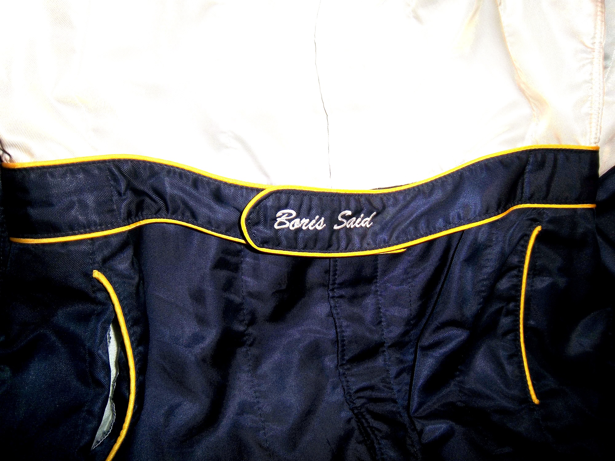
One aspect of driver suits that has become a target for new customizations in the last 15-17 years is the belt. For many years, the belt was unadorned, or had a very small logo. Belts are a comfort feature, and typically made of the same material that the suit itself is made out of, with the same amount of layers and has a Velcro closure on it. Belts may incorporate a border made with an alternate color, to help it stand out.

Belts had no design or decoration on them for many years, as examined by this Ted Musgrave example from 1995,16-musgrave-beltthis Ricky Craven example from 1996,41-craven-beltand many more.barber-belt nunn-belt petty-belt 17-sedgwick-belt 9-speed-belt But it was around that time, that something began to happen. Looking at the Ted Musgrave suit from 1995, his name is embroidered into the left-chest area.16-musgrave-lshoulderIn 1998, this had changed so that his name is embroidered into the belt.15-musgrave-beltThis was popular in F1 and IndyCar for many years, and is still the way that names are presented on the driver suit.25-wallace-belt 23-wimmer-belt 12-stremme-belt 10-labonte-belt 15-sprague-belt 31-skinner-belt 36-said-belt1 90-stricklin-belt 96-reeves-belt Other examples, such as this Randy Lajoie example circa 1999-2000 will have a sponsor logo embroidered into the belt.1-lajoie-BELTKasey Kahne wore this suit in 2005 at an event, and it has a GOODYEAR logo on the front, and when the belt is opened, on the inside, the FIA certification is present here. 9-kahne-belt 9-kahne-fiaFormula 1 and IndyCar have a unique quirk to the design. Since the drivers come from all over the world, the flag from the driver’s home country is sewn into the belt, such as this Alex Barron example from 1998:36-barron-beltNot all belts are created equal. Christian Fittipaldi didn’t wear belts on two of his NASCAR suits. The first one, comes from 2002, while he was sponsored by Georgia Pacific, and instead of the belt, he just has his name sewn into the suit.45-fittipaldi-beltThis Christian Fittipaldi example from 2003 features no belt, and no name.44-fittipaldi-beltThis Nort Northam example from the 1988 Sunbank 24 at Daytona, now the Rolex 24 at Daytona, features a belt that is specifically designed to be removed.56-Northam-beltMany NASCAR action figures will feature the belt designs on them, and many of these figures are pretty accurate, but I think I’ll save that for another blog.

Tailgating Time!

Just for fun, I’ve decided to add a recipe that can easily be made while tailgating at the track. This is my recipe for beer-broiled brats. This works well in the fall, during the Chase, on a cooler day.

You will need:

1 6-pack of beer

1 16oz jar of sauerkraut

½ sliced onion

garlic salt and butter to taste

12 plain, uncooked bratwurst

Take the 6 pack, and pour it into a large pan. Place the pan on the grill or stove, and add 1/4 the jar of sauerkraut, the onions, salt and butter, and finally the brats. Bring to a boil and boil for 8 minutes.

Tip-Do NOT cut or puncture the brats in any way, the casing keeps the juice, and taste in the brats. For more flavor, let soak after cooking. DO NOT OVERBOIL THE BRATS, that is the best way to ruin them.

While the brats are boiling, prepare a grill. Gas or charcoal works either way. After boiling is done, remove from the liquid, and place on the hot grill, and cook 5 minutes per side. Brats are made from pork, and under-cooking them can be hazardous, You want to watch the race from the stands, not a hospital room.  Here is a video visualizing the process…

After grilling the brats, toast the buns on the grill for 20 seconds, place the brats in the buns, and serve. For sides, I would recommend some mustard potato salad, some potato or tortilla chips, and, of course, plenty of ice-cold beer!

This recipe will rock your tailgating party at the next race, and I will post more simple recipes for tailgating in the near future.

Paint Scheme Reviews

Jamie McMurray #1 McDonald’s/Monopoly Chevy SS The simple design is good, but the color scheme needs a lot of work. Beige does NOT work on race cars, and this is a perfect example. The Rich Uncle Pennybags(or Mr Monopoly) wearing sunglasses is not very attractive either, so I can give this scheme a C at best.

Kasey Kahne #5 Pepsi Max Chevy SS Are you kidding me? Is it too much to ask to pick a design scheme? You can have a cutting edge purple design which works, OR a matte black design that works, BUT YOU CAN’T HAVE BOTH! The purple, red and black design is good, but the design scheme is just horrible. Even with a good color scheme, this earns an F

Tony Stewart #14 Mobil1 Chevy SS Ok, now THIS is a great scheme! Simple design, great color scheme, great design all over, A+

Tony Stewart #14 Go Daddy Chevy SS This is, without a doubt, the best Go Daddy scheme EVER! Great simple design, amazing color scheme, and black works much better than yellow or green. A+

Clint Boyer #15 Peak/Duck Dynasty Toyota Camry Oh man, where do I start here? The color scheme would work without the baby blue stripe, the hunting camo roof is just awful, and the overall design just looks forced. This car looks like a bad photoshop job…F

Greg Biffle #16 3MSafety Ford Fusion The contrast between the white and black parts of the car would normally not work, but because it is a safety themed car, and safety coveralls are typically white or black with an orange and silver stripe on them to increase visibility, this scheme makes sense. The colors are good, and I give this scheme an A

Kyle Busch #18 M&M’s Peanut Butter Toyota Camry I ranked Kyles regular M&M’s scheme as an A+, and this scheme somehow improves on it. The orange background works even better than the regular scheme. I have to give this scheme an A+

Trevor Bayne #21 Motorcraft/Henry Ford Ford Fusion This is a solid scheme, I like the Henry Ford design. The black, white and gold scheme works very well, and it is an A scheme

Austin Dillon #33 Mycogen Seeds Chevy SS Meh. I like the color scheme, but the front to back arch is overdone, and the is unoriginal at best. I will give it a C

Ron Fellows #33 Canadian Tire Chevy SS Grey red and black can be tough to work with sometimes, but this scheme works very well. The red flames work well, and the otherwise basic design is very attractive. A

Victor Gonzalez Jr. #36 Mobil 1/IMCA Chevy SS This was a late entry into the race in Sonoma, Gonzalez is a “road course ringer” so there was not much time to design and decal a car, but that said, this is a great simple scheme, no pointless design, and a great color scheme. A+

Ryan Newman #39 Quicken Loans/Smurfs 2 Chevy SS Again, as with Kasey Kahne above, PICK A DESIGN SCHEME! You can either have a red and black scheme, or a red and white scheme, BUT NOT BOTH! It looks like someone designed a Smurf scheme, quickly realized that it needed to carry a Quicken Loans design as well, and tried to make a hybrid of the two, which is just awful, and earns an F

Landon Cassill #40 Interstate Moving Company Chevy SS Good color scheme, kinda reminds me of United Airlines back in the day, and a really simple smooth design. Good scheme and earns an A

Juan Pablo Montoya #42 Depends Chevy SS Is this a good look? Depends! Joking aside, this is not a very good scheme, the green logo works, but the black and grey scheme is awful.

Juan Pablo Montoya #42 Axe Apollo Chevy SS The Apollo Astronaut design is unique. It works very well, and although the design is convulted, it is very attractive. The color scheme works well and this scheme earns an A

Juan Pablo Montoya #42 Energizer Chevy SS From the wheel well forward it is a great scheme. From the driver door backward it is awful. Whatever look they were going for, they missed. It just looks horrible. Great colors, but awful design, D

Aric Almirola #43 Smithfield Helping Hungry Homes Ford Fusion A patriotic scheme, mixed with Petty Blue, that is not overdesigned. Giving this scheme an A is not going far enough to describe how good it is.

Jimmie Johnson #48 Lowes/Disney’s Planes Chevy SS While I like the color scheme and basic design, the hood logo is awful. The door number has a black outline, and it is very visible, but the hood logo which does not have a black outline is next to invisible, which defeats the purpose of having a logo on the car in the first place. That said, it is still a good design, and I will be generous and give it a B.

Paulie Harraka #52 HASA Pool Products Ford Fusion I like matte black, and the hood logo and basic color scheme are good. The smaller logos on the quarter panel are hard to see, but it gives the car a smaller, short track look. A

David Reutimann #83 Dr. Pepper Toyota Camry Dr Pepper has a great color scheme and great designs on their packaging, and this is reflected in this paint scheme. It works very well, and is a great complement to a bottle of Dr. Pepper. A

Tomi Drissi #87 The Wolverine Toyota Camry Many movie paint schemes don’t work, but this is not most movie paint schemes. It is simple, has a great color scheme, and has a great design, and earns an A

Travis Kvapil #93 Dr. Pepper Toyota Camry A design based on Diet Dr. Pepper, again a design faithful to the packaging, that works very well. Everything that I said about the Reutimann scheme above applies here, and this scheme earns an A

Travis Kvapil #83 Burger King Rib Sandwich Toyota Camry BK Racing has a lot of great schemes this year, and this is another one. Great color scheme, great overall design, and I like what they did with the rib sandwich. I’m not a “Rib-wich”guy, but I like this, and give it an A.

The Driver Suit Blog-Grading the 2013 All-Star Race

By David G. Firestone

Last week was the All-Star Showdown and the All-Star Race.  These two events are magnets for special paint schemes.  The top two finishers from the Showdown move to the All-Star Race.  I have graded both events, starting with the Showdown.  It is ranked from best to worst.

The Good:

1 David Reutimann #83 Burger King/Dr. Pepper Toyota Camry. Great classic design with a great color scheme that gets an A+

2 Travis Kvapil #93 Burger King/ Dr. Pepper Toyota Camry See Above, A+

3 David Gilliland #38 Long John Silvers Ford Fusion Good color scheme, and the basic design used with that scheme on this car just makes it stand out. I’m not a fan of yellow on race cars in most cases, but I’ll overlook it this time because it is just so good. A+

4 Jeff Burton #31 Cat Chevy SS The scheme is solid, has good colors, great number designs and a good pattern used. Final Grade: A

5 Martin Truex Jr. #56 NAPA Toyota Camry Simple, elegant with a great color scheme, great logos and great number design.  Final Grade: A

Aric Almirola #43 Smithfield Ford Fusion Lose the design on the doors and it would be perfect. Other than that this scheme is perfect and earns a solid A

7 Mike Bliss #19 Gentry Plastics Inc. Toyota Camry-Good color scheme and simple design work well here, A

8 Terry Labonte #32 Oxy Water Ford Fusion I don’t know why, but I like this scheme. Normally I wouldn’t like the color scheme and basic design but for whatever reason, I like this. A-

Juan Pablo Montoya #42 Target Chevy SS Great color, great number design, and the pattern used is a lot more subtle than last year’s scheme. The quarter-panels have too many associate sponsors and looks too cluttered, keeping the Final Grade at a B.

10 Bobby Labonte #47 House Autry House Foods Toyota Camry The design is simple, but good. The color scheme need some work. The red used is too bright, as is the blue. The logo group on the quarter-panel is awful. B-. If the color wasn’t so bright, I could grade it higher.

The So-So

11 Joe Nemechek #87 Royal Teak Toyota Camry Good color scheme, simplistic design, not much to say here, C

12 Landon Cassill #33 Bicycle NASCAR Playing Cards Chevy SS-Decent color scheme, but the design is all over the place, way too chaotic, C-

13 Paul Menard #27 Serta Chevy SS Basically the same scheme as his regular scheme, but different hood logo…nothing really to say here…C-

14 JJ Yeley #36 World TradeX Chevy SS– Not much to say here…other than make the logo bigger. D-

15 Dave Blaney #7 Sany Chevy SS Great color scheme ruined by bad door design and generic racing number design. The design is just disgusting to look at, and it gets a D-

16 Casey Mears #13 Geico Ford Fusion Eww…just eww. The color scheme is dreadful, and the designs on the side are painful to look at. It passed because of the logo and number design. Final Grade: D-

17 David Stremme #30 Lean 1 Toyota Camry The best way I can describe this scheme is that there is nothing good about it. Anything they could have messed up with this scheme, they did. It gets an F

18 Scott Riggs #44 No Label Watches Ford Fusion An awful scheme made much worse by a horrible color scheme that earns an F- grade.

19 Michael McDowell #95 Levine Family Racing Ford Fusion There is nothing right about this scheme. F-

20 Brian Keselowski #52 Supportmillitary.org Toyoa Camry-Eww…Too much going on, with the oversized camo in too many different colors, and the door design which is awful. F-

Now on to the All-Star Race.  Jamie McMurray, and Ricky Stenhouse Jr. transferred in from their performances in the Showdown, and Danica Patrick was voted in.  As such, their grades will be mentioned here.

The Good

1 Brad Keselwoski #2 Miller Lite Fan Mosiac Ford Fusion.  It looks really good, and the pictures of the fans give it a condensation on the can effect that is really cool.  A+

2 David Ragan #34 CSX Play It Safe Ford Fusion This is a very solid scheme, with great colors, great design and an overall great look. CSX did this scheme very well and it gets an A+

3 Kyle Bush #18 Snickers Bites Toyota Camry A paint scheme that has a great color scheme, and illustrates the theory that less is more. Nothing bad about this Scheme-A+

4 Joey Logano #22 Pennzoil Ford Fusion Pennzoil has an amazing shade of yellow, and they really put it on display in this A+ scheme

5 Jeff Gordon Cromax Pro Chevy SS Another good DuPont inspired scheme with a great color scheme and great design-A+

6 Dale Earnhardt Jr. #88 National Guard Chevy SS Great scheme, nothing wrong, A+

7 Danica Patrick #10 Go Daddy Cares Chevy SS-The racing stripe makes the scheme look better, and the hood logo is good as well  A

8 Carl Edwards #99 Fastenal Ford Fusion The stripes work well here, and the color scheme is good. A

9 Ricky Stenhouse Jr. #17 Best Buy Ford Fusion  The number design, color scheme, and simplistic design give the car a good look. A

10 Kevin Harvick #29 Budweiser/Rheem Chevy SS-Good color scheme, and I like the two different designs on the side.  A-

11 Clint Bowyer #15 5 Hour Energy Toyota Camry Good color scheme, decent design, could use some work on the front. B+

12 Tony Stewart #14 National Wild Turkey Federation Chevy SS Good color scheme and overall design, but the major issue I have is with the NATIONAL WILD TURKEY being on a curve and not as visible It gets a B-

The So-So

13 Jamie McMurray #1 Bass Pro Shops/NWTF Chevy SS-Great Color Scheme, Awful design, C+

14 Denny Hamlin #11 FedEx Express Toyota Camry The front nose design and stripes are awful. The color scheme is great, but the stripes kill it. The best grade I can give is a C+

15 Greg Biffle #16 3M Filtrete Ford Fusion-Could you please pick a color scheme and stick with it?  Two different color schemes on the same car is just awful. But they are two good color schemes. C-

16 Ryan Newman #39 Aspen Dental Chevy SS-Good colors, but awful design…what does this have to do with teeth?  C-

17 Jimmie Johnson #48 Lowes Patriotic Chevy SS-Not the best scheme he has run all year, but I would love to see the car in that shade of red on the bottom C-

18 Matt Kenseth #20 Husky Toyota Camry Not much really to say, mediocre color scheme, no real design to comment on, the logos are plain Jane enough, it’s a bland scheme that earns a C grade. A mediocre grade for a mediocre scheme.

The Awful

19 Marcos Ambrose #9 Stanley/DeWalt Ford Fusion  Is it normal to get seasick while looking at a paint scheme?  The Petty Blue just does not work here, and the oval around the letters is pointless.  The car looks awful even though it has a great color scheme and great sponsor logos. D

20 Kurt Busch #78 Furniture Row Military Appreciation Night Chevy SS I love the matte black that Furniture Row usually uses, so this is kind of disappointing. That said, the color are good, but the hood design needs work. The MILITARY APPRECIATION banner is much to small and it is hard to see at speed. A good scheme that has been ruined and earns a D-

Before I leave, I have two more pieces of business.  First off, I would also like to extend congratulations to Tim Flock, Jack Ingram, Dale Jarrett, Maurice Petty, and Glen “Fireball” Roberts for being elected to the 2014 class of the NASCAR Hall of Fame.

Second off, RIP Dick Trickle.  You will be missed.

The Driver Suit Blog-Pit Boards…Unique and Under-Appreciated.

By David Firestone

Today, I thought we should discuss an item that everyone sees, but not everyone understands…the mighty pit board. Pit Boards are an item that most average collector wouldn’t think that would come up for sale, but they do. I am a proud owner of one myself:mccumbee-pit-1

This beauty of an item is from MRD Motorsports, and was used between 2007 and 2009 for Chad McCumbee and Blake Bjorklund, amongst others. Made from a thick plastic inside, with the color design made with a plastic similar to many campaign signs, it shows very nice use, with scratches and scuff marks. There are two types of pit boards. One type hangs above the pit lane, to help indicate to the driver where his pit is. This board almost always has the car number and holes cut into it to cut down on wind resistance. This is an example of one used by MRD.

The other type, like the one shown above, is to indicate to the car where to stop in the pit. In years past, a crew member would stand behind the board and the car would drive up to him, as shown at 6:49 at the video here…

http://youtu.be/w4v_ya596eg?t=6m46s

Since this was as dangerous as one thinks it is, in the 1990’s, pit crews switched to the “lollipop” form still used today.  The board is held on a long pole and held where the driver can see and hit it to stop at their stall, as seen below:

http://youtu.be/ilJ5qxhBbaI

Boards are often customized to driver preference.  Kevin Harvick is known for his “Happy Face” pit board.  Some drivers use sponsor names, other use car numbers.  It all looks confusing on pit road sometimes.  In this example, the MRD Motorsports board has the car number design on it.  This board shows where the pole was attached to the board.mccumbee-pit-2 mccumbee-pit-3And it also shows numerous scratches and scuff marks from race use.mccumbee-pit-3 mccumbee-pit-4The back of this board is plain black.  That is due to MRD being a low budget team, with limited resources.mccumbee-pit-5A quick search on ebay and other sites shows that these items frequently sold as collectors items after a race.  These are unique items, and for NASCAR fans are conversation pieces.

And now on to Paint Schemes…

Brian Vickers #11 FedEx Delivery Manager Toyota Camry  Good simple scheme with great colors and design, gets an A

Sam Hornish Jr. #12 SKF Ford Fusion  Good color scheme, but it looks like a cross between Joey Logano’s scheme and Aric Almirola’s schemes.  I give it a B+

Tony Stewart #14 Mobil 1/Bass Pro Shop Chevy SS The color scheme is good, but the overall design isn’t as good as the regular scheme. Too much going on. The best grade it can earn is a C

Clint Bowyer #15 Toyota Toyota Camry Not much to complain about here, good color scheme and simple design and an A grade

Clint Bowyer #15 KFC I Ate The Bones Toyota Camry KFC has great lettering and a great shade of red, and both are not represented here very well.  That said, I don’t hate this scheme, colors are good, but what is with the hood design?  The KFC logo is too small, and the hood has some creepy guy with a bowl cut as the most promising feature.  All things considered, it earns a C-

Kyle Busch #18 M&M’s M’ Prove America Toyota Camry Good scheme with a great color scheme and good design. Nothing wrong with this solid A scheme.

Kyle Busch #18 Doublemint Gum Toyota Camry Just like Kyle’s scheme on the 18, I love the color scheme, love the simple design, love the fact that the 81 is the 18 backwards, love this scheme, A+

David Ragan #34 Detail Doctor Ford Fusion  Decent color scheme and decent design.  C-

Juan Pablo Montoya #42 Clorox 100th Anniversary Chevy SS  Surprise!  Happy Birthday!  The blue and white is good but the rest looks too goofy to be good.  It looks like a birthday party for a 4 year old.  Lose the confetti and streamers and I would like it much more, this scheme earns a D+

Aric Almirola #43 Enrich/Smithfield/Farmland Ford Fusion Lose the design on the doors and it would be perfect. Other than that these three schemes, different only by the hood and quarter panel sponsors are perfect and earn solid A schemes

Aric Almirola #43 Transportation Impact Ford Fusion Black white and lime green? Seriously? And the black front makes it look like the car was in a wreck and had the nose replaced. Not a good look at all. The door design is awful and the quarter panel is even worse! I can’t give this scheme a passing grade and it gets an F!

Aric Almirola #43 Jani-King/STP Gas Booster Ford Fusion This scheme makes up for the Transportation Impact scheme with simple perfection, and an A grade

Aric Almirola #43 STP/Farmland Ford Fusion OK, last Almirola scheme…I promise! A good throwback scheme is ruined with the door number design. Get rid of the oval design and it would get an A, whereas this scheme earns a B-

Scott Riggs #44 No Label Watches Ford Fusion An awful scheme made much worse by a horrible color scheme that earns an F- grade.

Scott Riggs #44 JPO Absorbents Ford Fusion Why do many racing teams have wave designs?  It is not a good design, and in this case it takes a good color scheme and ruins it earning a D grade.

Bobby Labonte #47 Clorox 100th Anniversary Toyota Camry Did anyone look at the main color of the car before it was painted?  This looks awful!  Montoya’s version looks better, but not by much.  D-

Jimmie Johnson #48 Lowes “Reverse” Chevy SS  Looks really good, and really stands out in nighttime racing.  Color scheme is good, as Lowe’s often is.  A+

Jimmie Johnson #48 Lowe’s “Emerald” Chevy SS  Decent color scheme, though if if were reversed it would look even better.  Even still it is good enough to earn an A-

Martin Truex Jr. #56 NAPA Brakes Toyota Camry Simple design, good color scheme, but the Twitter handle on the back of the roof is distracting and it looks awful.  It takes an A scheme to a B-

Kurt Busch #78 Furniture Row Military Appreciation Night Chevy SS I love the matte black that Furniture Row usually uses, so this is kind of disappointing. That said, the color are good, but the hood design needs work. The MILITARY APPRECIATION banner is much to small and it is hard to see at speed. A good scheme that has been ruined and earns a D-

Elliot Sadler #81 Double-Mint Gum Toyota Camry Just like Kyle’s scheme on the 18, I love the color scheme, love the simple design, love the fact that the 81 is the 18 backwards, love this scheme, A+

Dale Earnhardt Jr. #88 National Guard Chevy SS What the hell?  The blue and white scheme works well with this design, but camo and black?  It just looks awful.  I love Dale Jr. but I can’t defend this scheme at all. F-

Scott Speed #95 Tracking Point/JTS Truck Sales Ford Fusion Good color scheme, but awful design. The diamond plate decals does nothing to help, and it earns a D-

Michael McDowell #98 Curb Record/ The Bobby Bones Show Ford Fusion Love the color schemes and design. Bonus points for the diagonal hood logo. Not many people can make the diagonal logo work, but it works here, A+

Carl Edwards #99 Geek Squad Ford Fusion.  Not much to say here, really simple design and it looks alright…C+

Carl Edwards #99 Cheez Its/Frosted Flakes Ford Fusion.  These two schemes are awful.  Too much going on, too many colors, no consistency, not a good pair of schemes at all, F