By David G. Firestone Last week, I had a column run on Uni-Watch, and I delayed this article until this week. Two weeks ago, we discussed visors, this week, we will discuss what has become known as the “helmet stripe.” Helmet stripes came from IndyCar and Formula 1 cars, which are open cockpit cars. Helmets are clearly visible to television cameras and fans. As a direct result, helmet design in Formula 1 has become its own unique art form. Helmet designs become a part of the driver identity. The other thing that these open cockpits allow is for sponsorship opportunity. As such, a small opaque stripe is used on helmet visors.
 In NASCAR, the visor was slow to arrive. This is due to two reasons, first, many drivers up until the mid 1990’s chose to wear open-faced helmets. While these helmets had a shade to help keep the sun out of a driver’s eyes. While sponsor logos do show up, they were used for the driver’s name. This Brad Noffsinger example from 1988 is an example of that.
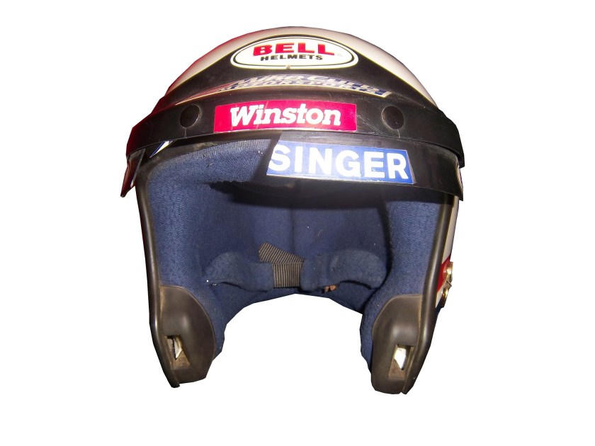
 The second reason that helmet stripes were slow to come to NASCAR is that in-car cameras, while used, were for many years positioned in such a way that the visor would not be seen. Even if helmets were painted, the visor had no stripe. When the in-car cameras were positioned to film the driver from the side and even from the front, the helmet stripe became the standard. The stripe is designed to fit over the part of the visor that overlaps the opaque part of the helmet, as this example shows.
 Helmet stripes have become standard. To show how it affects the overall look of the helmet, I took this Kevin Lepage helmet from 1999, and edited the pictures to show how it looks.

 Not bad, but let’s compare it side by side to the original helmet…

 Helmet stripes have become a unique way for a driver to customize a helmet, as this video shows:
Paint Scheme Reviews!
Because of the Uni-Watch article last week, I didn’t get to review paint schemes. Within the last couple of weeks there were a large number of 2014 paint schemes released. Now I know that many of these will change before the start of the 2014 season, but I will grade them anyways.
Brad Keselowski #2 Miller Lite Ford Fusion Same scheme as this year, same grade, C
Kevin Harvick #4 Budweiser Chevy SS Same Scheme as last year, same grade, A
Kevin Harvick #4 Jimmy John’s Chevy SS They improved one of the best schemes in NASCAR and went from an A to A+
Kevin Harvick #4 Outback Steakhouse Chevy SS The color scheme remains the same but red takes over from beige as the primary color, which gives the car a great look, and an A grade
Kasey Kahne #5 Great Clips Chevy SS Same scheme as this year, same D+ grade
Kasey Kahne #5 Pepsi Max Cheyv SS Same scheme as last year, same F grade
Marcos Ambrose #9 Stanley/DeWalt Ford Fusion Great color scheme, though the nose, and quarter panel design are over done. Even still, I give it a B-
Marcos Ambrose #9 DeWalt/Stanley Ford Fusion See Above
Tony Stewart #14 Bass Pro Shop/Mobil 1 Chevy SS I get that two companies with different desgin schemes are sharing the car, but this is just brutal to look at. The orange and camo contrast is hideous, and the overall design is overdone. C-
Tony Stewart #14 Mobil 1/Bass Pro Shop Chevy SS The white and black contrast just looks awful! I really hope this changes before the season starts, because this is a scheme that is painful to look at. I have to give it an F
Tony Stewart #14 Code 3 Associates/Mobil 1 Chevy SS As bad of a color scheme as this is, it is certainly better than the other two Tony Stewart schemes are. That said, the color scheme warrants an F while the design warrants an A, so I’ll split the difference and give it a C
Greg Biffle #16 3M Ford Fusion This scheme is a MAJOR improvement over this year’s design! All of the pointless noise on the door is gone, and the car has a very smooth look because of it, and I have to give this design an A
Ricky Stenhouse Jr. #17 Nationwide Insurance Ford Fusion Great color and design schemes, though the white on light blue lettering and logos are hard to see. Even still, I have to give it an A-
Joey Logano #22 Shell/Pennzoil Ford Fusion Same scheme as last year, same grade, D
Joey Logano #22 AAA Insurance Ford Fusion See Above
Jeff Gordon #24 Pepsi Max Chevy SS I gave this scheme a C-, but given the *ahem* other Pepsi Max scheme, I’ve reconsidered, and I will give this scheme a B
Ryan Newman #31 Caterpillar Chevy SS An improvement on an already good scheme, A+
Aric Almirola #43 Smithfield Foods Ford Fusion If the hood and front were done in the stars design, and the rest of the car was red and white striped, it would look better, and I would be able to give it more than a C+
Jimmie Johnson #48 Lowes Chevy SS Supposidly, this will be the main scheme for the whole season, and I have to say it looks amazing, and is an A+ grade
Jimmie Johnson #48 Lowes/Kobalt Chevy SS This will be run for a few races, and it is an A+ scheme.
Carl Edwards #99 Fastenal Ford Fusion Same scheme as last year, same A grade
Carl Edwards #99 UPS Ford Fusion No redeeming features whatsoever, F-`
Now on to new 2013 paint schemes…
Jamie McMurray #1 Cessna/Auburn University Chevy SS The white hood and roof just look aukward, compared to the black covering the rest of the car. That said, it is still a decent scheme, and I’ll give it a B
Dave Blaney #7 Breast Cancer Awareness Chevy SS Pinkwashing is an automatic F
Landon Cassill #33 T-Mone Chevy SS This is a perfect example as to why only one person should design a car. It looks like it took at least 3 people to design the car, each with a different idea as to what the car should look like. And in the end it is just a mess, and not even a good color scheme can give this scheme a passing grade. F
David Ragan #34 Safercar.gov Ford Fusion See Above. F
JJ Yeley #36 United Mining Equipment Chevy SS Even if I didn’t give pinkwashing schemes an automatic F, this scheme would get an F anyway, it just looks awful
Kyle Larson #51 Target Chevy SS Simple, yet attractive, and it earns an A
Kurt Busch #78 Wonder Bread Chevy SS To celebrate the return of Wonder Bread, Kurt is going to channel Ricky Bobby, except for one difference…this scheme is a lot better than the Ricky Bobby Scheme. No flames and the baloons coming from the brake duct are a great look for this car, and it earns an A
Dale Earnhardt Jr. #88 Mountain Dew/Xbox 1 Chevy SS It has a great color scheme, and that is the nicest thing I can say about it. The design is just awful, and it looks like it will give people seizures as it drives around the track. I give it an F
Blake Koch #95 Supportmillitary.org Ford Fusion Eww…Too much going on, with the over-sized camo in too many different colors, and the door design which is awful. F-


