
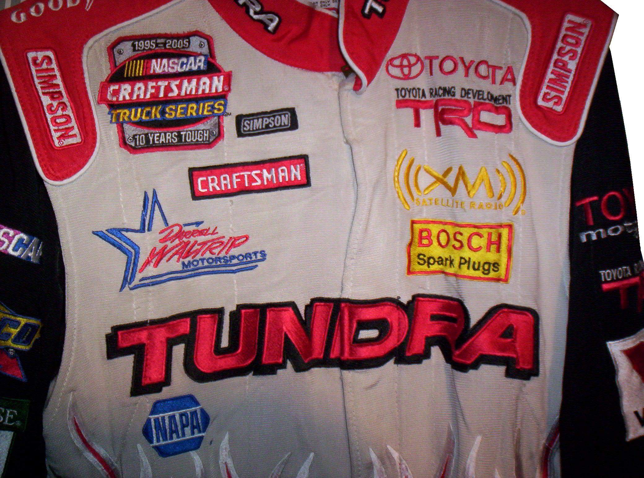
A uniquly designed Jody Miller Toyota Tundra race worn driver suit from 2005 will be examined this week.
Tag: darrell waltrip racing
The Driver Suit Blog-Ladies and Gentlemen: The Paint Schemie Awards!
By David G. Firestone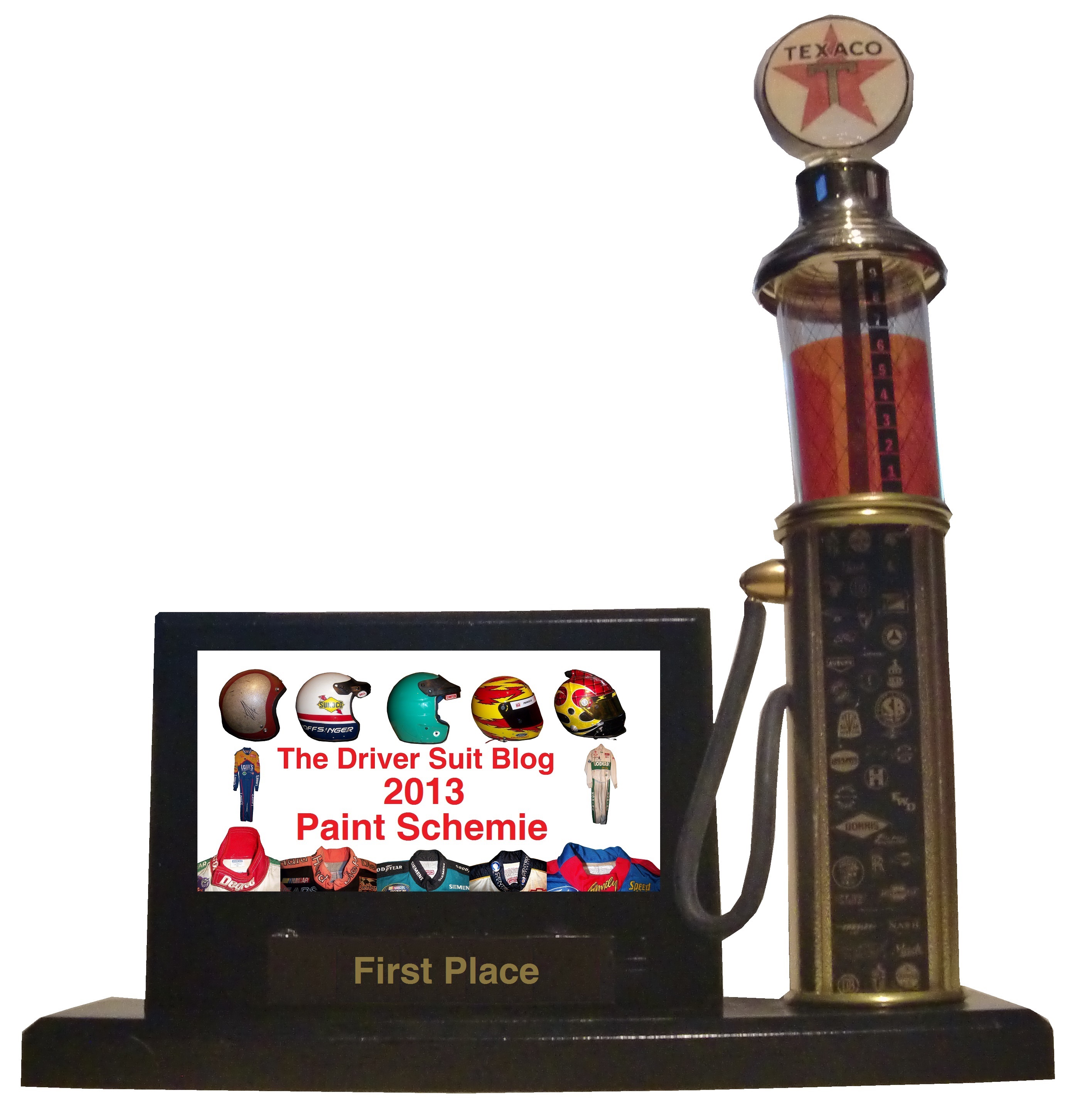
For the end of the 2013 Season, I will reveal the best and worst paint schemes and driver suits of 2013. This was done using a focus group of one, namely myself, and uses the following standards:
Color Scheme:How the colors look, and how they work with each other.
Overall Design:How good the design itself looks, is there too much, or not enough.
Primary Sponsor Logos: How the primary sponsor logos look on the car
Originality: How original is the scheme. Note that originality can work both for and against a scheme in award voting.
Let’s get the bad paint scheme awards out of the way.
First, the Paint Schemie Award for Worst Single Paint Scheme.
The nominees are:
Dave Blaney #7 Sany Ford Fusion
Clint Bowyer #15 Duck Dynasty Toyota Camry
Greg Biffle #16 Red Cross Give Blood Ford Fusion
Austin Dillon #33 Honey Nut Cheerios Chevy SS
Brian Keselowski #52 Star Coach Motor Tours Toyota Camry
And the Paint Schemie Award for worst single paint scheme goes to…
BRIAN KESELOWSKI #52 STAR COACH TOYOTA CAMRY
The next Paint Schemie Award is for Exhibition Race Paint Schemes. This category is a little different, as the Schemies will go to the best and worst special scheme that was run in either the Sprint Unlimited, the Sprint Showdown or the Sprint All-Star Race.
The Paint Schemie Award for Worst Exhibition Race Paint Scheme Goes To:
BRIAN KESELOWSKI’S SPRINT SHOWDOWN SCHEME
The Paint Schemie Worst Dressed Driver Award goes to
Joey Logano
Our next category is the Award For Worst Scheme Set of 2013, which is given to the team that consistently runs bad paint schemes throughout the season.
The Nominees Are:
David Stremme #30 Toyota Camry
The Winner for Worst Scheme Set of 2013 goes to:
DAVID STREMME #30 TOYOTA CAMRY
The Paint Schemie Award for Most Degraded Paint Scheme goes to Kasey Kahne, who’s scheme from 2013 is much worse than that of 2012.
Now the nominees for Best Single Paint Scheme are:
Kyle Busch #18 Doublemint Gum Toyota Camry
Trevor Bayne #21 Motorcraft/Quick Lane Ford Fusion
David Ragan #34 CSX Play it Safe Ford Fusion
Juan Pablo Montoya #42 Target Chevy SS
Jimmie Johnson #48 Lowes Chevy SS
David Reutimann #83 Burger King/Dr. Pepper Toyota Camry
The Paint Schemie Award for Best Single Paint Scheme Goes to
KYLE BUSCH #18 DOUBLEMINT GUM TOYOTA CAMRY
The next two Paint Schemie Awards are for Best Exhibition Race Paint Scheme, and Worst Exhibition . These are a little different, as they will go to the best and worst special scheme that was run in either the Sprint Unlimited, the Sprint Showdown or the Sprint All-Star Race.
And taking these schemes into consideration, the Paint Scheme Goes To:
JIMMIE JOHNSON’S SPRINT UNLIMTED SCHEME!
The Paint Schemie Award for Most Improved Paint Scheme goes to:
Kevin Harvick
who improved his schemes from 2012 to 2013
The Paint Schemie Best Dressed Award goes to:
Jimmie Johnson
Now, our final Paint Schemie Award, The Best Scheme Set of 2013:
Now for this, I will take a look at the best Chevy Schemes, followed by Ford, and then Toyota, and then finally I will reveal the winners of the Paint Schemie Awards.
And now, the 5 best Chevy teams that have consistently run great schemes:
#1 Jimmie Johnson The classic design that is paired with different color schemes every once in a while works very well. The design gives the car a very clean look, and is a very timeless look.
#2 Kurt Busch Furniture Row Racing’s “less is more” approach works very well here, with a matte black, white lettering and red letters. They always look good, thought I wish their results on the track were as good as they look.
#3 Kevin Harvick Kevin has had, for the most part, done quite well. All of the schemes have great color schemes, and most have great sponsor logos, and are decently original. Originality works well here, but some of the overall designs, namely the Bad Boy Buggies and Rheem/Budweiser combination schemes need a lot of work, but otherwise Kevin Harvick has had a great season paint scheme wise.
#4 Juan Pablo Montoya The Target scheme is very solid, with great colors, great overall design, and great sponsor logos. Not original, but solid. The most original scheme is the Axe Apollo scheme, but that was just brutal. It had a decent color scheme, and a decent sponsor logo, but the whole outer-space motif just did not work. If Axe Apollo was not on the car this year, Juan would be at the top of the standings.
#5 Phoenix Racing/Turner Scott Motorsports A team that has a very consistent track record when it comes to good color schemes, originality, as well as primary sponsor logos, the team can sometimes have serious issues with overall design. The Hendrick Cars scheme, and the Guy Roofing scheme are just brutal in that category.
Moving on to Ford.
#1 Trevor Bayne The Wood Brothers haven’t run a full schedule this year, but when they have shown up, they have always looked good. The schemes are original, since the Wood Brothers used these schemes for many years, and the colors, overall design, and sponsor schemes are always great.
#2 Aric Almirola The Transportation Impact scheme is keeping Almirola from the top spot, because it does not fit the team at all, and it just looks brutal. Other than that scheme, which while original, has awful colors, and overall design, every scheme they ran is solid, with the STP/Farmland scheme almost making up for Transportation Impact.
#3 Sam Hornish Jr. His one and only appearance in the Sprint Cup came at Kansas this year, and this one scheme, with great colors, great overall design, and great sponsor logos worked very well. I gave him 3rd, since everyone else on the list ran full schedules, and he only ran one race.
#4 Marcos Ambrose The Mac Tools scheme looks odd, with a great color scheme, but iffy overall design. The Stanley logo redesign could have worked well, but the black covering the front and headlights does not enhance the look at all. I was not a fan of this scheme at the beginning of the year, but some slight adjustments to the color scheme worked well.
#5 Ricky Stenhouse Jr. A “pinkwashing” scheme makes an appearance, which takes away from the overall grade. That said, this team has great color schemes all year, but some of the overall designs have a bit too much noise. Sponsor logos work well, and Ricky has had a great year.
Last, but certainly not least is Toyota.
#1 Michael Waltrip/Mark Martin/Brian Vickers Every scheme they have run has been a hit, with great color scheme, great overall design, great sponsor logos, and decent originality. No bad schemes here!
#2 Kyle Busch Overall great design, color schemes, and primary sponsor logos, Kyle also has the most original schemes of the top contenders for the Paint Schemie awards. That said, the Mprove America needs a different shade of blue, while the white Interstate Batteries scheme could use a different color besides white.
#3BK Racing Great color schemes, sponsor logos, and overall design. These designs work well, except for the Old Dominion scheme, which is just awful. Everything that the other schemes are, Old Dominion is not, and it is keeping BK Racing out of the top spot.
#4 Martin Truex Jr. Overall, this team works well when it comes to colors, overall design, originality, and primary sponsor logos, except for the camouflage scheme. The camouflage scheme was awful, and it knocked Martin out of the top spot.
#5 JTG Daugherty Racing Most of what they ran this year was great, but the Bushes Baked Beans car has an odd overall design, and a weird color scheme. The Clorox scheme has a bad color scheme, as does the Charter scheme. If these schemes were fixed, there is no reason why JTG Daugherty could be in the top spot.
Now I will take these top contenders, and rank them in order from worst to best. These top contenders should feel very proud that they have earned a spot on the countdown.
#13 Martin Truex Jr.
#12 Phoenix Racing/Turner Scott Motorsports
#11 Marcos Ambrose
#5 Kyle Busch
#4 Kurt Busch
#3 Michael Waltrip/Mark Martin/Brian Vickers
And Finally The Paint Scheme Award for Best Paint Scheme Set of 2013 goes to:
#1 Trevor Bayne
Congratulations to everyone who won a First award, and to everyone who won a Worst award…paint your cars better!
To conclude the Paint Schemie Awards, I will finish with a top 10 list I have been wanting to do for quite a while. These are the
TOP 10 SPONSORS I MISS IN NASCAR
10 Skoal Bandit The shade of green they used was one of the best, and the car has a classic look that always looks good.
9 Kodiak A simple look, with my all-time favorite shade of green ever used on a race car. I have a lot of Kodiak race-used items, and they all look good.
8 Miller Genuine Draft Rusty’s MGD scheme had a much simpler design than the Miller Lite scheme, and it had a much better color scheme. I really hope they throwback to this scheme at some point.
7 Tide Are there any orange schemes that could ever live up to Tide? No, this is the best orange scheme in the history of auto racing.
6 Smokin’ Joe’s It had a great color scheme, and it had a very 1990’s design, that oddly enough still looks attractive.
5 Western Auto/Parts America The chrome numbers, the layered fading, the color scheme, it just comes together very well.
4 The Family Channel The logo is awesome, the colors can’t be any better, the lettering is great, and it just comes together very well.
3 Kodak If there is or was a better shade of yellow in NASCAR, I haven’t seen it yet!
2 Texaco/Havoline Great simple design, with an amazing hood logo, and great color scheme.
1 GM Goodwrench This scheme is, in a word, perfect. It doesn’t evolve, it doesn’t have to. It is simply perfect.
There is one last piece of business that I need to address. I like to keep it light on the Driver Suit Blog, but sometimes I have to address a news story that is heavy, like this story that was released on Thursday. Dario Franchiti, who has won 3 Indy 500’s, 4 Indycar Championships, and 21 races announced on Thursday, that due to injuries sustained at the Shell and Pennzoil Grand Prix of Houston on October 6. During that race, he was involved in a scary wreck, and suffered spinal and knee injuries that doctors have told him are too serious to resume his career. 13 fans, who were in the wrong place at the wrong time were injured in the wreck as well. I’m saddened that a talented driver had his career end like that, and I really wish it didn’t have to. But what I really hope is that IndyCar learns what lessons need to be learned, and make changes to safety so that the chances of this scenario repeating are lowered. I know that there will always be the risk of injury or death in auto racing, that adds to the mystique of the race car driver, but every wreck has a story to tell. These stories should be looked over, and changes made so that another talented in the prime of his career does not have to go through what Dario had to this week. Fans should also be able to go to a race, and not have to worry about getting hurt during a wreck. If the investigation in this incident results in changes that keep fans and drivers from serious injury in the future, than the lessons have been learned. My thoughts and prayers are with Dario and his Family right now.
The Driver Suit Blog-They Pay the Bills, So They Design The Suit
By David G. Firestone From a design aspect, no other factor contributes as much as the primary sponsor or sponsors of the car. Everything from the colors to the torso design, to the television logos, to the shoulder epaulet and collar design depends on the primary sponsor. While this has been the case for the most part, how the primary sponsor is displayed can vary quite a bit.
Currently, the standard design for a primary sponsor logo is to have a large logo across the front of the lower torso, and on the back on the upper torso. These Christian Fittipaldi designs from 2002-2003 are great examples of that. The Georgia Pacific design from 2002 has a decent sized logo on the front bottom torso, and the same logo higher up on the back torso.
 The Bugles example from 2003 has identical logo placement for the Bugles logo.
 Many driver suits feature this same logo placement.


![]()


 Taking a look at this Ricky Craven example from 1996, it features a design aspect that was very heavily used. The torso features a plan color, with a stripe across it with the sponsor name on that stripe. Dale Earnhardt Sr. used this design for many years, as did Rusty Wallace, Dick Trickle, and Steve Grissom among others. It is a fairly straightforward design, but it works very well.
 Other suits have the primary sponsor logo present, but the logo is underwhelming. This design is exampled by this Bobby Hillin Jr. Moroso driver suit from 1991,
 This Lake Speed example from 1997,
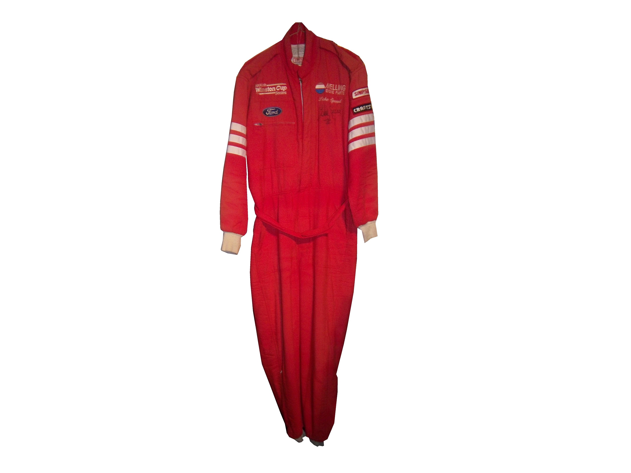
and this Ted Musgrave example from 1998.
 In very rare instances, a primary sponsor is excluded from the suit altogether. One example is this Terry Labonte suit I covered earlier this year. That example was made for Terry to wear in a very last minute driver change. Another example is this David Stremme suit from 2009. I covered this issue earlier in the year, but to sum it up, because of a conflict between Verizon, the sponsor of Stremme’s car, and Sprint, the title sponsor of the Sprint Cup race, Verizon was not allowed to have their logos on Stremme’s car and driver suit. As such, Stremme raced a Dodge sponsorship, and wore this suit.
 One of the newer designs that is frequently seen is what I call the leg stripe design. This Kasey Kahne example shows a leg design that has a large white stripe running up the red background, with the DODGE television logo running up the leg. Sponsors can make their logos stand out more with this design, so it is becoming more popular every year.
 This Scott Wimmer example is from 2002, and is rather unique in this category.
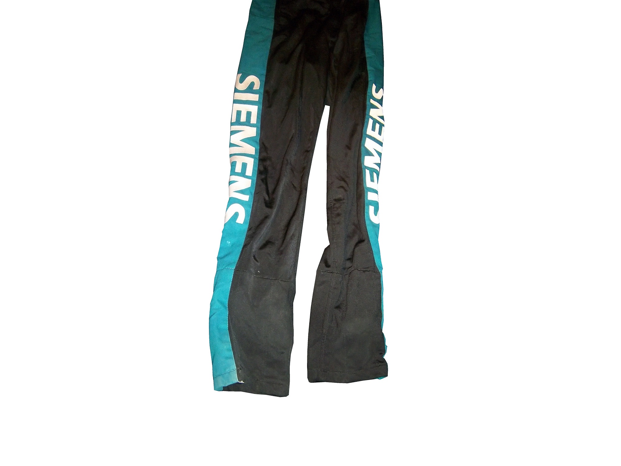 It needs an explanation…The suit was worn for the entire 2002 season, which had a Siemens sponsorship for the first 25 races. After Siemens left the team, Scott Wimmer went on to win 4 of the next 9 races in an unsponsored black car with red and yellow flames…while wearing this suit.
While I get that the team not buying another suit for Wimmer to wear…it just looks weird.
Now this is another suit that needs an explanation. Nort Northam is a Porsche dealer based in Florida. He was a race car driver from 1979-1992, and his career was not great, with no wins, and two podiums. In 1988, he raced in the Sunbank 24 at Daytona, now called the Rolex 24 at Daytona in a Porsche owned by fellow driver Karl Durkheimer.
 During that race, he wore this driver suit. It appears on this suit that a sponsor patch has been removed or fallen off. Now to understand the basic design, you need to understand that Nort raced in two races a year, and having a suit custom designed would be a needless expense. As such, his name, and two sponsor patches did the trick. Not fancy, but effective. This late 1980’s SCCA example is also a minimalist design, but it sticks to the “80’s stripe” design as the Ricky Craven example.
The last thing about primary sponsors is that sometimes, primary sponsor designs follow other sports uniform trends. This example from 1998 was worn by Jeremy Mayfield. At that time, gigantic logos across the fronts of uniforms were the big thing, and that was not good. This fad did not last long, thank heavens!
Driver Suit Blog “Wheel Reviews”
Last night, I went to see the movie “Rush” and I have to say, it was really good. It has been said “you love your rivals, because you need someone to beat.” Nowhere is this more evident than Rush. Directed by Ron Howard and starring Daniel Brühl as Niki Lauda and Chris Hemsworth as James Hunt, Rush is the story of the rivalry between the two, from their days in Formula 3 in 1970, to Formula 1 in the 1970’s. For fans of racing movies, it is a true masterpiece.
The film takes the perspectives of the two drivers. Lauda is represented in the film as a talented driver who is great with setting up a race car. He is a driver who takes what he does very seriously. Hunt on the other hand is more of a playboy. He is a great driver, but his fast and furious lifestyle is a distraction from his true talent. Both are talented, but when Hesketh Racing, Hunt’s team can’t find sponsorship for the upcoming 1976 season, Hunt loses his ride. After his wife leaves for a ski trip, Hunt gets a ride with McLaren after Emerson Fittipaldi leaves to race for his cousin.
In 1976, Hunt struggles for the first part of the year, while Lauda, fresh off his 1975 World Championship is always a factor in the points standings. Hunt’s luck changes at the Spanish Grand Prix, where he beats Lauda, though he is disqualified for his car being less than an inch over regulation. Hunt’s wife divorces him, and driven by this, his season turns around. Though Lauda struggles at this point, the points standings are close coming into the German Grand Prix
The 1976 German Grand Prix was a critical point in this story, as the points battle was heating up. This race was at the the “Old Nürburgring” one of the most difficult tracks in the world. The weather was stormy, which kicks up the danger. Knowing the track as well as he did, Lauda called a meeting of the drivers and stated that the race should be canceled because of the conditions. Hunt thinks it is just a trick to take a race out of the schedule, and the cancellation is voted down. Lauda is seriously hurt in a wreck, and he is hospitalized. Hunt blames himself for the wreck. The story from there is the story of the 1976 Formula 1 World Championship.
The cars in the movie were very accurate, in some cases, vintage equipment was used. The tires used were made by Goodyear, and had the lettering in white as opposed to the yellow lettering that they currently use. The crew uniforms were very accurate as well. The driver uniforms were very well done, as were the helmets. Something that I noticed about them was that I couldn’t see any safety certification visible.
All in all, this is a great movie, and racing fans will enjoy this movie, so I give it an A!
Paint Scheme Reviews
Jamie McMurray #1 Liftmaster Chevy SS Good color scheme and decent desisn add up to an A- grade
Clint Bowyer #15 Raspberry 5-Hour Energy/Living Beyond Breast Cancer Toyota Camry I hate pinkwashing and I hate raspberries, so this gets an automatic F
Kyle Busch #18 M&M’s Halloween Toyota Camry The leaf designs on the bottom of the doors just look odd, and it takes a solid A scheme, to an A-. It does have great overall design and great colors, but the leaves just kill it.
Matt Kenseth #20 Home Depot/Let’s Do This Toyota Camry The overall scheme is great, and has a great color scheme. The problem is that the back end is yellow, which just looks odd when compared to the rest of the car. If the back was black, it would match quite well, but this is just bad. I want to give this scheme a higher grade, but the best I can do is a B-
JJ Yeley #36 Drive Sober Arrive Alive Chevy SS Great color scheme, great colors, and a cause that is easy to support add up to an A+ scheme.
Ryan Newman #39 Slate Water Heaters Chevy SS While I don’t get the silver design at the bottom of the car, this is a great scheme, and gets an A+
Ryan Truex #51 Shooters Sporting Center Chevy SS The yellow outline on the numbers is brutal, and the Shooters Sporting Center logo is just awful. C- is the best I can do.
