
A rare Las Vegas Outlaws helmet that was worn in practice will be examined this week in our season 9 finale. Season 10 will start in November.
Author: dgf2099
I'm just a normal guy who collects race-worn driver suits, helmets, sheet metal, and other race-worn items. I will use this blog to help collectors, and race fans alike understand the various aspects of driver suits and helmets, and commentate on paint schemes.
The Driver Suit Blog-Figure This Out!
By David G. Firestone
In my last column, I mentioned that Starting Lineup and Winner’s Circle figures made in the 1980’s and 1990’s censored alcohol and tobacco logos. But when it comes to these figures, how do the uniforms the figures portray stack up to their real-life counterparts?
First, lets discuss the figures themselves. Created by Kenner starting in 1988, Starting Lineup was a line of action figures based on baseball starts. As time went on, the line expanded from just baseball to football, basketball, hockey, and racing. The figures are 4 inches tall. For racing, Starting Lineup figures were packaged under the Winner’s Circle brand. The drivers features were championship-level or rookie of the year drivers. One of those was Mike Skinner released in 1998, which is in perfect condition, though has been removed from the package.
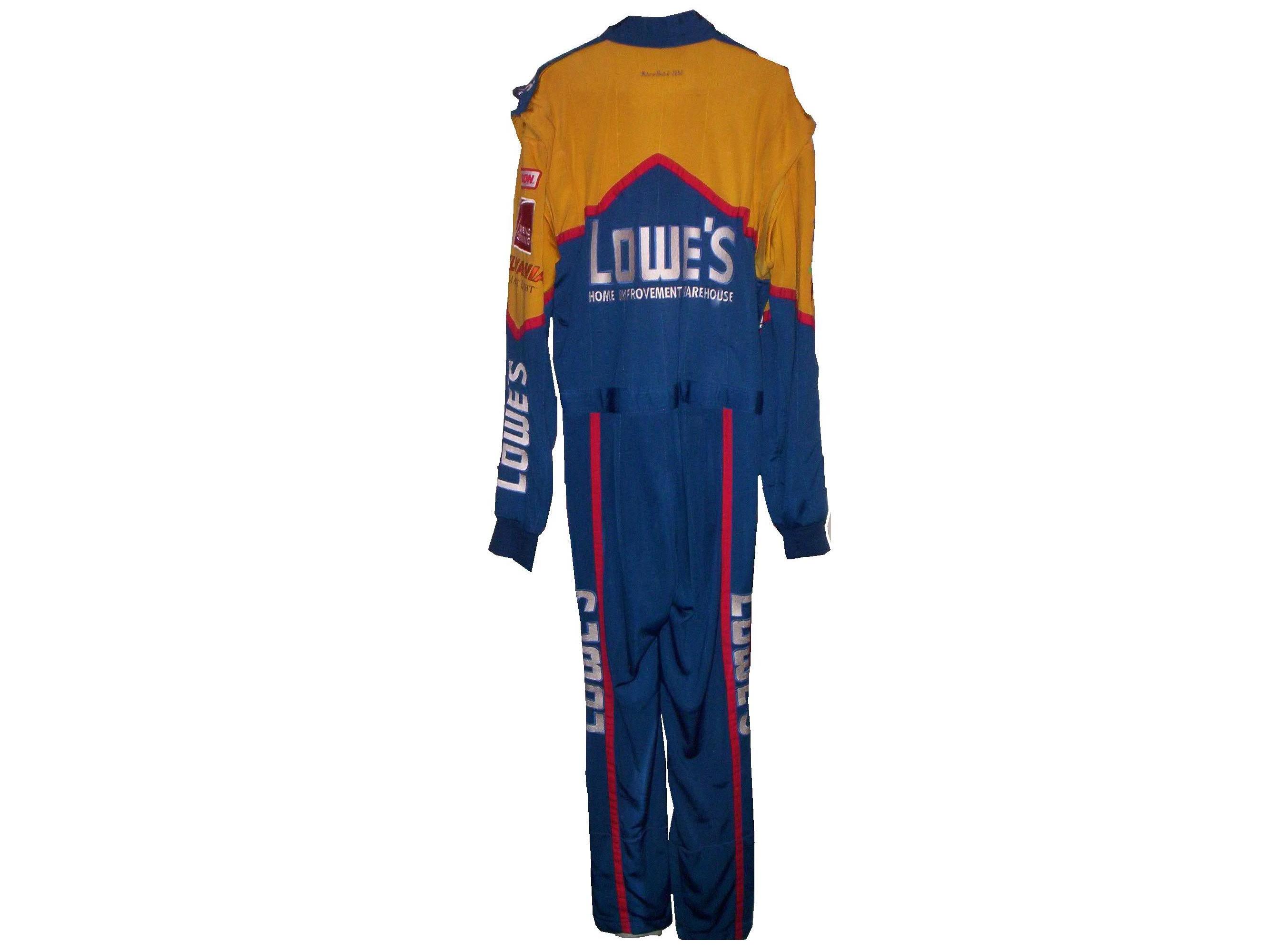
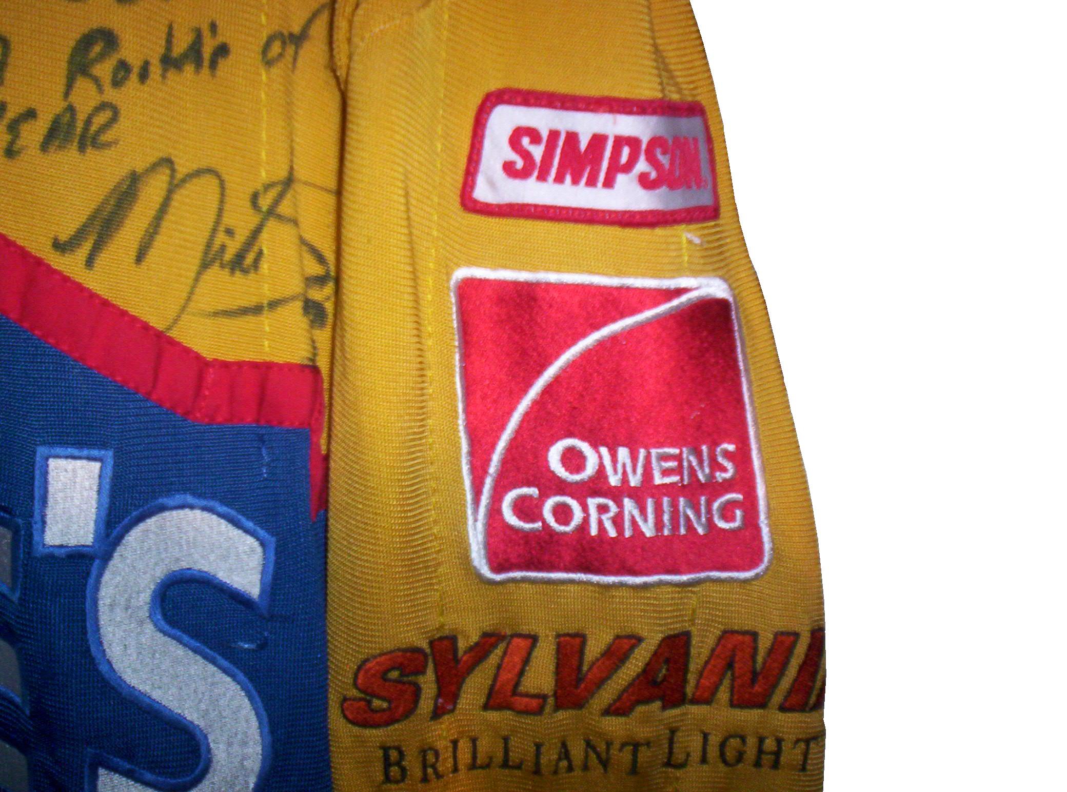
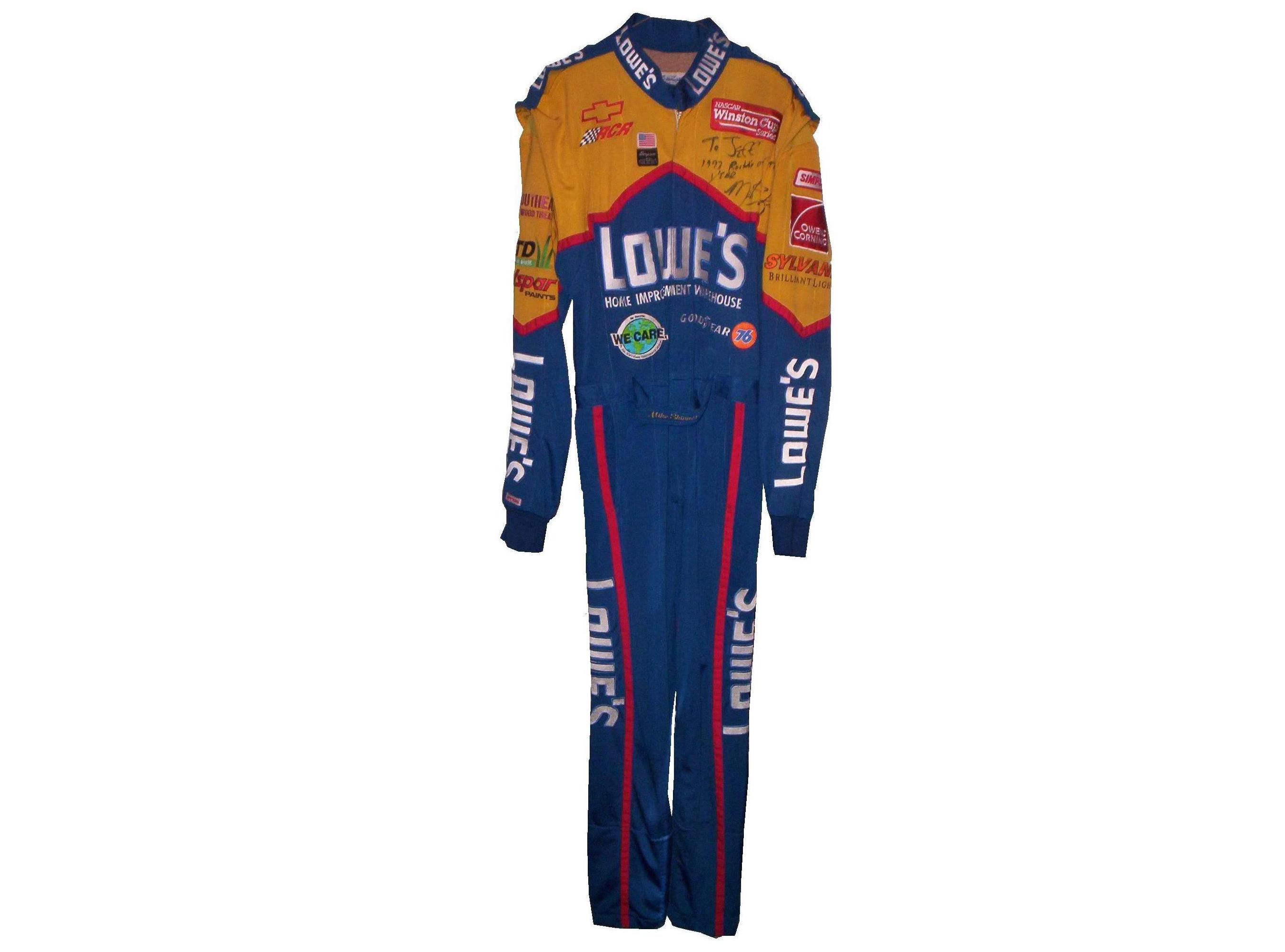 The driver suit it is based on is Mike Skinner’s 1997 race-used driver suit from his rookie of the year campaign. It was purchased from the Jeff Hamilton collection, and came with a letter stating as such. It shows nice use, and Jeff has signed the right chest. It also features something I have seen on a few other suits from that era, but from nowhere else, the Future Suit inscription. I have been waiting a while to discuss this. Custom suits from 1997 have something written on the back of the neck. On the Skinner suit it reads “Future-Suit-2-2252.
 This Stevie Reeves suit from 1997 has a similar inscription
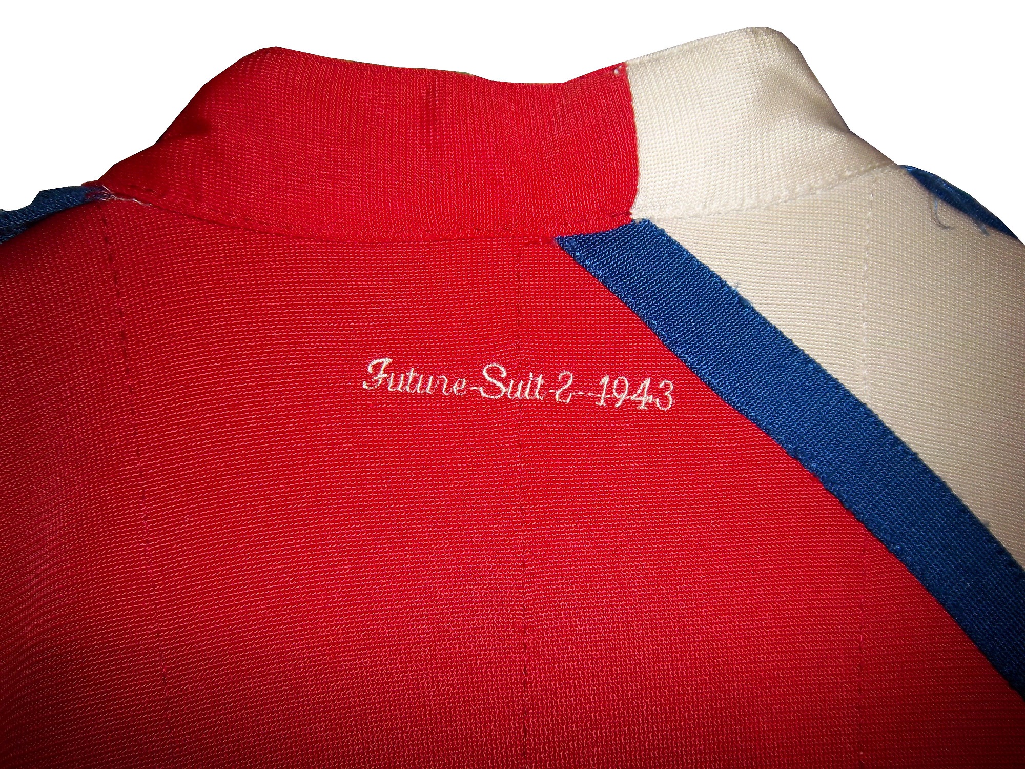 This Lake Speed suit from 1997 was purchased off the rack, and does not bear the inscription,
 Interestingly, suits from 1996 and before,
and suits from 1998 and after, do not have this inscription. From what I have been able to gather, this was an inventory number for customized suits. But I do not understand why it seems to only be used on suits from 1997. Ok, getting off track here, getting back to Finish Line figures….
Taking a look at this figure as compared to the real-life driver suit this figure is based on, it is very accurate. The bottom torso logos, and television logos on the sleeves are identical. The chest is missing the Chevy and Winston Cup logos, and has the name, whereas on the real suit the name is on the belt. They still did a very good job though.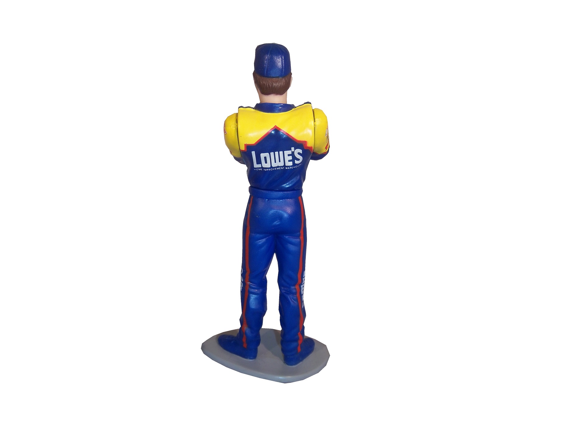
 The logos on the upper sleeves are identical on both the figure and the real suit.


The scale and position of the LOWES logo on the back of the figure as compared to the back of the real suit is identical as well.  The position, location, and size of the television logos on the legs are perfect as well. They really did a great job with this figure.

The detail in this figure is amazing, because Finish Line’s Starting Lineup counterparts lacked some details. Baseball figures from the same set in the same year, such as this Albert Belle figure often lacked pinstripes.


Other examples include recycling of bodies. Every Finish Line figure is basically 4 different body parts, head, upper body, legs, and arms. These were taken, painted appropriately and then attached to each other. That is why all the figures look alike, but with minor differences. 


I can vividly remember buying these as a kid. When I got my first, a Dan Pasqua 1989 White Sox figure for my birthday, I was excited. Now, 23 years later, I have the ability to take a toy from my childhood, and compare it side by side to the uniform it is based on. I can honestly say I never thought it would happen, but I am thrilled to take the opportunity.
Chicago-Style Hot Dogs
In honor of the Chase for the NASCAR Sprint Cup Championship starting at Chicago, I will do a couple of Tailgating Time recipes featuring Chicago food products. The first is Chicago-style Hot Dogs. This classic has been enjoyed in Chicago since the Great Depression. It has been enjoyed by those in the Chicago-land area for some time.
You Will Need:
2 packages Vienna Beef hot dogs
2 packages S. Rosen’s Mary Ann Buns-Both come in packages of 8
1 Chopped white onion
1 Sliced Tomato
1 Jar Yellow Mustard
1 Jar Sweet pickle relish with mint,
2 Jars of pickled sport peppers
Celery salt
Chicago-Style dogs are traditionally boiled or steamed. If it is grilled, it is referred to as a “char-dog.” Once the hot dogs are done cooking, place the hot dogs in the bun, and then put the condiments in this order: mustard, relish, onion, tomato, sport peppers, pickle spear, celery salt. Ketchup on these dogs is UNACCEPTABLE! The final product will look like this: Classic Maxwell Street Polish Sausages
Anyone from Chicago will recognize this dish, and those from all over the country will enjoy this dish as well. This recipe needs both a hot plate as well as a grill. For a group of 6 people, you will need:
12 kielbasa links
12 sausage buns
1 large jar yellow mustard
6 large sweet onions
1 jar Olive Oil
First, on the pan, saute the sweet onions in a bit of olive oil on low for an hour and a half with a touch of thyme and salt. This might seem like a while, but the results are worth it.
While the onions are cooking, fire up the grill, wait until it is hot, and cook the kielbasa links until they show some char on the outside.
A few minutes before the kielbasa and onions are done cooking, pour the mustard into a bowl, this will help in the serving process.
Take the buns and smear the insides of the bun with mustard using a rubber spatula. Take the sausage and place one piece in each bun, and cover the top of the sausage with the now caramelized onions. The final product will look like this:
Paint Scheme Reviews!
Marcos Ambrose #9 DeWALT/ACE/CMN Ford Fusion Good overall design however my main issue with the scheme is the very small writing on the side of the car. Designing a car with lettering too small to show up on the track that can be seen on the track or on television makes no sense at all. That said, this is still a good scheme, and I will give it a B
Greg Biffle #16 3M/Scotchguard Ford Fusion Everything I just said about the Marcos Ambrose scheme above applies here, as the Scotchguard logo is much too small. But the scheme is good and I will give it a B
Ricky Stenhouse Jr. #17 Ford Ecoboost Ford Fusion Great color scheme, great design, works very well, and it gets an A
Kyle Busch #18 M&M’s American Heritage Toyota Camry Kyle has great schemes, and this is no exception. The American Heritage chocolate line features chocolate made as it was back in 1750. The scheme has some light changes, including the American Heritage logo, and a stereotypical colonial hat on the quarter panel. It works very well, and it earns an A
Jeff Gordon #24 Drive to End Hunger/Fan Names on Hood Chevy SS Taking a terrible paint scheme to begin with, and adding tiny lettering to the hood is a great way to earn an F
Paul Menard #27 Menards/Quaker State Chevy SS Green and gold is always a great scheme, but the spike design just does not work at all. I can give it a C at best, but the spikes are just awful.
Jeff Burton #31 Utility Trailers Chevy SS Great color scheme and great design. This scheme earns an A
Ken Schrader #32 Safe Skies Locks Ford Fusion It is a very basic paint scheme however basic can be very good, as this scheme shows. Looks very smooth and very good, and has a great color scheme. It earns an A
David Ragan #34 Farm Rich Ford Fusion Mediocre color scheme, but what they did is that they took that color scheme and designed the car to look like the rolling hills of a farm, with the Farm Rich logo acting as the sun, which works very well, and I have to give this scheme an A
Josh Wise #35 The Pete Store Ford Fusion The template this team uses works well when they have a logo with the matching colors. This example works very well, and earns an A
Dale Earnhardt Jr. #88 Time Warner Cable Chevy SS The blue is too bright, but the overall scheme is good, though I do wish Time Warner could pick a better logo. A
The Driver Suit Blog-NASCAR Sponsorship and Children…Sailing the Censorship.
By David G. Firestone
Since I started this blog, I have found myself chasing stories more. One thing will lead to another, and sometimes, I will discover something that I have never thought I would write about. Today’s column is one of these examples. This story started off when I tried to photo-match this Bobby Hillin suit from 1991
I came across this card:
It is a perfect match except for one thing. Note that the Winston logo has been edited out. 
 Now this is not an isolated incident. Many toys and cards are marketed to children. As such, having alcohol and/or tobacco sponsors on cards and toys is a no-no. But I came across this recently, and it just boggled my mind.
I wrote about my trip to the National Sports Collectors Convention a few weeks ago. Something else I did was that I bought 3 boxes of 1995 Upper Deck NASCAR Series 2 and did a vintage box break on YouTube. What a “vintage box break” means is that I buy a box of cards from the 1990’s or early 2000’s that claim to have autographed cards randomly placed in packs, and open every pack in the box to try and find an autographed card. Sometimes it works,
sometimes it doesn’t.
Well this is the result of the 1995 Upper Deck box break…
After I finished the break, I began to examine the cards more closely, and came across something really unusual. For reasons I can’t understand, the sponsors are partially sponsored, which means that some alcohol and tobacco sponsors are censored, while others are not. For example, Skoal is censored in all forms on cards


 Whereas Kodiak, which is the same product is not.
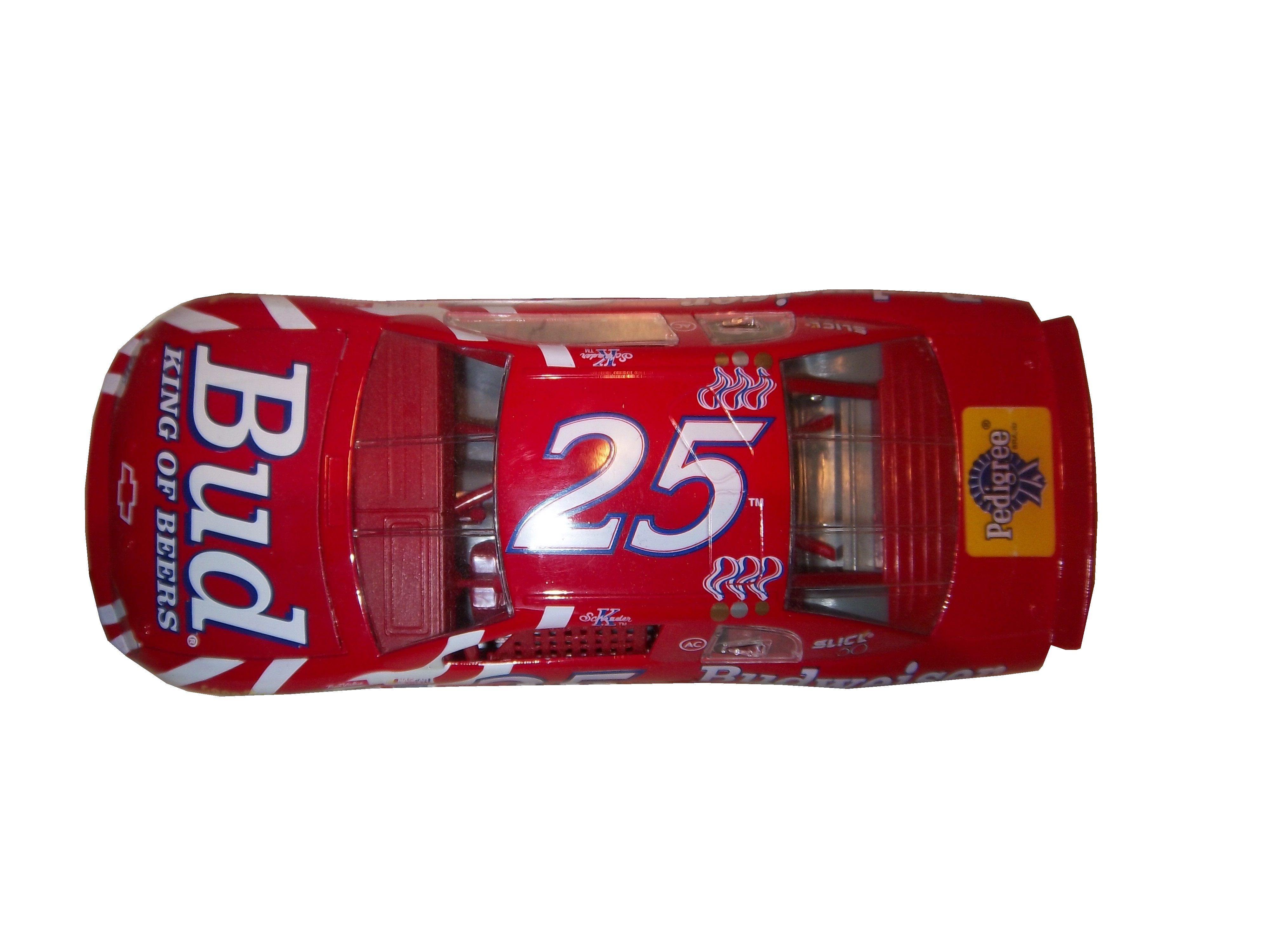
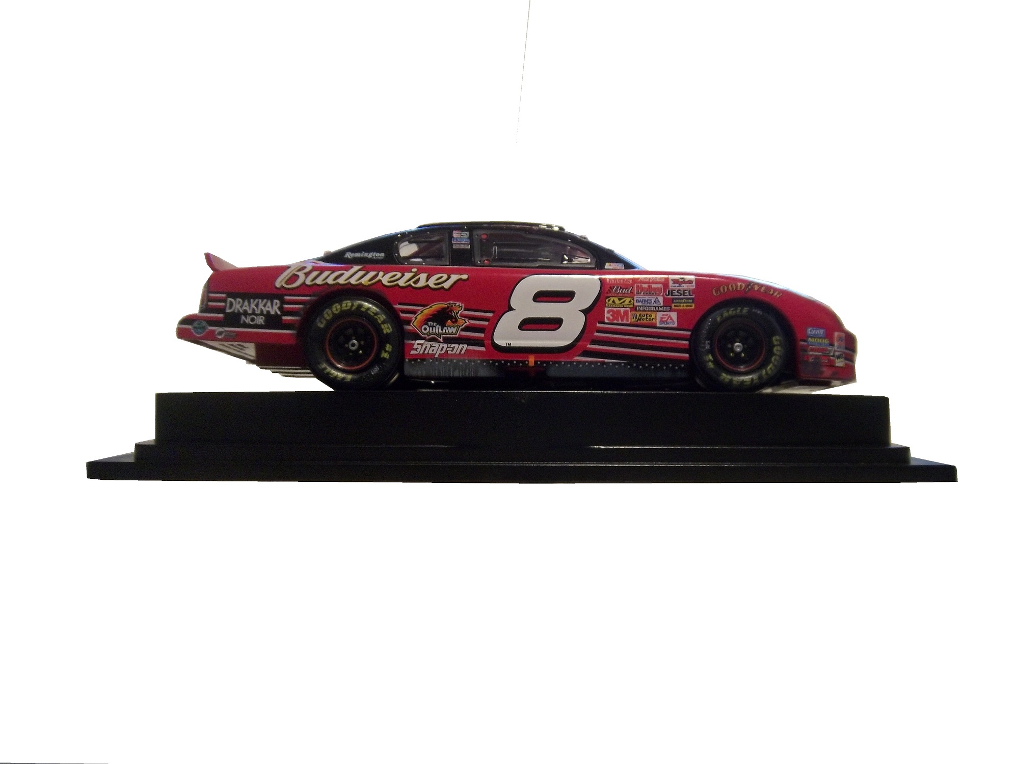
 The other one that I saw is that Budweiser is censored as a sponsor,

 While Miller Genuine Draft, the same product is not.
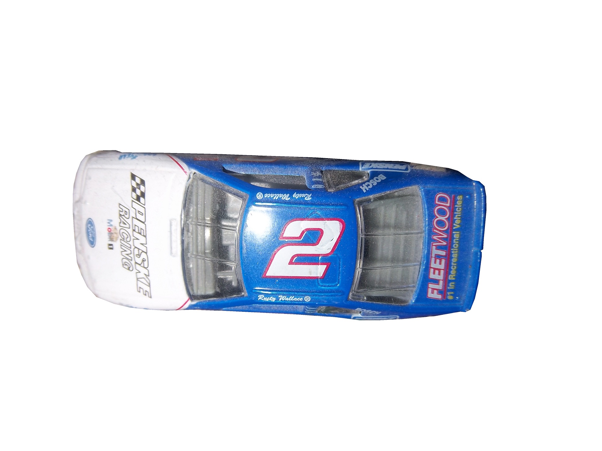
 Some cards censor all the controversial sponsors, some don’t censor any, but I have never seen a company favor one over the other before, and it just seems odd. There seems to be a science to censoring sponsors. While I’m not a fan of censorship of sponsors, it is easy to understand why it happens. Parents don’t want their children to smoke or drink alcohol, which is understandable. So these toys, such as these 1/64 scale cars will replace the alcohol sponsor with the name of the driver and/or the name of the team that owns the car, as these examples show, such as Rusty Wallace

 Ricky Craven

 Ken Schrader
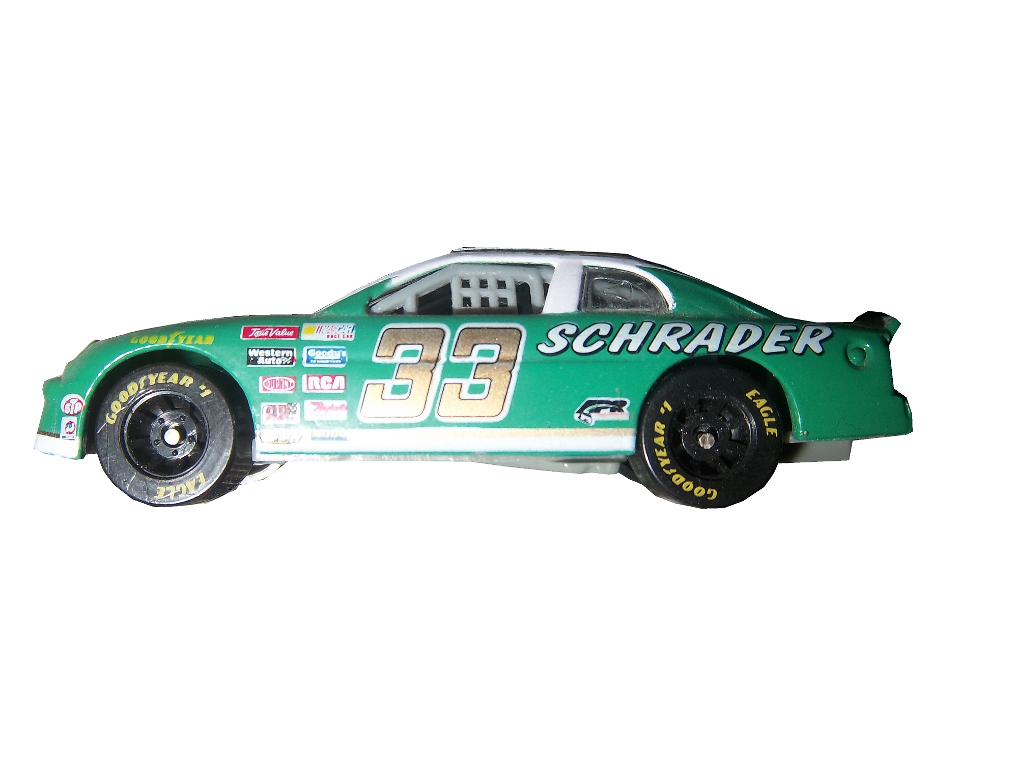

 and Steve Grissom

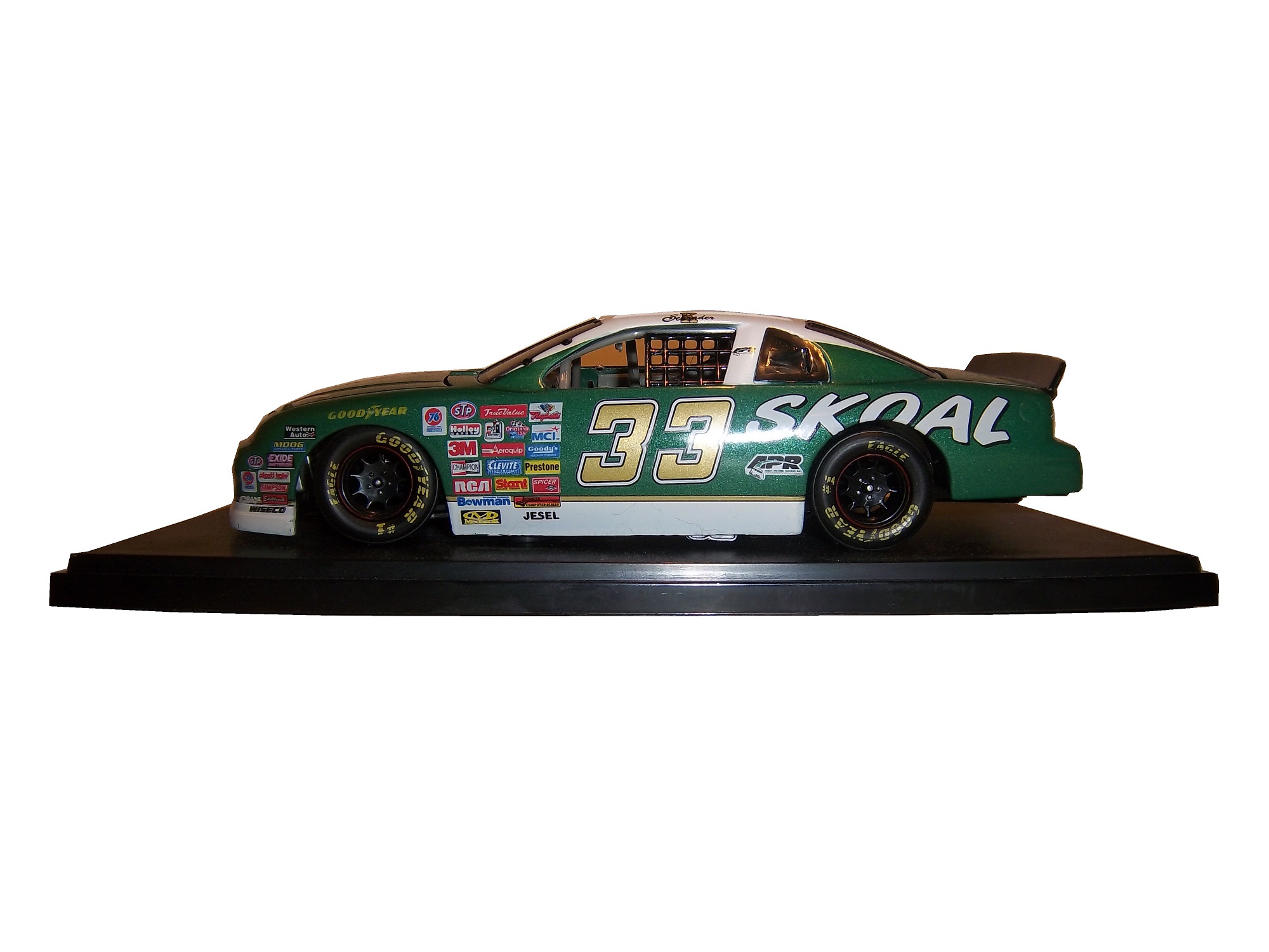
 Those marketed for grown-ups will have the logos, such as these Ken Schrader examples.


 And this Dale Earnhardt Jr. Example
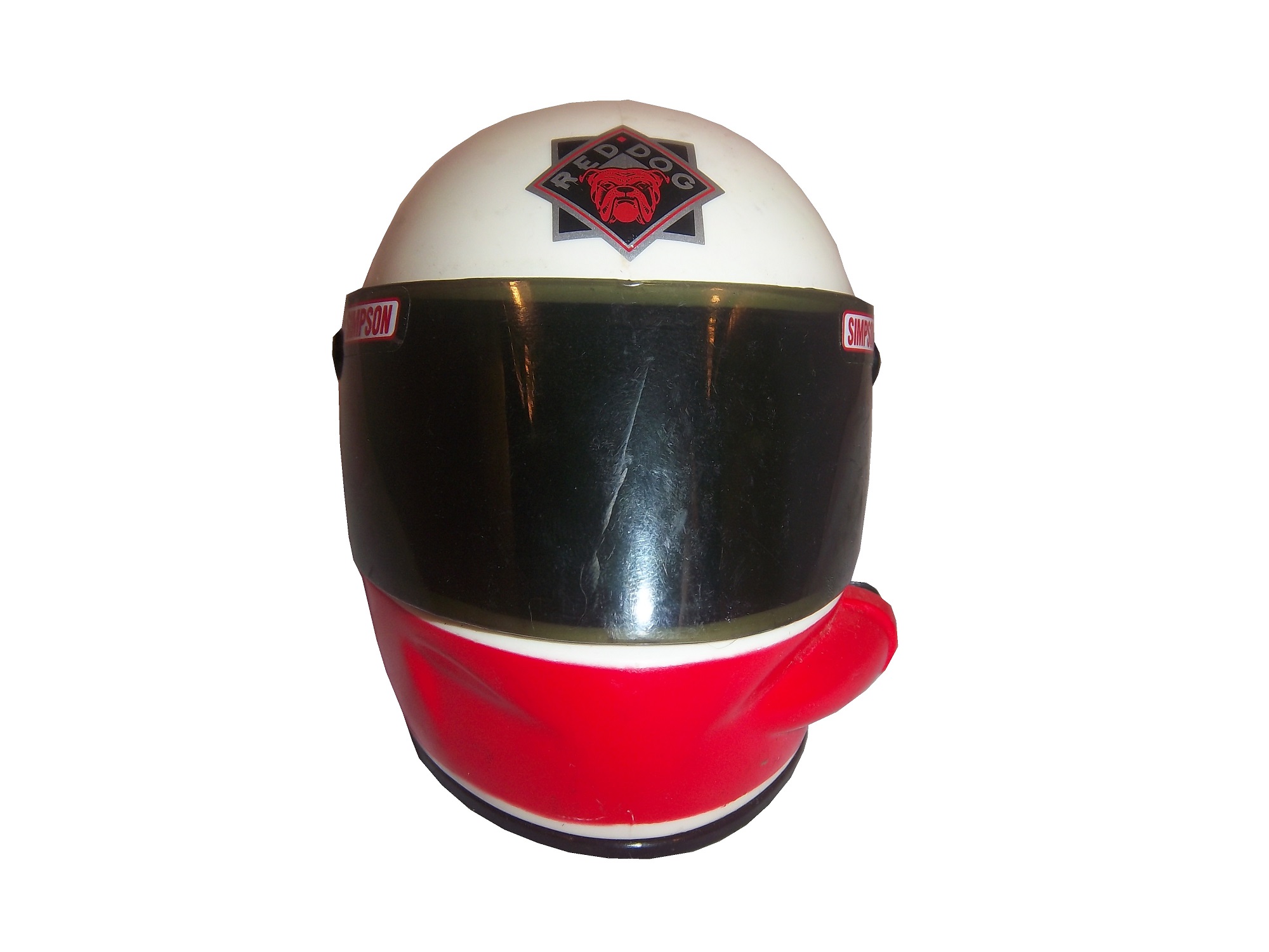
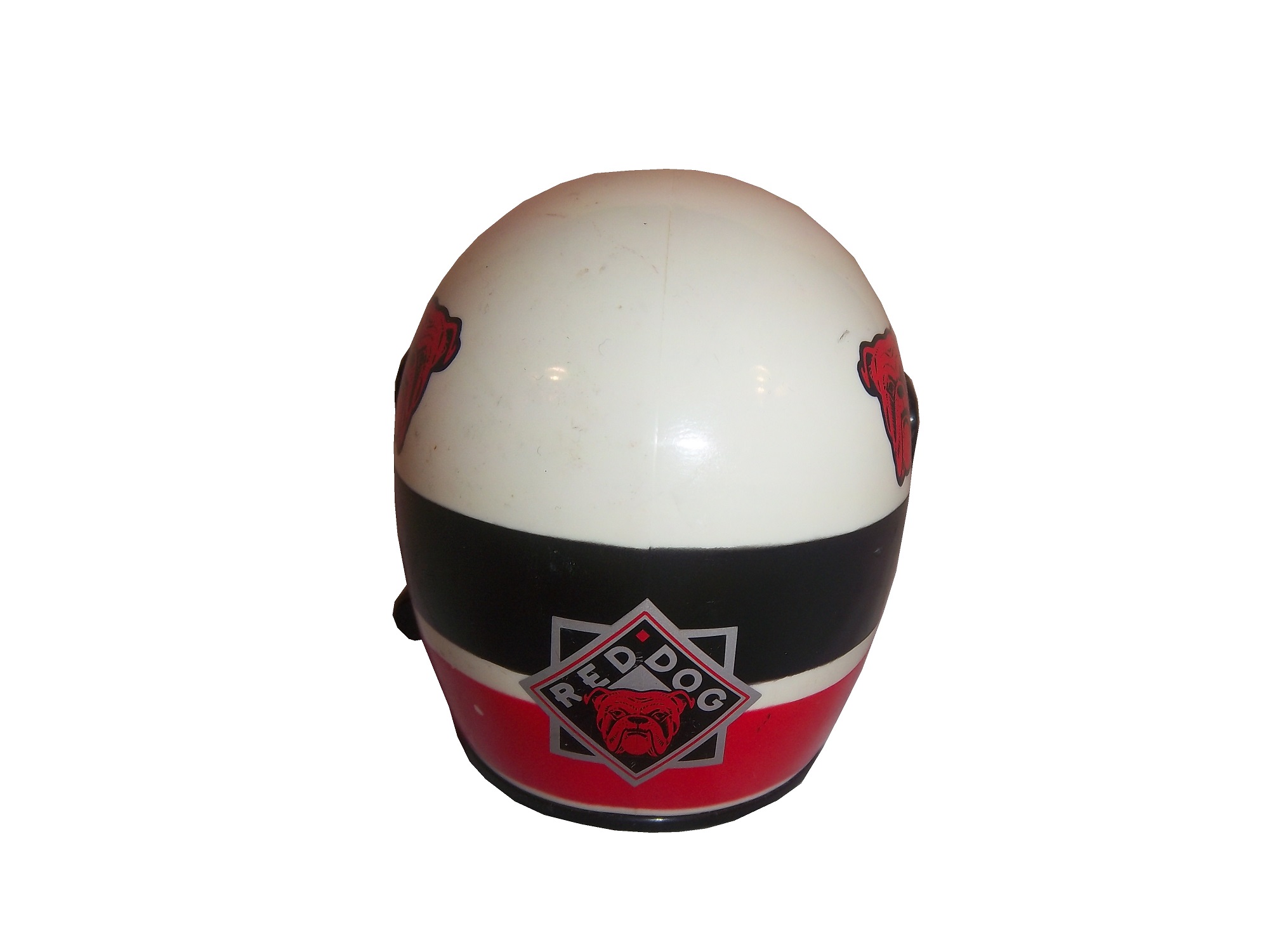
 Simpson mini helmets manufactured in the early to mid 1990’s always have the sponsors, such as these examples from Rusty Wallace,


 Red Dog Beer,


 Ricky Craven,


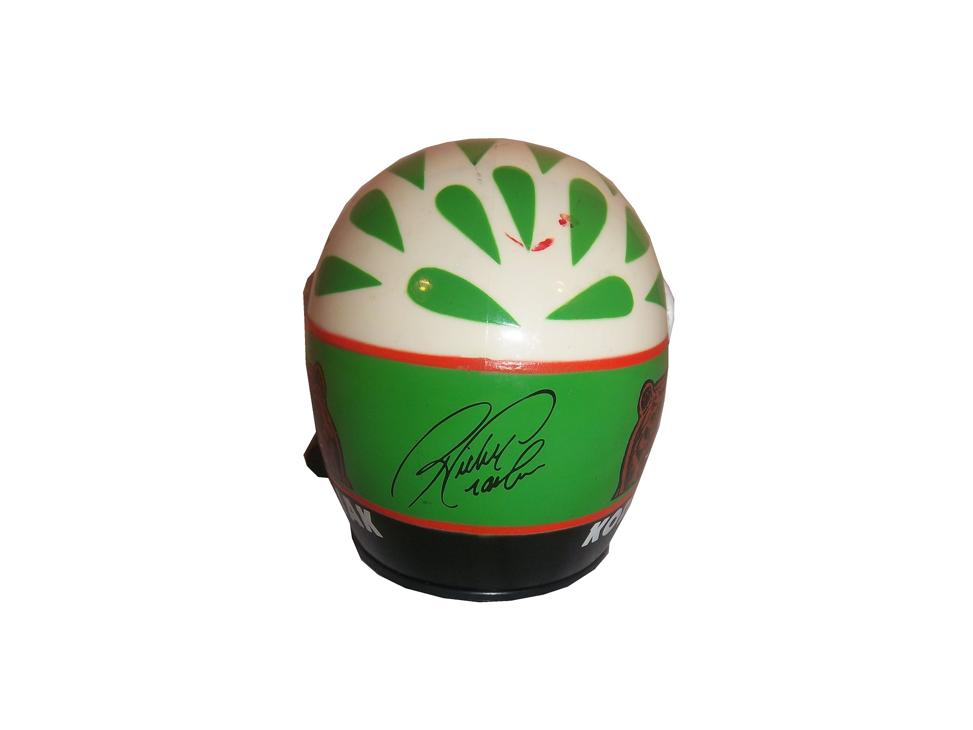
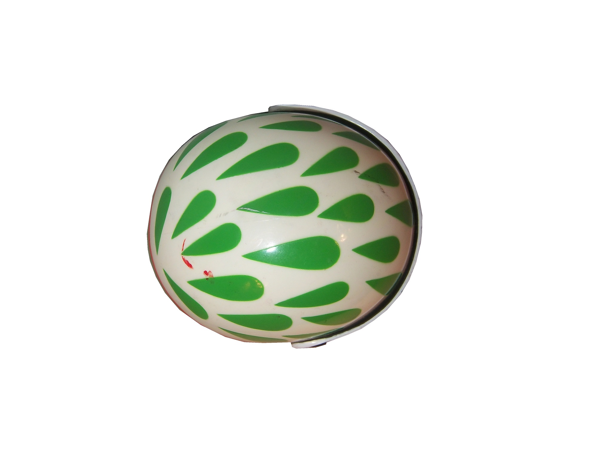
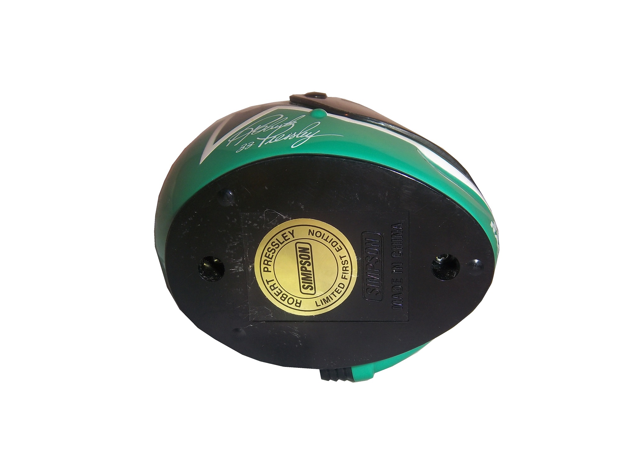
 and Robert Pressley.


 “Hero Cards” which are given out to fans by race teams will never censor the primary sponsor logos in any situation.
 Whereas other cards are left up to the teams many of which will censor the cards:


 Kenner made a series of NASCAR figures under the Finish Line banner in the mid 1990’s, and these religiously censored the sponsors, as this Rusty Wallace figure from 1998 clearly shows.
While tobacco has all but disappeared from NASCAR, alcohol is still a prominent. Coors Light sponsors the pole award, but in the die casts made for kids, which are 1/64 size, the Coors Light decal is missing as displayed on this Tony Stewart diecast. Whereas on the adult 1/24 sized car, the Coors Light decal can clearly be seen as seen on this Tony Stewart diecast. This Tony Stewart photo puzzle, in the kids section of the NASCAR Superstore has the Coors Light decal intact for some reason. Again, while I disagree with censorship, at least be consistent.
And now for something that isn’t censored…
Nothing new paint scheme wise…At this point, many teams are going to start premiering their 2014 schemes, and we’ll get to those at another time.
DGF2099 Productions-Introduction to Sports Memorabilia-Brian Hunter Game Used Lot
I recently bought a lot of items worn and/or used by Brian Hunter, during his playing days, which we will examine this week.
DGF2099 Productions-Introduction to Sports Memorabilia-Tony Canadeo 2012 Commercial Jersey
A treat this week for Green Bay Packer fans, as this Tony Canadeo jersey that was worn for the NFL Evolution commercial in 2012 is featured.
The Driver Suit Blog-A Great Series Needs a Great Logo!
By David G. Firestone
The NASCAR Sprint Cup Series has a unique tradition that stretches back to the 1970’s, the Series Logo. Series Logos are now commonplace in most forms of racing, excluding Formula 1, which does not need a series logo. The evolution of the NASCAR Sprint Cup Series logo over the years in interesting.
1972-1981 This logo is designed in classic 1970’s design, and can be seen on driver suits, as this Dale Earnhardt Sr. example from 1980 clearly shows.
1982-1988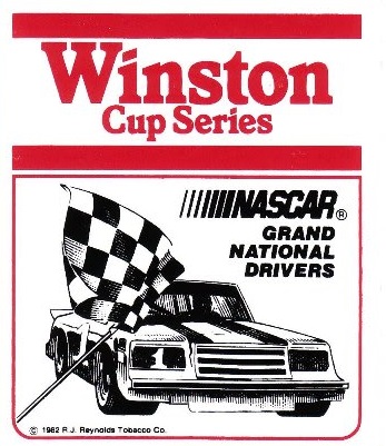 The “1 Car” logo was a major redesign, and features a logo, with NASCAR GRAND NATIONAL SERIES embroidered, and a 1980’s car. Very visible on driver suits from the era.
1989-1992A simple Winston logo, which, while underwhelming is very visible on this Bobby Hillin Jr. Suit, andthis photo of Dale Earnhardt Sr. from 1992…and look who is next to him!
1993-1996 Again an underwhelming yet attractive series logo. The interesting thing about logos from 1993-2001 is that there are two designs, red with white lettering that displayed better on light driver suits, and white with red lettering that displayed better on dark colored driver suits. Though the rule was rather ambiguous for a while.
1997-1999 This design went through some changes when Winston changed the design of their packaging. Starting in 1998, Winston went from a rounder typeface to a narrower and straighter typeface, as a young Tony Stewart is modeling.
1998: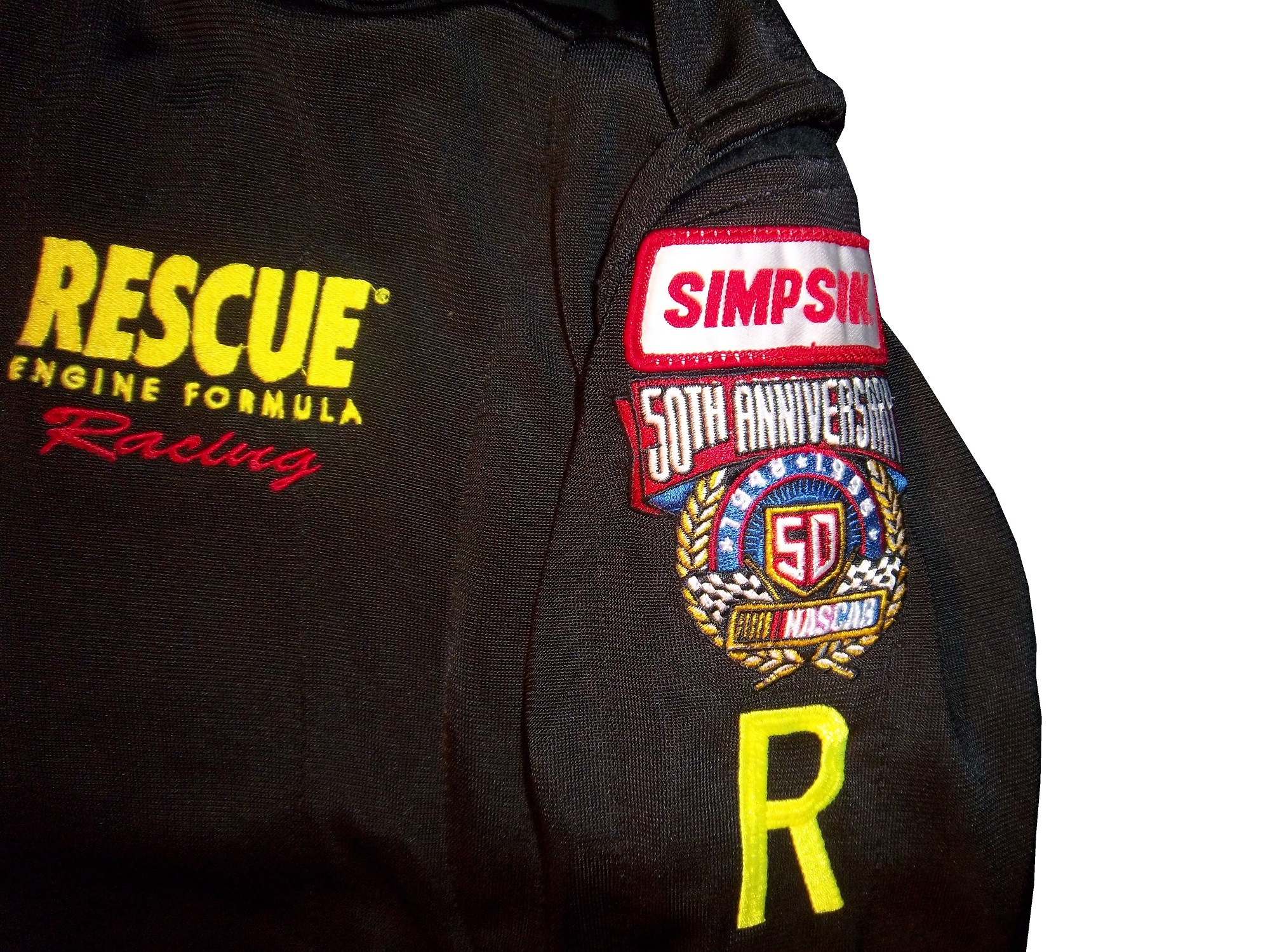 Every team and driver ran the NASCAR 50th Anniversary logo on their cars and driver suits. Not bad at all.
2000-2001 A square design with an oval logo was used from 2000-2001, with the color-flipping returning. At this point, the discussion of who would replace Winston started, as due to legislation, cigarettes would not be allowed to sponsor auto racing within the next few years.
2002-2003
 The transitional oval logo. The Busch Grand National series had adopted an oval logo in 1995, and since the series would change sponsorships in 2004, this new logo would be the bridge between the old and the new.
2004-2007 New sponsor, new colors, new shape. Nextell Communications took over in 2004 and it became the Nextell Cup Series. This logo would remain constant until Sprint and Nextell merged, which led to:
2008-Present:Same color scheme, same shape, same basic design.
The logo has become a marketing point for NASCAR teams and NASCAR itself. Die casts, driver uniform coats, t-shirts, pit crew shirts, and many other items carry these logos.
Now on to the Nationwide Series
1982-1994

These two logos were used for the Busch Grand National series. The plain Busch logo worked better and was used more often than the Busch Beer Series logo.
1995-2004 An oval logo with the sponsor name, and GRAND NATIONAL SERIES added below. It was very marketable and worked quite well as a logo.
2004-2007 Grand National Series has been removed, and some minor redesigns to BUSCH and the NASCAR logo as well. 2006 featured the 25th Anniversary logo.
2007-Present Complete redesign for the NASCAR Nationwide Series which began when Nationwide took over the titular sponsorship of the series. Uneven oval with a Nationwide logo, and a NASCAR logo, with a new overall design and color scheme.
Last but certainly not least the Truck Series
1995: For the first season, the Truck Series was referred to as the “Super Truck Series by Craftsman.” It featured a decidedly early 1990’s logo. It lasted for only one season.
1996-2002 The Craftsman Truck Series is a better name and the logo, while still bearing a 1990’s style design, is more refined and professional.
2003-2008 The entire logo is inside the oval, some minor color and typeface changes are present as well. 2005 featured the 10th anniversary logo.
 2009-Present
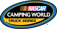 The same off-center oval design as the Nationwide Series and Sprint Cup logos, with a sponsor redesign for Camping World, who took over for Craftsman after 2009.
Paint Scheme Reviews
Jamie McMurray #1 Bad Boy Buggies Chevy SS Not a bad scheme, colors work well, and the ovarall design is simple yet attractive, I give it an A+
Greg Biffle #16 Bondo/3M Ford Fusion The color scheme is good, but the red designs on a red background just look odd. If it was a white design, it would work well, but this just looks odd. Still, it’s odd, but not awful, so I will give it a C
Ricky Stenhouse #17 Nationwide Insurance Ford Fusion Um…This has a great color scheme and a great simple design, but this just does not work. Too much black, and not enough silver and blue. It would work well if the blue and silver were the predominant colors, and black was the where the silver is. I can give this a C
Austin Dillon #33 Advocare Chevy SS It works very well, great color scheme and great desgin…except for the black outline around the numbers. Why? The stripes don’t interfere with it at all. If it was just a small black outline around the edge of the numbers it would work, but the black negative space area is just distracting. Without the black, it would be an A, but this scheme earns a B-
David Ragan #34 Peanut Patch Hot Boiled Peanuts/Race Trac Ford Fusion While the color scheme brings back memories of the Houston Astros Tequila Sunrise jerseys, the overall design is good. I like the mountain-esque design, but the random peanuts scattered over the hood and quarter panels are just awful. I really want to give this a better grade, but a C- is the best I can do for this scheme.
Josh Wise #35 Carson-Newman University Ford Fusion Great color scheme, and great design…except for the eagle. Why is the eagle facing the back of the car? If the eagle was facing the front, I would give this scheme an A, but this just looks bad, and takes the grade down to a C
Landon Cassill #40 Moonshine Attitude Attire Chevy SS Ok, let me make this clear…hunting camouflage is not, has never been, and never will be an acceptable background color for a race car. It didn’t work for Duck Dynasty, and it doesn’t work for this car, and it gets an F
Aric Almirola #43 Rain Eater Wiper Blades/Charter Communications Ford Fusion This color scheme works very well, except for the hood logo, where the green logo is next to invisible on the Petty blue of the hood. But even so, the scheme as a whole works very well, so I’ll give it an A.
Ryan Truex #51 Seawatch Chevy SS Having never heard of Seawatch, I thought it was an activist group at first, but Seawatch is actually a very well established clam company based in Maryland. The overall design is really good, though the wave next to the rear wheel well is a bit out of place. Still it looked very good on the track, and I give it an A.
Justin Allgaier #51 Brandt Chevy SS A timeless design, with a great color scheme and a great design that earns an A
Dale Earnhardt Jr. #88 Race 2 Achieve/National Guard Chevy SS Race 2 Achieve is a program that teaches advanced math through the eyes of Hendrick Motorsports engineers. It shows how the engineers use Algebra II and trigonometry to solve problems on the race car. This is a great old-school scheme, with a great color scheme, and great overall simple design. A+
Dale Earnhardt Jr. #88 National Guard/Breast Cancer Awareness Chevy SS Oh God! October is coming therefore, the pinkwashing must start. For those who don’t know the term, “Pinkwashing” is the process of using pink ribbons and/or the pink color to sell products, many of which are inherently unhealthy, with a “portion of the proceeds going to support the fight against breast cancer.” Sadly, most of these funds do not go to serious research, but rather to “feel good” causes such as the Susan G. Komen foundation. Because it is used as a marketing gimmick, and I, as well as my mom who is a breast cancer survivor are opposed to pinkwashing, any and every pink paint scheme, regardless of how good it looks, will earn an automatic F- grade.
Michael McDowell #98 Victory Junction Ford Fusion Unlike Komen, Victory Junction is a cause most people can support. Founded by the Petty Family, after the death of Adam Petty, Victory Junction is a camp for children with terminal and chronic illnesses, so while they are there, they can forget about the troubles of life, and have fun. That said, this is a great scheme, with a very simple yet attractive design, and great colors. The only bad thing I can say about this scheme is that I would love the logo on the quarter panels. That one thing can’t take away from an A+ scheme.
DGF2099 Productions-Introduction to Sports Memorabilia-Mike McCoy 1969 Notre Dame Practice-Worn Jersey
For all you Notre Dame Fighting Irish fans, a treat this week, we will examine a Mike McCoy 1969 Notre Dame practice-worn and signed jersey.
The Driver Suit Blog-A Prototype Pit Crew Suit…Say That Three Times Fast Part 2
By David G. Firestone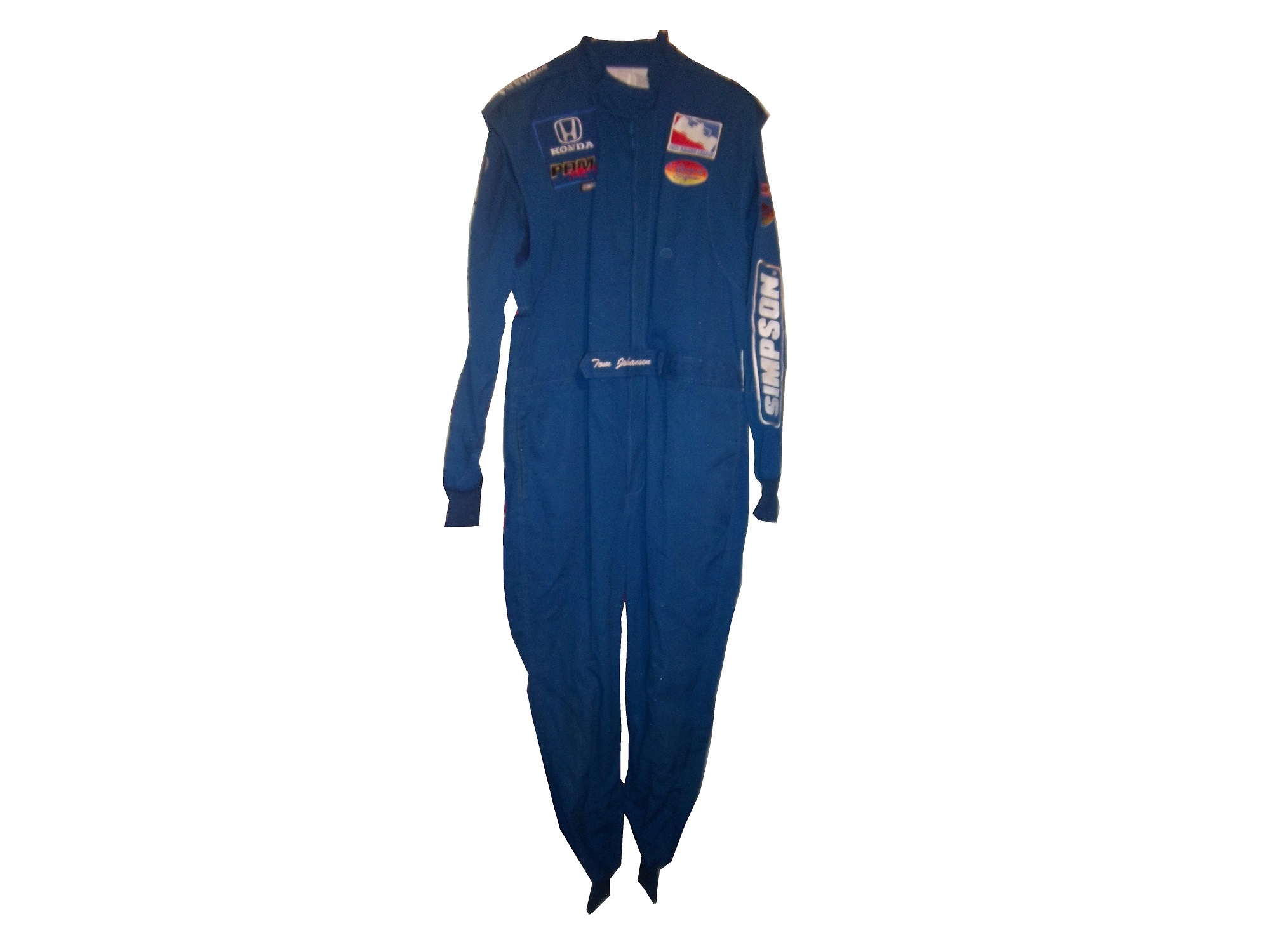
Last week, we discussed this “prototype pit crew suit” from the prototype aspect. This week, we will discuss the pit crew aspect. This is a very interesting aspect of racing suits. Pit crews have a very dangerous job. They have to change 4 tires, make any adjustments, and refuel the car in a matter of seconds. The risk level is as high as you could possibly imagine. Fire is a frequent risk, especially when refueling the car or repairing the damage from a wreck. As such, pit crews are required to wear fire protection identically to what the driver wears.
This footage is from the 1984 Miller High Life 400 in Charlotte. Note what the crews are wearing in this pit stop:
Yes, pit guys for many years had no fire protection or helmets at all, and there were no speed limits at all, so pit road was a very dangerous place. That all changed at the 1990 Atlanta Journal 500, the final race of the 1990 season. Bill Elliot was on pit road at lap 300, when Ricky Rudd lost control of his car at high speed, and hit a couple of Elliot’s crew members by accident. One of those crew members, Mike Rich, suffered unsurvivable injuries and died. To help insure that something like this would never happen again, the first pit road rules were implemented in 1991. As time went on, more rules concerning safety were implemented, including head protection, fire protection, radio gear, so that now a pit stop looks like this:
Notice that every crew member, including the crew chief wears a fire-suit, this is not an option, it is a rule. That is because when a fire starts on pit road, the crew members won’t get hurt, as seen below:
That was from earlier in the year, and none of the crew members from that incident were seriously hurt.
While most crew members have the option of one or two piece suits, those involved in refueling the car don’t have a choice. NASCAR uses high octane E85 fuel, which is an 85 gasoline/15 ethanol mixture. IndyCar uses an ethanol blend, which is not as flammable, but will still burn if ignited. Marco Andretti’s crew accidentally set his car on fire during a race last year. Again, no crew members were hurt. Gas men wear a one-piece suit, with a full-face helmet, thick gloves, and racing shoes as shown here. Crew members often wear two-piece suits, as it provides the wearer with less restriction in movement than a one-piece, which comes in handy when changing tires. Tire carriers, changers, and jack men wear open-face helmets, frequently with LED lights for extra visibility at night races.
Remember that the ultimate goal of a driver or pit crew suit is to protect the wearer from fire. The protection may be uncomfortable. The suit might be hot, or constrictive, but all that matters is that the wearer is safe. SFI and FIA certification comes standard on these suits. The risk on pit road is transparently clear to the crew members, and these uniforms are designed to keep the crew from being injured in case the worst case scenario happens.
No paint scheme news this week, will be back next week with something interesting, an analysis of the evolution of NASCAR series logos…
The Driver Suit Blog-A Prototype Pit Crew Suit…Say That Three Times Fast Part 1
By David G. Firestone.
Ok, for the next two weeks, I am going to focus on one single suit. This is a “prototype crew suit.” In other words, it is a prototype suit for a pit crew member. In that light, I will do two articles, one focusing on the “prototype” part and the other will focus on the “pit crew” part.
This is a prototype suit. What that means is that this suit was made up to see how various design aspects work. The designers will attach various aspects, stripes, sponsor patches, to a full-size mockup of a suit, usually a single-layer suit, to see how the suit will look like when finished. Since driver and pit crew suits can cost as much as $1500 each to make, this is a simpler and cheaper way to design a suit in full-size. A full size mockup looks very impressive. The designs can be changed as needed.
Prototype suits are made from a single-layer suit. Single-layer suits are cheaper to use, but provide little protection in case of fire, so they are not often used in race condition. Suit design has, in the last 20+ years gone from not an issue to very critical. Because suits are used for promotion for the primary sponsor, the design aspect is very important. Every aspect, from the colors, to the primary and associate sponsor patches, to the decorative design is taken into consideration.
This particular suit was made for PDM racing, for use in the IndyCar Racing League in 2006. It was made for an individual by the name of Tom Johansen. It appears that Johansen is a crew member, and this suit was designed for his use. The logos are sewn on patches, the patches are placed on pieces of fabric, and then attached to the suit. From there, the suit starts to take shape, and the name is attached to the belt, and the logos are attached to the shoulder epaulets. In this example:
The right chest has a HONDA and a PDM RACING logo.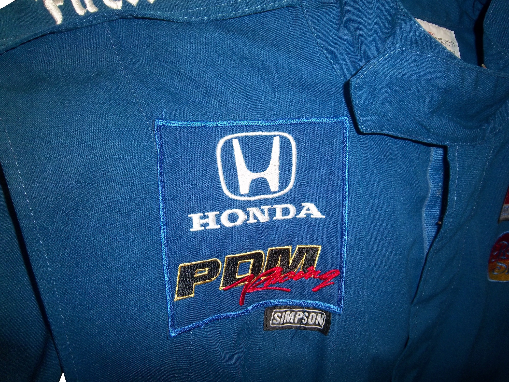 The left chest has an INDY RACING LEAGUE logo and a ROYAL SPA logo.
 The belt has TOM JOHANSEN directly embroidered into it.
 The legs are cuffed.
 The sleeves have small logos on the top, and large SIMPSON logos present the bottom.


 The shoulder epaulet have FIRESTONE logos present.
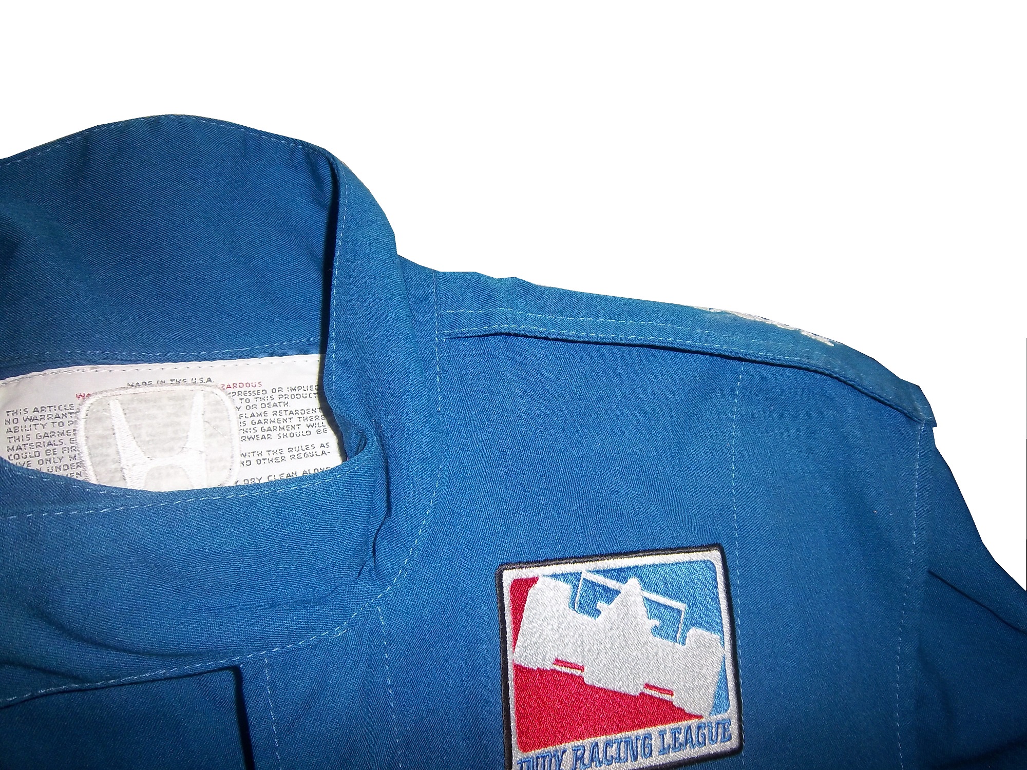 The back cowl has a HONDA logo that covers part of the tag.
 The back Torso has a large ROYAL SPA logo, Royal Spa being the primary sponsor at the time.The suit shows no wear to speak of, nor does it have any safety certification.
The question is asked, did this suit see race-use? While the suit itself shows no wear, it seems likely that it did in some form see race use. PDM Racing was always a sub-par team, and they were always a low-budget team. An inside joke was that PDM stood for “Poor Dumb Mechanics.” So the fact that this suit was made would indicate that it was used by Johansen. However what part Tom Johansen served on the crew is unknown. On the other hand, a single-layer suit such as this would not provide much protection for the wearer in the very real threat of a fire. The suit material feels very light, and the wearer would have been seriously injured if a fire had taken place. The deciding factor for me is that the suit shows no wear. I have suits in my collection that have been worn for only a few races, but have a lot of visible wear, and for a pit crew suit, that is pretty telling.
Prototype suits provide little protection in case of fire, unlike pit crew suits which are designed to give the wearer as much protection as possible, which we will examine further next week.
Paint Scheme Time!
Jamie McMurray #1 Advil Chevy SS While I’m not a fan of the grid on the front, the car as a whole has a simple, yet attractive design, as well as a good color scheme. So I’ll overlook the grid and give this an A+
Brad Keselowski #2 Miller Lite/Luke Brian Ford Fusion I gave this basic scheme a C+ at the beginning of the year, and this new design doesn’t add or take away from the scheme, so I will leave it at a C
Alex Kennedy #19 Media Master Toyota Camry Nothing really remarkable here, just a simple white scheme with black numbers and green logos. Very simple, and very plain, C+
David Stremme #30 Genny Light Toyota Camry Too much needless decoration. A good color scheme, but there is way too much going on design wise on the side of the car. It just looks awful, and I give it a D-
David Ragain #34 Taco Bell Ford Fusion I have yet to cover Taco Bell this year, but this scheme has a great color scheme, great side design, and a very pronounced design on the hood, which really makes the car stand out, and gives it a better look. A+
Ryan Newman #39 Haas 30th Anniversary Chevy SS Haas has a great scheme already, and the all-black look really works well here. To give this scheme anything less than an A+ is unfair.
Ryan Newman #39 Quicken Loans/PTA Chevy SS The nicest thing I can say about this is that it looks like a unicorn threw up all over the car. F-
Brian Keselowski #52 Star Coach Race Tours Toyota Camry Are you f***ing kidding me? I have to give them credit, they took the worst scheme in NASCAR this year, and found a way to make it even worse. The color and design are horrific, and bonus points for putting blue lettering in the green camo, thus making it nearly invisible. Giving this scheme an F– does not go far enough! WORST SCHEME THIS YEAR!
Brian Vickers #55 Toyota Cares Toyota Camry Good color scheme, and decent design. It is pretty simple, and it works. A
And speaking of Brian Vickers, we got a look at the design for his 2014 Aarons Dream Machine Toyota Camry. The scheme has a more modern look, both in the overall design and door numbers. It is a great scheme, with a great color scheme. A+
DGF2099 Productions-Introduction to Sports Memorabilia-1958 Washington Senators Uniform Numbers
Now these are interesting. This week, we will look at some uniform numbers from the 1958 Washington Senators 3D uniforms.
