Since I started this blog, I have found myself chasing stories more. One thing will lead to another, and sometimes, I will discover something that I have never thought I would write about. Today’s column is one of these examples. This story started off when I tried to photo-match this Bobby Hillin suit from 1991
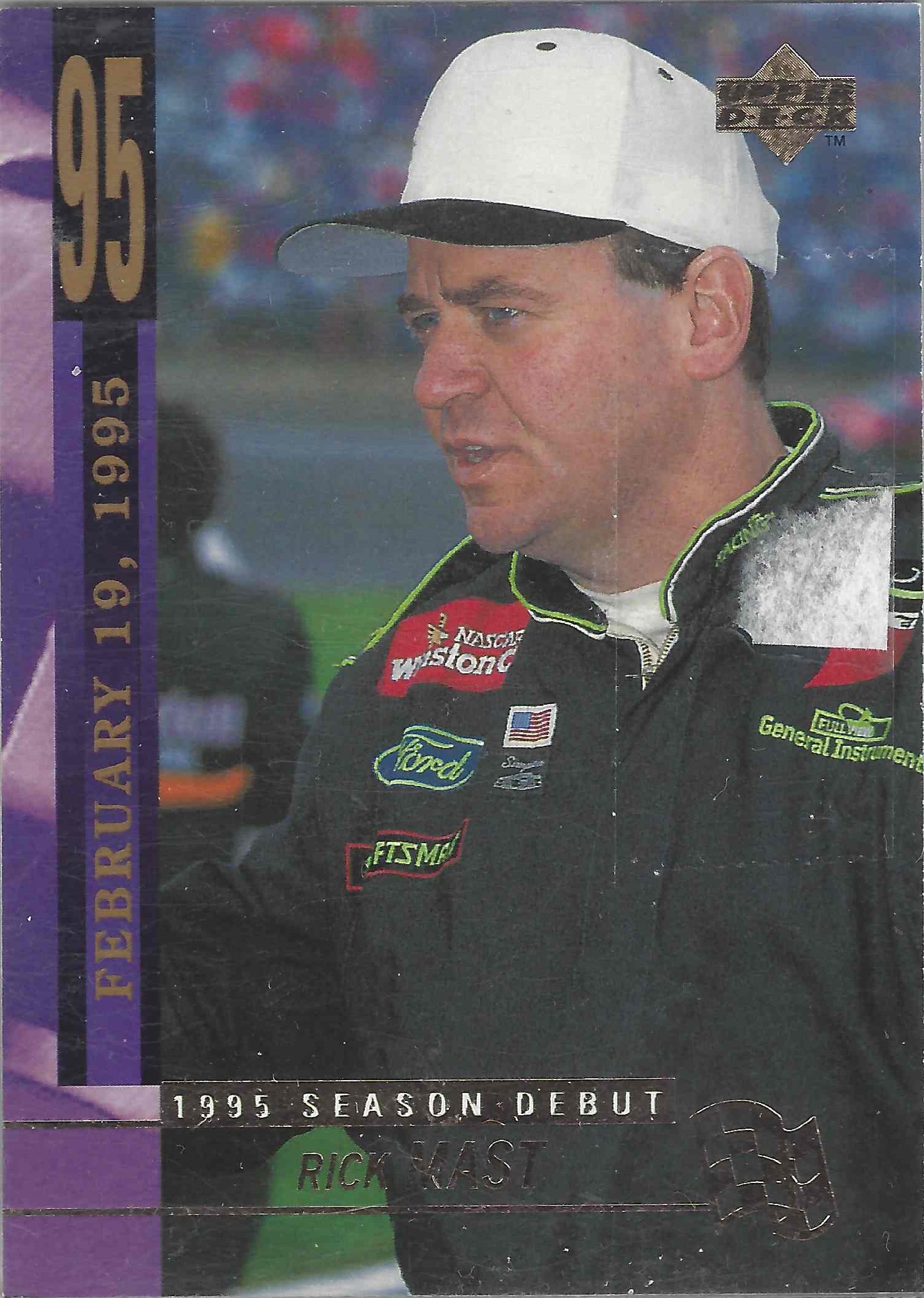
I came across this card:
It is a perfect match except for one thing. Note that the Winston logo has been edited out. Now this is not an isolated incident. Many toys and cards are marketed to children. As such, having alcohol and/or tobacco sponsors on cards and toys is a no-no. But I came across this recently, and it just boggled my mind.
I wrote about my trip to the National Sports Collectors Convention a few weeks ago. Something else I did was that I bought 3 boxes of 1995 Upper Deck NASCAR Series 2 and did a vintage box break on YouTube. What a “vintage box break” means is that I buy a box of cards from the 1990’s or early 2000’s that claim to have autographed cards randomly placed in packs, and open every pack in the box to try and find an autographed card. Sometimes it works,
sometimes it doesn’t.
Well this is the result of the 1995 Upper Deck box break…
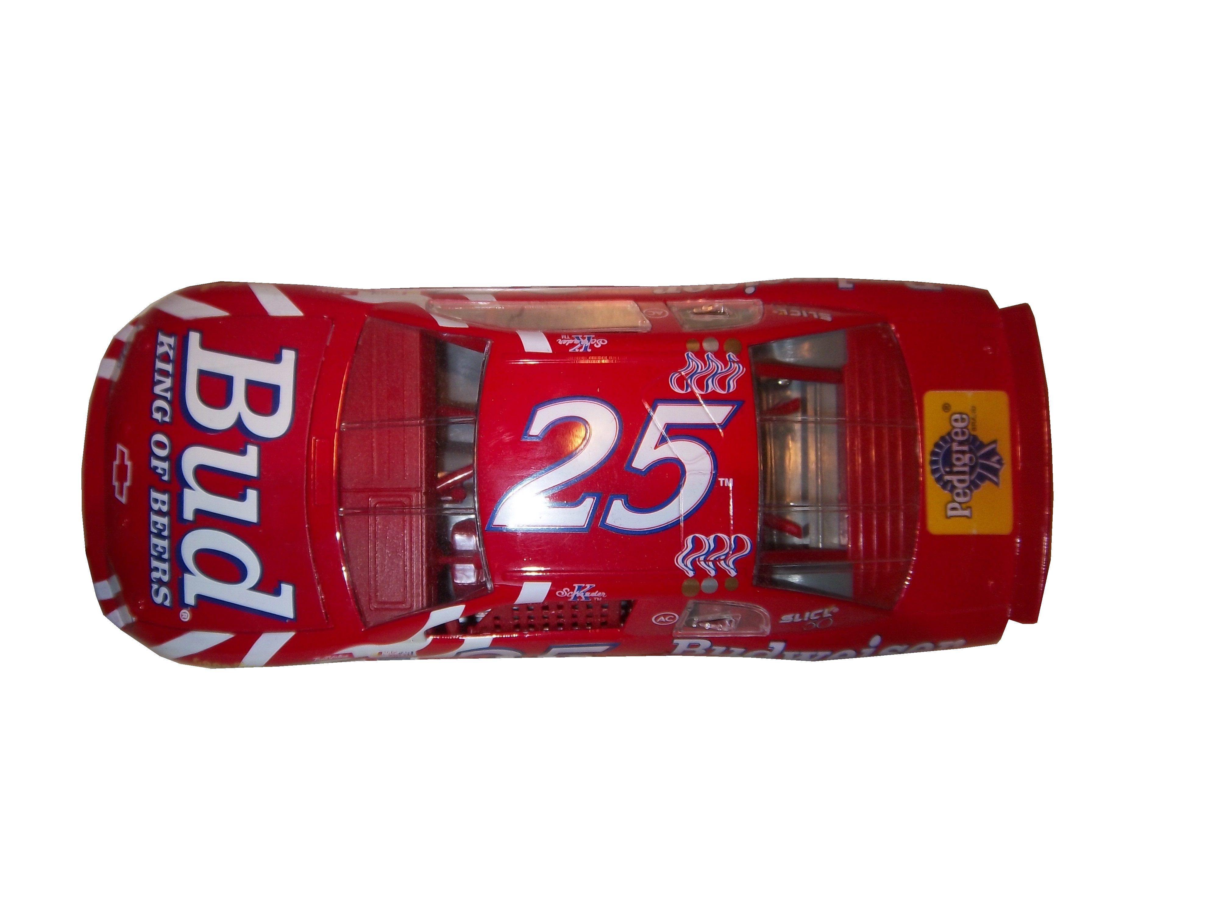
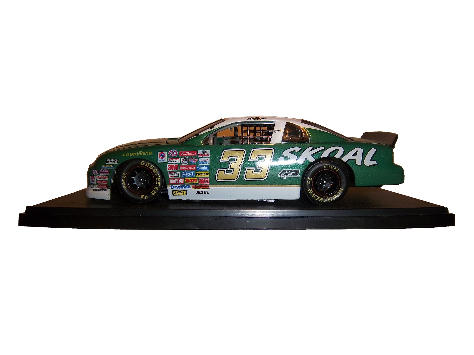
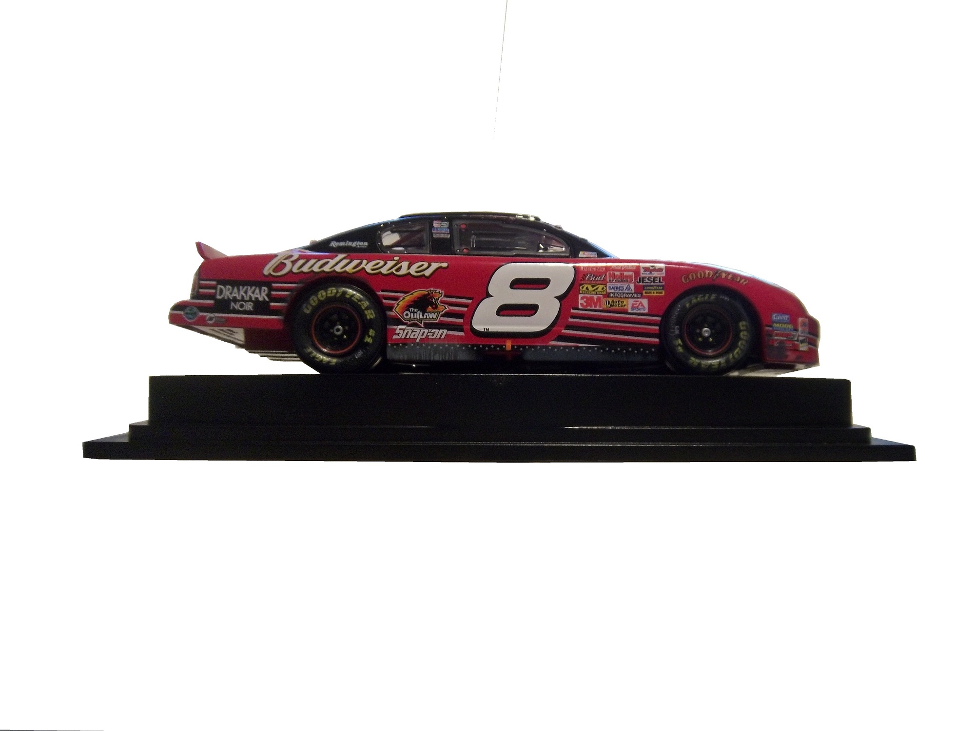
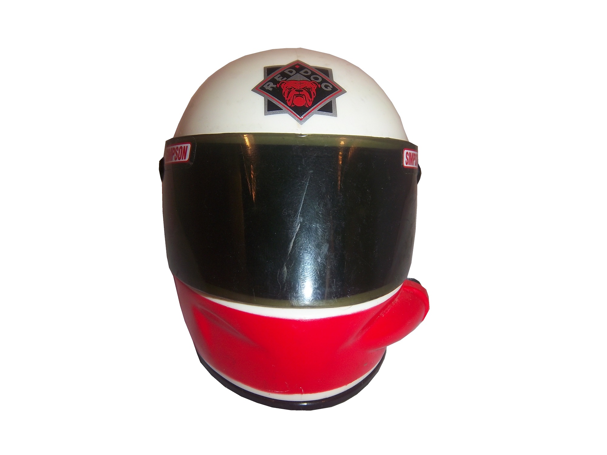
After I finished the break, I began to examine the cards more closely, and came across something really unusual. For reasons I can’t understand, the sponsors are partially sponsored, which means that some alcohol and tobacco sponsors are censored, while others are not. For example, Skoal is censored in all forms on cardsWhereas Kodiak, which is the same product is not. The other one that I saw is that Budweiser is censored as a sponsor,While Miller Genuine Draft, the same product is not.Some cards censor all the controversial sponsors, some don’t censor any, but I have never seen a company favor one over the other before, and it just seems odd. There seems to be a science to censoring sponsors. While I’m not a fan of censorship of sponsors, it is easy to understand why it happens. Parents don’t want their children to smoke or drink alcohol, which is understandable. So these toys, such as these 1/64 scale cars will replace the alcohol sponsor with the name of the driver and/or the name of the team that owns the car, as these examples show, such as Rusty Wallace Ricky CravenKen Schrader and Steve Grissom Those marketed for grown-ups will have the logos, such as these Ken Schrader examples.And this Dale Earnhardt Jr. Example Simpson mini helmets manufactured in the early to mid 1990’s always have the sponsors, such as these examples from Rusty Wallace, Red Dog Beer, Ricky Craven, and Robert Pressley. “Hero Cards” which are given out to fans by race teams will never censor the primary sponsor logos in any situation. Whereas other cards are left up to the teams many of which will censor the cards:Kenner made a series of NASCAR figures under the Finish Line banner in the mid 1990’s, and these religiously censored the sponsors, as this Rusty Wallace figure from 1998 clearly shows.
While tobacco has all but disappeared from NASCAR, alcohol is still a prominent. Coors Light sponsors the pole award, but in the die casts made for kids, which are 1/64 size, the Coors Light decal is missing as displayed on this Tony Stewart diecast. Whereas on the adult 1/24 sized car, the Coors Light decal can clearly be seen as seen on this Tony Stewart diecast. This Tony Stewart photo puzzle, in the kids section of the NASCAR Superstore has the Coors Light decal intact for some reason. Again, while I disagree with censorship, at least be consistent.
And now for something that isn’t censored…
Nothing new paint scheme wise…At this point, many teams are going to start premiering their 2014 schemes, and we’ll get to those at another time.
The NASCAR Sprint Cup Series has a unique tradition that stretches back to the 1970’s, the Series Logo. Series Logos are now commonplace in most forms of racing, excluding Formula 1, which does not need a series logo. The evolution of the NASCAR Sprint Cup Series logo over the years in interesting.
1972-1981This logo is designed in classic 1970’s design, and can be seen on driver suits, as this Dale Earnhardt Sr. example from 1980 clearly shows.
1982-1988The “1 Car” logo was a major redesign, and features a logo, with NASCAR GRAND NATIONAL SERIES embroidered, and a 1980’s car. Very visible on driver suits from the era.
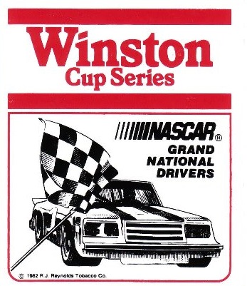
1989-1992A simple Winston logo, which, while underwhelming is very visible on this Bobby Hillin Jr. Suit, andthis photo of Dale Earnhardt Sr. from 1992…and look who is next to him!
1993-1996Again an underwhelming yet attractive series logo. The interesting thing about logos from 1993-2001 is that there are two designs, red with white lettering that displayed better on light driver suits, and white with red lettering that displayed better on dark colored driver suits. Though the rule was rather ambiguous for a while.
1997-1999This design went through some changes when Winston changed the design of their packaging. Starting in 1998, Winston went from a rounder typeface to a narrower and straighter typeface, as a young Tony Stewart is modeling.
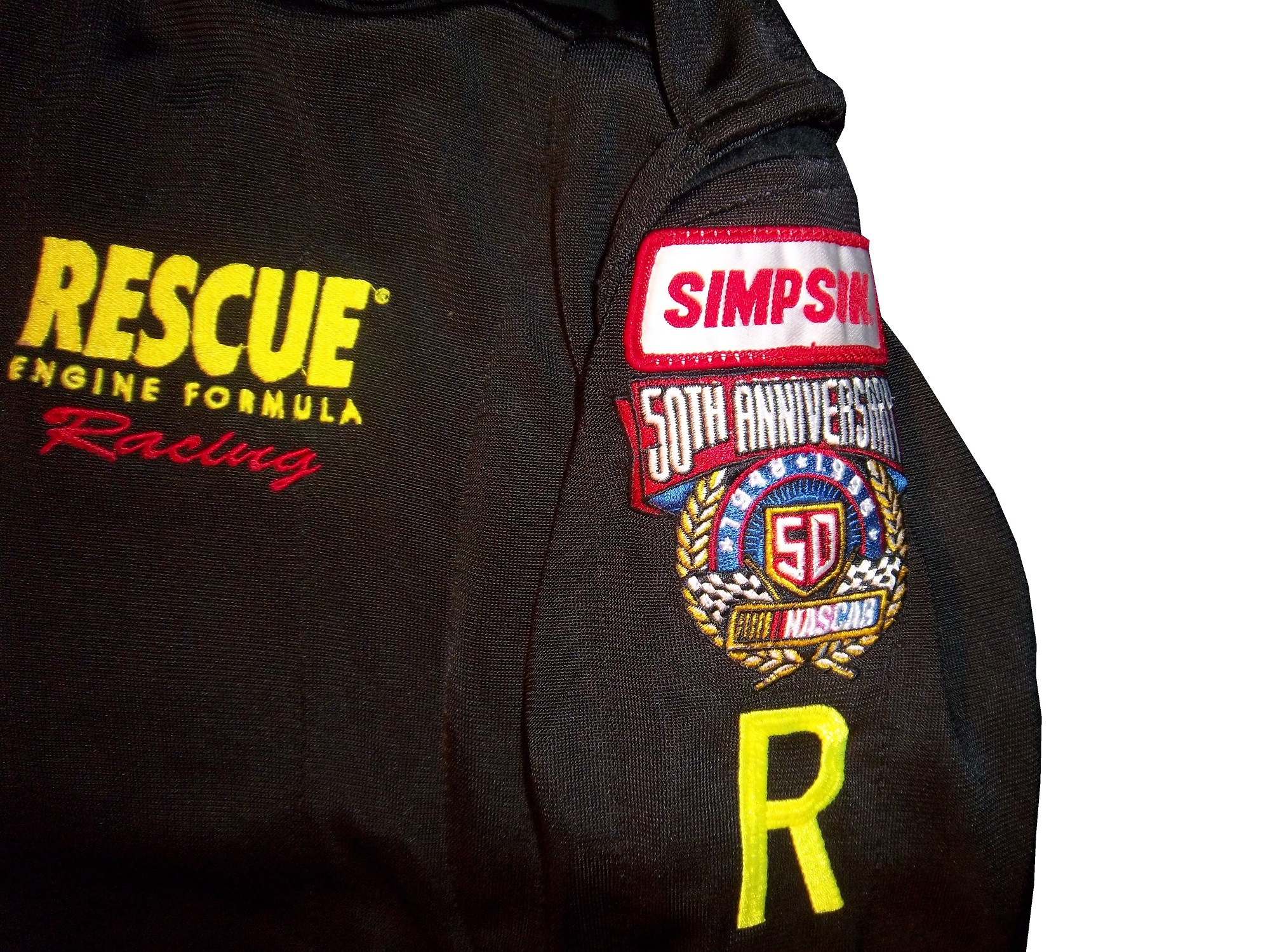
1998:Every team and driver ran the NASCAR 50th Anniversary logo on their cars and driver suits. Not bad at all.
2000-2001A square design with an oval logo was used from 2000-2001, with the color-flipping returning. At this point, the discussion of who would replace Winston started, as due to legislation, cigarettes would not be allowed to sponsor auto racing within the next few years.
2002-2003 The transitional oval logo. The Busch Grand National series had adopted an oval logo in 1995, and since the series would change sponsorships in 2004, this new logo would be the bridge between the old and the new.
2004-2007New sponsor, new colors, new shape. Nextell Communications took over in 2004 and it became the Nextell Cup Series. This logo would remain constant until Sprint and Nextell merged, which led to:
2008-Present:Same color scheme, same shape, same basic design.
The logo has become a marketing point for NASCAR teams and NASCAR itself. Die casts, driver uniform coats, t-shirts, pit crew shirts, and many other items carry these logos.
Now on to the Nationwide Series
1982-1994
These two logos were used for the Busch Grand National series. The plain Busch logo worked better and was used more often than the Busch Beer Series logo.
1995-2004An oval logo with the sponsor name, and GRAND NATIONAL SERIES added below. It was very marketable and worked quite well as a logo.
2004-2007Grand National Series has been removed, and some minor redesigns to BUSCH and the NASCAR logo as well. 2006 featured the 25th Anniversary logo.
2007-PresentComplete redesign for the NASCAR Nationwide Series which began when Nationwide took over the titular sponsorship of the series. Uneven oval with a Nationwide logo, and a NASCAR logo, with a new overall design and color scheme.
Last but certainly not least the Truck Series
1995:For the first season, the Truck Series was referred to as the “Super Truck Series by Craftsman.” It featured a decidedly early 1990’s logo. It lasted for only one season.
1996-2002The Craftsman Truck Series is a better name and the logo, while still bearing a 1990’s style design, is more refined and professional.
2003-2008The entire logo is inside the oval, some minor color and typeface changes are present as well. 2005 featured the 10th anniversary logo.2009-PresentThe same off-center oval design as the Nationwide Series and Sprint Cup logos, with a sponsor redesign for Camping World, who took over for Craftsman after 2009.
Greg Biffle #16 Bondo/3M Ford Fusion The color scheme is good, but the red designs on a red background just look odd. If it was a white design, it would work well, but this just looks odd. Still, it’s odd, but not awful, so I will give it a C
Ricky Stenhouse #17 Nationwide Insurance Ford Fusion Um…This has a great color scheme and a great simple design, but this just does not work. Too much black, and not enough silver and blue. It would work well if the blue and silver were the predominant colors, and black was the where the silver is. I can give this a C
Austin Dillon #33 Advocare Chevy SS It works very well, great color scheme and great desgin…except for the black outline around the numbers. Why? The stripes don’t interfere with it at all. If it was just a small black outline around the edge of the numbers it would work, but the black negative space area is just distracting. Without the black, it would be an A, but this scheme earns a B-
David Ragan #34 Peanut Patch Hot Boiled Peanuts/Race Trac Ford Fusion While the color scheme brings back memories of the Houston Astros Tequila Sunrise jerseys, the overall design is good. I like the mountain-esque design, but the random peanuts scattered over the hood and quarter panels are just awful. I really want to give this a better grade, but a C- is the best I can do for this scheme.
Josh Wise #35 Carson-Newman University Ford Fusion Great color scheme, and great design…except for the eagle. Why is the eagle facing the back of the car? If the eagle was facing the front, I would give this scheme an A, but this just looks bad, and takes the grade down to a C
Landon Cassill #40 Moonshine Attitude Attire Chevy SS Ok, let me make this clear…hunting camouflage is not, has never been, and never will be an acceptable background color for a race car. It didn’t work for Duck Dynasty, and it doesn’t work for this car, and it gets an F
Ryan Truex #51 Seawatch Chevy SS Having never heard of Seawatch, I thought it was an activist group at first, but Seawatch is actually a very well established clam company based in Maryland. The overall design is really good, though the wave next to the rear wheel well is a bit out of place. Still it looked very good on the track, and I give it an A.
Dale Earnhardt Jr. #88 Race 2 Achieve/National Guard Chevy SS Race 2 Achieve is a program that teaches advanced math through the eyes of Hendrick Motorsports engineers. It shows how the engineers use Algebra II and trigonometry to solve problems on the race car. This is a great old-school scheme, with a great color scheme, and great overall simple design. A+
Dale Earnhardt Jr. #88 National Guard/Breast Cancer Awareness Chevy SS Oh God! October is coming therefore, the pinkwashing must start. For those who don’t know the term, “Pinkwashing” is the process of using pink ribbons and/or the pink color to sell products, many of which are inherently unhealthy, with a “portion of the proceeds going to support the fight against breast cancer.” Sadly, most of these funds do not go to serious research, but rather to “feel good” causes such as the Susan G. Komen foundation. Because it is used as a marketing gimmick, and I, as well as my mom who is a breast cancer survivor are opposed to pinkwashing, any and every pink paint scheme, regardless of how good it looks, will earn an automatic F- grade.
Michael McDowell #98 Victory Junction Ford Fusion Unlike Komen, Victory Junction is a cause most people can support. Founded by the Petty Family, after the death of Adam Petty, Victory Junction is a camp for children with terminal and chronic illnesses, so while they are there, they can forget about the troubles of life, and have fun. That said, this is a great scheme, with a very simple yet attractive design, and great colors. The only bad thing I can say about this scheme is that I would love the logo on the quarter panels. That one thing can’t take away from an A+ scheme.
Last week, we discussed this “prototype pit crew suit” from the prototype aspect. This week, we will discuss the pit crew aspect. This is a very interesting aspect of racing suits. Pit crews have a very dangerous job. They have to change 4 tires, make any adjustments, and refuel the car in a matter of seconds. The risk level is as high as you could possibly imagine. Fire is a frequent risk, especially when refueling the car or repairing the damage from a wreck. As such, pit crews are required to wear fire protection identically to what the driver wears.
Yes, pit guys for many years had no fire protection or helmets at all, and there were no speed limits at all, so pit road was a very dangerous place. That all changed at the 1990 Atlanta Journal 500, the final race of the 1990 season. Bill Elliot was on pit road at lap 300, when Ricky Rudd lost control of his car at high speed, and hit a couple of Elliot’s crew members by accident. One of those crew members, Mike Rich, suffered unsurvivable injuries and died. To help insure that something like this would never happen again, the first pit road rules were implemented in 1991. As time went on, more rules concerning safety were implemented, including head protection, fire protection, radio gear, so that now a pit stop looks like this:
Notice that every crew member, including the crew chief wears a fire-suit, this is not an option, it is a rule. That is because when a fire starts on pit road, the crew members won’t get hurt, as seen below:
That was from earlier in the year, and none of the crew members from that incident were seriously hurt.
While most crew members have the option of one or two piece suits, those involved in refueling the car don’t have a choice. NASCAR uses high octane E85 fuel, which is an 85 gasoline/15 ethanol mixture. IndyCar uses an ethanol blend, which is not as flammable, but will still burn if ignited. Marco Andretti’s crew accidentally set his car on fire during a race last year. Again, no crew members were hurt. Gas men wear a one-piece suit, with a full-face helmet, thick gloves, and racing shoes as shown here. Crew members often wear two-piece suits, as it provides the wearer with less restriction in movement than a one-piece, which comes in handy when changing tires. Tire carriers, changers, and jack men wear open-face helmets, frequently with LED lights for extra visibility at night races.
Remember that the ultimate goal of a driver or pit crew suit is to protect the wearer from fire. The protection may be uncomfortable. The suit might be hot, or constrictive, but all that matters is that the wearer is safe. SFI and FIA certification comes standard on these suits. The risk on pit road is transparently clear to the crew members, and these uniforms are designed to keep the crew from being injured in case the worst case scenario happens.
No paint scheme news this week, will be back next week with something interesting, an analysis of the evolution of NASCAR series logos…
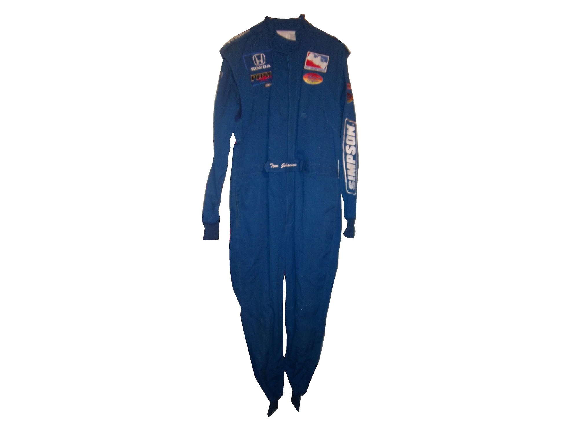
Ok, for the next two weeks, I am going to focus on one single suit. This is a “prototype crew suit.” In other words, it is a prototype suit for a pit crew member. In that light, I will do two articles, one focusing on the “prototype” part and the other will focus on the “pit crew” part.
This is a prototype suit. What that means is that this suit was made up to see how various design aspects work. The designers will attach various aspects, stripes, sponsor patches, to a full-size mockup of a suit, usually a single-layer suit, to see how the suit will look like when finished. Since driver and pit crew suits can cost as much as $1500 each to make, this is a simpler and cheaper way to design a suit in full-size. A full size mockup looks very impressive. The designs can be changed as needed.
Prototype suits are made from a single-layer suit. Single-layer suits are cheaper to use, but provide little protection in case of fire, so they are not often used in race condition. Suit design has, in the last 20+ years gone from not an issue to very critical. Because suits are used for promotion for the primary sponsor, the design aspect is very important. Every aspect, from the colors, to the primary and associate sponsor patches, to the decorative design is taken into consideration.
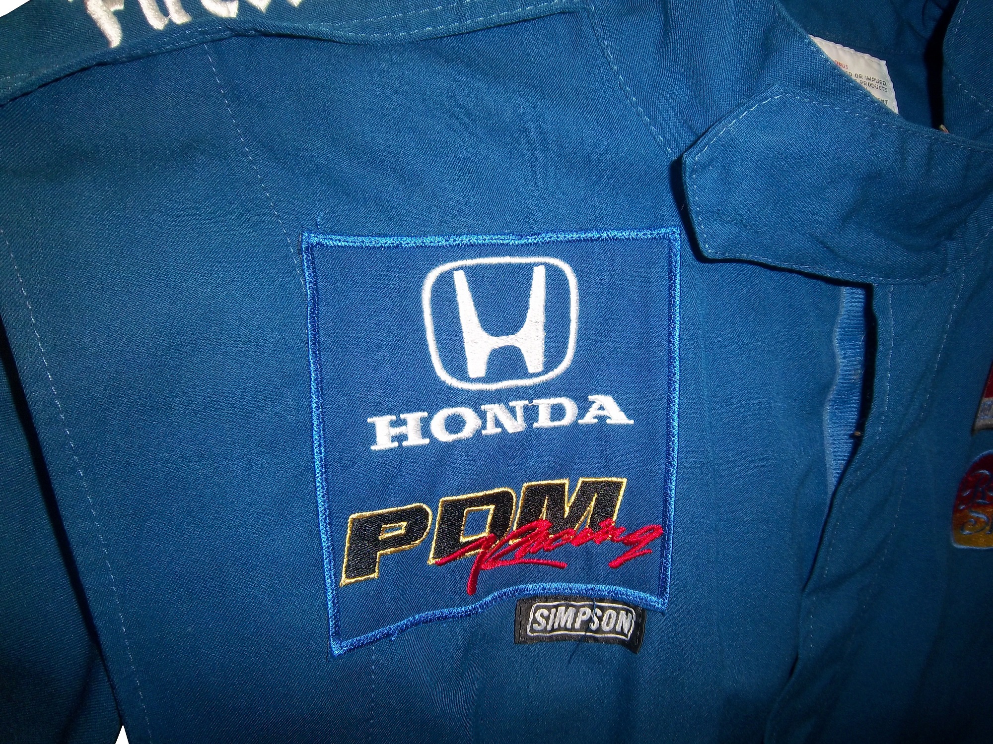
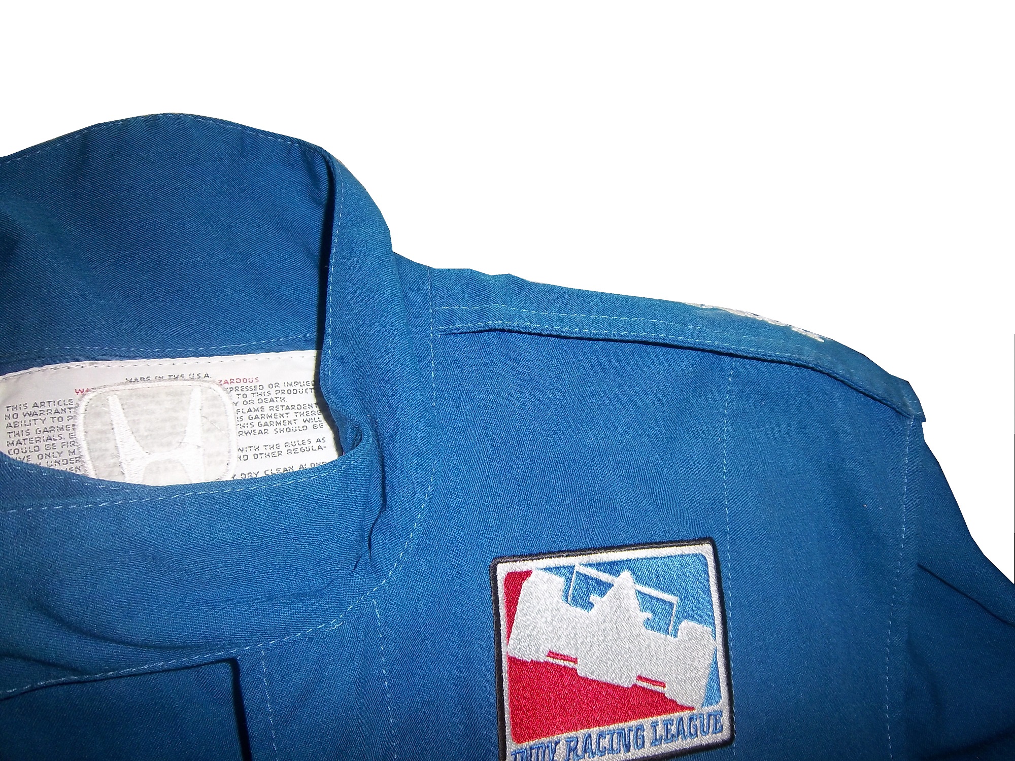
This particular suit was made for PDM racing, for use in the IndyCar Racing League in 2006. It was made for an individual by the name of Tom Johansen. It appears that Johansen is a crew member, and this suit was designed for his use. The logos are sewn on patches, the patches are placed on pieces of fabric, and then attached to the suit. From there, the suit starts to take shape, and the name is attached to the belt, and the logos are attached to the shoulder epaulets. In this example:
The right chest has a HONDA and a PDM RACING logo.The left chest has an INDY RACING LEAGUE logo and a ROYAL SPA logo.The belt has TOM JOHANSEN directly embroidered into it.The legs are cuffed.The sleeves have small logos on the top, and large SIMPSON logos present the bottom.The shoulder epaulet have FIRESTONE logos present.The back cowl has a HONDA logo that covers part of the tag.The back Torso has a large ROYAL SPA logo, Royal Spa being the primary sponsor at the time.The suit shows no wear to speak of, nor does it have any safety certification.
The question is asked, did this suit see race-use? While the suit itself shows no wear, it seems likely that it did in some form see race use. PDM Racing was always a sub-par team, and they were always a low-budget team. An inside joke was that PDM stood for “Poor Dumb Mechanics.” So the fact that this suit was made would indicate that it was used by Johansen. However what part Tom Johansen served on the crew is unknown. On the other hand, a single-layer suit such as this would not provide much protection for the wearer in the very real threat of a fire. The suit material feels very light, and the wearer would have been seriously injured if a fire had taken place. The deciding factor for me is that the suit shows no wear. I have suits in my collection that have been worn for only a few races, but have a lot of visible wear, and for a pit crew suit, that is pretty telling.
Prototype suits provide little protection in case of fire, unlike pit crew suits which are designed to give the wearer as much protection as possible, which we will examine further next week.
Paint Scheme Time!
Jamie McMurray #1 Advil Chevy SS While I’m not a fan of the grid on the front, the car as a whole has a simple, yet attractive design, as well as a good color scheme. So I’ll overlook the grid and give this an A+
Alex Kennedy #19 Media Master Toyota Camry Nothing really remarkable here, just a simple white scheme with black numbers and green logos. Very simple, and very plain, C+
David Stremme #30 Genny Light Toyota Camry Too much needless decoration. A good color scheme, but there is way too much going on design wise on the side of the car. It just looks awful, and I give it a D-
David Ragain #34 Taco Bell Ford Fusion I have yet to cover Taco Bell this year, but this scheme has a great color scheme, great side design, and a very pronounced design on the hood, which really makes the car stand out, and gives it a better look. A+
Brian Keselowski #52 Star Coach Race Tours Toyota Camry Are you f***ing kidding me? I have to give them credit, they took the worst scheme in NASCAR this year, and found a way to make it even worse. The color and design are horrific, and bonus points for putting blue lettering in the green camo, thus making it nearly invisible. Giving this scheme an F– does not go far enough! WORST SCHEME THIS YEAR!
While I’m primarily a driver uniform guy, I collect other stuff as well. I like game-worn and game-used memorabilia, space-flown stuff, and Presidential bill pens, amongst other things. Last Saturday, I spent the day at the National Sports Collectors Convention in Rosemont Illinois. The NSCC, or “The National” is the biggest sports memorabilia show in the United States, and features hundreds and hundreds of sports memorabilia dealers from all over the country.
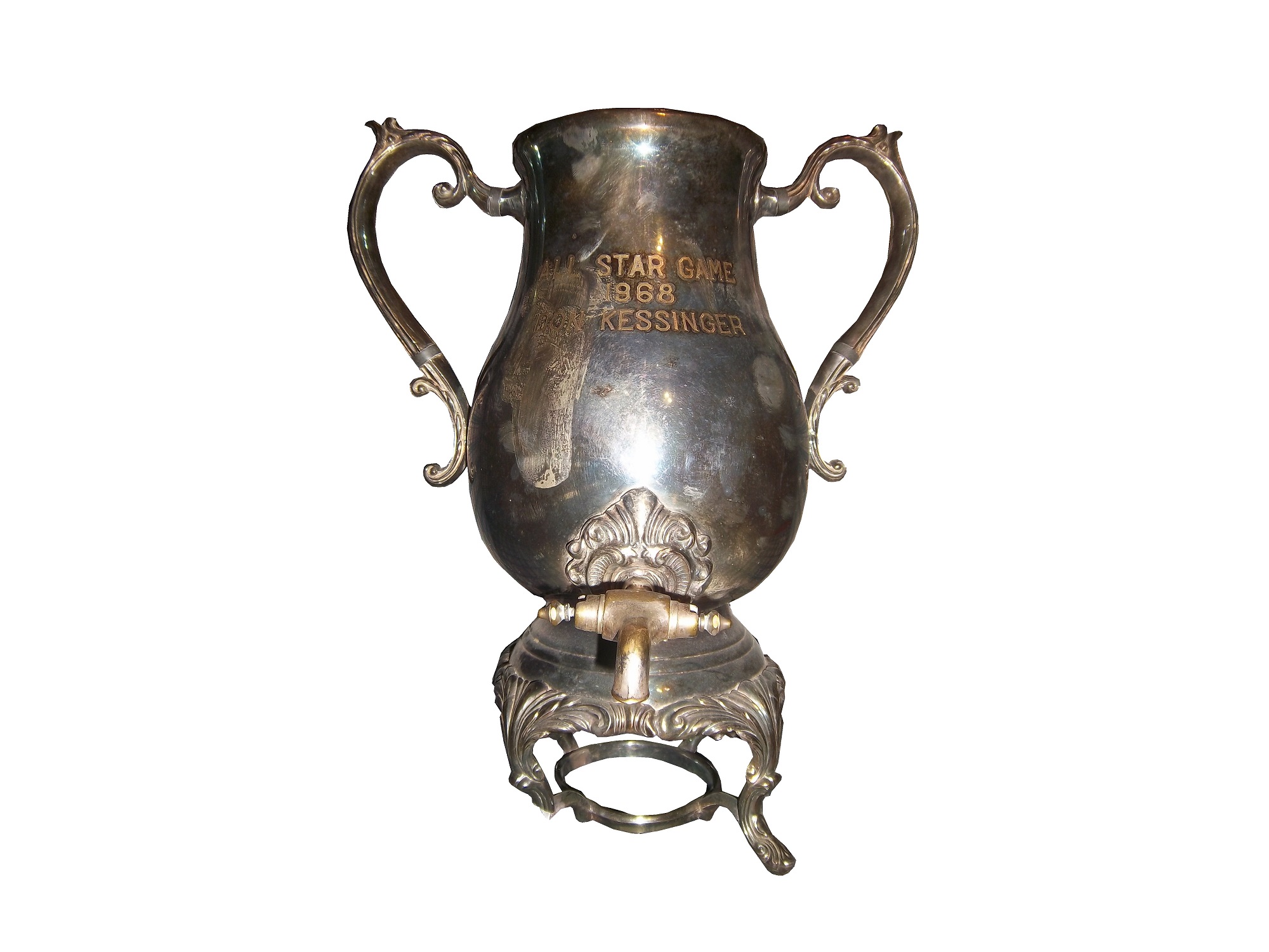
I go to these conventions on a regular basis, and something that I noticed in recent years is that racing memorabilia is present at these shows more and more, as the racing memorabilia market expands. I go to these shows with an open mind. What I don’t want to do is to go there wanting something specific, and pass up the chance to get an item that I really want. I find myself making offers and deals on items I would never would have dreamed I would buy. I went to a show in March, and came away with this Don Kessinger 1968 MLB All-Star Game trophy/coffee pot.
While racing memorabilia has a bigger part in these shows, what I DON’T see are driver suits. These shows, especially the National, features dealer and stores from all over the country, and they can only bring so much of their inventory to these shows. Transporting a driver suit from one state to another for a sports memorabilia convention, can be problematic at best. I have however seen driver shoes, gloves, helmets, sheet metal, and pit crew clothes at these shows, and you never know, I may see a driver suit at a show in the near future. Die casts, especially autographed ones are abundant at conventions, and I usually pick up one or two of them.
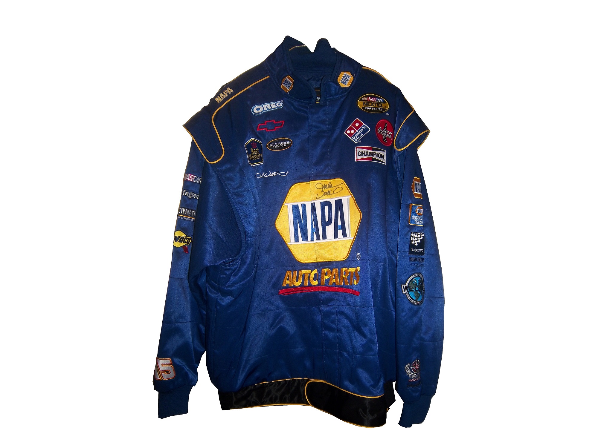
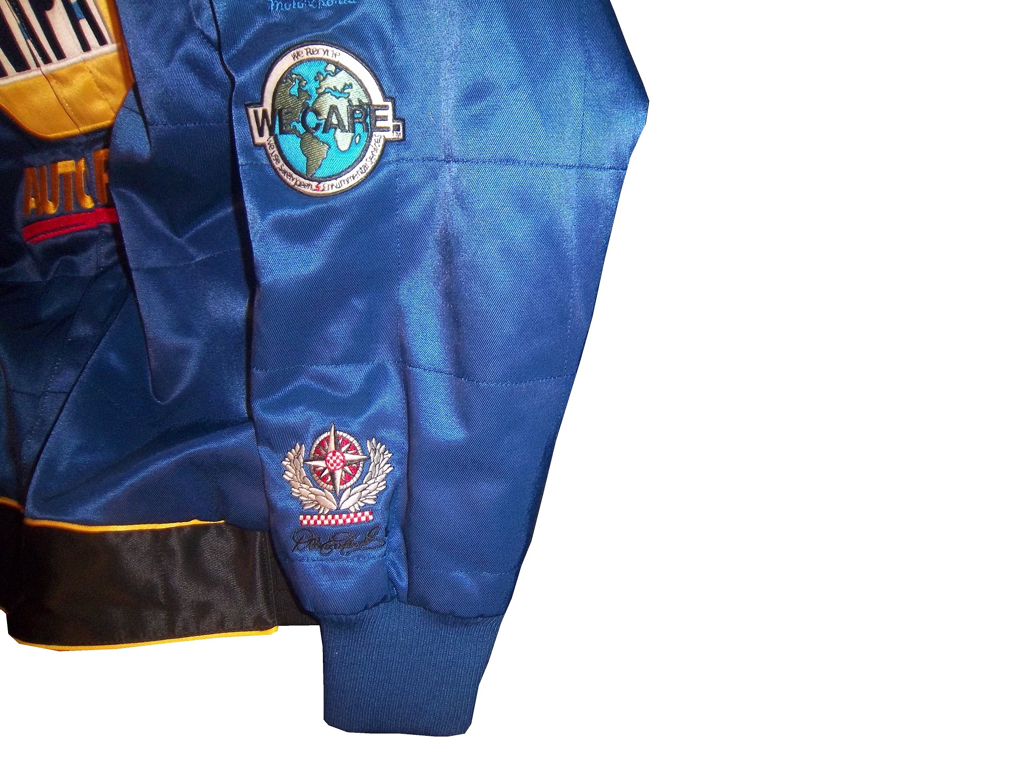
I picked up this very spiffy Michael Waltrip autographed jacket base on his 2004 driver suit. This jacket is notable in that it is very accurate when compared to his suit. It has arm gussets, which I have never seen on a jacket before.The material feels like the material that the real suit is made from, and is as heavy as an on track suit. It has a belt, though the belt is black, whereas the suit belt is blue, and Waltrip’s signature is embriodered into the side of the jacket, where a Goodyear logo is embroidered.Waltrip’s name would normally be sewn into the belt in yellow lettering on a blue background.
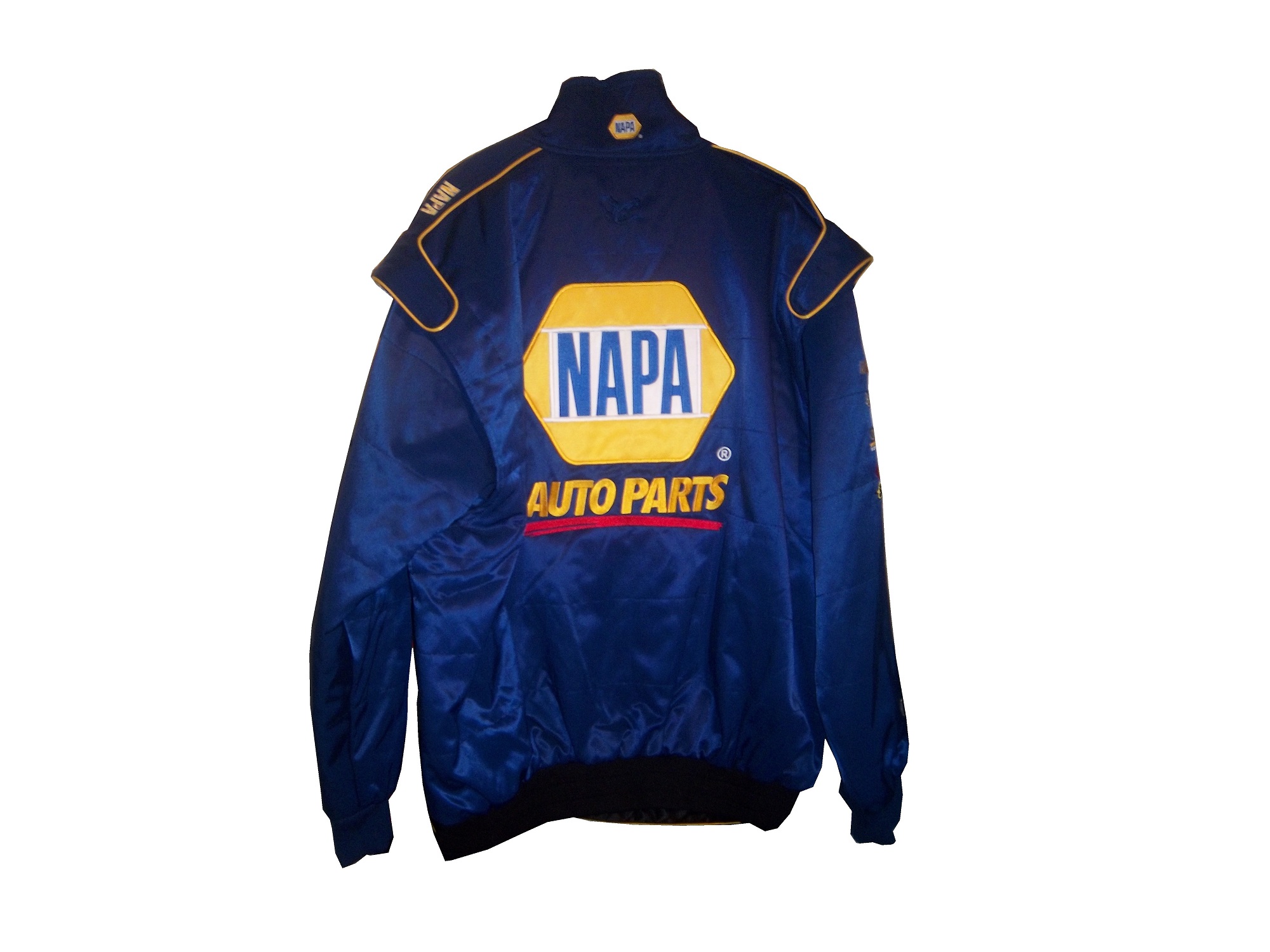
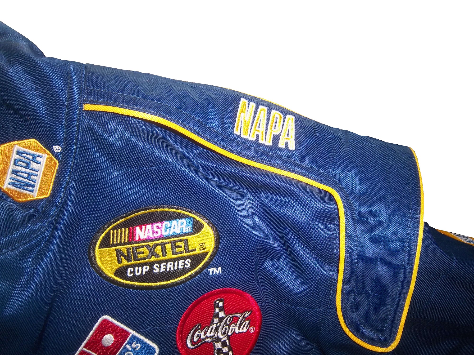
The arm logos are very accurate, and just like the suit, there are no television logos on the ends of the sleeves.Michael signed the jacket on the front NAPA logo.An identical NAPA logo is on the back.
And instead of a safety certification, there is a NAPA logo on the back.
I also bought a coin and die set from the U.S. Mint. The large round object is a die used to press coins.
Tailgating Time!
A classic tailgating recipie is chili. It works well in the late summer and fall, and is very easy. This is a recipie that I personally use, and it is unique and has a kick to it.
You will need:
2 pounds chorizo sausage
2 onions, chopped
2 (7 ounce) cans stewed tomatoes
2 (7 ounce) cans smoked chipotle peppers
2 (15 ounce) cans tomato sauce
2 (15 ounce) cans kidney beans
3 cups water
2 pinches chili powder
2 pinch garlic powder
salt and pepper to taste
In two large saucepans over medium heat, using one pan for half the ingredients each, combine the chorizo and onion and saute until meat is browned and onion is tender. Add the stewed tomatoes with juice, smoked chipotle peppers with juice, tomato sauce, beans and water.
Season with the chili powder, garlic powder, salt and ground black pepper to taste. Bring to a boil, reduce heat to low, cover and let simmer for 15 minutes.
Paint Scheme Reviews:
Jeff Burton #31 GutterClear 365 Chevy SS Um…Who did the decals on the quarter panel? Why is the logo bent over the top of the deck lid? It looks odd, and it doesn’t do the car any favors. The CAT logo on the light blue background looks forced and awkward. The bad part is that if those two flaws were fixed, this would be a very solid scheme. I love the colors, and the overall design looks amazing, but the rear sponsor is just awful. I will give this scheme a C+ It is good but it need some work.
One aspect of driver suits that has become a target for new customizations in the last 15-17 years is the belt. For many years, the belt was unadorned, or had a very small logo. Belts are a comfort feature, and typically made of the same material that the suit itself is made out of, with the same amount of layers and has a Velcro closure on it. Belts may incorporate a border made with an alternate color, to help it stand out.
Belts had no design or decoration on them for many years, as examined by this Ted Musgrave example from 1995,this Ricky Craven example from 1996,and many more. But it was around that time, that something began to happen. Looking at the Ted Musgrave suit from 1995, his name is embroidered into the left-chest area.In 1998, this had changed so that his name is embroidered into the belt.This was popular in F1 and IndyCar for many years, and is still the way that names are presented on the driver suit. Other examples, such as this Randy Lajoie example circa 1999-2000 will have a sponsor logo embroidered into the belt.Kasey Kahne wore this suit in 2005 at an event, and it has a GOODYEAR logo on the front, and when the belt is opened, on the inside, the FIA certification is present here. Formula 1 and IndyCar have a unique quirk to the design. Since the drivers come from all over the world, the flag from the driver’s home country is sewn into the belt, such as this Alex Barron example from 1998:Not all belts are created equal. Christian Fittipaldi didn’t wear belts on two of his NASCAR suits. The first one, comes from 2002, while he was sponsored by Georgia Pacific, and instead of the belt, he just has his name sewn into the suit.This Christian Fittipaldi example from 2003 features no belt, and no name.This Nort Northam example from the 1988 Sunbank 24 at Daytona, now the Rolex 24 at Daytona, features a belt that is specifically designed to be removed.Many NASCAR action figures will feature the belt designs on them, and many of these figures are pretty accurate, but I think I’ll save that for another blog.
Tailgating Time!
Just for fun, I’ve decided to add a recipe that can easily be made while tailgating at the track. This is my recipe for beer-broiled brats. This works well in the fall, during the Chase, on a cooler day.
You will need:
1 6-pack of beer
1 16oz jar of sauerkraut
½ sliced onion
garlic salt and butter to taste
12 plain, uncooked bratwurst
Take the 6 pack, and pour it into a large pan. Place the pan on the grill or stove, and add 1/4 the jar of sauerkraut, the onions, salt and butter, and finally the brats. Bring to a boil and boil for 8 minutes.
Tip-Do NOT cut or puncture the brats in any way, the casing keeps the juice, and taste in the brats. For more flavor, let soak after cooking. DO NOT OVERBOIL THE BRATS, that is the best way to ruin them.
While the brats are boiling, prepare a grill. Gas or charcoal works either way. After boiling is done, remove from the liquid, and place on the hot grill, and cook 5 minutes per side. Brats are made from pork, and under-cooking them can be hazardous, You want to watch the race from the stands, not a hospital room. Here is a video visualizing the process…
After grilling the brats, toast the buns on the grill for 20 seconds, place the brats in the buns, and serve. For sides, I would recommend some mustard potato salad, some potato or tortilla chips, and, of course, plenty of ice-cold beer!
This recipe will rock your tailgating party at the next race, and I will post more simple recipes for tailgating in the near future.
Paint Scheme Reviews
Jamie McMurray #1 McDonald’s/Monopoly Chevy SS The simple design is good, but the color scheme needs a lot of work. Beige does NOT work on race cars, and this is a perfect example. The Rich Uncle Pennybags(or Mr Monopoly) wearing sunglasses is not very attractive either, so I can give this scheme a C at best.
Kasey Kahne #5 Pepsi Max Chevy SS Are you kidding me? Is it too much to ask to pick a design scheme? You can have a cutting edge purple design which works, OR a matte black design that works, BUT YOU CAN’T HAVE BOTH! The purple, red and black design is good, but the design scheme is just horrible. Even with a good color scheme, this earns an F
Clint Boyer #15 Peak/Duck Dynasty Toyota Camry Oh man, where do I start here? The color scheme would work without the baby blue stripe, the hunting camo roof is just awful, and the overall design just looks forced. This car looks like a bad photoshop job…F
Greg Biffle #16 3MSafety Ford Fusion The contrast between the white and black parts of the car would normally not work, but because it is a safety themed car, and safety coveralls are typically white or black with an orange and silver stripe on them to increase visibility, this scheme makes sense. The colors are good, and I give this scheme an A
Austin Dillon #33 Mycogen Seeds Chevy SS Meh. I like the color scheme, but the front to back arch is overdone, and the is unoriginal at best. I will give it a C
Ron Fellows #33 Canadian Tire Chevy SS Grey red and black can be tough to work with sometimes, but this scheme works very well. The red flames work well, and the otherwise basic design is very attractive. A
Victor Gonzalez Jr. #36 Mobil 1/IMCA Chevy SS This was a late entry into the race in Sonoma, Gonzalez is a “road course ringer” so there was not much time to design and decal a car, but that said, this is a great simple scheme, no pointless design, and a great color scheme. A+
Ryan Newman #39 Quicken Loans/Smurfs 2 Chevy SS Again, as with Kasey Kahne above, PICK A DESIGN SCHEME! You can either have a red and black scheme, or a red and white scheme, BUT NOT BOTH! It looks like someone designed a Smurf scheme, quickly realized that it needed to carry a Quicken Loans design as well, and tried to make a hybrid of the two, which is just awful, and earns an F
Juan Pablo Montoya #42 Depends Chevy SS Is this a good look? Depends! Joking aside, this is not a very good scheme, the green logo works, but the black and grey scheme is awful.
Juan Pablo Montoya #42 Axe Apollo Chevy SS The Apollo Astronaut design is unique. It works very well, and although the design is convulted, it is very attractive. The color scheme works well and this scheme earns an A
Juan Pablo Montoya #42 Energizer Chevy SS From the wheel well forward it is a great scheme. From the driver door backward it is awful. Whatever look they were going for, they missed. It just looks horrible. Great colors, but awful design, D
Aric Almirola #43 Smithfield Helping Hungry Homes Ford Fusion A patriotic scheme, mixed with Petty Blue, that is not overdesigned. Giving this scheme an A is not going far enough to describe how good it is.
Jimmie Johnson #48 Lowes/Disney’s Planes Chevy SS While I like the color scheme and basic design, the hood logo is awful. The door number has a black outline, and it is very visible, but the hood logo which does not have a black outline is next to invisible, which defeats the purpose of having a logo on the car in the first place. That said, it is still a good design, and I will be generous and give it a B.
David Reutimann #83 Dr. Pepper Toyota Camry Dr Pepper has a great color scheme and great designs on their packaging, and this is reflected in this paint scheme. It works very well, and is a great complement to a bottle of Dr. Pepper. A
Tomi Drissi #87 The Wolverine Toyota Camry Many movie paint schemes don’t work, but this is not most movie paint schemes. It is simple, has a great color scheme, and has a great design, and earns an A
Travis Kvapil #83 Burger King Rib Sandwich Toyota Camry BK Racing has a lot of great schemes this year, and this is another one. Great color scheme, great overall design, and I like what they did with the rib sandwich. I’m not a “Rib-wich”guy, but I like this, and give it an A.
I don’t normally do a midweek column, but a brand new event in NASCAR is taking place tonight. Eldora Speedway in New Weston, Ohio is the site of a new experiment in the NASCAR world. For the first time since 1970, one of NASCAR’s top series, the Camping World Truck Series will race on a dirt oval. Tonight at 8PM EST, 30 of NASCAR’s top drivers including Ryan Newman, Ken Schrader, Kenny Wallace and others will race 150 laps, in 3 different segments on a ½ mile clay track.
Some things have surprised me about this event. The first thing is that two drivers who I would have expected to try and make the field aren’t attending the race. The first is Kyle Busch. Busch is what I like to call a “pure driver” and what that means is that he is truly happy when he is behind the wheel of a race car. The dirt style of racing I think would suit Kyle very well. The other absent driver that really shocks me is Tony Stewart. Stewart, like Busch is a pure driver, but what makes Tony’s absence from this race perplexing is that HE OWNS ELDORA SPEEDWAY! Why Tony Stewart isn’t in this race at a track that he owns is kind of odd.
Now even though this is the first dirt-track race featuring on of NASCAR’s top 3 series, I doubt it will be the last. This event is a concept that is a long time coming, and I think it will in the very near future extend to the Nationwide and Sprint Cup series. I would honestly love to see a second all-star race on Eldora or another dirt track added to both of NASCAR’s top series, in addition to the truck series.
The Driver Suit Blog and DGF2099 Productions team up to stop something that has been going on for too long, sports memorabilia being destroyed for “swatch cards”
When it comes to driver suits, I normally focus on race-worn items, but this week I’m going to shift gears, and focus on another kind of suit…and yes, pun intended. This example is a suit used by the Richard Petty Driving Experience. What the RPDE does is give die hard fans the ability to get in a stock car and either be driven around a track for a few laps, or drive the car around the track after some instruction. The cars are almost identical to Gen 4 cars, but have two seats and are scaled down to 600 horsepower from the over 800 currently run in NASCAR.
It looks similar in design to suits that Richard Petty wore during his racing days. Interestingly, there is no Petty blue, but a darker blue similar to the blue used in STP logos. There are no logos of any kind present, not even of the suit manufacturer, a company called Westex. I find it odd that at that time, the Richard Petty Driving Experience logo wasn’t used. There is no indication it was ever present on the suit to begin with. The legs are cuffed, as opposed to the boot cut that most NASCAR drivers like to use. Arm gussets, which give drivers better freedom of movement, are not here either. Later suits have some of these features.
Now even though the cars are either driven by professionals, or by drivers who have had lessons, the risk of crash and fire is present. As such, the fans are issued driver suits. This is an early version of the suit issued to them. What strikes me about this suit is that it is a single-layer suit with no epaulets. The epaulet is critical here because they are specifically designed for pulling an unconscious driver from a burning car in the event of a wreck. The fact that is is a single-layer suit is an issue here because in racing, redundancy is safety. NASCAR drivers wear double or triple-layer suits as well as fireproof long johns that give them 30 seconds of fire protection. I would be shocked if this suit would give 10 seconds.
I should also mention at this point that the suit does not have any SFI or FIA certification. When you are driving fans around a track with the ever present risk of fire, having a suit that can withstand the worst case scenario is a plus. SFI certification is designed to do just that, insure that the person wearing the suit will be able to be protected in the worst case scenario, so I do not get the logic of having uncertified suit for use.
All that said, now let’s discuss the basics.
The collar is a Velcro-shut design.
The tag is custom for the RPDE and has some things written and crossed out in Sharpie.
The sleeves are plain.
There is an unadorned belt.
The front torso shows some stains.
It should be noted that these suits are no longer used, and now Simpson SFI certified suits are currently in use. And while the suit has its short comings it is still a very attractive item. I plan on doing the RPDE in the very near future.
The driver suit is almost always customized for the driver, and as such, the driver has the option of adding customizations to the suit. This may come in the form of size,
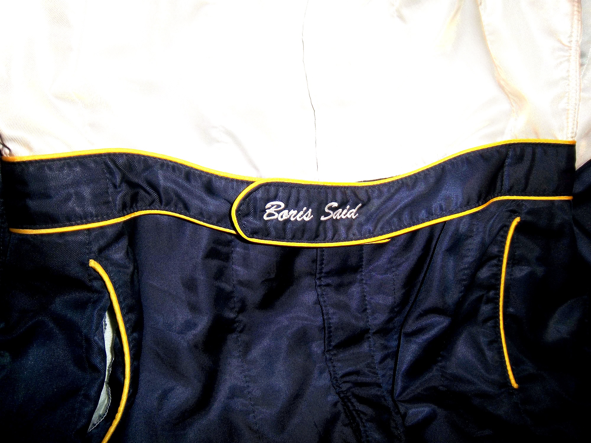
and belt design,but the back of the neck is a unique place for customizations. The designs that are placed on the back of the neck are as unique as the driver themselves.I’ve gone at length to discuss the FIA certification which is frequently sewn into the back of the neck. This is a prominent feature in Formula 1 and IndyCar. That is standard issue, so no real need to comment on it any more.In NASCAR, the back of the neck can be used for a myriad of different customizations. One of the most common is a car number, such as this Christian Fittipaldi suit, and another common feature can be sponsor logos, such as this Randy LaJoie Bob Evans suit from 1999-2000,and this Joey Miller Craftsman Truck Series suit from 2005.This Kasey Kahne suit has the Evernham Motorsports logo sewn into the back of the neck.And Roger Penske likes to have the American Flag on the back of the neck of his suits, as evidenced by this David Stremme suit from 2009.Older Simpson driver suits have been known to have an inventory number sewn here, as exampled by this Mike Skinner suit from 1997,and this Stevie Reeves example, again from 1997.But for my money, the personal customizations are more fun when they are as unique as the driver is. In this Terry Labonte suit, Terry has added a Texas logo.My favorite customization is from a Boris Said suit from 2005. Said has added a Boris Badenov design to the back of his neck.It’s the little things that make a suit personal, and these are some of those little things. Who says a driver suit can’t be fun.
And of course, it goes without saying that the neck is frequently left blank, as exampled by this Nort Northam suit from 1988.
Jamie McMurray #1 Cessna Patriotic Chevy SS Pretty good scheme here, red white and blue is always a solid scheme, but the one gripe I have is the pointless circle around the door number. While it gives the car a vintage look, it is just out of place here. Even still, this scheme is a solid A-
Kasey Kahne #5 Hendrick Cars Chevy SS Red white and black is a very solid color scheme, and the design, while a bit convoluted looks really good. It has a hurricane-esquire design that looks really good. A-
Danica Patrick #10 Go Daddy .US Chevy SS The simple design of this scheme looks really good…but what is going on with the colors? Why is the car painted in Russian dressing green? Russian dressing is good, but not as a color scheme. The red white and blue designs clash, and it just looks awful. D-
Kyle Busch #18 Interstate Batteries All Battery Center Toyota Camry Now THIS is what an Interstate Batteries scheme should be! The classic dark green, gold and white color scheme is amazing, and the design is simple yet very attractive. Giving this scheme an A+ is not saying enough about how great this scheme is!
Jeff Gordon #24 Axalta Standox Chevy SS White flames on a blue background? Seriously? I could forgive it if it was blue flames on a white background, blue flames look really good. But white flames? This design ruins a great color scheme AND a great design scheme TOGETHER! Now that is impressive! F-
Jeff Burton #31 Quikset Chevy SS Decent color scheme but the design needs a little work. If the red was on the hood, roof and deck-lid and the black was on the sides, I would give it an A, but the shark-fin design is brutal on the eyes, and serves no real purpose. As such, I can only give it a C-
AJ Allmendinger #51 Neil Bonnett Throwback Chevy SS While I like most throwback schemes, this one, while accurate, has the worst color scheme I have ever seen. It just screams 1980’s. Hot pink and neon yellow really stands out, and not in a good way. Still, I do miss Neil, and they were pretty accurate, so I will give this scheme a B


 Whereas Kodiak, which is the same product is not.
 The other one that I saw is that Budweiser is censored as a sponsor,

 While Miller Genuine Draft, the same product is not.
 Some cards censor all the controversial sponsors, some don’t censor any, but I have never seen a company favor one over the other before, and it just seems odd. There seems to be a science to censoring sponsors. While I’m not a fan of censorship of sponsors, it is easy to understand why it happens. Parents don’t want their children to smoke or drink alcohol, which is understandable. So these toys, such as these 1/64 scale cars will replace the alcohol sponsor with the name of the driver and/or the name of the team that owns the car, as these examples show, such as Rusty Wallace

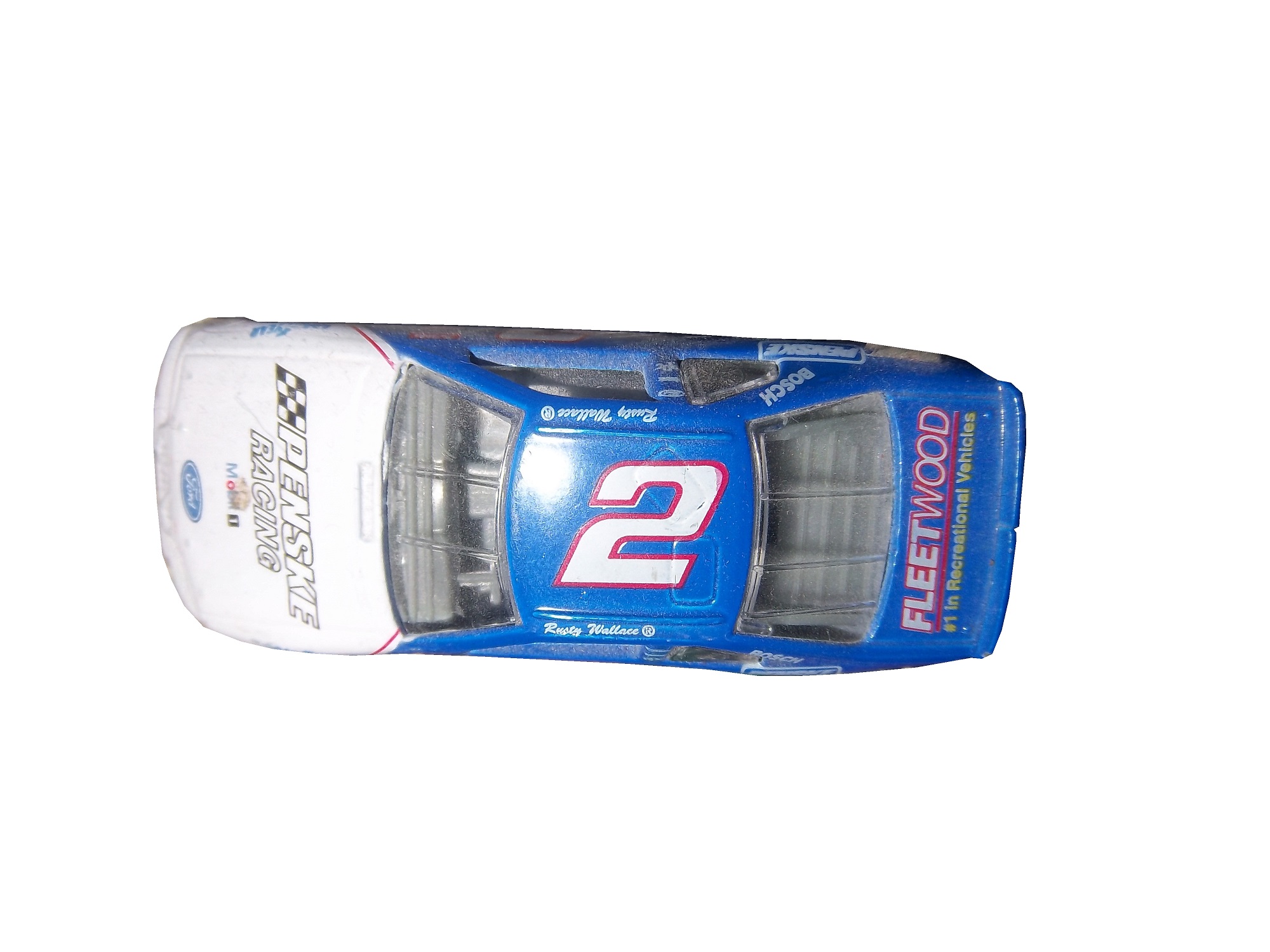 Ricky Craven

 Ken Schrader
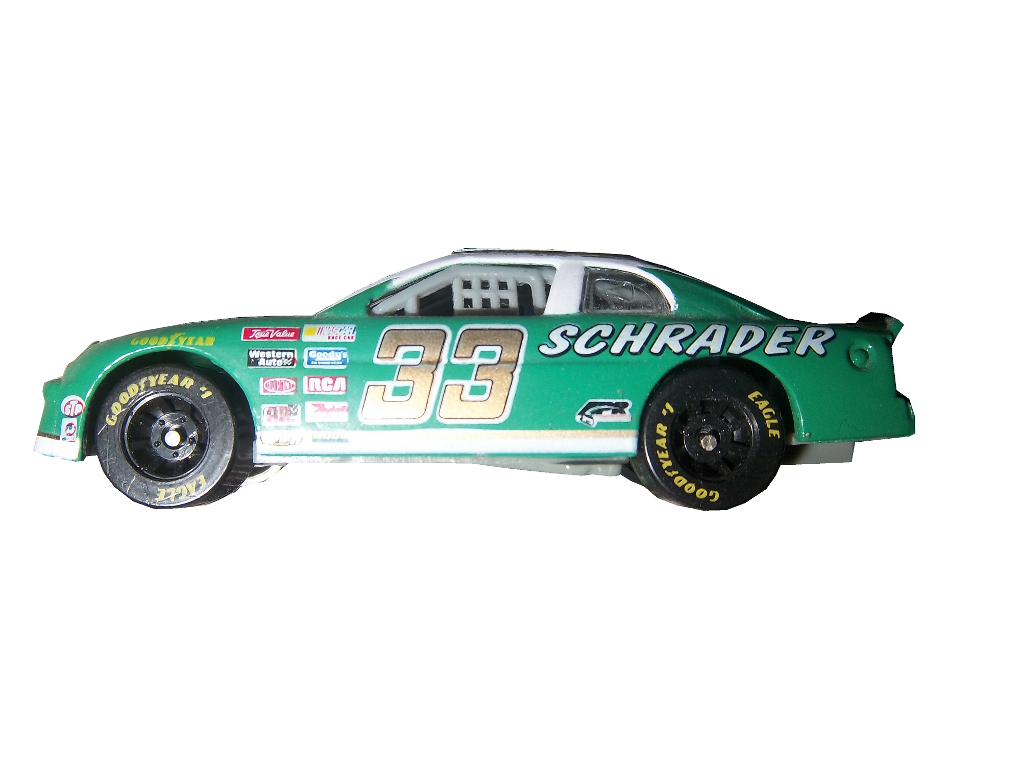

 and Steve Grissom

 Those marketed for grown-ups will have the logos, such as these Ken Schrader examples.


 And this Dale Earnhardt Jr. Example
 Simpson mini helmets manufactured in the early to mid 1990’s always have the sponsors, such as these examples from Rusty Wallace,


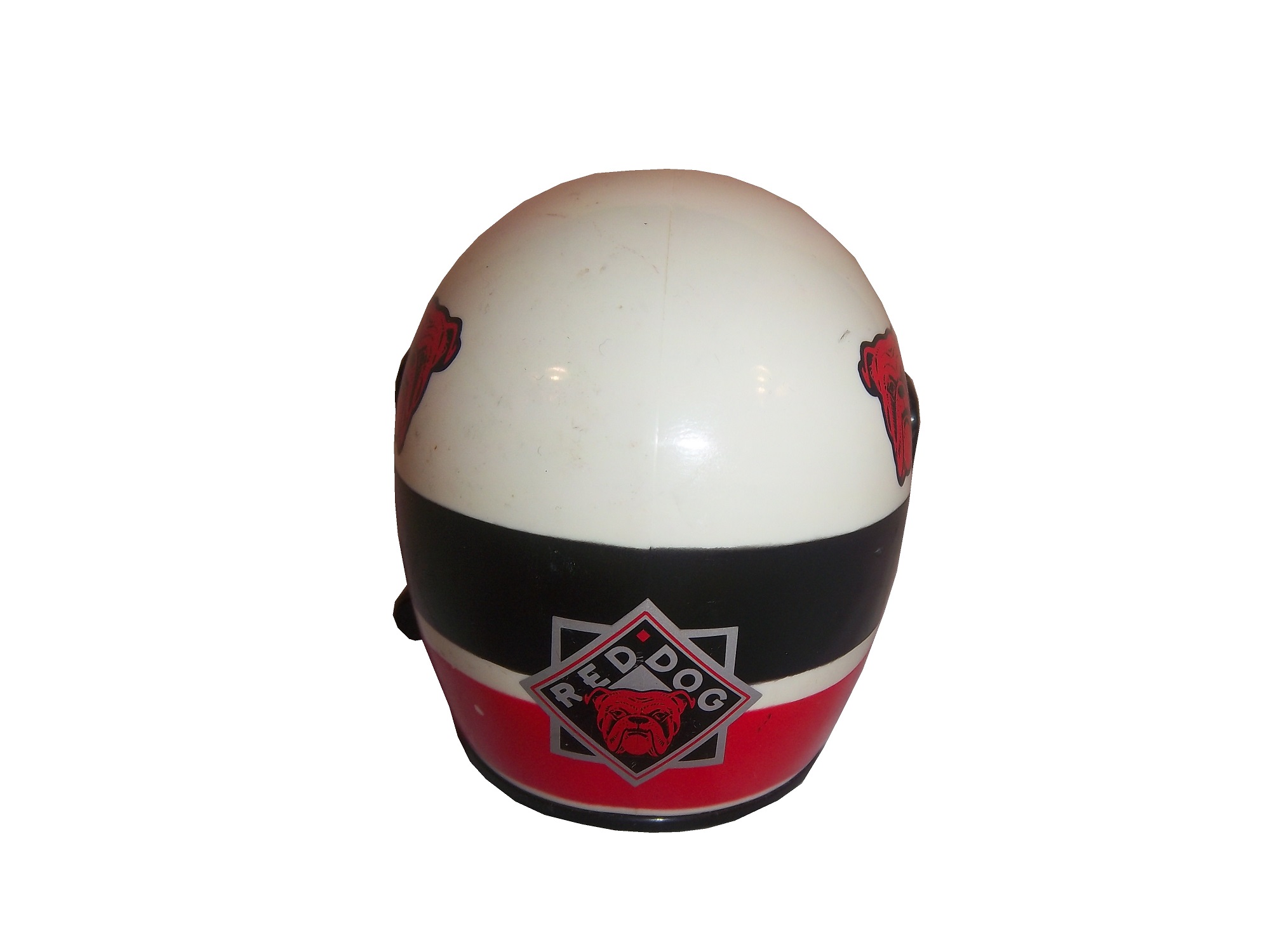
 Red Dog Beer,


 Ricky Craven,


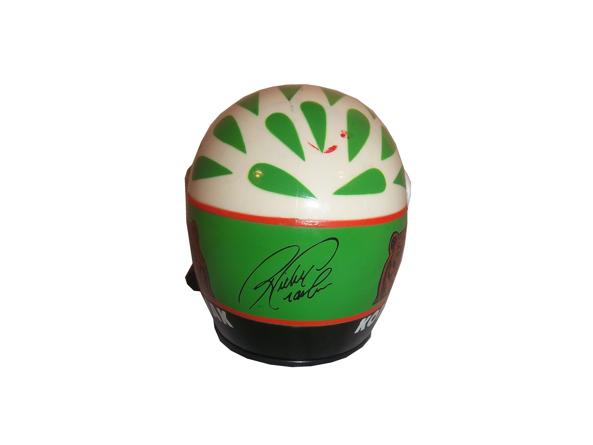
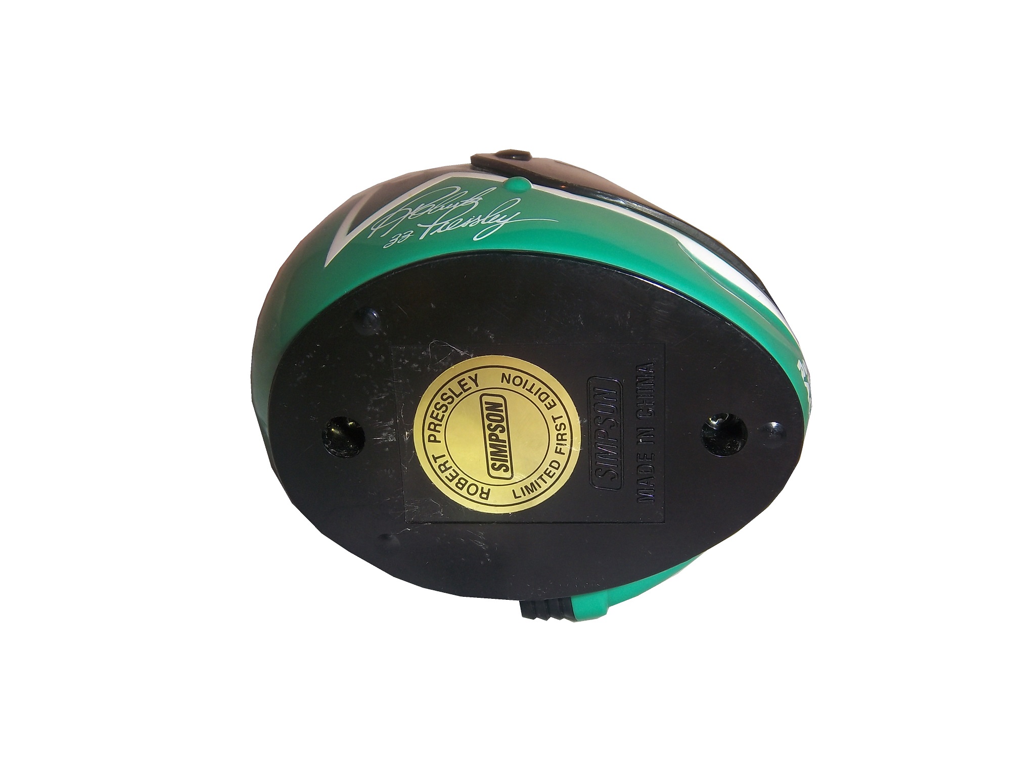
 and Robert Pressley.


 “Hero Cards” which are given out to fans by race teams will never censor the primary sponsor logos in any situation.
 Whereas other cards are left up to the teams many of which will censor the cards:


 Kenner made a series of NASCAR figures under the Finish Line banner in the mid 1990’s, and these religiously censored the sponsors, as this Rusty Wallace figure from 1998 clearly shows.


