An Open Letter to Roger Goodell

By David G. Firestone

Dear Roger Goodell,

I am an NFL fan, one of millions across the country and the world. I have been following the NFL for years. I am going to ask a question that every fan should be asking you. Why do you hate the fans?

You enforce a series of rules and have made a number of very questionable rulings recently that make it clear that you do in fact, hate your fan base. Let me rephrase that, you hate the fans but love their money. Ticket prices to games are out of control. Tickets for the last row of Soldier Field are $103.54 for one seat! At those prices, a family of four would have to pay $414.16. That’s just for tickets, that does not include parking, food, beverages, and souvenirs. All totaled, it would cost a family $500 to sit so far away from the field. To put that in perspective, that same family could go to a Cubs, White Sox, Bulls AND a Blackhawks game and have money left over!

Ticket prices are skyrocketing and the value doesn’t justify the price, so the question is, why would I go to a game? The answer is I wouldn’t. For the costs of a game, it is cheaper and easier to stay home and watch…oh wait, I can’t. You enforce the blackout rule which means that if 84% of the overpriced tickets are sold, the game cannot be broadcast to the fans in the market. You have really screwed the fans in this respect, it’s too expensive to go to games, but you can’t show the game on television unless 85% of these overpriced tickets are sold!

Let’s say I get a ticket. Let’s say I take a girlfriend with me. Let’s say she wants to take her purse, which is average sized. She can’t take it in because of a ridiculous bag policy implemented in 2013. This was voted on by the The NFL Committee on Stadium Security and I’ll wager a week’s pay that there wasn’t one woman on that committee, because it was passed unanimously. I understand that security is an issue, but you went way too far. You have clearly shown that women aren’t respected as real NFL fans…I’ll get to that in a little bit.

Some of the on-field rules are designed to spite the fans as well. The dunking of a football after a touchdown, the bob and weave, and many other touchdown celebrations that the fans love have been needlessly banned. Thursday Night Football, which was a failure in all respects last year, is not only back, but there are going to be TWO games instead of one. We hate the idea, we make it fail because we hate the idea, and you give us more. You banned teams using multiple helmets over the course of a season stating your concerns about concussions, while at the same time bragging about how you want an 18 game season. In every instance, the fans have reacted negatively, and they are the reason you exist. But what does it matter what the fans want? Again, more proof you hate us, but love our money.

But if we needed anymore proof that you hate us, you gave it to us on Thursday, when you announced that Ray Rice would be suspended for two games and fined 3 checks for a domestic violence incident. Terrelle Prior got a 3 game suspension for selling memorabilia in college, Josh Gordon is in serious trouble for smoking a joint, Ben Roethlisberger got a harsher sentence for a sexual assault accusation, and you suspend Ray Rice for TWO GAMES? Jimmy Haslam conned $54 million in a customer scam, and he gets nothing. Supposedly, you are waiting for the legal system to work this case through, though I have never seen this happen in any other sport, and you didn’t do this for any one of the other cases.

You and the rest of the front office of the NFL have made it clear that you hate women. The Ray Rice incident was horrific to watch! It was the end of a domestic violence incident where he dragged her unconscious body off an elevator, took some stuff off of her, and left. Josh Gordon may lose his entire season because of marijuana, where even the government is lessening it’s grasp on the laws against it. Ray Rice beats the tar out of a woman, leaves her lying in a hallway and is suspended for TWO GAMES?

The cheerleader complaints, that they are paid poorly and are treated like crap only add to this situation. They spend all year working for $100 a game or less? They are given demeaning instructions and rules. They are basically treated like second class citizens. But then again, what should I expect from a league that takes such a lackluster position on domestic abuse? Why do you treat women like objects as opposed to human beings?

I implore you to look at the fans as an asset rather than a burden. We want to be able to come to games! We want to be respected ! We want justice when players break the rules! We want to be entertained at games! We want equality! We want to be a part of the NFL! Please, give us the respect and credit we deserve and stop screwing us over!

Sincerely,

A concerned NFL Fan

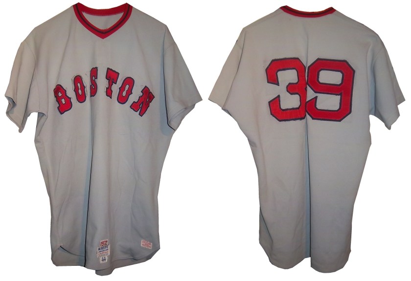
Vintage Item Spotlight-Mike Garman 1972 Boston Red Sox Game Worn Jersey
39-garman - CopyBy David G. Firestone

Last year, when I started this project last year, I know I would have to end it at some point. Tragically, this post is that point. This will be the last regular installment of Vintage Item Spotlight. I’ve had fun with it, but it’s gotten overwhelming, writing this, The Driver Suit Blog, and producing Introduction to Sports Memorabilia. I’ve had fun, and I’ve saved my favorite item for last.

Mike Garman was a journeyman pitcher who was signed by the Boston Red Sox to their farm system in 1967 at age 17. He spent 1967, 1968, and the majority of 1969 with the Greenville Red Sox, and was a September call up in 1969, 1971, and 1972. He was a member of the full-time roster in 1973, but was traded to the Cardinals at the end of the season. He also pitched for the Cubs, Dodgers and Expos, until he failed to make the roster in 1979. After on season in the minors, he retired in 1980.

When he was a September call up in 1972, he was issued this road jersey. His first pitching appearance came on September 4 in the second game of a double-heard against the Milwaukee Brewers in Milwaukee. The appearance was for the bottom halves of the 7th and 8th innings, and he gave up one hit, one home run and an error. During that appearance, he wore this pullover jersey.39-garman

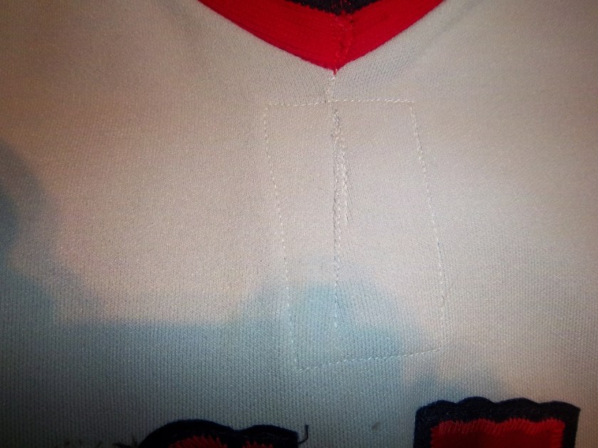
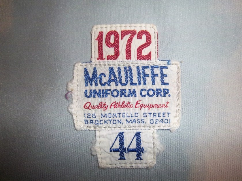
What fascinates me about this jersey is the fact that the BOSTON lettering across the front has been removed, and was replaced with RED SOX, and then was restored. The reason it was removed was because from Major League Baseball’s inception up until the 1980’s, many teams would remove their lettering and logos from the uniforms, and then send them down to their minor league affiliates. The minors would, in turn, add their own lettering as a way of saving money. It looks a little sloppy, but the lettering looks good, and it’s the correct size.39-garman-flogo2 39-garman-flogo4 39-garman-flogo3The front of the collar has some repair work done to it. It was cut and repaired.39-garmancolarThe back numbers show some wear, and have been replaced at some point. and I love the red-on-blue setup the Red Sox use.39-garman-39The tagging is correct, and it just adds to the vintage feel of the uniform. Tim McAuliffe Inc was founded in 1896 in Boston, and supplied caps and uniforms for baseball up until the 1970’s, when the competition became too great, and they were run out of the market. While they were a supplier, they often had other companies make parts of the uniform and slapped their own tags on it.39-garman-tag1 39-garman-tag2This is a truly unique jersey, and is my favorite items. This was also one of my favorite projects. I’m sad it has to end, but stay tuned, I might have something else in the near future.

Vintage Item Spotlight-Chicago Bears Autographs

urlacher-1 - CopyBy David G. Firestone

Having grown up in Suburban Chicago, I grew up following the Bears. Admittidly, I’m not a football fan, I’m a racing fan, but I do support Chicago fans. I also like to go to autograph signings and get things signed.

Yes I know that these items are not “vintage” per se, but they does have an interesting history behind it. In 2004, I went to Woodfield Mall outside of Chicago with some friends, and I bought a Brian Urlacher jersey for $45. Back then, that was what new NFL jerseys cost. I know, I can’t believe it anymore either. I then noticed that in the center court there was a table with a line, and I realized that Jim Miller was signing autographs at a free signing. So I took my jersey and got it signed by Jim Miller. That was the start of a journey.urlacher-1

Later that year, The Great Indoors opened in Deerfield Illinois, and Brian Urlacher was going to do a free signing, and the first 500 people would get one autograph. After standing in a snowstorm for an hour, I got inside, got to meet the Maytag Repairman, had a free cup of coffee, and then was one of the first 500 and got my autograph!

I was doing more signings than I currently do now, so I got more signautres and shows and signings, but things really kicked into overdrive in 2005 when the Chicago Bears had the 20th Anniversary of their Super Bowl XX victory, and there were dozens, and I mean DOZENS of signings. In total, this jersey has 25 signatures, including Urlacher, Jim Miller, Jim McMahon, and William Perry,urlacher-2 urlacher-3 urlacher-4

If I had the chance, I would take other items to me with signings. This Bears helmet for example has a number of signautres including William Perry, and Dan Hampton. I like the look of the helmet with no facemask, it has a more vintage look.bears-1 bears-2

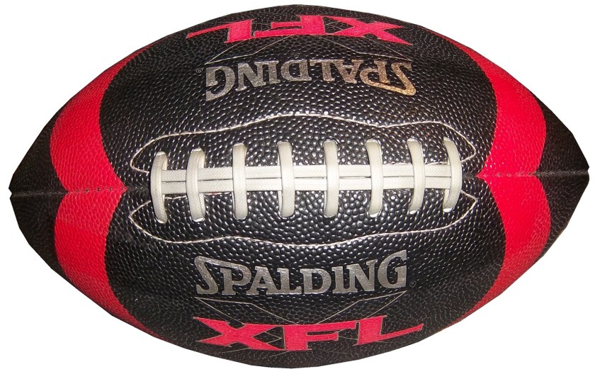
By far, the most unususal item in my Bears collection is this XFL football. The XFL was a football league founded by Vince McMahon in 2001, and folded after one season. I took this full size regulation football with me to a number of signings, and every Bear who signed it said the exact same thing to me, word for word “This is the first XFL ball I’ve ever signed.” It’s a unique item, and one of my favorite items in my autograph collection.xfl-2 xfl-3 xfl-1

Vintage Item Spotlight-Titan II Blast Door Control Box

titanblastdoor1

By David G. Firestone

I’m not a traveler. I don’t really travel as much as I should, because I don’t fly well. This last March, I went to Tuscon, Arizona, and spent a week at my parent’s condo. We did a whole bunch of fun stuff, including the Titan II museum, located southwest of Davis–Monthan Air Force Base. Davis–Monthan Air Force Base was the home of the 390th Strategic Missile Wing of the Strategic Air Command. The Titan II was also used by the 381st Strategic Missile Wing at McConnell Air Force Base near Wichita, Kansas, and the 308th Strategic Missile Wing located at Little Rock Air Force Base in Arkansas. Each of these wings had 18 Titan II silos, with fully contained launch facilities and crew quarters for the missile crews. A 4th group, the 1st Strategic Aerospace Division, located at Vandenberg Air Force Base in California had 3 silos for technical development and training.

The Titan II missile is a 3 stage missile carried nuclear warheads, and could be launched on several minutes notice. The launch process is carefully scripted to insure a false launch could not take place. Two individuals are needed for the missile to launch successful. Training was carefully planned. Regular inspections took place. The missile itself utilized a liquid fuel, Aerozine 50 and an oxidizer, Dinitrogen tetroxide. The two compounds were kept in separate tanks, and when the missile was launched, the two compounds were combined and the mixture caused the thrust needed to launch the rockets off the ground.

2014-titanmuseum-3-4-3
2014-titanmuseum-3-4-1
2014-titanmuseum-3-4-2
2014-titanmuseum-3-4-16
2014-titanmuseum-3-4-19
2014-titanmuseum-3-4-6
2014-titanmuseum-3-4-11
2014-titanmuseum-3-4-15
titanblastdoor1

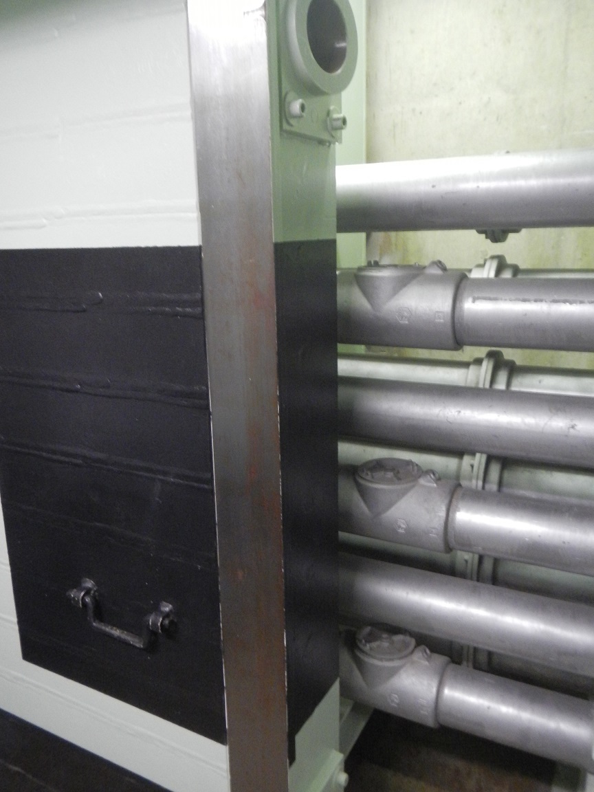
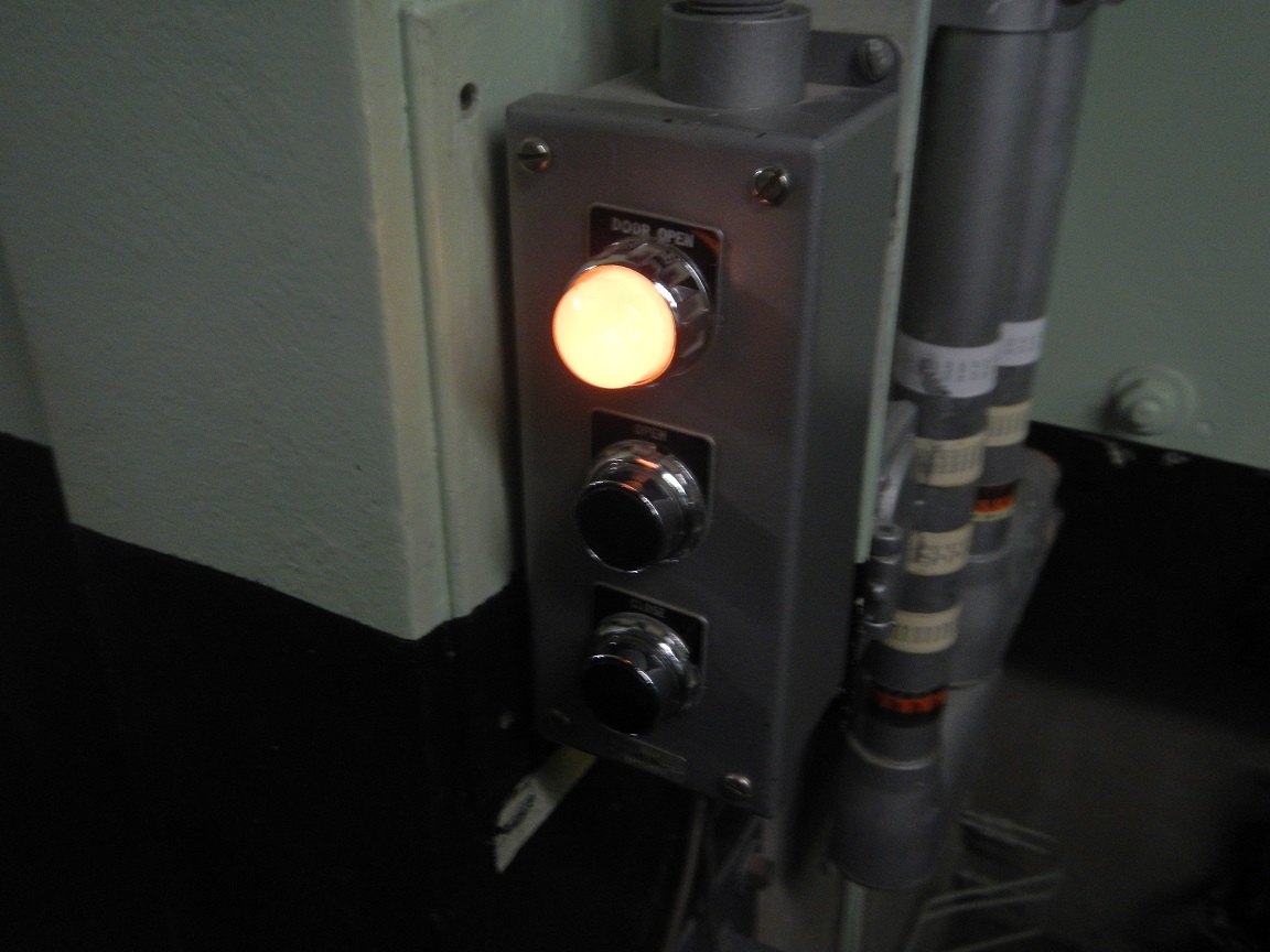
The Titan II museum consists of a tour given by former crew members. The majority of the museum is underground, but above it are a number of vintage items that were used on the base. To enter the base, you have to go underground through a staircase, and pass through a number of blast doors. You then get a tour of the control room, go through a launch sequence, and then you go see an actual Titan II, which was never fueled, and has been mounted in the silo. The blast doors are 6000 pound each, and require a special switch to secure and open them. I purchase one of them in the gift shop.

titanblastdoor1
titanblastdoor2
titanblastdoor3
titanblastdoor4
titanblastdoor5
2014-titanmuseum-3-4-5
2014-titanmuseum-3-4-17

This particular door switch was used in Wichita Kansas, at the 381st Strategic Missile Wing at McConnell Air Force Base. When the silos were dismantled in the 1980’s, much of the equipment used was so obsolete, it couldn’t be recycled, so much of it was sold for scrapped. This was the only one they had in stock, and to hold a piece of the Cold War in your own hands is truly humbling. This was part of a machine that could have ended the world. While at the museum you can go to the top of the silo, and look down into the silo and see the missile and really get an idea of how big it is. There is a hole cut into the warhead because due to a treaty, this missile must not be able to fire or hold a payload. This hole and the permanently open silo doors conform to the treaty.

Vintage Item Spotlight-Animation Cels

superbubbleBy David G. Firestone

Going to take a break from sports stuff on Vintage Item Spotlight for a while, the Senators numbers took a lot out of me. We all watched cartoons growing up. That goes without saying. What many people don’t realize is that animation cels from your favorite childhood programs are becoming collector items. They even have their own section on eBay. I’ve got a few, and today we will examine them this week.

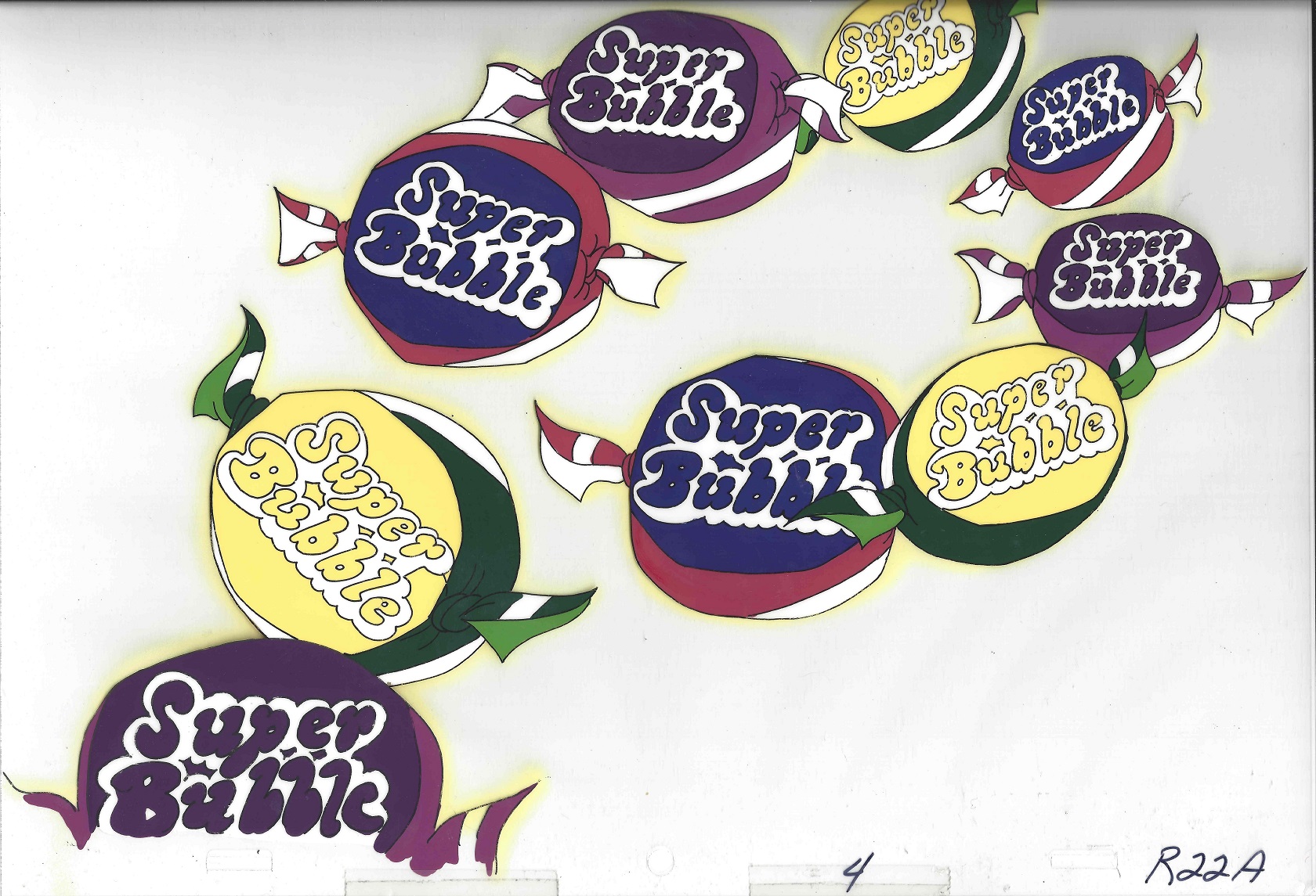
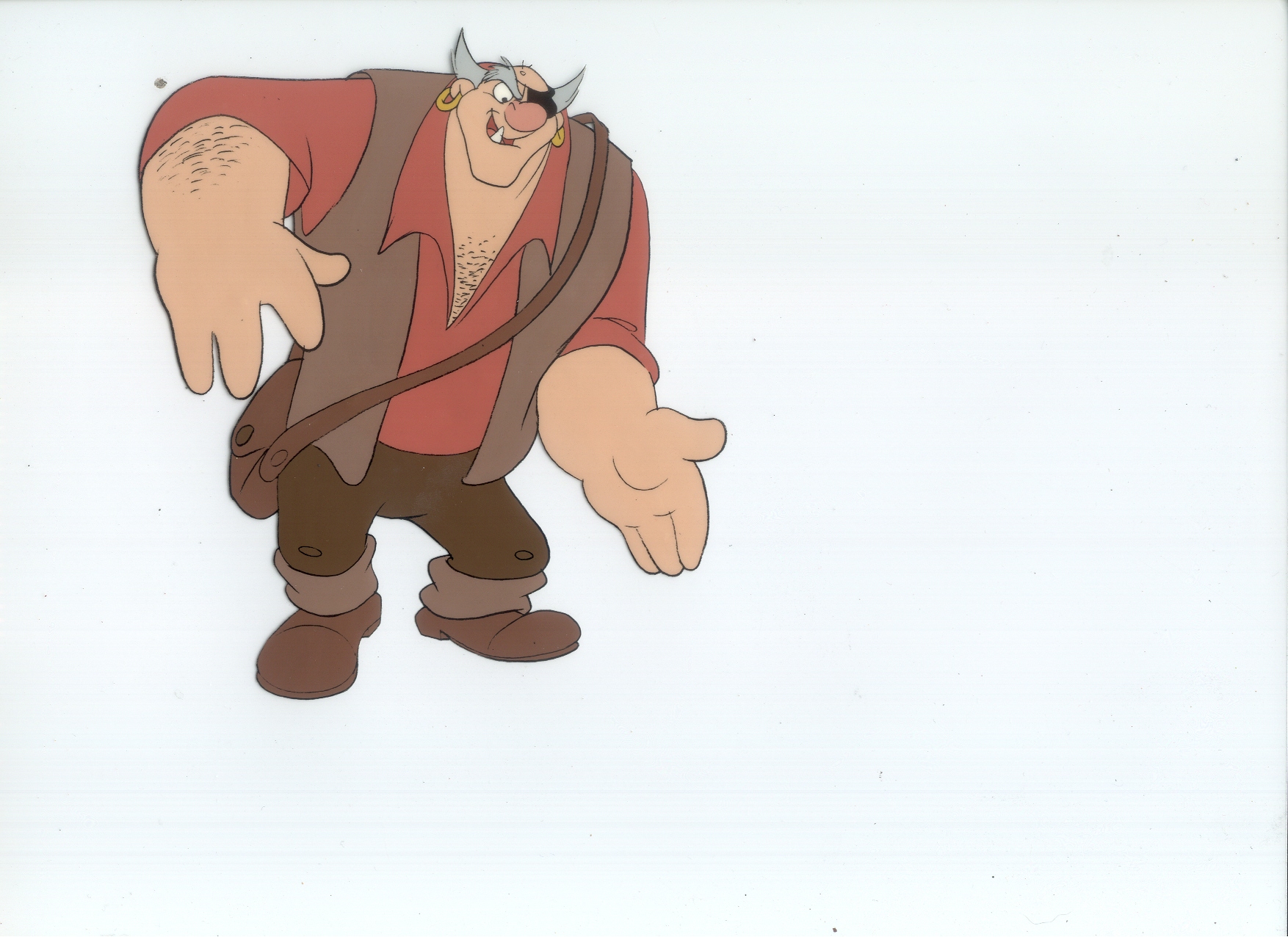
One thing that I do is get a item that I use to familiarize myself with some of the aspects of other items to come. This example is a cel from a Super Bubble commercial from the 1970s. Each cel is 1/30th of a second, and the motion comes from minute changes in the drawings. The shot is framed, and the clear acetate sheet is put under the camera and is held in place by the little holes in the bottom.superbubbleThis cel comes to us from Cap’n O. G. Readmore in 1985. This was from the first episode of his short-lived show where he told the story of Jack and the Beanstalk. This is the giant that Jack meets. The shot is set up so that he is high up in the left corner. It comes with a matching production drawing.giant-1 pd=211Now we all get into collecting for something specific, and for me, that was to get cels from my all-time favorite show, Beavis and Butt-Head. The first one I got was from the episode Canoe and features the duo in their underwear. The shot in question takes place just after their teacher, Mr. Van Driessen gets mauled by a bear.bb-canoe

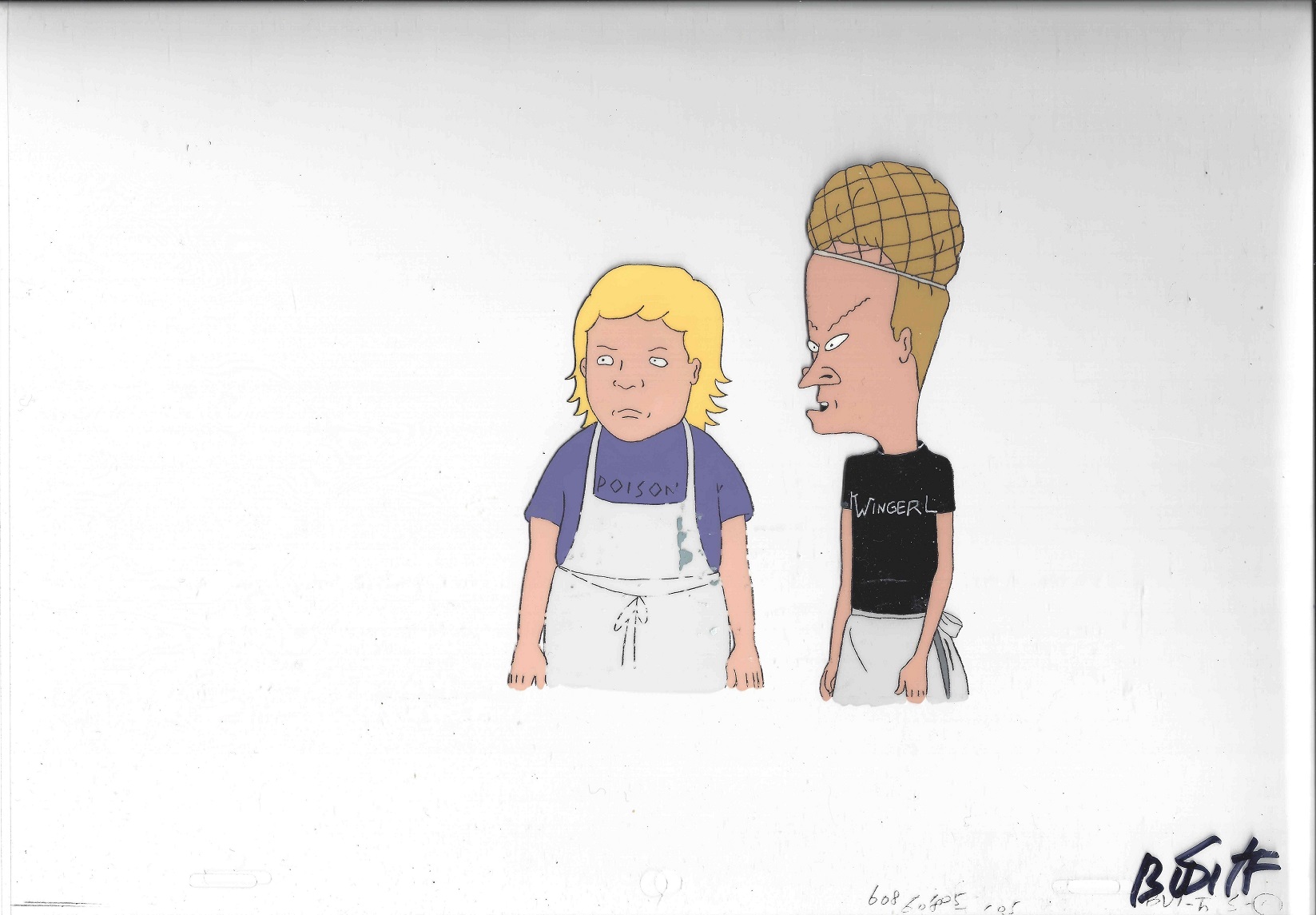
The second cel that I got was from It’s a Miserable Life, which was a parody of It’s a Wonderful Life. Butt-head was never born and Beavis is spending Christmas working in a soup kitchen with Stewart. This cel is from that scene.bb-xmas2

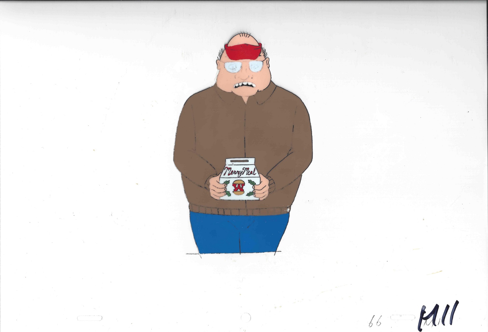
The other Christmas episode was called “Huh Huh Humbug” and was an obvious parody of A Christmas Carol. This scene features principal McVicker sneaking a value meal home from Burger World for his kids. This cel is from that scene.bb-xmas1

This scene from the “Madame Blavatsky” episode features the two walking down the street, after Beavis is convinced he is a psychic. It is set up to look like it was filmed from a distance away. There is an official MTV logo on the cel.bb-mdmeblvtzky

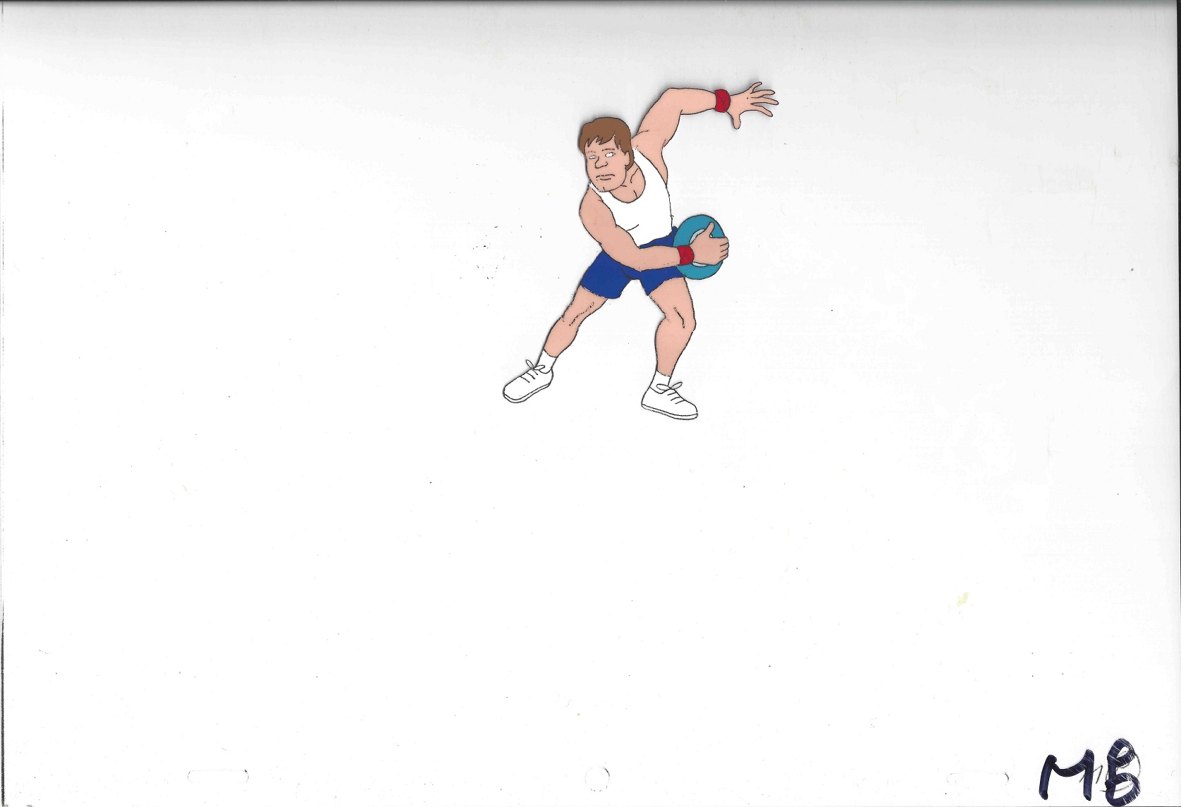
While at Stewart’s house, the duo watch the Olympics and decide to use a 17th century antique plate as a discuss. This is a cel of the Olympic event they watched in Plate Frisbee.bb-platefrisbee

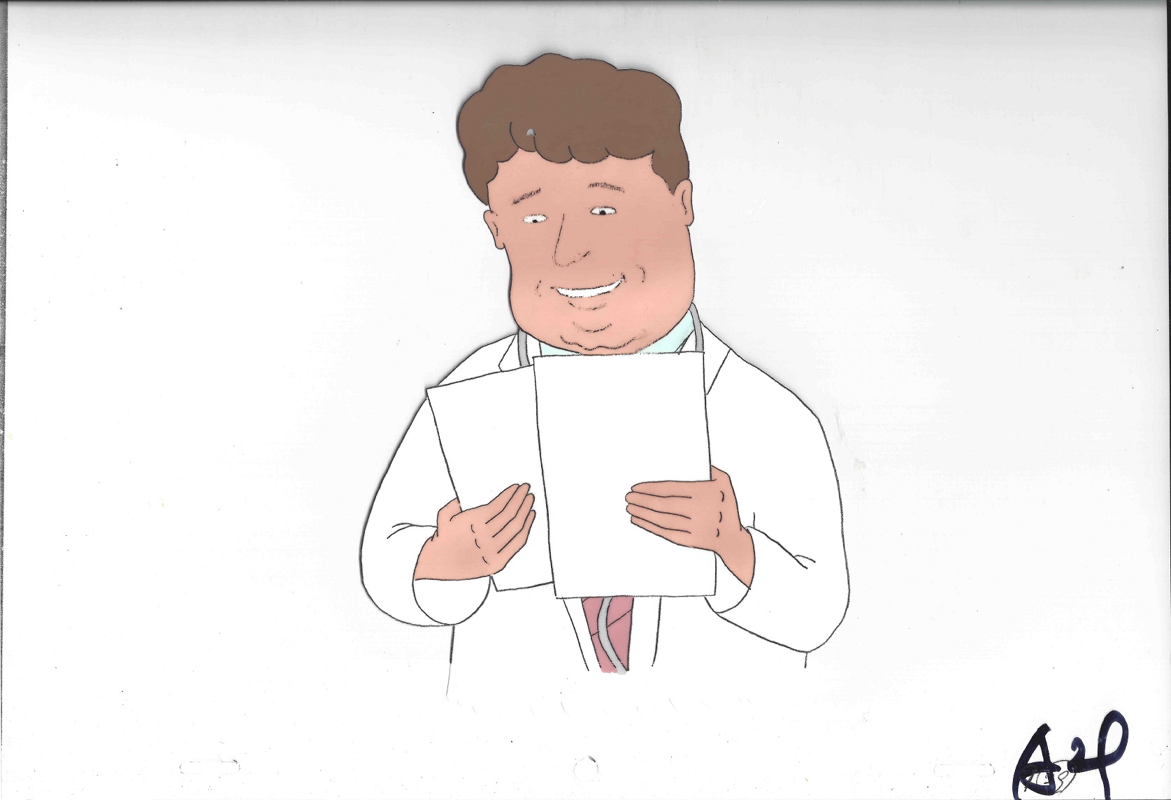
One of their more intelligent ideas was to make some extra money selling sperm in Sperm Bank. During the episode Stewart’s dad visits the clinic and has a chat with this nice doctor:bb-spermbank1 bb-spermbank2

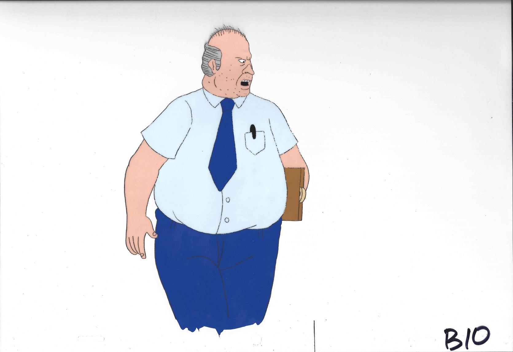
One of the my favorite episodes is Closing Time. Throughout the course of the series, the duo work at Burger World, an obvious parody of McDonald’s. They get the owner in trouble and get the restaurant shut down numerous times. Despite that, they keep their jobs. This episode features the duo discovering how much fun it is to throw food into a ceiling fan. After they make a complete mess of the restaurant, health inspector Harry Butasker(who was featured in a later episode as “Sam Gluckman”) closes the restaurant. This cel is from when he first walks in.bb-closingtime

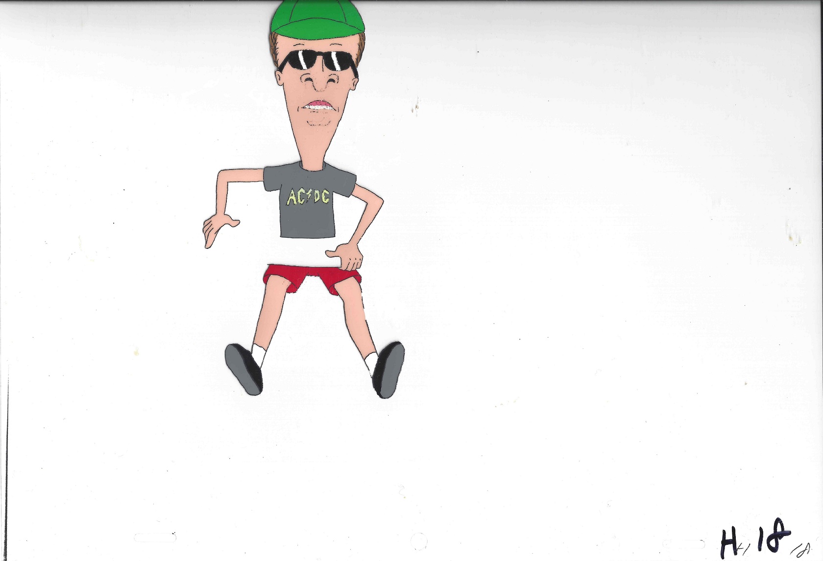
This last cel is one of my personal favorites. Incognito is a banned episode that was pulled from MTV after numerous complaints that it featured a student bran dashing and firing a gun while in school. Beavis and Butt-Head changed their names to “Crevasse and Bum-Head” and this cel is from a scene when they are trying to disguise their identities.bb-incognito

More Albie Pearson and Washington Senators Research

preasonnumber-10By David G. Firestone

I can hear many of you saying “why are you still covering this Dave?” and this will be my last Washington Senators article for a while. When I started this project, I had no idea it would balloon the way that it did. I’ve found more layers to this story than I ever could have predicted. This article was a direct result of these layers.  I’ve developed a theory of why they were designed they way that they were, and their design origins…but more on that later.

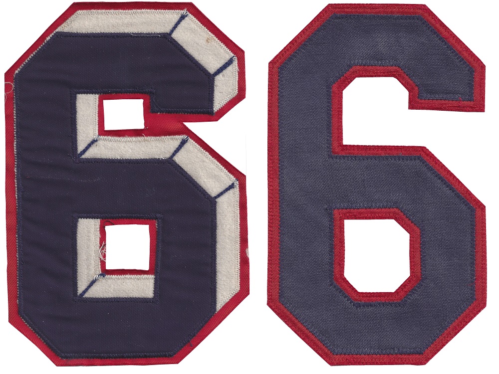
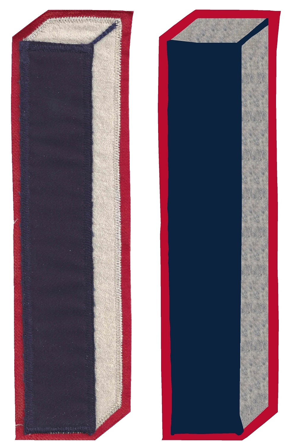
I was recently contacted by a seller who was able to get the numeral off Albie Pearson’s road uniform from his 1958 rookie season. As you can see, it looks like a generic two-tone number used by the Cardinals or Braves. The home number is an intricately designed number, with aspects never seen before or since. Whereas the road numeral looks like something that one would be able to buy for a little league, or softball uniform.preasonnumber-10

This was something I could not understand in terms of design. Normally, when a uniform is designed, the home and road numbers are similar to each other. In this case, they are the polar opposite of each other. When compared side by side, they look like they are from two different uniforms.preasonnumber-13

I took the Eddie Yost number, and made a mock up of the design with the gray multi-colored flannel design.yostnumber-11 yostnumber-12

Not a bad looking number, but why would there be a revolutionary design like that on a home uniform, and nothing new for the road uniform. The road uniform they were wearing at the time was created in 1955, a year before the 3D uniforms were introduced. It makes sense, why would you redesign a uniform that was already recently redesigned? But it also does not explain why no effort was made to add some design to the road uniforms.

I was trying to figure this out, and something dawned on me. Maybe this design wasn’t supposed to be a primary uniform, but instead meant to be an alternate uniform. The more I think about it, the more sense it makes. The 3D was meant to be worn at home for certain games, and then for other games, they would wear their regular uniforms. Back in the 50’s, the merch machine was not as in production as it is today, and alternates were not as common as they are today, but not unheard of.  Fans were buying merchandise, but didn’t buy jerseys they way they do today.  So it wasn’t made to sell replica jerseys, so we can eliminate that as a reason.

The Washington Senators had some alternates in their history. They had home alternates in 1910, 1924, and 1942. While alternate uniforms were used, they were not common in the 1950’s. Calvin Griffith, then owner of the Senators had just taken over from his father Clark, and it can be argued that Calvin was dealing with new competition. The St. Louis Browns had moved to Baltimore in 1954, and attendance at Senators games was down. Griffith Stadium in Washington was old, the Senators were, for the most part, a spent force, and the team had a negative image. Clark Griffith was a segregationist, and the Jim Crow laws applied to Griffith Stadium. Toward the end of the 1950’s, this was more of a liability than an asset.

My theory is that Clark had to find a way to boost attendance, and he wanted the Senators to have new uniforms to help that. He took an alternate design for a home uniform, made it into the primary home design, to give the Senators a futuristic look. The first era of 3D films was nearing its end, and Clark must have seen that they brought people in. It didn’t last long, only 3 seasons, and in 1959, it became clear that the Senators were heading for greener pastures, this pasture being in Minnesota, where they have remained ever since.

This is one of the most attractive uniform designs ever created, and the fact that it died less than 3 seasons after it was unleashed is a tragedy.  The fact that this design isn’t seen as much on replica designs, or throwbacks is even more of a tragedy.  This research project has been a labor of love, but for the time being, I have to move on to other projects.  I don’t think that this will be the last I do on the subject, but it is for now.

Why I Chose To De-Wahoo My Indians Jersey

KODAK Digital Video CameraBy David G. Firestone

I am a uniform enthusiast. That has never been in question. I have always loved sports uniforms, and have a large number of them in my personal collection. I happen to have a 1976 Dennis Eckersley throwback jersey. I made a decision concerning this jersey that even a few people who know me might not understand. I decided to remove the Chief Wahoo patch from the left sleeve.

This is in response to a recent discussion concerning Native American team names. Do we keep the Native American name and imagery despite the fact that many people find them offensive, or do we change the Native American name and imagery and change the tradition of the teams? Basically I have decided to “de-Wahoo” my jersey for a number of reasons. Obviously since it is a racial issue, it was an easy decision, but this is a bit more personal for me.

I went to DePaul University in Chicago, and during my spring breaks, I went on what are referrred to as “service immersions.” We would travel to a specific location, live with a group, and work with the local residents to make life better for people. I did everything from building decks, to tutoring New York City students. But the first two trips I went on helped me made this decision

The first trip I went on was to Brainered Minnesota in March 2001, where we, in conjunction with Habitat For Humanity worked on houses for a week on the Mille Lacs Reservation. We got to know the locals, we conversed, and I had a great time and grew as a person. That was the first of what turned out to be many trips.

Established in 1855, the Mille Lacs Reservation is located about 100 miles north of Minneapolis–Saint Paul, at the at the southern end of Mille Lacs Lake and composes about 60,975 acres. It is home to many of the Mille Lacs Band of Ojibwe as well as the Mississippi River Band of Chippewa Indians.

My second trip took place in November 2001, two months after the 9/11 Attacks. We flew during my winter break to San Carlos Arizona, and spent two weeks in the San Carlos Apache reservation. It was supposed to be that each of us would spend one week working in the classroom at St. Charles School, where we were also staying, and one week working on fixing a house. As fate would have it, I had messed up my ankle before we left, and I was unable to work on the house. I spent two weeks working in the 2nd grade class at St. Charles. It was, without a doubt, the most meaningful thing in my life.

The reservation is located in southeastern Arizona, was established by President Grant in 1872, is on 2,910.7 square miles. It is bigger than the state of Rhode Island, which has 1544.89 square miles. It is located in a remote desert area, surrounded by a ring of mountains. There are areas of the reservation where non-Native Americans are not allowed to go, and then there are areas where no humans are allowed to go. The area is very economically poor, with many people barely able to make ends meet.

Initially I was nervous, having no experience in working with 2nd graders, but those fears would be unfounded, as I worked with the kids well. There were bout 20 kids in the class, some more rambunctious than others. I worked with them, helped out in the classroom, and got to know them, and their culture. I was able to accompany a group of dancers to a show in a shopping mall, and for many of these kids, this was the first time they had ever been to a mall. They had never been on an escalator before, and it took a bit of coaxing to get them to use it. Those children were a perfect example of the human spirit. These kids came from little money, but they were proud of who they were and had hope for the future. Two weeks went by and we had to go back to Chicago, but I still carry part of San Carlos and Brainered in my heart.

That is why I decided to de-Wahoo my jersey. My experiences in Minnesota and Arizona were so influential, and I have too much respect for the Native American to keep an image like that on a uniform. I have also made the decision to no longer wear my Chicago Blackhawks jerseys for the same reason.

Vintage Item Spotlight-Albie Pearson Topps #317 Rookie Card

preasonnumber-8By David G. Firestone

Albie Pearson played baseball in the Major League from 1958 to 1966. He played for the Washington Senators, Baltimore Orioles, and Los Angeles/California Angels. He was selected to the 1963 MLB All-Star game in Cleveland where he was a starter. Pearson was one of 3 outfielders to start the game, beating out Carl Yastrzemski, and Harmon Killebrew as starters. He is most well-known for his phenomenal 1958 rookie season, which he won the American League Rookie Of the Year honor, as well as The Sporting News Rookie of the Year Award.

In 1958, the Washington Senators were in the last year of one of the most ambitious uniform designs of their era, the legendary 3D Uniform. The home uniform featured a W and the back numerals in a 3 dimensional design. The design of the numbers was somewhat complex as illustrated by this similarly designed Eddie Yost number from the same year…yostnumber-2

As can clearly be seen, the red bottom layer is made of tackle-twill, which was and still is one of the most popular materials for baseball uniform numbers. The middle layer is the same cream-colored lightweight flannel that the uniforms themselves were made of. The top layer is a blue tackle-twill design, to give the 3D appearance. The uniform was featured in the 1958 Warner Brothers musical Damn Yankees, and the numbers can clearly be seen in the Shoeless Joe from Hannibal MO scene as seen here:

The uniform lettering on the jerseys, while similar, is not as accurate as the on-field uniforms, as seen below…

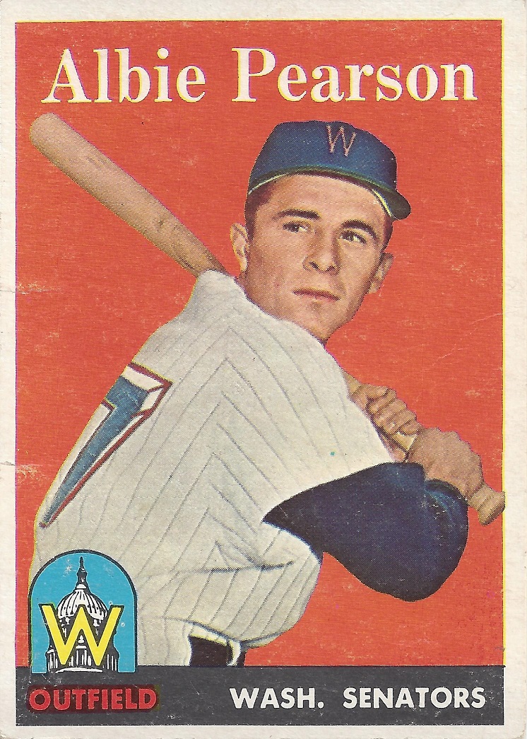
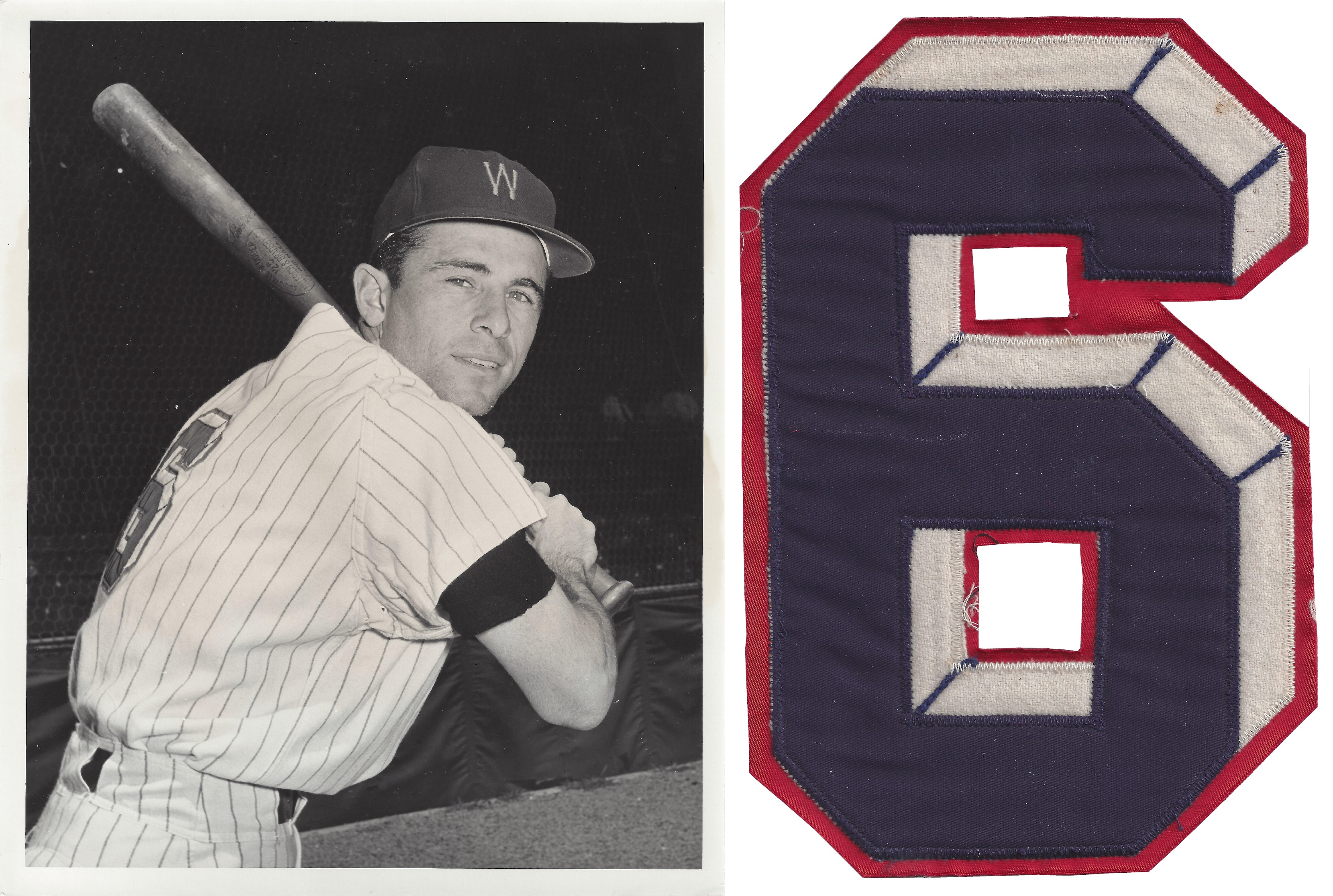
This is the number 6 that Albie Pearson wore on his home jersey during his 1958 Washington Senators rookie season. preasonnumber-1 preasonnumber-3It matches the Eddie Yost number design exactly. I also found a photo of him wearing this number on the back of his jersey.preasonnumber-10Now when I do research on an item, photo matching is paramount. One of the first and best places to find photographic evidence is trading cards. So I looked up his rookie card. I found it was a 1958 Topps Card, specifically card #317. When I saw the card, I was shocked.preasonnumber-8

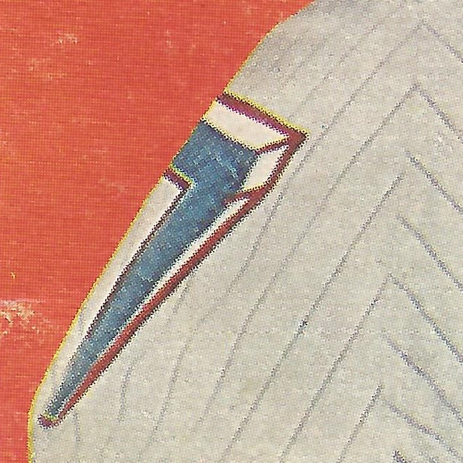
What was so shocking? Let’s take a closer look…preasonnumber-9Huh? Pearson isn’t wearing #6, instead he is wearing a jersey with a number 7. When compared to the photograph above, it also appears as though it is a two-digit number. I could not understand how something like this could come to pass, and felt it warranted more research. It would seem likely that he wore a different number in training camp. I wanted to go to the source, and ask Mr. Pearson himself.

Pearson did not spend any time in the minors for Washington, so that can be eliminated as the cause. He was traded to the Senators in January 1958. Through some more research, I learned that since his retirement, Albie Pearson has founded churches and orphanages in Zambia and Ecuador. He founded Father’s Heart Ranch, an 11 acre ranch for abused, abandoned and neglected 6-12 year old boys. He lives on the ranch and is in charge of day-to-day operations. I contacted Albie Pearson about this through Father’s Heart Ranch\,and I got this response.. “…I believe the #7 which you see on my rookie card was the number I wore during spring training with the Washington Senators. I cannot recall if the number was 37 or 7 that I wore during spring training. My true number that I wore when I was rookie of the year was #6.” Based on this insight, I checked baseball reference, and found that #7 had been assigned to Bobby Malkmus in 1958 for 25 games and #37 wasn’t assigned to any player in 1958 or 1957. Based on this, it appears that Pearson is wearing #37 in his Topps rookie card.

I have never seen this number design anywhere else. I don’t even think that there are throwback jerseys with this design. So I felt it proper to analyze these number for all to enjoy. In fact, this is one of my favorite sub-genres in the memorabilia hobby, jersey numbers.  Next edition of Vintage Item Spotlight, we will examine these numbers even closer.