The Driver Suit Blog-Item Spotlight-Alex Barron 1998 Champ Car Driver Suit

By David G. Firestone
While I typically watched NASCAR growing up, I did also watch IndyCar. That was before “the split” which diluted the value the sport so much that to this day it is still suffering, 6 years after the unification of Champ Car and the Indy Racing League. I got tired of politics and wanted to watch racing, I didn’t care who was sanctioning it. I still watch IndyCar racing and I collect race-used stuff.

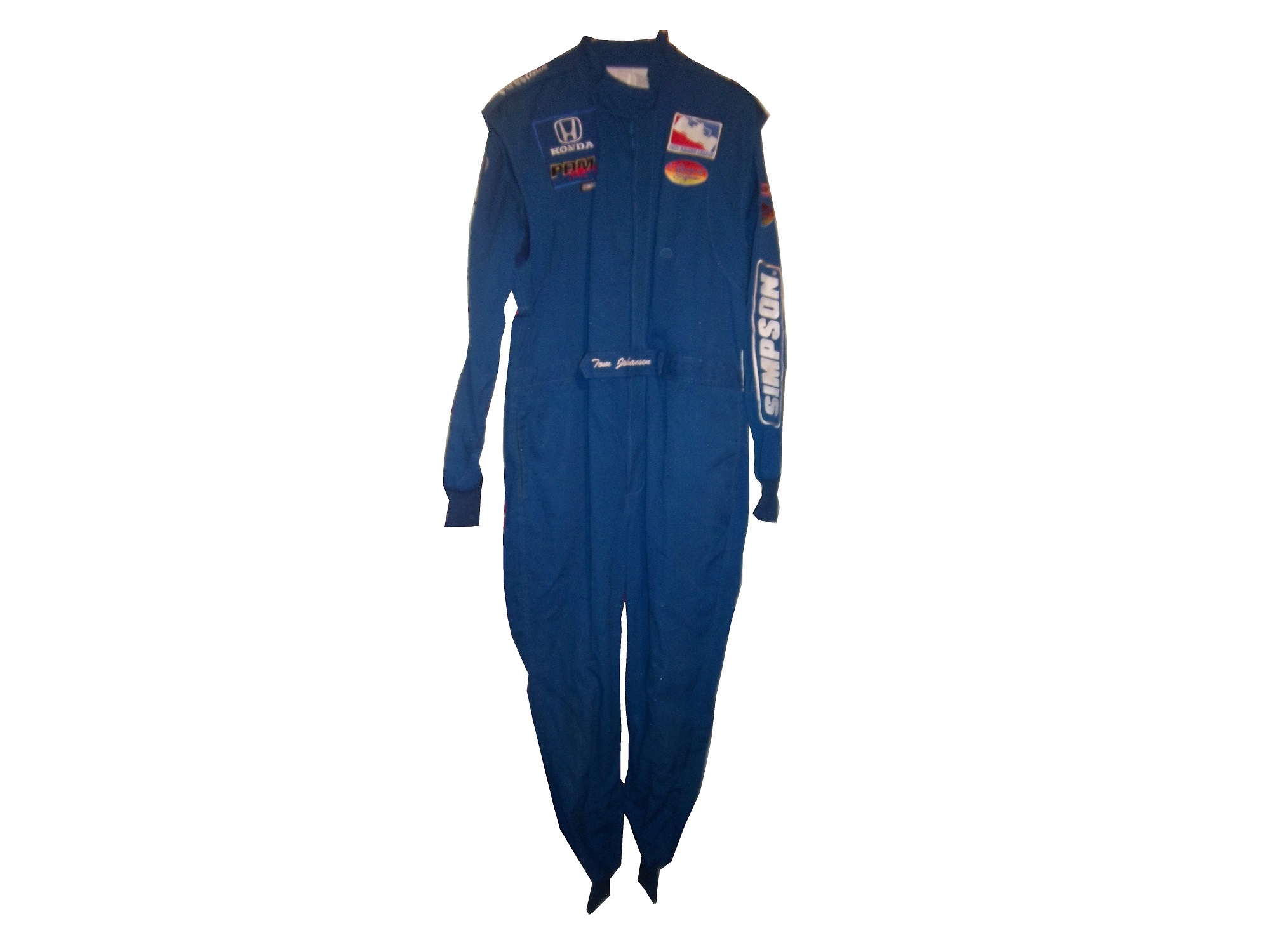
I mentioned this a few months ago, when I discussed video matching. My first open wheel driver suit is this Alex Barron suit from 1998.36-barron

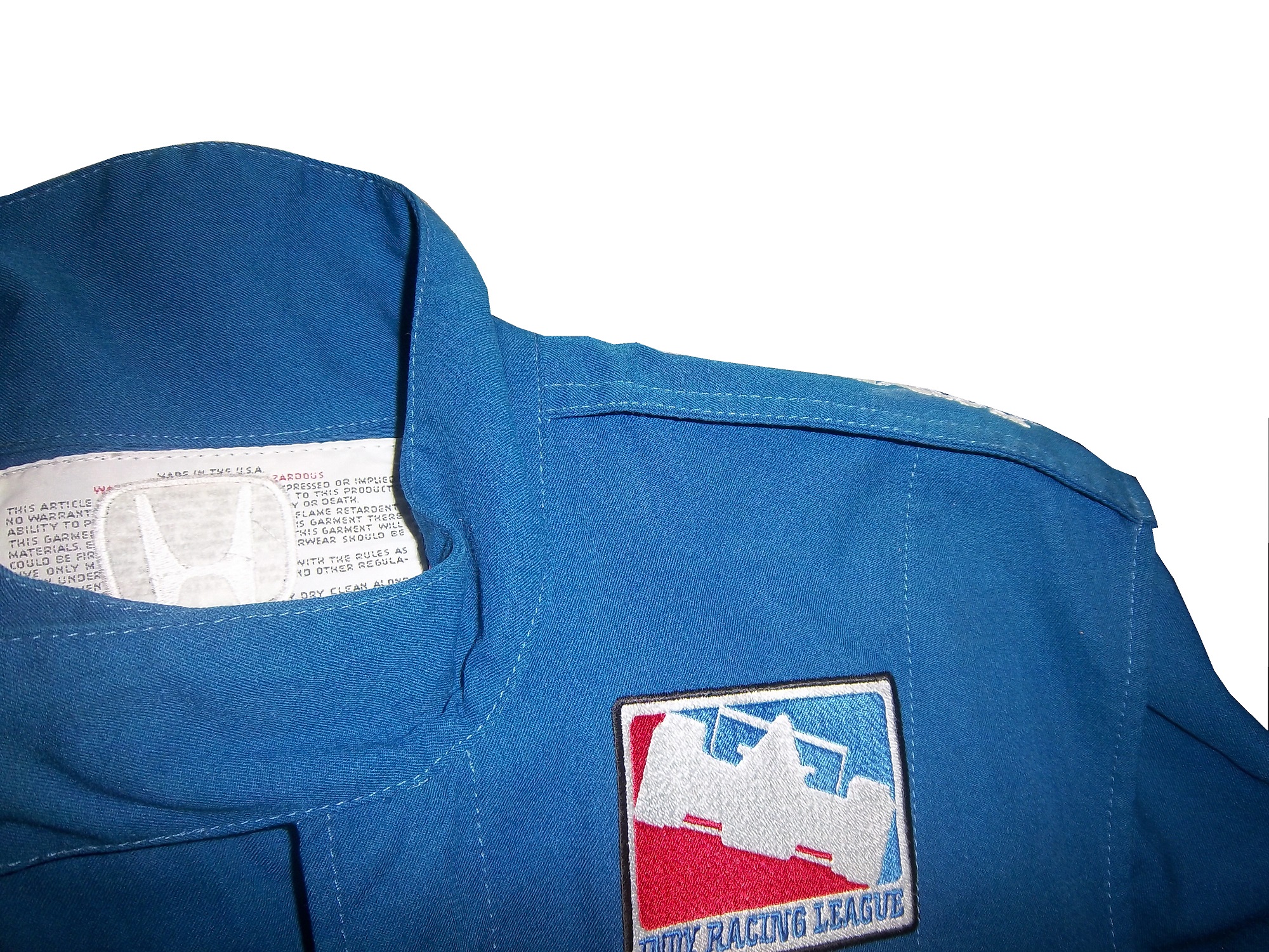
Not only is this my first open wheel suit, it was also my first suit that featured an FIA safety certification on the back of the neck. Having dealt in NASCAR suits, I didn’t know what to make of it, and through some research, I eventually learned what it was and what it meant.36-barron-neck 36-barron-fia2
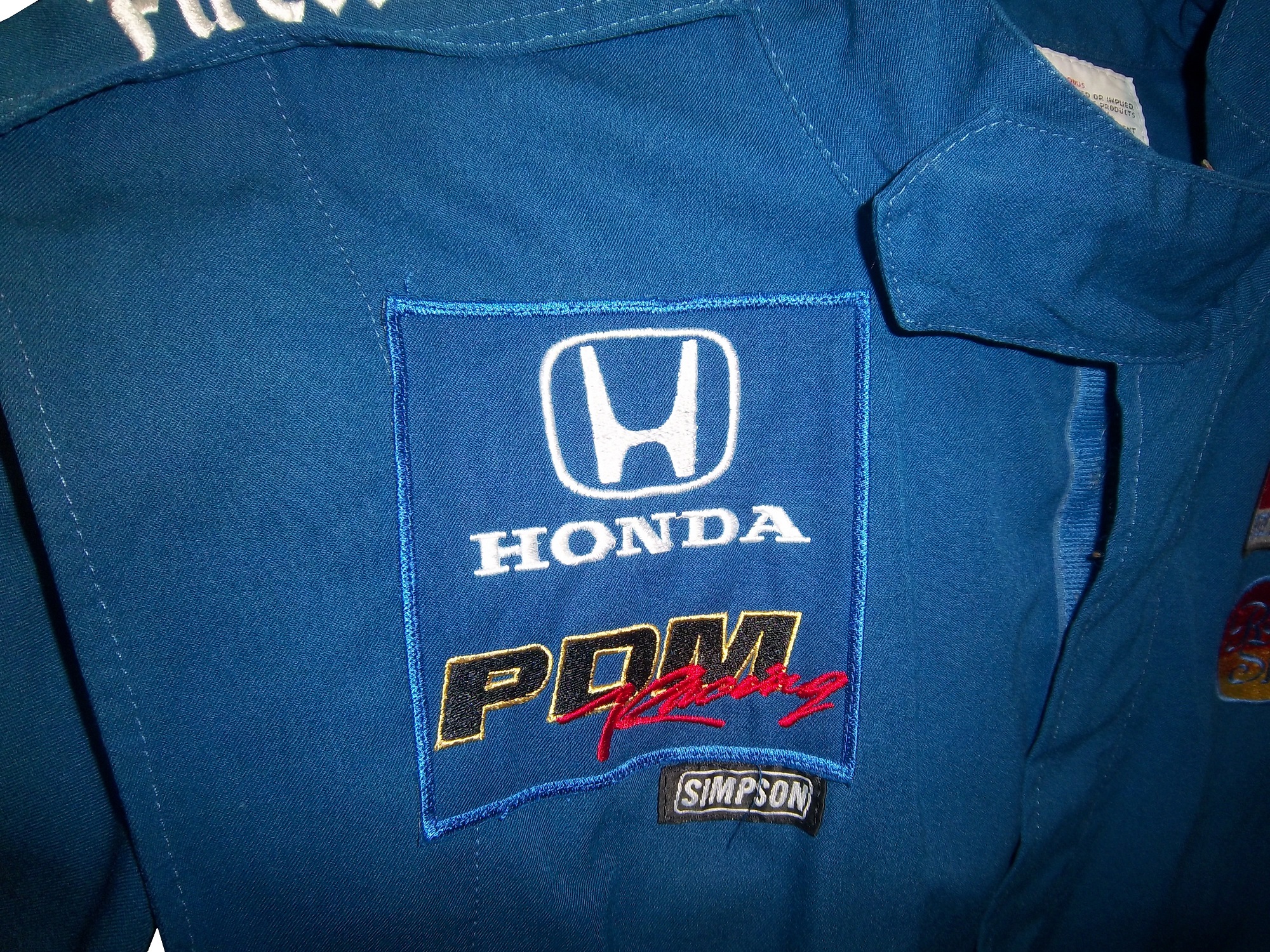
The chest features a FedEx Championship Series patch, probably my favorite sanctioning body patch ever,
and logos for Toyota and Denso.36-barron-lchest 36-barron-rchest 36-barron-flogo
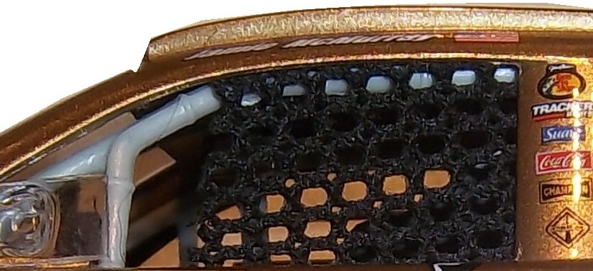
This being my first Sparco driver suit, The cowl tags, and location of the warranty tags were out of place, as compared to a NASCAR driver suit.36-barron-tag 36-barron-tag2One thing I do find interesting is that there are no television logos on the sleeves and legs, but as the video at the end shows, that was not uncommon, but more on that later.36-barron-rsleeve2 36-barron--lsleeve2 36-barron-legs
The collar has an unusual design. Most collar designs feature either logos on the side, or logos across the front, or sometimes both. This one is unique in that it features a DEGREE logo on the front, as well as a CASTROL logo on the right side, but nothing on the left side…I’ve never seen that before or since, and I can’t understand the need for that particular design…it just looks odd.36-barron-collarAlex’s name is embroidered into the belt, and something I love about open wheel suits is that because it is an international sport, much more so than NASCAR, the driver usually has their home country flag embroidered next to their name on their suit, as this suit shows.36-barron-belt
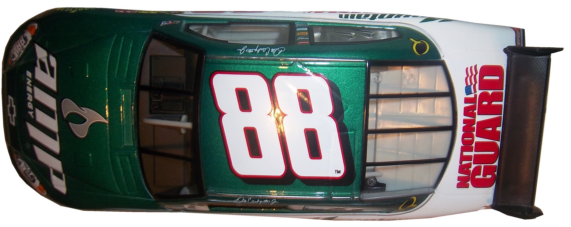
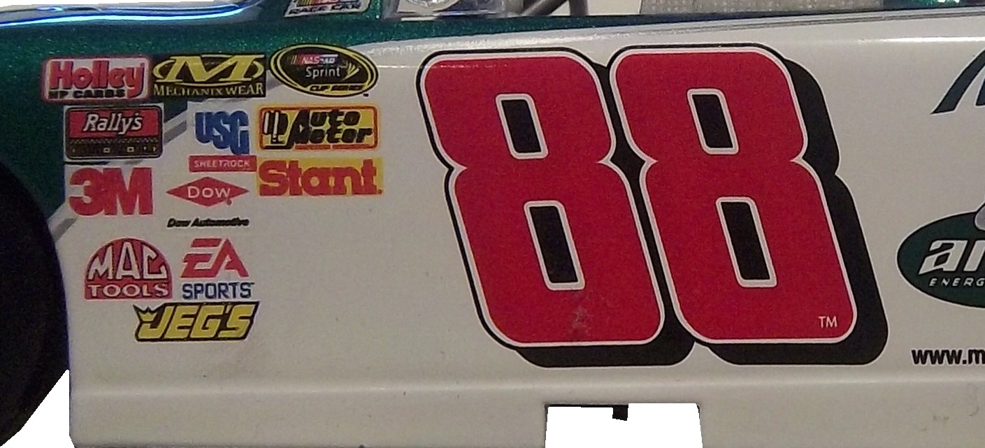
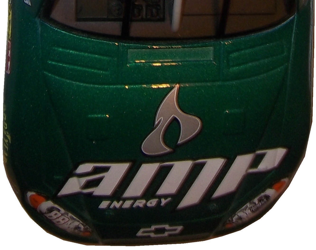
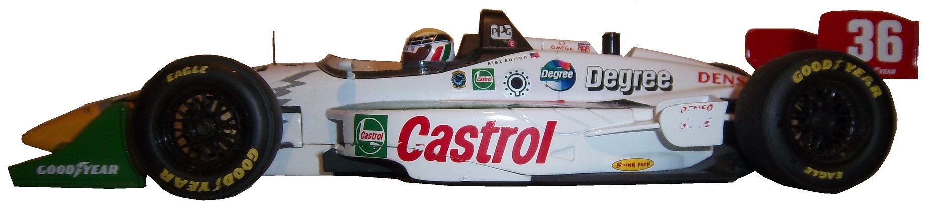
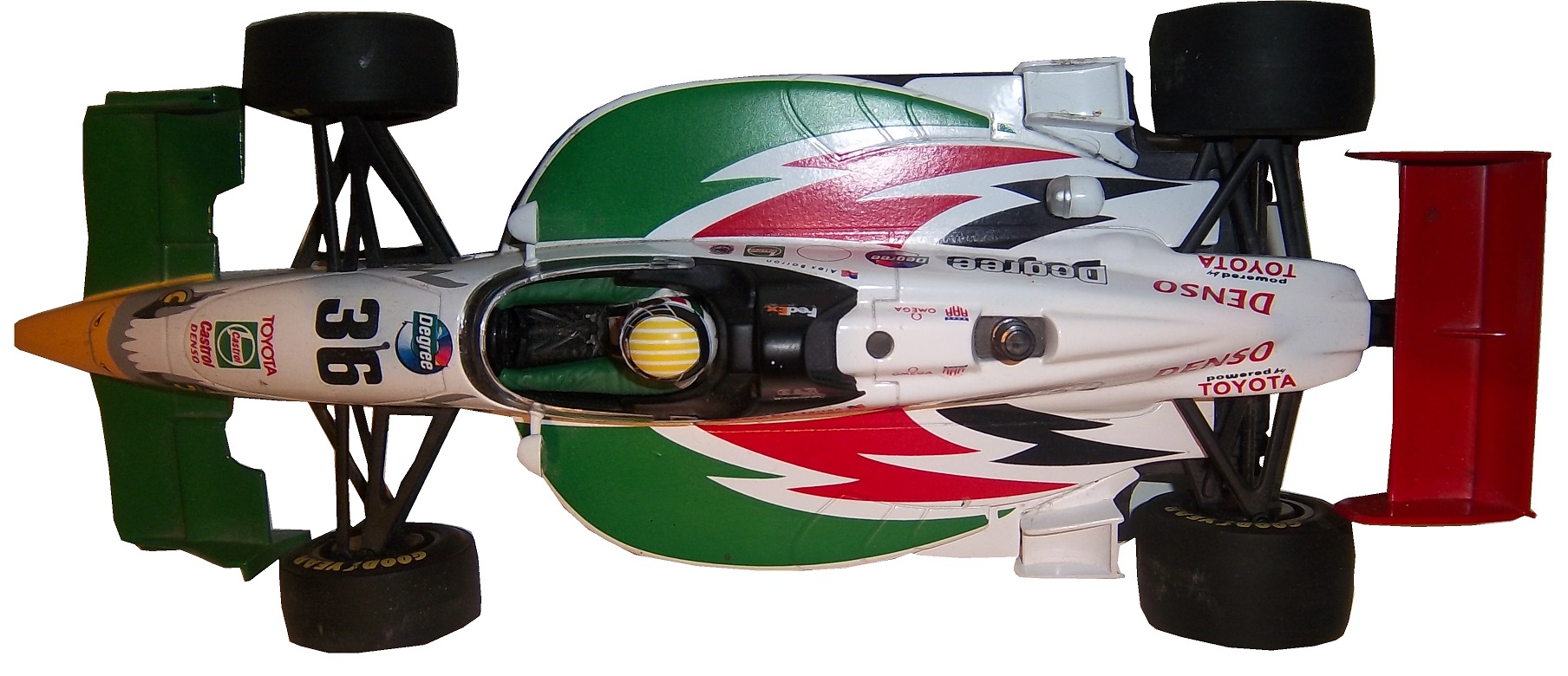
I also have a 1/18 die cast of Barron’s very sharp looking car from 1998. It is the only die cast I have that has a driver in it. I love the fact that he is wearing a very accurate version of his driver suit.36i-barron-2 36i-barron-3 36i-barron-1Now as I mentioned, this was the suit Barron wore during his most infamous moment, his crash at Road America, where he wound up on top of Bryan Herta. Someone recently uploaded the whole race to YouTube, and when watching it, notice that nobody has logos for the in-car camera. I find that rather interesting, since it would be very easy to place logos on the sleeves, and it was commonplace in other forms of racing. But it is an interesting race.

Now we have another piece of news to discuss.  In the realm of NCAA sports, the two major factions in uniforms are Nike and Under Armour.  Nike has a deal with Denny Hamlin for driver suits, and I was wondering when Under Armour would jump on the band wagon, and this week, we got our answer.  Under Armour, who has signed deals with Michael Waltrip Racing and Henrdick Motorsports to outfit teams with apparel.  This deal does not include the drivers themselves but the car numbers are fair play.  I find it a bit unusual that the deal provides apparel for all members of the team, pit crew members, front office personel, and everyone EXCEPT the faces of the franchises.  Now that might change in the near future, but for now that is how the deal works.  You can read more about the deal here.

Now we move to…

PAINT SCHEME REVIEWS!

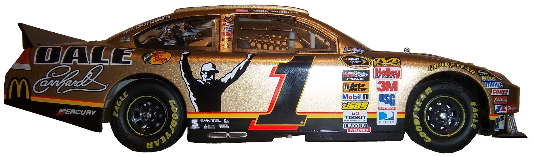
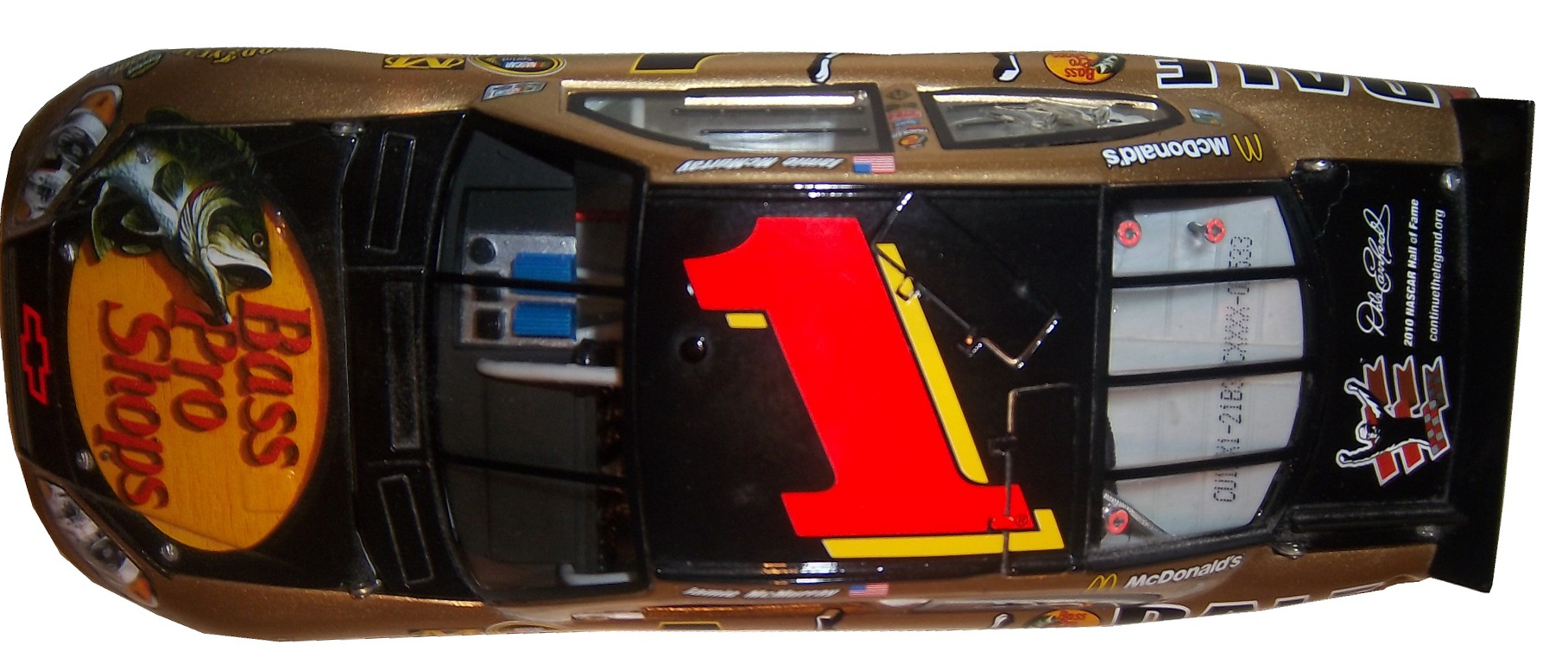
Jamie McMurray #1 Bell Helicopters Chevy SS Great look, great color scheme, A+

Austin Dillon #3 Dow Powerhouse Solar Chevy SS The side is somewhat over designed, but I like the product placement on the roof. The color scheme is great so I will give it a B

Denny Hamlin #11 FedEx Office March Of Dimes Toyota Camry Decent color scheme, but the side is a bit overdesigned, and has a messy look to it. C+

Clint Bowyer #15 Willy’s Duck Diner/Buck Commander Toyota Camry Too much camo. Camo doesn’t work they way designers want it to on a car and I give it a D

Greg Biffle #16 Give Kids A Smile Ford Fusion Man! Greg Biffle really wants the Paint Schemie Awards for Most Degraded Paint Schemes, and Worst Paint Scheme Set with another F scheme. Horrible design, and an ugly paint scheme.

Greg Biffle #16 3M Areospace Ford Fusion Take the worst aspects of Greg Biffle 2014 schemes, and add a liberal amount of camo, and you have an F scheme

Ricky Stenhouse Jr. #17 Ford EcoBoot Ford Fusion I like the color scheme, I like the overall scheme, and my only complaint is that the orange numbers on the roof should be on the door.  Still it is an A scheme

Cole Whitt #26 Swan Energy Toyota Camry Simple design and a great color scheme earns an A+

Cole Whitt #26 Swan Energy Toyota Camry Simple design and a great color scheme earns an A+

Paul Menard #27 Menards/Duracel Chevy SS This is the best Menard scheme I have seen! Duracel works very well on the hood, and I give it an A

Parker Kligerman #30 Swan Energy Toyota Camry Just when I thought Swan had learned the error of their ways, and were improving their paint schemes, along comes this one. Now we are back to square one, and this scheme earns a D+

Parker Kligerman #30 SMS Audio Toyota Camry Well things for Swan are looking up, this is a pretty cool design. It works very well, and has a great color scheme. A+

Ryan Newman #31 Quicken Loans Billion Dollar Bracket Challenge Chevy SS I understand what they tried to do, but the scheme as a whole is just bland, boring, and C+.

Travis Kvapil #32 Keen Parts Ford Fusion  Decent design, good color scheme, but the logo on the hood is very difficult to see.  That is a major issue.  When a sponsor pays for a car, the hood design should be easy to see, but this isn’t easy, and I give it a C-

Aric Almirola #43 Ekrich Ford Fusion The red on the roof is pointless, and it takes away from a great scheme. If the roof were Petty Blue, and the red was just a stripe on the bottom, I would give this scheme an A+ but with the red roof, it goes down to a B-

Michael McDowell #95 Triangle Office Equipment Levine Family Racing keeps up the fight with Swan Racing to win the Most Improved Paint Schemie Award with another beautiful A+ scheme!

The Driver Suit Blog-The Sprint Unlimited Preview

By David G. Firestone

The 36th Sprint Unlimited starts tonight at 8:15 ET on Fox. This marks the beginning of the Daytona 500 and the beginning of the NASCAR season. I will be looking forward to it, and I will enjoy it as always.

The field will feature pole award winners and past winners of the event. These include:
· Denny Hamlin (4 poles)
· Kyle Busch (3 poles)
· Joey Logano (2 poles)
· Jimmie Johnson (2 poles)
· Matt Kenseth (2 poles)
· Ryan Newman (2 poles)
· Dale Earnhardt Jr. (2 poles)
· Jeff Gordon (2 poles)
· Carl Edwards (2 poles)
· Marcos Ambrose (1 pole)
· Kurt Busch (1 pole)
· Kevin Harvick (1 pole)
· Brad Keselowski (1 pole)
· Mark Martin (1 pole)
· Jamie McMurray (1 pole)
· Danica Patrick (1 pole)
· Ricky Stenhouse Jr. (1 pole)
· Terry Labonte (past winner: 1985)
· Tony Stewart (past winner: 2001, 2002 and 2007)

The event will feature a number of segments which were voted on by NASCAR fans including myself, and many of you. The first segment will feature laps followed by a second segment of laps, and then a third segment of laps. Many special paint schemes will be run for this race, as is traditional. My personal favorite is the Miller Lite Throwback scheme being run by Brad Keselowski.

Now some factoids about the race.

*There are, in total, Chevy drivers, Ford drivers and Toyota drivers.

*Chevy has 20 wins, Ford has 7 wins, and Toyota has 1 win.

*Mark Martin has competed in 20 consecutive events from 1989-2008.

*Dale Earnhardt Sr. has won 6 events, more than anyone else in 1980, 1986, 1988, 1991, 1993, and 1995 and went on to win the Sprint Cup Championship 4 times in 1980, 1986, 1991, and 1993, he is one of 7 drives to do so.

*From 1979-2011 the event was sponsored by Anheuser-Busch, first called the Busch Clash which was the brainchild of Monty Roberts, brand manager of Busch Beer, who sponsored the Pole Award. It remained the Busch Clash until 1998, when Budweiser took over the Pole Award, and it was renamed the Budweiser Shootout. In 2012, Sprint, the series sponsor took over the sponsorship after Budweiser announced they would drop the sponsorship in favor of sponsoring the Duel Races that determine the starting order of the Daytona 500.

*Petty Enterprises was not eligible to run the Shootout because of a rule stating that only drivers that ran the Busch/Budweiser pole award decal were eligible to enter the shootout. Richard Petty and his family did not support alcohol sponsorship or decals on race cars. So John Andretti, Bobby Hamilton, Jeff Green, and Aric Almirola who all had a number of poles with Petty Enterprises were not eligible to participate. I find it interesting that Petty has reversed course on the alcohol sponsorship rule, since Kasey Kahne was sponsored by Budweiser, and Marcos Ambrose will run at least one race sponsored by Twisted Tea.

*Buddy Baker won the inaugural Sprint Unlimited in 1979, which was a 20 lap sprint.

*Since many top drivers were excluded from the race due to not winning a pole award, they moved to the TV booth as color commentators. These included Dale Earnhardt Sr. in 1981, Richard Petty and AJ Foyt in 1982 and 1983, Neil Bonnett in 1993, Darrell Waltrip in 1994, 1995, 1997, and 1999, and Kenny Wallace in 1998.

*There has never been a driver who has won the Sprint Unlimited, Budweiser Duel and Daytona 500 in the same year. Drivers have won 2 of 3 in a season, but never scored the hat trick.

*One of the first instances of a special paint scheme being used specifically for the Sprint Unlimited was the Chroma Premier scheme run by Jeff Gordon in 1997. He followed it up the next year with the legendary Chroma-lusion scheme, which feature a paint that changed color. Since then, special schemes have become commonplace.

*Richard Childress Racing has 8 Sprint Unlimited wins, most of any team. Hendrick Motorsports has 6 wins, and Joe Gibbs Racing has 5 wins.

The Unlimited starts tonight at 8 PM ET on Fox Sports 1, and I look forward to watching the event as I hope the rest of you do too.

Though I have had a VERY busy week, I still have time for…

Paint Scheme Reviews!

Kasey Kahne #5 Time Warner Cable Chevy SS It is a good color scheme, but the design on the side needs a little tweaking. Get rid of the needless zig-zag pattern and it works a whole lot better. It is still a decent scheme, so I will give it a C

Michael Annett #7 Pilot/Flying J Chevy SS Good color scheme, but the awful template is back for Tommy Baldwin. It is really sad, because this could be a great scheme, but the template takes it from an A to a C-

Michael Annett #7 Accell Construction Chevy SS See Above

Marcos Ambrose #9 Mac Tools Ford Fusion Good color scheme here, and decent design, worth a B

Clint Bowyer #15 AAA Insurance Toyota Camry Great color scheme, good design, worth a B+

Kyle Busch #18 M&M’s Peanut Toyota Camry I like this, it has a great shade of yellow, hard to find in NASCAR these days, and the peanut motif works very well. It is an original design, and I’ll give it an A

Trevor Bayne #21 Motorcraft Ford Fusion  This is why The Wood Brothers won the Paint Schemies and took the top spot in the Paint Scheme Leaderboard.  A++

Joey Logano #22 Autotrader.com Ford Fusion  Sometimes orange works, sometimes it doesn’t.  This is an example of an orange scheme that just doesn’t work.  If the white was taken out completely it might work, but this is just horrid, and I give it an F

Cole Whitt #26 Speed Stick Gear Toyota Camry This is one of the few schemes that has both a classic and modern look at the same time, and paired with a great color scheme, it earns an A

Paul Menard #27 Menard’s/Peak Chevy SS Good design, awful color scheme, D+

Terry Labonte #32 C&J Energy Services Ford Fusion I’ll give it a C+ until I can see a picture WITHOUT an Instagram filter!

David Ragan #34 CSX Ford Fusion  What in the hell is going on here?  Why is the hood decal upside down?  Why in the world would they do that?  Were they drunk when they decaled the car?  The only thing that I can guess is that it is designed for an in-car camera…but that makes no sense either!  F-

David Gilliland #38 Loves Truck Stops Ford Fusion  Good color scheme, decent design, plus unlike David Ragan, the hood decal is in the correct position, A-

Bobby Labonte #52 Phoenix Racing/HScott Motorsports Chevy SS Great color scheme, very simple yet attractive design, can’t say anything bad about it, A+

Michael Waltrip #66 Blue Def Toyota Camry While I like the field motif, it looks too much like the Windows XP Bliss background for me to take it seriously. I’ll give it a B-

Dale Earnhardt Jr. #88 Kelley Blue Book Chevy SS  During my Daytona Preseason Thunder article, I said I wanted to see the #88 they used on a real car.   I got my wish, and I like this design overall.  The metallic gold is a bold choice, it doesn’t always work well.  I give it an A+

BUT WAIT, THERE’S MORE!

As many of you know, I don’t just research and collect driver suits and racing items, I collect and research many other things.  I recently had a column run in Uni-Watch concerning some lettering from the 1958 Washington Senators, and you can read my column here.

The Driver Suit Blog-Die Casts-Celebrating the Machines

100_4177 - CopyBy David G. Firestone

How I have gone as long as I have without delving into the subject of die casts? I really don’t know, but for this week’s column, we are going to discuss it. Racing as a sport is half man, half machine. When it comes to collectibles, they both get virtually equal billing. One of the biggest collectibles in racing is the legendary die cast car.

Die cast cars began as an industry in the early 20th Century, but the early cars were very basic, with a simple body design and rolling wheels. They were of very poor quality, lacked detail, and often broke for no apparent reason. An zinc-based alloy named Zamak solved this problem. In 1953 Jack Odell, co-owner of Lesney Products in England had a moment that revolutionized the industry forever. His daughter went to a school that allowed the students to bring toys, provided they were small enough to fit in a matchbox. He created a small die cast steam roller that could easily fit in a matchbox. For the Coronation of Queen Elizabeth II, he created a similarly sized model of her Coronation coach. After selling 1 million of these small coaches, he realized he was on to something, and thus the Matchbox line of die cast cars was born. In 1968 Mattel launched the Hot Wheels brand, which, like Matchbox created cars in 1:64 scale, or S-Scale for railroading. In 1997 after being sold numerous times, Mattel bought Matchbox and has been fostering the brand ever since.

Race cars are a popular version of die casts, as most boys who love racing will buy the die cast of their favorite driver, and play with it as if they are driving the car. I’m guilty of this, as I’m willing to bet the majority of racing fans are, if you don’t believe, check this out. In the beginning, die casts were marketed and sold to kids, but as time went on, it became clear that grown up fans liked these as well. So die cast manufacturers began to create larger “adult collectibles,” typically in either 1:18 scale, or 1:24 scale, or one of the accepted G scales. The adult die casts will feature alcohol and tobacco sponsors, and are much more accurate in design, with cloth window nets, and working hoods, decklids, and roof spoilers. As time progressed, these cars gained a very dedicated following, and have become very profitable for NASCAR, IndyCar and F1. Interesting to note that the standard size for NHRA and NASCAR die casts is 1:24 and 1:64 whereas IndyCar uses 1:18 and 1:64 and F1 use 1:18 and 1:43. NASCAR die casts can also be purchased in 1:43, 1:32, and 1:18, here is how they compare to each other:100_4177An adult collectible die cast as mentioned above, is very accurate, such as this Jamie McMurray example from 2010. The amount of accuracy in this design is stunning! 1-mcmurray-1 1-mcmurray-2 1-mcmurray-3The window net is made of cloth,1-mcmurray-1 - doorthe contingency decals are all accurate1-mcmurray-1 - numberthe roof features a place for the in car cameras, as well was a pair of functioning roof spoilers.1-mcmurray-1 - roofThe hood opens to display a very accurately recreated engine.1-mcmurray-1 - hoodWhereas this Dale Earnhardt Jr. die cast, this one a children’s toy has a plastic window net,88-earnhart-1 88-earnhart-2 88-earnhart-3the contingency decals aren’t as accurate,88-earnhart-1-doorthe roof does not feature working roof spoilers, or an in-car camera pod,88-earnhart-3 -roofand the hood doesn’t open.88-earnhart-3 - CopyIf we look at an IndyCar die cast, we see some different things. This example is an Alex Barron example from 1998, purchased because I have the matching driver suit. This particular die cast is a 1:18 scale, and features a working suspension that when you move the wheels move the steering wheel. Everything else about the car, including the helmet and driver suit are perfect as compared to the real car.36i-barron-1 36i-barron-2 36i-barron-3Everything that I just said about the Jamie McMurray die cast can also apply to this Dale Earnhardt IROC model. Again the accuracy in this design is amazing!1-earnhardt1 1-earnhardt2 1-earnhardt3 1-mcmurray-1 - de hoofOne of my personal favorie die casts is this Cruz Pedregon 1:32 die cast from 1998. The body can be removed from the rest of the car to reveal details of the car.pedregon-1 pedregon-2 pedregon-3 pedregon-4 pedregon-5 pedregon-6 pedregon-7 pedregon-8 pedregon-9 pedregon-10 pedregon-11 Haulers, which are used to transport cars to and from races, but they aren’t made as much today as they used to, sadly. This example is a Ricky Rudd example from the early 1990’s.rudd2 rudd3 rudd1  Now we move from replica cars to the real ones as we get to…

PAINT SCHEME REVIEWS

Brad Keselowski #2 Alliance Truck Parts Ford Fusion Very solid design, the yellow works very well, and the black numbers and stripes work very well, and I can’t give it anything less than an A+

Brad Keselowski #2 Wurth Ford Fusion Another very solid design with a great color scheme that earns an A+

Dave Blaney #77 Plinker Arms Ford Fusion I would love for the side design to be more simplified. It is a decent scheme, but the door design is too busy, and it is very distracting. I give this scheme a C-, bad design, good color scheme.

Ryan Truex #83 Borla Exhaust Toyota Camry This is actually a great scheme, with the oversized exhaust design that starts on the area where the real exhaust starts, and extends to just under the numbers. The number has been redesigned since last year and they work very well. I give this scheme an A.

In Memorandum 2013 Continued.

Andy Granatelli-Former CEO of STP, partially responsible for STP’s sponsorship of Richard Petty.

Bruce Pepper-Brother of ThorSport Racing GM David Pepper.

Dennis Wood-Former owner of Phoenix International Speedway

Now comes the best news of the new year so far…THE ROLEX 24 AT DAYTONA STARTS LATER TODAY!  The TUDOR United SportsCar Championship starts off the racing season later today.  Fox will carry the first part of the race starting at 2PM/1PM CST, and Fox Sports 1 and Fox Sports 2 will carry the race as well.  You had better believe I will be watching and enjoying it.


The Driver Suit Blog-Paint Scheme Leaderboard Part 4-The Grand Finale

By David G. Firestone

The focus group of one has had its meetings, and has made its decisions.  Here are all 50 teams that ran the Sprint Cup this year ranked first to last on their paint schemes:

#1-Wood Brothers #21-A classic design scheme that just seems to get better with age. The Henry Ford design combines classic and modern elements for an amazing look.

#2-Hendrick Motorsports #48 Jimmie Johnson went with a very classic look, with a day scheme and a night scheme, which worked very well. Johnson did not have a bad look all year.

#3-Michael Waltrip Racing #55 Simple traditional designs. That is the secret to their success on the leaderboard. Color schemes are great as well. Nothing wrong with these schemes.

#4-Furniture Row Racing #78 When it came down to picking a number 1 for Chevy, for both the Paint Schemie and the Leaderboard, I had to flip a coin to pick a number 1, and Johnson won. Kurt Busch ran a series of very solid schemes, not a lot to comment on and it always looks good.

#5-Joe Gibbs Racing #18 Like Jimmie Johnson and Kurt Busch on the Chevy side, the Toyota winner for both the Paint Schemie and Leaderboard was decided by a coin flip. More modern than the 55, all these schemes are good, with amazing paint schemes and really good design.

#6-Richard Petty Motorsports #43 This team combines classic and modern looks, and uses Petty Blue very effectively. The Transportation Impact scheme was not good at all, and kept the 43 team out of the top spot.  Extra Credit for the Maurice Petty Tribute Scheme.

#7-BK Racing #83 Great designs all around, but the hood needs work. Why is it black when the rest of the car is red?

#8-BK Racing #93 See Above, but the Old Dominion scheme drags it down.

#9-Penske Racing #12-Though only raced for one race, the SKF design worked very well. A great color and great design scheme. If this had been raced for multiple races, I would have ranked it higher, but it is still a solid scheme.

#10-Richard Childress Racing #29 The Bad Boy Buggies scheme is bad, and the Rheem/Budweiser combo scheme is awful, but aside from those, Kevin Harvick has had a very good season, paint scheme wise

#11-Earnhardt Ganassi Racing #42 Get rid of the Axe Apollo scheme and the Camouflage scheme, and Juan Pablo Montoya would have the top spot.

#12-Richard Petty Motorsports #9 This set earned a place in the top 5 because it improved by a lot over the course of the season. It has a great color scheme, but the early schemes were not great, but since Stanley redesigned their logo, and made some changes to the car, it is a very nice set.

#13-Phoenix Racing/Turner Scott #51 Guy Roofing and Hendrick Cars are hideous, but apart from that, they have run a great set of paint schemes. Bonus points given for the Neil Bonnett throwback scheme.

#14-Michael Waltrip Racing #56 The Get Back and Give Back scheme is horrid, but the rest of the schemes are really good.

#15-JTG Daugherty Racing #47 Most of what they ran this year was great, but the Bushes Baked Beans car has an odd overall design, and a weird color scheme. The Clorox scheme has a bad color scheme, as does the Charter scheme, as does the Wounded Warrior Project scheme.

#16-Roush Fenway Racing #17 A pinkwashing scheme as well as the Valvoline NexGen scheme kick Ricky Stenhouse Jr. out of the top spot. Sad thing too, as Ricky had a very solid year when it comes to paint schemes

#17-Joe Gibbs Racing #81 Alert Energy is awful. Double Mint is awesome.

#18-Penske Racing #2 While I miss the beer colored wheels from last year, Keselowski has had a decent year, the color scheme is great, though there is too much white on the car. The Redd’s Apple Ale scheme was great, but the Fan Mosaic and Patriotic schemes need some work.

#19-Roush Fenway Racing #16 Greg Biffle had a lot of great schemes, but he had a number of awful ones , including a pinkwashing scheme as well. Get rid of the pinkwashing scheme, the Scotchguard, give blood, and Megulars schemes, and he would be in the top 5.

#20-Richard Childress Racing #27 The yellow is too bright, but other than that, the schemes are really good.

#21-Stewart Haas Racing #14 Some of these schemes are good, others not so much.

#22Hendrick Motorsports #88 Dale Jr. runs good schemes most of the time, but Soldiers of Steel, Orange Amp Energy, and Camouflage are just brutal. Additional points lost for a pinkwashing scheme.

#23-Joe Gibbs Racing #20 If the Dollar General was more plain, and did not have the orange back, I would love to give Matt Kenseth a higher spot, and a pinkwashing scheme does not help.

#24-Earnhardt Ganassi Racing #1 Bad Boy Buggies is even worse here, and the Bass Pro Shop schemes are awful. A number of good schemes here as well.

#25-FAS Lane Racing #32 The Oxy Water scheme, and the gray scale C&J Energy Services schemes do not work, but the rest of the schemes they ran do

#26-Front Row Motorsports #38 The template they run works very well when the color scheme matches that of the sponsor. When it doesn’t match, it looks awful.

#27-Front Row Motorsports #35, See above

#28-Front Row Motorsports #34, See above, aside from the CSX scheme, which looks great, and the Peanut Patch scheme which looks awful.

#29-Tommy Baldwin Racing #36 This team looks better without a primary sponsor than they do with one.

#30-Max Q Motorsports #37 Simple, yet attractive. Would be higher if they ran more races.

#31-Joe Gibbs Racing #11 The Jason Leffler tribute scheme and the FedEx delivery manager schemes are great, but the rest are just awful. I miss the Gen 5 schemes

#32-Nemco Racing #87 The word that can best describe this set is dull. Not bad, but not spectacular.

#33-Circle Team Sport #40 Interstate Moving is really good. Moon Shine Attitude Attire is really awful, and their pinkwashing scheme is even worse.

#34-Roush Fenway Racing #99 Geek Squad and Fastenal work well, the rest…not so much.

#35-Richard Childress Racing #31 A few good schemes but most of them are mediocre at best.

#36-Hendrick Motorsports #24 See Above

#37-Stewart Haas Racing #10 Worst shades of yellow in NASCAR, and the pinkwashing scheme is so much worse.

#38-Michael Waltrip Racing #15 Clint has consistently run cars with great color schemes, but awful designs. Except for Duck Dynasty, and pinkwashing, which are just hideous.

#39-Humphrey Smith Racing #19 Another car that just looks better without a primary sponsor.

#40-Germain Racing #13 Nothing really wrong, but nothing really right with these schemes.

#41-Penske Racing #22 Red and yellow is a really great color scheme, but the design is all wrong. This design gets even worse with the AAA scheme, which has an even better color scheme. The Pennzoil scheme is good, but not good enough to save the set.

#42-Stewart Haas Racing #39 I have to give them credit, their schemes are mostly awful, but at least they are creative.

#43-Tommy Baldwin Racing #7 Worst. Door. Number. Ever. The rest of the car isn’t good either, and a pinkwashing scheme doesn’t help.

#44-Phil Parsons Racing# 98 The schemes come in one of two food groups, bland or awful. Great colors, but the designs are horrid.

#45-Levine Family Racing #95 Worst template in NASCAR.

#46-Hendrick Motorsports #5 Innovation can be a bad thing. This, for example is what happens when you let Karl Benjamin design your cars.

#47-Circle Sport/RCR #33 It amazes me how two different teams can use the same car number, and both can put awful designs on their cars. Special credit for the Honey Nut Cheerios scheme, which is just horrific.

#48-Xxxtreme Motorsports #44 Yuck.

#49-Hamilton-Means Racing #52 Paulie Harraka had a great scheme, but Brian Keselowski…not so much.

#50-Swan Racing #30/26 Please tell me this is an experiment on how to make the worst paint scheme in history? Is Swan Racing competing with Travis Pastrana for the most obnoxious paint scheme in NASCAR?

The Driver Suit Blog-Paint Scheme Leaderboard Part 2- Chevy

By David G. Firestone

Last week, I ranked the Ford teams based on their paint schemes, and this week I will do the Chevy teams and next week I’ll rank the Toyota teams, so without further ado all the Chevy teams ranked from best to worst:

#1 Hendrick Motorsports #48 Jimmie Johnson went with a very classic look, with a day scheme and a night scheme, which worked very well. Johnson did not have a bad look all year.

#2 Furniture Row Racing #78 When it came down to picking a number 1 for Chevy, for both the Paint Schemie and the Leaderboard, I had to flip a coin to pick a number 1, and Johnson won. Kurt Busch ran a series of very solid schemes, not a lot to comment on and it always looks good.

#3 Richard Childress Racing #29 The Bad Boy Buggies scheme is bad, and the Rheem/Budweiser combo scheme is awful, but aside from those, Kevin Harvick has had a very good season, paint scheme wise

#4 Earnhardt Ganassi Racing #42 Get rid of the Axe Apollo scheme and the Camouflage scheme, and Juan Pablo Montoya would have the top spot.

#5 Phoenix Racing/Turner Scott #51 Guy Roofing and Hendrick Cars are hideous, but apart from that, they have run a great set of paint schemes. Bonus points given for the Neil Bonnett throwback scheme.

#6 Richard Childress Racing #27 The yellow is too bright, but other than that, the schemes are really good.

#7 Stewart Haas Racing #14 Some of these schemes are good, others not so much.

#8 Hendrick Motorsports #88 Dale Jr. runs good schemes most of the time, but Soldiers of Steel, Orange Amp Energy, and Camouflage are just brutal. Additional points lost for a pinkwashing scheme.

#9 Earnhardt Ganassi Racing #1 Bad Boy Buggies is even worse here, and the Bass Pro Shop schemes are awful. A number of good schemes here as well.

#10 Tommy Baldwin Racing #36 This team looks better without a primary sponsor than they do with one.

#11 Max Q Motorsports #37 Simple, yet attractive. Would be higher if they ran more races.

#12 Circle Team Sport #40 Interstate Moving is really good. Moon Shine Attitude Attire is really awful, and their pinkwashing scheme is even worse.

#13 Richard Childress Racing #31 A few good schemes but most of them are mediocre at best.

#14-Hendrick Motorsports #24 See Above

#14 Stewart Haas Racing #10 Worst shades of yellow in NASCAR, and the pinkwashing scheme is so much worse.

#15 Stewart Haas Racing #39 I have to give them credit, their schemes are mostly awful, but at least they are creative.

#16 Tommy Baldwin Racing #7 Worst. Door. Number. Ever. The rest of the car isn’t good either, and a pinkwashing scheme doesn’t help.

#17 Hendrick Motorsports #5 Innovation can be a bad thing. This, for example is what happens when you let Karl Benjamin design your cars.

#19 Circle Sport/RCR #33 It amazes me how two different teams can use the same car number, and both can put awful designs on their cars. Special credit for the Honey Nut Cheerios scheme, which is just horrific.

The Driver Suit Blog-The First Question…Where Do You Buy This Stuff?

By David G. Firestone100_24791 100_31471

I discuss the various aspects of race-worn and race used collectibles on this blog, and in researching something, I had received a suggestion that sounded like a great idea. The idea that was posed was “You may want to mention where people can actually buy these suits as well.” So I think I will.

The most obvious place to purchase race-worn and race-used items is eBay. Now this is not as simple as it might sound. In the Sports Memorabilia, Cards and Fan Shop section, entering the term “Suit”is a good place to start. Entering the term “driver” can be a mixed bag, and the term “firesuit” as well as “driver suit” work well. If that is not to your liking, search “driver suitfiresuit” “driver firesuit” “NASCAR uniform” “racing uniform” or “driver uniform” in the Any Categories setting.

Another, less likely place on eBay is the Safety Equipment section on eBay motors. Reason being that not all race-worn driver suits end up in collections, many of them are recycled and sold to racers who need a quality firesuit but do not have the resources to spend the thousands needed for a customized one. In fact, many auctions that are geared towards collectors also mention the size in case the suit is bought by a racer.

I have a couple of sellers that I buy from on a regular basis. One of my favorites is Just For Fun Collectibles. They have an amazing selection, and some of the best prices for stuff I have ever seen. I have bought a lot from them, and I always enjoy buying from them. The other seller I buy from regularly is Race Image. Both are based in North Carolina, and Race Image buys regularly from race teams, and resells the items both on their site and on eBay. Like Just For Fun, I have bought a lot from them, and I always enjoy buying from them.  Raceusedrescued is another great seller, who has a whole lot of NASCAR stuff.

Using legitimate auction sites can be iffy, not as many people are into race-worn and race-used memorabilia, as are into baseball, or football. But one place that regularly sells race-worn material is Paragon Auctions. They have had a lot of race-worn driver suits for sale in their auctions. Other groups, such as Heritage Auctions and American Memorabilia both have had a lot of suits sell through their auctions.

But with all the places to buy items, doing the research before you buy is critical. That is why I started The Driver Suit Blog, to give collectors the resources and information that they need to do the hobby, and do it right. I’m not someone who just buys these because they look nice, throw them in a closet, and never think about them. I look at them, admire them, and I understand how much work went into designing them. I love this hobby, and I fully support it, and I want to help collectors advance in this hobby in any way I can. That is why I put the time and effort I do into this blog.

Next week, I will announce the 2013 Driver Suit Blog Paint Schemie Awards. The Schemies are a series of awards given out for paint schemes in the Sprint Cup series. For every category, there are two awards given, First and Worst. First awards are given to the best schemes of the year, and worst…well that is pretty self-explanatory, isn’t it?

Tailgating Time!

I took my chili recipe I previously mentioned, and  changed the recipe slightly.

You will need:
2 pounds beef chorizo sausage
1 onions, chopped
1 (7 ounce) can diced tomatoes-drained
1 (7 ounce) cans smoked chipotle salsa
1 (12 ounce) can kidney beans-drained
1 cup water
Chili powder and garlic powder to taste
In a large saucepan over medium heat, combine the chorizo and onion and saute until meat is browned and onion is tender. Add the diced tomatoes, smoked chipotle salsa,beans and water.
Season with the chili powder, and garlic powder to taste. Bring to a boil, reduce heat to low, cover and let simmer for 15 minutes.

Paint Scheme Reviews

First we start with 2014 schemes…

Brad Keselowski #2 Miller Lite Retro Ford Fusion This scheme is perfect. There is nothing that can be done to improve it. A+

Marcos Ambrose #9 Twisted Tea Ford Fusion A good color scheme is in play here. I like the shades of yellow, green and blue used here. The overall design works well with the color scheme, and I will give it an A.

Now on to 2013 schemes…

Jamie McMurray #1 Lexar Chevy SS  Decent color scheme, and if you get rid of the flash drives at the bottom, it would be an A scheme.  This scheme is good, and earns a B+

Dave Blaney #7 Ultra Wheels Chevy SS This is the first time that this car actually looks good…provided you get rid of that door number. B+

Clint Bowyer #15 5-Hour Energy Sour Apple Toyota Camry Another example of why camouflage does NOT work on race cars. What does camouflage have to do with sour apples? This scheme does not work, and it gets an F

Greg Biffle #16 Scotch Ford Fusion  Eww…the green design clashes with the red, and the plaid design is atrocious.  F

Ricky Stenhouse Jr. #17 RFR Driven Chevy SS  Ricky has run a lot of great schemes this year, and this scheme is not an exception.  Great color and simple design earns this scheme an A.

Ryan Newman #39 Quicken Loans-Salute to Veterans Day Chevy SS This scheme is a bit more complex in the grade that I gave it, and requires some explanation.  This scheme features pictures of United States Military Veterans on the side as a tribute to them.  They have earned a place on the car, and have earned the respect as a nation, and an A+++ grade.

Landon Cassill #40 Pirate Oilfield Chevy SS Looks good, great color scheme, simple design, A+

Juan Pablo Montoya #42 Target Camouflage Chevy SS Camo just doesn’t work for race cars, an this is no exception. While they did try to keep the red, it just looks awful, and I’ll give it an F

Bobby Labonte #47 Wounded Warrior Project Toyota Camry Camo doesn’t ever look good on a race car, and this is another example. It looks better than this though…

Kyle Larson #51 Visit Dallas Chevy SS I love color scheme, and I love the skyline on the hood. I’m disappointed that the skyline isn’t on the side of the car, it would look good on the door, but it is still a solid A scheme.

Dale Earnhardt Jr. National Guard Breast Cancer Awareness Chevy SS Pinkwashing is an automatic F grade.

Dale Earnhardt Jr. Amp Gold Chevy SS Not a bad color scheme, though the dot design does not look good at all. I’ll be generous and give it a B-


The Driver Suit Blog-The Helmet Stripe-An Unusual Place For Sponsorship

By David G. Firestone14ALast week, I had a column run on Uni-Watch, and I delayed this article until this week.  Two weeks ago, we discussed visors, this week, we will discuss what has become known as the “helmet stripe.” Helmet stripes came from IndyCar and Formula 1 cars, which are open cockpit cars. Helmets are clearly visible to television cameras and fans. As a direct result, helmet design in Formula 1 has become its own unique art form. Helmet designs become a part of the driver identity. The other thing that these open cockpits allow is for sponsorship opportunity. As such, a small opaque stripe is used on helmet visors.lepage-4In NASCAR, the visor was slow to arrive. This is due to two reasons, first, many drivers up until the mid 1990’s chose to wear open-faced helmets. While these helmets had a shade to help keep the sun out of a driver’s eyes. While sponsor logos do show up, they were used for the driver’s name. This Brad Noffsinger example from 1988 is an example of that.Noffsinger-4The second reason that helmet stripes were slow to come to NASCAR is that in-car cameras, while used, were for many years positioned in such a way that the visor would not be seen. Even if helmets were painted, the visor had no stripe. When the in-car cameras were positioned to film the driver from the side and even from the front, the helmet stripe became the standard. The stripe is designed to fit over the part of the visor that overlaps the opaque part of the helmet, as this example shows.musgrave2 musgrave3Helmet stripes have become standard. To show how it affects the overall look of the helmet, I took this Kevin Lepage helmet from 1999, and edited the pictures to show how it looks. lepage-2  lepage-4  lepage-6Not bad, but let’s compare it side by side to the original helmet…lepage-7 lepage-8 lepage-9Helmet stripes have become a unique way for a driver to customize a helmet, as this video shows:

Facebook pages and Twitter helmets are becoming standard on these. All visors that a driver would wear on a helmet have these stripes, which is standard, as visors are changed on a regular basis, and sponsors want the advertising space that they pay for.

Paint Scheme Reviews!

Because of the Uni-Watch article last week, I didn’t get to review paint schemes.  Within the last couple of weeks there were a large number of 2014 paint schemes released. Now I know that many of these will change before the start of the 2014 season, but I will grade them anyways.

Brad Keselowski #2 Miller Lite Ford Fusion  Same scheme as this year, same grade, C

Kevin Harvick #4 Budweiser Chevy SS Same Scheme as last year, same grade, A

Kevin Harvick #4 Jimmy John’s Chevy SS  They improved one of the best schemes in NASCAR and went from an A to A+

Kevin Harvick #4 Outback Steakhouse Chevy SS The color scheme remains the same but red takes over from beige as the primary color, which gives the car a great look, and an A grade

Kasey Kahne #5 Great Clips Chevy SS Same scheme as this year, same D+ grade

Kasey Kahne #5 Pepsi Max Cheyv SS Same scheme as last year, same F grade

Marcos Ambrose #9 Stanley/DeWalt Ford Fusion Great color scheme, though the nose, and quarter panel design are over done. Even still, I give it a B-

Marcos Ambrose #9 DeWalt/Stanley Ford Fusion See Above

Tony Stewart #14 Bass Pro Shop/Mobil 1 Chevy SS I get that two companies with different desgin schemes are sharing the car, but this is just brutal to look at. The orange and camo contrast is hideous, and the overall design is overdone. C-

Tony Stewart #14 Mobil 1/Bass Pro Shop Chevy SS The white and black contrast just looks awful! I really hope this changes before the season starts, because this is a scheme that is painful to look at. I have to give it an F

Tony Stewart #14 Code 3 Associates/Mobil 1 Chevy SS As bad of a color scheme as this is, it is certainly better than the other two Tony Stewart schemes are. That said, the color scheme warrants an F while the design warrants an A, so I’ll split the difference and give it a C

Greg Biffle #16 3M Ford Fusion This scheme is a MAJOR improvement over this year’s design! All of the pointless noise on the door is gone, and the car has a very smooth look because of it, and I have to give this design an A

Ricky Stenhouse Jr. #17 Nationwide Insurance Ford Fusion Great color and design schemes, though the white on light blue lettering and logos are hard to see. Even still, I have to give it an A-

Joey Logano #22 Shell/Pennzoil Ford Fusion Same scheme as last year, same grade, D

Joey Logano #22 AAA Insurance Ford Fusion  See Above

Jeff Gordon #24 Pepsi Max Chevy SS I gave this scheme a C-, but given the *ahem* other Pepsi Max scheme, I’ve reconsidered, and I will give this scheme a B

Ryan Newman #31 Caterpillar Chevy SS  An improvement on an already good scheme, A+

Aric Almirola #43 Smithfield Foods Ford Fusion If the hood and front were done in the stars design, and the rest of the car was red and white striped, it would look better, and I would be able to give it more than a C+

Jimmie Johnson #48 Lowes Chevy SS Supposidly, this will be the main scheme for the whole season, and I have to say it looks amazing, and is an A+ grade

Jimmie Johnson #48 Lowes/Kobalt Chevy SS This will be run for a few races, and it is an A+ scheme.

Carl Edwards #99 Fastenal Ford Fusion Same scheme as last year, same A grade

Carl Edwards #99 UPS Ford Fusion No redeeming features whatsoever, F-`

Now on to new 2013 paint schemes…

Jamie McMurray #1 Cessna/Auburn University Chevy SS The white hood and roof just look aukward, compared to the black covering the rest of the car.  That said, it is still a decent scheme, and I’ll give it a B

Dave Blaney #7 Breast Cancer Awareness Chevy SS Pinkwashing is an automatic F

Marcos Ambrose #9 Bostitch Ford Fusion The 2014 scheme is previewed here, and I’ll give it the same B- grade I gave the 2014 scheme.

Landon Cassill #33 T-Mone Chevy SS This is a perfect example as to why only one person should design a car.  It looks like it took at least 3 people to design the car, each with a different idea as to what the car should look like.  And in the end it is just a mess, and not even a good color scheme can give this scheme a passing grade.  F

David Ragan #34 Safercar.gov Ford Fusion  See Above. F

JJ Yeley #36 United Mining Equipment Chevy SS Even if I didn’t give pinkwashing schemes an automatic F, this scheme would get an F anyway, it just looks awful

Kyle Larson #51 Target Chevy SS Simple, yet attractive, and it earns an A

Kurt Busch #78 Wonder Bread Chevy SS  To celebrate the return of Wonder Bread, Kurt is going to channel Ricky Bobby, except for one difference…this scheme is a lot better than the Ricky Bobby Scheme.    No flames and the baloons coming from the brake duct are a great look for this car, and it earns an A

Dale Earnhardt Jr. #88 Mountain Dew/Xbox 1 Chevy SS  It has a great color scheme, and that is the nicest thing I can say about it.  The design is just awful, and it looks like it will give people seizures as it drives around the track.  I give it an F

Blake Koch #95 Supportmillitary.org Ford Fusion Eww…Too much going on, with the over-sized camo in too many different colors, and the door design which is awful. F-


The Driver Suit Blog-Open or Closed…Which Helmet Would You Have Chosen?

By David G. Firestone

[Editor’s Note: Originally, this week was a post dedicated to primary sponsor logos. However, I had this column on the shelf for a while, but given recent events in the NFL, which fellow uniform blogger Paul Lukas has covered in depth, I felt that this article concerning helmet safety in NASCAR would be appropriate to run this week, with the primary sponsor logo column running next week. DF]lepagePrior to the tragic events of the 2001 Daytona 500, drivers had to make a choice that in this day in age seems absolutely absurd. From the beginning of NASCAR to that tragic day drivers had their choice of helmets, and they were open-faced,lepage94-2or full-face.lepage99-2To examine the merits and demerits of both helmets let’s take a look at one example of each, both worn by the same driver, Kevin Lepage. First, the open-faced helmetlepage94-1 lepage94-2 lepage94-4 lepage94-3 lepage94-6 lepage94-5Worn in the Nationwide Series in 1994 and 1995 during his rookie and sophomore seasons, this helmet bears a decal from high-end plush toy company Vermont Teddy Bears. It shows very heavy use, with scratches and scuff marks, has had the microphone equipment removed, and Lepage has signed the back of the helmet in black Sharpie.

Now let’s look at the full-face helmet,lepage99-1 lepage99-2 lepage99-3 lepage99-5 lepage99-6 lepage99-7 lepage99-8Worn by Lepage in the 1999 Winston Cup season, this helmet was painted for the combination Primestar/TV Guide #16 Ford. Like the open-faced helmet, it shows scratches and scuff marks, and Lepage has signed the top of the helmet above the visor. Unlike the open-faced helmet, this helmet still has the microphone equipment.

Now on to the comparison…

Looking at the helmets from the inside, there was no real difference between the two. Both are the same basic design, with the same inner liner and filler.lepage7The left sides of the helmets differ greatly. Notice that there is a hose attachment near the Ford logo on the full-faced helmet. This is to accommodate the “hotbox” attachment. Hotboxes are designed to force air into the driver’s face to help keep them cool. This is not a luxury, as driver compartments can reach as high as 160 degrees Fahrenheit, and drivers typically wear 3-4 layers of Nomex during a race. Keep in mind that in-car drinking systems are not standard as of 2000, and the hotbox is a great tool for driver comfort.lepage5Microphone equipment is added to the helmet on the right side. The only difference between these two helmets is that the microphone has been removed on the open-faced helmet.lepage1The back of the helmets are virtually identical except for the paint schemes and the liability tag present.lepage6The front of the helmet is the key to making the decision. Everything else thus far is a minor issue. The question was asked then, and is asked now, why were these helmets legal for as long as they were? These pictures should answer that question:lepage3 lepage4The bottom of the helmet underneath the visor gives an extra bit of safety in case of fire, BUT takes away about 2-3 inches of visibility. That 3 inches might not seem like that much, but in a race car, trying to keep situational awareness of what the car is doing, those 3 inches are as critical as you can imagine. NASCAR at the time had the opinion that if they had the restriction in place, that the obstruction could cause a driver to lose that situational awareness, and lead to a wreck. NASCAR felt that any rule that could cause a wreck is a bad idea, and rightfully so. How often in the wake and investigation of accidents does it reveal that a rule, regulation, or guideline cause an accident? It happens quite often. NASCAR at the time felt that imposing a rule that all helmets should be full-faced that is could very easily lead to an accident, and as such, allowed open-faced helmets to avoid that from happening.

It was a rule that was easy to understand, but would lead to tragedy. It led to this design, which itself is now becoming obsolete:mcdonalds-1 mcdonalds-6 mcdonalds-7 mcdonalds-4 mcdonalds-3 mcdonalds-9 mcdonalds-10 mcdonalds-12Now, even the best full-faced helmet designs from the 1990’s are now a distant memory and the current helmet design has taken over. It might seem like unfair, but if these rules were in place at the 2001 Daytona 500, we would have never lost a true legend.

Paint Scheme Reviews!

Jamie McMurray #1 Linksys Chevy SS Clean lines and a great color scheme make for an A+ scheme!

Matt Kenseth #20 Husky/500th Start Toyota Camry The gray-scale design does not work here at all. The rest of the car looks very good, but the black and dark gray color scheme needs work. If the Husky red is where the gray is, it would work better, but the best grade I can give is a C-

Michael McDowell #51 SEM Chevy SS Classic design with a great color scheme, A+

And we have a 2014 leak…

Austin Dillon #3 Cheerios Chevy SS This is the best Cheerios scheme I have ever seen! The goofy bagel design is gone, and has been replaced with a couple of racing stripes. I also love the black around the #3. If this is the final design, it will be a great car, and I give it an A+!

The Driver Suit Blog-A Great Series Needs a Great Logo!

By David G. Firestone10-labonte-rchest

The NASCAR Sprint Cup Series has a unique tradition that stretches back to the 1970’s, the Series Logo. Series Logos are now commonplace in most forms of racing, excluding Formula 1, which does not need a series logo. The evolution of the NASCAR Sprint Cup Series logo over the years in interesting.

1972-1981imagesThis logo is designed in classic 1970’s design, and can be seen on driver suits, as this Dale Earnhardt Sr. example from 1980 clearly shows.

1982-1988WCSnewThe “1 Car” logo was a major redesign, and features a logo, with NASCAR GRAND NATIONAL SERIES embroidered, and a 1980’s car. Very visible on driver suits from the era.

1989-199220-hillin-rchestA simple Winston logo, which, while underwhelming is very visible on this Bobby Hillin Jr. Suit, andthis photo of Dale Earnhardt Sr. from 1992…and look who is next to him!

1993-199616-musgrave-rshoulderAgain an underwhelming yet attractive series logo. The interesting thing about logos from 1993-2001 is that there are two designs, red with white lettering that displayed better on light driver suits, and white with red lettering that displayed better on dark colored driver suits. Though the rule was rather ambiguous for a while.

1997-19999-speed-chestThis design went through some changes when Winston changed the design of their packaging. Starting in 1998, Winston went from a rounder typeface to a narrower and straighter typeface, as a young Tony Stewart is modeling.

1998:15-musgrave-lsleeve1Every team and driver ran the NASCAR 50th Anniversary logo on their cars and driver suits. Not bad at all.

2000-200190-stricklin-rchestA square design with an oval logo was used from 2000-2001, with the color-flipping returning. At this point, the discussion of who would replace Winston started, as due to legislation, cigarettes would not be allowed to sponsor auto racing within the next few years.

2002-200344-Fittipaldi-lchest 45-fittipaldi-lchest The transitional oval logo. The Busch Grand National series had adopted an oval logo in 1995, and since the series would change sponsorships in 2004, this new logo would be the bridge between the old and the new.

2004-20079-kahne-rchestNew sponsor, new colors, new shape. Nextell Communications took over in 2004 and it became the Nextell Cup Series. This logo would remain constant until Sprint and Nextell merged, which led to:

2008-Present:10-labonte-rchestSame color scheme, same shape, same basic design.

The logo has become a marketing point for NASCAR teams and NASCAR itself. Die casts, driver uniform coats, t-shirts, pit crew shirts, and many other items carry these logos.

Now on to the Nationwide Series

1982-1994busch-beer-mountains Racingbgnlogo

These two logos were used for the Busch Grand National series. The plain Busch logo worked better and was used more often than the Busch Beer Series logo.

1995-2004NbgnsAn oval logo with the sponsor name, and GRAND NATIONAL SERIES added below. It was very marketable and worked quite well as a logo.

2004-2007NbsGrand National Series has been removed, and some minor redesigns to BUSCH and the NASCAR logo as well. 2006 featured the 25th Anniversary logo.

2007-PresentNnsComplete redesign for the NASCAR Nationwide Series which began when Nationwide took over the titular sponsorship of the series. Uneven oval with a Nationwide logo, and a NASCAR logo, with a new overall design and color scheme.

Last but certainly not least the Truck Series

1995:NstsFor the first season, the Truck Series was referred to as the “Super Truck Series by Craftsman.” It featured a decidedly early 1990’s logo. It lasted for only one season.

1996-2002NctsThe Craftsman Truck Series is a better name and the logo, while still bearing a 1990’s style design, is more refined and professional.

2003-2008Ncts2The entire logo is inside the oval, some minor color and typeface changes are present as well. 2005 featured the 10th anniversary logo.12-miller-rshoulder - Copy2009-PresentNcwtsThe same off-center oval design as the Nationwide Series and Sprint Cup logos, with a sponsor redesign for Camping World, who took over for Craftsman after 2009.

Paint Scheme Reviews

Jamie McMurray #1 Bad Boy Buggies Chevy SS Not a bad scheme, colors work well, and the ovarall design is simple yet attractive, I give it an A+

Greg Biffle #16 Bondo/3M Ford Fusion The color scheme is good, but the red designs on a red background just look odd. If it was a white design, it would work well, but this just looks odd. Still, it’s odd, but not awful, so I will give it a C

Ricky Stenhouse #17 Nationwide Insurance Ford Fusion Um…This has a great color scheme and a great simple design, but this just does not work. Too much black, and not enough silver and blue. It would work well if the blue and silver were the predominant colors, and black was the where the silver is. I can give this a C

Austin Dillon #33 Advocare Chevy SS It works very well, great color scheme and great desgin…except for the black outline around the numbers. Why? The stripes don’t interfere with it at all. If it was just a small black outline around the edge of the numbers it would work, but the black negative space area is just distracting. Without the black, it would be an A, but this scheme earns a B-

David Ragan #34 Peanut Patch Hot Boiled Peanuts/Race Trac Ford Fusion While the color scheme brings back memories of the Houston Astros Tequila Sunrise jerseys, the overall design is good. I like the mountain-esque design, but the random peanuts scattered over the hood and quarter panels are just awful. I really want to give this a better grade, but a C- is the best I can do for this scheme.

Josh Wise #35 Carson-Newman University Ford Fusion Great color scheme, and great design…except for the eagle. Why is the eagle facing the back of the car? If the eagle was facing the front, I would give this scheme an A, but this just looks bad, and takes the grade down to a C

Landon Cassill #40 Moonshine Attitude Attire Chevy SS Ok, let me make this clear…hunting camouflage is not, has never been, and never will be an acceptable background color for a race car. It didn’t work for Duck Dynasty, and it doesn’t work for this car, and it gets an F

Aric Almirola #43 Rain Eater Wiper Blades/Charter Communications Ford Fusion This color scheme works very well, except for the hood logo, where the green logo is next to invisible on the Petty blue of the hood. But even so, the scheme as a whole works very well, so I’ll give it an A.

Ryan Truex #51 Seawatch Chevy SS Having never heard of Seawatch, I thought it was an activist group at first, but Seawatch is actually a very well established clam company based in Maryland. The overall design is really good, though the wave next to the rear wheel well is a bit out of place. Still it looked very good on the track, and I give it an A.

Justin Allgaier #51 Brandt Chevy SS A timeless design, with a great color scheme and a great design that earns an A

Dale Earnhardt Jr. #88 Race 2 Achieve/National Guard Chevy SS Race 2 Achieve is a program that teaches advanced math through the eyes of Hendrick Motorsports engineers. It shows how the engineers use Algebra II and trigonometry to solve problems on the race car. This is a great old-school scheme, with a great color scheme, and great overall simple design. A+

Dale Earnhardt Jr. #88 National Guard/Breast Cancer Awareness Chevy SS Oh God! October is coming therefore, the pinkwashing must start. For those who don’t know the term, “Pinkwashing” is the process of using pink ribbons and/or the pink color to sell products, many of which are inherently unhealthy, with a “portion of the proceeds going to support the fight against breast cancer.” Sadly, most of these funds do not go to serious research, but rather to “feel good” causes such as the Susan G. Komen foundation. Because it is used as a marketing gimmick, and I, as well as my mom who is a breast cancer survivor are opposed to pinkwashing, any and every pink paint scheme, regardless of how good it looks, will earn an automatic F- grade.

Michael McDowell #98 Victory Junction Ford Fusion Unlike Komen, Victory Junction is a cause most people can support. Founded by the Petty Family, after the death of Adam Petty, Victory Junction is a camp for children with terminal and chronic illnesses, so while they are there, they can forget about the troubles of life, and have fun. That said, this is a great scheme, with a very simple yet attractive design, and great colors. The only bad thing I can say about this scheme is that I would love the logo on the quarter panels. That one thing can’t take away from an A+ scheme.

The Driver Suit Blog-A Prototype Pit Crew Suit…Say That Three Times Fast Part 1

By David G. Firestone.johansen

Ok, for the next two weeks, I am going to focus on one single suit. This is a “prototype crew suit.” In other words, it is a prototype suit for a pit crew member. In that light, I will do two articles, one focusing on the “prototype” part and the other will focus on the “pit crew” part.

This is a prototype suit. What that means is that this suit was made up to see how various design aspects work. The designers will attach various aspects, stripes, sponsor patches, to a full-size mockup of a suit, usually a single-layer suit, to see how the suit will look like when finished. Since driver and pit crew suits can cost as much as $1500 each to make, this is a simpler and cheaper way to design a suit in full-size. A full size mockup looks very impressive. The designs can be changed as needed.

Prototype suits are made from a single-layer suit. Single-layer suits are cheaper to use, but provide little protection in case of fire, so they are not often used in race condition. Suit design has, in the last 20+ years gone from not an issue to very critical. Because suits are used for promotion for the primary sponsor, the design aspect is very important. Every aspect, from the colors, to the primary and associate sponsor patches, to the decorative design is taken into consideration.johansen

This particular suit was made for PDM racing, for use in the IndyCar Racing League in 2006. It was made for an individual by the name of Tom Johansen. It appears that Johansen is a crew member, and this suit was designed for his use. The logos are sewn on patches, the patches are placed on pieces of fabric, and then attached to the suit. From there, the suit starts to take shape, and the name is attached to the belt, and the logos are attached to the shoulder epaulets. In this example:

The right chest has a HONDA and a PDM RACING logo.johansen-rchestThe left chest has an INDY RACING LEAGUE logo and a ROYAL SPA logo.johansen-lchestThe belt has TOM JOHANSEN directly embroidered into it.johansen-beltThe legs are cuffed.johansen-legsThe sleeves have small logos on the top, and large SIMPSON logos present the bottom.johansen-rsleeve1 johansen-rsleeve2 johansen-lsleeve1 johansen-lsleeve2The shoulder epaulet have FIRESTONE logos present.johansen-rshoulder johansen-lshoulderThe back cowl has a HONDA logo that covers part of the tag.johansen-blogo johansen-rchestThe back Torso has a large ROYAL SPA logo, Royal Spa being the primary sponsor at the time.johansen-blogoThe suit shows no wear to speak of, nor does it have any safety certification.

The question is asked, did this suit see race-use?  While the suit itself shows no wear, it seems likely that it did in some form see race use.  PDM Racing was always a sub-par team, and they were always a low-budget team.  An inside joke was that PDM stood for “Poor Dumb Mechanics.”  So the fact that this suit was made would indicate that it was used by Johansen.  However what part Tom Johansen served on the crew is unknown.   On the other hand, a single-layer suit such as this would not provide much protection for the wearer in the very real threat of a fire.  The suit material feels very light, and the wearer would have been seriously injured if a fire had taken place.  The deciding factor for me is that the suit shows no wear.  I have suits in my collection that have been worn for only a few races, but have a lot of visible wear, and for a pit crew suit, that is pretty telling.

Prototype suits provide little protection in case of fire, unlike pit crew suits which are designed to give the wearer as much protection as possible, which we will examine further next week.

Paint Scheme Time!

Jamie McMurray #1 Advil Chevy SS While I’m not a fan of the grid on the front, the car as a whole has a simple, yet attractive design, as well as a good color scheme. So I’ll overlook the grid and give this an A+

Brad Keselowski #2 Miller Lite/Luke Brian Ford Fusion I gave this basic scheme a C+ at the beginning of the year, and this new design doesn’t add or take away from the scheme, so I will leave it at a C

Alex Kennedy #19 Media Master Toyota Camry Nothing really remarkable here, just a simple white scheme with black numbers and green logos. Very simple, and very plain, C+

David Stremme #30 Genny Light Toyota Camry Too much needless decoration. A good color scheme, but there is way too much going on design wise on the side of the car. It just looks awful, and I give it a D-

David Ragain #34 Taco Bell Ford Fusion I have yet to cover Taco Bell this year, but this scheme has a great color scheme, great side design, and a very pronounced design on the hood, which really makes the car stand out, and gives it a better look. A+

Ryan Newman #39 Haas 30th Anniversary Chevy SS Haas has a great scheme already, and the all-black look really works well here. To give this scheme anything less than an A+ is unfair.

Ryan Newman #39 Quicken Loans/PTA Chevy SS The nicest thing I can say about this is that it looks like a unicorn threw up all over the car. F-

Brian Keselowski #52 Star Coach Race Tours Toyota Camry Are you f***ing kidding me? I have to give them credit, they took the worst scheme in NASCAR this year, and found a way to make it even worse. The color and design are horrific, and bonus points for putting blue lettering in the green camo, thus making it nearly invisible. Giving this scheme an F– does not go far enough! WORST SCHEME THIS YEAR!

Brian Vickers #55 Toyota Cares Toyota Camry Good color scheme, and decent design. It is pretty simple, and it works. A

And speaking of Brian Vickers, we got a look at the design for his 2014 Aarons Dream Machine Toyota Camry. The scheme has a more modern look, both in the overall design and door numbers. It is a great scheme, with a great color scheme. A+