Ty Dillon #33 Charter Chevy SS-Charter has the worst shade of green in NASCAR, and with the over designing, it earns an F.
Kyle Larson #42 Target Camo Chevy SS-Good color scheme, awful design scheme, add a one letter grade deduction for use of camo and you have a D- grade.
Aric Almirola #43 Farmland Pork Ford Fusion-I get what they are trying to do, but the light green and blue color scheme does not work. I can’t give this any higher than a C, so I won’t.
Aric Almirola #43 Farmland/Folds of Honor Ford Fusion-Works very well, color and design scheme is great, and while there is camo in the design scheme, I’ll forgive it because it looks good. It’s subtle, and it works. A+
Greg Biffle #16 Ortho Home Defense Ford Fusion-A totally new paint scheme for next year, and this is actually an A scheme! Color scheme is good, the minimalist design with the red and yellow stripe on the bottom looks good, and again, this is an A scheme.
Joey Gase #32 Donate Life Ford Fusion Decent paint scheme, but the design scheme needs work. There is some needless over design on the door just under the second number, and it distracts from the rest of the scheme.
Joey Gase #32 24-7 E-Cigs Ford Fusion I’m fascinated by the rules concerning e-cigs. NASCAR and many other racing series have strict rules that state tobacco companies cannot sponsor cars. I live in Evanston, Illinois and over here, they are regulated as tobacco cigarettes. That said, the design looks good, the color scheme is good, there aren’t too many good shades of green used in NASCAR, and it earns an A+
NEW LOGO ALERT! On Thursday, NASCAR released the logo for the Xfinity Series which is what the Nationwide Series will become on January 1, 2015. I will have much more to say about it on Saturday, as well as some upcoming changes to the site.
The 2014 Sprint All Star race is behind us, and as usual, there were a myriad of different paint schemes. Some were good, others not so much, but I have to say there were a lot of great schemes in this year’s race. Let’s start with the Sprint Showdown. Unlike in previous years, The Showdown took place on Friday, and the All-Star Race was on Saturday. The Showdown was a great event, which saw Clint Bowyer winning, AJ Allmendinger finishing second, and in the upset of the year, Josh Wise winning the Sprint Fan vote, and advancing to the All Star Race. Let’s get to the grades:
#10 Cole Whitt #26 Speed Stick Gear Toyota Camry This is one of the few schemes that has both a classic and modern look at the same time, and paired with a great color scheme, it earns an A
#13 Austin Dillon #3 Dow Chevy SS While I like the color scheme and number and logo designs, the white stripe up the side kills the look. It takes an A scheme to a B+ scheme.
#14 Kyle Larson #42 Target Chevy SS The scheme looks decent, I like the red on the back, though I do not like the Target logos at the bottom. That takes a scheme that was an A grade to a B-
#16 Michael Annett #7 Pilot/Flying J Chevy SS Good color scheme, but the awful template is back for Tommy Baldwin. It is really sad, because this could be a great scheme, but the template takes it from an A to a C-
#19 JJ Yeley #44 Phoenix Warehouse Chevy SS My first thought when I saw this scheme was it looked like the color scheme from the 1994-1995 NBA All-Star Game jerseys which is a decent color scheme. But to say the car is overdesigned is an understatement. This scheme is awful. Not even a great color scheme can help this car pass. F
Now we move on to the All-Star Race, which saw Jamie McMurray pull an upset and take the win, thus guaranteeing him entry into the event for the next 10 years. Overall there were a lot of great schemes, though I wish more teams would run special schemes.
#5 David Ragan #34 Taco Bell Ford Fusion Overall design and color schemes are good, and the only complaint is that the Taco Bell logo should be in color as opposed to black and white. A+
#11 Jeff Gordon #24 Drive to End Hunger Chevy SS Great overall design, great color scheme, though the D on the hood reversed to miror the curves of the hood looks odd. Still it’s a good scheme and Ill give it an A
#12 Dale Earnhardt Jr. #88 National Guard Chevy SS The new metallic numbers work, and the overall design is decent, since it incorporates the design used on the numbers. I’ll give it an B+
#13 Denny Hamlin #11 FedEx Express Toyota Camry The front nose design and stripes are awful. The color schemes are great, as are the logos and numbers, but the stripes kill it. The best grade I can give is a C+
#15 Kasey Kahne #5 Time Warner Cable Chevy SS It is a good color scheme, but the design on the side needs a little tweaking. Get rid of the needless zig-zag pattern and it works a whole lot better. It is still a decent scheme, so I will give it a C
#17 Matt Kenseth #20 Home Depot/Huskey Toyota Camry I would give this scheme an A grade, but the yellow back bumper ruins it. The clash between the two just works awkward, and it takes an A scheme down to a C
#19 Ryan Newman #31 Cat/Quicken Loans Chevy SS What in the blue hell is going on here? I’ve liked Ryan’s schemes this year but this is an F scheme, even though I like the color scheme.
#22 Greg Biffle#16 3M Ford Fusion-The sides and roof have gotten worse from last year. I have to give it an F in that respect.
Also, check this video out concerning how different pit stops in open wheel racing were between 1950 and today:
The video shows how far we have come in pit stops, but we also have come a long way in driver uniforms.
By David G. Firestone
50 years ago this week, events over the course of 6 days in May of 1964 changed the culture, cars, and uniforms of auto racing forever. Three deaths in two races over those six days demonstrated that current safety methods were ineffective at best, and 3 talented drivers lost their lives. The 1964 World 600 and the 1964 Indianapolis 500 helped introduce reenforced fuel tanks and Nomex driver suits, among other things. 50 years later, those events are still being felt
The World 600 began in the early afternoon on May 24, 1964. For the first six laps, it was business as usual, but on lap 7, on the backstretch, Junior Johnson and Ned Jarrett wrecked, and Glenn “Fireball” Roberts swerved to avoid them, and wrecked. He was trapped in the car by the pedals, and his car caught fire. Ned Jarrett ran and pulled Roberts from the car, and paramedics took him to the hospital. 39 days after the wreck, while still in the hospital from his injuries, he died from pneumonia.
NASCAR had rules concerning “fire retardant” uniforms but these were inadequate at best. These uniforms were cotton coveralls traditionally used by workmen that had been dipped in a number of fire retardant materials including Borax. These were not only ineffective, but were extremely uncomfortable to wear. They were known for inflaming the skin, and aggravating asthma. Fireball was not wearing these coveralls during that race, because he had a doctor’s note stating he should not wear them. There is some debate over what the doctor’s note was for, either for asthma or skin hives. It llustrates why these uniforms were not popular, they were so uncomfortable to wear that drivers did not want to wear them.
6 days later, on May 30, the 48th Indianapolis 500 was held. Dave MacDonald started 14th, and Eddie Sachs started 17th when the green flag dropped. MacDonald was racing a car built by racing innovator Mickey Thompson, which by all accounts was badly built and difficult to drive. The first lap led into the second, which saw Dave MacDonald lose control of his car and smash into the inside wall. The fuel tank instantly ignited and the car went across the track, and collected a number of other cars, including Eddie Sachs car, which also exploded on impact. Sachs was killed by the impact, but MacDonald was seriously burned, and his lungs were scorched, the lung damage proved to be fatal.
Inspired by these events, the Nomex firesuit was introduced in 1967 as a replacement for the cotton coveralls dipped in chemicals. It was a lot more comfortable and safer than chemical-dipped cotton, so drivers were more willing to wear them. Like most new safety equipment in sports, it took a while to catch on. Nomex was created in 1967, for NASA. Its main use at the time was for the Apollo Command Module parachutes. NASA needed a material that could stand up to the heat of reentering the earth’s atmosphere, and still remain fully functional.
Bill Simpson is credited with introducing Nomex to driver suits. The story goes that Simpson started making Nomex suits after learning about the material from astronaut Pete Conrad while Simpson was working as a consultant for NASA. One of the pivital moments in the history of the suit was when Simpson had heard that a competitor had been badmouthing his products, and so, in something he said later was “the dumbest thing I have ever done,” challenged the competitor to a “burn off.” Simpson put on his suit and lit himself on fire. He later recreated this for a Mazda commercial.
Why did it take so long to make critical changes to driver uniforms? The events that took place in 1964 were tragic, and it clearly illustrated why the old system didn’t work. The only change made immediately after the events was the rule that fire retardant suits were now mandatory, regardless of how it made the driver feel. In today’s sports safety culture, there would be focus groups, meetings within the sanctioning body, and changes within a few months after the event. But by 1964 standards, just rigidly enforcing the rule was the best course of action. Remember that in 1964 race car drivers were seen as somewhat expendable. Driver deaths in racing were stunningly common back then. As such, while there was a need for improvement, it was not a priority for sanctioning bodies. The sad fact is that back then, driver deaths were part of the allure of racing. People would go to these events and hope to see a fatal crash, as crass as that sounds. As for the suits themselves, the only other options besides chemical dipped cotton was aluminized cotton or aluminized kevlar, which was not more comfortable, as it was like wearing aluminum foil.
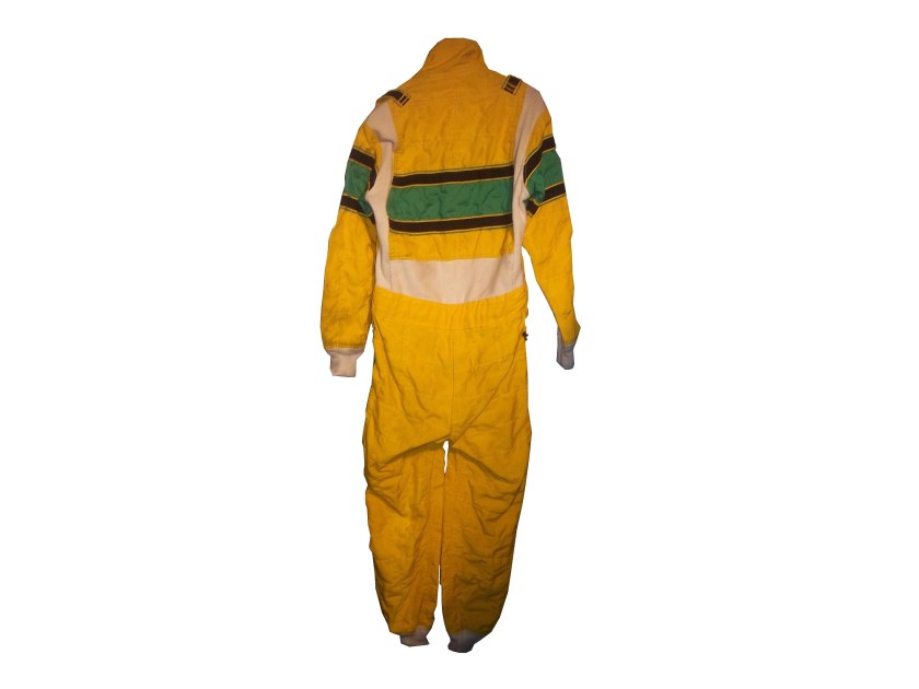
So what did these pre-Nomex driver suits look like? They looked like this. This is a driver suit made by Hinchman in Indianapolis. It is basically a polyester suit that is customizedto thedriver’spreference. It is not all that different than a jumpsuit that one would wear to work. It is a very flimsy material, has no cuffson the arms or legs, and, most amazingly, the tag states that the suit is “Untreated, will burn, must be dipped.” This suit was worn circa 1972, which is indicated by the “Archie Bunker for President” patch sewn into the chest. Like any new safety technology in sports, it takes time for it to become the standard, and for Nomex, this is no exception.
This race, along with the 1955 24 Hours of Le Mans and the 2001 Daytona 500 have their legacies written in death, but unlike other similar events, the lessons they had to teach were learned, and the racing world as a whole is better for them. The deaths in these events were not in vain, and others are alive because of them. 50 years later, those 6 days in May 1964 are still having an impact on racing.
I have been neglecting the Paint Scheme grades for the last few weeks, so after this brief post, we will focus on those this week. I want to clarify a term that I use regularly. I use the word “overdesigned” and what it basically means is that the paint scheme has design for design sake. The scheme has design that serves no real purpose, and was just added needlessly. Most things we own are, to a certain extent, over designed, mainly to prevent damage from regular use. But when a car uses needless design in a paint scheme, more often than not, it looks awful.
The other news items I wanted to get to are from Formula 1. I’m not an F1 fan per se, but I felt that these deserved some time on the DSB. First there was a major shift in how cars are numbered in F1. It used to be that were ever the driver finished in the previous season is what his car number was. Now the change has been made and instead it is that the drivers pick a number and then use that for their entire careers. Sky Sports covered the driver’s number choices in full, and I’m now a Daniel Ricardo fan! The 2014 F1 helmet designs have been released and the designs speak for themselves. This last item is about the man who is in charge of painting Lewis Hamilton’s Silver Arrow for the German-based Mercedes GP Petronas Formula One Team, my favorite team appearance wise in F1. Now we move on to…
Paint Scheme Reviews
Austin Dillon #3 American Ethanol Chevy SS For many years, green was considered an unlucky color in auto racing. That said, this is a decent scheme. The green used is very good, and the overall design is good. The green around the vent on the side is needless, but this scheme still works. A-
Austin Dillon #3 Bad Boy Buggies/Realtree Chevy SS I’m seriously considering giving any camo paint scheme an automatic F because not one that I have seen in the last 5 years looks good at all. This scheme is just awful. The white/camo scheme is hideous and I’m embarrassed to have to grade it. F
Jeff Gordon #24 Texas A&M Engineering Chevy SS Decent color scheme, but the side design is odd. It has a little too much design. The crooked Texas A&M logo looks odd here too. Still it is a decent design and earns a C+
Paul Menard #27 Menards/Quaker State Chevy SS Quaker State has a great shade of green, and it should be the dominant color of the car. The yellow base with green accents looks awkward. I’ll give it a C
Travis Kvapil #32 Ask More Get More Ford Fusion Two different schemes in two weeks is unusual and for whatever reason, the new car was a bit over designed. It still has a decent look and earns a B+
David Ragan #34 Taco Bell Ford Fusion Overall design and color schemes are good, and the only complaint is that the Taco Bell logo should be in color as opposed to black and white. A+
JJ Yeley #44 Phoenix Warehouse Chevy SS My first thought when I saw this scheme was it looked like the color scheme from the 1994-1995 NBA All-Star Game jerseys which is a decent color scheme. But to say the car is overdesigned is an understatement. This scheme is awful. Not even a great color scheme can help this car pass. F
Jeff Burton #66 Toyota Toyota Camry The stripe down the side is much too big, and the hood design looks odd. The color scheme is good, but the overall design is a D+
Dale Earnhardt Jr. #88 Mountain Dew Kickstart Chevy SS The black and green color scheme is good, and the side is a bit overdeisgned. If the green stripes were scaled back, it would work better. It is work a B- grade.
By David G. FirestoneFrom a design aspect, no other factor contributes as much as the primary sponsor or sponsors of the car. Everything from the colors to the torso design, to the television logos, to the shoulder epaulet and collar design depends on the primary sponsor. While this has been the case for the most part, how the primary sponsor is displayed can vary quite a bit.
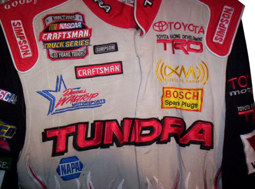
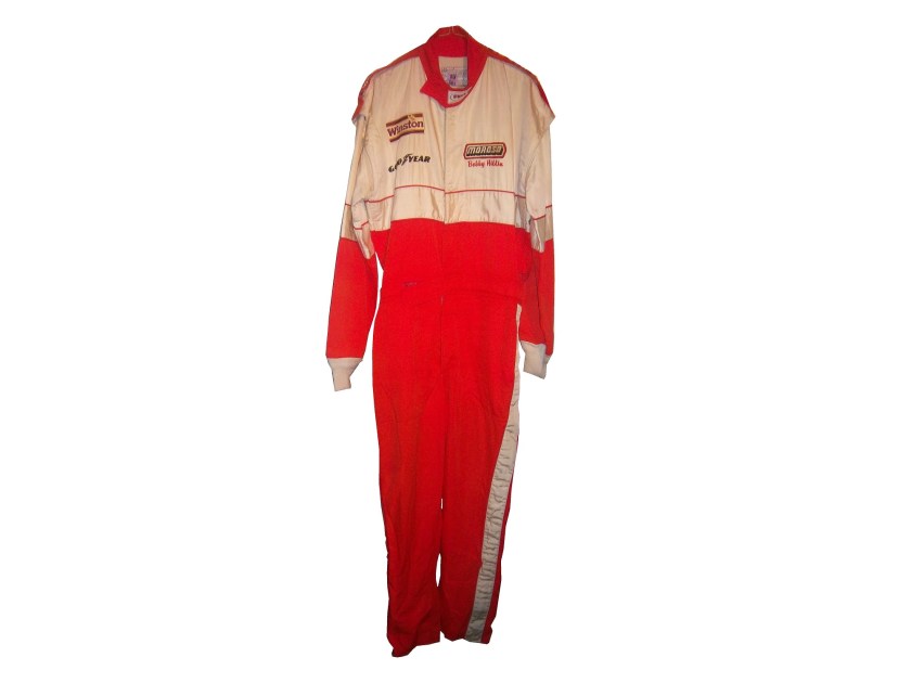
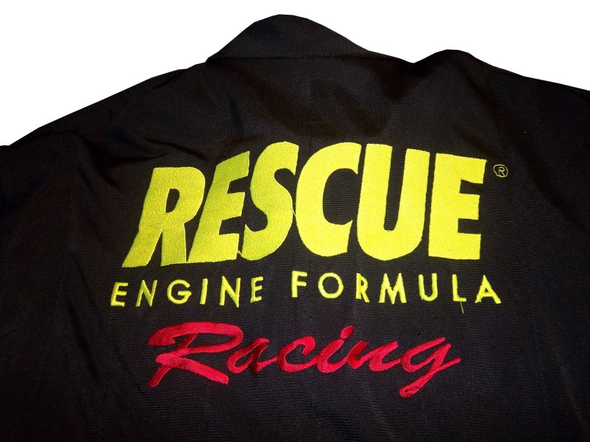
Currently, the standard design for a primary sponsor logo is to have a large logo across the front of the lower torso, and on the back on the upper torso. These Christian Fittipaldi designs from 2002-2003 are great examples of that. The Georgia Pacific design from 2002 has a decent sized logo on the front bottom torso, and the same logo higher up on the back torso.The Bugles example from 2003 has identical logo placement for the Bugles logo.Many driver suits feature this same logo placement.Taking a look at this Ricky Craven example from 1996, it features a design aspect that was very heavily used. The torso features a plan color, with a stripe across it with the sponsor name on that stripe. Dale Earnhardt Sr.used this design for many years, as did Rusty Wallace, Dick Trickle, and Steve Grissom among others. It is a fairly straightforward design, but it works very well.Other suits have the primary sponsor logo present, but the logo is underwhelming. This design is exampled by this Bobby Hillin Jr. Moroso driver suit from 1991, This Lake Speed example from 1997,
and this Ted Musgrave example from 1998.In very rare instances, a primary sponsor is excluded from the suit altogether. One example is this Terry Labonte suit I covered earlier this year. That example was made for Terry to wear in a very last minute driver change. Another example is this David Stremme suit from 2009. I covered this issue earlier in the year, but to sum it up, because of a conflict between Verizon, the sponsor of Stremme’s car, and Sprint, the title sponsor of the Sprint Cup race, Verizon was not allowed to have their logos on Stremme’s car and driver suit. As such, Stremme raced a Dodge sponsorship, and wore this suit.One of the newer designs that is frequently seen is what I call the leg stripe design. This Kasey Kahne example shows a leg design that has a large white stripe running up the red background, with the DODGE television logo running up the leg. Sponsors can make their logos stand out more with this design, so it is becoming more popular every year.This Scott Wimmer example is from 2002, and is rather unique in this category.It needs an explanation…The suit was worn for the entire 2002 season, which had a Siemens sponsorship for the first 25 races. After Siemens left the team, Scott Wimmer went on to win 4 of the next 9 races in an unsponsored black car with red and yellow flames…while wearing this suit.
While I get that the team not buying another suit for Wimmer to wear…it just looks weird.
Now this is another suit that needs an explanation. Nort Northam is a Porsche dealer based in Florida. He was a race car driver from 1979-1992, and his career was not great, with no wins, and two podiums. In 1988, he raced in the Sunbank 24 at Daytona, now called the Rolex 24 at Daytona in a Porsche owned by fellow driver Karl Durkheimer.During that race, he wore this driver suit. It appears on this suit that a sponsor patch has been removed or fallen off. Now to understand the basic design, you need to understand that Nort raced in two races a year, and having a suit custom designed would be a needless expense. As such, his name, and two sponsor patches did the trick. Not fancy, but effective. This late 1980’s SCCA example is also a minimalist design, but it sticks to the “80’s stripe” design as the Ricky Craven example.
The last thing about primary sponsors is that sometimes, primary sponsor designs follow other sports uniform trends. This example from 1998 was worn by Jeremy Mayfield. At that time, gigantic logos across the fronts of uniforms were the big thing, and that was not good. This fad did not last long, thank heavens!
Driver Suit Blog “Wheel Reviews”
Last night, I went to see the movie “Rush” and I have to say, it was really good. It has been said “you love your rivals, because you need someone to beat.” Nowhere is this more evident than Rush. Directed by Ron Howard and starring Daniel Brühl as Niki Lauda and Chris Hemsworth as James Hunt, Rush is the story of the rivalry between the two, from their days in Formula 3 in 1970, to Formula 1 in the 1970’s. For fans of racing movies, it is a true masterpiece.
The film takes the perspectives of the two drivers. Lauda is represented in the film as a talented driver who is great with setting up a race car. He is a driver who takes what he does very seriously. Hunt on the other hand is more of a playboy. He is a great driver, but his fast and furious lifestyle is a distraction from his true talent. Both are talented, but when Hesketh Racing, Hunt’s team can’t find sponsorship for the upcoming 1976 season, Hunt loses his ride. After his wife leaves for a ski trip, Hunt gets a ride with McLaren after Emerson Fittipaldi leaves to race for his cousin.
In 1976, Hunt struggles for the first part of the year, while Lauda, fresh off his 1975 World Championship is always a factor in the points standings. Hunt’s luck changes at the Spanish Grand Prix, where he beats Lauda, though he is disqualified for his car being less than an inch over regulation. Hunt’s wife divorces him, and driven by this, his season turns around. Though Lauda struggles at this point, the points standings are close coming into the German Grand Prix
The 1976 German Grand Prix was a critical point in this story, as the points battle was heating up. This race was at the the “Old Nürburgring” one of the most difficult tracks in the world. The weather was stormy, which kicks up the danger. Knowing the track as well as he did, Lauda called a meeting of the drivers and stated that the race should be canceled because of the conditions. Hunt thinks it is just a trick to take a race out of the schedule, and the cancellation is voted down. Lauda is seriously hurt in a wreck, and he is hospitalized. Hunt blames himself for the wreck. The story from there is the story of the 1976 Formula 1 World Championship.
The cars in the movie were very accurate, in some cases, vintage equipment was used. The tires used were made by Goodyear, and had the lettering in white as opposed to the yellow lettering that they currently use. The crew uniforms were very accurate as well. The driver uniforms were very well done, as were the helmets. Something that I noticed about them was that I couldn’t see any safety certification visible.
All in all, this is a great movie, and racing fans will enjoy this movie, so I give it an A!
Kyle Busch #18 M&M’s Halloween Toyota Camry The leaf designs on the bottom of the doors just look odd, and it takes a solid A scheme, to an A-. It does have great overall design and great colors, but the leaves just kill it.
Matt Kenseth #20 Home Depot/Let’s Do This Toyota Camry The overall scheme is great, and has a great color scheme. The problem is that the back end is yellow, which just looks odd when compared to the rest of the car. If the back was black, it would match quite well, but this is just bad. I want to give this scheme a higher grade, but the best I can do is a B-
Last week was the All-Star Showdown and the All-Star Race. These two events are magnets for special paint schemes. The top two finishers from the Showdown move to the All-Star Race. I have graded both events, starting with the Showdown. It is ranked from best to worst.
3 David Gilliland #38 Long John Silvers Ford Fusion Good color scheme, and the basic design used with that scheme on this car just makes it stand out. I’m not a fan of yellow on race cars in most cases, but I’ll overlook it this time because it is just so good. A+
4 Jeff Burton #31 Cat Chevy SS The scheme is solid, has good colors, great number designs and a good pattern used. Final Grade: A
6 Aric Almirola #43 Smithfield Ford Fusion Lose the design on the doors and it would be perfect. Other than that this scheme is perfect and earns a solid A
8 Terry Labonte #32 Oxy Water Ford Fusion I don’t know why, but I like this scheme. Normally I wouldn’t like the color scheme and basic design but for whatever reason, I like this. A-
9 Juan Pablo Montoya #42 Target Chevy SS Great color, great number design, and the pattern used is a lot more subtle than last year’s scheme. The quarter-panels have too many associate sponsors and looks too cluttered, keeping the Final Grade at a B.
10 Bobby Labonte #47 House Autry House Foods Toyota Camry The design is simple, but good. The color scheme need some work. The red used is too bright, as is the blue. The logo group on the quarter-panel is awful. B-. If the color wasn’t so bright, I could grade it higher.
15 Dave Blaney #7 Sany Chevy SS Great color scheme ruined by bad door design and generic racing number design. The design is just disgusting to look at, and it gets a D-
16 Casey Mears #13 Geico Ford Fusion Eww…just eww. The color scheme is dreadful, and the designs on the side are painful to look at. It passed because of the logo and number design. Final Grade: D-
17 David Stremme #30 Lean 1 Toyota Camry The best way I can describe this scheme is that there is nothing good about it. Anything they could have messed up with this scheme, they did. It gets an F
Now on to the All-Star Race. Jamie McMurray, and Ricky Stenhouse Jr. transferred in from their performances in the Showdown, and Danica Patrick was voted in. As such, their grades will be mentioned here.
2 David Ragan #34 CSX Play It Safe Ford Fusion This is a very solid scheme, with great colors, great design and an overall great look. CSX did this scheme very well and it gets an A+
3 Kyle Bush #18 Snickers Bites Toyota Camry A paint scheme that has a great color scheme, and illustrates the theory that less is more. Nothing bad about this Scheme-A+
14 Denny Hamlin #11 FedEx Express Toyota Camry The front nose design and stripes are awful. The color scheme is great, but the stripes kill it. The best grade I can give is a C+
15 Greg Biffle #16 3M Filtrete Ford Fusion-Could you please pick a color scheme and stick with it? Two different color schemes on the same car is just awful. But they are two good color schemes. C-
18 Matt Kenseth #20 Husky Toyota Camry Not much really to say, mediocre color scheme, no real design to comment on, the logos are plain Jane enough, it’s a bland scheme that earns a C grade. A mediocre grade for a mediocre scheme.
The Awful
19 Marcos Ambrose #9 Stanley/DeWalt Ford Fusion Is it normal to get seasick while looking at a paint scheme? The Petty Blue just does not work here, and the oval around the letters is pointless. The car looks awful even though it has a great color scheme and great sponsor logos. D
20 Kurt Busch #78 Furniture Row Military Appreciation Night Chevy SS I love the matte black that Furniture Row usually uses, so this is kind of disappointing. That said, the color are good, but the hood design needs work. The MILITARY APPRECIATION banner is much to small and it is hard to see at speed. A good scheme that has been ruined and earns a D-
Before I leave, I have two more pieces of business. First off, I would also like to extend congratulations to Tim Flock, Jack Ingram, Dale Jarrett, Maurice Petty, and Glen “Fireball” Roberts for being elected to the 2014 class of the NASCAR Hall of Fame.
With the sad passing of Dick Trickle, as well as the All-Star Race, and the Memorial Day trifecta next week, I decided today I needed a change of pace, and I wouldn’t think about racing or driver suits today. So with my uncle in town, we went to the Museum of Science and Industry in Chicago. It’s an amazing museum with a lot of fun things to see and do, and we had a great time.
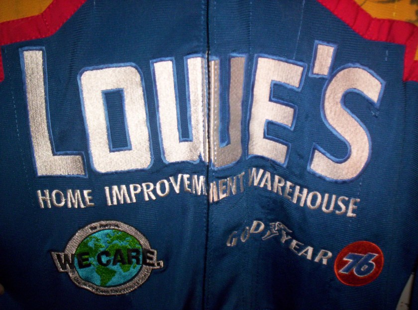
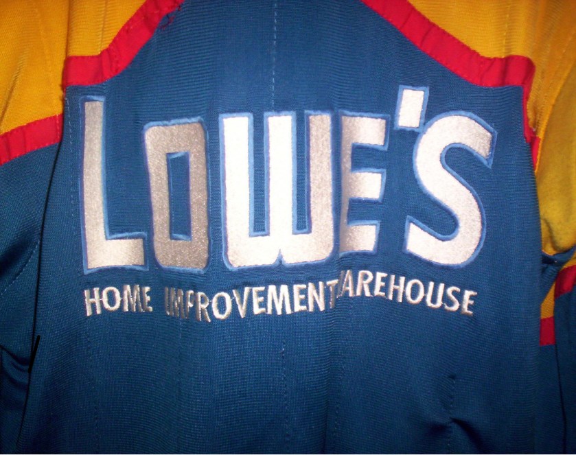
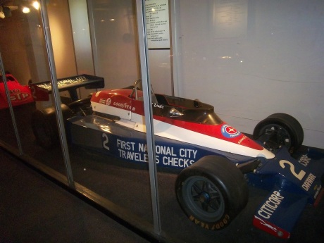
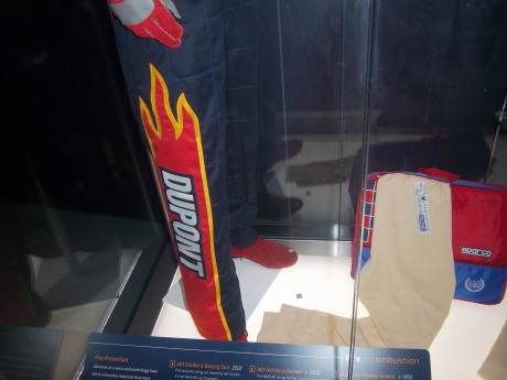
They have an exhibit that I saw concerning vintage cars, and a number of race cars. They have the winning car from the 1993 Sunrace USAA 1924 Marmon race car Wally Dallenbach’s car from the 1972 Indy 500 and Al Unser’s 1978 Lola race car that won the triple crown The Spirit Of America, which held the land speed record from August 1963 to October 1964, and still holds the record for world’s longest skid mark is also on display as well.There is a new exhibit as well, Science Storms, an impressive state of the art exhibit detailing the science of natural phenomena, and how modern society has to interact with it. It is on two floors in the main gallery. On the second floor, there are displays for physics, magnetism, electricity, and fire among other things. At the end of the balcony, there is a large Tesla coil mounted in the ceiling. Nearby, I was shocked to see this display:That is a Jeff Gordon driver suit, with a similar helmet. A helmet that has been bi-sected to display the fire protection that the helmetA helmet used for fire testing, and a Nomex hood.A racing helmet and matching goggles from the 1950,s and a 1975 drag racing helmet worn by Dennis Bacaand some Nomex undergarments and a Sparco bag. Now first off, why is the picture of Jeff Gordon from 2011 when the suit is from 2002? I think that it would be better if the picture of Gordon featured him wearing the suit on display. But that’s a minor complaint compared to some of the other issues the display has. The bag in the display clearly states “Jeff Gordon 2003.” So that might lead one to believe that the suit was from 2003. However after doing some research, the suit is from 2002. Looking at a 2003 suit, The Quaker State logo is different, the Lowes logo is gone, and the GMAC and Goodyear logos are in different places. So kudos to the museum for catching that.
The biggest issue is with the helmet cut in half. The sign clearly states “Jeff Gordon’s Helmet, Circa 2002.” Just taking a look at it, and I can clearly tell it’s not race-worn. I can tell for a number of reasons. Let’s start with the obvious fact that the color schemes on the helmet and driver suit are completely different. Second off, there are no ventilation ports or microphone equipment present. Since Gordon was wearing the vent on the left side of his helmet, the fact it is not there is very telling. Considering that DuPont Automotive Finishes paid nearly $12 million total to sponsor Gordon in 2002, his sponsor logos are conspicuously absent, and for a helmet that was supposedly worn for an entire racing season, it seems to be in very VERY good condition, almost new. It should also be noted that there are no HANS anchors present. At first I thought it was because the helmet was not meant to have them, but it turns out they were either supposed to be there, or have been removed. Why this occurred is not clear, but it clearly was NOT worn by Jeff Gordon. In fact, I would be shocked if he ever held this helmet. But there is one other issue with this display. The whole display is geared around fire protection, but there is no mention of safety certification. This is not a minor complaint, as the suit has a FIA certification on the back of the neck, but in the display is almost invisible.That picture, as bad as it is, is the best I can do, because the side of the display is inaccessible to viewers. If a display discussing fire safety, at least mention that the suit is certified to do just that!
Outside of that display, I had a great time at the Museum of Science and Industry, and I can look past those complaints to say that it is a really nice display that tells viewers a lot about racing safety. So if you are ever in Chicago, stop on over. I promise it is worth the time!
Now on to NASCAR All-Star Showdown Special Schemes…
Greg Biffle #16 3M Filtrete Ford Fusion-Could you please pick a color scheme and stick with it? Two different color schemes on the same car is just awful. But they are two good color schemes. C-
I would like to discuss some issues that have come up in recent weeks with the new Gen 6 car. These issues seem minor, but with this new car, they need to be addressed. And because these issues are issues, it leads to a conclusion that is kind of stunning in my mind.
Two issues revolve around Denny Hamilin. The first is his $25,000 fine for “criticizing the product.” and I’ll get to that in just a minute. The other one is his massive L1 Compression fracture that he suffered at Fontana. This injury should never have happened, but it did. The Gen 5 cars, as unattractive as they were design-wise, were safety-focused. The discussion on how safe they were ended with Michael McDowell’s scary wreck during qualifying at Texas in 2008. The car suffered serious damage, but McDowell was unhurt. This wreck was just as bad, but Hamlin is out of the car until he is fully healed.
NASCAR needs to be safety-focused, putting driver and fan safety before anything else. The fact that Denny has an L1 compression fracture because of a wreck is proof that there is a lot of room for improvement in the Gen 6 car. That isn’t the only issue with the car that needs to be addressed. The car seems to change with each race. At a super speedway, the spoiler is lower than it is at other tracks. At intermediate tracks the roof cameras are not used for reasons that have yet to be explained to the general public. It almost seems as though NASCAR is making the rules up as they go along. Please pick a design and setup and stick with it.
The other issue that needs to be discussed is penalties surrounding the new car. Denny Hamlin was fined $25,000 for saying that the car has room for improvement. Why was he fined for that? I understand that the car was designed by many different people, who put a lot of time and effort into it, but here is the thing…the people who designed the car are not the ones who are the focal point of racing, the driver is. If the drivers are complaining about the car not being competitive, and not driving the way it is supposed to, it should be addressed. The Gen 4 and Gen 5 cars went through a lot of refining, and so should the Gen 6 car.
One penalty that was issued was to Penske Racing for having suspension parts unapproved by NASCAR. Although all of Ford’s engines come from Roush Yates, many teams use their own designs for equipment used in the car. As such, these parts have to be approved by NASCAR. Obviously these parts weren’t approved. Yet Penske, Brad Keselwoski, and Joey Logano are swearing up and down that they were legal, and working in a gray area. If the parts are unapproved, they are unapproved.
The other major penalty was to Matt Kenseth for having a connector rod that was 3 grams under the minimum weight required by NASCAR. My concern with this issue is that the engine in question came from Toyota Racing Development. TRD knows what the rules and regulations are, and they knew what the parts should have been. I do not believe for a second that of the people involved with making the engine, not one of them knew didn’t realize that the parts were illegal. They knew what it was, and they sent it out anyway. That brings up an important question. 8 teams in the Sprint Cup work with TRD. In total that accounts for 10 different teams. Each team has a primary and backup car. There is also an additional engine at the teams disposal. So for each Toyota team there are 3 engines for use. If Matt Kenseth is running illegal equipment, who else is?
On to paint schemes…
Brad Keselowski #2 Redd’s Apple Ale Ford Fusion Black and Red is always a good scheme, and the overall design is good. The sticking point for me with this scheme is that APPLE ALE is almost invisible on the quarter panel. So for a final grade, it gets a B-
David Ragan #34 CSX Play It Safe Ford Fusion This is a very solid scheme, with great colors, great design and an overall great look. CSX did this scheme very well and it gets an A+
JJ Yeley #36 NASCAR Day Chevy SS Another simple yet attractive scheme that works very well. Nothing more to say than great job, and enjoy your A grade.
Ryan Newman #39 Code 3 Associates Chevy SS Ok, you can have either flames OR a racing stripe, but not both. Because the combo takes a good design and makes it into a horrible design. The only thing giving this scheme a passing grade is the color scheme being as good as it is, but it earns a D-
Travis Kvapil #93 Dominion Raceway Toyota Camry Am I the only one who thinks it is odd that a speedway that doesn’t exist yet is sponsoring a car for one race? That aside, the door design needs work, but the color scheme is solid, and I give it a B-