
A short-lived company called Sports Coverup made NASCAR replica helmets in the late 1990’s, and here are five examples.
Tag: mark martin
The Driver Suit Blog-Replica Helmets, and Why We Need Them In Racing Part 5
 By David G. Firestone
Last November, I discussed replica helmets. Between then and now, I came across a line of replica helmets that were released in the 1990’s. I sincerely don’t know how I missed these growing up. These look like the kinds of things that were marketed in the NASCAR catalog, and Winston Cup Illustrated.
The company that made them was called Sports Cover Up. They are long out of business, and this is the only product I was ever able to find them making. Helmet marketing was interesting back then because Simpson was marketing mini helmets of the drivers who they made helmets for, Bell made some too, but from what I’ve seen, these were done on a team by team basis.
There are two kinds. The first ones were made in 1997, and made of a softer plastic. It almost has a rubbery feel to it. The visor is stuck in place, and can’t be moved up, and they have a thick plastic bottom permanently attached to the helmet. There are 5 holes, one large and four tiny. As for the design, I was able to find three examples, Bill Elliott, Bobby Labonte, and Mark Martin. Bobby Labonte was sponsored by Interstate Batteries, and the motif looks good. Previously, Labonte had worn NFL helmet designs, but that went away, and was replaced with Interstate Batteries motifs, and this example looks really good.


Bill Elliott was sponsored by McDonald’s and the motif looks like a real McDonald’s helmet. McDonald’s has a really good shade of red, and it is frequently used on the helmets of the drivers they sponsor. This example really does look like a race helmet, though I don’t know who Serengeti, the visor stripe sponsor is though.


The Mark Martin helmet is great because it really looks like what Martin used to wear in the 1990’s when he was sponsored by Valvoline. The details are good, and the visor stripe is accurate too. One thing I noticed is that on the bottom, it states that Roush Racing was, at the time this helmet was made, located in Livonia Michigan. I never knew that. Apparently, the team was originally a small piece of Roush Enterprises, but has since grown into a racing powerhouse.


 Sports Cover Up released a second set of full-size helmets, which we will discuss next week.
The Driver Suit Blog-The Sprint Unlimited Preview
By David G. Firestone
The 36th Sprint Unlimited starts tonight at 8:15 ET on Fox. This marks the beginning of the Daytona 500 and the beginning of the NASCAR season. I will be looking forward to it, and I will enjoy it as always.
The field will feature pole award winners and past winners of the event. These include:
· Denny Hamlin (4 poles)
· Kyle Busch (3 poles)
· Joey Logano (2 poles)
· Jimmie Johnson (2 poles)
· Matt Kenseth (2 poles)
· Ryan Newman (2 poles)
· Dale Earnhardt Jr. (2 poles)
· Jeff Gordon (2 poles)
· Carl Edwards (2 poles)
· Marcos Ambrose (1 pole)
· Kurt Busch (1 pole)
· Kevin Harvick (1 pole)
· Brad Keselowski (1 pole)
· Mark Martin (1 pole)
· Jamie McMurray (1 pole)
· Danica Patrick (1 pole)
· Ricky Stenhouse Jr. (1 pole)
· Terry Labonte (past winner: 1985)
· Tony Stewart (past winner: 2001, 2002 and 2007)
The event will feature a number of segments which were voted on by NASCAR fans including myself, and many of you. The first segment will feature laps followed by a second segment of laps, and then a third segment of laps. Many special paint schemes will be run for this race, as is traditional. My personal favorite is the Miller Lite Throwback scheme being run by Brad Keselowski.
Now some factoids about the race.
*There are, in total, Chevy drivers, Ford drivers and Toyota drivers.
*Chevy has 20 wins, Ford has 7 wins, and Toyota has 1 win.
*Mark Martin has competed in 20 consecutive events from 1989-2008.
*Dale Earnhardt Sr. has won 6 events, more than anyone else in 1980, 1986, 1988, 1991, 1993, and 1995 and went on to win the Sprint Cup Championship 4 times in 1980, 1986, 1991, and 1993, he is one of 7 drives to do so.
*From 1979-2011 the event was sponsored by Anheuser-Busch, first called the Busch Clash which was the brainchild of Monty Roberts, brand manager of Busch Beer, who sponsored the Pole Award. It remained the Busch Clash until 1998, when Budweiser took over the Pole Award, and it was renamed the Budweiser Shootout. In 2012, Sprint, the series sponsor took over the sponsorship after Budweiser announced they would drop the sponsorship in favor of sponsoring the Duel Races that determine the starting order of the Daytona 500.
*Petty Enterprises was not eligible to run the Shootout because of a rule stating that only drivers that ran the Busch/Budweiser pole award decal were eligible to enter the shootout. Richard Petty and his family did not support alcohol sponsorship or decals on race cars. So John Andretti, Bobby Hamilton, Jeff Green, and Aric Almirola who all had a number of poles with Petty Enterprises were not eligible to participate. I find it interesting that Petty has reversed course on the alcohol sponsorship rule, since Kasey Kahne was sponsored by Budweiser, and Marcos Ambrose will run at least one race sponsored by Twisted Tea.
*Buddy Baker won the inaugural Sprint Unlimited in 1979, which was a 20 lap sprint.
*Since many top drivers were excluded from the race due to not winning a pole award, they moved to the TV booth as color commentators. These included Dale Earnhardt Sr. in 1981, Richard Petty and AJ Foyt in 1982 and 1983, Neil Bonnett in 1993, Darrell Waltrip in 1994, 1995, 1997, and 1999, and Kenny Wallace in 1998.
*There has never been a driver who has won the Sprint Unlimited, Budweiser Duel and Daytona 500 in the same year. Drivers have won 2 of 3 in a season, but never scored the hat trick.
*One of the first instances of a special paint scheme being used specifically for the Sprint Unlimited was the Chroma Premier scheme run by Jeff Gordon in 1997. He followed it up the next year with the legendary Chroma-lusion scheme, which feature a paint that changed color. Since then, special schemes have become commonplace.
*Richard Childress Racing has 8 Sprint Unlimited wins, most of any team. Hendrick Motorsports has 6 wins, and Joe Gibbs Racing has 5 wins.
The Unlimited starts tonight at 8 PM ET on Fox Sports 1, and I look forward to watching the event as I hope the rest of you do too.
Though I have had a VERY busy week, I still have time for…
Paint Scheme Reviews!
Kasey Kahne #5 Time Warner Cable Chevy SS It is a good color scheme, but the design on the side needs a little tweaking. Get rid of the needless zig-zag pattern and it works a whole lot better. It is still a decent scheme, so I will give it a C
Michael Annett #7 Pilot/Flying J Chevy SS Good color scheme, but the awful template is back for Tommy Baldwin. It is really sad, because this could be a great scheme, but the template takes it from an A to a C-
Michael Annett #7 Accell Construction Chevy SS See Above
Marcos Ambrose #9 Mac Tools Ford Fusion Good color scheme here, and decent design, worth a B
Clint Bowyer #15 AAA Insurance Toyota Camry Great color scheme, good design, worth a B+
Kyle Busch #18 M&M’s Peanut Toyota Camry I like this, it has a great shade of yellow, hard to find in NASCAR these days, and the peanut motif works very well. It is an original design, and I’ll give it an A
Trevor Bayne #21 Motorcraft Ford Fusion This is why The Wood Brothers won the Paint Schemies and took the top spot in the Paint Scheme Leaderboard. A++
Joey Logano #22 Autotrader.com Ford Fusion Sometimes orange works, sometimes it doesn’t. This is an example of an orange scheme that just doesn’t work. If the white was taken out completely it might work, but this is just horrid, and I give it an F
Cole Whitt #26 Speed Stick Gear Toyota Camry This is one of the few schemes that has both a classic and modern look at the same time, and paired with a great color scheme, it earns an A
Paul Menard #27 Menard’s/Peak Chevy SS Good design, awful color scheme, D+
Terry Labonte #32 C&J Energy Services Ford Fusion I’ll give it a C+ until I can see a picture WITHOUT an Instagram filter!
David Ragan #34 CSX Ford Fusion What in the hell is going on here? Why is the hood decal upside down? Why in the world would they do that? Were they drunk when they decaled the car? The only thing that I can guess is that it is designed for an in-car camera…but that makes no sense either! F-
David Gilliland #38 Loves Truck Stops Ford Fusion Good color scheme, decent design, plus unlike David Ragan, the hood decal is in the correct position, A-
Bobby Labonte #52 Phoenix Racing/HScott Motorsports Chevy SS Great color scheme, very simple yet attractive design, can’t say anything bad about it, A+
Michael Waltrip #66 Blue Def Toyota Camry While I like the field motif, it looks too much like the Windows XP Bliss background for me to take it seriously. I’ll give it a B-
Dale Earnhardt Jr. #88 Kelley Blue Book Chevy SS During my Daytona Preseason Thunder article, I said I wanted to see the #88 they used on a real car. I got my wish, and I like this design overall. The metallic gold is a bold choice, it doesn’t always work well. I give it an A+
BUT WAIT, THERE’S MORE!
As many of you know, I don’t just research and collect driver suits and racing items, I collect and research many other things. I recently had a column run in Uni-Watch concerning some lettering from the 1958 Washington Senators, and you can read my column here.
The Driver Suit Blog-Paint Scheme Leaderboard Part 4-The Grand Finale
By David G. Firestone
The focus group of one has had its meetings, and has made its decisions. Here are all 50 teams that ran the Sprint Cup this year ranked first to last on their paint schemes:
#1-Wood Brothers #21-A classic design scheme that just seems to get better with age. The Henry Ford design combines classic and modern elements for an amazing look.
#2-Hendrick Motorsports #48 Jimmie Johnson went with a very classic look, with a day scheme and a night scheme, which worked very well. Johnson did not have a bad look all year.
#3-Michael Waltrip Racing #55 Simple traditional designs. That is the secret to their success on the leaderboard. Color schemes are great as well. Nothing wrong with these schemes.
#4-Furniture Row Racing #78 When it came down to picking a number 1 for Chevy, for both the Paint Schemie and the Leaderboard, I had to flip a coin to pick a number 1, and Johnson won. Kurt Busch ran a series of very solid schemes, not a lot to comment on and it always looks good.
#5-Joe Gibbs Racing #18 Like Jimmie Johnson and Kurt Busch on the Chevy side, the Toyota winner for both the Paint Schemie and Leaderboard was decided by a coin flip. More modern than the 55, all these schemes are good, with amazing paint schemes and really good design.
#6-Richard Petty Motorsports #43 This team combines classic and modern looks, and uses Petty Blue very effectively. The Transportation Impact scheme was not good at all, and kept the 43 team out of the top spot. Extra Credit for the Maurice Petty Tribute Scheme.
#7-BK Racing #83 Great designs all around, but the hood needs work. Why is it black when the rest of the car is red?
#8-BK Racing #93 See Above, but the Old Dominion scheme drags it down.
#9-Penske Racing #12-Though only raced for one race, the SKF design worked very well. A great color and great design scheme. If this had been raced for multiple races, I would have ranked it higher, but it is still a solid scheme.
#10-Richard Childress Racing #29 The Bad Boy Buggies scheme is bad, and the Rheem/Budweiser combo scheme is awful, but aside from those, Kevin Harvick has had a very good season, paint scheme wise
#11-Earnhardt Ganassi Racing #42 Get rid of the Axe Apollo scheme and the Camouflage scheme, and Juan Pablo Montoya would have the top spot.
#12-Richard Petty Motorsports #9 This set earned a place in the top 5 because it improved by a lot over the course of the season. It has a great color scheme, but the early schemes were not great, but since Stanley redesigned their logo, and made some changes to the car, it is a very nice set.
#13-Phoenix Racing/Turner Scott #51 Guy Roofing and Hendrick Cars are hideous, but apart from that, they have run a great set of paint schemes. Bonus points given for the Neil Bonnett throwback scheme.
#14-Michael Waltrip Racing #56 The Get Back and Give Back scheme is horrid, but the rest of the schemes are really good.
#15-JTG Daugherty Racing #47 Most of what they ran this year was great, but the Bushes Baked Beans car has an odd overall design, and a weird color scheme. The Clorox scheme has a bad color scheme, as does the Charter scheme, as does the Wounded Warrior Project scheme.
#16-Roush Fenway Racing #17 A pinkwashing scheme as well as the Valvoline NexGen scheme kick Ricky Stenhouse Jr. out of the top spot. Sad thing too, as Ricky had a very solid year when it comes to paint schemes
#17-Joe Gibbs Racing #81 Alert Energy is awful. Double Mint is awesome.
#18-Penske Racing #2 While I miss the beer colored wheels from last year, Keselowski has had a decent year, the color scheme is great, though there is too much white on the car. The Redd’s Apple Ale scheme was great, but the Fan Mosaic and Patriotic schemes need some work.
#19-Roush Fenway Racing #16 Greg Biffle had a lot of great schemes, but he had a number of awful ones , including a pinkwashing scheme as well. Get rid of the pinkwashing scheme, the Scotchguard, give blood, and Megulars schemes, and he would be in the top 5.
#20-Richard Childress Racing #27 The yellow is too bright, but other than that, the schemes are really good.
#21-Stewart Haas Racing #14 Some of these schemes are good, others not so much.
#22Hendrick Motorsports #88 Dale Jr. runs good schemes most of the time, but Soldiers of Steel, Orange Amp Energy, and Camouflage are just brutal. Additional points lost for a pinkwashing scheme.
#23-Joe Gibbs Racing #20 If the Dollar General was more plain, and did not have the orange back, I would love to give Matt Kenseth a higher spot, and a pinkwashing scheme does not help.
#24-Earnhardt Ganassi Racing #1 Bad Boy Buggies is even worse here, and the Bass Pro Shop schemes are awful. A number of good schemes here as well.
#25-FAS Lane Racing #32 The Oxy Water scheme, and the gray scale C&J Energy Services schemes do not work, but the rest of the schemes they ran do
#26-Front Row Motorsports #38 The template they run works very well when the color scheme matches that of the sponsor. When it doesn’t match, it looks awful.
#27-Front Row Motorsports #35, See above
#28-Front Row Motorsports #34, See above, aside from the CSX scheme, which looks great, and the Peanut Patch scheme which looks awful.
#29-Tommy Baldwin Racing #36 This team looks better without a primary sponsor than they do with one.
#30-Max Q Motorsports #37 Simple, yet attractive. Would be higher if they ran more races.
#31-Joe Gibbs Racing #11 The Jason Leffler tribute scheme and the FedEx delivery manager schemes are great, but the rest are just awful. I miss the Gen 5 schemes
#32-Nemco Racing #87 The word that can best describe this set is dull. Not bad, but not spectacular.
#33-Circle Team Sport #40 Interstate Moving is really good. Moon Shine Attitude Attire is really awful, and their pinkwashing scheme is even worse.
#34-Roush Fenway Racing #99 Geek Squad and Fastenal work well, the rest…not so much.
#35-Richard Childress Racing #31 A few good schemes but most of them are mediocre at best.
#36-Hendrick Motorsports #24 See Above
#37-Stewart Haas Racing #10 Worst shades of yellow in NASCAR, and the pinkwashing scheme is so much worse.
#38-Michael Waltrip Racing #15 Clint has consistently run cars with great color schemes, but awful designs. Except for Duck Dynasty, and pinkwashing, which are just hideous.
#39-Humphrey Smith Racing #19 Another car that just looks better without a primary sponsor.
#40-Germain Racing #13 Nothing really wrong, but nothing really right with these schemes.
#41-Penske Racing #22 Red and yellow is a really great color scheme, but the design is all wrong. This design gets even worse with the AAA scheme, which has an even better color scheme. The Pennzoil scheme is good, but not good enough to save the set.
#42-Stewart Haas Racing #39 I have to give them credit, their schemes are mostly awful, but at least they are creative.
#43-Tommy Baldwin Racing #7 Worst. Door. Number. Ever. The rest of the car isn’t good either, and a pinkwashing scheme doesn’t help.
#44-Phil Parsons Racing# 98 The schemes come in one of two food groups, bland or awful. Great colors, but the designs are horrid.
#45-Levine Family Racing #95 Worst template in NASCAR.
#46-Hendrick Motorsports #5 Innovation can be a bad thing. This, for example is what happens when you let Karl Benjamin design your cars.
#47-Circle Sport/RCR #33 It amazes me how two different teams can use the same car number, and both can put awful designs on their cars. Special credit for the Honey Nut Cheerios scheme, which is just horrific.
#48-Xxxtreme Motorsports #44 Yuck.
#49-Hamilton-Means Racing #52 Paulie Harraka had a great scheme, but Brian Keselowski…not so much.
#50-Swan Racing #30/26 Please tell me this is an experiment on how to make the worst paint scheme in history? Is Swan Racing competing with Travis Pastrana for the most obnoxious paint scheme in NASCAR?
The Driver Suit Blog-Paint Scheme Leaderboard Part 3- Toyota
By David G. Firestone
The Paint Scheme Leaderboard continues with Toyota today. This has been a stressful series, and it will be even more so next week, when I rank all 50 teams in order from best to worst. Enough complaining, on to the schemes.
#1 Michael Waltrip Racing #55 Simple traditional designs. That is the secret to their success on the leaderboard. Color schemes are great as well. Nothing wrong with these schemes.
#2 Joe Gibbs Racing #18 Like Jimmie Johnson and Kurt Busch on the Chevy side, the Toyota winner for both the Paint Schemie and Leaderboard was decided by a coin flip. More modern than the 55, all these schemes are good, with amazing paint schemes and really good design.
#3 BK Racing #83 Great designs all around, but the hood needs work. Why is it black when the rest of the car is red?
#4 BK Racing #93 See Above, but the Old Dominion scheme drags it down.
#5 Michael Waltrip Racing #56 The Get Back and Give Back scheme is horrid, but the rest of the schemes are really good.
#6 JTG Daugherty Racing #47 Most of what they ran this year was great, but the Bushes Baked Beans car has an odd overall design, and a weird color scheme. The Clorox scheme has a bad color scheme, as does the Charter scheme, as does the Wounded Warrior Project scheme.
#7 Joe Gibbs Racing #81 Alert Energy is awful. Double Mint is awesome.
#8 Joe Gibbs Racing #20 If the Dollar General was more plain, and did not have the orange back, I would love to give Matt Kenseth a higher spot, and a pinkwashing scheme does not help.
#9 Joe Gibbs Racing #11 The Jason Leffler tribute scheme and the FedEx delivery manager schemes are great, but the rest are just awful. I miss the Gen 5 schemes
#10 Nemco Racing #87 The word that can best describe this set is dull. Not bad, but not spectacular.
#11 Michael Waltrip Racing #15 Clint has consistently run cars with great color schemes, but awful designs. Except for Duck Dynasty, and pinkwashing, which are just hideous.
#12 Humphrey Smith Racing #19 Another car that just looks better without a primary sponsor.
#13 Hamilton-Means Racing #52 Paulie Harraka had a great scheme, but Brian Keselowski…not so much.
#14 Swan Racing #30/26 Please tell me this is an experiment on how to make the worst paint scheme in history? Is Swan Racing competing with Travis Pastrana for the most obnoxious paint scheme in NASCAR?
Next Week, The big finale, all 49 teams ranked from best to worst!
The Driver Suit Blog-Paint Scheme Leaderboard Part 2- Chevy
By David G. Firestone
Last week, I ranked the Ford teams based on their paint schemes, and this week I will do the Chevy teams and next week I’ll rank the Toyota teams, so without further ado all the Chevy teams ranked from best to worst:
#1 Hendrick Motorsports #48 Jimmie Johnson went with a very classic look, with a day scheme and a night scheme, which worked very well. Johnson did not have a bad look all year.
#2 Furniture Row Racing #78 When it came down to picking a number 1 for Chevy, for both the Paint Schemie and the Leaderboard, I had to flip a coin to pick a number 1, and Johnson won. Kurt Busch ran a series of very solid schemes, not a lot to comment on and it always looks good.
#3 Richard Childress Racing #29 The Bad Boy Buggies scheme is bad, and the Rheem/Budweiser combo scheme is awful, but aside from those, Kevin Harvick has had a very good season, paint scheme wise
#4 Earnhardt Ganassi Racing #42 Get rid of the Axe Apollo scheme and the Camouflage scheme, and Juan Pablo Montoya would have the top spot.
#5 Phoenix Racing/Turner Scott #51 Guy Roofing and Hendrick Cars are hideous, but apart from that, they have run a great set of paint schemes. Bonus points given for the Neil Bonnett throwback scheme.
#6 Richard Childress Racing #27 The yellow is too bright, but other than that, the schemes are really good.
#7 Stewart Haas Racing #14 Some of these schemes are good, others not so much.
#8 Hendrick Motorsports #88 Dale Jr. runs good schemes most of the time, but Soldiers of Steel, Orange Amp Energy, and Camouflage are just brutal. Additional points lost for a pinkwashing scheme.
#9 Earnhardt Ganassi Racing #1 Bad Boy Buggies is even worse here, and the Bass Pro Shop schemes are awful. A number of good schemes here as well.
#10 Tommy Baldwin Racing #36 This team looks better without a primary sponsor than they do with one.
#11 Max Q Motorsports #37 Simple, yet attractive. Would be higher if they ran more races.
#12 Circle Team Sport #40 Interstate Moving is really good. Moon Shine Attitude Attire is really awful, and their pinkwashing scheme is even worse.
#13 Richard Childress Racing #31 A few good schemes but most of them are mediocre at best.
#14-Hendrick Motorsports #24 See Above
#14 Stewart Haas Racing #10 Worst shades of yellow in NASCAR, and the pinkwashing scheme is so much worse.
#15 Stewart Haas Racing #39 I have to give them credit, their schemes are mostly awful, but at least they are creative.
#16 Tommy Baldwin Racing #7 Worst. Door. Number. Ever. The rest of the car isn’t good either, and a pinkwashing scheme doesn’t help.
#17 Hendrick Motorsports #5 Innovation can be a bad thing. This, for example is what happens when you let Karl Benjamin design your cars.
#19 Circle Sport/RCR #33 It amazes me how two different teams can use the same car number, and both can put awful designs on their cars. Special credit for the Honey Nut Cheerios scheme, which is just horrific.
The Driver Suit Blog-Ladies and Gentlemen: The Paint Schemie Awards!
By David G. Firestone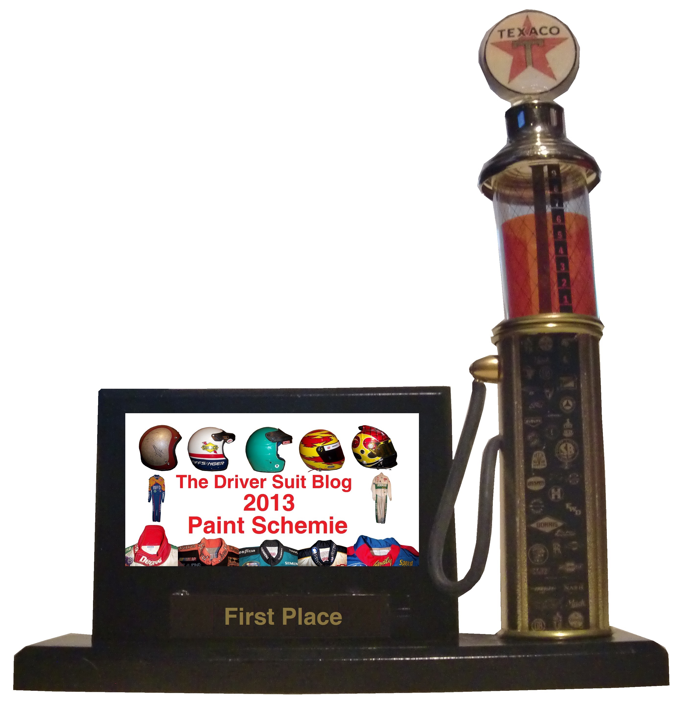
For the end of the 2013 Season, I will reveal the best and worst paint schemes and driver suits of 2013. This was done using a focus group of one, namely myself, and uses the following standards:
Color Scheme:How the colors look, and how they work with each other.
Overall Design:How good the design itself looks, is there too much, or not enough.
Primary Sponsor Logos: How the primary sponsor logos look on the car
Originality: How original is the scheme. Note that originality can work both for and against a scheme in award voting.
Let’s get the bad paint scheme awards out of the way.
First, the Paint Schemie Award for Worst Single Paint Scheme.
The nominees are:
Dave Blaney #7 Sany Ford Fusion
Clint Bowyer #15 Duck Dynasty Toyota Camry
Greg Biffle #16 Red Cross Give Blood Ford Fusion
Austin Dillon #33 Honey Nut Cheerios Chevy SS
Brian Keselowski #52 Star Coach Motor Tours Toyota Camry
And the Paint Schemie Award for worst single paint scheme goes to…
BRIAN KESELOWSKI #52 STAR COACH TOYOTA CAMRY
The next Paint Schemie Award is for Exhibition Race Paint Schemes. This category is a little different, as the Schemies will go to the best and worst special scheme that was run in either the Sprint Unlimited, the Sprint Showdown or the Sprint All-Star Race.
The Paint Schemie Award for Worst Exhibition Race Paint Scheme Goes To:
BRIAN KESELOWSKI’S SPRINT SHOWDOWN SCHEME
The Paint Schemie Worst Dressed Driver Award goes to
Joey Logano
Our next category is the Award For Worst Scheme Set of 2013, which is given to the team that consistently runs bad paint schemes throughout the season.
The Nominees Are:
David Stremme #30 Toyota Camry
The Winner for Worst Scheme Set of 2013 goes to:
DAVID STREMME #30 TOYOTA CAMRY
The Paint Schemie Award for Most Degraded Paint Scheme goes to Kasey Kahne, who’s scheme from 2013 is much worse than that of 2012.
Now the nominees for Best Single Paint Scheme are:
Kyle Busch #18 Doublemint Gum Toyota Camry
Trevor Bayne #21 Motorcraft/Quick Lane Ford Fusion
David Ragan #34 CSX Play it Safe Ford Fusion
Juan Pablo Montoya #42 Target Chevy SS
Jimmie Johnson #48 Lowes Chevy SS
David Reutimann #83 Burger King/Dr. Pepper Toyota Camry
The Paint Schemie Award for Best Single Paint Scheme Goes to
KYLE BUSCH #18 DOUBLEMINT GUM TOYOTA CAMRY
The next two Paint Schemie Awards are for Best Exhibition Race Paint Scheme, and Worst Exhibition . These are a little different, as they will go to the best and worst special scheme that was run in either the Sprint Unlimited, the Sprint Showdown or the Sprint All-Star Race.
And taking these schemes into consideration, the Paint Scheme Goes To:
JIMMIE JOHNSON’S SPRINT UNLIMTED SCHEME!
The Paint Schemie Award for Most Improved Paint Scheme goes to:
Kevin Harvick
who improved his schemes from 2012 to 2013
The Paint Schemie Best Dressed Award goes to:
Jimmie Johnson
Now, our final Paint Schemie Award, The Best Scheme Set of 2013:
Now for this, I will take a look at the best Chevy Schemes, followed by Ford, and then Toyota, and then finally I will reveal the winners of the Paint Schemie Awards.
And now, the 5 best Chevy teams that have consistently run great schemes:
#1 Jimmie Johnson The classic design that is paired with different color schemes every once in a while works very well. The design gives the car a very clean look, and is a very timeless look.
#2 Kurt Busch Furniture Row Racing’s “less is more” approach works very well here, with a matte black, white lettering and red letters. They always look good, thought I wish their results on the track were as good as they look.
#3 Kevin Harvick Kevin has had, for the most part, done quite well. All of the schemes have great color schemes, and most have great sponsor logos, and are decently original. Originality works well here, but some of the overall designs, namely the Bad Boy Buggies and Rheem/Budweiser combination schemes need a lot of work, but otherwise Kevin Harvick has had a great season paint scheme wise.
#4 Juan Pablo Montoya The Target scheme is very solid, with great colors, great overall design, and great sponsor logos. Not original, but solid. The most original scheme is the Axe Apollo scheme, but that was just brutal. It had a decent color scheme, and a decent sponsor logo, but the whole outer-space motif just did not work. If Axe Apollo was not on the car this year, Juan would be at the top of the standings.
#5 Phoenix Racing/Turner Scott Motorsports A team that has a very consistent track record when it comes to good color schemes, originality, as well as primary sponsor logos, the team can sometimes have serious issues with overall design. The Hendrick Cars scheme, and the Guy Roofing scheme are just brutal in that category.
Moving on to Ford.
#1 Trevor Bayne The Wood Brothers haven’t run a full schedule this year, but when they have shown up, they have always looked good. The schemes are original, since the Wood Brothers used these schemes for many years, and the colors, overall design, and sponsor schemes are always great.
#2 Aric Almirola The Transportation Impact scheme is keeping Almirola from the top spot, because it does not fit the team at all, and it just looks brutal. Other than that scheme, which while original, has awful colors, and overall design, every scheme they ran is solid, with the STP/Farmland scheme almost making up for Transportation Impact.
#3 Sam Hornish Jr. His one and only appearance in the Sprint Cup came at Kansas this year, and this one scheme, with great colors, great overall design, and great sponsor logos worked very well. I gave him 3rd, since everyone else on the list ran full schedules, and he only ran one race.
#4 Marcos Ambrose The Mac Tools scheme looks odd, with a great color scheme, but iffy overall design. The Stanley logo redesign could have worked well, but the black covering the front and headlights does not enhance the look at all. I was not a fan of this scheme at the beginning of the year, but some slight adjustments to the color scheme worked well.
#5 Ricky Stenhouse Jr. A “pinkwashing” scheme makes an appearance, which takes away from the overall grade. That said, this team has great color schemes all year, but some of the overall designs have a bit too much noise. Sponsor logos work well, and Ricky has had a great year.
Last, but certainly not least is Toyota.
#1 Michael Waltrip/Mark Martin/Brian Vickers Every scheme they have run has been a hit, with great color scheme, great overall design, great sponsor logos, and decent originality. No bad schemes here!
#2 Kyle Busch Overall great design, color schemes, and primary sponsor logos, Kyle also has the most original schemes of the top contenders for the Paint Schemie awards. That said, the Mprove America needs a different shade of blue, while the white Interstate Batteries scheme could use a different color besides white.
#3BK Racing Great color schemes, sponsor logos, and overall design. These designs work well, except for the Old Dominion scheme, which is just awful. Everything that the other schemes are, Old Dominion is not, and it is keeping BK Racing out of the top spot.
#4 Martin Truex Jr. Overall, this team works well when it comes to colors, overall design, originality, and primary sponsor logos, except for the camouflage scheme. The camouflage scheme was awful, and it knocked Martin out of the top spot.
#5 JTG Daugherty Racing Most of what they ran this year was great, but the Bushes Baked Beans car has an odd overall design, and a weird color scheme. The Clorox scheme has a bad color scheme, as does the Charter scheme. If these schemes were fixed, there is no reason why JTG Daugherty could be in the top spot.
Now I will take these top contenders, and rank them in order from worst to best. These top contenders should feel very proud that they have earned a spot on the countdown.
#13 Martin Truex Jr.
#12 Phoenix Racing/Turner Scott Motorsports
#11 Marcos Ambrose
#5 Kyle Busch
#4 Kurt Busch
#3 Michael Waltrip/Mark Martin/Brian Vickers
And Finally The Paint Scheme Award for Best Paint Scheme Set of 2013 goes to:
#1 Trevor Bayne
Congratulations to everyone who won a First award, and to everyone who won a Worst award…paint your cars better!
To conclude the Paint Schemie Awards, I will finish with a top 10 list I have been wanting to do for quite a while. These are the
TOP 10 SPONSORS I MISS IN NASCAR
10 Skoal Bandit The shade of green they used was one of the best, and the car has a classic look that always looks good.
9 Kodiak A simple look, with my all-time favorite shade of green ever used on a race car. I have a lot of Kodiak race-used items, and they all look good.
8 Miller Genuine Draft Rusty’s MGD scheme had a much simpler design than the Miller Lite scheme, and it had a much better color scheme. I really hope they throwback to this scheme at some point.
7 Tide Are there any orange schemes that could ever live up to Tide? No, this is the best orange scheme in the history of auto racing.
6 Smokin’ Joe’s It had a great color scheme, and it had a very 1990’s design, that oddly enough still looks attractive.
5 Western Auto/Parts America The chrome numbers, the layered fading, the color scheme, it just comes together very well.
4 The Family Channel The logo is awesome, the colors can’t be any better, the lettering is great, and it just comes together very well.
3 Kodak If there is or was a better shade of yellow in NASCAR, I haven’t seen it yet!
2 Texaco/Havoline Great simple design, with an amazing hood logo, and great color scheme.
1 GM Goodwrench This scheme is, in a word, perfect. It doesn’t evolve, it doesn’t have to. It is simply perfect.
There is one last piece of business that I need to address. I like to keep it light on the Driver Suit Blog, but sometimes I have to address a news story that is heavy, like this story that was released on Thursday. Dario Franchiti, who has won 3 Indy 500’s, 4 Indycar Championships, and 21 races announced on Thursday, that due to injuries sustained at the Shell and Pennzoil Grand Prix of Houston on October 6. During that race, he was involved in a scary wreck, and suffered spinal and knee injuries that doctors have told him are too serious to resume his career. 13 fans, who were in the wrong place at the wrong time were injured in the wreck as well. I’m saddened that a talented driver had his career end like that, and I really wish it didn’t have to. But what I really hope is that IndyCar learns what lessons need to be learned, and make changes to safety so that the chances of this scenario repeating are lowered. I know that there will always be the risk of injury or death in auto racing, that adds to the mystique of the race car driver, but every wreck has a story to tell. These stories should be looked over, and changes made so that another talented in the prime of his career does not have to go through what Dario had to this week. Fans should also be able to go to a race, and not have to worry about getting hurt during a wreck. If the investigation in this incident results in changes that keep fans and drivers from serious injury in the future, than the lessons have been learned. My thoughts and prayers are with Dario and his Family right now.
