By David G. Firestone
The NASCAR Sprint Cup Series has a unique tradition that stretches back to the 1970’s, the Series Logo. Series Logos are now commonplace in most forms of racing, excluding Formula 1, which does not need a series logo. The evolution of the NASCAR Sprint Cup Series logo over the years in interesting.
1972-1981 This logo is designed in classic 1970’s design, and can be seen on driver suits, as this Dale Earnhardt Sr. example from 1980 clearly shows.
1982-1988 The “1 Car” logo was a major redesign, and features a logo, with NASCAR GRAND NATIONAL SERIES embroidered, and a 1980’s car. Very visible on driver suits from the era.
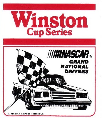
1989-1992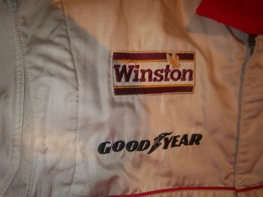 A simple Winston logo, which, while underwhelming is very visible on this Bobby Hillin Jr. Suit, andthis photo of Dale Earnhardt Sr. from 1992…and look who is next to him!
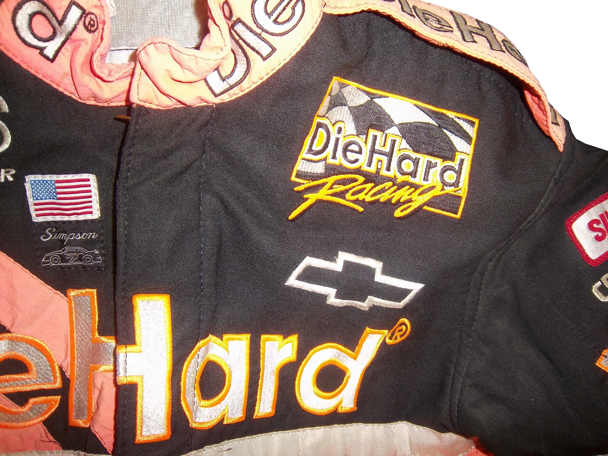
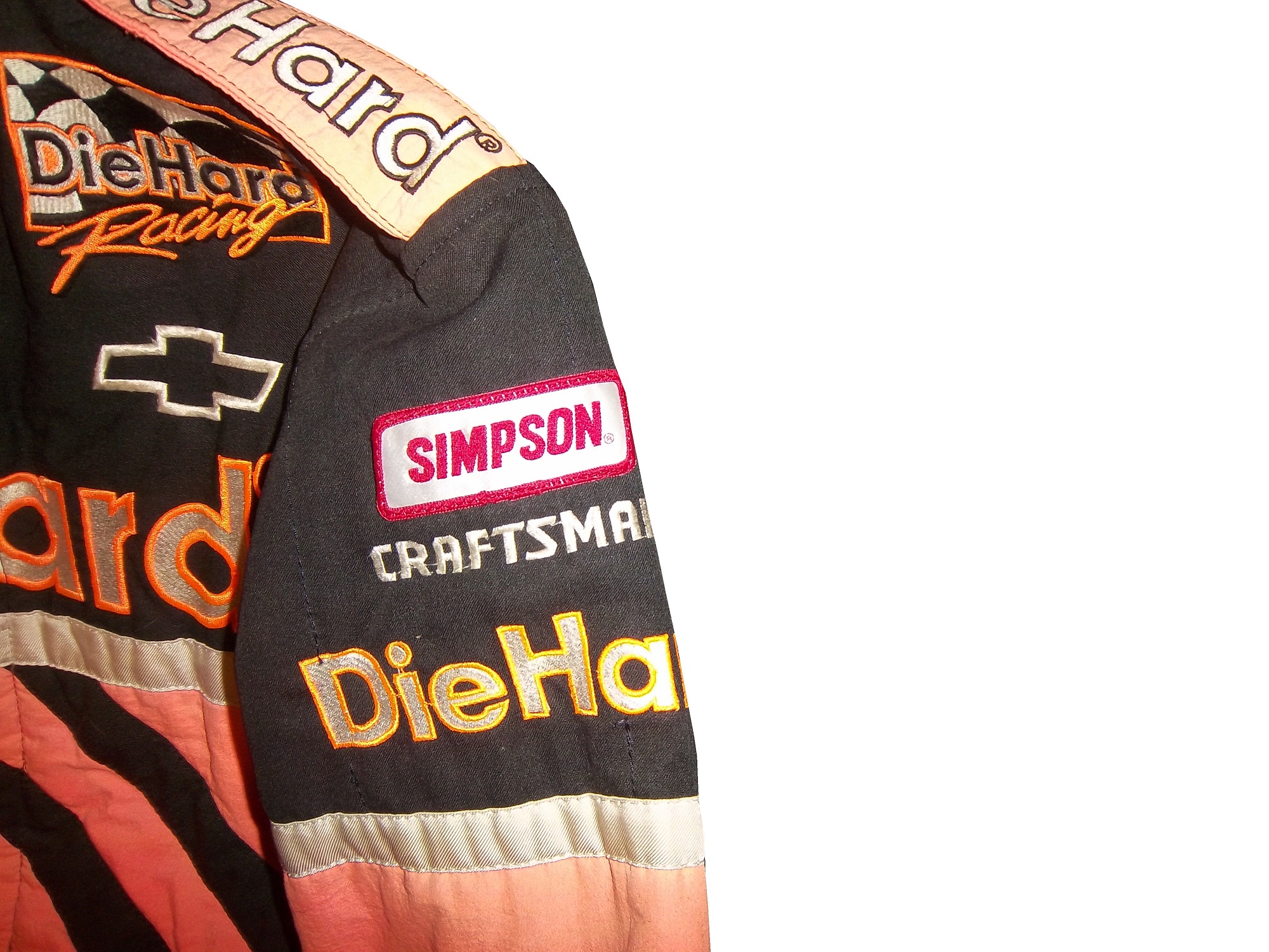
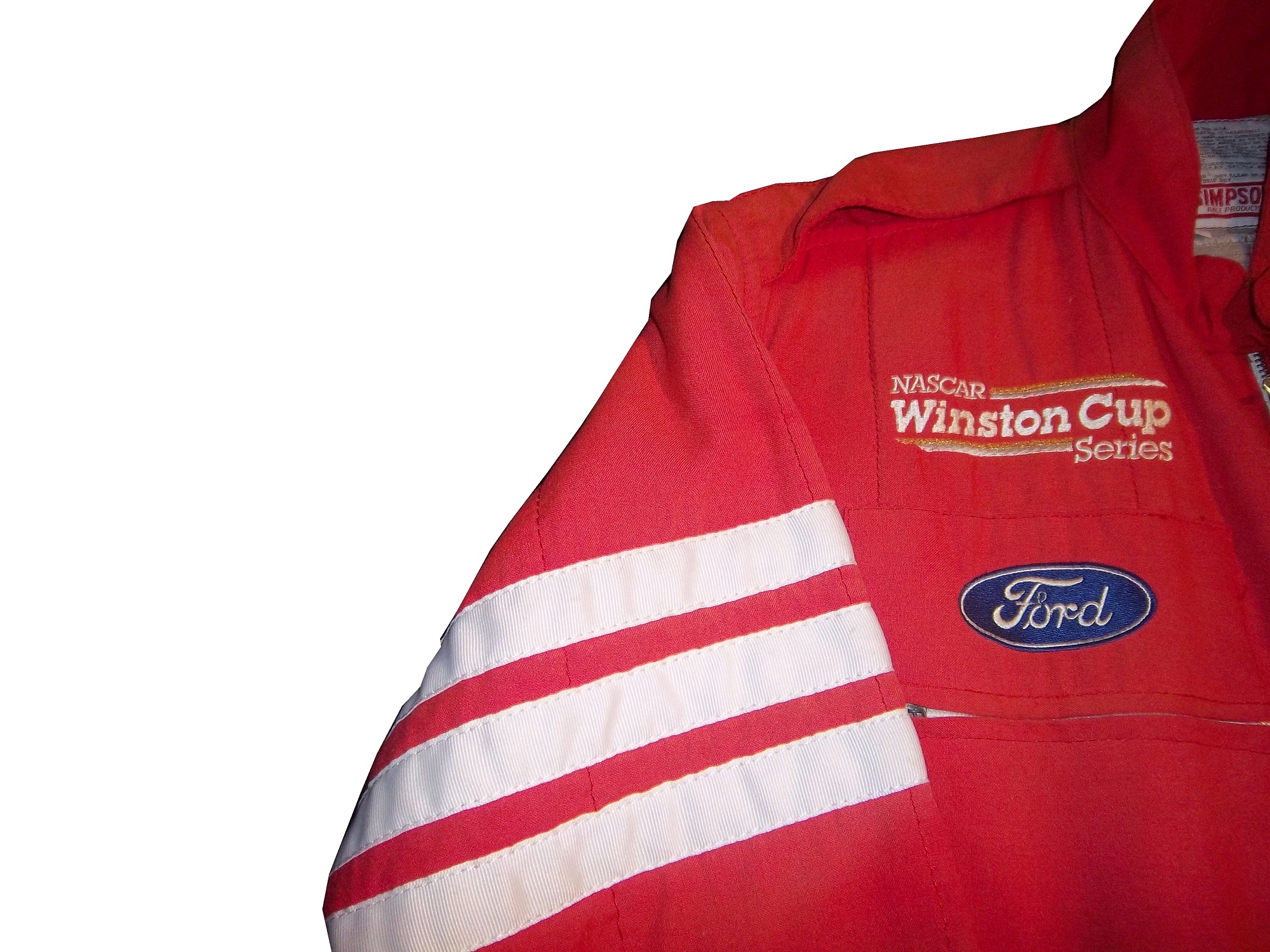
1993-1996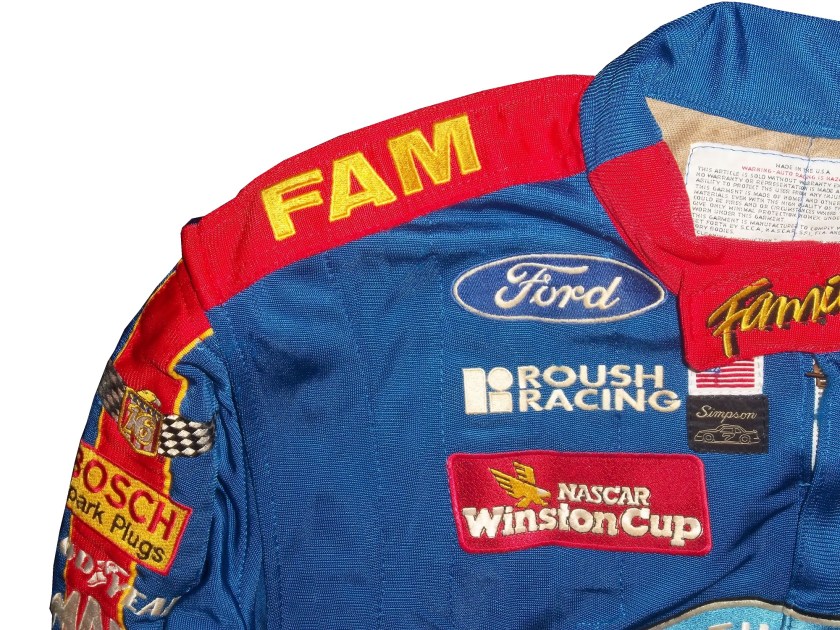 Again an underwhelming yet attractive series logo. The interesting thing about logos from 1993-2001 is that there are two designs, red with white lettering that displayed better on light driver suits, and white with red lettering that displayed better on dark colored driver suits. Though the rule was rather ambiguous for a while.
1997-1999 This design went through some changes when Winston changed the design of their packaging. Starting in 1998, Winston went from a rounder typeface to a narrower and straighter typeface, as a young Tony Stewart is modeling.
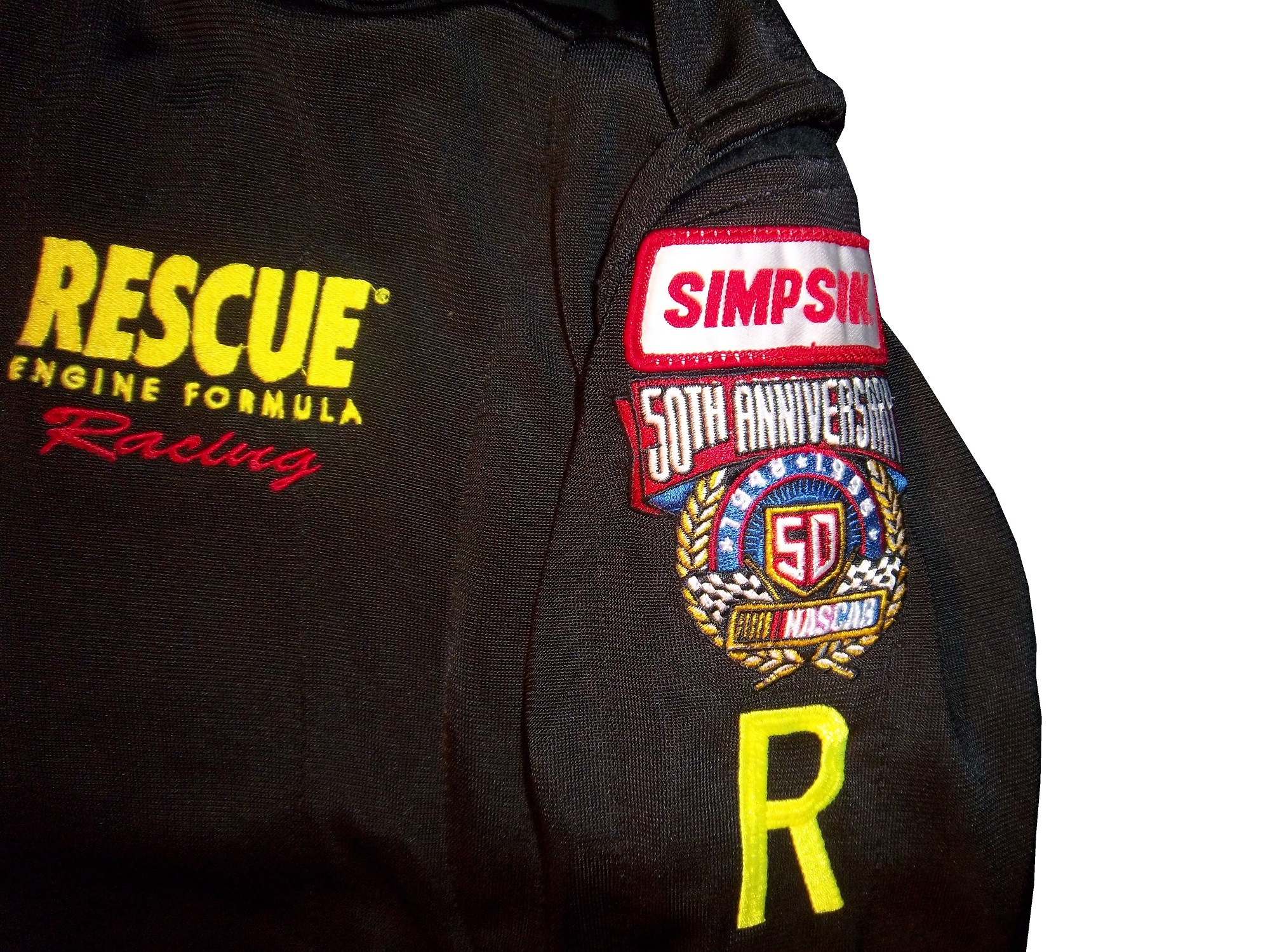
1998: Every team and driver ran the NASCAR 50th Anniversary logo on their cars and driver suits. Not bad at all.
2000-2001 A square design with an oval logo was used from 2000-2001, with the color-flipping returning. At this point, the discussion of who would replace Winston started, as due to legislation, cigarettes would not be allowed to sponsor auto racing within the next few years.
2002-2003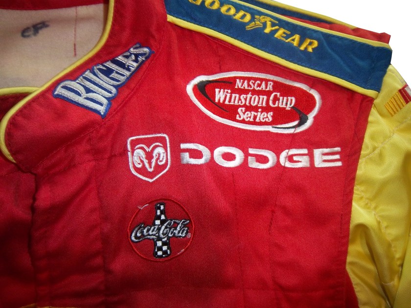
 The transitional oval logo. The Busch Grand National series had adopted an oval logo in 1995, and since the series would change sponsorships in 2004, this new logo would be the bridge between the old and the new.
2004-2007 New sponsor, new colors, new shape. Nextell Communications took over in 2004 and it became the Nextell Cup Series. This logo would remain constant until Sprint and Nextell merged, which led to:
2008-Present:Same color scheme, same shape, same basic design.
The logo has become a marketing point for NASCAR teams and NASCAR itself. Die casts, driver uniform coats, t-shirts, pit crew shirts, and many other items carry these logos.
Now on to the Nationwide Series
1982-1994
These two logos were used for the Busch Grand National series. The plain Busch logo worked better and was used more often than the Busch Beer Series logo.
1995-2004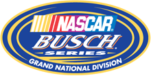 An oval logo with the sponsor name, and GRAND NATIONAL SERIES added below. It was very marketable and worked quite well as a logo.
2004-2007 Grand National Series has been removed, and some minor redesigns to BUSCH and the NASCAR logo as well. 2006 featured the 25th Anniversary logo.
2007-Present Complete redesign for the NASCAR Nationwide Series which began when Nationwide took over the titular sponsorship of the series. Uneven oval with a Nationwide logo, and a NASCAR logo, with a new overall design and color scheme.
Last but certainly not least the Truck Series
1995: For the first season, the Truck Series was referred to as the “Super Truck Series by Craftsman.” It featured a decidedly early 1990’s logo. It lasted for only one season.
1996-2002 The Craftsman Truck Series is a better name and the logo, while still bearing a 1990’s style design, is more refined and professional.
2003-2008 The entire logo is inside the oval, some minor color and typeface changes are present as well. 2005 featured the 10th anniversary logo.
 2009-Present
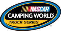 The same off-center oval design as the Nationwide Series and Sprint Cup logos, with a sponsor redesign for Camping World, who took over for Craftsman after 2009.
Paint Scheme Reviews
Jamie McMurray #1 Bad Boy Buggies Chevy SS Not a bad scheme, colors work well, and the ovarall design is simple yet attractive, I give it an A+
Greg Biffle #16 Bondo/3M Ford Fusion The color scheme is good, but the red designs on a red background just look odd. If it was a white design, it would work well, but this just looks odd. Still, it’s odd, but not awful, so I will give it a C
Ricky Stenhouse #17 Nationwide Insurance Ford Fusion Um…This has a great color scheme and a great simple design, but this just does not work. Too much black, and not enough silver and blue. It would work well if the blue and silver were the predominant colors, and black was the where the silver is. I can give this a C
Austin Dillon #33 Advocare Chevy SS It works very well, great color scheme and great desgin…except for the black outline around the numbers. Why? The stripes don’t interfere with it at all. If it was just a small black outline around the edge of the numbers it would work, but the black negative space area is just distracting. Without the black, it would be an A, but this scheme earns a B-
David Ragan #34 Peanut Patch Hot Boiled Peanuts/Race Trac Ford Fusion While the color scheme brings back memories of the Houston Astros Tequila Sunrise jerseys, the overall design is good. I like the mountain-esque design, but the random peanuts scattered over the hood and quarter panels are just awful. I really want to give this a better grade, but a C- is the best I can do for this scheme.
Josh Wise #35 Carson-Newman University Ford Fusion Great color scheme, and great design…except for the eagle. Why is the eagle facing the back of the car? If the eagle was facing the front, I would give this scheme an A, but this just looks bad, and takes the grade down to a C
Landon Cassill #40 Moonshine Attitude Attire Chevy SS Ok, let me make this clear…hunting camouflage is not, has never been, and never will be an acceptable background color for a race car. It didn’t work for Duck Dynasty, and it doesn’t work for this car, and it gets an F
Aric Almirola #43 Rain Eater Wiper Blades/Charter Communications Ford Fusion This color scheme works very well, except for the hood logo, where the green logo is next to invisible on the Petty blue of the hood. But even so, the scheme as a whole works very well, so I’ll give it an A.
Ryan Truex #51 Seawatch Chevy SS Having never heard of Seawatch, I thought it was an activist group at first, but Seawatch is actually a very well established clam company based in Maryland. The overall design is really good, though the wave next to the rear wheel well is a bit out of place. Still it looked very good on the track, and I give it an A.
Justin Allgaier #51 Brandt Chevy SS A timeless design, with a great color scheme and a great design that earns an A
Dale Earnhardt Jr. #88 Race 2 Achieve/National Guard Chevy SS Race 2 Achieve is a program that teaches advanced math through the eyes of Hendrick Motorsports engineers. It shows how the engineers use Algebra II and trigonometry to solve problems on the race car. This is a great old-school scheme, with a great color scheme, and great overall simple design. A+
Dale Earnhardt Jr. #88 National Guard/Breast Cancer Awareness Chevy SS Oh God! October is coming therefore, the pinkwashing must start. For those who don’t know the term, “Pinkwashing” is the process of using pink ribbons and/or the pink color to sell products, many of which are inherently unhealthy, with a “portion of the proceeds going to support the fight against breast cancer.” Sadly, most of these funds do not go to serious research, but rather to “feel good” causes such as the Susan G. Komen foundation. Because it is used as a marketing gimmick, and I, as well as my mom who is a breast cancer survivor are opposed to pinkwashing, any and every pink paint scheme, regardless of how good it looks, will earn an automatic F- grade.
Michael McDowell #98 Victory Junction Ford Fusion Unlike Komen, Victory Junction is a cause most people can support. Founded by the Petty Family, after the death of Adam Petty, Victory Junction is a camp for children with terminal and chronic illnesses, so while they are there, they can forget about the troubles of life, and have fun. That said, this is a great scheme, with a very simple yet attractive design, and great colors. The only bad thing I can say about this scheme is that I would love the logo on the quarter panels. That one thing can’t take away from an A+ scheme.


 By David G. Firestone
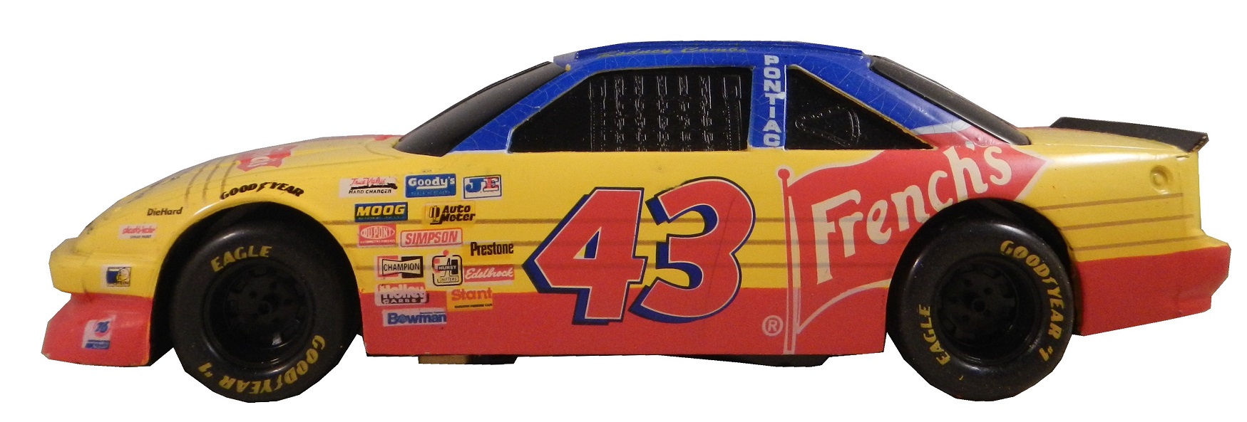
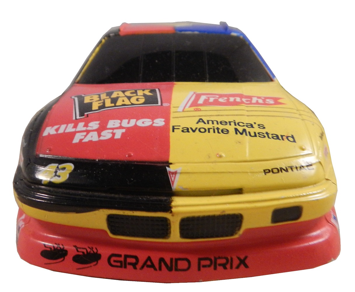

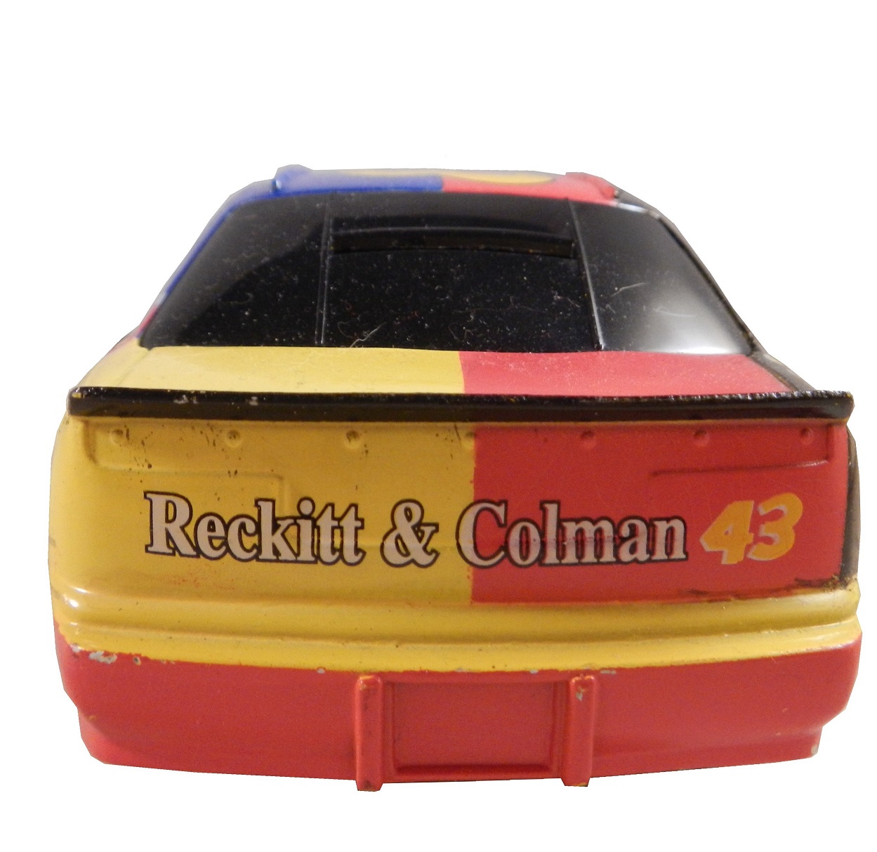


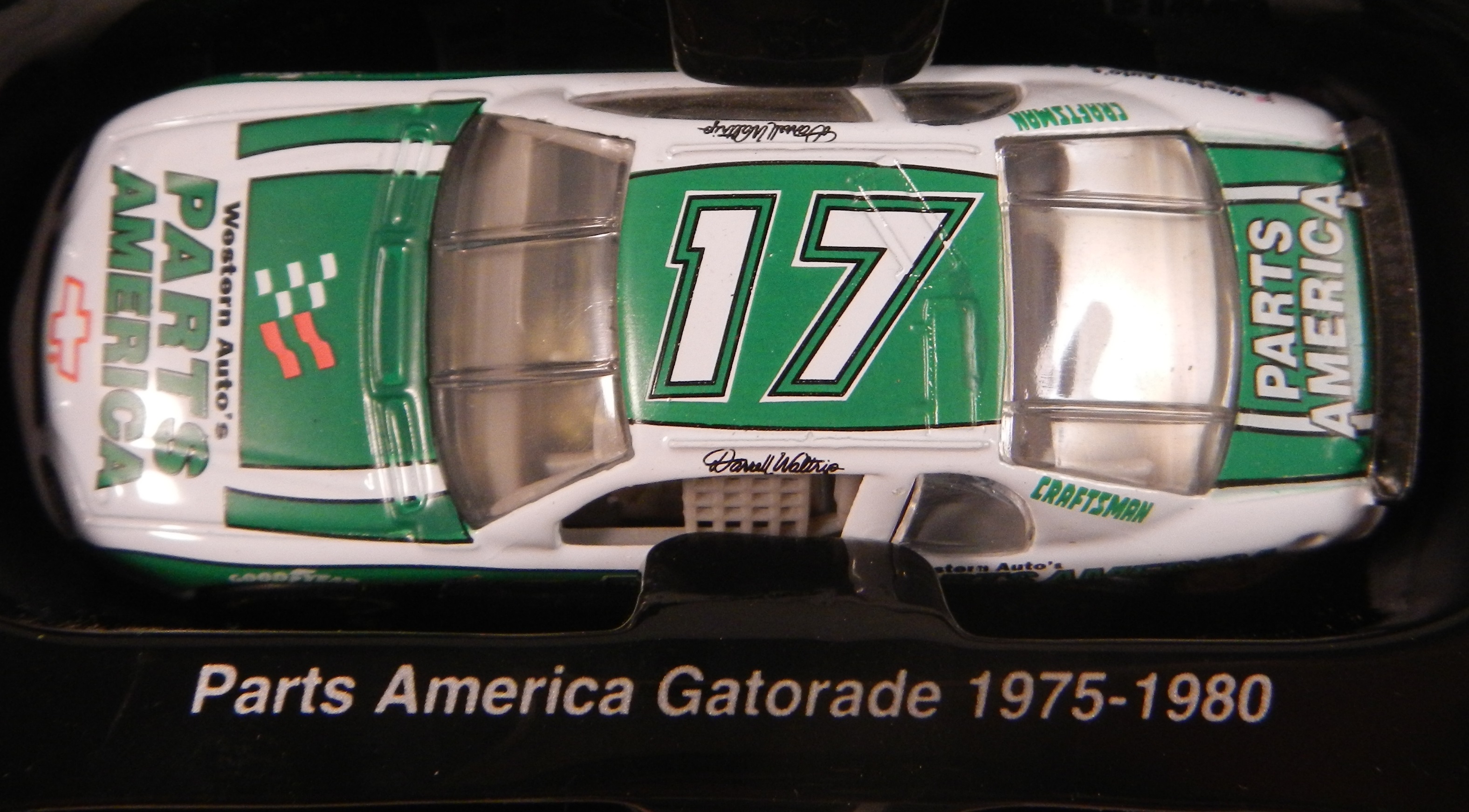
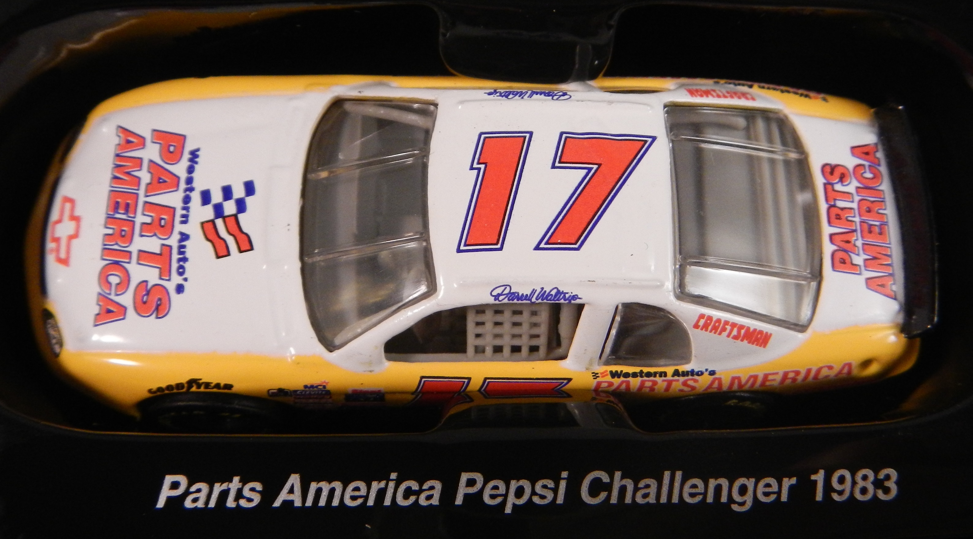
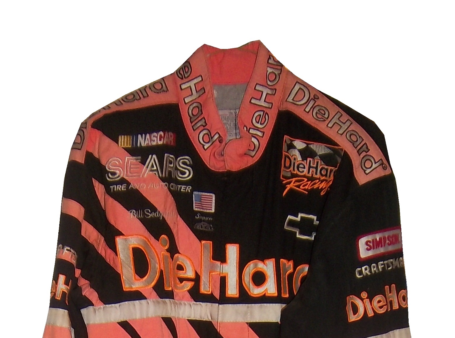
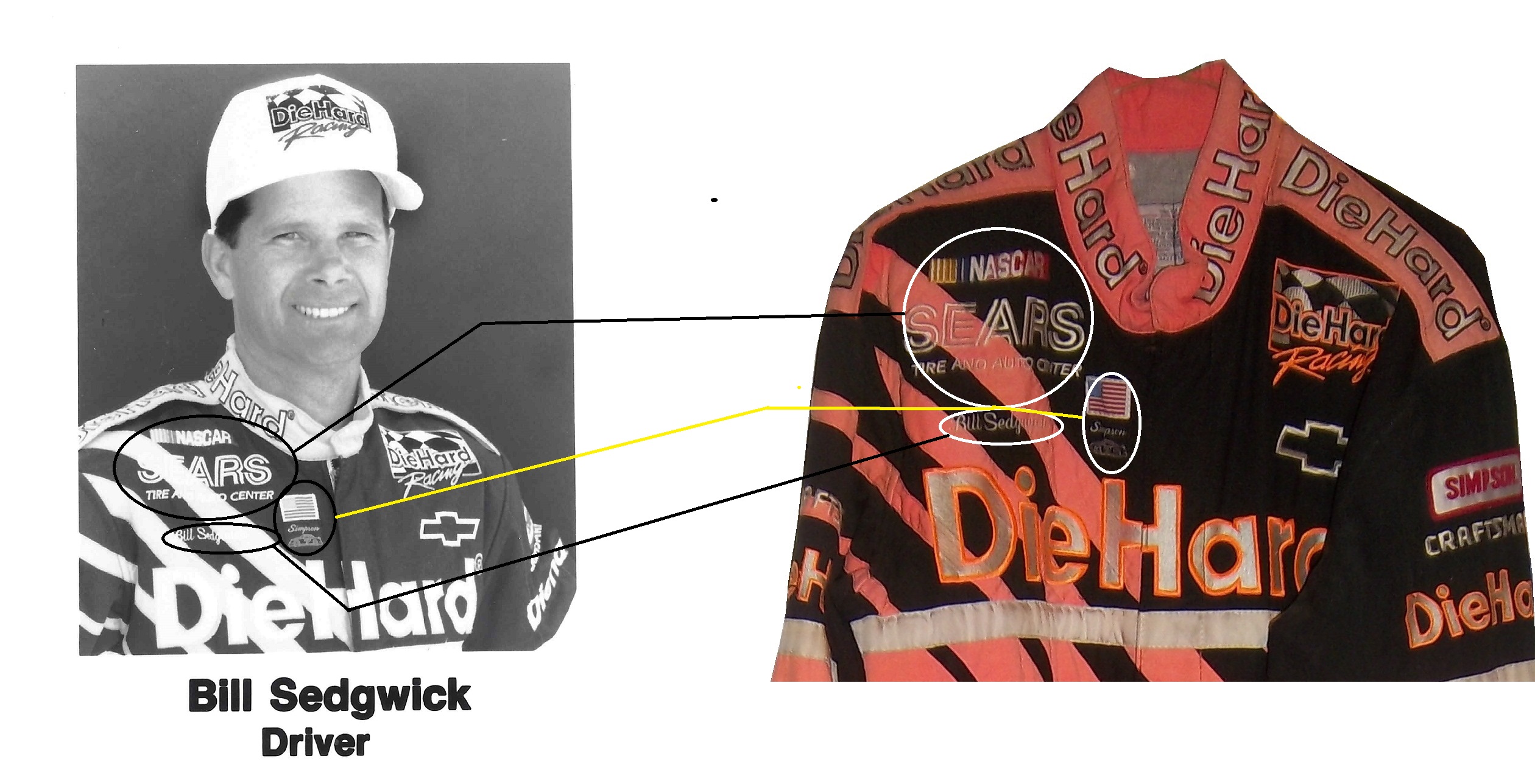
 Yes this was an actual paint scheme used on a real race car. I had never seen a design scheme like this before or since. It is one of the oddest paint schemes I have ever seen. Normally if two different companies sponsor a car, one runs their scheme for a number of races, and the other runs their scheme for a number of races. The driver suit is no less unusual. But I bought this for another reason besides just the paint scheme. This is an example of a NASCAR bank. These were marketed for a number of years to kids as collectibles. They were marketed to kids in the late 1980’s through the mid 1990’s. They are 1:24 scale, and are the same design as their die-cast toy counterparts. They faded out after a while. After trying to use one, I now understand why they faded from use. Let’s look at the bottom.
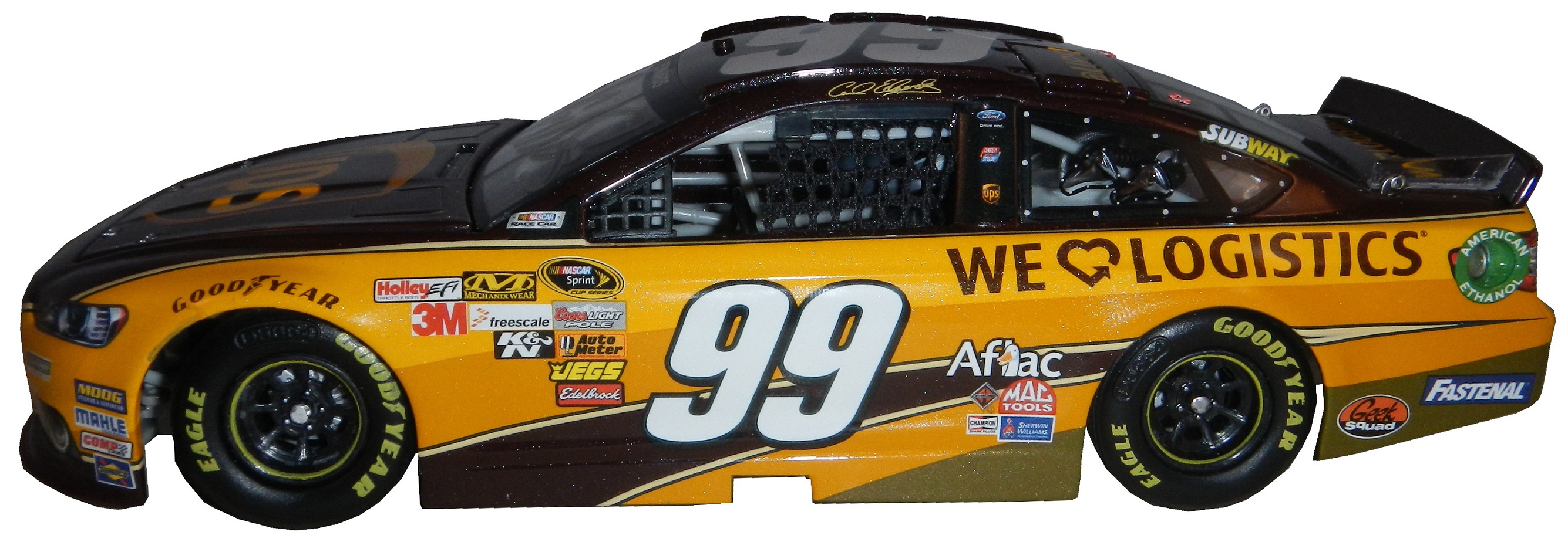 Carl ran the UPS scheme for one race in 2013, at the Quaker State 400, where he started 2nd, led 35 laps, but finished 21st. This is an autographed version, of which only 900 were sold by Lionel. Unlike the bank, this is a very accurate design. It’s made of a more lightweight metal, the window net is cloth,
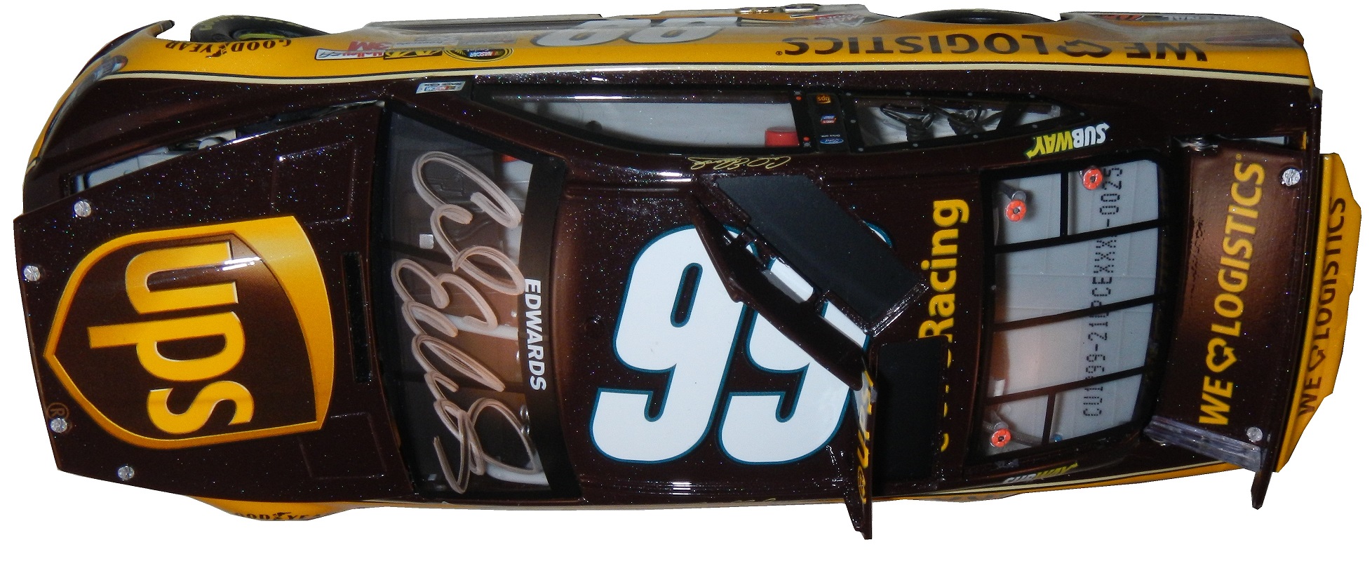
 the grill is accurate,
 so are the door decals.
 The hood opens,

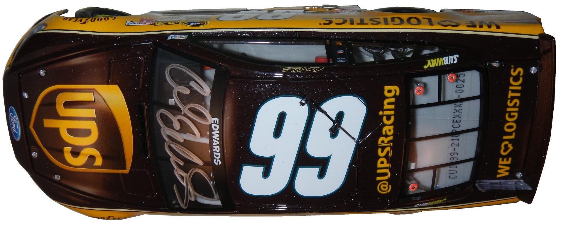
 It has all the details of it’s on track counterparts at a 1:24 scale, with a nice Carl Edwards signature on the windshield. My biggest complaint is that the hood is difficult to open, and does not open very far. It takes away from the appearance.


 Now we move on to the real thing with…
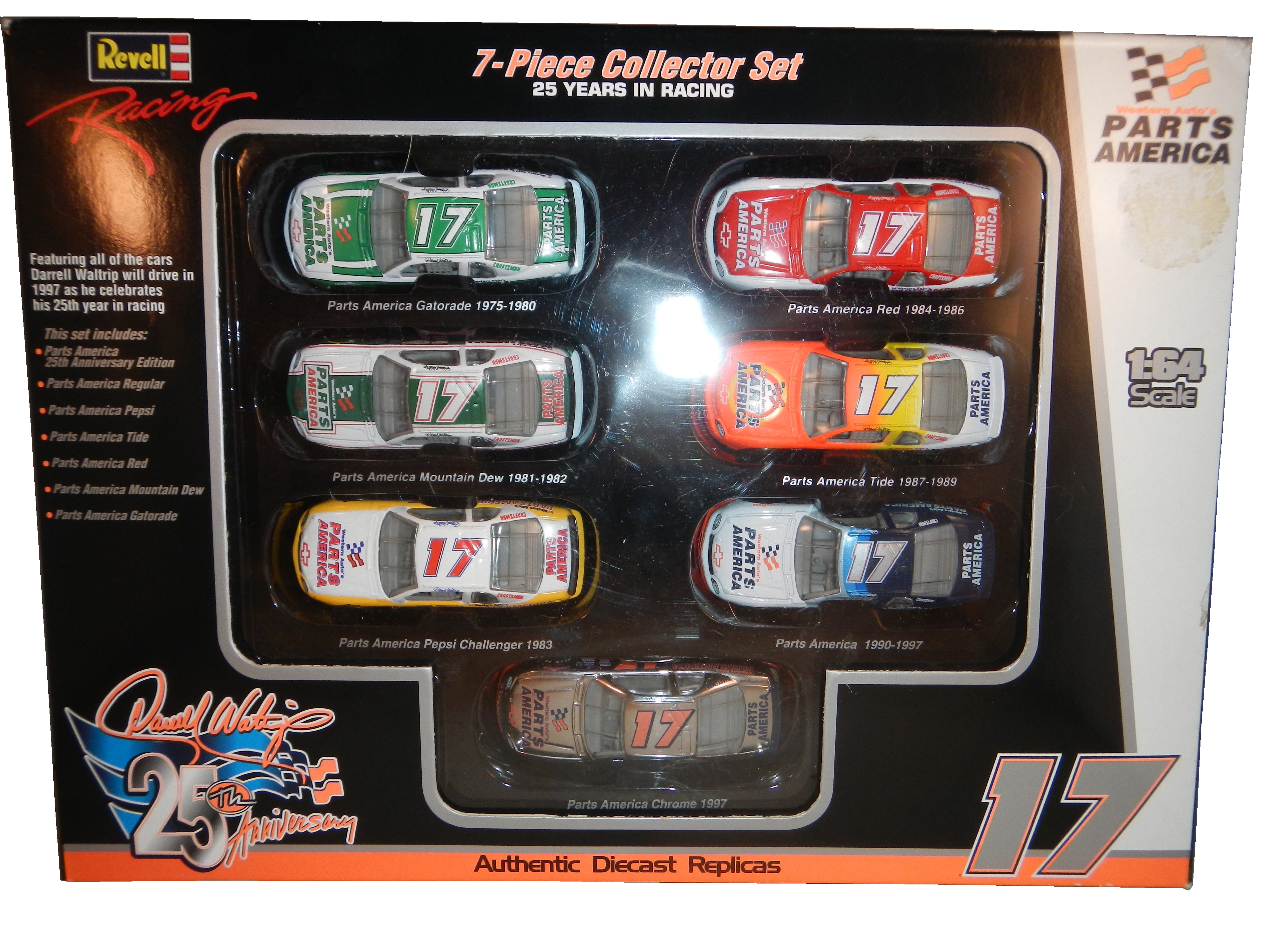


