The Driver Suit Blog-My Day at the NHRA in Joliet

100_3559I had a post ready to go concerning collar designs, but I’ve decided to save that for next week. I’m still on vacation, and last Saturday I went to see the 16th annual O’Reilly Auto Parts Route 66 NHRA Nationals presented by Super Start Batteries, in Joliet. I had the chance to get VIP tickets, so I went with Argie, a friend from work, and some of her friends, and took the chance to mix business with pleasure.

It was a mixture of Mello Yello Drag Racing Series regulars, and some minor league drivers, but it was fun. The first thing I learned was how loud these cars really are. I’ve been to NASCAR races, and I’ve heard the engines running, but NHRA engines are so much louder than I had thought. For a while, I was standing in the spectator area on track level, and as they warmed up, you felt the vibrations of the engine. I’m standing about 75 feet away from the starting line, and when they went by, you felt it in every part of your body, a split second after they passed you. Needless to say, it was AWESOME!

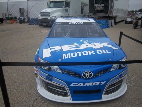
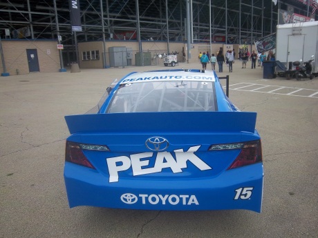
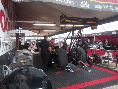
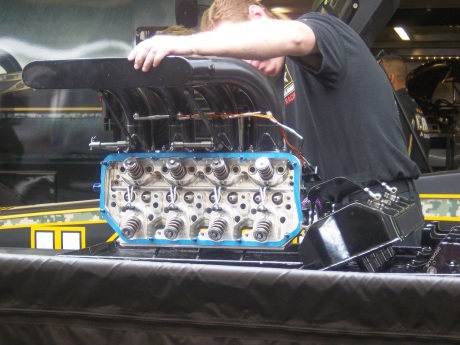
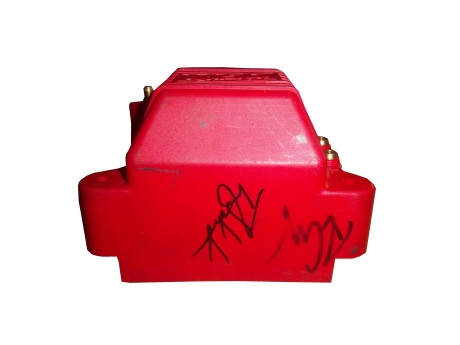
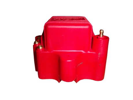
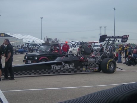
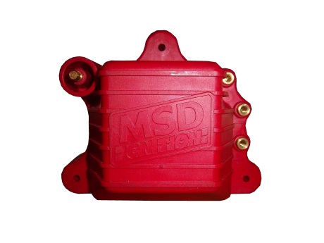
One thing I did enjoy was checking out the different kinds of cars, from top fuel dragsters, 100_3531 100_3532to super stocks,100_3543to funny cars, 100_3545 100_3546 100_3547 100_3552The scoreboard tells the fans who won, and what their times and speeds were, each side having its own scoreboard with lights around the sponsor logo to tell you who won.100_3544I also checked out the tires on these cars, and man, they are huge! They look like they are twice the size of NASCAR tires.100_3550Speaking of which, I got a chance to check out the new Gen 6 Sprint Cup car, as Clint Bowyer’s Toyota Camry show car made an appearance…it looks amazing!100_3535 100_3534 100_3533 100_3537 100_3536 100_3538 100_3539They even had a jet dragster, but I didn’t get to see it on the track…oh well.100_3560One of the fun things about these events is that you can check out the pit area, so I did, checked out all sorts of cars, and the various equipment and stages of preparation and equipment used in them.   100_3540 100_3541 100_3553 100_3554 100_3555 100_3557Impact Racing had a booth there, and they had the various designs of helmets sold for race use. Aside from NASCAR, IndyCar and motocross designs, they had drag racing helmets. Drag racing helmets feature a visor design similar to wrap-around sunglasses. Top fuel and funny cars have their own designs, with funny car having an air filer, since the nitro-methane engine sits in front of the driver, instead of behind, like in a top fuel dragster. 100_3548 100_3549Many of the teams sell off equipment from the cars after the various events are done, and I took full advantage, acquiring a timing belt from Bob Tasca’s Motorcraft Funny car, this one used in his first qualifying session at the Ford Thunder Valley Nationals in Bristol Tennessee. This run he had a 4.15 second, 306 MPH run. This thing is HUGE, measuring over 64 inches in circumference and 3 inches across. tasca-belt1 tasca-belt2As well as an ignition coil and a spark plug from Morgan Lucas Racing. Ignition coils are used to turn on cars in general, but this MSD 8142 is designed to fire up these 8000 horsepower engines, which need a lot of electricity to start and operate. I was fortunate enough to have Tony Schumacher and Ron Capps autograph it in person. mlr-coil1 mlr-coil2 mlr-coil3 mlr-coil4 mlr-coil5 mlr-coil6 mlr-coil7My VIP ticket got me into the Don Schumacher Racing hospitality area. That was a lot of fun. We got to watch his car get prepared. Since the U.S. Army is his primary sponsor, DSR had some Army recruiters and soldiers speak. Though speaking to a crowd is not always easy when you have 2 8000 horsepower cars racing nearby. Then Tony Schumacher got up and gave a speech, and discussed his helmet, which prompted this question from me:
Afterwards, I was able to get a photo with him,100_3556and got to watch the engine test. This video looks tame, but unless you see it in person, you don’t have any idea how loud it really is, and I was 15 feet away when I shot that video!

Then I had dinner,100_3558and called it a day. I had a great time, and I will go back any chance I get!

In other news, I went back to the Museum of Science and Industry, and I went to the Jeff Gordon suit exhibit, and was shocked to see this:100_3811THE ENTIRE DISPLAY had been emptied out of the display case.  At first I didn’t know what had happened, so I asked at the information desk.  They, in turn, told me that pipes located above the display had been leaking, and that the items had been removed.  I hope that when the display is fixed, the issues I discussed in a previous blog will have been fixed, I will keep you posted.

And since I’m here, Let’s talk paint schemes…shall we?

Jamie McMurray #1 Hellmann’s 100th Anniversary Chevy SS The yellow or green on the contingency decals is pointless, and it takes away from what is a very solid scheme, with simple design and great color. I give it a B+, almost an A, just not enough.

Casey Mears #13 Valvoline Next Gen Ford Fusion Not bad, not bad at all. I like the color scheme, which has both earth and motor oil tones in it, and the overall design is great. A+

Tony Stewart #14 Ducks Unlimited Chevy SS Although it is just his normal scheme with DUCKS UNLIMITED instead of MOBIL 1 on the quarter panel, I hate his new look. The black scheme from before Kansas was really good, but this is just horrible. Too much orange, not enough black or camo. F

Clint Bowyer #15 Toyota Camry 30th Anniversary Toyota Camry Ok, so is this a red car, a black car, or a silver car…I’m really lost here. The nose and front panels look red, but the hood and back quarter panels look black, and the roof is silver. They took one of the best color schemes in racing, and made it horrible! The only thing giving this scheme a passing grade is the color scheme, but even that can’t keep it above a D-

Aric Almirola #43 Go Bowling Ford Fusion I love what they did here. The bowling ball nose and pin design give a great impression, and the color scheme works very well here. A+

AJ Allmendinger #47 Scotts Toyota Camry Simple and attractive, with a very nice simple color scheme…But could someone explain to me why in this rendering the windshield decal reads AJ ALLMENDINGER instead of just ALLMENDINGER? The only time a first name is on the windshield is in the case of Kurt and Kyle Busch. There is no other Allmendinger racing in the Sprint Cup. That said, this scheme earns an A

Brian Vickers #55 Aaron’s/Louisville Cardinals Toyota Camry The color scheme is amazing, and the basic simple design of the car works well. The hood has some needless design, which does affect the grade, but even so, it still earns an A-

Martin Truex Jr. #56 NAPA Batteries/Get Back and Give Back Toyota Camry  Another example of why most teams only USE ONE COLOR AND DESIGN SCHEME!  The nose features BDU digital camouflage in light and dark green, which works well.  The doors feature Truex’s normal scheme, again good color and design, and the back features a blue/black digital camouflage, again which would work well by itself.  The problem is that the combination of the three make for an awful look.   This scheme is one of the worst so far this year, and it earns the F- grade it deserves.  I fully support our Armed Forces, but this scheme is horrible!

Carl Edwards #99 UPS Ford Fusion I know I covered this scheme in a previous post, but this photo illustrates why I hate UPS as a car sponsor. No matter what, UPS cars have one thing in common, and that is that the driver suit can look really good, whereas the car will look awful. In this case, the car has pointless designs and needlessly added colors, whereas the driver suit is simple and attractive. So my previous grade of D- still applies.

And finally, while I don’t normally do Nationwide paint schemes anymore, I had to do this one. Kurt Busch has had a throwback at Talladega reminiscent of Neil Bonnett’s Country Time scheme from the 1980’s, and last night, he had had an amazing scheme taken from Days of Thunder…I love that scheme because I love the movie. The boxy design of the Camaro works well with the scheme, as it is much similar to the design of the Lumina. Keep it up Kurt!
The Driver Suit Blog-Arm Gussets…Comfortable AND Safe!

By David G. Firestone

We’ve all seen them in telecasts and photos, but what many of us do not realize is what they are and what they do. I am talking about the arm gusset. Arm gussets are seen at the top of the sleeve on a driver suit, under the shoulder. They are a flexible piece of Nomex specifically designed to do two things. One is protect the driver, the other is give the driver some freedom of movement.10-labonte-rshoulder 10-labonte-lshoulderArm Gussets are almost always present on race-worn driver suits. Anyone who has worn a one-piece full body jumpsuit can attest to the fact that it restricts freedom of body movement. The gusset takes some of that restriction away. This is important when it comes to driving, because it gives the driver one less thing to concentrate on, and in the worst case scenario, can help a driver escape a burning vehicle much quicker.36-said-rshoulder 36-said-lshoulderGussets have very little variation, though I have seen one unusual one. In this Ricky Craven suit from 1996, the front of the sleeves look like they are attached to the body, whereas the back has a gusset in it. This would be done for driver preference of course, bur I have never seen a half gusset before or since.100_3458 100_3457 100_3456This Lake Speed suit from 1997 is store bought, as opposed to custom designed, and it has no gussets. This suit would have some restriction of movement. Again this can come down to driver choice.9-speed-rshoulder 9-speed-lshoulderThe need for protection vs. the need for driver comfort is a major conflict in the world of racing safety. The gusset is a major meeting point between the two sides involved, and the drivers love them.

RIP Jason Leffler…you will be missed.

Now on to paint schemes.

Jame McMurray #1 Parade Magazine Chevy SS-Great color scheme, great design, nothing wrong at all, A+

Jame McMurray #1 Banana Boat Chevy SS-A scheme that could be a B+ is ruined by an awful color scheme. That orange is the worst I have ever seen on a race car. It takes this scheme and takes to a D-

Jamie McMurray #1 Bad Boy Buggies Chevy SS-An attempt to be innovative with design fails horribly here. The color scheme is decent, but the design is awful.

Brad Keselowski #2 Miller Lite Patriotic Ford Fusion-Taking the stars and stripes and slapping them on a race car can work…just not here. If it was just plain blue with red and white lettering, it would work better, but this just falls flat. C-

Marcos Ambrose #9 Stanley/DeWalt Racing for a Miracle Ford Fusion-This is a major improvement over what they currently run. This just works! A+

Denny Hamlin #11 Sport Clips Toyota Camry-Seriously? Why does it look like a sperm is painted in red on the side of the car? The red/white/black color scheme works, but the door design is just awful! D-

Denny Hamlin #11 Fedex/Autism Speaks Toyota Camry-Much better! The puzzle design, and solid color scheme look really good here. The red 11 is amazing too! Can’t give this anything but an A+

Tony Stewart #14 Code 3 Chevy SS-Love the scheme, love the simple design and great color scheme.  Works very well and earns an A+

Clint Bowyer #15 5-Hour Energy Patriotic Toyota Camry-How is this patriotic? Oh….I get it…the stars….just one problem…THE COLOR SCHEME IS WRONG! If it was red white and blue I would like this, but this is just awful! You want to honor America, but can’t get the color scheme right? F-

Greg Biffle #16 Fastenal Ford Fusion-Since minor variations of this scheme were run by Biffle, Ricky Stenhouse, and Carl Edwards with minor variations between them, I will grade them all here. Solid scheme, good color scheme, A+ for all 3.

Greg Biffle #16 3M/Ace/Rite Aid Ford Fusion-The color scheme is good, but the door design is too busy. If it was one single color, it would work quite well, but being a mix of black, blue, red, and white it just looks confusing. It works, but not as well as it could, and earns a C+

Jeff Gordon #24 Axalta Chevy SS-Another DuPont scheme with different logos that works very well. Good color scheme and design. A+

Paul Menard #27 Menard’s/Libman Chevy SS-The Libman green hood design just looks horrible on the yellow background of the car. The green is too light, and if it were darker it might work, but this scheme earns a D

Kevin Harvick #29 Budweiser Patriotic Chevy SS-This is another patriotic scheme that works very well with a good design. A+

J.J. Yeley #36 Click it or Ticket Chevy SS-Good design, but awful color scheme. The green and blue is just horrible. If one or the other was used it might work, but this is horrific. F

Ryan Newman #39 Quicken Loans Patriotic Chevy SS-Meh.  The design needs work.  Too much going on with the front of the car to earn anything above a C

Aric Almirola #43 Air Force Ford Fusion-Great design, simple design with a great color scheme. A+

Bobby Labonte #47 Bush’s Grilling Beans Toyota Camry-The overall design and color scheme is good, but the major flaw here is that the quarter panel has 5 different logos, most of which clash with the Bush’s scheme. It takes an A scheme and drags it down to a C

Jimmie Johnson #48 Lowes Patriotic Chevy SS-The only bad thing I can say about this is that the red should be a little darker. Other than that, this scheme earns an A

Jimmie Johnson #48 Monsters University Chevy SS-If the blue was darker, I would like it more, but the blue is too light. Other than that, this is a solid scheme. B+

Martin Truex Jr. #56 Napa Patriotic Toyota Camry-Perfect…that is all I can say. A+

The Driver Suit Blog-The Glossary of Terms

By David G. Firestone9-kahneFor this week’s blog, I will be doing a visual glossary of terms that I use when describing driver suits and helmets. To illustrate this, we will use this examples from a number of suits, including this Kasey Kahne suit from 2005.

and this Terry Labonte suit from 2008

10-labonteCollar-The collar is the main protection for the driver’s neck. There are two types of collars, the ones that velcro shut, and the kind that overlap, but do not attach. A popular place for sponsor logos.9-kahne-collar29-kahne-rshoulder 9-kahne-lshoulderShoulder Epaulet-a piece of fabric used to decorate the shoulders. Some are designed for visual appearance, but some are designed to be used to pull an unconscious driver from a burning car. Another popular place for sponsor logos.  10-labonte-rshoulder 10-labonte-lshoulderArm Gusset-Pieces of Nomex at the top of the sleeves that attach to the main body of the suit designed for driver comfort, while keeping it fire retardant.100_3458 100_3457 100_3456Liability Tag-Found in every piece of racing uniforms this tag states that any injury they incur while wearing the item is the fault of the driver, not the company. 10-labonte-tagSeries Logo-Logo indicating what series the driver is racing in. Currently found at the top of the suit on the right side for NASCAR and the left side for IndyCar, though it has been more nomadic in the past. 10-labonte-rchest9-kahne-rchestAssociate Sponsor Logos-Smaller logos found at the top of the chest. Typically these include the series logo, tire logo, car manufacturer, team name, and one or two other sponsors. These small logos are a good way to photomatch a suit.9-kahne-rchest 9-kahne-lchestPrimary Sponsor Logo-The biggest logo on the suit, can measure as much as 14 inches around. Usually found on the center torso on front and upper torso on back. This logo is also the reason is why all of the other design features of the suit revolve around.9-kahne-flogo 9-kahne-blogoBelt-Many driver suits feature a belt, which is for driver comfort. The safety certification is sometimes found on the inside, has a velcro closure. The driver name or a sponsor logo is often found here.  9-kahne-beltTelevision Logo-Found on the sleeves and legs, these logos are specifically positioned so that when the driver is sitting in the car, they appear visible to the in-car cameras.  9-kahne-rsleeve2 9-kahne-legsCuff-the end of the arms and legs have a Nomex cuff. On the legs, the cuffs are often covered by a boot cut.  100_2474-copy1Double or Triple-Layer-Most driver suits have multiple layers of Nomex in them to protect the driver from firescreen

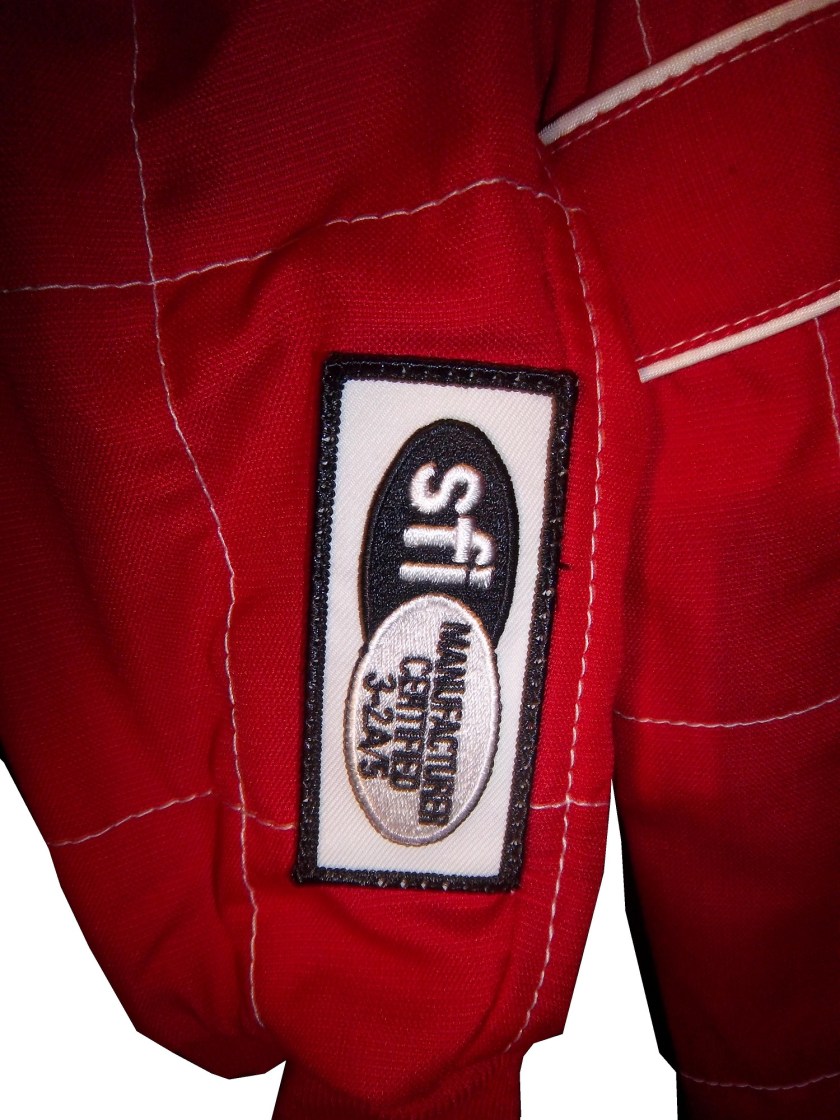
Safety Certification-Driver suits are independently inspected by FIA and/or SFI to insure that they meet or exceed the fire protection they promise to provide. SFI certification is typically found on the inside of the left sleeve, and FIA can be found on either the back of the neck, or inside the belt.10-labonte-sfi 9-kahne-fia  fia 1 sfi36-barron-fia236-barron-neck

The Driver Suit Blog-The Replacements…The Driver Suit Edition

By David G. Firestone

I have been focusing too much on paint schemes lately, so I’ll hold off on that for a while. Back to driver suits. As Brian Vickers demonstrated earlier this year, when there is time to plan for a driver replacement, a full driver suit with all correct sponsor logos can be done for a driver. But what if the driver change isn’t as easy to anticipate? What if it is a last minute deal? Sometimes, you get an item like this:10-labonte

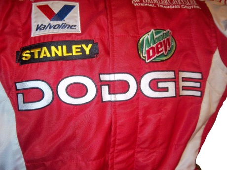
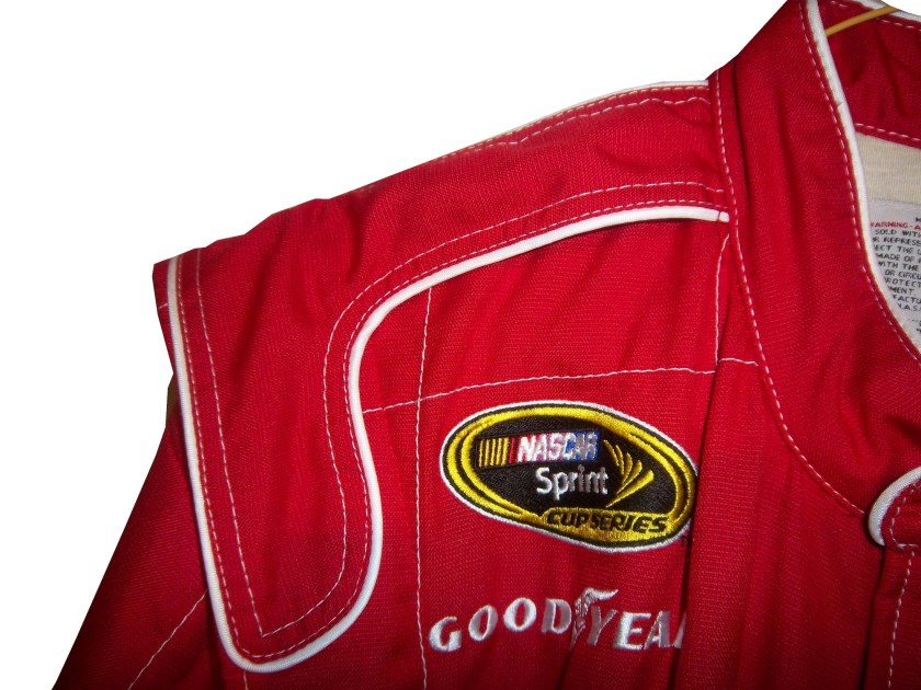
10-labontebHere’s the back story, Patrick Carpentier was racing for Gillette-Evernham Motorsports in 2008. He was a part time Cup driver, and full time Nationwide Series driver. During the week of August 3, 2008, Carpentier was scheduled to driver in the NAPA Auto Parts 200 in Quebec. Because of the travel restrictions involved, he was not able to make the Sunoco Red Cross Pennsylvania 500 the next day. As such, Terry Labonte was chosen to take the #10 Charter Communications Dodge Charger for that race. Since this was a last minute deal, Labonte was given this basic suit, with SPRINT CUP, GOODYEAR, VALVOLINE, GILETTE-EVERNHAM MOTORSPORTS, NASCAR, and SUNOCO logos. The full Charter Communications design would have taken more time than the team had to make the suit.

10-labonte-rchest 10-labonte-lchest 10-labonte-rsleeve1 10-labonte-lsleeve1

In all honesty, it works very well. It has the classic quilt pattern, and the minimal logos give it a very retro look. This is also the only driver suit that I have ever seen that has no manufacturer logos, either Dodge or Simpson, and has a full SFI Certification.

10-labonte-rshoulder 10-labonte-sfiOther than the lack of logos, this is a standard custom designed Sprint Cup driver suit. It has shoulder epaulets and arm gussets, as well as Terry Labonte’s name on the belt. The Texas logo is presnet next to Labonte’s name, and I have never seen this on other suits he wore. I was able to find some pictures of him wearing the suit, and he looks good in it.

10-labonte-belt

The Driver Suit Blog-Grading the 2013 All-Star Race

By David G. Firestone

Last week was the All-Star Showdown and the All-Star Race.  These two events are magnets for special paint schemes.  The top two finishers from the Showdown move to the All-Star Race.  I have graded both events, starting with the Showdown.  It is ranked from best to worst.

The Good:

1 David Reutimann #83 Burger King/Dr. Pepper Toyota Camry. Great classic design with a great color scheme that gets an A+

2 Travis Kvapil #93 Burger King/ Dr. Pepper Toyota Camry See Above, A+

3 David Gilliland #38 Long John Silvers Ford Fusion Good color scheme, and the basic design used with that scheme on this car just makes it stand out. I’m not a fan of yellow on race cars in most cases, but I’ll overlook it this time because it is just so good. A+

4 Jeff Burton #31 Cat Chevy SS The scheme is solid, has good colors, great number designs and a good pattern used. Final Grade: A

5 Martin Truex Jr. #56 NAPA Toyota Camry Simple, elegant with a great color scheme, great logos and great number design.  Final Grade: A

Aric Almirola #43 Smithfield Ford Fusion Lose the design on the doors and it would be perfect. Other than that this scheme is perfect and earns a solid A

7 Mike Bliss #19 Gentry Plastics Inc. Toyota Camry-Good color scheme and simple design work well here, A

8 Terry Labonte #32 Oxy Water Ford Fusion I don’t know why, but I like this scheme. Normally I wouldn’t like the color scheme and basic design but for whatever reason, I like this. A-

Juan Pablo Montoya #42 Target Chevy SS Great color, great number design, and the pattern used is a lot more subtle than last year’s scheme. The quarter-panels have too many associate sponsors and looks too cluttered, keeping the Final Grade at a B.

10 Bobby Labonte #47 House Autry House Foods Toyota Camry The design is simple, but good. The color scheme need some work. The red used is too bright, as is the blue. The logo group on the quarter-panel is awful. B-. If the color wasn’t so bright, I could grade it higher.

The So-So

11 Joe Nemechek #87 Royal Teak Toyota Camry Good color scheme, simplistic design, not much to say here, C

12 Landon Cassill #33 Bicycle NASCAR Playing Cards Chevy SS-Decent color scheme, but the design is all over the place, way too chaotic, C-

13 Paul Menard #27 Serta Chevy SS Basically the same scheme as his regular scheme, but different hood logo…nothing really to say here…C-

14 JJ Yeley #36 World TradeX Chevy SS– Not much to say here…other than make the logo bigger. D-

15 Dave Blaney #7 Sany Chevy SS Great color scheme ruined by bad door design and generic racing number design. The design is just disgusting to look at, and it gets a D-

16 Casey Mears #13 Geico Ford Fusion Eww…just eww. The color scheme is dreadful, and the designs on the side are painful to look at. It passed because of the logo and number design. Final Grade: D-

17 David Stremme #30 Lean 1 Toyota Camry The best way I can describe this scheme is that there is nothing good about it. Anything they could have messed up with this scheme, they did. It gets an F

18 Scott Riggs #44 No Label Watches Ford Fusion An awful scheme made much worse by a horrible color scheme that earns an F- grade.

19 Michael McDowell #95 Levine Family Racing Ford Fusion There is nothing right about this scheme. F-

20 Brian Keselowski #52 Supportmillitary.org Toyoa Camry-Eww…Too much going on, with the oversized camo in too many different colors, and the door design which is awful. F-

Now on to the All-Star Race.  Jamie McMurray, and Ricky Stenhouse Jr. transferred in from their performances in the Showdown, and Danica Patrick was voted in.  As such, their grades will be mentioned here.

The Good

1 Brad Keselwoski #2 Miller Lite Fan Mosiac Ford Fusion.  It looks really good, and the pictures of the fans give it a condensation on the can effect that is really cool.  A+

2 David Ragan #34 CSX Play It Safe Ford Fusion This is a very solid scheme, with great colors, great design and an overall great look. CSX did this scheme very well and it gets an A+

3 Kyle Bush #18 Snickers Bites Toyota Camry A paint scheme that has a great color scheme, and illustrates the theory that less is more. Nothing bad about this Scheme-A+

4 Joey Logano #22 Pennzoil Ford Fusion Pennzoil has an amazing shade of yellow, and they really put it on display in this A+ scheme

5 Jeff Gordon Cromax Pro Chevy SS Another good DuPont inspired scheme with a great color scheme and great design-A+

6 Dale Earnhardt Jr. #88 National Guard Chevy SS Great scheme, nothing wrong, A+

7 Danica Patrick #10 Go Daddy Cares Chevy SS-The racing stripe makes the scheme look better, and the hood logo is good as well  A

8 Carl Edwards #99 Fastenal Ford Fusion The stripes work well here, and the color scheme is good. A

9 Ricky Stenhouse Jr. #17 Best Buy Ford Fusion  The number design, color scheme, and simplistic design give the car a good look. A

10 Kevin Harvick #29 Budweiser/Rheem Chevy SS-Good color scheme, and I like the two different designs on the side.  A-

11 Clint Bowyer #15 5 Hour Energy Toyota Camry Good color scheme, decent design, could use some work on the front. B+

12 Tony Stewart #14 National Wild Turkey Federation Chevy SS Good color scheme and overall design, but the major issue I have is with the NATIONAL WILD TURKEY being on a curve and not as visible It gets a B-

The So-So

13 Jamie McMurray #1 Bass Pro Shops/NWTF Chevy SS-Great Color Scheme, Awful design, C+

14 Denny Hamlin #11 FedEx Express Toyota Camry The front nose design and stripes are awful. The color scheme is great, but the stripes kill it. The best grade I can give is a C+

15 Greg Biffle #16 3M Filtrete Ford Fusion-Could you please pick a color scheme and stick with it?  Two different color schemes on the same car is just awful. But they are two good color schemes. C-

16 Ryan Newman #39 Aspen Dental Chevy SS-Good colors, but awful design…what does this have to do with teeth?  C-

17 Jimmie Johnson #48 Lowes Patriotic Chevy SS-Not the best scheme he has run all year, but I would love to see the car in that shade of red on the bottom C-

18 Matt Kenseth #20 Husky Toyota Camry Not much really to say, mediocre color scheme, no real design to comment on, the logos are plain Jane enough, it’s a bland scheme that earns a C grade. A mediocre grade for a mediocre scheme.

The Awful

19 Marcos Ambrose #9 Stanley/DeWalt Ford Fusion  Is it normal to get seasick while looking at a paint scheme?  The Petty Blue just does not work here, and the oval around the letters is pointless.  The car looks awful even though it has a great color scheme and great sponsor logos. D

20 Kurt Busch #78 Furniture Row Military Appreciation Night Chevy SS I love the matte black that Furniture Row usually uses, so this is kind of disappointing. That said, the color are good, but the hood design needs work. The MILITARY APPRECIATION banner is much to small and it is hard to see at speed. A good scheme that has been ruined and earns a D-

Before I leave, I have two more pieces of business.  First off, I would also like to extend congratulations to Tim Flock, Jack Ingram, Dale Jarrett, Maurice Petty, and Glen “Fireball” Roberts for being elected to the 2014 class of the NASCAR Hall of Fame.

Second off, RIP Dick Trickle.  You will be missed.

The Driver Suit Blog-Pit Boards…Unique and Under-Appreciated.

By David Firestone

Today, I thought we should discuss an item that everyone sees, but not everyone understands…the mighty pit board. Pit Boards are an item that most average collector wouldn’t think that would come up for sale, but they do. I am a proud owner of one myself:mccumbee-pit-1

This beauty of an item is from MRD Motorsports, and was used between 2007 and 2009 for Chad McCumbee and Blake Bjorklund, amongst others. Made from a thick plastic inside, with the color design made with a plastic similar to many campaign signs, it shows very nice use, with scratches and scuff marks. There are two types of pit boards. One type hangs above the pit lane, to help indicate to the driver where his pit is. This board almost always has the car number and holes cut into it to cut down on wind resistance. This is an example of one used by MRD.

The other type, like the one shown above, is to indicate to the car where to stop in the pit. In years past, a crew member would stand behind the board and the car would drive up to him, as shown at 6:49 at the video here…

http://youtu.be/w4v_ya596eg?t=6m46s

Since this was as dangerous as one thinks it is, in the 1990’s, pit crews switched to the “lollipop” form still used today.  The board is held on a long pole and held where the driver can see and hit it to stop at their stall, as seen below:

http://youtu.be/ilJ5qxhBbaI

Boards are often customized to driver preference.  Kevin Harvick is known for his “Happy Face” pit board.  Some drivers use sponsor names, other use car numbers.  It all looks confusing on pit road sometimes.  In this example, the MRD Motorsports board has the car number design on it.  This board shows where the pole was attached to the board.mccumbee-pit-2 mccumbee-pit-3And it also shows numerous scratches and scuff marks from race use.mccumbee-pit-3 mccumbee-pit-4The back of this board is plain black.  That is due to MRD being a low budget team, with limited resources.mccumbee-pit-5A quick search on ebay and other sites shows that these items frequently sold as collectors items after a race.  These are unique items, and for NASCAR fans are conversation pieces.

And now on to Paint Schemes…

Brian Vickers #11 FedEx Delivery Manager Toyota Camry  Good simple scheme with great colors and design, gets an A

Sam Hornish Jr. #12 SKF Ford Fusion  Good color scheme, but it looks like a cross between Joey Logano’s scheme and Aric Almirola’s schemes.  I give it a B+

Tony Stewart #14 Mobil 1/Bass Pro Shop Chevy SS The color scheme is good, but the overall design isn’t as good as the regular scheme. Too much going on. The best grade it can earn is a C

Clint Bowyer #15 Toyota Toyota Camry Not much to complain about here, good color scheme and simple design and an A grade

Clint Bowyer #15 KFC I Ate The Bones Toyota Camry KFC has great lettering and a great shade of red, and both are not represented here very well.  That said, I don’t hate this scheme, colors are good, but what is with the hood design?  The KFC logo is too small, and the hood has some creepy guy with a bowl cut as the most promising feature.  All things considered, it earns a C-

Kyle Busch #18 M&M’s M’ Prove America Toyota Camry Good scheme with a great color scheme and good design. Nothing wrong with this solid A scheme.

Kyle Busch #18 Doublemint Gum Toyota Camry Just like Kyle’s scheme on the 18, I love the color scheme, love the simple design, love the fact that the 81 is the 18 backwards, love this scheme, A+

David Ragan #34 Detail Doctor Ford Fusion  Decent color scheme and decent design.  C-

Juan Pablo Montoya #42 Clorox 100th Anniversary Chevy SS  Surprise!  Happy Birthday!  The blue and white is good but the rest looks too goofy to be good.  It looks like a birthday party for a 4 year old.  Lose the confetti and streamers and I would like it much more, this scheme earns a D+

Aric Almirola #43 Enrich/Smithfield/Farmland Ford Fusion Lose the design on the doors and it would be perfect. Other than that these three schemes, different only by the hood and quarter panel sponsors are perfect and earn solid A schemes

Aric Almirola #43 Transportation Impact Ford Fusion Black white and lime green? Seriously? And the black front makes it look like the car was in a wreck and had the nose replaced. Not a good look at all. The door design is awful and the quarter panel is even worse! I can’t give this scheme a passing grade and it gets an F!

Aric Almirola #43 Jani-King/STP Gas Booster Ford Fusion This scheme makes up for the Transportation Impact scheme with simple perfection, and an A grade

Aric Almirola #43 STP/Farmland Ford Fusion OK, last Almirola scheme…I promise! A good throwback scheme is ruined with the door number design. Get rid of the oval design and it would get an A, whereas this scheme earns a B-

Scott Riggs #44 No Label Watches Ford Fusion An awful scheme made much worse by a horrible color scheme that earns an F- grade.

Scott Riggs #44 JPO Absorbents Ford Fusion Why do many racing teams have wave designs?  It is not a good design, and in this case it takes a good color scheme and ruins it earning a D grade.

Bobby Labonte #47 Clorox 100th Anniversary Toyota Camry Did anyone look at the main color of the car before it was painted?  This looks awful!  Montoya’s version looks better, but not by much.  D-

Jimmie Johnson #48 Lowes “Reverse” Chevy SS  Looks really good, and really stands out in nighttime racing.  Color scheme is good, as Lowe’s often is.  A+

Jimmie Johnson #48 Lowe’s “Emerald” Chevy SS  Decent color scheme, though if if were reversed it would look even better.  Even still it is good enough to earn an A-

Martin Truex Jr. #56 NAPA Brakes Toyota Camry Simple design, good color scheme, but the Twitter handle on the back of the roof is distracting and it looks awful.  It takes an A scheme to a B-

Kurt Busch #78 Furniture Row Military Appreciation Night Chevy SS I love the matte black that Furniture Row usually uses, so this is kind of disappointing. That said, the color are good, but the hood design needs work. The MILITARY APPRECIATION banner is much to small and it is hard to see at speed. A good scheme that has been ruined and earns a D-

Elliot Sadler #81 Double-Mint Gum Toyota Camry Just like Kyle’s scheme on the 18, I love the color scheme, love the simple design, love the fact that the 81 is the 18 backwards, love this scheme, A+

Dale Earnhardt Jr. #88 National Guard Chevy SS What the hell?  The blue and white scheme works well with this design, but camo and black?  It just looks awful.  I love Dale Jr. but I can’t defend this scheme at all. F-

Scott Speed #95 Tracking Point/JTS Truck Sales Ford Fusion Good color scheme, but awful design. The diamond plate decals does nothing to help, and it earns a D-

Michael McDowell #98 Curb Record/ The Bobby Bones Show Ford Fusion Love the color schemes and design. Bonus points for the diagonal hood logo. Not many people can make the diagonal logo work, but it works here, A+

Carl Edwards #99 Geek Squad Ford Fusion.  Not much to say here, really simple design and it looks alright…C+

Carl Edwards #99 Cheez Its/Frosted Flakes Ford Fusion.  These two schemes are awful.  Too much going on, too many colors, no consistency, not a good pair of schemes at all, F

The Driver Suit Blog-Some Issues with the New Gen 6 Car

By David G. Firestone

I would like to discuss some issues that have come up in recent weeks with the new Gen 6 car. These issues seem minor, but with this new car, they need to be addressed. And because these issues are issues, it leads to a conclusion that is kind of stunning in my mind.

Two issues revolve around Denny Hamilin. The first is his $25,000 fine for “criticizing the product.” and I’ll get to that in just a minute. The other one is his massive L1 Compression fracture that he suffered at Fontana. This injury should never have happened, but it did. The Gen 5 cars, as unattractive as they were design-wise, were safety-focused. The discussion on how safe they were ended with Michael McDowell’s scary wreck during qualifying at Texas in 2008. The car suffered serious damage, but McDowell was unhurt. This wreck was just as bad, but Hamlin is out of the car until he is fully healed.

NASCAR needs to be safety-focused, putting driver and fan safety before anything else. The fact that Denny has an L1 compression fracture because of a wreck is proof that there is a lot of room for improvement in the Gen 6 car. That isn’t the only issue with the car that needs to be addressed. The car seems to change with each race. At a super speedway, the spoiler is lower than it is at other tracks. At intermediate tracks the roof cameras are not used for reasons that have yet to be explained to the general public. It almost seems as though NASCAR is making the rules up as they go along. Please pick a design and setup and stick with it.

The other issue that needs to be discussed is penalties surrounding the new car. Denny Hamlin was fined $25,000 for saying that the car has room for improvement. Why was he fined for that? I understand that the car was designed by many different people, who put a lot of time and effort into it, but here is the thing…the people who designed the car are not the ones who are the focal point of racing, the driver is. If the drivers are complaining about the car not being competitive, and not driving the way it is supposed to, it should be addressed. The Gen 4 and Gen 5 cars went through a lot of refining, and so should the Gen 6 car.

One penalty that was issued was to Penske Racing for having suspension parts unapproved by NASCAR. Although all of Ford’s engines come from Roush Yates, many teams use their own designs for equipment used in the car. As such, these parts have to be approved by NASCAR. Obviously these parts weren’t approved. Yet Penske, Brad Keselwoski, and Joey Logano are swearing up and down that they were legal, and working in a gray area. If the parts are unapproved, they are unapproved.

The other major penalty was to Matt Kenseth for having a connector rod that was 3 grams under the minimum weight required by NASCAR. My concern with this issue is that the engine in question came from Toyota Racing Development. TRD knows what the rules and regulations are, and they knew what the parts should have been. I do not believe for a second that of the people involved with making the engine, not one of them knew didn’t realize that the parts were illegal. They knew what it was, and they sent it out anyway. That brings up an important question. 8 teams in the Sprint Cup work with TRD. In total that accounts for 10 different teams. Each team has a primary and backup car. There is also an additional engine at the teams disposal. So for each Toyota team there are 3 engines for use. If Matt Kenseth is running illegal equipment, who else is?

On to paint schemes…

Brad Keselowski #2 Redd’s Apple Ale Ford Fusion Black and Red is always a good scheme, and the overall design is good. The sticking point for me with this scheme is that APPLE ALE is almost invisible on the quarter panel. So for a final grade, it gets a B-

Tony Stewart #14 National Wild Turkey Federation Chevy SS Good color scheme and overall design, but the major issue I have is with the NATIONAL WILD TURKEY being on a curve and not as visible It gets a B-

Jeff Gordon #24 AARP Chase Card Chevy SS The color and designs are all over the place, and the giant credit card on the hood is pretty ugly. Not good at all, F

Kevin Harvick Bell Helicopters Chevy SS A simple design with a good color scheme. Not much else to say other than good job, and it gets an A grade.

Jeff Burton #31 Airgas-Bulwark Chevy SS Meh. That sums it up. Uninspired color scheme, and bland design give it a mediocre look and a C- grade.

Jeff Burton #31 American Ethanol Chevy SS Good color scheme and design. A-

David Ragan #34 CSX Play It Safe Ford Fusion This is a very solid scheme, with great colors, great design and an overall great look. CSX did this scheme very well and it gets an A+

JJ Yeley #36 NASCAR Day Chevy SS Another simple yet attractive scheme that works very well. Nothing more to say than great job, and enjoy your A grade.

David Gilliland #38 EZ Pawn Ford Fusion Good color scheme though the design is a bit over complex. As such it gets a B+.

Ryan Newman #39 Code 3 Associates Chevy SS Ok, you can have either flames OR a racing stripe, but not both. Because the combo takes a good design and makes it into a horrible design. The only thing giving this scheme a passing grade is the color scheme being as good as it is, but it earns a D-

Bobby Labonte #47 Pine Sol Toyota Camry Yet another simple yet amazing good scheme that earns an A grade!

Elliot Sadler #81 Alert Energy Gum Toyota Camry A good scheme with a consistent design and a decent color scheme that earns a B+ grade.

Travis Kvapil #93 Dominion Raceway Toyota Camry Am I the only one who thinks it is odd that a speedway that doesn’t exist yet is sponsoring a car for one race? That aside, the door design needs work, but the color scheme is solid, and I give it a B-

The Driver Suit Blog-NASCAR Helmets Over The Years

By David G. Firestonemcconnell-5The evolution of the racing helmet in NASCAR for the most part was slow, in the beginning. NASCAR was officially founded in 1947, two years after World War II ended. Many of the helmets worn during the 1940’s and 1950’s were little more than repainted army and air force helmets. These helmets were basic at best, and as protection for the dangers of racing, these helmets were inadequate at best. During the 1950’s, many drivers switched from military headgear to motorcycle helmets. In the 1960’s, motorcycle-style helmets became the norm.mcconnell-5The above helmet was worn by Jim McConnell, who raced and promoted races in Maine, and went on to found Beech Ridge Motor Speedway in Scarborough, Maine. This is a racing helmet, but it looks more like Wyatt’s Captain America helmet from Easy Rider, in its basic design. It has an open face, no microphone equipment, and is rather thin. Although there would be advancements in helmet technology, the open-face design would remain popular until the 1980’s.Noffsinger-1This helmet was worn by Brad Noffsinger in 1988, it is the same general design, though it is much thicker, has some advancements in visor technology, and had some microphone technology in it as well. Although these helmets have since been banned, they remained legal for as long as they did for one simple reason: Advanced visibility. NASCAR did not want to have a crash caused by decreased visibility due to a rule mandating full-face helmets.musgrave1The Ted Musgrave helmet mentioned in a previous post is a perfect example. The bottom part covering the chin does to a certain extent reduce visibility for a driver. The logic makes sense, in that if there was a crash caused by reduced visibility, so for the 1990’s and 2000, the open-face was legal…then came the 2001 Daytona 500. That race saw the death of Dale Earnhardt Sr. from a Basilar skull fracture, which as tragic as it was, wasn’t the first death due to sub-par safety equipment. John Nemechek, Adam Petty, Kenny Irwin Jr., and Tony Roper had all been killed in similar accidents. Only after Earnhardt’s death, did the HANS device come to light, and eventually became mandatory in NASCAR, and eventually, across the board in racing. Now the helmets used in NASCAR look like this:mcdonalds-1This is a helmet worn between 2004 and 2005 by either Regan Smith or Jason Keller. As you can see, it has a number of advancements, including the visor, and air intakes, but the biggest advancement is these small bolts towards the back.mcdonalds-2 - CopyThese are where the HANS device connects to the helmet. The HANS device was mandated after the death of Dale Earnhardt Sr. to prevent Basilar skull fracture deaths. This device has worked very well. The HANS device works by attaching the device to the helmet, and then being secured by the shoulder straps.

As advanced as this helmet is, there is always room for improvement. What new form will the racing helmet of tomorrow take? Only time will tell.

On to Paint Schemes, we have a lot of ground to cover today…

First in the Camping World Truck Series

Chris Cockrum #07 Accu-Tech/Homesmart Toyota Tundra Decent color scheme, good stripe pattern, logos are easy to see. Solid A grade.

Sean Coor #82 Warriors in the Workplace Ford F-Series Simple yet bold. Great use of matte black, great number design and color scheme. The logo is easy to see and stands out. No distracting stripes or patterns. Solid A grade.

Next up, the Nationwide Series

Sam Hornish Jr. #12 Wurth Tools Ford Mustang The doors look like they have race damage on them already, which is not a good sign. The color scheme is decent, but the Pennzoil stripes just kill it. The logos are easy to see, but the stripes are just awful. Final grade C+

Matt Kenseth #18 Reser’s Foods Toyota Camry. Numbers are great, color scheme is good, logos are easy to see, and the background design is visible, but not overpowering. The only thing keeping this scheme from a higher grade is the picture of the package on the side of the car. That drags the grade down to a B+ from an A

Now moving on to the Sprint Cup Series

Denny Hamlin #11 FedEx Toyota Camry There are a total of 4 variations of the FedEx scheme, Express, Freight, Ground and Office. Right off the bat, the front nose design and stripes are awful. The color schemes are great, as are the logos and numbers, but the stripes kill it. The best grade I can give is a C+ across the board.

Paul Menard #27 Menard’s Chevy SS Not the worst I have ever seen, but the yellow is way too bright, and the massive collection of sponsor stickers on the quarter panel is just ugly. Final Grade C-

The Driver Suit Blog-My Thoughts on the 2013 Daytona Testing So Far…

This video displays some of the things I have noticed from Preseason Thunder…Aside from the fact that the new cars look good, and that there is still some work to do, here are my thoughts from Preseason Thunder at Daytona…

The roof ads are next to invisible when viewed from the standard TV cameras.  They may look better from in-car cameras, but until I see them, I’ll reserve my judgement…

The radio antennas are much larger than last year, and are much more visible than last year.  This may just be the setup for testing, but it looks really ugly.

The names on the windshield need to be in bigger lettering.  At speed, these names are very hard to read.

It turns out that Ford is running tailpipe decals, but they are much less predominant that their Chevy counterparts.

The yellow Dollar General scheme with the orange Home Depot rear looks much MUCH worse at speed.

Many of the cars are running a matte black design, with numbers and sponsor decals…and it is amazing how this improves the look of many of the cars.

and finally…Daytona has a very nice checkerboard design in the front infield.

Now let’s discuss paint schemes…we have a lot of ground to cover.

Clint Boywer #15 5 Hour Energy Toyota Camry   Basically the same scheme as last year, nothing really wrong, but nothing really right with this scheme…final grade C

Ryan Newman #39 Outback Steakhouse Chevy SS   A decent scheme ruined by a bland color scheme.  The mountain stripes look good, but the beige background just makes it bland.  Is the Australian Outback dealing with smog?  A sky blue would work much better here.   Final Grade: C

Bobby Labonte #47 Bushes Baked Beans/Charter/Clorox/Kingsford/Scott Toyota Camry   The Final Grades for the Bushes, Clorox, Kingsford and Scott schemes are all A…Nothing wrong with them.  The Charter scheme is ruined by a really mediocre color scheme, and earns a C.

Kurt Busch #78 Furniture Row Racing Chevy SS Not much here, but I love the matte black, simple logo and number design and the complete lack of stripes or other designs, and it warrants an A…simple yet elegant.

Moving on to the new schemes in the Nationwide Series

Brian Scott #2 Shore Lodge Chevy Camaro Richard Childress is the only owner who can use the black/white/silver combo effectivey, which is what this scheme does. The stripe pattern needs work, but the logos are very visible, and the lettering is good.  Final Grade B+

Elliot Sadler #11 One Main Financial Toyota Camry Great color scheme, logo, number design, and all-around simple yet bold paint scheme that earns a final grade of an A

Eric McClure #14 Hefty Toyota Camry  Not a big fan of this color scheme. The stripes on the quarter panels are dreadful. The numbers and logos are good, and boost the scheme to a C grade.

The Driver Suit Blog-The Epaulet…What It Was, and What It Is

12-miller-rshoulder - CopyThe mighty epaulet, every racing fan has seen them, but few understand what they are for. They are now mostly for fashion and sponsor exposure, but epaulets have a more interesting history than one might think.12-miller-lshoulderBack in the 1950′s and 60′s, racing suits were supposed to provide fire protection, but early versions of the suit were very unreliable. Many drivers perished in fires, and sometimes, drivers were trapped within the car, unable to escape the raging inferno within their car. The solution? The epaulet. Mounted on both shoulders, epaulets were reinforced strips of fabric specifically designed to help pull an injured or unconscious driver from a burning car. Epaulets quickly became an integral part of the driver suit.10-labonte-rshoulder

As racing technology became more advanced, the need for epaulets for safety began to decrease, but this was happening at a time when coverage was increasing and sponsorship was rising. It did not take that long for sponsors to realize that they could slap a logo on the epaulet and get the company name more visible on pictures and TV interviews. As such the epaulet made the successful transition from safety feature to fashion accessory.

10-labonte-lshoulderAs in-car cameras began to become commonplace across racing, epaulets evolved with them. I mentioned in a previous post that Christian Fittipaldi favored epaulet styles used in F1 and IndyCar. When Sparco first came to NASCAR in the early 2000′s, they brought their epaulet style with them, and it quickly became the standard for NASCAR epaulet style. Most driver suits worn in NASCAR today involve some variation of the Sparco epaulet. They have evolved very well over the years, and are a familiar part of the driver suit

Moving on to paint schemes…

First the NASCAR Camping Word Truck Series

Ty Dillon #3 Bass Pro Shops Chevy Silverado Bass Pro Shops has a great scheme this year, both in the Cup series, and this scheme is just good. Nothing wrong, everything right, Final grade: A+

Brendan Gaughn #62 South Point Hotel and Casino Chevy Silverardo This scheme is very simple, and looks really good. The color scheme is solid, and brings back memories of Rusty Wallace driving for Miller Genuine Draft. The lettering is easy to read, and stands out. Final Grade: A

Now on to the Sprint cup Series…

Trevor Bayne #21 Ford Motorcraft/Quick Lane Ford Fusion I think this is a prototype, but that said, this is still a classic scheme. It has a great color scheme, number design, and is just a solid scheme all around. Final Grade A+

Jeff Burton #31 Cheerios Chevy SS This scheme is rather under designed for my taste. The color scheme is decent, but the gray Cheerio design is hard to see, and looks more like soda carbonation rather than breakfast cereal. Final Grade C+   On a related note some more pics from the Caterpillar scheme have been released, and they are still using the same scheme from last year.  It is pretty good, so my final grade will not change.

Austin Dillon #33 Honey Honey Nut Cheerios Chevy SS Now this is just awful. The color scheme is bad, and the HONEY NUT CHEERIOS lettering is nearly invisible. The bright blue Kroger logo looks out of place, and the tailpipe decals with rookie stripe just takes more away from an already bad scheme. Final Grade F-