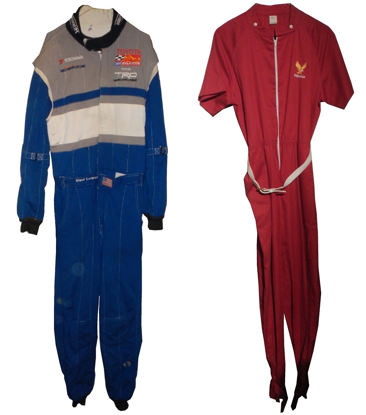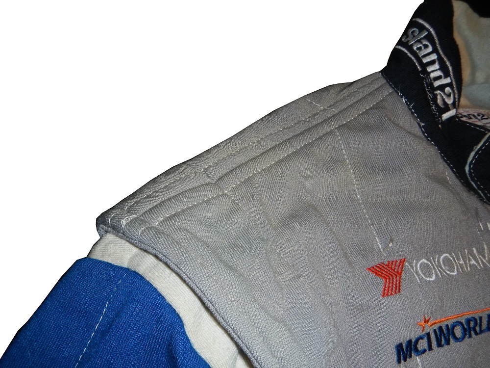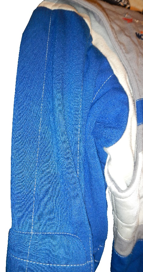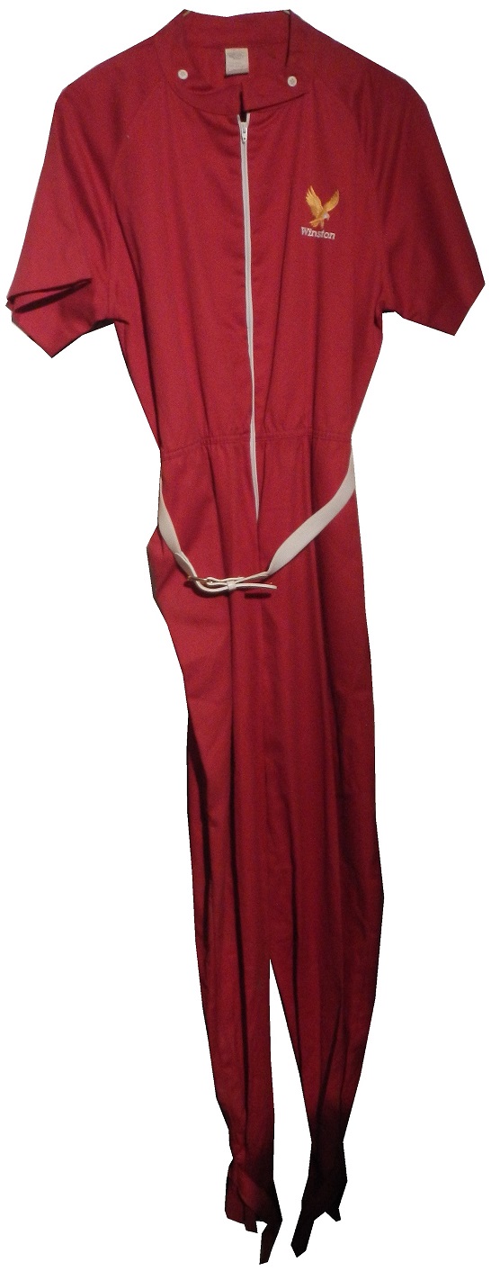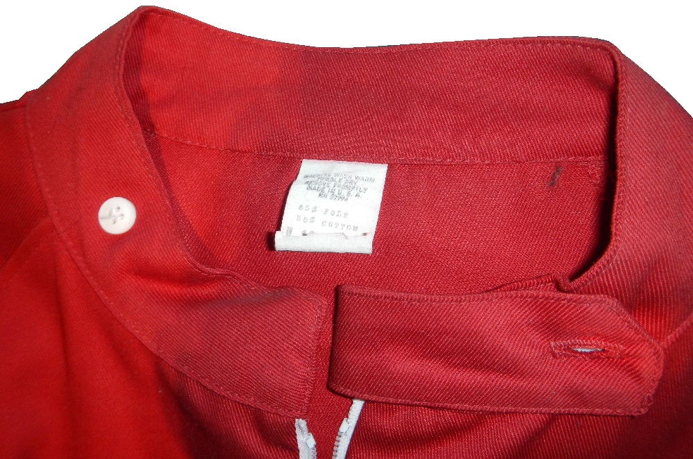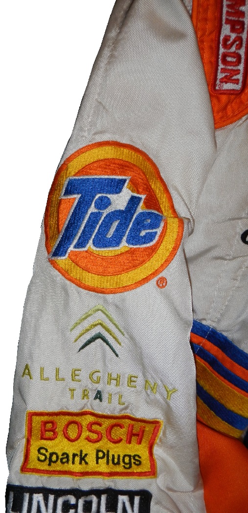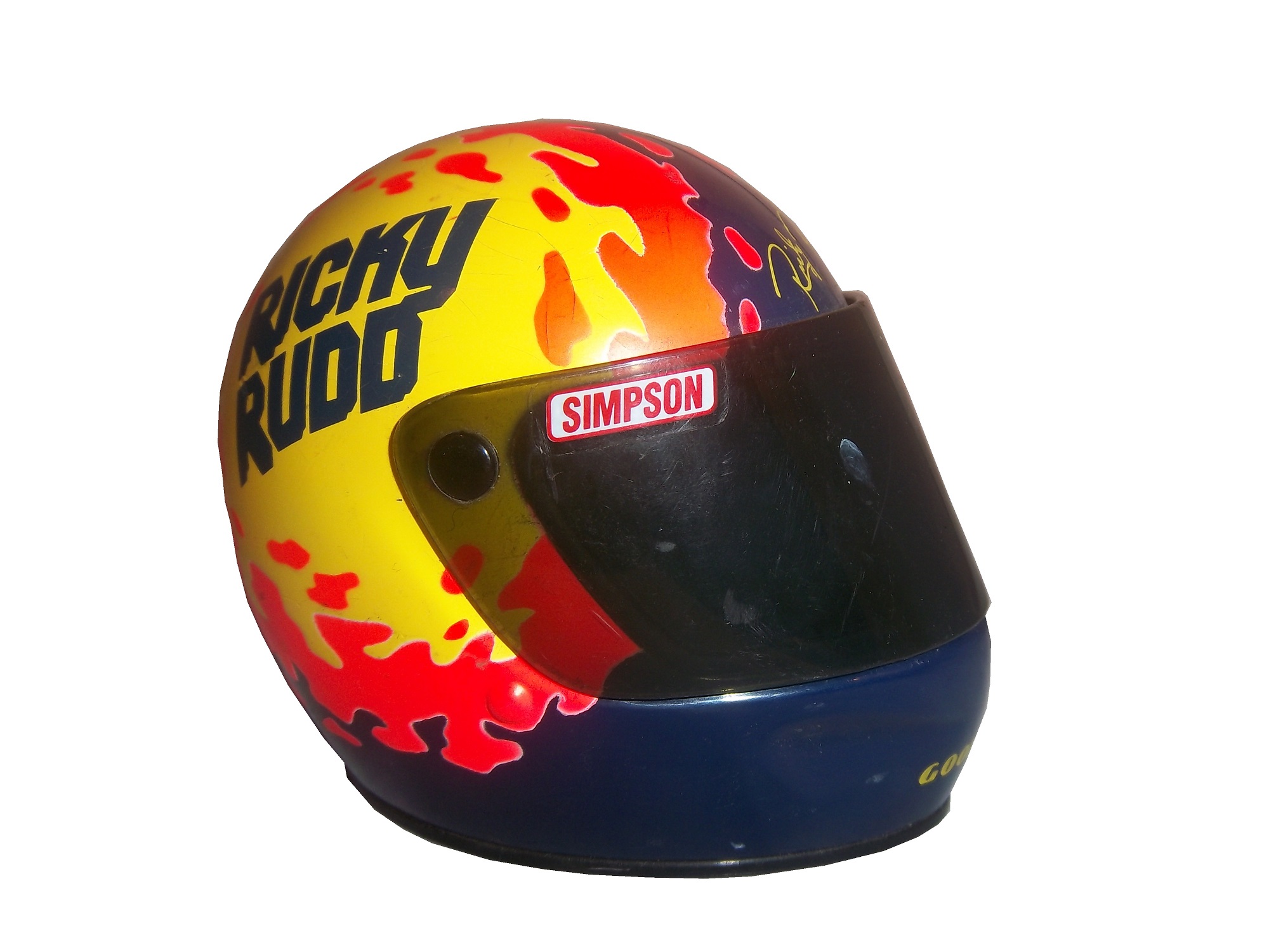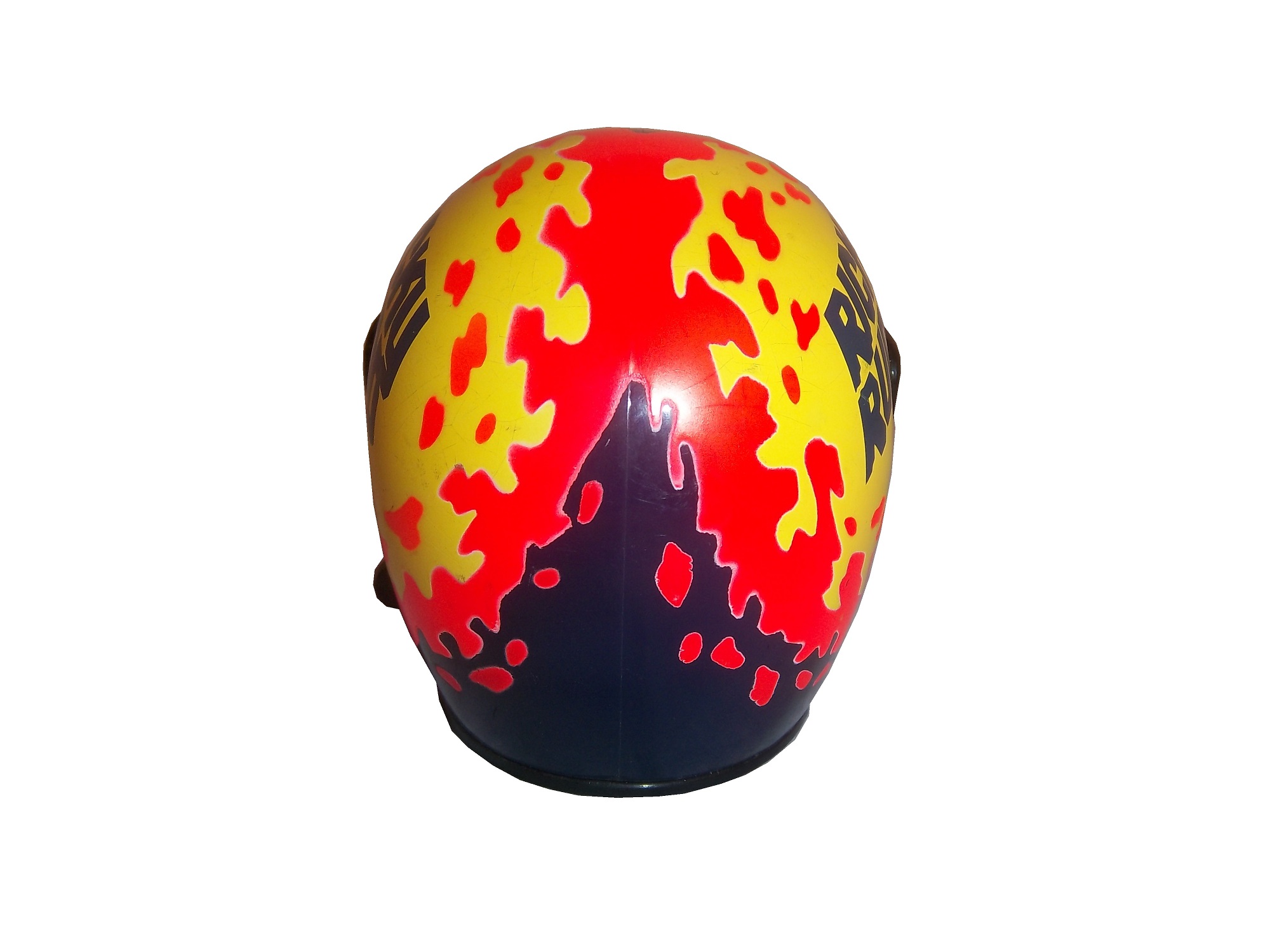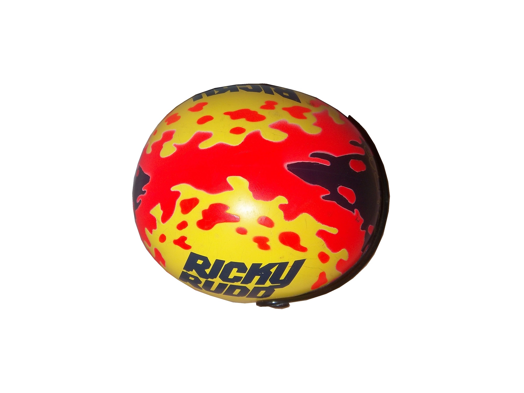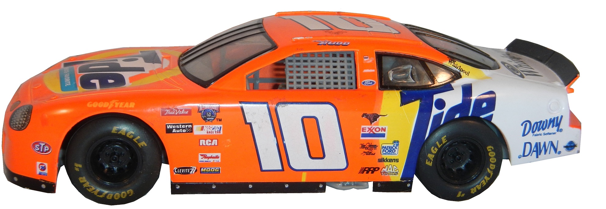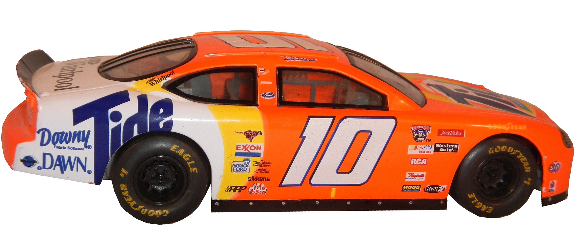
A collection of NASCAR, and NHRA race used equipment, including parts and sheet metal.
Tag: nascar
The Driver Suit Blog-Oakley…Not Just For Sunglasses Anymore!
When you say “driver suit” you think of names like Simpson, Sparco, Impact!, OMP, Stand 21, and Momo, you don’t automatically think of Oakley. Oakley started in 1975 as a sunglasses company by Jim Jannard in his garage in Foothill Ranch California. He got the name from Oakley, his English Setter. He went from working in his garage to one of the biggest sunglasses companies in the world. They design eyewear for athletes, the military, skiers, and, starting in the late 2000’s, motorsports apparel.
Oakley makes a number of racing items, the most prominent being driver suits. IndyCar drivers Justin Wilson, Ed Carpenter, Mike Conway, and Josef Newgarden all wear Oakley driver suits as do Alex Bowman, Ryan Truex, Martin Truex Jr., Clint Bowyer, Jeff Burton, Michael Waltrip, and Ricky Stenhouse Jr. in NASCAR and Tony Schumacher in the NHRA. While they make suits for the top drivers in the sport, for some reason they don’t seem to sell suits through their own site, you have to go to a third-party site to buy their racing suits…which to me seems odd, because no one else ever does that.
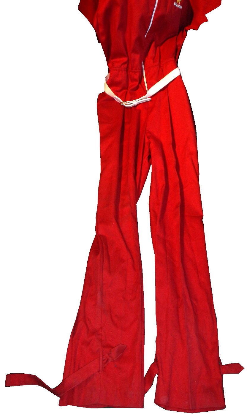
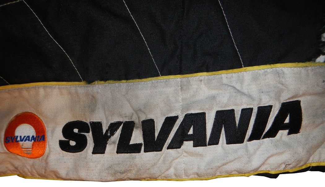
This particular suit was worn by Jason Romesburg, who was the rear tire changer for Paul Menard in 2010. Menard had a decent season, with a top 5, and 6 top 10’s and 17 laps led. The suit shows heavy use, with the right cuff on the pant leg destroyed.
In addition to the damage to the pant leg, what strikes me about this suit is that the material seems so light. While it is safety certified, it does not feel like a Nomex suit. It is very light for a suit of its size.
The suit is a two-piece and the jacket does not show as much wear as the pants, and I understand the reason. The logo about the Menard’s logo is for Mastercraft Doors.
Paul Menard races with Menard’s on the quarter panel and a rotating set of sponsors on the hood. Mastercraft Doors was on the hood for 3 races in 2010, the Brickyard 400, the Carfax 400 at Michigan, and the Ford 400 at Homestead. While the jacket doesn’t show as much wear, it does show some staining on the sleeves.
There are stains on the white area of the sleeves. Since Romesburg was a tire changer, this is to be expected.
The two piece suit is very popular with pit crews because it has the same fire protection as a one piece but with less restriction than a one piece. If you have ever worn a one-piece jumpsuit you know that it does restrict movement, as opposed to a jacket and pants of the exact same size. So when you are changing 4 tires in 14 seconds, you need every edge you get. What I don’t see on the jacket are arm gussets. These would be used to add movement without subtracting fire protection. I have two theories on this, either the suit fit well enough that they weren’t needed, or because the crews were switching jackets so often that expense or time dictated that arm gussets couldn’t be used.
One detail I love are the television logos on the sleeves.
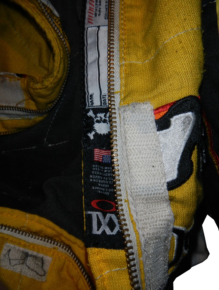
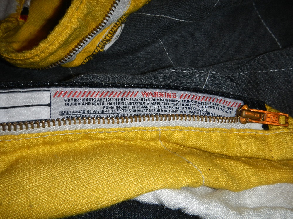
The dual logos on the sleeves look good and actually work well for both sponsors. The suit actually looks pretty good, but I do not like the quilt pattern on the legs, because it isn’t represented on the jacket, and it does look pretty odd in this respect. It does look like the two were designed and made by different people. I’m also amazed by how lackluster the warranty label is…
That is the shortest warranty label I have ever seen on a modern suit. Let’s compare it to a Simpson tag…
Wow that is a short warranty label, also, I don’t think a skull and crossbones don’t belong on this kind of suit, but it does say what it needs to say, just in a much shorter form than most driver suits.
In short, Oakley is making decent suits, and they are doing what they are designed to do, protect the driver from fire. I think Oakley suit could catch with minor league racers, provided they start marketing them better. The fact that they don’t sell them through their own website, and provide more info on the drivers who wear their suits make it hard to sell them to the general public. Puma, which has a lot of talent on its roster too, does not want to sell through its own website. Why they don’t is a mystery, as there is a lot of money in these suits, and people will pay for high quality suits made by a reputable company.
Before I get to the Paint Scheme Reviews, we have some breaking news on a story I had discussed in my Silly Season post a few weeks ago. I had mentioned at the time that Comcast was in negotiations with NASCAR to become the title sponsor of the Nationwide Series. Nationwide Insurance is leaving the series at the end of the season. Well it was announced on Wednesday that Comcast and NASCAR have come to a deal for a 10 year sponsorship of what will be called the Xfinity Series. It was not revealed how much the deal was worth, but we are talking hundreds of millions of dollars. I will be interested to see the series logo and what Xfinity does with the new deal. Now on to…
PAINT SCHEME REVIEWS!
Kevin Harvick #4 Budweiser Aluminum Pint Chevy SS A bit cluttered, the solid red works well with Budweiser, and it has a classic look with a modern twist. A-
Jeff Gordon #24 Drive to End Hunger Chevy SS The front is a bit over designed, the ribbon on the side does work somewhat, and the orange, I’d never thought I would say this, is too dull. I’ll give it a C+
Joe Nemechek #66 Friedman Law Firm Toyota Camry Law firms can be good at what they do, and they are apparently great at designing race cars. Clean, simple, attractive with a good color scheme eans an A+
Clay Rogers #75 Beard Oil Chevy SS Beard Motorsports is making their debut with Clay Rogers at Richmond in the Beard Oil Chevy. Their first time car has a great design scheme and a great color scheme and earns an A+
Dale Earnhardt Jr. #88 Nationwide Chevy SS A great design with a great color scheme and a great simple design. My sticking point with this is that I do not like the silver numbers, the font design just doesn’t work. I’ll give it a B+
David Stremme #90 Junie Donlavey Tribute Chevy SS Junie Donlavey passed away earlier this year, and Circle Sport Racing will run this design based on his 1972 Ford Gran Torino. It looks amazing, and I have to give it an A+
Josh Wise #98 Provident Metals Ford Fusion Looks good, good color scheme, decent design scheme. Too many stripes. I looked Provident Metals up and found that they are a precious metal dealer who make a currency called “Zombucks” which they jokingly market as “currency for the Apocalypse.” I’ll give it an A-
Home Beer Brewing Project Update…
Two weeks ago, I started the work on brewing beer using the Mr. Beer Homebrewing Kit. It fermented for two weeks, and I bottled it this week. The recipe will make 2 gallons of beer, which fits into four 2-liter bottles. I added the sugar to the bottles…
added some liquid to the bottom to get the mixture started…
then I bottled the four 2-liter bottles…
Now I have to wait two more weeks for the carbination to complete….
then I have to chill for two days prior to enjoying…Ugh! Well, I’ll keep you posted, and I’ll have some jam while I wait…
DGF2099 Productions-Introduction to Sports Memorabilia-Racing Figurines
A collection of NASCAR, and NHRA Starting Lineup figures from the late 1990’s.
The Driver Suit Blog-Die Casts Examined
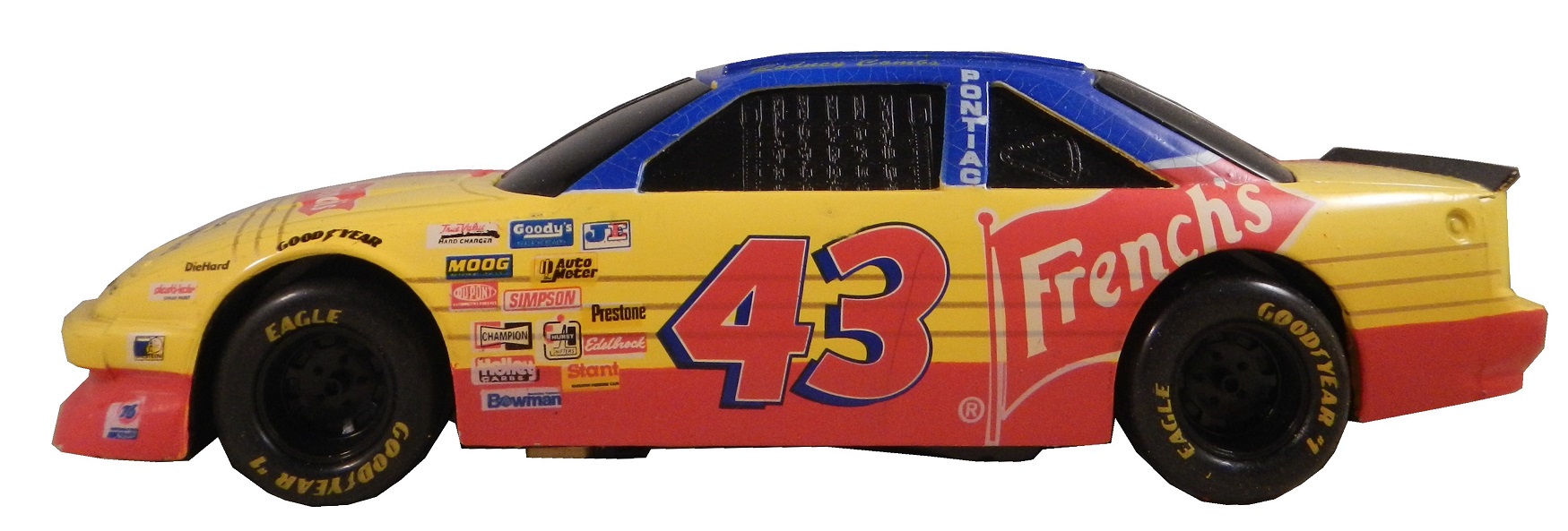
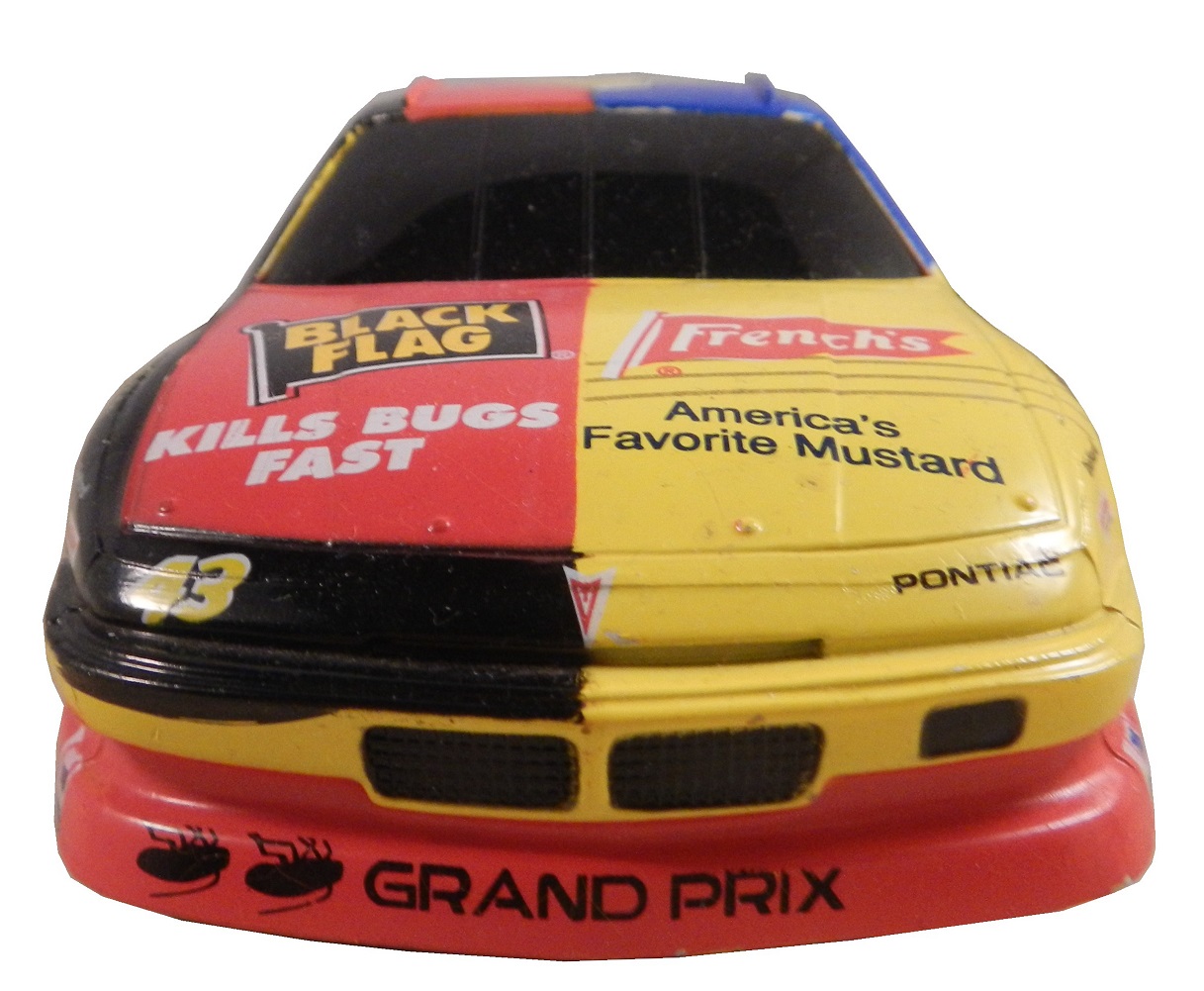
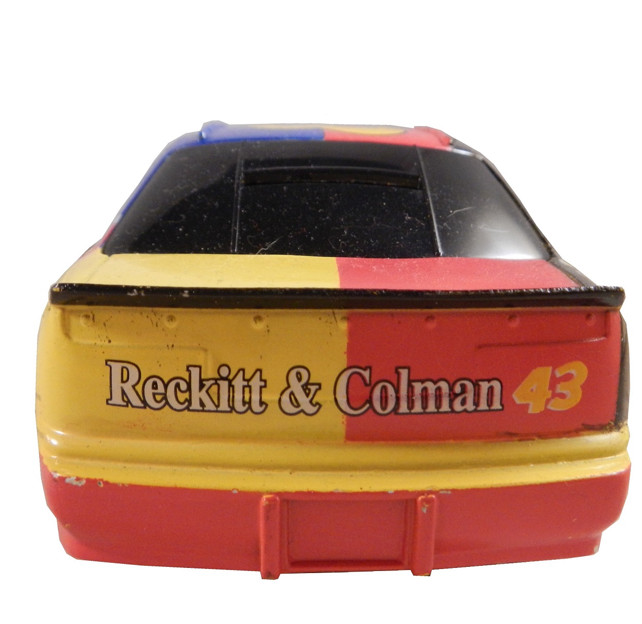
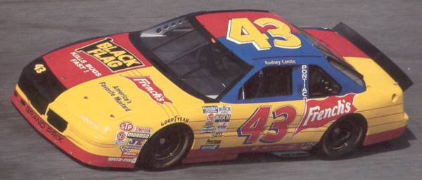
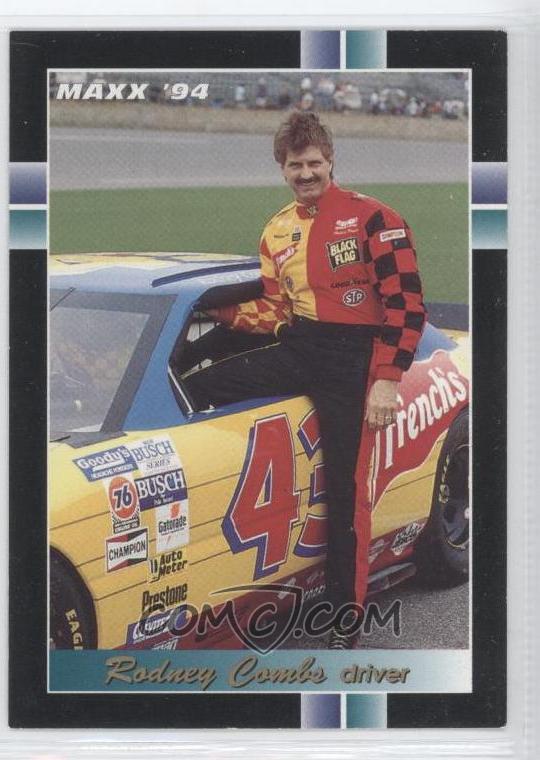
Recently, I came across a design quirk I had never seen on a car before. Take a look at these two cars above. These two design schemes were used by Rodney Combs in 1994. He raced in the Busch Grand National Series. He had 3 top 10’s, and led 11 laps. Now while these two paint schemes look completely different, they are a lot more connected than you might think…
Yes this was an actual paint scheme used on a real race car. I had never seen a design scheme like this before or since. It is one of the oddest paint schemes I have ever seen. Normally if two different companies sponsor a car, one runs their scheme for a number of races, and the other runs their scheme for a number of races. The driver suit is no less unusual. But I bought this for another reason besides just the paint scheme. This is an example of a NASCAR bank. These were marketed for a number of years to kids as collectibles. They were marketed to kids in the late 1980’s through the mid 1990’s. They are 1:24 scale, and are the same design as their die-cast toy counterparts. They faded out after a while. After trying to use one, I now understand why they faded from use. Let’s look at the bottom.
The bank opens with a key and the door that the coins are supposed to come out of is much too small for a standard American coin to fall out of. I tried to remove some coins and it took me 45 minutes to remove all of them. While they were a good idea on paper, their practicalities made them next to useless and needlessly annoying.
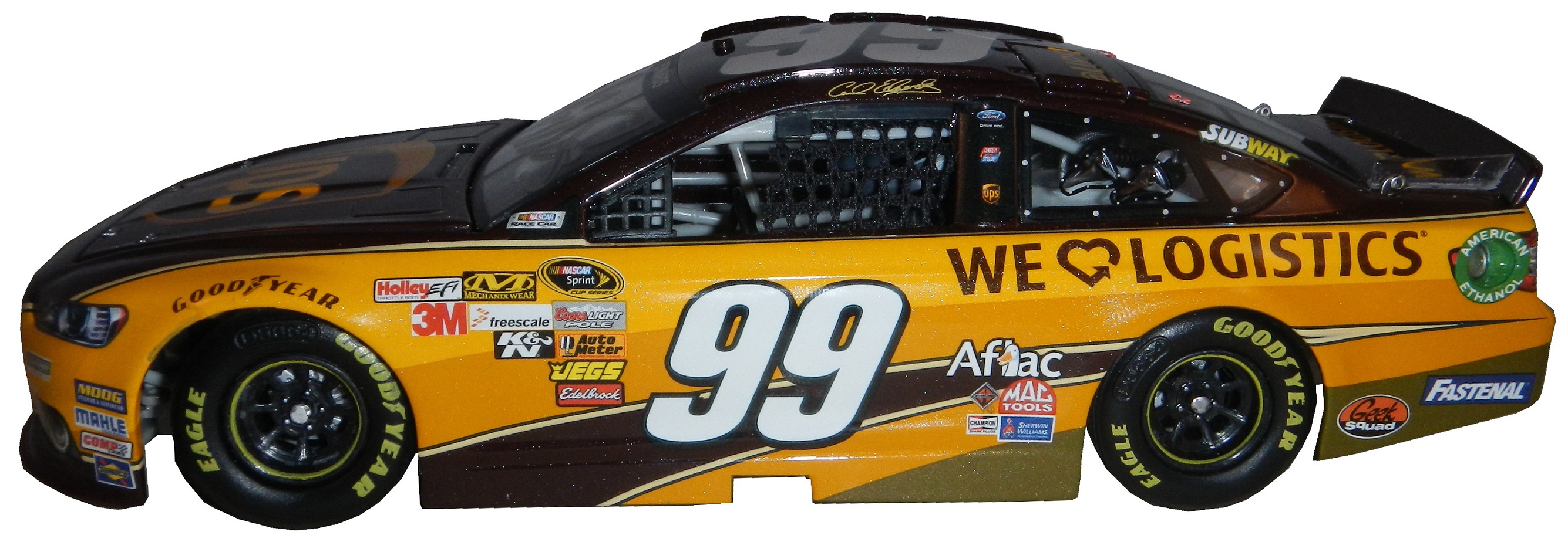
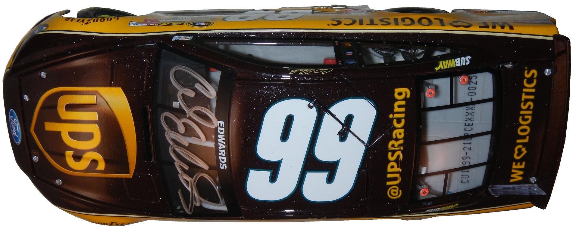
We move from the old to the new, with this Carl Edwards design from 2013. This is my first die-cast scheme of the Gen 6 car, and I have to say, I’m amazed at the detail. Check it out.
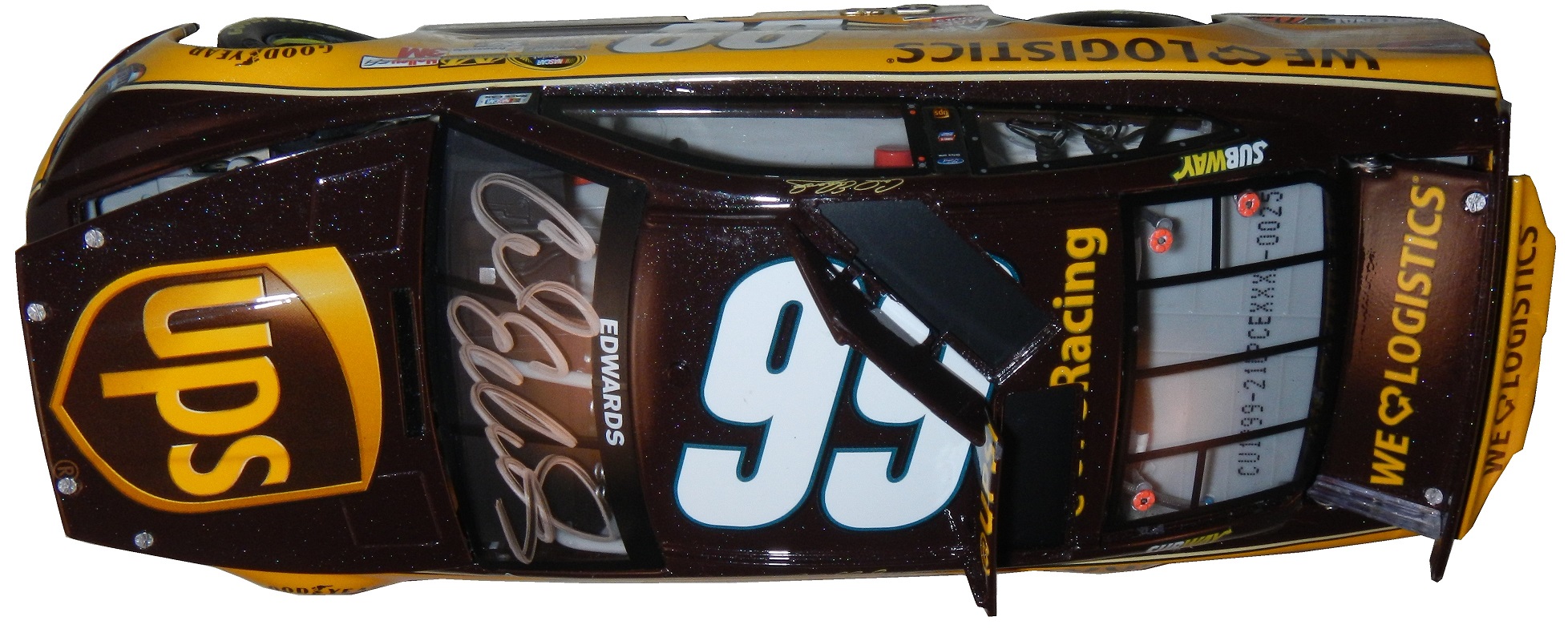
Carl ran the UPS scheme for one race in 2013, at the Quaker State 400, where he started 2nd, led 35 laps, but finished 21st. This is an autographed version, of which only 900 were sold by Lionel. Unlike the bank, this is a very accurate design. It’s made of a more lightweight metal, the window net is cloth,
the grill is accurate,
so are the door decals.
The hood opens,
the details are really accurate, and the paint scheme is amazingly accurate.
It has all the details of it’s on track counterparts at a 1:24 scale, with a nice Carl Edwards signature on the windshield. My biggest complaint is that the hood is difficult to open, and does not open very far. It takes away from the appearance.

Now we move on to the real thing with…
PAINT SCHEME REVIEWS!
Michael Annett #7 Pilot /Allstate Peterbuilt/St Jude’s Chevy SS Great color scheme, great simple design, A+
Clint Bowyer #15 Speed Digital Toyota Camry Clint keeps up a streak of bad schemes with his RK Motors scheme but with a different logo. D-
Greg Biffle #16 Ortho Fire Ant Killer Ford Fusion Great color scheme, good design, I give it an A-, the number still looks horrible.
Ty Dillion #33 Rheem Comfort Products Chevy SS From this moment onward, anytime I see camo on the side of a race car it will be an automatic 1 letter grade deduction. In this case it takes a great scheme, and ruins it. It would have been an A scheme, but with the contrasting designs, it earns a C-
Landon Cassill #40 CRC 1 Tank Renew Chevy SS Decent color scheme, but the design is a bit overdone. If it didn’t have the yellow stripes on the back I would like it more, but this is a decent scheme, worth a B-
Justin Allgaier #51 Auto Owners Insurance Chevy SS Can’t say anything bad about this scheme, A+
Michael McDowell #95 Teenage Mutant Ninja Turtles Ford Fusion Let me get this straight, The Turtles are in a Michael Bay directed movie that to date has made over $242 million and this scheme seems to go out of its way not to use the movie? I’m trying to make sense of that…OK, now the color scheme is good, but the back of the car is very cluttered. Even still it’s a B+ scheme.
DGF2099 Productions-Introduction to Sports Memorabilia-Racing Mini Helmets
A collection of NASCAR,IndyCar and NHRA mini helmets from across the years
The Driver Suit Blog-The Silly Season…and Why It Isn’t Silly For Me…
By David G. Firestone
It’s August, the summer is winding down, you are seeing back to school ads on TV, Halloween stuff is popping up in stores, and the Silly Season is officially underway. For me, this begins the most hectic part of the year for The Driver Suit Blog. Within the next few months, driver changes, sponsor changes and team changes will be announced. There is always a shakeup of some kind, and this year will be no different.
Carl Edwards, for example, will be leaving Roush Fenway Racing after the season. It was announced on Tuesday that Edwards would be moving to Joe Gibbs Racing and driving the #19 Toyota Camry. He has sponsors, one of which is Arris, which is a communications company for 17 races. The remaining 19 races he has a sponsor for the other races, but that hasn’t been addressed yet.
Where a driver is in the points helps with these kinds of decisions. As it stands right now, there are 1- drivers in the Chase because of a victory, and X driver who are in the Chase because of points. Will that change before Chicagoland? I have no reason to believe it won’t. I will be watching the Federated Auto Parts 400 this year, in light of what happened last year. I would have to believe that something like last year can happen. As of today, there are 12 drivers, AJ Allmendinger, Aric Almorla, Kurt Busch, Kyle Busch, Dale Earnhardt Jr., Carl Edwards, Jeff Gordon, Denny Hamlin, Kevin Harvick, Jimmy Johnson, Brad Keselowski, and Joey Logano have a spot in the Chase due to wins. That leaves 4 spots open, and with 3 races to go it is highly unlikely that there will be 3 new winners, so some drama can and will happen.
The part where it gets really bad is that from here to Daytona in February, there will be 2015 paint schemes released on a regular basis. The problem is that every 2015 scheme I grade will have to be taken with a grain of salt. For example,in mid-August last year, Brian Vickers was announced to drive the #55 Aaron’s Dream Machine. The announcement included photos of the car. However, later on, a new design was released, and became the current standard. I didn’t complain too much because both designs are good. But this is a constant issue for me, do I grade them as-is, or do I back off and wait? This will get more and more frustrating between now and Homestead. An example of this is that Ricky Stenhouse Jr.and Greg Biffle just announced one of their new car designs for 2015. I will take it with a grain of salt, but I will grade it below as I normally would.
Something I also have to take into consideration is that something late in the season will cause a major change to the playing field. A perfect example is the unpleasantness last year at the Federated Auto Parts 400. After that scandal, Napa announced that it would be leaving Michael Waltrip Racing, and that left Martin Truex Jr. without a ride. He moved to Furniture Row Racing, and the full-time #56 became the part time #66.
One other major story I am following and I’m sure you are as well is who will sponsor the Nationwide Series next season? It was announced in 2013 that after 2014, Nationwide Insurance would be leaving as the series sponsor. Nothing definitive has been announced as of today, but I would have to believe there will be an announcement before the season ends. I’m curious just as the rest of us as to who that would be. Comcast is negotiatinng a deal for the series, and I would think a deal would be announced quite soon.
There will be driver changes, sponsor changes, team changes, and schedule changes. A rumor is going around that The Southern 500 will move back to Labor Day, Atlanta will follow the Daytona 500, and that the first Bristol race is moving from early March to mid-April. Again, when the schedule is announced we will know for sure. There are little changes every year, and after a while these little changes add up to big changes.
One other bit of news I need to address is that on Monday, a number of teams stayed at Michigan to test some 2015 rule changes. All totaled, 6 different car configurations were tested for a total of 160 laps. Again, equipment changes are a common event between seasons and this is nothing new. Information will be taken, adjustments will be made, and there will be more testing during the off season. Once that happens, the rules package will be created and distributed to the teams for the upcoming season.
Now before I get into paint schemes, I’d like to discuss something that has been happening in F1 for a while and I think needs to be stopped. Between the Hungarian Grand Prix on July 27, and the Belgian Grand Prix on August 29, F1 is on it’s “summer break.” This is due to the high travel restrictions and the limit on active crew members an F1 team can have. Teams don’t show up to the track on the Friday before the race, they show up on the Monday before the race. While I am not unsympathetic to the demands on crew members, I am a racing fan. F1 is one of the most watched sports in the world, with telecasts that can get as many as 54 million viewers worldwide. Fans love the sport, and the summer break is a headache. So here is my solution. First, we double the number of active personnel that the team can have, so fresh guys that can be rotated. Second, we extend the season by 4 weeks, so that there can be time for drivers and crew to relax between events.
Now we have a lot of ground to cover when it comes to…
PAINT SCHEME REVIEWS!
First, we have our first 2015 paint scheme,
Greg Biffle #16 Ortho Fire Ant Killer Ford Fusion Great color scheme, good design, I give it an A-, the number still looks horrible.
Ricky Stenhouse Jr. #17 Fastenal Ford Fusion Decent design, great color scheme, I hope this scheme stays on…A
Now on to 2014 Schemes…
Brad Keselowski #2 Miller Lite/Careers for Veterans Ford Fusion This is a rare case where the quarterpanel logo needs to be bigger. The lettering is hard to see in this photo, and was harder to see on the telecast. It takes an A scheme down to a B+
Michael Annett #7 Pilot /Allstate Peterbuilt Chevy SS Great color scheme, great simple design, A+
Greg Biffle #16 Roush Perfomance Ford Fusion Red and black is a great color combination, and I like the dot fade effect. This is the best Biffle scheme all year and it earns an A
Greg Biffle #16 Hire our Heroes Ford Fusion Another prime example of why came and race cars don’t mix. This is just an awful mess. The American flag motif just looks horrible with the camo, but I think it might look good by itself. I’ll give it a D
Kyle Busch #18 Doublemint Gum Toyota Camry Great color scheme, great design, A+
Alex Bowman #23 Dustless Blasting Toyota Camry I don’t like green on race cars, but at least here it is used tastefully. It works very well and earns an A+
Cole Whitt #26 Bully Hill Vineyards Toyota Camry Good color scheme, odd design for the sponsor. A vineyard using a spilled wine design to sell wine…not a good look. C-
Cole Whitt #26 Speed Stick/Iowa City Chop House Toyota Camry I find it amazing that the same team that brought the terrible scheme above could come up with an A+ scheme for the race one week later.
Travis Kvapil #32 Keen Parts/Try Androzone Ford Fusion Great simple design and a great color scheme earns an A+
Travis Kvapil #32 Skuttle Tight Ford Fusion Great simple design and a great color scheme earns an A+
Alex Kennedy #33 Circle Sport Chevy SS Good color scheme, bad design, it’s giving me a headache, D+
David Stremme #33 ThunderCoal Chevy SS Good color scheme bad design, C-
Aric Almirola #43 Eckrich Ford Fusion Ok, I thought we had this said, but I’ll say it again…CAMO DOES NOT WORK ON RACE CARS! It takes an A scheme down to a C-
Jimmie Johnson #48 Jimmie Johnson Foundation Chevy SS Another classic Jimmie Johnson A+ scheme!
Jimmie Johnson #48 Lowes Chevy SS Reportedly, Jimmie was unhappy with the color scheme change from blue to white and asked Lowes to swtich back to blue after a series of sub-par finishes. Lowes agreed, and the car is another classic Jimmie Johnson A+ scheme!
Joe Nemechek #66 Landcastle Title Toyota Camry Great simple design and a great color scheme earns an A+
Nelson Piquet Jr. #77 Worx Ford Fusion Another tasteful use of green, another A+ scheme!
Josh Wise #98 Provident Metals Ford Fusion The word horrible is not enough to describe this car! Too overdesigned and with a bad color scheme, I can only give it an F
Carl Edwards #99 Ford Eco-Boost Ford Fusion The word of the day is overdesigned. Good color scheme, but overdesgined and a C- grade
Before I go I wanted to tell you about a project. I recently bought a Mr. Beer home brewing kit. It is a kit for beginers like me who have no experience brewing beer. It is a realativly simple process. The kit comes with a 2 gallon fermenter, some booster sugar, brewer’s yeast, a pale ale hopped malt extract, and some no rinse cleanser.
You need a non wooden spoon, a glass bowl a can opener and a measuring cup.
You use the no rinse cleanser to sanitize everything you use to make the beer, then you place the hopped malt extract and booster containers in hot water while you boil 4 cups of water.
While the water is boiling, you fill the fermenter with 4 quarts of cold water. Once the water is boiled, you add the hopped malt extract, and booster sugar, and mix well.
Then you pour the mix into the fermenter, add more water, and then add the yeast.
Now comes the hard part, we have to wait two weeks for it to ferment. I’ll keep you posted.
DGF2099 Productions-Introduction to Sports Memorabilia-NASCAR Die Cast Episode 2
For the 12 season premier, we will look at my collection of Nationwide, Camping World Truck, IndyCar and NHRA die casts
DGF2099 Productions-Introduction to Sports Memorabilia-NASCAR Die Cast Episode 1
For the 12 season premier, we will look at my NASCAR Sprint Cup Die Cast collection.
DGF2099 Productions-Introduction to Press Kits-1995 Bill Sedgewick Press Kit
Bill Sedgewick raced for one season in the Die Hard Chevy 1500 CKfor the 1996 Craftsman Truck Series for Darrell Waltrip Motorsports, and this press kit was issued for that season.
The Driver Suit Blog-Which Way Does Your Favorite Team Lean?
Number designs are an important detail in American auto racing, especially NASCAR, where the number is used on all of the merchandise sold to fans. The number is an identity for the driver and for the fans. While I was watching the Camping World RV Sales 301, for some reason, I noticed that the majorty of the car number are slanted. As the race went on, I noticed that almost all of them were slanted to the right. The Carl Edwards die cast above shows what I mean. Let’s look at the driver’s side car number up close.
As you can see, the numbers are slanted with the top slanted to the right of the bottom. This gives the illusion that the numbers are being blown back by the speed of the car. I kept thinking about this and I decieded to see just who uses which slant when designing numbers for race cars. I wound up doing the NASCAR Sprint Cup Series, the Verizon IndyCar Series, and Formula 1. Here is what my research found…
NASCAR SPRINT CUP SERIES
Jamie McMurray-1-Straight
Brad Keselowski-2-Right
Austin Dillon-3-Left
Kevin Harvick-4-Right
Kasey Kahne-5-Right
Michael Annett-7-Right
Marcos Ambrose-9-Right
Danica Patrick-10-Right
Denny Hamlin-11-Right
Ryan Blaney/Juan Pablo Montoya-12-Right
Casey Mears-13-Right
Tony Stewart-14-Right
Clint Bowyer-15-Right
Greg Biffle-16-Right
Ricky Stenhouse Jr.-17-Right
Kyle Busch-18-Right
Matt Kenseth-20-Right
Trevor Bayne-21-Straight
Joey Logano-22-Right
Alex-Bowman-23-Right
Jeff Gordon-24-Right
Cole Whitt-26-Right
Paul Menard-27-Right
Joe Nemecheck-29-Right
Parker Kligerman-30-Right
Ryan Newman-31-Left
Travis Kvapil/Blake Koch/Boris Said/Eddie MacDonald-31-Right/Straight
RCR/Circle Sport-33-Left(RCR)/Right/(Circle Sport)
David Ragan-34-Right
David Reutimann-35-Right
Reed Sorenson-36-Right
David Gilliland-38-Right
Landon Cassill-40-Right
Kurt Busch-41-Right
Kyle Larson-42-Right
Aric Almirola-43-Right
JJ Yeley-44-Right
AJ Allmendinger-47-Right
Jimmie Johnson-48-Right
Justin Allgaier-51-Right
Bobby Labonte-52-Right
Brian Vickers-55-Right
Michael Waltrip/Joe Nemechek-66-Right
Dave Blaney-77-Straight
Martin Truex Jr.-78-Right
Ryan Truex-83-Right
Joe Nemecheck-87-Right
Dale Earnhardt Jr.-88-Right
BK Racing-93-Right
Michael McDowell-95-Right
Josh Wise-98-Right
Carl Edwards-99-Right
VERIZON INDYCAR SERIES
Juan Pablo Montoya-2-Straight
Helio Castroneves-3-Straight
Jacques Villeneuve-5-Right
Townsend Bell-6-Right
Mikhail Aleshin-7-Right
Ryan Briscoe-8-Straight
Scott Dixon-9-Straight
Tony Kanaan-10-Straight
Sebastien Bourdais-11-Right
Will Power-12-Straight
Takuma Sato-14-Straight
Graham Rahal-15-Right
Oriol Servia-16-Right
Sebastian Saavedra-17-Straight
Carlos Huertas-18-Right
Justin Wilson-19-Right
Ed Carpenter/Mike Conway-20-Right
JR Hilderbrand-21-Right
Sage Karan-22-Right
Marco Andretti-25-Right
Kurt Busch/Franck Montagny-26-Right
James Hinchcliffe-27-Right
Ryan Hunter-Reay-28-Right
James Davison-33-Straight
Carlos Munoz-34-Right
Martin Plowman-41-Straight
Pippa Mann-63-Right
Josef Newgarden-67-Straight
Alex Tagliani-68-Straight
Simon Pagenaud-77-Right
Charlie Kimball-83-Straight
Buddy Lazier-91-Right
Jack Hawksworth-98-Straight
FORMULA 1
Sebastian Vettel-1-Straight
Daniel Ricciardo-3-Straight
Max Chilton-4-Straight
Nico Rosberg-6-Straight
Kimi Raikkonen-7-Straight
Romain Grosjean-8-Right
Marcus Ericsson-9-Straight
Kamui Kobayashi-10-Straight
Sergio Perez-11-Right
Pastor Maldonado-13-Right
Fernando Alonso-14-Right
Jules Bianchi-17-Straight
Felipe Massa-19-Straight
Kevin Magnussen-20-Straight
Esteban Gutierrez-21-Straight
Jenson Button-22-Straight
Jean-Eric Vergne-25-Straight
Daniil Kvyat-26 Straight
Nico Hulkenberg-27-Straight
Lewis Hamilton-44-Straight
Valtteri Bottas-77-Straight
Adrian Sutil-99-Straight
Ok, that’s a lot to swallow, so let’s add the total number of number designs and look at the data:
*NASCAR-54 *IndyCar-33 *Formula 1-22 *Totals-109
Right-48-89% Right-19-58% Right-4-18% Right-71-65%
Straight-3-5.5% Straight-14-42% Straight-18-82% Straight-35-32%
Left-3-5.5% Left-0-0% Left-0-0% Left-3-3%
The Sprint Cup car numbers overwhelmingly are designed to lean to the right. In fact, only 6 of the 54 teams don’t use numbers that lean to the right. In IndyCar, it is much more down the middle, with 19 cars with right leaning numbers and 14 straight leaning numbers. Formula 1 is the straightest series, with only 4 of the 22 numbers being slanted. NASCAR is the only group of the series that has left-leaning numbers, all 3 of which 3, 31, and 33, are raced by Richard Childress Racing.
It is one of those odd idiosyncrasies of racing design that a lot of people see but don’t notice. In fact, I didn’t notice until a couple weeks ago that the numbers seem to lean from one side to another. I also am curious as to why so many teams choose to have the car numbers lean to the right. I’m not saying it looks bad, they, for the most part, look really good.
Now we continue our theme with…
PAINT SCHEME REVIEWS!
Austin Dillon #3 Mycogen Seeds Chevy SS The red black and white scheme works very well, and it has a really good design that works well and earns an A
Kevin Harvick #4 Mobil 1 Chevy SS For a Mobil 1 design, this is pretty good. It is a lot less clutter, and shorter stripes than Tony Stewart’s car, and the color scheme is good. A+
Juan Pablo Montoya #12 Go Penske Ford Fusion Great simple design, decent color scheme earns an A-
Greg Biffle #16 3M 1942 Throwback Ford Fusion An perfect example of why throwback schemes fail. A classic logo which I have to admit looks really good, on a modern car, with modern design, modern numbers, and modern logos. It just looks out of place. F
Jeff Gordon #24 Axalta/Maaco Chevy SS The red, yellow and black color scheme works, except the blue and white Maaco logo scheme contrasts with it. The Pepsi globe looks odd there too, so I can’t give it any higher than a C-
Cole Whitt #26 Toyota of Scranton Racing Toyota Camry Great color scheme, great simple design, A+
David Ragan #34 MDS Ford Fusion Great simple design, decent color scheme earns an A-
David Ragan #34 A&W Root Beer Float Day Ford Fusion The color is good, the basic design scheme is good, but the Root Beer Float Day logos are too small. Even in this picture they look too small and are hard to see. If I am looking at a picture and I think it is too small, how do you think it will look on the track? C-
Reed Sorenson #36 Red Rocks Cafe Chevy SS The red black and white scheme works very well, and it has a really good design that works well and earns an A
Reed Sorenson #36 Zing Zang Chevy SS The overall design looks like a Richard Petty Motorsports car, the color schemes are all over the place, and the logo looks too much like a Mountain Dew logo. I give it a D-
Bobby Labonte #37 Accell Construction Chevy SS Good color scheme, but the awful template is back for Tommy Baldwin. It is really sad, because this could be a great scheme, but the template takes it from an A to a C-
Landon Cassill #40 Cars For Sale Chevy SS The yellow is too bright, and the gray and black numbers look too dark on the side. The design is mediocre and I’ll give it a C-
Kurt Busch #41 Haas Automotion Chevy SS This is a perfect example of why gray-scale color schemes don’t work. By itself it is a good look, but the Monster Energy logo, the Goodyear logo, and the contigency logos ruin the look. If it were all gray-scale, I would give it an A, but because of those flaws, it earns a B-
Aric Almirola #43 Go Bowling Ford Fusion I love what they did here. The bowling ball nose and pin design give a great impression, and the color scheme works very well here. A+
Justin Allgaier #51 Collision Cure Chevy SS Yellow black and blue is a bold color scheme choice, but this works. The design is simple, and it has a really good unique look, and I’ll give it an A
Dale Earnhardt Jr. #88 Michael Baker International Chevy SS Basically this is the National Guard scheme with a different color scheme, and let me tell you, it just doesn’t work. I love the new number design, but blue and black just doesn’t work. The overall color scheme is not great either, and it shows. It takes an A+ scheme and takes it down to a C+
Michael McDowell #95 Thrivent Financial Ford Fusion Levine Family Racing has improved leaps and bounds over last year and it shows. Great color scheme, great design, A+