For the 12 season premier, we will look at my collection of Nationwide, Camping World Truck, IndyCar and NHRA die casts
Tag: nascar
DGF2099 Productions-Introduction to Sports Memorabilia-NASCAR Die Cast Episode 1
For the 12 season premier, we will look at my NASCAR Sprint Cup Die Cast collection.
DGF2099 Productions-Introduction to Press Kits-1995 Bill Sedgewick Press Kit
Bill Sedgewick raced for one season in the Die Hard Chevy 1500 CKfor the 1996 Craftsman Truck Series for Darrell Waltrip Motorsports, and this press kit was issued for that season.
The Driver Suit Blog-Which Way Does Your Favorite Team Lean?
 By David G. Firestone
Number designs are an important detail in American auto racing, especially NASCAR, where the number is used on all of the merchandise sold to fans. The number is an identity for the driver and for the fans. While I was watching the Camping World RV Sales 301, for some reason, I noticed that the majorty of the car number are slanted. As the race went on, I noticed that almost all of them were slanted to the right. The Carl Edwards die cast above shows what I mean. Let’s look at the driver’s side car number up close. As you can see, the numbers are slanted with the top slanted to the right of the bottom. This gives the illusion that the numbers are being blown back by the speed of the car. I kept thinking about this and I decieded to see just who uses which slant when designing numbers for race cars. I wound up doing the NASCAR Sprint Cup Series, the Verizon IndyCar Series, and Formula 1. Here is what my research found…
NASCAR SPRINT CUP SERIES
Jamie McMurray-1-Straight
Brad Keselowski-2-Right
Austin Dillon-3-Left
Kevin Harvick-4-Right
Kasey Kahne-5-Right
Michael Annett-7-Right
Marcos Ambrose-9-Right
Danica Patrick-10-Right
Denny Hamlin-11-Right
Ryan Blaney/Juan Pablo Montoya-12-Right
Casey Mears-13-Right
Tony Stewart-14-Right
Clint Bowyer-15-Right
Greg Biffle-16-Right
Ricky Stenhouse Jr.-17-Right
Kyle Busch-18-Right
Matt Kenseth-20-Right
Trevor Bayne-21-Straight
Joey Logano-22-Right
Alex-Bowman-23-Right
Jeff Gordon-24-Right
Cole Whitt-26-Right
Paul Menard-27-Right
Joe Nemecheck-29-Right
Parker Kligerman-30-Right
Ryan Newman-31-Left
Travis Kvapil/Blake Koch/Boris Said/Eddie MacDonald-31-Right/Straight
RCR/Circle Sport-33-Left(RCR)/Right/(Circle Sport)
David Ragan-34-Right
David Reutimann-35-Right
Reed Sorenson-36-Right
David Gilliland-38-Right
Landon Cassill-40-Right
Kurt Busch-41-Right
Kyle Larson-42-Right
Aric Almirola-43-Right
JJ Yeley-44-Right
AJ Allmendinger-47-Right
Jimmie Johnson-48-Right
Justin Allgaier-51-Right
Bobby Labonte-52-Right
Brian Vickers-55-Right
Michael Waltrip/Joe Nemechek-66-Right
Dave Blaney-77-Straight
Martin Truex Jr.-78-Right
Ryan Truex-83-Right
Joe Nemecheck-87-Right
Dale Earnhardt Jr.-88-Right
BK Racing-93-Right
Michael McDowell-95-Right
Josh Wise-98-Right
Carl Edwards-99-Right
VERIZON INDYCAR SERIES
Juan Pablo Montoya-2-Straight
Helio Castroneves-3-Straight
Jacques Villeneuve-5-Right
Townsend Bell-6-Right
Mikhail Aleshin-7-Right
Ryan Briscoe-8-Straight
Scott Dixon-9-Straight
Tony Kanaan-10-Straight
Sebastien Bourdais-11-Right
Will Power-12-Straight
Takuma Sato-14-Straight
Graham Rahal-15-Right
Oriol Servia-16-Right
Sebastian Saavedra-17-Straight
Carlos Huertas-18-Right
Justin Wilson-19-Right
Ed Carpenter/Mike Conway-20-Right
JR Hilderbrand-21-Right
Sage Karan-22-Right
Marco Andretti-25-Right
Kurt Busch/Franck Montagny-26-Right
James Hinchcliffe-27-Right
Ryan Hunter-Reay-28-Right
James Davison-33-Straight
Carlos Munoz-34-Right
Martin Plowman-41-Straight
Pippa Mann-63-Right
Josef Newgarden-67-Straight
Alex Tagliani-68-Straight
Simon Pagenaud-77-Right
Charlie Kimball-83-Straight
Buddy Lazier-91-Right
Jack Hawksworth-98-Straight
FORMULA 1
Sebastian Vettel-1-Straight
Daniel Ricciardo-3-Straight
Max Chilton-4-Straight
Nico Rosberg-6-Straight
Kimi Raikkonen-7-Straight
Romain Grosjean-8-Right
Marcus Ericsson-9-Straight
Kamui Kobayashi-10-Straight
Sergio Perez-11-Right
Pastor Maldonado-13-Right
Fernando Alonso-14-Right
Jules Bianchi-17-Straight
Felipe Massa-19-Straight
Kevin Magnussen-20-Straight
Esteban Gutierrez-21-Straight
Jenson Button-22-Straight
Jean-Eric Vergne-25-Straight
Daniil Kvyat-26 Straight
Nico Hulkenberg-27-Straight
Lewis Hamilton-44-Straight
Valtteri Bottas-77-Straight
Adrian Sutil-99-Straight
Ok, that’s a lot to swallow, so let’s add the total number of number designs and look at the data:
*NASCAR-54 *IndyCar-33 *Formula 1-22 *Totals-109
Right-48-89% Right-19-58% Right-4-18% Right-71-65%
Straight-3-5.5% Straight-14-42% Straight-18-82% Straight-35-32%
Left-3-5.5% Left-0-0% Left-0-0% Left-3-3%
The Sprint Cup car numbers overwhelmingly are designed to lean to the right. In fact, only 6 of the 54 teams don’t use numbers that lean to the right. In IndyCar, it is much more down the middle, with 19 cars with right leaning numbers and 14 straight leaning numbers. Formula 1 is the straightest series, with only 4 of the 22 numbers being slanted. NASCAR is the only group of the series that has left-leaning numbers, all 3 of which 3, 31, and 33, are raced by Richard Childress Racing.
It is one of those odd idiosyncrasies of racing design that a lot of people see but don’t notice. In fact, I didn’t notice until a couple weeks ago that the numbers seem to lean from one side to another. I also am curious as to why so many teams choose to have the car numbers lean to the right. I’m not saying it looks bad, they, for the most part, look really good.
Now we continue our theme with…
PAINT SCHEME REVIEWS!
Austin Dillon #3 Mycogen Seeds Chevy SS The red black and white scheme works very well, and it has a really good design that works well and earns an A
Kevin Harvick #4 Mobil 1 Chevy SS For a Mobil 1 design, this is pretty good. It is a lot less clutter, and shorter stripes than Tony Stewart’s car, and the color scheme is good. A+
Juan Pablo Montoya #12 Go Penske Ford Fusion Great simple design, decent color scheme earns an A-
Greg Biffle #16 3M 1942 Throwback Ford Fusion An perfect example of why throwback schemes fail. A classic logo which I have to admit looks really good, on a modern car, with modern design, modern numbers, and modern logos. It just looks out of place. F
Jeff Gordon #24 Axalta/Maaco Chevy SS The red, yellow and black color scheme works, except the blue and white Maaco logo scheme contrasts with it. The Pepsi globe looks odd there too, so I can’t give it any higher than a C-
Cole Whitt #26 Toyota of Scranton Racing Toyota Camry Great color scheme, great simple design, A+
David Ragan #34 MDS Ford Fusion Great simple design, decent color scheme earns an A-
David Ragan #34 A&W Root Beer Float Day Ford Fusion The color is good, the basic design scheme is good, but the Root Beer Float Day logos are too small. Even in this picture they look too small and are hard to see. If I am looking at a picture and I think it is too small, how do you think it will look on the track? C-
Reed Sorenson #36 Red Rocks Cafe Chevy SS The red black and white scheme works very well, and it has a really good design that works well and earns an A
Reed Sorenson #36 Zing Zang Chevy SS The overall design looks like a Richard Petty Motorsports car, the color schemes are all over the place, and the logo looks too much like a Mountain Dew logo. I give it a D-
Bobby Labonte #37 Accell Construction Chevy SS Good color scheme, but the awful template is back for Tommy Baldwin. It is really sad, because this could be a great scheme, but the template takes it from an A to a C-
Landon Cassill #40 Cars For Sale Chevy SS The yellow is too bright, and the gray and black numbers look too dark on the side. The design is mediocre and I’ll give it a C-
Kurt Busch #41 Haas Automotion Chevy SS This is a perfect example of why gray-scale color schemes don’t work. By itself it is a good look, but the Monster Energy logo, the Goodyear logo, and the contigency logos ruin the look. If it were all gray-scale, I would give it an A, but because of those flaws, it earns a B-
Aric Almirola #43 Go Bowling Ford Fusion I love what they did here. The bowling ball nose and pin design give a great impression, and the color scheme works very well here. A+
Justin Allgaier #51 Collision Cure Chevy SS Yellow black and blue is a bold color scheme choice, but this works. The design is simple, and it has a really good unique look, and I’ll give it an A
Dale Earnhardt Jr. #88 Michael Baker International Chevy SS Basically this is the National Guard scheme with a different color scheme, and let me tell you, it just doesn’t work. I love the new number design, but blue and black just doesn’t work. The overall color scheme is not great either, and it shows. It takes an A+ scheme and takes it down to a C+
Michael McDowell #95 Thrivent Financial Ford Fusion Levine Family Racing has improved leaps and bounds over last year and it shows. Great color scheme, great design, A+
DGF2099 Productions-Introduction to Press Kits-1997 Ernie Irvan Texaco Press Kit
1997 was Ernie’s last season in the #28 Texaco Havoline Ford Thunderbird, and this was his last Texaco Press Kit.
The Driver Suit Blog-The End of An Era in Evanston
 By David G. Firestone
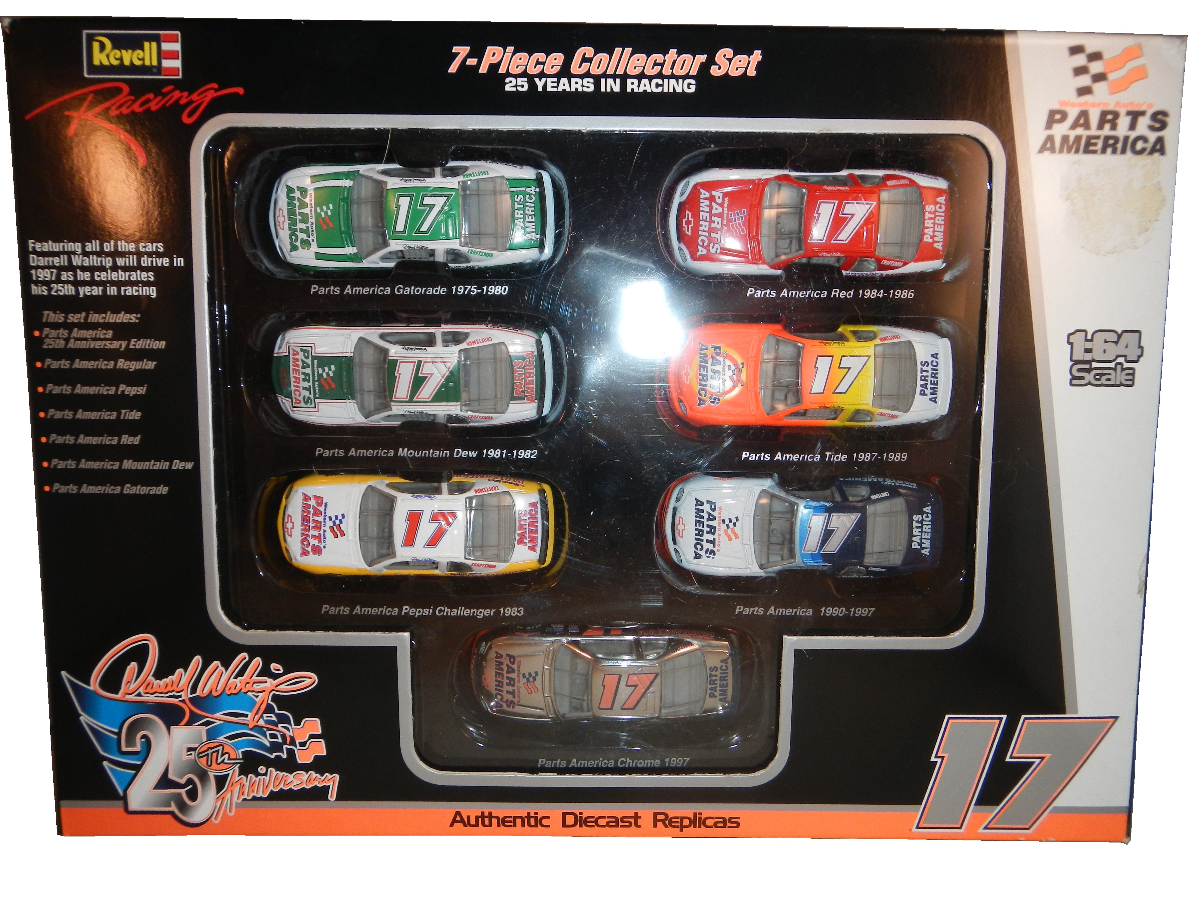
We all have at least one place that we always remember fondly from our childhood. It could be a restaurant, a park, the home of a close friend, or family member, or a park. We all have at least one, probably many. It is always sad when one of these places goes away. Well this happened to me this last week, when an Evanston institution began the process of moving.
Tom Thumb in Downtown Evanston was a place that I and a number of my friends spent a great deal of our childhood. Some of us were skateboarders, some of us were RC car fanatics, some of us, like me were model builders and die cast collectors. It had been in the same place for 49 years, but they announced that they were going to move after a zoning decision was made to replace the current building with a two-story building for two restaurants. So, on July 12, after 49 years as an Evanston institution, it closed. I went there on the 12, and made, with a heavy heart, my last purchase.
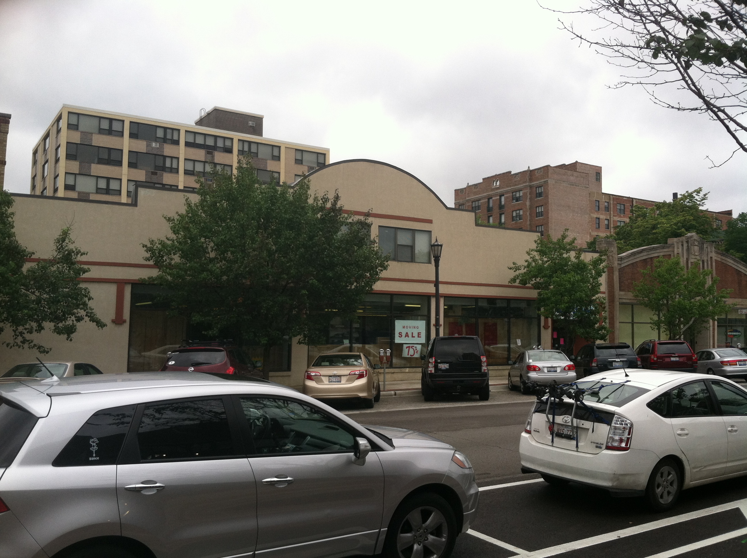 This was a sad day because I am a huge NASCAR fan, and for many years, Tom Thumb was the only store in Evanston that sold NASCAR stuff. It was also one of, if not the oldest skate shop in the midwest. I went there, looked around the store where I spend my childhood, took it all in, and bought my last purchase, this 1997 Darrell Waltrip 25th Anniversary set.I bought this for two reasons. The first is that I love this set, I remember many of these schemes from races I watched in 1997. They all look really good, and they bring back memories. The second reason, and I didn’t even think about this until I started doing some work for next week. During my research, I was grumbling about how many different paint schemes each car runs every week, and it dawned on me that this might be the first example of that in the Sprint Cup Series.
You never had this much variety in paint schemes before 1997. Each team ran one scheme for the majority of the season, maybe 2 or 3 different schemes and special schemes for the All-Star race, and possibly the Busch Clash. But Darrell Waltrip ran, in total, 7 different schemes, each based on a specific era in his career. Each had Western Auto Parts America as the primary sponsor, but were based for past sponsors. He started with Gatorade, which he ran for DiGard Motorsports, from 1975-1980. He won two Coca Cola 600’s(1978, 1979) a Winston 500(1977) the Southern 500(1978,1979)as well as 22 other races during that time.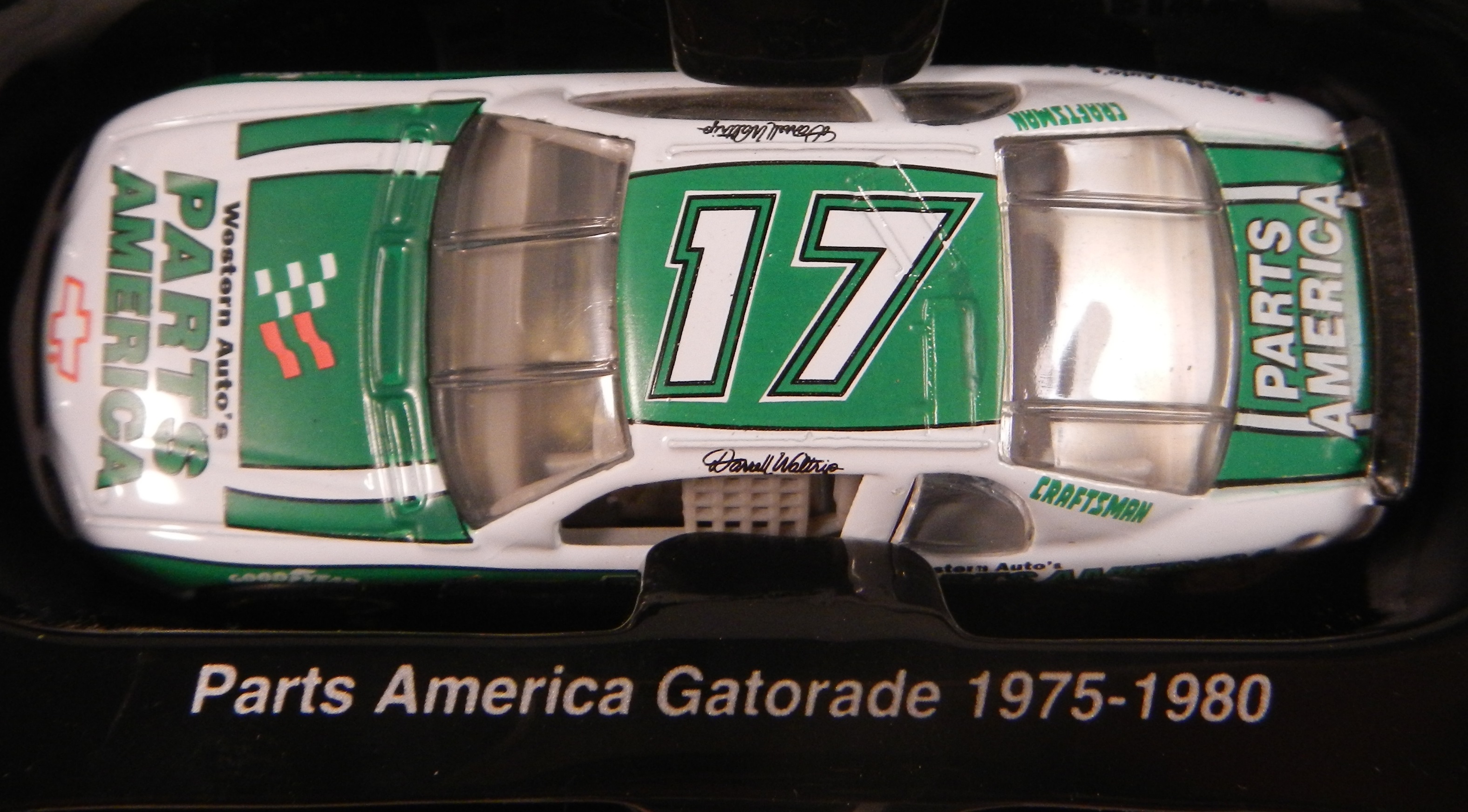 In 1981, he left DiGard for Junior Johnson Motorsports, and was sponsored by Mountain Dew, where he won 24 races including the 1982 Winston 500, the 1981 Busch Clash, and two of his three Sprint Cup Championships
 Pepsi replaced Mountain Dew and created The Pepsi Challenger which he ran in 1983 for Junior Johnson. He won 6 races for Pepsi
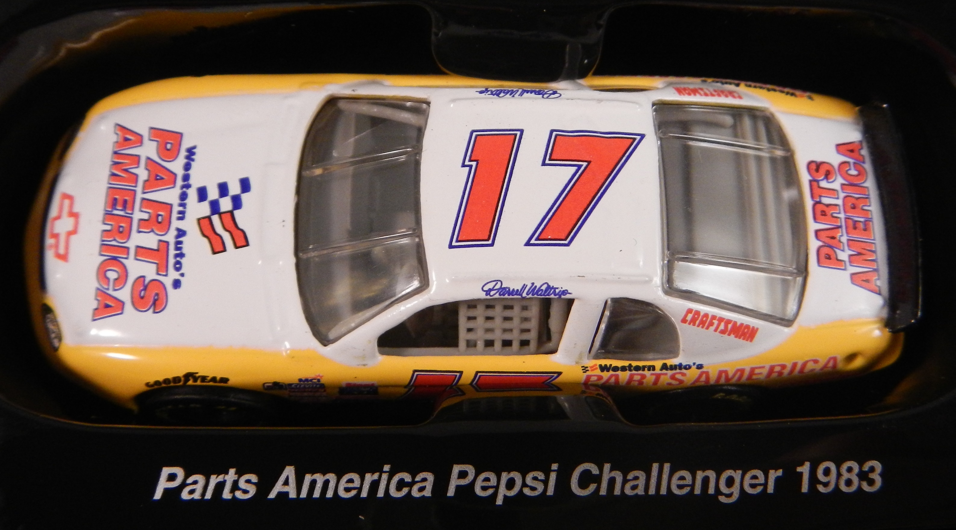 After Pepsi left, Budweiser took over the sponsorship, and from 1984-1986, he won 13 races, the 1985 Winston Cup Championship, the Inagural All-Star Race in 1985, the 1985 Southern 500, and the Winston 500. I find love how they call it “Red” instead of Budweiser since this was marketed to kids at the time.
 In 1987, he made the move to Hendrick Motorsports, and picked up Tide as a sponsor. He won the 1989 Daytona 500, The 1988 and 1989 Coca Cola 600’s and 6 other races. I loved that it was identical to the scheme used by Ricky Rudd that same season.
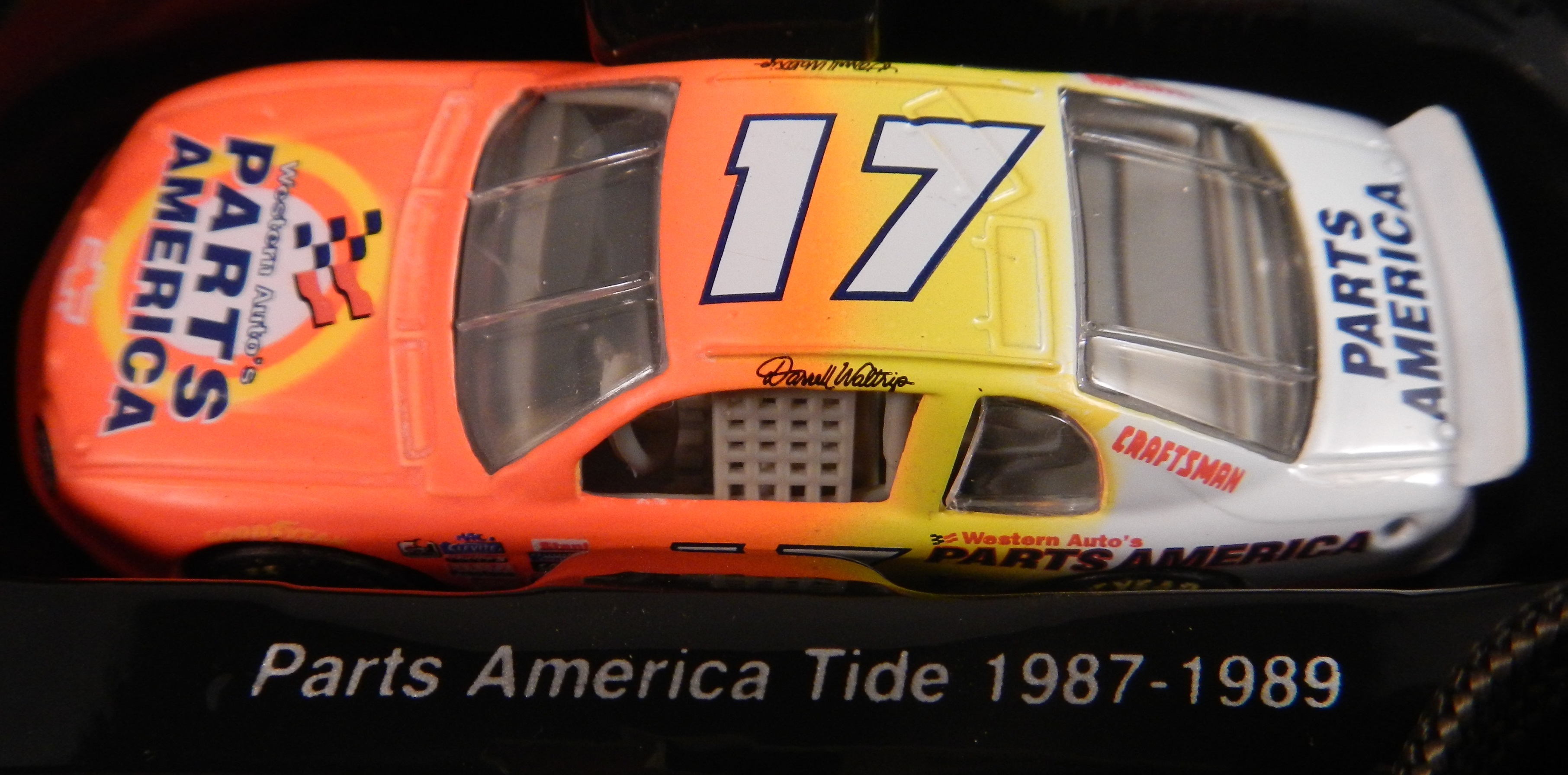 From 1990-1997, he raced the #17 for Hendrick Motorsports in 1990, and then founded Darrell Waltrip Motorsports, which raced this scheme from 1990 to 1997. He won 5 races, but was never to get his former glory back. Western Auto left the team after 1997, and Darrell Waltrip Motorsports shut down shortly after the start of the 1998 season.
 The last scheme is one of the most innovative schemes in the history of NASCAR. His legendary Chrome scheme. Darrell loved chrome, using chrome numbers, and a chrome helmet. This was supposed to be used for just a single race, but it was raced a number of times that season. Nothing like this had ever been done in NASCAR before. There had been chrome numbers, but never a chrome car. This car was so far ahead of it’s time. Darrell even had a Chrome driver suit that he wore with this car!
 1997 would be the beginning of the end for Darrell Waltrip. He shut down his Winston Cup team in 1998, and joined Dale Earnhardt Inc. midway through the season. He would race for just two more seasons before fully retiring in 2000.
The idea of 7 different schemes seems like standard opperating procedure today, but back in 1997, this was revolutionary. This was unheard of. These schemes were all good, and they worked well, but this surprised some fans. 17 years later, this is the norm rather than the exception. If I did the paint scheme reveiws back in 1997, I would write one article at the beginning of the season, one before the all-star race, and maybe one midway through the season. There were no changes to paint scheme, or if there were, they were very rare.
Tom Thumb will reopen eventually. But whavever the new location, it will never have the same feel as the decades old building were it was once housed. I will miss it. I really will. But I find a bit of irony in that I bought the beginning of an era at the end of another era. I will visit Tom Thumb when they reopen, and I wish them the best of luck. From the residents of Evanston to Tom Thumb, we will miss you, and we wish you the best of luck in your new location!
We also have a paint scheme related news item to discuss. This last week, NASCAR announced that the Chase for the NASCAR Sprint Cup would have some new features on their cars. Specifically, all Chase contenders will have a yellow splitter cover, a yellow window stripe with black letters, yellow roof numbers, and a special Chase for the NASCAR Sprint Cup decal. I’ve been speculalting that this might come to be, and now I have proof. I am not going to discuss how I think it will look, until I have a good idea as to who is in the Chase, and how it will look on their cars. Here is an illustration of how it looks.
With that out of the way, we move on to…
PAINT SCHEME REVIEWS
Kasey Kahne #5 Great Clips/Shark Week Chevy SS Another case where it looks like two different designers created the car without speaking to each other. It looks awful. The color scheme is good, so it passes, though just bearly with a D-
Tony Stewart #14 Bass Pro Shops/Ducks Unlimited Chevy SS For a Bass Pro Shops scheme it looks really good. It isn’t over designed, has a nice patriotic touch, and has a good color scheme. A+
Clint Bowyer #15 RK Motors Charlotte Toyota Camry Clint’s C scheme but with an even worse color scheme ends in a D-
Greg Biffle #16 3M Throwback Ford Fusions Greg Biffle is holding a contest to pick a throwback sheme for his race at Pocono in August. I would normally grade all four of these seperatley, however they all have the same traits, so I will grade them at once. All four have really good color schemes, and really nice logos, but they are all plagues with modern car numbers as well as modern designs. They simply look awful. I will vote for none of these schemes and give them all an F-
Trevor Bayne #21 QuickLane Ford Fusion A really good design with a really good color scheme. It works very well, A+
Cole Whitt #26 Scorpion Window Film Toyota Camry Good color scheme, good design, though the silver stripe on the bottom is a bit much. A-
Paul Menard #27 Menards/Splash Chevy SS The Splash logo looks really good, and I’ll give it a B+
Joe Nemechek #29 Toyota Cares Toyota Camry Great color scheme, awful design, they average out to a C-
Morgan Shepherd #33 ThunderCoal Chevy SS I liked the other ThunderCoal scheme, but this is just awful. Too many neon colors, and it is needlessly overdesigned. I give it an F
Alex Kennedy #33 MediaCAST Chevy SS Awful color scheme and way too over designed. F
Landon Cassill #40 Gallery Furniture Chevy SS Great color scheme, great simple design, though the 40 could be brighter. A
Kyle Larson #42 Cottonelle Chevy SS Great color scheme, great design A+
Michael Waltrip #66 Royal Teak Toyota Camry Good color scheme, great simple design, A+
Martin Truex Jr. #78 Worldvision Chevy SS Great color scheme, great design, I love that fade, looks great. A+
Ryan Truex #83 Voodoo/Armed Forces Motorsports Toyota Camry A D+ scheme with a new hood logo is still a D+ scheme.
Michael McDowell #95 JPO Absorbents Ford Fusion Another great Levine Family Racing scheme. It is hard to believe how bad they were last year. Great color and design scheme equals an A+ scheme.
Carl Edwards #99 UPS Ford Fusion They took a D- scheme, and made it worse. Awful color scheme, awful design, F-
DGF2099 Productions-Introduction to Press Kits-1996 Ernie Irvan Texaco Press Kit
1996 saw Ernie Irvan settle into a routine in the #28 Texaco Havoline Ford, and this press kit was issued for that season.
DGF2099 Productions-Introduction to Press Kits-1995 Ernie Irvan Texaco Press Kit
This press kit, used for Ernie Irvan during his triumphant return to NASCAR in 1995 will be examined this week.
The Driver Suit Blog-Why I Hate Politics and Paint Scheme Update
By David G. Firestone
I have a lot of paint schemes to discuss and we will get to that shortly. I wanted to discuss something that took place before the Coke Zero 400 last week. It is a bit murky, but here is what took place.
Charlie Crist is a former governor of Florida, and a former Republican. After a brief hiatus from politics, he has annoucned his intentions to run for the Governor of Florida as a democrat. He had plans to run the #98 Phil Parsons Racing Ford driven by Josh Wise. After this was announced however, the Republican Party of Florida filed a lawsuit stating that it was a campaign contribution worth more than $3,000. Remember, this was the same team that was crowd funded by Reddit and Dogecoin at Talladega, and that sponsorship cost about $55,000. It was later reported that the Charlie Crist decals had been removed from the car. Phil Parsons Racing stated the deal was in response to a series of negative ads toward Crist, and that the Crist decals were part of a deal with recording artist Lee Brice. They also stated that they didn’t pull the sponsorship due to the lawsuit, and that the $25,000 sponsorship would be returned.
I frankly don’t buy any of that for a second. I think that it was because of the lawsuit, and that Phil Parsons Racing did not want to get thrown under the bus because of it. They tried to handle it as diplomatic as possible, but it still sounds sketchy. The other reason I have a huge problem with this is because the simple fact that politics and racing don’t mix. Look at what’s happened with F1 and IndyCar. Politics are a constant issue in the sport, and I for one am tired of it. Look at the Ayrton Senna/Alan Prost battle in the 1990’s! Look at The Split! Politics ruins racing!
This is not the first time a politician with deep pockets has sponsored a race car, but I hope that this is the last time. I’m not against politics, I’m against forcing it into something it has no place being in! If tobacco, cel phone carriers, and hard liqour have or had been banned from sponsoring cars, then so should politicians.
Ok enough serious stuff, on to…
PAINT SCHEME REVIEWS!
Jamie McMurray #1 Cessna/Hawker Chevy SS Nothing bad to say here…A+
Jamie McMurray #1 Lexar Chevy SS Great Color Scheme, great design, A+
Austin Dillon #3 Great Stuff Chevy SS Color scheme is good, the design looks very odd. The gold numbers and chain design does not suit the car at all, and if they were left off, I would give it an A, but this scheme earns a B-
Austin Dillon #3 NRA Museum Chevy SS Good color scheme, decent design, B+
Austin Dillon #3 Cheerios Protien Chevy SS Much too overdeisgned, decent color scheme, C-
Kasey Kahne #5 Team Stream Chevy SS Good color scheme, but Kasey loves to drive overdesigned cars, and this is no exception. I’m giving it a C which is a very fair grade here.
Kasey Kahne #5 Farmers Chevy SS Good color scheme, decent design, B+
Marcos Ambrose #9 Black and Decker Ford Fusion Good color scheme, Good design, A
Danica Patrick #10 GoDaddy/Florida Lottery Chevy SS It looks like two people designed this car, and they didn’t talk to each other while designing it. Both sets of color schemes are awful, and both design schemes are awful. F-
Greg Biffle #16 3M/DAV Ford Fusion Green usually doesn’t look good, camo never looks good, so this scheme earns an F
Greg Biffle #16 3M Aerospace Ford Fusion See Above F
Greg Biffle #16 NESN 30th Anniversary Ford Fusion A bit less overdesigned, at least by Greg Biffle’s standards, and I do like the Red Sox and Bruins logos as well, so I will give it a C
Greg Biffle #16 3M Ford Fusion Good color scheme, decent design, B+. Nice change for Greg Biffle.
Kyle Busch #18 Interstate Battery Center Toyota Camry No. Redeeming. Features. Whatsoever. F-
Ricky Stenhouse Jr. #17 Cargil Ford Fusion Much MUCH TOO OVER DESIGNED! F
Jeff Gordon Panasonic Toughbook Chevy SS Blue and white work very well, and while it is a bit over designed, it works, and I’ll give it an A
Jeff Gordon #24 Pepsi Chevy SS Great color scheme, great design scheme, A+
Cole Whitt #26 Rinnai Toyota Camry The color scheme is good, and the design is great, so it gets an A+
Cole Whitt #26 Tapout Muscle Recovery Toyota Camry Simple design, great color scheme, A+
Boris Said #32 7-Eleven Ford Fusion I normally hate green on race cars, but this works well. I like the design scheme too, and I give it an A
Bobby Labonte #33 Thunder Coal Chevy SS Great simple design and a great color scheme, A+
Alex Kennedy #33 MediaCast Chevy SS The color scheme is awful, and the design is worse. F
Reed Sorenson #36 Theme Park Connection Chevy SS Ugly design, good color scheme, C-
David Gilliland #38 Long John Silvers Free Fish and Fries Ford Fusion Great design, great color scheme, great look, A+
David Gilliland #38 Love’s Truck Stops Ford Fusions CAMO DOES NOT WORK ON RACE CARS! F
Landon Cassill #40 Snap Fitness Chevy SS So So design, good color scheme C+
Kyle Larson #42 Target Chevy SS Whadaya Know? An A+ Patriotic scheme!
Aric Almirola #43 Waffle House/Smithfield Ford Fusion The understated patriotic design scheme works well, and the color scheme works well too. B-
Justin Algaier #51 CSSUSA Chevy SS Looks good, overall design is good, color scheme is good, and I’ll give it an A
Brian Vickers #55 Aarons/Florida State Toyota Camry Good design with a good design color scheme, A
Brett Moffit #66 Toyota Toyota Camry Good color scheme, simple design, looks very good, A
Tommy Drissi #66 Hercules Toyota Camry I don’t even know where to begin…it just looks awful. F
Martin Truex Jr. #78 World Vision Chevy SS Good color scheme decent design, B-
Dale Earnhardt Jr. #88 Kelly Blue Book Chevy SS A decent scheme, but a bit overdeisgned. Color scheme looks good. B
Dale Earnhardt Jr. #88 National Guard Chevy SS See David Gilliland Love’s above. F
Michael McDowell #95 K-Love Ford Fusion I like the color scheme, and the overall design is another good Levine Family Racing scheme that earns an A
Josh Wise #98 Dogecoin Ford Fusion Good simple design with a good color scheme equals an A grade
Josh Wise #98 Phil Parsons Racing Ford Fusion Since this design is what was raced, I will grade it as such. The color scheme is decent, but it is a tad too overdesigned. It is a D+ look.
DGF2099 Productions-Introduction to Press Kits-1994 Ernie Irvan Texaco Press Kit
This press kit, used for Ernie Irvan during his injury shortened 1994 season, will be examined this week.


