By David G. FirestoneSome time ago, I did two posts focusing on one item, and for the next two weeks, I’ll do something similar. A part of the driver uniform that is seen by virtually everyone but not really discussed is the visor in the helmet. We see them on in-car cameras and on television, but we don’t think about them by itself that much. It seems like a minor part, but it has an interesting history.
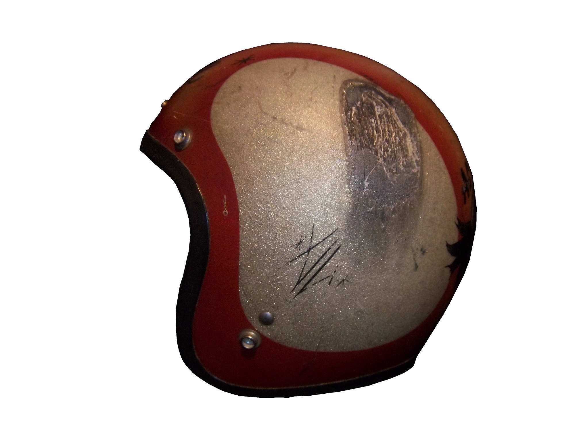
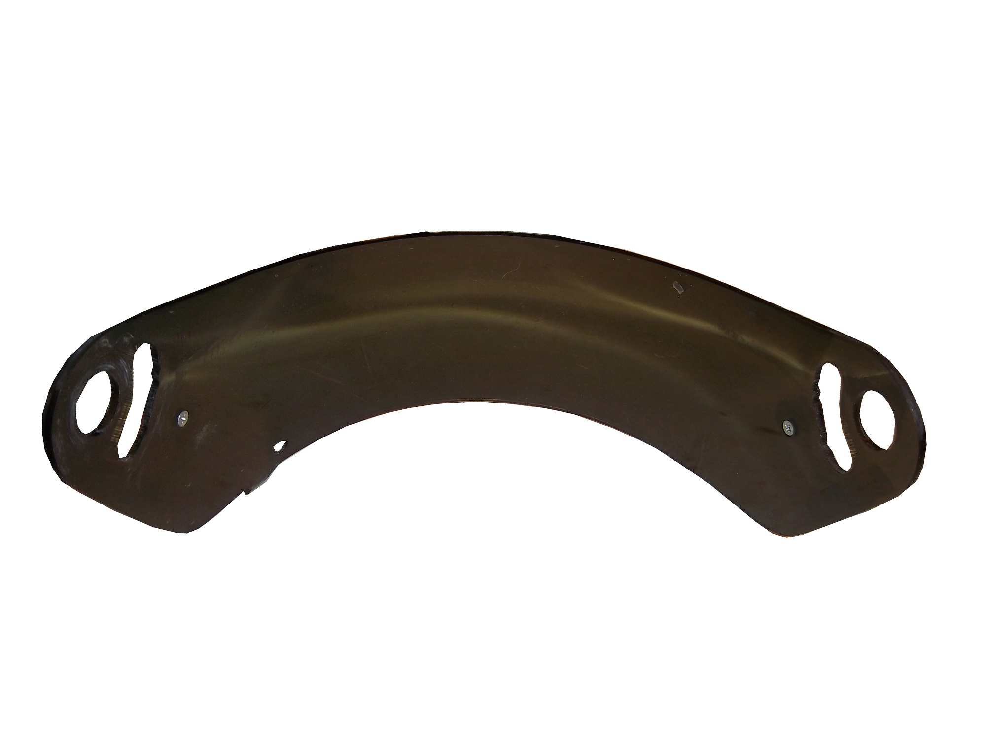
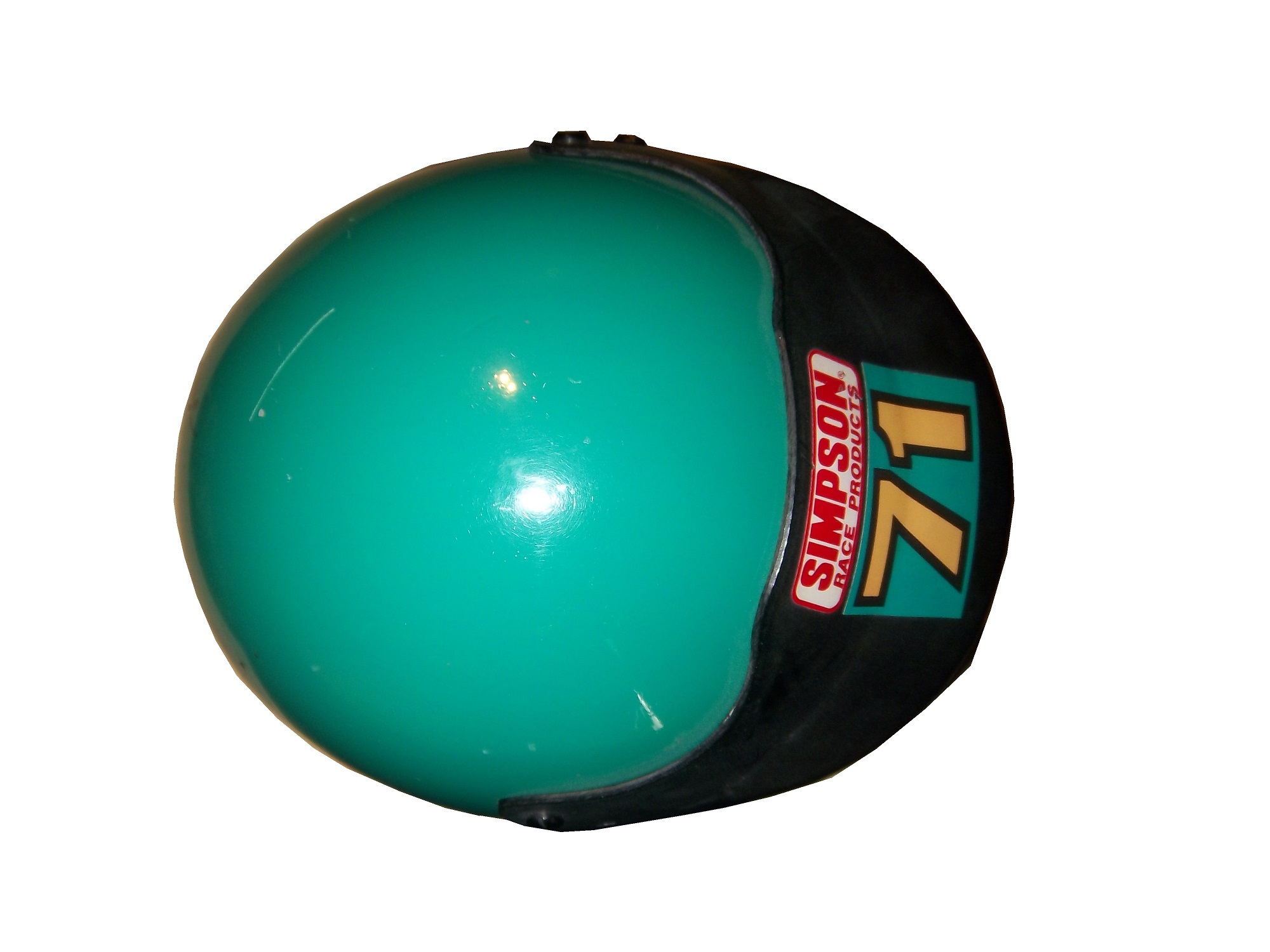
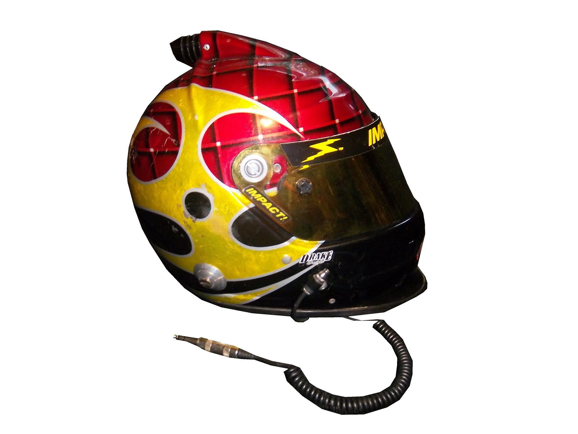
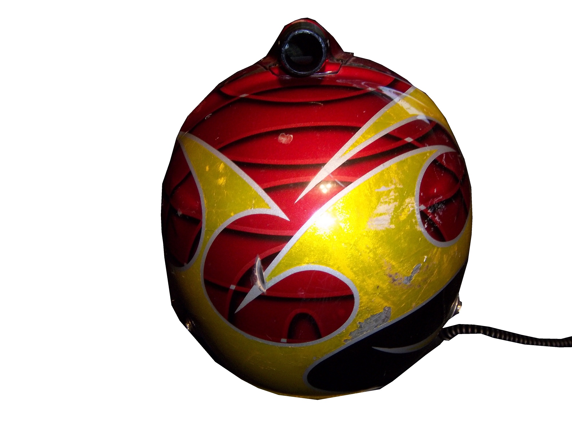
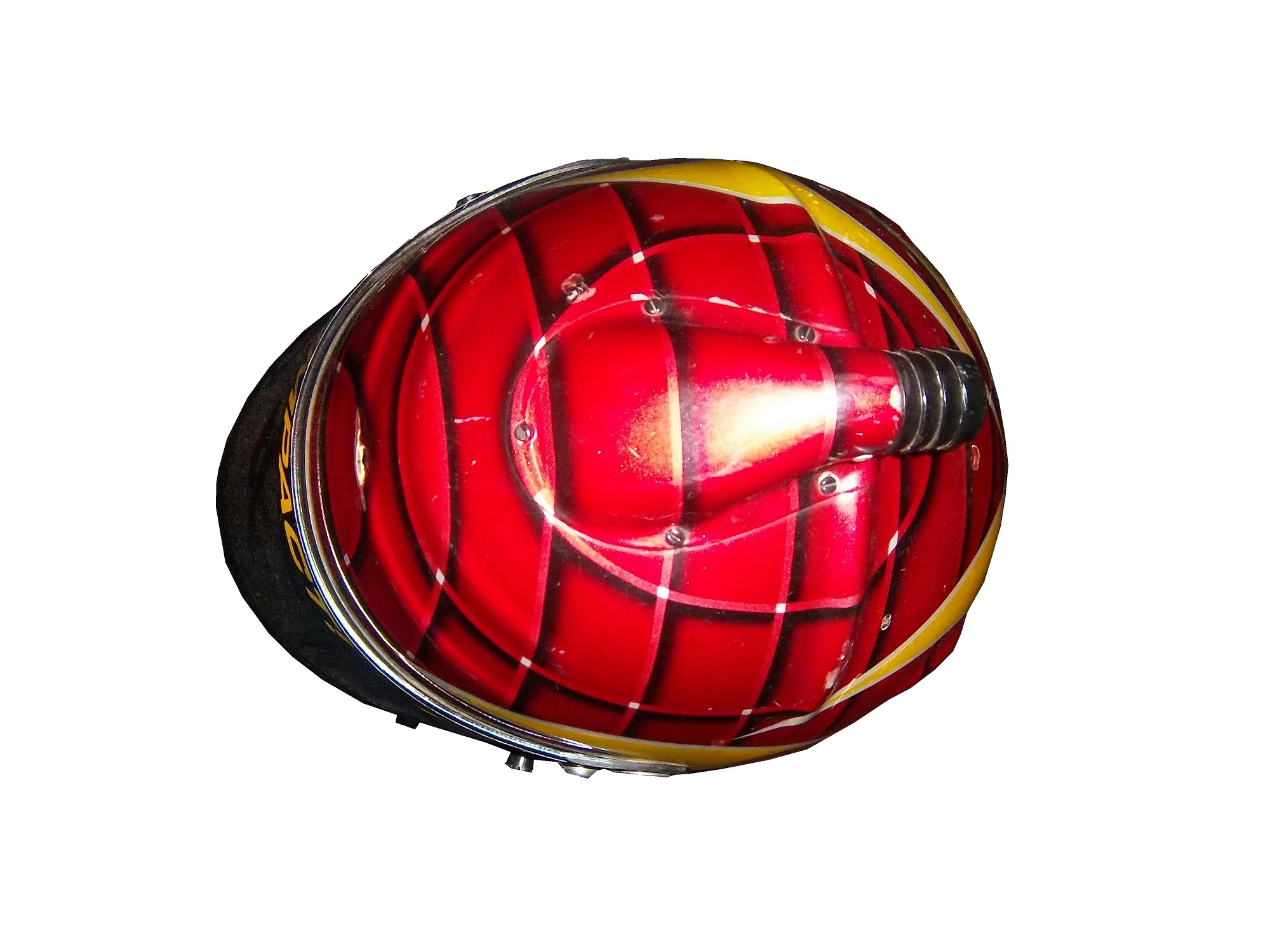
From the 1920’s through the late 1980’s, helmets were primarily open-faced. This example is from the 1960’s, and was worn by Maine short track driver Jim McConnell.These helmets are very simple in design, they just cover the whole head, except for the face. The downside to this is that when the sun shines in the driver’s eyes, or if the car is an open-cockpit the wind can and will force the drivers eyes closed, or fumes from the car can get in a driver’s eyes. As such, these helmets were worn with goggles.As full-faced helmets took over, the visor came attached to the helmet. The early ones were basically plexi-glass but as safety certification got more advanced, the visors were and still are fire tested. They also have to stand impact testing as well. As the helmets became more advanced over the years, so did the visors. Let’s take a look at one:This visor is from the McDonald’s helmet I covered earlier in the year. It is made of a very tough, but very light clear plastic. The visor is attached to the helmet by 3 screws, two that hold the visor to the helmet and a third that guides the visor and keep it in the proper place. There was a 4th one, but it was removed at the driver’s request. The visor has some unique features. At the bottom-left side there is a small flap, which is used by the driver to open the visor. Next to the small flap is a hole for a small peg. The peg goes in the hole, and holds the visors shut, but is small enough so that if a driver wants to open the helmet, they can do so with no trouble. Drivers frequently leave the visor open slightly, so two small knobs, one on each side so the driver can open or close the visor.Notice that it has a yellow-ish tint. This is one of 3 options for drivers, dark tint, light tint, and clear. The visor is designed to be easily changed at the drivers request. Clear visors are used for night races, and tinted ones are used for sunny races. In the event a race goes from day to night, a driver can use a tinted tear off, so that when it gets dark, they can remove the tint and have a clear visor.Like eyeglasses, visors get scratched over time. As such, they are changed often. Like most other items racing teams and drivers use, when they are no longed needed, they are sold to the general public. They are frequently autographed by drivers, and are a popular item to get signed by drivers. They are interesting to look at, and interesting to examine up-close. All helmet visors in this day in age have a sponsor stripe across the top, and we’ll cover that next week.
Kasey Kahne #5 Farmers Insurance Chevy SS It’s amazing what a different shade of paint can do to a paint scheme. This years Farmer’s scheme earned a D+ because of the primary color, this scheme earns a B+ because of the color. The design needs some work, but the whole scheme is a major improvement.
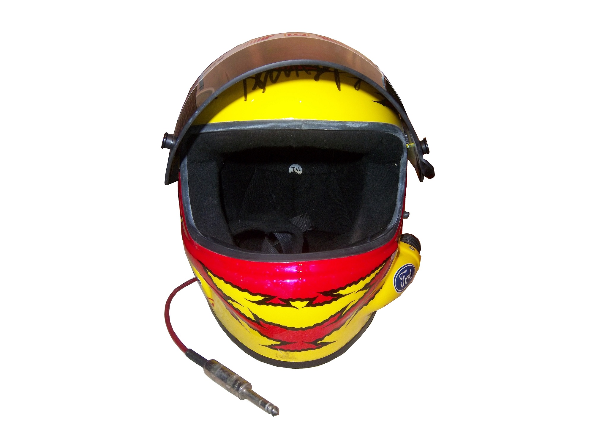
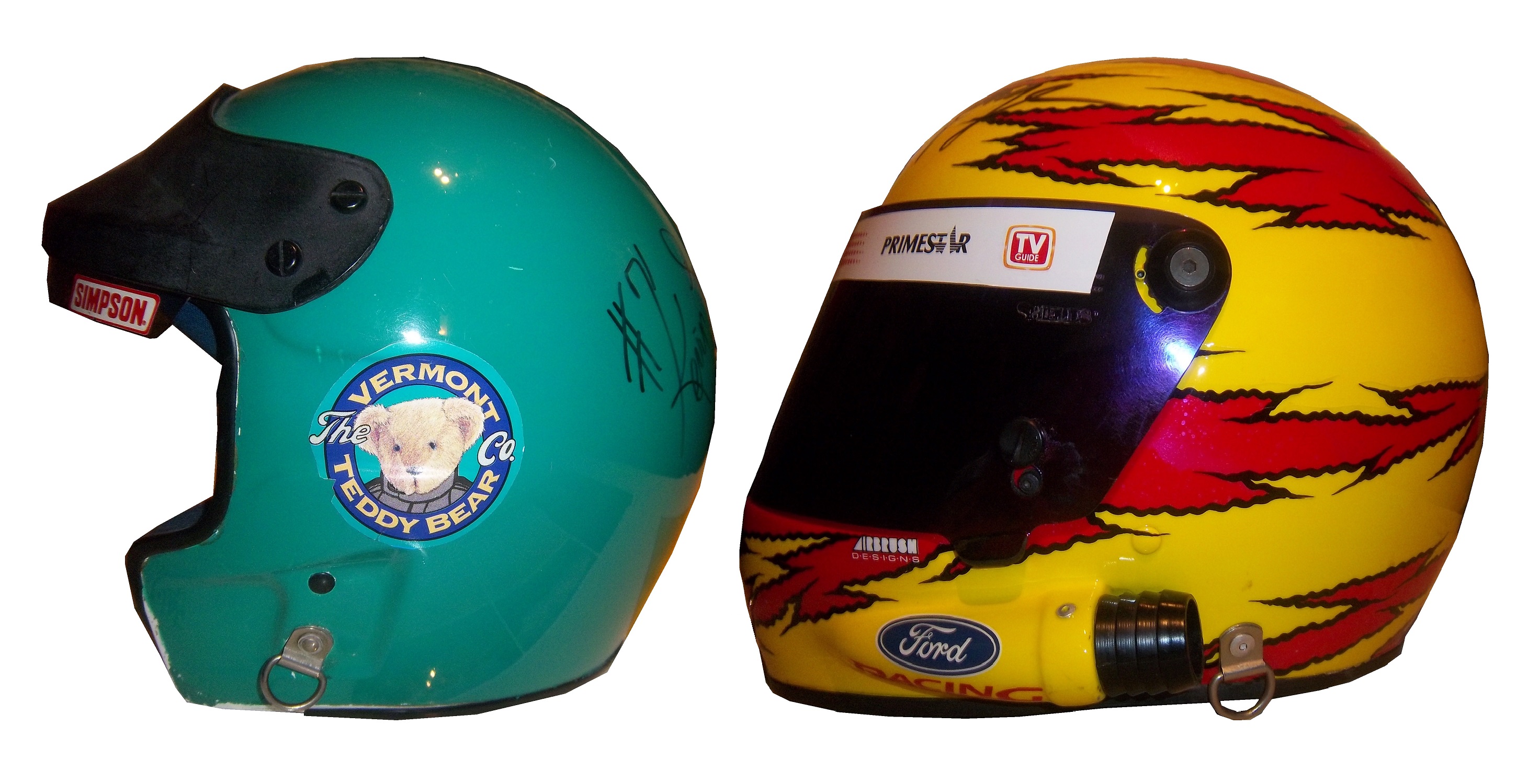
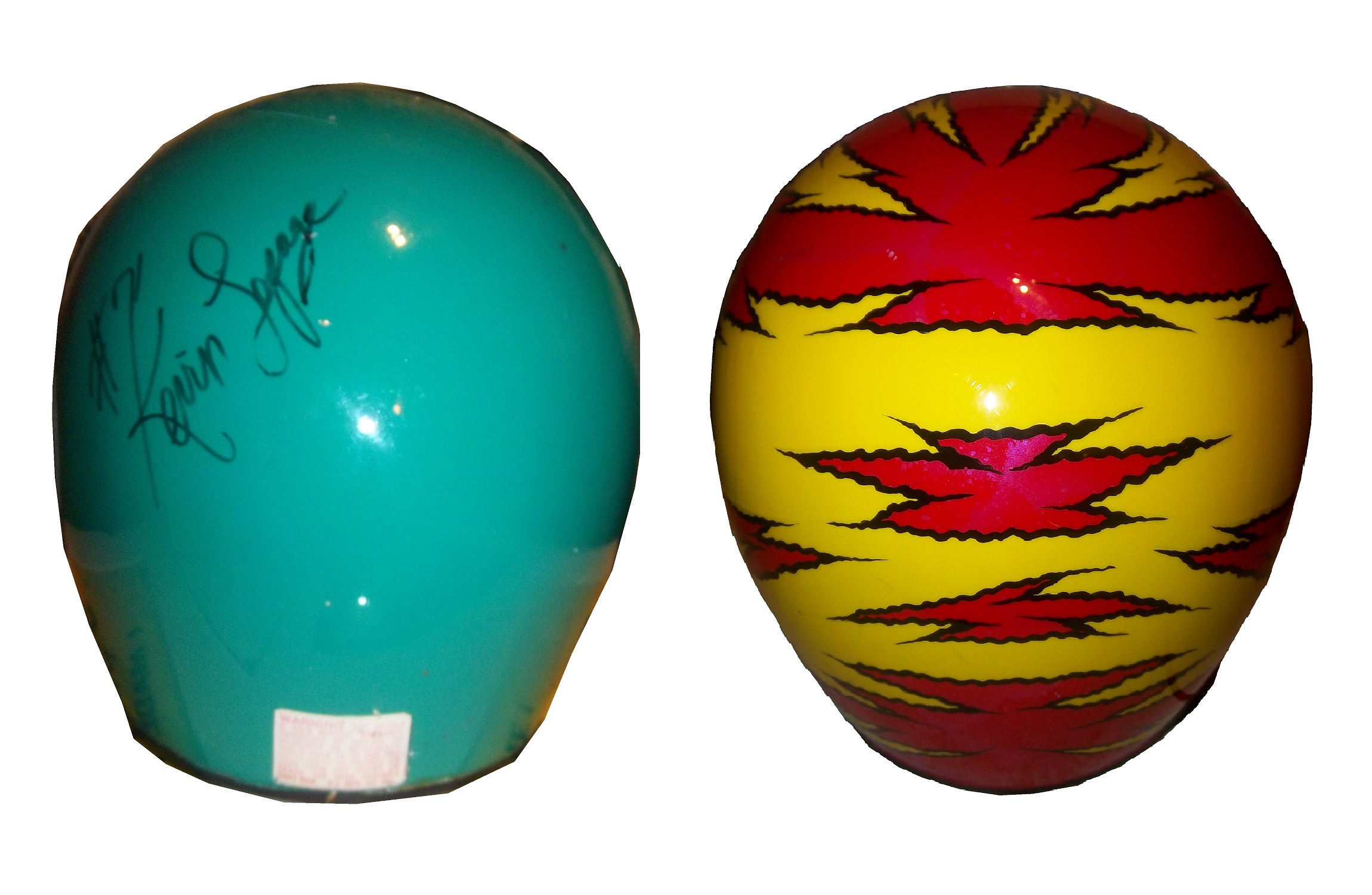
[Editor’s Note: Originally, this week was a post dedicated to primary sponsor logos. However, I had this column on the shelf for a while, but given recent events in the NFL, which fellow uniform blogger Paul Lukashas covered in depth, I felt that this article concerning helmet safety in NASCAR would be appropriate to run this week, with the primary sponsor logo column running next week. DF]Prior to the tragic events of the 2001 Daytona 500, drivers had to make a choice that in this day in age seems absolutely absurd. From the beginning of NASCAR to that tragic day drivers had their choice of helmets, and they were open-faced,or full-face.To examine the merits and demerits of both helmets let’s take a look at one example of each, both worn by the same driver, Kevin Lepage. First, the open-faced helmetWorn in the Nationwide Series in 1994 and 1995 during his rookie and sophomore seasons, this helmet bears a decal from high-end plush toy company Vermont Teddy Bears. It shows very heavy use, with scratches and scuff marks, has had the microphone equipment removed, and Lepage has signed the back of the helmet in black Sharpie.
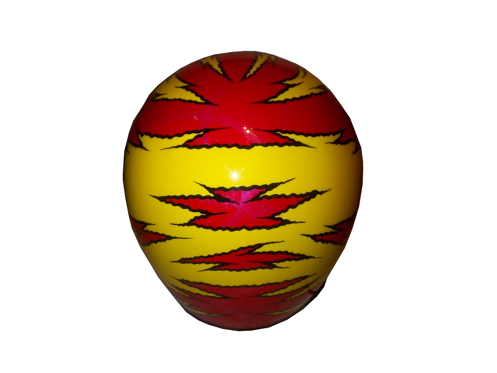
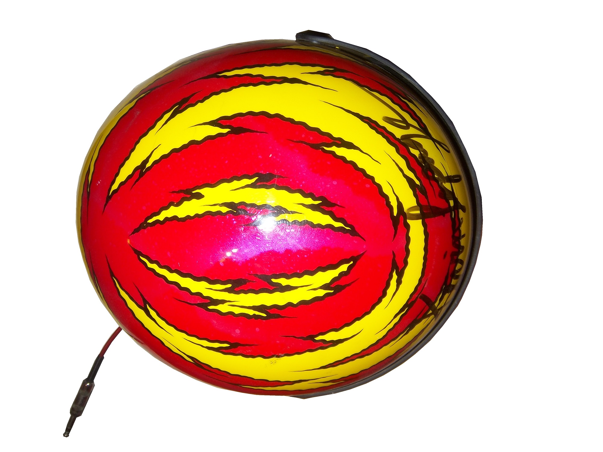
Now let’s look at the full-face helmet,Worn by Lepage in the 1999 Winston Cup season, this helmet was painted for the combination Primestar/TV Guide #16 Ford. Like the open-faced helmet, it shows scratches and scuff marks, and Lepage has signed the top of the helmet above the visor. Unlike the open-faced helmet, this helmet still has the microphone equipment.
Now on to the comparison…
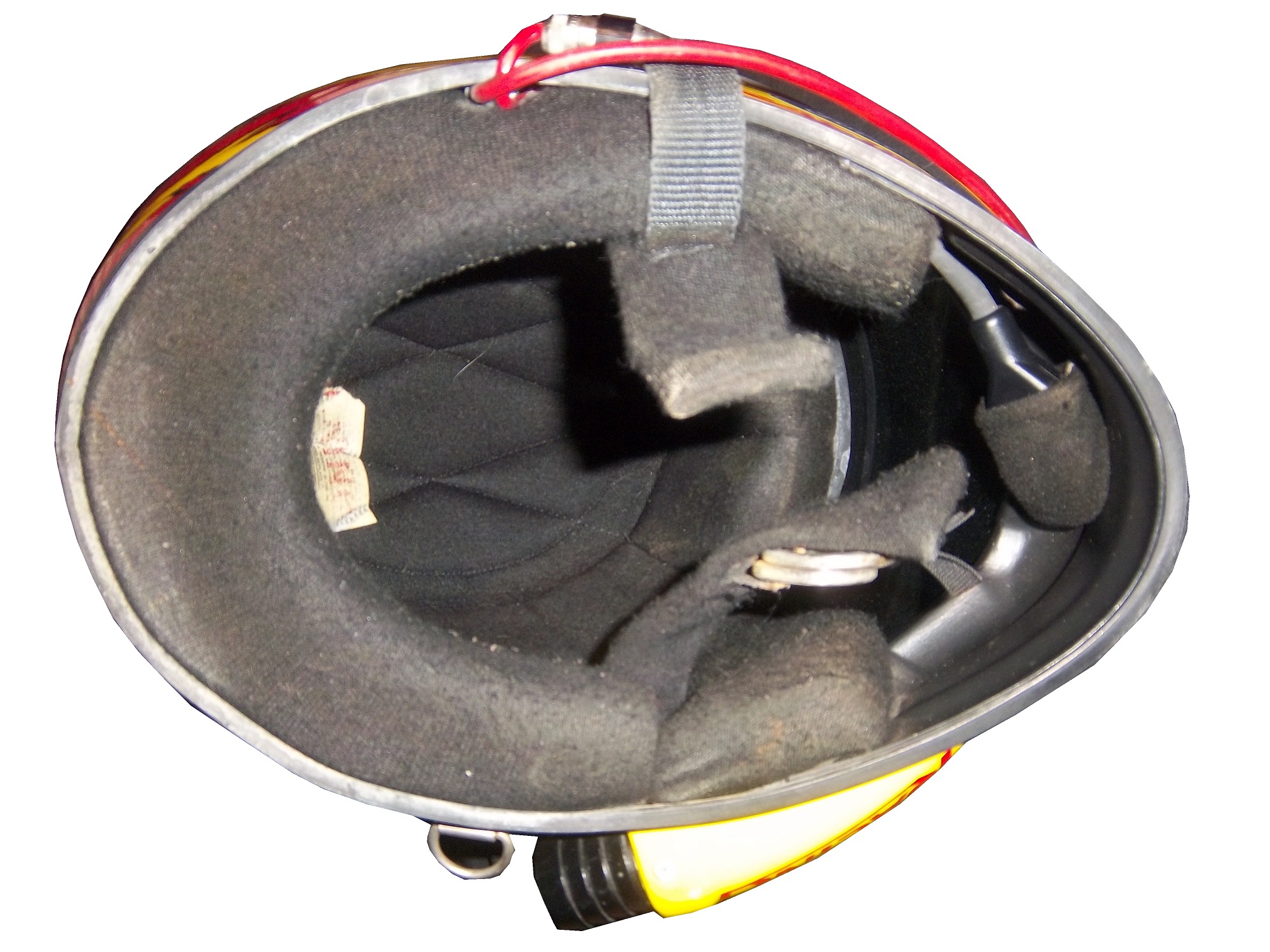
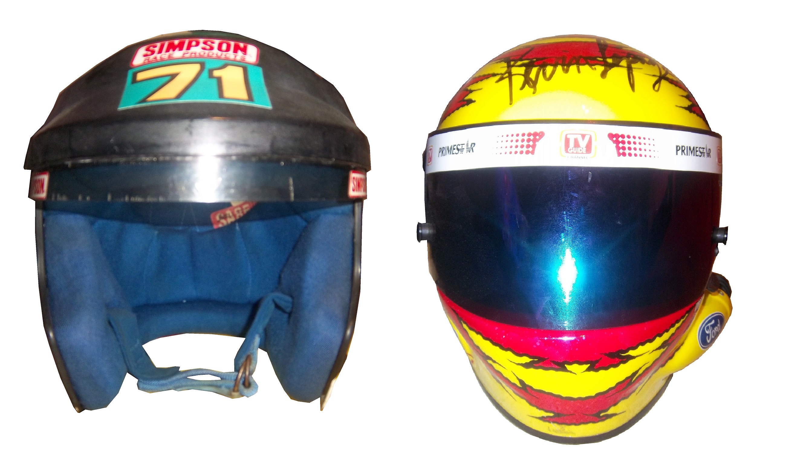
Looking at the helmets from the inside, there was no real difference between the two. Both are the same basic design, with the same inner liner and filler.The left sides of the helmets differ greatly. Notice that there is a hose attachment near the Ford logo on the full-faced helmet. This is to accommodate the “hotbox” attachment. Hotboxes are designed to force air into the driver’s face to help keep them cool. This is not a luxury, as driver compartments can reach as high as 160 degrees Fahrenheit, and drivers typically wear 3-4 layers of Nomex during a race. Keep in mind that in-car drinking systems are not standard as of 2000, and the hotbox is a great tool for driver comfort.Microphone equipment is added to the helmet on the right side. The only difference between these two helmets is that the microphone has been removed on the open-faced helmet.The back of the helmets are virtually identical except for the paint schemes and the liability tag present.The front of the helmet is the key to making the decision. Everything else thus far is a minor issue. The question was asked then, and is asked now, why were these helmets legal for as long as they were? These pictures should answer that question:The bottom of the helmet underneath the visor gives an extra bit of safety in case of fire, BUT takes away about 2-3 inches of visibility. That 3 inches might not seem like that much, but in a race car, trying to keep situational awareness of what the car is doing, those 3 inches are as critical as you can imagine. NASCAR at the time had the opinion that if they had the restriction in place, that the obstruction could cause a driver to lose that situational awareness, and lead to a wreck. NASCAR felt that any rule that could cause a wreck is a bad idea, and rightfully so. How often in the wake and investigation of accidents does it reveal that a rule, regulation, or guideline cause an accident? It happens quite often. NASCAR at the time felt that imposing a rule that all helmets should be full-faced that is could very easily lead to an accident, and as such, allowed open-faced helmets to avoid that from happening.
It was a rule that was easy to understand, but would lead to tragedy. It led to this design, which itself is now becoming obsolete:Now, even the best full-faced helmet designs from the 1990’s are now a distant memory and the current helmet design has taken over. It might seem like unfair, but if these rules were in place at the 2001 Daytona 500, we would have never lost a true legend.
Matt Kenseth #20 Husky/500th Start Toyota Camry The gray-scale design does not work here at all. The rest of the car looks very good, but the black and dark gray color scheme needs work. If the Husky red is where the gray is, it would work better, but the best grade I can give is a C-
Austin Dillon #3 Cheerios Chevy SS This is the best Cheerios scheme I have ever seen! The goofy bagel design is gone, and has been replaced with a couple of racing stripes. I also love the black around the #3. If this is the final design, it will be a great car, and I give it an A+!
I normally don’t do two posts in one week, but after the events of the last two weeks in NASCAR, I felt compelled to state my feelings on the matter. Obviously, what took place at and after the Federated Auto Parts 400 is shocking to say the least. As a NASCAR fan, and collector, I felt that I had to say something.
First, I’ll discuss Joey Logano and David Ragan. Obviously what happened was that Ragan allowed Logano to pass him, to get a position, to get points needed to make the chase. It does need to be noted that on a very technical basis, the two are “partners” as they are both Ford drivers. However, it is still a violation of the rules, but at the same time, I can’t really blame Ragan. Front Row Motorsports is a middle-shelf team that has flashes of success, but is not a championship team. Ragan had nothing to gain in that race at that point. Logano had everything to lose at that point. He is having a great year, with a new team, and I think he can win the Sprint Cup this year. That said, it is a violation of the rules, and the rules are the rules.
Now we turn to the Michael Waltrip situation. Michael Waltrip and his older brother Darrell are old school stock car drivers. Old school drivers are notorious for trying to and finding ways around the rules. However, unlike the old days, in this day in age, cars are very closely inspected, and radio chatter is monitored by fans and officials alike. That is why this whole situation is as important as it is.
Now clearly what took place is that with 10 laps to go, Ryan Newman was leading the race, and with the points they way they were, he would make the Chase with a win. Martin Truex Jr. who would miss the Chase with Newman’s win is trying his best to make as many positions as he can to get as many points as he can to make the Chase, and give his teammate Clint Bowyer an advantage. Bowyer is being given info on the situation via team radio, and was obviously given a very poorly coded radio message to intentionally spin out to bring out a caution, and start a round of pit stops. When all pit stops are said and done, Newman is far back in the pack, and is out of the Chase Points wise. The race restarts, and on lap 198, Brian Vickers, the third driver for Michael Waltrip Racing, was ordered by his spotter Ty Norris, who is also the general manager and vice president for Michael Waltrip Racing to make a green flag pit stop, which gives Truex another boost in the point standings.
When the checkered flag flew, both Logano and Truex were in the Chase, and Jeff Gordon, and Ryan Newman were out. Gordon and Newman were disappointed, but they handled it well. Almost instantly, the issue came to light, starting with ESPN’s coverage. The commentators knew something was up, and it was clear from the in-car camera that the spin was intentional. Between Richmond and Chicago, the investigation led to the biggest penalty in the history of NASCAR, with a $300,000 fine and 50 owner point reduction for all 3 teams, all crew chiefs, were placed on probation, and Ty Norris was suspended indefinitely. Because of this, Truex was removed from the Chase, and Ryan Newman was added. Furthermore, with the Logano/Ragan situation, a 13th driver, Jeff Gordon, was added to the Chase.
Drivers know when they have in-cars, so it makes no sense that he would intentionally spin out. If Brian Vickers, who did not have an in-car had spun out, it would have been much more difficult to make a case. Also, if Vickers had pitted under green to fix some damage, it would have been much harder to prove something would have happened.
If this was a unique incident for Michael Waltrip Racing, I think that it could be forgiven at the end of the season, but let’s take a trip back to 2007, specifically, the days leading up to the Twin 125’s before they Daytona 500. Evernham Motorsports and Roush Fenway were caught with “illegal modifications” for their cars, and fines and suspensions were levied. Michael Waltrip Racing was caught with an illegal fuel additive in his primary car, and was fined 100 points for the violation.
NAPA, who had sponsored Waltrip since his 2001 Daytona 500 win had said that they would stand by him, but if something like this happened again, that would not be guaranteed. Well something like that happened again. This morning, NAPA announced that they will not sponsor MWR anymore after this season, which is understandable. NAPA is a very loyal sponsor, so clearly what happened was that they decided that the cheating was going to continue until they said something. It is sad, but it happened.
My question is this, a very valid argument could be made that Truex himself did not do anything intentionally wrong, and that he was thrown under the bus because of the actions of his teammates. Another argument can be made that NASCAR stated when announcing the penalty, that they could not prove that Bowyer spun intentionally. Taking all the evidence into consideration, it appears that Truex had no idea what was going on around him, and that his teammates kept this information from him. I think with the penalties NASCAR levied against MWR, that Truex did in fact get thrown under the bus. At the same time, the rule comes across as a “hand of one is the hand of all” rule, which means that if your team cheats to help you, you are just as responsible for what happens.
To summarize, I think that NASCAR did what they felt was right, and I feel as though NAPA had to do what they they thought was right. Do I agree with it? Absolutely! NASCAR and its sponsors need to make it as clear as they can that cheating will not be tolerated. The rules are the rules, and even if the drivers disagree with them, they have to be followed.
One aspect of driver suits that has become a target for new customizations in the last 15-17 years is the belt. For many years, the belt was unadorned, or had a very small logo. Belts are a comfort feature, and typically made of the same material that the suit itself is made out of, with the same amount of layers and has a Velcro closure on it. Belts may incorporate a border made with an alternate color, to help it stand out.
Belts had no design or decoration on them for many years, as examined by this Ted Musgrave example from 1995,this Ricky Craven example from 1996,and many more. But it was around that time, that something began to happen. Looking at the Ted Musgrave suit from 1995, his name is embroidered into the left-chest area.In 1998, this had changed so that his name is embroidered into the belt.This was popular in F1 and IndyCar for many years, and is still the way that names are presented on the driver suit. Other examples, such as this Randy Lajoie example circa 1999-2000 will have a sponsor logo embroidered into the belt.Kasey Kahne wore this suit in 2005 at an event, and it has a GOODYEAR logo on the front, and when the belt is opened, on the inside, the FIA certification is present here. Formula 1 and IndyCar have a unique quirk to the design. Since the drivers come from all over the world, the flag from the driver’s home country is sewn into the belt, such as this Alex Barron example from 1998:Not all belts are created equal. Christian Fittipaldi didn’t wear belts on two of his NASCAR suits. The first one, comes from 2002, while he was sponsored by Georgia Pacific, and instead of the belt, he just has his name sewn into the suit.This Christian Fittipaldi example from 2003 features no belt, and no name.This Nort Northam example from the 1988 Sunbank 24 at Daytona, now the Rolex 24 at Daytona, features a belt that is specifically designed to be removed.Many NASCAR action figures will feature the belt designs on them, and many of these figures are pretty accurate, but I think I’ll save that for another blog.
Tailgating Time!
Just for fun, I’ve decided to add a recipe that can easily be made while tailgating at the track. This is my recipe for beer-broiled brats. This works well in the fall, during the Chase, on a cooler day.
You will need:
1 6-pack of beer
1 16oz jar of sauerkraut
½ sliced onion
garlic salt and butter to taste
12 plain, uncooked bratwurst
Take the 6 pack, and pour it into a large pan. Place the pan on the grill or stove, and add 1/4 the jar of sauerkraut, the onions, salt and butter, and finally the brats. Bring to a boil and boil for 8 minutes.
Tip-Do NOT cut or puncture the brats in any way, the casing keeps the juice, and taste in the brats. For more flavor, let soak after cooking. DO NOT OVERBOIL THE BRATS, that is the best way to ruin them.
While the brats are boiling, prepare a grill. Gas or charcoal works either way. After boiling is done, remove from the liquid, and place on the hot grill, and cook 5 minutes per side. Brats are made from pork, and under-cooking them can be hazardous, You want to watch the race from the stands, not a hospital room. Here is a video visualizing the process…
After grilling the brats, toast the buns on the grill for 20 seconds, place the brats in the buns, and serve. For sides, I would recommend some mustard potato salad, some potato or tortilla chips, and, of course, plenty of ice-cold beer!
This recipe will rock your tailgating party at the next race, and I will post more simple recipes for tailgating in the near future.
Paint Scheme Reviews
Jamie McMurray #1 McDonald’s/Monopoly Chevy SS The simple design is good, but the color scheme needs a lot of work. Beige does NOT work on race cars, and this is a perfect example. The Rich Uncle Pennybags(or Mr Monopoly) wearing sunglasses is not very attractive either, so I can give this scheme a C at best.
Kasey Kahne #5 Pepsi Max Chevy SS Are you kidding me? Is it too much to ask to pick a design scheme? You can have a cutting edge purple design which works, OR a matte black design that works, BUT YOU CAN’T HAVE BOTH! The purple, red and black design is good, but the design scheme is just horrible. Even with a good color scheme, this earns an F
Clint Boyer #15 Peak/Duck Dynasty Toyota Camry Oh man, where do I start here? The color scheme would work without the baby blue stripe, the hunting camo roof is just awful, and the overall design just looks forced. This car looks like a bad photoshop job…F
Greg Biffle #16 3MSafety Ford Fusion The contrast between the white and black parts of the car would normally not work, but because it is a safety themed car, and safety coveralls are typically white or black with an orange and silver stripe on them to increase visibility, this scheme makes sense. The colors are good, and I give this scheme an A
Austin Dillon #33 Mycogen Seeds Chevy SS Meh. I like the color scheme, but the front to back arch is overdone, and the is unoriginal at best. I will give it a C
Ron Fellows #33 Canadian Tire Chevy SS Grey red and black can be tough to work with sometimes, but this scheme works very well. The red flames work well, and the otherwise basic design is very attractive. A
Victor Gonzalez Jr. #36 Mobil 1/IMCA Chevy SS This was a late entry into the race in Sonoma, Gonzalez is a “road course ringer” so there was not much time to design and decal a car, but that said, this is a great simple scheme, no pointless design, and a great color scheme. A+
Ryan Newman #39 Quicken Loans/Smurfs 2 Chevy SS Again, as with Kasey Kahne above, PICK A DESIGN SCHEME! You can either have a red and black scheme, or a red and white scheme, BUT NOT BOTH! It looks like someone designed a Smurf scheme, quickly realized that it needed to carry a Quicken Loans design as well, and tried to make a hybrid of the two, which is just awful, and earns an F
Juan Pablo Montoya #42 Depends Chevy SS Is this a good look? Depends! Joking aside, this is not a very good scheme, the green logo works, but the black and grey scheme is awful.
Juan Pablo Montoya #42 Axe Apollo Chevy SS The Apollo Astronaut design is unique. It works very well, and although the design is convulted, it is very attractive. The color scheme works well and this scheme earns an A
Juan Pablo Montoya #42 Energizer Chevy SS From the wheel well forward it is a great scheme. From the driver door backward it is awful. Whatever look they were going for, they missed. It just looks horrible. Great colors, but awful design, D
Aric Almirola #43 Smithfield Helping Hungry Homes Ford Fusion A patriotic scheme, mixed with Petty Blue, that is not overdesigned. Giving this scheme an A is not going far enough to describe how good it is.
Jimmie Johnson #48 Lowes/Disney’s Planes Chevy SS While I like the color scheme and basic design, the hood logo is awful. The door number has a black outline, and it is very visible, but the hood logo which does not have a black outline is next to invisible, which defeats the purpose of having a logo on the car in the first place. That said, it is still a good design, and I will be generous and give it a B.
David Reutimann #83 Dr. Pepper Toyota Camry Dr Pepper has a great color scheme and great designs on their packaging, and this is reflected in this paint scheme. It works very well, and is a great complement to a bottle of Dr. Pepper. A
Tomi Drissi #87 The Wolverine Toyota Camry Many movie paint schemes don’t work, but this is not most movie paint schemes. It is simple, has a great color scheme, and has a great design, and earns an A
Travis Kvapil #83 Burger King Rib Sandwich Toyota Camry BK Racing has a lot of great schemes this year, and this is another one. Great color scheme, great overall design, and I like what they did with the rib sandwich. I’m not a “Rib-wich”guy, but I like this, and give it an A.
The driver suit is almost always customized for the driver, and as such, the driver has the option of adding customizations to the suit. This may come in the form of size,
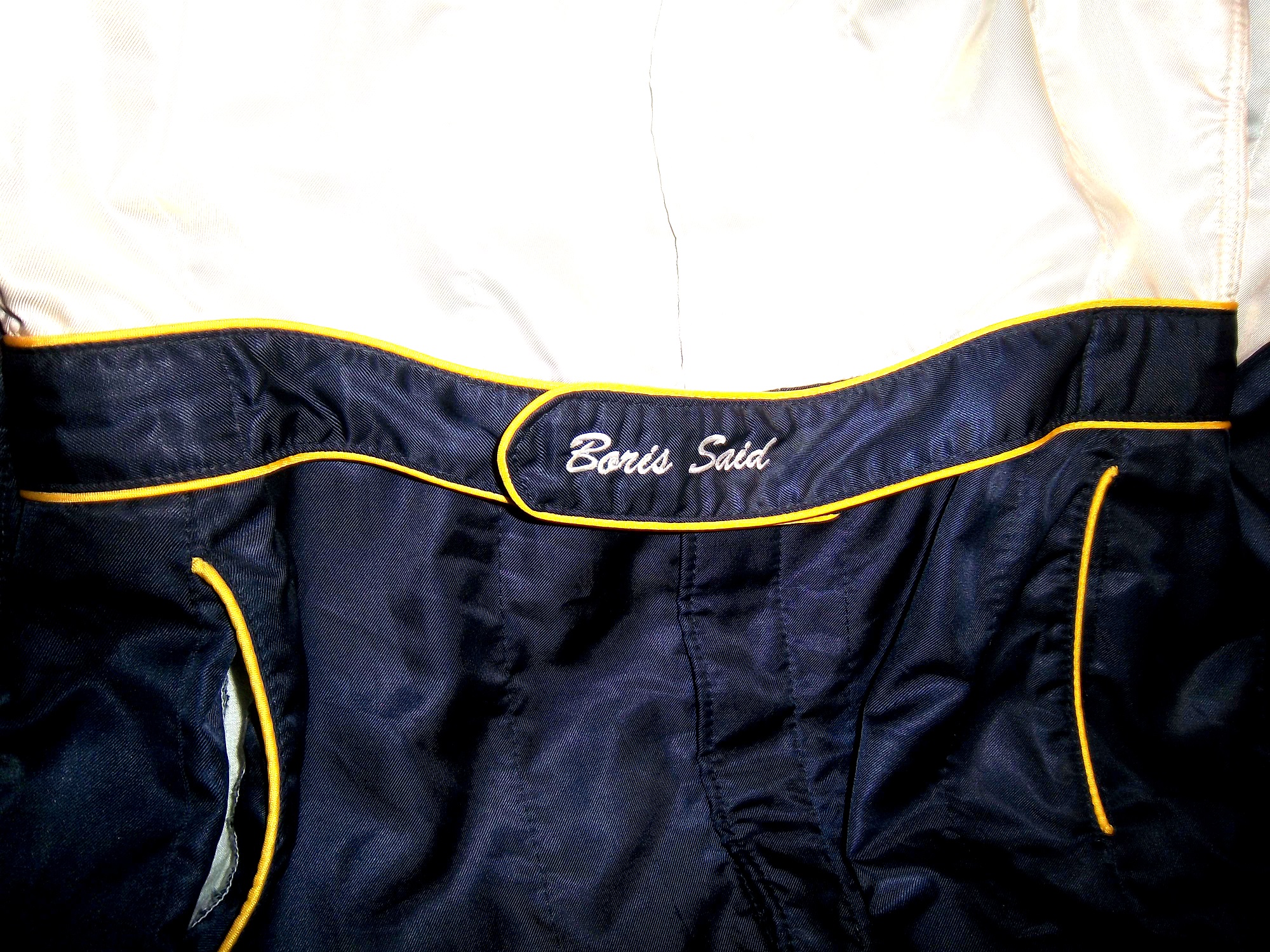
and belt design,but the back of the neck is a unique place for customizations. The designs that are placed on the back of the neck are as unique as the driver themselves.I’ve gone at length to discuss the FIA certification which is frequently sewn into the back of the neck. This is a prominent feature in Formula 1 and IndyCar. That is standard issue, so no real need to comment on it any more.In NASCAR, the back of the neck can be used for a myriad of different customizations. One of the most common is a car number, such as this Christian Fittipaldi suit, and another common feature can be sponsor logos, such as this Randy LaJoie Bob Evans suit from 1999-2000,and this Joey Miller Craftsman Truck Series suit from 2005.This Kasey Kahne suit has the Evernham Motorsports logo sewn into the back of the neck.And Roger Penske likes to have the American Flag on the back of the neck of his suits, as evidenced by this David Stremme suit from 2009.Older Simpson driver suits have been known to have an inventory number sewn here, as exampled by this Mike Skinner suit from 1997,and this Stevie Reeves example, again from 1997.But for my money, the personal customizations are more fun when they are as unique as the driver is. In this Terry Labonte suit, Terry has added a Texas logo.My favorite customization is from a Boris Said suit from 2005. Said has added a Boris Badenov design to the back of his neck.It’s the little things that make a suit personal, and these are some of those little things. Who says a driver suit can’t be fun.
And of course, it goes without saying that the neck is frequently left blank, as exampled by this Nort Northam suit from 1988.
Jamie McMurray #1 Cessna Patriotic Chevy SS Pretty good scheme here, red white and blue is always a solid scheme, but the one gripe I have is the pointless circle around the door number. While it gives the car a vintage look, it is just out of place here. Even still, this scheme is a solid A-
Kasey Kahne #5 Hendrick Cars Chevy SS Red white and black is a very solid color scheme, and the design, while a bit convoluted looks really good. It has a hurricane-esquire design that looks really good. A-
Danica Patrick #10 Go Daddy .US Chevy SS The simple design of this scheme looks really good…but what is going on with the colors? Why is the car painted in Russian dressing green? Russian dressing is good, but not as a color scheme. The red white and blue designs clash, and it just looks awful. D-
Kyle Busch #18 Interstate Batteries All Battery Center Toyota Camry Now THIS is what an Interstate Batteries scheme should be! The classic dark green, gold and white color scheme is amazing, and the design is simple yet very attractive. Giving this scheme an A+ is not saying enough about how great this scheme is!
Jeff Gordon #24 Axalta Standox Chevy SS White flames on a blue background? Seriously? I could forgive it if it was blue flames on a white background, blue flames look really good. But white flames? This design ruins a great color scheme AND a great design scheme TOGETHER! Now that is impressive! F-
Jeff Burton #31 Quikset Chevy SS Decent color scheme but the design needs a little work. If the red was on the hood, roof and deck-lid and the black was on the sides, I would give it an A, but the shark-fin design is brutal on the eyes, and serves no real purpose. As such, I can only give it a C-
AJ Allmendinger #51 Neil Bonnett Throwback Chevy SS While I like most throwback schemes, this one, while accurate, has the worst color scheme I have ever seen. It just screams 1980’s. Hot pink and neon yellow really stands out, and not in a good way. Still, I do miss Neil, and they were pretty accurate, so I will give this scheme a B
I had a post ready to go concerning collar designs, but I’ve decided to save that for next week. I’m still on vacation, and last Saturday I went to see the 16th annual O’Reilly Auto Parts Route 66 NHRA Nationals presented by Super Start Batteries, in Joliet. I had the chance to get VIP tickets, so I went with Argie, a friend from work, and some of her friends, and took the chance to mix business with pleasure.
It was a mixture of Mello Yello Drag Racing Series regulars, and some minor league drivers, but it was fun. The first thing I learned was how loud these cars really are. I’ve been to NASCAR races, and I’ve heard the engines running, but NHRA engines are so much louder than I had thought. For a while, I was standing in the spectator area on track level, and as they warmed up, you felt the vibrations of the engine. I’m standing about 75 feet away from the starting line, and when they went by, you felt it in every part of your body, a split second after they passed you. Needless to say, it was AWESOME!
One thing I did enjoy was checking out the different kinds of cars, from top fuel dragsters, to super stocks,to funny cars, The scoreboard tells the fans who won, and what their times and speeds were, each side having its own scoreboard with lights around the sponsor logo to tell you who won.I also checked out the tires on these cars, and man, they are huge! They look like they are twice the size of NASCAR tires.Speaking of which, I got a chance to check out the new Gen 6 Sprint Cup car, as Clint Bowyer’s Toyota Camry show car made an appearance…it looks amazing!They even had a jet dragster, but I didn’t get to see it on the track…oh well.One of the fun things about these events is that you can check out the pit area, so I did, checked out all sorts of cars, and the various equipment and stages of preparation and equipment used in them. Impact Racing had a booth there, and they had the various designs of helmets sold for race use. Aside from NASCAR, IndyCar and motocross designs, they had drag racing helmets. Drag racing helmets feature a visor design similar to wrap-around sunglasses. Top fuel and funny cars have their own designs, with funny car having an air filer, since the nitro-methane engine sits in front of the driver, instead of behind, like in a top fuel dragster. Many of the teams sell off equipment from the cars after the various events are done, and I took full advantage, acquiring a timing belt from Bob Tasca’s Motorcraft Funny car, this one used in his first qualifying session at the Ford Thunder Valley Nationals in Bristol Tennessee. This run he had a 4.15 second, 306 MPH run. This thing is HUGE, measuring over 64 inches in circumference and 3 inches across. As well as an ignition coil and a spark plug from Morgan Lucas Racing. Ignition coils are used to turn on cars in general, but this MSD 8142 is designed to fire up these 8000 horsepower engines, which need a lot of electricity to start and operate. I was fortunate enough to have Tony Schumacher and Ron Capps autograph it in person. My VIP ticket got me into the Don Schumacher Racing hospitality area. That was a lot of fun. We got to watch his car get prepared. Since the U.S. Army is his primary sponsor, DSR had some Army recruiters and soldiers speak. Though speaking to a crowd is not always easy when you have 2 8000 horsepower cars racing nearby. Then Tony Schumacher got up and gave a speech, and discussed his helmet, which prompted this question from me:
Afterwards, I was able to get a photo with him,and got to watch the engine test. This video looks tame, but unless you see it in person, you don’t have any idea how loud it really is, and I was 15 feet away when I shot that video!
Then I had dinner,and called it a day. I had a great time, and I will go back any chance I get!
In other news, I went back to the Museum of Science and Industry, and I went to the Jeff Gordon suit exhibit, and was shocked to see this:THE ENTIRE DISPLAY had been emptied out of the display case. At first I didn’t know what had happened, so I asked at the information desk. They, in turn, told me that pipes located above the display had been leaking, and that the items had been removed. I hope that when the display is fixed, the issues I discussed in a previous blog will have been fixed, I will keep you posted.
And since I’m here, Let’s talk paint schemes…shall we?
Jamie McMurray #1 Hellmann’s 100th Anniversary Chevy SS The yellow or green on the contingency decals is pointless, and it takes away from what is a very solid scheme, with simple design and great color. I give it a B+, almost an A, just not enough.
Tony Stewart #14 Ducks Unlimited Chevy SS Although it is just his normal scheme with DUCKS UNLIMITED instead of MOBIL 1 on the quarter panel, I hate his new look. The black scheme from before Kansas was really good, but this is just horrible. Too much orange, not enough black or camo. F
Clint Bowyer #15 Toyota Camry 30th Anniversary Toyota Camry Ok, so is this a red car, a black car, or a silver car…I’m really lost here. The nose and front panels look red, but the hood and back quarter panels look black, and the roof is silver. They took one of the best color schemes in racing, and made it horrible! The only thing giving this scheme a passing grade is the color scheme, but even that can’t keep it above a D-
Aric Almirola #43 Go Bowling Ford Fusion I love what they did here. The bowling ball nose and pin design give a great impression, and the color scheme works very well here. A+
AJ Allmendinger #47 Scotts Toyota Camry Simple and attractive, with a very nice simple color scheme…But could someone explain to me why in this rendering the windshield decal reads AJ ALLMENDINGER instead of just ALLMENDINGER? The only time a first name is on the windshield is in the case of Kurt and Kyle Busch. There is no other Allmendinger racing in the Sprint Cup. That said, this scheme earns an A
Brian Vickers #55 Aaron’s/Louisville Cardinals Toyota Camry The color scheme is amazing, and the basic simple design of the car works well. The hood has some needless design, which does affect the grade, but even so, it still earns an A-
Martin Truex Jr. #56 NAPA Batteries/Get Back and Give Back Toyota Camry Another example of why most teams only USE ONE COLOR AND DESIGN SCHEME! The nose features BDU digital camouflage in light and dark green, which works well. The doors feature Truex’s normal scheme, again good color and design, and the back features a blue/black digital camouflage, again which would work well by itself. The problem is that the combination of the three make for an awful look. This scheme is one of the worst so far this year, and it earns the F- grade it deserves. I fully support our Armed Forces, but this scheme is horrible!
Carl Edwards #99 UPS Ford Fusion I know I covered this scheme in a previous post, but this photo illustrates why I hate UPS as a car sponsor. No matter what, UPS cars have one thing in common, and that is that the driver suit can look really good, whereas the car will look awful. In this case, the car has pointless designs and needlessly added colors, whereas the driver suit is simple and attractive. So my previous grade of D- still applies.
And finally, while I don’t normally do Nationwide paint schemes anymore, I had to do this one. Kurt Busch has had a throwback at Talladega reminiscent of Neil Bonnett’s Country Time scheme from the 1980’s, and last night, he had had an amazing scheme taken from Days of Thunder…I love that scheme because I love the movie. The boxy design of the Camaro works well with the scheme, as it is much similar to the design of the Lumina. Keep it up Kurt!
Like shoulder epaulets, the collar of a driver suit has made a transition. It has gone from safety accessory to fashion piece, but unlike the epaulet, it is not only ornamental. Because the collar is still a piece of safety equipment. It goes without saying that fire is an ever present danger in auto racing. The collar protects the neck from burns. This may seem minor, but many people who die from burns die from infection. When the skin is compromised, it can’t stop germs from getting inside the body, and as such makes infection a serious risk during burn injuries.
But the fashion aspect of collars is interesting as well. With the standard alignment of sponsors on the top of the suit, the Series logo, tire manufacturer logo, car manufacturer logo, and other sponsor logos are on the top, and the primary sponsor logos are present on the collar and epaulets. This Randy Lajoie example shows how the suit appears during an televised interview:Note a couple of things: First, the fabric on the collar overlaps just a bit here, but when the driver wears it, it meets perfectly at the center of the neck. Second, it allows the driver to breathe easily. Comfort Vs. Safety is a constant debate. This is one kind of collar, the other kind of collar is what I call the Velcro collar, as shown in this Alex Barron suit from 1998:The Velcro collar is exactly what it sounds like, a collar with a strap which Velcros shut. This provides a little more protection in case of fire. It also has another use, as sponsor ads are popular to put on the front of the Velcro strap. This has been used quite often over the years… This is due to the fact that for quite some time the open face helmet was used, and the collar provided extra fire protection where the helmet failed. In this day in age, helmets come standard with Nomex socks on the bottom, so the collar, while still a key safety feature, is not as critical. But for sponsor logo placement, it really can’t be beat.
If the collar does not have a Velcro closure, then the primary sponsor logo is sewn into either side of the collar. Like the Lajoie example above, or this Mike Skinner example below, this can be used very effectively as a place for sponsor logos.Like most other aspects of the driver suit, the choice of Velcro or not comes down to driver preference. Kyle Bush, as well as older brother Kurt favor the Velcro style, whereas Tony Stewart and Carl Edwards prefer the non-Velcro variety. Many pit crew shirts have a similar design to the driver design as well.
Editor’s note: For the next two weeks I will be on a very badly needed vacation. I will still have articles ready to go, but I won’t be commenting on up do date issues until I get back. I will still check in from time to time.
Greg Biffle #16 3M/Give Kids a Smile Ford Fusion The same bland paint scheme that I described as “There’s nothing really wrong here, but nothing really right here either. The side design looks forced, the black roof is idiotic, the color scheme is good, but the number design looks too cliche. It makes no sense, but 3M schemes never do.” It has a small Give Kids a Smile logo on the hood, that is all but invisible. I gave it a C and it will stay at a C.
Austin Dillon #33 American Ethanol Chevy SS While I hate the shade of green used here, this scheme looks pretty decent. The designs around the front brake vent are unnessicary, but I still like them. If the green were a bit darker, I could give it a better grade than a C+.
AJ Allmendinger #47 Charter Toytoa Camry The hood design is interesting here. It is designed in the same light as television logos on driver suits. It is a unique idea that works and I hope will catch on. The color scheme is great, and I love the overall design. A
Brian Vickers #55 Aaron’s/Louisville Cardinals Toyota Camry The color scheme is good, but the Fruit Stripe Gum design seen on the Louisville Cardinals shorts is ugly. The whole Zubaz design scheme is horrible on sports uniforms, and even worse on this car. I have nothing against the Louisville Cardinals, but this is horrible. F
We’ve all seen them in telecasts and photos, but what many of us do not realize is what they are and what they do. I am talking about the arm gusset. Arm gussets are seen at the top of the sleeve on a driver suit, under the shoulder. They are a flexible piece of Nomex specifically designed to do two things. One is protect the driver, the other is give the driver some freedom of movement.Arm Gussets are almost always present on race-worn driver suits. Anyone who has worn a one-piece full body jumpsuit can attest to the fact that it restricts freedom of body movement. The gusset takes some of that restriction away. This is important when it comes to driving, because it gives the driver one less thing to concentrate on, and in the worst case scenario, can help a driver escape a burning vehicle much quicker.Gussets have very little variation, though I have seen one unusual one. In this Ricky Craven suit from 1996, the front of the sleeves look like they are attached to the body, whereas the back has a gusset in it. This would be done for driver preference of course, bur I have never seen a half gusset before or since.This Lake Speed suit from 1997 is store bought, as opposed to custom designed, and it has no gussets. This suit would have some restriction of movement. Again this can come down to driver choice.The need for protection vs. the need for driver comfort is a major conflict in the world of racing safety. The gusset is a major meeting point between the two sides involved, and the drivers love them.
Jame McMurray #1 Banana Boat Chevy SS-A scheme that could be a B+ is ruined by an awful color scheme. That orange is the worst I have ever seen on a race car. It takes this scheme and takes to a D-
Brad Keselowski #2 Miller Lite Patriotic Ford Fusion-Taking the stars and stripes and slapping them on a race car can work…just not here. If it was just plain blue with red and white lettering, it would work better, but this just falls flat. C-
Denny Hamlin #11 Sport Clips Toyota Camry-Seriously? Why does it look like a sperm is painted in red on the side of the car? The red/white/black color scheme works, but the door design is just awful! D-
Tony Stewart #14 Code 3 Chevy SS-Love the scheme, love the simple design and great color scheme. Works very well and earns an A+
Clint Bowyer #15 5-Hour Energy Patriotic Toyota Camry-How is this patriotic? Oh….I get it…the stars….just one problem…THE COLOR SCHEME IS WRONG! If it was red white and blue I would like this, but this is just awful! You want to honor America, but can’t get the color scheme right? F-
Greg Biffle #16 3M/Ace/Rite Aid Ford Fusion-The color scheme is good, but the door design is too busy. If it was one single color, it would work quite well, but being a mix of black, blue, red, and white it just looks confusing. It works, but not as well as it could, and earns a C+
Jeff Gordon #24 Axalta Chevy SS-Another DuPont scheme with different logos that works very well. Good color scheme and design. A+
Paul Menard #27 Menard’s/Libman Chevy SS-The Libman green hood design just looks horrible on the yellow background of the car. The green is too light, and if it were darker it might work, but this scheme earns a D
J.J. Yeley #36 Click it or Ticket Chevy SS-Good design, but awful color scheme. The green and blue is just horrible. If one or the other was used it might work, but this is horrific. F
Bobby Labonte #47 Bush’s Grilling Beans Toyota Camry-The overall design and color scheme is good, but the major flaw here is that the quarter panel has 5 different logos, most of which clash with the Bush’s scheme. It takes an A scheme and drags it down to a C
By David G. FirestoneFor this week’s blog, I will be doing a visual glossary of terms that I use when describing driver suits and helmets. To illustrate this, we will use this examples from a number of suits, including this Kasey Kahne suit from 2005.
and this Terry Labonte suit from 2008
Collar-The collar is the main protection for the driver’s neck. There are two types of collars, the ones that velcro shut, and the kind that overlap, but do not attach. A popular place for sponsor logos.Shoulder Epaulet-a piece of fabric used to decorate the shoulders. Some are designed for visual appearance, but some are designed to be used to pull an unconscious driver from a burning car. Another popular place for sponsor logos. Arm Gusset-Pieces of Nomex at the top of the sleeves that attach to the main body of the suit designed for driver comfort, while keeping it fire retardant.Liability Tag-Found in every piece of racing uniforms this tag states that any injury they incur while wearing the item is the fault of the driver, not the company. Series Logo-Logo indicating what series the driver is racing in. Currently found at the top of the suit on the right side for NASCAR and the left side for IndyCar, though it has been more nomadic in the past. Associate Sponsor Logos-Smaller logos found at the top of the chest. Typically these include the series logo, tire logo, car manufacturer, team name, and one or two other sponsors. These small logos are a good way to photomatch a suit.Primary Sponsor Logo-The biggest logo on the suit, can measure as much as 14 inches around. Usually found on the center torso on front and upper torso on back. This logo is also the reason is why all of the other design features of the suit revolve around.Belt-Many driver suits feature a belt, which is for driver comfort. The safety certification is sometimes found on the inside, has a velcro closure. The driver name or a sponsor logo is often found here. Television Logo-Found on the sleeves and legs, these logos are specifically positioned so that when the driver is sitting in the car, they appear visible to the in-car cameras. Cuff-the end of the arms and legs have a Nomex cuff. On the legs, the cuffs are often covered by a boot cut. Double or Triple-Layer-Most driver suits have multiple layers of Nomex in them to protect the driver from firescreen
Safety Certification-Driver suits are independently inspected by FIA and/or SFI to insure that they meet or exceed the fire protection they promise to provide. SFI certification is typically found on the inside of the left sleeve, and FIA can be found on either the back of the neck, or inside the belt.
I have been focusing too much on paint schemes lately, so I’ll hold off on that for a while. Back to driver suits. As Brian Vickers demonstrated earlier this year, when there is time to plan for a driver replacement, a full driver suit with all correct sponsor logos can be done for a driver. But what if the driver change isn’t as easy to anticipate? What if it is a last minute deal? Sometimes, you get an item like this:
Here’s the back story, Patrick Carpentier was racing for Gillette-Evernham Motorsports in 2008. He was a part time Cup driver, and full time Nationwide Series driver. During the week of August 3, 2008, Carpentier was scheduled to driver in the NAPA Auto Parts 200 in Quebec. Because of the travel restrictions involved, he was not able to make the Sunoco Red Cross Pennsylvania 500 the next day. As such, Terry Labonte was chosen to take the #10 Charter Communications Dodge Charger for that race. Since this was a last minute deal, Labonte was given this basic suit, with SPRINT CUP, GOODYEAR, VALVOLINE, GILETTE-EVERNHAM MOTORSPORTS, NASCAR, and SUNOCO logos. The full Charter Communications design would have taken more time than the team had to make the suit.
In all honesty, it works very well. It has the classic quilt pattern, and the minimal logos give it a very retro look. This is also the only driver suit that I have ever seen that has no manufacturer logos, either Dodge or Simpson, and has a full SFI Certification.
Other than the lack of logos, this is a standard custom designed Sprint Cup driver suit. It has shoulder epaulets and arm gussets, as well as Terry Labonte’s name on the belt. The Texas logo is presnet next to Labonte’s name, and I have never seen this on other suits he wore. I was able to find some pictures of himwearing the suit, and he looks good in it.

 Some time ago, I did two posts focusing on one item, and for the next two weeks, I’ll do something similar. A part of the driver uniform that is seen by virtually everyone but not really discussed is the visor in the helmet. We see them on in-car cameras and on television, but we don’t think about them by itself that much. It seems like a minor part, but it has an interesting history.


 These helmets are very simple in design, they just cover the whole head, except for the face. The downside to this is that when the sun shines in the driver’s eyes, or if the car is an open-cockpit the wind can and will force the drivers eyes closed, or fumes from the car can get in a driver’s eyes. As such, these helmets were worn with goggles.
 As full-faced helmets took over, the visor came attached to the helmet. The early ones were basically plexi-glass but as safety certification got more advanced, the visors were and still are fire tested. They also have to stand impact testing as well. As the helmets became more advanced over the years, so did the visors. Let’s take a look at one:
 Notice that it has a yellow-ish tint. This is one of 3 options for drivers, dark tint, light tint, and clear. The visor is designed to be easily changed at the drivers request. Clear visors are used for night races, and tinted ones are used for sunny races. In the event a race goes from day to night, a driver can use a tinted tear off, so that when it gets dark, they can remove the tint and have a clear visor.
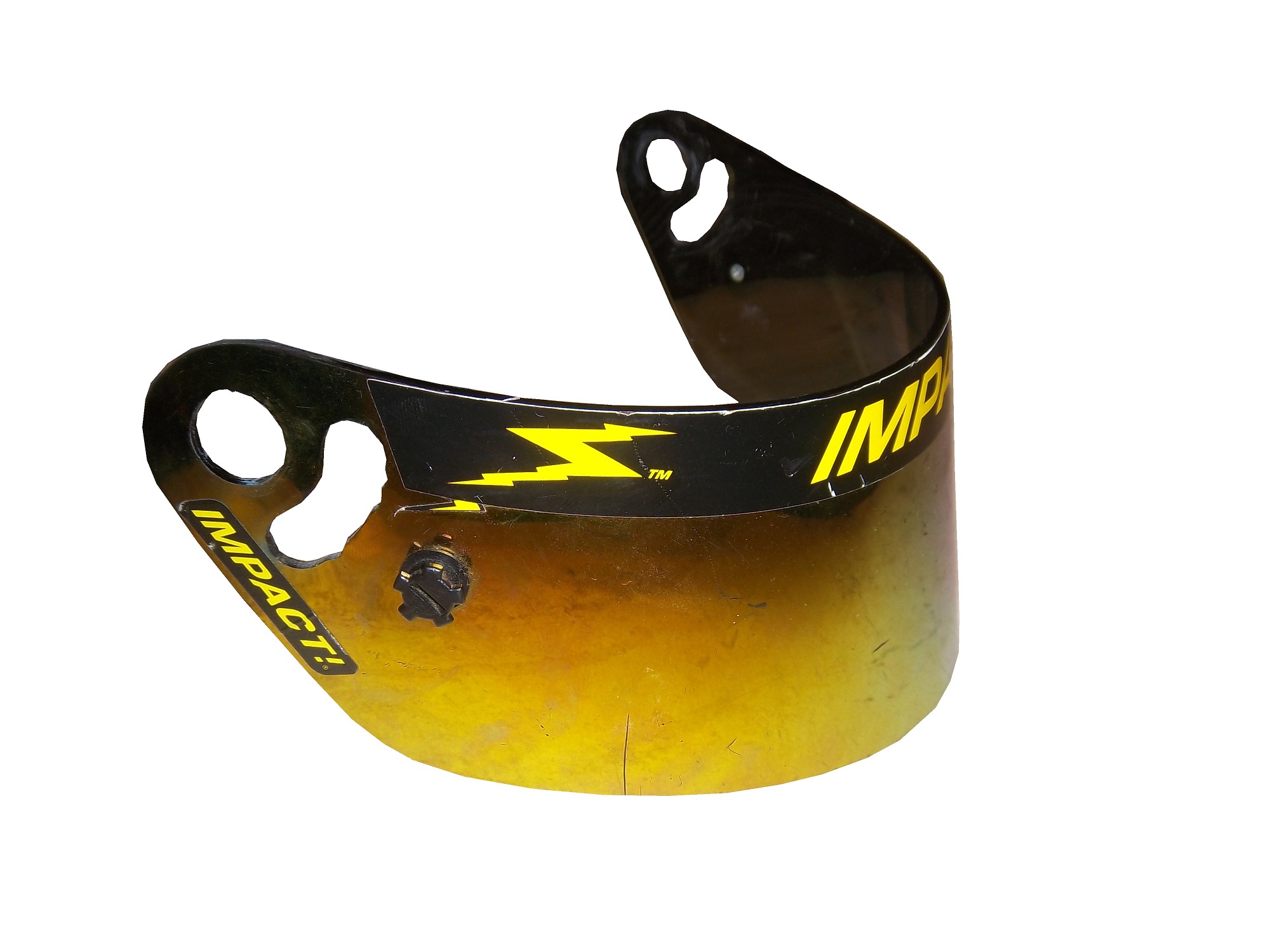
 Like eyeglasses, visors get scratched over time. As such, they are changed often. Like most other items racing teams and drivers use, when they are no longed needed, they are sold to the general public. They are frequently autographed by drivers, and are a popular item to get signed by drivers. They are interesting to look at, and interesting to examine up-close. All helmet visors in this day in age have a sponsor stripe across the top, and we’ll cover that next week.
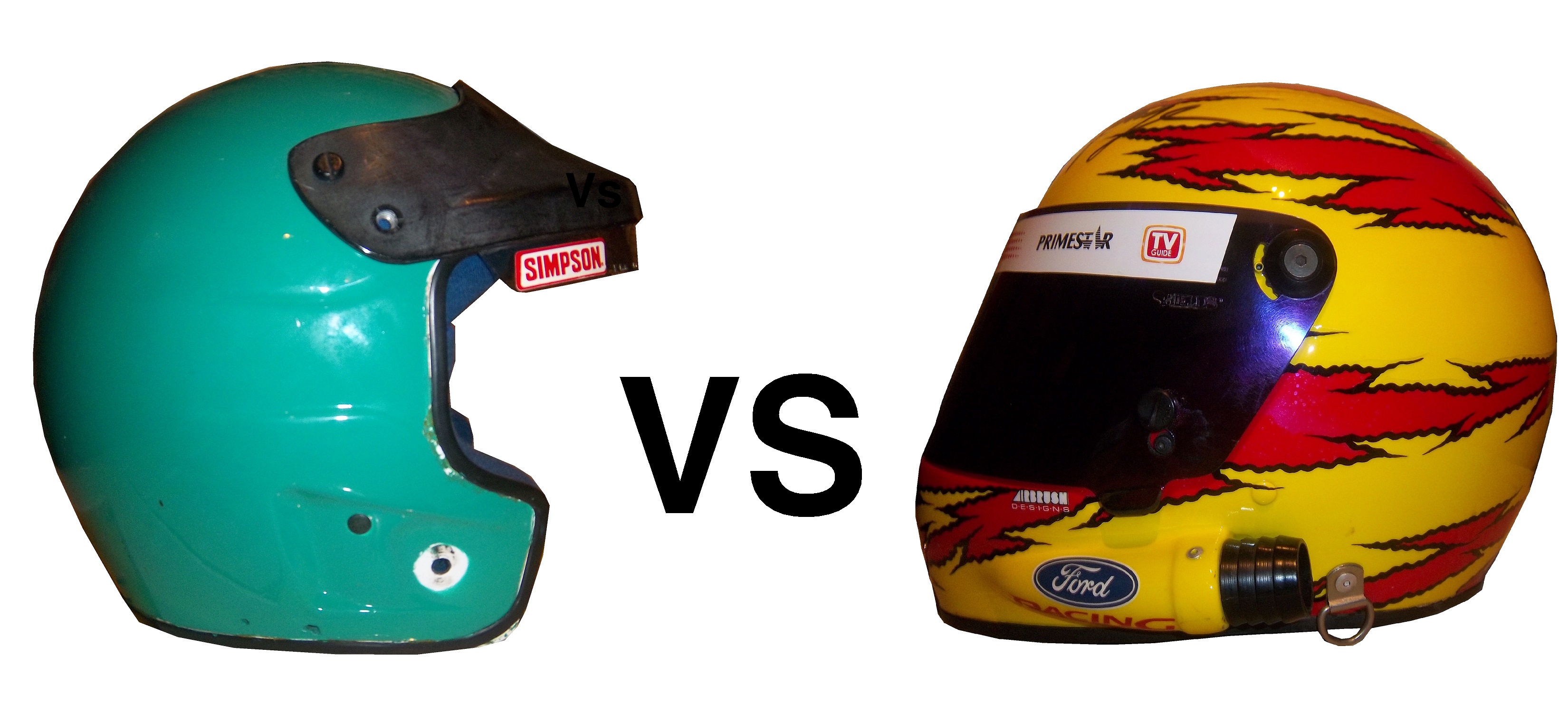


