The Driver Suit Blog-Driver Suit Blog…The Origins

cropped-dsbgrahpic.jpgBy David G. Firestone

The Driver Suit Blog is my favorite project I have ever undertaken. I’ve gotten a few people who ask about the origins of The Driver Suit Blog, and so this week, we will start with how it came to be. The origins are rooted in my game-used memorabilia collection. I started in hockey, and looked at the various game wear patterns on jerseys. I then would get into other forms of memorabilia, and would analyze them for an old website. In 2008, I went to the National Sports Collector’s Convention in Rosemont, and came away with a late 1960’s Oakland A’s jersey. As fate would have it, when I got home, I was looking for something on my computer and found Windows Movie Maker on my XP based hard drive. I decided on a whim to make a video about it, and with that Introduction to Sports Memorabilia was born.

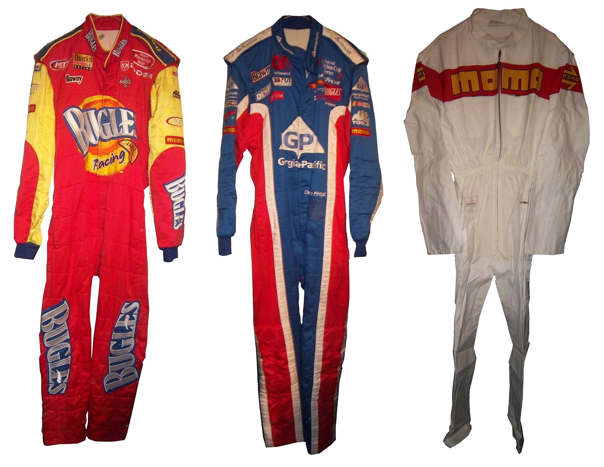
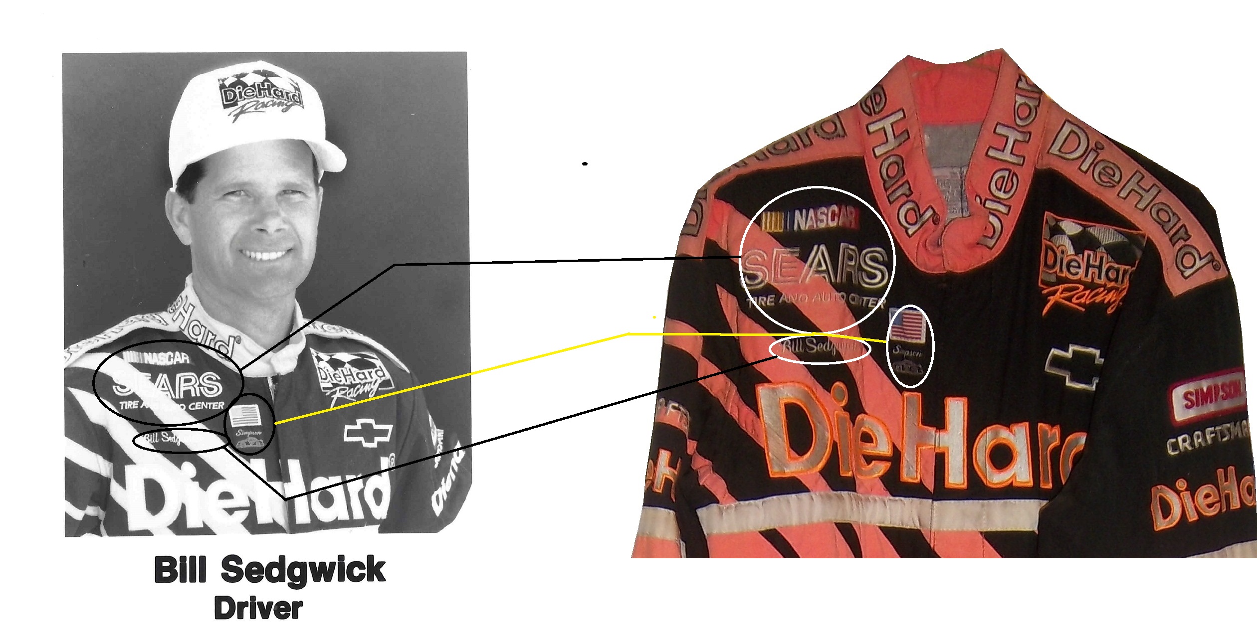
I started into driver suits in 2010, and researched the suits the same way I research every other game-used item. I had a lot of trouble finding information for a collector about the various aspects of driver suits and race-worn memorabilia. So I just did what I could, research wise. In 2012, I asked Paul Lukas if I could guest write a column for Uni-Watch. Now the blog was never a thought prior to this article, but as work progressed, it dawned on me that I could start a blog for driver suit and racing memorabilia collectors. So in January 2013, The Driver Suit Blog was born.

The paint scheme grading was born out of frustration. I had been working on a Christian Fittipaldi article, and it wasn’t long enough, so I started grading paint schemes to fill some extra space. I kept doing it, and it has become a part of the blog. The same can be said for Tailgating Time, which was also based on a Uni-Watch feature known as Cuilinary Corner. Tailgating Time was designed for tailgaters, to give them recipies that can be cooked on a grill or hot plate at a track, but are something more than just burgers and hot dogs.

Where will the blog go from here? I will continue my work for driver suit collectors, giving them tips on how to analyze driver suits. Tailgating Time will return, but I can’t say for sure when this will happen. I have a lot of stuff planned so stay tuned.

I also want to take a moment to thank my readers. Without you guys, this would have never taken off, and I just want to say thanks. I also owe a huge debt to Paul Lukas. Without him, the Driver Suit Blog would have never been created. Paul, next time you are in Evanston, hit me up, we’ll go out for a beer!

Next week, we will go behind the scenes and examine how a Driver Suit Blog article comes to be.  One other thing that I will start in a couple of weeks is I will do more Wheel Reviews for The Driver Suit Blog, but for now, we conclude with

PAINT SCHEME REVIEWS!

Ryan Blaney #12 SKF Ford Fusion I gave this exact same scheme an A last year, and it earned 9th place on the Paint Scheme Leaderboard as well. This scheme still earns an A+

Clint Bowyer #15 Cherry 5-hour ENERGY benefiting Special Operations Warrior Foundation Toyota Camry Well we have a new winner for longest sponsor name, and we have a new high score for Clint Bowyer with a solid B+ scheme. It has a smooth look, and an overall great design. The sides are a bit overdesigned, which took down the grade.

Ricky Stenhouse Jr. #17 Building For America’s Bravest Ford Fusion Much too overdesigned, and another example of why camoflage on race cars NEVER WORKS! The only thing keeping this design above water is a great color scheme. C-

Ricky Stenhouse Jr. #17 Eco Power Rerefined Oil Ford Fusion I’m not a fan of green on race cars, it often does not work, but this scheme is really good. I love the light to dark fade, and the overall design is great. A+

Kyle Busch #18 M&M’s Peanut Toyota Camry Another great M&M’s scheme, great color and design schemes, A+

Kyle Busch #18 Snickers Toyota Camry Great color scheme, and a decent design scheme. It has a look similar to the Stavloa Brothers design from the early 1990’s.

Cole Whitt #26 Iowa Chop House Toyota Camry When it comes to great paint schemes for the #26, BK Racing picked up where Swan Racing left off. Great color and design schemes, A+

Cole Whitt #26 Scorp’d Crossbows Toyota Camry See Above A+

AJ Allmedinger #47 Hungry Jack Toyota Camry What is this new deal with diagonal curved stripes across the side? It just looks awkward. It has a great color scheme, but the design just looks bad. C-

Jimmie Johnson #48 Lowes/Valspar Chevy SS Jimmy’s same great classic design with a very nice red rear end. I love a great shade of red on a race car, and this is a great shade of red. A+

The Driver Suit Blog-Showing Some Love for the NHRA!

100_3556By David G. Firestone

While the bulk of The Driver Suit Blog is devoted to NASCAR, which, admittedly is my favorite form of auto racing, I do follow other forms of racing, and collect items from many different forms of racing. I am a fan of NHRA drag racing, and I attend races when I can. I have a decent collection of NHRA memorabilia, so this week, I’m gonna show some love for drag racing.

First, let’s get some factual history out of the way. Founded in 1951 by Wally Parks, the National Hot Rod Association or NHRA was created to act as a governing body for the sport of drag racing. Parks had previously founded Motor Trend and Hot Rod magazines, and was a racing enthusiast . The NHRA has 80,000 members, 95% of which are non-professional drivers. While there are hundreds of drag racing classes, The three most popular and well-known are top fuel, funny cars and pro stocks.

Top fuel dragsters are 25 feet long, have the engine mounted behind the driver to provide weight to the rear tires, which are 36 inches high by 17 inches wide. They run on a 90/10 fuel mix, 90% nitromethane and 10% methanol.100_3531Funny cars are designed with a frame, engine, suspension and cockpit with a fiberglass body that raises up to allow access to the car. The name “funny car” came to be because the early models in the 1960’s had the rear wheel base moved forward, and huge rear tires. They didn’t look “stock” so they were called “funny.”100_3545Pro stocks are an interesting design. Whereas top fuel and funny cars use nitro burning supercharged V8’s, by rule, pro stocks can’t use superchargers, turbochargers, or nitrous oxide. They also run on 118 octane racing fuel. Little consideration is given aerodynamically, and the cars can be hard to handle.alderman1

In regards to race-used equipment, I have this timing belt from Bob Tasca’s Motorcraft Funny car, this one used in his first qualifying session at the Ford Thunder Valley Nationals in Bristol Tennessee. This run he had a 4.15 second, 306 MPH run. This thing is HUGE, measuring over 64 inches in circumference and 3 inches across.tasca-belt2 tasca-belt1As well as an ignition coil and a spark plug from Morgan Lucas Racing. Ignition coils are used to turn on cars in general, but this MSD 8142 is designed to fire up these 8000 horsepower engines, which need a lot of electricity to start and operate. I was fortunate enough to have Tony Schumacher and Ron Capps autograph it in person.mlr-coil3 mlr-coil6 mlr-coil5 mlr-coil4 mlr-coil1 mlr-coil7 mlr-plug

One thing I wanted was a race-used piston. I recently got one, but it is in two different pieces. The piston rod itself was used and autographed by top fuel driver Bob Vandergriff, and the piston head was used and autographed by Brandon Bernstein, son of drag racing legend Kenny Bernstein. The piston head is 3 inches in diameter, and the piston rod is almost a foot long!vandergriff1 vandergriff2 bernstein-piston1 bernstein-piston2

One of the more oddball items I have is this 1987 Budweiser/NHRA driver suit. Here is what I can say definitively about this suit: It was made in 1987, shows a lot of use, is not safety certified, and shows the Simpson open-wheel tag. Other than that, I don’t know much about this suit and I’m still working on it.budweiser budweiser-lchest budweiser-rchest budweiserb budweiser-blogoNow we move on to die-casts. In my die cast article, I mentioned that I have a 1:32 Cruz Pedregon 1998 die cast from his days with Joe Gibbs Racing.pedregon-1 pedregon-2 pedregon-3 pedregon-4 pedregon-5 pedregon-6 pedregon-7 pedregon-8 pedregon-9 pedregon-11 pedregon-10

During my recent vacation, I found myself at a baseball card store. I bought a bunch of NASCAR die casts, as well as a Darrell Alderman 1:24 pro stock from 1997, where the doors open, and the hood comes off.alderman1 alderman2 alderman3 alderman4 alderman5 alderman6 alderman7 alderman8 alderman9 alderman10 alderman11 alderman12Also from 1997, this Tony Pedregon 1:24 funny car die cast, with a body that is removabletpedregon-1 tpedregon-2 tpedregon-3 tpedregon-4 tpedregon-5 tpedregon-6 tpedregon-7 tpedregon-8 tpedregon-9 tpedregon-10 tpedregon-11My personal favorite die cast is this Bob Vandergriff 1:24 top fuel die cast.vandergriff-1 vandergriff-2 vandergriff-3

Now we move from NHRA to NASCAR with…

PAINT SCHEME REVIEWS

Jamie McMurray #1 Cessna Chevy SS  Not the worst patriotic scheme I have seen, but it it a bit overdone.  Giving it a C+

Kevin Harvick #4 Hunt Brothers Pizza Chevy SS  It’s a bit overdesigned, but the green looks good(I hate most shades of green used in NASCAR) and it earns a C

Danica Patrick # 10 GoDaddy Chevy SS  I didn’t think this was possible, but they took one of the ugliest schemes in racing and found a way to make it worse…the hood speaks for itself, and it says “I’m getting an F-!”

Greg Biffle 3M Window Film Ford Fusion What in the blue Hell is going on here?  This is the worst Greg Biffle scheme I have seen this year and considering how bad his schemes have been that is saying a lot.  F-

Travis Kvapil #32 Keen Parts Ford Fusion  Awful color scheme, and the goofy pyscadelic side design just looks awful.  I’m also laughing at corvetteparts.net painted on the side of a FORD!  F-

David Ragan #34 KFC Ford Fusion  Great color choice, smooth look, great all around design, I will give them an A+

Landon Cassill #40 Atlantic Plumbing and Utilities Chevy SS  Good color scheme, and the simple yet attractive design works well.  A

Kurt Busch #41 Haas Made in America Chevy SS  When it comes to patriotic schemes, it is hit or miss, and this is a hit.  The stars and stripes look good, and the overall design is solid enough to earn an A.

Josh Wise #98 DogeCoin Ford Fusion Such colors! Very design! So good! A+

Before I go I need to cover an update to a story I discussed last week.  I had discussed Swan Racing going under due to lack of sponsorship.  I did not get a chance to discuss that Swan Racing has gone under, but the two cars, #26 and #30 have found new homes.  BK Racing is now the new home for the #26, and XXXtreme Motorsports is home for the #30, though it will change to #44, and keep the current owner points.  It is always sad when a team has to close, but at least the equipment did not go to waste.  Sadly, Parker Kligerman is now out of a ride for the foreseeable future.


The Driver Suit Blog-Two Great Pieces of Advice for Anyone With A Hobby

By David G. Firestone

If I could give a new collector two pieces of advice, they would be 1: In this hobby, when you stop learning, it stops being fun and 2: Research, research, research. Research is critical in any hobby, and that is, for the most part, why The Driver Suit Blog exists. I put a lot of research into this hobby, and I will give some pointers to help my fellow collectors.

First, always get a picture of the item you are going to buy beforehand. This is useful for a number of reasons. First, you can photo match the item. If you are not able to find an exact photo of the suit, helmet or accessory, you can “style match” the item. Style matching is finding evidence that the driver or crew member wore a design similar to the item in question. Drivers wear multiple versions of the same suit for a number of reasons. Nomex is a great material, however, if the suit catches fire, the Nomex will change color, and will not protect the area of the burn after the fire. So if a driver gets into a fiery crash in practice, and the suit gets damaged on the arm. The suit will have to be replaced for the race, because it is very possible that a similar crash could occur during the race, and wearing the damaged suit would wind up burning the driver.

Figuring out WHEN the suit was worn can be tricky, but in addition to photo matching, you can do a driver search on Racing Reference. Racing Reference is a site devoted entirely to racing stats, and for every race they list, they have driver, owner and sponsor information. So for example, let’s take this Stevie Reeves suit:96-reeves

The primary sponsor is Big A Auto Parts, and is a Busch Series suit. So you go to his driver page:reeves1

and clicking the races in his Nationwide Series Statistics section, you can look at each of his sponsors.reeves2 In this case, he was only sponsored by Big A Auto Parts in 1997. So it can be concluded that the suit was worn in 1997.

In some cases, you will not be able to find a photo of the driver wearing the suit, that is just the law of the land. When searching for a photo, I use Getty Images, Google, YouTube, and eBay. It might seem strange that I use eBay but it works quite well and I have had a lot of success. People sell photos, press kits, hero cards and other such things on eBay, and this is a gold mine. In some cases, I have no luck in searching for photos, and I will take a break, get something to eat, play with the cat, take the dog for a walk, and I will have a moment when I realize I should change a parameter of the search. Sometimes it works, other times it does not.

When it comes to learning, when you stop, the hobby stops being fun. I’ve been collecting sports memorabilia since I was 5, and I’m constantly learning new things about it all the time. Never stop learning, because every hobby is constantly changing, and new information can be very useful.

I also have to cover this story. I gave Swan Racing a lot of bad reviews for paint schemes last year, and I said this year, they stand a good chance of winning the Schemie for most improved paint scheme set. Well, it looks as though they will have to shut down due to a lack of sponsorship. As it stands right now, the team is shutting down and Cole Whitt does not have a ride for Richmond. I will update the story as I learn more information.

Now we move on to…

PAINT SCHEME REVIEWS

Brad Keselowski #2 Detroit Genuine Parts Ford Fusion  Great design, great color scheme, I like the black B post, A+

Kevin Harvick #4 Budweiser Chevy SS The Coca Cola 600 is held as the July 4th race, and as such, NASCAR teams like to run patriotic schemes. The scheme as a whole is good, and red, white and blue is a great color scheme. I give it an A. Something else to note: Notice that the name on the windshield is in a patriotic design, as opposed to white lettering on a black background. Is this going to be run by all teams? Stay Tuned!

Kasey Kahne #5 Farmers/Thank A Million Teachers Chevy SS I really hate the huge FARMERS lettering on the side of the car, and I’m guessing that the design on the lettering is a photo mosiac. The color scheme is not good, and there are a number of dark designs on the black background which are almost impossible to see. I support the idea of Thank a Million Teachers, but this scheme looks awful, and earns an F

Tony Stewart #14 Bass Pro Shops/Ducks Unlimited Chevy SS Sadly this is the best Bass Pro Shops scheme I have seen in 2014, and it is a C+ design so that isn’t saying much. Why can’t we go back to this?

Greg Biffle #16 Scotch Ford Fusion  Greg’s paint scheme downward spiral continues, with this horrid scheme!  The green and plaid doesn’t work with the Biffle template, and it just looks like a mangled mess that earns an F grade!

Paul Menard #27 Menard’s/Certainteed Chevy SS This scheme works! I love the color scheme, and the design is really good. A+

Paul Menard #27 Menard’s/Pittsburgh Paints Chevy SS I love this scheme! The color works well, the design is original. It stands out, and it just plain works! A+

David Stremme #33 Newton Building Supplies Chevy SS Red and white is a good color combination, and if the side did not have the small rectangle just behind the front wheel, I would give it an A, but it takes it down to a B+

Kyle Larson #42 Target 25th Anniversary Chevy SS Really simple design, and a good color scheme. I will tentatively give this scheme an A until I see the real scheme.

Kyle Larson #42 Axe Peace Chevy SS  Decent color scheme, but much too overdesigned.  Too much visual noise, and i just don’t like it.  The green number look awful as well.  D-

Ryan Truex #83 VooDoo BBQ Toyota Camry color scheme is not great, and the car in general is way too overdesigned.  I can’t give this scheme anything less than a D-

Carl Edwards #99 Fordalwaysracing.com Ford Fusion See Brad Keselowski Above…A+

Also, NASCAR.com has come up with their staff picks for the best paint schemes in the Sprint Cup, Nationwide Series, and Camping World Truck Series. I can’t say I disagree with most of their choices in this respect!

The Driver Suit Blog-F1 and NASCAR Discussions

By David G. Firestone

Gonna be a bit of a long entry today, but I have a few things that I really need to discuss, that I haven’t been able to get to until today. I typically write a DSB article a few weeks in advance, and work on it over the weeks before it runs, but given the circumstances, I needed to write a fresh article for this week. Now while the site focuses mainly on NASCAR, I watch other forms of racing, including F1. The F1 race at Bahrain on Sunday was one of the best F1 races I have ever seen. That said, F1 is dealing with a controversy this season, that I need to address

F1 implemented in 2014, a series of regulations designed at making the sport more eco-friendly, or so they say. Engines are also now supercharged, and a redesign of the bodywork has that regulates that the nose of the car is much lower. Since during the off season teams were not able to observe each other, each team showed up to the Australian Grand Prix with a different nose design. These new regulations also had the effect of making the engine sound somewhat quieter. This change in engine noise did not go unnoticed, and many fans complained. There was even discussion of a lawsuit for failing to deliver what was promised by the promoters.

I’m a racing fan, and I understand that the sound of the engines is a huge part of the ambiance of the event. I get it. But at the same time, engine changes are going to happen. Engines will evolve. In fact, if you were to take an F1 engine from 2004, and put it in a current chassis, the car would not be competitive. I get what engine noise means, but sometimes you have to take the bad with the good. The racing has been better this season, and I personally will take the lower engine volume for the better racing.

One other rule new to the 2014 F1 season is a new mandate that the last race of the F1 season, the Abu Dhabi Grand Prix will have double points, to keep the championship points battle alive. What I’d like to see, is for the last TWO races, The Brazillian Grand Prix and the Abu Dhabi Grand Prix to have double points. I think that the last two races having double points would have a major impact on the championship, and would bring more spectators, both live and on television to the event.

A few more things from F1, first the United States Grand Prix in Austin Texas has been moved from November 9 to November 2 to accommodate a Texas A&M football game. What this does also is to move the race away from the season finale of the Sprint Cup Series season. This will give it more visibility in the United States, since it does not have to compete as much with NASCAR for attention. My favorite change in 2014 is that Williams F1 switched to Mercedes engines, and got Martini as a sponsor. They have utilized a very attractive vintage scheme. God that is a beautiful scheme!

The next topic here is something that has been bugging me for a while this year. I watch NASCAR at every given opportunity, I love the broadcast team on Fox, I love Darrell and Michael Waltrip, but I really, REALLY wish they would just shut up about this rookie class. I really do. I get rookies, I get rookie phenoms, but I do not want to hear anymore about this “amazing rookie class.”

I get that in recent years that rookie classes have been lackluster. I get that. Rookie classes can be legendary, like 1979 with Dale Earnhardt Sr., Terry Labonte and Harry Gant, or embarrassing, like 1990, with, Rob Moroso, Jack Pennington, Jerry O’Neil, and Jeff Purvis. I also get that there hasn’t been a decent rookie class since 2006. That said, this rookie class, is not as good as the broadcasters like to talk about.

Darrel said on numerous occasions that this is the largest rookie class since 1994. Ok, I get that, but let’s look at who was in that class, Steve Grissom, Joe Nemechek, Loy Allen, Jr., John Andretti, Jeremy Mayfield, Mike Wallace, Ward Burton, Rich Bickle, Billy Standridge, Rodney Orr, and Jeff Burton who won the Rookie of the Year. Loy Allen Jr. Mike Wallace, Steve Grissom, Rich and Billy Standridge were all busts. Orr was tragically killed before the Daytona 500. Andretti has two wins, Ward Burton has 5 wins, including the 2002 Daytona 500, ONLY BECAUSE STERLING MARLIN ILLEGALLY REPAIRED HIS CAR UNDER A RED FLAG, Joe Nemechek has 4 wins. Jeff Burton was the best of the lot with 21 wins. But the fact is that what it had in driver numbers, it lacked in talent. I’m seeing this same thing with this rookie class

Let’s look at each driver individually, and try to understand why they are in the Sprint Cup Series. Gonna do this in no particualr order, and we will start with Parker Kligerman. He was decent in the Truck Series, with 25 top 10’s in 50 races, with 1 win. He finished in the top 10 in HALF of the races he started in! Ok, so he moves to the Nationwide Series, and falls to 18 top 10’s in 51 races. Ok, still not bad, but he does not have a win. He has raced since 2009, so he raced in 51 races in 4 years. Um…you think he needs some more padding? He has some talent, but it needs to be developed. Unlike some of the other drivers he has some potential.

Cole Whitt is next. Not one win in any of the Big 3 Series. Like Kligerman, he has 18 top 10’s in 51 races. Unlike Kligerman, he was bland in the Truck Series. He’s an underwhelming driver in an overwhelming series. To top that off, he signs with Swan Racing! Swan Racing is to NASCAR as the New York Mets are to baseball…a total embarrassment. No top 10’s, and they have led 5 LAPS IN 3 YEARS! 5 LAPS IN 56 RACES! THEY AVERAGE A LEAD LAP EVERY 11 RACES! They are a total embarrassment to auto racing!

Michael Annett is one of the more underrated drivers, in my mind, in this rookie class. He has a lot of potential, and I think that with the right team, he might win a few races, but I don’t think he will do much more than that. Again, no races won in any of the big series.

BK Racing made the perplexing decision to fire two veteran drivers and replace them with rookies. I don’t disagree with hiring rookies, but Alex Bowman, and Ryan Truex don’t have the results to warrant the move. Again, why do teams insist on moving inexperienced rookies with minimal exposure to the schedule to the Sprint Cup?

Now Kyle Larson on the other hand, is a contender. He has a Truck Series win, and a Nationwide Series win, and in 10 Sprint Cup starts, he has two top 10’s, including a 2nd place finish. He was one bad restart away from winning the race. I think this kid is a contender for the championship. Even when he doesn’t win, he is strong behind the wheel, and I think he is one of two contenders for the Rookie of the Year.

The other contender is Austin Dillon. In 55 races, he has 5 wins, 34 top 10’s and won the Truck Series Championship in 2011. When he moved to the Nationwide Series, he had, in 77 races he has two wins, 53 top 10’s, and won the championship in 2013, without winning a race. In 19 Sprint Cup races, he has a top 10, and I think he is the front runner for the Sprint Cup Rookie of the Year.

So of the 7 contenders for Rookie of the Year, we really only have two contenders. I get it. I really do not want to hear any more about the rookies, so guys, please, stop talking about them!

Now on a positive note…

Paint Scheme Reviews!

Jamie McMurray #1 Beechcraft Chevy SS Great color scheme, great design, great scheme A+

Austin Dillon #3 Bass Pro Shop Chevy SS Camo and orange never work, and this is the worst example I have seen yet. Why can’t the #3 Bass Pro Shop car look like this? This is an F scheme, and I’m being polite!

Denny Hamlin #11 SportClips Toyota Camry Good color scheme, but much too overdesigned. D-

Alex Bowman #23 Dr. Pepper Toyota Camry Like the silver, and the design scheme is very good. A

David Gilliland #38 A&W Ford Fusion Front Row Racing uses a really good template and the color scheme works very well. A

Aric Almirola #43 Fresh From Florida Ford Fusion(try saying that 3 times fast!) Aric has had some great schemes this year, but this is awful. Bad color scheme, much too overdesigned, and it just looks awful. F

Justin Allgaier #51 AWX Performance Plus Chevy SS Great color scheme and a great design scheme earn an A grade.

Brian Vickers # 55 Aaron’s/Florida State Toyota Camry Good design, great color scheme, an A scheme all around

Carl Edwards #99 Ford EcoBoost Ford Fusion It looks like the designer had a stroke while designing the car. The color scheme is good, and that is the only good thing I can say about this scheme. It has earned an F

The Driver Suit Blog-Item Spotlight-Alex Barron 1998 Champ Car Driver Suit

By David G. Firestone
While I typically watched NASCAR growing up, I did also watch IndyCar. That was before “the split” which diluted the value the sport so much that to this day it is still suffering, 6 years after the unification of Champ Car and the Indy Racing League. I got tired of politics and wanted to watch racing, I didn’t care who was sanctioning it. I still watch IndyCar racing and I collect race-used stuff.

I mentioned this a few months ago, when I discussed video matching. My first open wheel driver suit is this Alex Barron suit from 1998.36-barron

Not only is this my first open wheel suit, it was also my first suit that featured an FIA safety certification on the back of the neck. Having dealt in NASCAR suits, I didn’t know what to make of it, and through some research, I eventually learned what it was and what it meant.36-barron-neck 36-barron-fia2The chest features a FedEx Championship Series patch, probably my favorite sanctioning body patch ever,
and logos for Toyota and Denso.36-barron-lchest 36-barron-rchest 36-barron-flogoThis being my first Sparco driver suit, The cowl tags, and location of the warranty tags were out of place, as compared to a NASCAR driver suit.36-barron-tag 36-barron-tag2One thing I do find interesting is that there are no television logos on the sleeves and legs, but as the video at the end shows, that was not uncommon, but more on that later.36-barron-rsleeve2 36-barron--lsleeve2 36-barron-legs
The collar has an unusual design. Most collar designs feature either logos on the side, or logos across the front, or sometimes both. This one is unique in that it features a DEGREE logo on the front, as well as a CASTROL logo on the right side, but nothing on the left side…I’ve never seen that before or since, and I can’t understand the need for that particular design…it just looks odd.36-barron-collarAlex’s name is embroidered into the belt, and something I love about open wheel suits is that because it is an international sport, much more so than NASCAR, the driver usually has their home country flag embroidered next to their name on their suit, as this suit shows.36-barron-beltI also have a 1/18 die cast of Barron’s very sharp looking car from 1998. It is the only die cast I have that has a driver in it. I love the fact that he is wearing a very accurate version of his driver suit.36i-barron-2 36i-barron-3 36i-barron-1Now as I mentioned, this was the suit Barron wore during his most infamous moment, his crash at Road America, where he wound up on top of Bryan Herta. Someone recently uploaded the whole race to YouTube, and when watching it, notice that nobody has logos for the in-car camera. I find that rather interesting, since it would be very easy to place logos on the sleeves, and it was commonplace in other forms of racing. But it is an interesting race.

Now we have another piece of news to discuss.  In the realm of NCAA sports, the two major factions in uniforms are Nike and Under Armour.  Nike has a deal with Denny Hamlin for driver suits, and I was wondering when Under Armour would jump on the band wagon, and this week, we got our answer.  Under Armour, who has signed deals with Michael Waltrip Racing and Henrdick Motorsports to outfit teams with apparel.  This deal does not include the drivers themselves but the car numbers are fair play.  I find it a bit unusual that the deal provides apparel for all members of the team, pit crew members, front office personel, and everyone EXCEPT the faces of the franchises.  Now that might change in the near future, but for now that is how the deal works.  You can read more about the deal here.

Now we move to…

PAINT SCHEME REVIEWS!

Jamie McMurray #1 Bell Helicopters Chevy SS Great look, great color scheme, A+

Austin Dillon #3 Dow Powerhouse Solar Chevy SS The side is somewhat over designed, but I like the product placement on the roof. The color scheme is great so I will give it a B

Denny Hamlin #11 FedEx Office March Of Dimes Toyota Camry Decent color scheme, but the side is a bit overdesigned, and has a messy look to it. C+

Clint Bowyer #15 Willy’s Duck Diner/Buck Commander Toyota Camry Too much camo. Camo doesn’t work they way designers want it to on a car and I give it a D

Greg Biffle #16 Give Kids A Smile Ford Fusion Man! Greg Biffle really wants the Paint Schemie Awards for Most Degraded Paint Schemes, and Worst Paint Scheme Set with another F scheme. Horrible design, and an ugly paint scheme.

Greg Biffle #16 3M Areospace Ford Fusion Take the worst aspects of Greg Biffle 2014 schemes, and add a liberal amount of camo, and you have an F scheme

Ricky Stenhouse Jr. #17 Ford EcoBoot Ford Fusion I like the color scheme, I like the overall scheme, and my only complaint is that the orange numbers on the roof should be on the door.  Still it is an A scheme

Cole Whitt #26 Swan Energy Toyota Camry Simple design and a great color scheme earns an A+

Cole Whitt #26 Swan Energy Toyota Camry Simple design and a great color scheme earns an A+

Paul Menard #27 Menards/Duracel Chevy SS This is the best Menard scheme I have seen! Duracel works very well on the hood, and I give it an A

Parker Kligerman #30 Swan Energy Toyota Camry Just when I thought Swan had learned the error of their ways, and were improving their paint schemes, along comes this one. Now we are back to square one, and this scheme earns a D+

Parker Kligerman #30 SMS Audio Toyota Camry Well things for Swan are looking up, this is a pretty cool design. It works very well, and has a great color scheme. A+

Ryan Newman #31 Quicken Loans Billion Dollar Bracket Challenge Chevy SS I understand what they tried to do, but the scheme as a whole is just bland, boring, and C+.

Travis Kvapil #32 Keen Parts Ford Fusion  Decent design, good color scheme, but the logo on the hood is very difficult to see.  That is a major issue.  When a sponsor pays for a car, the hood design should be easy to see, but this isn’t easy, and I give it a C-

Aric Almirola #43 Ekrich Ford Fusion The red on the roof is pointless, and it takes away from a great scheme. If the roof were Petty Blue, and the red was just a stripe on the bottom, I would give this scheme an A+ but with the red roof, it goes down to a B-

Michael McDowell #95 Triangle Office Equipment Levine Family Racing keeps up the fight with Swan Racing to win the Most Improved Paint Schemie Award with another beautiful A+ scheme!

The Driver Suit Blog-Ted Musgrave-My Favorite Driver to Collect Part 2

musgrave2By David G. Firestone

Last week, I discussed my favorite driver to collect, and this week I will examine his most well-known sponsor. From 1994-1997 Musgrave was sponsored by the Family Channel. The distinctive patriotic red white and blue design with that Family Channel logo was eye catching. The Family Channel logo was classic 1990’s design. It was also an idea whose time had come, and is still a great idea.

It was founded by Pat Robertson in 1977 as the CBN Satellite Service, which focused on Christian Broadcast Network programing. By 1981, it had re-branded as the CBN Cable Network, which began to focus more on family-friendly programing. It was a channel where families could watch together without needless violence, and gratuitous sex, something that should be redone today. The major moment was in 1990 when the channel became too profitable for the non-profit Christian Broadcast Network, and was transferred to International Family Entertainment, Inc. The CBN Cable Network became The Family Channel, and began to air recent dramas and sitcoms, as well as cartoons. In 1994, to gain visibility, The Family Channel joined forces with Roush Racing to create the #16 Family Channel Ford Thunderbird. This partnership lasted for 3 years, and Ted raced in 124 races, with 15 top 5’s and 36 top 10’s.

During the 1997 season, The Family Channel was purchased by Fox Kids Worldwide Inc. which was a joint venture between News Corporation, and Saban which re-branded the channel as Fox Family channel. This was out of necessity, as the average age of the viewer under the Family Channel banner was much older, and Fox Family set about trying to win back the younger viewers. The channel was used for everything from movies to cartoons, to Fox programing to Major League baseball. It became clear when the channel went from 10th in ratings to 17th in Nielsen ratings, that something was not working. Many outside observers felt that the push for younger viewers alienated the previous viewers.

In July 2001, almost 4 years to the date, the channel was sold to ABC and re-branded it ABC Family, which still operates to this day. It has come up with a format that amalgamates the two different styles of network. Though it hasn’t regained its previous glory, it has created a network that is family-friendly and appeals to families, not just young kids.

The #16 race team it spawned has had just as interesting a history. Roush had started in NASCAR in 1988, with Mark Martin as a driver and Stroh’s Light as the sponsor. They had a lot of success as a combo, and a second team was created in 1992. Wally Dallenbach Jr. started driving the Keystone Beer sponsored #16 Ford Thunderbird in 1992. Changes came in 1994, When Ted Musgrave was taken on as a sponsor. Ted was kept on until midway through the 1998 season, when he was let go from the team, and replaced with Kevin Lepage.

In 1999, TV Guide became one of the primary sponsors, and Lepage had a decent start to the season. As 1999 went on, Primestar left, TV Guide stayed and Lepage slipped in the points standings. I own a Kevin Lepage race-worn and signed helmet from 1999. It has the distinctive red and yellow scheme that TV Guide was known for.       lepage99-1 lepage99-2 lepage99-3 lepage99-4 lepage99-5 lepage99-6 lepage99-7 lepage99-8In 2000, Family Click took over as a sponsor, but Lepage slightly improved finishing 26th . At the end of the season, Family Click left the team, Lepage was released, and the #16 team disappeared for the entire 2001 season.

In 2002, the #16 Roush Racing Ford came back to NASCAR with Greg Biffle. They ran a limited schedule with 7 races started of the 10 races Biffle attempted to qualify for. In 2003, Biffle raced in the #16 Ford full-time, winning the Winston Cup Rookie of the Year award. Biffle continues to race in the #16 Ford full time and has had a lot of success, having won 19 races between 2003 and 2013. This team has a very bright future ahead of it.

Now on to…

PAINT SCHEME REVIEWS

Greg Biffle #16 Megulars Ford Fusion Best scheme Greg Biffle has run all year…and since that this is a C+ scheme, that is really sad. The color scheme is good, but the car design is awful.

Travis Kvpail #32 SK Handtools Ford Fusion Great design, great color scheme A+

David Stremme #33 Mace Chevy SS Great design, great color scheme, and I think that this is the first self-defense spray I have seen sponsor a car, so A+

David Reuitmann #35 MDS Ford Fusion Great color scheme, great design scheme, works very well, A+

Justin Allgaier #51 SEM Chevy SS Great color scheme, great design scheme, works very well, A+

Justin Allgaier #51 AccuDoc Chevy SS Decent color scheme, yellow is a bit too bright, otherwise a great scheme, A-

Dave Blaney #77 Humphrey Racing Ford Fusion Great color scheme, great design scheme, works very well, A+

Josh Wise #98 Trench Shoring Chevy SS Great color scheme, great design scheme, works very well, A+

The Driver Suit Blog-Paint Scheme Grades and Clarification of a Term

By David G. Firestone

I have been neglecting the Paint Scheme grades for the last few weeks, so after this brief post, we will focus on those this week.  I want to clarify a term that I use regularly.  I use the word “overdesigned” and what it basically means is that the paint scheme has design for design sake.  The scheme has design that serves no real purpose, and was just added needlessly.  Most things we own are, to a certain extent, over designed, mainly to prevent damage from regular use.  But when a car uses needless design in a paint scheme, more often than not, it looks awful.

The other news items I wanted to get to are from Formula 1.  I’m not an F1 fan per se, but I felt that these deserved some time on the DSB.  First there was a major shift in how cars are numbered in F1.  It used to be that were ever the driver finished in the previous season is what his car number was.  Now the change has been made and instead it is that the drivers pick a number and then use that for their entire careers.  Sky Sports covered the driver’s number choices in full, and I’m now a Daniel Ricardo fan!  The 2014 F1 helmet designs have been released and the designs speak for themselves.  This last item is about the man who is in charge of painting Lewis Hamilton’s Silver Arrow for the German-based Mercedes GP Petronas Formula One Team, my favorite team appearance wise in F1.  Now we move on to…

Paint Scheme Reviews

Austin Dillon #3 American Ethanol Chevy SS For many years, green was considered an unlucky color in auto racing. That said, this is a decent scheme. The green used is very good, and the overall design is good. The green around the vent on the side is needless, but this scheme still works. A-

Austin Dillon #3 Bad Boy Buggies/Realtree Chevy SS I’m seriously considering giving any camo paint scheme an automatic F because not one that I have seen in the last 5 years looks good at all. This scheme is just awful. The white/camo scheme is hideous and I’m embarrassed to have to grade it. F

Greg Biffle #16 Red Cross Give Blood/3M Ford Fusion One of Greg’s best schemes he has ever run. I can’t say anything bad. It has a simple yet attractive design, and a great color scheme. A+

Ricky Stenhouse Jr. #17 Zest Ford Fusion Same scheme as last year, same F grade.

Kyle Busch #18 Interstate Batteries Toyota Camry Same scheme as last year, same B Grade

Jeff Gordon #24 Texas A&M Engineering Chevy SS Decent color scheme, but the side design is odd. It has a little too much design. The crooked Texas A&M logo looks odd here too. Still it is a decent design and earns a C+

Paul Menard #27 Menards/Quaker State Chevy SS Quaker State has a great shade of green, and it should be the dominant color of the car. The yellow base with green accents looks awkward. I’ll give it a C

Parker Kligerman #30 Swan Racing Toyota Camry Simple design and a great color scheme earns an A+

Parker Kligerman #30 Swan Racing Toyota Camry Simple design and a great color scheme earns an A+

Travis Kvapil #32 Ask More Get More Ford Fusion Yellow, white and black is a great color scheme. Overall design is great and the car has a great look to it. A+

Travis Kvapil #32 Ask More Get More Ford Fusion Two different schemes in two weeks is unusual and for whatever reason, the new car was a bit over designed. It still has a decent look and earns a B+

Timmy Hill #33 Circle Sport Chevy SS Simple design and a great color scheme earns an A+

David Ragan #34 Taco Bell Ford Fusion Overall design and color schemes are good, and the only complaint is that the Taco Bell logo should be in color as opposed to black and white.  A+

David Ragan #34 Dockside Logistics Ford Fusion  The car looks great, with a great color scheme and great design scheme…A+

David Ragan #34 Farm Rich Ford Fusion  Good color scheme and I love the rolling hills effect…A+

Reed Sorenson #36 Tommy Baldwin Racing Chevy SS Simple design and a great color scheme earns an A+

David Gilliland #38 Long John Silvers Ford Fusion Great design, great color scheme, great look, A+

Landon Cassill #40 Nabi Tablet Chevy SS Good color scheme, but the the car, like the Nabi Tablet is overdesigned, and earns a C

Landon Cassill #40 CRC Industries / K&W FiberLock Chevy SS A very simple design, though the yellowish-green is unattractive. If the green was darker it would work better. C+

Kyle Larson #42 Clorox Chevy SS AJ Allemdinger has a good Clorox scheme, this is an awful scheme . Why did they choose that shade of yellow instead of white? I can’t give this a passing grade. F

Aric Almirola #43 Farmland Ford Fusion Simple design and a great color scheme earns an A+

JJ Yeley #44 Phoenix Warehouse Chevy SS My first thought when I saw this scheme was it looked like the color scheme from the 1994-1995 NBA All-Star Game jerseys which is a decent color scheme. But to say the car is overdesigned is an understatement. This scheme is awful. Not even a great color scheme can help this car pass. F

AJ Allmendinger #47 Bush’s Grilling Beans Chevy SS  Great color scheme and a simple design earns an A+

Justin Allgaier #51 SEM Chevy SS Simple design, great color scheme, looks great, A+

Brian Vickers #55 Xarelto Toytoa Camry Good simple design with a great color scheme earns an A.

Jeff Burton #66 Toyota Toyota Camry The stripe down the side is much too big, and the hood design looks odd. The color scheme is good, but the overall design is a D+

Joe Nemechek #87 SmartBen Toyota Camry Simple design, great color scheme, looks great, A+

Dale Earnhardt Jr. #88 Mountain Dew Kickstart Chevy SS The black and green color scheme is good, and the side is a bit overdeisgned. If the green stripes were scaled back, it would work better. It is work a B- grade.

Michael McDowell #95 WRL Contractors Ford Fusion Levine Family Racing continues to get back into my good graces with another A scheme with great design and a great color scheme.

Carl Edwards #99 Kelloggs/Cheez Its Ford Fusion Too many colors, and the car is overdesigned. F

The Driver Suit Blog-The Sprint Unlimited Preview

By David G. Firestone

The 36th Sprint Unlimited starts tonight at 8:15 ET on Fox. This marks the beginning of the Daytona 500 and the beginning of the NASCAR season. I will be looking forward to it, and I will enjoy it as always.

The field will feature pole award winners and past winners of the event. These include:
· Denny Hamlin (4 poles)
· Kyle Busch (3 poles)
· Joey Logano (2 poles)
· Jimmie Johnson (2 poles)
· Matt Kenseth (2 poles)
· Ryan Newman (2 poles)
· Dale Earnhardt Jr. (2 poles)
· Jeff Gordon (2 poles)
· Carl Edwards (2 poles)
· Marcos Ambrose (1 pole)
· Kurt Busch (1 pole)
· Kevin Harvick (1 pole)
· Brad Keselowski (1 pole)
· Mark Martin (1 pole)
· Jamie McMurray (1 pole)
· Danica Patrick (1 pole)
· Ricky Stenhouse Jr. (1 pole)
· Terry Labonte (past winner: 1985)
· Tony Stewart (past winner: 2001, 2002 and 2007)

The event will feature a number of segments which were voted on by NASCAR fans including myself, and many of you. The first segment will feature laps followed by a second segment of laps, and then a third segment of laps. Many special paint schemes will be run for this race, as is traditional. My personal favorite is the Miller Lite Throwback scheme being run by Brad Keselowski.

Now some factoids about the race.

*There are, in total, Chevy drivers, Ford drivers and Toyota drivers.

*Chevy has 20 wins, Ford has 7 wins, and Toyota has 1 win.

*Mark Martin has competed in 20 consecutive events from 1989-2008.

*Dale Earnhardt Sr. has won 6 events, more than anyone else in 1980, 1986, 1988, 1991, 1993, and 1995 and went on to win the Sprint Cup Championship 4 times in 1980, 1986, 1991, and 1993, he is one of 7 drives to do so.

*From 1979-2011 the event was sponsored by Anheuser-Busch, first called the Busch Clash which was the brainchild of Monty Roberts, brand manager of Busch Beer, who sponsored the Pole Award. It remained the Busch Clash until 1998, when Budweiser took over the Pole Award, and it was renamed the Budweiser Shootout. In 2012, Sprint, the series sponsor took over the sponsorship after Budweiser announced they would drop the sponsorship in favor of sponsoring the Duel Races that determine the starting order of the Daytona 500.

*Petty Enterprises was not eligible to run the Shootout because of a rule stating that only drivers that ran the Busch/Budweiser pole award decal were eligible to enter the shootout. Richard Petty and his family did not support alcohol sponsorship or decals on race cars. So John Andretti, Bobby Hamilton, Jeff Green, and Aric Almirola who all had a number of poles with Petty Enterprises were not eligible to participate. I find it interesting that Petty has reversed course on the alcohol sponsorship rule, since Kasey Kahne was sponsored by Budweiser, and Marcos Ambrose will run at least one race sponsored by Twisted Tea.

*Buddy Baker won the inaugural Sprint Unlimited in 1979, which was a 20 lap sprint.

*Since many top drivers were excluded from the race due to not winning a pole award, they moved to the TV booth as color commentators. These included Dale Earnhardt Sr. in 1981, Richard Petty and AJ Foyt in 1982 and 1983, Neil Bonnett in 1993, Darrell Waltrip in 1994, 1995, 1997, and 1999, and Kenny Wallace in 1998.

*There has never been a driver who has won the Sprint Unlimited, Budweiser Duel and Daytona 500 in the same year. Drivers have won 2 of 3 in a season, but never scored the hat trick.

*One of the first instances of a special paint scheme being used specifically for the Sprint Unlimited was the Chroma Premier scheme run by Jeff Gordon in 1997. He followed it up the next year with the legendary Chroma-lusion scheme, which feature a paint that changed color. Since then, special schemes have become commonplace.

*Richard Childress Racing has 8 Sprint Unlimited wins, most of any team. Hendrick Motorsports has 6 wins, and Joe Gibbs Racing has 5 wins.

The Unlimited starts tonight at 8 PM ET on Fox Sports 1, and I look forward to watching the event as I hope the rest of you do too.

Though I have had a VERY busy week, I still have time for…

Paint Scheme Reviews!

Kasey Kahne #5 Time Warner Cable Chevy SS It is a good color scheme, but the design on the side needs a little tweaking. Get rid of the needless zig-zag pattern and it works a whole lot better. It is still a decent scheme, so I will give it a C

Michael Annett #7 Pilot/Flying J Chevy SS Good color scheme, but the awful template is back for Tommy Baldwin. It is really sad, because this could be a great scheme, but the template takes it from an A to a C-

Michael Annett #7 Accell Construction Chevy SS See Above

Marcos Ambrose #9 Mac Tools Ford Fusion Good color scheme here, and decent design, worth a B

Clint Bowyer #15 AAA Insurance Toyota Camry Great color scheme, good design, worth a B+

Kyle Busch #18 M&M’s Peanut Toyota Camry I like this, it has a great shade of yellow, hard to find in NASCAR these days, and the peanut motif works very well. It is an original design, and I’ll give it an A

Trevor Bayne #21 Motorcraft Ford Fusion  This is why The Wood Brothers won the Paint Schemies and took the top spot in the Paint Scheme Leaderboard.  A++

Joey Logano #22 Autotrader.com Ford Fusion  Sometimes orange works, sometimes it doesn’t.  This is an example of an orange scheme that just doesn’t work.  If the white was taken out completely it might work, but this is just horrid, and I give it an F

Cole Whitt #26 Speed Stick Gear Toyota Camry This is one of the few schemes that has both a classic and modern look at the same time, and paired with a great color scheme, it earns an A

Paul Menard #27 Menard’s/Peak Chevy SS Good design, awful color scheme, D+

Terry Labonte #32 C&J Energy Services Ford Fusion I’ll give it a C+ until I can see a picture WITHOUT an Instagram filter!

David Ragan #34 CSX Ford Fusion  What in the hell is going on here?  Why is the hood decal upside down?  Why in the world would they do that?  Were they drunk when they decaled the car?  The only thing that I can guess is that it is designed for an in-car camera…but that makes no sense either!  F-

David Gilliland #38 Loves Truck Stops Ford Fusion  Good color scheme, decent design, plus unlike David Ragan, the hood decal is in the correct position, A-

Bobby Labonte #52 Phoenix Racing/HScott Motorsports Chevy SS Great color scheme, very simple yet attractive design, can’t say anything bad about it, A+

Michael Waltrip #66 Blue Def Toyota Camry While I like the field motif, it looks too much like the Windows XP Bliss background for me to take it seriously. I’ll give it a B-

Dale Earnhardt Jr. #88 Kelley Blue Book Chevy SS  During my Daytona Preseason Thunder article, I said I wanted to see the #88 they used on a real car.   I got my wish, and I like this design overall.  The metallic gold is a bold choice, it doesn’t always work well.  I give it an A+

BUT WAIT, THERE’S MORE!

As many of you know, I don’t just research and collect driver suits and racing items, I collect and research many other things.  I recently had a column run in Uni-Watch concerning some lettering from the 1958 Washington Senators, and you can read my column here.

The Driver Suit Blog-MOMO and Christian Fittipaldi…A Match Made In Heaven

44-fittipaldiBy David G. Firestone

These last few weeks have been hell in Chicago weather-wise.  I have been under the weather myself, but this week, I wanted to touch on something that I covered in depth last year. After watching the Rolex 24 at Daytona, I learned that MOMO is celebrating its 50 anniversary this year. I first learned about MOMO when I covered Christian Fittipaldi’s Driver Suits back at the beginning of the blog. MOMO is one of the more ubiquitous racing safety companies in racing.sccatrack-blogoMOMO is short for “Moretti-Monza” which is Giampiero Moretti’s last name and Monza, a town in the Province of Milan. Giampiero Moretti was a driver who won the 1998 24 Hours of Daytona. He created a company specifically to make racing products. MOMO has gradually expanded over the years, and is now involved heavily in almost all forms of auto racing.

One thing I have noticed is that MOMO steering wheels are used very heavily in NASCAR. Whenever there are in-car cameras, there is always one located near the ignition behind the steering wheel, and almost every one of them has a MOMO logo on them. They are also very involved in F1, and IndyCar racing in terms of parts. When the best and most recognizable teams in the biggest forms of auto racing all use the same group for their parts, it proves that MOMO is the best in what they do.

I also mention Christian Fittipaldi because he won the Rolex 24 at Daytona in an Action Express Coyote Corvette DP. This is his second win, his first one coming in 2004 in a Bell Motorsports Doran JE4-Pontiac. As covered earlier in the year, I own two Christian Fittipaldi MOMO driver suits. In all honesty, these two suits were my first introduction to MOMO as a brand. MOMO however has a large presence in auto racing.fittipaldiIn the SCCA Miami Grand Prix, these suits were issued to track workers. MOMO stated that these would be fireproofed for one race only. It feels like an old school chemical dipped suit, but I have no proof of that. It does not appear to have been worn, but it probably is not fireproof any more though.sccatrack sccatrackb2014 is the 50th anniversary of what I’m going to call “The dark week,” May 24-30 1964 when the World 600 and Indy 500 took place. Three drivers were killed by fire, which changed the safety culture of racing forever. I will cover that issue in depth later in the season.

Paint Scheme Reviews!

Marcos Ambrose #9 Stanley Ford Fusion Though a tad over designed, the car does has a clean look, and a great color scheme, so I will give it an A-

Marcos Ambros3 #9 DeWalt Ford Fusion See Above

Kyle Busch #18 Skittles Toyota Camry When I first heard about Skittles returning to NASCAR, I thought it would look like this or this, so naturally I was worried, but I like this simple and attractive design. A+

Kyle Busch #18 Peanut M&M’s Toyota Camry Decent scheme, good color scheme, A-

Matt Kenseth #20 Dollar General Toyota Camry My major complaint was the black and silver stripes on the sides were too big and promenent. They solved that issue this season, and the car looks better. In fact, I’ll give it a B!

Jeff Gordon #24 AXALTA Chevy SS Classic Jeff Gordon design, and I like the blue on the flames, and the black flames on the back. A+

Paul Menard #27 Menards/Richmond Chevy SS Love this scheme, great design and color scheme, A+

Paul Menard #27 Menards/Serta Chevy SS Same scheme as last year, same C+ grade

Eric McClure #35 Hefty/Arm and Hammer Ford Fusion Good color scheme, but the car looks over deisgned and it doesn’t look good at all. D+

Kurt Busch #41 Haas Chevy SS Great design and color scheme, A+

Kurt Busch #41 Slate Water Heaters Chevy SS Kurt is running a really good template this year, and this is another example. The condensation design is overdone, and it takes an A scheme down to a B-, otherwise it is a great design.

Aric Almirola #43 STP Ford Fusion This is one of my favorite schemes this year! A classic design, with great colors and a great look earns an A+

AJ Allmendinger #47 Kroger/USO Chevy SS Though the scheme is the same as last year, JTG Daugherty Racing has switched from Toyota to Chevy this season. That being said, I like this scheme, and I will give it an A

AJ Allmendinger #47 Bushes Baked Beans Chevy SS Simple design, great color scheme, A

AJ Allmendinger #47 Kingsford Chevy SS See Above

AJ Allmendinger #47 Scotts Chevy SS See Above

AJ Allmendinger #47 Clorox Chevy SS See Above

AJ Allmendinger #47 Charter Communication Chevy SS I like the overall design, but that is an awful shade of green. Green is not a great color for a race car, neither is yellow, so yellowish-green definitly doesn’t work. I’ll be generous and give it a C-

Joe Nemechek #66 Land Castle Title Toyota Camry If the bottom was a single color stripe, I would give it very high marks, but the over design makes it look awful. C-

Michael McDowell #95 K-Love Ford Fusion Not only is McDowell and Levine Family Racing running a better template this year, the K-Love scheme actually improves on it. I can’t give this scheme anything lower than an A

Carl Edwards #99 Subway Ford Fusion A bad design from last year, earns a D-

The Driver Suit Blog-Two Birthdays in January…

100_4380By David G. Firestone
On the first anniversary of the founding of The Driver Suit Blog I felt it appropriate to analyze the first two NASCAR driver suits I ever bought. I started in the driver suit hobby in March of 2010, with a Bill Sedgwick Die Hard driver suit from the Craftsman Truck Series in 1996. 17-sedgwickI purchased this specific item for a number of reasons, first, it was well within my price range, and second, I wanted a low-end example that I can look at and get a general feel for aspects that I will see in other driver suits.
Some of the stuff I learned from this particular suit helped me understand the very basics of design aspects on race-worn driver suits. Some of the aspects I discovered from that were completely different and it was through subsequent research that I began to understand driver suits more. I have kept it for as long as I have is because I love the suit, and I even though I have had it for almost 4 years, I still find aspects about it that interest me.
The suit is custom designed for Darrell Waltrip’s Craftsman Truck Series team. Sedgwick drove the #17 Chevy C-1500 for the entire 1996 season, whereas Waltrip drove the #5 truck for a very limited schedule. Sedgwick had 3 top 5’s and 8 top 10’s in the 23 of the 24 races that year, and led a total of 8 laps. Sedgwick was released at the end of the season.17-sedgwickThe triple-layer suit is custom designed for Sedgwick, with the Sears Die Hard logos on the collar and shoulder epaulets,17-sedgwick-collar 17-sedgwick-rshoulder 17-sedgwick-lshoulderSears Die Hard logos across the front and Sedgwick’s name on the right chest,17-sedgwick-rchest17-sedgwick-lchestno arm gussets,17-sedgwick-rsleeve1 17-sedgwick-lsleeve1no adornment on the belt,17-sedgwick-beltTV logos and safety stripes on the legs,17-sedgwick-legsTV logos on the sleeves,17-sedgwick-rsleeve2 17-sedgwick-lsleeve2 and a huge logo across the back.17-sedgwickb 17-sedgwickb-logoI purchased a press kit for this suit, which I covered in December, concerning this suit, and I realized that the suit Sedgwick is wearing in the promotional photo is the same suit that is in my collection. I keep the press kit in my authentication binder with the rest of my COA’s and LOA’s17-sedgwick-presskit1 17-sedgwick-presskit3 17-sedgwick-presskit2 17-sedgwick 17-sedgwick-presskit2The other suit I bought, my first Winston Cup suit was a Lake Speed suit from 1997, this one is a bit different. In 1997, Speed was racing for Melling Racing, which in 1997 was a shell of its former self. Melling had 34 victories and the 1988 Winston Cup Championship, but by 1997, they had no real sponsorship, and had not won a race since 1991. During that season Lake Speed didn’t score a top 5, top 10, or victory, and only led 3 laps in the 25 races he raced in that year.9-speedDue to the lack of sponsorship, Speed didn’t have the luxury of having a custom-made suit that season so he wore what appears to be a store bought suit. It looks like the suit was purchased either from a store or a catalog, and customized for Lake’s use. There are no large sponsor logos on the collar,9-speed-collarshoulder epaulets,9-speed-chest 9-speed-lshouldertorso,9-speed-bsleeves,9-speed-rsleeve1 9-speed-rsleeve2 9-speed-lsleeve1 9-speed-lsleeve2or legs.9-speed-legsThe legs have a cuff cut, as opposed to a boot cut like the Bill Sedgwick suit has.
Everyone who has a hobby or an interest started somewhere. With me, it was with these two driver suits. No matter what you do in your hobby, or how high you fly in your hobby, you were a rookie, and you started from somewhere. Never forget where you came from. These two suits are a reminder of what I was, and I love these two.
Before we get to paint schemes, I need to say something to my readers. When I started this project one year ago, I never thought it would take off as much as it did. I have a group of really awesome readers and followers. I also owe a special thanks to Paul Lukas of Uni-Watch, because if I had never written my two articles for Uni-Watch in 2013, I would never have done the research I did for them, and I would never have had the frustration of not finding research from the collector’s perspective, and The Driver Suit would never have been born. To all my readers, from the bottom of my heart, I say thank you! Stay Tuned because 2014 will be even better than 2013!

Paint Scheme Reveiws

Jamie McMurray #1 Cessna Chevy SS Black with silver numbers and white trim looks simple and really good. I can’t say anything bad about this scheme, and bonus points for improving the door number design. A+

Jamie McMurray #1 McDonald’s Chevy SS Same great design as last year, same A grade.

Austin Dillon #3 Dow Chevy SS Take the white stripe down the side off, and it will be a solid A scheme. The white does not look good at all. The red/white/black color scheme works very well, and it is decently designed, so I will give it a B+

Danica Patrick #10 Go Daddy Chevy SS Not only does Go Daddy continue to use the worst shade of yellow in NASCAR, they also have given the worst shade of orange a more prominent role in the car. Givng this car an F is a very fair grade.

Denny Hamlin #11 FedEx Ground Toyota Camry Same scheme as last year, same C+ grade

Denny Hamlin #11 FedEx Freight Toyota Camry Same scheme as last year, same C+ grade

Denny Hamlin #11 FedEx Office Toyota Camry Same scheme as last year, same C+ grade

Denny Hamlin #11 FedEx Express Toyota Camry Same scheme as last year, same C+ grade

Casey Mears #13 Geico Ford Fusion The yellow they use is awful, and the side design is just too loud,  I’ll give it a D

Ricky Stenhouse Jr. #17 NOS Ford Fusion I love this color scheme, however, I don’t love the side design. It has too many different different designs, all of which would work on their own but combined they look like a jumbled mess. I really want to like this scheme, but I just can’t, so I’ll give it a C-

Ricky Stenhouse Jr. #17 Fifth-Third Bank Ford Fusion Everything I just said about NOS applies here. C-

Clint Bowyer #15 5 Hour Energy Toyota Camry Same scheme as last year, same B+ grade.

Kyle Busch #18 M&M’s Toyota Camry Same scheme as last year, same A+ grade.

Ryan Newman #31 Cat Chevy SS New season, new driver, new scheme that looks great and earns an A

Kurt Busch #41 Haas CNC Chevy SS Great color scheme and a very simple desgin look very good here. I also like the matte black used, and the door numbers look really solid. Can’t give this scheme anything less than an A

Kyle Larson #42 Target Chevy SS The scheme looks decent, I like the white on the back, though I do not like the Target logos at the bottom. That takes a scheme that was an A grade to a B-

Brian Vickers #55 Aaron’s Toyota Camry A good scheme, and the 55 lettering looks really good here, and the gold is a nice touch. A

Martin Truex Jr. #78 Furniture Row Chevy SS Simple, and perfect. A+

Dale Earnhardt Jr. #88 Diet Mountain Dew Chevy SS Same scheme as last year, but I never gave it a grade. So here is my analysis Not a great scheme, too much needless design on the side of the car, and the silver background is just brutal. The red lettering on a green background is unattractive at best, and all in all, this is a D- grade.

Michael McDowell #95 Levine Family Racing Ford Fusion This scheme is so much better than last year’s scheme, and just for that I’ll give it a B

Carl Edwards #99 Aflac Ford Fusion This has a terrible color scheme, with lime green, neon blue, black and white. The wing design is not only ugly but would work better starting at the door and working behind.