
By David G. Firestone
First we have four new 2016 schemes…
Kevin Harvick #4 Busch Chevy SS-A mainstay of NASCAR sponsorship, Busch makes its return in 2016, along with Busch Light as the primary sponsor of Kevin Harvick’s car. This design, based on a throwback can is great, and I can’t say anything bad about it. A+
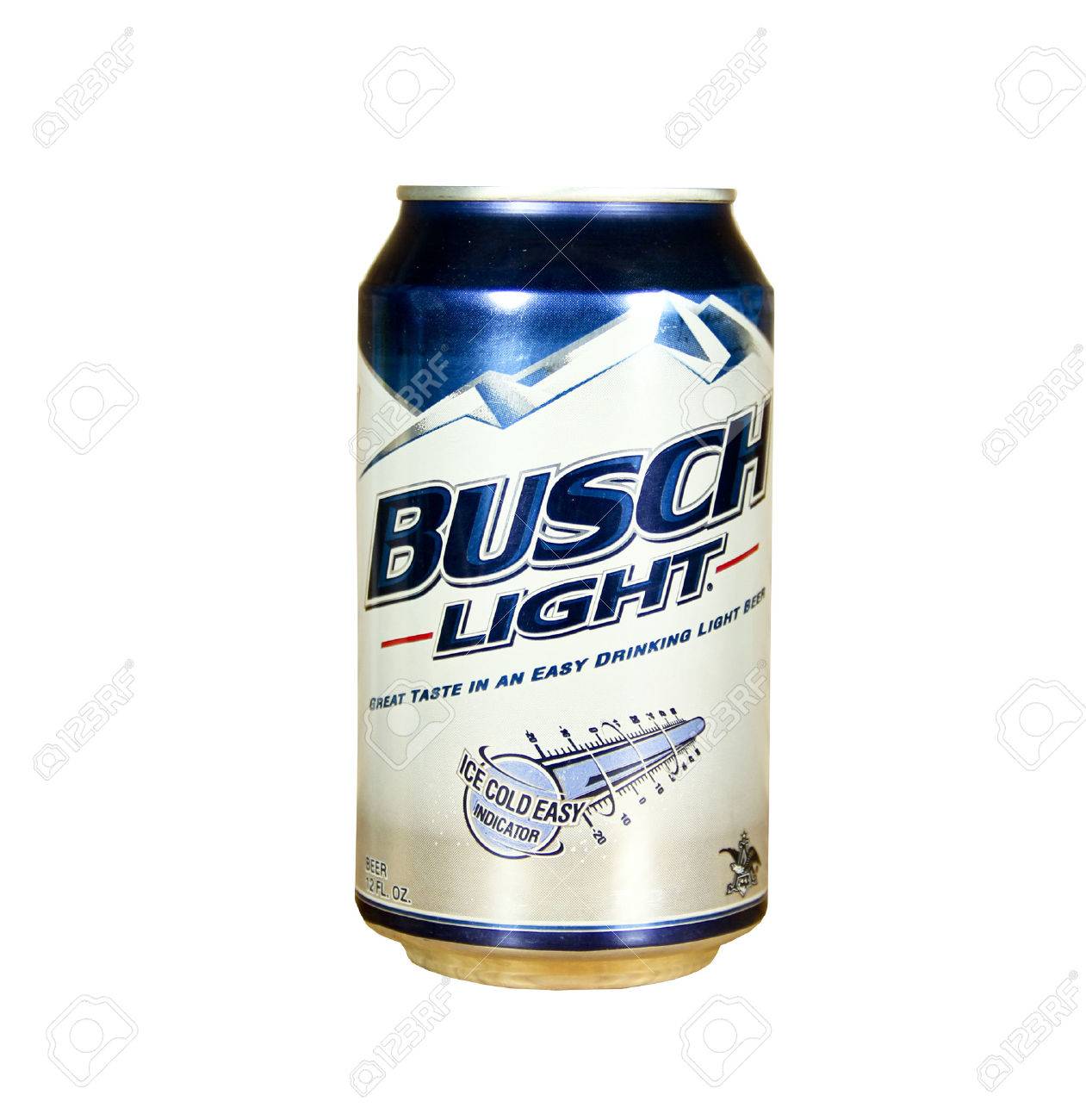
Kevin Harvick #4 Busch Light Chevy SS-Based on a Busch Light can, everything I like about Busch also applies here. A+
Marin Truex Jr. #78 Furniture Row Toyota Camry–No change A+
Dale Earnhardt Jr. #88 TaxSlayer Chevy SS-The colors scheme is really good, and the design works well. I like the gold designs and door numbers too. A+
Now on to the 2015 schemes…
Jamie McMurray #1 Naturemade Gummies Chevy SS-No. Redeeming. Features. At. All. F
Trevor Bayne #6 Advocare Pink Ford Fusion-In keeping with Driver Suit Blog policy, all pinkwashing schemes earn an automatic F.
Sam Hornish Jr. #9 Walmart/SlimFast Ford Fusion-Same as Walmart scheme, same B- grade.
Greg Biffle #16 Roush Performance Parts Pink Ford Fusion-In keeping with Driver Suit Blog policy, all pinkwashing schemes earn an automatic F.
Kyle Busch #18 Halloween M&M’s Toyota Camry-M&M’s always has top notch M&M’s Halloween schemes, and this scheme is no exception. The color and design work very well, and earn an A+.
Kyle Busch #18 M&M’s Pink Toyota Camry-In keeping with Driver Suit Blog policy, all pinkwashing schemes earn an automatic F.
Ryan Blaney #21 PPG Automotive Finishes Ford Fusion-Great color scheme, the blue works well, and the paint streaks to the white rear looks really good. A+
Jeb Burton #23 Dr. Pepper Pink Toyota Camry-In keeping with Driver Suit Blog policy, all pinkwashing schemes earn an automatic F.
Brett Moffitt #34 Dockside Logistics Ford Fusion-Great color scheme and great design scheme earns an A+.
Landon Cassill #40 Cars For Sale Pink Chevy SS-In keeping with Driver Suit Blog policy, all pinkwashing schemes earn an automatic F.
Kyle Larson #42 Target Plaid Chevy SS-Plaid does not look good on race cars, no matter what. D-
Jimmie Johnson #48 Lowe’s Red Vest Chevy SS-When I first heard about this scheme I thought the red would improve the scheme, but it actually takes a B- scheme down to a C-.
Dale Earnhardt Jr.#88 Nationwide/Plenti Chevy SS-I’m not sure if the Plenti designs are meant to be confetti, butterflies, birds, or what, but they take a B+ scheme down to a C+.
Michael McDowell #95 Thrivent Financial/Habitat For Humanity Ford Fusion-The use of gray can be a minefield, but this works well, and the overall design looks good too. A+
nascar, nascar sprint cup, nascar sprint cup series, sprint cup, sprint cup series, toyota camry, camry, toyota, chevy, ss, chevy ss, ford fusion, ford, fusion, jamie mcmurray, naturemade gummies, sam hornish jr., walmart, slimfast, kyle busch, m&m’s halloween, m&m’s pink,target plaid, kyle larson, dale earnhardt jr., nationwide, plenti,martin truex jr., furniture row, dale earnhardt jr., taxslayer, trevor bayne, advocare, jimmie johnson, lowe’s, ryan blaney, ppg, jeb burton, dr pepper, brett moffitt, dockside logistics, landon cassill, cars for sale, michael mcdowell, thrivent financial, habitat for humanity,busch, busch light, kevin harvick
