By David G. Firestone
CHIP GANASSI RACING TEAM #1
Jamie McMurray #1 Cessna/Beechcraft Chevy SS–No Change A
Jamie McMurray #1 McDonald’s Chevy SS–Same basic scheme, but with a new door design. B+
Jamie McMurray #1 Cessna/McDonald’s Chevy SS-Special dual scheme for the Daytona 500, black Cessna on the front, fade to red McDonald’s on the back. A+
Jamie McMurray #1 Sherwin Williams Chevy SS-New sponsor for 2015, Red, white and blue with a red line down the center, with the top fades blue to white on top, and white to blue on the bottom. B+
Jamie McMurray #1 Cessna/Dixie Chopper Chevy SS–New sponsor for 2015, same as Cessna/Beechcraft scheme A
Jamie McMurray #1 Energizer Eco Advanced Chevy SS–New sponsor for 2015, same as #42 scheme. D+
Jamie McMurray #1 Bass Pro Shops/Big Ceder Lodge Chevy SS–New scheme for 2015, black with an orange oval with hunting camo in the front. F
Jamie McMurray #1 Cushman Chevy SS-New sponsor for 2015, white with a red bumper, and a series of red wave stripes up the side. A+
Jamie McMurray #1 Cessna/Beechcraft Chevy SS-Same as Cushman scheme, but with Beechcraft logo on sides. A+
Jamie McMurray #1 Lexar Chevy SS–New scheme for 2015, fade replaces stripe on bottom, slight change of sponsors. A+.
TEAM PENSKE #2
Brad Keselowski #2 Miller Lite Ford Fusion–Same basic design as 2014, but with no gold stripe, vintage Miller Crest, or hop designs on the side. A+
Brad Keselowski #2 Alliance Truck Parts Ford Fusion–New redesign, similar in design to Joey Logano’s Shell/Pennzoil Ford, black replaces yellow as the primary color. A+
Brad Keselowski #2 Wurth Ford Fusion–Redesign from last season, follows the Shell/Pennzoil template. A+
Brad Keselowski #2 Detroit Genuine Parts Ford Fusion–New scheme for 2015, blue Penske template on a black background C-
Brad Keselowski #2 Miller Genuine Draft Ford Fusion–Throwback scheme that ran from 1990-1996 A+
Brad Keselowski #2 Miller High Life Ford Fusion–Based on the design that Bobby Allison won the 1983 Sprint Cup Championship. A+
Brad Keselowski #2 Miller Lite/Penske 25th Anniversary Ford Fusion-Same as Miller Lite scheme but with a special design on the hood. A+
Brad Keselowski #2 Miller Lite 1998 Throwback Ford Fusion–Based on the 1998 Rusty Wallace scheme, but with some subtle differences. Different logo on hood and sides, and a layers stripe on the stripes. A+
Brad Keselowski #2 Miller Lite 2007 Gold Throwback Ford Fusion–Based loosely on the 2007 gold scheme raced at the Sprint Unlimited and All-Star Race, new hood logo and designs, door and hood numbers covered by blue. B-
Brad Keselowski #2 Miller Lite 2010 Throwback Ford Fusion–Based on the Miller Lite scheme from 2010, with some changes to accommodate the Gen 6 car. B-
Brad Keselowski #2 Miller Lite/Careers for Veterans Ford Fusion-Same as Miller Lite but with Careers for Veterans on the quarter panel. A+
Brad Keselowski #2 Avaya Ford Fusion-New sponsor for 2015, red, white and black Penske template. A+
Brad Keselowski #2 Miller Lite/Luke Bryan Ford Fusion-New scheme, same as Miller Lite but with Luke Bryan on the hood. A+
RICHARD CHILDRESS RACING #3
Austin Dillon #3 Cheerios Chevy SS–No change A+
Austin Dillon #3 Dow Chevy SS–No change B+
Austin Dillon #3 Bass Pro Shops Chevy SS–No Change F
Austin Dillon #3 American Ethanol Chevy SS–No Change A-
Austin Dillon #3 Dow Energy and Water Chevy SS–No change B-
Austin Dillon #3 Dow/WeatherTech Chevy SS-Same scheme as Dow B+
Austin Dillon #3 Dow Styrofoam Insulation Chevy SS-New sponsor for 2015, black with a downward fade to blue, and a Dow insulation motif on the front. C+
Austin Dillon #3 Dow Patriotic Chevy SS-New scheme for 2015, silver with an American flag motif on the sides, roof and hood. B+
Austin Dillon #3 Weather Tech Chevy SS-New sponsor for 2015, white with a red and black roof, and red and black accents on the sides. A-
Austin Dillon #3 NRA Museum Chevy SS–New scheme for 2015, black replaces blue on door number and behind. A+
Austin Dillon #3 Dow/Utility Chevy SS-Same as Dow scheme, B+.
Auston Dillon #3 Dow Agro Sciences Chevy SS-New sponsor for 2015, red with black curved stripes starting at the door number and moving up the side of the rear. A+.
Austin Dillon #3 American Ethanol Throwback Chevy SS-New scheme for 2015. throwback design based on a Richard Childress scheme from the 1970’s and 1980’s. Red top and bottom, white stripes on roof and sides. B-
STEWART-HAAS RACING #4
Kevin Harvick #4 Budweiser Chevy SS–No change A
Kevin Harvick #4 Jimmie Johns Chevy SS–No change A
Kevin Harvick #4 Outback Steakhouse–No Change A
Kevin Harvick #4 Ditech Chevy SS-New sponsor for 2015, blue, and white is the primary color scheme A+
Kevin Harvick #4 Hunt Brothers Pizza Chevy SS–New scheme for 2015, green, red, and white color scheme with a series of geometrical shapes across the side. F
Kevin Harvick #4 Budweiser Throwback Chevy SS-New scheme for 2015, yellow with red and black stripes on bottom, sublimated yellow stripes on side. A
Kevin Harvick #4 Folds of Honor/Budweiser/Folds of Honor Chevy SS-New scheme for 2015, slightly smaller logos on right side and hood. A+
Kevin Harvick #4 Budweiser Make It Home Chevy SS-New scheme for 2015, all red with white lettering. A+
HENDRICK MOTORSPORTS #5
Kasey Kahne #5 Great Clips Chevy SS–No Change D+
Kasey Kahne #5 Time Warner Cable Chevy SS–No Change C
Kasey Kahne #5 Farmers Insurance Chevy SS–Complete redesign from last year, black, and dark blue replaces light blue and silver, and the design has been completely revamped. C+
Kasey Kahne #5 Liftmaster Chevy SS-New sponsor for 2015, red and white redesign of the Time Warner scheme. C+
Kasey Kahne #5 Pepsi Chevy SS–No change B+
Kasey Kahne #5 Great Clips/Shark Week Chevy SS–New scheme for 2015, yellow, blue, aqua, and orange color scheme, similar to Great Clips, but with a shark motif. B+
Kasey Kahne #5 Aquafina Chevy SS-New sponsor for 2015, blue and white with a water motif. A+
Kasey Kahne #5 Hendrick Ride Along Chevy SS-New scheme for 2015, red stripes across top and bottom, white separating both, which meet at front, vintage designed numbers and logos. A+
ROUSH-FENWAY RACING #6
Trevor Bayne #6 Advocare Ford Fusion-New team, new sponsor, red, white and blue is the color scheme. A+
Trevor Bayne #6 Advocare Camo Ford Fusion-New scheme for 2015, blue with a white front, and a camo motif across. F
Trevor Bayne #6 Advocare Mark Martin Throwback Ford Fusion–New scheme for 2015, based on Mark Martin’s Valvoline scheme from 1998-1999. A+
TOMMY BALDWIN RACING #7
Alex Bowman #7 Nikko/Toy State Chevy SS-New sponsor for 2015, Red borders a blue design on the sides and hood. D-
Alex Bowman #7 Accell Construction Chevy SS–No change. C-
Alex Bowman #7 DOC 360 Chevy SS-New sponsor for 2015, all black with DOC 360 logos on front and sides. A+
Alex Bowman #7 Chevy SS-All black with white numbers. A+
Alex Bowman #7 Golden Corral Chevy SS-Same scheme as #46, same C+ grade.
Alex Bowman #7 Chevy SS-All black with gold and white numbers. A+
Alex Bowman #7 Culer Chevy SS-New sponsor for 2015, dark blue, white, and green, with a wire-frame motif up the side. C+
Alex Bowman #7 Racing Rewards Chevy SS-New sponsor for 2015, green with a red paint stripe diagonally up the side. C+
Alex Bowman #7 Advance Auto Parts Chevy SS-New sponsor for 2015, black with a white stripe on the sides. A+
Alex Bowman #7 Marsh Supermarkets Chevy SS-New sponsor for 2015, white with red and green flames up the sides. B+
Alex Bowman #7 FW1 Wash and Wax Chevy SS-New sponsor for 2015, black with a diagonal red to green fade over door number and sides. B-
Alex Bowman #7 APC Chevy SS-New sponsor for 2015, black top, yellow stripe across sides blue bottom. B-
Alex Bowman #7 “Tiger” Tom Baldwin Throwback Chevy SS-New scheme for 2015, pays tribute to “Tiger” Tom Baldwin’s modified car Has image of air filter on hood, and roll bars on sides. A+
RICHARD PETTY MOTORSPORTS #9
Sam Hornish Jr. #9 Twisted Tea Ford Fusion–No Change A
Sam Hornish Jr. #9 Camping World/Medallion Bank Ford Fusion-New sponsor set for 2015, a redesign of the Fresh From Florida #43 scheme. F
Sam Hornish Jr. #9 Medallion Bank Ford Fusion-New sponsor for 2015, same as Camping World Scheme, but with a darker green. F
Sam Hornish Jr. #9 Medallion Bank/Mercury Marine Ford Fusion-New sponsor for 2015, same as Camping World Scheme, but with a red, white and blue as a color scheme. B+
Sam Hornish Jr. #9 Lyons Financial Ford Fusion–Redesign of the Medallion Bank scheme, with a Lyons Financial logo on the hood. F
Sam Hornish Jr. #9 Nature Blast/Medallion Bank Ford Fusion-New sponsor for 2015, light green and dark green diagonal stripes up the side. F
Sam Hornish Jr. #9 Victory Junction/Shop.com Ford Fusion-New sponsor for 2015, blue with a series of small white strips in a grid pattern on the side, and an oval with the sponsor on a white background. C+
Sam Hornish Jr. #9 Jacob Companies Ford Fusion-New sponsor for 2015, aqua, blue and white with a series of geometrical designs on sides and roof. B-
Sam Hornish Jr. #9 Advance Auto Parts Ford Fusion-New sponsor for 2015, dark yellow with black and red stripes on sides. B+
Sam Hornish Jr. #9 Transportation Impact Ford Fusion-New sponsor for 2015, Jacob Companies color scheme with a lightning bolt swirl design. C-
Sam Hornish Jr. #9 Blue Emu Ford Fusion-New sponsor for 2015, white front with blue rear, and white spirals on sides. B+
Sam Hornish Jr. #9 Winn Dixie Throwback Ford Fusion–New sponsor for 2015, based on Mark Martin’s 1999 Winn Dixie scheme with modern logos. B-
Sam Hornish Jr. #9 Go Bowling/Draft Kings Ford Fusion–New sponsor for 2015, Medallion Bank scheme but with different logos. B+
STEWART-HAAS RACING #10
Danica Patrick #10 Aspen Dental Chevy SS–Same basic design as last year, but the blue ovals on the white are more pronounced. C
Danica Patrick #10 GoDaddy Chevy SS–New redesign with more black and less orange. F
Danica Patrick #10 GoDaddy/TaxAct Chevy SS-New sponsor combo for the Sprint Unlimited, front of the car retains traditional GoDaddy design, whereas back quarter panel is TaxAct. C-
Danica Patrick #10 TaxAct Chevy SS-One race sponsor, will run at Martinsville in March, red, white and black scheme, with diagonal design up the doors. C-
Danica Patrick #10 Mobil 1/Aspen Dental Chevy SS–New sponsor/scheme for 2015, a rehash of Tony Stewart’s #14 Mobil 1/ Bass Pro Shops scheme. C+
Danica Patrick #10 GoDaddy Small Biz Force Chevy SS-Same as GoDaddy but with #smallbizforce on the hood. F
Danica Patrick #10 GoDaddy Black Chevy SS-New scheme for 2015, reversal of the current scheme with black on top, green on bottom. C+
JOE GIBBS RACING #11
Denny Hamlin #11 FedEx Express Toyota Camry–New redesign with a much simpler front and more design on the sides. A+
Denny Hamln #11 FedEx Office Toyota Camry–Same redesign as FedEx Express A+
Denny Hamlin #11 FedEx Freight Toyota Camry–Same redesign as FedEx Express A+
Denny Hamlin #11 FedEx Ground Toyota Camry–Same redesign as FedEx Express A+
Denny Hamlin #11 SportClips Toyota Camry–New redesign with a new door design C-
Denny Hamlin Autism Speaks Toyota Camry–New scheme for 2015, same as FedEx schemes but with an Autism Speaks color scheme. A+
Denny Hamlin #11 Sport Clips Throwback Toyota Camry-New scheme for 2015, white top and hood, black stripe across sides, vintage number design, and red bottom. C
GERMAIN RACING #13
Casey Mears #13 Geico Chevy SS–No Change. D-
Casey Mears #13 Geico/Squidward Chevy SS-New sponsor for 2015, blue and aqua with a Squidward tentacles motif. F
Casey Mears #13 Geico Millitary Chevy SS–No Change. F
STEWART-HAAS RACING #14
Tony Stewart #14 Bass Pro Shops/Mobil 1 Chevy SS–Same color scheme as last year, but with a new design on the side. C+
Tony Stewart #14 Mobil 1/Bass Pro Shops Chevy SS–Same color scheme as last year, but with a new design on the side. C+
Tony Stewart #14 Code 3 Associates/Mobil1 Chevy SS–No Change C+
Tony Stewart #14 Mobil 1/Rush Truck Centers Chevy SS–No Change A+
Tony Stewart #14 Mobil 1/Bass Pro Shops American Salute Chevy SS–New scheme for 2015, white takes over for blue as the primary color, scheme is much simpler. A-
Tony Stewart #14 Bass Pro Shops/Arctic Cat Chevy SS-New sponsor for 2015, same as Bass Pro Shops but with Attic Cat on the sides. F
Tony Stewart #14 Bass Pro Shop Throwback/Mobil 1 Chevy SS-New scheme for 2015, silver on top, red stripes across car, bottom is black, vintage Bass Pro Shops log on hood. C+
Tony Stewart #14 Bass Pro Shops/Ducks Unlimited Chevy SS-Same as Bass Pro Shops, but with Ducks unlimited on side. C+
MICHAEL WALTRIP RACING #15
Clint Bowyer #15 5 Hour Energy Toyota Camry–No Change B+
Clint Bowyer #15 Peak Toyota Camry–No Change B
Clint Bowyer #15 Maxwell House Toyota Camry-New sponsor for 2015, blue with orange and white wave designs on bottom. A
Clint Bowyer #15 Cherry 5-hour ENERGY benefiting Special Operations Warrior Foundation Toyota Camry–Same scheme as last year, with a few minor associate changes. B+
Clint Bowyer #15 AAA Insurance Toyota Camry–No Change. B+
Clint Bowyer #15 Jack Links/Big Machine Records Toyota Camry-New sponsor for 2015, Bowyer template with a red, white, and black color combo. B+
Clint Bowyer #15 Casey’s General Store Toyota Camry-New sponsor for 2015, Bowyer template with green, red, white, and black color scheme. A-
Clint Bowyer #15 5 Hour Energy Toyota Camry-New scheme for 2015, front has Bowyer template, rear has sponsor logos. A+
Clint Bowyer #15 Buddy Baker Throwback Toyota Camry-New scheme for 2015, hand painted throwback to Buddy Baker’s 1974 scheme. A++
ROUSH-FENWAY RACING #16
Greg Biffle #16 Cheez Its Ford Fusion-New sponsor for 2015, red with a cheese colored stripe and crackers on the side. A+
Greg Biffle #16 Clean Harbors Ford Fusion-New sponsor for 2015, red white and black design A-
Greg Biffle #16 Ortho Fire Ant Killer Ford Fusion–No change A-
Greg Biffle #16 Ortho Home Defense Ford Fusion-New sponsor, white design with a red and yellow stripe on the bottom, with a net design on the side. A
Greg Biffle #16 Ortho Bug-B-Gon Ford Fusion-New sponsor, new design, red, black, and white is the primary color scheme. A+
Greg Biffle #16 Cheez It/Patrick Starr Ford Fusion-New sponsor for 2015, red with an underwater motif and Patrick Starr on the hood. F
Greg Biffle #16 Safety Kleen Ford Fusion-New sponsor for 2015, green, yellow, white, and black with an overly complex design on the sides. F
Greg Biffle #16 Lilly Diabetes Ford Fusion-New sponsor for 2015, white front, red, black, and green stripes up the side. C-
Greg Biffle #16 Roush Performance Parts Ford Fusion–New scheme for 2015, same color scheme but with vertical stripes replacing the dot motif. C-
Greg Biffle #16 Ortho Throwback Ford Fusion-New scheme for 2015, red with white hood, vintage numbers, logos, and consistency decals. A+
ROUSH-FENWAY RACING #17
Ricky Stenhouse Jr. #17 Fastenal Ford Fusion-New primary sponsor, blue, and white is the color scheme. A
Ricky Stenhouse Jr. #17 Fifth-Third Bank Ford Fusion–Same color scheme as 2014, but with a new, simpler side design. A+
Ricky Stenhouse Jr. #17 NOS Ford Fusion–Same color scheme as 2014, but with an updated design. B-
Ricky Stenhouse Jr. #17 Zest Ford Fusion–No Change. F
Ricky Stenhouse Jr. #17 Fastenal Patriotic Ford Fusion–New scheme for 2015, much more subtle patriotic design, with a star and stripe motif, which replaces the American motif. B+
Ricky Stenhouse Jr. #17 Ford EcoBoost Ford Fusion–New scheme for 2015, same as Carl Edwards in 2014. F
Ricky Stenhouse Jr. #17 Juicy Juice Ford Fusion-New scheme for 2015, green with red stripe and yellow dots. A
Ricky Stenhouse Jr. #17 Cargil David Pearson Throwback Ford Fusion–New scheme for 2015, based on David Pearson’s 1969 Ford Torino Cobra. A+
JOE GIBBS RACING #18
Kyle Busch #18 Interstate Batteries Toyota Camry–No Change F-
Kyle Busch #18 M&M’s Crispy Toyota Camry-New design for 2015, with a green background and more emphasis on M&M’s Crispy, as well as a new hood logo. B-
David Ragan #18 Snickers Xtreme Toyota Camry-New scheme for 2015, brown with a series of fades around the Xtreme logo. D+
Kyle Busch #18 Pedigree Toyota Camry–New scheme for 2015, orange with white and blue on the bottom. A+
Erik Jones #18 M&M’s Red Nose Day Toyota Camry-New scheme for 2015, yellow with red noses replacing most of the M&M designs. Red Nose Day is an event to raise money for kids in poverty by having fun via a telethon staring a lot of comedians and stars. A+
Kyle Busch #18 Skittles Toyota Camry–No Change. A+
Kyle Busch #18 M&M’s/American Hertiage Toyota Camry-New scheme for 2015, slight change in color, and American Heritage logos on quarter panels. B-
Kyle Busch #18 Interstate Batteries Center Toyota Camry-Same as Interstate Batteries scheme. F
JOE GIBBS RACING #19
Carl Edwards #19 Stanley Toyota Camry-New team and new sponsor, yellow, black, and white is the color scheme. B+
Carl Edwards #19 Aaris Toyota Camry-New team and new sponsor, reddish orange with the Aaris logo used as part of the side stripe. A
Carl Edwards #19 Comcast Business Toyota Camry-New sponsor for 2015, blue, silver and white, with a stripe that starts on the bottom, covers the car number, and takes over the top at the back. D-
Carl Edwards #19 SportClips Toyota Camry-New sponsor, same design as Denny Hamlin. C-
Carl Edwards #19 Subway Toyota Camry–New sponsor for Joe Gibbs, much simpler design. A+
Carl Edwards #19 Stanley/Cook’s Children’s Hospital Toyota Camry–Slight redesign of the Stanley scheme, with one paitent name from each state on the car. B+
Carl Edwards #19 Minions Toyota Camry-New sponsor for 2015, white with Minions in different poses on sides, deck-lid, and hood. A+
JOE GIBBS RACING #20
Matt Kenseth #20 DeWalt Toyota Camry-New sponsor, black, green, yellow, and white is the color scheme.-A+
Matt Kenseth #20 Dollar General Toyota Camry–Much simpler than the 2014 scheme, with fewer side designs. A
Matt Kenseth #20 DeWalt Made In America Toyota Camry-Same basic DeWalt scheme, but with a patriotic motif on sides, and Made In America logo on hood. A+
WOOD BROTHERS RACING #21
Ryan Blaney #21 Motorcraft/Quicklane Ford Fusion–No Change A+
Ryan Blaney #21 Maryn Winters Motorcraft JDRF Ford Fusion-Designed by Maryn Winters, an 8 year old with type 1 diabetes, the car features a flower and park theme across the whole car. A+
Ryan Blaney #21 Snap On Ford Fusion–New sponsor for 2015, scheme mirrors that of Cruz Pedregon’s funny car. A+
Ryan Blaney #21 SKF Ford Fusion-New sponsor for 2015, blue with white letters and a red and white Nike-style logo up the sides. A+
Ryan Blaney #21 Snap On Throwback Ford Fusion-New scheme for 2015, same as Snap On, but photos of Snap On distributors replace white. B-
Ryan Blaney #21 SKF Manufacturing Day Ford Fusion-New scheme for 2015, slight modification of SKF scheme with a polka dot motif and special logo on hood. A+
TEAM PENSKE #22
Joey Logano #22 Shell/Pennzoil Ford Fusion–No change D
Joey Logano #22 AAA Ford Fusion–The AAA logo has been straightened up in 2015. D
Joey Logano #22 Southern California AAA Ford Fusion–Redesign of the AAA scheme, with Southern California AAA logo in place of the standard AAA logo. D
Joey Logano #22 Pennzoil Platnum Ford Fusion–No Change F
Joey Logano #22 Auto Trader.com Ford Fusion–New scheme for 2015 Ford Fusion-Redesign using the Penske Template. D-
Joey Logano #22 Snap On Ford Fusion–New sponsor for 2015, scheme mirrors that of Cruz Pedregon’s funny car. A+
Joey Logano #22 Shell/Pennzoil Indy 500 Ford Fusion–New scheme for 2015, designed to match Helio Castroneves’ Indy 500 car. A+
Joey Logano #22 Auto Trader/Pennzoil Ford Fusion-New sponsor for 2015, same as Shell/Pennzoil. D
Joey Logano #22 Shell Pennzoil Mario Andretti Throwback Ford Fusion-New scheme for 2015, based on Mario Andretti’s 1988 24 Hours of LeMans Porsche. A+
BK RACING #23
J.J. Yeley #23 Dr. Pepper/Maxim Fantasy Sports Toyota Camry-New sponsor for the Daytona 500. Black on top, white on the bottom, red stripe in between, Dr Pepper style logo on the door number.-B-
JJ Yeley #23 Dr Pepper Toyota Camry–Slight redesign for 2015, car keeps the red on top, new number design, and white on bottom. B-
J.J. Yeley #23 American Cancer Society Toyota Camry-New sponsor for 2015, white, red and blue with a supplanted design on the blue, and a thunderbolt motif. C-
Alex Bowman #23 Dr. Pepper Throwback Toyota Camry-New scheme for 2015, all red with some sublimated I’m a Pepper logos and vintage Dr. Pepper and I’m a Pepper logos on the quarter panel. A+
JJ Yeley #23 We Salute You Toyota Camry-New scheme for 2015, white, with a patriotic motif on the sides and back. Donation of $10 will get a fallen soldier’s name on the hood and quarter panel. A+
JJ Yeley #23 Heinz Toyota Camry-New sponsor for 2015, black with Heinz bottles on sides and back. A+
JJ Yeley #23 Dr. Pepper Toyota Camry-Same as Burger King #83, except Dr. Pepper replaces Burger King logos. A+
JJ Yeley #23 TraqGear/CoolShirt Toyota Camry-New sponsor for 2015, dark blue, light blue, and white with a stripe and corner design on doors. A+
JJ Yeley #23 Voodoo Grills Toyota Camry-New sponsor for 2015, same as #83, F.
Jeb Burton #23 Estes Cat Throwback Toyota Camry–New scheme for 2015, Based on Ward Burton’s 2002 Daytona 500 Winning scheme. A+
JJ Yeley #23 Beds For Kids Toyota Camry-New sponsor for 2015, blue with silver stripe running up the side, white bottom, Dr Pepper design has been removed, vintage-style logos on sides and hood. B-
HENDRICK MOTORSPORTS #24
Jeff Gordon #24 3M Chevy SS-New design for 2015, silver, with red accents and numbers, with a white hood design that extends over the roof and deck-lid. A+
Jeff Gordon #24 Axalta Chevy SS–No Change A+
Jeff Gordon #24 Pepsi Chevy SS-No Change A+
Jeff Gordon #24 Drive to End Hunger Chevy SS–Much simpler redesign, with new hood logo and same color scheme A+
Jeff Gordon #24 Panasonic Toughbook Chevy SS–No Change A+
Jeff Gordon #24 Axalta/Fix Auto Chevy SS–Same basic Axalta scheme, but with Fix Auto on the side. A+
Jeff Gordon #24 Axalta/Penn State Chevy SS-New scheme for 2015, all blue with a slight blue twist design on the sides. B+
Jeff Gordon #24 Red Cross Chevy SS-New sponsor for 2015, all black with red accents. A
Jeff Gordon #24 AARP Member Services/United Health Care Chevy SS-New sponsor for 2015, black front which fades to red on hood, red stripes on sides. A+
Jeff Gordon #24 Axalta Throwback Chevy SS–Based on the scheme Jeff Gordon raced from 1993-2000. A+
Jeff Gordon #24 AARP Member Advantages/Chase Credit Cards Chevy SS-New sponsor for 2015, same as Member Services/United Health Care, but with Chase Credit Cards instead of United Health Care A+
Jeff Gordon #24 Axalta “It’s Been a Great Ride” Chevy SS-New scheme for 2015, will be run at Homestead, Jeff’s final race, same as Axalta, but with “It’s been a great ride” on quarter panel. A+
HENDRICK MOTORSPORTS #25
Chase Elliott #25 NAPA Chevy SS-New sponsor and car number for 2015, blue is the primary sponsor, with a yellow design on the side. B
Chase Elliott #25 NAPA Fauxback Chevy SS–To be raced at Darlington, based on the 1985 Coors Ford design, but with NAPA colors and logos. C-
BK RACING #26
Jeb Burton #26 Live Deals Ford Fusion-New sponsor for the Daytona 500, will have similar design as JJ Yeley, but with orange, black, and white. B-
Jeb Burton #26 Maxim Toyota Camry-New sponsor for 2015, white with black lettering. A+
Jeb Burton #26 Maxim Red Toyota Camry–Red redesign of the white Maxim scheme, with BK Racing letter circle. A-
Jeb Burton #26 Estes Toyota Camry-New sponsor for 2015, black on top, red stripe down the middle, yellow stripes on bottom. D+
Jeb Burton #26 Maxim Fantasy Sports/Estes Toyota Camry-New scheme for 2015, Red with Maxim Fantasy Sports on hood, and Estes on quarter panel. A+
Jeb Burton #26 Rocky Ridge Toyota Camry-New sponsor for 2015, black, with red and gray curve designs on sides. F
RICHARD CHILDRESS RACING #27
Paul Menard #27 Pittsburgh Paints/Menard’s Chevy SS–No change A
Paul Menard #27 Menard’s/Serta Chevy SS–Same basic scheme as 2014, but with more blue on the sides than last year. C+
Paul Menard #27 Menard’s/Peak Chevy SS–Some slight changes to the stripes, and roof F
Paul Menard #27 Menard’s/Duracel Chevy SS–New scheme for 2015, using a black, yellow, and gold version of the Menard’s template. A+
Paul Menard #27 Menard’s/Quaker State Chevy SS–No change C
Paul Menard #27 Menard’s/FVP Chevy SS-New sponsor for 2015, standard Paul Menard Template with silver designs for FVP. A
Paul Menard #27 Menard’s/Sylvania Chevy SS-New sponsor for 2015, red and yellow version of the Menard’s template. D-
Paul Menard #27 Menard’s/Schrock Chevy SS-New scheme for 2015, 2015 Menard’s template with purple stripes. B+
Paul Menard #27 Moen/Menard’s Chevy SS-Menard’s Template with black and blue stripes across the sides. A+
Paul Menard #27 Menard’s/Richmond Water Heaters Chevy SS–No Change. A+
Paul Menard #27 Menard’s/Nebco Chevy SS-Menard’s template with Nebco on hood, and light blue on stripes. A+
Paul Menard #27 Menard’s/Libman Chevy SS-New sponsor for 2015, Menard’s template with green stripes. A+
Paul Menard #27 Menard’s/Knauf Chevy SS-New sponsor for 2015, Menard’s template with sky blue. D-
Paul Menard #27 Menard’s Throwback Chevy SS-New scheme for 2015, rainbow stripe pattern with vintage Menard’s logo and door numbers. A+
RAB RACING #29
Justin Marks #29 American Born Moonshine Toyota Camry-New sponsor for the Daytona 500, has a wood finished look, with white lettering. A+
TMG RACING #30
Ron Horniday #30 Smokey Mountain Herbal Snuff Chevy SS-New team and sponsor for 2015. Two-tone green design with white lettering and yellow accents. C-
Ron Horniday #30 Toyota Camry-Matte black with blue and white lettering. A+
RICHARD CHILDRESS RACING #31
Ryan Newman #31 Cat Chevy SS–Same color scheme, but the car as a whole has been redesigned A+
Ryan Newman #31 Quicken Loans Chevy SS–No change A
Ryan Newman #31 Granger Chevy SS-New sponsor for 2015, green, red and white, with some designs on the side. B +
Ryan Newman #31 Caterpillar Throwback Chevy SS-New scheme for 2015, Yellow with black stripes up the center and vintage logos. A+
Ryan Newman #31 Wix Filters Chevy SS–No Change. F
Ryan Newman #31 Cat/Quicken Loans Chevy SS–New scheme for 2015, a more straight design replaces the curved design featured on last year’s car. C-
GO FAS RACING #32
Go FAS Racing #32 Keen Parts Ford Fusion–Simpler redesign and a much simpler color scheme. B+
Go FAS Racing #32 C&J Energy Services Ford Fusion–Same color scheme, but with a different and much more complex side design F
Mike Bliss #32 Draft Demons Ford Fusion-New sponsor for 2015, red and black diagonal stripes with a fire motif at the bottom. A
Mike Bliss #32 King Taco Ford Fusion-New sponsor for 2015, red, gold and white, with a circular design on the sides, and vintage lettering on the quarter panels and hood. B+
Mike Bliss #32 Keen Parts/Corvetteparts.net Ford Fusion–New design for 2015, light blue has been eliminated entierly, replaced with black and grey. Cutting edge design replaced 1960’s design. F
Mike Bliss #32 Rimrock Ford Fusion-New sponsor for 2015, black with red and green designs on the side. F
Mike Bliss #32 Texas Tech Ford Fusion-New sponsor for 2015, red fade to black with a large Texas Tech logo on the back. A
Mike Bliss #32 Alpha Floors/JoeUSA.com Ford Fusion-New scheme for 2015, all white with logos on the hood. A+
Joey Gase #32 Donate For Life/Corvette Parts Ford Fusion-New sponsor for 2015, same as Corvette Parts. F
Mike Bliss #32 Rimrock Devlin/Corvette Parts Ford Fusion-Same as Corvette Parts but with Rimrock Devlin on side. F
Travis Kvapil #32 Victorypress.biz Ford Fusion-New sponsor for 2015, all white with Victorypress.biz logo on side. A+
Boris Said #32 SPG Ford Fusion-New sponsor for 2015, white with SPG logos on hood. A+
Boris Said Genesee Beer Ford Fusion–New sponsor for 2015,based on old school AMC Matador schemes A+
Michael McDonald #32 Draft Demons Ford Fusion-New scheme for Red, yellow, and white with a fire and devil motif up the side. F
Josh Wise #32 Brandeis Machinery Ford Fusion-New sponsor for 2015, similar to Rimrock Devlin but with a different color scheme. F
Travis Kvapil #32 Skuttletight Ford Fusion-New sponsor for 2015, green, black and white with an angled stripe up the side. A+
Josh Wise #32 Tom Siple Foundation Ford Fusion-New sponsor for 2015, white with black and yellow letters, and Tom Siple Foundation logos on sides and hood. A+
Josh Wise #32 Beer Frost/Corvetteparts.com Tide Throwback Ford Fusion–New scheme for 2015, based on the “Tide Ride” used by the #32 team from 2000-2006. A+
RICHARD CHILDRESS RACING #33
Ty Dillon #33 Yuengling Brewery Chevy SS-New sponsor, red, white, and blue is the primary color scheme. A+
Ty Dillon #33 Cheerios Chevy SS-New sponsor for the Daytona 500, based on Austin Dillon’s Cheerios scheme, but with a Kroger’s logo on the hood. A
Brian Scott #33 White Tail Lodge Chevy SS–No change. D-
Ty Dillon #33 Nexium Chevy SS-New sponsor for 2015, blue and yellow color scheme, yellow on hood, with a right angle design that extends to the door. A-
Ty Dillon #33 Plankton Chevy SS-New sponsor for 2015, pink with the character’s face on the hood, which fades to blue towards the back. Krabby Patties are located behind the door number, and the character is depicted behind the rear wheel. F
Brian Scott #33 Kraft Singles Chevy SS-New sponsor for 2015, patriotic motif with a series of geometrical designs on the sides. F
Brian Scott #33 Shore Lodge Chevy SS–No change. B+
CIRCLE SPORT RACING #33
Alex Kennedy #33 Dream Factory Chevy SS–No Change. B
Michael Annett #33 Pilot/Flying J Chevy SS-This one requires an explanation. At Atlanta, Michael Annett didn’t get his car through inspection in time, and didn’t get to qualify. Brian Scott offered his ride to Annett that weekend, and so the car was repainted. A+
Alex Kennedy #33 Honor and Remember Chevy SS-New sponsor for 2015, red, yellow, and white, diagonal stripes up the sides, and a flag motif on the hood. B-
Travis Kvapil #33 Chevy SS-Black with white letters. A+
Mike Bliss #33 Harry Gant Throwback Chevy SS-New scheme for 2015, based on the Skoal Bandit scheme run by Harry Gant. A+
FRONT ROW MOTORSPORTS #34
David Ragan #34 KFC Ford Fusion–Redesign for 2015, all white front, KFC style stripes on the back. A+
David Ragan #34 CSX Ford Fusion–Same basic scheme, though the word bubble on the hood has been replaced with a CSX logo. A+
David Ragan #34 Southern Belle Seafood Ford Fusion-New sponsor for 2015, blue, white, and red, follows the “Front Row Motorsports Template” with a stripe that curves above and around the door number, that separates the colors of the car. A+
Chris Buescher #34 A&W Ford Fusion–No Change. A+
Brett Moffitt #34 Dockside Logistics Ford Fusion–No change. A+
Brett Moffit #34 CSX Veterans Ford Fusion-Same as CSX but with Proud to Hire Our Veterans with a series of veterans groups logos on hood. A+
Brett Moffat #34 A&W National Root Beer Float Day Ford Fusion-Same as A&W scheme. A+
Chris Buscher #34 Bully Hill Vineyards Ford Fusion–New scheme for 2015, moves from BK Racing to Front Row Motorsports, black replaces blue on primary design. D+
Brett Moffitt #34 No Escape Ford Fusion-New sponsor for 2015, dark blue with a texture motif, orange letters and numbers. C-
FRONT ROW MOTORSPORTS #35
Cole Whitt #35 Speed Stick Gear Ford Fusion–No Change A
Cole Whitt #35 Rinnai Filters Ford Fusion–Same scheme as 2014, different team. A+
Cole Whit #35 Sprouts Ford Fusion-New sponsor for 2015, red and blue, with a fruit design on the side. A+
Cole Whitt #35 Ford Fusion-All white with orange and black letters. A+
Cole Whitt #35 Standard Plumbing Toyota Camry-New sponsor for 2015, all white with red oval Standard Plumbing logos. A+
Cole Whitt #35 Tweaker Energy Shot Ford Fusion-New sponsor for 2015. All black with Tweaker Energy Shot logos on sides and hood. A+
Cole Whitt #35 Uponor Plumbing Products Chevy SS-New sponsor for 2015, black with blue and white letters on sides. A+
Cole Whitt #35 KFC Ford Fusion-New sponsor for 2015, same as #34. A+
Cole Whitt #35 MDS Ford Fusion-New sponsor for 2015, white with black logos and gold and black numbers. A+
Cole Whitt #35 Dockside Logistics Chevy SS-New sponsor for 2015, same as #34. A+
FRONT ROW MOTORSPORTS #38
David Gilliland #38 Love’s Travel Stops Ford Fusion–No change A
David Gilliland #38 MDS Ford Fusion–Same scheme as 2014, but different team. A-
David Gilliland #38 The Pete Store Ford Fusion–Almost the same as last year, with a slight change in the curve behind the driver letters. A+
David Gilliland #38 Farm Rich Ford Fusion–New team for Farm Rich, same scheme as last year. A+
David Gilliland #38 Love’s Support the Troops Ford Fusion–No change. F
David Gilliland #38 Florida Lottery Ford Fusion-New sponsor for 2015, Front Row template, with a blue, orange and green color scheme. C+
David Gilliland #38 FFA/CSX Ford Fusion-New sponsor for 2015, white front and back, blue FFA motif in center, yellow stripes divide the two. B+
David Gilliland #38 Cash Crash Ford Fusion-New sponsor for 2015, Front Row template, green bottom, white top, red numbers and line separating the top and bottom. C+
HILLMAN-SMITH MOTORSPORTS #40
Landon Cassill #40 Snap 24-7 Fitness Chevy SS–Slight redesign from last year, with the black quarter panel replaced with red. A+
Landon Cassill #40 Cars For Sale Chevy SS–No Change C-
Landon Cassill #40 CRC 1-Tank Renew Chevy SS–No Change. B-
Landon Cassill #40 Percon Chevy SS-All red with Percon logos on the hood and sides. A+
Landon Cassill #40 Newton Business Supplies Chevy SS–New team, same scheme. B-
Landon Cassill #40 CRC Knock’er Loose Chevy SS-New sponsor for 2015, green with red lettering and a black design on the hood and designs. F
Landon Cassill #40 Link-Belt Chevy SS-New sponsor for 2015, all black with Link-Belt logos on the sides and hood. A+
Landon Cassill #40 Snap Fitness Patriotic Chevy SS-New scheme for 2015, battered American Flag motif. A+
Landon Cassill #40 CRC Brakleen Chevy SS–No change. A
Landon Cassill #40 Interstate Moving Services Chevy SS–New sponsor for 2015, red, white, and blue with a patriotic motif on sides. A+
Landon Cassill #40 Interstate Moving/Precon Chevy SS-New scheme for 2015, black with interstate logo on hood, and Precon logo on sides. A+
Landon Cassill #40 Chevy SS-Black with white numbers. A+
Landon Cassill #40 Hillman Automotive Chevy SS-New sponsor for 2015, black with white numbers and Hillman Automotive on hood. A+
Landon Cassill #40 Proud to be an American Chevy SS–New scheme for 2015, based on Sterling Marlin’s patriotic car from the Protection One 400. A+
CHIP GANASSI RACING TEAM #42
Kyle Larson #42 Target Chevy SS– Same basic design as 2014, but with some sponsor changes on the quarter panel. B-
Kyle Larson #42 White Target Chevy SS–Same basic design as 2014, but with some sponsor changes on the quarter panel. B-
Kyle Larson #42 Energizer Eco Advanced Chevy SS–New scheme for 2015, different stripe color, fewer logos on the side. D
Kyle Larson #42 Axe White Chevy SS-New sponsor for 2015, all white with silver Target logos, and silver Axe logos. A
Kyle Larson #42 Viva Vantage Chevy SS-New sponsor for 2015, dark blue with white lettering, and a wave pattern across the sides. A+
Kyle Larson #42 Target Camo Chevy SS–No Change. F.
Kyle Larson #42 Target Bullseye Chevy SS-New scheme for 2015, same basic scheme, but with Bullseye the dog on the sides and hood. A+
Kyle Larson #42 Coca Cola/Target Chevy SS-New sponsor for 2015, Coca Cola makes a rare car sponsor appearance, red with Target logos on bottom, and Coca Cola bottle on hood and sides. A+
Kyle Larson #42 Suave Chevy SS-New sponsor for 2015, blue with a silver stripe on the front, and Suave logos on sides. A+
Kyle Larson #42 Clorox Chevy SS–No Change. D-
RICHARD PETTY MOTORSPORTS #43
Aric Almoriola #43 Eckrich Ford Fusion–Same basic design, but with a Nathans logo on the rear. C+
Aric Almirola #43 Smithfield Ford Fusion–No change B+
Aric Almirola #43 Fresh From Florida Ford Fusion–No Change. F
Aric Almirola #43 STP Ford Fusion–No Change. A+
Aric Almirola #43 Smithfield/Cheney Brothers Ford Fusion–Slight redesign of the Smithfield scheme, with a Cheney Brothers logo B+
Aric Almirola #43 United States Air Force Ford Fusion–No Change. A+
Aric Almirola #43 Nathan’s Hot Dogs Ford Fusion–Same basic scheme as 2014, but a blue roof replaces the yellow roof. B+
Aric Almirola #43 Armour Ford Fusion-New sponsor for 2015, Petty blue with green and red numbers, and Armour logos on sides and hood. A-
Aric Almirola #43 STP 1972 Throwback Ford Fusion–New scheme for 2015, based on Richard Petty’s 1972 STP Dodge. A+
Aric Almirola #43 Waffle House Ford Fusion–No Change. B-
TEAM XTREME RACING #44
Reed Sorenson #44 Golden Corral Chevy SS-New sponsor for 2015, same design as 2015 #36. A
Travis Kvapil #44 Phoenix Warehouse Chevy SS–No Change F
HSCOTT MOTORSPORTS #46
Michael Annett #46 Pilot/Flying J Chevy SS-New car number and design. White is the primary color, with red and yellow accents on the sides and front. A+
Michael Annett #46 Cypress HQ Chevy SS–New team for Cypress in 2015, some slight stripe changes on the quarter panel, and a darker blue. F
Michael Annett #46 Northland Oil Chevy SS-New sponsor for 2015, red with black design and white lettering. D-
Michael Annett #46 Philmor Chevy SS-New Sponsor for 2015, yellow, orange and red, with a series of differing designs on the front, sides and back. F
Michael Annett #46 Allstate Peterbuilt Chevy SS-Same basic scheme as last year, with some slight associate sponsor changes, and a new rear quarter panel. A
Michael Annett #46 Bene-Fit Chevy SS–New sponsor for 2015, same as Cypress HQ scheme. F
Michael Annett #46 Pilot/Flying J/Sherwin Williams Chevy SS-New sponsor for 2015, white with red logos, and a large Sherwin Williams can on the side. A+
Michael Annett #46 Pilot Camo Throwback Chevy SS–New scheme for 2015, BDU style camoflage scheme that harkens back to Alan Kulwiki in 1991. A+
Michael Annett #46 Switch Hitch Chevy SS-New sponsor for 2015, same as #51 Switch Hitch but white replaces black as the primary color. A+
Michael Annett #46 Pilot/Flying J Throwback Chevy SS-New scheme for 2015, black with yellow stripes, and vintage Pilot and modern Flying J logos. C+
JTG DAUGHTERY RACING #47
AJ Allmendinger #47 Better Than Bullion Chevy SS-New Sponsor for 2015, all black with a gold stripe running down the side. A+
AJ Allmendinger #47 Bush’s Best Chevy SS–Same basic scheme, some logos have changed on the side. B+
AJ Allmendinger #47 Clorox Chevy SS–Same basic scheme, some logos have changed on the side. A
AJ Allmendinger #47 House Autry Chevy SS-New primary sponsor for 2015, Red sides, with blue roof and posts. A+
AJ Allmendinger #47 Bush’s Chilli Beans Chevy SS-New sponsor, yellow to orange to yellow fade across whole car. A
AJ Allmendinger #47 Hungry Jack Chevy SS–Same basic scheme, some logos have changed on the side. A
AJ Allmendinger #47 Kingsford Chevy SS–Same basic scheme, some logos have changed on the side. A
AJ Allmendinger #47 Scott Chevy SS–Same basic scheme, some logos have changed on the side. A
AJ Allmendinger #47 Bush’s Grilling Beans Chevy SS–Same basic scheme, some logos have changed on the side. A
AJ Allmendinger #47 Kroger Chevy SS–No change A
AJ Allmendinger #47 Kroger/Scotts Chevy SS-New scheme for 2015, red on the front, white curve with sponsors on the back sides, the hood is blue and white, the roof is blue. A+
AJ Allmendinger #47 Kroger/Better than Bullion Chevy SS-Same scheme as Kroger/Scott’s scheme. A+
HENDRICK MOTORSPORTS #48
Jimmie Johnson #48 Lowe’s Chevy SS–New design, bears a resemblance to the old Kobalt tools scheme from 2009. C-
Jimmie Johnson #48 Kobalt Chevy SS–New design, redesigned version of the current Lowe’s scheme. C-
Jimmie Johnson #48 Lowes Pro Services Chevy SS-New design for 2015, same as current Lowe’s scheme, but with PRO SERVICES written on hood and quarter panels. C-
Jimmie Johnson #48 Lowes/Jimmie Johnson Foundation Chevy SS–New scheme for 2015, black with a dark blue stripe across the hood and roof. A+
Jimmie Johnson #48 Lowe’s Throwback Chevy SS-New scheme for 2015, blue and creme with throwback logos. B-
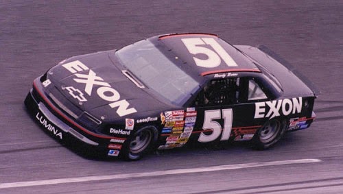
HSCOTT MOTORSPORTS #51
Justin Allgaier #51 Brandt Chevy SS–Same primary design, but the door number has reversed colors. A+
Justin Allgaier #51 Switch Hitch/Fraternal Order of Eagles Chevy SS-New sponsor set for 2015, all black with yellow and orange stripes that go around the side of the car. D-
Justin Allgaier #51 Flipping Ships Chevy SS-New sponsor for 2015, dark blue, with a fade from top to bottom, and a sublimated wave design. B+
Justin Allgaier #51 Auto-Owners Insurance Chevy SS–New scheme for 2015, redesign of the old scheme. White has been mostly replaced with dark blue and black. B+
Justin Allgaier #51 AccuDoc Solutions/FOE Chevy SS-Same as FOE, but with AccuDoc on hood. D+
Justin Allagaier #51 SEM Chevy SS-New sponsor for 2015, black with white and red SEM logos on sides and hood. A+
Justin Allgaier #51 Switch Hitch Chevy SS-New sponsor for 2015, black with an orange stripe up the side. A+
Justin Allgaier #51 Trademark Chevy SS-New sponsor for 2015, red, white and blue, with a patriotic motif. A+
Justin Allgaier #51 Brandt Throwback Chevy SS-New scheme for 2015, vintage numbers replace current design, EST 1953 has been added as well. A+
MICHAEL WALTRIP RACING #55
Brian Vickers #55 Aaron’s Toyota Camry–Same basic design as last year, the nose has been changed, the main blue is slightly darker, and the gold has been replaced with light blue A+
Brett Moffitt #55 Aaron’s 60th Anniversary Toyota Camry-New scheme for 2015, colors are reversed, new logo on the hood. A+
Brian Vickers #55 Janssen Toyota Camry-New sponsor for 2015, blue, yellow, and orange with a wave pattern across the side. A+
Brett Moffitt #55 Aaron’s/Steve Byrnes Tribute Toyota Camry-Same as Aaron’s but with A fitting tribute to a tragic death. A+
David Ragan #55 Aaron’s/Spongebob Toyota Camry-New sponsor for 2015, blue to purple fade, yellow on the quarter panel, with Spongebob on the hood. D-
David Ragan #55 Aaron’s.com Toyota Camry-New scheme, slight redesign of the Aaron’s scheme. A+
David Ragan #55 Aaron’s Ken Ragan Throwback Toyota Camry–New scheme for 2015, throwback to David’s father Ken’s 1990’s car. A+
PREMIUM MOTORSPORTS #62
Brian Scott #62 Shore Lodge Chevy SS-New sponsor for the Daytona 500, Black with white lettering and silver designs. B-
Brendan Gaughn #62 Diathrive Chevy SS-New sponsor for 2015, black, with a blue and white arch up the side. C+
Brendan Gaughn #62 Chevy SS-Black with red and yellow numbers, A+
Brendan Gaughn #62 Vydox Plus Chevy SS-New sponsor for 2015, white with a blue fade on the hood and roof, with a red oval on the bottom of the quarter panel. A
Brendan Gaughn #62 Low T Central Chevy SS-New sponsor for 2015, all black with Low T Central logos on the hood and quarter panels. A+
Brendan Gaughn #62 Chevy SS-New scheme for 2015, all black with red, black, and yellow letters. A+
Timmy Hill #62 Ford Fusion-New manufacturer and scheme, black with gold and white numbers. A+
Reed Sorenson #62 Chevy SS-New scheme and manufacturer for 2015, white with blue stripes and blue numbers. A+
Reed Sorenson #62 Chevy SS-New scheme for 2015, all white with blue and black numbers. A+
Timmy Hill #62 Champion Machinery Chevy SS-New sponsor for 2015, same as plain #62, but with Champion Machinery logo on hood. A+
PREMIUM MOTORSPORTS #66
Mike Wallace #66 Crazy Vapors/X8 Energy Gum Toyota Camry-New sponsor for 2015, Hood has Crazy Vapors green stripe design, side has X8 abstract design. F
Tanner Berryhill #66 Chevy SS-New scheme for 2015, all black with silver, white and blue letters. A+
FURNITURE ROW RACING #78
Martin Truex Jr. #78 Furniture Row Chevy SS–No Change A+
Martin Truex Jr. #78 Furniture Row Racing/Colorado Freedom Memorial Chevy SS-Same as Furniture Row but with Colorado Freedom Memorial and World Vision on quarter panel. A+
Martin Truex Jr. #78 Furniture Row National Ovarian Cancer Awareness Month Chevy SS-New scheme for 2015, same basic scheme, but teal replaces orange. A+
BK RACING #83
Johnny Sauter #83 Dustless Blasting Toyota Camry-New sponsor for 2015, green stripes up the hood and roof, white design with Dr Pepper style door numbers. B-
Matt Dibenedetto #83 Burger King Toyota Camry–Slight redesign for 2015, black takes over as primary color, Dr. Pepper design around door numbers. B-
Matt Dibenedetto #83 Dr Pepper Toyota Camry-Same as Burger King. B-
BK Racing #83 Cosmo Motors Toyota Camry-New scheme for 2015, black with red and gray wave patterns on the sides. C-
Matt DiBenedetto #83 Dan Bilzerian Toyota Camry–New scheme for 2015, white with Dan Bilzerian on hood, and logos on side. A+
Matt DiBenedetto #83 Anest Iwata Toyota Camry-New sponsor for 2015, black on top, aqua on bottom, white stripe down the sides. A+
Matt DiBenedetto #83 Voodoo Grills Toyota Camry–New scheme for 2015, slight redesign for the side stripes, and the new door logo is present. F
Matt DiBenedetto #83 Cosmo Motors Toyota Camry-New sponsor for 2015, black, red, white and gray with a series of oval designs on sides, hoods, and roof. C-
Matt DiBenedetto #83 James Madison University Toyota Camry-New sponsor for 2015, gold bottom, blue top, JMU logos on sides and hood, gold back. B+
HENDRICK MOTORSPORTS #88
Dale Earnhardt Jr. #88 Nationwide Chevy SS–No Change B+
Dale Earnhardt Jr. #88 Diet Mountain Dew Chevy SS–No major changes,except a Nationwide logo replaces the National Guard logo. D-
Dale Earnhardt Jr. #88 Kelly Blue Book Chevy SS–Same basic design but blue has replaced white as the primary color. B
Dale Earnhardt Jr. #88 Mountain Dew Dewshine Chevy SS-New scheme for 2015, green background with gold lettering and white front bumper. A+
Dale Earnhardt Jr. #88 Mountain Dew Baja Blast Chevy SS-New sponsor for 2015, silver front, with black wave pattern on the quarter panel. D-
Dale Earnhardt Jr. #88 Amp Energy Passionfruit Chevy SS– New scheme for 2015, all black with a series of blue and yellow designs on the sides and roof. D+
Dale Earnhardt Jr. #88 Nationwide Patriotic Chevy SS-Black on top, silver stripe down center, American flag motif on bottom. A+
Dale Earnhardt Jr. #88 Windows 10 Chevy SS-New sponsor for 2015, white on front, three stripes transferring to blue after the windshield. A+
Dale Earnhardt Jr. #88 Valvoline Buddy Baker Throwback Chevy SS–New sponsor for 2015, classic Valvoline scheme from 1984. A+
LEVINE FAMILY RACING #95
Michael McDowell #95 Thrivent Financial Ford Fusion–Redesign of last year’s scheme, another example of logo as a stripe pattern. A
Michael McDowell #95 K-Love Ford Fusion–Template has been redesigned, and the city outline on the rear quarterpanel has been removed. A
Michael McDowell #95 Thrivent Financial Silver Ford Fusion-Redesign of Thrivent Financial scheme, with the logo on the sides removed, and silver replaces the red on the sides. A
Michael McDowell #95 WRL Contractors/Thrivent Financial/Larry the Lobster Ford Fusion-New sponsor for 2015, white with blue and purple stripes on the hood and sides, yellow quarter panel with Larry the Lobster. D-
Michael McDowell #95 Thrivent Financial Ford Fusion– A
PHIL PARSONS RACING/PREMIUM MOTORSPORTS #98
Josh Wise #98 Phoenix Construction Ford Fusion-New sponsor for 2015, all white with red lettering, and red and black numbers A+
Josh Wise #98 Mike Curb 200th Start Ford Fusion-Same as Phoenix Warehouse, but with a different quarter panel and hood design. A+
Josh Wise #98 Ford Fusion-White with black and red lettering, A+
Josh Wise #98 Steve Byrnes Tribute Ford Fusion-Simple dedication to the memory of Steve Byrnes, who passed away from cancer this season. A+
Josh Wise #98 Royal Teak Ford Fusion-New sponsor for 2015, all white with black and blue letters. A+
Josh Wise #98 Ford Fusion-Plain white with Royal Teak color lettering. A+
Josh Wise #98 Dogecoin Ford Fusion-New scheme for 2015, all white with Doge on hood, and back. A+
Josh Wise #98 Big Red/Xyience Ford Fusion-Big Red logos on sides and hood, Xyience on sides as well, spilled soda motif across whole car. F
Timmy Hill #98 Curb Record/Tim Duggar White Ford Fusion-New sponsor for 2015, white with black lettering and Tim Duggar on hood. A+
Timmy Hill #98 Curb Record/Tim Duggar Black Ford Fusion-New scheme for 2015, black with white Tim Duggar hood and white lettering and numbers. A+
Reed Sorenson #98 Chevy SS-New scheme and manufacturer for 2015, white with blue stripes and blue numbers. A+
Timmy Hill #98 Ford Fusion-New scheme for 2015, white with a blue roof, and blue and black numbers. A+
Timmy Hill #98 Big Daddy RV’s Ford Fusion-New sponsor for 2015, all white with Big Daddy’s RV’s logo on hood. A+motorsports, reed sorenson, golden corral, geico, germain racing, casey mears,josh wise, phoenix construction, phil parsons racing, phil parsons,premium motorsports, brian scott, shore lodge, cars for sale, rinnai, detroit genuine parts, fifth third bank,medallion bank, camping world, comcast,dr. pepper, burger king,draft demons, mike bliss, southern belle seafood, phoenix warehouse, brian scott, white tail, miller genuine draft, miller high life,mds, king taco, fix auto, skittles,


