
By David G. Firestone
I have a lot of paint schemes to discuss and we will get to that shortly. I wanted to discuss something that took place before the Coke Zero 400 last week. It is a bit murky, but here is what took place.
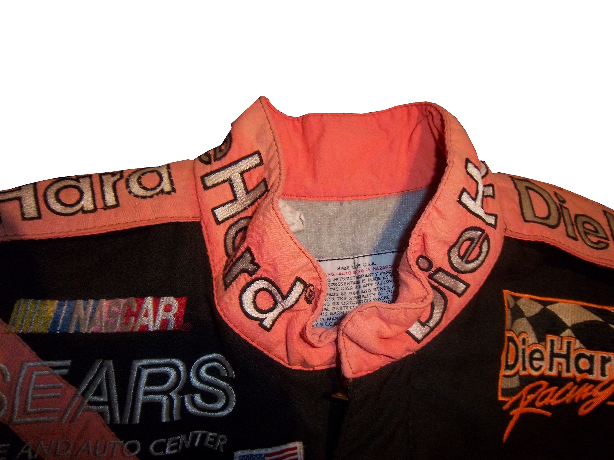
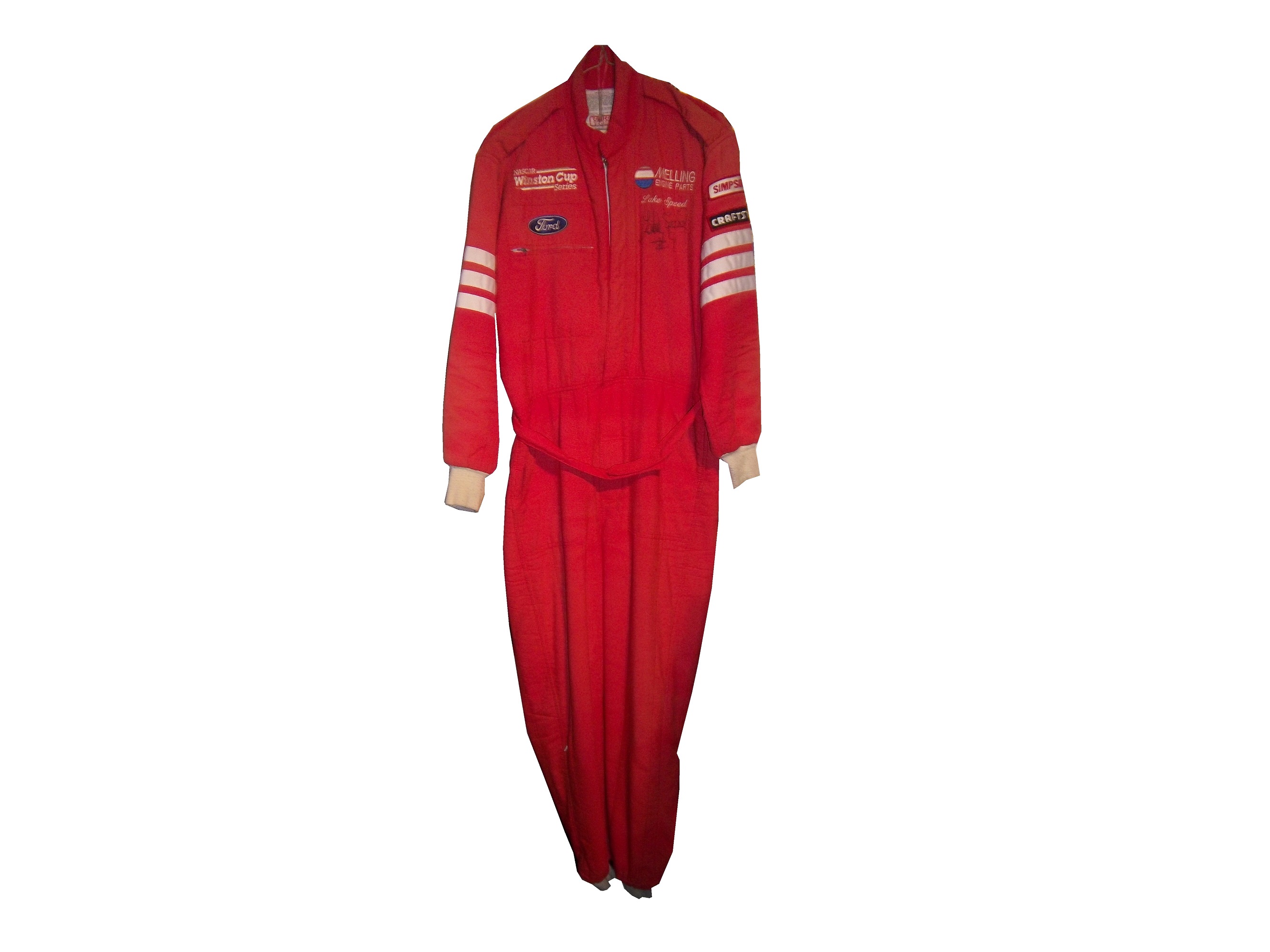
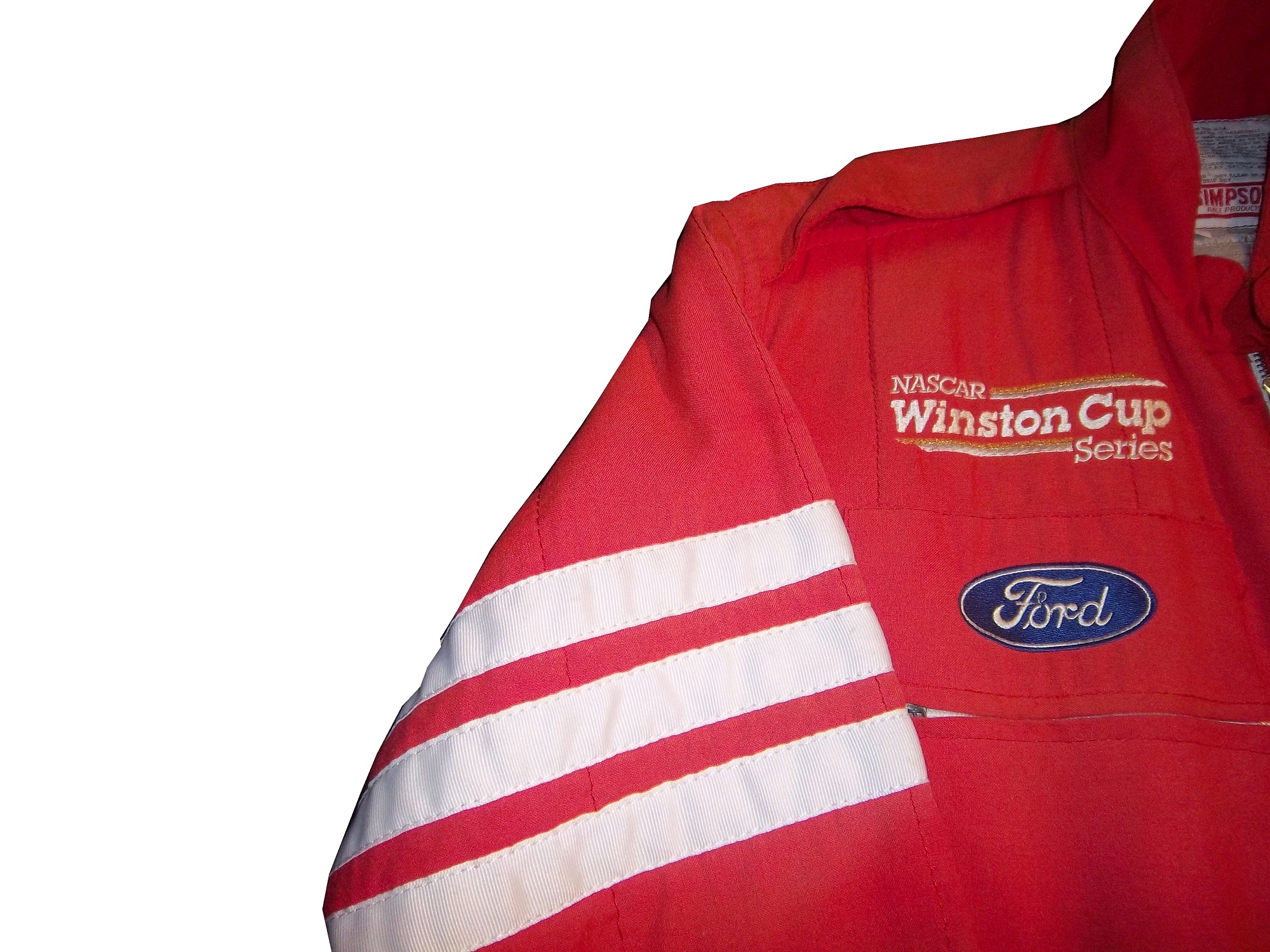
Charlie Crist is a former governor of Florida, and a former Republican. After a brief hiatus from politics, he has annoucned his intentions to run for the Governor of Florida as a democrat. He had plans to run the #98 Phil Parsons Racing Ford driven by Josh Wise. After this was announced however, the Republican Party of Florida filed a lawsuit stating that it was a campaign contribution worth more than $3,000. Remember, this was the same team that was crowd funded by Reddit and Dogecoin at Talladega, and that sponsorship cost about $55,000. It was later reported that the Charlie Crist decals had been removed from the car. Phil Parsons Racing stated the deal was in response to a series of negative ads toward Crist, and that the Crist decals were part of a deal with recording artist Lee Brice. They also stated that they didn’t pull the sponsorship due to the lawsuit, and that the $25,000 sponsorship would be returned.
I frankly don’t buy any of that for a second. I think that it was because of the lawsuit, and that Phil Parsons Racing did not want to get thrown under the bus because of it. They tried to handle it as diplomatic as possible, but it still sounds sketchy. The other reason I have a huge problem with this is because the simple fact that politics and racing don’t mix. Look at what’s happened with F1 and IndyCar. Politics are a constant issue in the sport, and I for one am tired of it. Look at the Ayrton Senna/Alan Prost battle in the 1990’s! Look at The Split! Politics ruins racing!
This is not the first time a politician with deep pockets has sponsored a race car, but I hope that this is the last time. I’m not against politics, I’m against forcing it into something it has no place being in! If tobacco, cel phone carriers, and hard liqour have or had been banned from sponsoring cars, then so should politicians.
Ok enough serious stuff, on to…
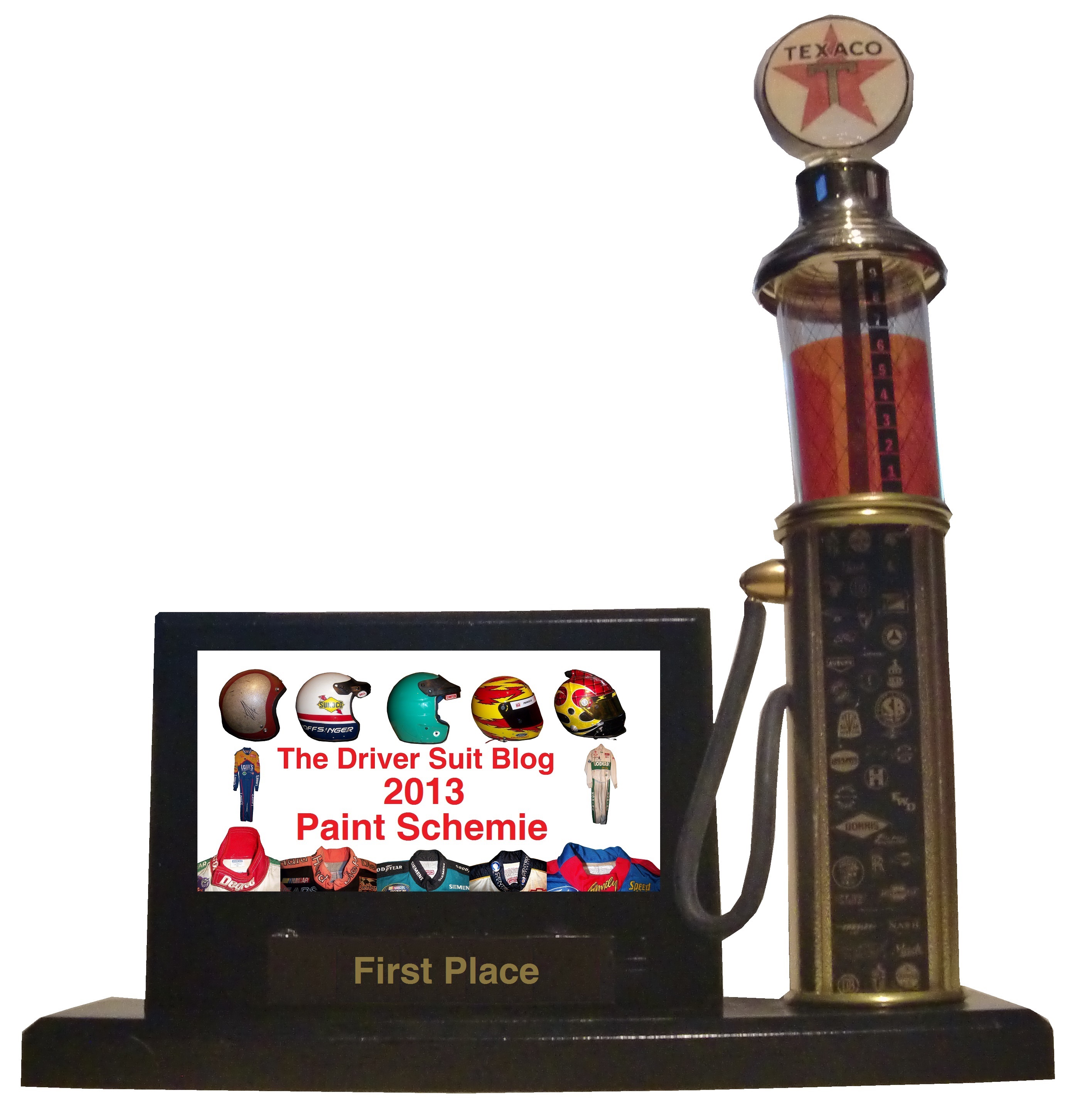
PAINT SCHEME REVIEWS!
Jamie McMurray #1 Cessna/Hawker Chevy SS Nothing bad to say here…A+
Jamie McMurray #1 Lexar Chevy SS Great Color Scheme, great design, A+
Austin Dillon #3 Great Stuff Chevy SS Color scheme is good, the design looks very odd. The gold numbers and chain design does not suit the car at all, and if they were left off, I would give it an A, but this scheme earns a B-
Austin Dillon #3 NRA Museum Chevy SS Good color scheme, decent design, B+
Austin Dillon #3 Cheerios Protien Chevy SS Much too overdeisgned, decent color scheme, C-
Kasey Kahne #5 Team Stream Chevy SS Good color scheme, but Kasey loves to drive overdesigned cars, and this is no exception. I’m giving it a C which is a very fair grade here.
Kasey Kahne #5 Farmers Chevy SS Good color scheme, decent design, B+
Marcos Ambrose #9 Black and Decker Ford Fusion Good color scheme, Good design, A
Danica Patrick #10 GoDaddy/Florida Lottery Chevy SS It looks like two people designed this car, and they didn’t talk to each other while designing it. Both sets of color schemes are awful, and both design schemes are awful. F-
Greg Biffle #16 3M/DAV Ford Fusion Green usually doesn’t look good, camo never looks good, so this scheme earns an F
Greg Biffle #16 3M Aerospace Ford Fusion See Above F
Greg Biffle #16 NESN 30th Anniversary Ford Fusion A bit less overdesigned, at least by Greg Biffle’s standards, and I do like the Red Sox and Bruins logos as well, so I will give it a C
Greg Biffle #16 3M Ford Fusion Good color scheme, decent design, B+. Nice change for Greg Biffle.
Kyle Busch #18 Interstate Battery Center Toyota Camry No. Redeeming. Features. Whatsoever. F-
Ricky Stenhouse Jr. #17 Cargil Ford Fusion Much MUCH TOO OVER DESIGNED! F
Jeff Gordon Panasonic Toughbook Chevy SS Blue and white work very well, and while it is a bit over designed, it works, and I’ll give it an A
Jeff Gordon #24 Pepsi Chevy SS Great color scheme, great design scheme, A+
Cole Whitt #26 Rinnai Toyota Camry The color scheme is good, and the design is great, so it gets an A+
Cole Whitt #26 Tapout Muscle Recovery Toyota Camry Simple design, great color scheme, A+
Boris Said #32 7-Eleven Ford Fusion I normally hate green on race cars, but this works well. I like the design scheme too, and I give it an A
Bobby Labonte #33 Thunder Coal Chevy SS Great simple design and a great color scheme, A+
Alex Kennedy #33 MediaCast Chevy SS The color scheme is awful, and the design is worse. F
Reed Sorenson #36 Theme Park Connection Chevy SS Ugly design, good color scheme, C-
David Gilliland #38 Long John Silvers Free Fish and Fries Ford Fusion Great design, great color scheme, great look, A+
David Gilliland #38 Love’s Truck Stops Ford Fusions CAMO DOES NOT WORK ON RACE CARS! F
Landon Cassill #40 Snap Fitness Chevy SS So So design, good color scheme C+
Kyle Larson #42 Target Chevy SS Whadaya Know? An A+ Patriotic scheme!
Aric Almirola #43 Waffle House/Smithfield Ford Fusion The understated patriotic design scheme works well, and the color scheme works well too. B-
Justin Algaier #51 CSSUSA Chevy SS Looks good, overall design is good, color scheme is good, and I’ll give it an A
Brian Vickers #55 Aarons/Florida State Toyota Camry Good design with a good design color scheme, A
Brett Moffit #66 Toyota Toyota Camry Good color scheme, simple design, looks very good, A
Tommy Drissi #66 Hercules Toyota Camry I don’t even know where to begin…it just looks awful. F
Martin Truex Jr. #78 World Vision Chevy SS Good color scheme decent design, B-
Dale Earnhardt Jr. #88 Kelly Blue Book Chevy SS A decent scheme, but a bit overdeisgned. Color scheme looks good. B
Dale Earnhardt Jr. #88 National Guard Chevy SS See David Gilliland Love’s above. F
Michael McDowell #95 K-Love Ford Fusion I like the color scheme, and the overall design is another good Levine Family Racing scheme that earns an A
Josh Wise #98 Dogecoin Ford Fusion Good simple design with a good color scheme equals an A grade
Josh Wise #98 Phil Parsons Racing Ford Fusion Since this design is what was raced, I will grade it as such. The color scheme is decent, but it is a tad too overdesigned. It is a D+ look.


