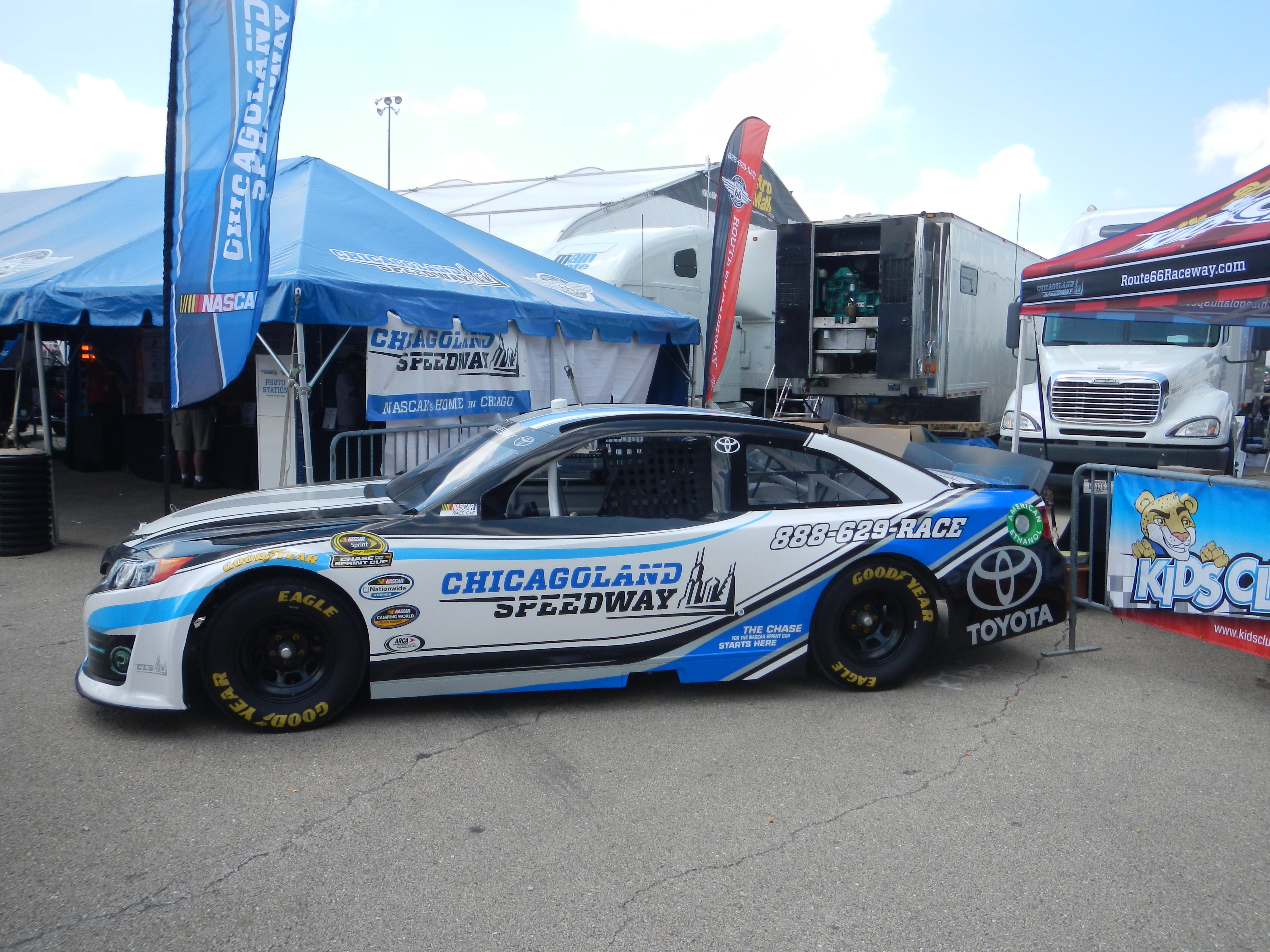
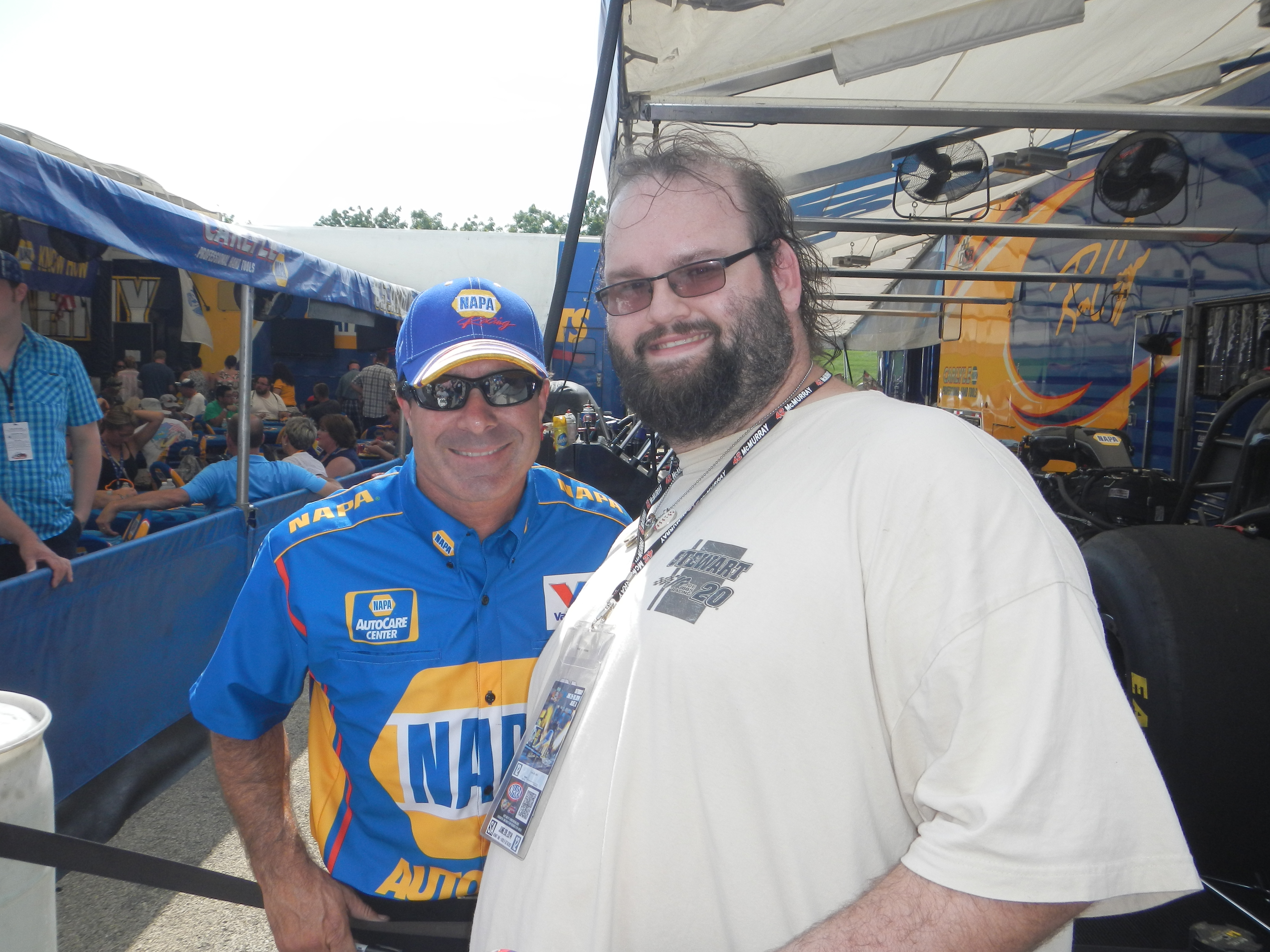
Every summer, I make a pilgrimage to two places, Jim’s Original and The O’Reilly Auto Parts Route 66 Nationals at Route 66 Raceway in Joliet. This last week, I did both. Jim’s Original is still good, and the Route 66 Nationals are always fun.This year, I went on Saturday and Sunday. Normally I would only go on Saturday, but this year I decided to double the fun. I went with Argie, a friend from work, and I spent Saturday watching racing and wandering through the pits. NHRA tickets promise that “every ticket is a pit pass” and trust me, they more than live up to that claim. You can walk around the pits and watch as the teams setup cars before races and fix cars after races. The wear and tear on nitro cars is such that the entire engine has to be disassembled, repaired, and reassembled between races, sometimes in as little as 45 minutes. Needless to say, speed is paramount.I had been fortunate enough to get a pass to the Don Schumacher Racing hospitality tent. This not only got me the tickets, but also a chance to meet Tony Schumacher, and Ron Capps. I came into the tent a little later than normal, and I got to listen Tony talk to the crowd, and take questions. I got a chance to ask him something that I have always wanted to ask a driver… “What is the weirdest thing you have ever autographed?” Having done autograph signings since I was 5, I’ve seen a lot of odd stuff get autographed over the years, and I was interested in the answer. He responded that he has signed a lot of body parts, arms, legs, etc, and that his wife hates that.
A few minutes later, he mentioned that he wears a 5-layer firesuit, as well as two additional layers of fire protection. That adds up to a total of 7 layers. Most NASCAR suits make up 3 layers, with an additional layer underneath. Nomex is not a lightweight material, and on days like Saturday, when it was 88 degrees outside, that can get very uncomfortable. He is also credited with the aforementioned canopy to Top Fuel dragsters.
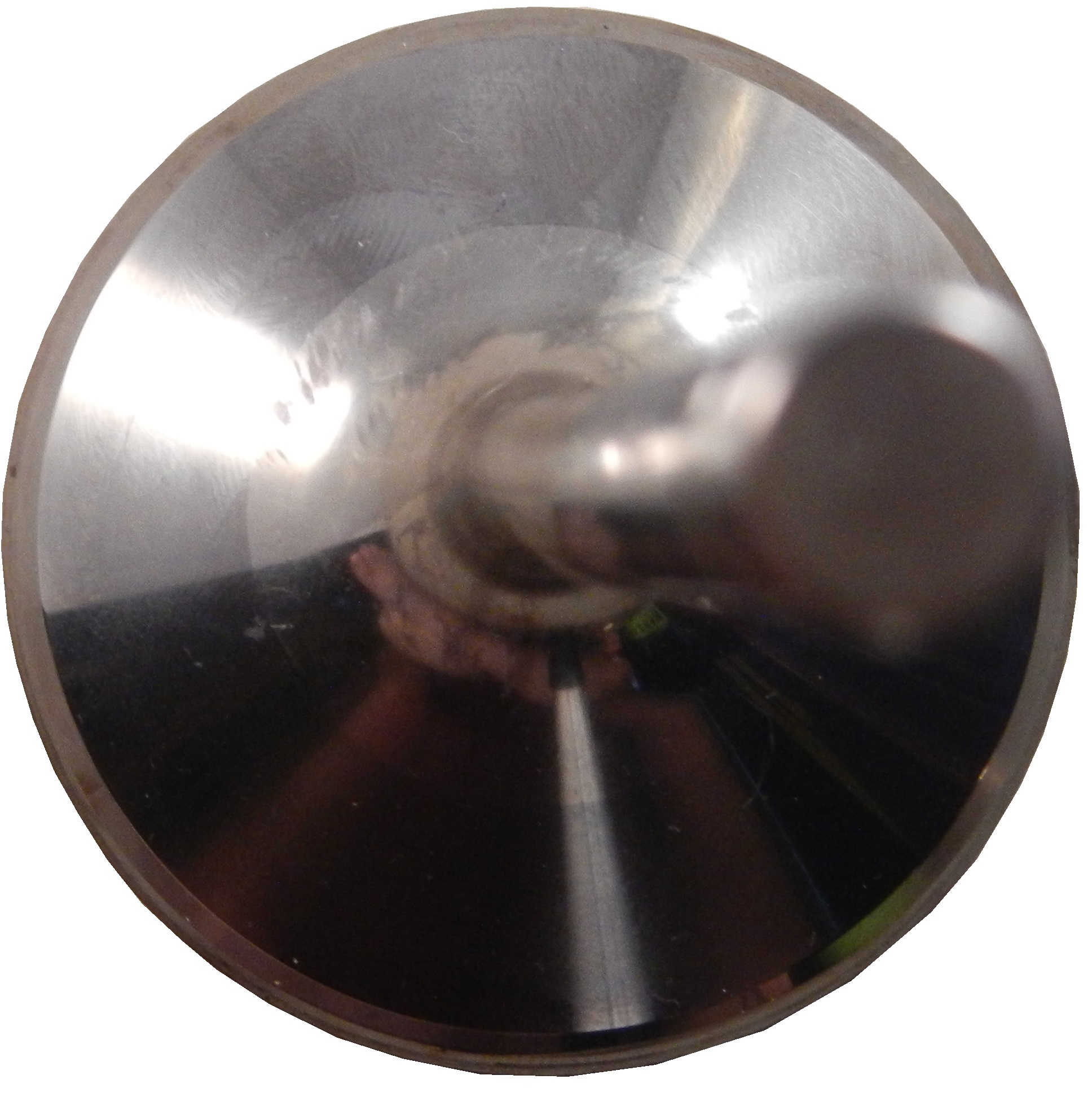
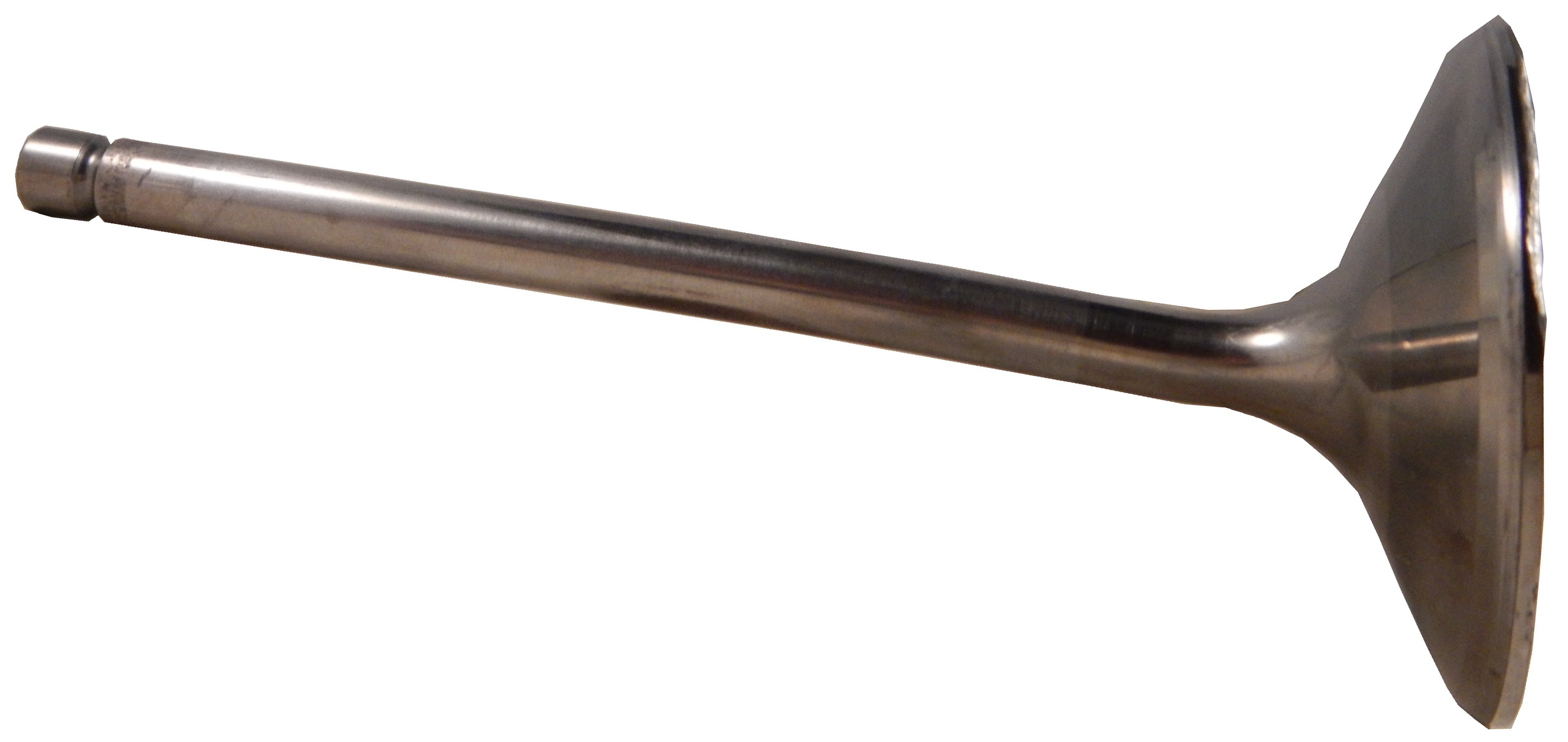
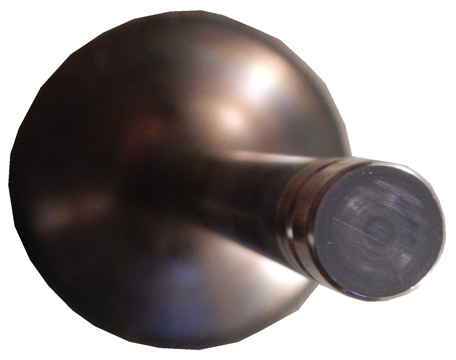
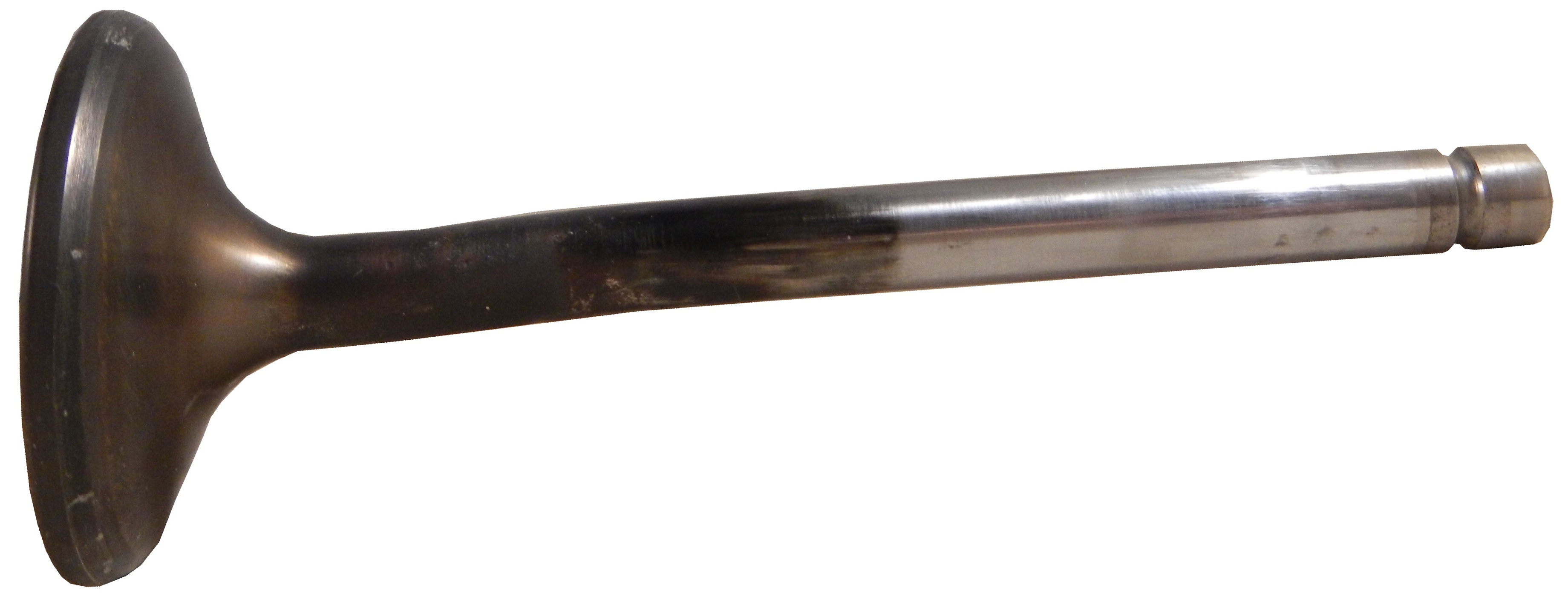
One thing I love to do is to buy race-used equipment from dragsters, and I did so this year as well. I bought a couple of valves from Tasca Racing, one large,and one small,Both show tremendous use, and have chips missing from them. Valves like these are used for one race and then replaced. The wear they go through for one run is very evident.
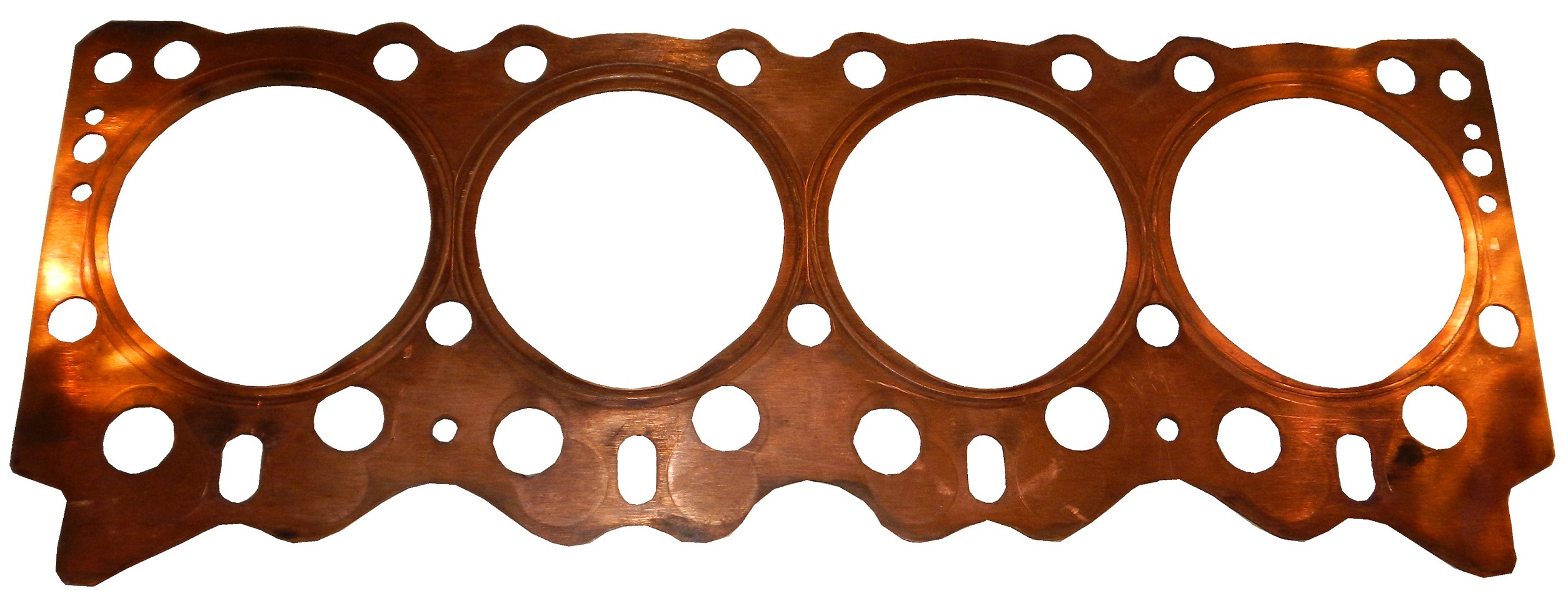
The other race used piece of equipment is a gasket from Morgan-Lucas Racing. It shows a huge amount of wear, and is a very heavy, thick and durable gasket.
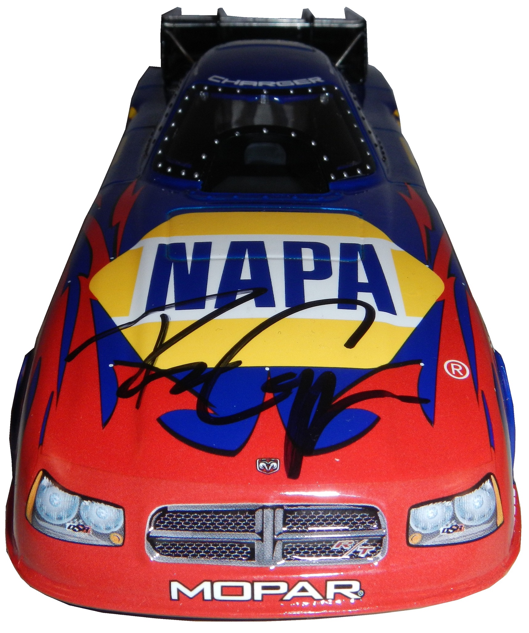
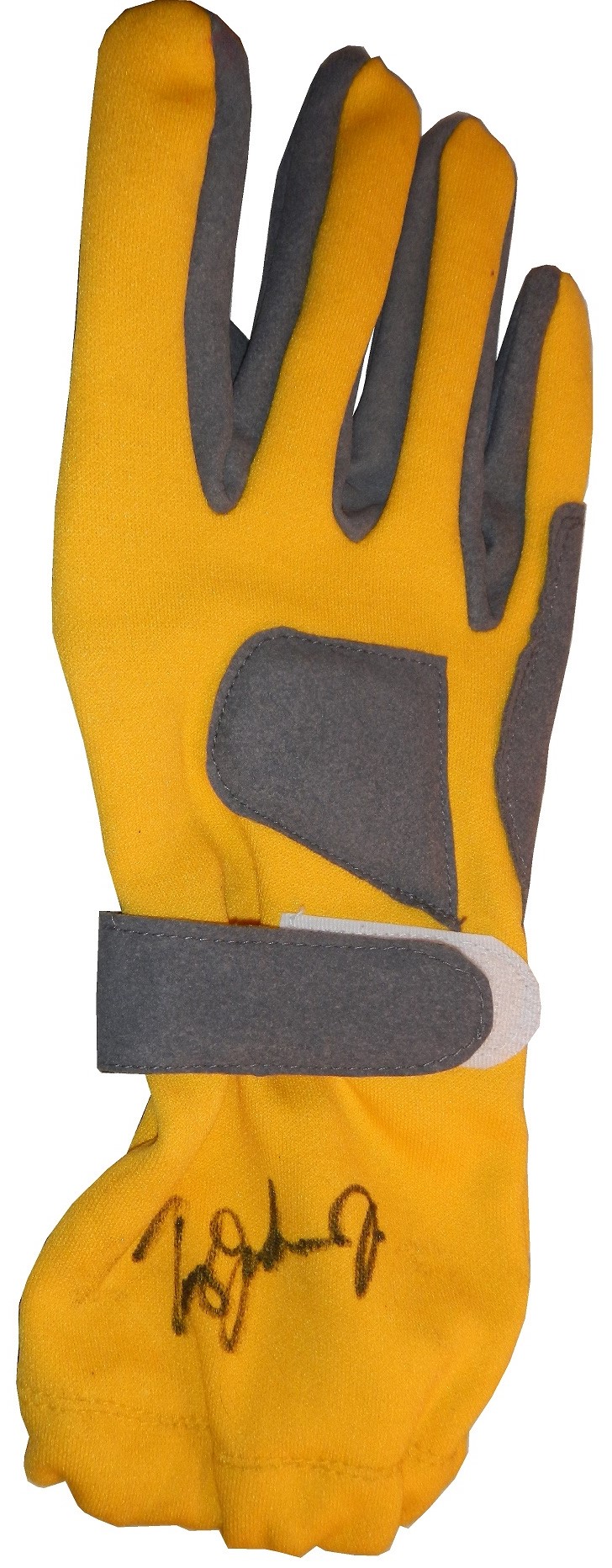
It just wouldn’t be a race for me without getting some autographs. I bought a Ron Capps funny car die cast, and had his sign it in person, and it looks really good.I had a pair of gloves I wanted to get signed, and I did, by Tommy Johnson Jr.My favorite item it this brightly painted helmet. It was signed by Robby Gordon when I bought it, and I got it signed by Clay Millian, Terry McMillen, Tony Schmacher, Tommy Johnson Jr.,Ron Capps, and the legendary Shirley Muldowney.
One thing I didn’t do as much this year was take pictures. I did take some, but not as many as last year. I did make a number of videos, as shown below.
That’s all for this week, I’ll return next week with a set of paint scheme reviews, and believe me, there are a lot of them! Hope you are all having a fun summer! Happy Belated Canada Day for our friends up North, Happy Fourth of July to my readers in the USA, and to everyone else, See you soon!
For the season finale of the 10th season of Introduction to Sports Memorabilia, I present this Kasey Kahne driver suit which he wore at the 2005 Detroit Auto Show.
By David G. FirestoneI must have said the word Nomex a thousand times on this blog, but what exactly is Nomex? In short, it is a flame-resistant meta-aramid cloth material. It is an aramid material, which is the same thing as Kevlar, but it is not as strong as a bulletproof vest, but it has great thermal, as well as chemical resistance, which makes it great for racing firesuits.
The development of the Nomex firesuit has been a long road. This road has seen its share of driver deaths and injuries. Before the Coca Cola 600, I discussed the deaths of Fireball Roberts, Eddie Sachs, and Dave McDonald in fire-related crashes over the course of 6 days in 1964. What took place from there would cross the paths of racing and a young drag racer.
Bill Simpson was born in Hermosa Beach, California in 1940. He took up drag racing at a young age, and at age 18, broke both arms in a drag racing crash. As he recuperated, he thought of safety in racing for the first time. He developed the idea of an X shaped parachute, and using materials from his uncle’s army surplus shop, developed a functional drag racing parachute. Don Garlits noticed the new parachutes, and took an interest, which helped the Simpson Drag Chute company to form. As time went on, he started making other racing equipment, which caught the attention of drivers, and, oddly enough, NASA. During a project, he met Pete Conrad, who introduced the now 27 year old Simpson to Nomex in 1967.
Nomex was created in 1967, for NASA. Far from the uses it has today, its main use at the time was for the Apollo Command Module parachutes. NASA needed a material that could stand up to the heat of reentering the earth’s atmosphere, and still remain fully functional. Simpson saw what the material could do, and decided it would work well to make driver suits, and other uniform items.Contrary to what most people think, Nomex is not fire PROOF, rather it is fire RETARDENT. It does burn, but burns at a much slower rate, and that protects the driver in the event of a fire. Bill Simpson decided to show how much better this material was by having a “burn off.” He put on one of his Simpson racing suits, doused himself in gasoline, and lit himself on fire. Though he was fully engulfed in flames, he was not hurt. Though he admits that is was a bad idea, it sold drivers on Nomex. Even today, 46 years later, Nomex is still the go-to material for driver suits.Nomex is used for many other things. Nomex sheet is used in power cords for insulation. Fire-fighters use Nomex for protection in saving lives. Fighter pilots wear Nomex suits in case of cockpit fires. Nomex was developed for NASA and NASA still uses a lot of Nomex. It is used in what NASA refers to as the “Thermal Micrometeoroid Garment of the Extravehicular Mobility Unit”, or in regular English, the “outer layer of a spacesuit.” The spacesuits that space shuttle astronauts wore on liftoff and touchdown were primarily made of Nomex. Almost every project that NASA has done in the last 40 years involves Nomex in one form or another, so it is a very versatile material.
Interestingly, as safety concerns increased, and safety equipment changes for the better, you begin to see that Nomex is beginning to have competition in the driver suit market in terms of fire protection. While I’m typically a traditionalist when it comes to sports uniforms, for driver suits that is a great thing. Developing a new material that serves the same purpose as Nomex, but can do it better and longer is a great thing. Eventually, Nomex will go the way of typewriters, film cameras, the printing press, and the floppy disk as an invention that is obsolete but changed the world.
Paint Scheme Reviews!
Some new 2014 schemes released this week:
Danica Patrick #10 Apsen Dental Chevy SS Even though this scheme is better than the *ahem* current Aspen Dental scheme, it still does not look good. But it is still an improvement, and I’ll give it a C
Ryan Newman #31 Quicken Loans Chevy SS Great color scheme-Check, Awesome use of Northwestern stripes-Check, classic design-Check, A+ Grade, Double-Check!
Dale Earnhardt Jr. #88 National Guard Chevy SS The numbers kill what is otherwise a great scheme. I like everything else, but the color of the numbers looks really odd, and I can’t really say it adds to the car at all. Still it is a decent scheme, so I’ll give it a B
Greg Biffle #16 Pink 3M Ford Fusion Pinkwashing is an automatic F. I hate it when companies use causes like this to move products, so I show no mercy in this sence.
Ricky Stenhouse Jr. #17 My Best Buy Ford Fusion The blue used on this scheme is a tad too light, but it is still a decent scheme, though the lighter blue takes it from the A grade Best Buy had to an A-
Joey Logano #22 Shell/Pennzoil/Hertz Ford Fusion I’ll be honest, I want to give this scheme a better grade, but the Hertz logo just looks out of place here, and it is awkward on an already iffy scheme. Best I can give it is a D-
Cole Whitt #30 Black Clover Toyota Camry Swan Racing seems to go out of its way to design bad paint schemes this year, and this scheme is no exception. It has no redeeming features at all, and earns an F-
Aric Almirola #41 Maurice Petty Tribute Ford Fusion Tribute schemes have worked very well across the board, and this is no exception. Simple, timeless, yet attractive, a great tribute to a great engine builder. Extra points for using Maurice’s #41 for the weekend. Interestingly, Maurice raced in a total of 26 Sprint Cup races, and had 7 top 5’s and 16 top 10’s during the 1960’s.
By David G. FirestoneFrom a design aspect, no other factor contributes as much as the primary sponsor or sponsors of the car. Everything from the colors to the torso design, to the television logos, to the shoulder epaulet and collar design depends on the primary sponsor. While this has been the case for the most part, how the primary sponsor is displayed can vary quite a bit.
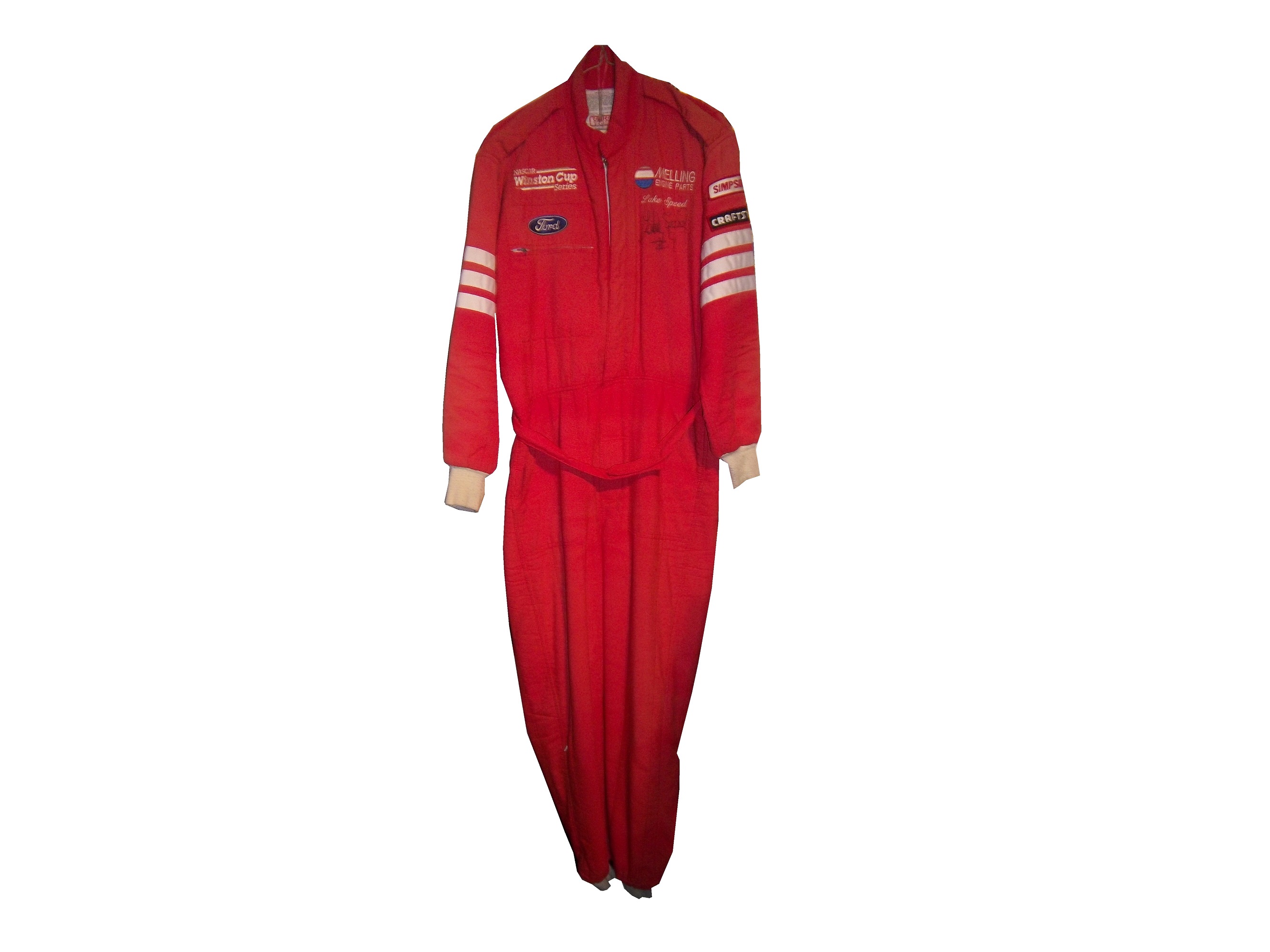
Currently, the standard design for a primary sponsor logo is to have a large logo across the front of the lower torso, and on the back on the upper torso. These Christian Fittipaldi designs from 2002-2003 are great examples of that. The Georgia Pacific design from 2002 has a decent sized logo on the front bottom torso, and the same logo higher up on the back torso.The Bugles example from 2003 has identical logo placement for the Bugles logo.Many driver suits feature this same logo placement.Taking a look at this Ricky Craven example from 1996, it features a design aspect that was very heavily used. The torso features a plan color, with a stripe across it with the sponsor name on that stripe. Dale Earnhardt Sr.used this design for many years, as did Rusty Wallace, Dick Trickle, and Steve Grissom among others. It is a fairly straightforward design, but it works very well.Other suits have the primary sponsor logo present, but the logo is underwhelming. This design is exampled by this Bobby Hillin Jr. Moroso driver suit from 1991, This Lake Speed example from 1997,
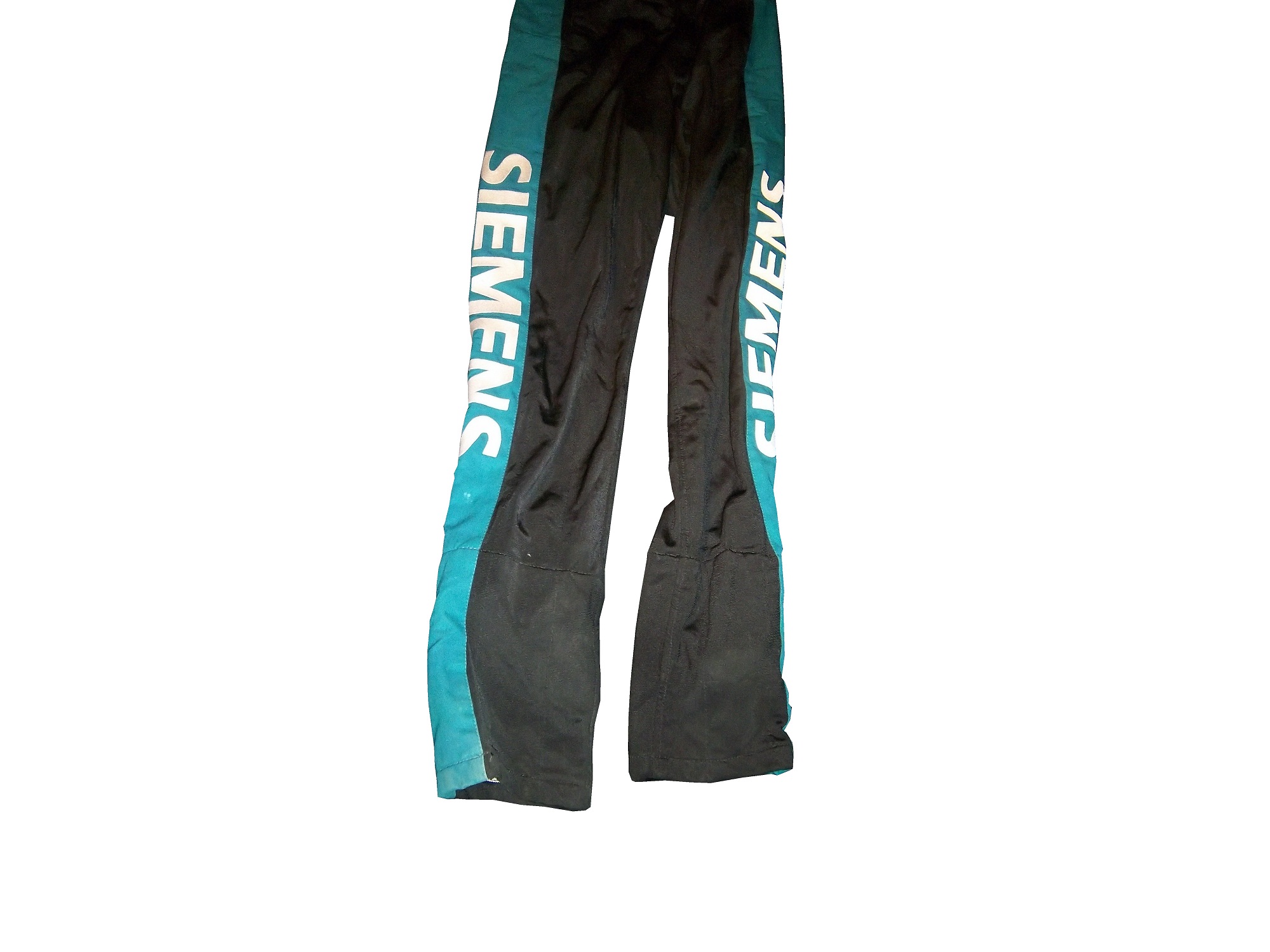
and this Ted Musgrave example from 1998.In very rare instances, a primary sponsor is excluded from the suit altogether. One example is this Terry Labonte suit I covered earlier this year. That example was made for Terry to wear in a very last minute driver change. Another example is this David Stremme suit from 2009. I covered this issue earlier in the year, but to sum it up, because of a conflict between Verizon, the sponsor of Stremme’s car, and Sprint, the title sponsor of the Sprint Cup race, Verizon was not allowed to have their logos on Stremme’s car and driver suit. As such, Stremme raced a Dodge sponsorship, and wore this suit.One of the newer designs that is frequently seen is what I call the leg stripe design. This Kasey Kahne example shows a leg design that has a large white stripe running up the red background, with the DODGE television logo running up the leg. Sponsors can make their logos stand out more with this design, so it is becoming more popular every year.This Scott Wimmer example is from 2002, and is rather unique in this category.It needs an explanation…The suit was worn for the entire 2002 season, which had a Siemens sponsorship for the first 25 races. After Siemens left the team, Scott Wimmer went on to win 4 of the next 9 races in an unsponsored black car with red and yellow flames…while wearing this suit.
While I get that the team not buying another suit for Wimmer to wear…it just looks weird.
Now this is another suit that needs an explanation. Nort Northam is a Porsche dealer based in Florida. He was a race car driver from 1979-1992, and his career was not great, with no wins, and two podiums. In 1988, he raced in the Sunbank 24 at Daytona, now called the Rolex 24 at Daytona in a Porsche owned by fellow driver Karl Durkheimer.During that race, he wore this driver suit. It appears on this suit that a sponsor patch has been removed or fallen off. Now to understand the basic design, you need to understand that Nort raced in two races a year, and having a suit custom designed would be a needless expense. As such, his name, and two sponsor patches did the trick. Not fancy, but effective. This late 1980’s SCCA example is also a minimalist design, but it sticks to the “80’s stripe” design as the Ricky Craven example.
The last thing about primary sponsors is that sometimes, primary sponsor designs follow other sports uniform trends. This example from 1998 was worn by Jeremy Mayfield. At that time, gigantic logos across the fronts of uniforms were the big thing, and that was not good. This fad did not last long, thank heavens!
Driver Suit Blog “Wheel Reviews”
Last night, I went to see the movie “Rush” and I have to say, it was really good. It has been said “you love your rivals, because you need someone to beat.” Nowhere is this more evident than Rush. Directed by Ron Howard and starring Daniel Brühl as Niki Lauda and Chris Hemsworth as James Hunt, Rush is the story of the rivalry between the two, from their days in Formula 3 in 1970, to Formula 1 in the 1970’s. For fans of racing movies, it is a true masterpiece.
The film takes the perspectives of the two drivers. Lauda is represented in the film as a talented driver who is great with setting up a race car. He is a driver who takes what he does very seriously. Hunt on the other hand is more of a playboy. He is a great driver, but his fast and furious lifestyle is a distraction from his true talent. Both are talented, but when Hesketh Racing, Hunt’s team can’t find sponsorship for the upcoming 1976 season, Hunt loses his ride. After his wife leaves for a ski trip, Hunt gets a ride with McLaren after Emerson Fittipaldi leaves to race for his cousin.
In 1976, Hunt struggles for the first part of the year, while Lauda, fresh off his 1975 World Championship is always a factor in the points standings. Hunt’s luck changes at the Spanish Grand Prix, where he beats Lauda, though he is disqualified for his car being less than an inch over regulation. Hunt’s wife divorces him, and driven by this, his season turns around. Though Lauda struggles at this point, the points standings are close coming into the German Grand Prix
The 1976 German Grand Prix was a critical point in this story, as the points battle was heating up. This race was at the the “Old Nürburgring” one of the most difficult tracks in the world. The weather was stormy, which kicks up the danger. Knowing the track as well as he did, Lauda called a meeting of the drivers and stated that the race should be canceled because of the conditions. Hunt thinks it is just a trick to take a race out of the schedule, and the cancellation is voted down. Lauda is seriously hurt in a wreck, and he is hospitalized. Hunt blames himself for the wreck. The story from there is the story of the 1976 Formula 1 World Championship.
The cars in the movie were very accurate, in some cases, vintage equipment was used. The tires used were made by Goodyear, and had the lettering in white as opposed to the yellow lettering that they currently use. The crew uniforms were very accurate as well. The driver uniforms were very well done, as were the helmets. Something that I noticed about them was that I couldn’t see any safety certification visible.
All in all, this is a great movie, and racing fans will enjoy this movie, so I give it an A!
Kyle Busch #18 M&M’s Halloween Toyota Camry The leaf designs on the bottom of the doors just look odd, and it takes a solid A scheme, to an A-. It does have great overall design and great colors, but the leaves just kill it.
Matt Kenseth #20 Home Depot/Let’s Do This Toyota Camry The overall scheme is great, and has a great color scheme. The problem is that the back end is yellow, which just looks odd when compared to the rest of the car. If the back was black, it would match quite well, but this is just bad. I want to give this scheme a higher grade, but the best I can do is a B-
One aspect of driver suits that has become a target for new customizations in the last 15-17 years is the belt. For many years, the belt was unadorned, or had a very small logo. Belts are a comfort feature, and typically made of the same material that the suit itself is made out of, with the same amount of layers and has a Velcro closure on it. Belts may incorporate a border made with an alternate color, to help it stand out.
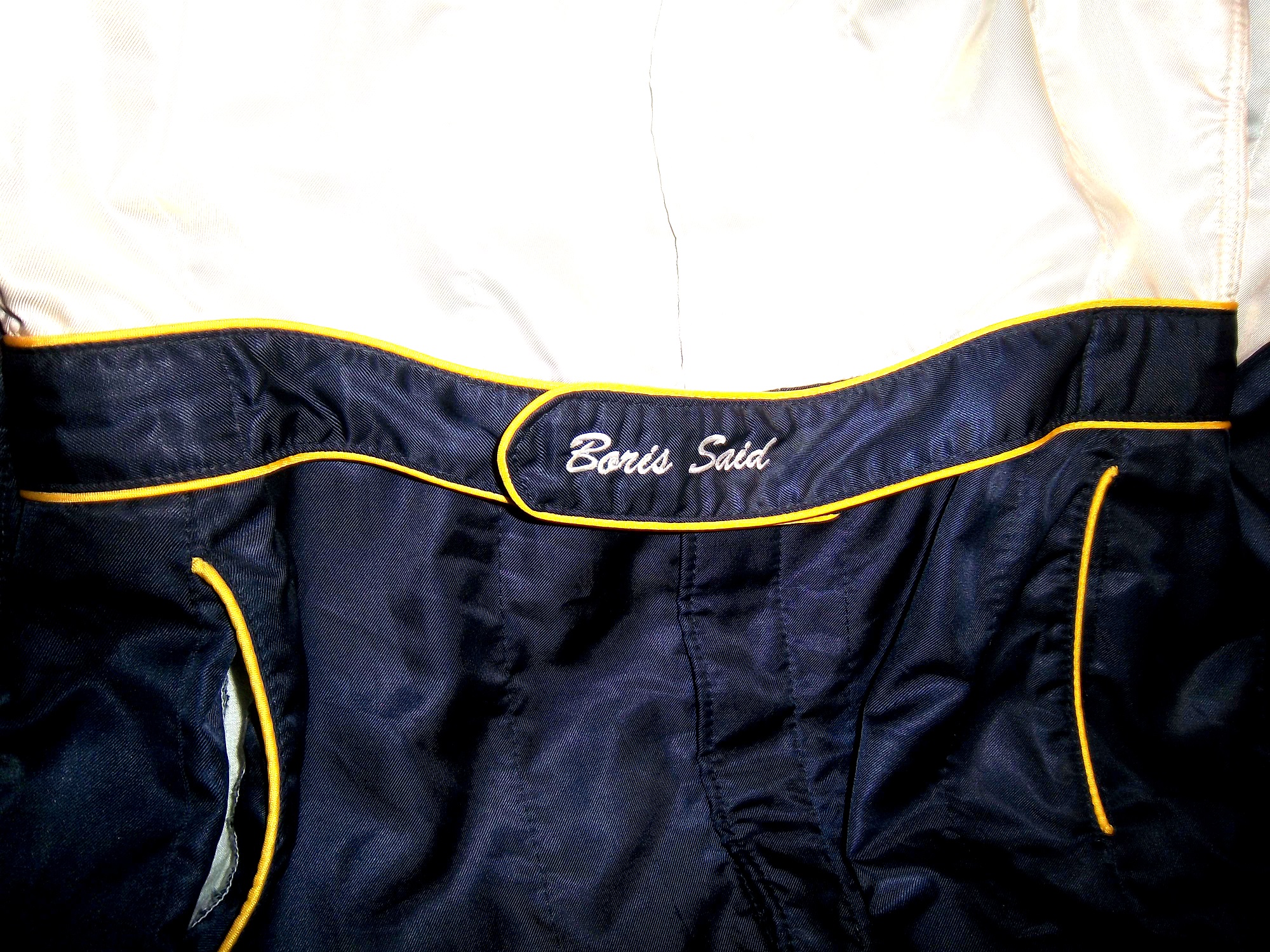
Belts had no design or decoration on them for many years, as examined by this Ted Musgrave example from 1995,this Ricky Craven example from 1996,and many more. But it was around that time, that something began to happen. Looking at the Ted Musgrave suit from 1995, his name is embroidered into the left-chest area.In 1998, this had changed so that his name is embroidered into the belt.This was popular in F1 and IndyCar for many years, and is still the way that names are presented on the driver suit. Other examples, such as this Randy Lajoie example circa 1999-2000 will have a sponsor logo embroidered into the belt.Kasey Kahne wore this suit in 2005 at an event, and it has a GOODYEAR logo on the front, and when the belt is opened, on the inside, the FIA certification is present here. Formula 1 and IndyCar have a unique quirk to the design. Since the drivers come from all over the world, the flag from the driver’s home country is sewn into the belt, such as this Alex Barron example from 1998:Not all belts are created equal. Christian Fittipaldi didn’t wear belts on two of his NASCAR suits. The first one, comes from 2002, while he was sponsored by Georgia Pacific, and instead of the belt, he just has his name sewn into the suit.This Christian Fittipaldi example from 2003 features no belt, and no name.This Nort Northam example from the 1988 Sunbank 24 at Daytona, now the Rolex 24 at Daytona, features a belt that is specifically designed to be removed.Many NASCAR action figures will feature the belt designs on them, and many of these figures are pretty accurate, but I think I’ll save that for another blog.
Tailgating Time!
Just for fun, I’ve decided to add a recipe that can easily be made while tailgating at the track. This is my recipe for beer-broiled brats. This works well in the fall, during the Chase, on a cooler day.
You will need:
1 6-pack of beer
1 16oz jar of sauerkraut
½ sliced onion
garlic salt and butter to taste
12 plain, uncooked bratwurst
Take the 6 pack, and pour it into a large pan. Place the pan on the grill or stove, and add 1/4 the jar of sauerkraut, the onions, salt and butter, and finally the brats. Bring to a boil and boil for 8 minutes.
Tip-Do NOT cut or puncture the brats in any way, the casing keeps the juice, and taste in the brats. For more flavor, let soak after cooking. DO NOT OVERBOIL THE BRATS, that is the best way to ruin them.
While the brats are boiling, prepare a grill. Gas or charcoal works either way. After boiling is done, remove from the liquid, and place on the hot grill, and cook 5 minutes per side. Brats are made from pork, and under-cooking them can be hazardous, You want to watch the race from the stands, not a hospital room. Here is a video visualizing the process…
After grilling the brats, toast the buns on the grill for 20 seconds, place the brats in the buns, and serve. For sides, I would recommend some mustard potato salad, some potato or tortilla chips, and, of course, plenty of ice-cold beer!
This recipe will rock your tailgating party at the next race, and I will post more simple recipes for tailgating in the near future.
Paint Scheme Reviews
Jamie McMurray #1 McDonald’s/Monopoly Chevy SS The simple design is good, but the color scheme needs a lot of work. Beige does NOT work on race cars, and this is a perfect example. The Rich Uncle Pennybags(or Mr Monopoly) wearing sunglasses is not very attractive either, so I can give this scheme a C at best.
Kasey Kahne #5 Pepsi Max Chevy SS Are you kidding me? Is it too much to ask to pick a design scheme? You can have a cutting edge purple design which works, OR a matte black design that works, BUT YOU CAN’T HAVE BOTH! The purple, red and black design is good, but the design scheme is just horrible. Even with a good color scheme, this earns an F
Clint Boyer #15 Peak/Duck Dynasty Toyota Camry Oh man, where do I start here? The color scheme would work without the baby blue stripe, the hunting camo roof is just awful, and the overall design just looks forced. This car looks like a bad photoshop job…F
Greg Biffle #16 3MSafety Ford Fusion The contrast between the white and black parts of the car would normally not work, but because it is a safety themed car, and safety coveralls are typically white or black with an orange and silver stripe on them to increase visibility, this scheme makes sense. The colors are good, and I give this scheme an A
Austin Dillon #33 Mycogen Seeds Chevy SS Meh. I like the color scheme, but the front to back arch is overdone, and the is unoriginal at best. I will give it a C
Ron Fellows #33 Canadian Tire Chevy SS Grey red and black can be tough to work with sometimes, but this scheme works very well. The red flames work well, and the otherwise basic design is very attractive. A
Victor Gonzalez Jr. #36 Mobil 1/IMCA Chevy SS This was a late entry into the race in Sonoma, Gonzalez is a “road course ringer” so there was not much time to design and decal a car, but that said, this is a great simple scheme, no pointless design, and a great color scheme. A+
Ryan Newman #39 Quicken Loans/Smurfs 2 Chevy SS Again, as with Kasey Kahne above, PICK A DESIGN SCHEME! You can either have a red and black scheme, or a red and white scheme, BUT NOT BOTH! It looks like someone designed a Smurf scheme, quickly realized that it needed to carry a Quicken Loans design as well, and tried to make a hybrid of the two, which is just awful, and earns an F
Juan Pablo Montoya #42 Depends Chevy SS Is this a good look? Depends! Joking aside, this is not a very good scheme, the green logo works, but the black and grey scheme is awful.
Juan Pablo Montoya #42 Axe Apollo Chevy SS The Apollo Astronaut design is unique. It works very well, and although the design is convulted, it is very attractive. The color scheme works well and this scheme earns an A
Juan Pablo Montoya #42 Energizer Chevy SS From the wheel well forward it is a great scheme. From the driver door backward it is awful. Whatever look they were going for, they missed. It just looks horrible. Great colors, but awful design, D
Aric Almirola #43 Smithfield Helping Hungry Homes Ford Fusion A patriotic scheme, mixed with Petty Blue, that is not overdesigned. Giving this scheme an A is not going far enough to describe how good it is.
Jimmie Johnson #48 Lowes/Disney’s Planes Chevy SS While I like the color scheme and basic design, the hood logo is awful. The door number has a black outline, and it is very visible, but the hood logo which does not have a black outline is next to invisible, which defeats the purpose of having a logo on the car in the first place. That said, it is still a good design, and I will be generous and give it a B.
David Reutimann #83 Dr. Pepper Toyota Camry Dr Pepper has a great color scheme and great designs on their packaging, and this is reflected in this paint scheme. It works very well, and is a great complement to a bottle of Dr. Pepper. A
Tomi Drissi #87 The Wolverine Toyota Camry Many movie paint schemes don’t work, but this is not most movie paint schemes. It is simple, has a great color scheme, and has a great design, and earns an A
Travis Kvapil #83 Burger King Rib Sandwich Toyota Camry BK Racing has a lot of great schemes this year, and this is another one. Great color scheme, great overall design, and I like what they did with the rib sandwich. I’m not a “Rib-wich”guy, but I like this, and give it an A.
The driver suit is almost always customized for the driver, and as such, the driver has the option of adding customizations to the suit. This may come in the form of size,
and belt design,but the back of the neck is a unique place for customizations. The designs that are placed on the back of the neck are as unique as the driver themselves.I’ve gone at length to discuss the FIA certification which is frequently sewn into the back of the neck. This is a prominent feature in Formula 1 and IndyCar. That is standard issue, so no real need to comment on it any more.In NASCAR, the back of the neck can be used for a myriad of different customizations. One of the most common is a car number, such as this Christian Fittipaldi suit, and another common feature can be sponsor logos, such as this Randy LaJoie Bob Evans suit from 1999-2000,and this Joey Miller Craftsman Truck Series suit from 2005.This Kasey Kahne suit has the Evernham Motorsports logo sewn into the back of the neck.And Roger Penske likes to have the American Flag on the back of the neck of his suits, as evidenced by this David Stremme suit from 2009.Older Simpson driver suits have been known to have an inventory number sewn here, as exampled by this Mike Skinner suit from 1997,and this Stevie Reeves example, again from 1997.But for my money, the personal customizations are more fun when they are as unique as the driver is. In this Terry Labonte suit, Terry has added a Texas logo.My favorite customization is from a Boris Said suit from 2005. Said has added a Boris Badenov design to the back of his neck.It’s the little things that make a suit personal, and these are some of those little things. Who says a driver suit can’t be fun.
And of course, it goes without saying that the neck is frequently left blank, as exampled by this Nort Northam suit from 1988.
Jamie McMurray #1 Cessna Patriotic Chevy SS Pretty good scheme here, red white and blue is always a solid scheme, but the one gripe I have is the pointless circle around the door number. While it gives the car a vintage look, it is just out of place here. Even still, this scheme is a solid A-
Kasey Kahne #5 Hendrick Cars Chevy SS Red white and black is a very solid color scheme, and the design, while a bit convoluted looks really good. It has a hurricane-esquire design that looks really good. A-
Danica Patrick #10 Go Daddy .US Chevy SS The simple design of this scheme looks really good…but what is going on with the colors? Why is the car painted in Russian dressing green? Russian dressing is good, but not as a color scheme. The red white and blue designs clash, and it just looks awful. D-
Kyle Busch #18 Interstate Batteries All Battery Center Toyota Camry Now THIS is what an Interstate Batteries scheme should be! The classic dark green, gold and white color scheme is amazing, and the design is simple yet very attractive. Giving this scheme an A+ is not saying enough about how great this scheme is!
Jeff Gordon #24 Axalta Standox Chevy SS White flames on a blue background? Seriously? I could forgive it if it was blue flames on a white background, blue flames look really good. But white flames? This design ruins a great color scheme AND a great design scheme TOGETHER! Now that is impressive! F-
Jeff Burton #31 Quikset Chevy SS Decent color scheme but the design needs a little work. If the red was on the hood, roof and deck-lid and the black was on the sides, I would give it an A, but the shark-fin design is brutal on the eyes, and serves no real purpose. As such, I can only give it a C-
AJ Allmendinger #51 Neil Bonnett Throwback Chevy SS While I like most throwback schemes, this one, while accurate, has the worst color scheme I have ever seen. It just screams 1980’s. Hot pink and neon yellow really stands out, and not in a good way. Still, I do miss Neil, and they were pretty accurate, so I will give this scheme a B
I have been focusing too much on paint schemes lately, so I’ll hold off on that for a while. Back to driver suits. As Brian Vickers demonstrated earlier this year, when there is time to plan for a driver replacement, a full driver suit with all correct sponsor logos can be done for a driver. But what if the driver change isn’t as easy to anticipate? What if it is a last minute deal? Sometimes, you get an item like this:
Here’s the back story, Patrick Carpentier was racing for Gillette-Evernham Motorsports in 2008. He was a part time Cup driver, and full time Nationwide Series driver. During the week of August 3, 2008, Carpentier was scheduled to driver in the NAPA Auto Parts 200 in Quebec. Because of the travel restrictions involved, he was not able to make the Sunoco Red Cross Pennsylvania 500 the next day. As such, Terry Labonte was chosen to take the #10 Charter Communications Dodge Charger for that race. Since this was a last minute deal, Labonte was given this basic suit, with SPRINT CUP, GOODYEAR, VALVOLINE, GILETTE-EVERNHAM MOTORSPORTS, NASCAR, and SUNOCO logos. The full Charter Communications design would have taken more time than the team had to make the suit.
In all honesty, it works very well. It has the classic quilt pattern, and the minimal logos give it a very retro look. This is also the only driver suit that I have ever seen that has no manufacturer logos, either Dodge or Simpson, and has a full SFI Certification.
Other than the lack of logos, this is a standard custom designed Sprint Cup driver suit. It has shoulder epaulets and arm gussets, as well as Terry Labonte’s name on the belt. The Texas logo is presnet next to Labonte’s name, and I have never seen this on other suits he wore. I was able to find some pictures of himwearing the suit, and he looks good in it.

 By David G. Firestone
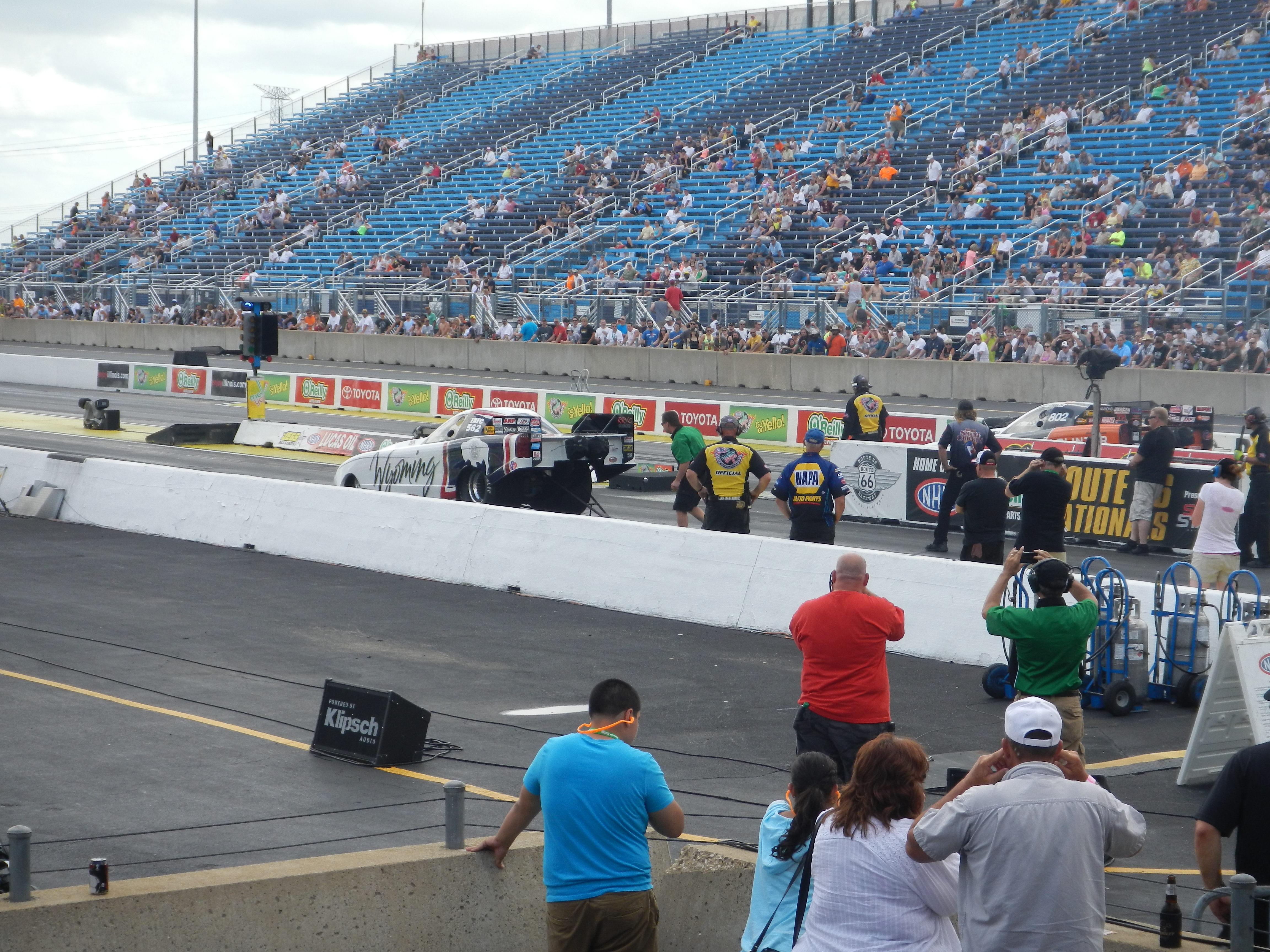

 This year, I went on Saturday and Sunday. Normally I would only go on Saturday, but this year I decided to double the fun. I went with Argie, a friend from work, and I spent Saturday watching racing and wandering through the pits. NHRA tickets promise that “every ticket is a pit pass” and trust me, they more than live up to that claim.
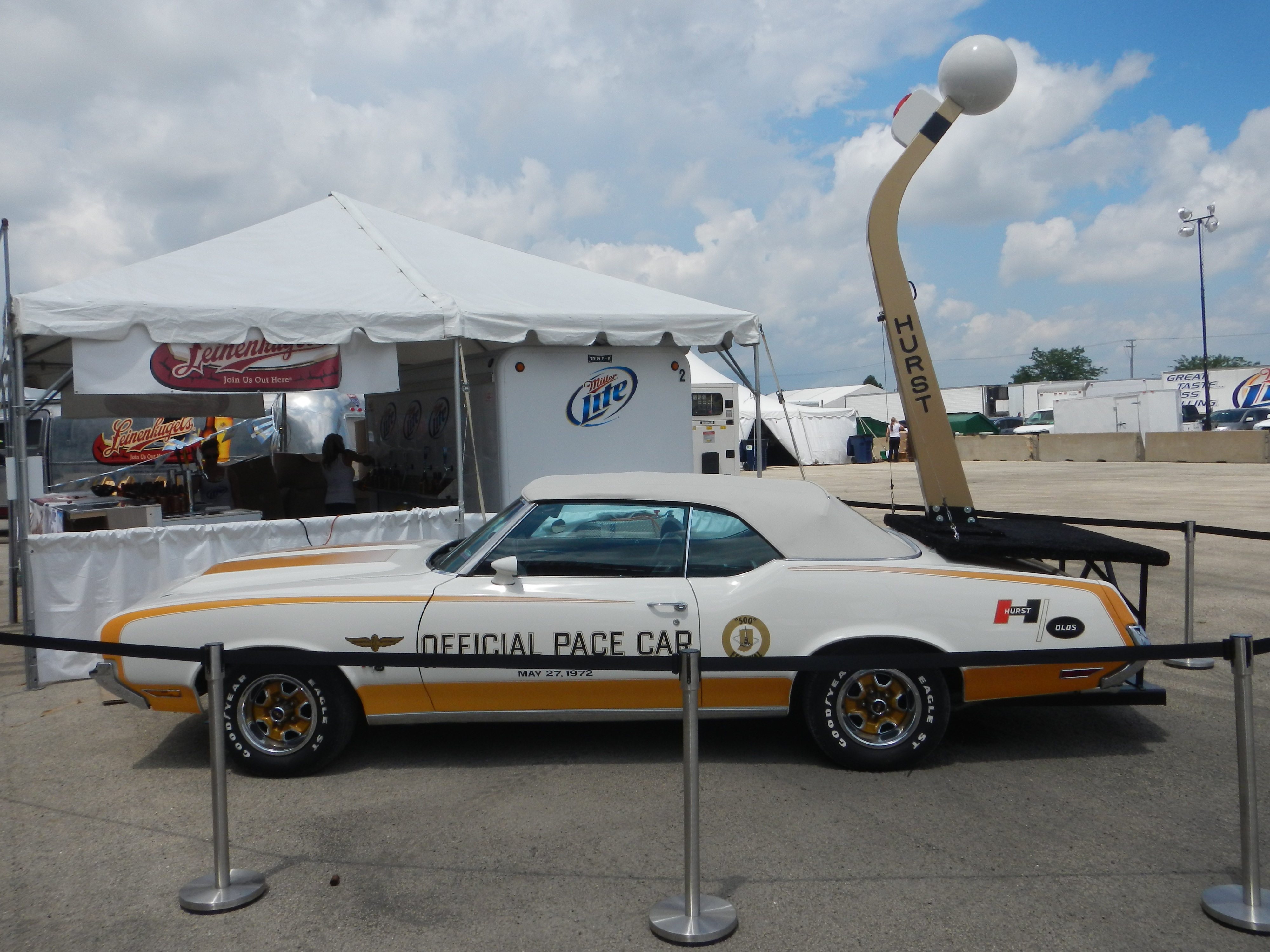
 You can walk around the pits and watch as the teams setup cars before races and fix cars after races. The wear and tear on nitro cars is such that the entire engine has to be disassembled, repaired, and reassembled between races, sometimes in as little as 45 minutes. Needless to say, speed is paramount.
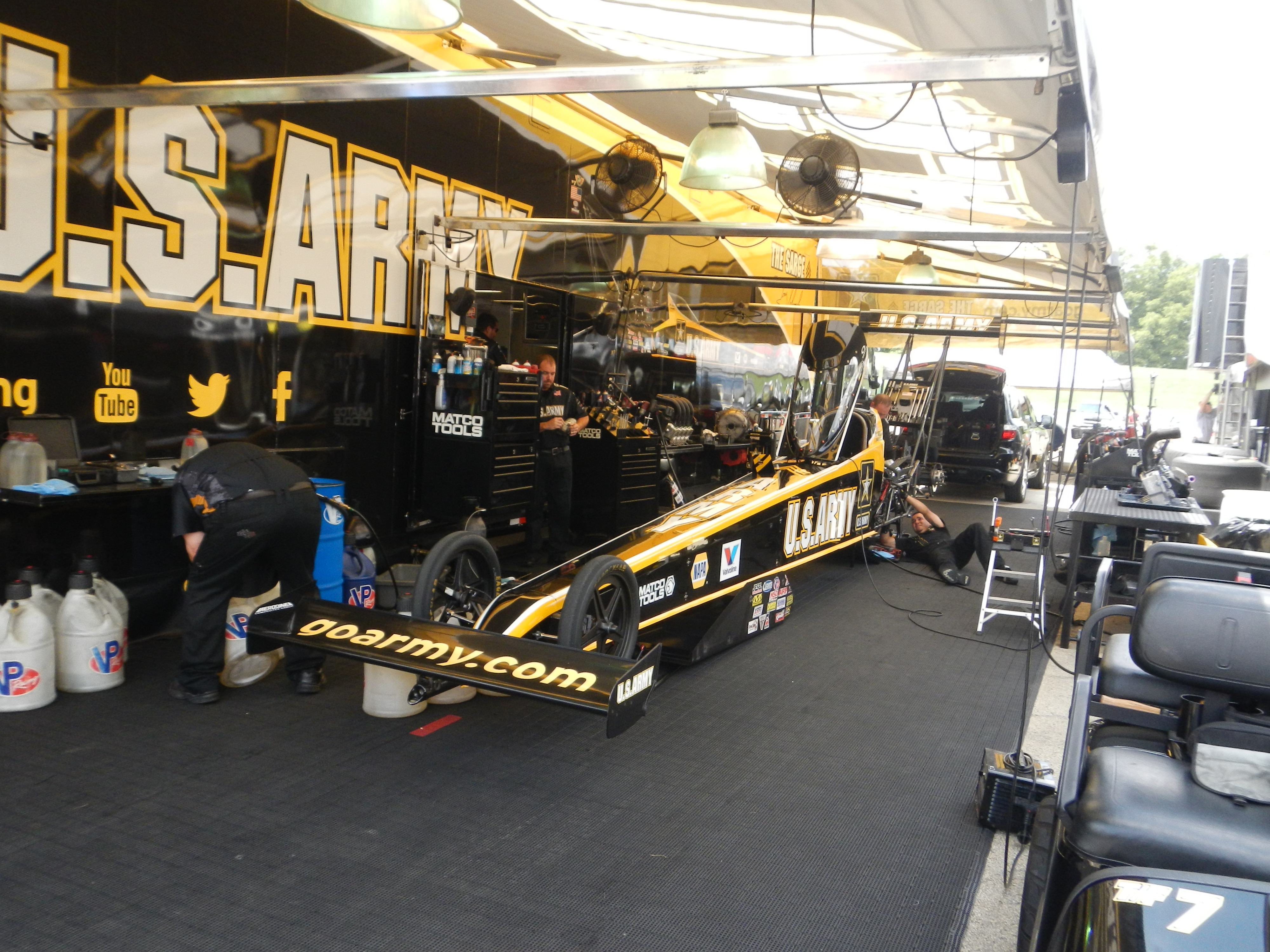 I had been fortunate enough to get a pass to the Don Schumacher Racing hospitality tent. This not only got me the tickets, but also a chance to meet Tony Schumacher, and Ron Capps. I came into the tent a little later than normal, and I got to listen Tony talk to the crowd, and take questions. I got a chance to ask him something that I have always wanted to ask a driver… “What is the weirdest thing you have ever autographed?” Having done autograph signings since I was 5, I’ve seen a lot of odd stuff get autographed over the years, and I was interested in the answer. He responded that he has signed a lot of body parts, arms, legs, etc, and that his wife hates that.
 and one small,
 Both show tremendous use, and have chips missing from them. Valves like these are used for one race and then replaced. The wear they go through for one run is very evident.
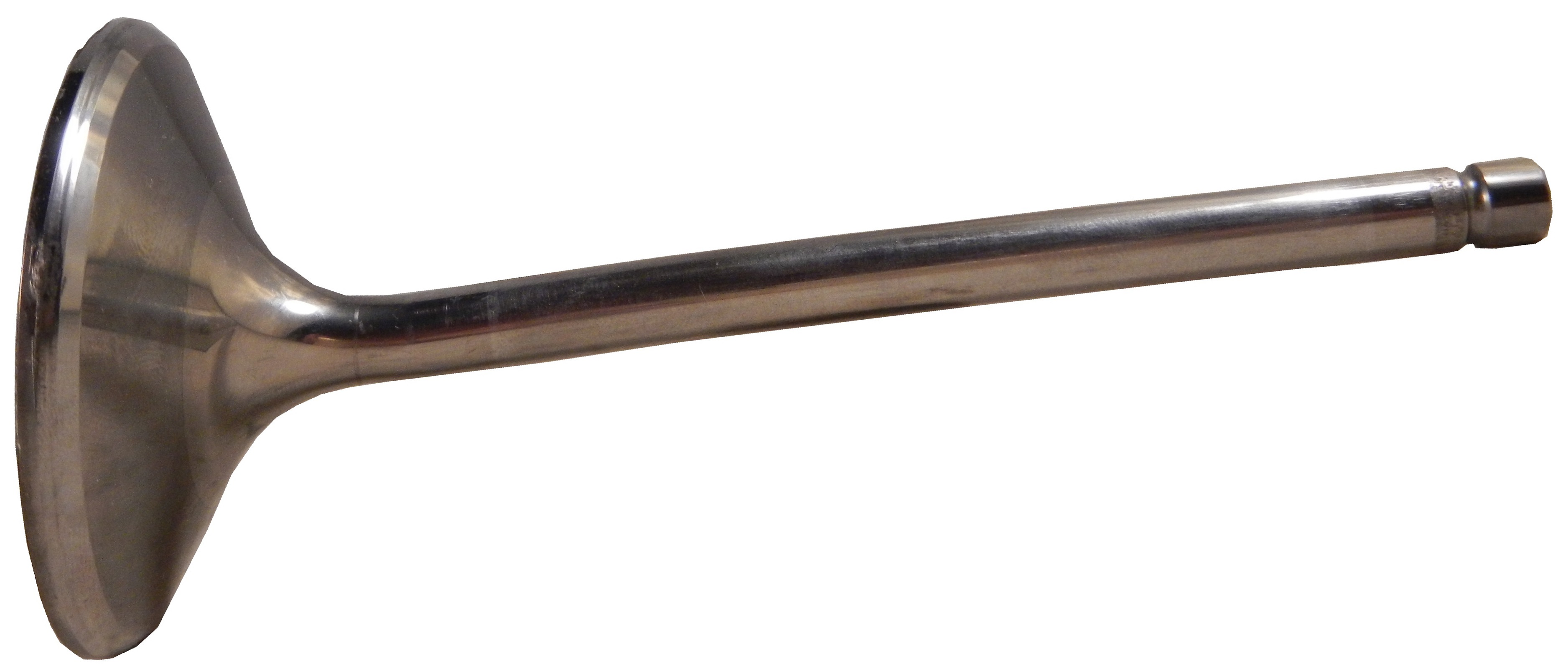


 I had a pair of gloves I wanted to get signed, and I did, by Tommy Johnson Jr.


 My favorite item it this brightly painted helmet.

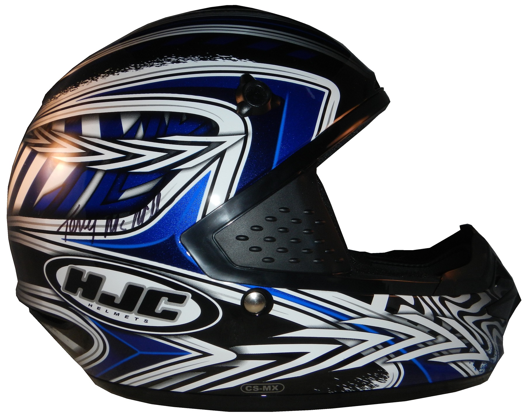

 It was signed by Robby Gordon when I bought it
 , and I got it signed by Clay Millian,
 Terry McMillen,
  Tony Schmacher, Tommy Johnson Jr.,
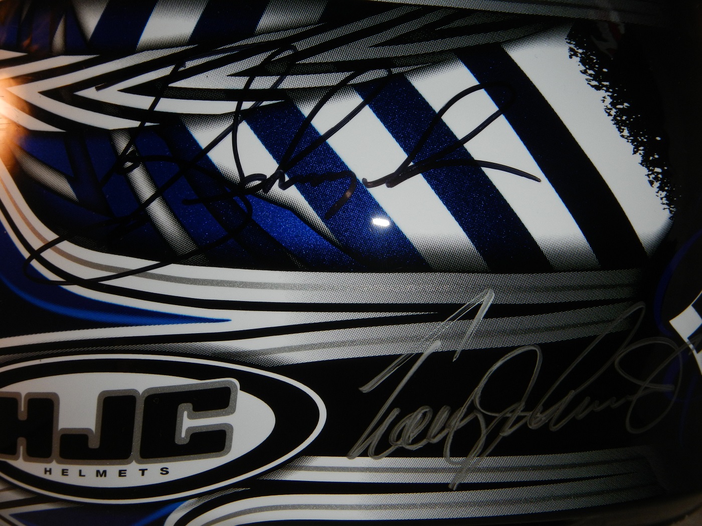 Ron Capps,
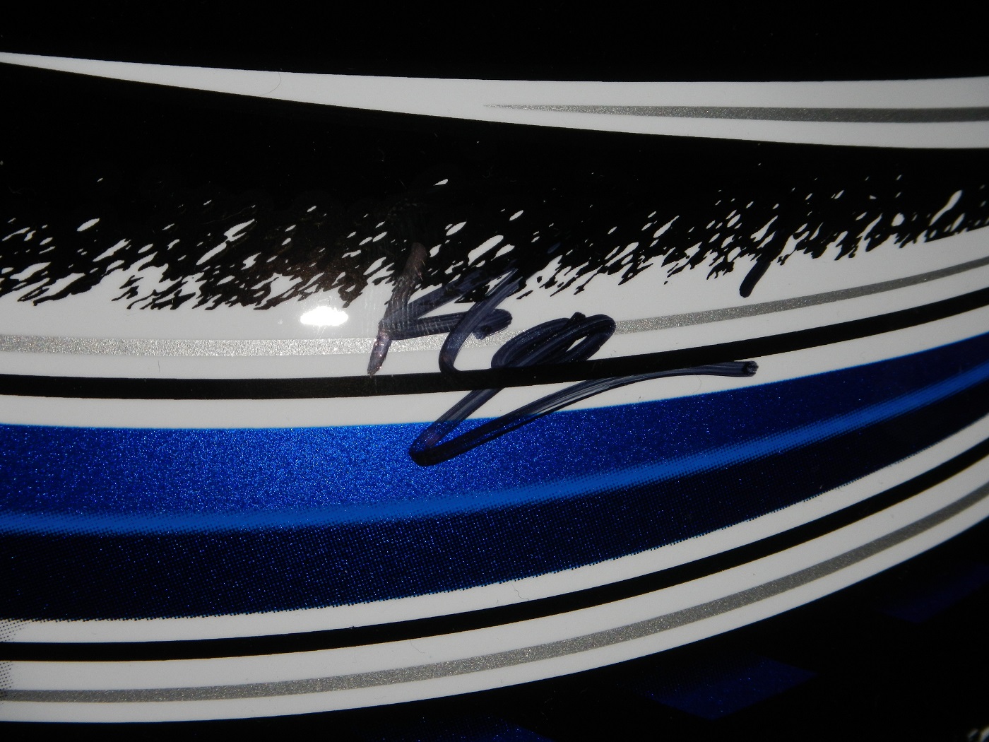 and the legendary Shirley Muldowney.


