The Driver Suit Blog-Nomex-The Core Of Driver Suits

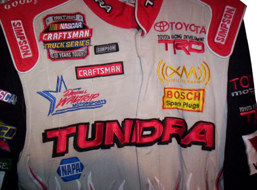
By David G. Firestonenomex1I must have said the word Nomex a thousand times on this blog, but what exactly is Nomex? In short, it is a flame-resistant meta-aramid cloth material. It is an aramid material, which is the same thing as Kevlar, but it is not as strong as a bulletproof vest, but it has great thermal, as well as chemical resistance, which makes it great for racing firesuits.Untitled

The development of the Nomex firesuit has been a long road. This road has seen its share of driver deaths and injuries. Before the Coca Cola 600, I discussed the deaths of Fireball Roberts, Eddie Sachs, and Dave McDonald in fire-related crashes over the course of 6 days in 1964. What took place from there would cross the paths of racing and a young drag racer.

Bill Simpson was born in Hermosa Beach, California in 1940. He took up drag racing at a young age, and at age 18, broke both arms in a drag racing crash. As he recuperated, he thought of safety in racing for the first time. He developed the idea of an X shaped parachute, and using materials from his uncle’s army surplus shop, developed a functional drag racing parachute. Don Garlits noticed the new parachutes, and took an interest, which helped the Simpson Drag Chute company to form. As time went on, he started making other racing equipment, which caught the attention of drivers, and, oddly enough, NASA. During a project, he met Pete Conrad, who introduced the now 27 year old Simpson to Nomex in 1967.

Nomex was created in 1967, for NASA. Far from the uses it has today, its main use at the time was for the Apollo Command Module parachutes. NASA needed a material that could stand up to the heat of reentering the earth’s atmosphere, and still remain fully functional. Simpson saw what the material could do, and decided it would work well to make driver suits, and other uniform items.nomex1nomex2Contrary to what most people think, Nomex is not fire PROOF, rather it is fire RETARDENT. It does burn, but burns at a much slower rate, and that protects the driver in the event of a fire. Bill Simpson decided to show how much better this material was by having a “burn off.” He put on one of his Simpson racing suits, doused himself in gasoline, and lit himself on fire. Though he was fully engulfed in flames, he was not hurt. Though he admits that is was a bad idea, it sold drivers on Nomex. Even today, 46 years later, Nomex is still the go-to material for driver suits.nomex3Nomex is used for many other things. Nomex sheet is used in power cords for insulation. Fire-fighters use Nomex for protection in saving lives. Fighter pilots wear Nomex suits in case of cockpit fires. Nomex was developed for NASA and NASA still uses a lot of Nomex. It is used in what NASA refers to as the “Thermal Micrometeoroid Garment of the Extravehicular Mobility Unit”, or in regular English, the “outer layer of a spacesuit.” The spacesuits that space shuttle astronauts wore on liftoff and touchdown were primarily made of Nomex. Almost every project that NASA has done in the last 40 years involves Nomex in one form or another, so it is a very versatile material.

Interestingly, as safety concerns increased, and safety equipment changes for the better, you begin to see that Nomex is beginning to have competition in the driver suit market in terms of fire protection. While I’m typically a traditionalist when it comes to sports uniforms, for driver suits that is a great thing. Developing a new material that serves the same purpose as Nomex, but can do it better and longer is a great thing. Eventually, Nomex will go the way of typewriters, film cameras, the printing press, and the floppy disk as an invention that is obsolete but changed the world.

Paint Scheme Reviews!

Some new 2014 schemes released this week:

Danica Patrick #10 Apsen Dental Chevy SS  Even though this scheme is better than the *ahem* current Aspen Dental scheme, it still does not look good.  But it is still an improvement, and I’ll give it a C

Ryan Newman #31 Quicken Loans Chevy SS  Great color scheme-Check, Awesome use of Northwestern stripes-Check, classic design-Check, A+ Grade, Double-Check!

Dale Earnhardt Jr. #88 National Guard Chevy SS  The numbers kill what is otherwise a great scheme.  I like everything else, but the color of the numbers looks really odd, and I can’t really say it adds to the car at all.  Still it is a decent scheme, so I’ll give it a B

Now we move on to 2013

Denny Hamlin #11 FedEx One Rate Toyota Camry  Very clean look, with a very good color scheme, can’t say anything bad about this, A+

Greg Biffle #16 Pink 3M Ford Fusion  Pinkwashing is an automatic F.  I hate it when companies use causes like this to move products, so I show no mercy in this sence.

Ricky Stenhouse Jr. #17 Pink 3M Ford Fusion  See Above, F

Ricky Stenhouse Jr. #17 My Best Buy Ford Fusion The blue used on this scheme is a tad too light, but it is still a decent scheme, though the lighter blue takes it from the A grade Best Buy had to an A-

Joey Logano #22 Shell/Pennzoil/Hertz Ford Fusion I’ll be honest, I want to give this scheme a better grade, but the Hertz logo just looks out of place here, and it is awkward on an already iffy scheme.  Best I can give it is a D-

Cole Whitt #30 Black Clover Toyota Camry  Swan Racing seems to go out of its way to design bad paint schemes this year, and this scheme is no exception.  It has no redeeming features at all, and earns an F-

Jeff Burton #31 Sleep Innovations Chevy SS  Great color scheme, though the design on the front is a bit overdone, still a good looking scheme that earns a solid B+

Aric Almirola #41 Maurice Petty Tribute Ford Fusion  Tribute schemes have worked very well across the board, and this is no exception.  Simple, timeless, yet attractive, a great tribute to a great engine builder.  Extra points for using Maurice’s #41 for the weekend.  Interestingly, Maurice raced in a total of 26 Sprint Cup races, and had 7 top 5’s and 16 top 10’s during the 1960’s.

Travis Kvapli #93 Dr. Pepper Toyota Camry  An A+ scheme all around.
 

The Driver Suit Blog-They Pay the Bills, So They Design The Suit

By David G. Firestone96-reeves-flogoFrom a design aspect, no other factor contributes as much as the primary sponsor or sponsors of the car. Everything from the colors to the torso design, to the television logos, to the shoulder epaulet and collar design depends on the primary sponsor. While this has been the case for the most part, how the primary sponsor is displayed can vary quite a bit.

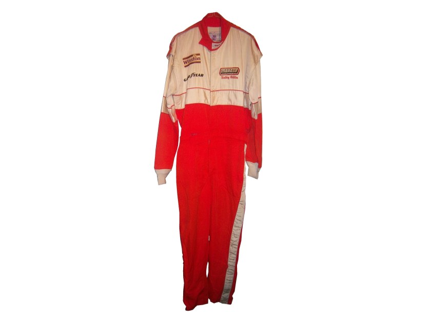
Currently, the standard design for a primary sponsor logo is to have a large logo across the front of the lower torso, and on the back on the upper torso. These Christian Fittipaldi designs from 2002-2003 are great examples of that. The Georgia Pacific design from 2002 has a decent sized logo on the front bottom torso, and the same logo higher up on the back torso.45-fittipaldi-flogo 45-fittipaldi-blogoThe Bugles example from 2003 has identical logo placement for the Bugles logo.44-Fittipaldi-flogo 44-Fittipaldi-blogoMany driver suits feature this same logo placement.96-reeves-flogo96-reeves-blogo90-stricklin-flogo90-stricklin-blogo31-skinner-flogo31-skinner-blogo17-sedgwick-flogo17-sedgwickb-logo16-musgrave-flogo16-musgrave-blogo15-sprague-flogo15-sprague-blogo1-lajoie-flogo1-lajoie-blogo (2)12-miller-flogo 12-miller-blogoTaking a look at this Ricky Craven example from 1996, it features a design aspect that was very heavily used. The torso features a plan color, with a stripe across it with the sponsor name on that stripe. Dale Earnhardt Sr. used this design for many years, as did Rusty Wallace, Dick Trickle, and Steve Grissom among others. It is a fairly straightforward design, but it works very well.41-craven-flogo 41-craven-blogoOther suits have the primary sponsor logo present, but the logo is underwhelming. This design is exampled by this Bobby Hillin Jr. Moroso driver suit from 1991,20-hillin This Lake Speed example from 1997,9-speed

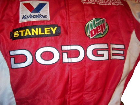
and this Ted Musgrave example from 1998.15-musgrave-lchest 15-musgrave-blogoIn very rare instances, a primary sponsor is excluded from the suit altogether. One example is this Terry Labonte suit I covered earlier this year. That example was made for Terry to wear in a very last minute driver change. Another example is this David Stremme suit from 2009. I covered this issue earlier in the year, but to sum it up, because of a conflict between Verizon, the sponsor of Stremme’s car, and Sprint, the title sponsor of the Sprint Cup race, Verizon was not allowed to have their logos on Stremme’s car and driver suit. As such, Stremme raced a Dodge sponsorship, and wore this suit.12-stremme-flogo 12-stremme-blogoOne of the newer designs that is frequently seen is what I call the leg stripe design. This Kasey Kahne example shows a leg design that has a large white stripe running up the red background, with the DODGE television logo running up the leg. Sponsors can make their logos stand out more with this design, so it is becoming more popular every year.9-kahne-legsThis Scott Wimmer example is from 2002, and is rather unique in this category.23-wimmer-legsIt needs an explanation…The suit was worn for the entire 2002 season, which had a Siemens sponsorship for the first 25 races. After Siemens left the team, Scott Wimmer went on to win 4 of the next 9 races in an unsponsored black car with red and yellow flames…while wearing this suit.

While I get that the team not buying another suit for Wimmer to wear…it just looks weird.

Now this is another suit that needs an explanation. Nort Northam is a Porsche dealer based in Florida. He was a race car driver from 1979-1992, and his career was not great, with no wins, and two podiums. In 1988, he raced in the Sunbank 24 at Daytona, now called the Rolex 24 at Daytona in a Porsche owned by fellow driver Karl Durkheimer.56-Northam 56-NorthambDuring that race, he wore this driver suit. It appears on this suit that a sponsor patch has been removed or fallen off. Now to understand the basic design, you need to understand that Nort raced in two races a year, and having a suit custom designed would be a needless expense. As such, his name, and two sponsor patches did the trick. Not fancy, but effective. This late 1980’s SCCA example is also a minimalist design, but it sticks to the “80’s stripe” design as the Ricky Craven example.

The last thing about primary sponsors is that sometimes, primary sponsor designs follow other sports uniform trends. This example from 1998 was worn by Jeremy Mayfield. At that time, gigantic logos across the fronts of uniforms were the big thing, and that was not good. This fad did not last long, thank heavens!

Driver Suit Blog “Wheel Reviews”

Last night, I went to see the movie “Rush” and I have to say, it was really good.  It has been said “you love your rivals, because you need someone to beat.” Nowhere is this more evident than Rush. Directed by Ron Howard and starring Daniel Brühl as Niki Lauda and Chris Hemsworth as James Hunt, Rush is the story of the rivalry between the two, from their days in Formula 3 in 1970, to Formula 1 in the 1970’s. For fans of racing movies, it is a true masterpiece.

The film takes the perspectives of the two drivers. Lauda is represented in the film as a talented driver who is great with setting up a race car. He is a driver who takes what he does very seriously. Hunt on the other hand is more of a playboy. He is a great driver, but his fast and furious lifestyle is a distraction from his true talent. Both are talented, but when Hesketh Racing, Hunt’s team can’t find sponsorship for the upcoming 1976 season, Hunt loses his ride. After his wife leaves for a ski trip, Hunt gets a ride with McLaren after Emerson Fittipaldi leaves to race for his cousin.

In 1976, Hunt struggles for the first part of the year, while Lauda, fresh off his 1975 World Championship is always a factor in the points standings. Hunt’s luck changes at the Spanish Grand Prix, where he beats Lauda, though he is disqualified for his car being less than an inch over regulation. Hunt’s wife divorces him, and driven by this, his season turns around. Though Lauda struggles at this point, the points standings are close coming into the German Grand Prix

The 1976 German Grand Prix was a critical point in this story, as the points battle was heating up. This race was at the the “Old Nürburgring” one of the most difficult tracks in the world. The weather was stormy, which kicks up the danger. Knowing the track as well as he did, Lauda called a meeting of the drivers and stated that the race should be canceled because of the conditions. Hunt thinks it is just a trick to take a race out of the schedule, and the cancellation is voted down. Lauda is seriously hurt in a wreck, and he is hospitalized. Hunt blames himself for the wreck. The story from there is the story of the 1976 Formula 1 World Championship.

The cars in the movie were very accurate, in some cases, vintage equipment was used. The tires used were made by Goodyear, and had the lettering in white as opposed to the yellow lettering that they currently use. The crew uniforms were very accurate as well. The driver uniforms were very well done, as were the helmets. Something that I noticed about them was that I couldn’t see any safety certification visible.

All in all, this is a great movie, and racing fans will enjoy this movie, so I give it an A!

Paint Scheme Reviews

Jamie McMurray #1 Liftmaster Chevy SS Good color scheme and decent desisn add up to an A- grade

Clint Bowyer #15 Raspberry 5-Hour Energy/Living Beyond Breast Cancer Toyota Camry I hate pinkwashing and I hate raspberries, so this gets an automatic F

Kyle Busch #18 M&M’s Halloween Toyota Camry The leaf designs on the bottom of the doors just look odd, and it takes a solid A scheme, to an A-. It does have great overall design and great colors, but the leaves just kill it.

Matt Kenseth #20 Home Depot/Let’s Do This Toyota Camry The overall scheme is great, and has a great color scheme. The problem is that the back end is yellow, which just looks odd when compared to the rest of the car. If the back was black, it would match quite well, but this is just bad. I want to give this scheme a higher grade, but the best I can do is a B-

JJ Yeley #36 Drive Sober Arrive Alive Chevy SS Great color scheme, great colors, and a cause that is easy to support add up to an A+ scheme.

Ryan Newman #39 Slate Water Heaters Chevy SS While I don’t get the silver design at the bottom of the car, this is a great scheme, and gets an A+

Ryan Truex #51 Shooters Sporting Center Chevy SS The yellow outline on the numbers is brutal, and the Shooters Sporting Center logo is just awful. C- is the best I can do.

The Driver Suit Blog Richard Petty Fan Suit

By David G. Firestone

pettyWhen it comes to driver suits, I normally focus on race-worn items, but this week I’m going to shift gears, and focus on another kind of suit…and yes, pun intended. This example is a suit used by the Richard Petty Driving Experience. What the RPDE does is give die hard fans the ability to get in a stock car and either be driven around a track for a few laps, or drive the car around the track after some instruction. The cars are almost identical to Gen 4 cars, but have two seats and are scaled down to 600 horsepower from the over 800 currently run in NASCAR.

pettybIt looks similar in design to suits that Richard Petty wore during his racing days. Interestingly, there is no Petty blue, but a darker blue similar to the blue used in STP logos. There are no logos of any kind present, not even of the suit manufacturer, a company called Westex. I find it odd that at that time, the Richard Petty Driving Experience logo wasn’t used. There is no indication it was ever present on the suit to begin with. The legs are cuffed, as opposed to the boot cut that most NASCAR drivers like to use. Arm gussets, which give drivers better freedom of movement, are not here either. Later suits have some of these features.

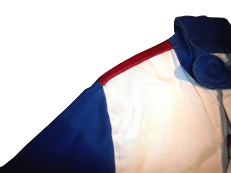
petty-chestpetty-btorsopetty-rshoulder petty-lshoulderNow even though the cars are either driven by professionals, or by drivers who have had lessons, the risk of crash and fire is present. As such, the fans are issued driver suits. This is an early version of the suit issued to them. What strikes me about this suit is that it is a single-layer suit with no epaulets. The epaulet is critical here because they are specifically designed for pulling an unconscious driver from a burning car in the event of a wreck. The fact that is is a single-layer suit is an issue here because in racing, redundancy is safety. NASCAR drivers wear double or triple-layer suits as well as fireproof long johns that give them 30 seconds of fire protection. I would be shocked if this suit would give 10 seconds.

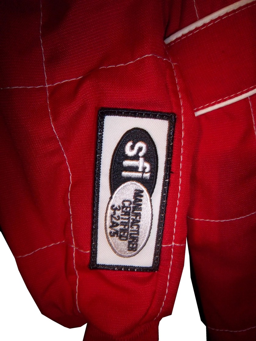
I should also mention at this point that the suit does not have any SFI or FIA certification. When you are driving fans around a track with the ever present risk of fire, having a suit that can withstand the worst case scenario is a plus. SFI certification is designed to do just that, insure that the person wearing the suit will be able to be protected in the worst case scenario, so I do not get the logic of having uncertified suit for use.

All that said, now let’s discuss the basics.

The collar is a Velcro-shut design.

petty-collarThe tag is custom for the RPDE and has some things written and crossed out in Sharpie.

petty-tagThe sleeves are plain.

petty-rsleeve1petty-rsleeve2petty-lsleeve1 petty-lsleeve2There is an unadorned belt.

petty-beltThe front torso shows some stains.

petty-chestIt should be noted that these suits are no longer used, and now Simpson SFI certified suits are currently in use. And while the suit has its short comings it is still a very attractive item. I plan on doing the RPDE in the very near future.

The Driver Suit Blog-Neck Backs…A Hotbed for Unique Customizations.

36-saidThe driver suit is almost always customized for the driver, and as such, the driver has the option of adding customizations to the suit. This may come in the form of size,

and belt design,36-barron-beltbut the back of the neck is a unique place for customizations. The designs that are placed on the back of the neck are as unique as the driver themselves.36-barron-neckI’ve gone at length to discuss the FIA certification which is frequently sewn into the back of the neck. This is a prominent feature in Formula 1 and IndyCar. That is standard issue, so no real need to comment on it any more.barber-neckIn NASCAR, the back of the neck can be used for a myriad of different customizations. One of the most common is a car number, such as this Christian Fittipaldi suit, 45-fittipaldi-bneckand another common feature can be sponsor logos, such as this Randy LaJoie Bob Evans suit from 1999-2000,1-lajoie-neckand this Joey Miller Craftsman Truck Series suit from 2005.12-miller-blogoThis Kasey Kahne suit has the Evernham Motorsports logo sewn into the back of the neck.9-kahne-neckAnd Roger Penske likes to have the American Flag on the back of the neck of his suits, as evidenced by this David Stremme suit from 2009.12-stremme-neckOlder Simpson driver suits have been known to have an inventory number sewn here, as exampled by this Mike Skinner suit from 1997,31-skinner-futureand this Stevie Reeves example, again from 1997.96-reeves-neckBut for my money, the personal customizations are more fun when they are as unique as the driver is. In this Terry Labonte suit, Terry has added a Texas logo.10-labonte-neckMy favorite customization is from a Boris Said suit from 2005. Said has added a Boris Badenov design to the back of his neck.36-said-neckIt’s the little things that make a suit personal, and these are some of those little things. Who says a driver suit can’t be fun.

And of course, it goes without saying that the neck is frequently left blank, as exampled by this Nort Northam suit from 1988.56-Northam-neck

Jamie McMurray #1 Cessna Patriotic Chevy SS Pretty good scheme here, red white and blue is always a solid scheme, but the one gripe I have is the pointless circle around the door number. While it gives the car a vintage look, it is just out of place here. Even still, this scheme is a solid A-

Brad Keselowski #2 Miller Lite Patriotic Ford Fusion Solid scheme, nothing to complain about, A+

Kasey Kahne #5 Hendrick Cars Chevy SS Red white and black is a very solid color scheme, and the design, while a bit convoluted looks really good. It has a hurricane-esquire design that looks really good. A-

Danica Patrick #10 Go Daddy .US Chevy SS The simple design of this scheme looks really good…but what is going on with the colors? Why is the car painted in Russian dressing green? Russian dressing is good, but not as a color scheme. The red white and blue designs clash, and it just looks awful. D-

Clint Bowyer #15 Peak Blue DEF Toyota Camry I gave this scheme a B grade, and the logo change on the hood does nothing to either add or subtract for this grade. B

Greg Biffle #16 3M Statue Of Liberty Ford Fusion Amazing how a better color scheme, as well as the Statue of Liberty design take a C grade and bring it up to a B

Kyle Busch #18 Interstate Batteries All Battery Center Toyota Camry Now THIS is what an Interstate Batteries scheme should be! The classic dark green, gold and white color scheme is amazing, and the design is simple yet very attractive. Giving this scheme an A+ is not saying enough about how great this scheme is!

Jeff Gordon #24 Axalta Standox Chevy SS White flames on a blue background? Seriously? I could forgive it if it was blue flames on a white background, blue flames look really good. But white flames? This design ruins a great color scheme AND a great design scheme TOGETHER! Now that is impressive! F-

Kevin Harvick #29 Budweiser Folds of Honor Chevy SS The Patriotic schemes worked quite well this year, and this is another example of that. A-

Jeff Burton #31 Quikset Chevy SS Decent color scheme but the design needs a little work. If the red was on the hood, roof and deck-lid and the black was on the sides, I would give it an A, but the shark-fin design is brutal on the eyes, and serves no real purpose. As such, I can only give it a C-

JJ Yeley #36 Golden Coral Patriotic Chevy SS Another A grade Patriotic scheme.

AJ Allmendinger #51 Neil Bonnett Throwback Chevy SS While I like most throwback schemes, this one, while accurate, has the worst color scheme I have ever seen. It just screams 1980’s. Hot pink and neon yellow really stands out, and not in a good way. Still, I do miss Neil, and they were pretty accurate, so I will give this scheme a B

Carl Edwards #99 Subway Ahhvocado Ford Fusion Good color scheme and a simple design. I’m not a fan of avocados on sandwiches, but this is a good solid A scheme.

The Driver Suit Blog-Collar Guard…Not a Product, but a Safety Feature.

1-lajoie-collarBy David G. Firestone

Like shoulder epaulets, the collar of a driver suit has made a transition. It has gone from safety accessory to fashion piece, but unlike the epaulet, it is not only ornamental. Because the collar is still a piece of safety equipment. It goes without saying that fire is an ever present danger in auto racing. The collar protects the neck from burns. This may seem minor, but many people who die from burns die from infection. When the skin is compromised, it can’t stop germs from getting inside the body, and as such makes infection a serious risk during burn injuries.

But the fashion aspect of collars is interesting as well. With the standard alignment of sponsors on the top of the suit, the Series logo, tire manufacturer logo, car manufacturer logo, and other sponsor logos are on the top, and the primary sponsor logos are present on the collar and epaulets. This Randy Lajoie example shows how the suit appears during an televised interview:1-lajoie-fNote a couple of things: First, the fabric on the collar overlaps just a bit here, but when the driver wears it, it meets perfectly at the center of the neck. Second, it allows the driver to breathe easily. Comfort Vs. Safety is a constant debate. This is one kind of collar, the other kind of collar is what I call the Velcro collar, as shown in this Alex Barron suit from 1998:36-barron-collarThe Velcro collar is exactly what it sounds like, a collar with a strap which Velcros shut. This provides a little more protection in case of fire. It also has another use, as sponsor ads are popular to put on the front of the Velcro strap. This has been used quite often over the years…41-craven-collarbarber-collar This is due to the fact that for quite some time the open face helmet was used, and the collar provided extra fire protection where the helmet failed. In this day in age, helmets come standard with Nomex socks on the bottom, so the collar, while still a key safety feature, is not as critical. But for sponsor logo placement, it really can’t be beat.

If the collar does not have a Velcro closure, then the primary sponsor logo is sewn into either side of the collar. Like the Lajoie example above, or this Mike Skinner example below, this can be used very effectively as a place for sponsor logos.31-skinner-collarLike most other aspects of the driver suit, the choice of Velcro or not comes down to driver preference. Kyle Bush, as well as older brother Kurt favor the Velcro style, whereas Tony Stewart and Carl Edwards prefer the non-Velcro variety. Many pit crew shirts have a similar design to the driver design as well.

Editor’s note: For the next two weeks I will be on a very badly needed vacation. I will still have articles ready to go, but I won’t be commenting on up do date issues until I get back. I will still check in from time to time.

Moving on to paint schemes…

Denny Hamlin #11 FedEx Express 2005 Toyota Camry Done as a memorial to Jason Leffler, this is a replica of the scheme that Leffler ran in 2005 during FedEx’s first season as a full-time NASCAR sponsor. It is very faithfull to the original scheme. It also has a great design and color scheme, and earns an A

Greg Biffle #16 3M/Give Kids a Smile Ford Fusion The same bland paint scheme that I described as “There’s nothing really wrong here, but nothing really right here either.  The side design looks forced, the black roof is idiotic, the color scheme is good, but the number design looks too cliche.  It makes no sense, but 3M schemes never do.” It has a small Give Kids a Smile logo on the hood, that is all but invisible. I gave it a C and it will stay at a C.

David Stremme #30 Window Wax Toyota Camry Ugh! This is bad, I can live with the color scheme, but the design is bad. It gets a D

Austin Dillon #33 American Ethanol Chevy SS While I hate the shade of green used here, this scheme looks pretty decent. The designs around the front brake vent are unnessicary, but I still like them. If the green were a bit darker, I could give it a better grade than a C+.

AJ Allmendinger #47 Charter Toytoa Camry The hood design is interesting here. It is designed in the same light as television logos on driver suits. It is a unique idea that works and I hope will catch on. The color scheme is great, and I love the overall design. A

Brian Vickers #55 Aaron’s/Louisville Cardinals Toyota Camry The color scheme is good, but the Fruit Stripe Gum design seen on the Louisville Cardinals shorts is ugly. The whole Zubaz design scheme is horrible on sports uniforms, and even worse on this car. I have nothing against the Louisville Cardinals, but this is horrible. F

Dale Earnhardt Jr #88 National Guard Solider of Steel Chevy SS Solid simple scheme with good colors, but the Superman Logo on the hood is next to invisible.

The Driver Suit Blog-Arm Gussets…Comfortable AND Safe!

By David G. Firestone

We’ve all seen them in telecasts and photos, but what many of us do not realize is what they are and what they do. I am talking about the arm gusset. Arm gussets are seen at the top of the sleeve on a driver suit, under the shoulder. They are a flexible piece of Nomex specifically designed to do two things. One is protect the driver, the other is give the driver some freedom of movement.10-labonte-rshoulder 10-labonte-lshoulderArm Gussets are almost always present on race-worn driver suits. Anyone who has worn a one-piece full body jumpsuit can attest to the fact that it restricts freedom of body movement. The gusset takes some of that restriction away. This is important when it comes to driving, because it gives the driver one less thing to concentrate on, and in the worst case scenario, can help a driver escape a burning vehicle much quicker.36-said-rshoulder 36-said-lshoulderGussets have very little variation, though I have seen one unusual one. In this Ricky Craven suit from 1996, the front of the sleeves look like they are attached to the body, whereas the back has a gusset in it. This would be done for driver preference of course, bur I have never seen a half gusset before or since.100_3458 100_3457 100_3456This Lake Speed suit from 1997 is store bought, as opposed to custom designed, and it has no gussets. This suit would have some restriction of movement. Again this can come down to driver choice.9-speed-rshoulder 9-speed-lshoulderThe need for protection vs. the need for driver comfort is a major conflict in the world of racing safety. The gusset is a major meeting point between the two sides involved, and the drivers love them.

RIP Jason Leffler…you will be missed.

Now on to paint schemes.

Jame McMurray #1 Parade Magazine Chevy SS-Great color scheme, great design, nothing wrong at all, A+

Jame McMurray #1 Banana Boat Chevy SS-A scheme that could be a B+ is ruined by an awful color scheme. That orange is the worst I have ever seen on a race car. It takes this scheme and takes to a D-

Jamie McMurray #1 Bad Boy Buggies Chevy SS-An attempt to be innovative with design fails horribly here. The color scheme is decent, but the design is awful.

Brad Keselowski #2 Miller Lite Patriotic Ford Fusion-Taking the stars and stripes and slapping them on a race car can work…just not here. If it was just plain blue with red and white lettering, it would work better, but this just falls flat. C-

Marcos Ambrose #9 Stanley/DeWalt Racing for a Miracle Ford Fusion-This is a major improvement over what they currently run. This just works! A+

Denny Hamlin #11 Sport Clips Toyota Camry-Seriously? Why does it look like a sperm is painted in red on the side of the car? The red/white/black color scheme works, but the door design is just awful! D-

Denny Hamlin #11 Fedex/Autism Speaks Toyota Camry-Much better! The puzzle design, and solid color scheme look really good here. The red 11 is amazing too! Can’t give this anything but an A+

Tony Stewart #14 Code 3 Chevy SS-Love the scheme, love the simple design and great color scheme.  Works very well and earns an A+

Clint Bowyer #15 5-Hour Energy Patriotic Toyota Camry-How is this patriotic? Oh….I get it…the stars….just one problem…THE COLOR SCHEME IS WRONG! If it was red white and blue I would like this, but this is just awful! You want to honor America, but can’t get the color scheme right? F-

Greg Biffle #16 Fastenal Ford Fusion-Since minor variations of this scheme were run by Biffle, Ricky Stenhouse, and Carl Edwards with minor variations between them, I will grade them all here. Solid scheme, good color scheme, A+ for all 3.

Greg Biffle #16 3M/Ace/Rite Aid Ford Fusion-The color scheme is good, but the door design is too busy. If it was one single color, it would work quite well, but being a mix of black, blue, red, and white it just looks confusing. It works, but not as well as it could, and earns a C+

Jeff Gordon #24 Axalta Chevy SS-Another DuPont scheme with different logos that works very well. Good color scheme and design. A+

Paul Menard #27 Menard’s/Libman Chevy SS-The Libman green hood design just looks horrible on the yellow background of the car. The green is too light, and if it were darker it might work, but this scheme earns a D

Kevin Harvick #29 Budweiser Patriotic Chevy SS-This is another patriotic scheme that works very well with a good design. A+

J.J. Yeley #36 Click it or Ticket Chevy SS-Good design, but awful color scheme. The green and blue is just horrible. If one or the other was used it might work, but this is horrific. F

Ryan Newman #39 Quicken Loans Patriotic Chevy SS-Meh.  The design needs work.  Too much going on with the front of the car to earn anything above a C

Aric Almirola #43 Air Force Ford Fusion-Great design, simple design with a great color scheme. A+

Bobby Labonte #47 Bush’s Grilling Beans Toyota Camry-The overall design and color scheme is good, but the major flaw here is that the quarter panel has 5 different logos, most of which clash with the Bush’s scheme. It takes an A scheme and drags it down to a C

Jimmie Johnson #48 Lowes Patriotic Chevy SS-The only bad thing I can say about this is that the red should be a little darker. Other than that, this scheme earns an A

Jimmie Johnson #48 Monsters University Chevy SS-If the blue was darker, I would like it more, but the blue is too light. Other than that, this is a solid scheme. B+

Martin Truex Jr. #56 Napa Patriotic Toyota Camry-Perfect…that is all I can say. A+

The Driver Suit Blog-The Glossary of Terms

By David G. Firestone9-kahneFor this week’s blog, I will be doing a visual glossary of terms that I use when describing driver suits and helmets. To illustrate this, we will use this examples from a number of suits, including this Kasey Kahne suit from 2005.

and this Terry Labonte suit from 2008

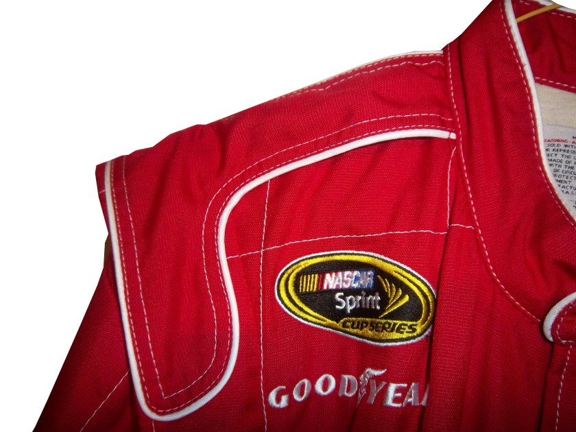
10-labonteCollar-The collar is the main protection for the driver’s neck. There are two types of collars, the ones that velcro shut, and the kind that overlap, but do not attach. A popular place for sponsor logos.9-kahne-collar29-kahne-rshoulder 9-kahne-lshoulderShoulder Epaulet-a piece of fabric used to decorate the shoulders. Some are designed for visual appearance, but some are designed to be used to pull an unconscious driver from a burning car. Another popular place for sponsor logos.  10-labonte-rshoulder 10-labonte-lshoulderArm Gusset-Pieces of Nomex at the top of the sleeves that attach to the main body of the suit designed for driver comfort, while keeping it fire retardant.100_3458 100_3457 100_3456Liability Tag-Found in every piece of racing uniforms this tag states that any injury they incur while wearing the item is the fault of the driver, not the company. 10-labonte-tagSeries Logo-Logo indicating what series the driver is racing in. Currently found at the top of the suit on the right side for NASCAR and the left side for IndyCar, though it has been more nomadic in the past. 10-labonte-rchest9-kahne-rchestAssociate Sponsor Logos-Smaller logos found at the top of the chest. Typically these include the series logo, tire logo, car manufacturer, team name, and one or two other sponsors. These small logos are a good way to photomatch a suit.9-kahne-rchest 9-kahne-lchestPrimary Sponsor Logo-The biggest logo on the suit, can measure as much as 14 inches around. Usually found on the center torso on front and upper torso on back. This logo is also the reason is why all of the other design features of the suit revolve around.9-kahne-flogo 9-kahne-blogoBelt-Many driver suits feature a belt, which is for driver comfort. The safety certification is sometimes found on the inside, has a velcro closure. The driver name or a sponsor logo is often found here.  9-kahne-beltTelevision Logo-Found on the sleeves and legs, these logos are specifically positioned so that when the driver is sitting in the car, they appear visible to the in-car cameras.  9-kahne-rsleeve2 9-kahne-legsCuff-the end of the arms and legs have a Nomex cuff. On the legs, the cuffs are often covered by a boot cut.  100_2474-copy1Double or Triple-Layer-Most driver suits have multiple layers of Nomex in them to protect the driver from firescreen
Safety Certification-Driver suits are independently inspected by FIA and/or SFI to insure that they meet or exceed the fire protection they promise to provide. SFI certification is typically found on the inside of the left sleeve, and FIA can be found on either the back of the neck, or inside the belt.10-labonte-sfi 9-kahne-fia  fia 1 sfi36-barron-fia236-barron-neck

The Driver Suit Blog-The Replacements…The Driver Suit Edition

By David G. Firestone

I have been focusing too much on paint schemes lately, so I’ll hold off on that for a while. Back to driver suits. As Brian Vickers demonstrated earlier this year, when there is time to plan for a driver replacement, a full driver suit with all correct sponsor logos can be done for a driver. But what if the driver change isn’t as easy to anticipate? What if it is a last minute deal? Sometimes, you get an item like this:10-labonte

10-labontebHere’s the back story, Patrick Carpentier was racing for Gillette-Evernham Motorsports in 2008. He was a part time Cup driver, and full time Nationwide Series driver. During the week of August 3, 2008, Carpentier was scheduled to driver in the NAPA Auto Parts 200 in Quebec. Because of the travel restrictions involved, he was not able to make the Sunoco Red Cross Pennsylvania 500 the next day. As such, Terry Labonte was chosen to take the #10 Charter Communications Dodge Charger for that race. Since this was a last minute deal, Labonte was given this basic suit, with SPRINT CUP, GOODYEAR, VALVOLINE, GILETTE-EVERNHAM MOTORSPORTS, NASCAR, and SUNOCO logos. The full Charter Communications design would have taken more time than the team had to make the suit.

10-labonte-rchest 10-labonte-lchest 10-labonte-rsleeve1 10-labonte-lsleeve1

In all honesty, it works very well. It has the classic quilt pattern, and the minimal logos give it a very retro look. This is also the only driver suit that I have ever seen that has no manufacturer logos, either Dodge or Simpson, and has a full SFI Certification.

10-labonte-rshoulder 10-labonte-sfiOther than the lack of logos, this is a standard custom designed Sprint Cup driver suit. It has shoulder epaulets and arm gussets, as well as Terry Labonte’s name on the belt. The Texas logo is presnet next to Labonte’s name, and I have never seen this on other suits he wore. I was able to find some pictures of him wearing the suit, and he looks good in it.

10-labonte-belt

The Driver Suit Blog-All-Star Race Weekend Events and Fun

By David G. Firestone

With the sad passing of Dick Trickle, as well as the All-Star Race, and the Memorial Day trifecta next week, I decided today I needed a change of pace, and I wouldn’t think about racing or driver suits today. So with my uncle in town, we went to the Museum of Science and Industry in Chicago. It’s an amazing museum with a lot of fun things to see and do, and we had a great time.

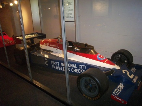
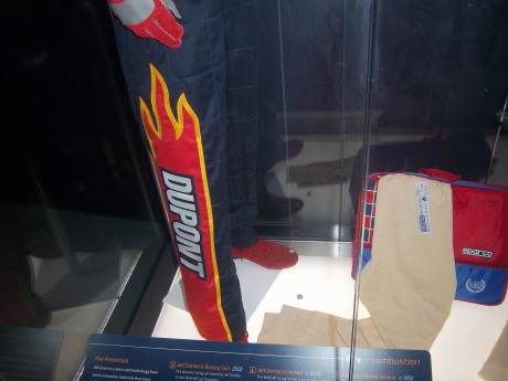
They have an exhibit that I saw concerning vintage cars, and a number of race cars. They have the winning car from the 1993 Sunrace USA100_3196100_3197A 1924 Marmon race car 100_3194 100_3195Wally Dallenbach’s car from the 1972 Indy 500 100_3192100_3193 and Al Unser’s 1978 Lola race car that won the triple crown 100_3190 100_3191The Spirit Of America, which held the land speed record from August 1963 to October 1964, and still holds the record for world’s longest skid mark is also on display as well.100_3185There is a new exhibit as well, Science Storms, an impressive state of the art exhibit detailing the science of natural phenomena, and how modern society has to interact with it. It is on two floors in the main gallery. On the second floor, there are displays for physics, magnetism, electricity, and fire among other things. At the end of the balcony, there is a large Tesla coil mounted in the ceiling. Nearby, I was shocked to see this display:IMAG0047That is a Jeff Gordon driver suit, with a similar helmet. 100_3176 100_3175 100_3177 100_3171A helmet that has been bi-sected to display the fire protection that the helmet100_3180A helmet used for fire testing, and a Nomex hood.100_3181A racing helmet and matching goggles from the 1950,s and a 1975 drag racing helmet worn by Dennis Baca100_3182and some Nomex undergarments and a Sparco bag. 100_3178 100_3179Now first off, why is the picture of Jeff Gordon from 2011 when the suit is from 2002? I think that it would be better if the picture of Gordon featured him wearing the suit on display. But that’s a minor complaint compared to some of the other issues the display has. The bag in the display clearly states “Jeff Gordon 2003.” So that might lead one to believe that the suit was from 2003. However after doing some research, the suit is from 2002. Looking at a 2003 suit, The Quaker State logo is different, the Lowes logo is gone, and the GMAC and Goodyear logos are in different places. So kudos to the museum for catching that.

The biggest issue is with the helmet cut in half. The sign clearly states “Jeff Gordon’s Helmet, Circa 2002.” Just taking a look at it, and I can clearly tell it’s not race-worn. I can tell for a number of reasons. Let’s start with the obvious fact that the color schemes on the helmet and driver suit are completely different. Second off, there are no ventilation ports or microphone equipment present. Since Gordon was wearing the vent on the left side of his helmet, the fact it is not there is very telling. Considering that DuPont Automotive Finishes paid nearly $12 million total to sponsor Gordon in 2002, his sponsor logos are conspicuously absent, and for a helmet that was supposedly worn for an entire racing season, it seems to be in very VERY good condition, almost new. It should also be noted that there are no HANS anchors present. At first I thought it was because the helmet was not meant to have them, but it turns out they were either supposed to be there, or have been removed. Why this occurred is not clear, but it clearly was NOT worn by Jeff Gordon. In fact, I would be shocked if he ever held this helmet. 100_3180 100_3180 - Copy 100_3180 - Copy - CopyBut there is one other issue with this display. The whole display is geared around fire protection, but there is no mention of safety certification. This is not a minor complaint, as the suit has a FIA certification on the back of the neck, but in the display is almost invisible.100_3184That picture, as bad as it is, is the best I can do, because the side of the display is inaccessible to viewers. If a display discussing fire safety, at least mention that the suit is certified to do just that!
Outside of that display, I had a great time at the Museum of Science and Industry, and I can look past those complaints to say that it is a really nice display that tells viewers a lot about racing safety. So if you are ever in Chicago, stop on over. I promise it is worth the time!

Now on to NASCAR All-Star Showdown Special Schemes…

First the All-Star Showdown Schemes…

Jamie McMurray #1 Bass Pro Shops/NWTF Chevy SS-Great Color Scheme, Awful design, C+

Danica Patrick #10 Go Daddy Cares Chevy SS-The racing stripe makes the scheme look better, and the hood logo is good as well  A

Mike Bliss #19 Gentry Plastics Inc. Toyota Camry-Good color scheme and simple design work well here, A

Landon Cassill #33 Bicycle NASCAR Playing Cards Chevy SS-Decent color scheme, but the design is all over the place, way too chaotic, C-

JJ Yeley #36 World TradeX Chevy SS– Not much to say here…other than make the logo bigger.  D-

Brian Keselowski #52 Supportmillitary.org Toyoa Camry-Eww…Too much going on, with the oversized camo in too many different colors, and the door design which is awful.  F-

Now On to All-Star Race Schemes.

Brad Keselwoski #2 Miller Lite Fan Mosiac Ford Fusion.  It looks really good, and the pictures of the fans give it a condensation on the can effect that is really cool.  A+

Greg Biffle #16 3M Filtrete Ford Fusion-Could you please pick a color scheme and stick with it?  Two different color schemes on the same car is just awful. But they are two good color schemes. C-

Kevin Harvick #29 Budweiser/Rheem Chevy SS-Good color scheme, and I like the two different designs on the side.  A-

Ryan Newman #39 Aspen Dental Chevy SS-Good colors, but awful design…what does this have to do with teeth?  C-

Jimmie Johnson #48 Lowes Patriotic Chevy SS-Not the best scheme he has run all year, but I would love to see the car in that shade of red on the bottom C-

DGF2099 Productions-Introduction to Sports Memorabilia-Boris Said 2005 Race-Worn and Signed Driver Suit

Paste a Video URL

A very large Boris Said driver suit from 2005, which Boris has signed on the front will be examined here.