The Driver Suit Blog-Showing Some Love for the NHRA!

100_3556By David G. Firestone

While the bulk of The Driver Suit Blog is devoted to NASCAR, which, admittedly is my favorite form of auto racing, I do follow other forms of racing, and collect items from many different forms of racing. I am a fan of NHRA drag racing, and I attend races when I can. I have a decent collection of NHRA memorabilia, so this week, I’m gonna show some love for drag racing.

First, let’s get some factual history out of the way. Founded in 1951 by Wally Parks, the National Hot Rod Association or NHRA was created to act as a governing body for the sport of drag racing. Parks had previously founded Motor Trend and Hot Rod magazines, and was a racing enthusiast . The NHRA has 80,000 members, 95% of which are non-professional drivers. While there are hundreds of drag racing classes, The three most popular and well-known are top fuel, funny cars and pro stocks.

Top fuel dragsters are 25 feet long, have the engine mounted behind the driver to provide weight to the rear tires, which are 36 inches high by 17 inches wide. They run on a 90/10 fuel mix, 90% nitromethane and 10% methanol.100_3531Funny cars are designed with a frame, engine, suspension and cockpit with a fiberglass body that raises up to allow access to the car. The name “funny car” came to be because the early models in the 1960’s had the rear wheel base moved forward, and huge rear tires. They didn’t look “stock” so they were called “funny.”100_3545Pro stocks are an interesting design. Whereas top fuel and funny cars use nitro burning supercharged V8’s, by rule, pro stocks can’t use superchargers, turbochargers, or nitrous oxide. They also run on 118 octane racing fuel. Little consideration is given aerodynamically, and the cars can be hard to handle.alderman1

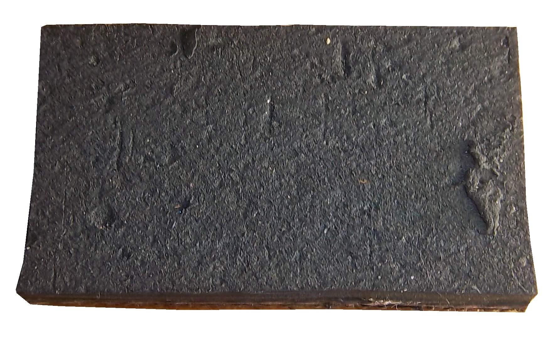
In regards to race-used equipment, I have this timing belt from Bob Tasca’s Motorcraft Funny car, this one used in his first qualifying session at the Ford Thunder Valley Nationals in Bristol Tennessee. This run he had a 4.15 second, 306 MPH run. This thing is HUGE, measuring over 64 inches in circumference and 3 inches across.tasca-belt2 tasca-belt1
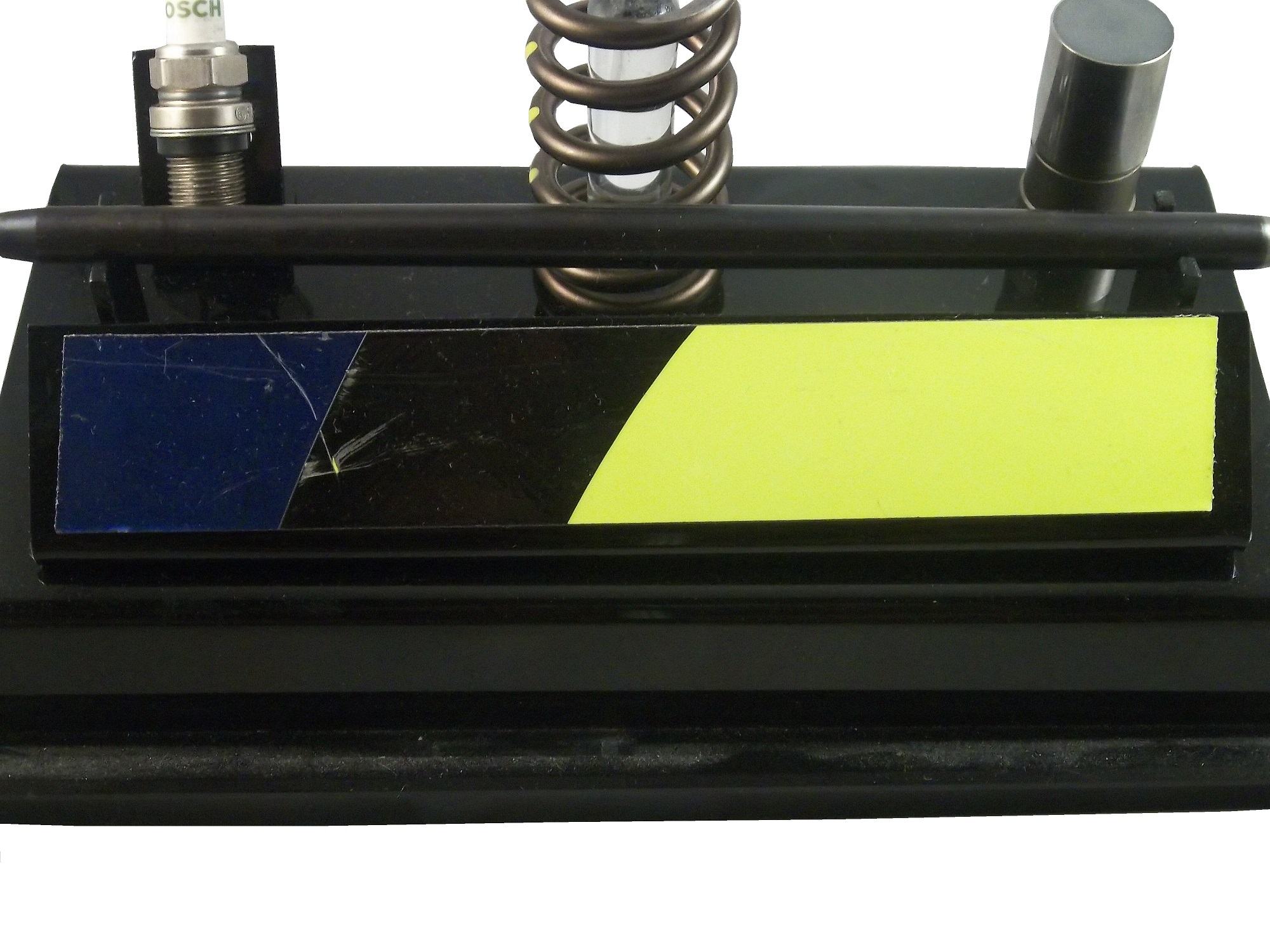
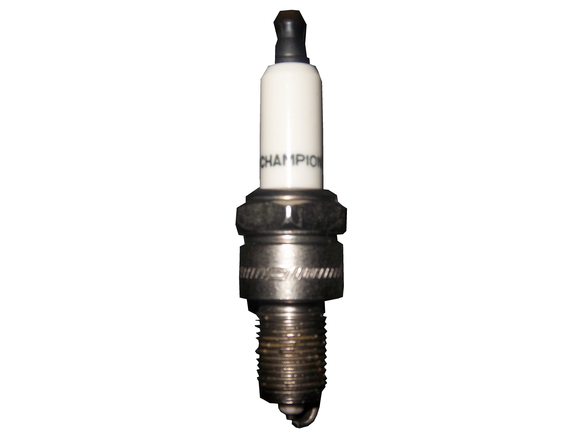
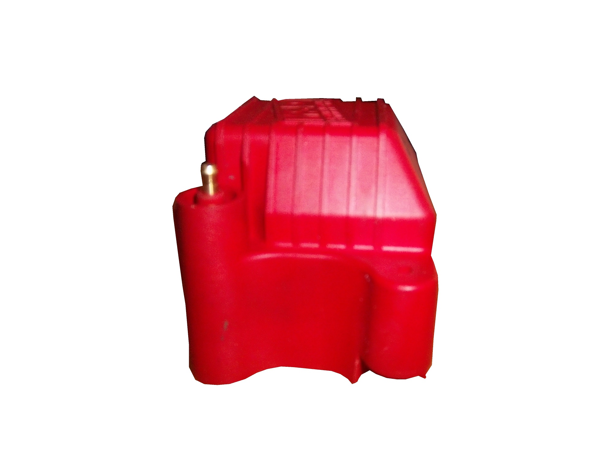
As well as an ignition coil and a spark plug from Morgan Lucas Racing. Ignition coils are used to turn on cars in general, but this MSD 8142 is designed to fire up these 8000 horsepower engines, which need a lot of electricity to start and operate. I was fortunate enough to have Tony Schumacher and Ron Capps autograph it in person.mlr-coil3 mlr-coil6 mlr-coil5 mlr-coil4 mlr-coil1 mlr-coil7 mlr-plug

One thing I wanted was a race-used piston. I recently got one, but it is in two different pieces. The piston rod itself was used and autographed by top fuel driver Bob Vandergriff, and the piston head was used and autographed by Brandon Bernstein, son of drag racing legend Kenny Bernstein. The piston head is 3 inches in diameter, and the piston rod is almost a foot long!vandergriff1 vandergriff2 bernstein-piston1 bernstein-piston2

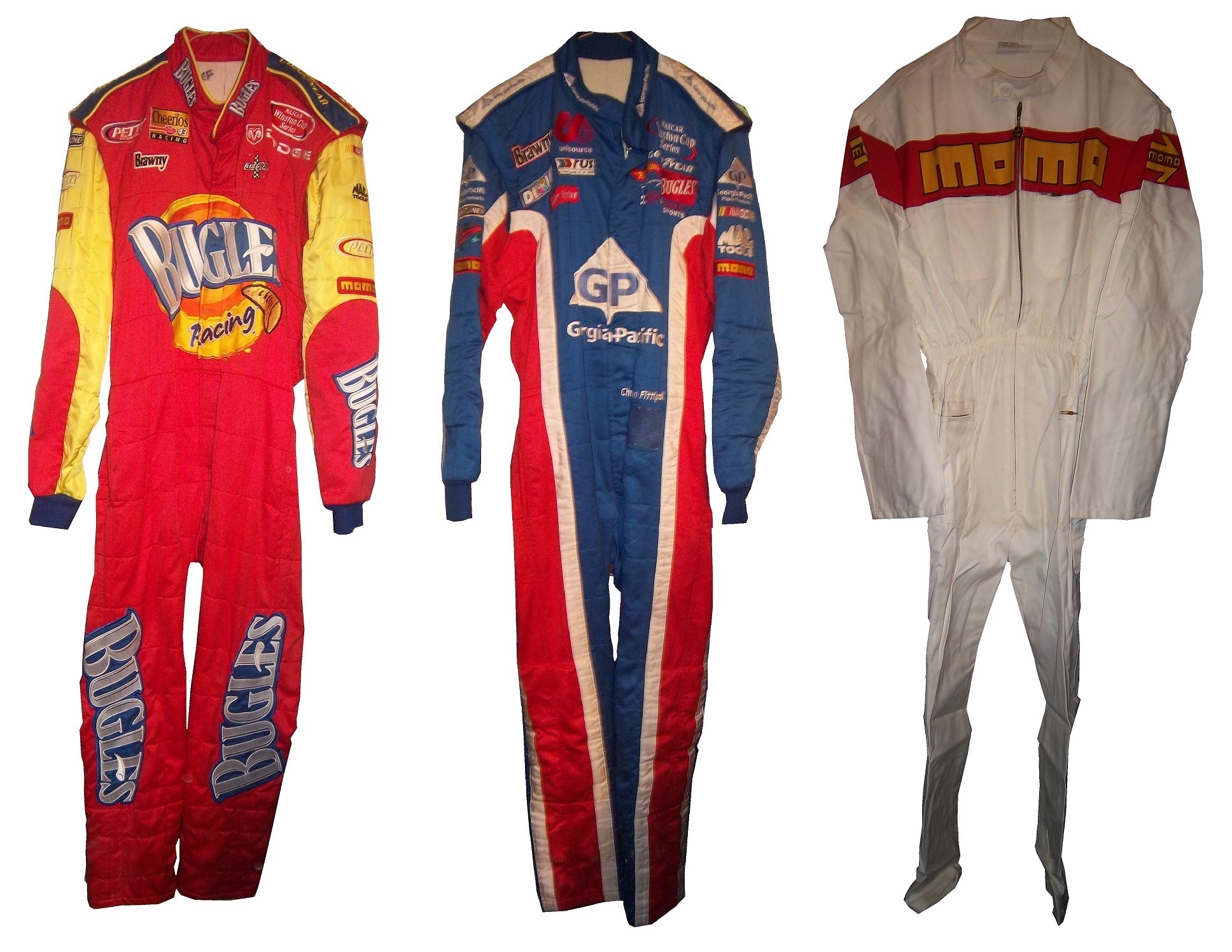
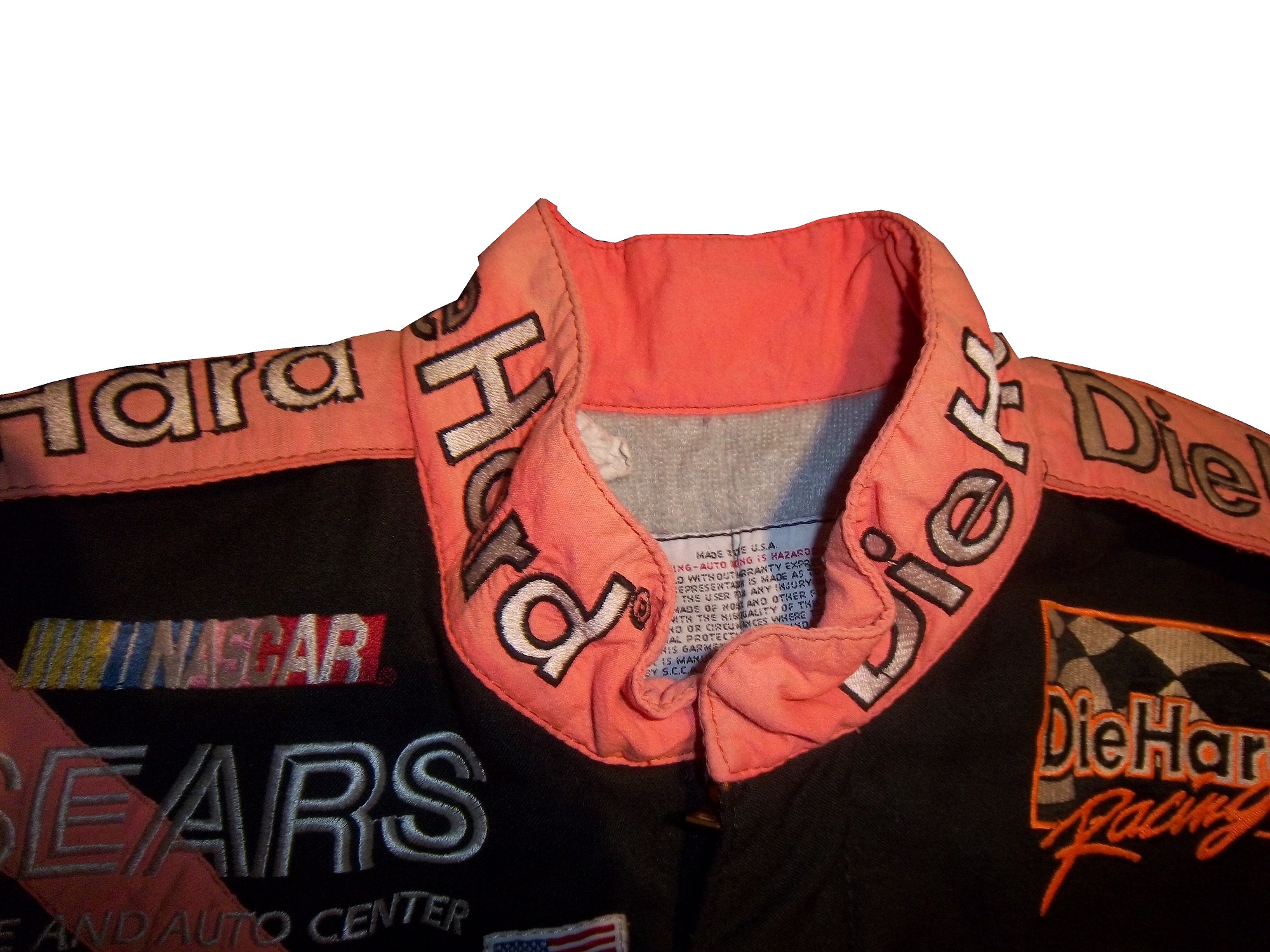
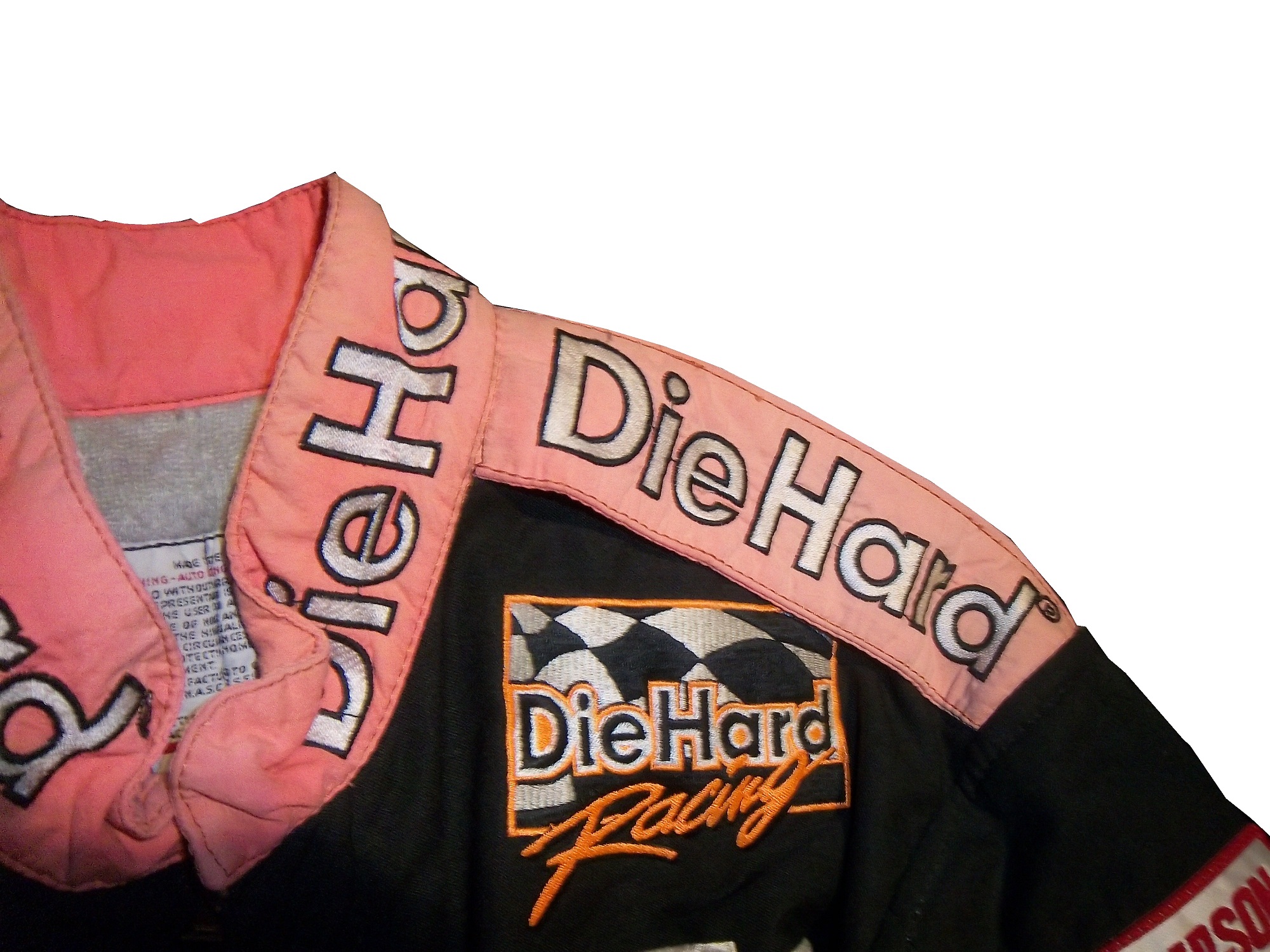
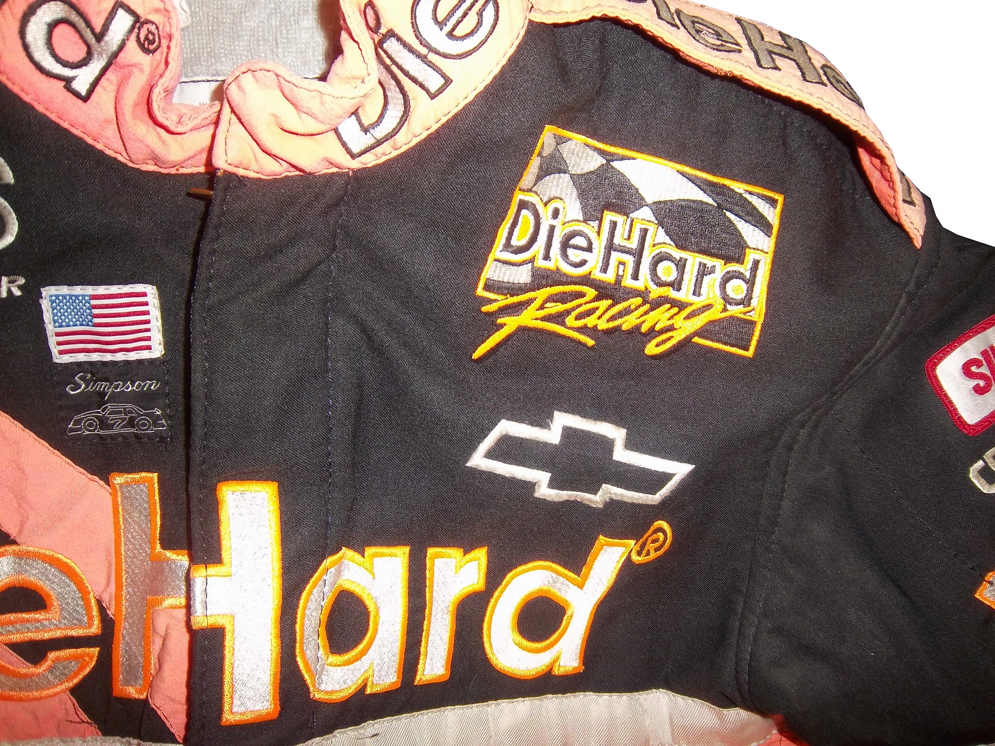
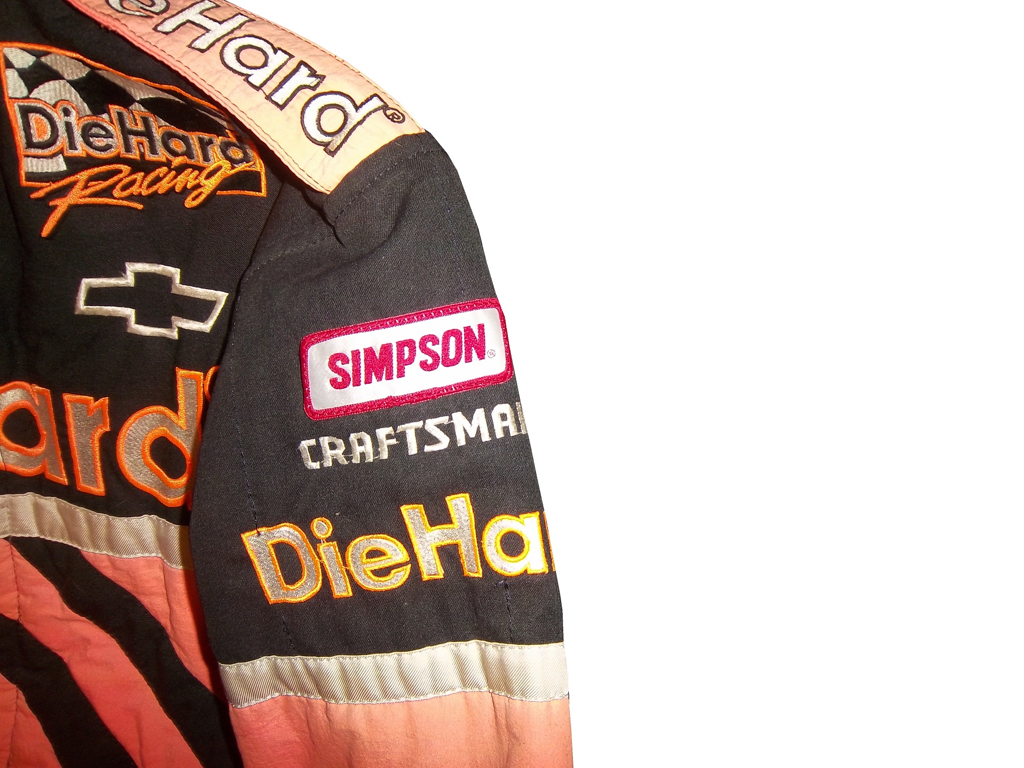
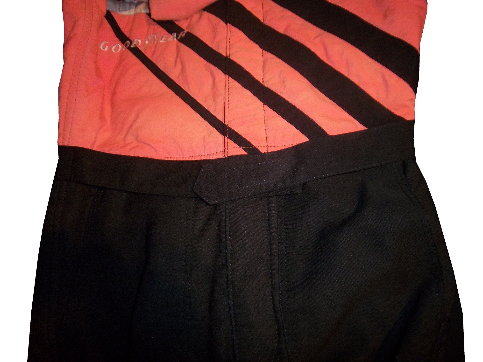
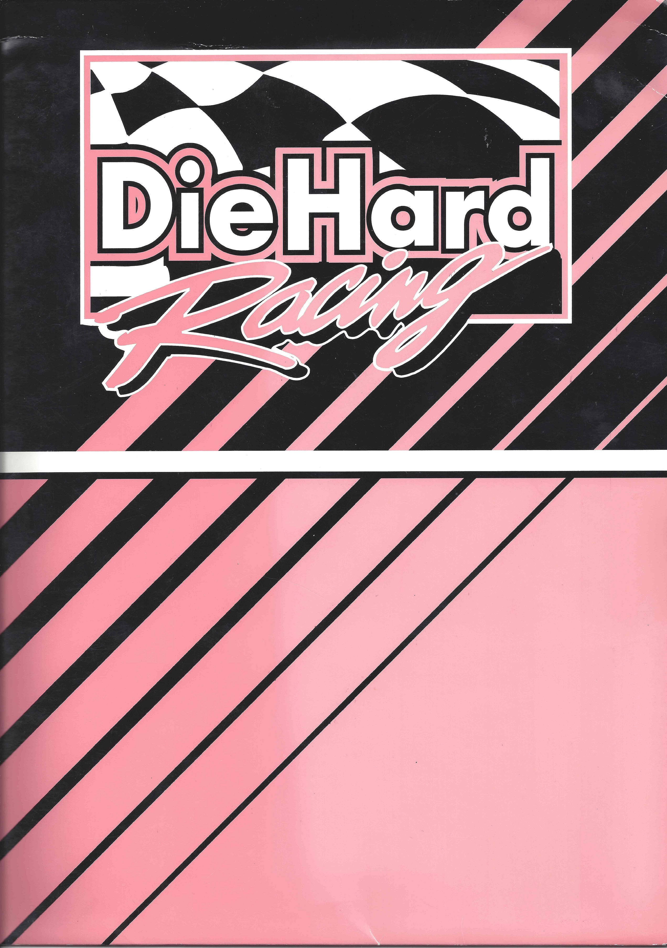
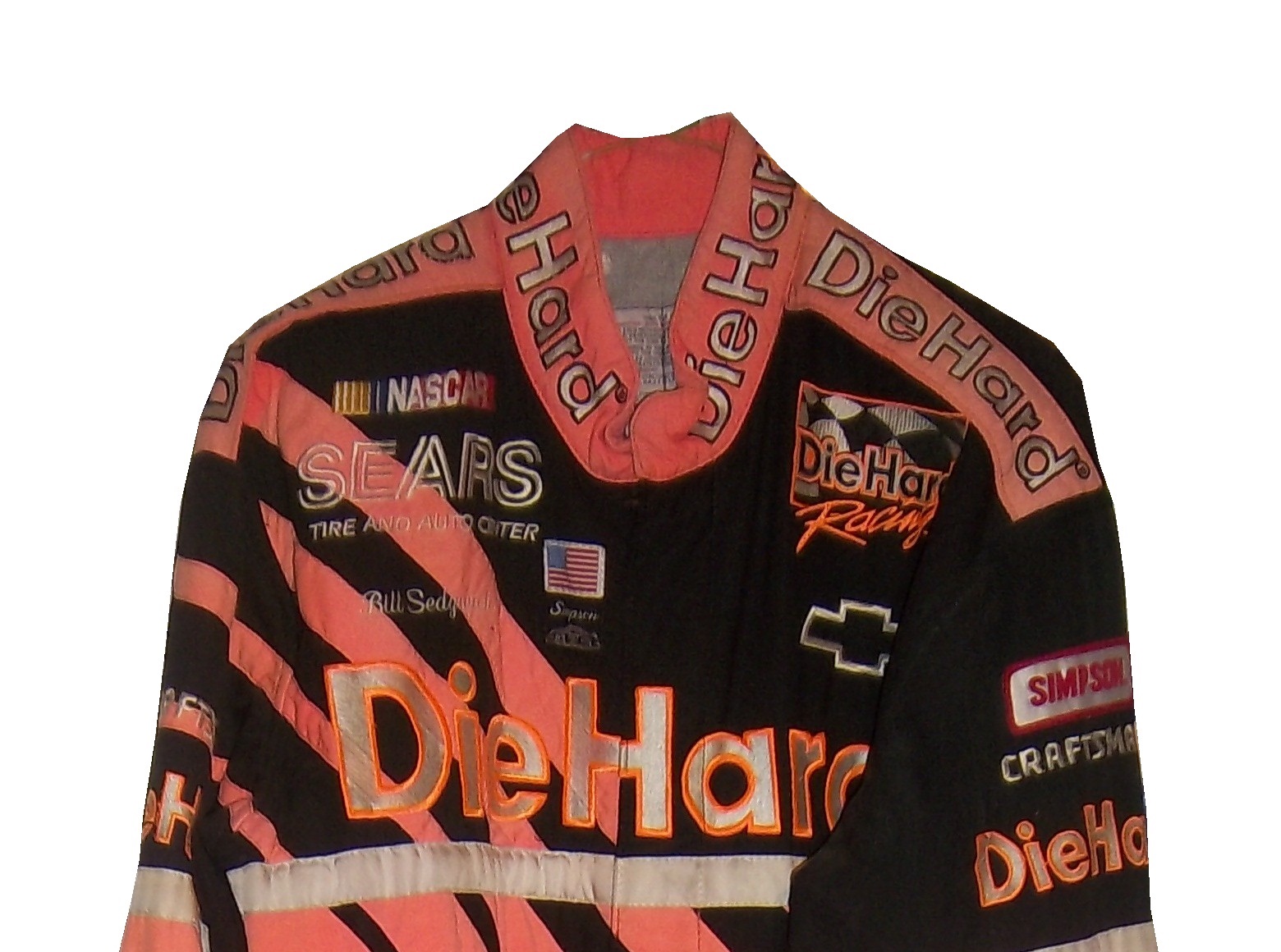
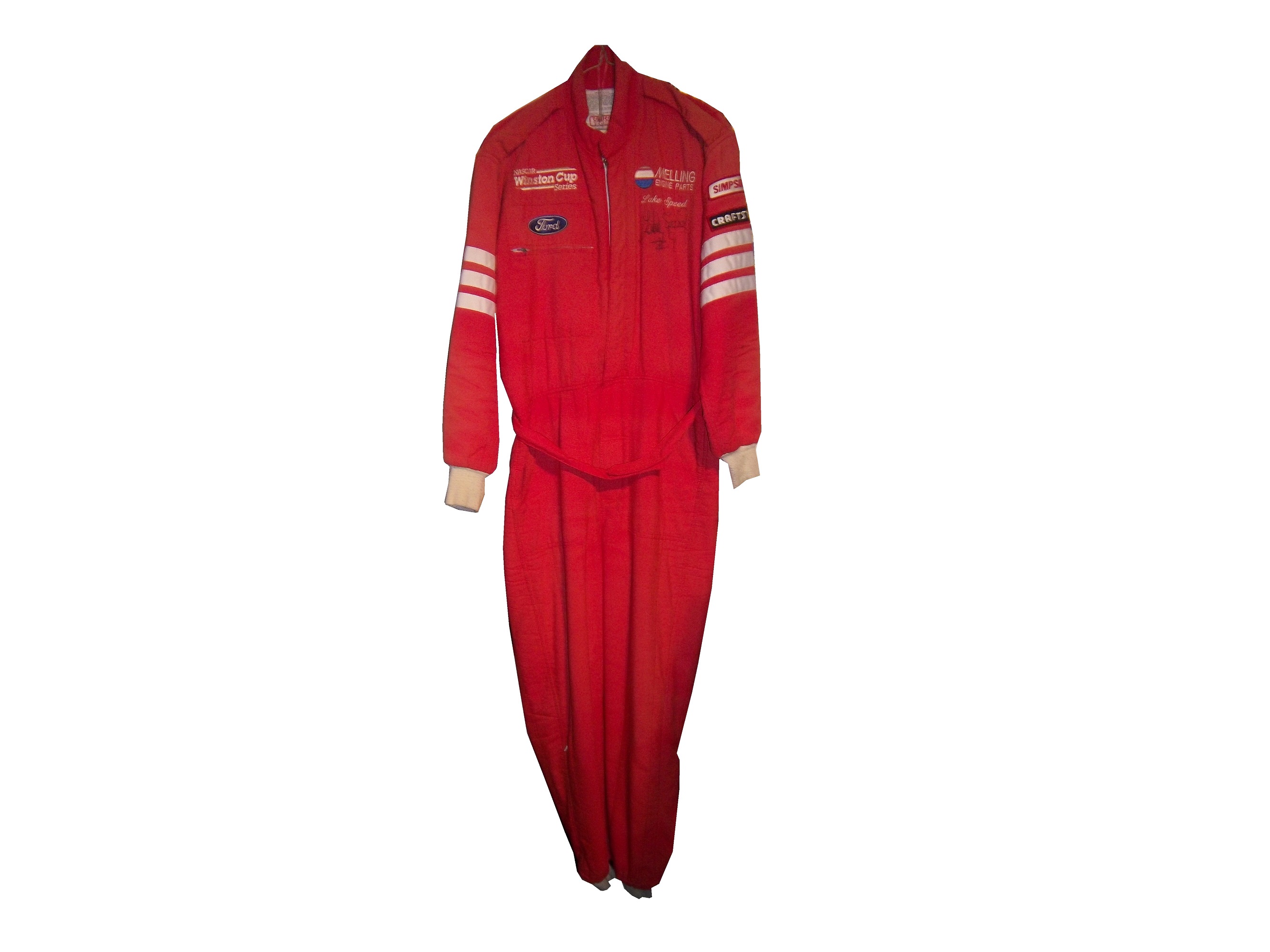
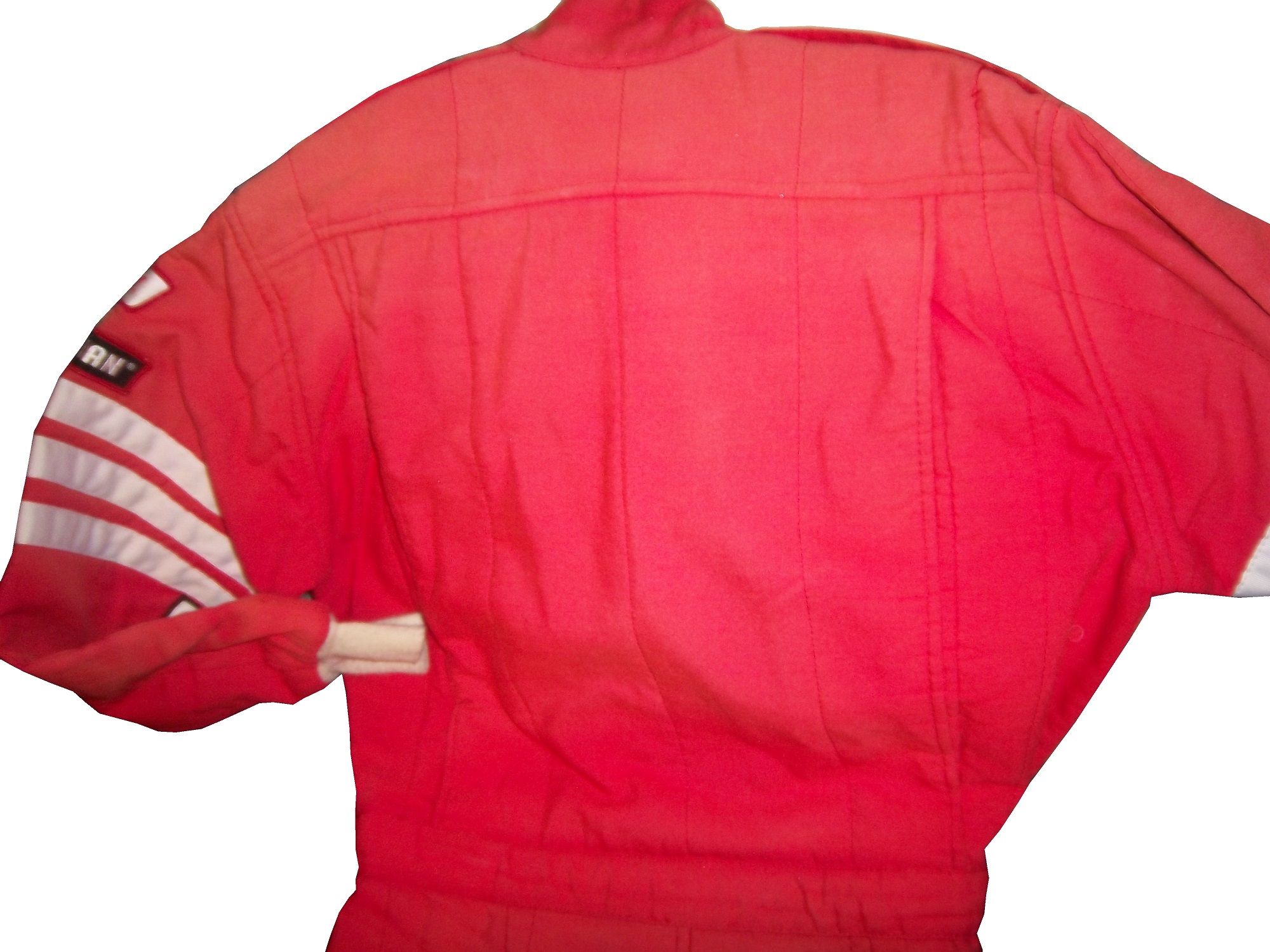
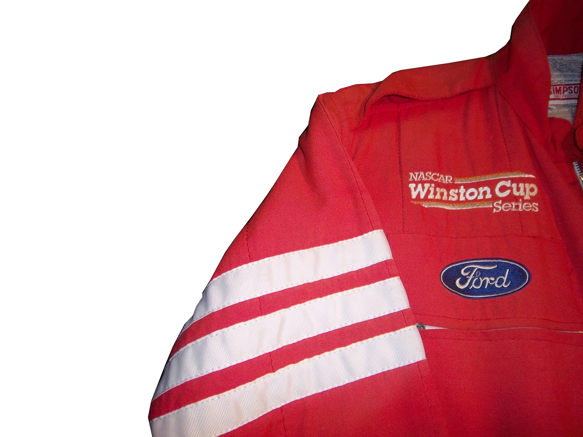
One of the more oddball items I have is this 1987 Budweiser/NHRA driver suit. Here is what I can say definitively about this suit: It was made in 1987, shows a lot of use, is not safety certified, and shows the Simpson open-wheel tag. Other than that, I don’t know much about this suit and I’m still working on it.budweiser budweiser-lchest budweiser-rchest budweiserb budweiser-blogoNow we move on to die-casts. In my die cast article, I mentioned that I have a 1:32 Cruz Pedregon 1998 die cast from his days with Joe Gibbs Racing.pedregon-1 pedregon-2 pedregon-3 pedregon-4 pedregon-5 pedregon-6 pedregon-7 pedregon-8 pedregon-9 pedregon-11 pedregon-10

During my recent vacation, I found myself at a baseball card store. I bought a bunch of NASCAR die casts, as well as a Darrell Alderman 1:24 pro stock from 1997, where the doors open, and the hood comes off.alderman1 alderman2 alderman3 alderman4 alderman5 alderman6 alderman7 alderman8 alderman9 alderman10 alderman11 alderman12Also from 1997, this Tony Pedregon 1:24 funny car die cast, with a body that is removabletpedregon-1 tpedregon-2 tpedregon-3 tpedregon-4 tpedregon-5 tpedregon-6 tpedregon-7 tpedregon-8 tpedregon-9 tpedregon-10 tpedregon-11My personal favorite die cast is this Bob Vandergriff 1:24 top fuel die cast.vandergriff-1 vandergriff-2 vandergriff-3

Now we move from NHRA to NASCAR with…

PAINT SCHEME REVIEWS

Jamie McMurray #1 Cessna Chevy SS  Not the worst patriotic scheme I have seen, but it it a bit overdone.  Giving it a C+

Kevin Harvick #4 Hunt Brothers Pizza Chevy SS  It’s a bit overdesigned, but the green looks good(I hate most shades of green used in NASCAR) and it earns a C

Danica Patrick # 10 GoDaddy Chevy SS  I didn’t think this was possible, but they took one of the ugliest schemes in racing and found a way to make it worse…the hood speaks for itself, and it says “I’m getting an F-!”

Greg Biffle 3M Window Film Ford Fusion What in the blue Hell is going on here?  This is the worst Greg Biffle scheme I have seen this year and considering how bad his schemes have been that is saying a lot.  F-

Travis Kvapil #32 Keen Parts Ford Fusion  Awful color scheme, and the goofy pyscadelic side design just looks awful.  I’m also laughing at corvetteparts.net painted on the side of a FORD!  F-

David Ragan #34 KFC Ford Fusion  Great color choice, smooth look, great all around design, I will give them an A+

Landon Cassill #40 Atlantic Plumbing and Utilities Chevy SS  Good color scheme, and the simple yet attractive design works well.  A

Kurt Busch #41 Haas Made in America Chevy SS  When it comes to patriotic schemes, it is hit or miss, and this is a hit.  The stars and stripes look good, and the overall design is solid enough to earn an A.

Josh Wise #98 DogeCoin Ford Fusion Such colors! Very design! So good! A+

Before I go I need to cover an update to a story I discussed last week.  I had discussed Swan Racing going under due to lack of sponsorship.  I did not get a chance to discuss that Swan Racing has gone under, but the two cars, #26 and #30 have found new homes.  BK Racing is now the new home for the #26, and XXXtreme Motorsports is home for the #30, though it will change to #44, and keep the current owner points.  It is always sad when a team has to close, but at least the equipment did not go to waste.  Sadly, Parker Kligerman is now out of a ride for the foreseeable future.


The Driver Suit Blog-The Sprint Unlimited Preview

By David G. Firestone

The 36th Sprint Unlimited starts tonight at 8:15 ET on Fox. This marks the beginning of the Daytona 500 and the beginning of the NASCAR season. I will be looking forward to it, and I will enjoy it as always.

The field will feature pole award winners and past winners of the event. These include:
· Denny Hamlin (4 poles)
· Kyle Busch (3 poles)
· Joey Logano (2 poles)
· Jimmie Johnson (2 poles)
· Matt Kenseth (2 poles)
· Ryan Newman (2 poles)
· Dale Earnhardt Jr. (2 poles)
· Jeff Gordon (2 poles)
· Carl Edwards (2 poles)
· Marcos Ambrose (1 pole)
· Kurt Busch (1 pole)
· Kevin Harvick (1 pole)
· Brad Keselowski (1 pole)
· Mark Martin (1 pole)
· Jamie McMurray (1 pole)
· Danica Patrick (1 pole)
· Ricky Stenhouse Jr. (1 pole)
· Terry Labonte (past winner: 1985)
· Tony Stewart (past winner: 2001, 2002 and 2007)

The event will feature a number of segments which were voted on by NASCAR fans including myself, and many of you. The first segment will feature laps followed by a second segment of laps, and then a third segment of laps. Many special paint schemes will be run for this race, as is traditional. My personal favorite is the Miller Lite Throwback scheme being run by Brad Keselowski.

Now some factoids about the race.

*There are, in total, Chevy drivers, Ford drivers and Toyota drivers.

*Chevy has 20 wins, Ford has 7 wins, and Toyota has 1 win.

*Mark Martin has competed in 20 consecutive events from 1989-2008.

*Dale Earnhardt Sr. has won 6 events, more than anyone else in 1980, 1986, 1988, 1991, 1993, and 1995 and went on to win the Sprint Cup Championship 4 times in 1980, 1986, 1991, and 1993, he is one of 7 drives to do so.

*From 1979-2011 the event was sponsored by Anheuser-Busch, first called the Busch Clash which was the brainchild of Monty Roberts, brand manager of Busch Beer, who sponsored the Pole Award. It remained the Busch Clash until 1998, when Budweiser took over the Pole Award, and it was renamed the Budweiser Shootout. In 2012, Sprint, the series sponsor took over the sponsorship after Budweiser announced they would drop the sponsorship in favor of sponsoring the Duel Races that determine the starting order of the Daytona 500.

*Petty Enterprises was not eligible to run the Shootout because of a rule stating that only drivers that ran the Busch/Budweiser pole award decal were eligible to enter the shootout. Richard Petty and his family did not support alcohol sponsorship or decals on race cars. So John Andretti, Bobby Hamilton, Jeff Green, and Aric Almirola who all had a number of poles with Petty Enterprises were not eligible to participate. I find it interesting that Petty has reversed course on the alcohol sponsorship rule, since Kasey Kahne was sponsored by Budweiser, and Marcos Ambrose will run at least one race sponsored by Twisted Tea.

*Buddy Baker won the inaugural Sprint Unlimited in 1979, which was a 20 lap sprint.

*Since many top drivers were excluded from the race due to not winning a pole award, they moved to the TV booth as color commentators. These included Dale Earnhardt Sr. in 1981, Richard Petty and AJ Foyt in 1982 and 1983, Neil Bonnett in 1993, Darrell Waltrip in 1994, 1995, 1997, and 1999, and Kenny Wallace in 1998.

*There has never been a driver who has won the Sprint Unlimited, Budweiser Duel and Daytona 500 in the same year. Drivers have won 2 of 3 in a season, but never scored the hat trick.

*One of the first instances of a special paint scheme being used specifically for the Sprint Unlimited was the Chroma Premier scheme run by Jeff Gordon in 1997. He followed it up the next year with the legendary Chroma-lusion scheme, which feature a paint that changed color. Since then, special schemes have become commonplace.

*Richard Childress Racing has 8 Sprint Unlimited wins, most of any team. Hendrick Motorsports has 6 wins, and Joe Gibbs Racing has 5 wins.

The Unlimited starts tonight at 8 PM ET on Fox Sports 1, and I look forward to watching the event as I hope the rest of you do too.

Though I have had a VERY busy week, I still have time for…

Paint Scheme Reviews!

Kasey Kahne #5 Time Warner Cable Chevy SS It is a good color scheme, but the design on the side needs a little tweaking. Get rid of the needless zig-zag pattern and it works a whole lot better. It is still a decent scheme, so I will give it a C

Michael Annett #7 Pilot/Flying J Chevy SS Good color scheme, but the awful template is back for Tommy Baldwin. It is really sad, because this could be a great scheme, but the template takes it from an A to a C-

Michael Annett #7 Accell Construction Chevy SS See Above

Marcos Ambrose #9 Mac Tools Ford Fusion Good color scheme here, and decent design, worth a B

Clint Bowyer #15 AAA Insurance Toyota Camry Great color scheme, good design, worth a B+

Kyle Busch #18 M&M’s Peanut Toyota Camry I like this, it has a great shade of yellow, hard to find in NASCAR these days, and the peanut motif works very well. It is an original design, and I’ll give it an A

Trevor Bayne #21 Motorcraft Ford Fusion  This is why The Wood Brothers won the Paint Schemies and took the top spot in the Paint Scheme Leaderboard.  A++

Joey Logano #22 Autotrader.com Ford Fusion  Sometimes orange works, sometimes it doesn’t.  This is an example of an orange scheme that just doesn’t work.  If the white was taken out completely it might work, but this is just horrid, and I give it an F

Cole Whitt #26 Speed Stick Gear Toyota Camry This is one of the few schemes that has both a classic and modern look at the same time, and paired with a great color scheme, it earns an A

Paul Menard #27 Menard’s/Peak Chevy SS Good design, awful color scheme, D+

Terry Labonte #32 C&J Energy Services Ford Fusion I’ll give it a C+ until I can see a picture WITHOUT an Instagram filter!

David Ragan #34 CSX Ford Fusion  What in the hell is going on here?  Why is the hood decal upside down?  Why in the world would they do that?  Were they drunk when they decaled the car?  The only thing that I can guess is that it is designed for an in-car camera…but that makes no sense either!  F-

David Gilliland #38 Loves Truck Stops Ford Fusion  Good color scheme, decent design, plus unlike David Ragan, the hood decal is in the correct position, A-

Bobby Labonte #52 Phoenix Racing/HScott Motorsports Chevy SS Great color scheme, very simple yet attractive design, can’t say anything bad about it, A+

Michael Waltrip #66 Blue Def Toyota Camry While I like the field motif, it looks too much like the Windows XP Bliss background for me to take it seriously. I’ll give it a B-

Dale Earnhardt Jr. #88 Kelley Blue Book Chevy SS  During my Daytona Preseason Thunder article, I said I wanted to see the #88 they used on a real car.   I got my wish, and I like this design overall.  The metallic gold is a bold choice, it doesn’t always work well.  I give it an A+

BUT WAIT, THERE’S MORE!

As many of you know, I don’t just research and collect driver suits and racing items, I collect and research many other things.  I recently had a column run in Uni-Watch concerning some lettering from the 1958 Washington Senators, and you can read my column here.

The Driver Suit Blog-MOMO and Christian Fittipaldi…A Match Made In Heaven

44-fittipaldiBy David G. Firestone

These last few weeks have been hell in Chicago weather-wise.  I have been under the weather myself, but this week, I wanted to touch on something that I covered in depth last year. After watching the Rolex 24 at Daytona, I learned that MOMO is celebrating its 50 anniversary this year. I first learned about MOMO when I covered Christian Fittipaldi’s Driver Suits back at the beginning of the blog. MOMO is one of the more ubiquitous racing safety companies in racing.sccatrack-blogoMOMO is short for “Moretti-Monza” which is Giampiero Moretti’s last name and Monza, a town in the Province of Milan. Giampiero Moretti was a driver who won the 1998 24 Hours of Daytona. He created a company specifically to make racing products. MOMO has gradually expanded over the years, and is now involved heavily in almost all forms of auto racing.

One thing I have noticed is that MOMO steering wheels are used very heavily in NASCAR. Whenever there are in-car cameras, there is always one located near the ignition behind the steering wheel, and almost every one of them has a MOMO logo on them. They are also very involved in F1, and IndyCar racing in terms of parts. When the best and most recognizable teams in the biggest forms of auto racing all use the same group for their parts, it proves that MOMO is the best in what they do.

I also mention Christian Fittipaldi because he won the Rolex 24 at Daytona in an Action Express Coyote Corvette DP. This is his second win, his first one coming in 2004 in a Bell Motorsports Doran JE4-Pontiac. As covered earlier in the year, I own two Christian Fittipaldi MOMO driver suits. In all honesty, these two suits were my first introduction to MOMO as a brand. MOMO however has a large presence in auto racing.fittipaldiIn the SCCA Miami Grand Prix, these suits were issued to track workers. MOMO stated that these would be fireproofed for one race only. It feels like an old school chemical dipped suit, but I have no proof of that. It does not appear to have been worn, but it probably is not fireproof any more though.sccatrack sccatrackb2014 is the 50th anniversary of what I’m going to call “The dark week,” May 24-30 1964 when the World 600 and Indy 500 took place. Three drivers were killed by fire, which changed the safety culture of racing forever. I will cover that issue in depth later in the season.

Paint Scheme Reviews!

Marcos Ambrose #9 Stanley Ford Fusion Though a tad over designed, the car does has a clean look, and a great color scheme, so I will give it an A-

Marcos Ambros3 #9 DeWalt Ford Fusion See Above

Kyle Busch #18 Skittles Toyota Camry When I first heard about Skittles returning to NASCAR, I thought it would look like this or this, so naturally I was worried, but I like this simple and attractive design. A+

Kyle Busch #18 Peanut M&M’s Toyota Camry Decent scheme, good color scheme, A-

Matt Kenseth #20 Dollar General Toyota Camry My major complaint was the black and silver stripes on the sides were too big and promenent. They solved that issue this season, and the car looks better. In fact, I’ll give it a B!

Jeff Gordon #24 AXALTA Chevy SS Classic Jeff Gordon design, and I like the blue on the flames, and the black flames on the back. A+

Paul Menard #27 Menards/Richmond Chevy SS Love this scheme, great design and color scheme, A+

Paul Menard #27 Menards/Serta Chevy SS Same scheme as last year, same C+ grade

Eric McClure #35 Hefty/Arm and Hammer Ford Fusion Good color scheme, but the car looks over deisgned and it doesn’t look good at all. D+

Kurt Busch #41 Haas Chevy SS Great design and color scheme, A+

Kurt Busch #41 Slate Water Heaters Chevy SS Kurt is running a really good template this year, and this is another example. The condensation design is overdone, and it takes an A scheme down to a B-, otherwise it is a great design.

Aric Almirola #43 STP Ford Fusion This is one of my favorite schemes this year! A classic design, with great colors and a great look earns an A+

AJ Allmendinger #47 Kroger/USO Chevy SS Though the scheme is the same as last year, JTG Daugherty Racing has switched from Toyota to Chevy this season. That being said, I like this scheme, and I will give it an A

AJ Allmendinger #47 Bushes Baked Beans Chevy SS Simple design, great color scheme, A

AJ Allmendinger #47 Kingsford Chevy SS See Above

AJ Allmendinger #47 Scotts Chevy SS See Above

AJ Allmendinger #47 Clorox Chevy SS See Above

AJ Allmendinger #47 Charter Communication Chevy SS I like the overall design, but that is an awful shade of green. Green is not a great color for a race car, neither is yellow, so yellowish-green definitly doesn’t work. I’ll be generous and give it a C-

Joe Nemechek #66 Land Castle Title Toyota Camry If the bottom was a single color stripe, I would give it very high marks, but the over design makes it look awful. C-

Michael McDowell #95 K-Love Ford Fusion Not only is McDowell and Levine Family Racing running a better template this year, the K-Love scheme actually improves on it. I can’t give this scheme anything lower than an A

Carl Edwards #99 Subway Ford Fusion A bad design from last year, earns a D-

The Driver Suit Blog-Two Birthdays in January…

100_4380By David G. Firestone
On the first anniversary of the founding of The Driver Suit Blog I felt it appropriate to analyze the first two NASCAR driver suits I ever bought. I started in the driver suit hobby in March of 2010, with a Bill Sedgwick Die Hard driver suit from the Craftsman Truck Series in 1996. 17-sedgwickI purchased this specific item for a number of reasons, first, it was well within my price range, and second, I wanted a low-end example that I can look at and get a general feel for aspects that I will see in other driver suits.
Some of the stuff I learned from this particular suit helped me understand the very basics of design aspects on race-worn driver suits. Some of the aspects I discovered from that were completely different and it was through subsequent research that I began to understand driver suits more. I have kept it for as long as I have is because I love the suit, and I even though I have had it for almost 4 years, I still find aspects about it that interest me.
The suit is custom designed for Darrell Waltrip’s Craftsman Truck Series team. Sedgwick drove the #17 Chevy C-1500 for the entire 1996 season, whereas Waltrip drove the #5 truck for a very limited schedule. Sedgwick had 3 top 5’s and 8 top 10’s in the 23 of the 24 races that year, and led a total of 8 laps. Sedgwick was released at the end of the season.17-sedgwickThe triple-layer suit is custom designed for Sedgwick, with the Sears Die Hard logos on the collar and shoulder epaulets,17-sedgwick-collar 17-sedgwick-rshoulder 17-sedgwick-lshoulderSears Die Hard logos across the front and Sedgwick’s name on the right chest,17-sedgwick-rchest17-sedgwick-lchestno arm gussets,17-sedgwick-rsleeve1 17-sedgwick-lsleeve1no adornment on the belt,17-sedgwick-beltTV logos and safety stripes on the legs,17-sedgwick-legsTV logos on the sleeves,17-sedgwick-rsleeve2 17-sedgwick-lsleeve2 and a huge logo across the back.17-sedgwickb 17-sedgwickb-logoI purchased a press kit for this suit, which I covered in December, concerning this suit, and I realized that the suit Sedgwick is wearing in the promotional photo is the same suit that is in my collection. I keep the press kit in my authentication binder with the rest of my COA’s and LOA’s17-sedgwick-presskit1 17-sedgwick-presskit3 17-sedgwick-presskit2 17-sedgwick 17-sedgwick-presskit2The other suit I bought, my first Winston Cup suit was a Lake Speed suit from 1997, this one is a bit different. In 1997, Speed was racing for Melling Racing, which in 1997 was a shell of its former self. Melling had 34 victories and the 1988 Winston Cup Championship, but by 1997, they had no real sponsorship, and had not won a race since 1991. During that season Lake Speed didn’t score a top 5, top 10, or victory, and only led 3 laps in the 25 races he raced in that year.9-speedDue to the lack of sponsorship, Speed didn’t have the luxury of having a custom-made suit that season so he wore what appears to be a store bought suit. It looks like the suit was purchased either from a store or a catalog, and customized for Lake’s use. There are no large sponsor logos on the collar,9-speed-collarshoulder epaulets,9-speed-chest 9-speed-lshouldertorso,9-speed-bsleeves,9-speed-rsleeve1 9-speed-rsleeve2 9-speed-lsleeve1 9-speed-lsleeve2or legs.9-speed-legsThe legs have a cuff cut, as opposed to a boot cut like the Bill Sedgwick suit has.
Everyone who has a hobby or an interest started somewhere. With me, it was with these two driver suits. No matter what you do in your hobby, or how high you fly in your hobby, you were a rookie, and you started from somewhere. Never forget where you came from. These two suits are a reminder of what I was, and I love these two.
Before we get to paint schemes, I need to say something to my readers. When I started this project one year ago, I never thought it would take off as much as it did. I have a group of really awesome readers and followers. I also owe a special thanks to Paul Lukas of Uni-Watch, because if I had never written my two articles for Uni-Watch in 2013, I would never have done the research I did for them, and I would never have had the frustration of not finding research from the collector’s perspective, and The Driver Suit would never have been born. To all my readers, from the bottom of my heart, I say thank you! Stay Tuned because 2014 will be even better than 2013!

Paint Scheme Reveiws

Jamie McMurray #1 Cessna Chevy SS Black with silver numbers and white trim looks simple and really good. I can’t say anything bad about this scheme, and bonus points for improving the door number design. A+

Jamie McMurray #1 McDonald’s Chevy SS Same great design as last year, same A grade.

Austin Dillon #3 Dow Chevy SS Take the white stripe down the side off, and it will be a solid A scheme. The white does not look good at all. The red/white/black color scheme works very well, and it is decently designed, so I will give it a B+

Danica Patrick #10 Go Daddy Chevy SS Not only does Go Daddy continue to use the worst shade of yellow in NASCAR, they also have given the worst shade of orange a more prominent role in the car. Givng this car an F is a very fair grade.

Denny Hamlin #11 FedEx Ground Toyota Camry Same scheme as last year, same C+ grade

Denny Hamlin #11 FedEx Freight Toyota Camry Same scheme as last year, same C+ grade

Denny Hamlin #11 FedEx Office Toyota Camry Same scheme as last year, same C+ grade

Denny Hamlin #11 FedEx Express Toyota Camry Same scheme as last year, same C+ grade

Casey Mears #13 Geico Ford Fusion The yellow they use is awful, and the side design is just too loud,  I’ll give it a D

Ricky Stenhouse Jr. #17 NOS Ford Fusion I love this color scheme, however, I don’t love the side design. It has too many different different designs, all of which would work on their own but combined they look like a jumbled mess. I really want to like this scheme, but I just can’t, so I’ll give it a C-

Ricky Stenhouse Jr. #17 Fifth-Third Bank Ford Fusion Everything I just said about NOS applies here. C-

Clint Bowyer #15 5 Hour Energy Toyota Camry Same scheme as last year, same B+ grade.

Kyle Busch #18 M&M’s Toyota Camry Same scheme as last year, same A+ grade.

Ryan Newman #31 Cat Chevy SS New season, new driver, new scheme that looks great and earns an A

Kurt Busch #41 Haas CNC Chevy SS Great color scheme and a very simple desgin look very good here. I also like the matte black used, and the door numbers look really solid. Can’t give this scheme anything less than an A

Kyle Larson #42 Target Chevy SS The scheme looks decent, I like the white on the back, though I do not like the Target logos at the bottom. That takes a scheme that was an A grade to a B-

Brian Vickers #55 Aaron’s Toyota Camry A good scheme, and the 55 lettering looks really good here, and the gold is a nice touch. A

Martin Truex Jr. #78 Furniture Row Chevy SS Simple, and perfect. A+

Dale Earnhardt Jr. #88 Diet Mountain Dew Chevy SS Same scheme as last year, but I never gave it a grade. So here is my analysis Not a great scheme, too much needless design on the side of the car, and the silver background is just brutal. The red lettering on a green background is unattractive at best, and all in all, this is a D- grade.

Michael McDowell #95 Levine Family Racing Ford Fusion This scheme is so much better than last year’s scheme, and just for that I’ll give it a B

Carl Edwards #99 Aflac Ford Fusion This has a terrible color scheme, with lime green, neon blue, black and white. The wing design is not only ugly but would work better starting at the door and working behind.

The Driver Suit Blog-Parts and Recreation

By David G. Firestonepettyrotor1

You know me for driver suits, but i also collect other things besides suits. Aside from helmets and other uniform items, i also collect other race-used items from the cars. Racing is half man half machine, and items from the machine make unique collectibles as well.

One of the most obvious things is sheet metal. Stock cars consist of a roll cage which contains the engine, suspension, and driver compartment. Covering that is what is called “sheet metal” which is a thin metal that has the shape of the car and where the paint scheme is added. The cars are “skinned” after each race. The sheet metal from cars has become a huge collectors market. Pieces can be as small as 1 inch squared, such as this Carl Edwards pieceedwards6, or huge, such as this Sterling Marlin door.marlin

Tires are also popular to collect as well. Tires can be purchased whole, but since they can weigh as much as 90 pounds, they are often cut up and the pieces are sold, like sheet metal. This example, used by Kevin Harvick in the 2002 Daytona 500 is an example. it gives a good example of the thickness of the tire, and the cords are visible as well.harvick-tire1 harvick-tire2  100_4233   This Kyle Petty/John Andretti card has two small pieces of tire, each used by the respective driver in the card. These are popular, and everything from suits to caps, to sheet metal wind up in cards. petty-card1 petty-card2

Race-used lug nuts go hand in hand with tires. Lug nuts are used once, and then sold after the race, such as these Tony Stewart examples. Lug nuts are Super glued to the rim, and one of these still has superglue residue on it.stewartlugnut-1 stewartlugnut-2 stewartlugnut-9

Mechanical components, especially engine components are interesting to collect, as there is no better representation of man and machine than a part of the heart of the machine. For example, I have a brake rotor used by John Andretti in the 1998 Bank of America 500 at Charlotte, which has been signed by Richard Petty. pettyrotor1 pettyrotor2 pettyrotor3 pettyrotor4   This is a set released after Jimmie Johnson won his first sprint cup title back in 2006. johnsongroupIt contains a series of pieces used by Johnson, including a piece of sheet metal from his door,johnsonsheet

a spark plug,johnsonplug

a valve spring,johnsonspring

a piece of the track bar,johnsonrod

and a lifter.johnsonlifter

i also have a spark plug from Morgan Lucas Racing in the NHRAmlr-plug

an ignition coil from Morgan Lucas Racing, which has been signed by Tony Schumacher and Ron Cappsmlr-coil3 mlr-coil2 mlr-coil4 mlr-coil5 mlr-coil6 mlr-coil1 mlr-coil7

and a timing belt from Bob Tasca,tasca-belt1 tasca-belt2

I discussed this pit board from Chad McCumbee earlier in the yearmccumbee-pit-1 mccumbee-pit-2 mccumbee-pit-3 mccumbee-pit-4 mccumbee-pit-5

one last item from the equipment collection is this piece of Daytona International Speedwaydaytona1 daytona2 daytona3 daytona4

Jamie McMurray #1 Cessna Chevy SS Black with silver numbers and white trim looks simple and really good. I can’t say anything bad about this scheme, and bonus points for improving the door number design. A+

Jamie McMurray #1 McDonald’s Chevy SS Same great design as last year, same A grade.

Austin Dillon #3 Dow Chevy SS Take the white stripe down the side off, and it will be a solid A scheme. The white does not look good at all. The red/white/black color scheme works very well, and it is decently designed, so I will give it a B+

Danica Patrick #10 Go Daddy Chevy SS Not only does Go Daddy continue to use the worst shade of yellow in NASCAR, they also have given the worst shade of orange a more prominent role in the car. Givng this car an F is a very fair grade.

Denny Hamlin #11 FedEx Ground Toyota Camry Same scheme as last year, same C+ grade

Denny Hamlin #11 FedEx Freight Toyota Camry Same scheme as last year, same C+ grade

Denny Hamlin #11 FedEx Office Toyota Camry Same scheme as last year, same C+ grade

Denny Hamlin #11 FedEx Express Toyota Camry Same scheme as last year, same C+ grade

Casey Mears #13 Geico Ford Fusion The yellow they use is awful, and the side design is just too lowd, Ricky Stenhouse Jr. NOS Ford Fusion I love this color scheme, however, I don’t love the side design. It has too many different different designs, all of which would work on their own but combined they look like a jumbled mess. I really want to like this scheme, but I just can’t, so I’ll give it a C-

Clint Bowyer #15 5 Hour Energy Toyota Camry Same scheme as last year, same B+ grade.

Kyle Busch #18 M&M’s Toyota Camry Same scheme as last year, same A+ grade.

Kurt Busch #41 Haas CNC Chevy SS Great color scheme and a very simple desgin look very good here. I also like the matte black used, and the door numbers look really solid. Can’t give this scheme anything less than an A

Dale Earnhardt Jr. #88 Diet Mountain Dew Chevy SS Same scheme as last year, but I never gave it a grade. So here is my analysis Not a great scheme, too much needless design on the side of the car, and the silver background is just brutal. The red lettering on a green background is unattractive at best, and all in all, this is a D- grade.

Carl Edwards #99 Aflac Ford Fusion This has a terrible color scheme, with lime green, neon blue, black and white. The wing design is not only ugly but would work better starting at the door and working behind.

The Driver Suit Blog-Paint Scheme Leaderboard Part 4-The Grand Finale

By David G. Firestone

The focus group of one has had its meetings, and has made its decisions.  Here are all 50 teams that ran the Sprint Cup this year ranked first to last on their paint schemes:

#1-Wood Brothers #21-A classic design scheme that just seems to get better with age. The Henry Ford design combines classic and modern elements for an amazing look.

#2-Hendrick Motorsports #48 Jimmie Johnson went with a very classic look, with a day scheme and a night scheme, which worked very well. Johnson did not have a bad look all year.

#3-Michael Waltrip Racing #55 Simple traditional designs. That is the secret to their success on the leaderboard. Color schemes are great as well. Nothing wrong with these schemes.

#4-Furniture Row Racing #78 When it came down to picking a number 1 for Chevy, for both the Paint Schemie and the Leaderboard, I had to flip a coin to pick a number 1, and Johnson won. Kurt Busch ran a series of very solid schemes, not a lot to comment on and it always looks good.

#5-Joe Gibbs Racing #18 Like Jimmie Johnson and Kurt Busch on the Chevy side, the Toyota winner for both the Paint Schemie and Leaderboard was decided by a coin flip. More modern than the 55, all these schemes are good, with amazing paint schemes and really good design.

#6-Richard Petty Motorsports #43 This team combines classic and modern looks, and uses Petty Blue very effectively. The Transportation Impact scheme was not good at all, and kept the 43 team out of the top spot.  Extra Credit for the Maurice Petty Tribute Scheme.

#7-BK Racing #83 Great designs all around, but the hood needs work. Why is it black when the rest of the car is red?

#8-BK Racing #93 See Above, but the Old Dominion scheme drags it down.

#9-Penske Racing #12-Though only raced for one race, the SKF design worked very well. A great color and great design scheme. If this had been raced for multiple races, I would have ranked it higher, but it is still a solid scheme.

#10-Richard Childress Racing #29 The Bad Boy Buggies scheme is bad, and the Rheem/Budweiser combo scheme is awful, but aside from those, Kevin Harvick has had a very good season, paint scheme wise

#11-Earnhardt Ganassi Racing #42 Get rid of the Axe Apollo scheme and the Camouflage scheme, and Juan Pablo Montoya would have the top spot.

#12-Richard Petty Motorsports #9 This set earned a place in the top 5 because it improved by a lot over the course of the season. It has a great color scheme, but the early schemes were not great, but since Stanley redesigned their logo, and made some changes to the car, it is a very nice set.

#13-Phoenix Racing/Turner Scott #51 Guy Roofing and Hendrick Cars are hideous, but apart from that, they have run a great set of paint schemes. Bonus points given for the Neil Bonnett throwback scheme.

#14-Michael Waltrip Racing #56 The Get Back and Give Back scheme is horrid, but the rest of the schemes are really good.

#15-JTG Daugherty Racing #47 Most of what they ran this year was great, but the Bushes Baked Beans car has an odd overall design, and a weird color scheme. The Clorox scheme has a bad color scheme, as does the Charter scheme, as does the Wounded Warrior Project scheme.

#16-Roush Fenway Racing #17 A pinkwashing scheme as well as the Valvoline NexGen scheme kick Ricky Stenhouse Jr. out of the top spot. Sad thing too, as Ricky had a very solid year when it comes to paint schemes

#17-Joe Gibbs Racing #81 Alert Energy is awful. Double Mint is awesome.

#18-Penske Racing #2 While I miss the beer colored wheels from last year, Keselowski has had a decent year, the color scheme is great, though there is too much white on the car. The Redd’s Apple Ale scheme was great, but the Fan Mosaic and Patriotic schemes need some work.

#19-Roush Fenway Racing #16 Greg Biffle had a lot of great schemes, but he had a number of awful ones , including a pinkwashing scheme as well. Get rid of the pinkwashing scheme, the Scotchguard, give blood, and Megulars schemes, and he would be in the top 5.

#20-Richard Childress Racing #27 The yellow is too bright, but other than that, the schemes are really good.

#21-Stewart Haas Racing #14 Some of these schemes are good, others not so much.

#22Hendrick Motorsports #88 Dale Jr. runs good schemes most of the time, but Soldiers of Steel, Orange Amp Energy, and Camouflage are just brutal. Additional points lost for a pinkwashing scheme.

#23-Joe Gibbs Racing #20 If the Dollar General was more plain, and did not have the orange back, I would love to give Matt Kenseth a higher spot, and a pinkwashing scheme does not help.

#24-Earnhardt Ganassi Racing #1 Bad Boy Buggies is even worse here, and the Bass Pro Shop schemes are awful. A number of good schemes here as well.

#25-FAS Lane Racing #32 The Oxy Water scheme, and the gray scale C&J Energy Services schemes do not work, but the rest of the schemes they ran do

#26-Front Row Motorsports #38 The template they run works very well when the color scheme matches that of the sponsor. When it doesn’t match, it looks awful.

#27-Front Row Motorsports #35, See above

#28-Front Row Motorsports #34, See above, aside from the CSX scheme, which looks great, and the Peanut Patch scheme which looks awful.

#29-Tommy Baldwin Racing #36 This team looks better without a primary sponsor than they do with one.

#30-Max Q Motorsports #37 Simple, yet attractive. Would be higher if they ran more races.

#31-Joe Gibbs Racing #11 The Jason Leffler tribute scheme and the FedEx delivery manager schemes are great, but the rest are just awful. I miss the Gen 5 schemes

#32-Nemco Racing #87 The word that can best describe this set is dull. Not bad, but not spectacular.

#33-Circle Team Sport #40 Interstate Moving is really good. Moon Shine Attitude Attire is really awful, and their pinkwashing scheme is even worse.

#34-Roush Fenway Racing #99 Geek Squad and Fastenal work well, the rest…not so much.

#35-Richard Childress Racing #31 A few good schemes but most of them are mediocre at best.

#36-Hendrick Motorsports #24 See Above

#37-Stewart Haas Racing #10 Worst shades of yellow in NASCAR, and the pinkwashing scheme is so much worse.

#38-Michael Waltrip Racing #15 Clint has consistently run cars with great color schemes, but awful designs. Except for Duck Dynasty, and pinkwashing, which are just hideous.

#39-Humphrey Smith Racing #19 Another car that just looks better without a primary sponsor.

#40-Germain Racing #13 Nothing really wrong, but nothing really right with these schemes.

#41-Penske Racing #22 Red and yellow is a really great color scheme, but the design is all wrong. This design gets even worse with the AAA scheme, which has an even better color scheme. The Pennzoil scheme is good, but not good enough to save the set.

#42-Stewart Haas Racing #39 I have to give them credit, their schemes are mostly awful, but at least they are creative.

#43-Tommy Baldwin Racing #7 Worst. Door. Number. Ever. The rest of the car isn’t good either, and a pinkwashing scheme doesn’t help.

#44-Phil Parsons Racing# 98 The schemes come in one of two food groups, bland or awful. Great colors, but the designs are horrid.

#45-Levine Family Racing #95 Worst template in NASCAR.

#46-Hendrick Motorsports #5 Innovation can be a bad thing. This, for example is what happens when you let Karl Benjamin design your cars.

#47-Circle Sport/RCR #33 It amazes me how two different teams can use the same car number, and both can put awful designs on their cars. Special credit for the Honey Nut Cheerios scheme, which is just horrific.

#48-Xxxtreme Motorsports #44 Yuck.

#49-Hamilton-Means Racing #52 Paulie Harraka had a great scheme, but Brian Keselowski…not so much.

#50-Swan Racing #30/26 Please tell me this is an experiment on how to make the worst paint scheme in history? Is Swan Racing competing with Travis Pastrana for the most obnoxious paint scheme in NASCAR?

The Driver Suit Blog-Paint Scheme Leaderboard Part 2- Chevy

By David G. Firestone

Last week, I ranked the Ford teams based on their paint schemes, and this week I will do the Chevy teams and next week I’ll rank the Toyota teams, so without further ado all the Chevy teams ranked from best to worst:

#1 Hendrick Motorsports #48 Jimmie Johnson went with a very classic look, with a day scheme and a night scheme, which worked very well. Johnson did not have a bad look all year.

#2 Furniture Row Racing #78 When it came down to picking a number 1 for Chevy, for both the Paint Schemie and the Leaderboard, I had to flip a coin to pick a number 1, and Johnson won. Kurt Busch ran a series of very solid schemes, not a lot to comment on and it always looks good.

#3 Richard Childress Racing #29 The Bad Boy Buggies scheme is bad, and the Rheem/Budweiser combo scheme is awful, but aside from those, Kevin Harvick has had a very good season, paint scheme wise

#4 Earnhardt Ganassi Racing #42 Get rid of the Axe Apollo scheme and the Camouflage scheme, and Juan Pablo Montoya would have the top spot.

#5 Phoenix Racing/Turner Scott #51 Guy Roofing and Hendrick Cars are hideous, but apart from that, they have run a great set of paint schemes. Bonus points given for the Neil Bonnett throwback scheme.

#6 Richard Childress Racing #27 The yellow is too bright, but other than that, the schemes are really good.

#7 Stewart Haas Racing #14 Some of these schemes are good, others not so much.

#8 Hendrick Motorsports #88 Dale Jr. runs good schemes most of the time, but Soldiers of Steel, Orange Amp Energy, and Camouflage are just brutal. Additional points lost for a pinkwashing scheme.

#9 Earnhardt Ganassi Racing #1 Bad Boy Buggies is even worse here, and the Bass Pro Shop schemes are awful. A number of good schemes here as well.

#10 Tommy Baldwin Racing #36 This team looks better without a primary sponsor than they do with one.

#11 Max Q Motorsports #37 Simple, yet attractive. Would be higher if they ran more races.

#12 Circle Team Sport #40 Interstate Moving is really good. Moon Shine Attitude Attire is really awful, and their pinkwashing scheme is even worse.

#13 Richard Childress Racing #31 A few good schemes but most of them are mediocre at best.

#14-Hendrick Motorsports #24 See Above

#14 Stewart Haas Racing #10 Worst shades of yellow in NASCAR, and the pinkwashing scheme is so much worse.

#15 Stewart Haas Racing #39 I have to give them credit, their schemes are mostly awful, but at least they are creative.

#16 Tommy Baldwin Racing #7 Worst. Door. Number. Ever. The rest of the car isn’t good either, and a pinkwashing scheme doesn’t help.

#17 Hendrick Motorsports #5 Innovation can be a bad thing. This, for example is what happens when you let Karl Benjamin design your cars.

#19 Circle Sport/RCR #33 It amazes me how two different teams can use the same car number, and both can put awful designs on their cars. Special credit for the Honey Nut Cheerios scheme, which is just horrific.

The Driver Suit Blog-Ladies and Gentlemen: The Paint Schemie Awards!

By David G. FirestoneCIMG1130

For the end of the 2013 Season, I will reveal the best  and worst paint schemes and driver suits of 2013. This was done using a focus group of one, namely myself, and uses the following standards:

Color Scheme:How the colors look, and how they work with each other.

Overall Design:How good the design itself looks, is there too much, or not enough.

Primary Sponsor Logos: How the primary sponsor logos look on the car

Originality: How original is the scheme. Note that originality can work both for and against a scheme in award voting.

Let’s get the bad paint scheme awards out of the way.CIMG1130 - Copy

First, the Paint Schemie Award for Worst Single Paint Scheme.

The nominees are:

Dave Blaney #7 Sany Ford Fusion

Clint Bowyer #15 Duck Dynasty Toyota Camry

Greg Biffle #16 Red Cross Give Blood Ford Fusion

Landon Cassil #33 Chevy SS

Austin Dillon #33 Honey Nut Cheerios Chevy SS

Brian Keselowski #52 Star Coach Motor Tours Toyota Camry

And the Paint Schemie Award for worst single paint scheme goes to…

BRIAN KESELOWSKI #52 STAR COACH TOYOTA CAMRY

The next Paint Schemie Award is for Exhibition Race Paint Schemes. This category is a little different, as the Schemies will go to the best and worst special scheme that was run in either the Sprint Unlimited, the Sprint Showdown or the Sprint All-Star Race.

The Paint Schemie Award for Worst Exhibition Race Paint Scheme Goes To:

BRIAN KESELOWSKI’S SPRINT SHOWDOWN SCHEME

The Paint Schemie Worst Dressed Driver Award goes to

Joey Logano

Our next category is the Award For Worst Scheme Set of 2013, which is given to the team that consistently runs bad paint schemes throughout the season.

The Nominees Are:

David Stremme #30 Toyota Camry

Scott Riggs #44 Ford Fusion

Carl Edwards #99 Ford Fusion

The Winner for Worst Scheme Set of 2013 goes to:

DAVID STREMME #30 TOYOTA CAMRY

The Paint Schemie Award for Most Degraded Paint Scheme goes to Kasey Kahne, who’s scheme from 2013 is much worse than that of 2012.CIMG1130

Now the nominees for Best Single Paint Scheme are:

Kyle Busch #18 Doublemint Gum Toyota Camry

Trevor Bayne #21 Motorcraft/Quick Lane Ford Fusion

David Ragan #34 CSX Play it Safe Ford Fusion

Juan Pablo Montoya #42 Target Chevy SS

Jimmie Johnson #48 Lowes Chevy SS

David Reutimann #83 Burger King/Dr. Pepper Toyota Camry

The Paint Schemie Award for Best Single Paint Scheme Goes to

KYLE BUSCH #18 DOUBLEMINT GUM TOYOTA CAMRY

The next two Paint Schemie Awards are for Best Exhibition Race Paint Scheme, and Worst Exhibition . These are a little different, as they will go to the best and worst special scheme that was run in either the Sprint Unlimited, the Sprint Showdown or the Sprint All-Star Race.

And taking these schemes into consideration, the Paint Scheme Goes To:

JIMMIE JOHNSON’S SPRINT UNLIMTED SCHEME!

The Paint Schemie Award for Most Improved Paint Scheme goes to:

Kevin Harvick

who improved his schemes from 2012 to 2013

The Paint Schemie Best Dressed Award goes to:

Jimmie Johnson

Now, our final Paint Schemie Award, The Best Scheme Set of 2013:

Now for this, I will take a look at the best Chevy Schemes, followed by Ford, and then Toyota, and then finally I will reveal the winners of the Paint Schemie Awards.

And now, the 5 best Chevy teams that have consistently run great schemes:

#1 Jimmie Johnson The classic design that is paired with different color schemes every once in a while works very well. The design gives the car a very clean look, and is a very timeless look.

#2 Kurt Busch Furniture Row Racing’s “less is more” approach works very well here, with a matte black, white lettering and red letters. They always look good, thought I wish their results on the track were as good as they look.

#3 Kevin Harvick Kevin has had, for the most part, done quite well. All of the schemes have great color schemes, and most have great sponsor logos, and are decently original. Originality works well here, but some of the overall designs, namely the Bad Boy Buggies and Rheem/Budweiser combination schemes need a lot of work, but otherwise Kevin Harvick has had a great season paint scheme wise.

#4 Juan Pablo Montoya The Target scheme is very solid, with great colors, great overall design, and great sponsor logos. Not original, but solid. The most original scheme is the Axe Apollo scheme, but that was just brutal. It had a decent color scheme, and a decent sponsor logo, but the whole outer-space motif just did not work. If Axe Apollo was not on the car this year, Juan would be at the top of the standings.

#5 Phoenix Racing/Turner Scott Motorsports A team that has a very consistent track record when it comes to good color schemes, originality, as well as primary sponsor logos, the team can sometimes have serious issues with overall design. The Hendrick Cars scheme, and the Guy Roofing scheme are just brutal in that category.

Moving on to Ford.

#1 Trevor Bayne The Wood Brothers haven’t run a full schedule this year, but when they have shown up, they have always looked good. The schemes are original, since the Wood Brothers used these schemes for many years, and the colors, overall design, and sponsor schemes are always great.

#2 Aric Almirola The Transportation Impact scheme is keeping Almirola from the top spot, because it does not fit the team at all, and it just looks brutal. Other than that scheme, which while original, has awful colors, and overall design, every scheme they ran is solid, with the STP/Farmland scheme almost making up for Transportation Impact.

#3 Sam Hornish Jr. His one and only appearance in the Sprint Cup came at Kansas this year, and this one scheme, with great colors, great overall design, and great sponsor logos worked very well. I gave him 3rd, since everyone else on the list ran full schedules, and he only ran one race.

#4 Marcos Ambrose The Mac Tools scheme looks odd, with a great color scheme, but iffy overall design. The Stanley logo redesign could have worked well, but the black covering the front and headlights does not enhance the look at all. I was not a fan of this scheme at the beginning of the year, but some slight adjustments to the color scheme worked well.

#5 Ricky Stenhouse Jr. A “pinkwashing” scheme makes an appearance, which takes away from the overall grade. That said, this team has great color schemes all year, but some of the overall designs have a bit too much noise. Sponsor logos work well, and Ricky has had a great year.

Last, but certainly not least is Toyota.

#1 Michael Waltrip/Mark Martin/Brian Vickers Every scheme they have run has been a hit, with great color scheme, great overall design, great sponsor logos, and decent originality. No bad schemes here!

#2 Kyle Busch Overall great design, color schemes, and primary sponsor logos, Kyle also has the most original schemes of the top contenders for the Paint Schemie awards. That said, the Mprove America needs a different shade of blue, while the white Interstate Batteries scheme could use a different color besides white.

#3BK Racing Great color schemes, sponsor logos, and overall design. These designs work well, except for the Old Dominion scheme, which is just awful. Everything that the other schemes are, Old Dominion is not, and it is keeping BK Racing out of the top spot.

#4 Martin Truex Jr. Overall, this team works well when it comes to colors, overall design, originality, and primary sponsor logos, except for the camouflage scheme. The camouflage scheme was awful, and it knocked Martin out of the top spot.

#5 JTG Daugherty Racing Most of what they ran this year was great, but the Bushes Baked Beans car has an odd overall design, and a weird color scheme. The Clorox scheme has a bad color scheme, as does the Charter scheme. If these schemes were fixed, there is no reason why JTG Daugherty could be in the top spot.

Now I will take these top contenders, and rank them in order from worst to best. These top contenders should feel very proud that they have earned a spot on the countdown.

#15 Ricky Stenhouse Jr.

#14 JTG Daugherty Racing

#13 Martin Truex Jr.

#12 Phoenix Racing/Turner Scott Motorsports

#11 Marcos Ambrose

#10 Juan Pablo Montoya

#9 Kevin Harvick

#8 Sam Hornish Jr.

#7 BK Racing

#6 Aric Almirola

#5 Kyle Busch

#4 Kurt Busch

#3 Michael Waltrip/Mark Martin/Brian Vickers

#2 Jimmie Johnson

And Finally The Paint Scheme Award for Best Paint Scheme Set of 2013 goes to:

#1 Trevor Bayne

Congratulations to everyone who won a First award, and to everyone who won a Worst award…paint your cars better!

To conclude the Paint Schemie Awards, I will finish with a top 10 list I have been wanting to do for quite a while.  These are the

TOP 10 SPONSORS I MISS IN NASCAR

10 Skoal Bandit The shade of green they used was one of the best, and the car has a classic look that always looks good.

9 Kodiak  A simple look, with my all-time favorite shade of green ever used on a race car.  I have a lot of Kodiak race-used items, and they all look good.

8 Miller Genuine Draft  Rusty’s MGD scheme had a much simpler design than the Miller Lite scheme, and it had a much better color scheme.  I really hope they throwback to this scheme at some point.

7 Tide  Are there any orange schemes that could ever live up to Tide?  No, this is the best orange scheme in the history of auto racing.

6 Smokin’ Joe’s  It had a great color scheme, and it had a very 1990’s design, that oddly enough still looks attractive.

5 Western Auto/Parts America   The chrome numbers, the layered fading, the color scheme, it just comes together very well.

4 The Family Channel  The logo is awesome, the colors can’t be any better, the lettering is great, and it just comes together very well.

3 Kodak  If there is or was a better shade of yellow in NASCAR, I haven’t seen it yet!

2 Texaco/Havoline  Great simple design, with an amazing hood logo, and great color scheme.

1 GM Goodwrench  This scheme is, in a word, perfect.  It doesn’t evolve, it doesn’t have to.  It is simply perfect.

There is one last piece of business that I need to address.  I like to keep it light on the Driver Suit Blog, but sometimes I have to address a news story that is heavy, like this story that was released on Thursday.  Dario Franchiti, who has won 3 Indy 500’s, 4 Indycar Championships, and 21 races announced on Thursday, that due to injuries sustained at the Shell and Pennzoil Grand Prix of Houston on October 6.  During that race, he was involved in a scary wreck, and suffered spinal and knee injuries that doctors have told him are too serious to resume his career.  13 fans, who were in the wrong place at the wrong time were injured in the wreck as well. I’m saddened that a talented driver had his career end like that, and I really wish it didn’t have to.  But what I really hope is that IndyCar learns what lessons need to be learned, and make changes to safety so that the chances of this scenario repeating are lowered.  I know that there will always be the risk of injury or death in auto racing, that adds to the mystique of the race car driver, but every wreck has a story to tell.  These stories should be looked over, and changes made so that another talented in the prime of his career does not have to go through what Dario had to this week.  Fans should also be able to go to a race, and not have to worry about getting hurt during a wreck.  If the investigation in this  incident results in changes that keep fans and drivers from serious injury in the future, than the lessons have been learned. My thoughts and prayers are with Dario and his Family right now.

The Driver Suit Blog-The Helmet Stripe-An Unusual Place For Sponsorship

By David G. Firestone14ALast week, I had a column run on Uni-Watch, and I delayed this article until this week.  Two weeks ago, we discussed visors, this week, we will discuss what has become known as the “helmet stripe.” Helmet stripes came from IndyCar and Formula 1 cars, which are open cockpit cars. Helmets are clearly visible to television cameras and fans. As a direct result, helmet design in Formula 1 has become its own unique art form. Helmet designs become a part of the driver identity. The other thing that these open cockpits allow is for sponsorship opportunity. As such, a small opaque stripe is used on helmet visors.lepage-4In NASCAR, the visor was slow to arrive. This is due to two reasons, first, many drivers up until the mid 1990’s chose to wear open-faced helmets. While these helmets had a shade to help keep the sun out of a driver’s eyes. While sponsor logos do show up, they were used for the driver’s name. This Brad Noffsinger example from 1988 is an example of that.Noffsinger-4The second reason that helmet stripes were slow to come to NASCAR is that in-car cameras, while used, were for many years positioned in such a way that the visor would not be seen. Even if helmets were painted, the visor had no stripe. When the in-car cameras were positioned to film the driver from the side and even from the front, the helmet stripe became the standard. The stripe is designed to fit over the part of the visor that overlaps the opaque part of the helmet, as this example shows.musgrave2 musgrave3Helmet stripes have become standard. To show how it affects the overall look of the helmet, I took this Kevin Lepage helmet from 1999, and edited the pictures to show how it looks. lepage-2  lepage-4  lepage-6Not bad, but let’s compare it side by side to the original helmet…lepage-7 lepage-8 lepage-9Helmet stripes have become a unique way for a driver to customize a helmet, as this video shows:

Facebook pages and Twitter helmets are becoming standard on these. All visors that a driver would wear on a helmet have these stripes, which is standard, as visors are changed on a regular basis, and sponsors want the advertising space that they pay for.

Paint Scheme Reviews!

Because of the Uni-Watch article last week, I didn’t get to review paint schemes.  Within the last couple of weeks there were a large number of 2014 paint schemes released. Now I know that many of these will change before the start of the 2014 season, but I will grade them anyways.

Brad Keselowski #2 Miller Lite Ford Fusion  Same scheme as this year, same grade, C

Kevin Harvick #4 Budweiser Chevy SS Same Scheme as last year, same grade, A

Kevin Harvick #4 Jimmy John’s Chevy SS  They improved one of the best schemes in NASCAR and went from an A to A+

Kevin Harvick #4 Outback Steakhouse Chevy SS The color scheme remains the same but red takes over from beige as the primary color, which gives the car a great look, and an A grade

Kasey Kahne #5 Great Clips Chevy SS Same scheme as this year, same D+ grade

Kasey Kahne #5 Pepsi Max Cheyv SS Same scheme as last year, same F grade

Marcos Ambrose #9 Stanley/DeWalt Ford Fusion Great color scheme, though the nose, and quarter panel design are over done. Even still, I give it a B-

Marcos Ambrose #9 DeWalt/Stanley Ford Fusion See Above

Tony Stewart #14 Bass Pro Shop/Mobil 1 Chevy SS I get that two companies with different desgin schemes are sharing the car, but this is just brutal to look at. The orange and camo contrast is hideous, and the overall design is overdone. C-

Tony Stewart #14 Mobil 1/Bass Pro Shop Chevy SS The white and black contrast just looks awful! I really hope this changes before the season starts, because this is a scheme that is painful to look at. I have to give it an F

Tony Stewart #14 Code 3 Associates/Mobil 1 Chevy SS As bad of a color scheme as this is, it is certainly better than the other two Tony Stewart schemes are. That said, the color scheme warrants an F while the design warrants an A, so I’ll split the difference and give it a C

Greg Biffle #16 3M Ford Fusion This scheme is a MAJOR improvement over this year’s design! All of the pointless noise on the door is gone, and the car has a very smooth look because of it, and I have to give this design an A

Ricky Stenhouse Jr. #17 Nationwide Insurance Ford Fusion Great color and design schemes, though the white on light blue lettering and logos are hard to see. Even still, I have to give it an A-

Joey Logano #22 Shell/Pennzoil Ford Fusion Same scheme as last year, same grade, D

Joey Logano #22 AAA Insurance Ford Fusion  See Above

Jeff Gordon #24 Pepsi Max Chevy SS I gave this scheme a C-, but given the *ahem* other Pepsi Max scheme, I’ve reconsidered, and I will give this scheme a B

Ryan Newman #31 Caterpillar Chevy SS  An improvement on an already good scheme, A+

Aric Almirola #43 Smithfield Foods Ford Fusion If the hood and front were done in the stars design, and the rest of the car was red and white striped, it would look better, and I would be able to give it more than a C+

Jimmie Johnson #48 Lowes Chevy SS Supposidly, this will be the main scheme for the whole season, and I have to say it looks amazing, and is an A+ grade

Jimmie Johnson #48 Lowes/Kobalt Chevy SS This will be run for a few races, and it is an A+ scheme.

Carl Edwards #99 Fastenal Ford Fusion Same scheme as last year, same A grade

Carl Edwards #99 UPS Ford Fusion No redeeming features whatsoever, F-`

Now on to new 2013 paint schemes…

Jamie McMurray #1 Cessna/Auburn University Chevy SS The white hood and roof just look aukward, compared to the black covering the rest of the car.  That said, it is still a decent scheme, and I’ll give it a B

Dave Blaney #7 Breast Cancer Awareness Chevy SS Pinkwashing is an automatic F

Marcos Ambrose #9 Bostitch Ford Fusion The 2014 scheme is previewed here, and I’ll give it the same B- grade I gave the 2014 scheme.

Landon Cassill #33 T-Mone Chevy SS This is a perfect example as to why only one person should design a car.  It looks like it took at least 3 people to design the car, each with a different idea as to what the car should look like.  And in the end it is just a mess, and not even a good color scheme can give this scheme a passing grade.  F

David Ragan #34 Safercar.gov Ford Fusion  See Above. F

JJ Yeley #36 United Mining Equipment Chevy SS Even if I didn’t give pinkwashing schemes an automatic F, this scheme would get an F anyway, it just looks awful

Kyle Larson #51 Target Chevy SS Simple, yet attractive, and it earns an A

Kurt Busch #78 Wonder Bread Chevy SS  To celebrate the return of Wonder Bread, Kurt is going to channel Ricky Bobby, except for one difference…this scheme is a lot better than the Ricky Bobby Scheme.    No flames and the baloons coming from the brake duct are a great look for this car, and it earns an A

Dale Earnhardt Jr. #88 Mountain Dew/Xbox 1 Chevy SS  It has a great color scheme, and that is the nicest thing I can say about it.  The design is just awful, and it looks like it will give people seizures as it drives around the track.  I give it an F

Blake Koch #95 Supportmillitary.org Ford Fusion Eww…Too much going on, with the over-sized camo in too many different colors, and the door design which is awful. F-


The Driver Suit Blog-Collar Guard…Not a Product, but a Safety Feature.

1-lajoie-collarBy David G. Firestone

Like shoulder epaulets, the collar of a driver suit has made a transition. It has gone from safety accessory to fashion piece, but unlike the epaulet, it is not only ornamental. Because the collar is still a piece of safety equipment. It goes without saying that fire is an ever present danger in auto racing. The collar protects the neck from burns. This may seem minor, but many people who die from burns die from infection. When the skin is compromised, it can’t stop germs from getting inside the body, and as such makes infection a serious risk during burn injuries.

But the fashion aspect of collars is interesting as well. With the standard alignment of sponsors on the top of the suit, the Series logo, tire manufacturer logo, car manufacturer logo, and other sponsor logos are on the top, and the primary sponsor logos are present on the collar and epaulets. This Randy Lajoie example shows how the suit appears during an televised interview:1-lajoie-fNote a couple of things: First, the fabric on the collar overlaps just a bit here, but when the driver wears it, it meets perfectly at the center of the neck. Second, it allows the driver to breathe easily. Comfort Vs. Safety is a constant debate. This is one kind of collar, the other kind of collar is what I call the Velcro collar, as shown in this Alex Barron suit from 1998:36-barron-collarThe Velcro collar is exactly what it sounds like, a collar with a strap which Velcros shut. This provides a little more protection in case of fire. It also has another use, as sponsor ads are popular to put on the front of the Velcro strap. This has been used quite often over the years…41-craven-collarbarber-collar This is due to the fact that for quite some time the open face helmet was used, and the collar provided extra fire protection where the helmet failed. In this day in age, helmets come standard with Nomex socks on the bottom, so the collar, while still a key safety feature, is not as critical. But for sponsor logo placement, it really can’t be beat.

If the collar does not have a Velcro closure, then the primary sponsor logo is sewn into either side of the collar. Like the Lajoie example above, or this Mike Skinner example below, this can be used very effectively as a place for sponsor logos.31-skinner-collarLike most other aspects of the driver suit, the choice of Velcro or not comes down to driver preference. Kyle Bush, as well as older brother Kurt favor the Velcro style, whereas Tony Stewart and Carl Edwards prefer the non-Velcro variety. Many pit crew shirts have a similar design to the driver design as well.

Editor’s note: For the next two weeks I will be on a very badly needed vacation. I will still have articles ready to go, but I won’t be commenting on up do date issues until I get back. I will still check in from time to time.

Moving on to paint schemes…

Denny Hamlin #11 FedEx Express 2005 Toyota Camry Done as a memorial to Jason Leffler, this is a replica of the scheme that Leffler ran in 2005 during FedEx’s first season as a full-time NASCAR sponsor. It is very faithfull to the original scheme. It also has a great design and color scheme, and earns an A

Greg Biffle #16 3M/Give Kids a Smile Ford Fusion The same bland paint scheme that I described as “There’s nothing really wrong here, but nothing really right here either.  The side design looks forced, the black roof is idiotic, the color scheme is good, but the number design looks too cliche.  It makes no sense, but 3M schemes never do.” It has a small Give Kids a Smile logo on the hood, that is all but invisible. I gave it a C and it will stay at a C.

David Stremme #30 Window Wax Toyota Camry Ugh! This is bad, I can live with the color scheme, but the design is bad. It gets a D

Austin Dillon #33 American Ethanol Chevy SS While I hate the shade of green used here, this scheme looks pretty decent. The designs around the front brake vent are unnessicary, but I still like them. If the green were a bit darker, I could give it a better grade than a C+.

AJ Allmendinger #47 Charter Toytoa Camry The hood design is interesting here. It is designed in the same light as television logos on driver suits. It is a unique idea that works and I hope will catch on. The color scheme is great, and I love the overall design. A

Brian Vickers #55 Aaron’s/Louisville Cardinals Toyota Camry The color scheme is good, but the Fruit Stripe Gum design seen on the Louisville Cardinals shorts is ugly. The whole Zubaz design scheme is horrible on sports uniforms, and even worse on this car. I have nothing against the Louisville Cardinals, but this is horrible. F

Dale Earnhardt Jr #88 National Guard Solider of Steel Chevy SS Solid simple scheme with good colors, but the Superman Logo on the hood is next to invisible.