The Paint Scheme Ranking Executive Committee met this week to rank Toyota. I worked while Alejandro amused himself with a bottle cap. Now here are the rankings, and you already know what NR stands for, so I don’t have to explain it.
1-Michael Waltrip Racing #55 Rank Last Year: 1st of 14-The color schemes are good, and the design schemes work very well.
2-Joe Gibbs Racing #18 Rank Last Year: 2nd of 14-The zebra stripe Interstate Battery scheme wrecks a perfect score for Kyle this year.
3-BK Racing #23 Rank Last Year:NR-The Dip Your Car scheme is awful, but the rest of the schemes are very good, and are very attractive.
4-BK Racing #26 Rank Last Year:14th of 14-Bully Hill Vinyards is an over-designed joke with an awful color scheme. The yellow numbers on the Burger King scheme are awful, but the rest of the schemes are good, and defendable.
5-RAB Racing #29 Rank Last Year:NR-Good color scheme, mediocre design scheme.
6-Joe Gibbs Racing #11 Rank Last Year:9th of 14-The Autisim Speaks scheme works well. The zipper scheme is decent, but odd. Sport Clips is over-designed, but with a good color scheme. The FedEx schemes have decent color schemes, but are over-designed on the front.
7-BK Racing #83 Rank Last Year:3rd of 14-VooDoo Barbecue is an over-designed mess. Dip your car is terrible, as is Zak. Burger King and Borla work well though.
8-Joe Gibbs Racing #20 Rank Last Year:8th of 14- Can all be summed up with medicore color schemes and mediocre design schemes
9-Swan Racing #30 Rank Last Year:14th of 14-The only time the car looked good was when it was unsponsored, but compared to last year’s design it looks amazing!
10-BK Racing #93 Rank Last Year:4th of 14-The Support Millitary scheme is the worst, and although Burger King, Dr. Pepper, and Iowa City Chop House do make up for it, it just isn’t enough.
11-Identity Ventures Racing #87 Rank Last Year:NR-300 is a mess, and Morris,Hardick and Schinder/SmartBen looks too dull.
12-Michael Waltrip Racing #15 Rank Last Year:11th of 14-The Peak scheme is defendable, the color scheme is good, but the rest of the schemes are just awful.
After a hectic Thanksgiving week, I can now report that Austin Dillon, Kasey Kahne, Denny Hamlin, Ryan Blaney, and Joey Logano all have new schemes ready.
Now we move on to the final paint scheme grades of 2014.
Reed Sorenson #36 Feed The Children/Dei Fratelli Tomatoes Chevy SS I like the general appearance, and the color scheme is really good for racing. The one thing that bugs me about this scheme is that for no apparent reason, the Dei Fratelli Tomatoes logo is bigger on one quarter panel than the other. It doesn’t look good small. I’ll give it a B+
Justin Allgaier #51 Brandt International Chevy SS I get the map motif of the scheme. The yellow on red would normally be a great color scheme, but this just looks like a jumbled up mess. I do like the flags at the bottom, and the Thai translation of “Professional Agriculture” is a nice touch. I’ll give it a B+
Now we move on to the 2015 Paint Scheme Tracker, and while Clint Bowyer did release his old scheme from 2014, it still looks amazing on his 2015 Toyota.
I want to clarify something that I stated last week. My rule for pinkwashing is an automatic F. After a few people pointed out to me that almost everyone is wearing a pink ribbon, I’ve made the decision not to factor a pink ribbon into the grades. That said, pink lettering, numbers, or background will still earn an automatic F. Let’s get to the reviews.
Denny Hamlin #11 FedEx One Rate Toyota Camry Um…huh? Someone explain to me what black leather and zippers have to do with FedEx? It’s not a bad design, though I could have done without the green at the bottom, so I’ll give it an A-, but I don’t get why they used that design at all.
Kyle Busch #18 M&M’s Halloween Toyota Camry M&M’s always have great Halloween schemes, and this is no different. Orange and black are always a good scheme, and the design fits both M&M’s and Halloween very well. I’ll give it an A+
Terry Labonte #32 C&J Energy Services Ford Fusion Terry is making his 890th start at Talladega, and this scheme is in honor of that. This is now, officially, my all-time favorite throwback scheme. The driver side is designed to look like his Kellogg’s scheme when he won the 1996 Sprint Cup Championship, and the passenger side is designed to look like his 1984 Championship winning Piedmont Airlines scheme. I couldn’t say anything bad about this if my life depended on is, A+
Landon Cassill #40 Thunder Coal Chevy SS Between the paint scheme grades for last week, and the race at Charlotte, Cassill picked up Thunder Coal as a sponsor. The logo works well on a white background, and the car has a clean, smooth look that earns an A+
Michael Waltrip #66 My AFib Story Toyota Camry Ok, this one needs some explaining. Michael Waltrip suffers from Atrial fibrillation or AFib, an abnormal heart rhythm. He is working with The American Heart Association to inform people about AFib, and this scheme features pictures of those who have shared their stories about dealing with the disease, and I have to give this an A+ for that. It also doesn’t hurt that the color and design schemes are really good too!
Josh Wise #98 Provident Metals Ford Fusion A much more scaled down version of the paint scheme, which is much smoother and better looking. It has a great color scheme, so I’ll give it a B+.
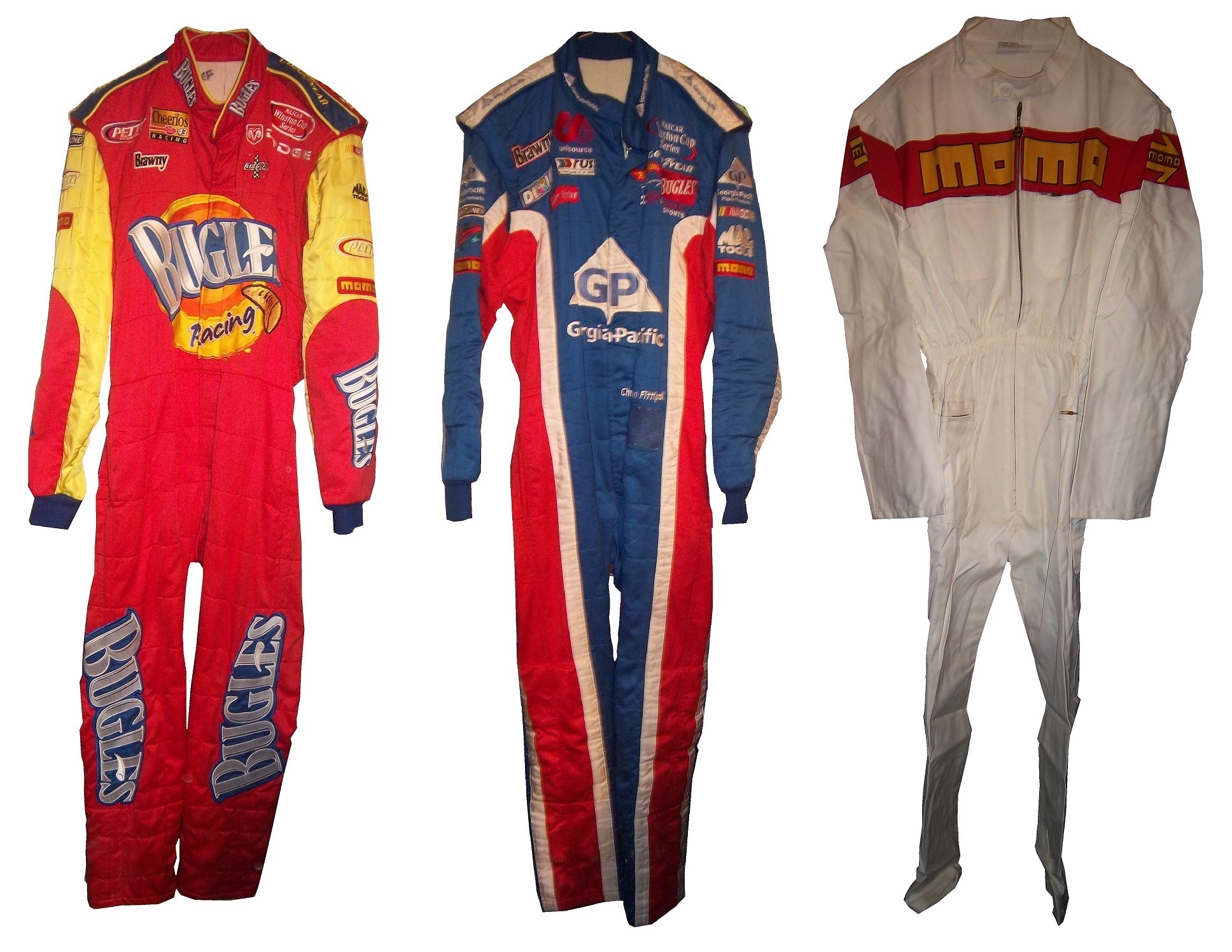
A couple of weeks ago, I discussed the events in 1964 that led to the invention of the Nomex driver suit. I also briefly discussed what one of these pre-Nomex suits looked like. Well that was meant as a Uni-Watch article, and was written differently than I would normally write it. It didn’t run on Uni-Watch for a myriad of reasons not worth getting in to. So for this week, I will analyze the suit in Driver Suit Blog style
Before Nomex became the standard for driver suits, racing was living in the dark ages. Drivers would race in whatever they were wearing when they came to the track. Little if any consideration was given to fire safety. As such, many drivers perished in on-track fires. Even when the fire retardant suits began to spring up, they were of little value. Prior to 1967, and for some time after, your standard driver suit was little more than a cotton or polyester suit dipped in borax and other chemicals. This made them fire retardant, but very uncomfortable to wear. Nomex made the driver suit safe and comfortable to wear.
But what did these suits look like? Well this is an example of a polyester suit. It was worn by an Indianapolis based driver named Bill Brach. He was a member of the Murat Shrine in Indianapolis, and he raced in this suit.The suit itself dates to 1972 at least, because of an Archie Bunker For President patch.It has a tag that says “Untreated, will burn,should be dipped.”The polyester material is very flimsy, and is ripped in one part.It has a classic racing stripe up the side, similar to what Paul Newman wore in LeMans.The belt has a metal-clasp to close it, unlike most suits, which use VelcroThe sleeves can be unzipped for comfort, which compromises the fire protection.The back has MURAT 500 SHRINE CLUB in chain stitching on the back.
This is an example of a suit from yesteryear. One that has been made obsolete. It is delicate, thin, and in a fire was of limited value. Nomex has become the standard, and suits like this are now simply relics.
Brad Keselowski #2 Redd’s Apple Ale Ford FusionBlack and Red is always a good scheme, and the overall design is good. The sticking point for me with this scheme is that APPLE ALE is almost invisible on the quarter panel. So for a final grade, it gets a B-
Alex Kennedy #33 Dream Factory Chevy SS Yeah it is a tad overdesigned, but it is for a charity to help children with life-threatening illnesses. So I’ll give it a B
Kurt Busch #41 Haas Chevy SS If the black were blue, and the red and white stripes were kept, I would like it more, but this scheme earns a C.
Kyle Larson #42 Cottonelle Chevy SS The blue looks decent, but the target logos on blue look awkward. The 42 would look better in white than dark blue as well. C+
Aric Almirola #43 Nathans Hot Dogs Ford Fusion As much as I like Nathans Hot Dogs, this is awful! The clash between the green and blue is horrific, and I can’t give this a passing grade.
The 2014 Sprint All Star race is behind us, and as usual, there were a myriad of different paint schemes. Some were good, others not so much, but I have to say there were a lot of great schemes in this year’s race. Let’s start with the Sprint Showdown. Unlike in previous years, The Showdown took place on Friday, and the All-Star Race was on Saturday. The Showdown was a great event, which saw Clint Bowyer winning, AJ Allmendinger finishing second, and in the upset of the year, Josh Wise winning the Sprint Fan vote, and advancing to the All Star Race. Let’s get to the grades:
#10 Cole Whitt #26 Speed Stick Gear Toyota Camry This is one of the few schemes that has both a classic and modern look at the same time, and paired with a great color scheme, it earns an A
#13 Austin Dillon #3 Dow Chevy SS While I like the color scheme and number and logo designs, the white stripe up the side kills the look. It takes an A scheme to a B+ scheme.
#14 Kyle Larson #42 Target Chevy SS The scheme looks decent, I like the red on the back, though I do not like the Target logos at the bottom. That takes a scheme that was an A grade to a B-
#16 Michael Annett #7 Pilot/Flying J Chevy SS Good color scheme, but the awful template is back for Tommy Baldwin. It is really sad, because this could be a great scheme, but the template takes it from an A to a C-
#19 JJ Yeley #44 Phoenix Warehouse Chevy SS My first thought when I saw this scheme was it looked like the color scheme from the 1994-1995 NBA All-Star Game jerseys which is a decent color scheme. But to say the car is overdesigned is an understatement. This scheme is awful. Not even a great color scheme can help this car pass. F
Now we move on to the All-Star Race, which saw Jamie McMurray pull an upset and take the win, thus guaranteeing him entry into the event for the next 10 years. Overall there were a lot of great schemes, though I wish more teams would run special schemes.
#5 David Ragan #34 Taco Bell Ford Fusion Overall design and color schemes are good, and the only complaint is that the Taco Bell logo should be in color as opposed to black and white. A+
#11 Jeff Gordon #24 Drive to End Hunger Chevy SS Great overall design, great color scheme, though the D on the hood reversed to miror the curves of the hood looks odd. Still it’s a good scheme and Ill give it an A
#12 Dale Earnhardt Jr. #88 National Guard Chevy SS The new metallic numbers work, and the overall design is decent, since it incorporates the design used on the numbers. I’ll give it an B+
#13 Denny Hamlin #11 FedEx Express Toyota Camry The front nose design and stripes are awful. The color schemes are great, as are the logos and numbers, but the stripes kill it. The best grade I can give is a C+
#15 Kasey Kahne #5 Time Warner Cable Chevy SS It is a good color scheme, but the design on the side needs a little tweaking. Get rid of the needless zig-zag pattern and it works a whole lot better. It is still a decent scheme, so I will give it a C
#17 Matt Kenseth #20 Home Depot/Huskey Toyota Camry I would give this scheme an A grade, but the yellow back bumper ruins it. The clash between the two just works awkward, and it takes an A scheme down to a C
#19 Ryan Newman #31 Cat/Quicken Loans Chevy SS What in the blue hell is going on here? I’ve liked Ryan’s schemes this year but this is an F scheme, even though I like the color scheme.
#22 Greg Biffle#16 3M Ford Fusion-The sides and roof have gotten worse from last year. I have to give it an F in that respect.
Also, check this video out concerning how different pit stops in open wheel racing were between 1950 and today:
The video shows how far we have come in pit stops, but we also have come a long way in driver uniforms.
By David G. Firestone
50 years ago this week, events over the course of 6 days in May of 1964 changed the culture, cars, and uniforms of auto racing forever. Three deaths in two races over those six days demonstrated that current safety methods were ineffective at best, and 3 talented drivers lost their lives. The 1964 World 600 and the 1964 Indianapolis 500 helped introduce reenforced fuel tanks and Nomex driver suits, among other things. 50 years later, those events are still being felt
The World 600 began in the early afternoon on May 24, 1964. For the first six laps, it was business as usual, but on lap 7, on the backstretch, Junior Johnson and Ned Jarrett wrecked, and Glenn “Fireball” Roberts swerved to avoid them, and wrecked. He was trapped in the car by the pedals, and his car caught fire. Ned Jarrett ran and pulled Roberts from the car, and paramedics took him to the hospital. 39 days after the wreck, while still in the hospital from his injuries, he died from pneumonia.
NASCAR had rules concerning “fire retardant” uniforms but these were inadequate at best. These uniforms were cotton coveralls traditionally used by workmen that had been dipped in a number of fire retardant materials including Borax. These were not only ineffective, but were extremely uncomfortable to wear. They were known for inflaming the skin, and aggravating asthma. Fireball was not wearing these coveralls during that race, because he had a doctor’s note stating he should not wear them. There is some debate over what the doctor’s note was for, either for asthma or skin hives. It llustrates why these uniforms were not popular, they were so uncomfortable to wear that drivers did not want to wear them.
6 days later, on May 30, the 48th Indianapolis 500 was held. Dave MacDonald started 14th, and Eddie Sachs started 17th when the green flag dropped. MacDonald was racing a car built by racing innovator Mickey Thompson, which by all accounts was badly built and difficult to drive. The first lap led into the second, which saw Dave MacDonald lose control of his car and smash into the inside wall. The fuel tank instantly ignited and the car went across the track, and collected a number of other cars, including Eddie Sachs car, which also exploded on impact. Sachs was killed by the impact, but MacDonald was seriously burned, and his lungs were scorched, the lung damage proved to be fatal.
Inspired by these events, the Nomex firesuit was introduced in 1967 as a replacement for the cotton coveralls dipped in chemicals. It was a lot more comfortable and safer than chemical-dipped cotton, so drivers were more willing to wear them. Like most new safety equipment in sports, it took a while to catch on. Nomex was created in 1967, for NASA. Its main use at the time was for the Apollo Command Module parachutes. NASA needed a material that could stand up to the heat of reentering the earth’s atmosphere, and still remain fully functional.
Bill Simpson is credited with introducing Nomex to driver suits. The story goes that Simpson started making Nomex suits after learning about the material from astronaut Pete Conrad while Simpson was working as a consultant for NASA. One of the pivital moments in the history of the suit was when Simpson had heard that a competitor had been badmouthing his products, and so, in something he said later was “the dumbest thing I have ever done,” challenged the competitor to a “burn off.” Simpson put on his suit and lit himself on fire. He later recreated this for a Mazda commercial.
Why did it take so long to make critical changes to driver uniforms? The events that took place in 1964 were tragic, and it clearly illustrated why the old system didn’t work. The only change made immediately after the events was the rule that fire retardant suits were now mandatory, regardless of how it made the driver feel. In today’s sports safety culture, there would be focus groups, meetings within the sanctioning body, and changes within a few months after the event. But by 1964 standards, just rigidly enforcing the rule was the best course of action. Remember that in 1964 race car drivers were seen as somewhat expendable. Driver deaths in racing were stunningly common back then. As such, while there was a need for improvement, it was not a priority for sanctioning bodies. The sad fact is that back then, driver deaths were part of the allure of racing. People would go to these events and hope to see a fatal crash, as crass as that sounds. As for the suits themselves, the only other options besides chemical dipped cotton was aluminized cotton or aluminized kevlar, which was not more comfortable, as it was like wearing aluminum foil.
So what did these pre-Nomex driver suits look like? They looked like this. This is a driver suit made by Hinchman in Indianapolis. It is basically a polyester suit that is customizedto thedriver’spreference. It is not all that different than a jumpsuit that one would wear to work. It is a very flimsy material, has no cuffson the arms or legs, and, most amazingly, the tag states that the suit is “Untreated, will burn, must be dipped.” This suit was worn circa 1972, which is indicated by the “Archie Bunker for President” patch sewn into the chest. Like any new safety technology in sports, it takes time for it to become the standard, and for Nomex, this is no exception.
This race, along with the 1955 24 Hours of Le Mans and the 2001 Daytona 500 have their legacies written in death, but unlike other similar events, the lessons they had to teach were learned, and the racing world as a whole is better for them. The deaths in these events were not in vain, and others are alive because of them. 50 years later, those 6 days in May 1964 are still having an impact on racing.
The Driver Suit Blog is my favorite project I have ever undertaken. I’ve gotten a few people who ask about the origins of The Driver Suit Blog, and so this week, we will start with how it came to be. The origins are rooted in my game-used memorabilia collection. I started in hockey, and looked at the various game wear patterns on jerseys. I then would get into other forms of memorabilia, and would analyze them for an old website. In 2008, I went to the National Sports Collector’s Convention in Rosemont, and came away with a late 1960’s Oakland A’s jersey. As fate would have it, when I got home, I was looking for something on my computer and found Windows Movie Maker on my XP based hard drive. I decided on a whim to make a video about it, and with that Introduction to Sports Memorabilia was born.
I started into driver suits in 2010, and researched the suits the same way I research every other game-used item. I had a lot of trouble finding information for a collector about the various aspects of driver suits and race-worn memorabilia. So I just did what I could, research wise. In 2012, I asked Paul Lukas if I could guest write a column for Uni-Watch. Now the blog was never a thought prior to this article, but as work progressed, it dawned on me that I could start a blog for driver suit and racing memorabilia collectors. So in January 2013, The Driver Suit Blog was born.
The paint scheme grading was born out of frustration. I had been working on a Christian Fittipaldi article, and it wasn’t long enough, so I started grading paint schemes to fill some extra space. I kept doing it, and it has become a part of the blog. The same can be said for Tailgating Time, which was also based on a Uni-Watch feature known as Cuilinary Corner. Tailgating Time was designed for tailgaters, to give them recipies that can be cooked on a grill or hot plate at a track, but are something more than just burgers and hot dogs.
Where will the blog go from here? I will continue my work for driver suit collectors, giving them tips on how to analyze driver suits. Tailgating Time will return, but I can’t say for sure when this will happen. I have a lot of stuff planned so stay tuned.
I also want to take a moment to thank my readers. Without you guys, this would have never taken off, and I just want to say thanks. I also owe a huge debt to Paul Lukas. Without him, the Driver Suit Blog would have never been created. Paul, next time you are in Evanston, hit me up, we’ll go out for a beer!
Next week, we will go behind the scenes and examine how a Driver Suit Blog article comes to be. One other thing that I will start in a couple of weeks is I will do more Wheel Reviews for The Driver Suit Blog, but for now, we conclude with
PAINT SCHEME REVIEWS!
Ryan Blaney #12 SKF Ford Fusion I gave this exact same scheme an A last year, and it earned 9th place on the Paint Scheme Leaderboard as well. This scheme still earns an A+
Cole Whitt #26 Iowa Chop House Toyota Camry When it comes to great paint schemes for the #26, BK Racing picked up where Swan Racing left off. Great color and design schemes, A+
AJ Allmedinger #47 Hungry Jack Toyota Camry What is this new deal with diagonal curved stripes across the side? It just looks awkward. It has a great color scheme, but the design just looks bad. C-
Jimmie Johnson #48 Lowes/Valspar Chevy SS Jimmy’s same great classic design with a very nice red rear end. I love a great shade of red on a race car, and this is a great shade of red. A+
These last few weeks have been hell in Chicago weather-wise. I have been under the weather myself, but this week, I wanted to touch on something that I covered in depth last year. After watching the Rolex 24 at Daytona, I learned that MOMO is celebrating its 50 anniversary this year. I first learned about MOMO when I covered Christian Fittipaldi’s Driver Suits back at the beginning of the blog. MOMO is one of the more ubiquitous racing safety companies in racing.MOMO is short for “Moretti-Monza” which is Giampiero Moretti’s last name and Monza, a town in the Province of Milan. Giampiero Moretti was a driver who won the 1998 24 Hours of Daytona. He created a company specifically to make racing products. MOMO has gradually expanded over the years, and is now involved heavily in almost all forms of auto racing.
One thing I have noticed is that MOMO steering wheels are used very heavily in NASCAR. Whenever there are in-car cameras, there is always one located near the ignition behind the steering wheel, and almost every one of them has a MOMO logo on them. They are also very involved in F1, and IndyCar racing in terms of parts. When the best and most recognizable teams in the biggest forms of auto racing all use the same group for their parts, it proves that MOMO is the best in what they do.
I also mention Christian Fittipaldi because he won the Rolex 24 at Daytona in an Action Express Coyote Corvette DP. This is his second win, his first one coming in 2004 in a Bell Motorsports Doran JE4-Pontiac. As covered earlier in the year, I own two Christian Fittipaldi MOMO driver suits. In all honesty, these two suits were my first introduction to MOMO as a brand. MOMO however has a large presence in auto racing.In the SCCA Miami Grand Prix, these suits were issued to track workers. MOMO stated that these would be fireproofed for one race only. It feels like an old school chemical dipped suit, but I have no proof of that. It does not appear to have been worn, but it probably is not fireproof any more though.2014 is the 50th anniversary of what I’m going to call “The dark week,” May 24-30 1964 when the World 600 and Indy 500 took place. Three drivers were killed by fire, which changed the safety culture of racing forever. I will cover that issue in depth later in the season.
Kyle Busch #18 Skittles Toyota Camry When I first heard about Skittles returning to NASCAR, I thought it would look like this or this, so naturally I was worried, but I like this simple and attractive design. A+
Matt Kenseth #20 Dollar General Toyota Camry My major complaint was the black and silver stripes on the sides were too big and promenent. They solved that issue this season, and the car looks better. In fact, I’ll give it a B!
Jeff Gordon #24 AXALTA Chevy SS Classic Jeff Gordon design, and I like the blue on the flames, and the black flames on the back. A+
Kurt Busch #41 Slate Water Heaters Chevy SS Kurt is running a really good template this year, and this is another example. The condensation design is overdone, and it takes an A scheme down to a B-, otherwise it is a great design.
Aric Almirola #43 STP Ford Fusion This is one of my favorite schemes this year! A classic design, with great colors and a great look earns an A+
AJ Allmendinger #47 Kroger/USO Chevy SS Though the scheme is the same as last year, JTG Daugherty Racing has switched from Toyota to Chevy this season. That being said, I like this scheme, and I will give it an A
AJ Allmendinger #47 Charter Communication Chevy SS I like the overall design, but that is an awful shade of green. Green is not a great color for a race car, neither is yellow, so yellowish-green definitly doesn’t work. I’ll be generous and give it a C-
Michael McDowell #95 K-Love Ford Fusion Not only is McDowell and Levine Family Racing running a better template this year, the K-Love scheme actually improves on it. I can’t give this scheme anything lower than an A


