
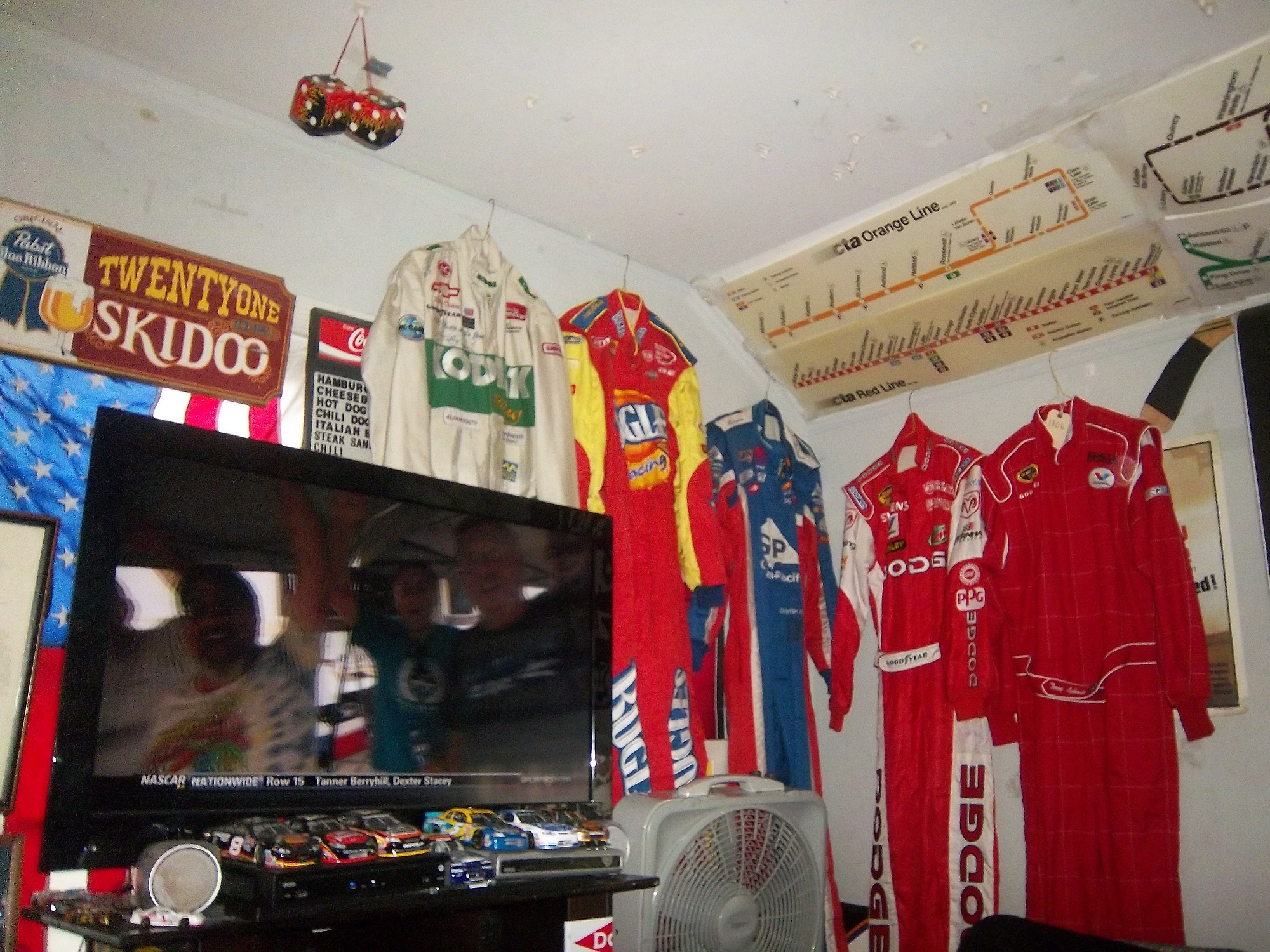
A Bobby Hillin Jr. Suit from his brief career with Moroso in 1991 will be in the spotlight this week.
Tag: nascar
The Driver Suit Blog-Paint Scheme Leaderboard Part 4-The Grand Finale
By David G. Firestone
The focus group of one has had its meetings, and has made its decisions. Here are all 50 teams that ran the Sprint Cup this year ranked first to last on their paint schemes:
#1-Wood Brothers #21-A classic design scheme that just seems to get better with age. The Henry Ford design combines classic and modern elements for an amazing look.
#2-Hendrick Motorsports #48 Jimmie Johnson went with a very classic look, with a day scheme and a night scheme, which worked very well. Johnson did not have a bad look all year.
#3-Michael Waltrip Racing #55 Simple traditional designs. That is the secret to their success on the leaderboard. Color schemes are great as well. Nothing wrong with these schemes.
#4-Furniture Row Racing #78 When it came down to picking a number 1 for Chevy, for both the Paint Schemie and the Leaderboard, I had to flip a coin to pick a number 1, and Johnson won. Kurt Busch ran a series of very solid schemes, not a lot to comment on and it always looks good.
#5-Joe Gibbs Racing #18 Like Jimmie Johnson and Kurt Busch on the Chevy side, the Toyota winner for both the Paint Schemie and Leaderboard was decided by a coin flip. More modern than the 55, all these schemes are good, with amazing paint schemes and really good design.
#6-Richard Petty Motorsports #43 This team combines classic and modern looks, and uses Petty Blue very effectively. The Transportation Impact scheme was not good at all, and kept the 43 team out of the top spot. Extra Credit for the Maurice Petty Tribute Scheme.
#7-BK Racing #83 Great designs all around, but the hood needs work. Why is it black when the rest of the car is red?
#8-BK Racing #93 See Above, but the Old Dominion scheme drags it down.
#9-Penske Racing #12-Though only raced for one race, the SKF design worked very well. A great color and great design scheme. If this had been raced for multiple races, I would have ranked it higher, but it is still a solid scheme.
#10-Richard Childress Racing #29 The Bad Boy Buggies scheme is bad, and the Rheem/Budweiser combo scheme is awful, but aside from those, Kevin Harvick has had a very good season, paint scheme wise
#11-Earnhardt Ganassi Racing #42 Get rid of the Axe Apollo scheme and the Camouflage scheme, and Juan Pablo Montoya would have the top spot.
#12-Richard Petty Motorsports #9 This set earned a place in the top 5 because it improved by a lot over the course of the season. It has a great color scheme, but the early schemes were not great, but since Stanley redesigned their logo, and made some changes to the car, it is a very nice set.
#13-Phoenix Racing/Turner Scott #51 Guy Roofing and Hendrick Cars are hideous, but apart from that, they have run a great set of paint schemes. Bonus points given for the Neil Bonnett throwback scheme.
#14-Michael Waltrip Racing #56 The Get Back and Give Back scheme is horrid, but the rest of the schemes are really good.
#15-JTG Daugherty Racing #47 Most of what they ran this year was great, but the Bushes Baked Beans car has an odd overall design, and a weird color scheme. The Clorox scheme has a bad color scheme, as does the Charter scheme, as does the Wounded Warrior Project scheme.
#16-Roush Fenway Racing #17 A pinkwashing scheme as well as the Valvoline NexGen scheme kick Ricky Stenhouse Jr. out of the top spot. Sad thing too, as Ricky had a very solid year when it comes to paint schemes
#17-Joe Gibbs Racing #81 Alert Energy is awful. Double Mint is awesome.
#18-Penske Racing #2 While I miss the beer colored wheels from last year, Keselowski has had a decent year, the color scheme is great, though there is too much white on the car. The Redd’s Apple Ale scheme was great, but the Fan Mosaic and Patriotic schemes need some work.
#19-Roush Fenway Racing #16 Greg Biffle had a lot of great schemes, but he had a number of awful ones , including a pinkwashing scheme as well. Get rid of the pinkwashing scheme, the Scotchguard, give blood, and Megulars schemes, and he would be in the top 5.
#20-Richard Childress Racing #27 The yellow is too bright, but other than that, the schemes are really good.
#21-Stewart Haas Racing #14 Some of these schemes are good, others not so much.
#22Hendrick Motorsports #88 Dale Jr. runs good schemes most of the time, but Soldiers of Steel, Orange Amp Energy, and Camouflage are just brutal. Additional points lost for a pinkwashing scheme.
#23-Joe Gibbs Racing #20 If the Dollar General was more plain, and did not have the orange back, I would love to give Matt Kenseth a higher spot, and a pinkwashing scheme does not help.
#24-Earnhardt Ganassi Racing #1 Bad Boy Buggies is even worse here, and the Bass Pro Shop schemes are awful. A number of good schemes here as well.
#25-FAS Lane Racing #32 The Oxy Water scheme, and the gray scale C&J Energy Services schemes do not work, but the rest of the schemes they ran do
#26-Front Row Motorsports #38 The template they run works very well when the color scheme matches that of the sponsor. When it doesn’t match, it looks awful.
#27-Front Row Motorsports #35, See above
#28-Front Row Motorsports #34, See above, aside from the CSX scheme, which looks great, and the Peanut Patch scheme which looks awful.
#29-Tommy Baldwin Racing #36 This team looks better without a primary sponsor than they do with one.
#30-Max Q Motorsports #37 Simple, yet attractive. Would be higher if they ran more races.
#31-Joe Gibbs Racing #11 The Jason Leffler tribute scheme and the FedEx delivery manager schemes are great, but the rest are just awful. I miss the Gen 5 schemes
#32-Nemco Racing #87 The word that can best describe this set is dull. Not bad, but not spectacular.
#33-Circle Team Sport #40 Interstate Moving is really good. Moon Shine Attitude Attire is really awful, and their pinkwashing scheme is even worse.
#34-Roush Fenway Racing #99 Geek Squad and Fastenal work well, the rest…not so much.
#35-Richard Childress Racing #31 A few good schemes but most of them are mediocre at best.
#36-Hendrick Motorsports #24 See Above
#37-Stewart Haas Racing #10 Worst shades of yellow in NASCAR, and the pinkwashing scheme is so much worse.
#38-Michael Waltrip Racing #15 Clint has consistently run cars with great color schemes, but awful designs. Except for Duck Dynasty, and pinkwashing, which are just hideous.
#39-Humphrey Smith Racing #19 Another car that just looks better without a primary sponsor.
#40-Germain Racing #13 Nothing really wrong, but nothing really right with these schemes.
#41-Penske Racing #22 Red and yellow is a really great color scheme, but the design is all wrong. This design gets even worse with the AAA scheme, which has an even better color scheme. The Pennzoil scheme is good, but not good enough to save the set.
#42-Stewart Haas Racing #39 I have to give them credit, their schemes are mostly awful, but at least they are creative.
#43-Tommy Baldwin Racing #7 Worst. Door. Number. Ever. The rest of the car isn’t good either, and a pinkwashing scheme doesn’t help.
#44-Phil Parsons Racing# 98 The schemes come in one of two food groups, bland or awful. Great colors, but the designs are horrid.
#45-Levine Family Racing #95 Worst template in NASCAR.
#46-Hendrick Motorsports #5 Innovation can be a bad thing. This, for example is what happens when you let Karl Benjamin design your cars.
#47-Circle Sport/RCR #33 It amazes me how two different teams can use the same car number, and both can put awful designs on their cars. Special credit for the Honey Nut Cheerios scheme, which is just horrific.
#48-Xxxtreme Motorsports #44 Yuck.
#49-Hamilton-Means Racing #52 Paulie Harraka had a great scheme, but Brian Keselowski…not so much.
#50-Swan Racing #30/26 Please tell me this is an experiment on how to make the worst paint scheme in history? Is Swan Racing competing with Travis Pastrana for the most obnoxious paint scheme in NASCAR?
The Driver Suit Blog-Paint Scheme Leaderboard Part 3- Toyota
By David G. Firestone
The Paint Scheme Leaderboard continues with Toyota today. This has been a stressful series, and it will be even more so next week, when I rank all 50 teams in order from best to worst. Enough complaining, on to the schemes.
#1 Michael Waltrip Racing #55 Simple traditional designs. That is the secret to their success on the leaderboard. Color schemes are great as well. Nothing wrong with these schemes.
#2 Joe Gibbs Racing #18 Like Jimmie Johnson and Kurt Busch on the Chevy side, the Toyota winner for both the Paint Schemie and Leaderboard was decided by a coin flip. More modern than the 55, all these schemes are good, with amazing paint schemes and really good design.
#3 BK Racing #83 Great designs all around, but the hood needs work. Why is it black when the rest of the car is red?
#4 BK Racing #93 See Above, but the Old Dominion scheme drags it down.
#5 Michael Waltrip Racing #56 The Get Back and Give Back scheme is horrid, but the rest of the schemes are really good.
#6 JTG Daugherty Racing #47 Most of what they ran this year was great, but the Bushes Baked Beans car has an odd overall design, and a weird color scheme. The Clorox scheme has a bad color scheme, as does the Charter scheme, as does the Wounded Warrior Project scheme.
#7 Joe Gibbs Racing #81 Alert Energy is awful. Double Mint is awesome.
#8 Joe Gibbs Racing #20 If the Dollar General was more plain, and did not have the orange back, I would love to give Matt Kenseth a higher spot, and a pinkwashing scheme does not help.
#9 Joe Gibbs Racing #11 The Jason Leffler tribute scheme and the FedEx delivery manager schemes are great, but the rest are just awful. I miss the Gen 5 schemes
#10 Nemco Racing #87 The word that can best describe this set is dull. Not bad, but not spectacular.
#11 Michael Waltrip Racing #15 Clint has consistently run cars with great color schemes, but awful designs. Except for Duck Dynasty, and pinkwashing, which are just hideous.
#12 Humphrey Smith Racing #19 Another car that just looks better without a primary sponsor.
#13 Hamilton-Means Racing #52 Paulie Harraka had a great scheme, but Brian Keselowski…not so much.
#14 Swan Racing #30/26 Please tell me this is an experiment on how to make the worst paint scheme in history? Is Swan Racing competing with Travis Pastrana for the most obnoxious paint scheme in NASCAR?
Next Week, The big finale, all 49 teams ranked from best to worst!
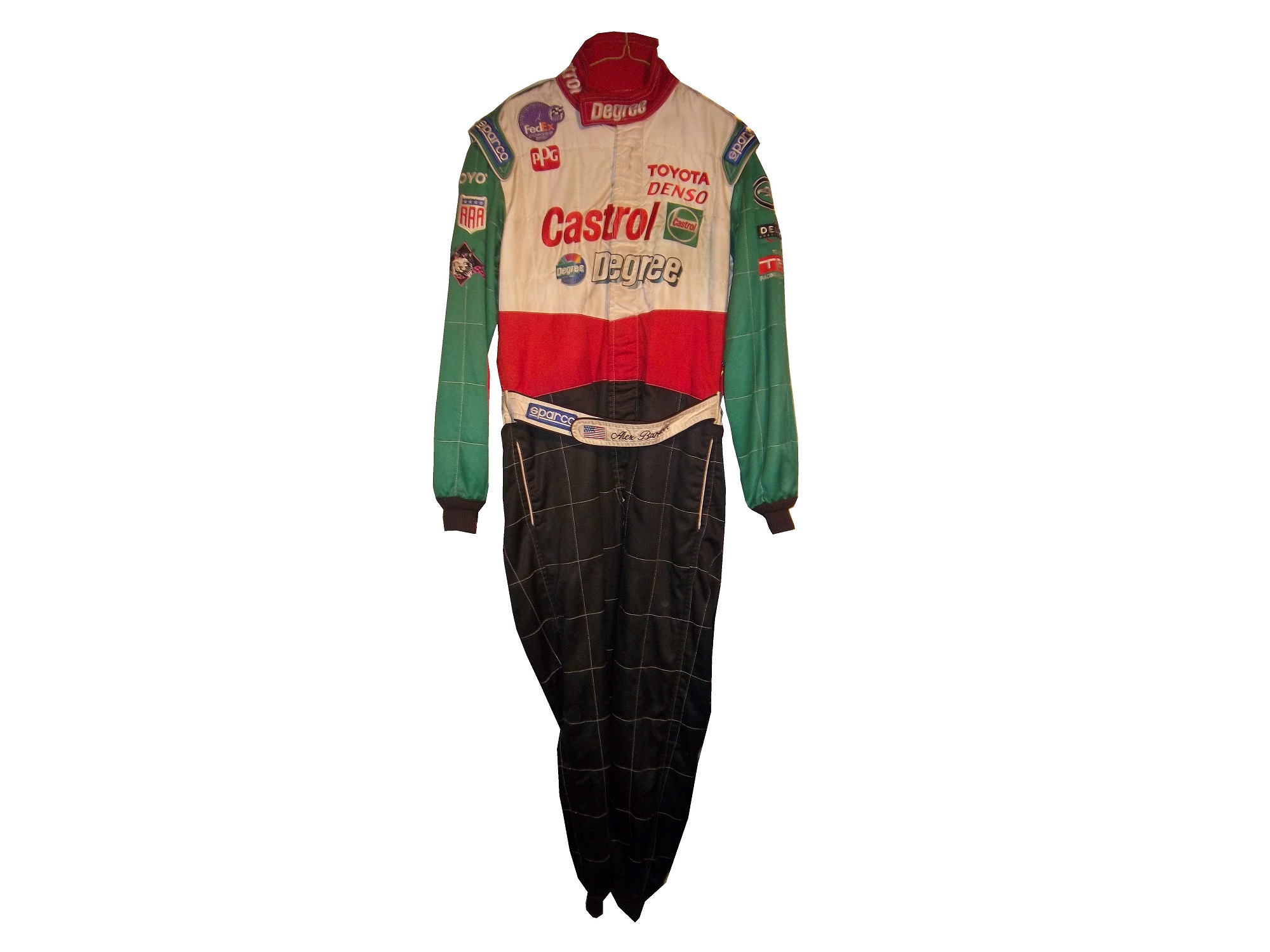
DGF2099 Productions-Introduction to Sports Memorabilia-Jody Miller 2005 Race Worn Driver Suit
A uniquly designed Jody Miller Toyota Tundra race worn driver suit from 2005 will be examined this week.
DGF2099 Proudctions-Introduction to Sports Memorabilia-Kenny Wallace 1999-2000 Race-Worn Driver Suit
Kenny Wallace is in the spotlight this week, as we look at a race-worn driver suit circa 1999-2000, which he has boldly autographed across the front.
The Driver Suit Blog-Paint Scheme Leaderboard Part 2- Chevy
By David G. Firestone
Last week, I ranked the Ford teams based on their paint schemes, and this week I will do the Chevy teams and next week I’ll rank the Toyota teams, so without further ado all the Chevy teams ranked from best to worst:
#1 Hendrick Motorsports #48 Jimmie Johnson went with a very classic look, with a day scheme and a night scheme, which worked very well. Johnson did not have a bad look all year.
#2 Furniture Row Racing #78 When it came down to picking a number 1 for Chevy, for both the Paint Schemie and the Leaderboard, I had to flip a coin to pick a number 1, and Johnson won. Kurt Busch ran a series of very solid schemes, not a lot to comment on and it always looks good.
#3 Richard Childress Racing #29 The Bad Boy Buggies scheme is bad, and the Rheem/Budweiser combo scheme is awful, but aside from those, Kevin Harvick has had a very good season, paint scheme wise
#4 Earnhardt Ganassi Racing #42 Get rid of the Axe Apollo scheme and the Camouflage scheme, and Juan Pablo Montoya would have the top spot.
#5 Phoenix Racing/Turner Scott #51 Guy Roofing and Hendrick Cars are hideous, but apart from that, they have run a great set of paint schemes. Bonus points given for the Neil Bonnett throwback scheme.
#6 Richard Childress Racing #27 The yellow is too bright, but other than that, the schemes are really good.
#7 Stewart Haas Racing #14 Some of these schemes are good, others not so much.
#8 Hendrick Motorsports #88 Dale Jr. runs good schemes most of the time, but Soldiers of Steel, Orange Amp Energy, and Camouflage are just brutal. Additional points lost for a pinkwashing scheme.
#9 Earnhardt Ganassi Racing #1 Bad Boy Buggies is even worse here, and the Bass Pro Shop schemes are awful. A number of good schemes here as well.
#10 Tommy Baldwin Racing #36 This team looks better without a primary sponsor than they do with one.
#11 Max Q Motorsports #37 Simple, yet attractive. Would be higher if they ran more races.
#12 Circle Team Sport #40 Interstate Moving is really good. Moon Shine Attitude Attire is really awful, and their pinkwashing scheme is even worse.
#13 Richard Childress Racing #31 A few good schemes but most of them are mediocre at best.
#14-Hendrick Motorsports #24 See Above
#14 Stewart Haas Racing #10 Worst shades of yellow in NASCAR, and the pinkwashing scheme is so much worse.
#15 Stewart Haas Racing #39 I have to give them credit, their schemes are mostly awful, but at least they are creative.
#16 Tommy Baldwin Racing #7 Worst. Door. Number. Ever. The rest of the car isn’t good either, and a pinkwashing scheme doesn’t help.
#17 Hendrick Motorsports #5 Innovation can be a bad thing. This, for example is what happens when you let Karl Benjamin design your cars.
#19 Circle Sport/RCR #33 It amazes me how two different teams can use the same car number, and both can put awful designs on their cars. Special credit for the Honey Nut Cheerios scheme, which is just horrific.
The Driver Suit Blog-The First Question…Where Do You Buy This Stuff?
By David G. Firestone
I discuss the various aspects of race-worn and race used collectibles on this blog, and in researching something, I had received a suggestion that sounded like a great idea. The idea that was posed was “You may want to mention where people can actually buy these suits as well.” So I think I will.
The most obvious place to purchase race-worn and race-used items is eBay. Now this is not as simple as it might sound. In the Sports Memorabilia, Cards and Fan Shop section, entering the term “Suit”is a good place to start. Entering the term “driver” can be a mixed bag, and the term “firesuit” as well as “driver suit” work well. If that is not to your liking, search “driver suit” firesuit” “driver firesuit” “NASCAR uniform” “racing uniform” or “driver uniform” in the Any Categories setting.
Another, less likely place on eBay is the Safety Equipment section on eBay motors. Reason being that not all race-worn driver suits end up in collections, many of them are recycled and sold to racers who need a quality firesuit but do not have the resources to spend the thousands needed for a customized one. In fact, many auctions that are geared towards collectors also mention the size in case the suit is bought by a racer.
I have a couple of sellers that I buy from on a regular basis. One of my favorites is Just For Fun Collectibles. They have an amazing selection, and some of the best prices for stuff I have ever seen. I have bought a lot from them, and I always enjoy buying from them. The other seller I buy from regularly is Race Image. Both are based in North Carolina, and Race Image buys regularly from race teams, and resells the items both on their site and on eBay. Like Just For Fun, I have bought a lot from them, and I always enjoy buying from them. Raceusedrescued is another great seller, who has a whole lot of NASCAR stuff.
Using legitimate auction sites can be iffy, not as many people are into race-worn and race-used memorabilia, as are into baseball, or football. But one place that regularly sells race-worn material is Paragon Auctions. They have had a lot of race-worn driver suits for sale in their auctions. Other groups, such as Heritage Auctions and American Memorabilia both have had a lot of suits sell through their auctions.
But with all the places to buy items, doing the research before you buy is critical. That is why I started The Driver Suit Blog, to give collectors the resources and information that they need to do the hobby, and do it right. I’m not someone who just buys these because they look nice, throw them in a closet, and never think about them. I look at them, admire them, and I understand how much work went into designing them. I love this hobby, and I fully support it, and I want to help collectors advance in this hobby in any way I can. That is why I put the time and effort I do into this blog.
Next week, I will announce the 2013 Driver Suit Blog Paint Schemie Awards. The Schemies are a series of awards given out for paint schemes in the Sprint Cup series. For every category, there are two awards given, First and Worst. First awards are given to the best schemes of the year, and worst…well that is pretty self-explanatory, isn’t it?
Tailgating Time!
I took my chili recipe I previously mentioned, and changed the recipe slightly.
You will need:
2 pounds beef chorizo sausage
1 onions, chopped
1 (7 ounce) can diced tomatoes-drained
1 (7 ounce) cans smoked chipotle salsa
1 (12 ounce) can kidney beans-drained
1 cup water
Chili powder and garlic powder to taste
In a large saucepan over medium heat, combine the chorizo and onion and saute until meat is browned and onion is tender. Add the diced tomatoes, smoked chipotle salsa,beans and water.
Season with the chili powder, and garlic powder to taste. Bring to a boil, reduce heat to low, cover and let simmer for 15 minutes.
Paint Scheme Reviews
First we start with 2014 schemes…
Brad Keselowski #2 Miller Lite Retro Ford Fusion This scheme is perfect. There is nothing that can be done to improve it. A+
Marcos Ambrose #9 Twisted Tea Ford Fusion A good color scheme is in play here. I like the shades of yellow, green and blue used here. The overall design works well with the color scheme, and I will give it an A.
Now on to 2013 schemes…
Jamie McMurray #1 Lexar Chevy SS Decent color scheme, and if you get rid of the flash drives at the bottom, it would be an A scheme. This scheme is good, and earns a B+
Dave Blaney #7 Ultra Wheels Chevy SS This is the first time that this car actually looks good…provided you get rid of that door number. B+
Clint Bowyer #15 5-Hour Energy Sour Apple Toyota Camry Another example of why camouflage does NOT work on race cars. What does camouflage have to do with sour apples? This scheme does not work, and it gets an F
Greg Biffle #16 Scotch Ford Fusion Eww…the green design clashes with the red, and the plaid design is atrocious. F
Ricky Stenhouse Jr. #17 RFR Driven Chevy SS Ricky has run a lot of great schemes this year, and this scheme is not an exception. Great color and simple design earns this scheme an A.
Ryan Newman #39 Quicken Loans-Salute to Veterans Day Chevy SS This scheme is a bit more complex in the grade that I gave it, and requires some explanation. This scheme features pictures of United States Military Veterans on the side as a tribute to them. They have earned a place on the car, and have earned the respect as a nation, and an A+++ grade.
Landon Cassill #40 Pirate Oilfield Chevy SS Looks good, great color scheme, simple design, A+
Juan Pablo Montoya #42 Target Camouflage Chevy SS Camo just doesn’t work for race cars, an this is no exception. While they did try to keep the red, it just looks awful, and I’ll give it an F
Bobby Labonte #47 Wounded Warrior Project Toyota Camry Camo doesn’t ever look good on a race car, and this is another example. It looks better than this though…
Kyle Larson #51 Visit Dallas Chevy SS I love color scheme, and I love the skyline on the hood. I’m disappointed that the skyline isn’t on the side of the car, it would look good on the door, but it is still a solid A scheme.
Dale Earnhardt Jr. National Guard Breast Cancer Awareness Chevy SS Pinkwashing is an automatic F grade.
Dale Earnhardt Jr. Amp Gold Chevy SS Not a bad color scheme, though the dot design does not look good at all. I’ll be generous and give it a B-
The Driver Suit Blog-Video-Matching, and The Challenges It has
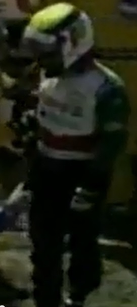
By David G. Firestone Video matching is another way to authenticate a driver suit, though it is somewhat more complex than simple photo-matching. Whereas a photo stands still, video is in motion, and this method of authentication is more complex and can sometimes be problematic. I will give you the steps to make this happen.
First is that you need to find a video that may have the driver wearing the suit visible in it. Google and YouTube are very good for this. It will take some time, and can be frustrating. Once you think you have found it, you have to watch every second of the video to see if the driver is in fact in the video. This can and often is time consuming and frustrating. If you get lucky and find a video, take a screen shot, and isolate the driver. On a PC you hit prtScn and then save it on an image saving program such as Windows Paint. For Macs, you use Command-Shift-3: Take a screenshot of the screen, and save it as a file on the desktop Once done, you can compare the screen shot to the real suit, as seen below:

 It needs to be noted that race-wear, that is wear that comes from racing does not always show up in video, as it is difficult to pinpoint when and where race-wear happened over the course of the season. In-car cameras can be used for video matching, but the downside to this is that since there is not a lot of the suit that shows up on in-car cameras during a race, this can be problematic, and can in some cases lead to a false identification of a suit.
In a number of instances, drivers appear in video games. Many racing games feature a select screen, where you can choose a driver, and they wear their suits as seen below:
Again, there is not a lot of the suit visible, so total identification can be difficult. I would wait until all other avenues have been exhausted.
The last way is to use a VHS tape of a race that has video of the driver in question. If at all possible, transfer the tape to a computer, or a DVD, but if that is not possible, then, as a last resort, take a picture of the screen, and use that to match the suit. It is not very scientific, and the quality will probably be low, but if it works, it works.
While it is not required to match a suit, real collectors who care about the hobby do so to make sure that they are getting the real deal when they buy a driver suit. But where exactly do you buy these suits? We’ll discuss that next week.
The Driver Suit Blog-Nomex-The Core Of Driver Suits
By David G. Firestone I must have said the word Nomex a thousand times on this blog, but what exactly is Nomex? In short, it is a flame-resistant meta-aramid cloth material. It is an aramid material, which is the same thing as Kevlar, but it is not as strong as a bulletproof vest, but it has great thermal, as well as chemical resistance, which makes it great for racing firesuits.
The development of the Nomex firesuit has been a long road. This road has seen its share of driver deaths and injuries. Before the Coca Cola 600, I discussed the deaths of Fireball Roberts, Eddie Sachs, and Dave McDonald in fire-related crashes over the course of 6 days in 1964. What took place from there would cross the paths of racing and a young drag racer.
Bill Simpson was born in Hermosa Beach, California in 1940. He took up drag racing at a young age, and at age 18, broke both arms in a drag racing crash. As he recuperated, he thought of safety in racing for the first time. He developed the idea of an X shaped parachute, and using materials from his uncle’s army surplus shop, developed a functional drag racing parachute. Don Garlits noticed the new parachutes, and took an interest, which helped the Simpson Drag Chute company to form. As time went on, he started making other racing equipment, which caught the attention of drivers, and, oddly enough, NASA. During a project, he met Pete Conrad, who introduced the now 27 year old Simpson to Nomex in 1967.
Nomex was created in 1967, for NASA. Far from the uses it has today, its main use at the time was for the Apollo Command Module parachutes. NASA needed a material that could stand up to the heat of reentering the earth’s atmosphere, and still remain fully functional. Simpson saw what the material could do, and decided it would work well to make driver suits, and other uniform items.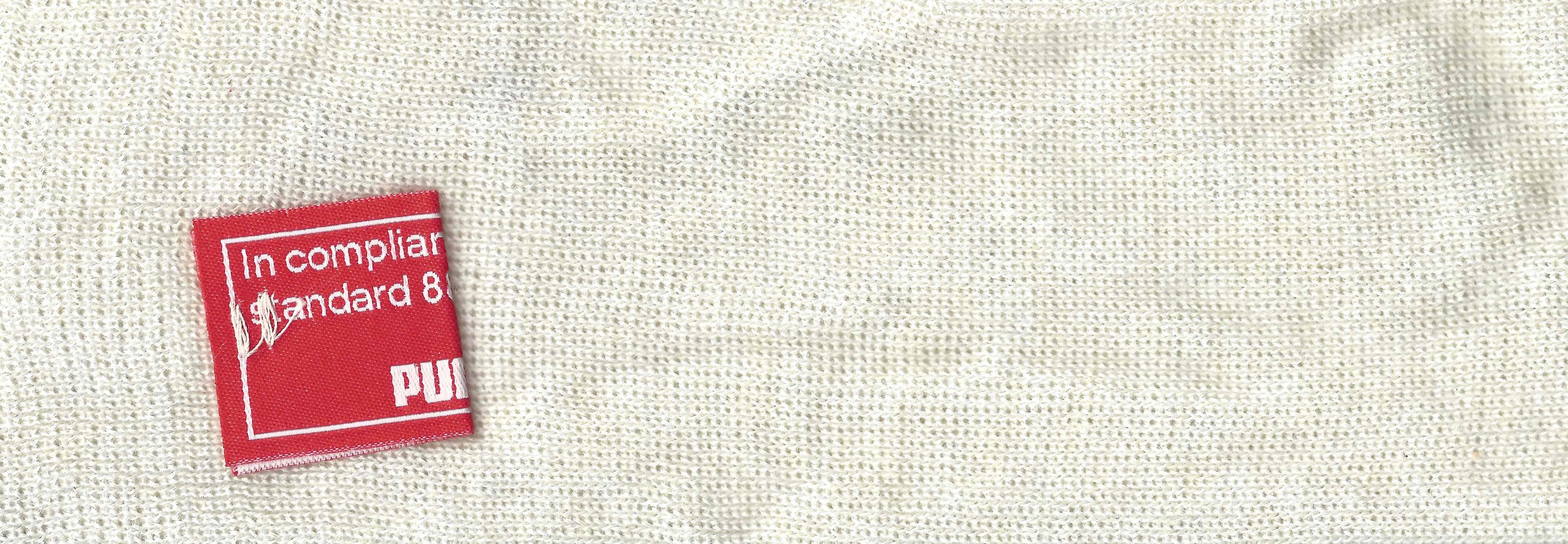 Contrary to what most people think, Nomex is not fire PROOF, rather it is fire RETARDENT. It does burn, but burns at a much slower rate, and that protects the driver in the event of a fire. Bill Simpson decided to show how much better this material was by having a “burn off.” He put on one of his Simpson racing suits, doused himself in gasoline, and lit himself on fire. Though he was fully engulfed in flames, he was not hurt. Though he admits that is was a bad idea, it sold drivers on Nomex. Even today, 46 years later, Nomex is still the go-to material for driver suits.
 Nomex is used for many other things. Nomex sheet is used in power cords for insulation. Fire-fighters use Nomex for protection in saving lives. Fighter pilots wear Nomex suits in case of cockpit fires. Nomex was developed for NASA and NASA still uses a lot of Nomex. It is used in what NASA refers to as the “Thermal Micrometeoroid Garment of the Extravehicular Mobility Unit”, or in regular English, the “outer layer of a spacesuit.” The spacesuits that space shuttle astronauts wore on liftoff and touchdown were primarily made of Nomex. Almost every project that NASA has done in the last 40 years involves Nomex in one form or another, so it is a very versatile material.
Interestingly, as safety concerns increased, and safety equipment changes for the better, you begin to see that Nomex is beginning to have competition in the driver suit market in terms of fire protection. While I’m typically a traditionalist when it comes to sports uniforms, for driver suits that is a great thing. Developing a new material that serves the same purpose as Nomex, but can do it better and longer is a great thing. Eventually, Nomex will go the way of typewriters, film cameras, the printing press, and the floppy disk as an invention that is obsolete but changed the world.
Paint Scheme Reviews!
Some new 2014 schemes released this week:
Danica Patrick #10 Apsen Dental Chevy SS Even though this scheme is better than the *ahem* current Aspen Dental scheme, it still does not look good. But it is still an improvement, and I’ll give it a C
Ryan Newman #31 Quicken Loans Chevy SS Great color scheme-Check, Awesome use of Northwestern stripes-Check, classic design-Check, A+ Grade, Double-Check!
Dale Earnhardt Jr. #88 National Guard Chevy SS The numbers kill what is otherwise a great scheme. I like everything else, but the color of the numbers looks really odd, and I can’t really say it adds to the car at all. Still it is a decent scheme, so I’ll give it a B
Now we move on to 2013
Denny Hamlin #11 FedEx One Rate Toyota Camry Very clean look, with a very good color scheme, can’t say anything bad about this, A+
Greg Biffle #16 Pink 3M Ford Fusion Pinkwashing is an automatic F. I hate it when companies use causes like this to move products, so I show no mercy in this sence.
Ricky Stenhouse Jr. #17 Pink 3M Ford Fusion See Above, F
Ricky Stenhouse Jr. #17 My Best Buy Ford Fusion The blue used on this scheme is a tad too light, but it is still a decent scheme, though the lighter blue takes it from the A grade Best Buy had to an A-
Joey Logano #22 Shell/Pennzoil/Hertz Ford Fusion I’ll be honest, I want to give this scheme a better grade, but the Hertz logo just looks out of place here, and it is awkward on an already iffy scheme. Best I can give it is a D-
Cole Whitt #30 Black Clover Toyota Camry Swan Racing seems to go out of its way to design bad paint schemes this year, and this scheme is no exception. It has no redeeming features at all, and earns an F-
Jeff Burton #31 Sleep Innovations Chevy SS Great color scheme, though the design on the front is a bit overdone, still a good looking scheme that earns a solid B+
Aric Almirola #41 Maurice Petty Tribute Ford Fusion Tribute schemes have worked very well across the board, and this is no exception. Simple, timeless, yet attractive, a great tribute to a great engine builder. Extra points for using Maurice’s #41 for the weekend. Interestingly, Maurice raced in a total of 26 Sprint Cup races, and had 7 top 5’s and 16 top 10’s during the 1960’s.
Travis Kvapli #93 Dr. Pepper Toyota Camry An A+ scheme all around.
The Driver Suit Blog-The Helmet Stripe-An Unusual Place For Sponsorship
By David G. Firestone Last week, I had a column run on Uni-Watch, and I delayed this article until this week. Two weeks ago, we discussed visors, this week, we will discuss what has become known as the “helmet stripe.” Helmet stripes came from IndyCar and Formula 1 cars, which are open cockpit cars. Helmets are clearly visible to television cameras and fans. As a direct result, helmet design in Formula 1 has become its own unique art form. Helmet designs become a part of the driver identity. The other thing that these open cockpits allow is for sponsorship opportunity. As such, a small opaque stripe is used on helmet visors.
 In NASCAR, the visor was slow to arrive. This is due to two reasons, first, many drivers up until the mid 1990’s chose to wear open-faced helmets. While these helmets had a shade to help keep the sun out of a driver’s eyes. While sponsor logos do show up, they were used for the driver’s name. This Brad Noffsinger example from 1988 is an example of that.
 The second reason that helmet stripes were slow to come to NASCAR is that in-car cameras, while used, were for many years positioned in such a way that the visor would not be seen. Even if helmets were painted, the visor had no stripe. When the in-car cameras were positioned to film the driver from the side and even from the front, the helmet stripe became the standard. The stripe is designed to fit over the part of the visor that overlaps the opaque part of the helmet, as this example shows.
 Helmet stripes have become standard. To show how it affects the overall look of the helmet, I took this Kevin Lepage helmet from 1999, and edited the pictures to show how it looks.
 Not bad, but let’s compare it side by side to the original helmet…

 Helmet stripes have become a unique way for a driver to customize a helmet, as this video shows:
Facebook pages and Twitter helmets are becoming standard on these. All visors that a driver would wear on a helmet have these stripes, which is standard, as visors are changed on a regular basis, and sponsors want the advertising space that they pay for.
Paint Scheme Reviews!
Because of the Uni-Watch article last week, I didn’t get to review paint schemes. Within the last couple of weeks there were a large number of 2014 paint schemes released. Now I know that many of these will change before the start of the 2014 season, but I will grade them anyways.
Brad Keselowski #2 Miller Lite Ford Fusion Same scheme as this year, same grade, C
Kevin Harvick #4 Budweiser Chevy SS Same Scheme as last year, same grade, A
Kevin Harvick #4 Jimmy John’s Chevy SS They improved one of the best schemes in NASCAR and went from an A to A+
Kevin Harvick #4 Outback Steakhouse Chevy SS The color scheme remains the same but red takes over from beige as the primary color, which gives the car a great look, and an A grade
Kasey Kahne #5 Great Clips Chevy SS Same scheme as this year, same D+ grade
Kasey Kahne #5 Pepsi Max Cheyv SS Same scheme as last year, same F grade
Marcos Ambrose #9 Stanley/DeWalt Ford Fusion Great color scheme, though the nose, and quarter panel design are over done. Even still, I give it a B-
Marcos Ambrose #9 DeWalt/Stanley Ford Fusion See Above
Tony Stewart #14 Bass Pro Shop/Mobil 1 Chevy SS I get that two companies with different desgin schemes are sharing the car, but this is just brutal to look at. The orange and camo contrast is hideous, and the overall design is overdone. C-
Tony Stewart #14 Mobil 1/Bass Pro Shop Chevy SS The white and black contrast just looks awful! I really hope this changes before the season starts, because this is a scheme that is painful to look at. I have to give it an F
Tony Stewart #14 Code 3 Associates/Mobil 1 Chevy SS As bad of a color scheme as this is, it is certainly better than the other two Tony Stewart schemes are. That said, the color scheme warrants an F while the design warrants an A, so I’ll split the difference and give it a C
Greg Biffle #16 3M Ford Fusion This scheme is a MAJOR improvement over this year’s design! All of the pointless noise on the door is gone, and the car has a very smooth look because of it, and I have to give this design an A
Ricky Stenhouse Jr. #17 Nationwide Insurance Ford Fusion Great color and design schemes, though the white on light blue lettering and logos are hard to see. Even still, I have to give it an A-
Joey Logano #22 Shell/Pennzoil Ford Fusion Same scheme as last year, same grade, D
Joey Logano #22 AAA Insurance Ford Fusion See Above
Jeff Gordon #24 Pepsi Max Chevy SS I gave this scheme a C-, but given the *ahem* other Pepsi Max scheme, I’ve reconsidered, and I will give this scheme a B
Ryan Newman #31 Caterpillar Chevy SS An improvement on an already good scheme, A+
Aric Almirola #43 Smithfield Foods Ford Fusion If the hood and front were done in the stars design, and the rest of the car was red and white striped, it would look better, and I would be able to give it more than a C+
Jimmie Johnson #48 Lowes Chevy SS Supposidly, this will be the main scheme for the whole season, and I have to say it looks amazing, and is an A+ grade
Jimmie Johnson #48 Lowes/Kobalt Chevy SS This will be run for a few races, and it is an A+ scheme.
Carl Edwards #99 Fastenal Ford Fusion Same scheme as last year, same A grade
Carl Edwards #99 UPS Ford Fusion No redeeming features whatsoever, F-`
Now on to new 2013 paint schemes…
Jamie McMurray #1 Cessna/Auburn University Chevy SS The white hood and roof just look aukward, compared to the black covering the rest of the car. That said, it is still a decent scheme, and I’ll give it a B
Dave Blaney #7 Breast Cancer Awareness Chevy SS Pinkwashing is an automatic F
Landon Cassill #33 T-Mone Chevy SS This is a perfect example as to why only one person should design a car. It looks like it took at least 3 people to design the car, each with a different idea as to what the car should look like. And in the end it is just a mess, and not even a good color scheme can give this scheme a passing grade. F
David Ragan #34 Safercar.gov Ford Fusion See Above. F
JJ Yeley #36 United Mining Equipment Chevy SS Even if I didn’t give pinkwashing schemes an automatic F, this scheme would get an F anyway, it just looks awful
Kyle Larson #51 Target Chevy SS Simple, yet attractive, and it earns an A
Kurt Busch #78 Wonder Bread Chevy SS To celebrate the return of Wonder Bread, Kurt is going to channel Ricky Bobby, except for one difference…this scheme is a lot better than the Ricky Bobby Scheme. No flames and the baloons coming from the brake duct are a great look for this car, and it earns an A
Dale Earnhardt Jr. #88 Mountain Dew/Xbox 1 Chevy SS It has a great color scheme, and that is the nicest thing I can say about it. The design is just awful, and it looks like it will give people seizures as it drives around the track. I give it an F
Blake Koch #95 Supportmillitary.org Ford Fusion Eww…Too much going on, with the over-sized camo in too many different colors, and the door design which is awful. F-
