
By David G. Firestone
I have been neglecting the Paint Scheme grades for the last few weeks, so after this brief post, we will focus on those this week. I want to clarify a term that I use regularly. I use the word “overdesigned” and what it basically means is that the paint scheme has design for design sake. The scheme has design that serves no real purpose, and was just added needlessly. Most things we own are, to a certain extent, over designed, mainly to prevent damage from regular use. But when a car uses needless design in a paint scheme, more often than not, it looks awful.
The other news items I wanted to get to are from Formula 1. I’m not an F1 fan per se, but I felt that these deserved some time on the DSB. First there was a major shift in how cars are numbered in F1. It used to be that were ever the driver finished in the previous season is what his car number was. Now the change has been made and instead it is that the drivers pick a number and then use that for their entire careers. Sky Sports covered the driver’s number choices in full, and I’m now a Daniel Ricardo fan! The 2014 F1 helmet designs have been released and the designs speak for themselves. This last item is about the man who is in charge of painting Lewis Hamilton’s Silver Arrow for the German-based Mercedes GP Petronas Formula One Team, my favorite team appearance wise in F1. Now we move on to…
Paint Scheme Reviews
Austin Dillon #3 American Ethanol Chevy SS For many years, green was considered an unlucky color in auto racing. That said, this is a decent scheme. The green used is very good, and the overall design is good. The green around the vent on the side is needless, but this scheme still works. A-
Austin Dillon #3 Bad Boy Buggies/Realtree Chevy SS I’m seriously considering giving any camo paint scheme an automatic F because not one that I have seen in the last 5 years looks good at all. This scheme is just awful. The white/camo scheme is hideous and I’m embarrassed to have to grade it. F
Greg Biffle #16 Red Cross Give Blood/3M Ford Fusion One of Greg’s best schemes he has ever run. I can’t say anything bad. It has a simple yet attractive design, and a great color scheme. A+
Ricky Stenhouse Jr. #17 Zest Ford Fusion Same scheme as last year, same F grade.
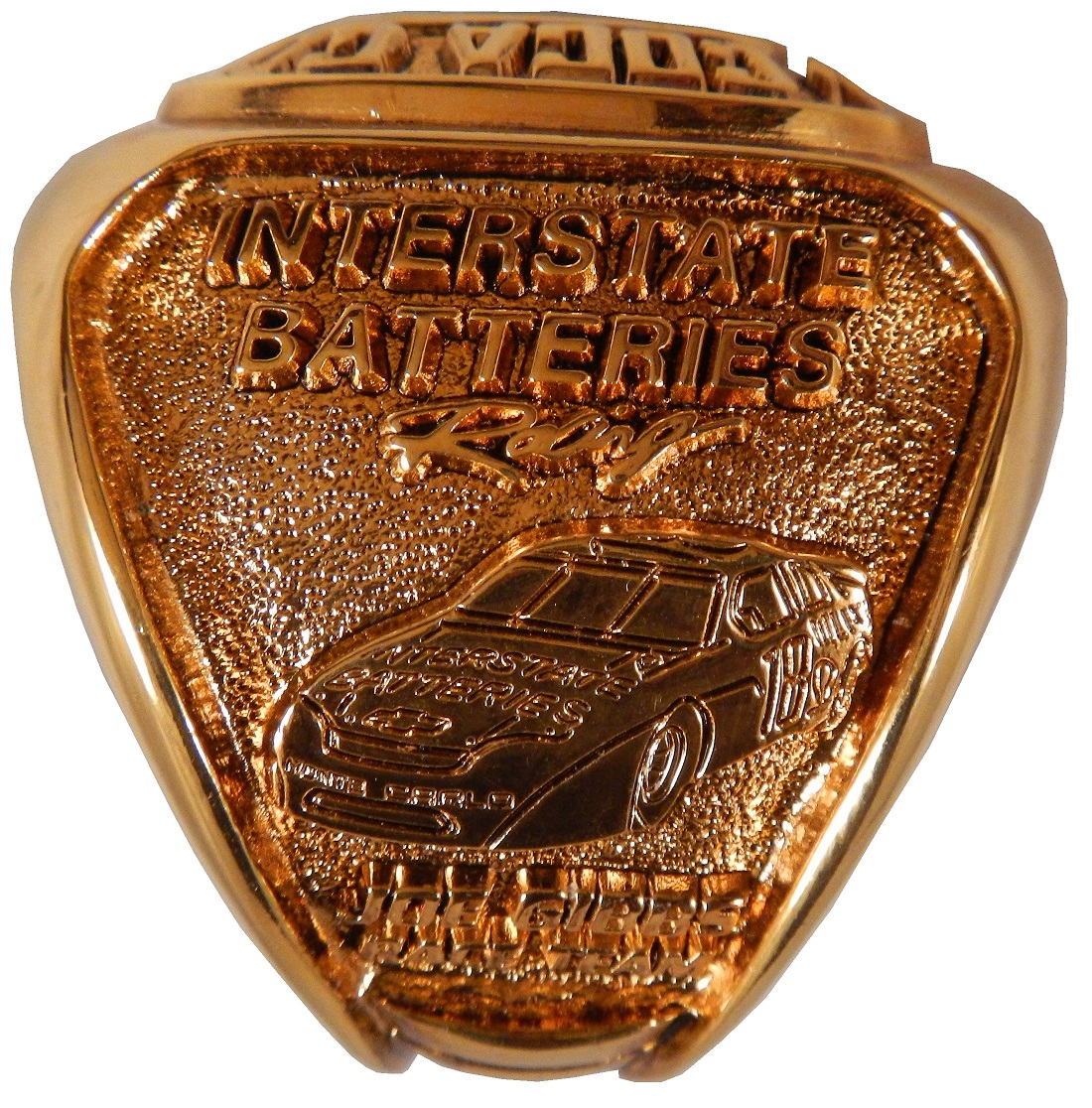
Kyle Busch #18 Interstate Batteries Toyota Camry Same scheme as last year, same B Grade
Jeff Gordon #24 Texas A&M Engineering Chevy SS Decent color scheme, but the side design is odd. It has a little too much design. The crooked Texas A&M logo looks odd here too. Still it is a decent design and earns a C+
Paul Menard #27 Menards/Quaker State Chevy SS Quaker State has a great shade of green, and it should be the dominant color of the car. The yellow base with green accents looks awkward. I’ll give it a C
Parker Kligerman #30 Swan Racing Toyota Camry Simple design and a great color scheme earns an A+
Parker Kligerman #30 Swan Racing Toyota Camry Simple design and a great color scheme earns an A+
Travis Kvapil #32 Ask More Get More Ford Fusion Yellow, white and black is a great color scheme. Overall design is great and the car has a great look to it. A+
Travis Kvapil #32 Ask More Get More Ford Fusion Two different schemes in two weeks is unusual and for whatever reason, the new car was a bit over designed. It still has a decent look and earns a B+
Timmy Hill #33 Circle Sport Chevy SS Simple design and a great color scheme earns an A+
David Ragan #34 Taco Bell Ford Fusion Overall design and color schemes are good, and the only complaint is that the Taco Bell logo should be in color as opposed to black and white. A+
David Ragan #34 Dockside Logistics Ford Fusion The car looks great, with a great color scheme and great design scheme…A+
David Ragan #34 Farm Rich Ford Fusion Good color scheme and I love the rolling hills effect…A+
Reed Sorenson #36 Tommy Baldwin Racing Chevy SS Simple design and a great color scheme earns an A+
David Gilliland #38 Long John Silvers Ford Fusion Great design, great color scheme, great look, A+
Landon Cassill #40 Nabi Tablet Chevy SS Good color scheme, but the the car, like the Nabi Tablet is overdesigned, and earns a C
Landon Cassill #40 CRC Industries / K&W FiberLock Chevy SS A very simple design, though the yellowish-green is unattractive. If the green was darker it would work better. C+
Kyle Larson #42 Clorox Chevy SS AJ Allemdinger has a good Clorox scheme, this is an awful scheme . Why did they choose that shade of yellow instead of white? I can’t give this a passing grade. F
Aric Almirola #43 Farmland Ford Fusion Simple design and a great color scheme earns an A+
JJ Yeley #44 Phoenix Warehouse Chevy SS My first thought when I saw this scheme was it looked like the color scheme from the 1994-1995 NBA All-Star Game jerseys which is a decent color scheme. But to say the car is overdesigned is an understatement. This scheme is awful. Not even a great color scheme can help this car pass. F
AJ Allmendinger #47 Bush’s Grilling Beans Chevy SS Great color scheme and a simple design earns an A+
Justin Allgaier #51 SEM Chevy SS Simple design, great color scheme, looks great, A+
Brian Vickers #55 Xarelto Toytoa Camry Good simple design with a great color scheme earns an A.
Jeff Burton #66 Toyota Toyota Camry The stripe down the side is much too big, and the hood design looks odd. The color scheme is good, but the overall design is a D+
Joe Nemechek #87 SmartBen Toyota Camry Simple design, great color scheme, looks great, A+
Dale Earnhardt Jr. #88 Mountain Dew Kickstart Chevy SS The black and green color scheme is good, and the side is a bit overdeisgned. If the green stripes were scaled back, it would work better. It is work a B- grade.
Michael McDowell #95 WRL Contractors Ford Fusion Levine Family Racing continues to get back into my good graces with another A scheme with great design and a great color scheme.
Carl Edwards #99 Kelloggs/Cheez Its Ford Fusion Too many colors, and the car is overdesigned. F


